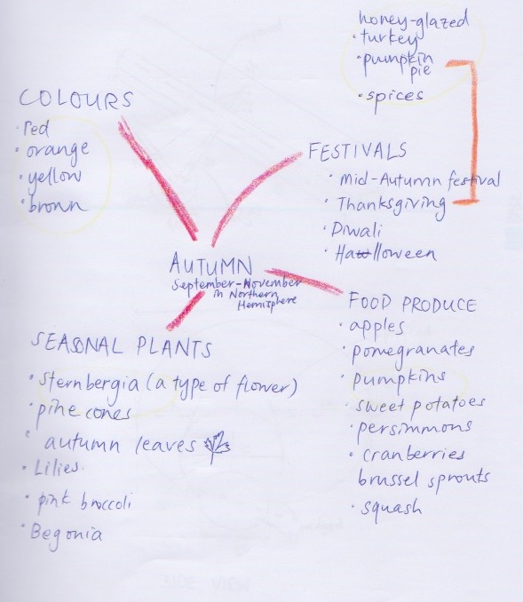
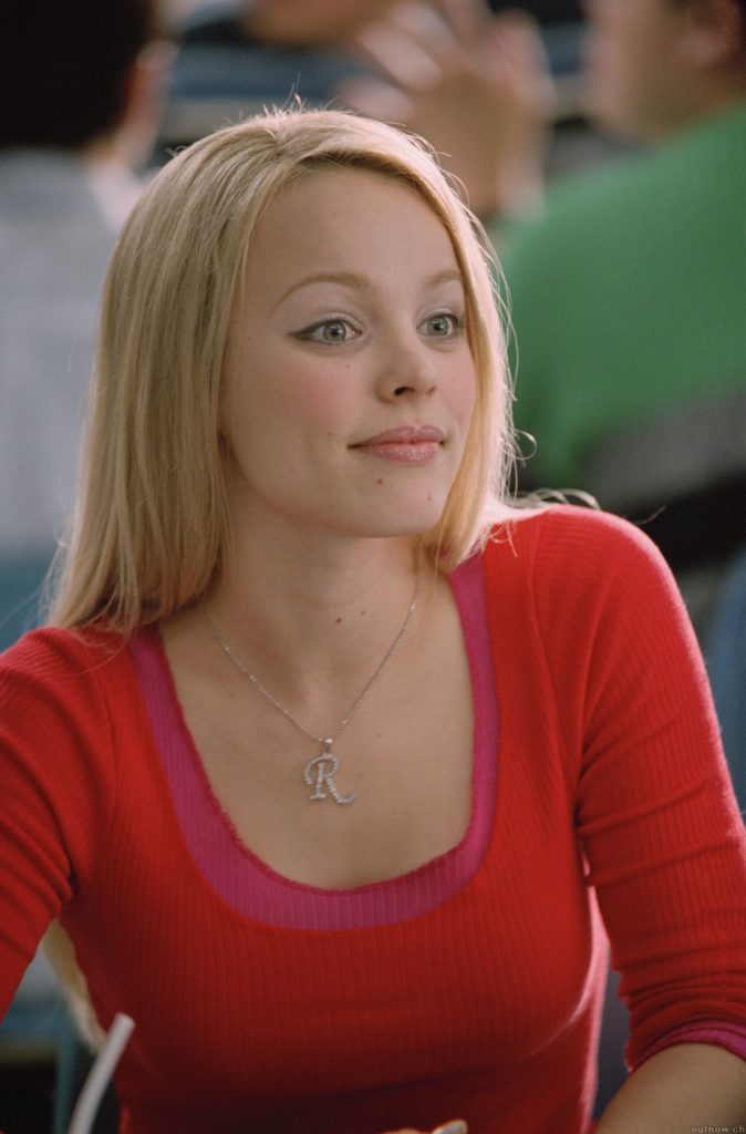
It is getting colder and darker; leaves are falling from the trees. There is a chill in the air overnight, frost on the ground in the morning, mist and fog in the air. Dry, dead leaves crunch beneath your feet and clouds appear when you breathe out. There is still a lingering warmth but always a constant reminder of the cold to come.
This is a quote I found describing Autumn and I believe it’s a good overview description of my final food model.
RESEARCH FOR AUTUMN
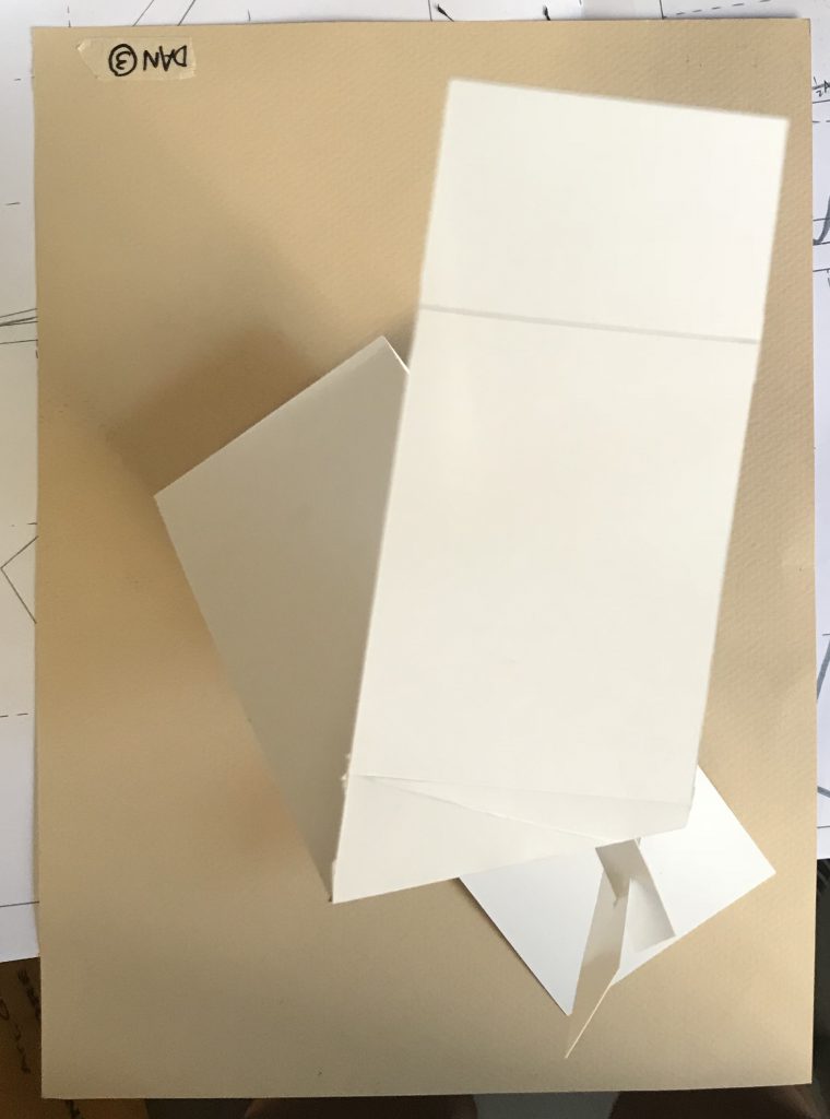
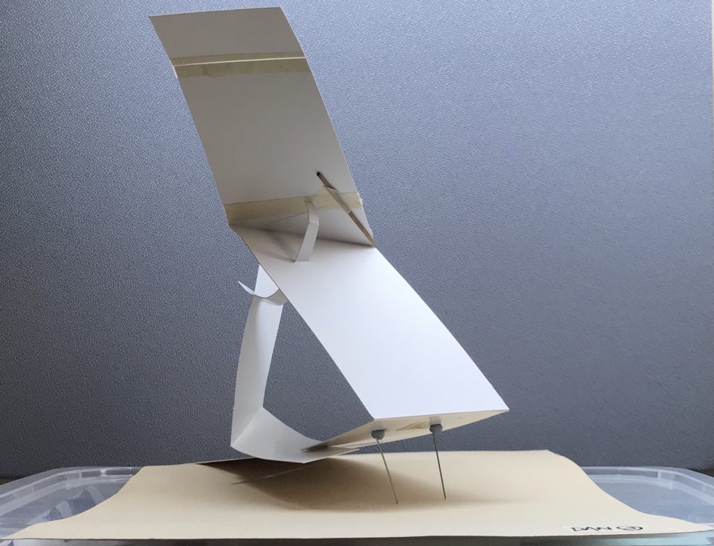
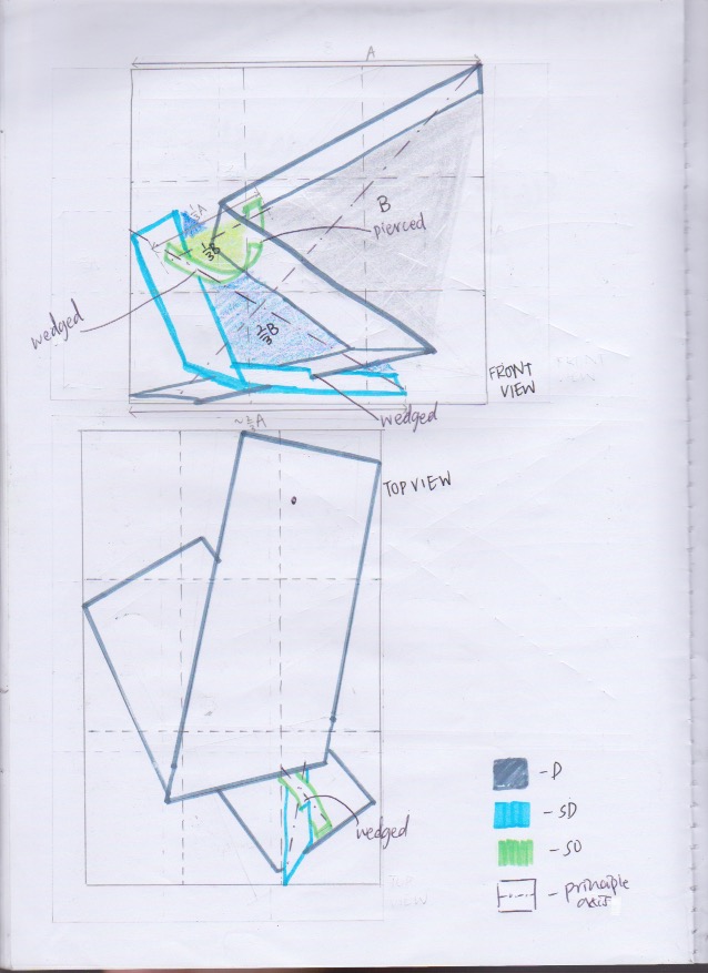
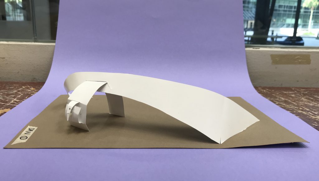
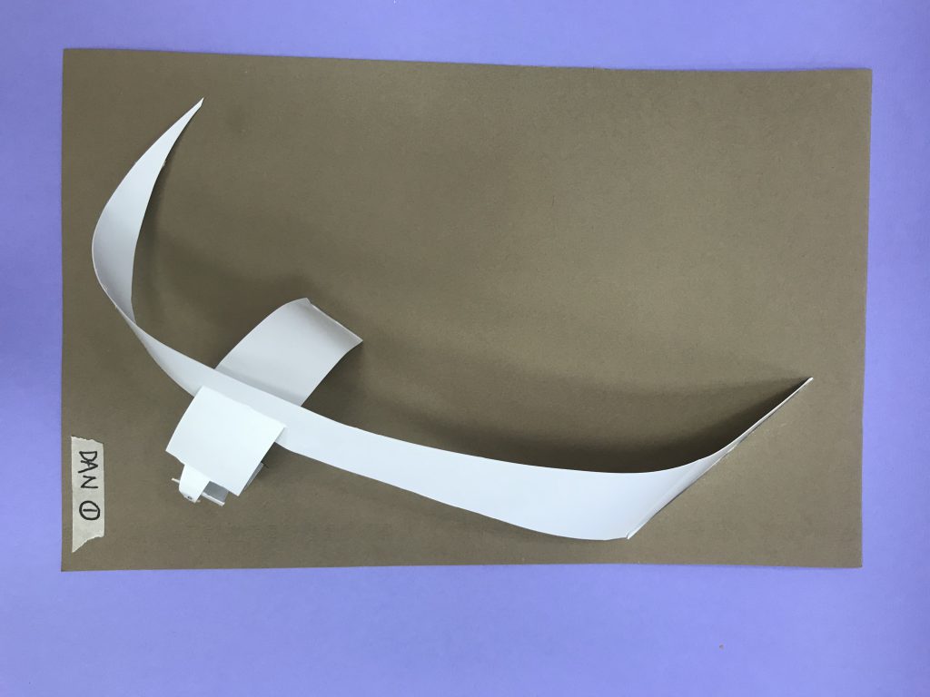
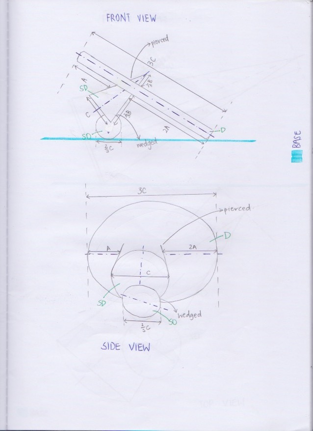
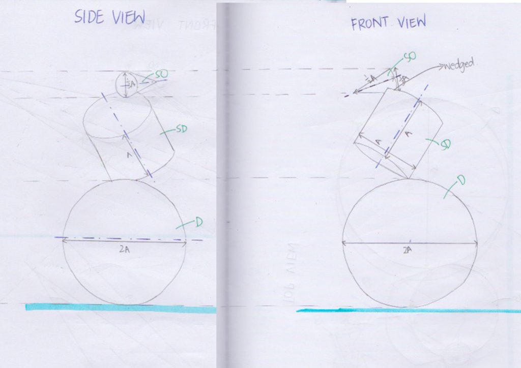
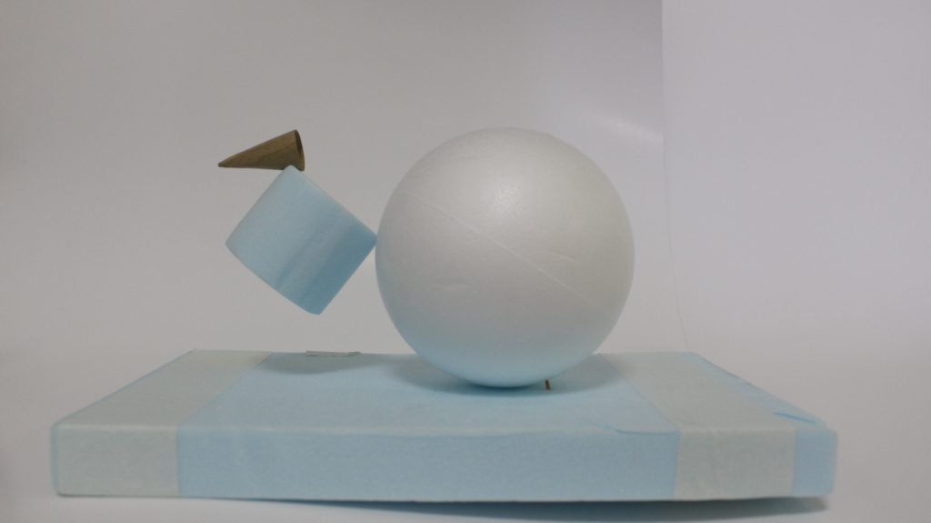
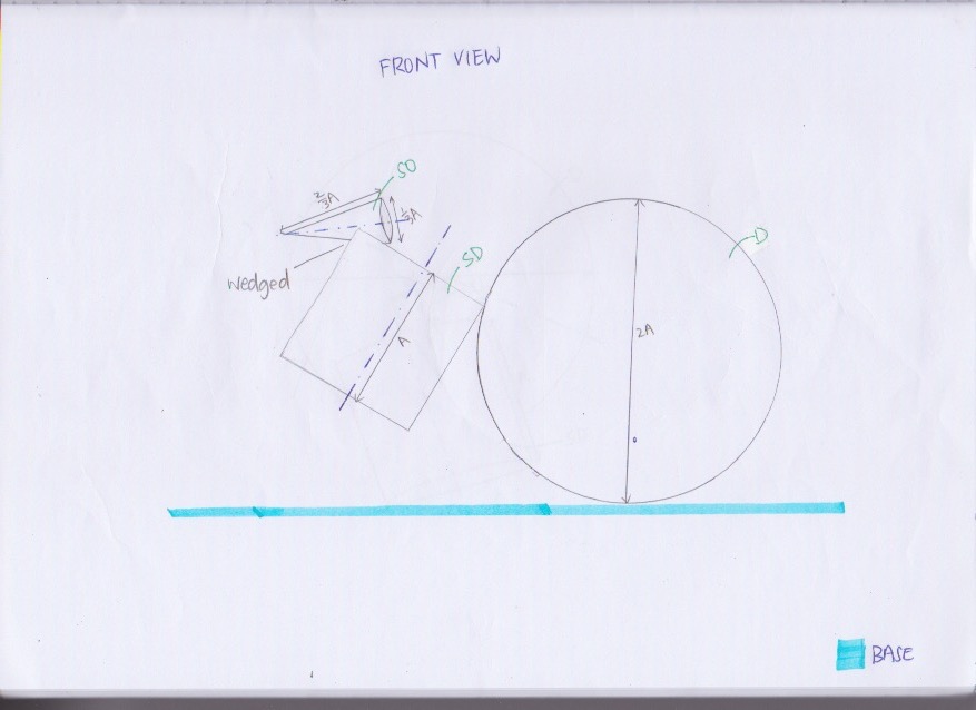
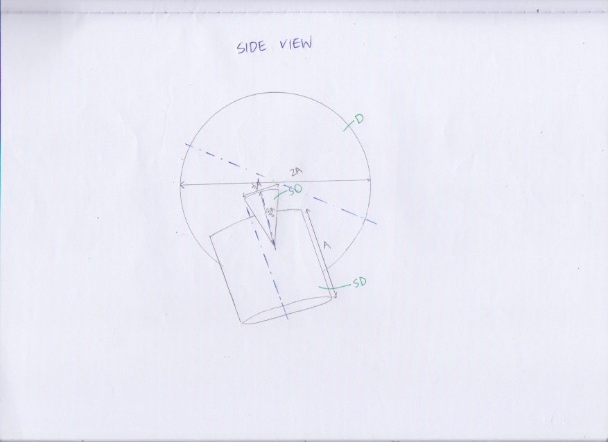
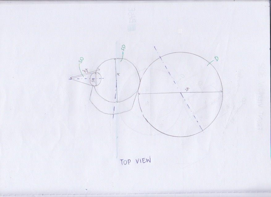
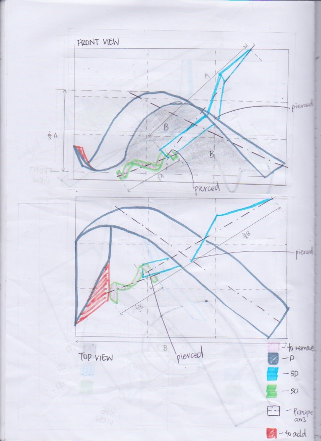
For my final food model, I chose to work with the theme of thanksgiving because I felt like with this theme I could bring in the taste aspects of savoury and sweet. This contrast in taste would be able to enhance the different properties between the D, SD and SO.
RESEARCH FOR THANKSGIVING
Thanksgiving began as a day to give thanks for the blessing of the harvest and of the preceding year.
According to https://www.foodnetwork.com/thanksgiving/thanksgiving-menus/classic-thanksgiving-menu, some of the few traditional dishes for thanksgiving:
- Squash soup
- Turkey w stuffing
- Pumpkin pie
I decided to incorporate Pumpkin Pie (Traditional thanksgiving dessert), Chocolate Fire replica (‘lingering warmth’ from the Quote, BUT this failed and hence I changed out for Turkey from the concept of Traditional thanksgiving dishes *will be explained further), Pomegranates (Seasonal Fruit produce) and Sternbergia (Seasonal Flower) into my food composition.

MAKING THE ACTUAL FOOD
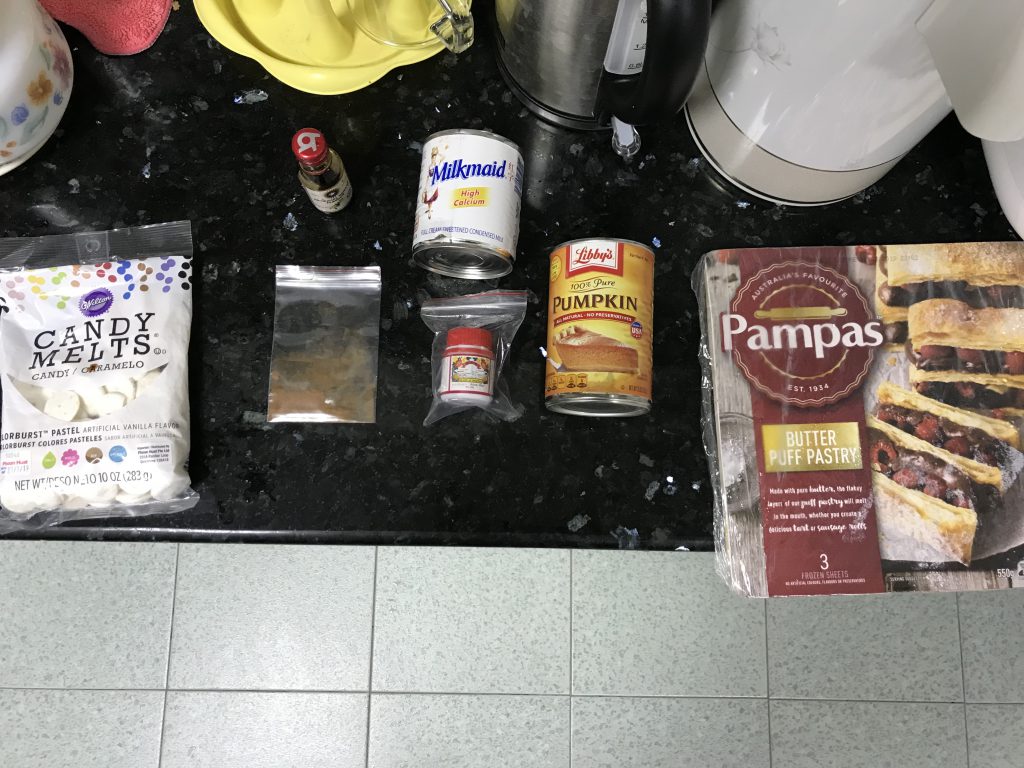
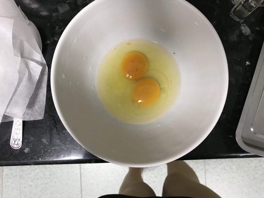
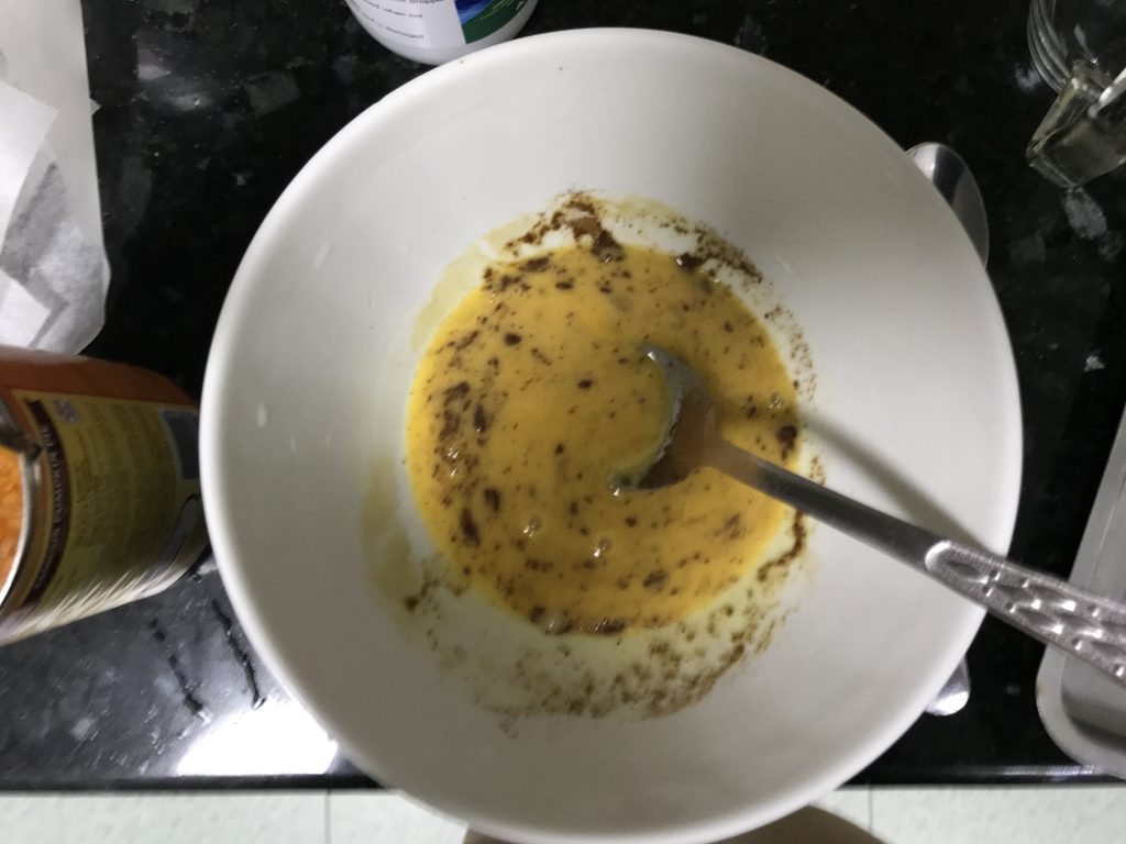
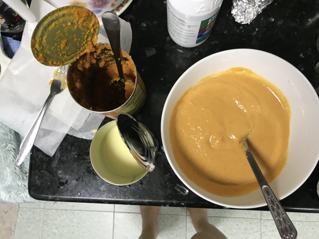
Making the pumpkin pie:
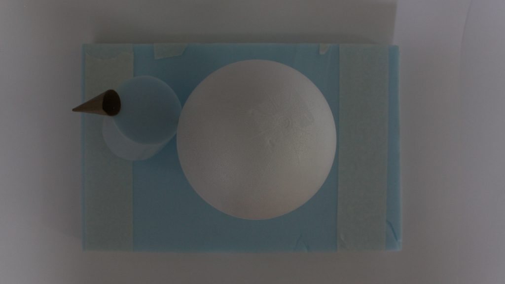
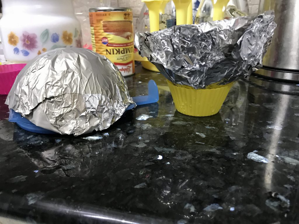
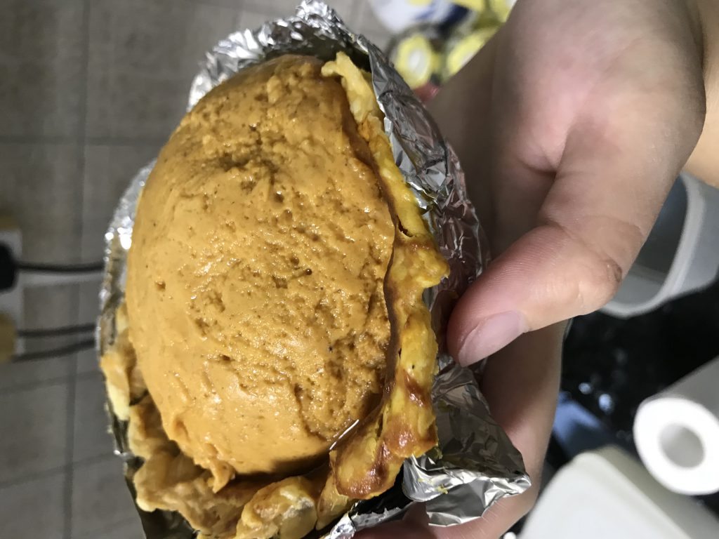
1. Make the hemisphere mould using a hemisphere Tupperware and aluminium foil
- Make the actual pie
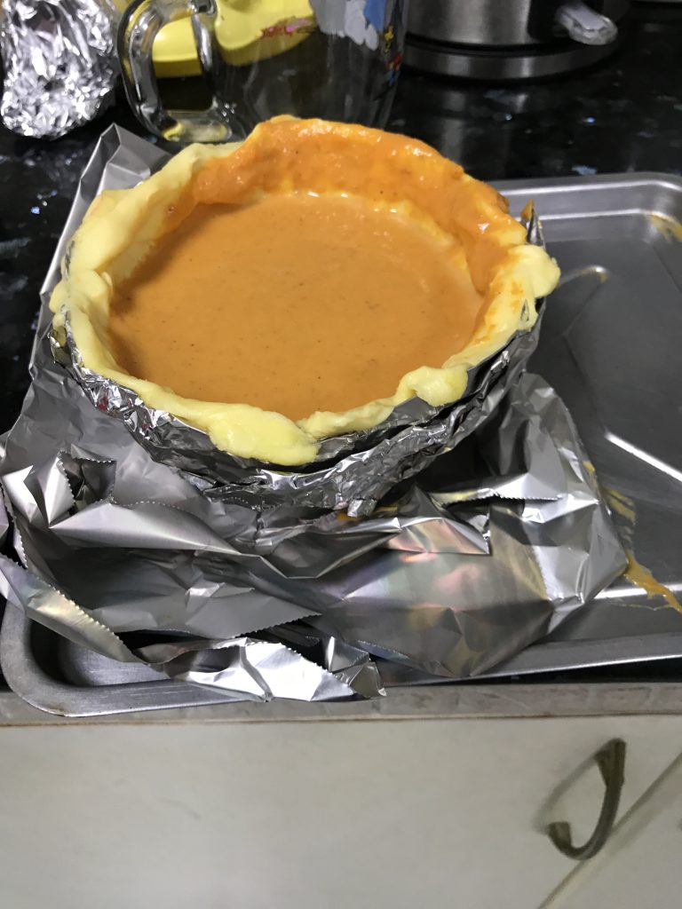
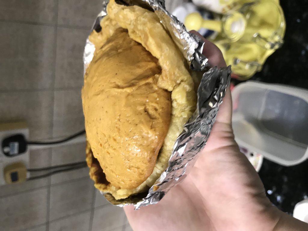
How it turned out!
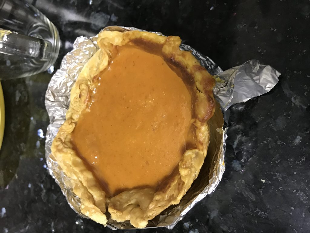
Made another half of just the filling without the crust to make a sphere pie
Next, make the chocolate fire by following this youtube video (https://www.youtube.com/watch?v=k0XcA9yi6uQ).
It was supposed to look like: 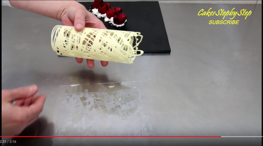 expect that it’s red.
But, everything that could go wrong at this step went wrong.
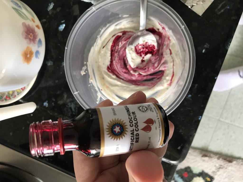
- I could never get the red I intended.
On first try,
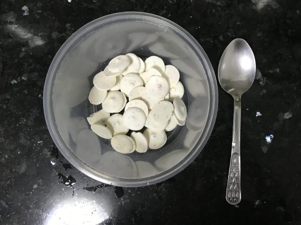
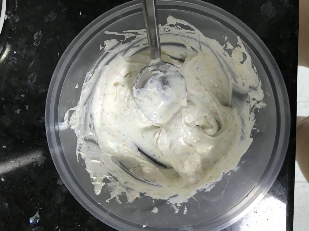
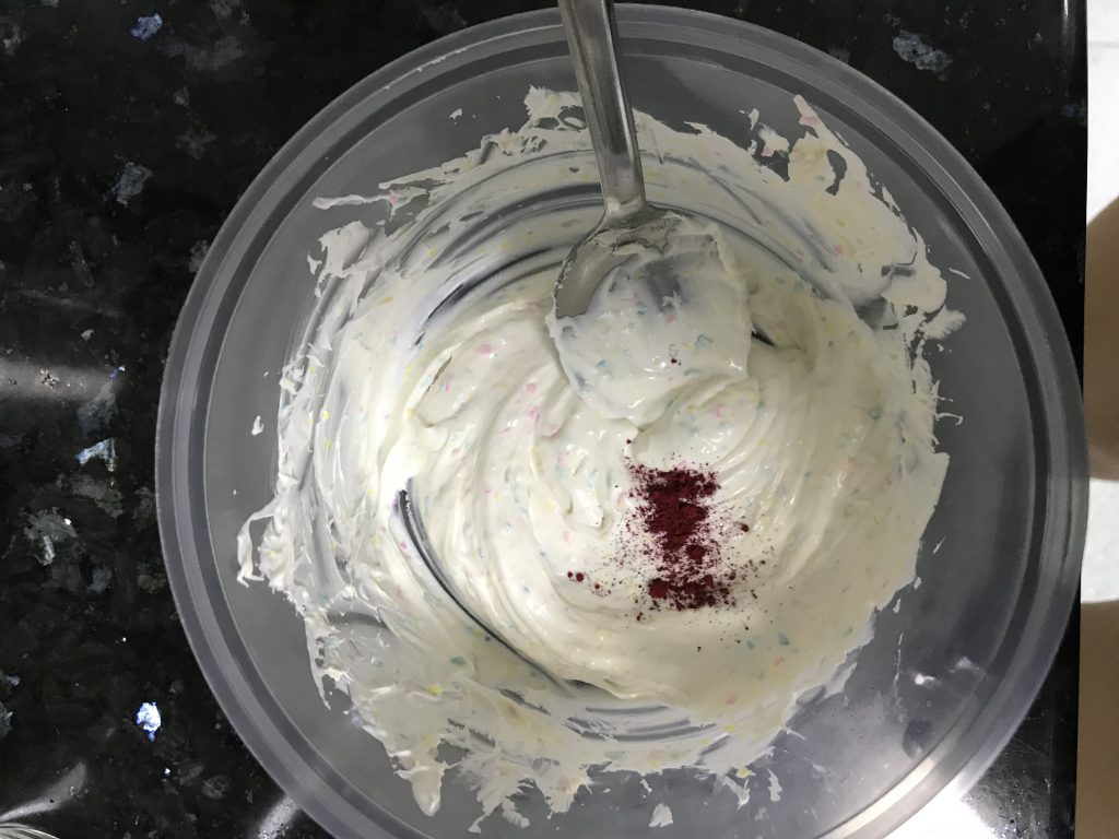
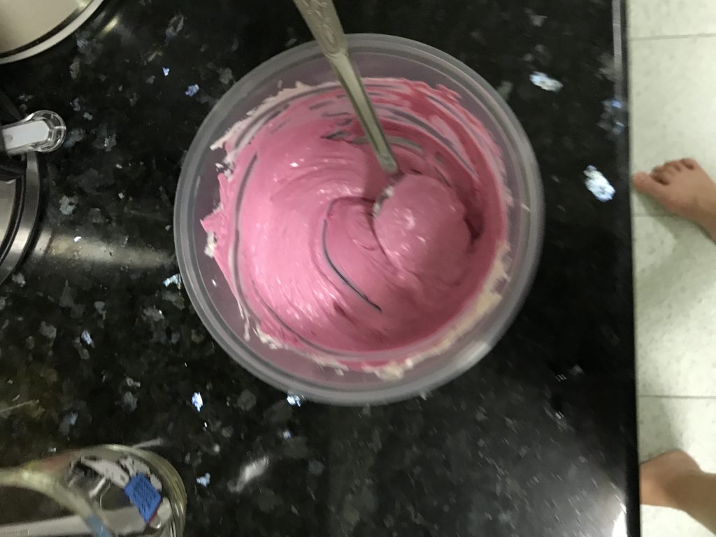
It came out a shade too light. So, I tried again with another food colouring.
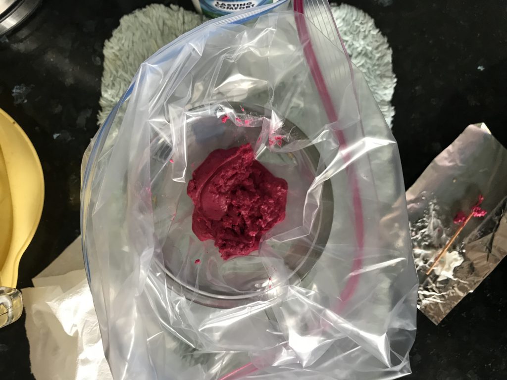
Now, it’s a darker shade of pink but still not the pink I wanted.
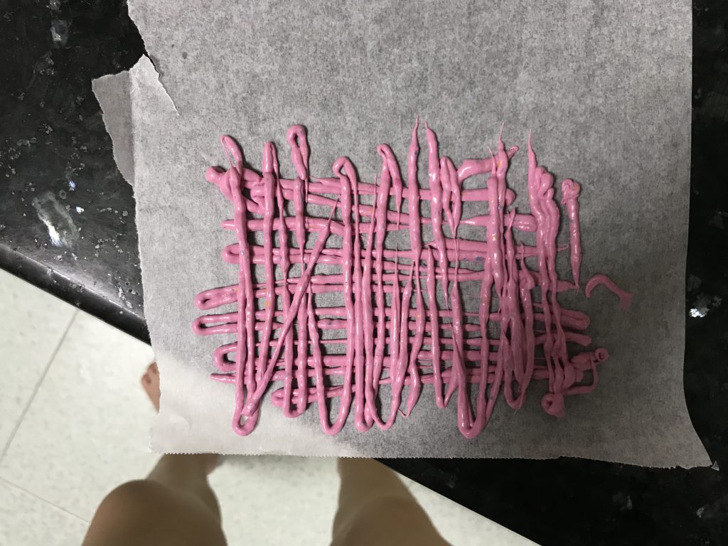
2. I could not get the chocolate thin enough to form the fire shape.
On the first try, it was too bulky, back-firing on what I intended.
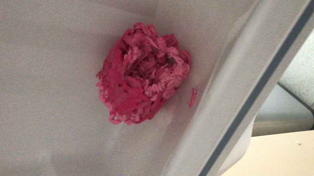
On the second try, the chocolate foil couldn’t even be rolled up.
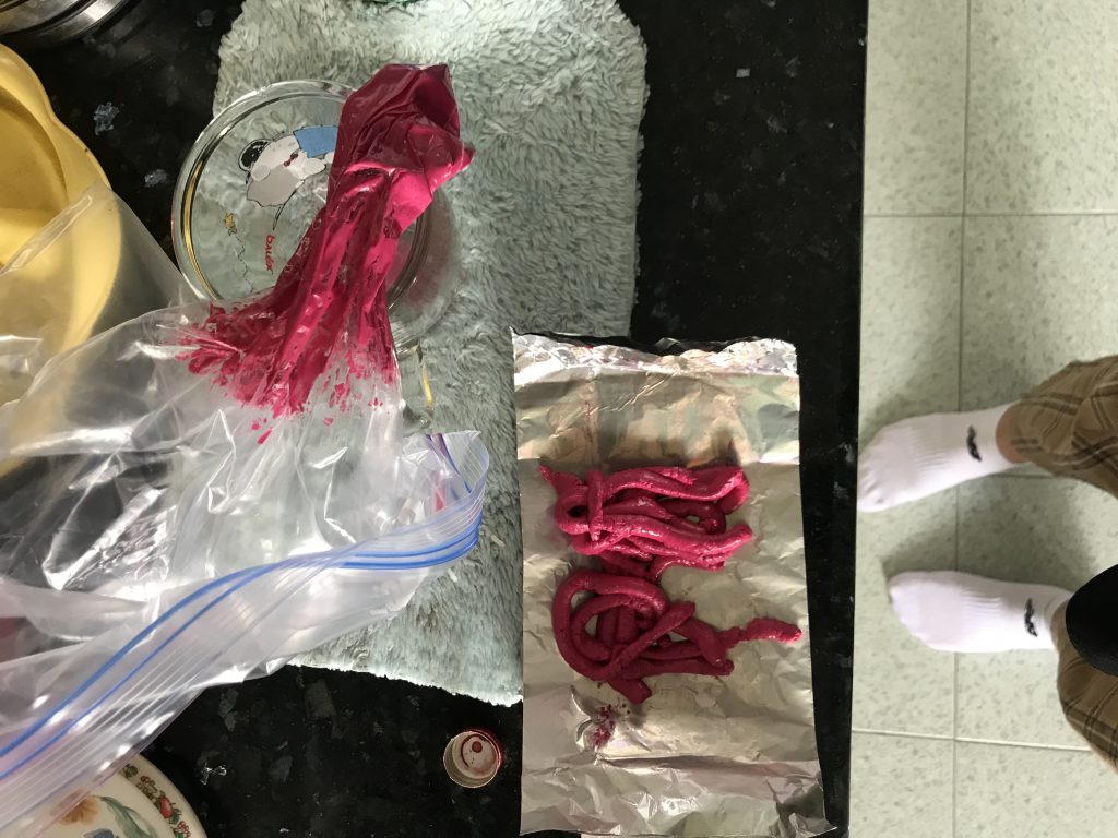
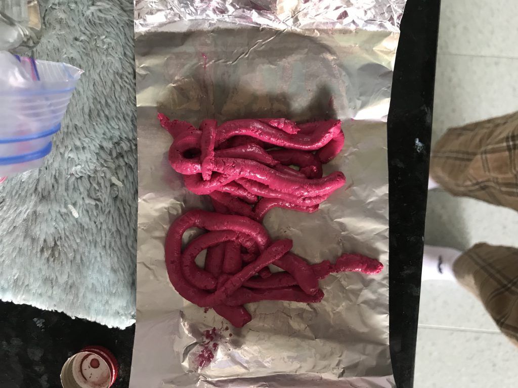
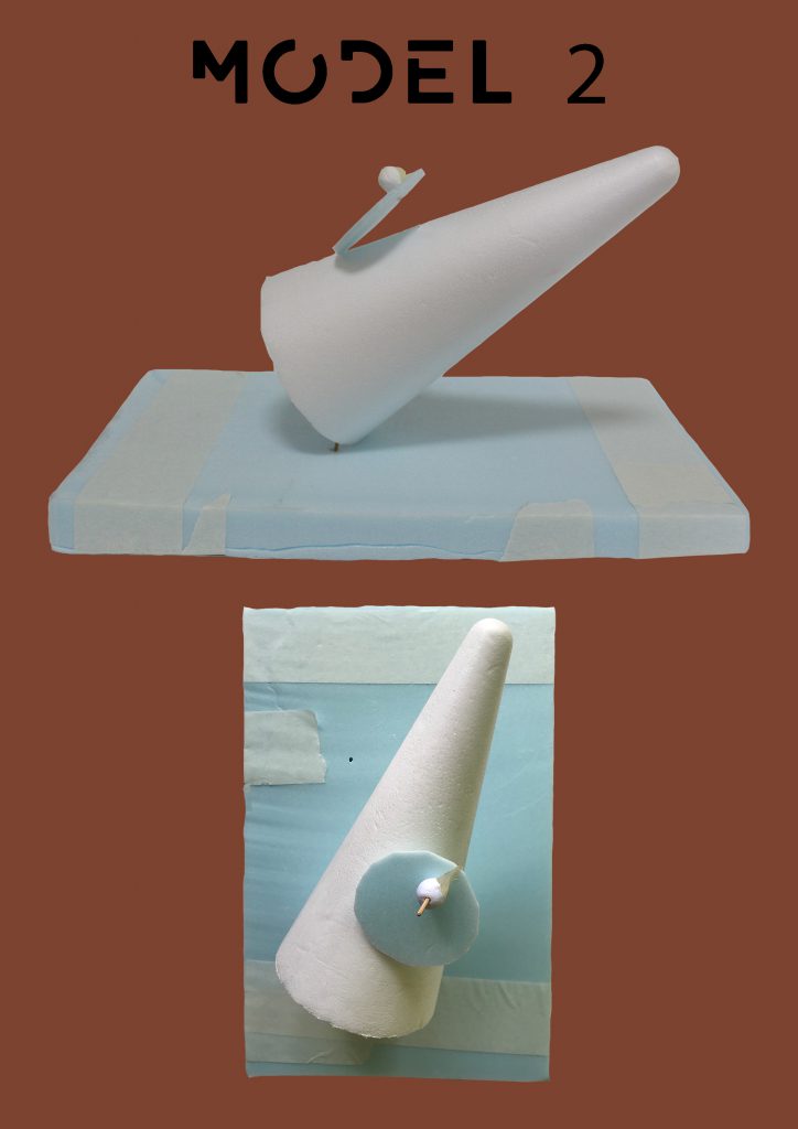
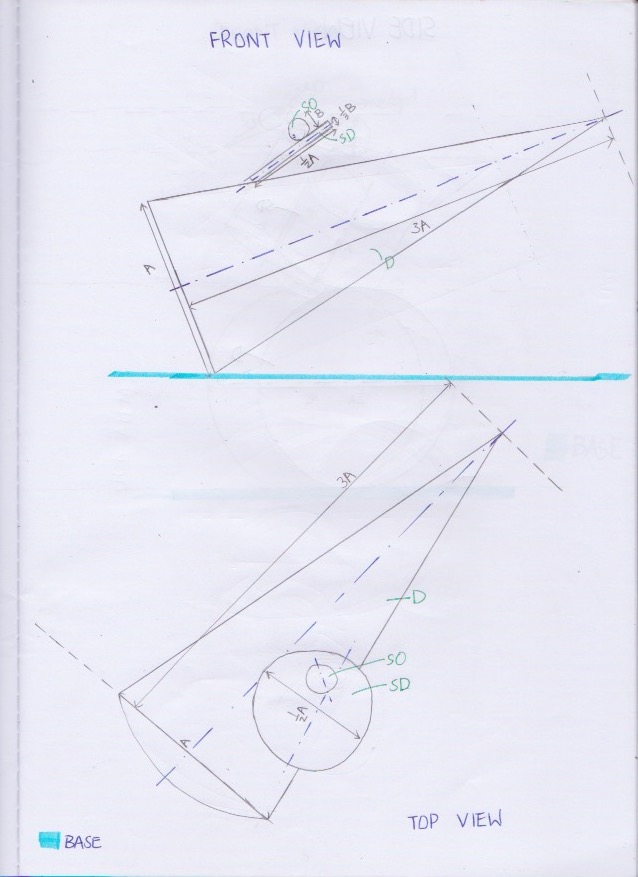
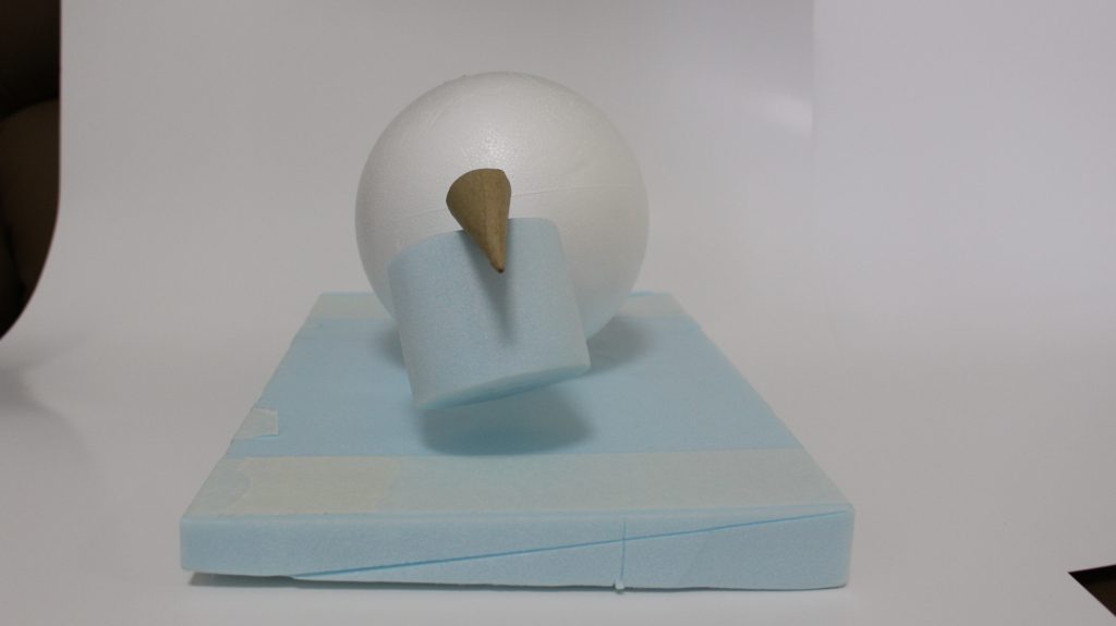
At this point, I gave up and evaluated what I could do so I decided to replace the initial chocolate fire idea with turkey sausages instead.
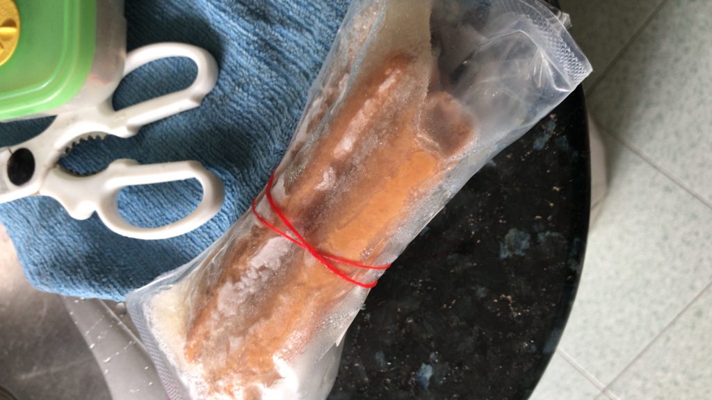
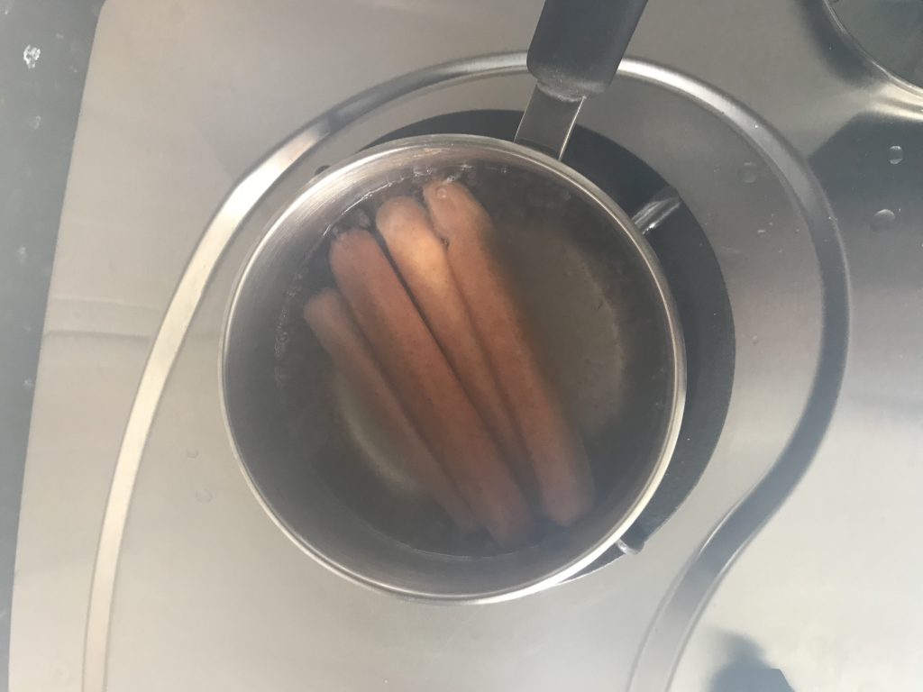
It was held together with toothpicks.
I made the cone out of honey comb chocolate to signify honey-glaze turkey.
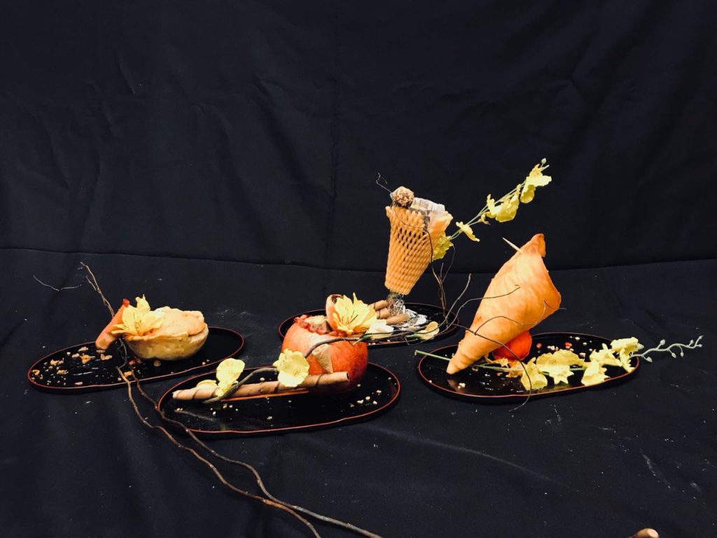
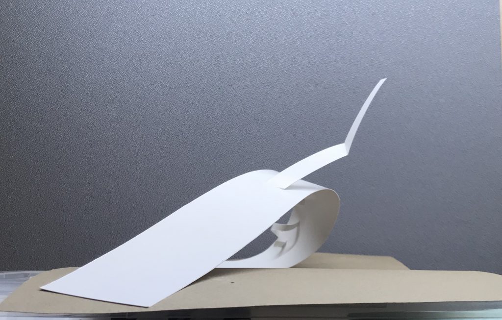
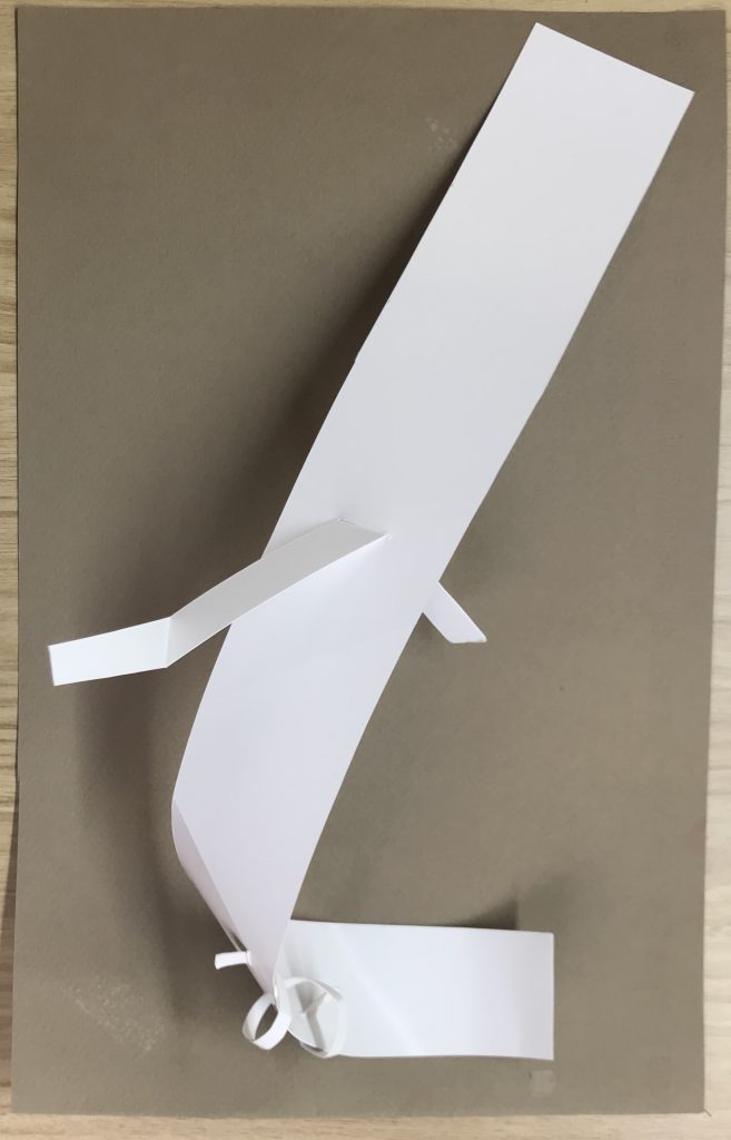
Food composition:
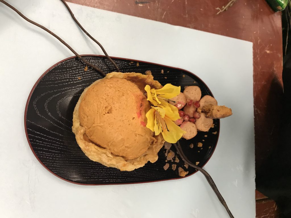
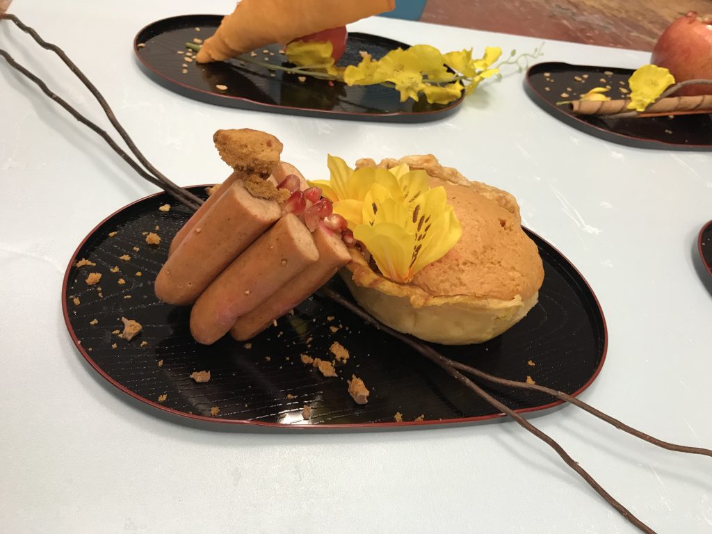
However, after consulting with Cheryl, she made a valid point that the sausages is stealing the show from the pumpkin pie because of its bulkiness. and how similar they were in length. So I made a reduction to the number of sausages and also the cone.
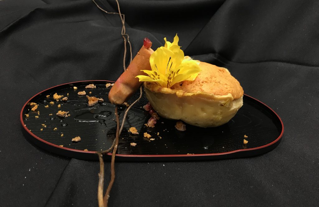
I am happy I made the change to this composition because
- The ambiguous D, SD, SO is now resolved. THIS even included the taste aspect whereby now the D is sweet, the SD is savoury but not overshadowing the D because it is just 1 and the light fruity taste from the pomegranate makes whole taste composition interesting.
- The red pomegranate didn’t get lost in composition even though it was small due to its colour.
- In general, it looks more cleaner and general more aesthetically pleasing.
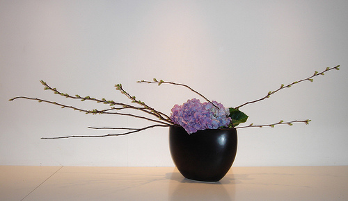
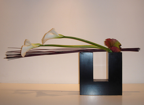
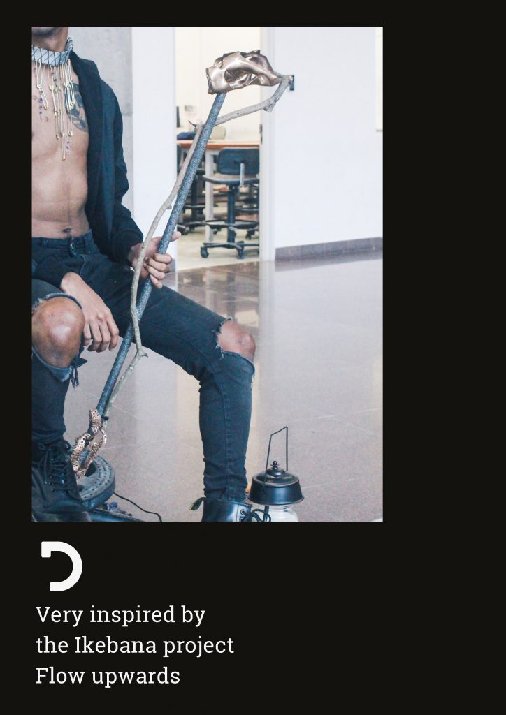
TWIG
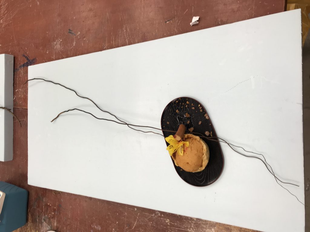
This was the twig I used. It was a relatively long twig placed in the ratio of 1:2 in relation to the dish.
This was because
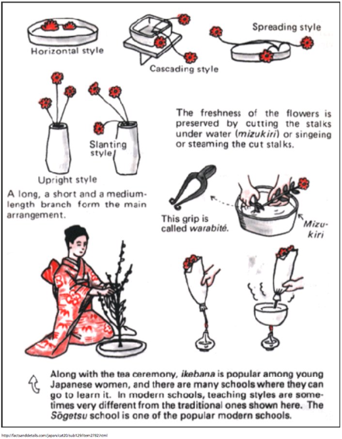
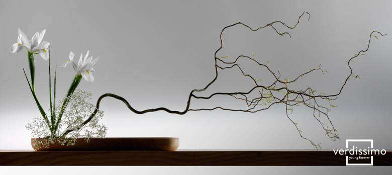
RESEARCH FOR IKEBANA
I wanted to bring out the rather horizontal layout of my composition but tweak it to make it more interesting by putting it at an angle to the dish. Not going to lie, I am also very inspired by Cheryl’s long twig example haha. I also referenced a few other arrangements.
PLATING/PRESENTATION
With reference back to the quote, we decided to present ours with an orange warmth light as well as a light hearted background music to bring out the Autumn atmosphere as described. As for plating we also have crumbs to represent dried fallen leaves and honey to represent the warmth autumn twinkle.
Here’s a photo representation of Autumn babies:
Here’s a video of Autumn babies:
https://drive.google.com/file/d/1w7GeOCHkDZHZ0jEsws-Oqb37Zqsjg_g4/view?usp=sharing
Hope you enjoy this documentation! Thank you for reading 🙂

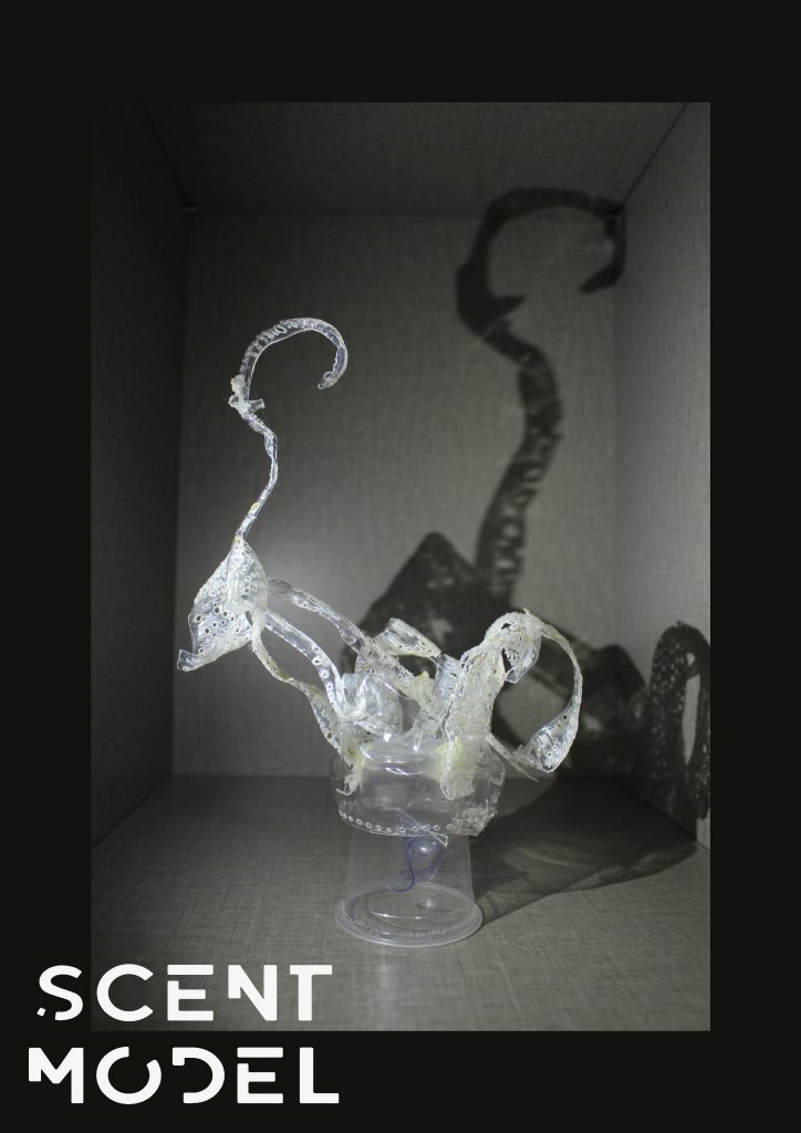
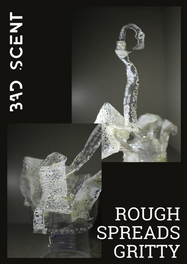
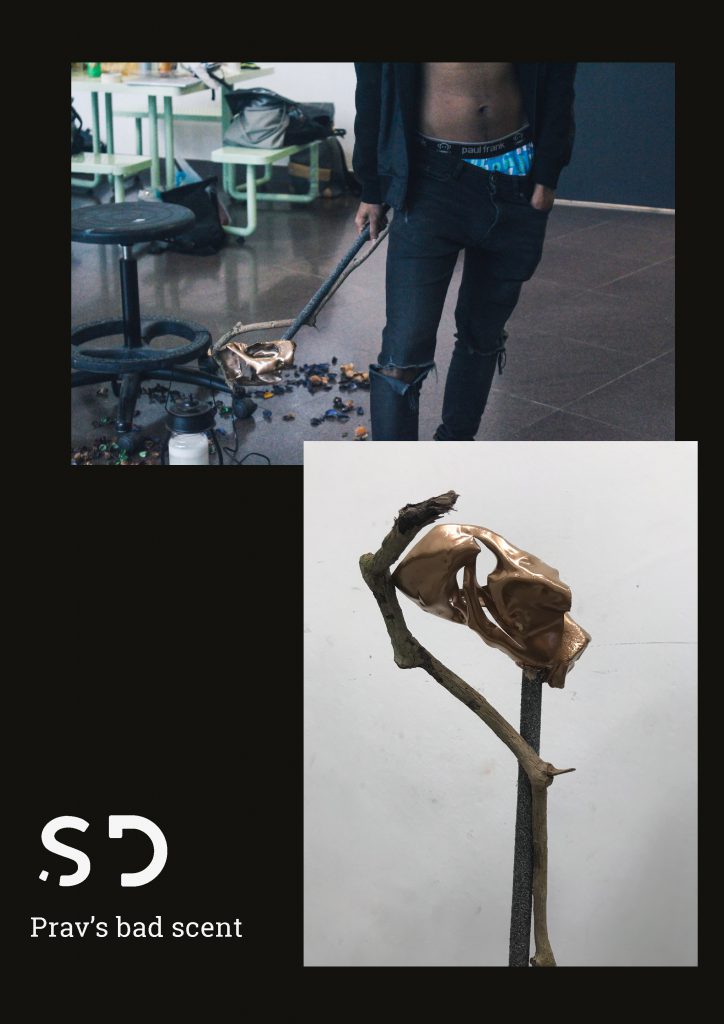
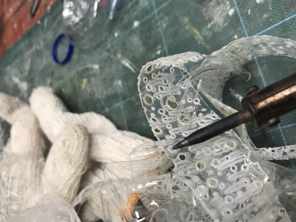 In attempt to texturise and give my bottle a gritty feeling
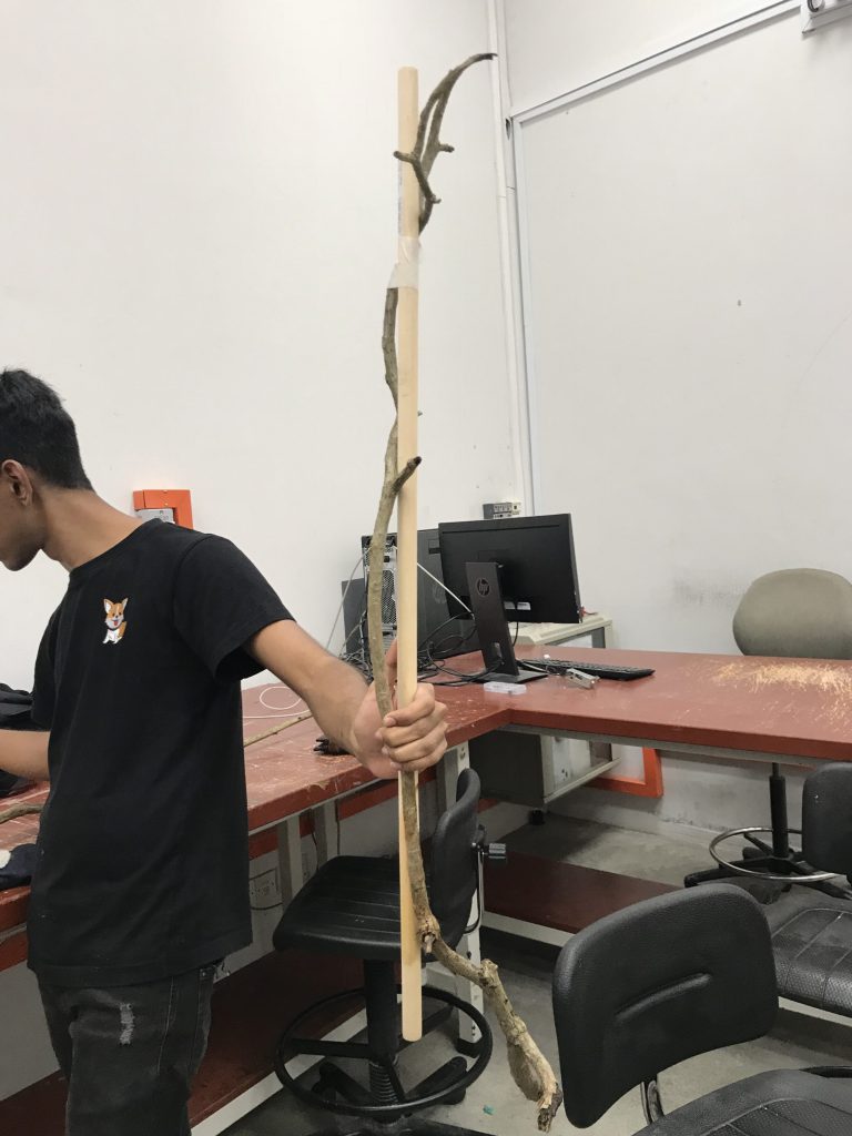 Had to carefully pick and carry a huge branch from Canteen 2 to ADM
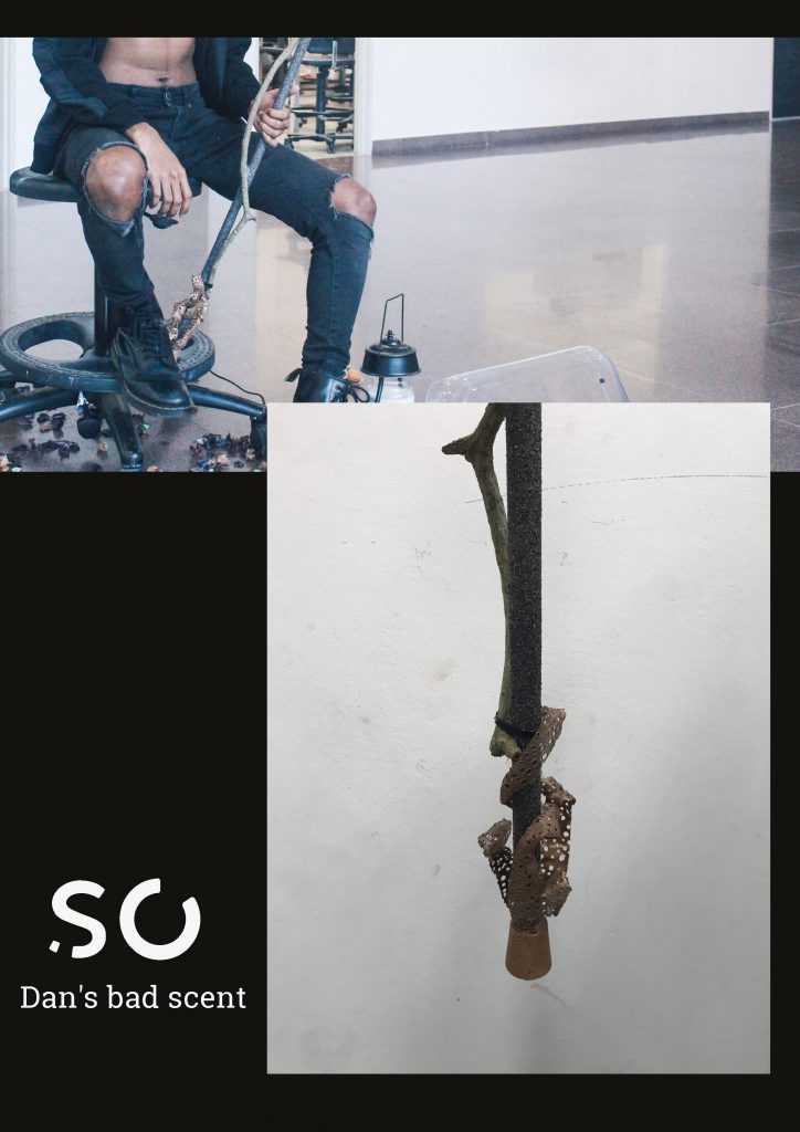
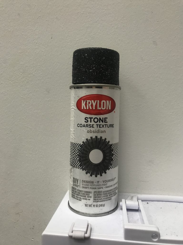 Spray painted our pole with a stone texturising spray in make the pole in line with my bad scent of air freshener because this would replicate the road


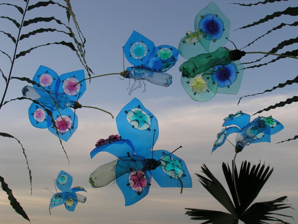 Morpho Butterflies
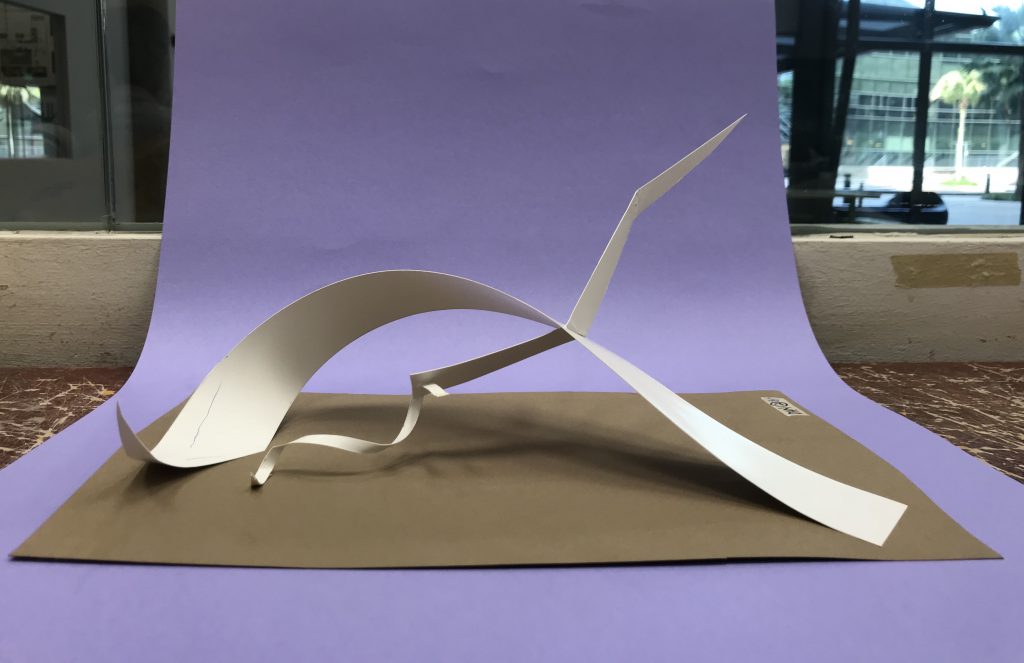
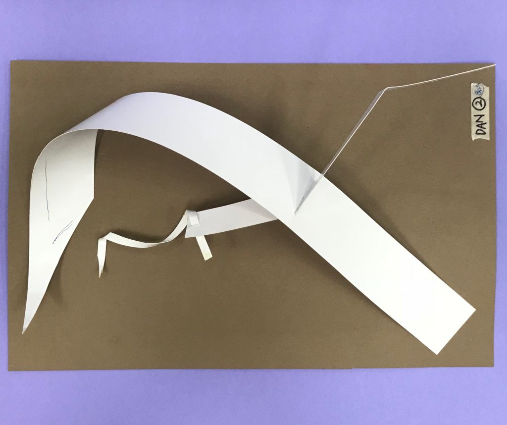
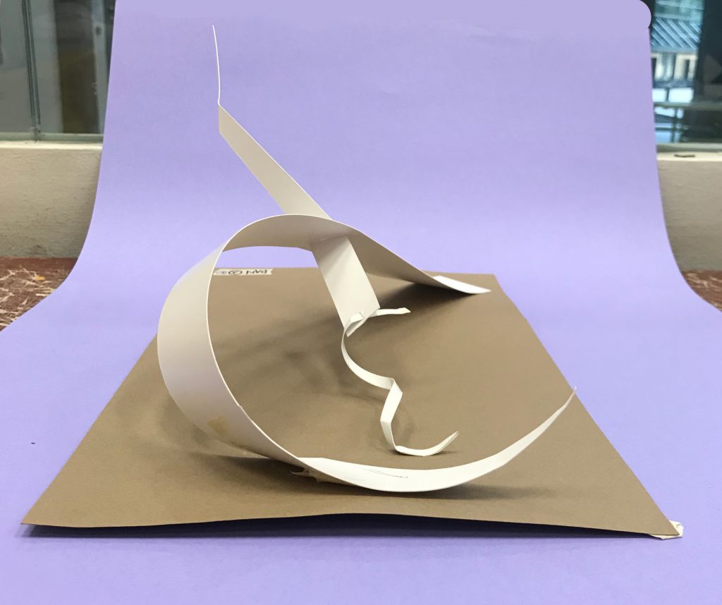
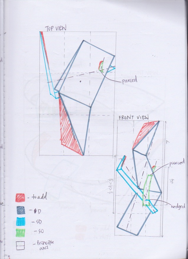
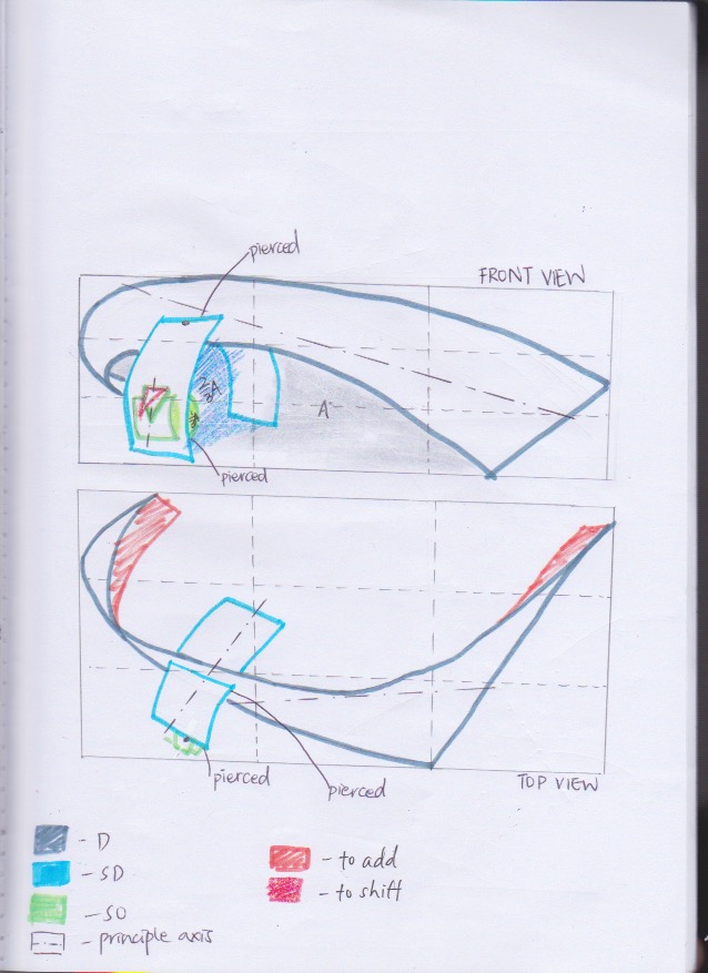
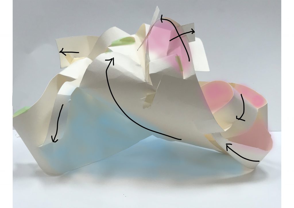
 2D Sketch Analysis
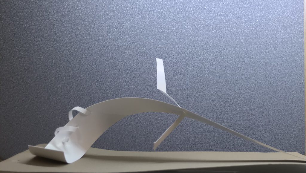
 2D Sketch Analysis