
The following slides below are our ( Kam Yit Ling and Myself) , presentation slides for today’s class presentation 🙂
We talked about Symmetry, Unity, Golden Ratio, Emphasis and Balance.


Examples of natural forms with reflection symmetry are: A butterfly exhibits reflection symmetry in its body and wings and the lake acting as a giant mirror which reflects the scenery horizontally.

The Taj Mahal is an example of architecture that exhibits Reflection symmetry, whereby the peak of the architecture acts as the central vertical axis.

An example of artwork that exhibits reflection symmetry is Symmetry by Ayano Ueshima.
Approximately one thousand q-tips were assembled to form this neckpiece that was systematically assembled to embody the symmetrical form of the human body.

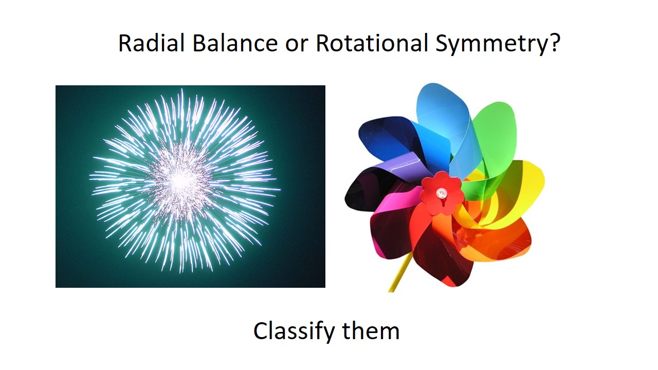
Rotation symmetry refers to the rotation of equivalent element around a common center. Whereby rotation of the element at any angle will produce the original image.


An example of art/ architecture that exhibits rotational symmetry is the Rose Window in the Strasbourg Cathedral that is often found in Gothic Architectural Style Churches.
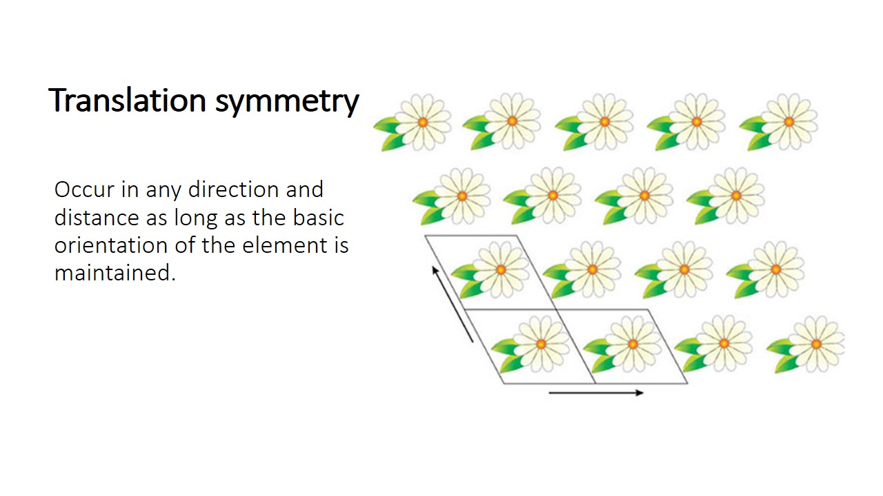
moving a figure a certain distance in a certain direction translating by a vector

Examples of natural forms with translational symmetry are: A school of the same species of fishes and a flock of birds.
They exhibit translation symmetry through reproduction—creating similar looking offspring.

Tessellation and Tilings are a form of translational symmetry as the orientation of the red and white horses constant regular shapes are translated to create a consistent pattern.

Thus deign logos such as brands like Starbucks, Target, Macdonald and Chanel uses symmetric logos as they attract attention and easy to be recalled by consumers.

Symmetry in design convey balance, harmony, and stability. Like the interior of chapels, which exudes stability, peace and harmony.
Use simple symmetrical forms when recognition is important, and more complex symmetrical forms when aesthetics and attractiveness are important.

Symmetry is the most basic and durable aspect of beauty.
Symmetric faces are perceived as more attractive than asymmetric faces. And perhaps this is why very good looking people end up on screens, because they have an almost symmetrical face, which is perceived as the epitome of beauty. But of course, beauty is in the eye of the beholder.


Unity cannot exist alone without the use of basic design principles and elements of art and design.

Unity helps to organise a visual image
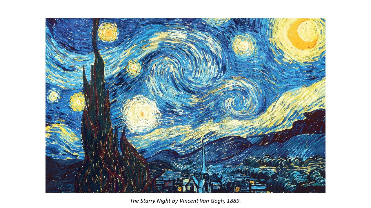
The Starry Night by Vincent Van Gogh is an example of how unity is achieved by the repetition of line. If you look closely, lines are the only mark that is used, thus the entire artwork is unified by the same texture that is consistent throughout piece.
The use of long lines, curved lines, thick lines and thin lines that create the movement we see in the painting, which adds variety to the work.
By using the same mark throughout the whole painting, there is a great sense of unity throughout the piece.

Another artwork that exhibits variety with unity is this artwork by Kandinsky. In this composition by Kandinsky, unity is provided by the repetition of circles on a neutral background. Variety is added by the different sizes and colours of the circles, and by overlapping them.


The golden ratio is the ratio of 1: 1.618. It is believed to be the most aesthetically pleasing geometric form to human eyes. Create a sense of beauty through harmony and proportion.

Apply it to a square will get the golden rectangle.
By continuously applying formula, the spiral get wider by a factor of phi at every quarter-turn becoming golden spiral. Golden spiral or called the
Divine Proportion is the tool used by artists and sculptors to achieve accurate proportion and aesthetic composition.

The pyramid of giza that was built based on accuracy uses phi in it.

Golden ratio is used in art for aesthetics and visual harmony. The balance in the school of Athens by Raphael was only achievable through lots of repetitive use of phi like the position of the large wall of the first arch to the top of stairs at the floor. The central figures draws our attention is because it is placed at the point of intersection of golden ratio.

Golden ratio even exist in our body proportions from our body, arm, ear and even feet.

Golden ratio on human face. Our brains seem to be subconsciously attracted to things that uses Golden Ratio.. This is before and after phi applied face. Which one do u think is more attractive? U can also try out this app on google play store to see ur chio rating.

The sunflower seed head is actually made up of golden spiral in rotational symmetry as mentioned before in the above slides regarding rotational symmetry. Basically golden ratio exist almost everywhere

How to make good use of golden ratio for our composition? Set your layout dimension according to golden ratio and add a space at the ratio point.

Secondly, place content along The Golden Spiral. Our eye is naturally drawn to the center of the spiral, where it will look for details, so focus your design on the center of the spiral and place areas of visual interest within the spiral.

Application of phi grid. Similar to the rules of Thirds which you position the most important elements along these lines, or at the points where they intersect to draw the viewer’s eye and attention. It creates tension, adds interest and energy to your composition.
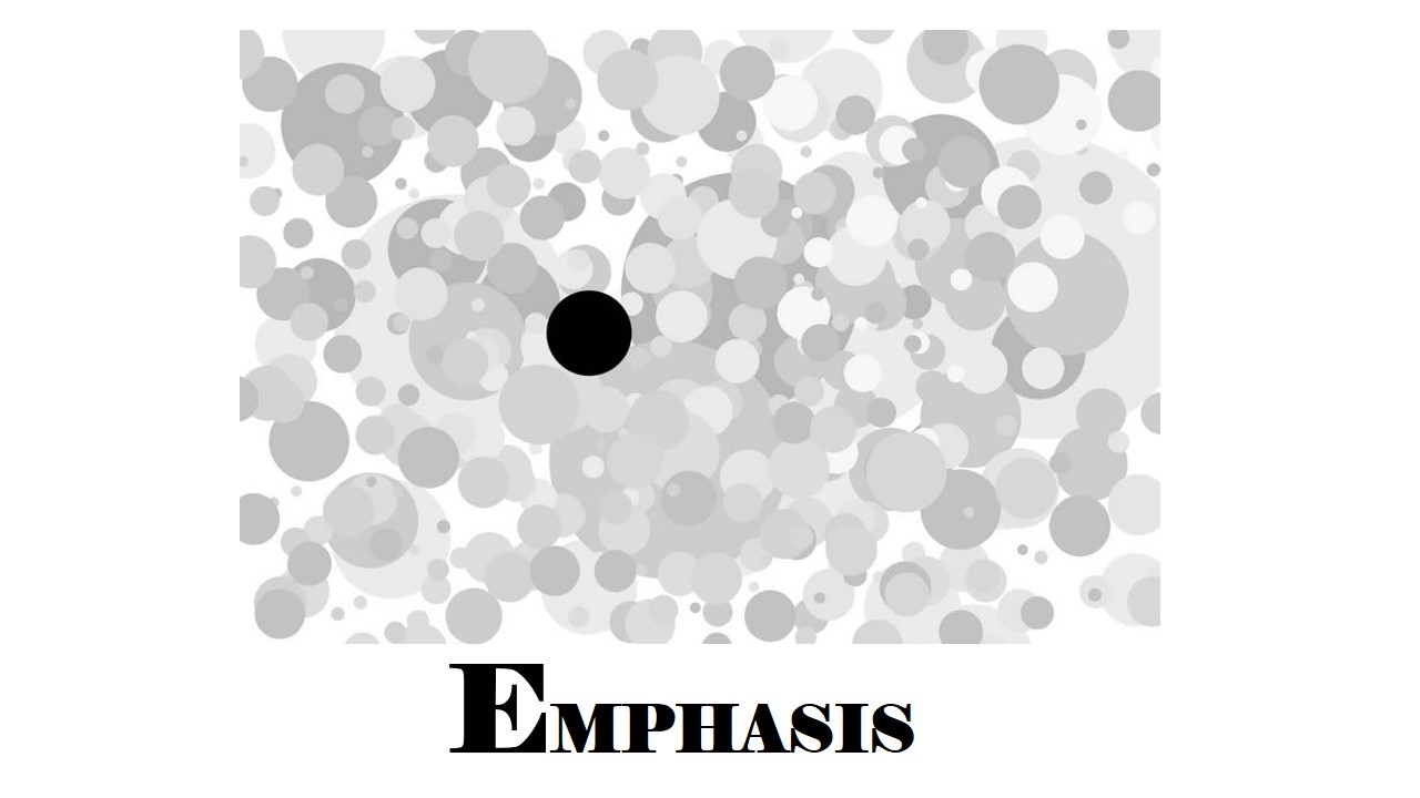
The black dot is the first thing that draw your attention right? This is visual emphasis.
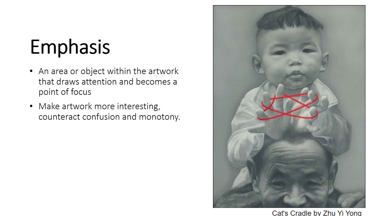
Emphasis is an area or object within the artwork that draws our attention and becomes a point of focus. Using emphasis make artwork more interesting, counteract confusion and monotony. In Cats cradle by Zhu Yi Yong without the red string, the whole painting will look dull and flat.

Emphasizing through size. bigger is always better. Our attention is always on the bigger object. That is why in design, title is always bigger so we can see clearly. The relative size can create Dynamic, tension, depth. The big orange in the painting have dynamic and tension because of the overwhelming size of the orange making it look like it going to drop anytime.

Contrast in shape. By Introducing a different shape square to the circles, the main focus is on the object that look out of place. The Colour also stand out capturing our eyes.

Deep magenta square by Richard Anuszkiewicz is an example of optical art. the magenta square is emphasized in the composition. Although the colors in background are fairly intense, they are much less intense than the magenta square. They are also made up of thin lines letting the large area of square dominates the composition. The subtle chemistry of complementary colors makes the geometry glow giving it a sense of depth.

Strong tonal contrast create dynamic like Chiaroscuro lighting. When there is dark, our attention will be drawn towards the light area.
Textural surface capture more attention than a smooth surface.

Center is where we would look first. Now what happen if the dots run away. The right dots being the furthest away from the center will be given the least emphasis becoming the least noticeable.

Line Directing guide our eyes to focus point using elements like perspectives and implied line shown in one point perspective by Gustave caillebotte. This Lead our eyes to the couple.


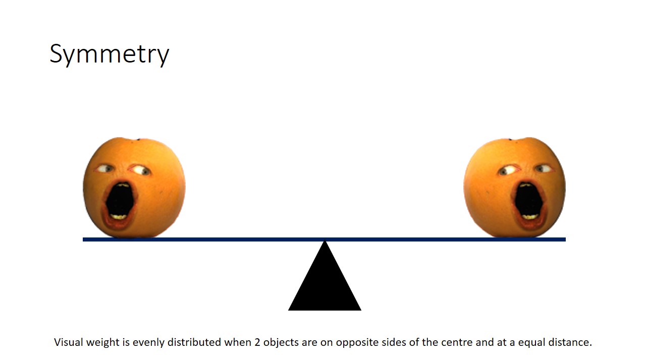
Balance is the distribution of interest or visual weight in a work.
If all the visually interesting elements of a work are centred in one spot,
The work is off balance and viewer’s gaze will be stuck in one place, thus ignoring the rest of the piece.
An unbalanced composition can lead to tension. When a design is unbalanced, the individual elements dominate the whole and the composition become less than the sum of its parts.

An example of an intended off-balance artwork is Isamu Noguchi’s Red Cube.
The tension of the tilt is disconcerting because the red cube is very heavy.
Attention is only placed in one place: the center of gravity, and not the entire artwork.
Thus this is a distinctive piece of art.


The concept of visual balance is often illustrated using a see-saw,
Where one object is directly at the centre or when 2 objects have the same visual weight and are on opposite sides of the centre, equally distance from each other, they balance.

An example of Symmetrical Balance present in art is ‘The Last Supper by Leonardo Da Vinci’. The Christ is in the centre. The architectural shapes in the background are mirror images of each other even though both sides are in contrast . The table is symmetrical. The amount of subject matters on the left and right of Christ are similar.

Asymmetrical balance, is more complex and difficult to render. It involves placement of objects in a way that will allow objects of different visual weight to balance one another around a fulcrum point.
For example, it is possible to balance a heavy object with a bunch of lighter objects on equal sides of a fulcrum.

Unequal weights can even be balanced by shifting the fulcrum point on our imaginary scale.

Asymmetrical balance is harder to grasp in an artwork as the artist must sense whether or not the composition is balanced.
An example of an artwork that exhibits asymmetrical balance is Piet Mondrian’s ‘Composition with Large Red Plane, Yellow, Black, Grey, and Blue’. The composition is asymmetrical, with one large dominant block of colour, which is red, which is balanced by distribution of the smaller blocks of yellow, blue grey, and white around.
Whereas for his other painting Composition with Double Line and Yellow 1932, asymmetrical balance is achieved. Our eyes are drawn diagonally toward the center of that block of yellow . The size of the bottom right square weighs out the visual weight caused by the yellow block. To form a kind of dynamic equilibrium.

Radial Balance is a visual balance based on a circle with its design extending from the center.


Thank you for your time!!
Cheers~