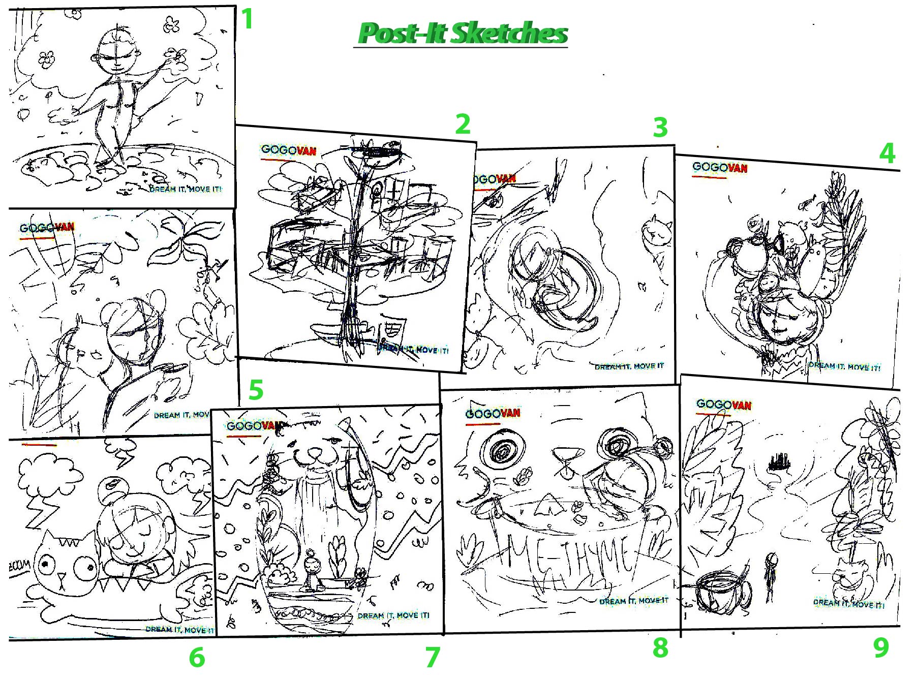
After that 15 min brain storming activity Ms Lisa had us try during class I felt was really useful, not only do i get to look around and have greater inspiration for ideas, i get to move around instead of sitting down!
From that walk, i generated this idea where i can do a fictional event like a Couch Potato Support group! A Couch Potato Party where we congratulating failure and have a very Tongue in Cheek approach to it! 😀

According to Cambridge dictionary, ‘Couch Potato’ describes a person who watches a lot of TV and does not have an active life.
The reason as to why I chose this topic is because I am pretty sure everyone of us has this ‘Couch Potato’ moments once… well… twice… OKAY FINE PERHAPS EVERYDAY OF OUR LIVES. AHEM. Okay and so I thought it’ll be fun to celebrate and encourage this unproductive behavior which is highly discouraged, by ENCOURAGING IT through this fictional event.
Instead of using literal metaphors of a couch and a potato, I thought of illustrating the characters for this project through exaggeration and relatability with the audiences.
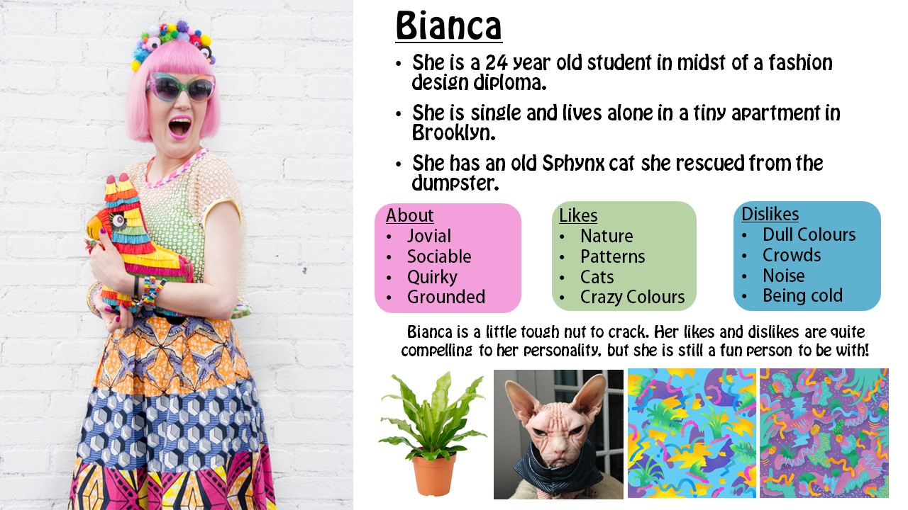
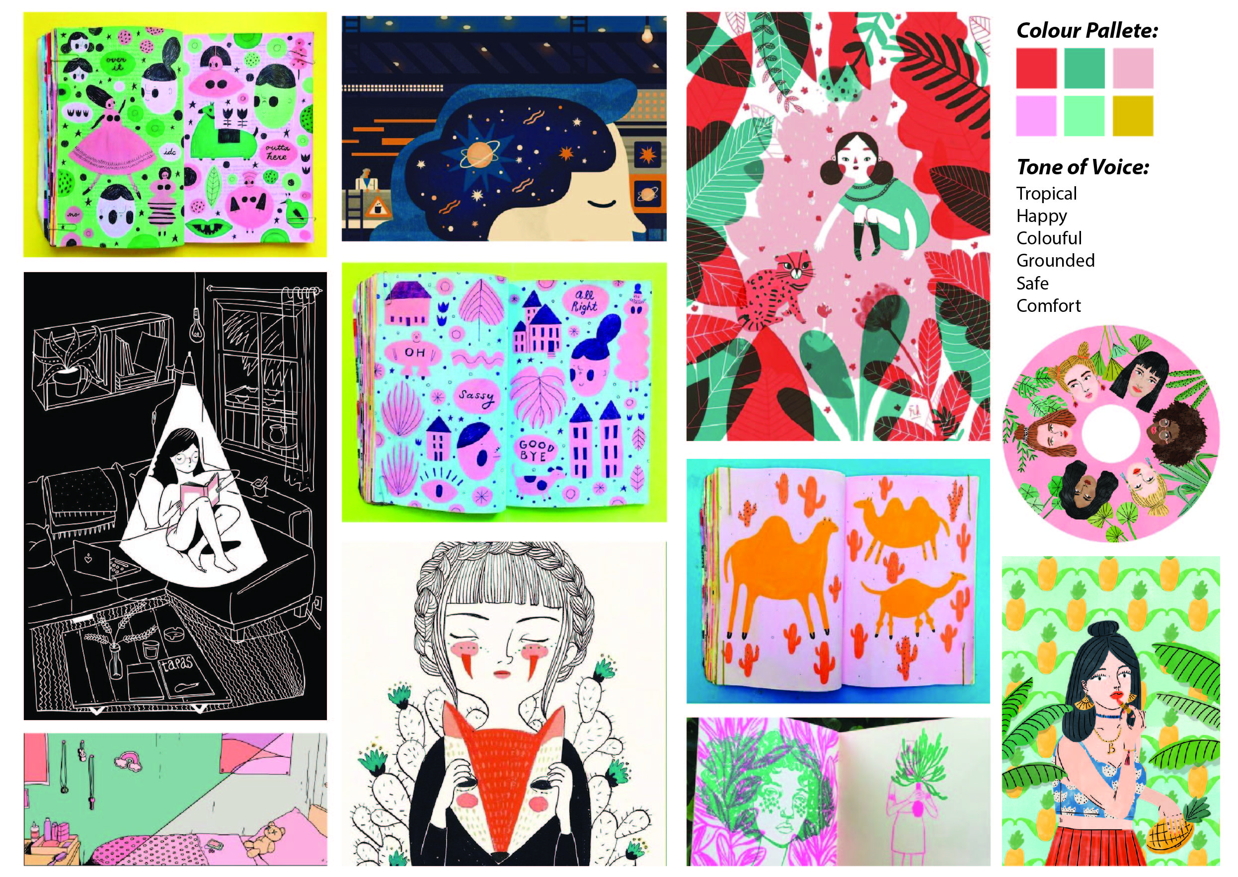
Style & User Personas
One of the things that I struggled with this assignment was to convey the tone of voice.
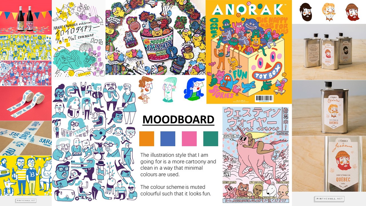
My ‘Couch Potato Support Group’ kit is for lazy people who don’t want to get off the couch to CONTINUE being at their hibernative mode.
And to create a loud and packaging design for it to attract buyers seems to be a little contrasting with the theme… Hopefully it turns out well!
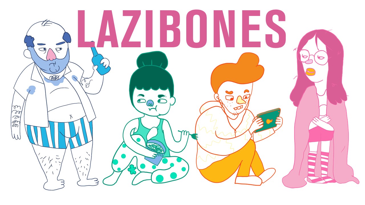
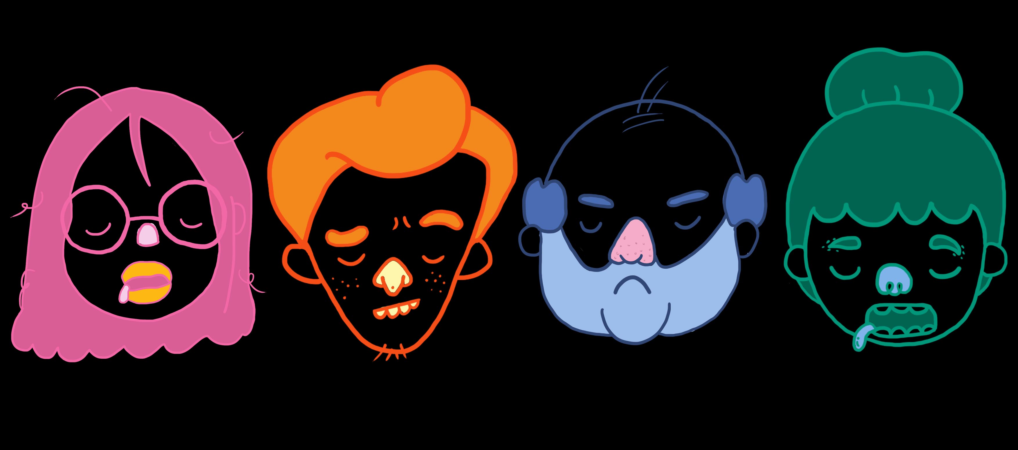
The idea I have is to illustrate 5 characters of varying age groups and gender who are representations of this couch-potato behaviour in everyone.
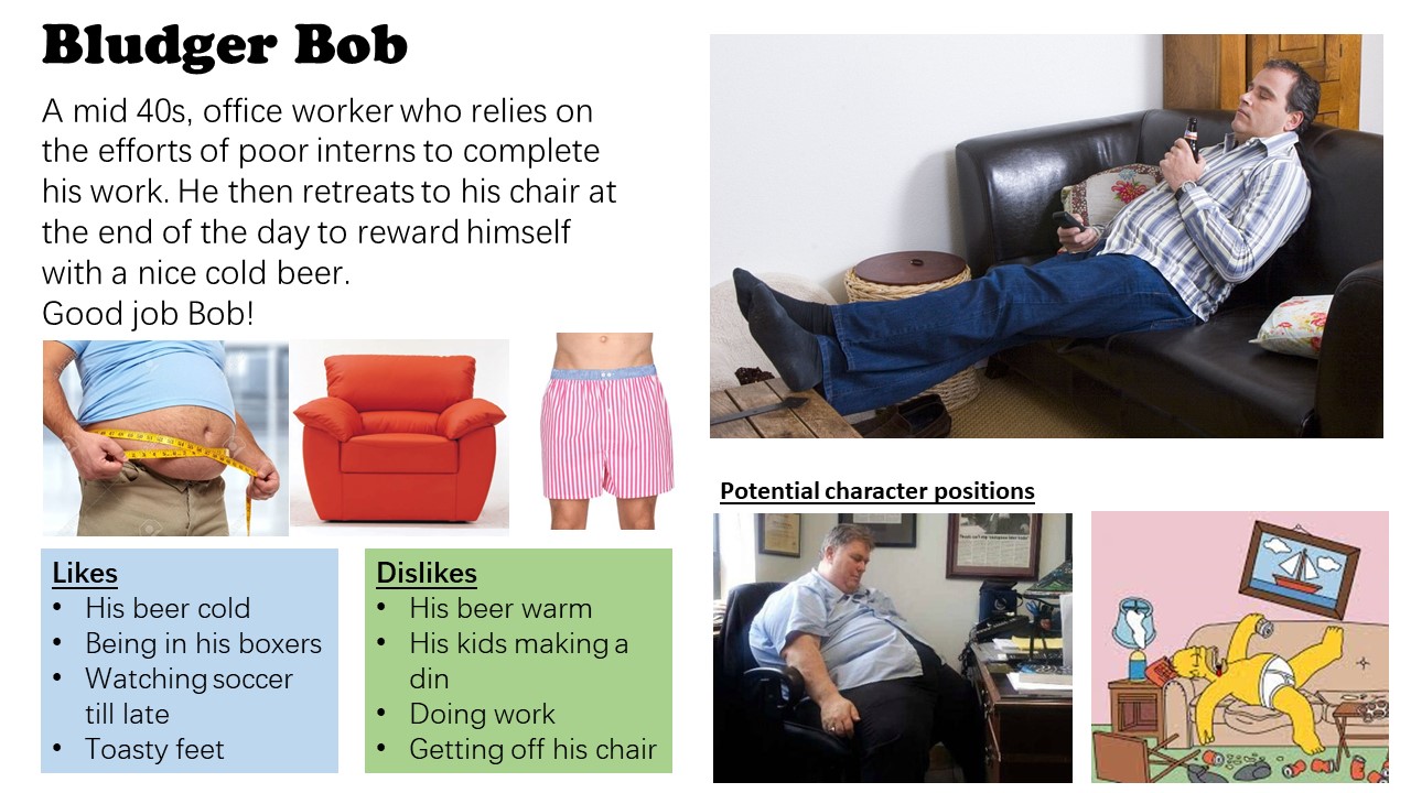
1st up, we have Bludger Bob
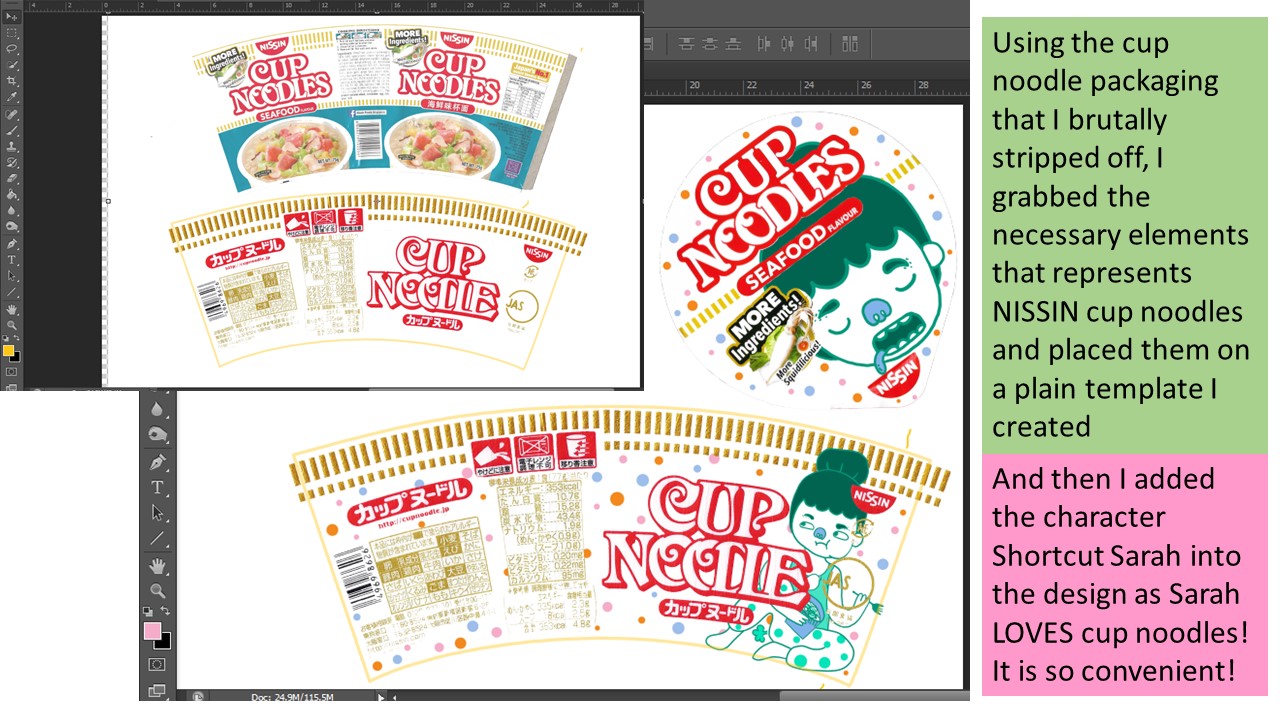
2nd , we have Shortcut Sarah
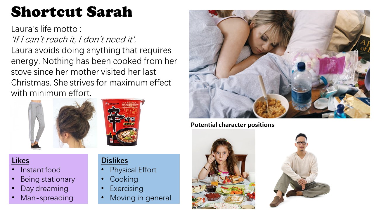
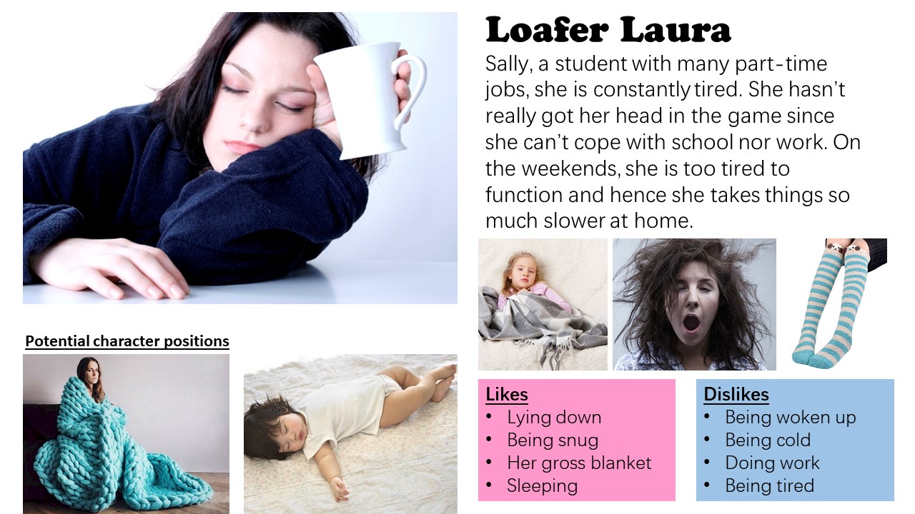
3rd, we have Loafer Laura
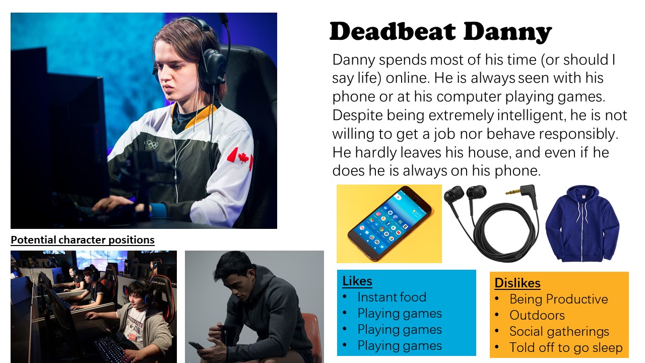
Lastly we have Deadbeat Danny.
The common traits that all of them have are that they are lazy and avoids doing any form of work.
The characters are also the user persona audiences as well.
Methodology
I tried to illustrate my characters using both Adobe Photoshop and Adobe Illustrator to compare first. Learning from my previous assignment 2 incident, I made a sudden switch from 3 weeks worth of Adobe Illustrator progress to work in Adobe Photoshop instead just days before the submission, mainly because working on Illustrator was not going very well for me and I was not willing to give up. Hence, I thought it’ll be a good lesson learnt to try out both software to see which would bring about more convenience and which would bring about the best form of illustration I wanted to achieve.
I sketched them out on paper first, and then I brought it to both software. Afterwards, I decreased the opacity of the image and used it as like a tracing paper for me to use my Wacom pen to draw over.
The first character I illustrated was Bludger Bob.
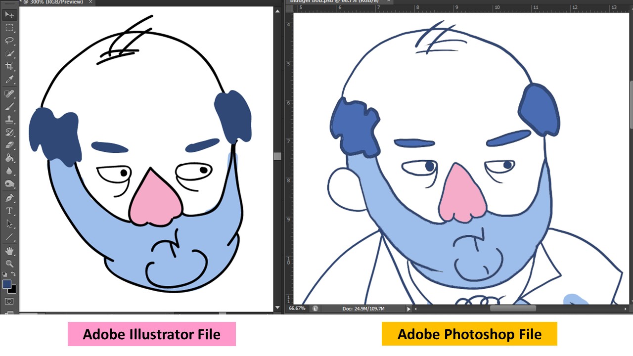
As you can see, the way it was illustrated varies a lot on both software.
Adobe Illustrator
(PROS)
I liked how clean the lines are and that I can transform the paths or toggle each vector points to my liking
I can resize the character without having to worry it will be pixelated or not.
(CONS)
Colouring was not easy as ‘Live Paint’ only worked for closed paths and using a brush tool to colour behind the lines resulted in very clean bulbous shapes that did not fit within the spaces I wanted to.
I did not have very good control over the outlines when I drew it out with a Wacom pen as they ‘round off’ to a certain shape I did not ask for. And the paths are not closed which I have to manually find the paths and close it. Which was much of an inconvenience.
I don’t like how Bludger Bob looks like here, he looks like a melted plastic blob..
Adobe Photoshop
(PROS)
It is easier to colour because there is more control over the paint bucket and brush.
Line work has more character.
Layers made it easier to try different kinds of colours
(CONS)
I cannot change the outline color once I fill in the colors via paint because they are all in 1 layer. Such that if I have to erased and make amendments to the outline after coloring it in, I cannot.
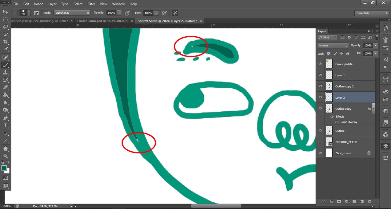
One of the issues I faced was that when I filled the colours in using bucket tool, there are spaces left uncoloured or that the lines has this white outline, which i resolved by painting it over in a separate layer below
Eventually I chose Photoshop to illustrate my characters and these are the 4 i have created.
- These 4 are the main characters that i have illustrated based off the user persona i have created above!
- Their colors are based off the mood board colors I have chosen as they seem bright and fun on packagings!
- I varied the tone of each color for each character because it is easier to work on, and it gives the subject matter more character and personality.
- Each character has a little bit of color from the following one so that each character is not that isolated, but cohesive with the rest as well. For instance, the orange on the Loafer Laura (Pink Girl) brings our attention to Deadbeat Danny (Orange boy) and so on 🙂
Packaging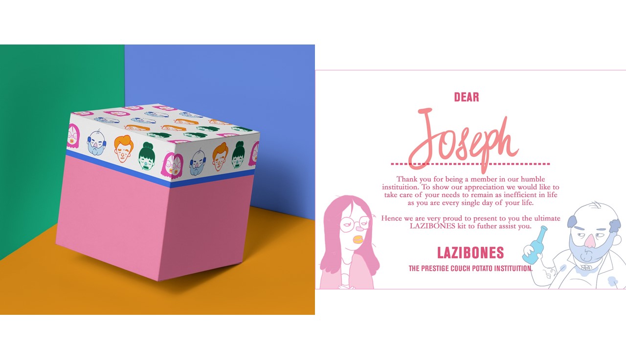
I did a mock up of the box kit design and a welcome card just to tie the whole Lazibones Kit together.
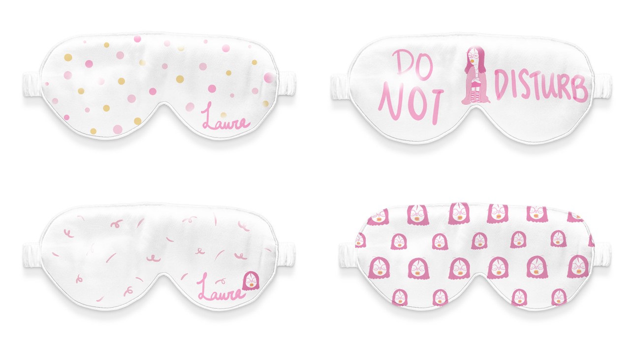
I came up with 4 different sleeping eye mask designs for Loafer Laura who loves to sleep.
The pieces with names are customizable to the customer’s request! Making it a very personalized gift for the ones who need to catch some shut-eye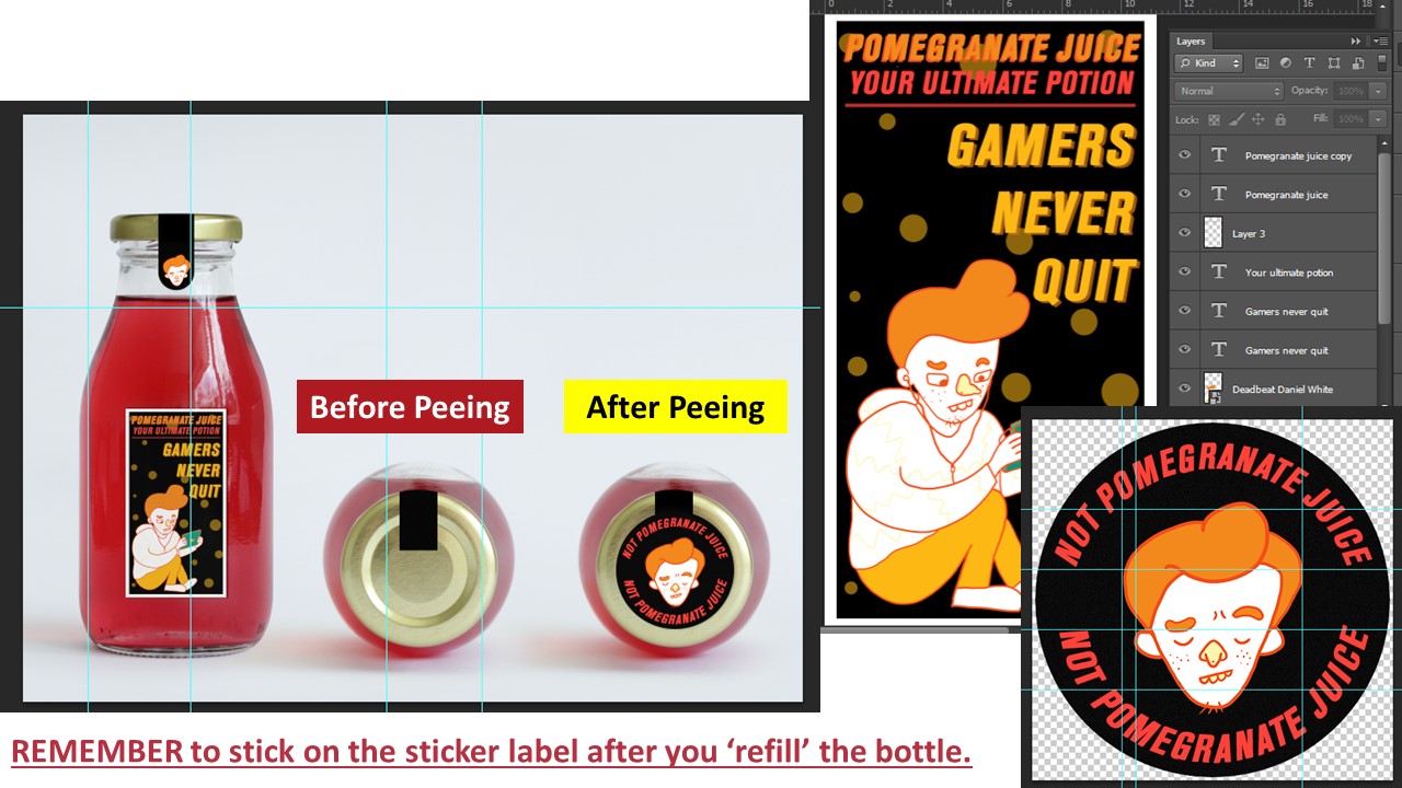
Idea for this drink comes from fictional characters in games where they take potions to regain their ‘health’.
Deadbeat Daniel who is addicted to games would regain his ‘health’ through this drink and conveniently pee back into this bottle when he is done because the game he is playing cannot end and the toilet is too far.
Oh and don’t forget to place the sticker on the lid to remind himself that his newly filled bottle is no longer pomegranate juice! 🙂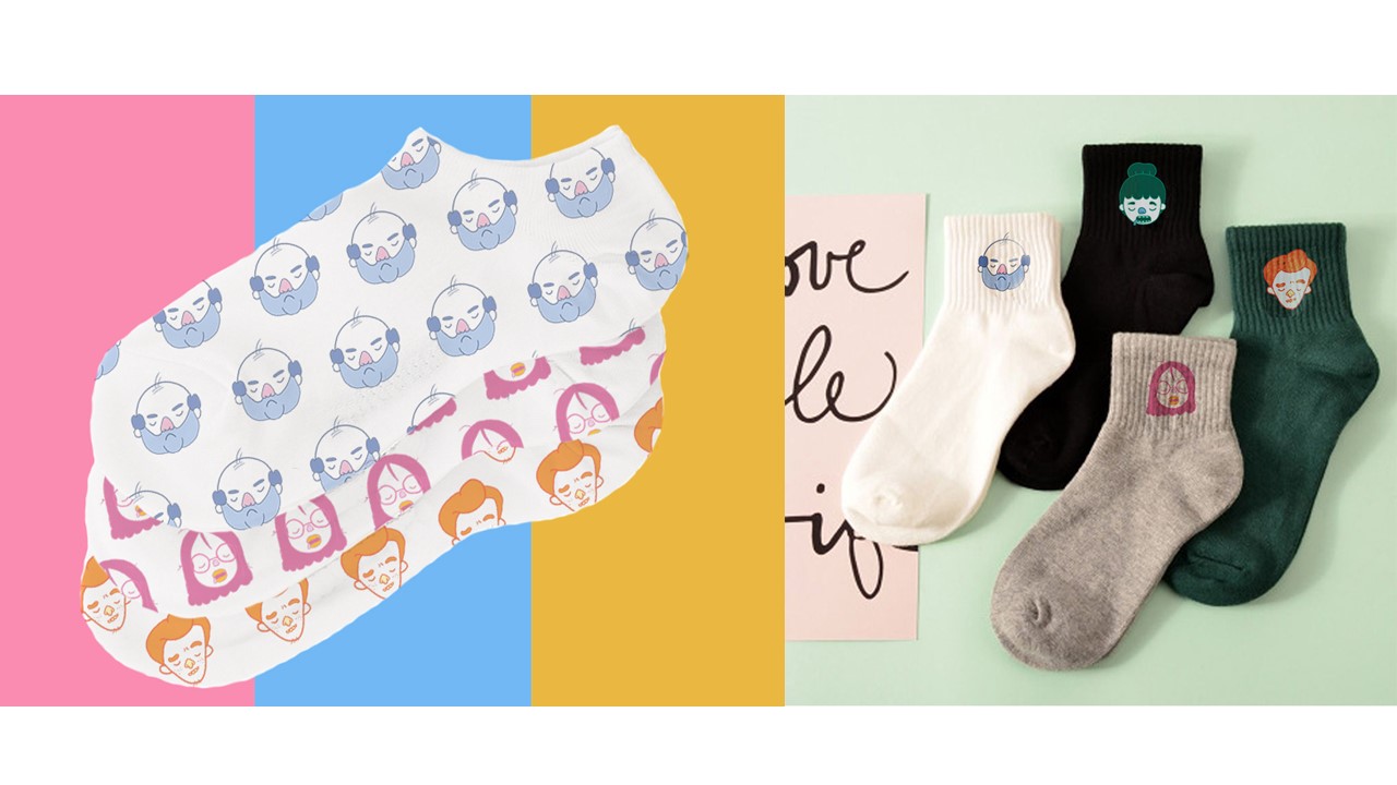
And for Bludger Bob who sits on his couch the moment he reaches home from work, fret not as he can wear these socks back home from work and to work the next day without changing!
These socks keep feet from sweating in Bob’s work shoes and keeps his feet warm at home while watching TV!
Socks are available in different designs as well in the case if Loafer Laura or Deadbeat Danny wants to wear them as well!
Critique Session + Feedback and Edits
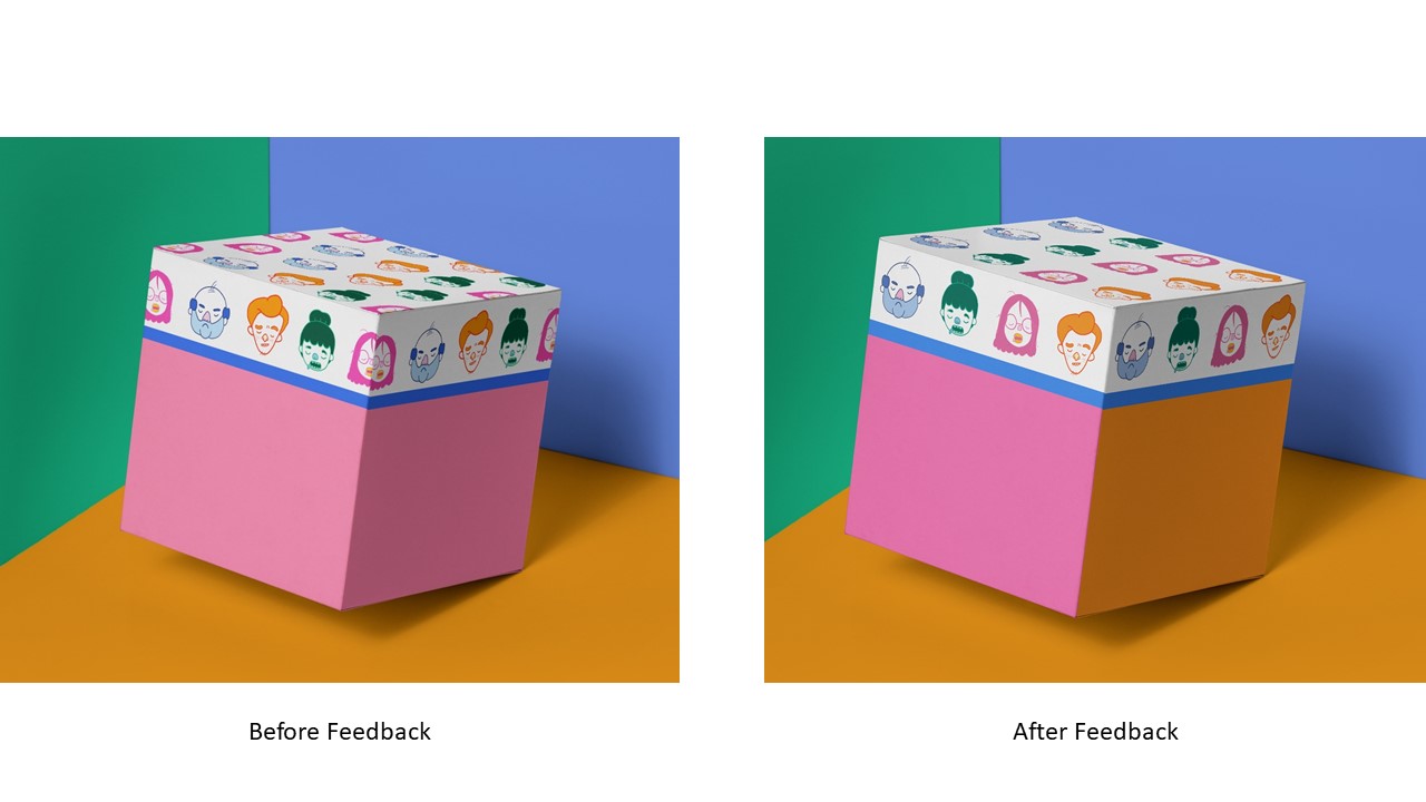
After the feedback, it was suggested that I make amendments to the box design such that the characters’ face don’t get cut off at the edges, and change the colour on the sides of the box.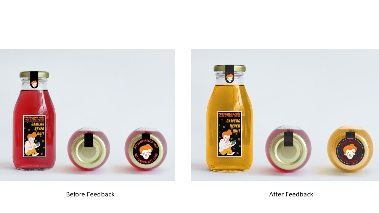
And also, for the drink and pee bottle for Deadbeat Daniel, it would have been more convincing to change the colour of the liquid to yellow to be more convincing. 😉
The middle drink is still left red to show that Pomegranate juice is still inside unlike the bottle on the right that is newly filled with pee.
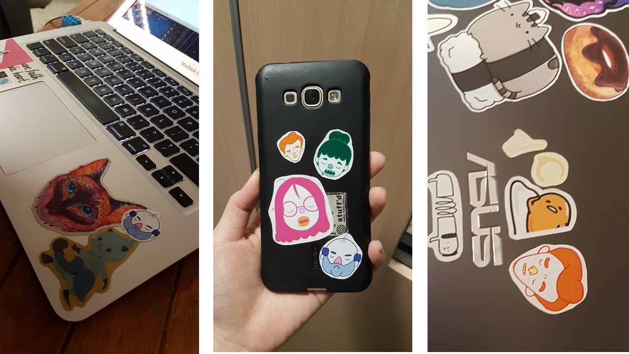
I gave out some stickers I printed for fun and I was very touched to see that my classmates like them :’) It is one of the best feelings in the world when they paste it on their laptops and even their phone <3
Click the link below to the final post for this final assignment!
DV2002: Assessment #3 – Applied Illustration (FINAL + My Reflection)


 Here are some of the prints close up!
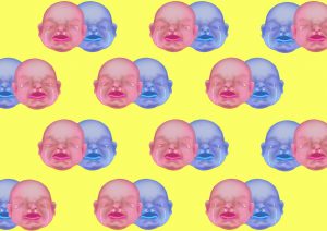
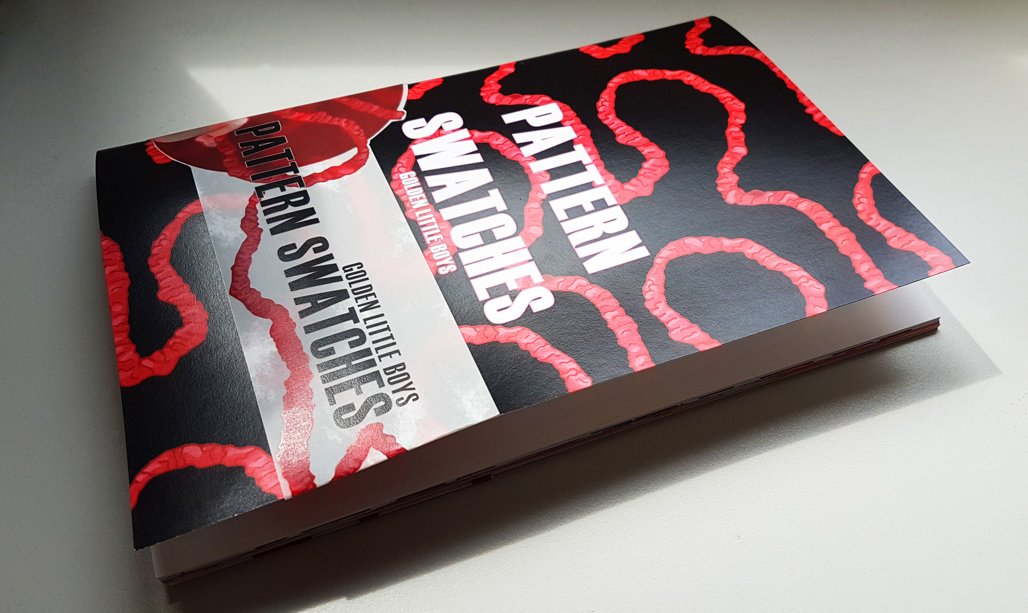
 The pattern swatch book contains all of the pattern swatch designs!And also the process of how the banner design came about to be!
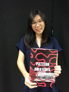 Really happy with how it came out to be!! 🙂


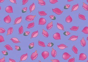
 Hence I placed all my bloomed lotuses at the top, and the petals falling from there. This creates visual direction as well from top to bottom, where all the fallen petals gather at the bottom.
 After consulting with Miss Ina, she asked me to try another composition where the babies are buried in lotus petals!
 And it was indeed a very different feeling as compared to the floating babies composition, and I added other existing motifs to see what else works best!
 To be honest, the comments given were really helpful because I was really stuck for a long time and the comments really helped to give me a new direction to approach my banner. THANK YOU. 🙂
 Afterwards I tried out different forms of illustrating it in digital form, just to see which method works the best. I was looking for feasibility and which method looks best.
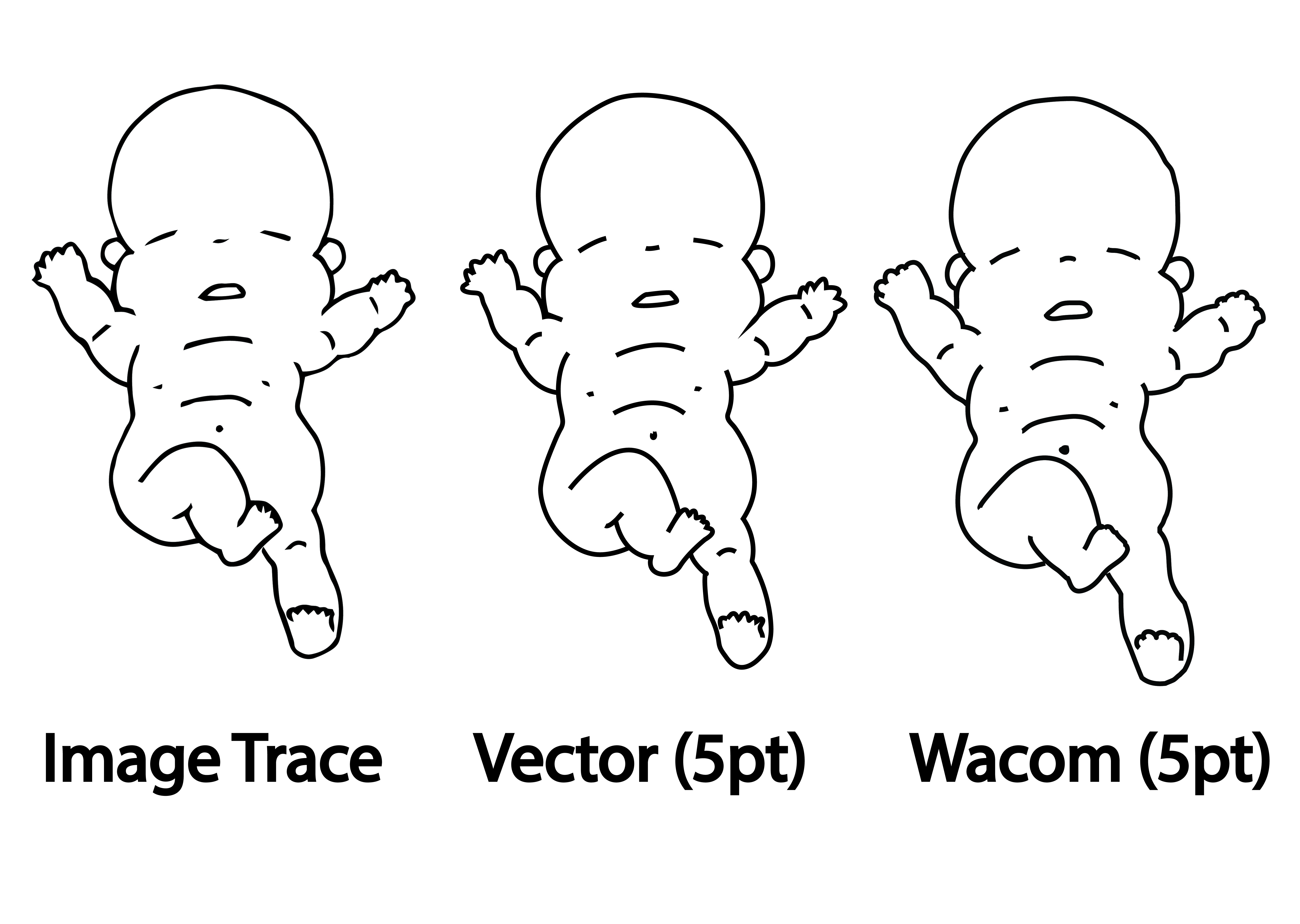 Every method has its pros and cons.
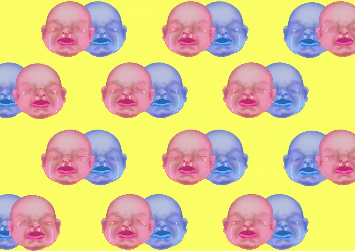
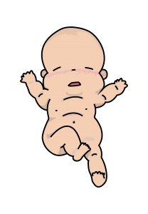 So I colored the baby using Wacom tablet over the Vectored outline method and got this as a result.
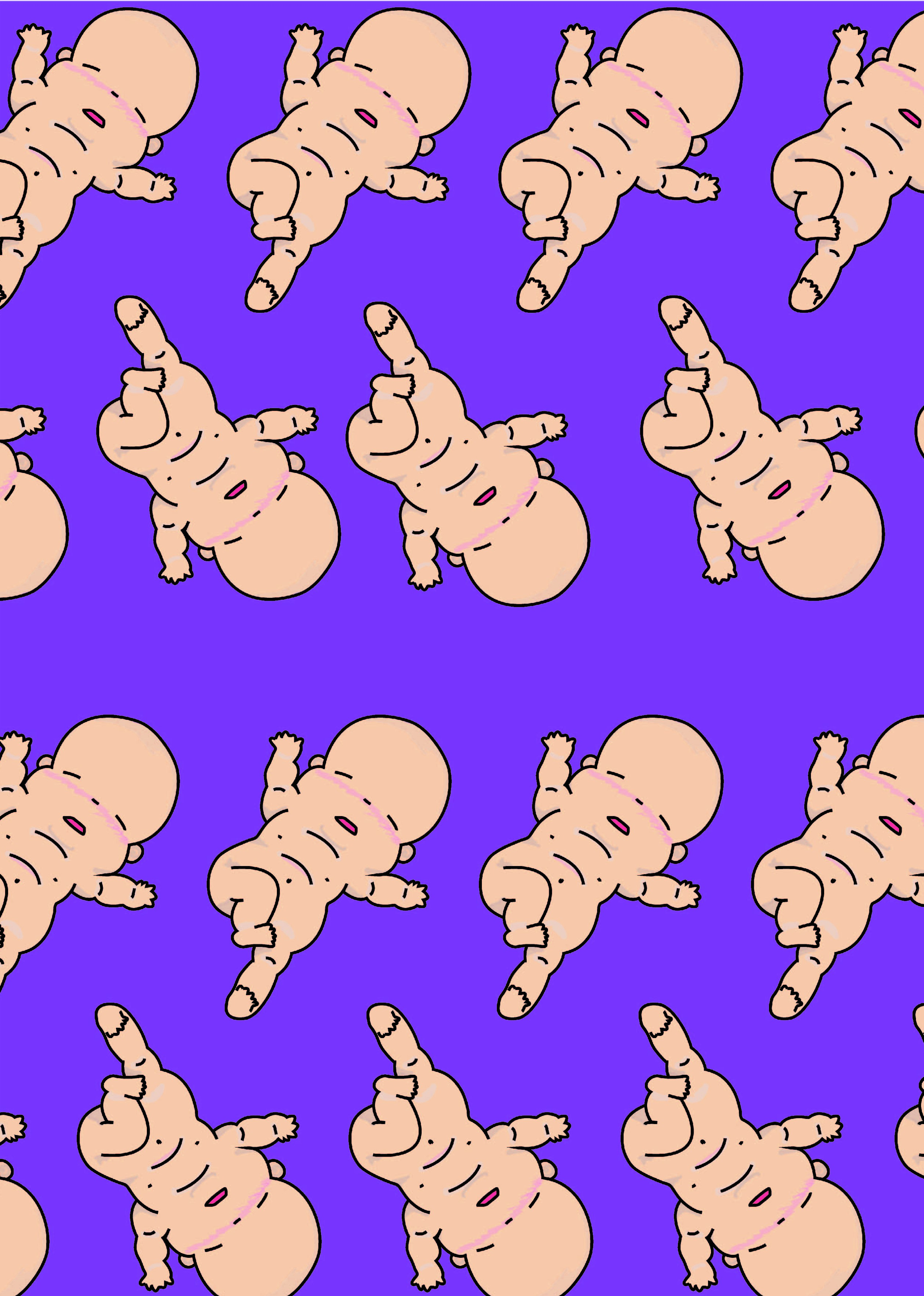 Woo~ it looks like they are doing a mass baby yoga event!
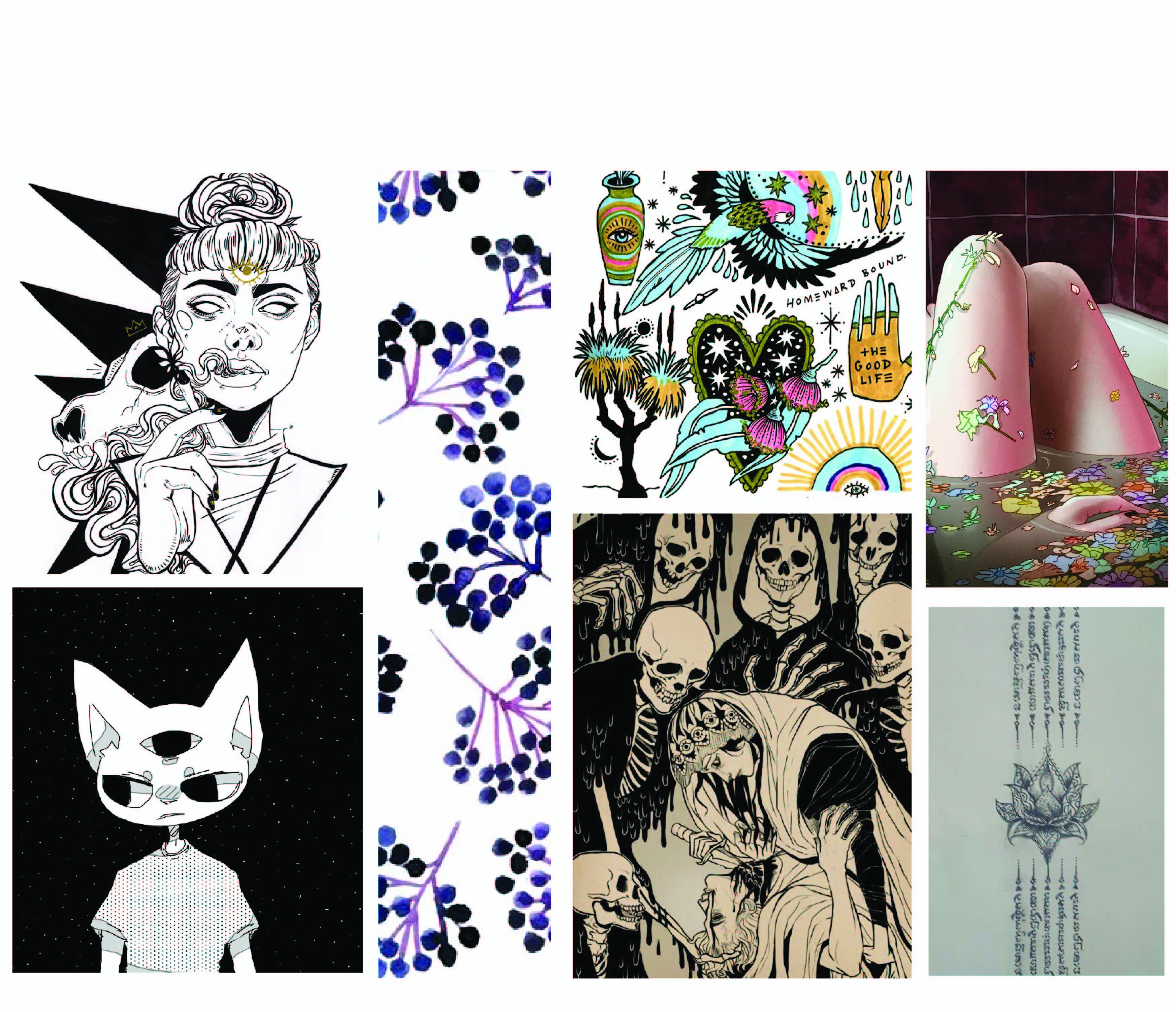
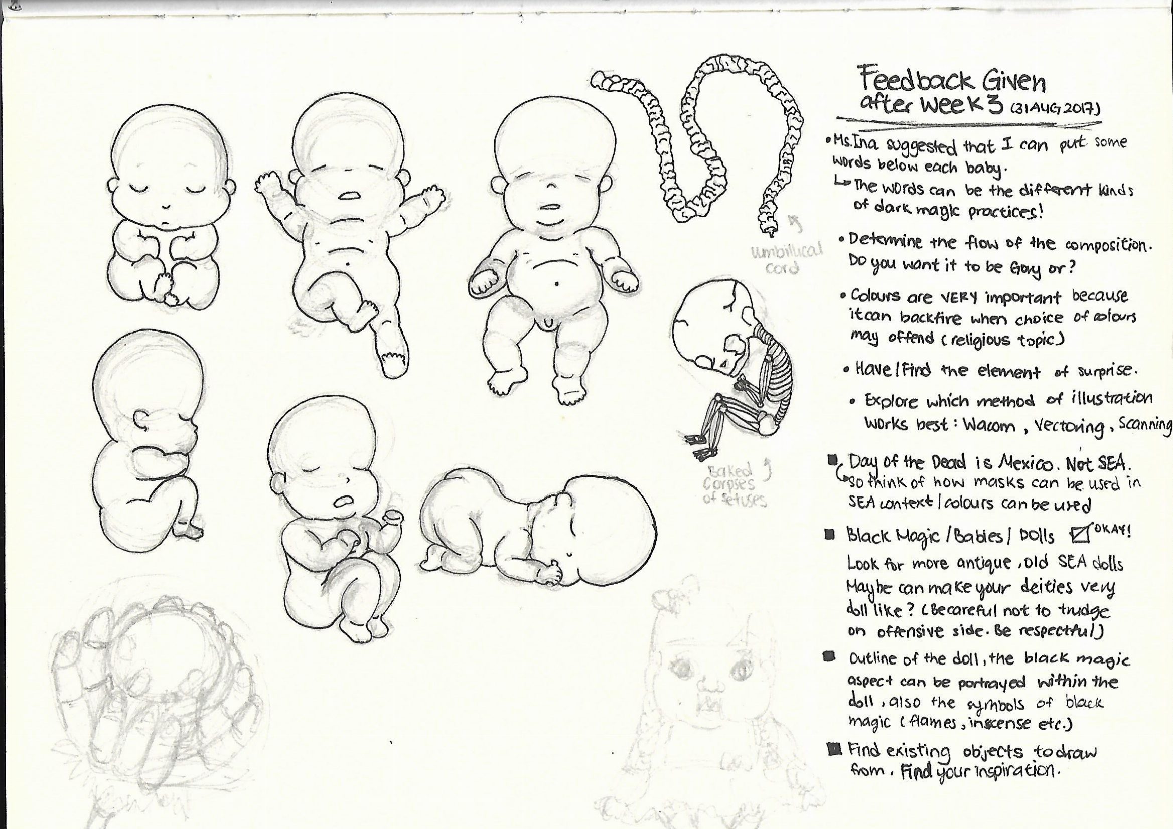
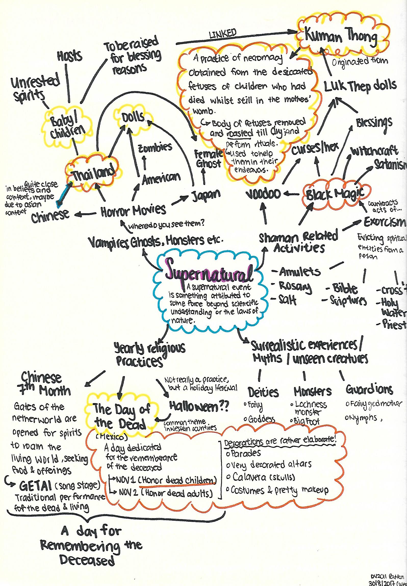 It is a wide network of sparse thoughts here and there, but I finally narrowed down to 2 topics I would like to explore on (The
  There is this grey area because it is a mixture of good and bad. In a way which meddling with ghost/spirits to obtain a positive outcome, is something that is quite risky.
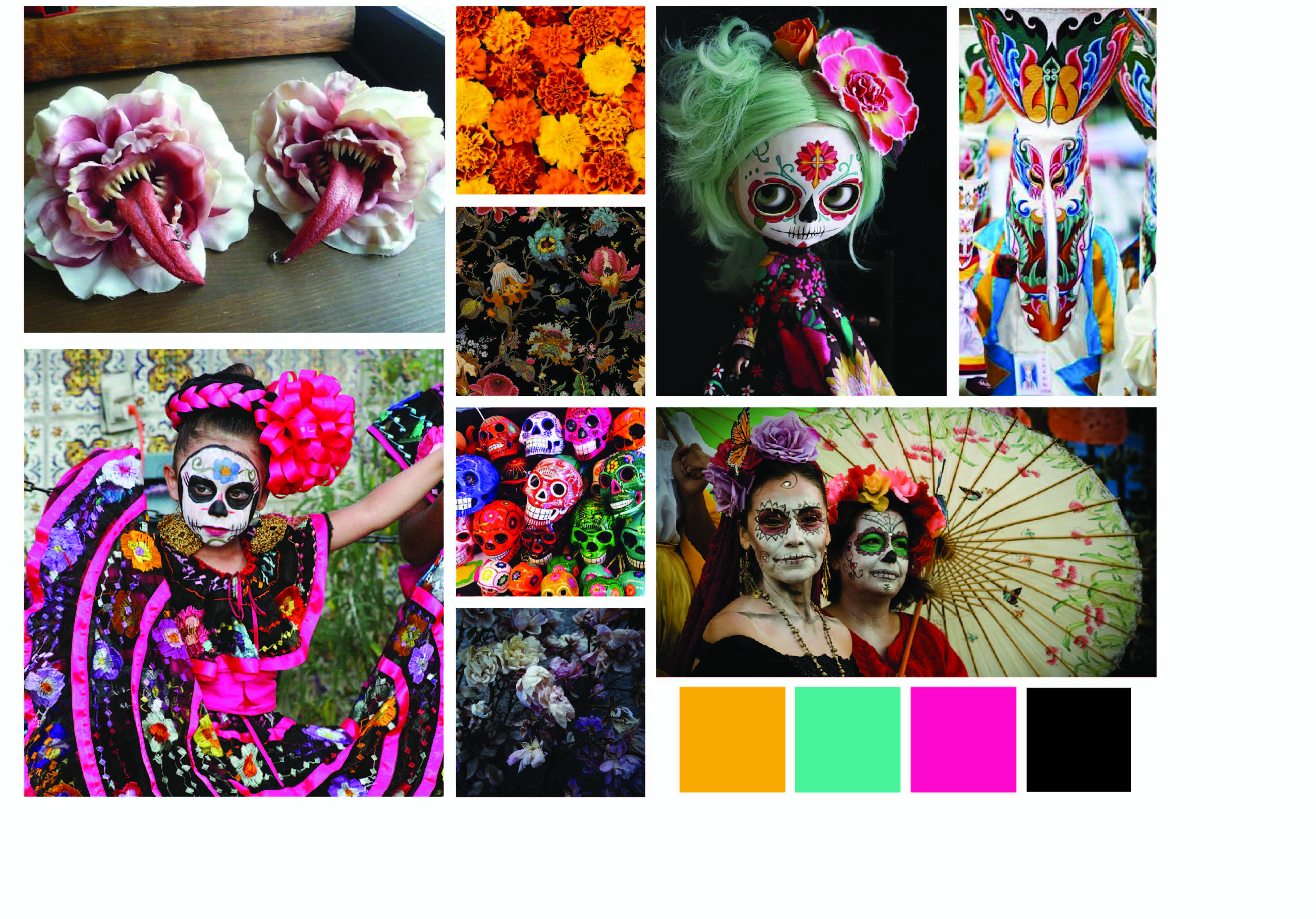 I am rather torn by the two themes, but at the same time I wonder how can I combine the two themes without being too jarring and contradicting, for which the Kuman Thong has a negative connotation to it due to its association with Black Magic, whereas The Day of The Dead is a jovial holiday marked to remember their loved ones.