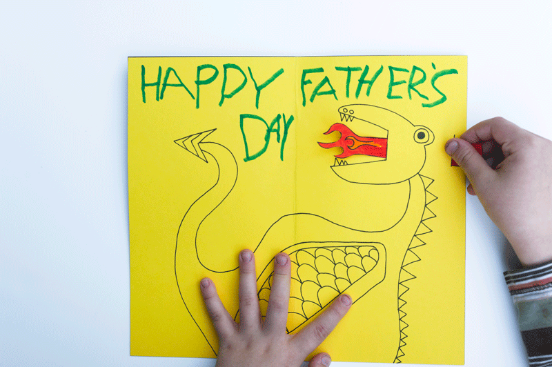
Since the final product is rather hands on interactive, I made a short video to show how the paper engineering mechanism can be played with in my work. If you hadn’t seen the ‘Process Stage’ post, Click HERE!
Thank you Jia Qi for being my camera man 🙂
Feedback given on presentation day!
Classmates’ Feedback and comments:
Joy’s Constructive Feedback 😀:
Choice of paper for this project is very important. It is rather flimsy and may break or tear when flipped multiple times. Paper shouldn’t fray at the edges.
Works can stand alone without instructions as it is rather distracting. Since the message of my project is ‘Self Discovery’, it may be better for the kids to explore the mechanism and how to play with this book instead of telling them how to.
Florist composition need not have ‘Left hand here’ and ‘Right Thumb here’, but instead a thumb and a hand outline is good enough, or even using a ‘flipping the page’ symbol is okay too.
Thickness of lines not constant (pots in florist is rather thin as compared to the rest). Suggested to change the setting, so when scaling up or down , can choose to scale proportionally.
Egyptianologist Colors were a little more jarring as it has the luminosity of highlighters, whereas everything else has richness.
Thank you lovely classmates and Joy for the comments and constructive feedback! 😀 I really appreciate it!! 😀
For this assignment I have heavily depended on my Visual Journal for note taking and thought processing as compared to last semester where OSS was where I post most of my thought process. Regardless, I will still take you through this journey from the start to end of this ‘Que Sera’ assignment via OSS, so… LETS GO~~
Ideation
Because the name cards require the use of the conceptually driven solutions and letter forms, combined with literal or abstract image to express our future jobs in typographic portraits, I did a mind mapping process in my Visual Journal to help with coming up with the 4 Jobs for each of the name cards: Florist, Egyptianologist, Home maker and Food Science Technologist.
Joy emphasized that we ought to have these 3 factors before consulation in order to give a good framework and direction for our assignment.
Concept
My concept for this project is using the delivery method of my goal now, which is to create a interactive children’s book, to execute the name cards for all 4 jobs.
Message
Individual name cards have their own messages and an overall message as a whole.
Florist – Do not let small thinking cut your life down to size. Dream big! Work hard!
Egyptianologist– Do not let someone else’s opinion define you.
Homemaker– Be as awesome as a Domestic Goddess.
Food Science Technologist– Never stop asking ‘Why?’ until you get you answer.
Overall message– Your job does not define who you are in the future. YOU define who you are in the future.
Tone
The overall tone of the Children’s Book concept is positive and educational. While urging the readers to discover and learn new things.
Artist references
I did not limit myself to one specific artist to use as reference because I did not want their style to be seen in my work. Hence I went online and offline to expose myself to interactive books and illustrations for children to serve as inspiration; extracting the pros of each book and learning to avoid the flaws which I did not want to see in my work.
Expression of tonality: I used different shades of the same color on to express tonality in the designs. This creates slight depth and also has an old school children’s book feeling.
Methodology
For all of the designs, I used hand drawn illustration, scanned the designs and used Adobe Photoshop to fill in colors and cleaned up the edges.
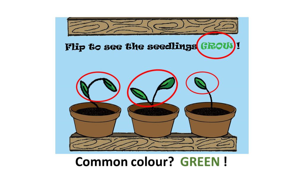
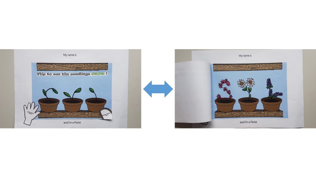
Florist (Age >5)
I used flip book animation to carry out the ‘Flip O’ Rama’ concept from the children’s comic: Captain Underpants. The following video below is how it would have looked like.
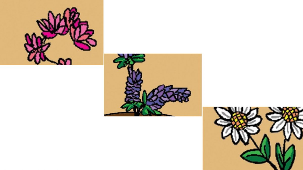
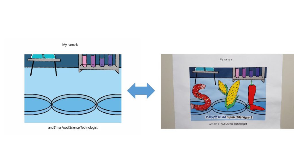
I wanted to show the growth of the plants from a boring seedling which looked like it may die any moment , into a blossoming plant. Hence, for the top image, I used the upper half of my initials : ‘SYL’ as the feeble seedlings in pots, and a full grown blossoming plant for the bottom image. So that when the user flips it repeatedly, it will look like the seedling is growing.
Joy also suggested for me to put out instructions on how the interactive-ness can be carried out by children, hence I pasted a ‘left hand here’ and ‘right thumb here’ instruction on the outside like how the Flip O’ Rama book did.
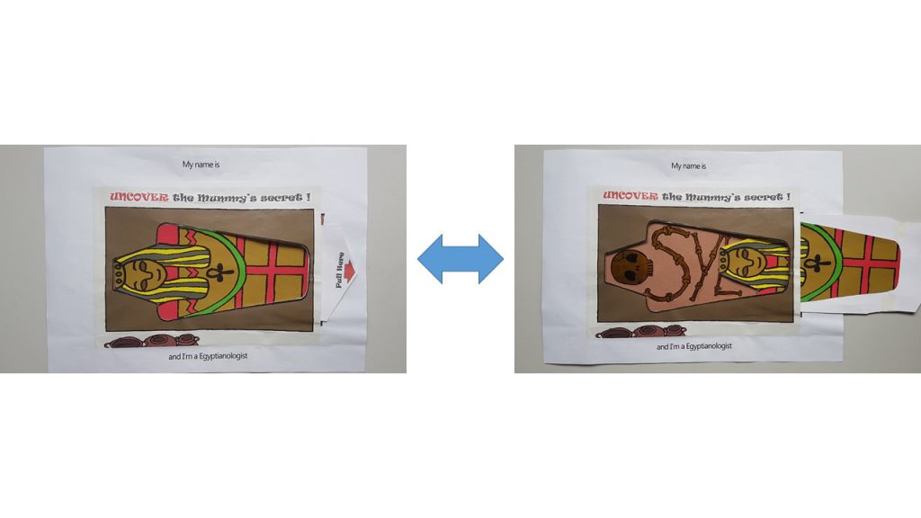
Egyptianologist ( Age 10-15)
I used the pull tab mechanism in this name card as seen in many pop up books.
I used Golden Flint paper on the interior of the Mummy coffin to act as the bones, which forms my name. My idea for this name card is to show that a dull looking exterior of the Mummy gives one the impression of something less of value. However, upon uncovering the truth by pulling the tab, it reveals the bright and golden bones of the Mummy.
In a way it also has many interpretations that can be taught such as:
‘Do not judge a book by its cover ‘
‘Its more important to have a heart of gold than a fancy exterior.’
‘Do not let what others think of you define who you really are.’
I also included a ‘Pull Here’ instructions with a red arrow to direct the child’s attention to it.
Homemaker ( Age >10)
For this name card, I used Velcro as the material to work with as I wanted to let the children organize and arrange where each of the item should go in the household chore. I was considering using felt to carry out this idea, but Shi Teng gave me a suggestion to draw out the illustrations and have them printed out instead, so that it is more consistent with the overall image of a sketchy hand drawn illustration. Thanks Shi Teng! 😀
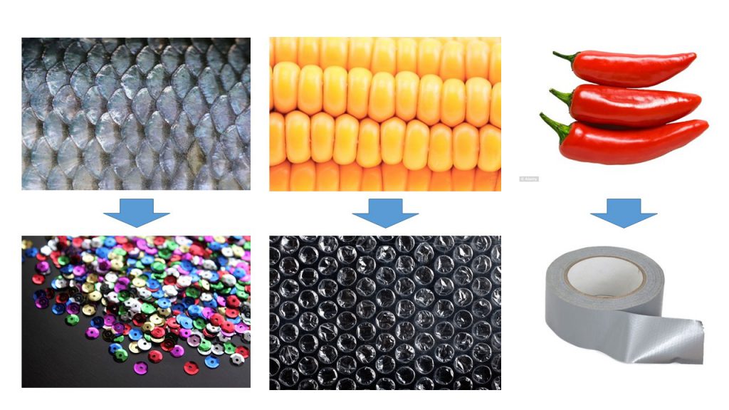
Food Science Technologist ( Age 16- 19)
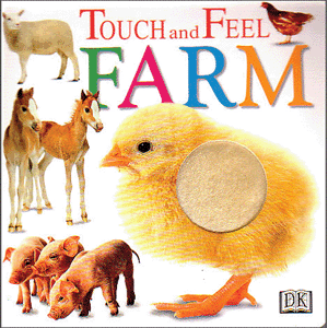
For this name card, I was highly driven ‘Touch and Feel’ books for young children.
I used Sequins to simulate the texture of fish scales, Bubble wrap to simulate the texture of corn and duct tape to simulate the waxy surface of Chilli.
Colors
Joy suggested I use a common color for the 4 compositions to express unity throughout. However, as much as I try to pick a common color, I don’t think it worked out very well to have Blue in my Egyptianologist illustrations ( It would have looked like an Ice Tomb) and neither Orange/ Yellow for my Food Science Technologist illustrations ( I required Blue to express the sterility of the Science lab).
Hence I split my compositions into 2 sides: Blue and Yellow
Blue (Hex code: #A4DBFF) – Florist (Complementary) and Food Science Technologist(Monochrome)
Yellow ( Hex Code: #E4C877)– Egyptianologist (Warm) and Homemaker (Analogous)
Instruction typography used
I used ‘Ravie’ Font and spaced out the individual letter because Children’s book has to be highly legible.
Font used I have chosen is Ravie because it has a rather whimsical feeling to it, but yet I chose to bold the fonts because it is still instructions and I didn’t want the children reading it to turn a blind eye to it.
Choice of color for font was something that was bugging me as well. As I felt Black was too strong as compared to the rest of the colorful compositions. But yet if I were to choose a color that suits individual composition, I felt that there was no unity to be seen as a whole in a book; and the instructions just blends in with the background where the children might turn a blind eye to it.
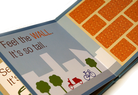
Hence my solution came about when I was researching for the way Children’s books present their instructions:
I really liked how…
A muted dark color was used to give the instructions. There is a mild sense of authority which I felt that one’s eyes would be drawn to read.
The key word ‘WALL‘ is in capital form.
The color used for the key word allows children to draw a relation between the word and the object. There is a sign (the word ‘WALL‘) and the signified (the wall picture)
Thus, I applied this reference to my instructions for the children.
I capitalized and gave a color to the keyword which is seen in the object.
Things I could’ve done if I can turn back in time.
I am really shooting myself in the foot for saying this. But, I think admitting to my mistake and learning from it is better than to bury it under the carpet. So, for my future self, here I go.
Explore different types of paper. I felt the struggle the most when I was carrying out the pull tab mechanism for the ‘I am an Egyptianologist’. I felt that if I explored the different type of GSM for paper before I executed the cutting, I would have achieved a better and smoother pull tab mechanism for this name card.
The following post would be the FINAL one for Assignment 1 Que Sera!

 Joy’s Constructive Feedback 😀:

 I also included a ‘Pull Here’ instructions with a red arrow to direct the child’s attention to it.
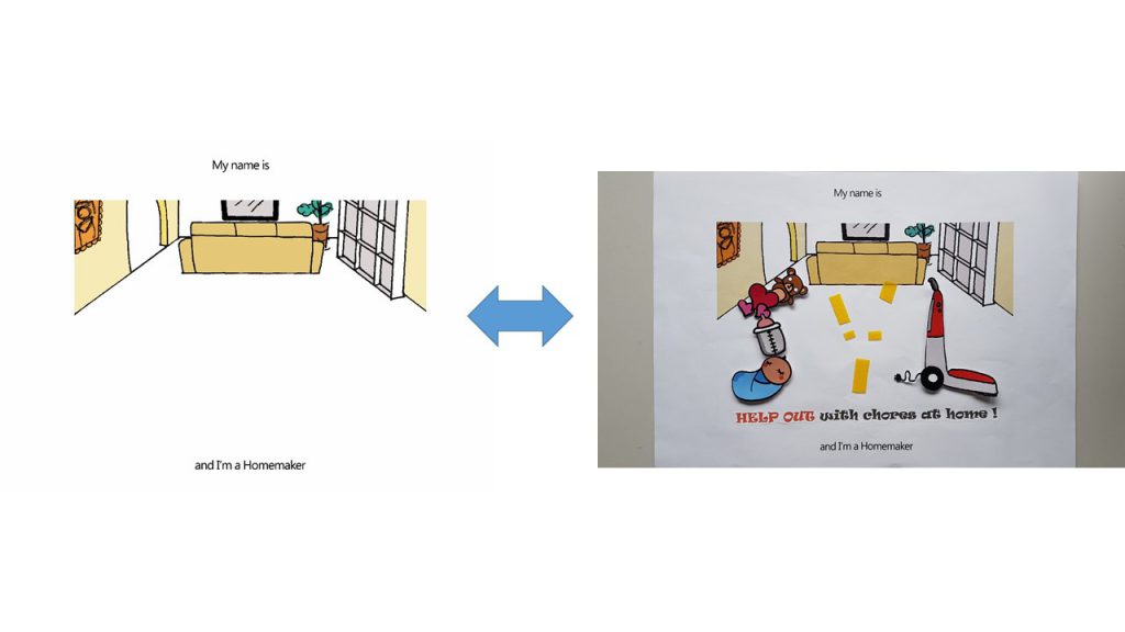
 I really liked how…