OH MY GOODNESS GRACIOUS… I forgot to upload my research on Ego.. :0 Here it is uploaded in Y1Sem2, present Yi Ling is trying to salvage the past Yi ling’s mistake.


Before we dive into Project 3: Ego, let me do some research~

Project Brief

In 4 rows of 3 squares, create a self portrait based on four different settings.

For each of the 4 rows, use the first column to represent yourself and the second column to represent a setting and third column to represent an imagined outcome. For instance, you (first column) at a family gathering (second column) equals to being the subject of scrutiny by relatives (third column).

Apply your understanding of colors and color theory to visually represent the multifacted nature of your personality. You may choose to do this digitally or by hand (or mix-media). There are a total of 12 image compositions.

Consider how colors can be used to suggest or evoke the feelings in the various representations as well as the cultural context of the various settings.

Specification

There are no limits to medium, technique or style. However the colors will have to be selected to represent one or few of the color harmonies:

  1. Monochrome Harmony
  2. Analogous Harmony
  3. Analogous Harmony Warm and Cool
  4. Complementary Hues
  5. Split Complementary

Color

Color has 3 attributes:

  1. Hue
  2. Saturation
  3. Value

If the surface or light does not have these three essential qualities, then it is not a color.

30_day_sweater_hue_value_saturation

  • The definition of Hue is varies for different experts. However, based on my research, Hue is basically a color. Hue are the colors on the outer rim of a subtractive color wheel.
Additive VS Subtractive Color Wheel

Additive V.S. Subtractive Color Wheel

  • Saturation is the purity or intensity of a color. Value and Saturation are not attached concepts – color can change its saturartion, but leave its value unchanged.
  • Value is the difference between light and dark. By adding more white to a certain color (lets say Red), the hue (Red) is still the same, but of different value.

Harmony in visual design means all parts of the visual image relate to and complement each other. Harmony pulls the pieces of a visual image together.

Monochrome Harmony

Monochrome Harmony are a value-based compositions that contain only one hue. There are no hue relationships in a monochrome harmony, only saturation and value relationships.

Parrot painting in Payne's grey by Joe Volkel

Parrot painting in Payne’s grey by Joe Volkel

Analogous Harmony

Analogous harmonies contain more than one hue, but all of the hues in this kind of harmony are adjacent on a color wheel. The adjacent colors on the color wheel are very easy to the eyes and peaceful to look at.

analogous

Artwork that demonstrates Analogous Harmony

Artwork that demonstrates Analogous Harmony

Analogous Harmony Warm and Cool

warm-cool-colors

Artwork that exhibits Warm and Cool Analogous Harmony.

Artwork that exhibits Warm and Cool Analogous Harmony.

Complementary Hues

Complementary hues are complementary colors that are opposite each other in a color wheel.

complementary-wheel1

Artwork that exhibits Complementary Artworks.

Artwork that exhibits Complementary Artworks.

Split Complementary

The split-complementary color scheme is a variation of the complementary color scheme. In addition to the base color, it uses the two colors adjacent to its complement. This color scheme has the same strong visual contrast as the complementary color scheme, but has less tension.

8242aaa3ef9d45c20464da149152d7ba

Artwork that exhibits Split Complementary Colors : Red, Turquoise and Green

Artwork that exhibits Split Complementary Colors : Red, Turquoise and Green

In addition to Split Complementary, there is also…

tumblr_m8cl7cwx3j1rrx82mTriadic color scheme uses colors that are evenly spaced around the color wheel.

cb0ed85f5b279a6a84443d7229bbbdea

Teiradic/ Rectangle colour scheme

82848c134c64483c9927605c644914e1

Square color scheme

alternate_complementary_color_harmony_by_samanthamuscaria-d4sd2p4


dddd


As of now, I am rather intrigued by the use of relative positions of the hues in the color wheel. Initially I thought that the color wheel was a mere collection of colors. But now I know that there is more than meets the eyes, and the relationships between the opposite, adjacent and uses the two colors adjacent to its complement color; could result in different meanings, and emotions that are evoked in an artwork. I am very interested in the exploration of Split Complementary Colors as it seemed modern and has a hint of pop-art to it as I search for relevant artworks that exhibits Split Complementary Colors.

Cheers,

Seng Yi Ling.embarassed

YAY So we have finally completed our FINAL assignment for 2D Foundation WOOHOO~
So lets get on with this extremely long and detailed post~

ME
Representation of Me: Tofu + Baby Elephant
slide1
Instead of using photographs of myself to represent myself, I decided to use my spirit animal as a representation of myself: A baby elephant.
Why a BABY elephant?
Because I often wish that I didn’t have to grow up so fast, and like a kid I am rather gullible & childish.
Why a baby ELEPHANT?
Because an elephant is a gentle giant ( I am rather big), they never forget(I bear grudges), they are playful and friendly but not to be trifled with ( my emotions are easily riled).
I was also intrigued to explore Anthropomorphism as well. Hence, I wanted to use Tofu as my subject as well. The texture of my elephant I have decided to go with is different types of Tofu as my friend once told me that I am like Tofu, soft and fragile and I ought to toughen up to be like Tau Pok.
slide2
Hence, in each row, the toughness of each elephant in each square will show the progression of how I , from a fragile watery Tau Huay transform into a tougher Tau Pok. Vice Versa. cool

Methodology
For the methodology for the representation of myself, I was very inspired by the cartoons I have watched in the past and recently.
Hence, I decided to carrying out my emotions and state into the form of hand-drawn elephant cartoon drawings, which then I scan my drawings into the computer, and then overlaying the texture of tofu over my drawings for the elephant’s skin on Photoshop.
This further emphasized on the meaning of my spirit animal is also soft and fragile like Tofu. Thus, giving a new definition to my spirit animal.
I decided to split the 4 rows into 2 where the first two will be on my concept of Dystopia and the other two will be my ideal concept of Utopia.
 scanwf
A constant method of carrying this project out is on Surrealism, as I was having lots of fun for project 2 and I would like to incorporate photo manipulation and montages again. 🙂

Compositions

1) Utopia 1:
 slide1
Me: Me when I am stressed.
Setting: Lured by Temptation
Black used in the background and doodled TV to show the dull and mundane life I am in. Juxtaposed by the burst of white light behind the TV, it acts as a metaphorical representation of the TV being a portal to send me to another dimension ( color wheel ) where there is colour, vibrance and excitement. Outstretched hand (Korean drama actor Song Joong Ki’s hand) from the center of the colour wheel invites and lures me into his world. *fangirl snigger*
Outcome: Living vicariously through fiction.
My concept for this composition is a themepark because I love thrilling rides and I lose track of time there. Similarly, in the land of fiction, I lose track of time and reality when I watch TV dramas.
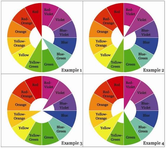
I used Square complementary Harmony color wheel in this composition where I used : Violet, Orange, Blue and Green. Violet/ purple gives off a dream like atmosphere, Blue is calming, orange gives a youthful and warm feeling and Green is refreshing.

 For this row, I was rather inspired by an image I saw online once which I felt it was highly relatable.
 main-qimg-b98d152beefb60cbd0cc74ab21e30e0e-c
Everyone is a genius. But if you judge a fish by its ability to climb a tree, it will live its whole life believing that it is stupid.
– Albert Einstein
2) Dystopia 1
slide3
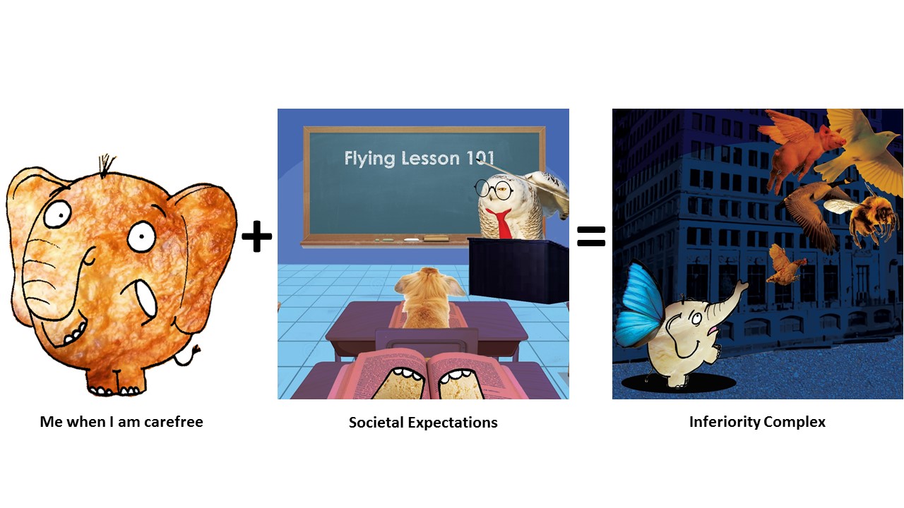
Me: Me when I am carefree
Setting:  Societal Expectations.
I used cool colors for this composition that has similar tones. Scene takes place in a classroom setting in my perspective. Blackboard serves as the center of focus to create line of perspective, further emphasized by grids on the floor, which says, “Flying Lesson 101”.
This is to show that sometimes in society and education, we are often taught things that we don’t need or does not apply to us individually, or it simply is not cut out for us. And no matter how hard we push ourselves to learn, we remember the theory but we cannot apply it.
Outcome: Inferiority complex.
Outcome is a representation of Exam day.
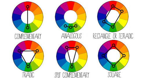
I used monochrome harmony ( Blue) and split complementary ( Blue with Orange ) in this composition. I used blue as the background as I wanted to express the coldness and cruel side of society (building in the background), as well as inferiority I experienced when my peers do extremely well but I don’t. It is as though, when I am not doing well in certain subjects as compared to others, I am deemed as incompetent, inadequate and less intelligent by society…
The bright orange juxtaposed against the dark blue background is to show how much my peers shine through their abilities, where I am blended into the background, questioning my abilities. I attempted to create a diagonal implied line from the bottom left corner to the top right hand corner, to convey the instability I felt.

3) Utopia 2

slide2

Me: Me when I have Anxiety
Setting: My Safe Haven
My Safe Haven is depicted in an outdoor scenario where ELEPHANTS SHOULD BE ROAMING AND NOT LOCKED IN CAGES NOR ENCLOSURES *ahem* where there is plenty of room to roam. I used rain, as Elephants love the rain; I represented the sun with a fried egg (Because I like too eat eggs) and the vegetation at the bottom to be a Soya Bean field as Tofu is made from Soya Beans, and metaphorically, I am where I am born. Hence, my safe haven is places where I find most joy and comfort as a child.
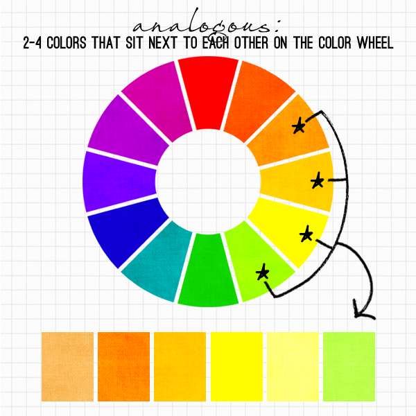
I used a Analogous Warm Colors for this composition where Green, Red, Orange and Yellow are present.
Outcome: Recuperation.
In this composition, the Elephant is seen in the ground with a Soya Bean and a rice grain on it’s side. This is a representation of me talking my problems out with my loved ones, and in this scenario, the Soya Bean is a representation of my family and friends (What made me ‘Me’.) and Rice is also the basic element which makes my comfort food: Carbohydrates. My elephant’s texture is Tau Huay again as I wanted to show that in front of my loved ones, I am allowed to breakdown and show my weak and fragile side 🙂 The Farmer Boots, Watering Can and Sunlight are what will help me grow up as a Soya Bean to be a stronger and happier person…I mean tofu.
I used Analogous Warm Colors and Earth tones for this composition.

4)Dystopia 2
slide4
Me: Me when I am Happy
Setting: Whirlpool of negativity
I depicted this composition by a hand grabbing the Elephant and attempting to throw her in the black hole made by the black and white whirlpool.
My highs and lows are rather unpredictable. I get triggered by comments and actions really easily as I am hypersensitive- *sighs* I am a Scorpio…excuses – and in an instant I get so caught up in chains of thoughts or reasons, I enter my abyss of fear and swirling thoughts, which eventually lead me to a state of melancholy.
Used Monochrome Harmony for this composition.
Outcome: Abyss of fear and melancholy
In my state of fear and melancholy, I am consumed by my own thoughts, things people say and self-loathe. I’ll think about past events and I get really scared of my consuming thoughts which swirls around me like vultures waiting to feed on my corpse.
Flying eyeballs with mouth-Conscious of things people say and the way they look at me.
Lizards with Math equations on them – Constant reminder of greatest fear in Math. I hate lizards.
Frankenstein Snowman – Things people compare parts of my body to.
Used Monochrome Harmony and Split Complementary ( Yellow rays from Window)
The texture of my elephant from a tough Tao Pok to Tau Gua to a watery fragile Tao Huay is evident here.

Artist References
A lot of my inspirations come from the cartoons I binged watched as a kid and the cartoons I watch now with my younger cousin on cable TV as a form of bonding session!
Best thing about being an Art student is that I can get away with watching cartoons for research purpose MUAHAHA.
I pay quite a lot of attention to the details in the animations which I drew my inspirations from:
Fairly Odd Parents
I really liked how they used color of the background has similar tones and roughly from the same hue. And the main characters are usually much more saturated and has brighter hues to draw our attention to them. The juxtaposition of the one-hue background to the more vibrant and colorful main characters really gives the main characters that POP of color.
The AMAZING WORLD OF GUMBALL
&
PICKLE AND PEANUT
cartoon-network-the-amazing-world-of-gumball
sectionname_xd_pickle_peanut_rich_nonretina_01c8eb16
My inspiration for Anthropomorphism comes from these 2 cartoons.
I liked how in The Amazing World of Gumball, the character’s personality are related for the medium they are made from. For instance, Teri (the paper bear beside Tina the T-rex) is made out of paper, she is very fragile, and physically weak. It is revealed that if Teri stands in the light, you can see “inside of her.”
And in Pickle and Peanut , I like how the main characters are the only ones made from ‘Real Objects’ whereas the rests are drawings.

Problems Faced
Use of colors
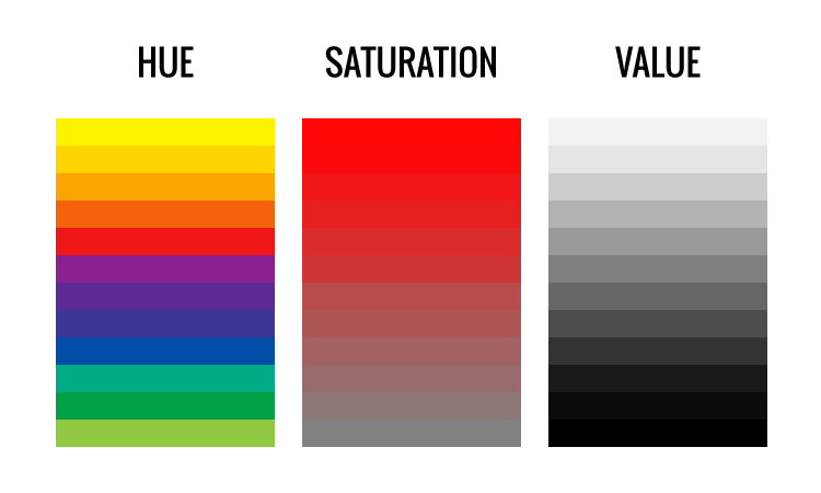
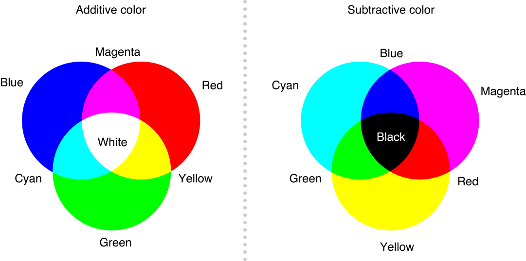
The colors aspect was bugging me quite a bit. The placement of colors on certain areas of my compositions and the saturation, tone and the Hex color code made it hard for me to decide as there were so many colors to choose from. But then again I was intrigued by the types of color harmony I can use to further illustrate and emphasize on my intention and emotion in each composition.
Ideas
I was rather concerned regarding using Color Harmony as the main key point as my head was really congested with ideas on how to pull off the photo montages, methodology, ideology and which elephant to use for which setting etc.
Images
Finding the right high resolution images for my photo montages and photo manipulation was rather difficult. For instance, it was not easy to find a high resolution image for tofu. 🙁

Comments and Feedback

Lovely Classmates’:
commensTHANK YOU GUYS FOR THE LOVELY COMMENTS <3
Miss Joy’s ( I can’t remember word for word but I got the gist):
– Can tell that I tried to apply my Principles of design such as implied lines and use of perspective.
– Joy suggested that for my ‘Societal Expectation’ composition, doing a sketch of a bunny hopping off a cliff to show the act of learning to fly would be better as compared to writing the text ‘Flying Lesson 101’ as the texts are rather jarring when seen as a whole during presentation of my 12 compositions, as it was the only composition with text on it. 🙂

Have pretty mixed feelings when lesson ended today 🙁 I had lots of fun working on the assignments, and odd to say but critique day is my favorite part of the assignment XD, but I cant help but feel a tinge of sadness when in sem 2 our class may split up and we may not get Joy as our instructor again even if we try to grab our timetable slots on STARwarS… sigh. But regardless I am very glad to get to know my classmates more as individuals through 2D projects ;’) It is my utmost pleasure guys~ Thank you for the memories <3

Methodology
My approach to Project 2 was to breakdown the quotes into keywords, and then branch out from the keywords to get inspirations as to what my possible choice of subjects can be used to represent my quotes without being too literal! 🙂
The final words I have decided to use to represent the key words are usually what I belive in or what I prefer to. For instance, I love “babies”. HENCE, “babies” would mean “Happiness” to me.
You can see the thought process in the following attached image of my 2D Sketchbook! ^-^
aslas
My objective in this assignment
In the following works, my unanimous goal is to make the quotes as non literal as I can by inserting dark humor, playing around with scale and involve the use of Dadaism to make the final pieces as surreal as I can. At the same time reinterpreting the quotes in my own perspective and exploring my choice of subjects.

Quote 1) “Happiness can be found, even in the darkest of times, if one only remembers to turn on the light.”

Keywords: 
Happiness -> babies , things that make babies happy
Darkest of times -> evil Hitler baby , poison
Turn on the light -> Sun
ay201617_fdn2d_g05_sengyiling_project2_4
Principles of elements and design: Lines, Repetition and Symmetrical Balance.
LINES from the sun rays in the background creates a radiating effect from the center of the image, to create a form of radial symmetry.
REPETITION of the items (bottles, spoons, cows etc.) in a spread out manner, using the rays of sun as guideline creates a sense of SYMMETRICAL BALANCE as the Baby Hitler acts as the central axis of this symmetry.
My Interpretation: Baby Hitler’s death could have been easily staged earlier to prevent a chaos, by poisoning (hence the poison sign on the spoons) the things baby Hitler would have loved. Such as adding alcohol to his milk, feeding poison to him in his baby food. Hence, Hitler’s death is a form of happiness to his victims.

Quote 2) “If there ever comes a day when we can’t be together keep me in your heart, I’ll stay there forever.”

Keywords 

Can’t be together-> distance and separation

Heart -> warmth in cold , maternal love, child

Stay there forever-> longing
 ay201617_fdn2d_g05_sengyiling_project2_3
Principles of elements and design: Scale, Repetition and Lines.
REPETITION of Jewish boy’s head in varying SCALE. There is slight use of implied lines created by the direction at which Hitler’s salute is directing our eyes to : Boy’s head.
My interpretation: This quote can be used in the situation where the Jewish mother is going to be executed while her son is being sent off to the concentration camps during the Holocaust. The use of the Jewish boy’s head in the background is to represent that, although he is held captive in the camp, his mind and spirit is elsewhere and not brainwashed by Hitler’s idealogy .

Quote 3) “Hold Ma Poodle!”
Keywords: 
Hold->grabbing
Poodle-> fluffy ->Sheeps
 zxcvbnmasdfghj
Since this quote had lesser keywords, I got feelings emulated in this quote instead, which is Agression.
Principles of elements and design: Scale, Repetition and Balance.
REPETITION of sheep with Mein Kampf books on their faces. SCALE of hand and Hitler’s face is much larger than the sheep. ASSYMETRICAL BALANCE is attempted as I tried to balance the visual weight of Hitler’s head on the right with the hand and Jewish Sheep on the left.
My interpretation: Mein Kampf is an autobiography by the National Socialist leader Adolf Hitler, in which he outlines his political ideology and future plans for Germany. And I pasted the book all over the sheeps’ face as I wanted to imply that the innocent sheep in the meadow were being brainwashed by Hitler’s ideologies. The sheep in the foreground is the only one without the Mein Kampf book as a face, instead it has a Kippah (Jewish cap), a representation that the innocent sheep is a Jew.
The hand is about to grab the Jewish sheep to be fed into Hitler’s mouth, a metaphor for the sheep that is about to be killed by Hitler, or brainwashed to be like the rest of the sheep. The aggression of the quote is carried out into action in this image.

Quote 4) “Come with me where dreams are born, and time is never planned.”

Keywords: 
Dreams->Clouds, Hitler
Born -> Giving Birth -> Beginning of time -> Dinosaur
Time-> Clock
Never planned ->Unexpectedness -> Impromptu birth?
 ay201617_fdn2d_g05_sengyiling_project2_1
Principles of elements and design: Scale, Repetition and Balance.
SCALE of Doctors against the Dinosaur. ASSYMETRICAL BALANCE is attempted as I tried to balance the visual weight of Dinosaur on the right with the doctors and clock on the left.
My interpretation: The dinosaur ( beginning of time = to imply birth of Hitler was a long time ago)  gave birth to baby Hitler, not knowing that it also gave birth to “Time” unexpectedly. “Time” is the antagonist from the mini web series: Don’t hug me I’m scared, on YouTube. Hence, implying that the birth of Hitler long time ago was the unexpected birth of an antagonist.

After looking at my concepts and final images, I decide to rearrange the sequence of my quotes. After looking through my final pieces, I felt that the images kind of convey a sequential story of the Hitler I portrayed.
Sequence is as followed.

Sequence is as followed.

Birth of Hitler > Rise of Nazism and mass murder/ conversion of Jews> Jews kept in concentration camps > How Hitler’s act of terror could have been prevented by an early death.

My Inspirations
  • I followed an Instagram account which posted a variety of creations by surrealistic artists, which gave me ideas on the choice of subjects and how I might want to compile the images together.
Instagram account where I drew my surrealism inspiration and ideas from.

Instagram account where I drew my surrealism inspiration and ideas from.

20161015_210538
  • I also used photo collage most of the time, inspired by Hannah Hoch’s photo collaging and John Hartfield’s form of photo montage. (link to my research on both artists :  https://oss.adm.ntu.edu.sg/yseng001/2d-project-2-for…rch-17-sept-2016/ )
  • I was truly enamored by Eugenia Loli ‘s compositions as she is very creative and imaginative in how she placed her subject matters and objects. Her compositions spurred me to be more imaginative and look at everyday objects differently.

Raw Deal Stargate Installation


Inner struggles through Project 2:

  • I had a hard time finding images I sought for which are in high quality 300dpi. The use of Adobe Photoshop and Adobe Illustrator was a huge headache for me when I first started as I had to learn from trial and error on how to configure the programs. The frequency of bitmap and tonal contrast was difficult to grasp as well as I was not sure how my design will look like upon silk screening. Sadly, in the end the design on my tote bag was not very well produced as I expected it to.:(
  • I really disliked how much water was wasted in the process of silk screen washing 🙁

Presentation Day Comments!

asdfghgfdsgfdf


Ms. Joy’s comment/feedback:

I cant remember 100% of what Ms. Joy said, but the gist of the good things she said about my Project 2 was that she liked how I used the elements and principles of design in my work to direct the viewer’s attention to areas I wanted to focus on, and the use of dark humor with the reoccurring motif of Hitler in my various warm and fuzzy quotes were well played.

Whereas things to improve on is that the 2nd composition was a rather confusing as the visual weight of the hand and Hitler’s head are very similar, hence it was rather confusing if the hand was grabbing Hitler or the Jewish sheep as, Hitler’s facial expression looked scared. Joy also suggested that maybe averting the gaze of Hitler could assist in my composition to make Hitler look less afraid of the hand. 🙂

Regarding my silkscreened tote bag, we both agreed that the silkscreen pay off was not that good and that perhaps in the future I can have more opportunity to silkscreen again, and perhaps exposing my screen for a longer time will result in a better print! 😀

Thank you Ms. Joy and my lovely classmates for your feedback and comments!!embarassed To be honest, my favorite part for presentation day is getting the post-it notes from my classmates, and obtaining feedback. For some unknown reason it makes me feel very excited! ^0^


Nonetheless, I had a really great experience with this project as I managed to use the principals of elements and design to create the design I wanted and then having to print them onto a tote bag! Having my design to be printed onto a product gave me a sense of achievement and a more tangible feeling of being a real designer. embarassed

Cheers!

Seng Yi Ling

SILK SCREENING

It was my very first time at silk-screening on the previous week and I had trouble conceptualizing the process because I simply couldn’t fathom how our printed designs on TRANSPARENT PLASTIC (Correct term: Transparency Paper) could be translated onto printed designs on tote bag while using this sieve looking tool (Correct term: Silk Screening frame).

I had to see and have hands-on experience to believe this amazing invention created by mankind!

Firstly we were told to wash our silk screen frames and use a hair dryer to blow dry them, to ensure they were clean!

Then we went into this enclosed red room ( Red light was present) where NO LIGHT was allowed to be present as there might be some chemical reaction with the medium we were going to use. We then coated the netting of our frames on the back and front using the blue paint-like medium and then placing our coated frames in this GIAGANTIC oven (It had really smooth rolling trays…) to dry the medium !

After which we were taught by Xiuming (Work-study senior) to place our transparency and frame into this GIGANTIC MACHINE which looked like a photocopy machine on the outside, but had like reflective metal on the inside which made it look like a tanning machine. After which we locked our designs in the machine, it made a whirring sound and the cloth above our designs was like sucked in!!! I was super amused at this point because I had never seen anything like this before!

The Photocopy looking machine which printed our designs onto the silk screen frame surface :)

The Photocopy looking machine which printed our designs onto the silk screen frame surface 🙂

After which the machine did it’s job, we took our designs to the back of the room to wash the residue off using this jet spray (It was fun… pretending that the jet spray was a rifle cool)! But in all honesty, I was rather upset at the amount of water wasted in this process of washing… considering that all of the students in ADM Year 1 had to do this, it is bad for the environment by wasting so much water. :'(

This jet spray allows the residue to be forced out of the net!

This jet spray allows the residue to be forced out of the net!

After cleaning up our designs on the frames, we used the hairdryer to dry the frame and apply a layer of thick ink over the top of our frame and pushed the ink across the designs using a wiper tool to ‘print’ our designs onto our tote bag!

Drying the design

Drying the design

I wasn’t very please with the eventual outcome on the tote bag as some areas were too dark and splotchy instead of greyish, and details were missed out… As you can see it is pretty in-identical to my digital design.

After test runs on paper, the final design has been printed on my totebag!

After test runs on paper, the final design has been printed on my tote bag!

Original digital design after bitmap<<<Original digital design after bitmap

What I regretted the most after the final printing onto my tote bag was not being able to have a good gauge of what my final print will look like based on the tonal contrast, quality of the digital image and frequency of the dots in bitmap, BEFORE printing on the transparency paper … I hope that in the future I can have more opportunity to try out silk screening again. It was really fun! But at the same time, the process of silk screening was not easy at all; and I really do commend those who could do it so well! laughing

If my personal experience with silk screening is not detailed enough, do check out this video on how silk screening is conducted!!

Cheers!

Seng Yi Ling cool

NEW PROJECT IS HERE!!

Our second project for 2D foundation class is called ‘Forrest Gump’! So let me start my research before we dive right into the course work!

Project Brief:

Create a visual narrative that expresses each movie quote of your choice using only symbols, pictograms, dingbats(ornaments), icons and engravings as your visual vocabulary.

The old engraving imagery puts the composition into historical context. You are to manipulate, alter and deconstruct the found graphic imagery to transcend its original meaning through the creation of the indicated narratives. Pay particular attention to the application of design principles to create visually engaging compositions.


~~~~~~~~~~~~~~~~~~~~~~~~~~~~~~~~~~~~~~~~~~~~~~~~~~~~~~

Symbols:

symbol-signs-the-ministry-of-type

A mark that is universally recognized to represent an object, action or situation.

Pictograms:

piccc

Pictograms are pictorial symbols for a word or phrase. Pictographs were used as the earliest known form of writing, examples having been discovered in Egypt and Mesopotamia from before 3000 BC.

image

Pictograms are also used as pictorial representation of statistics on a chart, graph, or computer screen.

Dingbats:

A dingbat is an ornament (used for decoration/embellishment), character, or spacer used in typesetting (composition of texts), often employed for the creation of box frames.

BlueGobletOrnaments

The term continues to be used in the computer industry to describe typeface that have symbols and shapes in the positions designated for alphabetical or numeric characters.

Dingbats2StrongForms dingbats-hero_image

In summary, I understand Dingbats as a form of ornamental embellishment OR symbols or shape that acts as a semiotic. (Correct me if I am wrong surprised)

Icons:

b_1279429335264

Icon has a physical resemblance to the signified, the symbol being represented and is usually a pictorial representation.

Engravings:

800px-2008-engraving

$_32

Engraving is putting a design onto a hard, flat surface (stone, wood, metal etc.), by carving into it resulting in a decorative piece.

958405b42008a8f67267a4eb1f60579b

Or may provide a printing plate of copper or another metal, for printing images on paper which are also called engravings.

~~~~~~~~~~~~~~~~~~~~~~~~~~~~~~~~~~~~~~~~~~~~~~~~~~~~~

More research will be done on my visual journal starting from this project onwards (I hope), and I will be uploading images of my journal in the furure!

Cheers,

Seng Yi Ling~smile

Before I dive into the project, some research and reference artists required to get my creative factory to start its engine~ But as of now, I am pretty uncertain about this project because it is rather abstract and lots of limitless imagination is required which I am rather worried about. ( Sounds familiar to my Project 1 woes…) And because I am a technology caveman, I predict that I going to have a hard time using the Adobe Photoshop and Illustrator. :'( Wish me luck~!

Surrealism

Surrealism is a 20th-century avant-garde movement in art and literature which sought to release the creative potential of the unconscious mind by using irrational juxtaposition of images.

surreal-painting-vladimir-kush%2017 6354760-r3l8t8d-800-18

To my understanding, surrealism is to create meaningful images that are illogically possible in reality.

DADAISM

Dada was an art movement of the European avant-garde in the early 20th century. The beginnings of Dada correspond to the outbreak of WWI. And the movement was a protest against the bourgeois nationalist and colonist interests, which many Dadaists believed were the root cause of the war.

f319679309841_560cc247eafab

Many Dadaists believed that the ‘reason’ and ‘logic’ of bourgeois capitalist society had led people into war. Hence they expressed their rejection of that ideology in artistic expression by embracing chaos and irrationality. Dada was not art: it was “anti-art”. Dada represented the opposite of everything which traditional art stood for.

duchamp

Based on my own understanding, Dadaism is ‘Anti-art’. It’s purpose is to reject any logical and reasonable thinking, going against whatever traditional art stood for. It seemed like a mass rebellion against traditional art. Fighting Art with Anti-art.

Russian Constructivism

Russian Constructivists had the intention to reinvent art and reconstruct art from level 0. Constructivism was primarily an art and architectural movement. It rejected the idea of art for arts’ sake and the traditional bourgeois class of society to which previous art had been catered. Practicality with beauty was the main thrust behind the constructivists.

manwithmoviecam

Instead it favored art as a practice directed towards social change or that would serve a social purpose and be practical in its nature. Developing after World War I, the movement sought to push people to rebuild society in a Utopian model rather than the one that had led to the war. Art, music, architecture etc. were influenced by constructivism. 

gustavklutsis-workers-everyone-must-vote-in-the-election-of-soviets-1930

Based on my observation, I realize that Russian Constructivism has minimal colors in its artworks. Variety is added by using basic element of design such as contrast of color and lines.

3337399f88d431c79e56c0820f82db31

Chinese Political Pop art by Wang Guang Yi’s Great Criticism Series instantly came to my mind when I searched for ‘Russian Constructivism’.

tumblr_nefs07nzif1r29uz6o1_540

Artwork by Wang Guang Yi

As you can see, there are some forms of similarity such as red is the dominant color, and use of lines draws the viewer’s attention to an area of focus.

Hannah Hoch

At first glance into her works, . I assumed she was a modern artist initially as Hoch’s work seemed timeless and is applicable to the present times.

hannah-hoch

Hannah Hoch was an important member of the Berlin Dada movement and a pioneer in collage and was one of the originators of Photomontage. She also consciously promoted the idea of women working creatively more generally in society. She explicitly addressed in her pioneering artwork in the form of photomontage the issue of gender and the figure of woman in modern society

tall

Surrealism and Dadaism seems to be heavily involved in her works. The effect of her work is initially one of visual confusion, and yet a kind of nonsense-narrative begins to develop. To me, she is like Picasso who used magazine cutouts to create collages instead of paint!

John Heartfield

John Heartfield was a pioneer of modern photomontage. Working in Germany and Czechoslovakia between the two world wars, he developed a unique method of appropriating and reusing photographs to powerful political effect. The process of cutting and pasting together elements to form a brilliant cohesive image became the foundation of Heartfield art.

yet-it-moves

To compose his works, he chose recognizable press photographs of politicians or events from the mainstream illustrated press. He then disassembled and rearranged these images to radically alter their meaning.

15johnheartfieldkriegundleichen
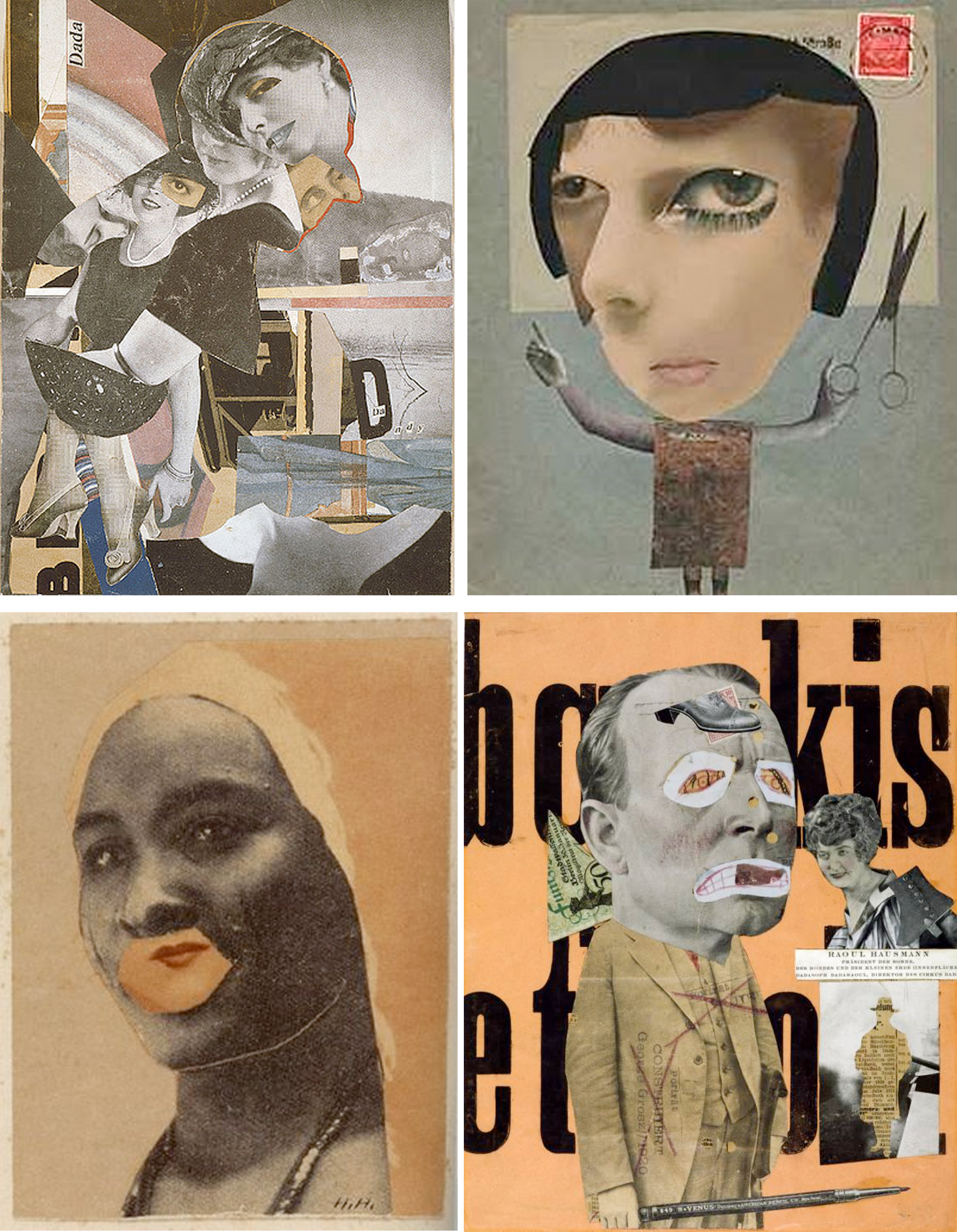
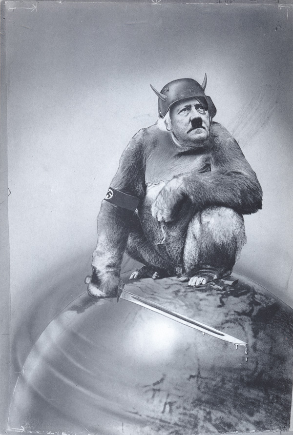
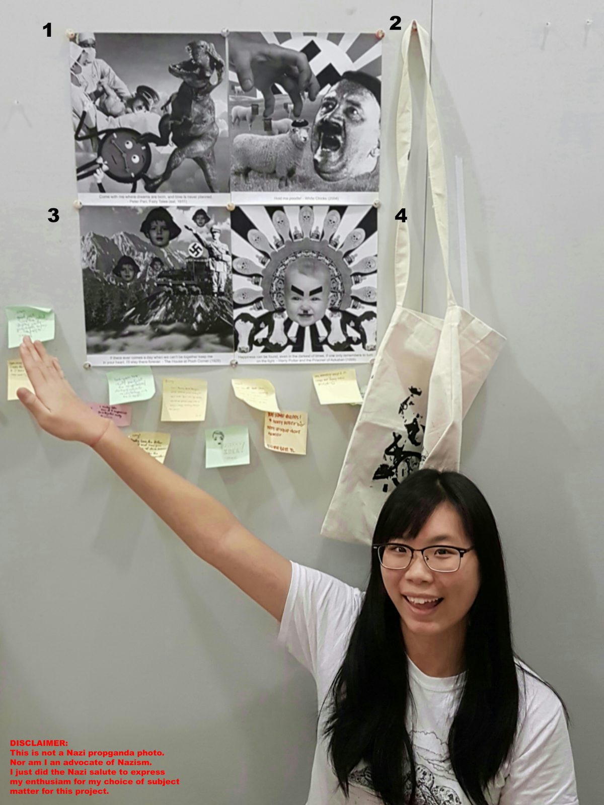
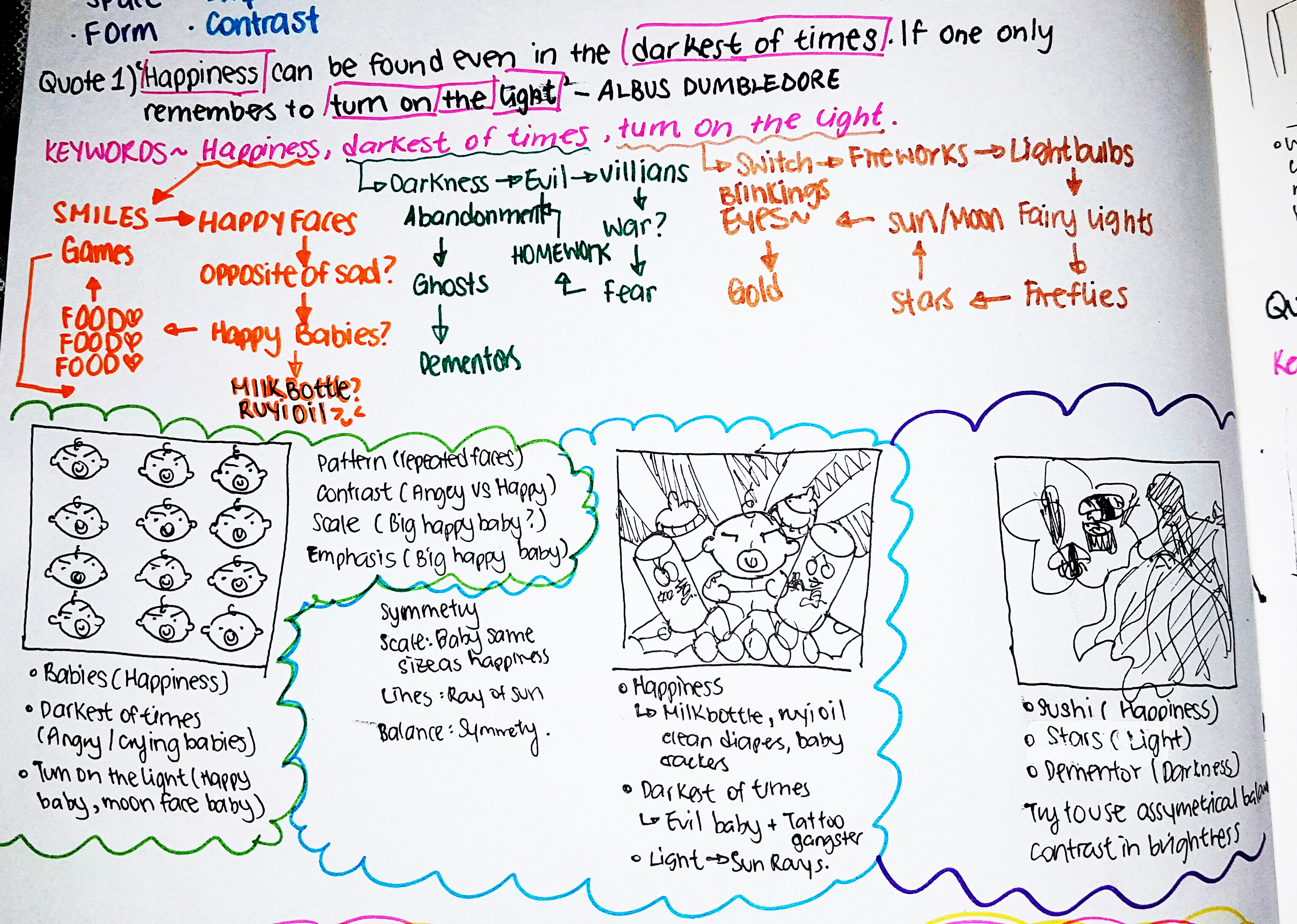
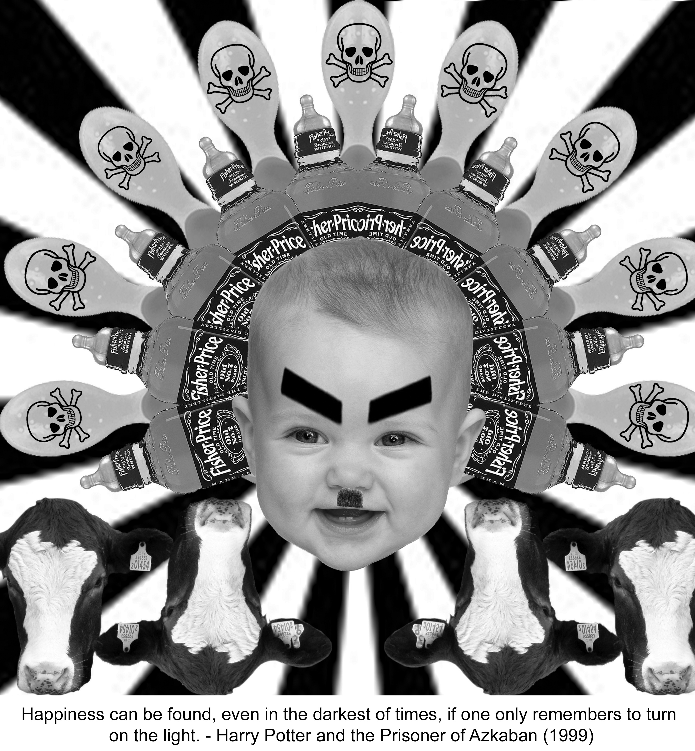
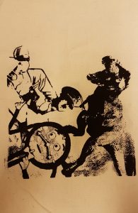
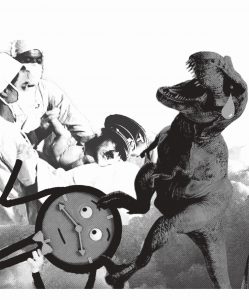
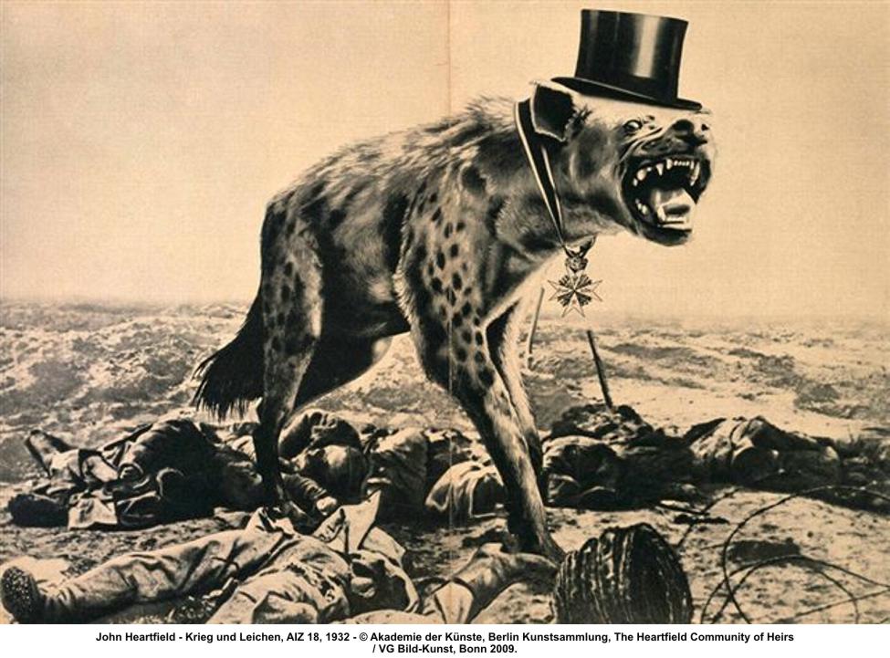
Heartfield’s strongest work used variations of scale and stark juxtapositions to activate his already gruesome photo-fragments. The result could have a frightening visual impact.
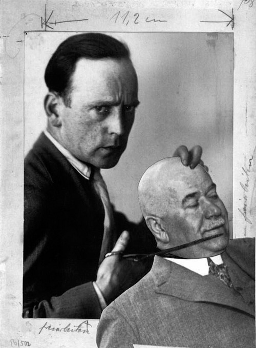
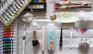
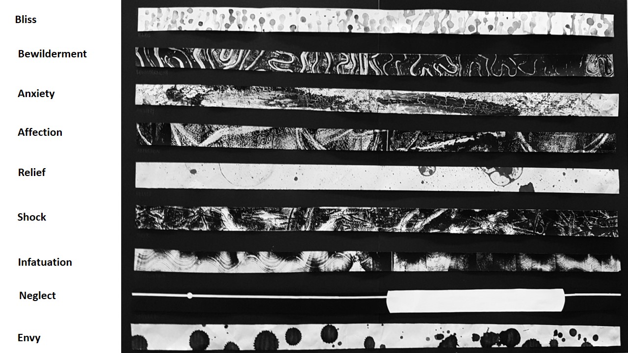
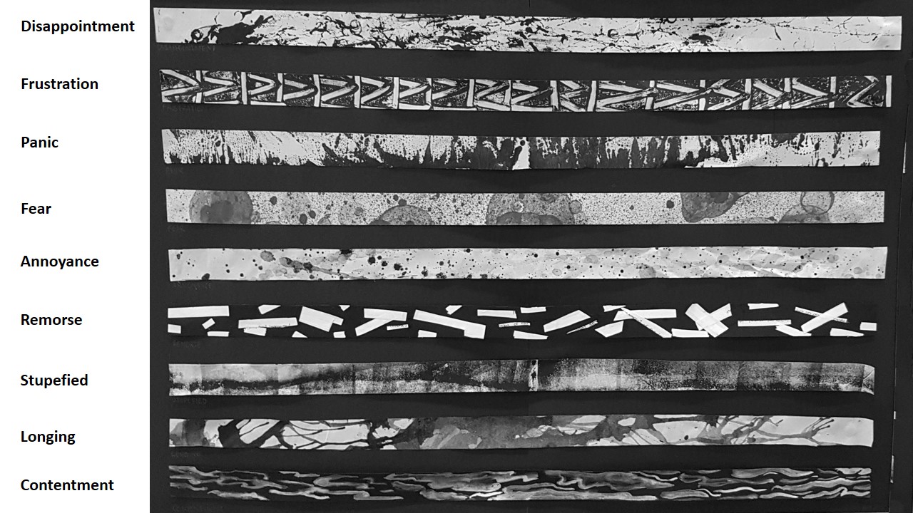
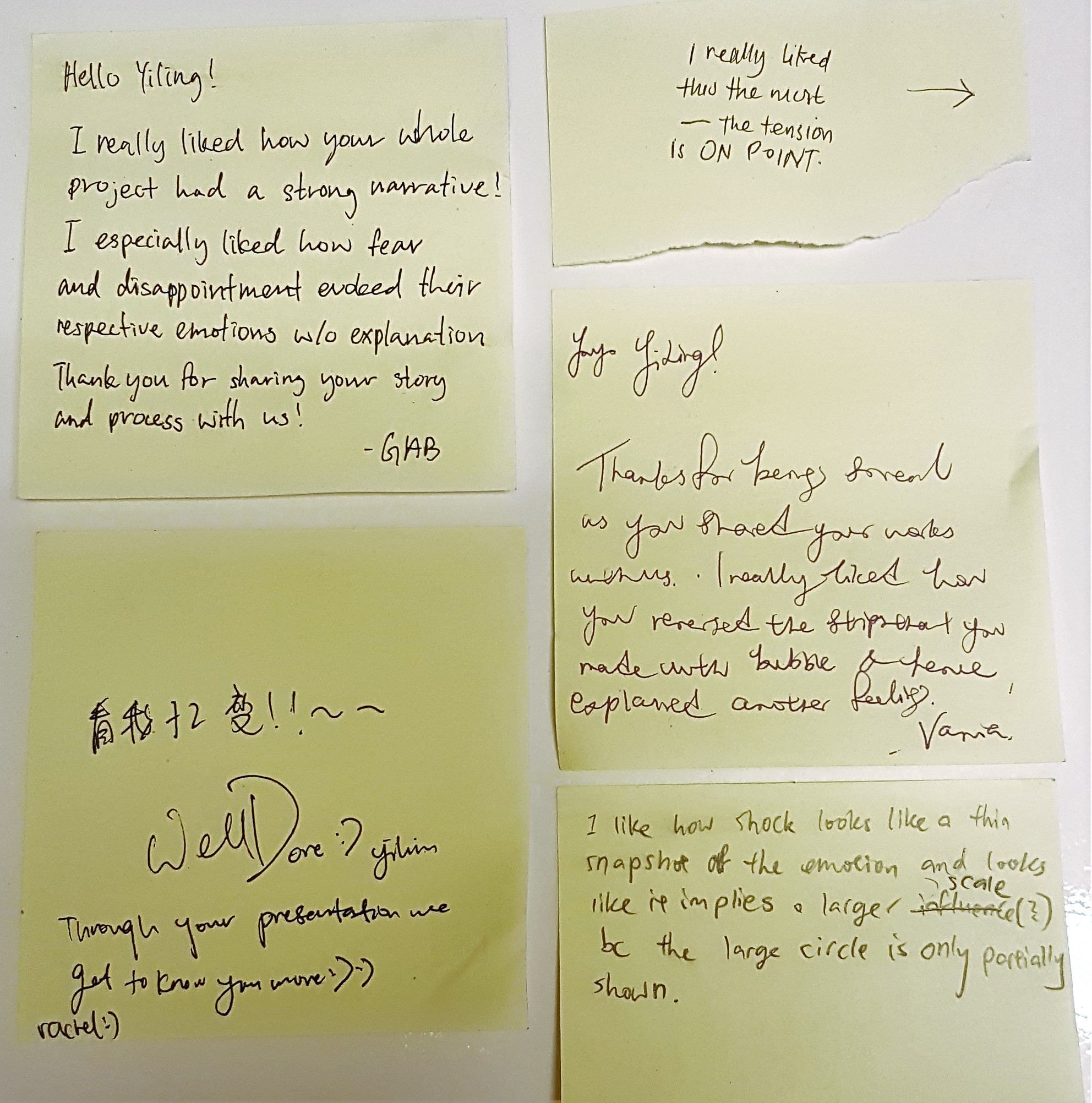
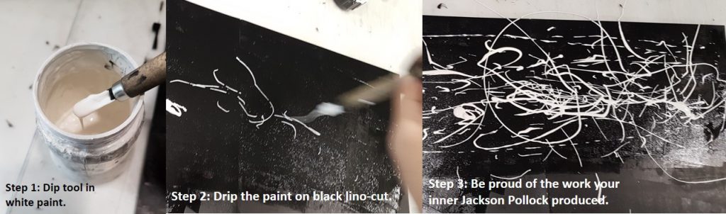
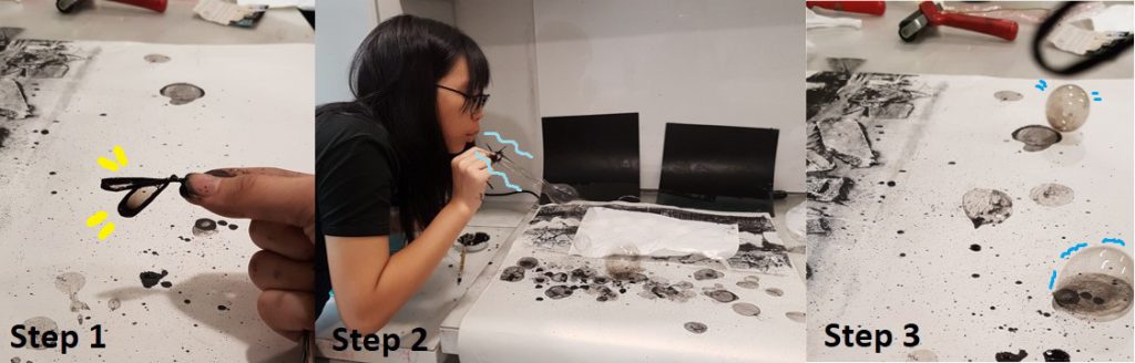
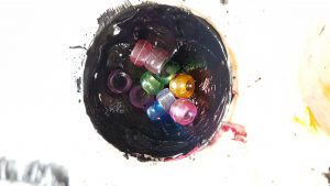
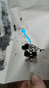
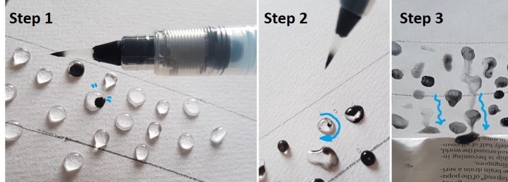
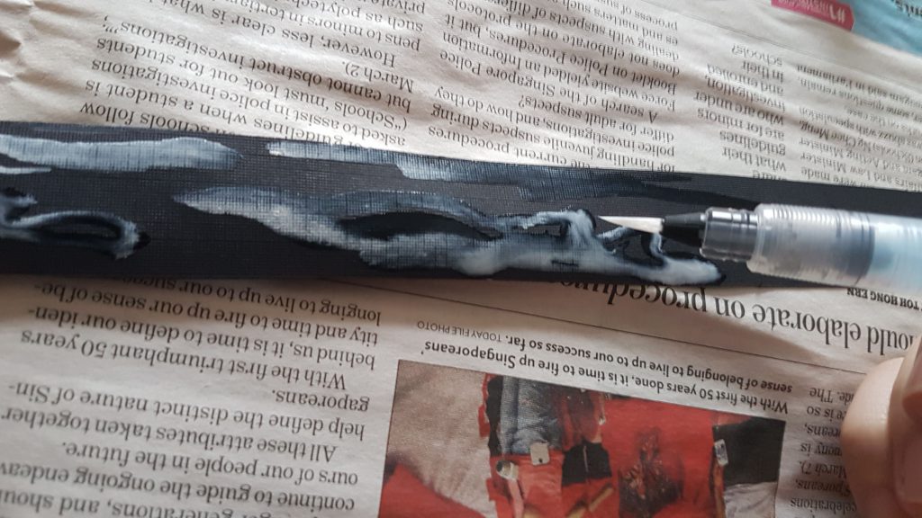
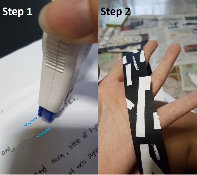
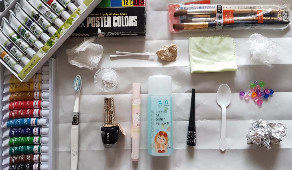
john_heartfield

I felt that Heartfield’s work are rather heartfelt as his ‘Anti-Nazi’ and ‘Anti-politics’ works held significant meaning behind the photomontage of satirical humor.

~~~~~~~~~~~~~~~~~~~~~~~~~~~~~~~~~~~~~~~~~~~~~~~~~~~~~~

From this round of research, I am inspired by a few concepts and methodology of artists, which I may use for this project:

  1. Basic Principles and Elements of Design can help direct the viewer’s attention to an area I want to focus on, AND to emphasize on a certain intention.
  2. Stray away from conventional traditional art mindsets, focus on the idea you want to bring out instead of the aesthetics. UNLEASH YOUR IRRATIONAL UNCONSCIOUS MIND~ RELEASE THE KRAKEN!!
  3. Create nonsense-narrative
  4. Use recognizable images
  5.  Vary scale of object and create stark juxtapositions

Cheers~

Seng Yi Ling.

The following slides below are our ( Kam Yit Ling and Myself) , presentation slides for today’s class presentation 🙂

We talked about Symmetry, Unity, Golden Ratio, Emphasis and Balance.Slide1 Slide2 Slide3 Slide4

Examples of natural forms with reflection symmetry are: A butterfly exhibits reflection symmetry in its body and wings and the lake acting as a giant mirror which reflects the scenery horizontally.

Examples of natural forms with reflection symmetry are: A butterfly exhibits reflection symmetry in its body and wings and the lake acting as a giant mirror which reflects the scenery horizontally.

The Taj Mahal is an example of architecture that exhibits Reflection symmetry, whereby the peak of the architecture acts as the central vertical axis.

The Taj Mahal is an example of architecture that exhibits Reflection symmetry, whereby the peak of the architecture acts as the central vertical axis.

An example of artwork that exhibits reflection symmetry is Symmetry by Ayano Ueshima.  Approximately one thousand q-tips were assembled to form this neckpiece that was systematically assembled to embody the symmetrical form of the human body.

An example of artwork that exhibits reflection symmetry is Symmetry by Ayano Ueshima.
Approximately one thousand q-tips were assembled to form this neckpiece that was systematically assembled to embody the symmetrical form of the human body.

Rotation symmetry refers to the rotation of equivalent element around a common center. Whereby rotation of the element at any angle will produce the original image.

Rotation symmetry refers to the rotation of equivalent element around a common center. Whereby rotation of the element at any angle will produce the original image.

Slide9

An example of art/ architecture that exhibits rotational symmetry is the Rose Window in the Strasbourg Cathedral that is often found in Gothic Architectural Style Churches.

An example of art/ architecture that exhibits rotational symmetry is the Rose Window in the Strasbourg Cathedral that is often found in Gothic Architectural Style Churches.

moving a figure a certain distance in a certain direction translating by a vector

moving a figure a certain distance in a certain direction translating by a vector

Examples of natural forms with translational symmetry are: A school of the same species of fishes and a flock of birds. They exhibit translation symmetry through reproduction—creating similar looking offspring.

Examples of natural forms with translational symmetry are: A school of the same species of fishes and a flock of birds.
They exhibit translation symmetry through reproduction—creating similar looking offspring.

Tessellation and Tilings are  a form of translational symmetry as the orientation of the red and white horses constant regular shapes are translated to create a consistent pattern.

Tessellation and Tilings are a form of translational symmetry as the orientation of the red and white horses constant regular shapes are translated to create a consistent pattern.

Thus deign logos such as brands like Starbucks, Target, Macdonald and Chanel uses symmetric logos as they attract attention and easy to be recalled by consumers.

Thus deign logos such as brands like Starbucks, Target, Macdonald and Chanel uses symmetric logos as they attract attention and easy to be recalled by consumers.

Symmetry in design convey balance, harmony, and stability. Like the interior of chapels, which exudes stability, peace and harmony. Use simple symmetrical forms when recognition is important, and more complex symmetrical forms when aesthetics and attractiveness are important.

Symmetry in design convey balance, harmony, and stability. Like the interior of chapels, which exudes stability, peace and harmony.
Use simple symmetrical forms when recognition is important, and more complex symmetrical forms when aesthetics and attractiveness are important.

Symmetry is the most basic and durable aspect of beauty.  Symmetric faces are perceived as more attractive than asymmetric faces. And perhaps this is why very good looking people end up on screens, because they have an almost symmetrical face, which is perceived as the epitome of beauty. But of course, beauty is in the eye of the beholder.

Symmetry is the most basic and durable aspect of beauty.
Symmetric faces are perceived as more attractive than asymmetric faces. And perhaps this is why very good looking people end up on screens, because they have an almost symmetrical face, which is perceived as the epitome of beauty. But of course, beauty is in the eye of the beholder.

Slide17 Slide18

Unity cannot exist alone without the use of basic design principles and elements of art and design.

Unity cannot exist alone without the use of basic design principles and elements of art and design.

Unity helps to organise a visual image

Unity helps to organise a visual image

The Starry Night by Vincent Van Gogh is an example of how unity is achieved by the repetition of line. If you look closely, lines are the only mark that is used, thus the entire artwork is unified by the same texture that is consistent throughout piece.  The use of long lines, curved lines, thick lines and thin lines that create the movement we see in the painting, which adds variety to the work. By using the same mark throughout the whole painting, there is a great sense of unity throughout the piece.

The Starry Night by Vincent Van Gogh is an example of how unity is achieved by the repetition of line. If you look closely, lines are the only mark that is used, thus the entire artwork is unified by the same texture that is consistent throughout piece.
The use of long lines, curved lines, thick lines and thin lines that create the movement we see in the painting, which adds variety to the work.
By using the same mark throughout the whole painting, there is a great sense of unity throughout the piece.

Another artwork that exhibits variety with unity is this artwork by Kandinsky. In this composition by Kandinsky, unity is provided by the repetition of circles on a neutral background. Variety is added by the different sizes and colours of the circles, and by overlapping them.

Another artwork that exhibits variety with unity is this artwork by Kandinsky. In this composition by Kandinsky, unity is provided by the repetition of circles on a neutral background. Variety is added by the different sizes and colours of the circles, and by overlapping them.

Slide23 Slide24

The golden ratio is the ratio of 1: 1.618. It is believed to be the most aesthetically pleasing geometric form to human eyes. Create a sense of beauty through harmony and proportion.

The golden ratio is the ratio of 1: 1.618. It is believed to be the most aesthetically pleasing geometric form to human eyes. Create a sense of beauty through harmony and proportion.

Apply it to a square will get the golden rectangle.  By continuously applying formula, the spiral get wider by a factor of phi at every quarter-turn becoming golden spiral. Golden spiral or called the  Divine Proportion is the tool used by artists and sculptors to achieve accurate proportion and aesthetic composition.

Apply it to a square will get the golden rectangle.
By continuously applying formula, the spiral get wider by a factor of phi at every quarter-turn becoming golden spiral. Golden spiral or called the
Divine Proportion is the tool used by artists and sculptors to achieve accurate proportion and aesthetic composition.

The pyramid of giza that was built based on accuracy uses phi in it.

The pyramid of giza that was built based on accuracy uses phi in it.

Golden ratio is used in art for aesthetics and visual harmony. The balance in the school of Athens by Raphael was only achievable through lots of repetitive use of phi like the position of the large wall of the first arch to the top of stairs at the floor.  The central figures draws our attention is because it is placed at the point of intersection of golden ratio.

Golden ratio is used in art for aesthetics and visual harmony. The balance in the school of Athens by Raphael was only achievable through lots of repetitive use of phi like the position of the large wall of the first arch to the top of stairs at the floor.  The central figures draws our attention is because it is placed at the point of intersection of golden ratio.

Golden ratio even exist in our body proportions from our body, arm, ear and even feet.

Golden ratio even exist in our body proportions from our body, arm, ear and even feet.

Golden ratio on human face. Our brains seem to be subconsciously attracted to things that uses Golden Ratio.. This is before and after phi applied face. Which one do u think is more attractive? U can also try out this app on google play store to see ur chio rating.

Golden ratio on human face. Our brains seem to be subconsciously attracted to things that uses Golden Ratio.. This is before and after phi applied face. Which one do u think is more attractive? U can also try out this app on google play store to see ur chio rating.

The sunflower seed head is actually made up of golden spiral in rotational symmetry as mentioned before in the above slides regarding rotational symmetry. Basically golden ratio exist almost everywhere

The sunflower seed head is actually made up of golden spiral in rotational symmetry as mentioned before in the above slides regarding rotational symmetry. Basically golden ratio exist almost everywhere

How to make good use of golden ratio for our composition? Set your layout dimension according to golden ratio and add a space at the ratio point.

How to make good use of golden ratio for our composition? Set your layout dimension according to golden ratio and add a space at the ratio point.

Secondly, place content along The Golden Spiral. Our eye is naturally drawn to the center of the spiral, where it will look for details, so focus your design on the center of the spiral and place areas of visual interest within the spiral.

Secondly, place content along The Golden Spiral. Our eye is naturally drawn to the center of the spiral, where it will look for details, so focus your design on the center of the spiral and place areas of visual interest within the spiral.

Application of phi grid. Similar to the rules of Thirds which you position the most important elements along these lines, or at the points where they intersect to draw the viewer’s eye and attention. It creates tension, adds interest and energy to your composition.

Application of phi grid. Similar to the rules of Thirds which you position the most important elements along these lines, or at the points where they intersect to draw the viewer’s eye and attention. It creates tension, adds interest and energy to your composition.

The black dot is the first thing that draw your attention right? This is visual emphasis.

The black dot is the first thing that draw your attention right? This is visual emphasis.

Emphasis is an area or object within the artwork that draws our attention and becomes a point of focus. Using emphasis make artwork more interesting, counteract confusion and monotony. In Cats cradle by Zhu Yi Yong without the red string, the whole painting will look dull and flat.

Emphasis is an area or object within the artwork that draws our attention and becomes a point of focus. Using emphasis make artwork more interesting, counteract confusion and monotony. In Cats cradle by Zhu Yi Yong without the red string, the whole painting will look dull and flat.

Emphasizing through size. bigger is always better. Our attention is always on the bigger object. That is why in design, title is always bigger so we can see clearly. The relative size can create Dynamic, tension, depth. The big orange in the painting have dynamic and tension because of the overwhelming size of the orange making it look like it going to drop anytime.

Emphasizing through size. bigger is always better. Our attention is always on the bigger object. That is why in design, title is always bigger so we can see clearly. The relative size can create Dynamic, tension, depth. The big orange in the painting have dynamic and tension because of the overwhelming size of the orange making it look like it going to drop anytime.

Contrast in shape. By Introducing a different shape square to the circles, the main focus is on the object that look out of place. The Colour also stand out capturing our eyes.

Contrast in shape. By Introducing a different shape square to the circles, the main focus is on the object that look out of place. The Colour also stand out capturing our eyes.

Deep magenta square by Richard Anuszkiewicz is an example of optical art. the magenta square is emphasized in the composition. Although the colors in background are fairly intense, they are much less intense than the magenta square. They are also made up of thin lines letting the large area of square dominates the composition. The subtle chemistry of complementary colors makes the geometry glow giving it a sense of depth.

Deep magenta square by Richard Anuszkiewicz is an example of optical art. the magenta square is emphasized in the composition. Although the colors in background are fairly intense, they are much less intense than the magenta square. They are also made up of thin lines letting the large area of square dominates the composition. The subtle chemistry of complementary colors makes the geometry glow giving it a sense of depth.

Strong tonal contrast create dynamic like Chiaroscuro lighting. When there is dark, our attention will be drawn towards the light area.  Textural surface capture more attention than a smooth surface.

Strong tonal contrast create dynamic like Chiaroscuro lighting. When there is dark, our attention will be drawn towards the light area.
Textural surface capture more attention than a smooth surface.

Center is where we would look first. Now what happen if the dots run away. The right dots being the furthest away from the center will be given the least emphasis becoming the least noticeable.

Center is where we would look first. Now what happen if the dots run away. The right dots being the furthest away from the center will be given the least emphasis becoming the least noticeable.

Line Directing guide our eyes to focus point using elements like perspectives and implied line shown in one point perspective by Gustave caillebotte. This Lead our eyes to the couple.

Line Directing guide our eyes to focus point using elements like perspectives and implied line shown in one point perspective by Gustave caillebotte. This Lead our eyes to the couple.

Slide43

Balance is the distribution of interest or visual weight in a work. If all the visually interesting elements of a work are centred in one spot,  The work is off balance and viewer’s gaze will be stuck in one place, thus ignoring the rest of the piece.  An unbalanced composition can lead to tension. When a design is unbalanced, the individual elements dominate the whole and the composition become less than the sum of its parts.

Balance is the distribution of interest or visual weight in a work.
If all the visually interesting elements of a work are centred in one spot,
The work is off balance and viewer’s gaze will be stuck in one place, thus ignoring the rest of the piece.
An unbalanced composition can lead to tension. When a design is unbalanced, the individual elements dominate the whole and the composition become less than the sum of its parts.

An example of an intended off-balance artwork is Isamu Noguchi's Red Cube. The tension of the tilt is disconcerting because the red cube is very heavy. Attention is only placed in one place: the center of gravity, and not the entire artwork. Thus this is a distinctive piece of art.

An example of an intended off-balance artwork is Isamu Noguchi’s Red Cube.
The tension of the tilt is disconcerting because the red cube is very heavy.
Attention is only placed in one place: the center of gravity, and not the entire artwork.
Thus this is a distinctive piece of art.

Slide46

The concept of visual balance is often illustrated using a see-saw,  Where one object is directly at the centre or when 2 objects have the same visual weight and are on opposite sides of the centre, equally distance from each other, they balance.

The concept of visual balance is often illustrated using a see-saw,
Where one object is directly at the centre or when 2 objects have the same visual weight and are on opposite sides of the centre, equally distance from each other, they balance.

Slide48

An example of Symmetrical Balance present in art is ‘The Last Supper by Leonardo Da Vinci’. The Christ is in the centre. The architectural shapes in the background are mirror images of each other even though both sides are in contrast . The table is symmetrical. The amount of subject matters on the left and right of Christ are similar.

An example of Symmetrical Balance present in art is ‘The Last Supper by Leonardo Da Vinci’. The Christ is in the centre. The architectural shapes in the background are mirror images of each other even though both sides are in contrast . The table is symmetrical. The amount of subject matters on the left and right of Christ are similar.

Asymmetrical balance, is more complex and difficult to render. It involves placement of objects in a way that will allow objects of different visual weight to balance one another around a fulcrum point.  For example, it is possible to balance a heavy object with a bunch of lighter objects on equal sides of a fulcrum.

Asymmetrical balance, is more complex and difficult to render. It involves placement of objects in a way that will allow objects of different visual weight to balance one another around a fulcrum point.
For example, it is possible to balance a heavy object with a bunch of lighter objects on equal sides of a fulcrum.

Unequal weights can even be balanced by shifting the fulcrum point on our imaginary scale.

Unequal weights can even be balanced by shifting the fulcrum point on our imaginary scale.

Asymmetrical balance is harder to grasp in an artwork as the artist must sense whether or not the composition is balanced. An example of an artwork that exhibits asymmetrical balance is Piet Mondrian’s ‘Composition with Large Red Plane, Yellow, Black, Grey, and Blue’. The composition is asymmetrical, with one large dominant block of colour, which is red, which is balanced by distribution of the smaller blocks of yellow, blue grey, and white around.  Whereas for his other painting Composition with Double Line and Yellow 1932, asymmetrical balance is achieved. Our eyes are drawn diagonally toward the center of that block of yellow . The size of the bottom right square weighs out the visual weight caused by the yellow block. To form a kind of dynamic equilibrium.

Asymmetrical balance is harder to grasp in an artwork as the artist must sense whether or not the composition is balanced.
An example of an artwork that exhibits asymmetrical balance is Piet Mondrian’s ‘Composition with Large Red Plane, Yellow, Black, Grey, and Blue’. The composition is asymmetrical, with one large dominant block of colour, which is red, which is balanced by distribution of the smaller blocks of yellow, blue grey, and white around.
Whereas for his other painting Composition with Double Line and Yellow 1932, asymmetrical balance is achieved. Our eyes are drawn diagonally toward the center of that block of yellow . The size of the bottom right square weighs out the visual weight caused by the yellow block. To form a kind of dynamic equilibrium.

Radial Balance is a visual balance based on a circle with its design extending from the center.

Radial Balance is a visual balance based on a circle with its design extending from the center.

Slide54 Slide55 Slide56 Slide57 Slide58 Slide59

Thank you for your time!!

Cheers~

“Emotion. It starts out small, but it grows.”

I suddenly came up with this quote while I was brainstorming for this project on my 2D sketchbook, and I find this very relatable to my direction into mark making. Little or undeveloped emotions are categorized into primary emotions when we are young, and it has become more evolved and complicated as we grow.

Concept

To document the myriad of emotions categorized into Positive and Negative emotions experienced while growing up.

Approach (towards the whole project, materials used, things tried)

My Approach towards the whole project is just freely experiment with everything and anything! I didn’t want to hold myself back by constraints, so I totally let myself go and immerse myself in the world of mark making while channeling my inner Jackson Pollock to assist my spontaneity! 🙂

20160821_153537

Materials used are nail polish, nail polish remover, water color, eyeliner, salt, acrylic paint, Chinese ink, mono-printing ink etc.

Mark making tools that I have tried are a wide variety. For instance…Tools used in Kitchen like Clingwrap, rubberbands, foil, toothpick, chopsticks, spoons etc. Things in First Aid Kits like crushed pills, cotton buds, cotton pads etc.

(More information of tools and materials I’ve experimented with are heavily documented in my previous posts! :))

Highlights of the works

Sequence of lines arranged on board are in the sequence of my emotions as I grow up.

First Board

First Board

Second Board

Second Board


~~~The flowing emotions below are categorized into ‘Primary emotions’ and do not represent the order of the 18 strips in the above images~~~

(JOY)

Bliss – Inspired by rain droplets on the window shield during a heavy downpour, the white noise is soothing to me. The flow of the lines created by gravity is soft and flowing.

Relief – This piece is actually a flip side of the paper I used for the creation of the ‘Fear strip’. There is lesser black and coagulation of black bubble marks on the other side of the paper. Just like sometimes when fear is just all in our head, we just need to look on the ‘flip side’ to see that fear is actually all in our head.

Contentment- Inspired by the calm and tranquil reflection on the lake, I am at the state of satisfaction and happiness. Strokes are soft and fluid which exhibits comfort.

(LOVE)

Infatuation – Like an intense but short-lived passion for someone, there are short frequent ups and downs. Lines are curved to evoke fluidity. Whiteness fades off towards the end to show infatuation fading off.

Affection – Tools used to create marks are soft and as the purpose of healing. Tissue used to wipe tears, and cotton mesh pads used to stop bleeding injuries.

Longing- A yearning desire to be cherished. Tone of black, the representation of yearning desire, varies at different stages and spreads in different directions that is not within my control. Spreading and tonal value of lines fade off towards the end to represent the wearing off of the desire.

(FEAR)

Fear – Coagulation of different sized black spots that takes up a lot of space. Just like fear itself that takes up unnecessary space.

Anxiety – Layering of black on white on black again, anxiety is to me is full of ‘what ifs’. The cracking of black and swirling mixture of black and white reveals the under layer of white shows that it is breaking one apart, and how swirling thoughts consume me slowly.

Panic – A dark and heavy base with sharp pointy lines pointing upwards, like panic which grows because of a strong heavy reason that weighs one down.

(ANGER)

Frustration – I wanted to created a perfect systematic pattern of angular lines. But an accidental mistake such as over estimation, messed up my pattern, which further emphasizes my frustration that my attempt to achieve perfection is ruined.

Influenza Virus

Influenza Virus

Envy – Splotches resemble influenza viruses which spreads routinely amongst people. You would not identify Flu easily until you’ve experienced the symptoms. Similarly, one wouldn’t realize they are envious of someone until they’ve experienced doing things out of the ordinary.

Annoyance – Different tonal values of black was a result of different ratio mixture of mediums. Aggressive marks are created by whacking a damp paintbrush in mid-air to achieve splatter patterns. Different tonal values of black ink symbolizes the extent of the issues I was annoyed about. The darker it is, the more serious, and the size of splatter represents the amount of issues I was annoyed about.

(SURPRISE)

Neurons

Transmission of nerve impulses along neurons.

Shock – Vigorous expressive lines with narrow spreading lines , like transmission of nerve impulses travel along neurons when one goes in shock.

Stupefied – To be put overwhelmed to the state of being incapable of any responsiveness. Black lines across the strip represent the state of constant astonishment. Similar to the TV static, and very fine details surround the line like noise.

Bewilderment  Vigorous movement of the flowing lines create a sense of confusion. Like a maze or tangle of lines. Lines get thinner towards the end to show the increase in fragility as more darkness overwhelms the lines.

(SADNESS)

Remorse – Correction tape on written words shows a mark on the surface if you look closely enough. Attempting to remove errors but marks are permanent, as much as we try to conceal of fix it. Damage has already been done.

Neglect – Tried to create 3 Dimensionality on a 2D platform by introducing space. Placed a small circle on the extreme left and a close up view of a very large circle on the right to create depth. Intended to create a line of perspective to show the physical distance between 2 circles by adding a horizontal line at the back to act as the background.

Disappointment – Wanted to create happy marks with a tool that brings me happiness, but ended up getting something distressful. Hence, disappointed when my expectations are not met.

Challenges faced & how I’ve addressed them.

  1. Certain emotions I want to convey using a specific item did not turn out the way I want them to. Hence, solution to that was to reuse the strips that convey a another feeling I felt upon looking at the final mark.
  2. I find it frustrating that I couldn’t focus on conveying my emotions into my mark making techniques as I was very restrained by how aesthetically pleasing it should be. And my solution was to do mark making in a way that I would not be able to see the final product as soon as I begin, as I would worry how it looks before I even end. So I would suggest closing my eyes as I proceed, only revealing the final product to myself when I am done (Like blind contouring in Foundation Drawing class!).

Comments given by my classmates! 🙂 Thanks for the comments! I really like receiving them! 😀

20160909_225124

~~~~~~~~~~~~~~~~~~~~~~~~~~~~~~~~~~~~~~~~~~~~~~~~~~~~~~

This concludes my last and final post for ‘(2D) Project 1: My line is Emo’!

Thanks for sticking with me on my journey into mark making! embarassed

Any suggestions for my own improvement or comments, do feel free to comment below!! 😀

Cheers,

Yi Ling.

More exploration of mark making! (23 Aug 2016)

20160825_092046

Mediums

20160825_092122

Tools for Monoprinting

New mediums and tools I tried out are white mono printing paint, Chinese calligraphy ink ; cardboard, kitchen towel, fake flower. My gut feeling for that day was the same as the previous self-exploration post! Just have fun and explore the possibilities of what each tool can do! 🙂

Chop chop

Used the cardboard with chopping motion to create curved lines.

Tried out Jackson Pollock's drip painting technique.

Tried out Jackson Pollock’s drip painting technique.

Tried out Jackson Pollock’s drip painting technique while I was literally jumping around the work area, hoping to generate some extravagant and expressive motions on the lino-cut.

P.S: The tool was very clean when I dipped it in the mono-printing ink.

BUBBLE BUBBLE BUBBLE POP

Gabrielle brought up the idea in the mono-printing room to use bubbles as a medium for our mark making, and many of us decide to give it a shot! Clara made a bubble blowing device by tying a rigid string into loops and lent it to me to experiment! (Thanks guys! ^~^)

The results were beautiful, but yet messy because the direction and size of bubbles are hard to control. In addition many of us who experimented with the bubble blowing techniques in the room ended up with black spots all over our faces when the bubble popped ! cool

~~~~~~~~~~~~~~~~~~~~~~~~~~~~~~~~~~~~~~~~~~~~~~~~~~~~~~

Brain-Storming Session (30 August 2016)

20160908_003943

I labeled each age range in a different colour and I’d realise that majority of my yellow stars lie in the Negative emotions category whereas my pink stars lie in the Positive Emotions category. This goes to show that more of my emotions has taken a downwards direction as I grew older.

After attempting with using my childhood item ( beads for braiding my hair) as a mark making tool in the previous post,

Childhoods beads

Childhoods beads

Short preview of the beads post

Rolling the beads down my newsprint paper.

I realised that something that had brought me joyful memories produces a mark that resembled something very distressful… I brought this problem I faced to group discussion where Miss Joy and my classmates gave me very insightful suggestions and I think I might really try them out to produce more emotive marks !
My classmates suggested to…
– Use the tools differently instead of sticking to the one way conventional method.
(For instance, rolling the entire paintbrush over my paper rather than simply using the brush tip.)
– Use the same method and same tools on different paper types.
– Inverse the colours. For instance, white marks on black paper instead of black marks on white paper.

Hence I decided to do more mark making explorations while trying out some of the suggestions given ! ^^

~~~~~~~~~~~~~~~~~~~~~~~~~~~~~~~~~~~~~~~~~~~~~~~~~~~~~~

Self Exploration into Mark Making (4 Sept 2016)

Was inspired by a few sceneries I spotted earlier that day which made me feel good, so I decided to recreate them to generate more ‘Positive Emotion’ marks.

Creating water blobs with water colour pen

Creating water blobs with water color pen inspired by rain on the window shield.

Decided to go ahead with my classmates’ suggestions of inversing the color and changing the choice of paper, and a few turned out pretty alright!

Dragging white water color paint over black vanguard sheet.

Dragging white water color paint over black vanguard sheet, to recreate the reflection of the sea at night.

Correction tape

Using correction tape as a medium

Thank you for reading through this extremely long post! The final post for ‘Project 1 : My line is Emo’ is coming to an end soon, so stay tuned for my last and final post on this project!! smile

Cheers,

Yi Ling.


Today I tried to do some self exploration on the marks I can create with some of the mediums at home, bearing in mind with the suggested solutions I came up with in my previous post! So I began my journey into mark making with an open mind with no expectations of myself, except to just have fun with mark making first! 🙂

20160821_153537Image 1: My tools and mediums used:  Acrylic paint, Watercolor paint, Poster color paint, cotton mesh, straw, an old tooth brush, a tea spoon of salt, nail varnish, Q-tips, a rock, nail polish remover, different sizes of paintbrushes, cloth, eyeliner, plastic teaspoon, scrunched up cling wrap, beads and scrunched up aluminum foil.

20160821_153747
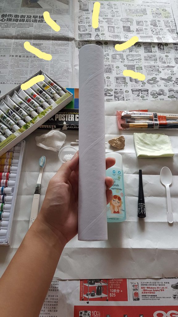
Image 2: Because I didn’t have a roller like the mono-printing post previously, I used a kitchen towel cardboard tube as a… low-budget roller. Hope that it works just as well.

I was very interested in knowing how each unconventional medium would react with the other. For instance, mixing acrylic paint with nail varnish / mixing watercolor paint with nail polish remover. Hoping that upon my experimentation I would discover a texture or pattern the 2 mediums could produce. Will they be miscible? Or no reaction will be observed?

20160821_154725
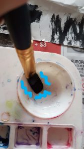
<< Image 3: I tried mixing watercolor paint with nail polish remover and to my surprise and excitement, the 2 mediums are not completely miscible! Black paint coagulations were found at the bottom of the palette.

20160821_154904
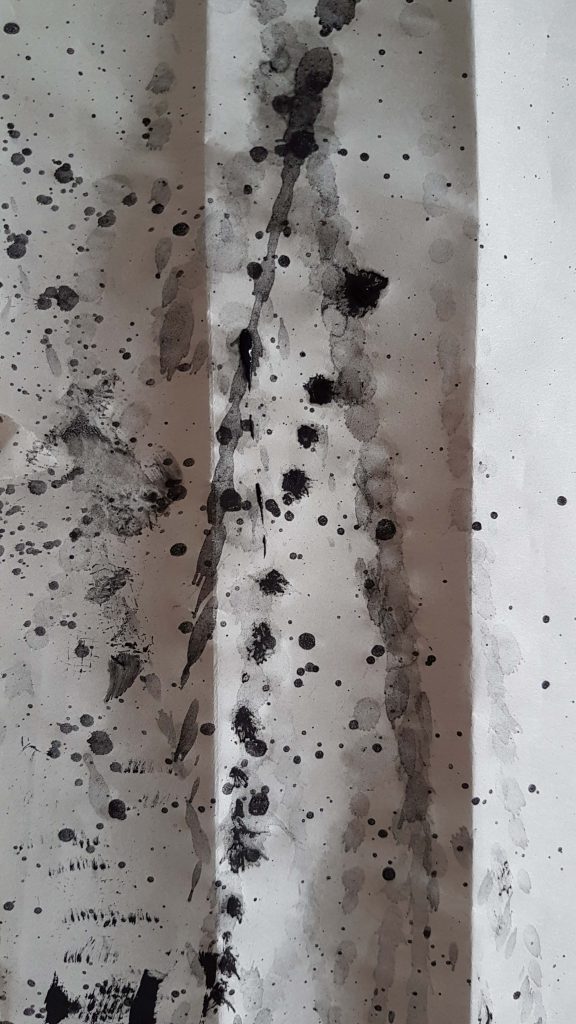
Image 4: After vigorously mixing the mediums in image 3, I swung my wet paintbrush onto the newsprint paper, creating far-ranged splatter patterns.

My first attempt at doing mark making without much visual aesthetic thoughts was considered pretty successful. I was intrigued at how far the splatter could go and the intensity of each splash as I channeled my inner Jackson Pollock. Soon I realized that this is a rather fun and cathartic activity!

I felt more carefree while being more bold in my strokes and actions (as I have already placed a lot of newspaper around me to prevent unwanted marks on my furniture at home) and I felt less restricted and more daring in my choice of mediums than before.

Then I went on to try out using nail varnish and nail polish remover!

20160821_155653Image 5: I cut open a tube of white nail varnish and poured it over the newsprint, and then adding a few drops of black nail varnish onto the white.


20160821_155855_020_01
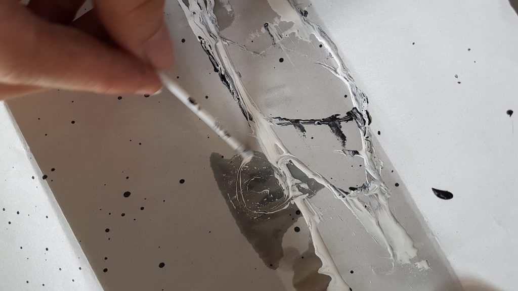
Image 6: I then used the plastic teaspoon to pour nail polish remover over the white nail varnish, and then using a Q-tip (with the cotton portion cut off) to swirl the mixture; creating another  pattern that is a result of 2 immiscible mediums!

Then I began trying out using a very fluid medium like black watercolor paint, and then using a straw to blow at the paint. Creating an unpredictable pattern that goes in different directions according to the dispersion of wind emitted from the straw.

blow art 
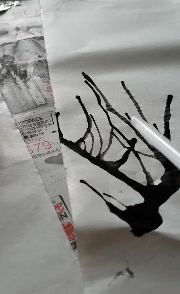
Image 7: Blowing air out from a straw onto an A2 newsprint with fluid black watercolor paint.

The distance of the paint travelled varies, depending on the amount of air I exhaled from my weak lung capacity. Distance of paint travelled decreases with time as the ink has already been spread, and I was very out of breath…yell

Then I was inspired to recreate an artwork I did as a child! The one whereby my kindergarten teacher gave us marbles coated with different colored paint, and a clean A4 sized paper in a paper box cover. She told us to place the marbles in the box cover with the paper and shake it. Resulting an unpredicted abstract pattern created by the colored marbles rolling in the box!

20160821_163503
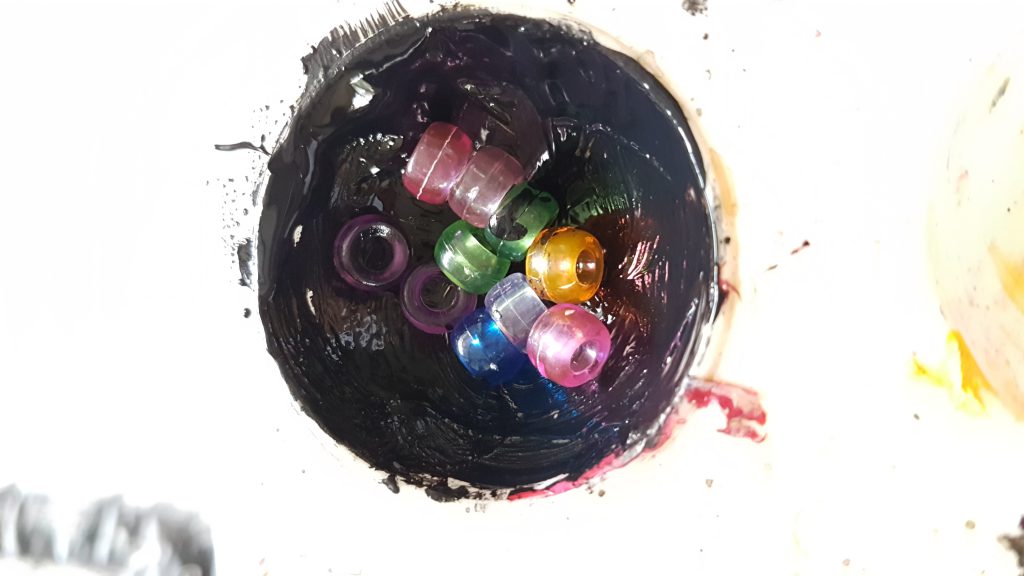
Image 8: I didn’t have marbles so I used beads and coated them in dense poster color paint.rolling
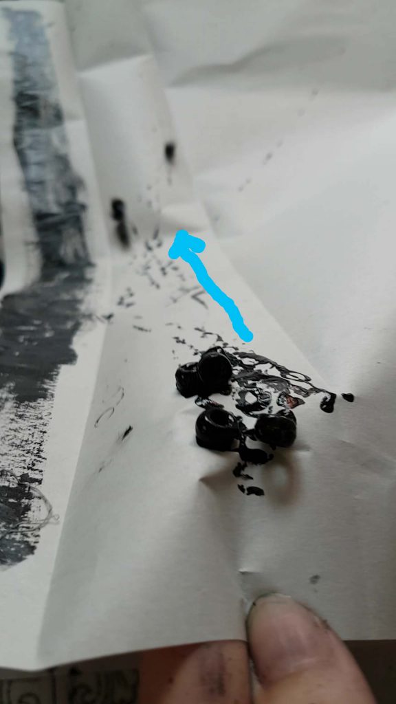
Image 9:  I tilted the paper in an angle and allowed the beads to roll downwards, creating a linear rolling pattern that goes in different direction.

Afterwards I tried to recreate what I have learnt in mono-printing class, but didn’t do so well as my choice of medium was not thick enough.

20160821_16424420160821_164305 


Image 10 and 11: I resulted in painting one size of my scrunched up aluminum foil and then rolling it across the newsprint paper with my kitchen towel cardboard tube. 

20160821_161744
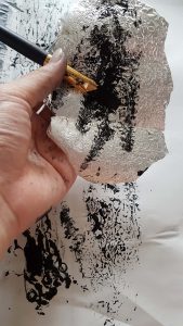
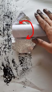
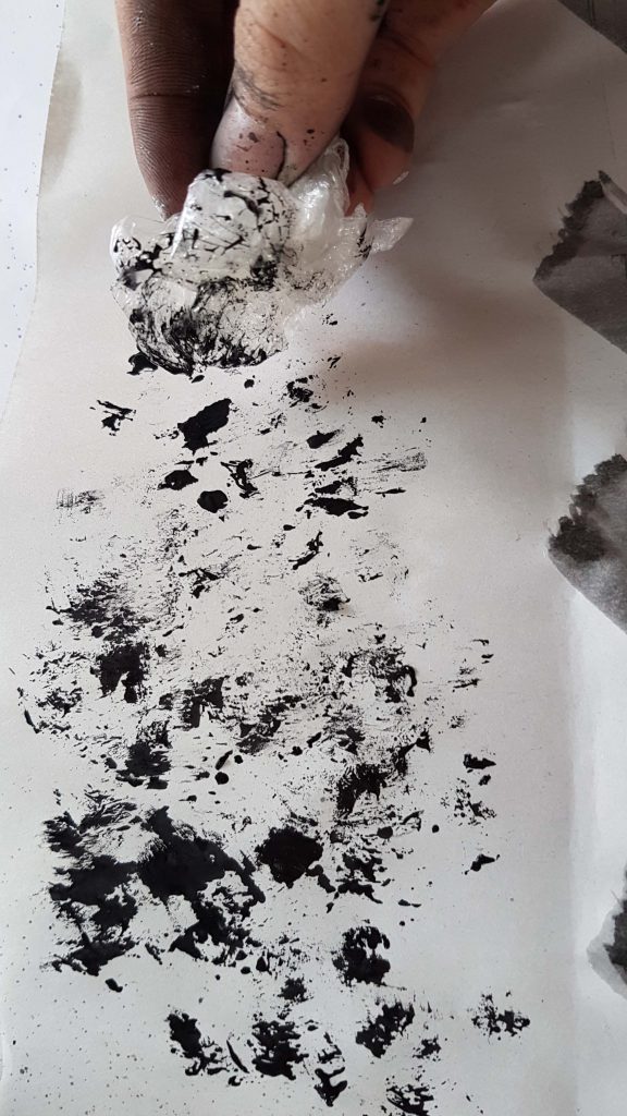
Image 12: I also used a scrunched up cling wrap dipped in paint to dab it all over my newsprint. Creating a blotchy and detailed patterns as the pain began to dry a little.

20160821_161434
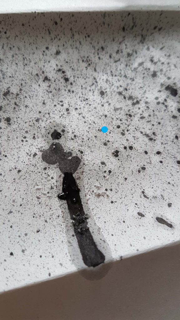
Image 13: Incorporating a tooth brush, I created tiny splattered patterns . The blotchy watercolor paint drip was created by accident. So I decided to add some salt crystals onto it, hoping to achieve a water color to gather the water pigments. But the experimentation has failed as the paper absorbed the water color more efficiently than the salt could.

These are just some of the mark making process I have documented! In conclusion for my first self exploration of mono-printing, I think the results were rather successful ! Though I took videos of how the process of each mark making attempt was done, sadly, I couldn’t upload the video as the file is too big and the format of the video is incompatible. 🙁

But still! The results of the final products were rather fine and I liked how each mark has its own feeling and different textures and patterns to it. :)4

Until next time~

Cheers,

Yi Ling.