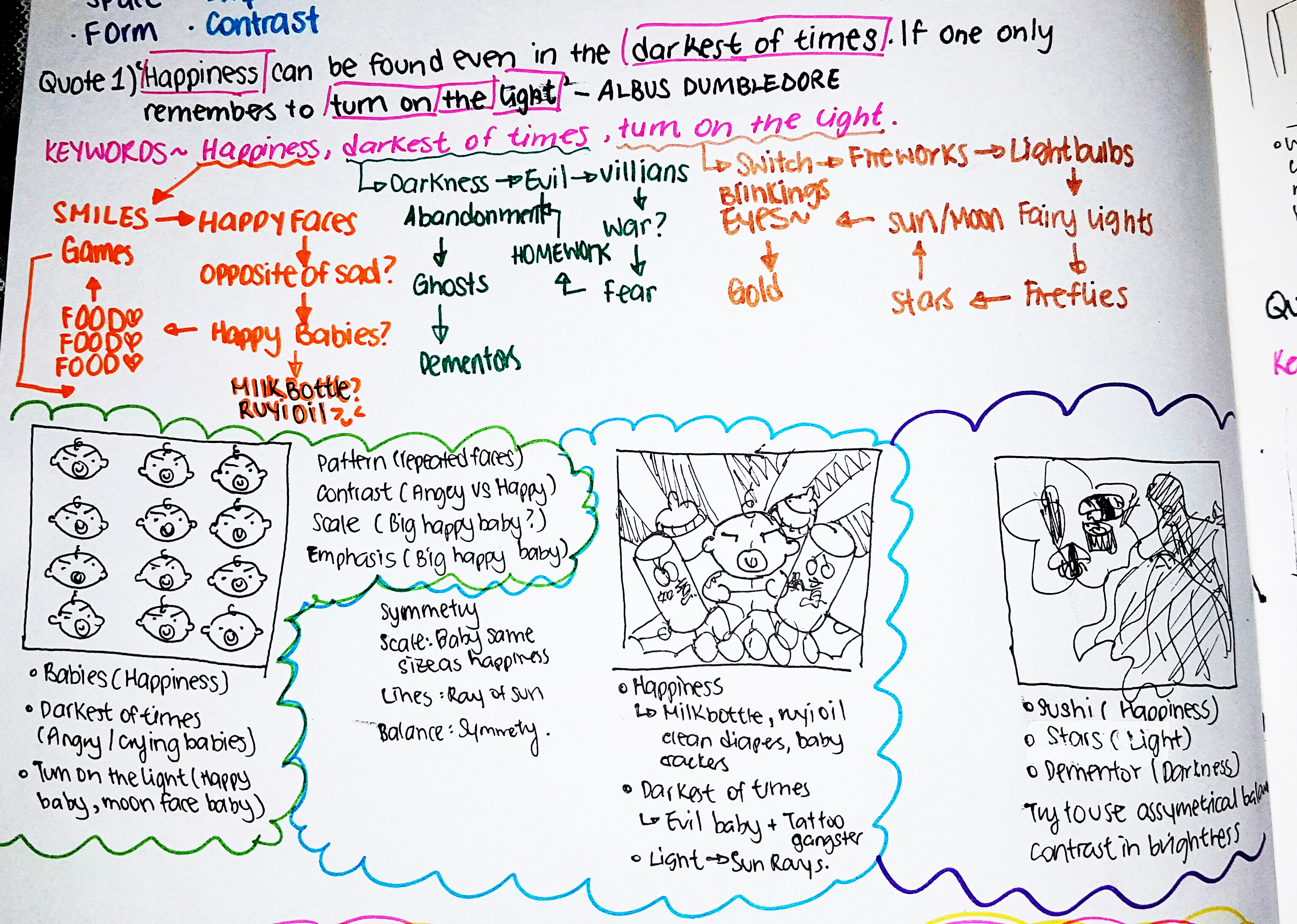
Methodology
My approach to Project 2 was to breakdown the quotes into keywords, and then branch out from the keywords to get inspirations as to what my possible choice of subjects can be used to represent my quotes without being too literal! 🙂
The final words I have decided to use to represent the key words are usually what I belive in or what I prefer to. For instance, I love “babies”. HENCE, “babies” would mean “Happiness” to me.
You can see the thought process in the following attached image of my 2D Sketchbook! ^-^
My objective in this assignment
In the following works, my unanimous goal is to make the quotes as non literal as I can by inserting dark humor, playing around with scale and involve the use of Dadaism to make the final pieces as surreal as I can. At the same time reinterpreting the quotes in my own perspective and exploring my choice of subjects.
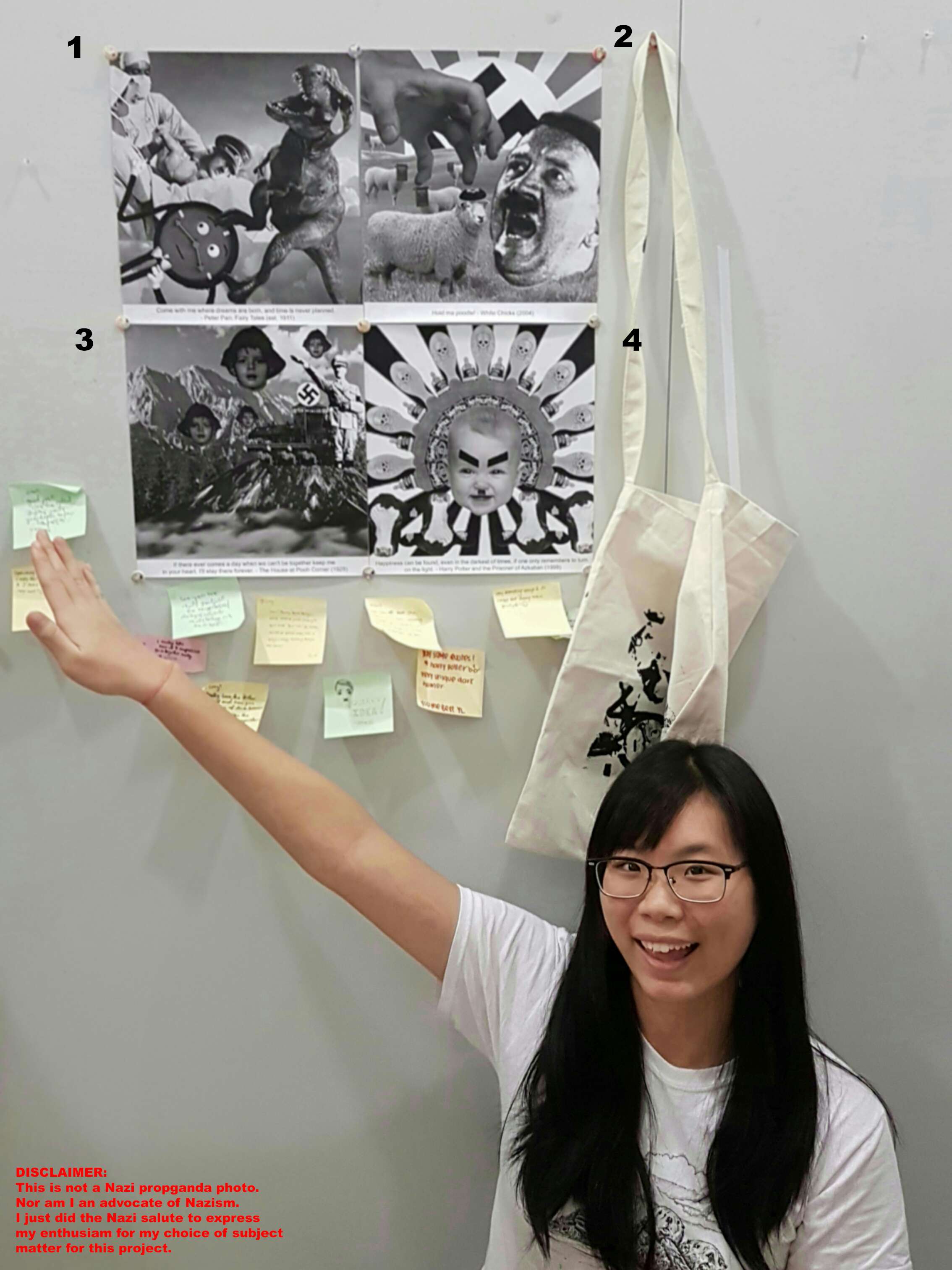
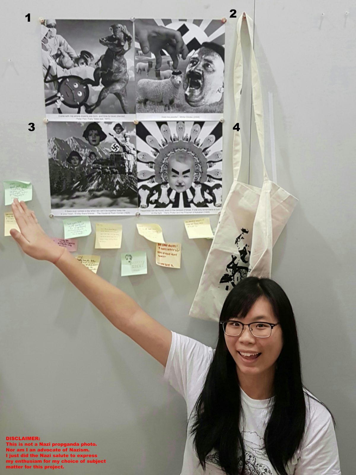
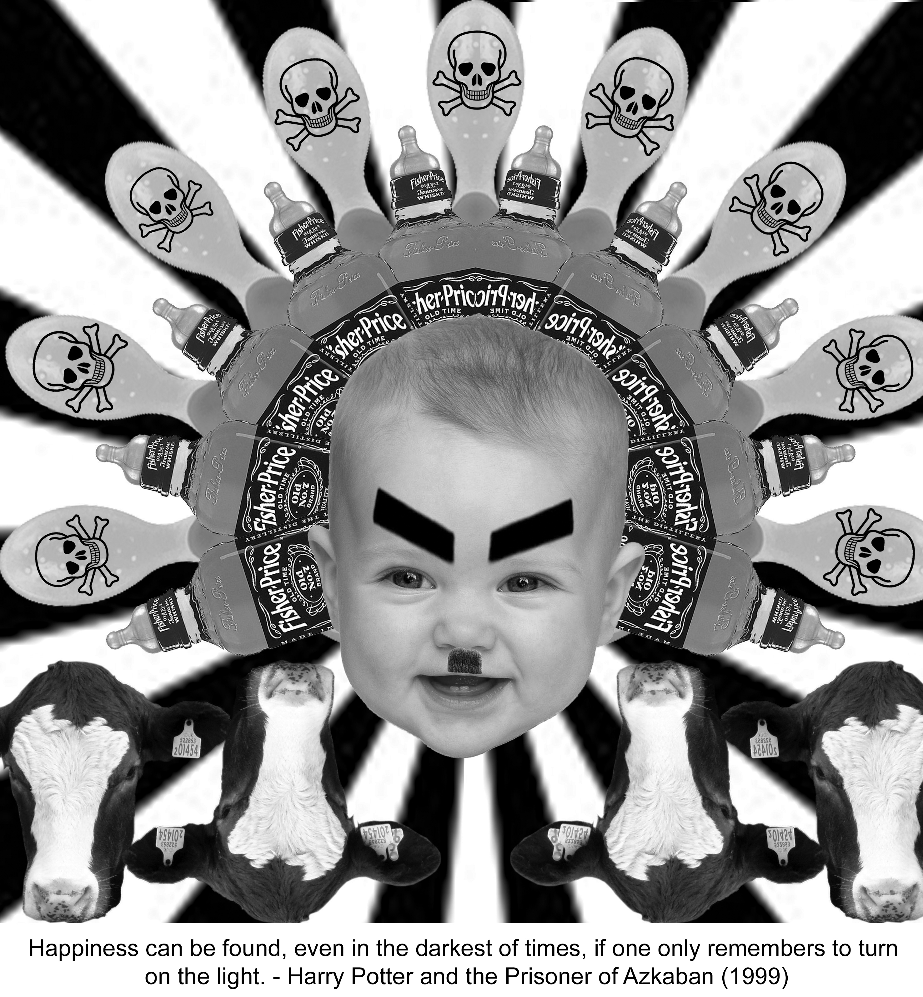
Quote 1) “Happiness can be found, even in the darkest of times, if one only remembers to turn on the light.”
Keywords:
Happiness -> babies , things that make babies happy
Darkest of times -> evil Hitler baby , poison
Turn on the light -> Sun
Principles of elements and design: Lines, Repetition and Symmetrical Balance.
LINES from the sun rays in the background creates a radiating effect from the center of the image, to create a form of radial symmetry.
REPETITION of the items (bottles, spoons, cows etc.) in a spread out manner, using the rays of sun as guideline creates a sense of SYMMETRICAL BALANCE as the Baby Hitler acts as the central axis of this symmetry.
My Interpretation: Baby Hitler’s death could have been easily staged earlier to prevent a chaos, by poisoning (hence the poison sign on the spoons) the things baby Hitler would have loved. Such as adding alcohol to his milk, feeding poison to him in his baby food. Hence, Hitler’s death is a form of happiness to his victims.
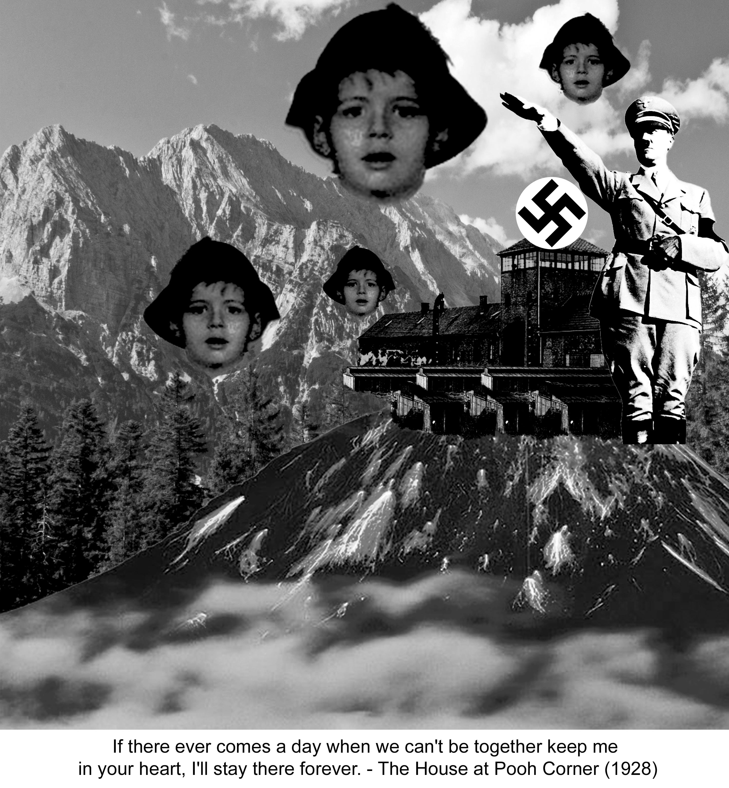
Quote 2) “If there ever comes a day when we can’t be together keep me in your heart, I’ll stay there forever.”
Keywords
Can’t be together-> distance and separation
Heart -> warmth in cold , maternal love, child
Stay there forever-> longing
Principles of elements and design: Scale, Repetition and Lines.
REPETITION of Jewish boy’s head in varying SCALE. There is slight use of implied lines created by the direction at which Hitler’s salute is directing our eyes to : Boy’s head.
My interpretation: This quote can be used in the situation where the Jewish mother is going to be executed while her son is being sent off to the concentration camps during the Holocaust. The use of the Jewish boy’s head in the background is to represent that, although he is held captive in the camp, his mind and spirit is elsewhere and not brainwashed by Hitler’s idealogy .
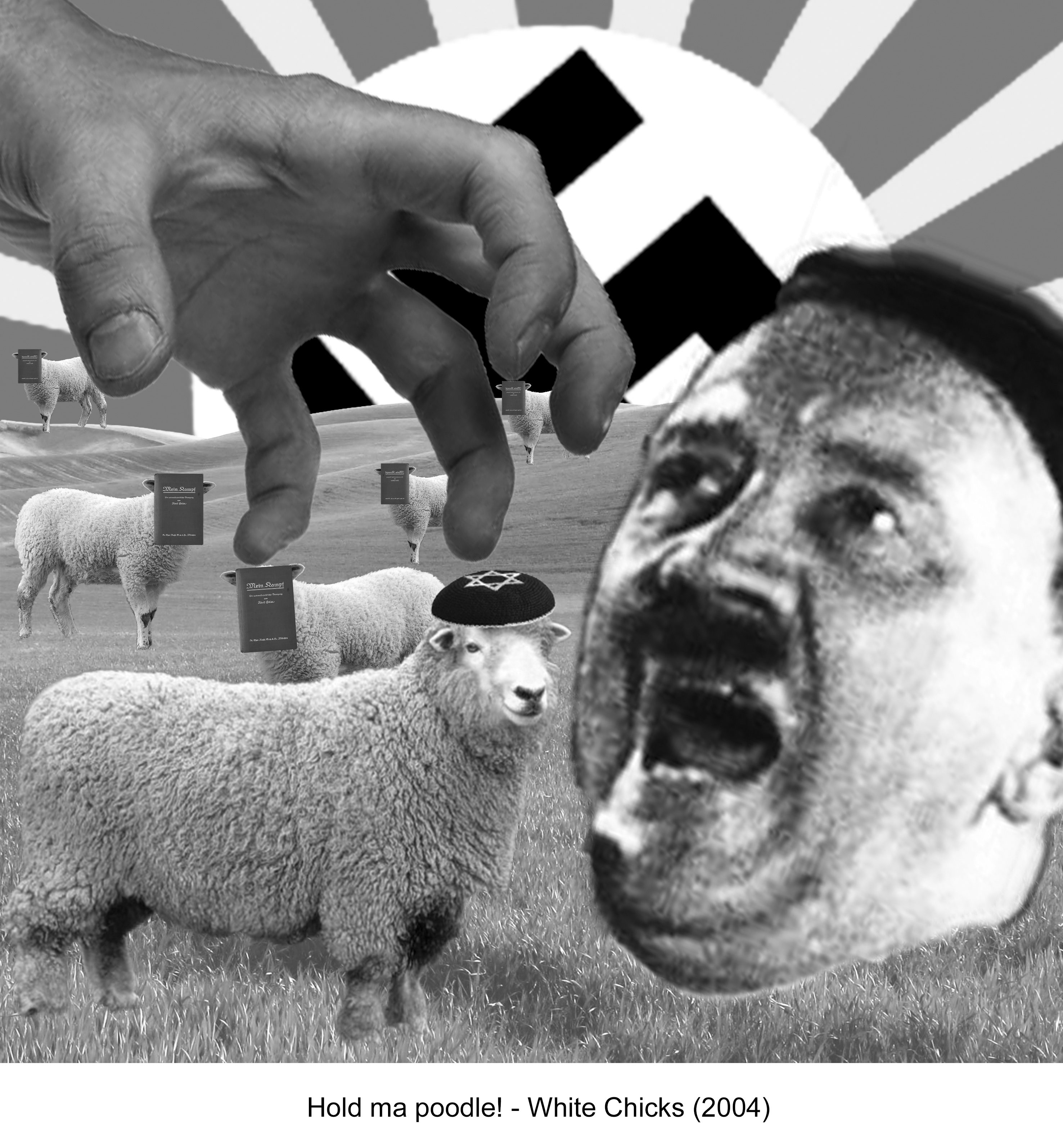
Quote 3) “Hold Ma Poodle!”
Keywords:
Hold->grabbing
Poodle-> fluffy ->Sheeps
Since this quote had lesser keywords, I got feelings emulated in this quote instead, which is Agression.
Principles of elements and design: Scale, Repetition and Balance.
REPETITION of sheep with Mein Kampf books on their faces. SCALE of hand and Hitler’s face is much larger than the sheep. ASSYMETRICAL BALANCE is attempted as I tried to balance the visual weight of Hitler’s head on the right with the hand and Jewish Sheep on the left.
My interpretation: Mein Kampf is an autobiography by the National Socialist leader Adolf Hitler, in which he outlines his political ideology and future plans for Germany. And I pasted the book all over the sheeps’ face as I wanted to imply that the innocent sheep in the meadow were being brainwashed by Hitler’s ideologies. The sheep in the foreground is the only one without the Mein Kampf book as a face, instead it has a Kippah (Jewish cap), a representation that the innocent sheep is a Jew.
The hand is about to grab the Jewish sheep to be fed into Hitler’s mouth, a metaphor for the sheep that is about to be killed by Hitler, or brainwashed to be like the rest of the sheep. The aggression of the quote is carried out into action in this image.
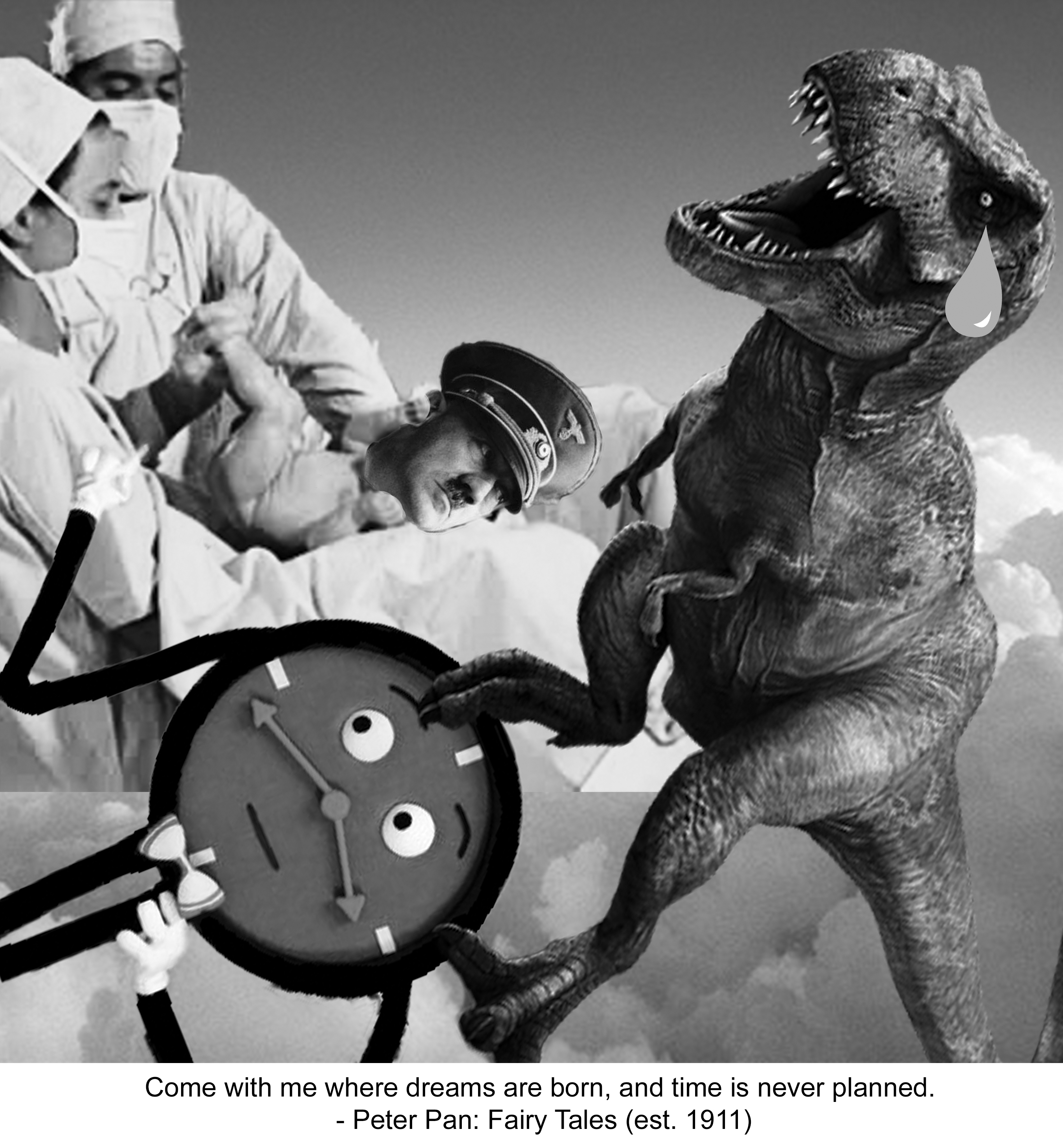
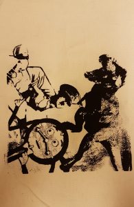
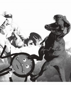
Quote 4) “Come with me where dreams are born, and time is never planned.”
Keywords:
Dreams->Clouds, Hitler
Born -> Giving Birth -> Beginning of time -> Dinosaur
Time-> Clock
Never planned ->Unexpectedness -> Impromptu birth?
Principles of elements and design: Scale, Repetition and Balance.
SCALE of Doctors against the Dinosaur. ASSYMETRICAL BALANCE is attempted as I tried to balance the visual weight of Dinosaur on the right with the doctors and clock on the left.
My interpretation: The dinosaur ( beginning of time = to imply birth of Hitler was a long time ago) gave birth to baby Hitler, not knowing that it also gave birth to “Time” unexpectedly. “Time” is the antagonist from the mini web series: Don’t hug me I’m scared, on YouTube. Hence, implying that the birth of Hitler long time ago was the unexpected birth of an antagonist.
After looking at my concepts and final images, I decide to rearrange the sequence of my quotes. After looking through my final pieces, I felt that the images kind of convey a sequential story of the Hitler I portrayed.
Sequence is as followed.
Birth of Hitler > Rise of Nazism and mass murder/ conversion of Jews> Jews kept in concentration camps > How Hitler’s act of terror could have been prevented by an early death.
My Inspirations
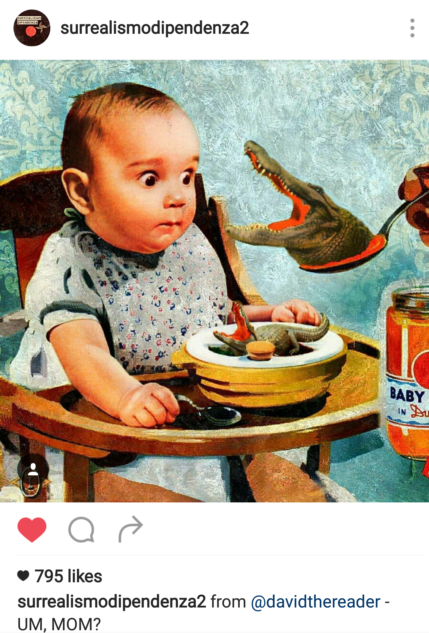
- I followed an Instagram account which posted a variety of creations by surrealistic artists, which gave me ideas on the choice of subjects and how I might want to compile the images together.
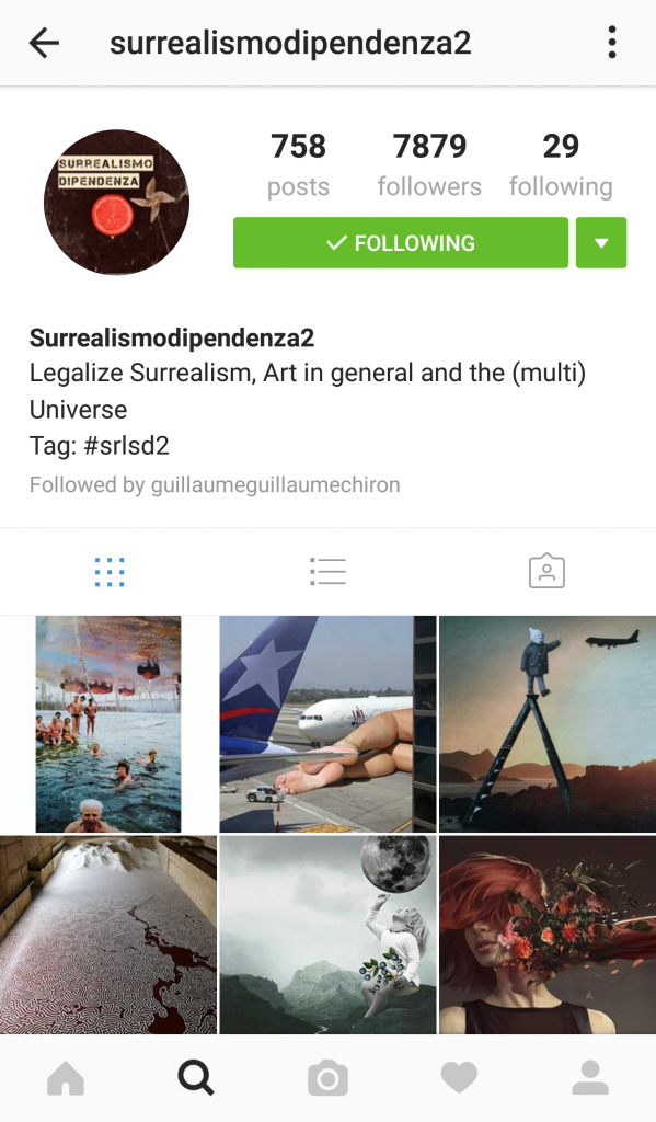
Instagram account where I drew my surrealism inspiration and ideas from.
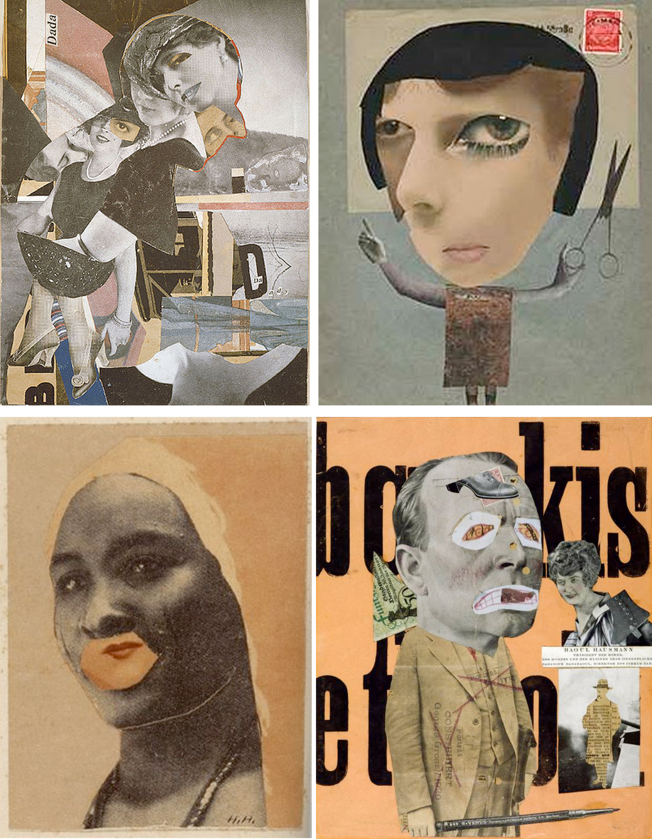
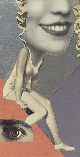
- I also used photo collage most of the time, inspired by Hannah Hoch’s photo collaging and John Hartfield’s form of photo montage. (link to my research on both artists : https://oss.adm.ntu.edu.sg/yseng001/2d-project-2-for…rch-17-sept-2016/ )
- I was truly enamored by Eugenia Loli ‘s compositions as she is very creative and imaginative in how she placed her subject matters and objects. Her compositions spurred me to be more imaginative and look at everyday objects differently.
Inner struggles through Project 2:
- I had a hard time finding images I sought for which are in high quality 300dpi. The use of Adobe Photoshop and Adobe Illustrator was a huge headache for me when I first started as I had to learn from trial and error on how to configure the programs. The frequency of bitmap and tonal contrast was difficult to grasp as well as I was not sure how my design will look like upon silk screening. Sadly, in the end the design on my tote bag was not very well produced as I expected it to.:(
- I really disliked how much water was wasted in the process of silk screen washing 🙁
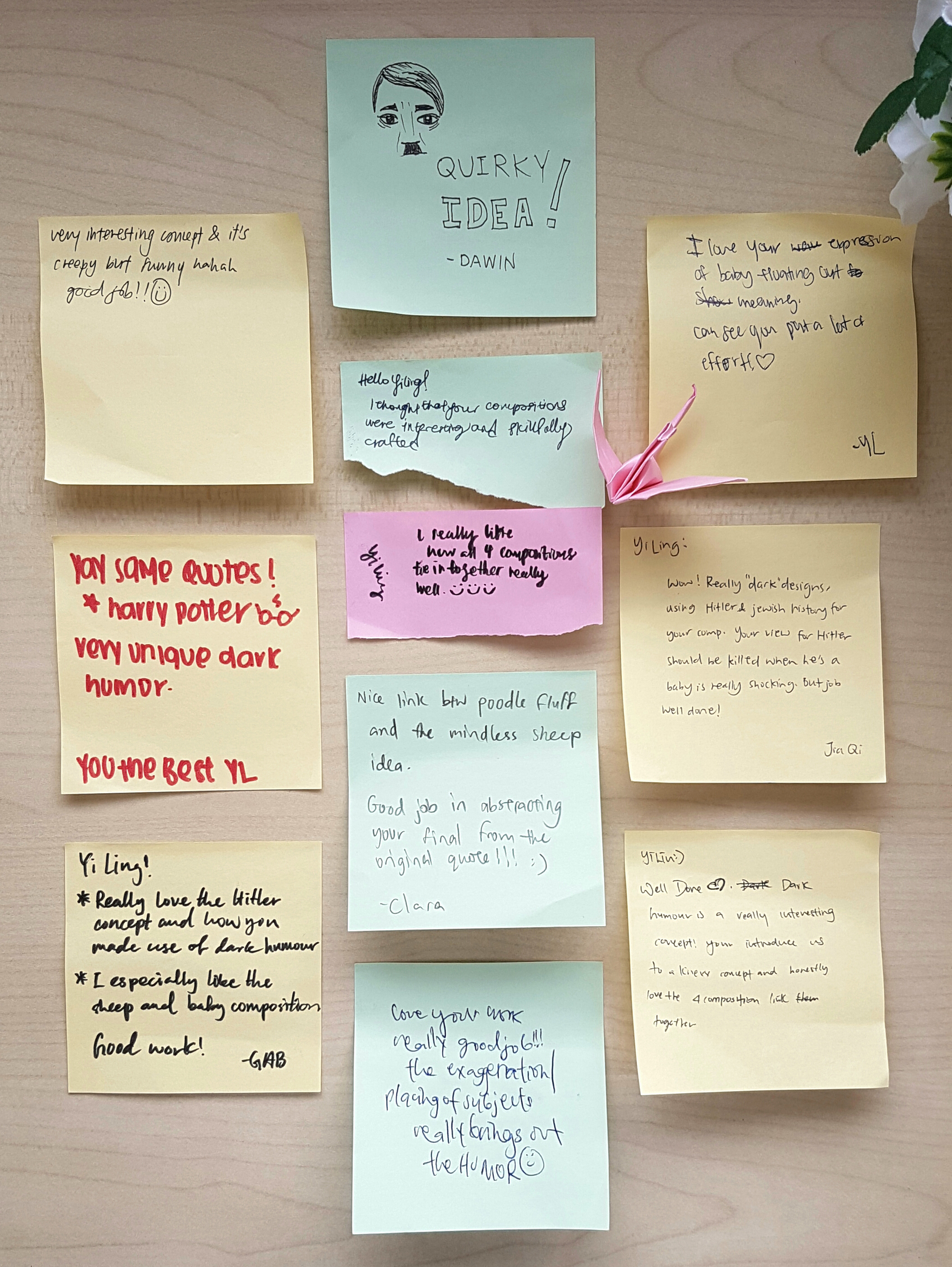
Presentation Day Comments!
Ms. Joy’s comment/feedback:
I cant remember 100% of what Ms. Joy said, but the gist of the good things she said about my Project 2 was that she liked how I used the elements and principles of design in my work to direct the viewer’s attention to areas I wanted to focus on, and the use of dark humor with the reoccurring motif of Hitler in my various warm and fuzzy quotes were well played.
Whereas things to improve on is that the 2nd composition was a rather confusing as the visual weight of the hand and Hitler’s head are very similar, hence it was rather confusing if the hand was grabbing Hitler or the Jewish sheep as, Hitler’s facial expression looked scared. Joy also suggested that maybe averting the gaze of Hitler could assist in my composition to make Hitler look less afraid of the hand. 🙂
Regarding my silkscreened tote bag, we both agreed that the silkscreen pay off was not that good and that perhaps in the future I can have more opportunity to silkscreen again, and perhaps exposing my screen for a longer time will result in a better print! 😀
Thank you Ms. Joy and my lovely classmates for your feedback and comments!! To be honest, my favorite part for presentation day is getting the post-it notes from my classmates, and obtaining feedback. For some unknown reason it makes me feel very excited! ^0^
Nonetheless, I had a really great experience with this project as I managed to use the principals of elements and design to create the design I wanted and then having to print them onto a tote bag! Having my design to be printed onto a product gave me a sense of achievement and a more tangible feeling of being a real designer.
Cheers!
Seng Yi Ling


 )! But in all honesty, I was rather upset at the amount of water wasted in this process of washing… considering that all of the students in ADM Year 1 had to do this, it is bad for the environment by wasting so much water. :'(
 <<<Original digital design after bitmap


 )
)


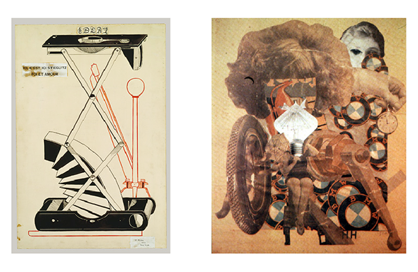

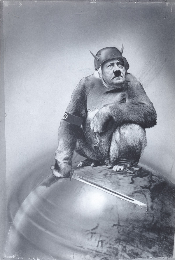
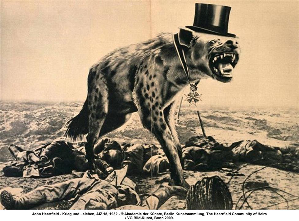 Heartfield’s strongest work used variations of scale and stark juxtapositions to activate his already gruesome photo-fragments. The result could have a frightening visual impact.
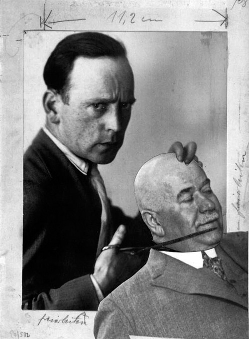
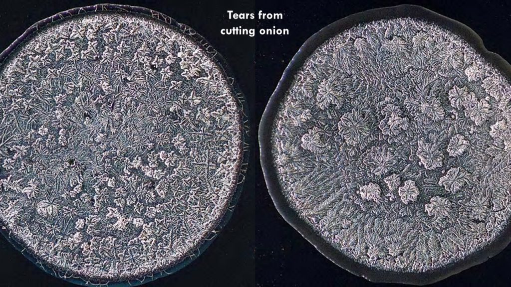
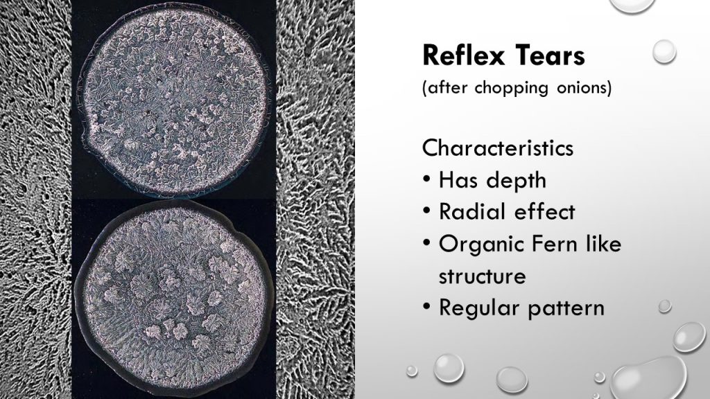
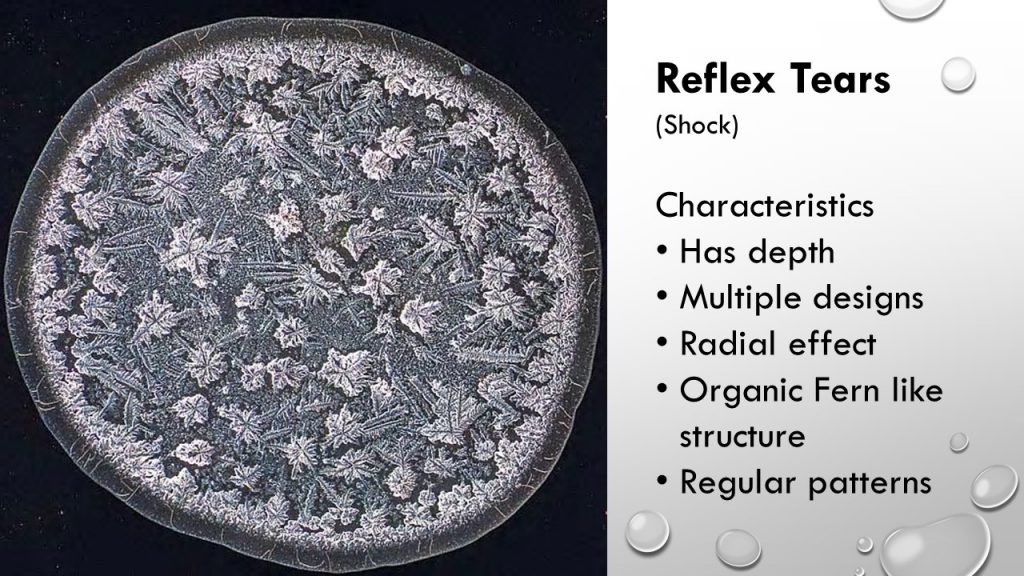
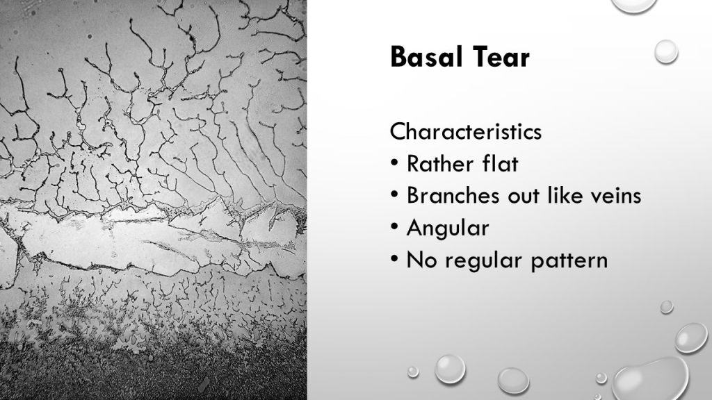
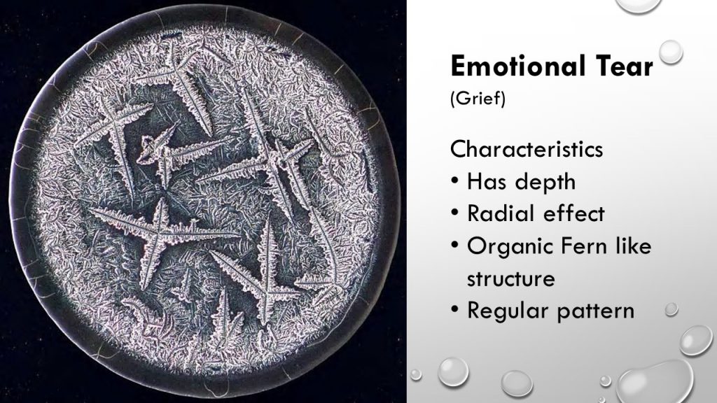
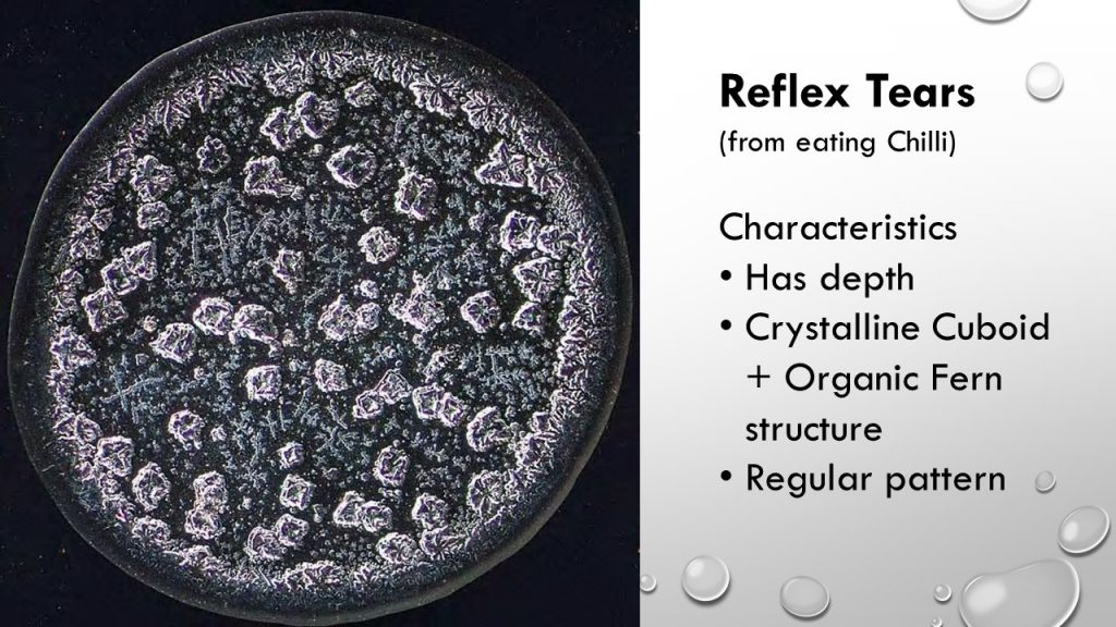
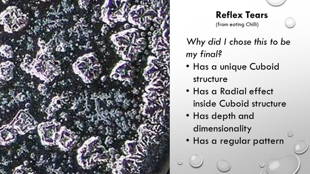
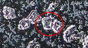
 And the video which failed to play during presentation entails the tear extraction process by the creator of these SEM and how the crystallization is formed: