BRIEF 4: PERSONAL CREATION
| Brief 4 |
PERSONAL CREATION: Creating expressive typography |
| Summary |
The final component of the module allows you the freedom to expand on any of the assignments to date. Choose from one of the following briefs. Other ideas of creating your own briefs are also welcomed. All briefs below are flexible but please discuss with instructor for approval.
A. Visual analysis of type anatomy
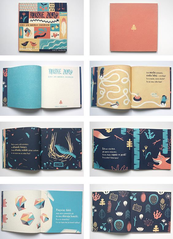
Select an alphabet and analyse its anatomy in a visually exciting way with at least 20 different typefaces. Compile your visual analysis into a book form.
B. Exploring vernacular type
Expanding on your vernacular type assignment or creating a new idea scratch. Develop an extensive visual collection. This collection should include original imagery and also digital manipulations of the letterform. Compile your outcome into a book form or other tangible formats.
C. Organic type creation
Expanding on your organic type assignment or create a new idea from scratch. Develop an in-depth and innovative method of creating your own organic type. Compile your outcome into a tangible format.
D. Type as pattern
Design a range of patterns using typography and deliver them as creative tangible output. Keep in mind that this should not be a repetition of your assignment but to create an innovative way of looking at type as pattern.
E. Type as image
Using various letterforms, create a series of imagery. Conceptualize a theme to tie all your imagery together and present them in a tangible format. Keep in mind that this is not a repetition of your assignment but an opportunity to create innovative ways of creating images from typography.
F. Type as narrative
Select a poem or a song lyric and express them in black and white using only type over a 32-44 pages book format.
G. Open brief
Think about which of the assignment you enjoyed most and how you can further expand on the making of it. Please discuss for approval. |
| Tips |
Employ typographical skills and knowledge gained over the last couple of weeks for the project. Be playful, have fun and justify your decisions! |
What you
must deliver
for this assignment |
- You are free to decide on the final outcome of your creation but ideally no smaller than a dimension of 18cm by 18cm.
- A process documentation link on OSS or PDF process
|
| Grading criteria |
- Creativity of concept
- Presence of typography appreciation (any form/method)
- Depth of methodology
- Aesthetics and craftsmanship
- Due diligence of experimentation
|
| Due date: |
Week 14 |
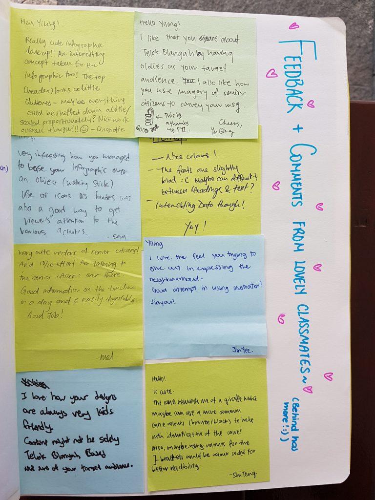
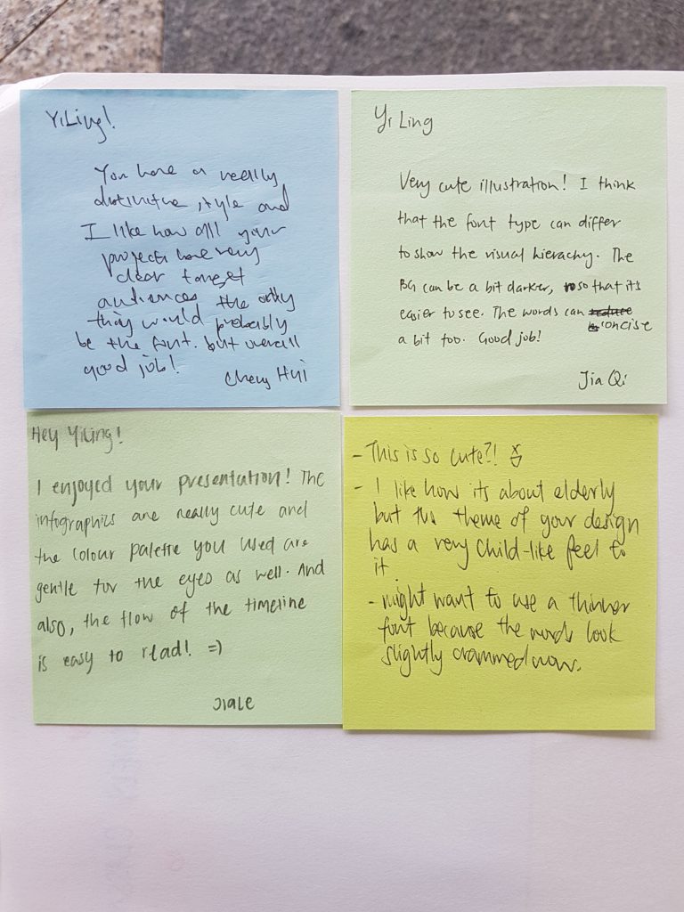
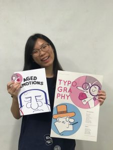
I am pretty keen to choose ‘E. Type as image’ as the choice of my expansion.
Documentation Journey for Assignment 4
16th October 2017 (Week 9/Week 14)
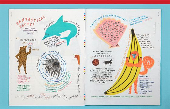
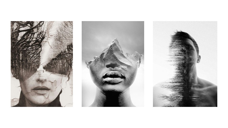
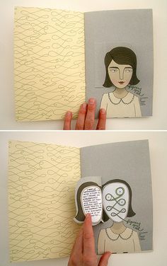
I would like to use alphabets of a particular typeface to make portraits of people. I was scrolling through my Pinterest feeds and saw many of these hand drawn portraits.

Looking at individual subject figures, my eyes tend to narrow their head, features into geometric shapes. That made me wonder if typefaces and letters can be used to make portraits.
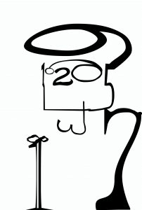 I did up a try-out to see if the idea was feasible. I used the numbers 1 to 10 to create an image of an old man; I manipulated the numbers by playing with the vectors to create certain features, for instance, the foot of 7 to be the foot of the old man, and the curve to be his back.
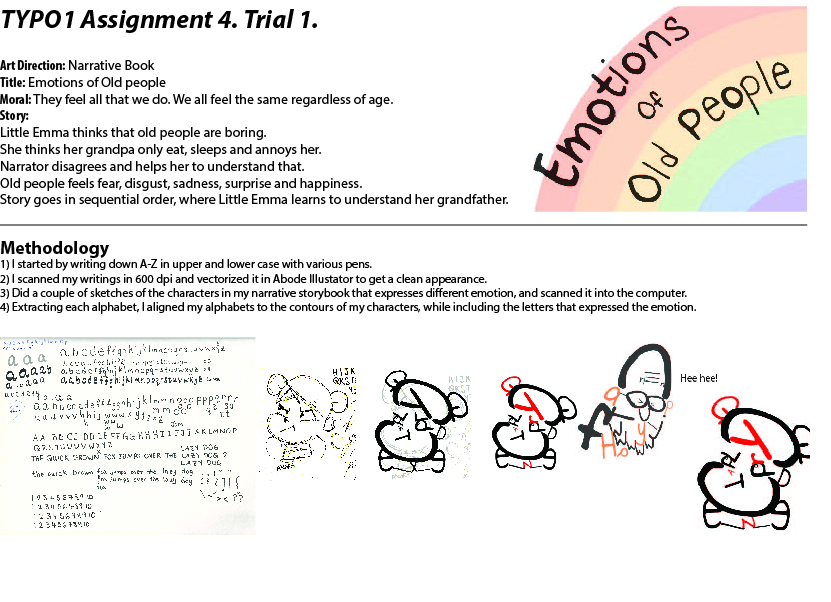
Hence, I gave my own handwriting a try to create characters and see how it goes. I had the idea to create emotions of Old People with the letters of the emotion. For instance, the word ‘Happy’ to create a happy elderly.
 I shall pitch this idea and see how it goes! 🙂
23th October 2017 (Week 10/Week 14)
Pitched previous week’s idea during group consultation and received many feedbacks! One of the feedbacks given was to leave the narratives out as layout and choice of type for story would be more difficult to tackle alongside with my characters.
A lot of reconsideration had to be done and a different approach was suggested if I were to carry on with this idea. Hence, I decided to give this idea another go and think of a backup plan if Type as Image wouldn’t do.
 I pitched my idea to Miss Angeline via email and she finds both ideas to be workable, and gave comments too! Yay! 🙂 But now I am in a dilemma because I want to go ahead with both ideas.
Hence, as of now, my plan is to fuse both ideas together. But I can’t seem to churn out a platform which both ideas can reside on… Perhaps a book about old people on Christmas day? :/ I’ll just go ahead with a few motifs and see it goes from there! 🙂
30th October 2017 (Week 11/Week 14)
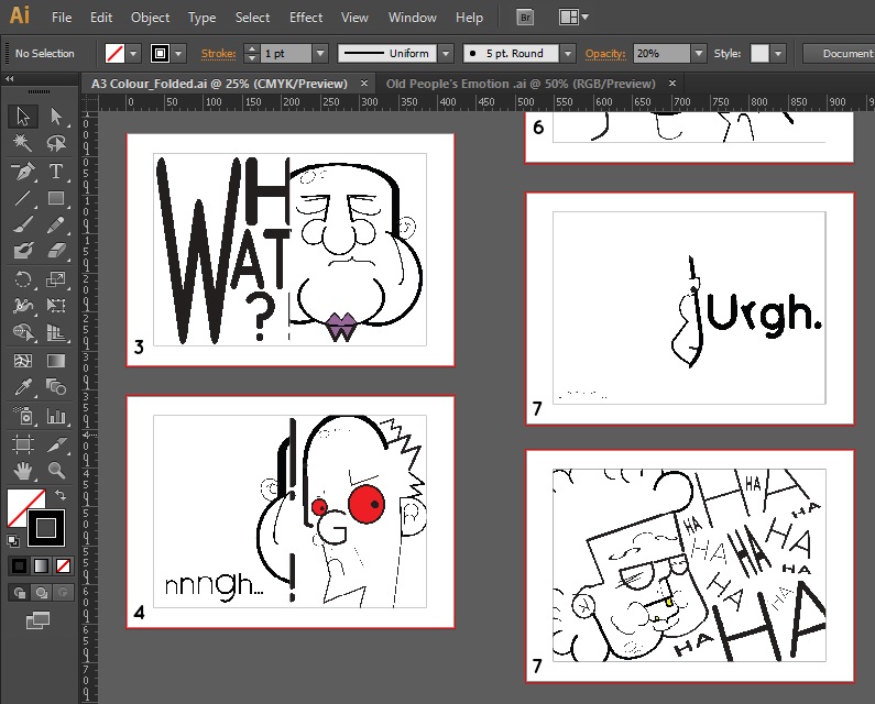
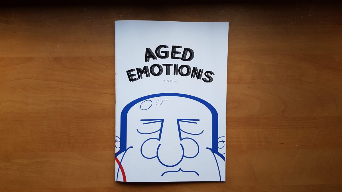
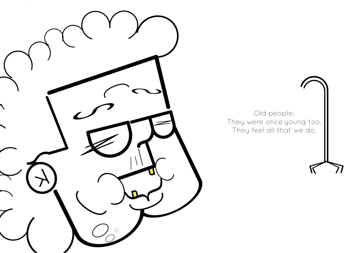
So in the end I decided to push forth with my Old people’s emotion idea and I created many more other old people portraits that illustrates different emotions.
In addition, I thought that having it in total black and white may be too flat and boring. Hence I added a color to each portrait to give it some life, while not taking away the attention from using type as image.

Emotion: Happy. The color Yellow is placed at her teeth. This is the ending page. Hence I wanted to end off the book with a message as written on the right.
I did a test print to show a prototype to Miss Angeline for consultation, and I already found lots of issues.
- Alignment of the pages on InDesign is rather complicated. Pages and Spreads ought to be odd an even numbers.
- Alignment of image. Margins. Gutter. etc.
- Alignment of different images on the same spread…

Oh well, at least I know about these issues BEFORE the actual printing day.
Upon consulting Miss Angeline with the prototype, these are the feedbacks and thoughts given to improve! 🙂
- Likes the layout where there is space on one side.
- Not so keen in seeing if can the emotion, but more keen in the typeface to create image.
- Like how it flows to the next page.
- Empty pages for? Can use blank space to write what letter you used? Or something fun the characters would say? Can use lesser words to prevent issues of long sentences type setting. Use something short. Or sound expression: ‘Huh? Hmm! Aiya… OI’. Start with the same typeface first just to play safe. Add colors and vary scale.
- Type Setting. Centralized? Too big? Too small? Little space? Leading? Kerning? Margin? Next one is centralized or at the side?
- Change size to A3. A4 is too small. Not 18×18.
- Title page? Can keep things simple. Emotions with Type, Type with emotions.
- Have 10 faces? 6 too little.
- What kind of paper?
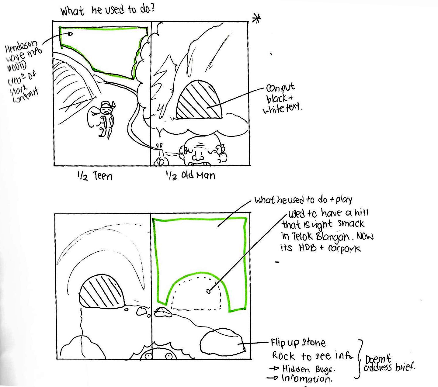
- *How would you take it out of the book? Transfer it to a huge poster? Promoting for some Elder’s convention or event; type 1 class promotion etc. Choose 2 very good ones and transfer it to an A2 poster.
8th November 2017 (Week 12/Week 14)
So based on last week’s feedback, I made some changes and additional information to make the book more wholesome. I included more faces and additional texts with the portraits!
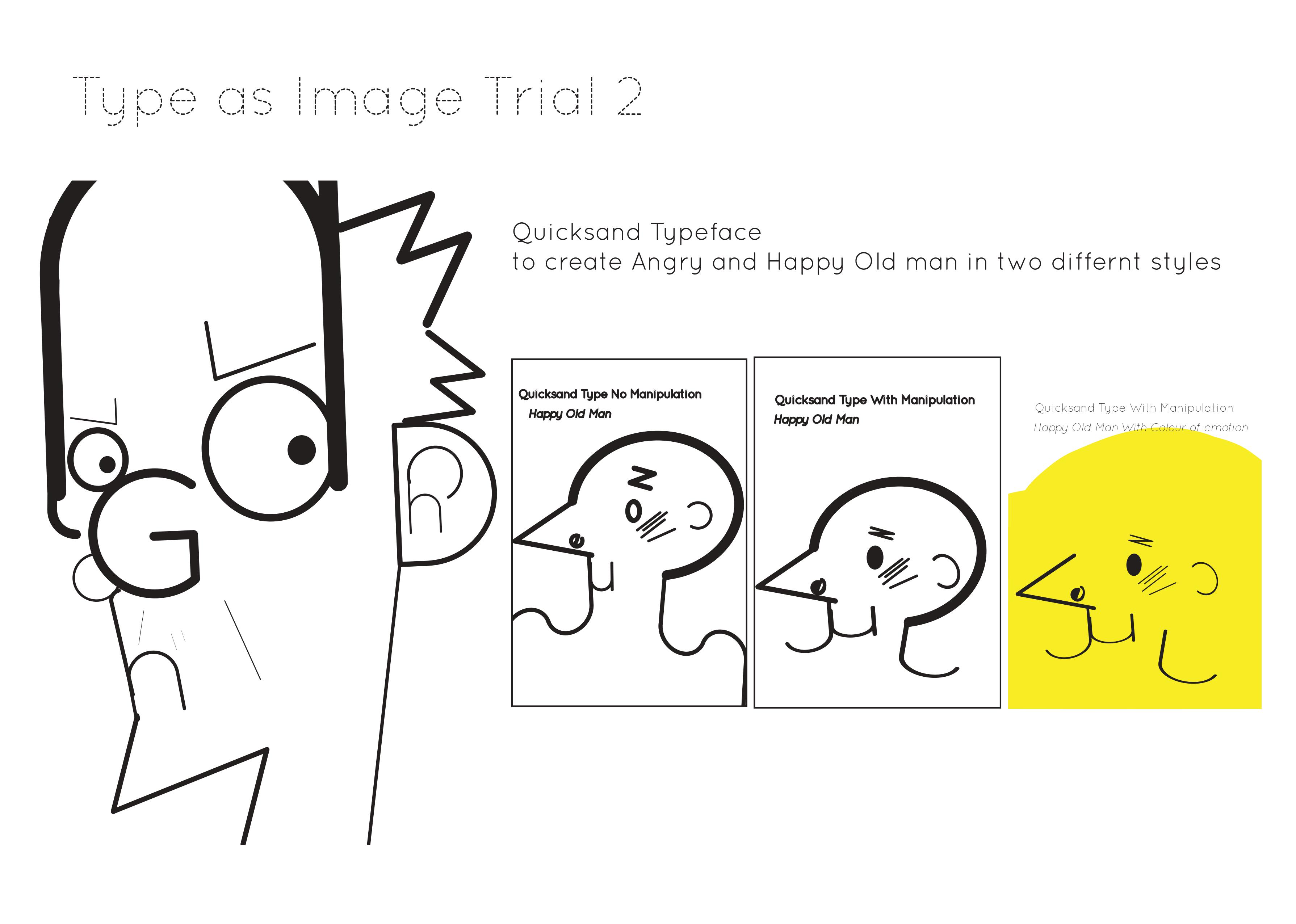
The texts used is the typeface, Quicksand. The texts are words or sounds I felt that the faces were expressing. Using the previous project’s brief on type as emotion, I manipulated the texts, and arranged it in a way that best expresses the emotion when reading.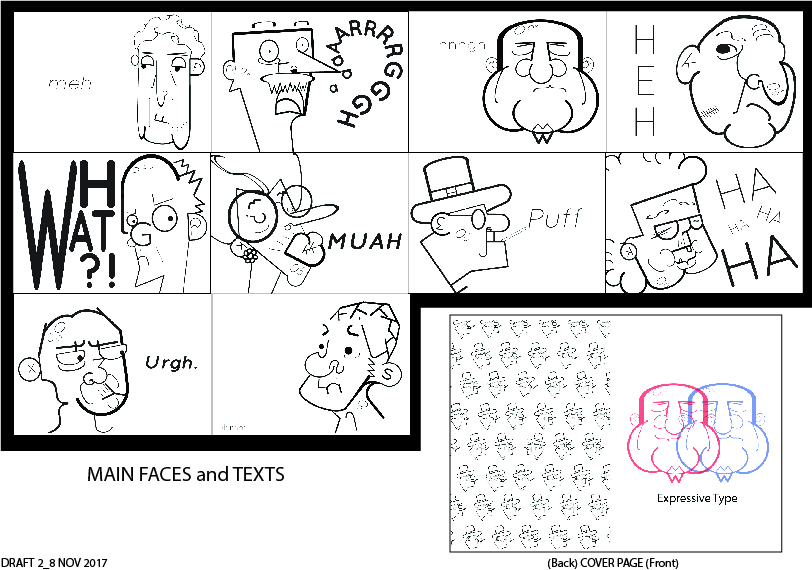 Feedbacks and Things to change:
- Back and front cover can be the faces back and front. Happy and Sad man.
- Images are fine, but type needs working. Use the first angry man as a model template.
- Some spaces can be filled, some can be not filled. ‘Meh’ can be more impactful. Bigger Type face, bolder, lighter etc.
- See the texts first then see the expression. That is the effect you would want to achieve.
- ‘Urgh’ can fill up the whole space.
- Title is very boring. Emotions of the elderly etc. Layout is dependent on the
- Repeating pattern doesn’t work.
- Questioning of choices of type size, layout and category must be explained.
Hopefully I can print this mock up before next week’s consultation and that everything will run smoothly! 🙂
11th November 2017 (Week 12/Week 14)
I have finally experienced the pain and stress that my peers were always lamenting about regarding printing day…
For some reason, I have been troubleshooting the issue from InDesign for several hours and I cannot solve the issue when the program cannot save my document in PDF for Booklet. The pages are always a spread instead of the chopped pages.
Hence, these are the solutions I have come up with to counter these problems.
- Manually cut the pages so that the booklet form can be saddle stitched.
- Change the binding technique to those that don’t require folding of pages.
Types of binding to explore

Types of binding
Type of Book Binding I may look into with regards to the spreads
- Perfect Bind (Still in booklet form but in 2 stacks)
- Perfect bind (Pages don’t have to be split, Glue sides to spine)
- Plastic Grip (Pages don’t have to be split, but double side printing. Bind with paper clip)
- Hole Punch ( Pages don’t have to be split, need side border for hole . Use ring to bind)
Trying Solution 1: 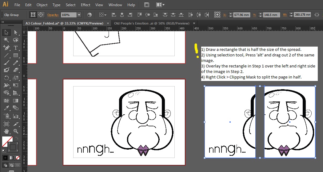 ***Note to future self: ALWAYS DO A MOCK UP WITH RECYCLED PAPER FIRST TO KNOW IF U GOT THE RIGHT NUMBER OF PAPER AND WHICH SIDE OF THE PAPER IS WHICH PAGE!!!
Start Piecing the half images together using the mockup as a guide, while labeling to make your life easier.
YAY I AM OFF TO PRINT THE MOCKUPS.
12th November 2017 (Week 12/Week 14)
So… I printed the mock up for the designs yesterday and of course, issues are bound to arise.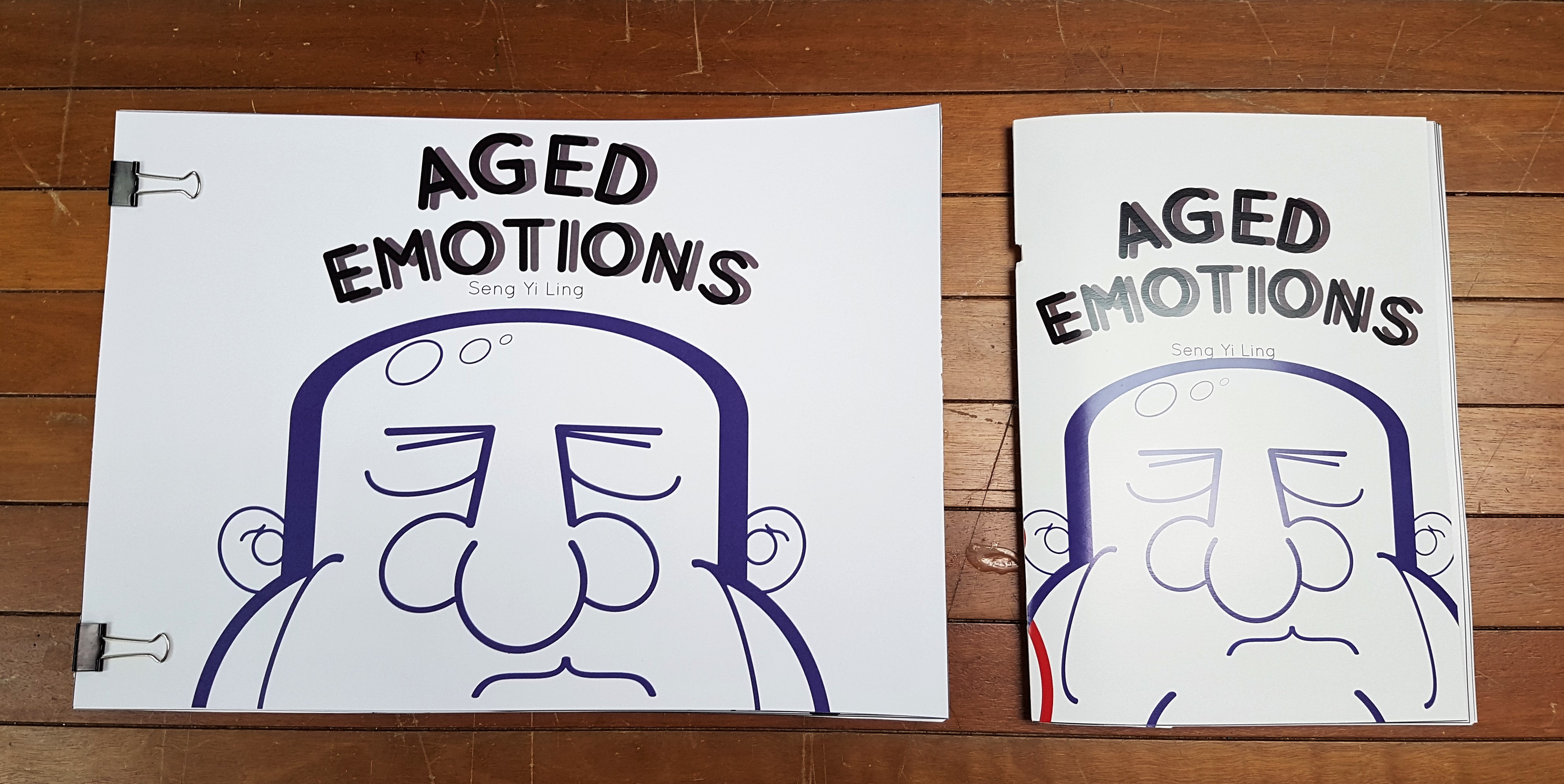
Paper choices: 300gsm (Gloss and Matte) and inside spreads are about 128gsm
I printed the format with the idea that I want to try saddle stitching stapling or the landscape form where I can use binder clips to hold it down.
The saddle stitch stapler mock up had several issues.
- The stapler punched a hole through the paper
- Alignment of each page is inaccurate. Even though scored at the center, paper thickness which cases certain pages to be obscured is prone.
- Stapled not directly at the center, hence some pages cannot be fully opened and flattened.
- When closed, the pages protrude. Cutting off the sides is a must, but cutting off important parts of the pages may happen.
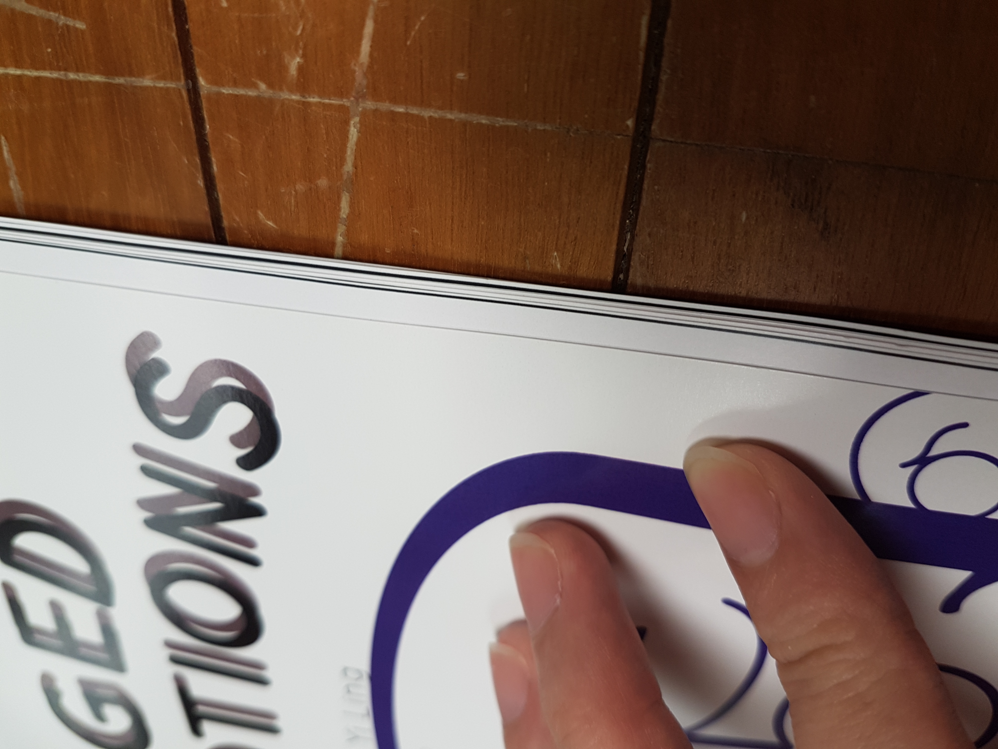
Stapled mockup punches a hole right through the paper after scoring 300 gsm paper.
White lines in the middle due to misalignment, and stapled inaccurately does not allow the pages to open fully.
Pages protrude out from the side
POTENTIAL SOLUTIONS
- Score the pages, making sure each side really is at the center, poke hole on scored areas and manually put the stapler inside. Fold the book in half and slice the sides. ( Remember to allow allowance space in designs as well incase cut off)
- Do all the above, but instead of staple, saddle stitch by sewing with dental floss. It will be neater too.
13th November 2017 (Week 13/Week 14)
Individual Consultation day! EXACTLY ONE MORE WEEK TILL D-DAY.
After showing my mockups to Miss Angeline, there is actually A LOT of room for improvement for not just only the binding issues listed above.
Feedbacks given
- Relook into the margin space for the texts. Pay attention to space between text and image.
- Visual hierarchy for each spread is important. Where you want the audience to look at first? Text or face first?
- Tracking, alignment has relation to each other.
- There are different ways of emphasizing. Not just size. Color, Bold it etc.
- *PAPER. Take note of paper quality. Paper thickness and texture matters a lot to give the over all mood of your product.
I took a few magazines from school to examine the paper quality and overall feeling the magazines gaves off. Also observing the layout and placement of text and image.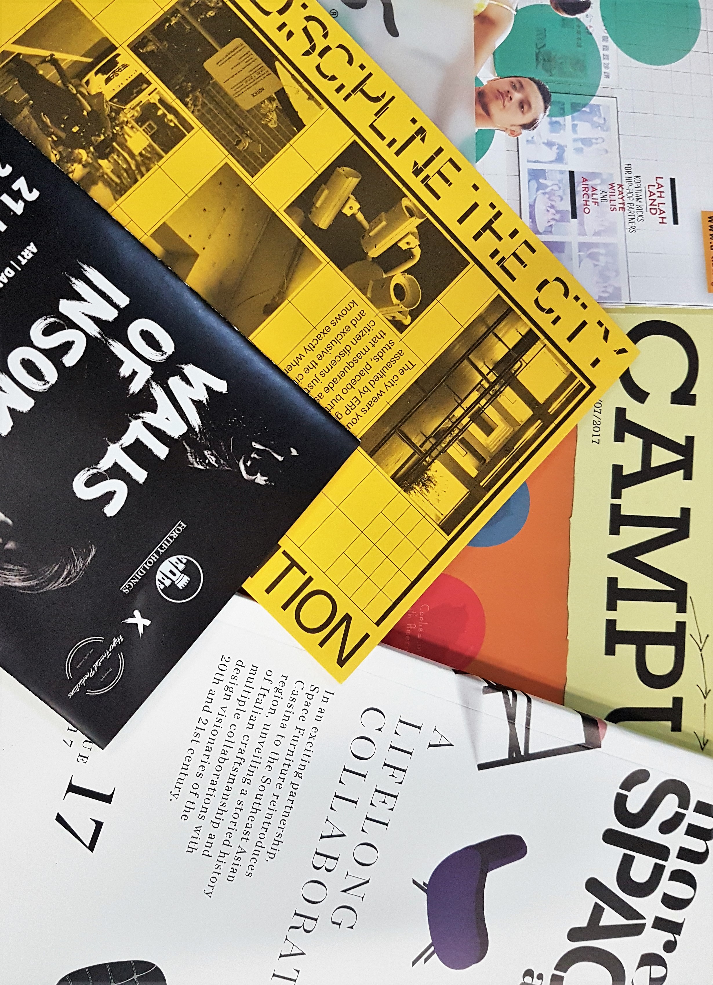
16th November 2017 (Week 13/Week 14)
I reinstalled my InDesign because the Adobe Illustrator way of printing has a lot of human error. And yes, the reason I had issues with my alignment and spread issues was due to a bug in the software. I couldn’t save the document in PDF, and FINALLY after reinstalling it is working!! YAY.
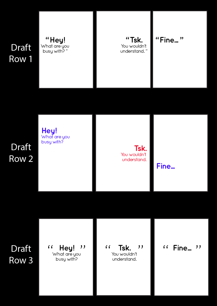
I made amendments to the feedbacks given for the previous consultation and tried out several ways the texts can be presented in a neater manner.
I am pretty inclined to Row 2 for the first few pages, as the simulation of a conversation is represented by colors and positioning.
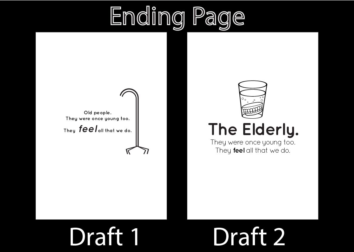
 Changed the ending page too
17th November 2017 (Week 13/Week 14)
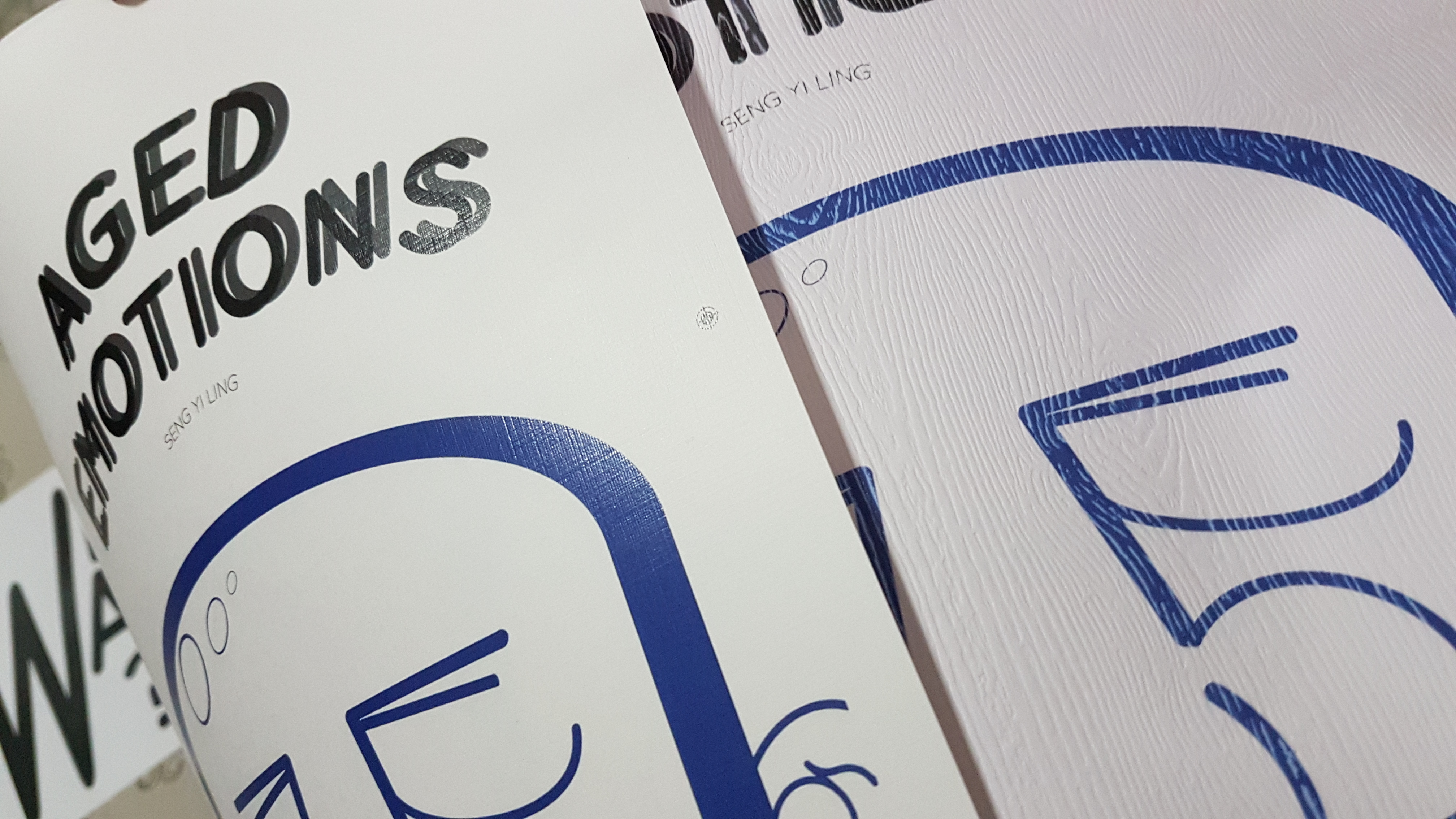
Given that my main deliverables (Aged Emotions Book) is just about complete, I moved on to produce extra deliverables given that I still had some time left before printing the FINAL product tomorrow!
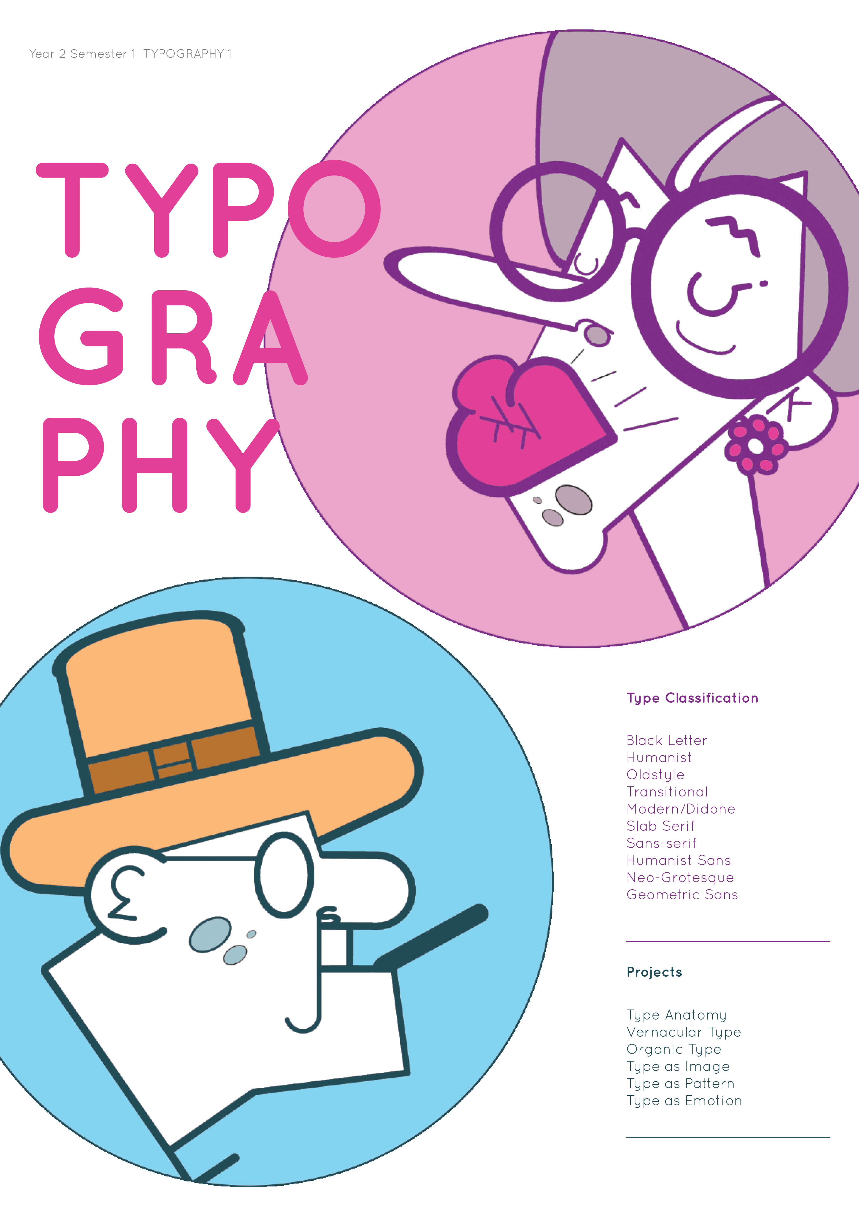
I was rather stuck on how I can apply my characters on other items, so I went ahead with Miss Angeline’s suggestion to do up a poster for her TYPOGRAPHY 1 module.
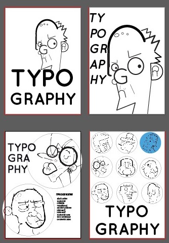
I tried out some layouts and compositions to see which works best!
And since the motif used for the poster are circular and colored, I think it may look good as stickers as well!
And with the final rounds of editing for the main and extra deliverables, I am ready to conquer printing day tomorrow!!
17th November 2017 (Week 13/Week 14)
PRINTING DAY!
So I went to the paper shop at North Bridge Road called ‘Fancy Paper’ to choose better quality papers for the printing, as the feedback given was to be more sensitive to paper type and weight.
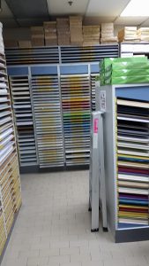
In the paper shop with a wide array of paper choices!
I wanted my book to express familiarity, and some sense of rootedness. The same feeling my grandparents evoked.
After choosing the papers I wanted, I went to Sunshine Plaza to print.
I was really worried that the printing would not be aligned as I would be doing saddle stitch, and both the sides of the pages are necessary to be aligned so the pages would not overlap that drastically.
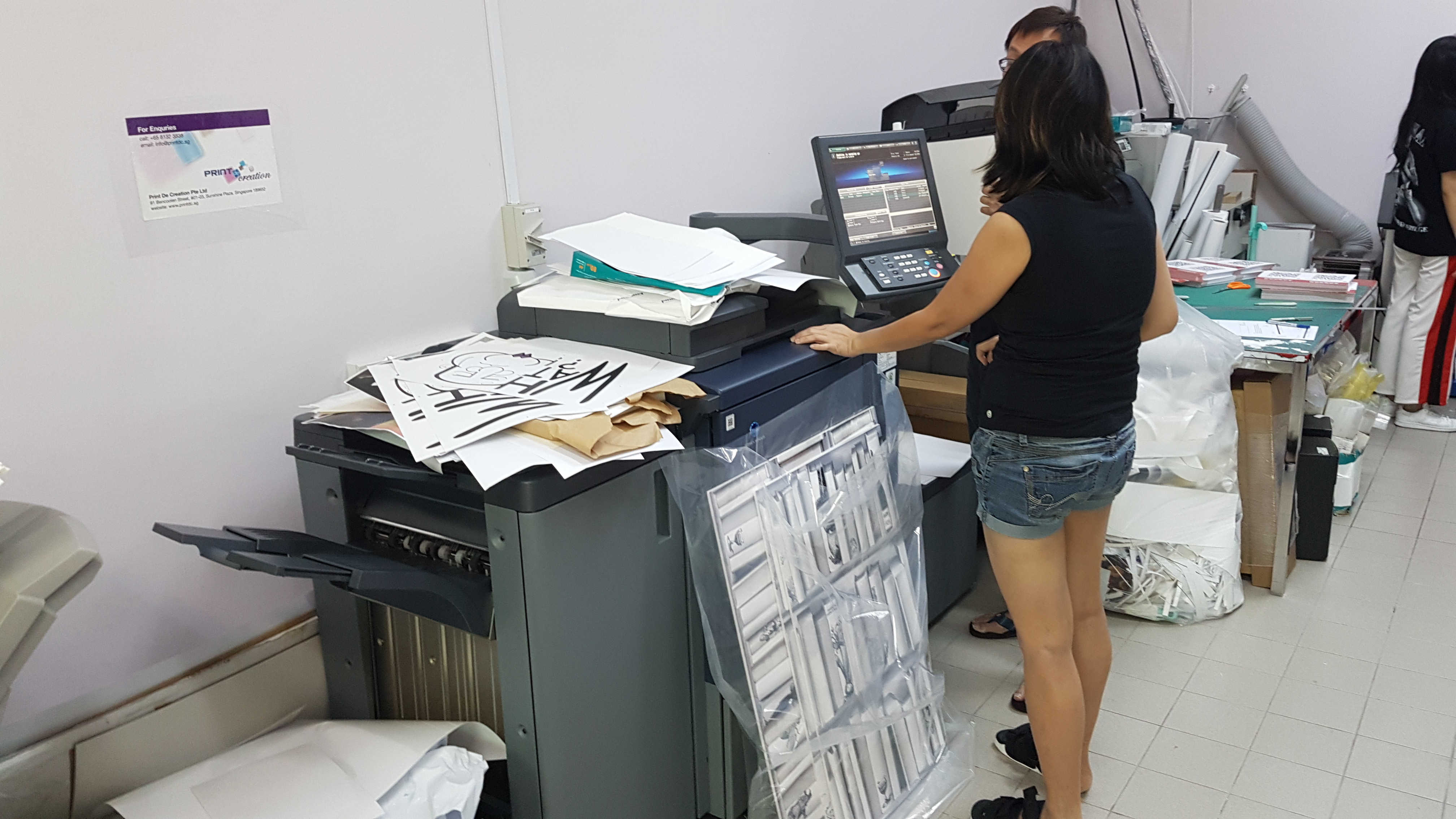
The printing shop lady was very helpful as I noticed that the alignment was off, and she recalibrated the machine for me. Look at all the test prints we did on the printer…
And thankfully, things turned out pretty well despite the multiple test prints by the re-calibrated machine. I took my prints home and started to do the saddle stitching.
The inner pages paper are A3 White Matte Paper, 160 GSM.
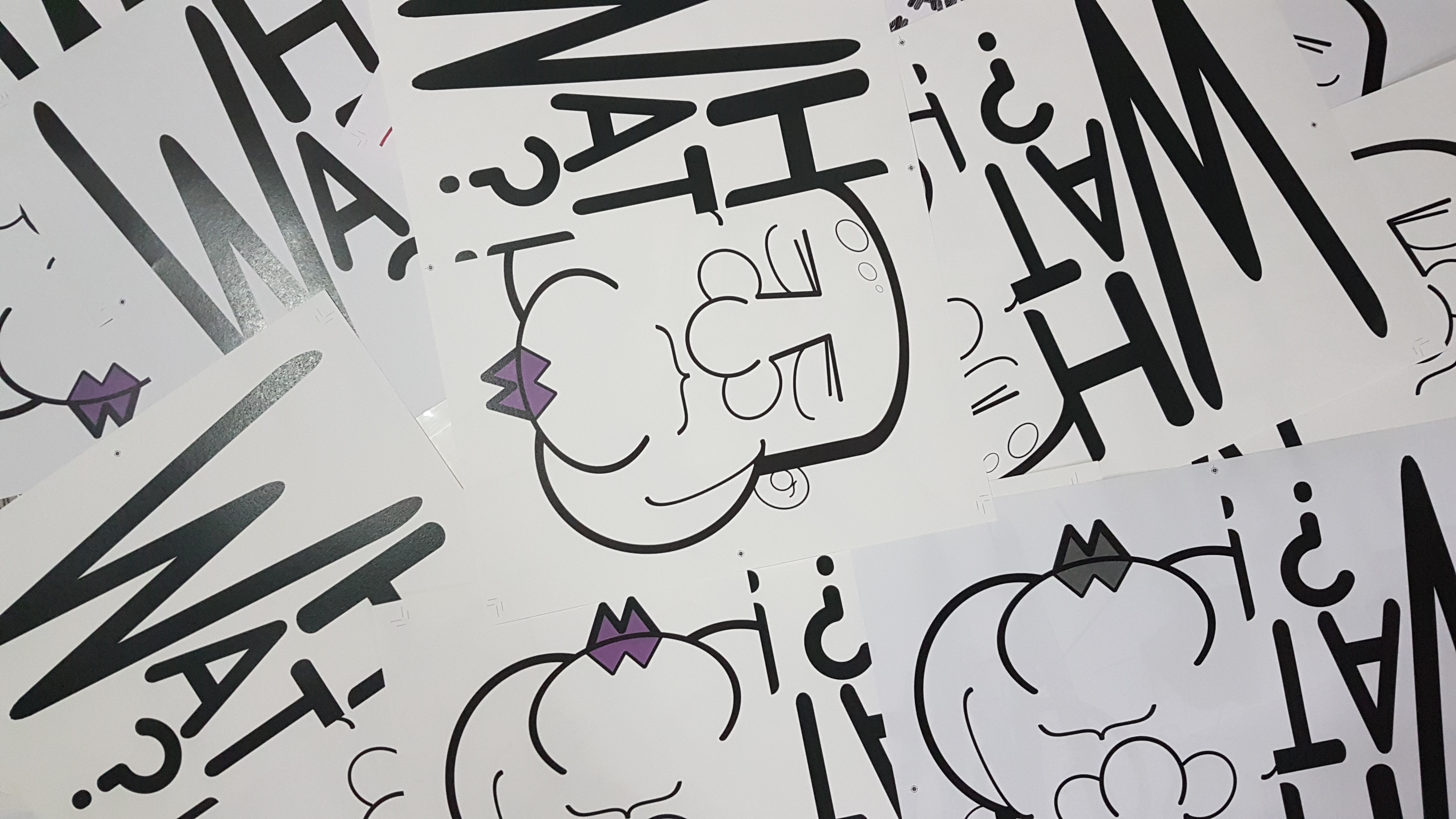
A. Lot. Of. Test. Prints.
At Fancy Paper, I chose a woody texture for the cover page of the book as I really liked the natural rooted quality evoked by the paper. But unfortunately, the paper texture made it hard for ink transfer and it. was. hideous.
Original choice of paper for cover page.
I chose another paper type that allowed better ink transfer while keeping to the rooted feeling I wanted my book to evoke. Hence, I chose this linen texture cover. The texture reminds me of the clothes washed by my grandmother when I was a kid.
A3 Linen White Textured Paper, 250 GSM
Left: Linen Texture Paper
Right: Wood Texture Paper
Regardless, I liked the texture of the papers and it felt really good to the touch!
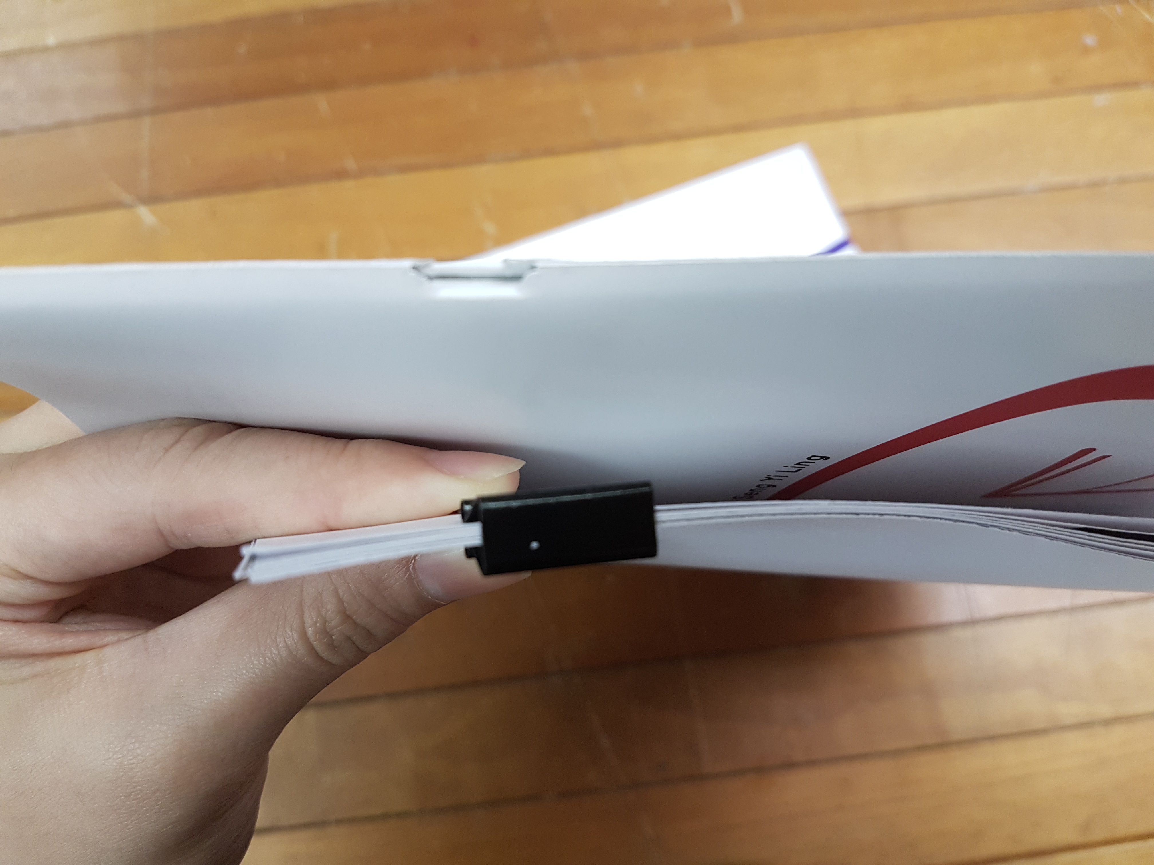
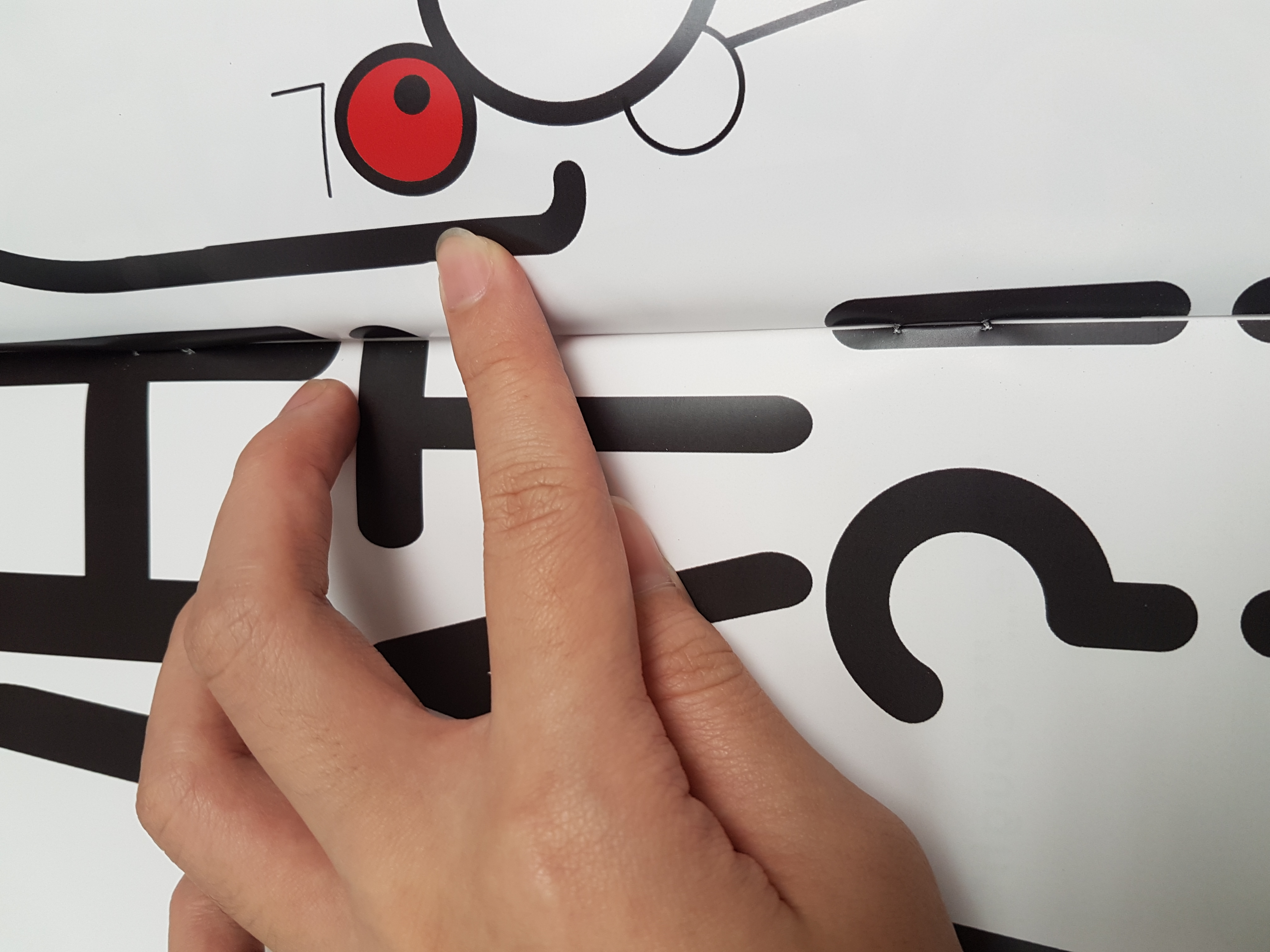
I proceeded to do my markings for saddle stitching. I realized that every single piece of paper printed did not align centrally and I had to manually shift the paper when I wanted to use the awl to poke the holes.
Poking the centerline with an awl.
Self notes to saddle stitching
- Use a pencil to draw the central line of the page.
- Divide the line with the number of holes you want on that piece and proceed to poke the markings with an awl.
- Draw a line on the centre of the next piece of paper, put that poked paper and new paper against the light and use the light that went through the holes as markings for the next page. Bind it with binder clip and poke through the same hole.
- Use the second piece as template for the next few pieces.
- Saddle stitch the whole stack and fold the book in half. Pressing the book down with weights to flatten it. Process to cut off the crop marks with the book folded.
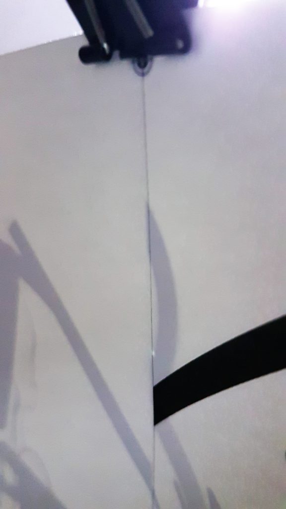
Aligning the hole to the pencil mark.
And I am rather happy with how the result turned out! It was rather neat and secure! 🙂
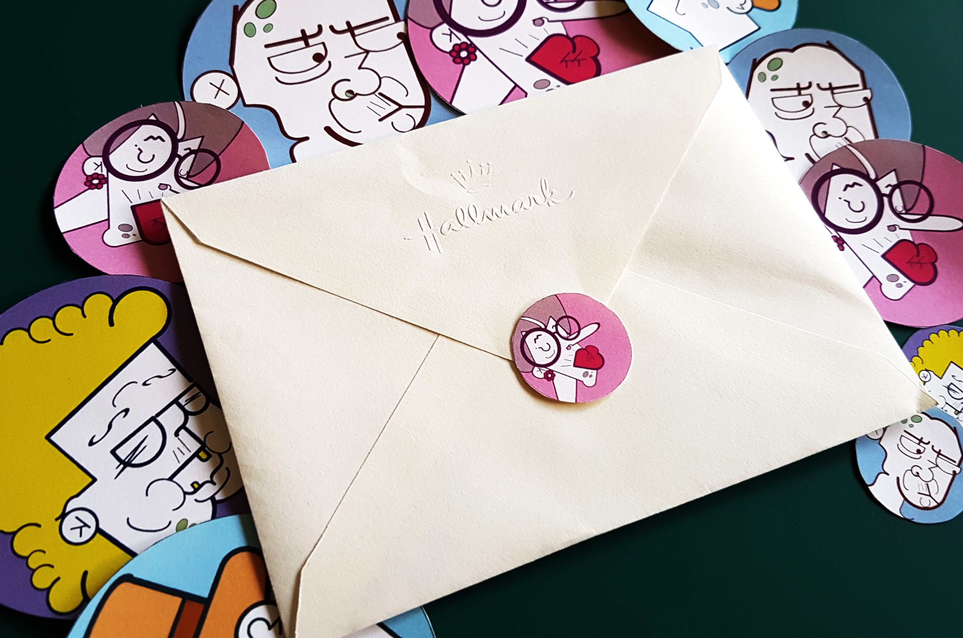
For the external deliverables, I made a poster for Typography 1 and made a few matte stickers with the existing icons for the poster!
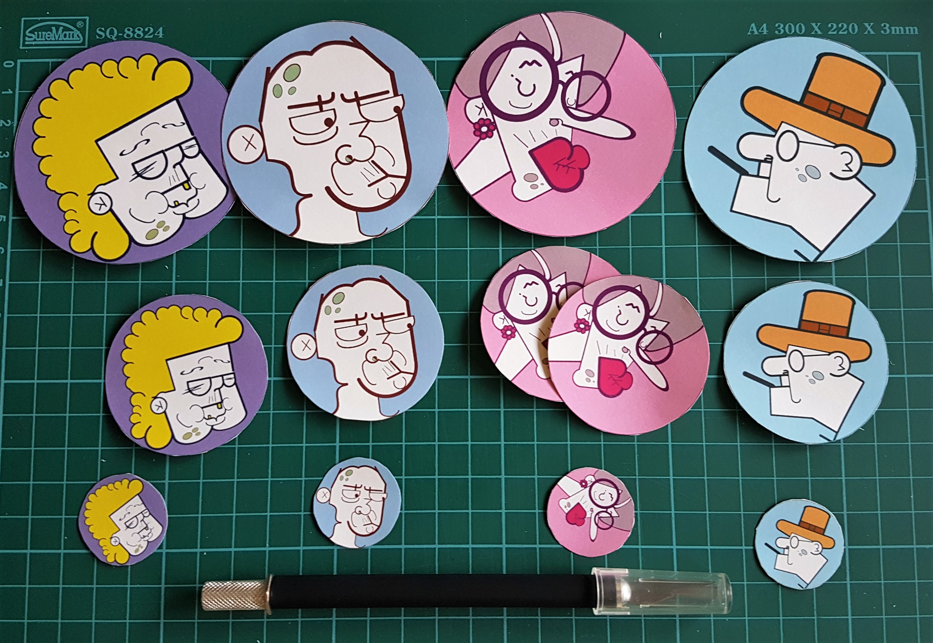
Stickers! I made them in various sizes to see which works best!
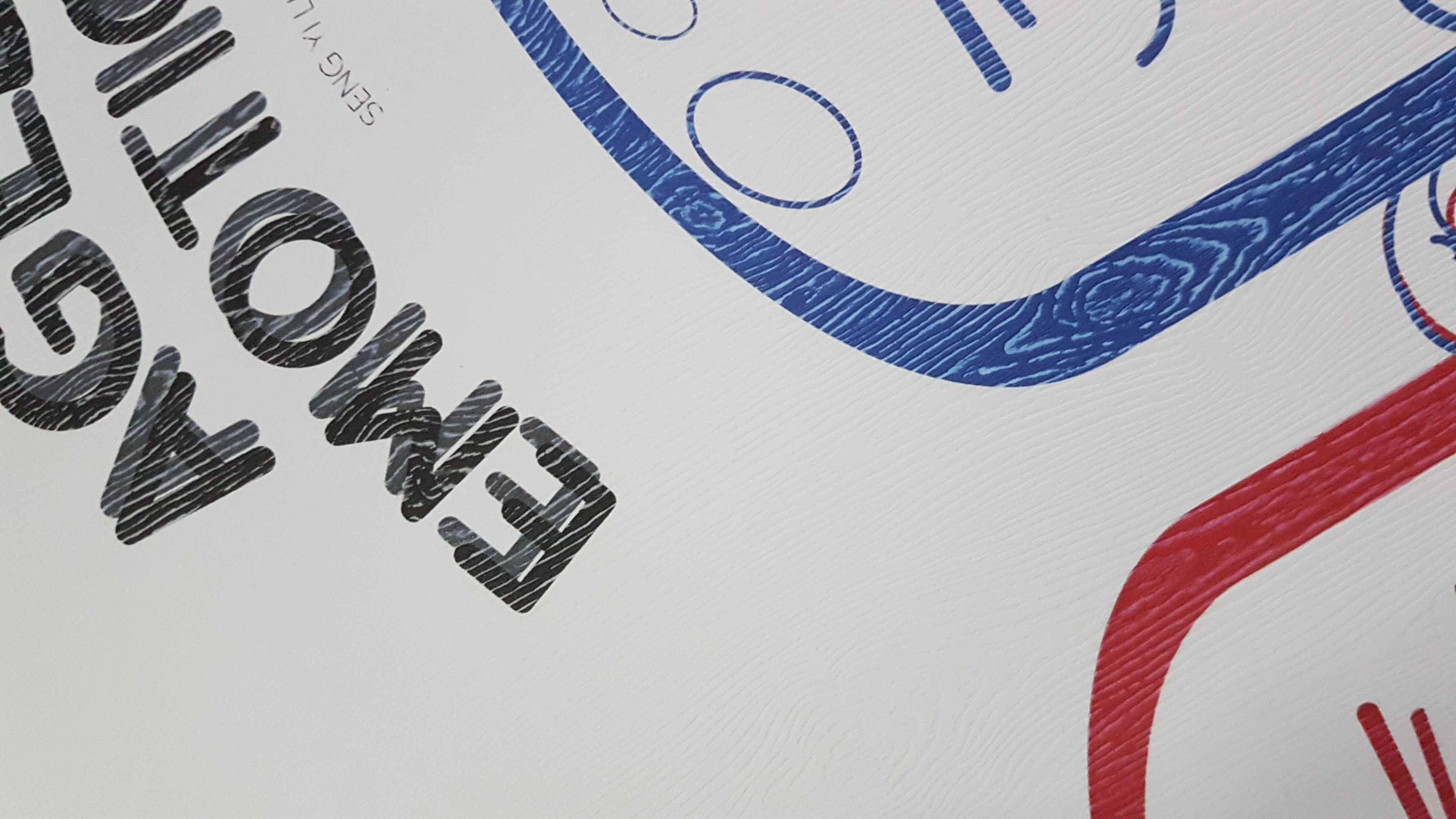
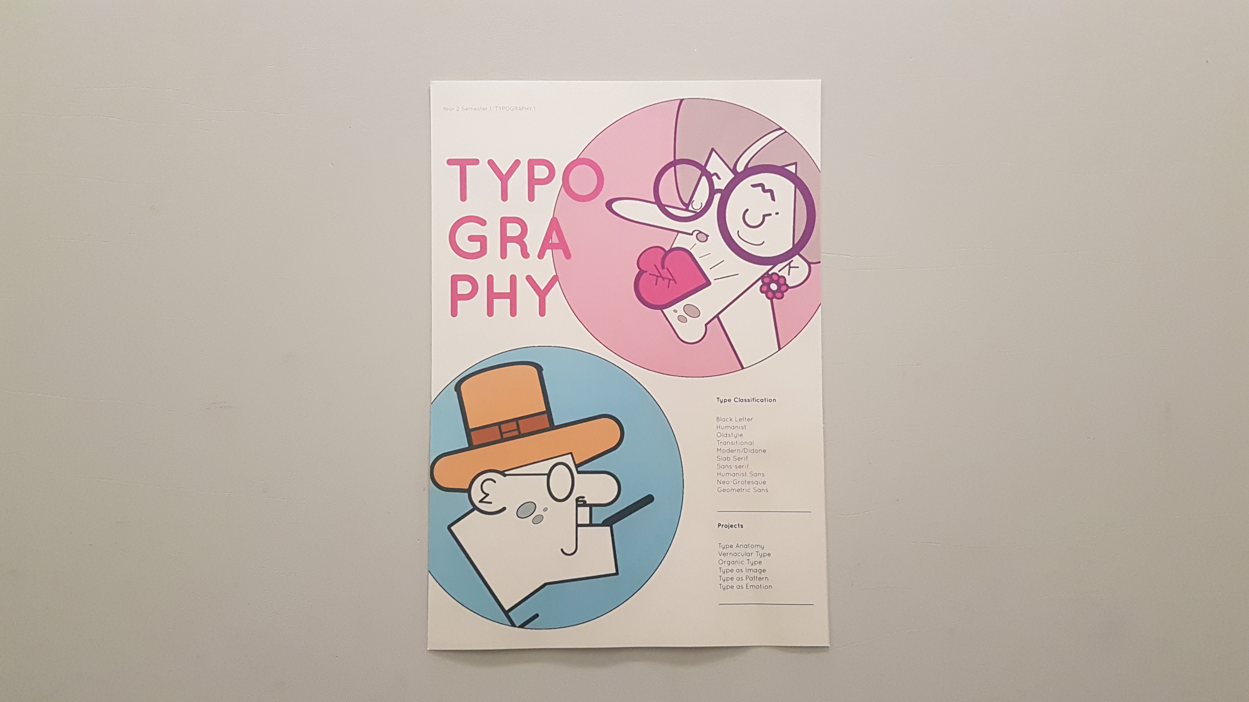
I really liked the choice of paper I chose for the poster, though it is unusual for a poster, the sheen of the paper and color made the poster look elegant. Like champagne!
The paper is 300gsm and the poster is in A3 sized.
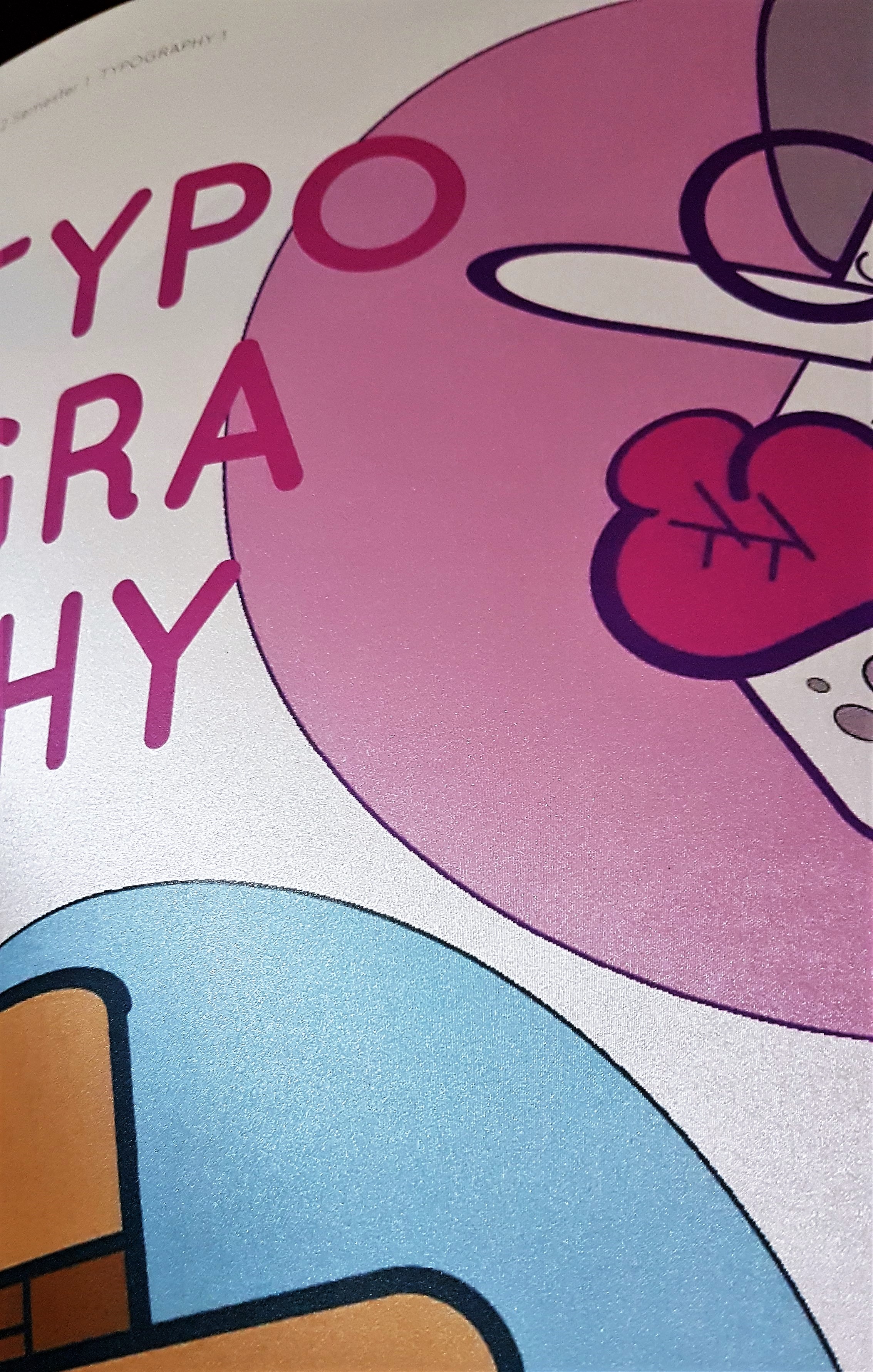
I really like the sheen when light falls on the poster. The lines are actually not there, I just enhanced the contrast for the shimmery sheen to be seen.
THANK YOU FOR STICKING THROUGH THIS VERY LONG DETAILED DOCUMENTATION POST WITH ME!
Not only this post was for sharing the journey of how this book came about, it was also a way of documenting notes on things I have learnt along the way, so in the future I would not make the same mistakes! 🙂
Next up, is the FINAL post for this assignment which I will show the fruits of labour and deliverables for presentation!
Click the image below for the FINAL POST! 🙂
Y2S1 TYPO1 – Assignment 4: PERSONAL CREATION (FINAL)
Cheers,
Seng Yi Ling


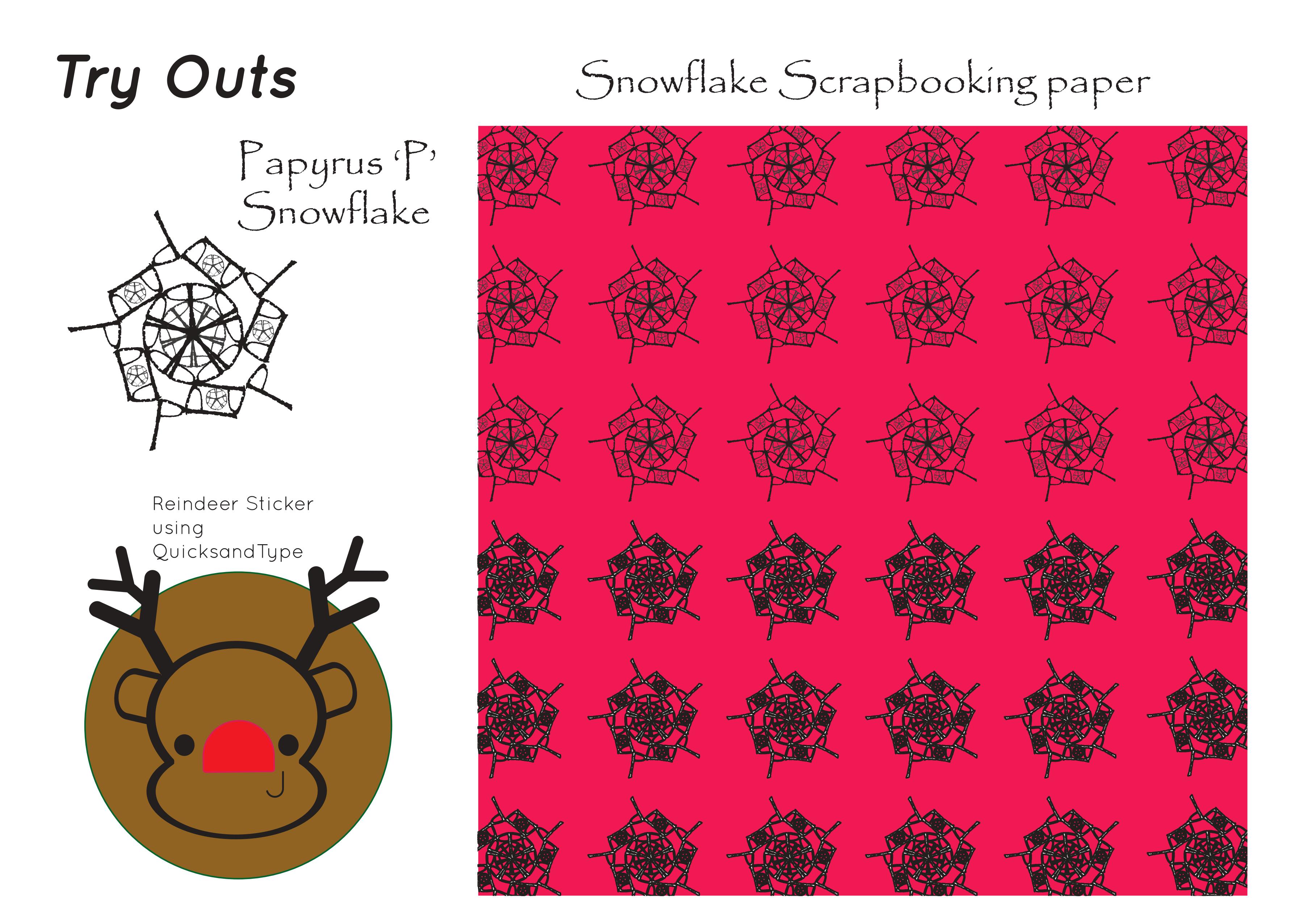
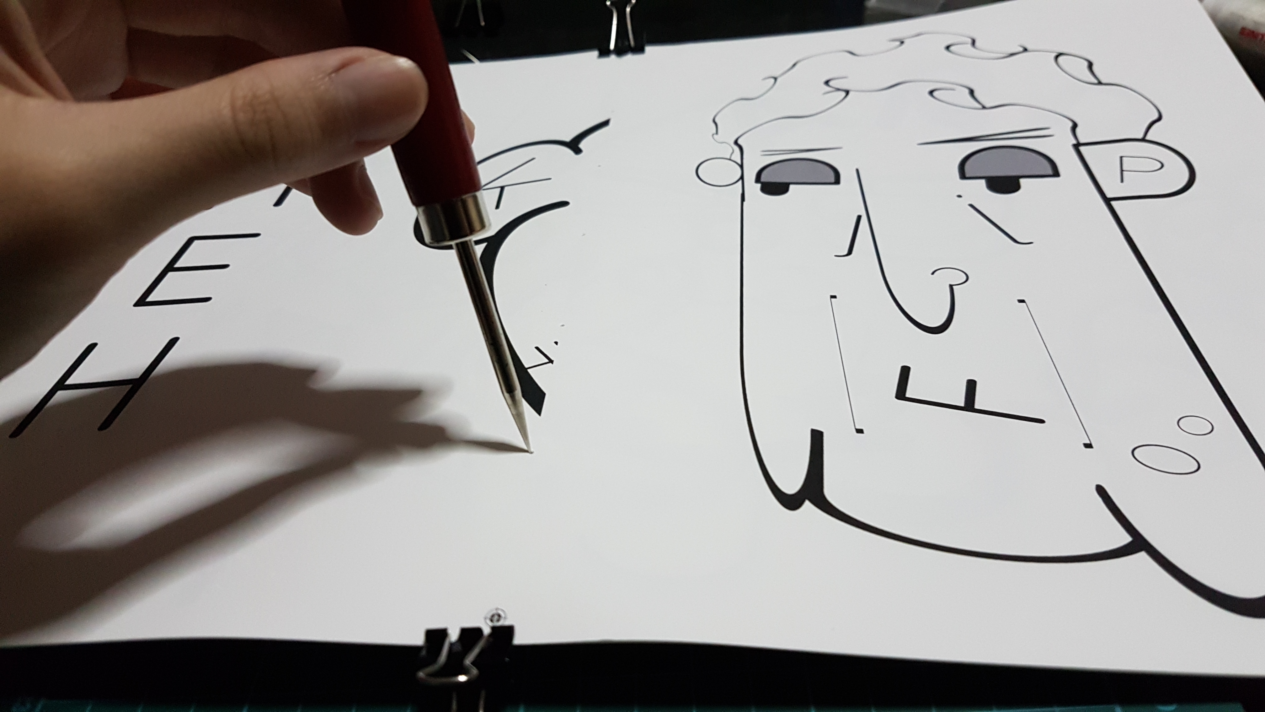
 Task 2 Trial: Afterwards we were to experiment with the repetition of a letter to create a pattern! Can you tell what letter and typeface it previously was? 🙂 It was the letter ‘P’ of the Typeface: Bauhaus 93.

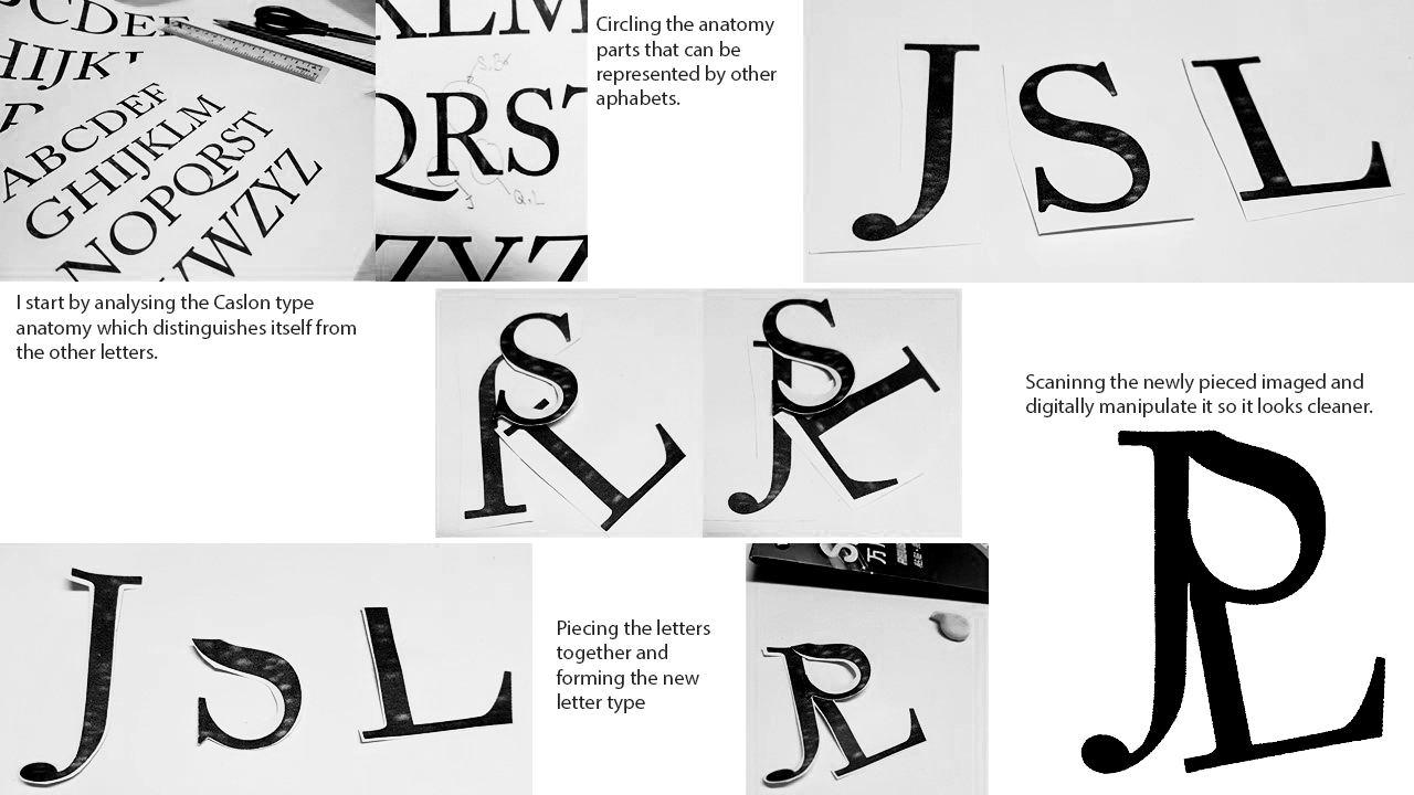 I also tried to recreate some other alphabets.


 Hence I wanted to go for something where the fonts conform around the illustration like this: