FINAL PRODUCT
Here is a video of how the ZINE looks like when flipped, and the following are a closer look on how the digital form looked like per page.

Outside Front Cover

Page 1

Page 2

Page 3

Page 4

Page 5

Page 6

Outside Back Cover
To see the previous project on Project 2 Part 1, click:
2D II Assignment 2 PART 1: “Zine: Neighborhood Explorer” FINAL
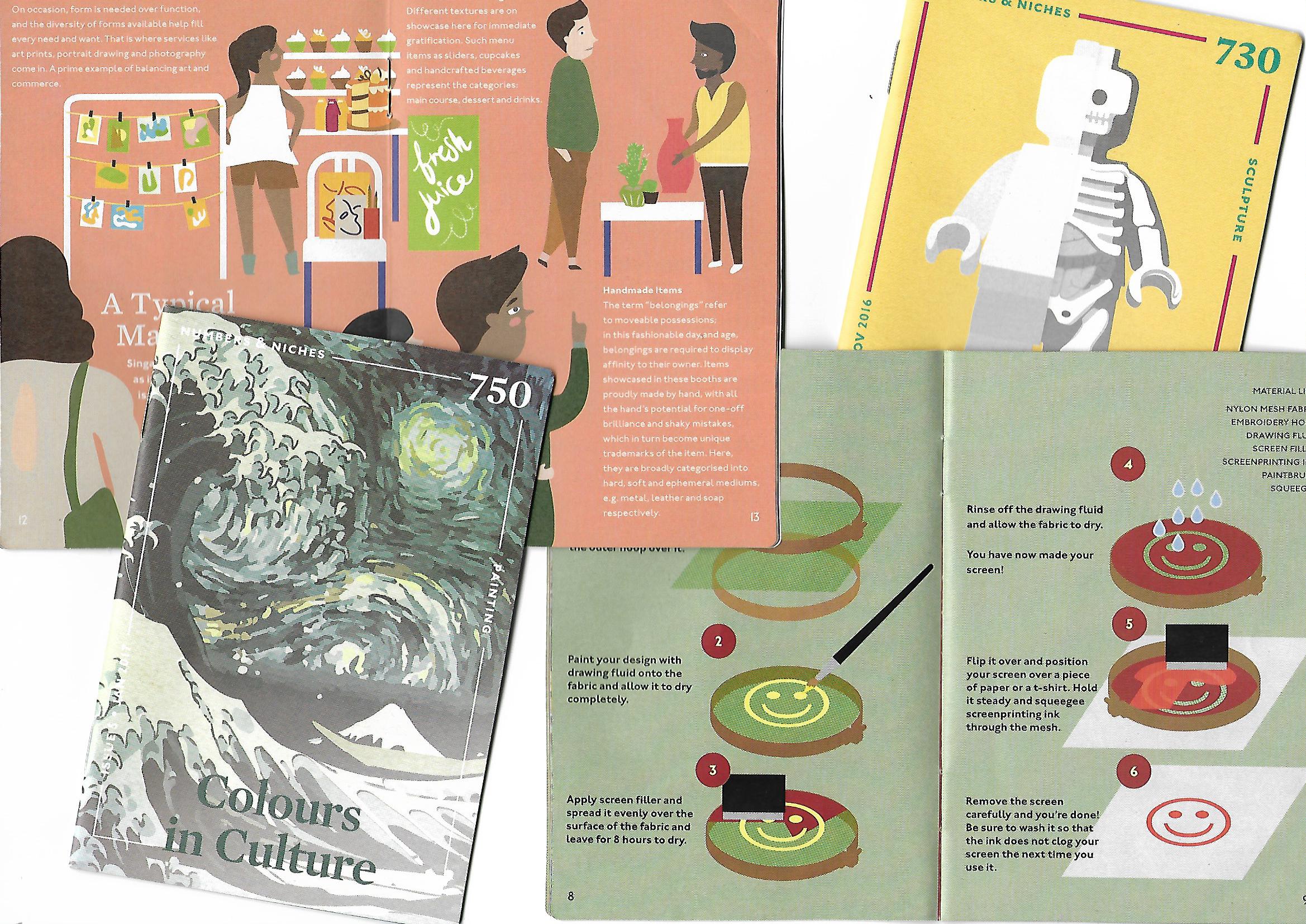
Concept
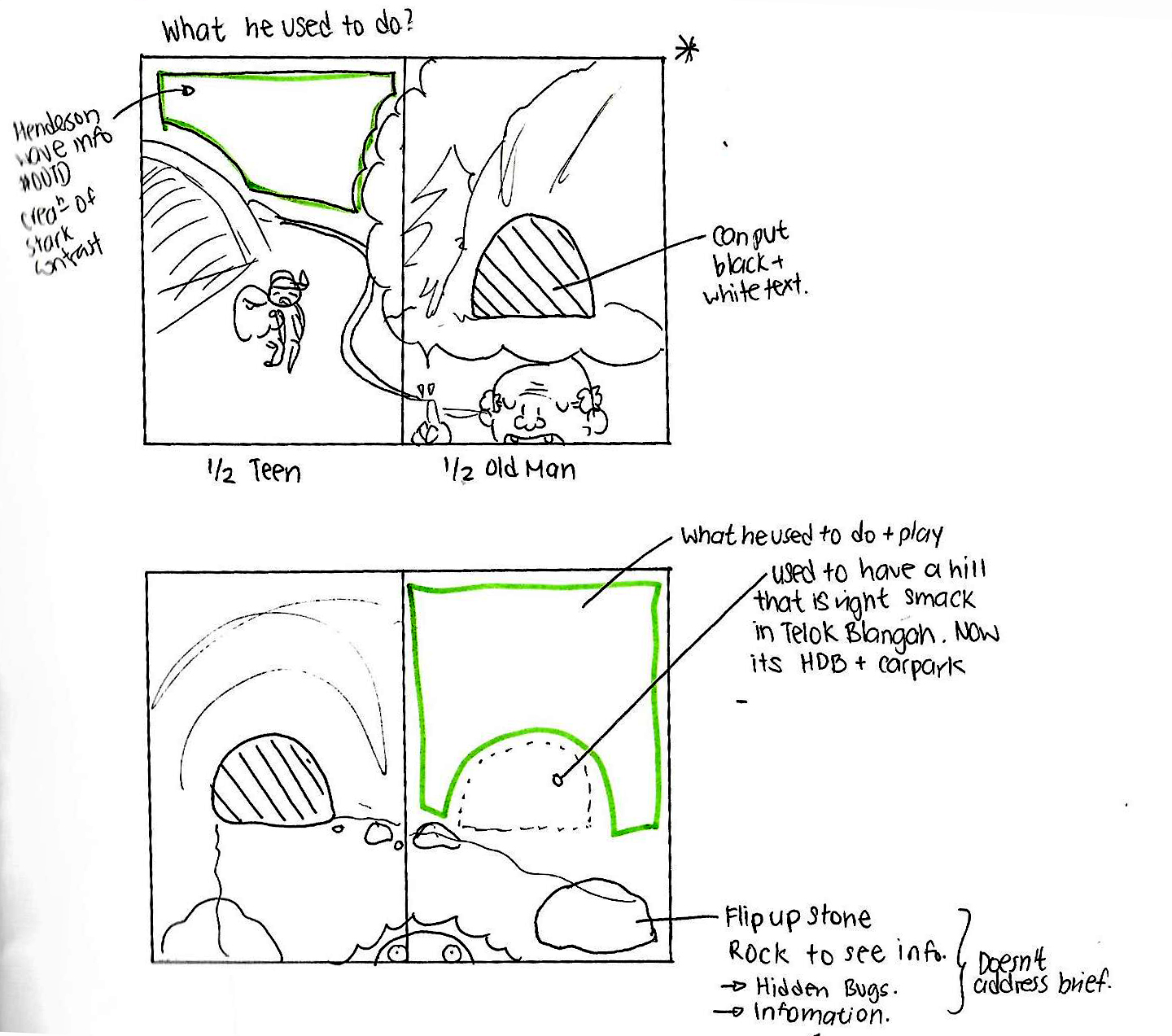
Guide around Telok Blangah with an elderly.
“Day in Telok Blangah guided by Uncle Tan. Readers get to go on an expedition with Uncle Tan, and he will show you around the places in Telok Blangah he like to visit, where he thinks you might like and what to do there.”
The story will go around the primary information and personal recounts I have gathered from the interviews I conducted, as well as secondary research such as location names.
Art direction
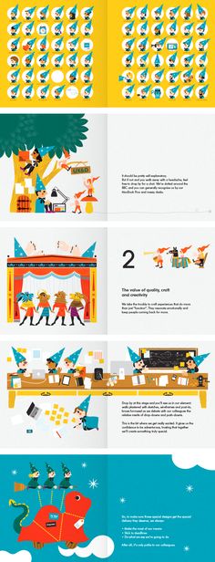
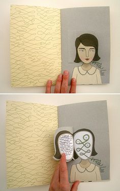
Heading in the direction of more whimsical illustrations that are more kid friendly.

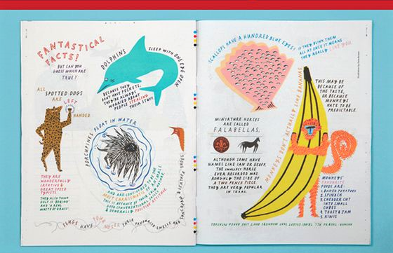
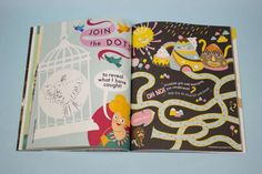
 I really like the vibrant colors and how organic the shapes are! I also really liked the path which guided the viewers as to where they should look at! Hence I thought that paths can help me in my Zine. 🙂
Change(s) in idea/execution (if any):
Wanted to use a more calligraphic font, but instead chose a font that has more of a personal handwritten feeling to it since the drawings are very hand drawn. So I chose to use the font: A little Sunshine.
Challenges
- Incorporating the feedbacks that I have gotten from my Part 1 infographics on Telok Blangah, one of the key issues was that the illustrations used were not uniquely Singaporean. Hence, I wanted to address that issue by illustrating the locations as they are instead of making it look like any regular place in Singapore.
- Throughout the making of the Zine, I was rather concerned with the layouts, how to use the grid format and how to maximize space without the spreads being too empty and lack of information.
Enjoyable moments
- I really enjoyed doing up the illustration process! It was rather therapeutic to doodle my fictional characters according to how I picture them to be, as well as filling in the colors! It is like seeing them come to life! 😀
- In addition, saddle stitching A4 paper was something nostalgic that I did with a friend in Primary School! We created weekly girly comic books/ magazines for kids our age and wrote stories about how we would have super fairy powers and banish our enemies in school and get all the good looking boys etc. We were 10…I have no idea what were we thinking ahaha. It was quite a hit as we had over 30 issues and went on to Season 2, and our classmates wanted weekly updates on our magazine. Ah… my youthful days…
Classmates’ Feedbacks and Comments! <3
This critique session was a little more different from the previous ones we had as Joy got us to shift to the left every 2 minutes, and giving a quick anonymous critique towards the Zine.
Oh my goodness… It was arms day that day. I have never felt my arm burn so much since the last time I did ‘A’ levels HAHAHA!!! So we were given an envelope to place all the 18 notes in the respective envelopes and also when we were presenting, some classmates gave their comments on post it notes as well! ^-^

Majority of the comments in the 18 notes I have received is that my font is too thin to be read against a dark background and readability was an issue! 🙁 And that the second spreadsheet was rather bare and empty as compared to the first spread. Really thankful for the feedback because these factors never really came to me since I’ve been looking at my Zine so many times I knew what I was writing and where I wanted to place it. Hence, through this, I have learnt that when a publication is made, it is very important that you see your publication in the eyes of the readers and not purely my own. I ought to see my ZINE like how I would if I were a total new stranger. 😀
Joy’s Comments and Feedbacks <3
- Can tell that you are pushing yourself digitally as well, despite using the traditional method of drawing and scanning in. So good job with the mixed medium attempt!
- Readability issues with the texts. Especially with the middle spread. Texts on dark solid background will always have readability issue, especially when your fonts are already so thin. 🙁 Many of your classmates have readability issues with your Zine as they also squinted and placed their faces really close to the texts to read it. Be mindful about that. Do test print every time to see next time.
- Guide for young and old came to be more cohesive when the text is added.
- The path way really helps to guide the viewers. However 2nd spread too much negative space, hence look sparse. Spread 1 is okay as paths provides breathing space as lots of details.
- Moving forward, you can look for animation boards to draw inspiration as you browse them. You have this style where is different form your other classmates. It is your own distinctive style, don’t be afraid to keep it. Within your own style, branch out and see what other animation styles you can appropriate in your future projects
With that, I conclude the end of Year 1 Semester 2 of FDN 2D II !!

To be honest I am rather sad as much as I am glad that the holidays are approaching 🙂 Really thankful to have such a nice bunch of classmates in this semester’s class who were so willing to help each other out and give kind and constructive feedbacks 🙂 As well as Joy, thank you for being my 2D teacher for the whole of YEAR 1 ! 2 SEMESTERS ! I have learnt a lot from you and it was an ultimate pleasure and JOY to be your student! Hope to see you guys again in my following years here in ADM!! 😀

Cheers,
Seng Yi Ling.
To be updated in Year 2 Sem 1~

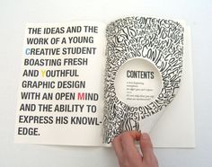
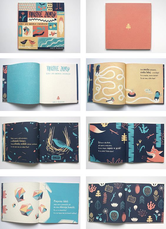
 Hence I wanted to go for something where the fonts conform around the illustration like this: