Week 2 of Foundation 4D class was our first lesson for the day!
Our instructor Miss Ruyi Wong taught us about many different aspects that contributes to a good photograph, as well as what our eyes perceive.
Reference artists such as Cindy Sherman and Sally Mann were used.
My classmates also shared their about their favorite photographers and explained the reasons why so. And the photographers shared that I have gained a new interest in are @nguan and @sheiku. (I went by their Instagram account)
Nguan: http://nguan.tv/
Looking at Nguan’s works, I find that they are very distinguishable as it has a pinkish filter that no one is able to easily replicate, and the colors present are comfortable to the eyes.

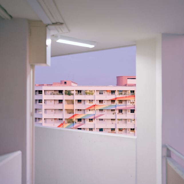 The subjects matter of his photographs are usually doing mundane, everyday things. The subject matter sometimes look straight at the camera. I felt that he was able to capture a sense of tranquility in his works, as well as bring about nostalgia to something of the past. His ‘Singapore Project’ is one of my favorite projects that he has done as the scenes and the type of subject matter portrayed in his photographs are places I have been and people whom somehow I have met before. This sense of familiarity is very soothing.
Sheiku: https://www.instagram.com/sheiku/?hl=en
Sheiku’s works are something that I draw similarity to a contemporary artist, Damien Hirst’s work. Similarly to Damien Hirst, Sheiku’s works are bizarre, unconventional and it include a shock factor. Sheiku turns ordinary objects into something extraordinary by introducing ready-mades and dissecting the object into something unrecognizable when put together.

His works on Instagram are either not captioned, or captioned with something vague or irrelevant. I would like to think that Sheiku wants us to explain his works in our own interpretation. For instance, upon seeing the above image, a short self-interpretation of this work comes to my mind…
“You trampled on my raw and beating heart when my love for you has grown and almost blossomed.”
Different emotions are evoked upon different ways of seeing Sheiku’s works for me. First comes shock (from choice of subject matter), second comes curiosity ( for why did he chose these objects and what do they mean?) and then lastly, a mellow emotion will wash over me as I try to interpret his meaning to his works.
~~~~~~~~~~~~~~~~~~~~~~~~~~~~~~~~~~~~~~~~~~~~~~~~~~~~~~
What I have learnt during lesson!
The study of signs – Semiotics has started since 1900s.
Semiotics is the study of signs and symbols and their use or interpretation.
Semiotics can be defined into two parts of signs.
- Signifier — The form of a sign. The form might be a sound, a word, a photograph, a facial expression, a painting of a pipe, etc.
- Signified — The concept or object that’s represented. The concept or object might be an actual pipe, the command to stop etc.
Signifiers are different in different cultures. Examples such as Justin Bieber flashing a double backhand peace sign seem harmless, but to some parts of the world it may seem offensive. (honestly speaking I still have no idea why was it offensive, my search results on Google was negative  Do tell me what it means if you know thank you!)
A unanimous signifier that everyone recognizes for example is a Life Buoy!

Everyone who sees it will know it is a buoyant support such as a lifebelt for keeping a person afloat in water.
Icon, Index, Symbol

Icon has a physical resemblance to the signified, the thing being represented.
Index is indirectly connected with an object
Symbol is not a representational image. There is no direct resemblance to the object.
**********************************************************
Iconoclasm is the act of attacking/ assertively rejecting cherished beliefs and institutions or established values and practices.
Metaphors & Association
Modern Advertising relies heavily on visual metaphors.
For instant, in the Alice in Wonderland cartoon version Miss Wong showed us, the bird calling Alice a ‘Serpent’ is a metaphor and assiociation to an ‘bird egg stealer’ as she is very big (because she ate some bread that made her grew into a giant), and her size is associated with the length of a serpent.

Or another example showed in the slides by Miss Wong is this advertisement for a beauty product. A ‘skin as smooth as peach’ is associated with a baby’s bottom.
As a peach is highly associated with a bum because of it’s shape and texture. This ad is advertising it’s product in such as way that, if the consumer uses this product, their face will be a smooth and youthful like a baby’s bottom. (yea right…)
Applying what I have learnt about Visual Metaphors onto another advertisement, I chose to use this anti-smoking advertisement…

In my own interpretation, this is a very strong anti-smoking ad as two subject matters are involved. As smoking is usually seen as doing harm to oneself, this advertisement raises awareness to smokers that not only they are doing harm to themselves, but also to other; as depicted by the second subject matter inside the smoker (literally and metaphorically INSIDE the smoker).
This image is highly grotesque to me as putting an unborn infant in view of direct contact with a cigarette is disturbing and uncomfortable to look at. In this case, I find that this advertisement has achieved it’s objective to induce a sense of pity to the innocent baby, against the act of smoking. Thus, encouraging smokers to quit smoking, and pregnant women to quit smoking for the sake of their offspring.
~~~~~~~~~~~~~~~~~~~~~~~~~~~~~~~~~~~~~~~~~~~~~~~~~~~~~~
Miss Wong then let us out to take some photos, using what we have learnt in class. I tried to find signs of semiotics in the scene I was taking.

A bright orange cone is a sign for drivers and onlookers to be aware, and a tool to redirect traffic.
Seeing that the cone is placed near the wall with a white tape stretched across, I deduced that the cone is to draw attention to others that the paint on the wall is wet. So do caution.

Directional arrows show where drivers should head to. Reflective yellow and black arrows on the bend of the wall warn drivers to be careful of the bed. 2 parallel white lines tells drivers to keep in their lanes.
With that, this concludes my lesson review for week 2!
Not only have I viewed images, advertisements and present day scenes with a new eye; I think that more thought will be placed when I look at things or before I take a photograph in the future.
Cheers,
Seng Yi Ling.



 Do tell me what it means if you know thank you!)


