Place of significance: My Grandparent’s House

Q: Why does it make you feel the way you feel? Are there any particular features or qualities about the place that evoke those feelings? Is it people, the environment or a combination?

I like to feel safe and stick to the things I am used to and familiar with, because I already know nothing bad is going to get to me.

My grandmother is very similar to me when it comes to preference. We both like things of the past. So she tries to retain the way things were when she first moved in the HDB flat, and never buys something new or modern unless the new replica of the broken product cannot be found anymore. Hence, the place is very much like the way I was as a child as far as I could remember.

The non-slip mustard tiled grid floors, traditional Chinese tear-off calendar, wooden rice container etc. looked the way they were for my whole life. Being in my grandmother’s house makes me feel like a little girl again every time I visit.

It is a combination of both the people and the environment really, that evoke those feelings of nostalgia, safety and lots of love. My grandparent’s house will not be the same as it is without my grandmother nor the feeling will be the same if my grandmother is living in a totally different house. I felt that difference the most upon the passing of my grandfather. Hence, the emptiness portrayed in the photographs is evident in my photos.

Q: What would you like to share with us?

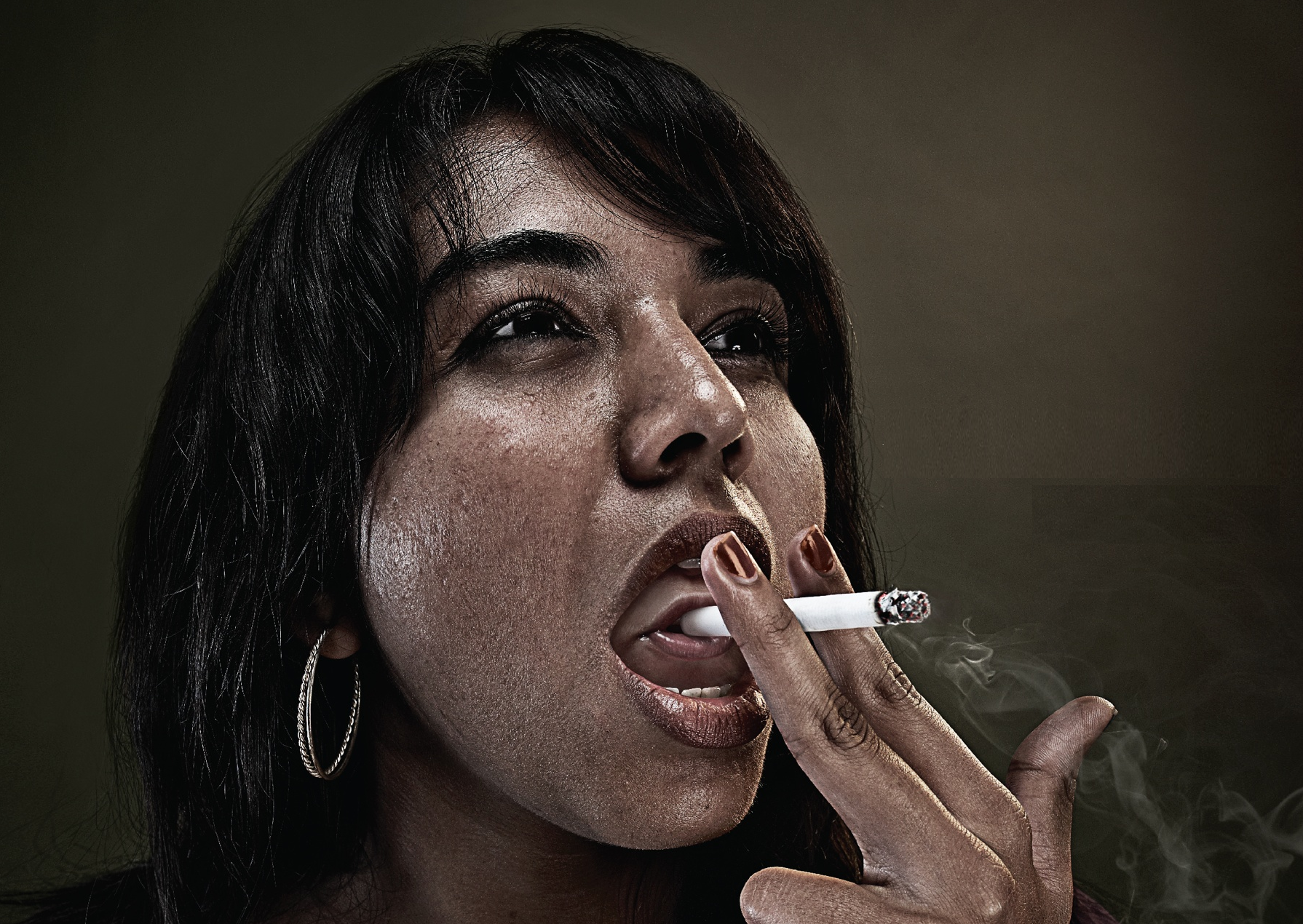
Richard Billingham, Untitled (Ray’s A Laugh 6), 1995

I was quite inspired by one of the reference artist, Richard Billingham. He was able to evoke the personalities of his subject matter and scenario, while being frank and authentic. He say he feels better when he doesn’t use a digital camera as he does not want to keep looking at the photographs behind the screen be bothered by how he can repetitively take a better photograph and he no longer knows what is he doing, so he thinks it is better if he cannot see what he has done at that moment, and then look later when the film is developed. I could relate to how Billingham feel regarding using a digital camera or smartphone to take photographs, as I would be so concerned about how pretty a photograph looks, I forget my initial intention: to take a meaningful photograph instead. A lot of his inspiration comes from childhood, which is what captured my attention initially.

The reason I shot the photographs from a downward angle is because I wanted to recreate the perspective I had as a child: Small and curious. I enhance the colours to replicate how the actual scenario looked like off camera, it is because this is how I see things: In colour, the way it is.

Upon taking the photographs, I was trying to look at the parts in the house that caught my attention the most at that age. I recall climbing up the table counter from the kitchen stove area so that I can reach the ‘Mamee Noodle Snack’ in the cabinet my grandmother hid from me before dinner. Hence, this photo of the kitchen counter. (Photograph 2)

The area where I played ‘Masak Masak’ with my grandmother’s bowls in the wooden cabinet, mixing my milk powder formula with the raw rice in the wooden bucket. (Photograph 4)

The cooking area where I watched my grandmother cook as I snuck a few pieces of piping hot luncheon meat into my mouth the instant she plated them. But of course, I think she knew. (Photograph 1)

All of these scenarios ended the same: My grandmother carrying and scolding me in Teo Chew dialect while I writhed and kicked in annoyance all the way to the living room where it is ‘safer’ for me to play as my grandfather would be watching me while he dozes off.

Problems faced when I was doing this project is that I was unable to capture the entire scenario. Like for instance, this photo feels incomplete without having that table. But if I were to manually move the table into the photo I am taking, the photo loses its significance because it feels staged.

However, if I were to stand in a position where both the table and the scenario I want to capture can be simultaneously captured, it still feels wrong because there is an extra materials in the photo that I don’t wish to capture.

Doing a panoramic shot of my world feels very spherical and some objects have too much depth when it is actually rather flat. Hence, the photos I have taken feels… missing of some emotions, or too many elements to focus on.

~~~~~~~~~~~~~~~~~~~~~~~~~~~~~~~~~~~~~~~~~~~~~~~~~~~~~~

These are the 4 images I have selected that best convey the world that is significant to me:

reedit

Photograph 1: A panoramic view of my world

My World Photo 2

Photograph 2

My World Photo 3

Photograph 3

My World Photo 1

Photograph 4

To conclude, as I grow older I have learnt that society does not work the way it does at home. I have to learn to try new things, be adventurous and take a leap of faith. But very much, most of the times I feel that doing these are very daunting and foreign to me, and that is where I rely on things that remind me of my safe haven. Since childhood is something I can never ever go back to, holding dear memories of it and being in places that reminds me of them is the least I can do to comfort myself when things gets too scary, it allows me to know how much of a person I have grown into, and how much more I have to know and grow.
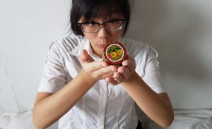
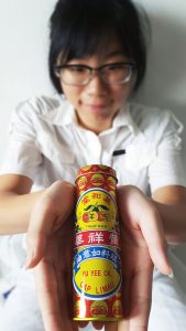
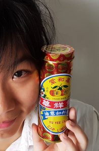
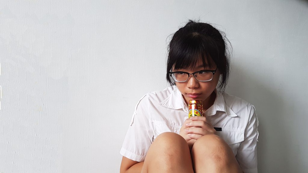
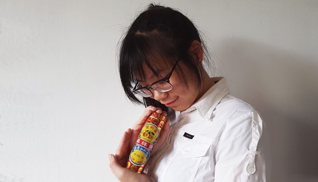
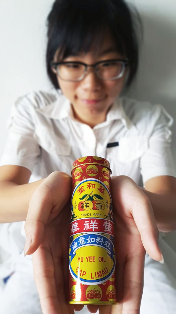
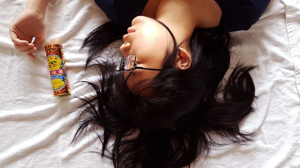
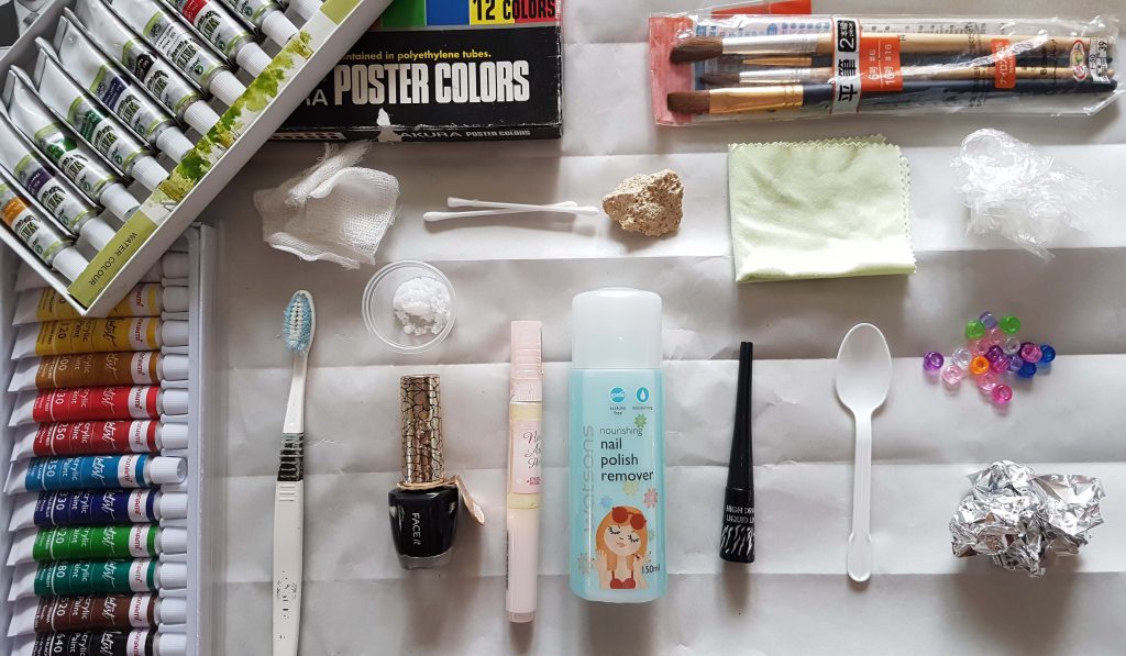
 

Object of Significance: Yu Yee Oil.

Significance:

Yu Yee Oil has been with us for as long as many of us can remember. I believe that every Singaporean is able to recognise this brand just base on the packaging design and colour. It is a go-to medicated oil for children who has stomach-ache and an essential item for parents to apply this on the belly and bottom of the feet for their kids every time after their bath.

Yu Yee Oil is a significant object that greatly reminds me of my childhood. It has been with me since I was a baby.

Even today, I still use it. Not only because for its function to cure stomach-aches, but because the smell itself is very comforting. I even bring it with me to places I am unfamiliar with. A familiar scent that has been with me since childhood. A scent that is highly distinguishable. A whiff of it instantly calms me down. It makes me feel grounded. The moment the minty scent hits the back of my throat; a surge of warmth spreads within me and I feel all soft, mushy and warm; like a baby wrapped in a bundle. And I like feeling like that. A baby wrapped in a bundle, safe and sound with not a thing to worry about. And I think this is a way I can take myself away from reality, even if it is only just for a while.

References and Objectives:

I used maternity, family and baby photoshoots as visual references.

I wanted to capture the essence of family love, tranquility and purity. So I studied how the position of subject matters in the photos can help achieve the mood I wanted to convey.

photo ref

Baby photo shoot ideas pictures with baby girl with her cute headband looking up to the camera


Hence, with that, I wanted to capture these bolded words above in my photographs.

~~~~~~~~~~~~~~~~~~~~~~~~~~~~~~~~~~~~~~~~~~~~~~~~~~~~~

My Story:

Close up of the object in a neutral background from various vantage points

Front view of object against white back drop.

Front view of object against white back drop.

Top View of object on soft towel

Top View of object on soft towel


Side view of object lying down on soft towel.

Side view of object lying down on soft towel.


Full Figure shot of myself with the object.

Normal Standing pose with the object.

Normal Standing pose with the object.


Full Figure shot of myself interacting with the object. Aim to capture my feeling about the object.

Cradling my object like a baby bump.

Cradling my object like a baby bump.


Mid-range shot of me interacting with the object. Aim to capture my feeling about the object.

Playing with my object as though it is like a newborn.

Playing with my object as though it is like a newborn.

My Story Photo 3 My Story Photo 2


Close- up shots of me interacting with the object

My Story Photo 1Close up shot 1


My final top 3 photographs that I felt conveyed the mood of my story:

I deliberately wore white to create a juxtaposition between the bright and vibrant colours of my object. So that more attention can be drawn to my object and my expressions which I wanted to use as the main elements to set the mood of my story.

My Story Photo 2

My object keeps me safe when I am scared.

I chose a specific timing in the afternoon to capture this image as the lighting from my window casts a shadow behind me. Shadow is casted towards the interior of the room which represented the internal darkness I have inside of me, and the bright light casted towards the exterior is a representation of my bright personality on the outside.

My Story Photo 3

My Object is soft and delicate to the skin like a baby.

My Story Photo 1

My object is small and close to me. Literally and metaphorically.


I attempted to create depth in this photograph as I brought my object much closer to the camera and pulled myself far behind. I wanted to show that a small and bright object like this, can also have a great impact in my plain white life.

~~~~~~~~~~~~~~~~~~~~~~~~~~~~~~~~~~~~~~~~~~~~~~~~~~~

THE HALL OF REJECTED WORKS

These are just some of the photographs that failed the cut to get selected as my top 3 images because I couldn’t capture the emotions I want to convey in the photographs.

photo ref


editted


I brought my hand around the object to draw the viewer’s attention by framing it, and tilting my head at that direction. I thought looking at it would provide an implied line in the direction of the object. I tousled and spread out my hair to give a more relaxed feeling. However, I felt that after the shot was taken the mood was more…sensuous than pure and tranquil. Hence this photograph did not make the cut.

~~~~~~~~~~~~~~~~~~~~~~~~~~~~~~~~~~~~~~~~~~~~~~~~~~~~~

Physical contact is a way to draw people closer because of intimacy and entering of one’s personal space. Hence, I plastered the object close to my face and cropped a mid-shot photograph to a close-up photograph obtain this. My objective for cropping is to allow the viewer to feel closer to us (me and my object). And placing the object against my face is a form of physical intimacy.

Close up shot 1

This photograph failed the cut because my object’s function is not to be used anywhere near the face (application on face may burn). In addition, this photograph looks like a cosmetic advertisement instead, which totally goes against the function of my object.


This was a fun project! 😀

So we were tasked to create a movie poster that represents our life story.

16-08-28-01-42-04-413_deco

Title: 回到最初 , Back in Time

Film Genre: Family / Documentary

Conceptual Idea: Yin and Yang. I played around with the colors and choice of clothing to further emphasize that I am an awkward present in the beautiful façade of the past.

Director’s story (ahem, me): I chose to use this playground as my background, as playgrounds like these are a rare find in Singapore. Traditional playgrounds like these, which are mainly made out of concrete are my favorite kind. I like how the concrete and tiles feels warm at night, and cool to the skin on warm and sunny days. Though colours are less vibrant, and more pastel than the typical plastic ones we see now; I prefer the traditional concrete ones because it feels more organic and sturdy, as though it is one with the concrete floors.

I spent a whole lot of my time playing in playgrounds like these while waiting for my parents to end work, and after dinner. And I made many temporary playground mates while playing typical playground games like hide-and-seek ( hence the pose).

Reason for it being a Mandarin poster because my family is mainly Teochew dialect and Mandarin speaking, hence the strong inclination to do a Mandarin poster.

Behind the scenes: Implied lines from the playground brings the viewer’s attention to the center of the playground, and then moving their eyes downwards to the 2 circles. I tried to go as far behind and crouched low. I tried to make myself look as small as I can, like a child playing a game of hide-and-seek.

Choice of color and tone: I picked earthy colors such as brown and green for the fonts to simulate the groundedness of the concrete playground. And edited the photo to give a yellow sepia tone to give off the feeling of nostalgia and reminiscence of my past.

In addition, my choice of clothes does not match the time period of the playground. I wore darker clothing so that the vibrant colors of the playground could stand out more.

Though I am the central figure of the movie poster, I wanted to create a contrast between me and the playground so that the viewers would look at the playground first, so as to imply that the traditional architecture is actually the key elements in this movie.


Today, our class brought the ready-mades purchases from 30 Kelantan Road last week! As we are going to create living organisms with the ready-mades.

Mr Peter mentioned, ‘Less is more’. So the lesser connections between the ready-mades, the better.

In a moment of folly today, I forgot to bring the items I bought from 30 Kelantan Road… But that is okay! I will just make do with what I retrieved from my dad’s tool box.smile

20160824_100803

These are the materials I brought from home, hoping that I can create magic from scrap.

After reviewing our ideas with Mr Peter, we went ahead and got our hands dirty when he gave the green light!

The coffee bean strainer resembled a braised duck head at first glance to me because of its color and holes in the right place that resembled a duck’s nose…

Image result for brown duck

Hence, I made a duck from a coffee bean strainer and a light bulbed shape bottle I got from a flea market at Tanjong Pajar railway station.

20160824_113426

My second animal is a Butterfly. Made from cut cord and a rusty immobile door hinge.

20160824_113703

Image result for butterfly with eyes

The holes for the screws resembles the pattern on a butterfly.

And my third animal is a Seahorse! Using a long screw as it’s snout, a hose tighten-er as it’s body and… and unidentified electronic object as it’s face.

20160824_120032

Front View

20160824_120039

Side View

20160824_113636

Image result for seahorse

It was a fun and creative lesson today as not only I felt that I was pushing my boundaries for imagination, I felt that I was trying to see non-living mechanical objects into something that is lively and alive!

Today I tried to do some self exploration on the marks I can create with some of the mediums at home, bearing in mind with the suggested solutions I came up with in my previous post! So I began my journey into mark making with an open mind with no expectations of myself, except to just have fun with mark making first! 🙂

20160821_153537Image 1: My tools and mediums used:  Acrylic paint, Watercolor paint, Poster color paint, cotton mesh, straw, an old tooth brush, a tea spoon of salt, nail varnish, Q-tips, a rock, nail polish remover, different sizes of paintbrushes, cloth, eyeliner, plastic teaspoon, scrunched up cling wrap, beads and scrunched up aluminum foil.

20160821_153747
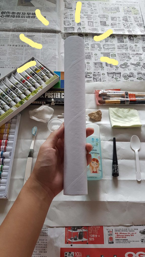
Image 2: Because I didn’t have a roller like the mono-printing post previously, I used a kitchen towel cardboard tube as a… low-budget roller. Hope that it works just as well.

I was very interested in knowing how each unconventional medium would react with the other. For instance, mixing acrylic paint with nail varnish / mixing watercolor paint with nail polish remover. Hoping that upon my experimentation I would discover a texture or pattern the 2 mediums could produce. Will they be miscible? Or no reaction will be observed?

20160821_154725
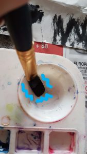
<< Image 3: I tried mixing watercolor paint with nail polish remover and to my surprise and excitement, the 2 mediums are not completely miscible! Black paint coagulations were found at the bottom of the palette.

20160821_154904
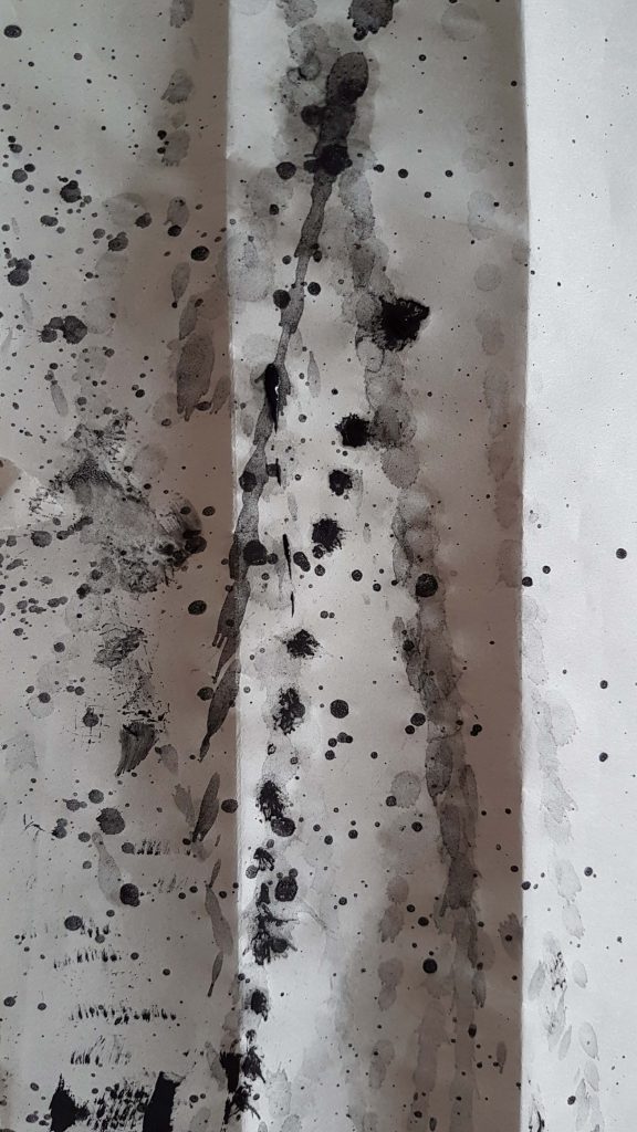
Image 4: After vigorously mixing the mediums in image 3, I swung my wet paintbrush onto the newsprint paper, creating far-ranged splatter patterns.

My first attempt at doing mark making without much visual aesthetic thoughts was considered pretty successful. I was intrigued at how far the splatter could go and the intensity of each splash as I channeled my inner Jackson Pollock. Soon I realized that this is a rather fun and cathartic activity!

I felt more carefree while being more bold in my strokes and actions (as I have already placed a lot of newspaper around me to prevent unwanted marks on my furniture at home) and I felt less restricted and more daring in my choice of mediums than before.

Then I went on to try out using nail varnish and nail polish remover!

20160821_155653Image 5: I cut open a tube of white nail varnish and poured it over the newsprint, and then adding a few drops of black nail varnish onto the white.


20160821_155855_020_01
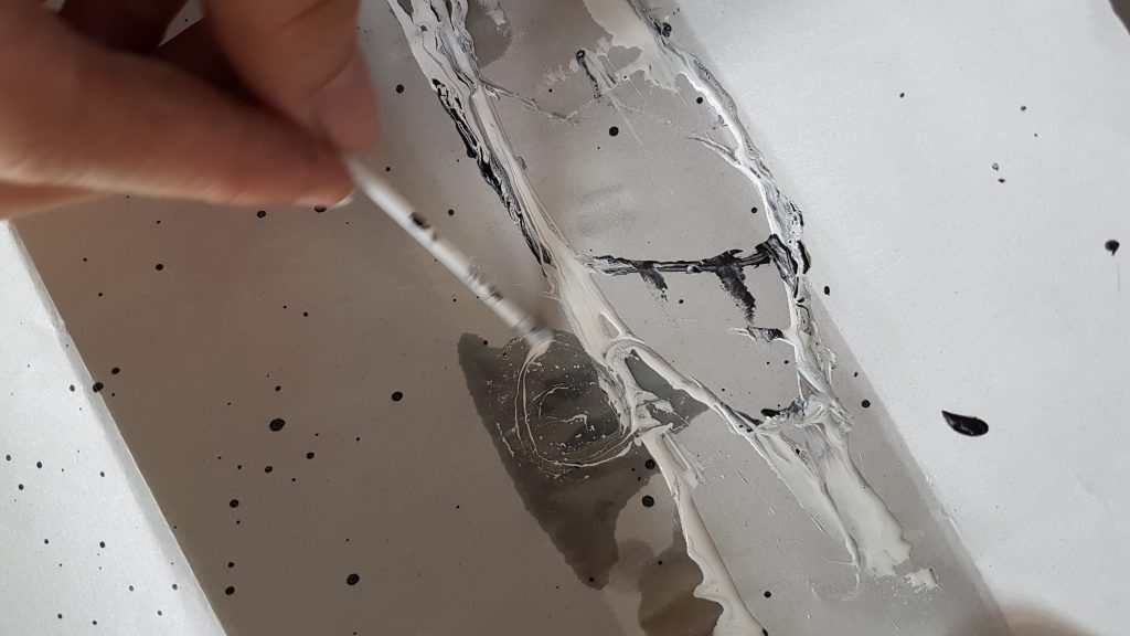
Image 6: I then used the plastic teaspoon to pour nail polish remover over the white nail varnish, and then using a Q-tip (with the cotton portion cut off) to swirl the mixture; creating another  pattern that is a result of 2 immiscible mediums!

Then I began trying out using a very fluid medium like black watercolor paint, and then using a straw to blow at the paint. Creating an unpredictable pattern that goes in different directions according to the dispersion of wind emitted from the straw.

blow art 
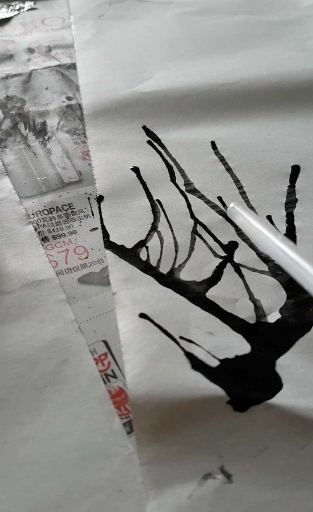
Image 7: Blowing air out from a straw onto an A2 newsprint with fluid black watercolor paint.

The distance of the paint travelled varies, depending on the amount of air I exhaled from my weak lung capacity. Distance of paint travelled decreases with time as the ink has already been spread, and I was very out of breath…yell

Then I was inspired to recreate an artwork I did as a child! The one whereby my kindergarten teacher gave us marbles coated with different colored paint, and a clean A4 sized paper in a paper box cover. She told us to place the marbles in the box cover with the paper and shake it. Resulting an unpredicted abstract pattern created by the colored marbles rolling in the box!

20160821_163503
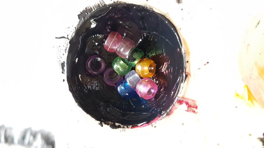
Image 8: I didn’t have marbles so I used beads and coated them in dense poster color paint.rolling
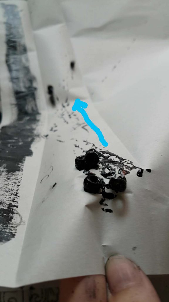
Image 9:  I tilted the paper in an angle and allowed the beads to roll downwards, creating a linear rolling pattern that goes in different direction.

Afterwards I tried to recreate what I have learnt in mono-printing class, but didn’t do so well as my choice of medium was not thick enough.

20160821_16424420160821_164305 


Image 10 and 11: I resulted in painting one size of my scrunched up aluminum foil and then rolling it across the newsprint paper with my kitchen towel cardboard tube. 

20160821_161744
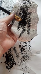
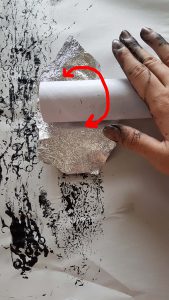
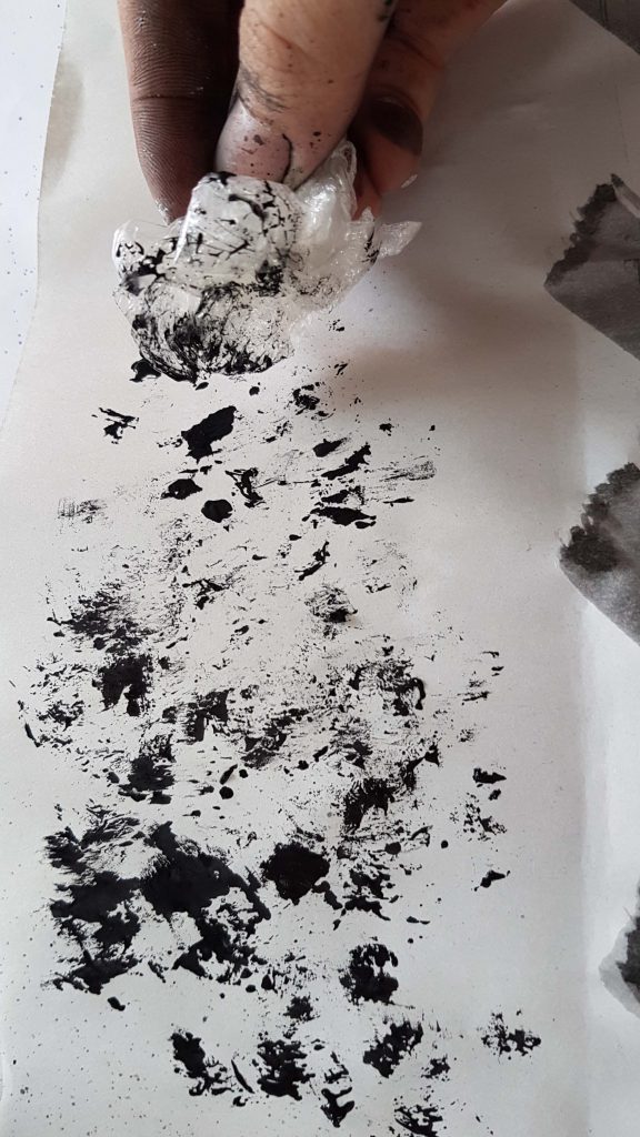
Image 12: I also used a scrunched up cling wrap dipped in paint to dab it all over my newsprint. Creating a blotchy and detailed patterns as the pain began to dry a little.

20160821_161434
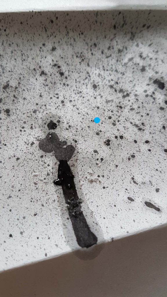
Image 13: Incorporating a tooth brush, I created tiny splattered patterns . The blotchy watercolor paint drip was created by accident. So I decided to add some salt crystals onto it, hoping to achieve a water color to gather the water pigments. But the experimentation has failed as the paper absorbed the water color more efficiently than the salt could.

These are just some of the mark making process I have documented! In conclusion for my first self exploration of mono-printing, I think the results were rather successful ! Though I took videos of how the process of each mark making attempt was done, sadly, I couldn’t upload the video as the file is too big and the format of the video is incompatible. 🙁

But still! The results of the final products were rather fine and I liked how each mark has its own feeling and different textures and patterns to it. :)4

Until next time~

Cheers,

Yi Ling.

Had my first mono printing lesson and it was extremely fun!

We started our day with Miss Joy by dividing our class into 2.

Our group taped pieces of A2 paper together and brought it downstairs to do a giant mind-mapping session to share our research regarding mark making.

Afterwards, we went to the print lab where Miss Joy showed us how to do mono printing by using mono printing ink, lino-cut,  rollers, our mark making choice of items and paper.

20160818_105306 - CopyImage 1: Spreading the mono-printing ink onto the lino-cut with the roller.

Mark making tools I have brought were: Twigs, leaves, Q-tips, toothpicks, plastic string, bubble wrap, cling wrap and aluminum foil.

Screenshot_20160820-183151 Image 2: Placing my mark making objects onto the wet lino-cut from Image 1.Screenshot_20160820-183251 
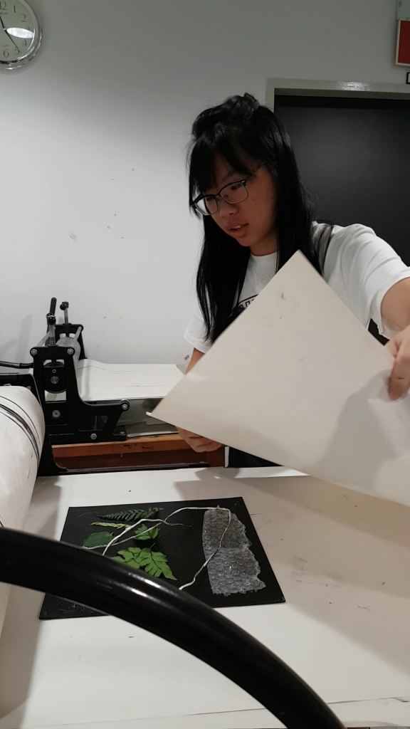
Image 3: Placing a piece of A2 newsprint paper on the lino-cut from Image 2.Screenshot_20160820-183325 Image 4: Covering my newsprint paper with a stack of A2 newsprint, which acts as a ‘Blanket’ to protect the roller machine from getting stained.roller machine Image 5: Begin turning the wheel which moves the platform below it, rolling the A2 newsprint over the lino-cut.peel off

Image 6: Return the wheel to its original starting point and peel off your A2 Newsprint to reveal the mono-print you’ve just created! 😀

reverse mono printingImage 7: After gently removing the mark making tools, place another clean A2 Newsprint on top of the lino-cut and repeat the step in Image 6 to achieve a detailed print of the mark making tools!


The rolling machine was very fascinating! And I liked the result where the mark making tools were removed better as more intricate details are printed onto the paper.

I have learnt that an even pressure applied to my paper creates an even and linear ink spreading appearance, as compared to manually using a clean roller to spread the ink on my own table; whereby the direction and uneven pressure I apply can produce unintentional lines that somehow also make the final product pleasant.

Issues faced during session:

I find it frustrating that I couldn’t focus on conveying my emotions into my mark making techniques.

For instance, I would like to express the emotion: Happiness. But I was really concerned about the patterns I have created. “Is it too spiral-ish? Why do I keep repeating the same pattern? It is not symmetrical enough!” Visual aesthetic concerns like this hinder my sincere thought expressions and I think it is something I should work on to resolve.

My possible solutions to my problems:

  1. Do mark making in a way that I would not be able to see the final product as soon as I begin, as I would worry how it looks before I even end. So I would suggest closing my eyes as I proceed, only revealing the final product to myself when I am done.
  2. Crop out the portion of my end product that depicts the emotions I want to convey.

I will try out these solutions and see how it works for me! 🙂 Stay tuned for my progress!

Photos are taken by my buddy, Queenie.


Thanks Queenie! 🙂20160818_110148


At first glance into the research of Automatic drawing, it is fairly similar to Mark Making. But let me dive deeper into the research to confirm my hypothesis. Lets go! surprised

What is Automatism?

Masson_automatic_drawing

 Automatic Drawing (1924)

André Masson

Ink on paper

(23.5 × 20.6 cm).

“Automatism” most often refers to a technique of subconscious drawing in which the artist allows his unconscious mind to take control. It is the primary method of surrealism.

Automatism is a sort of accelerated or intensified gestural movements. Unexpected and unpredicted images can be made to appear, while avoiding conscious control over the image.

Automatic techniques not only involves doodling or marking marks on paper.

Some other automatic techniques include:

Grattage

Grattage is a surrealist painting technique that involves laying a canvas prepared with a layer of oil paint over a textured object and then scraping the paint off to create an interesting and unexpected surface

Grattage

Max Ernst
Forest and Dove 1927
Oil on canvas
support: 1003 x 813 mm
frame: 1200 x 1012 x 66 mm

Frottage

Frottage is a surrealist and ‘automatic’ method of creative production that involves creating a rubbing of a textured surface using a pencil or other drawing materialuntitled

Phoenix Landing

2003

Roger Clark Miller

Fumage

Fumage is a technique in which an image is created by painting with smoke from a lighted candle into a ground of wet paint.


Fumage, gouache, and color pencil work, by Antonio Muñiz

1955

Oil, sand and glue on canvas

551 x 380 mm

Sand painting

Sand painting is the art of pouring colored sands, and powdered pigments from minerals or crystals, or pigments from other natural or synthetic sources onto a surface to make a fixed, or unfixed sand painting.

Star, Winged Being, Fish 1955 Andr? Masson 1896-1987 Bequeathed by Elly Kahnweiler 1991 to form part of the gift of Gustav and Elly Kahnweiler, accessioned 1994 http://www.tate.org.uk/art/work/T06822

André Masson

Star, Winged Being, Fish 1955

Froissage

Froissage is a method of collage in which the lines made by crumpling up a piece of paper are used to create a drawing.

Froissage - Andre-Pierre Arnal

Torn paper collage etc.

Paper collage is a technique of an art production where the artwork is created using an assemblage of different forms and shapes using paper.

Wren in Winter Original Framed Torn Paper Collage by DawnsGallery,:

When did Automatism begin?

Popularized during the 20th century by Surrealist artists, they sought to unleash the creative force of the unconscious in art.

The Surrealists embraced automatic drawing as way to incorporate the subconscious into their artwork, and to free themselves from artistic conventions, social norms and everyday thinking.

Automatic drawing and painting was seen as the only way then to escape from cultural, intellectual and historical constraints and unlock the basic creativity supposedly lodged deep within the artist’s personality. This technique, Surrealists felt, was a way in to access meaning and information that were unavailable through tradition and the conscious mind.

Impact Automatism had ?

Apart from Surrealism, other movements/ group in which Automatism has played a role includes: Dadaism ( In the early 20th Century), the gestural style of Action Painting and a late-1940s Canadian artist group known as Les Automatistes.

Probably the most famous painters associated with automatic art are Salvador Dali (1904-89) and Jackson Pollock (1912-56). Since the 1930s, Automatism has become a part of the technical repertoire of both modern and postmodern art.

What I admire about automatic drawing is that it is an immediate way to start creating art. It can be done when one feels completely uninspired or faced with a mental block due to lack of ideas. Automatism is a great way to free your creativity. It lifts you out of your logical brain’s desire to make something that’s “good” or “accurate”, unleashing your subconscious mind and breaking free from societal constraints!

Hence, to conclude the research. I feel that Automatic drawing incorporates mark making. Automatic drawing is the idea, and mark making is the technique to carry it out. cool


  • What is mark making? And what can be used to do it?

Mark making is a term used to describe the different lines, patterns, and textures we create in an artwork.

It applies to any art material we use on any surface. A dot made with a pencil, a line created with a pen, a swirl painted with a brush, these are all types of mark making.

  • How is mark making done?

https://www.youtube.com/watch?v=WZ5ConE6kgM

The above link is a brief video on how mark making can be done. The ways of mark making are free and limitless!laughing

mark making
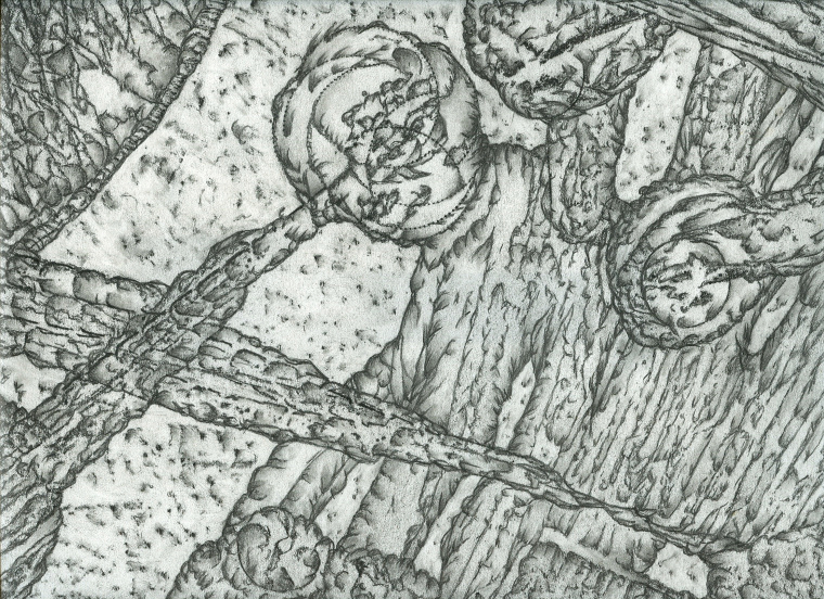
Mark making can be loose and gestural, or structured and controlled. Zen-like doodles, expressive and emotive paint throwing techniques and simply rubbing a stick/ comb/ toilet brush (??) through some acrylic paint are just some of the many creative ways mark making can be done!

But in Project 1 “My line is emo”; my project restricts me to have a black and white outcome in the end, as well as avoiding illustrating emotions literally or creating anything representational…sealed Come on now brain, time for my creative juices to start flowing through my Factory of Creations~

  • When has mark making been introduced?

mmmm

According to the trustworthy search engine: Google, it seems like there is no exact date as to when mark making was officially introduced. It just happened! So in my assumptions, I suppose mark making began when mankind discovered art! Because making patterns or tracing your fingers with a medium that shows a physical and permanent mark, is after all a pictorial attempt at mark making isn’t it? surprised

  • Where and when has mark making been used?

kids

Mark making has been used frequently as an expressive leisure form of art work, art therapy as well as a form of expression and development for children during early childhood.

According to the book ‘Navigating Art Therapy: A Therapist’s Companion’ by Chris Wood, mark making has served as a form of therapy for the physical, spiritual and mental health for humans.

“Indigenous mark-making has been associated, since prehistoric times, with understanding the connections between interior and exterior. Spiritual and religious rituals have also used mark making in aspects concerning health, healing and the sustaining of life.”

-Page 16, Navigating Art Therapy: A Therapist’s Companion by Chris Wood

  • Who has done Mark Making?

Mark making has been done by everyone in one way or another, regardless of an accidental or intended attempts.

For instance, when you accidentally knocked your colored beverage onto your homework, and despite the momentary hysteria, you’re like, “Wow, this is a rather gorgeous splatter I have created by accident!” (true story).

Some artists who has taken mark making into the next level, and are very good at it are:

  • Julie Mehretu, who makes large-scale, gestural paintings that are built up through layers of acrylic paint on canvas overlaid with mark-making using pencil, pen, ink and thick streams of paintJulie1

Kabul
2013
Graphite and acrylic on linen
96 x 144 in. (243.8 x 365.8 cm)

Mehretu’s work conveys a layering and compression of time, space and place and a collapse of art historical references, from the dynamism of the Italian Futurists and the geometric abstraction of Malevich to the enveloping scale of Abstract Expressionist color field painting.

In her highly worked canvases, Mehretu creates new narratives using abstracted images of cities, histories, wars and geographies with a frenetic mark making that for the artist becomes a way of signifying social agency as well suggesting an unravelling of a personal biography.

  • Yves Klein was a showman and one of his most famous events was the imprinting of paper with naked models smeared with blue paint, as he directed their performance to music. The-Great-Battle-Yves-KleinGrande Anthropophagie bleue
    Hommage à Tennessee Williams, 1960

    (Large blue anthropophagy, Homage to Tennessee Williams)
    Grande bataille [Great battle]
    Pure pigment and synthetic resin
    on paper marouflaged to canvas -276 x 418 cm

The Grande Anthropophagie bleue. Hommage a Tennessee Williams is an accurate reflection of the fragility and suffering. In reference to the final scene of Tennessee Williams’ Suddenly Last Summer, adapted for the screen by Joseph Mankiewics in 1959, the work is an expression of great violence by the chaos and force of its marks

Klein presented his work in forms that were recognized as art but would then take away the expected content of that form (paintings without pictures, a book without words, a musical composition without in fact composition) leaving only a shell. He wanted his subjects to be represented by their imprint: the image of their absence.

  • Jackson Pollock was an influential American painter, and the leading force behind the abstract expressionist movement in the art world. His dripping technique (where he danced around the canvas in a trance like state) turned painting into a performance where the canvas bore witness to the act of painting and the resulting work represented an event (of painting) rather than an object.pololock
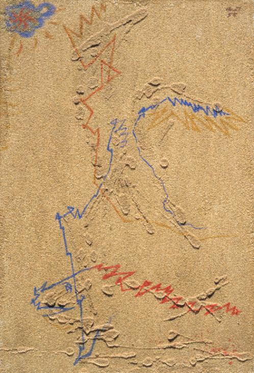
Pollock also incorporates the use of different unconventional mediums. Instead of using the traditional paint brush, he would add depth to his images using knives, trowels, sticks and even his own foot prints as part of the artwork, as he works while standing IN his monumental artwork. In that it had a direct relation to the artist’s emotions, expression, and mood, and showcased their feeling behind the pieces they designed. Thus, achieving different patterns and forms in midst of his expressive mark making.

jacksin

Jackson Pollock’s Autumn Rhythm (Number 30)

1950

Enamel on canvas

105 x 207 in. (266.7 x 525.8 cm)


With that, I conclude my first round of research into mark making.

Cheers!

Yi Ling smile


References for research:

http://painting.about.com/od/artglossarym/g/definition-mark-making.htms

http://whitecube.com/artists/julie_mehretu/

http://www.jackson-pollock.org/autumn-rhythm.jsp


Week 2 of Foundation 4D class was our first lesson for the day!

Our instructor Miss Ruyi Wong taught us about many different aspects that contributes to a good photograph, as well as what our eyes perceive.

Reference artists such as Cindy Sherman and Sally Mann were used.

My classmates also shared their about their favorite photographers and explained the reasons why so. And the photographers shared that I have gained a new interest in are @nguan and @sheiku. (I went by their Instagram account)

Nguan: http://nguan.tv/

Looking at Nguan’s works, I find that they are very distinguishable as it has a pinkish filter that no one is able to easily replicate, and the colors present are comfortable to the eyes.

The subjects matter of his photographs are usually doing mundane, everyday things. The subject matter sometimes look straight at the camera. I felt that he was able to capture a sense of tranquility in his works, as well as bring about nostalgia to something of the past. His ‘Singapore Project’ is one of my favorite projects that he has done as the scenes and the type of subject matter portrayed in his photographs are places I have been and people whom somehow I have met before. This sense of familiarity is very soothing.

Sheiku: https://www.instagram.com/sheiku/?hl=en

Sheiku’s works are something that I draw similarity to a contemporary artist, Damien Hirst’s work. Similarly to Damien Hirst, Sheiku’s works are bizarre, unconventional and it include a shock factor. Sheiku turns ordinary objects into something extraordinary by introducing ready-mades and dissecting the object into something unrecognizable when put together.

His works on Instagram are either not captioned, or captioned with something vague or irrelevant. I would like to think that Sheiku wants us to explain his works in our own interpretation. For instance, upon seeing the above image, a short self-interpretation of this work comes to my mind…

“You trampled on my raw and beating heart when my love for you has grown and almost blossomed.”

Different emotions are evoked upon different ways of seeing Sheiku’s works for me. First comes shock (from choice of subject matter), second comes curiosity ( for why did he chose these objects and what do they mean?) and then lastly, a mellow emotion will wash over me as I try to interpret his meaning to his works.

~~~~~~~~~~~~~~~~~~~~~~~~~~~~~~~~~~~~~~~~~~~~~~~~~~~~~~

What I have learnt during lesson!

The study of signs – Semiotics has started since 1900s.

Semiotics is the study of signs and symbols and their use or interpretation.

Semiotics can be defined into two parts of signs.

  1. Signifier — The form of a sign. The form might be a sound, a word, a photograph, a facial expression, a painting of a pipe, etc.
  2. Signified — The concept or object that’s represented. The concept or object might be an actual pipe, the command to stop etc.

Signifiers are different in different cultures. Examples such as Justin Bieber flashing a double backhand peace sign seem harmless, but to some parts of the world it may seem offensive. (honestly speaking I still have no idea why was it offensive, my search results on Google was negative frown Do tell me what it means if you know thank you!)

A unanimous signifier that everyone recognizes for example is a Life Buoy!

Everyone who sees it will know it is a buoyant support such as a lifebelt for keeping a person afloat in water.

Icon, Index, Symbol

Icon has a physical resemblance to the signified, the thing being represented.

Index is indirectly connected with an object

Symbol is not a representational image. There is no direct resemblance to the object.

**********************************************************

Iconoclasm is the act of attacking/ assertively rejecting cherished beliefs and institutions or established values and practices.

Metaphors & Association

Modern Advertising relies heavily on visual metaphors.

For instant, in the Alice in Wonderland cartoon version Miss Wong showed us, the bird calling Alice a ‘Serpent’ is a metaphor and assiociation to an ‘bird egg stealer’ as she is very big (because she ate some bread that made her grew into a giant), and her size is associated with the length of a serpent.

Or another example showed in the slides by Miss Wong is this advertisement for a beauty product. A ‘skin as smooth as peach’ is associated with a baby’s bottom.

As a peach is highly associated with a bum because of it’s shape and texture. This ad is advertising it’s product in such as way that, if the consumer uses this product, their face will be a smooth and youthful like a baby’s bottom. (yea right…)

Applying what I have learnt about Visual Metaphors onto another advertisement, I chose to use this anti-smoking advertisement…

In my own interpretation, this is a very strong anti-smoking ad as two subject matters are involved. As smoking is usually seen as doing harm to oneself, this advertisement raises awareness to smokers that not only they are doing harm to themselves, but also to other; as depicted by the second subject matter inside the smoker (literally and metaphorically INSIDE the smoker).

This image is highly grotesque to me as putting an unborn infant in view of direct contact with a cigarette is disturbing and uncomfortable to look at. In this case, I find that this advertisement has achieved it’s objective to induce a sense of pity to the innocent baby, against the act of smoking. Thus, encouraging smokers to quit smoking, and pregnant women to quit smoking for the sake of their offspring.

~~~~~~~~~~~~~~~~~~~~~~~~~~~~~~~~~~~~~~~~~~~~~~~~~~~~~~

Miss Wong then let us out to take some photos, using what we have learnt in class. I tried to find signs of semiotics in the scene I was taking.

20160816_122318

A bright orange cone is a sign for drivers and onlookers to be aware, and a tool to redirect traffic.

Seeing that the cone is placed near the wall with a white tape stretched across, I deduced that the cone is to draw attention to others that the paint on the wall is wet. So do caution.

20160816_113331

Directional arrows show where drivers should head to. Reflective yellow and black arrows on the bend of the wall warn drivers to be careful of the bed. 2 parallel white lines tells drivers to keep in their lanes.

With that, this concludes my lesson review for week 2!

Not only have I viewed images, advertisements and present day scenes with a new eye; I think that more thought will be placed when I look at things or before I take a photograph in the future.

Cheers,

Seng Yi Ling.

Research and ideas about mark making is my first task for today.

p1_ex3_1-1024x683

Upon first introduction to mark making in Foundation 2D class today, I was reminded of Art and craft session in kindergarten where we used paint and cut vegetables to stamp on paper.

Hmm.. Ideas~