HELLO! So this is the second project for Year 1 Semester 2, which is actually 1 part of the entire project!
Part I( 2 Weeks) : Research, Sketches, Collection of Data and Presenting found data (soft copy) in a visually engaging manner.
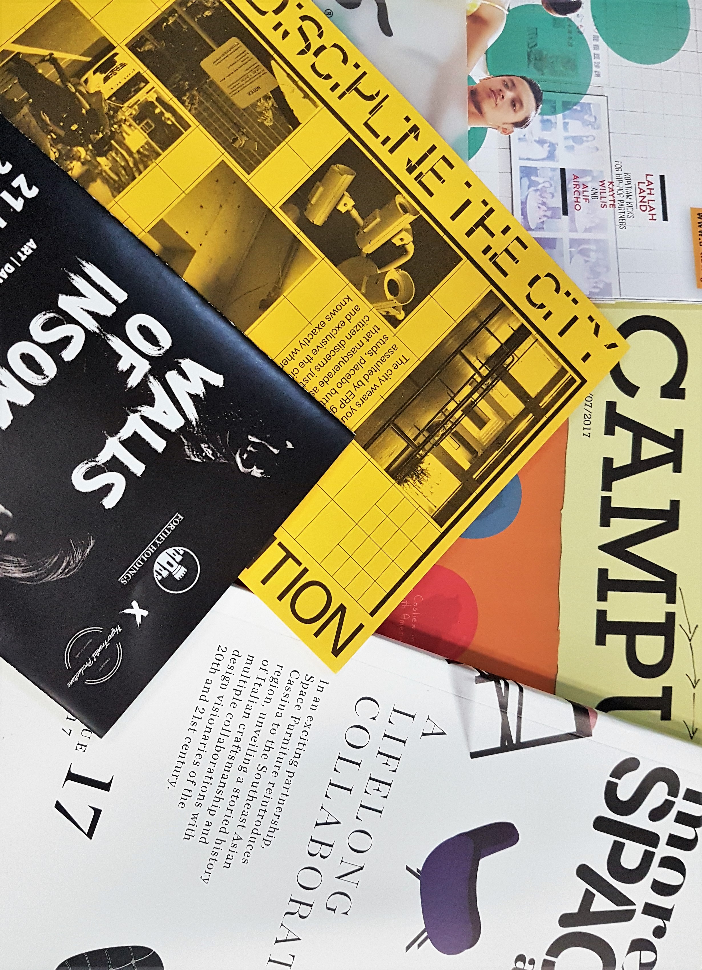
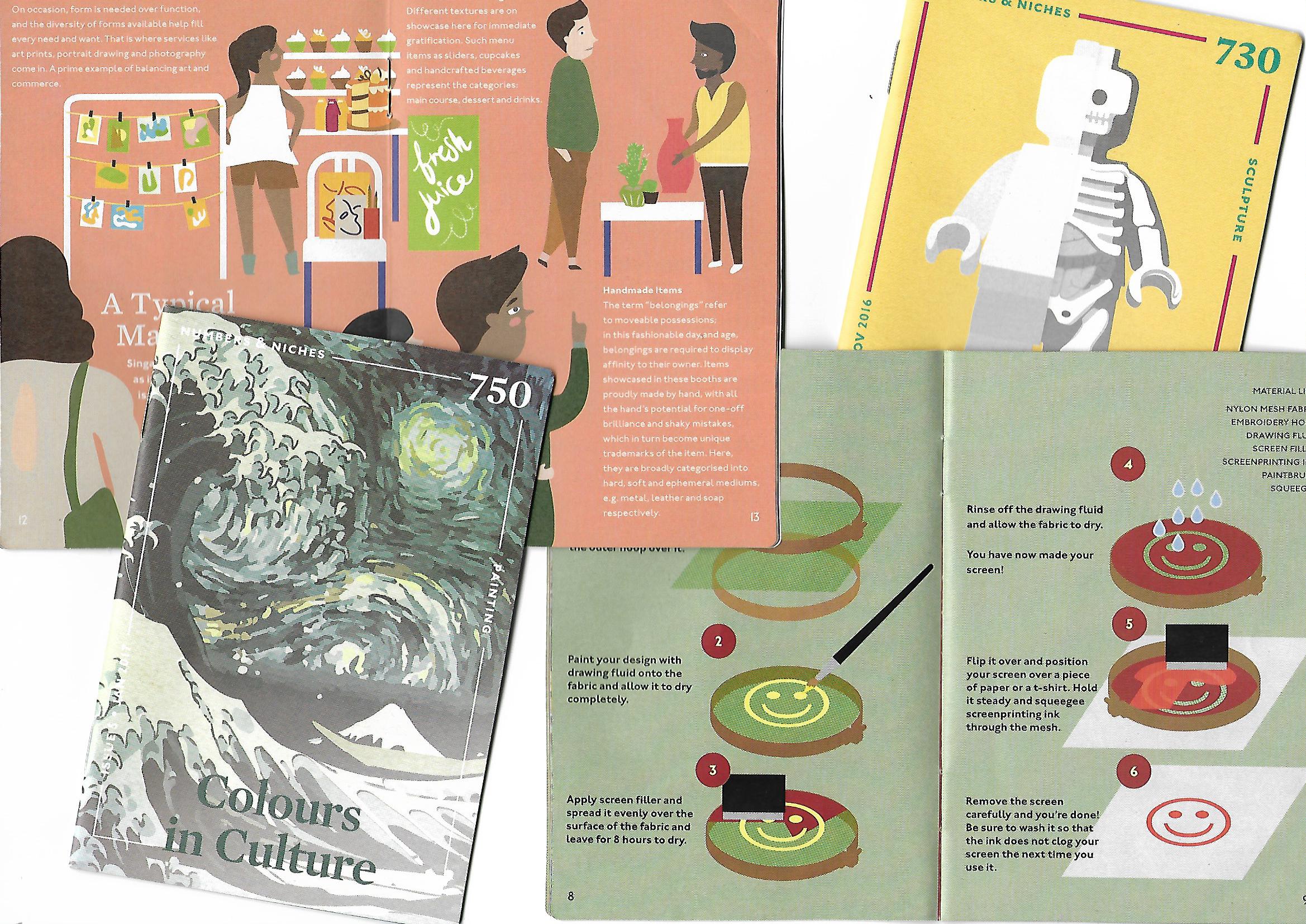
Part II : Creation of Zine.
The area that I have gotten from drawing lots in class as to which neighborhood I had to embark an exploration to is…
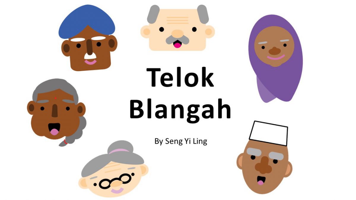
TELOK BLANGAH

And what do I know about this place? ABSOLUTELY NOTHING. ZILTCH.

When I got the slip of paper that determines the choice of location for the rest of the semester, I even asked Joy,” Is this place even in Singapore??”
Oh well. One thing about this project is that the more foreign you are to the location, the better it is because you’ll be seeing things from fresh eyes and discover new things! 😀
SO LETS GET STARTED WITH THE RESEARCH PROCESS WOOHOO!!
SECONDARY RESEARCH ON TELOK BLANGAH
What is ‘Secondary Research’ – Secondary research is accessing information already gathered from the originator or a distributor of a primary research. For instance, like obtaining information from third party sources, magazine article’s or my friend’s grandfather’s sister who lives in Telok Blangah (just an example).
So I made some quick online research about Telok Blangah and to my surprise, I did find some interesting facts already!
- Telok Blangah is a subzone region and housing estate located in Bukit Merah, Singapore.
- Founder of Singapore,Sang Nila Utama , landed at Telok Blangah and went inland to hunt wild animals, where he spotted a majestic Lion afar and decided to name our homeland, Singapura (Lion City).
- The area regained prominence during 1823, the British period, when Sir Stamford Raffles assigned Temenggong Abdul Rahman and his followers, 0.81 km2 of land for their residence and a cemetery. The area flourished under Temenggong Abdul Rahman because of his monopoly over the gutta percha (Some tree sap) trade.
- Kampong Bahru replaced the old kampong along the Singapore River. And this first resettlement could be called the first urban renewal project in Singapore. The Hill maintained the old name of Telok Blangah Hill until July 1845 when it was renamed Mount Faber after Captain Faber of the Madras Engineers.
- Telok Blangah Road was officially named in 1907.
- The shrine of Puteri Radin Mas Ayu, a sixteenth-century Javanese princess, is located at Mount Faber Road, near the junction with Telok Blangah Road.
SECONDARY RESEARCH ON
WHAT IS TELOK BLANGAH KNOWN FOR?

Nature. Telok Blangah at first glance online screams ‘NATURE’.
Population Estimate as of 30 June 2016 : 10,500
Telok Blangah Hill Park (10 Telok Blangah Green, 109178)

Terrace Garden Mostly used as just a walkway between Hort Park and Mount Faber. There is an undisturbed, idyllic ambience with a solitary gazebo sits atop the hill along with classical European white railings. Despite what a sight the garden is, the real spectacle to behold here is the panoramic view of the cityscape from a bird’s eye view.
Henderson Wave Bridge (Henderson Road, Southern Ridges, Bukit Merah, Singapore 159557)
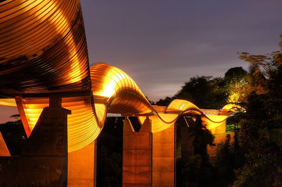
Singapore’s highest pedestrian bridge, at 36m above ground. Surrounded by greenery and bird’s eye view of the southern part of Singapore, the shell-like crevices doubles as shelters and is a great place for family and friends to relax there. The bridge is illuminated from 7pm to 7am daily.
Alkaff Mansion Ristorante (10 Telok Blangah Green)
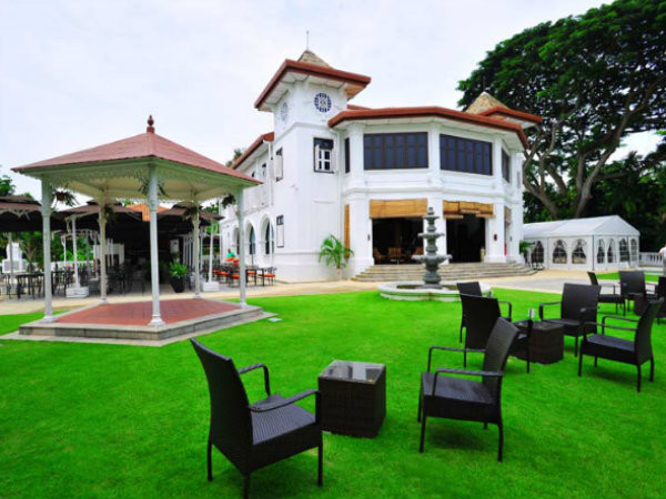
Built in 1918 as a weekend retreat for the illustrious Yemeni Alkaff family of spice traders. The Alkaffs ancestors arrived in Singapore from Yemen in 1852, and Alkaff Mansion was not only their family home, but also the venue for luxurious high society parties in the 1930’s – imagine Great Gatsby, Singapore style.
For an unknown reason, the mansion was abandoned after WW2, and went into a state of disrepair. With a large outdoor terrace, fountains, and a gorgeous interior, Alkaff is thought of as one of the most magnificent colonial houses still standing in Singapore. And now, it is an Italian Ristorante.
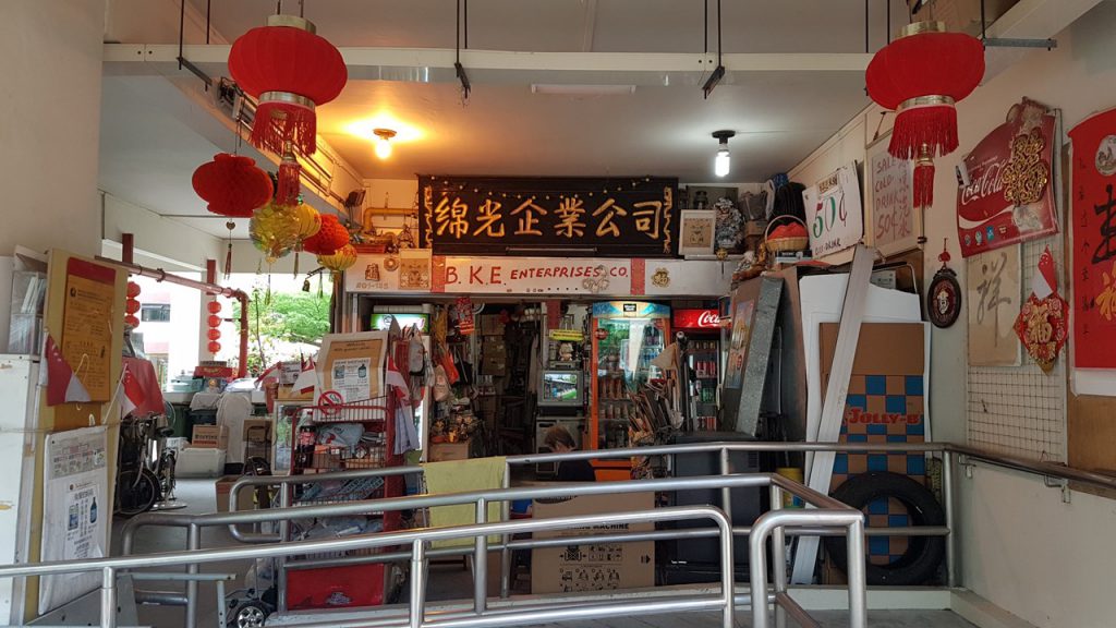
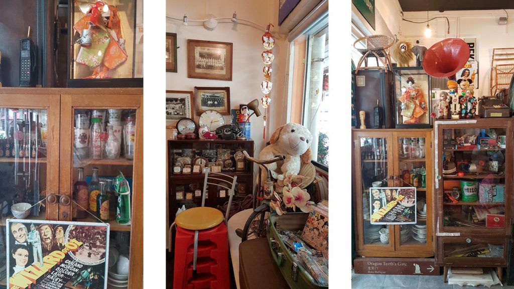
Old Habits Boutique Café (#01-315, 38 Telok Blangah Rise, 090038)
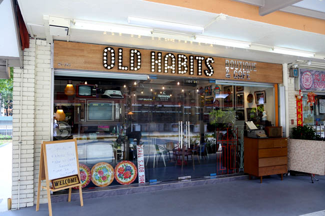
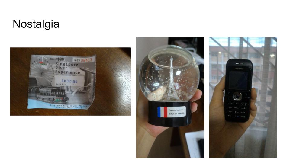
Nostagia is in. Old Habits is part vintage boutique and part café, a place to appreciate the lifestyle of the old eras and immerse in the memories of the past. The interior of the boutique café is docked with many vintage items from the past which the owner of the café, Donovan Goh collects.
This section concludes the secondary research I had done BEFORE I went on my field trip as of 15 Feb 2017. 🙂 The following segment will be on my documentation of my field trip!
FIELD TRIP DAY 19 Feb 2017
And so, I went to Telok Blangah with my trusty partner in crime ( Dad  ) for the field trip and thanks to him, I was able to cover more area on this foreign ground in Singapore!
What is ‘Primary Research’? – Primary research is any type of research that you go out and collect yourself. Examples include surveys, interviews, observations, and ethnographic research.
So when I was on my way to Telok Blangah, I was not certain what I was looking for. Its either food or shops and I didn’t want to touch on the nature parks aspect as it is the most prominent aspect in Telok Blangah and I didn’t want to do something that can be easily found on the net.
So I went to look for Food first since we were hungry anyway.
FOOD in Telok Blangah
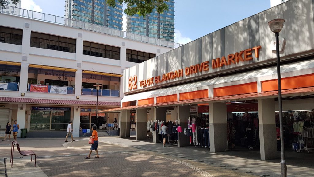
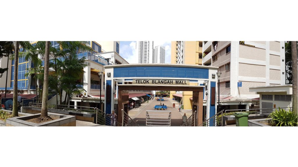
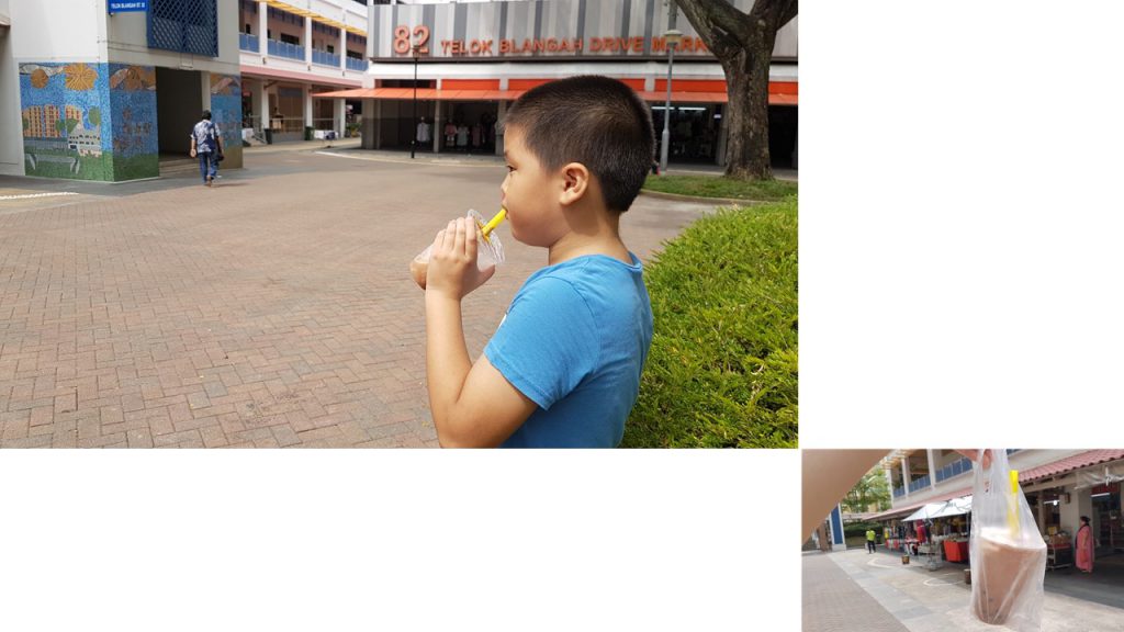
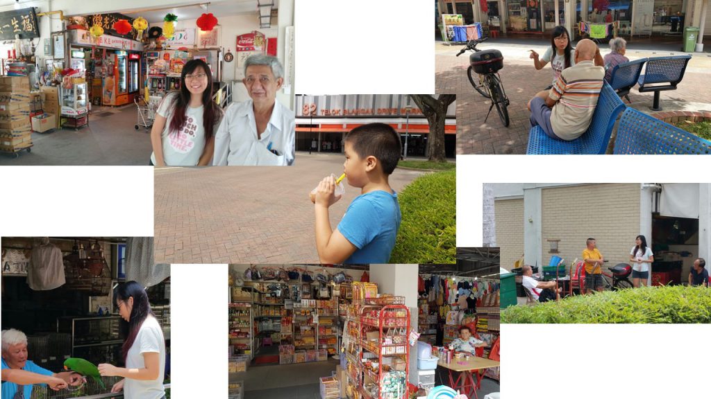
The place my dad and I went to eat at was 82 Telok Blangah Drive Market, I chose that specific location as it was within the Telok Blangah Mall area which I wanted to visit as well. Within the market, there was already a couple of lines queuing up for some local food which I also joined in to partake in the ‘Participant Observation’ aspect.
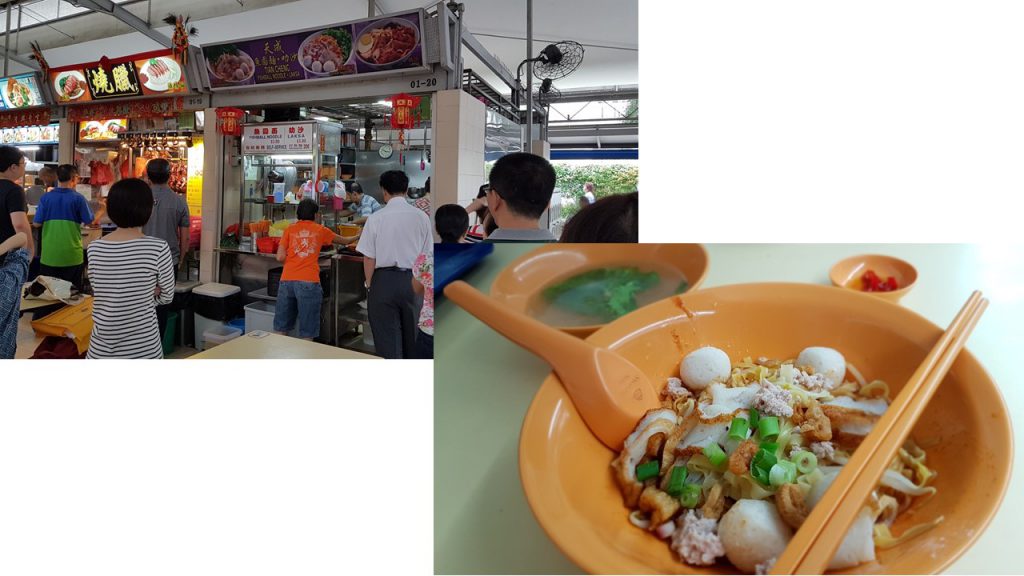
The noodles I queued for took 30 mins and I was pondering what was taking so long. I observed and saw that the owner and his wife were perhaps in their mid 60’s and the cooking process was rather unique. The Uncle cooking the noodles had a system where his wife is the one taking the order and frying up the fishcakes (which I believe is handmade), and he was the one preparing for the noodles. He was swift in his actions and he bounced on the balls of his feet. And was the noodles worth the 30 min wait? Well, lets say I have tasted better. But the fishcakes were good though.
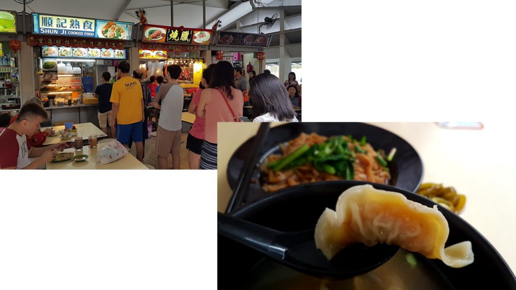
And I also tried Shun Ji Dumpling Noodles as the queue died down after lunch hours. The dumplings were smaller than the ones I’ve eaten , but they are packed with fresh shrimps and pepper! It was really good.
QUALITATIVE DATA COLLECTION
What is ethnography and participant-observation? What are some ways collecting data?
The aim of ethnography and participant-observation is to gain a close and intimate familiarity with a given group of individuals and their practices through an intensive involvement with people in their cultural environment.
Some forms of collecting data are conducting informal interviews, direct observation, and analyzing personal documents produced within an age group etc. It involves the characterization of Qualitative Research and can include Quantitative Dimensions.
What is qualitative and quantitative data? 
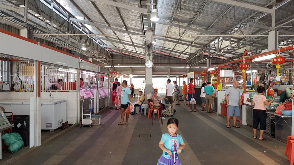
After which I toured around the market and was astounded to see that the wet market was extremely clean and spacious. There wasn’t a hint of poultry odor as the area was very well ventilated.
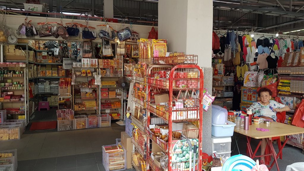
Turning into a corner, I saw an elderly lady tending to her Incense Paper shop and I plucked my courage to conduct a Qualitative Data collection with my 1st interviewee.
What I have gotten out from the interview:
Incense paper auntie has been selling incense paper for 10 over years, living here for 40 over years. She said that the difference between Telok Blangah then and now is that the markets aren’t as lively. She mentioned that there was a drastic decrease in the number of people living here. Don’t know where all the people go. Old residents die and the younger people don’t really want to move to Telok Blangah. Telok Blangah has more elderly people than youngsters. Houses here are all new now, not as before. She didn’t play a lot as a teen in this area, she was a housewife.
Shortly after, I was spurred to interview more people as I wanted to have multiple perspective of things and personal recounts of the resident’s perception of their own neighborhood. I walked around Telok Blangah Mall.
A little boy caught my attention as he was drinking Ice Blended Milo from my childhood cheap bubble tea shops and I asked him where did he get it. He brought me to the shop and I spoke to him. (grabbing my opportunities right here~)
What I have gotten out from the interview:
The milo ice blended he has gotten is from the ‘old store’, not the ‘new store’ that was closed today. New one is called Mei Li Shop. He always buy at the Old store. HE IS BORN HERE. HE IS SINGAPOREAN ( he emphasized on that, I was not kidding with the caps lock). He questions my nationality haha. He is walking around here as his parents are shopping for things. He goes to his friends’ house to play after school. Play computer games and Ipad. Telok Blangah is very boring. His parents work at Tanjong Pagar and Raffles Place. He can go home on his own.
My dad is a vey good paparazzi. I didn’t even know he was secretly helping me document my explorations haha!
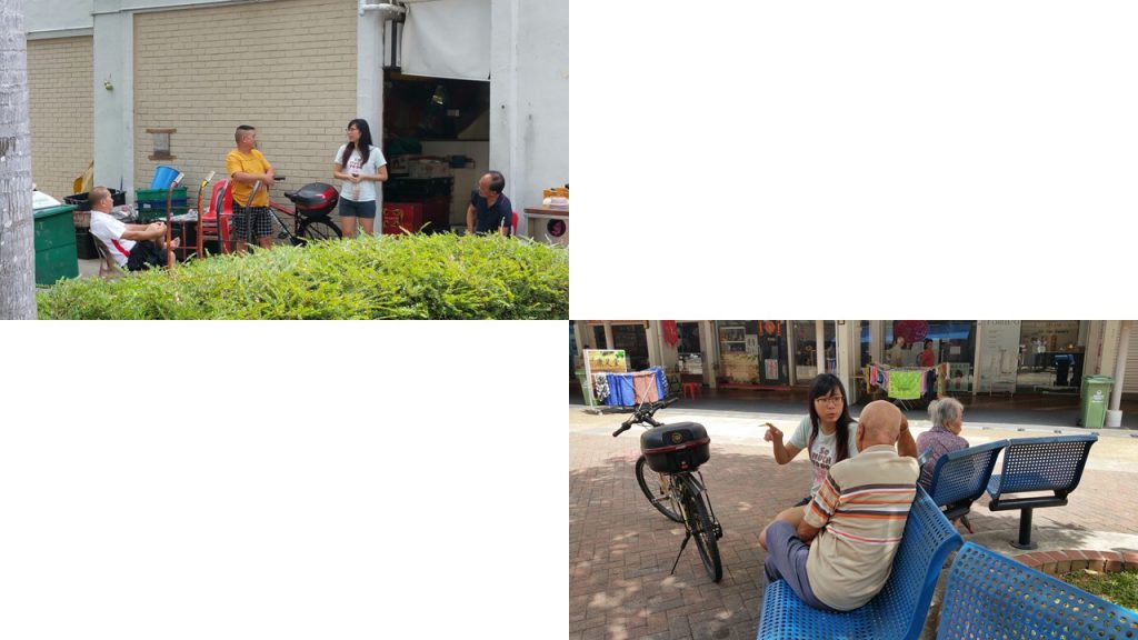
I saw an elderly sitting on his own and I guess that he lived here as he was sitting rather comfortably on the benches. Hence I approached him and asked him about his personal recount of his past in Telok Blangah.
What I have gotten out from the interview:
Uncle stays in the vicinity. Here is nice. Stayed here since 1980. No play. Now retired. Last time work at PSA Container Port. He is happy with his CPF. After eating at the market, he go home. Occasionally goes to the nearby shopping centre.
I was on a roll. It was a heat of a moment spur of courage and I went round searching for people who looked like they lived here and I was determined to collect as many personal recounts as possible. Which led me to this group of uncles who sat at the fruits stall discussing about their lifestyle.
What I have gotten out from the interview:
(In this group I’m interviewing consist of 4 uncles) 3 of them have been staying here for 10 over years, whereas the other has been staying here for 40 over years. Constantly asking me why am I asking them questions (they seem wary. I don’t know why). Here has no place for their leisure. Only form of leisure they can frequent is Marina Bay Sands (MBS) Casino or here at the fruits stall to talk to friends. Here is full of old people nothing else, its so dead here. Its a dead end. Eat and go home that’s it. Houses here 30 years ago used to be short and tiny, now is all high rise. The uncle (71 Years Old) whom I spoke to has been living here the longest came to Singapore in 31 August 1983, selling fruits since then. He was 30 plus when he started selling fruits. He was an immigrant, he ran from Russia to Singapore. He did not go for dates in Singapore because he was busy working. Work and go home. People who used to live here has passed on. Or if they are alive they eat their lunch, go home or sit with friends and talk.
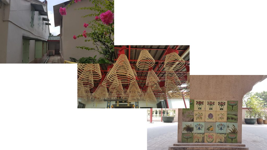
One of the uncles told me that I should visit the 2 old temples behind to interview the elderlies as they have lived there far longer than any of them. So my dad and I went to look for the temples they’ve mentioned.
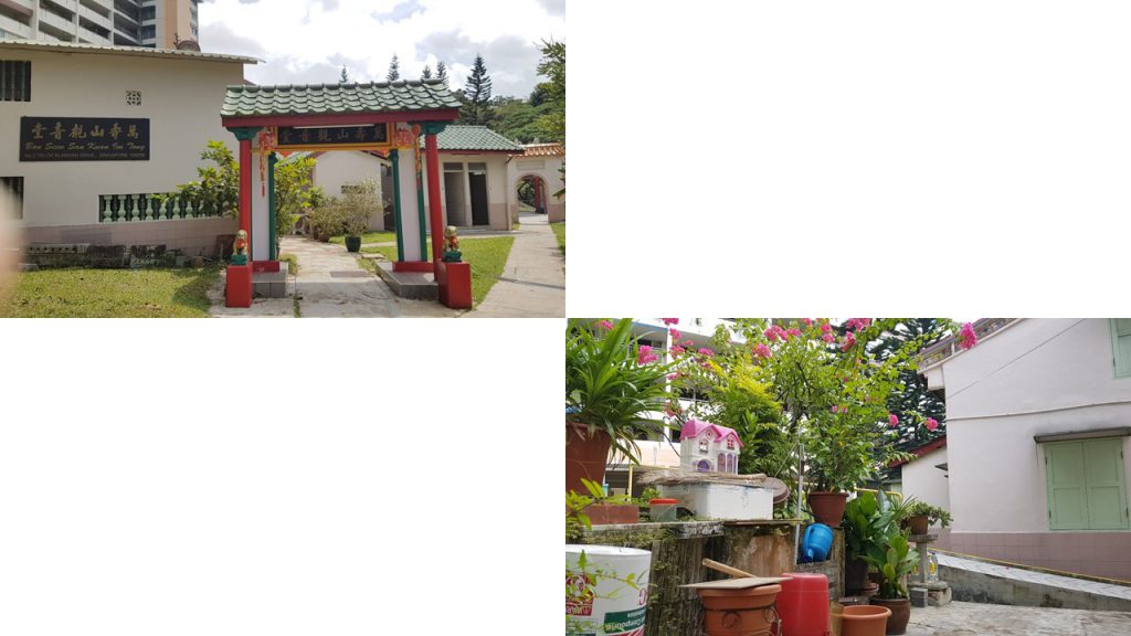
Sad to say, it seems like the elderlies has gone home at that timing we went, but the temple was really beautiful and intimate as it was rather small, and the devotees are the residents within the neighborhood.
While walking back to our car, my dad and I chanced upon this very vintage looking Mama shop (A mama shop or mamak shop is a convenience store or sundry shop in Singapore that is often located under a high-rise apartment block ) . Most Mama shops I recall as a kid are usually ran by Indians, but this was a Chinese Mama shop. The interior looked extremely different as well so I decided to speak to the owner.
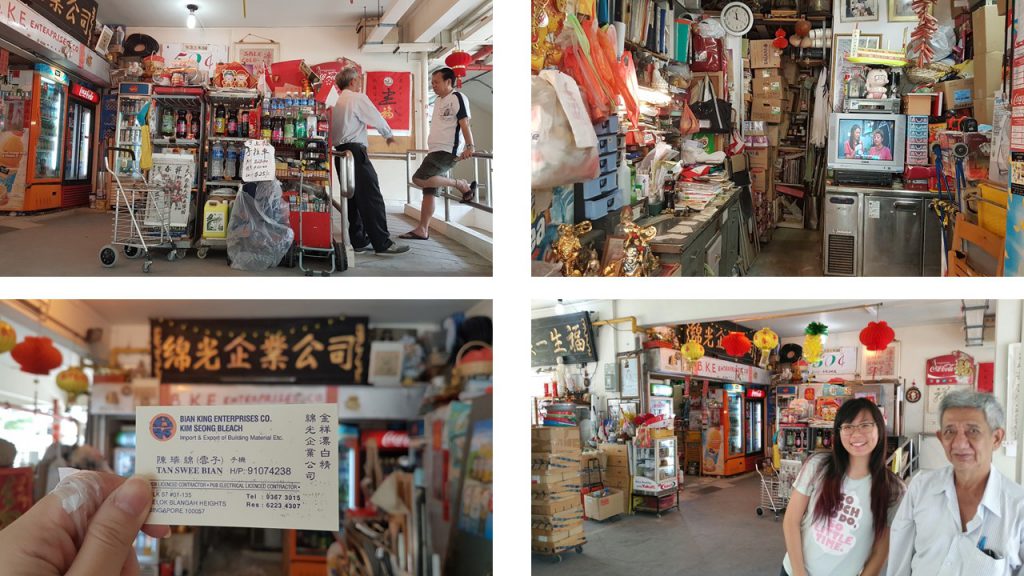
What I have gotten out from the interview:
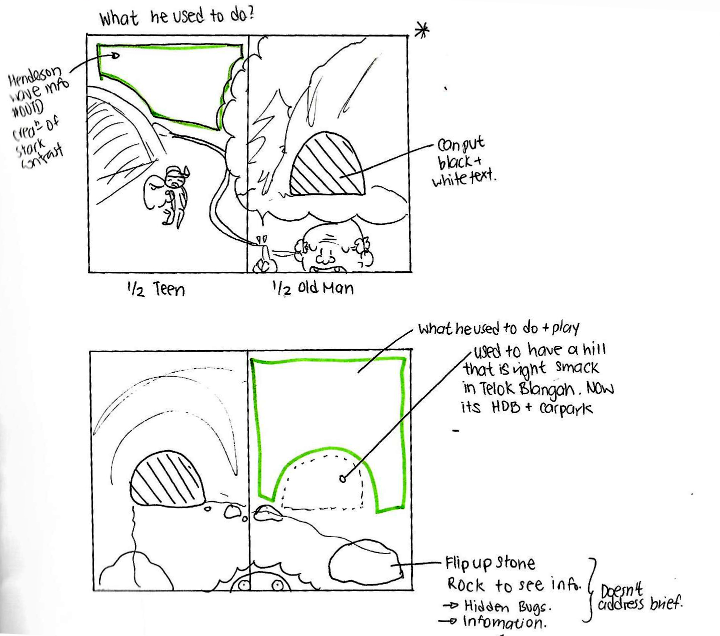
Stayed here all his life. The company he worked for is 50 over years old. (the mama shop now used to be a part of a company, explains the grand shop sign) . Used to be in a office in Henderson Crescent ( location is at the back of a SGD$10 note), but got chased out by government to Tampines. Uncle started doing business when he was 23 years old, now he is 73 years old. Telok Blanagh here is a hill. Used to be a hill right here *Gesture area which has carparks and HDB flats* , government bombed the area to pave way for making roads and houses. Hill was as tall as Mount Faber. Used to have a very big temple on the hill, and a reservoir. Temple is so large you can see it from the distance, that was over 30 years ago. When he was younger, his childhood was playing in a natural cave in Mount Faber which has been sealed off by the government now. He went there often since he was 6 years old with his friends and his class teacher, playing with mud and clay to make dolls in the natural cave. Not like now, so many things to play with. Last time don’t have so many things to play with. In the past after playing he would go to the waterfall and hydrate himself, waterfall is contaminated now or even gone. Used to eat bird food (鸟饭)as a kid, the ones mother bird brings to their chicks . Venus flytraps are poisonous, they are inedible.
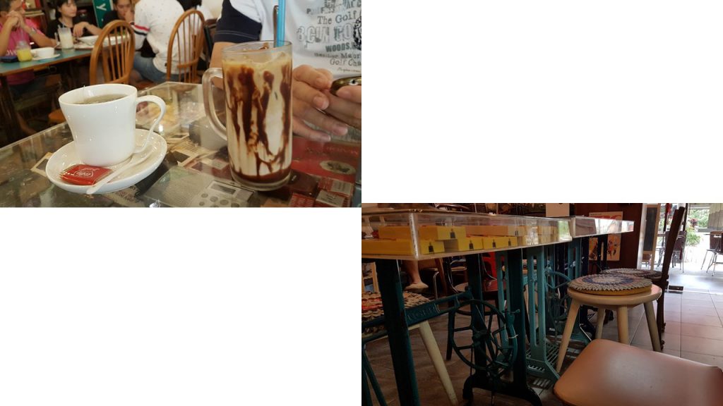
After speaking to the kind owner of the Mama shop, I wanted to visit Old Habits Boutique Café which I saw on my secondary research just to see if I would chance upon any younger age group of interviewees.
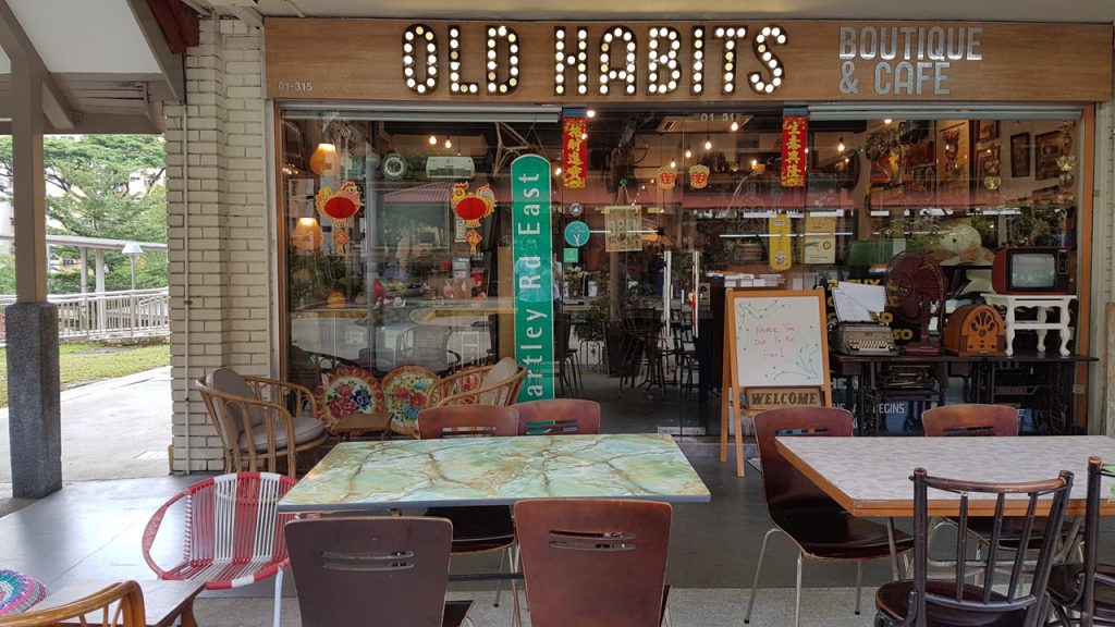
Surprisingly, the patrons of Old Habits Boutique Café were middle aged and families were there too for Sunday brunch. The interior was really beautiful and intriguing as it was heavily decorated with toys, vinyl records, sign boards collected from the past.
On my way back to the car, I was estatic to see a group of elderly men chatting at the Bird Shop along with their bird cages. I was even more estatic when I saw Parrots on the railings. I talked to the Parrot (What? Parrots can be a part of my Qualitative Data collection too okay? XD) .
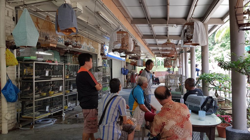
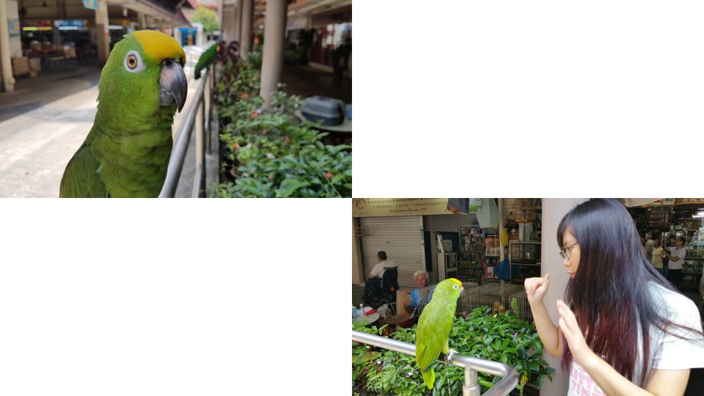
The owner of the parrots told me that he has lived here for many years already and part of his and his friend’s past time here is bringing their birds out to ‘Chat’ together as they drank their afternoon coffee.
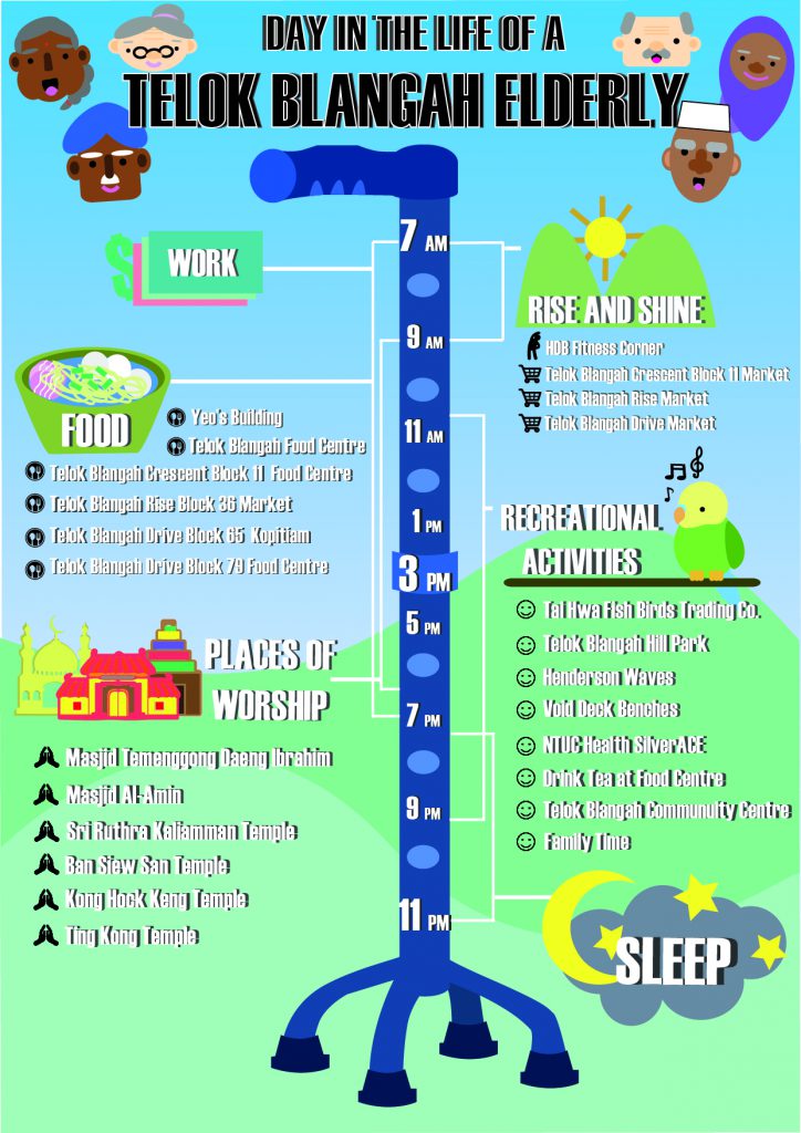
Overall conclusion from Qualitative Data Collection:
- There is a drastic decrease in the number of people living here as compared to the past.
- Telok Blangah has more elderly people than youngsters.
- There used to be another hill as tall as Mount Faber here, but was removed to pave way for houses and roads.
- Here has no place for their leisure.
- Here is full of old people nothing else.
- Eat and go home that’s it.
- Houses here 30 years ago used to be short and tiny, now is all high rise.
- Work and go home.
- People who used to live here has passed on. Or if they are alive they eat their lunch, go home or sit with friends and talk.
How I would think of presenting my data for the infographics
Since, Telok Blangah is quite a hill infested area, I was thinking of presenting the infographics like this. Like a map.

Perhaps using real images to represent certain activities the residents do? Like eating, talking to friends etc.
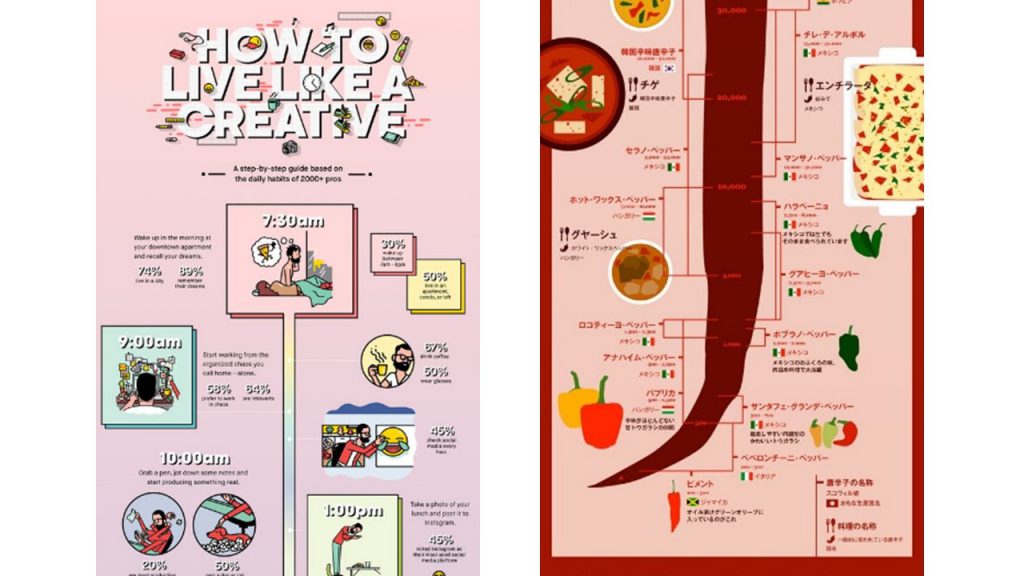
What are infographics and how are they used to effectively communicate data? What other ways can we visually represent data?
Information graphics or infographics are graphic visual representations of information, data or knowledge intended to present information quickly and clearly. They can improve cognition by utilizing graphics to enhance the human visual system’s ability to see patterns and trends.
After my field trip today, I am sad to say that I still don’t have a concrete methodology as to how I would want to carry my Infographics out. But what I am certain of is that I would like my infographics to be based on my interviewee’s personal recounts and where they would frequent in Telok Blangah. This is not a very concrete resolution, but I would like to brainstorm more on how I would want to convert that to infographics.
That’s all for today!

Hope that the next time I post would be more concrete!!
Cheers,
Seng Yi Ling.
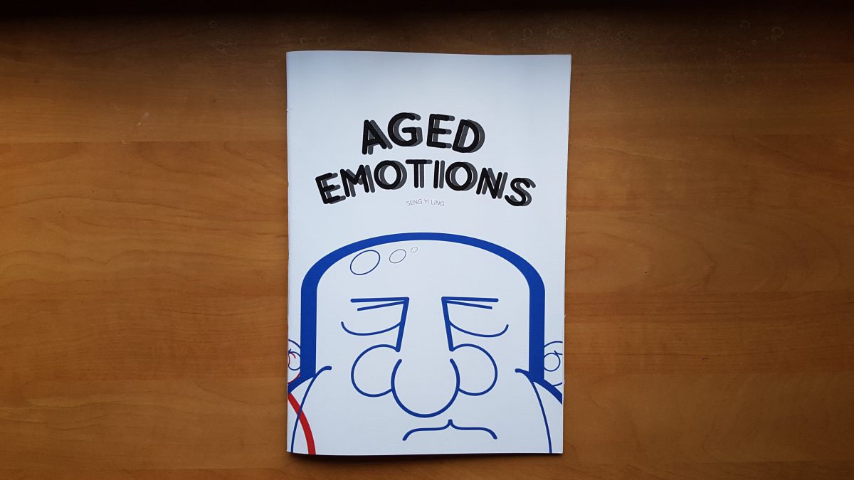
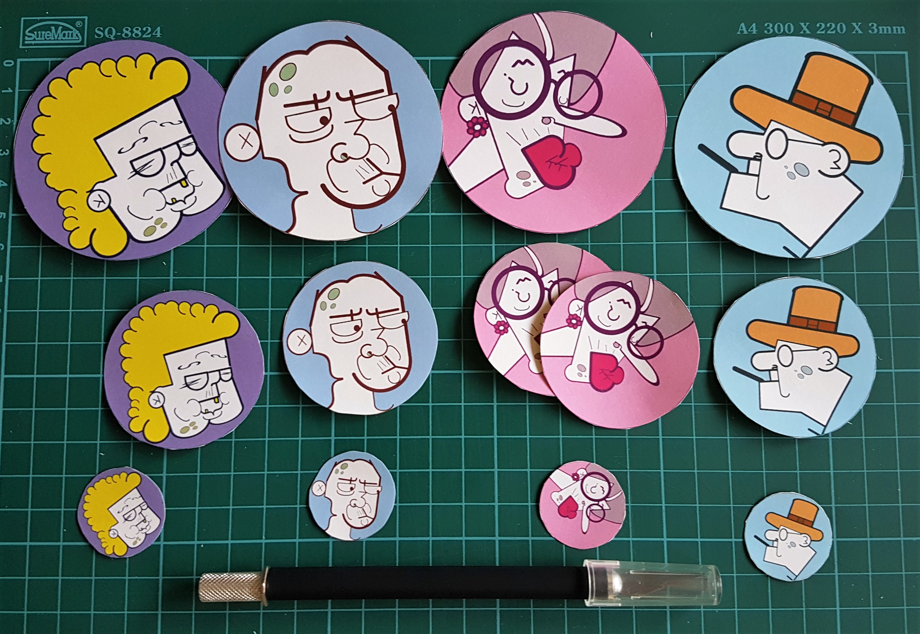


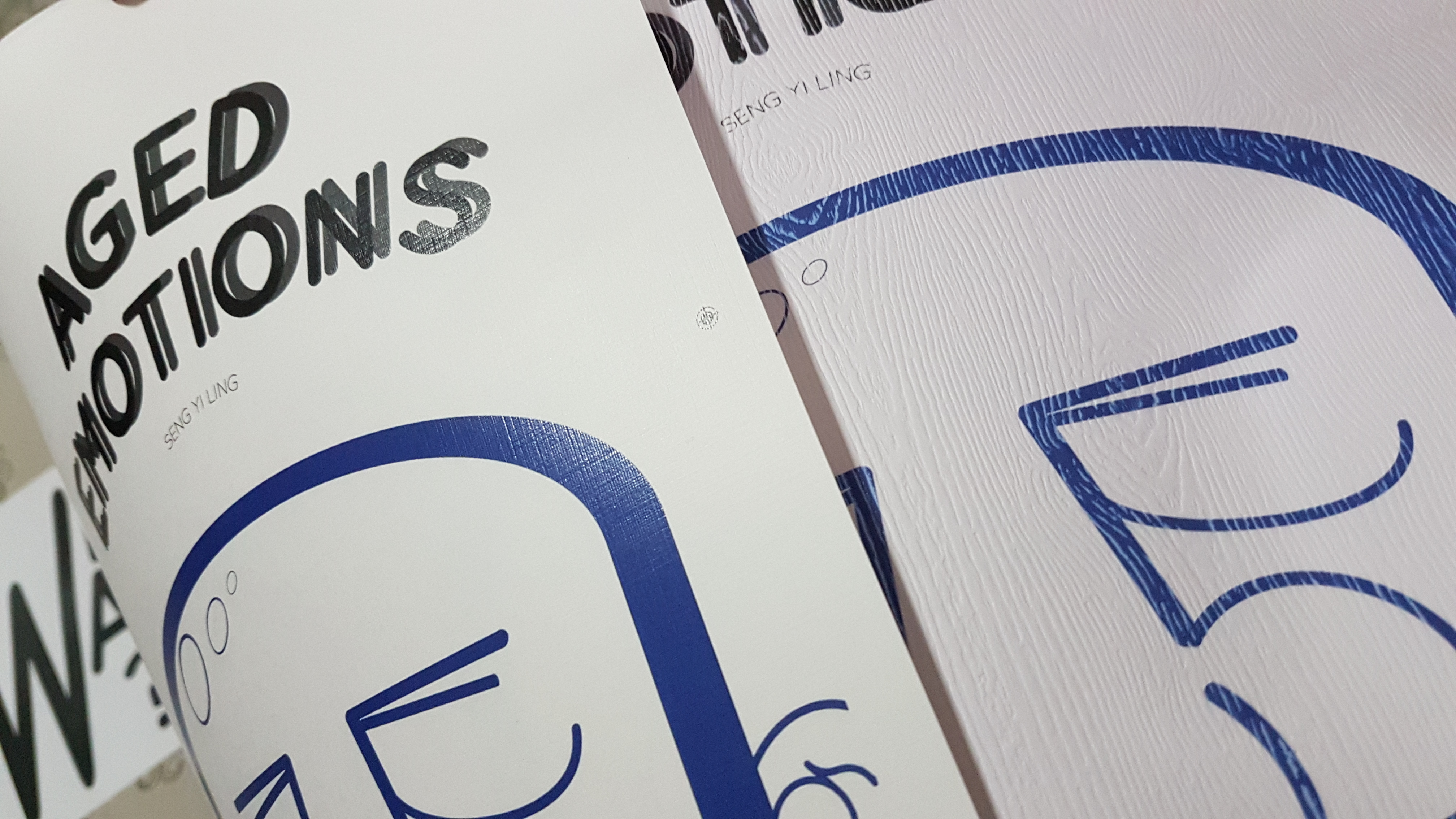
 I did up a try-out to see if the idea was feasible. I used the numbers 1 to 10 to create an image of an old man; I manipulated the numbers by playing with the vectors to create certain features, for instance, the foot of 7 to be the foot of the old man, and the curve to be his back.
 I shall pitch this idea and see how it goes! 🙂
 I pitched my idea to Miss Angeline via email and she finds both ideas to be workable, and gave comments too! Yay! 🙂 But now I am in a dilemma because I want to go ahead with both ideas.
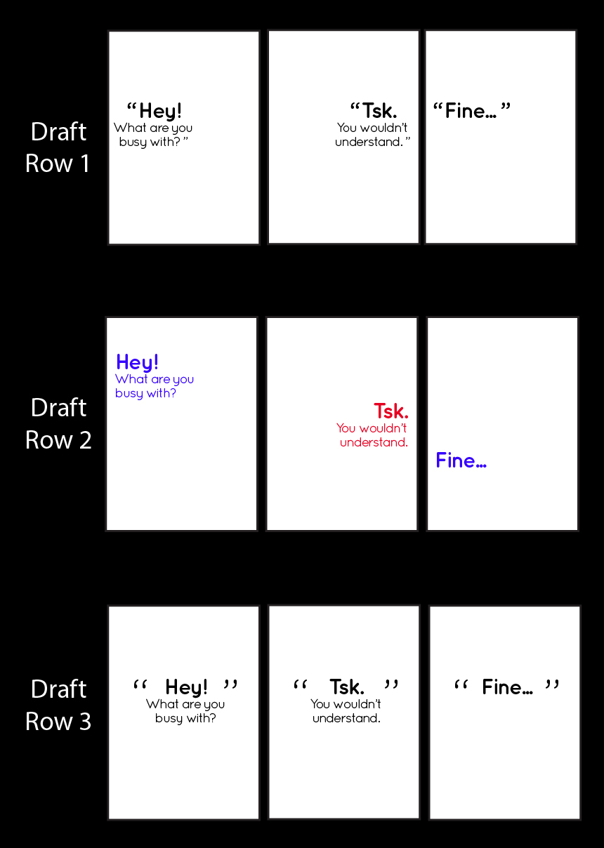
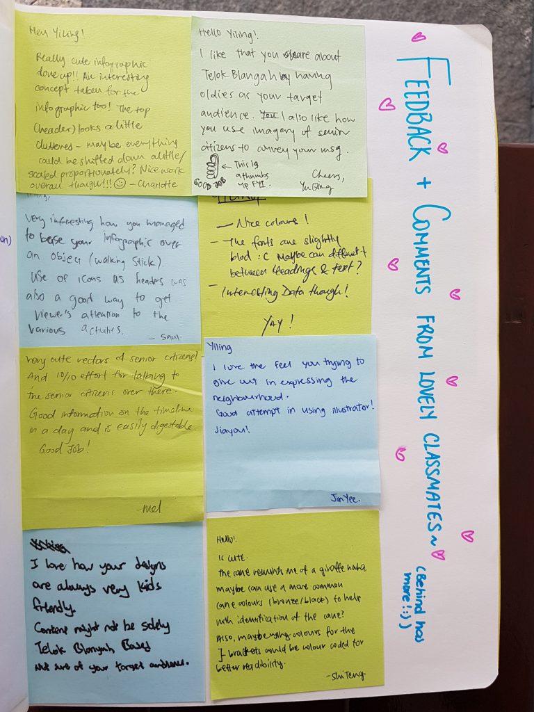
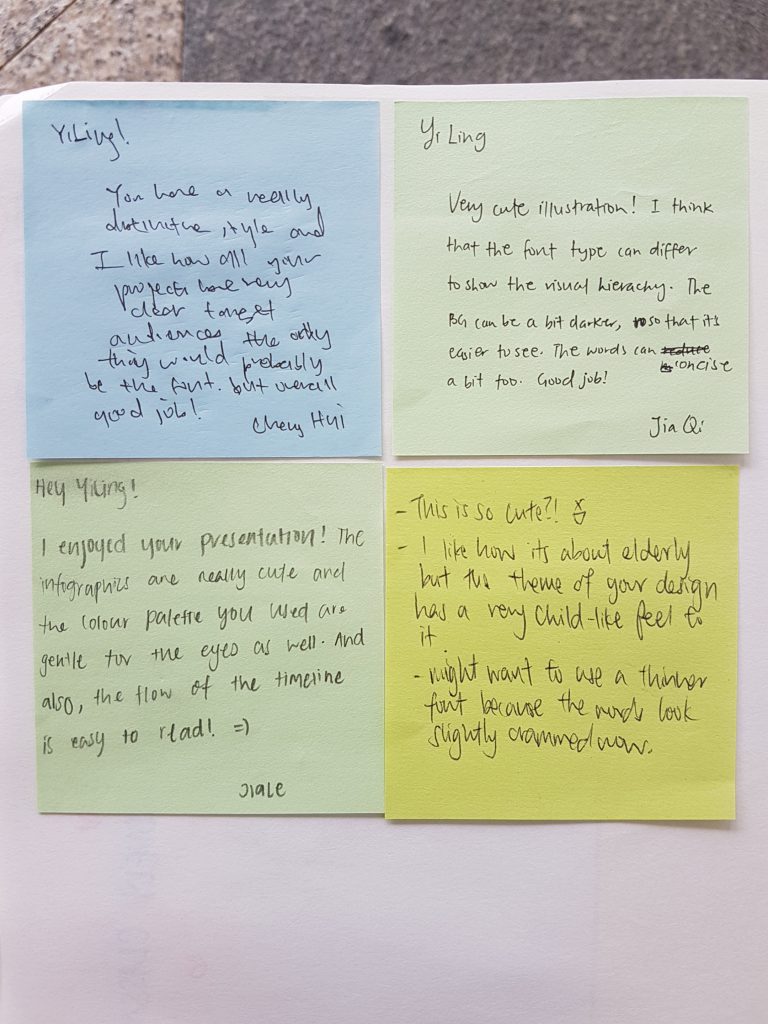
 Feedbacks and Things to change:
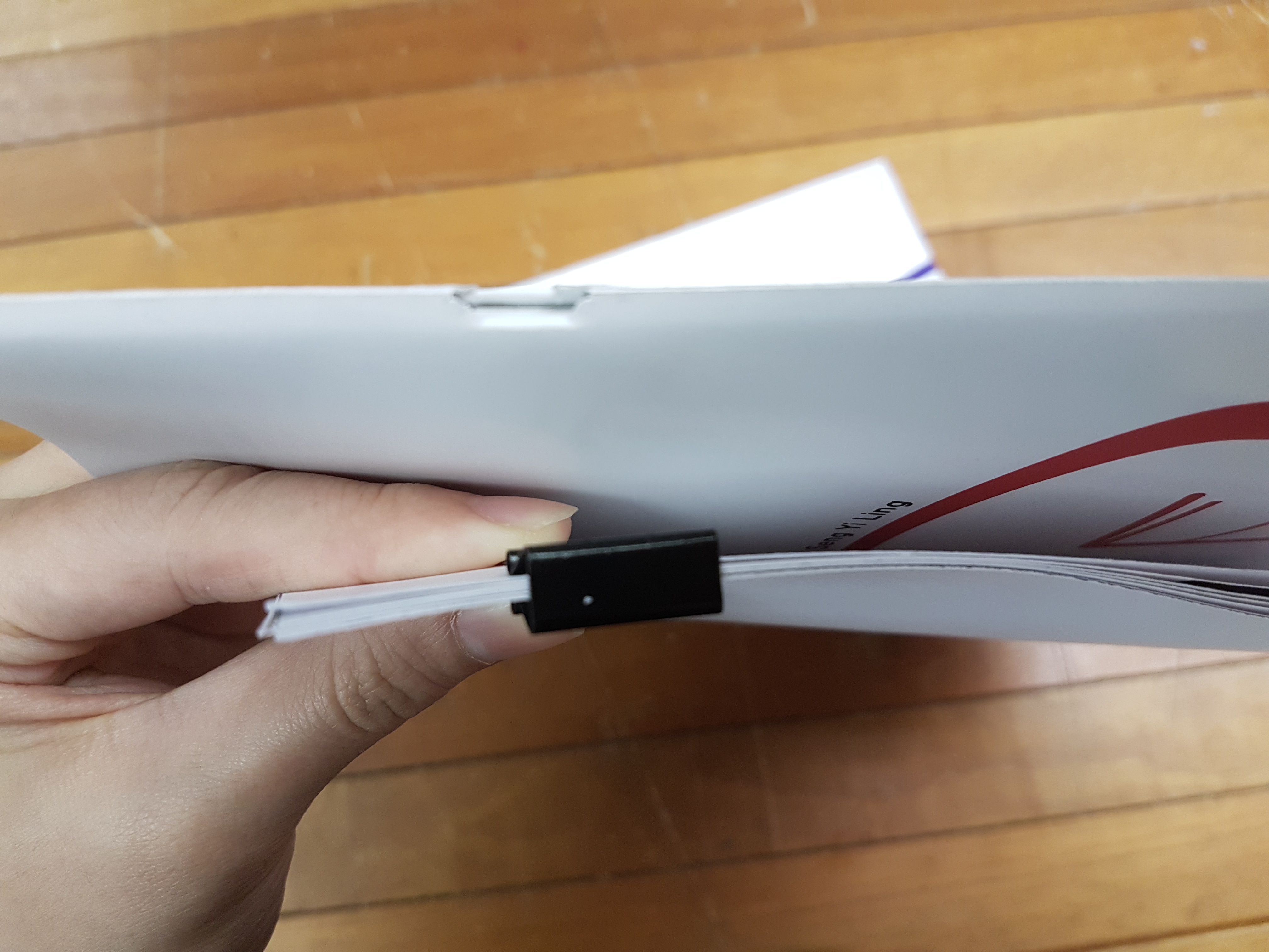
 ***Note to future self: ALWAYS DO A MOCK UP WITH RECYCLED PAPER FIRST TO KNOW IF U GOT THE RIGHT NUMBER OF PAPER AND WHICH SIDE OF THE PAPER IS WHICH PAGE!!!
 Changed the ending page too
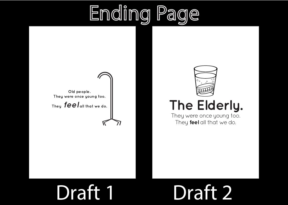
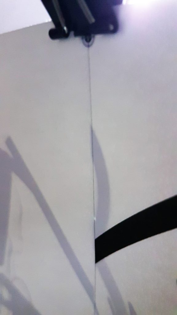

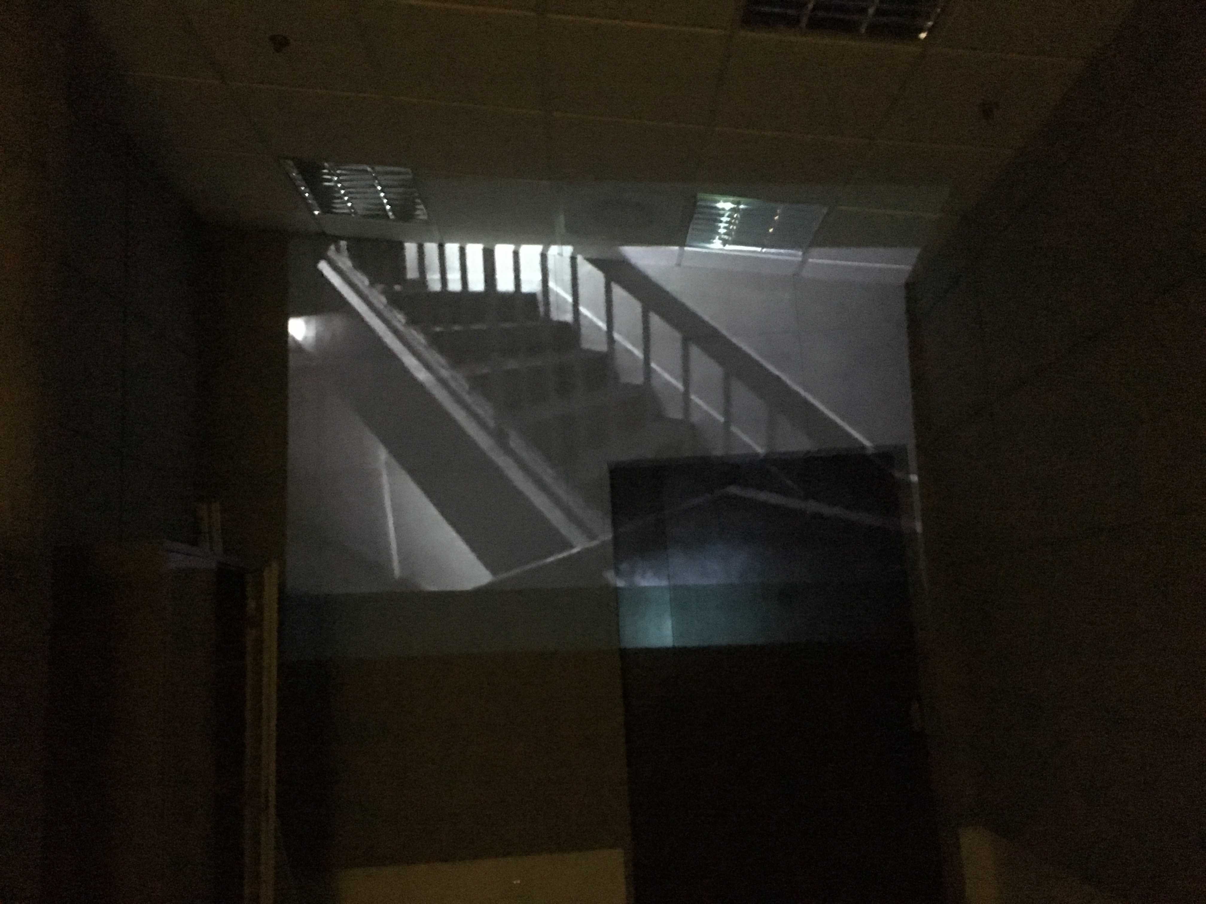
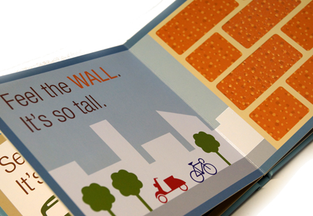
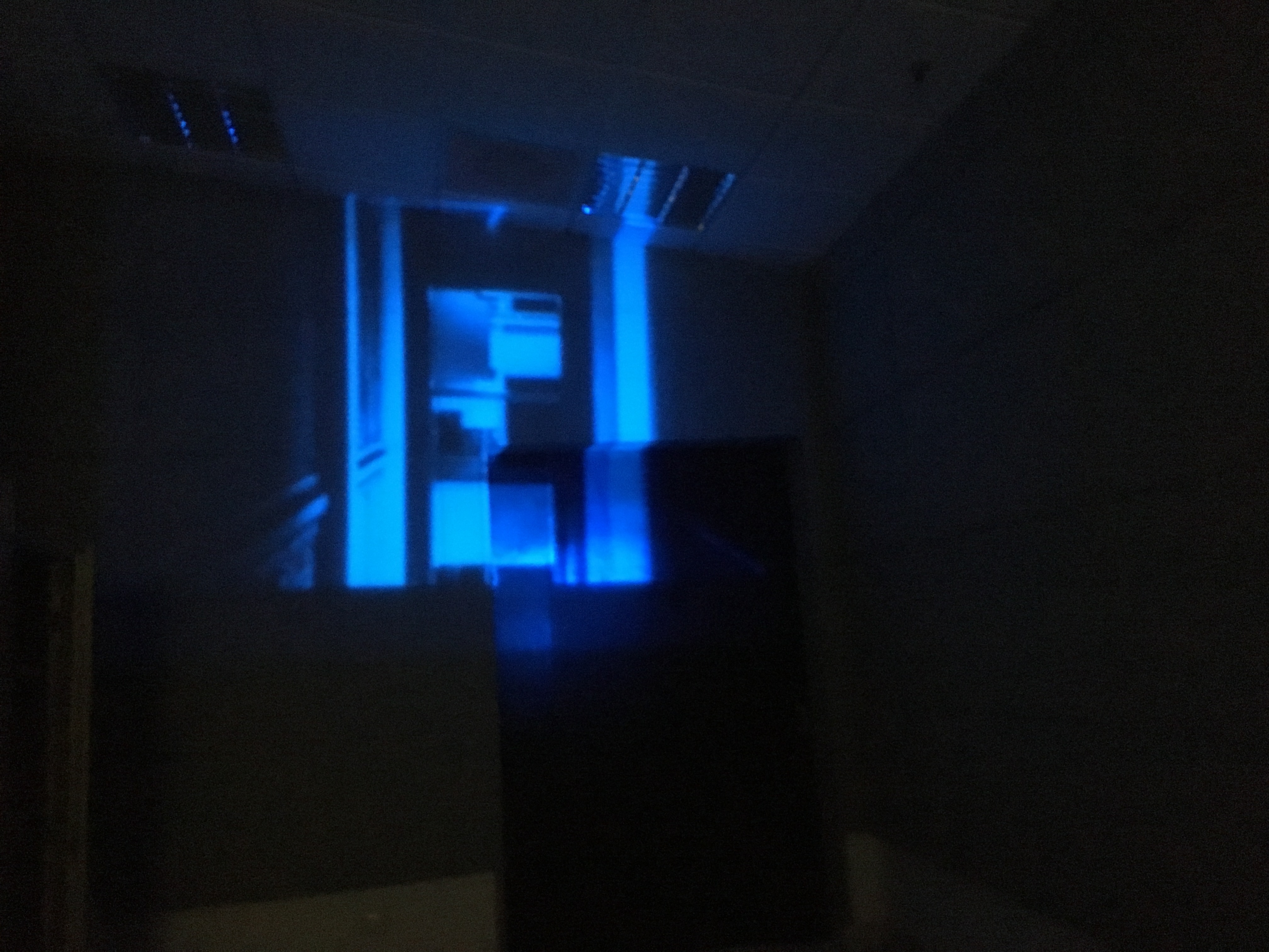 In addition, the projection on the wall creates space in a confined indoor area as it shows the vast outside world.
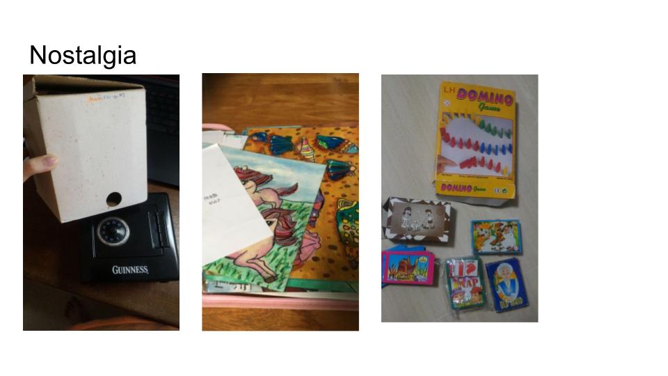
 CHEERIO~ See you guys around in Year 2 Sem 1 ;D
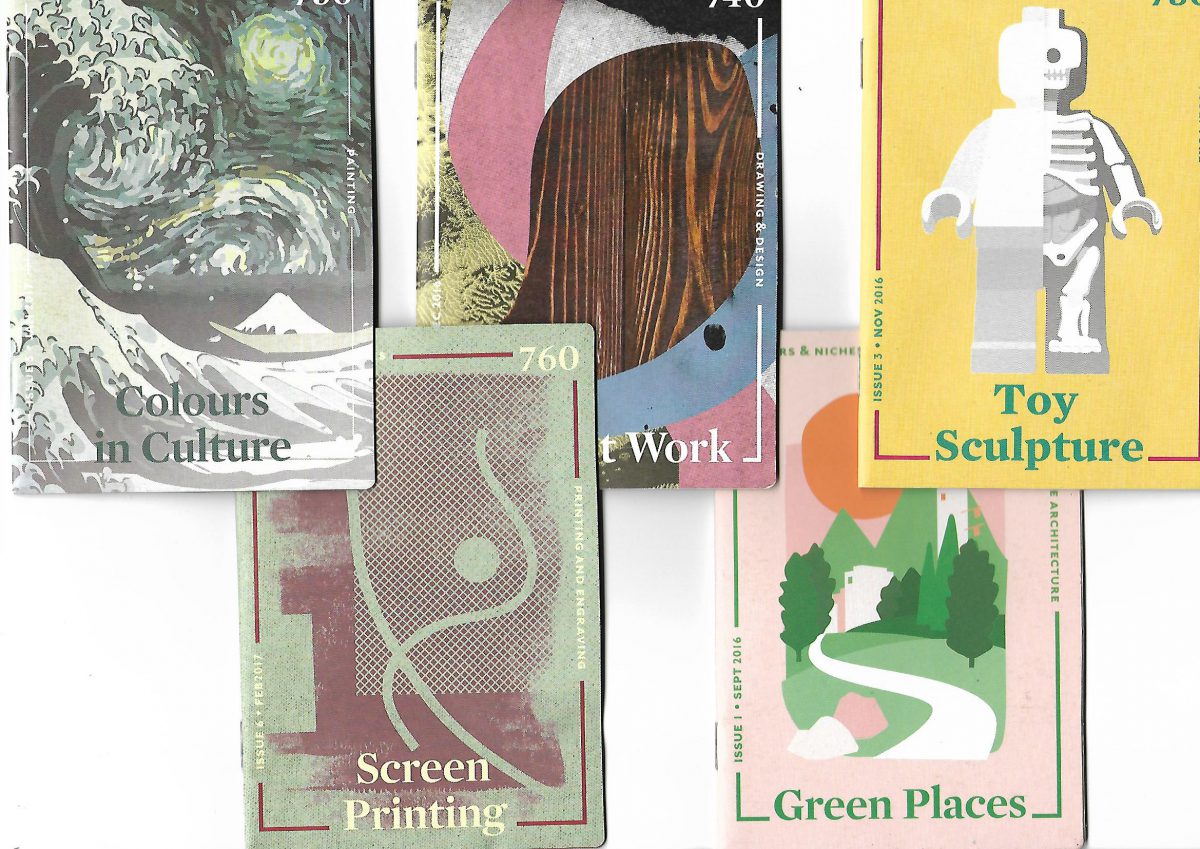


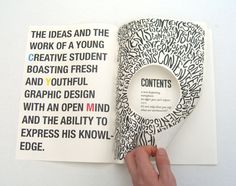
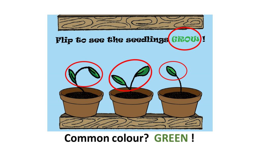
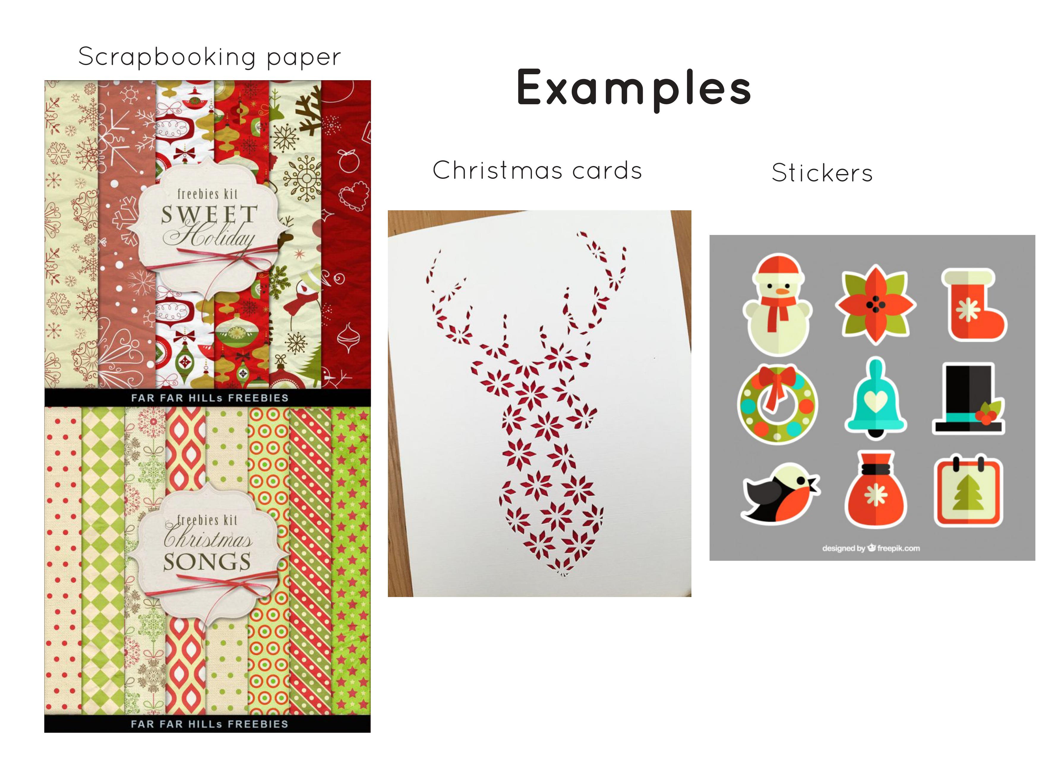
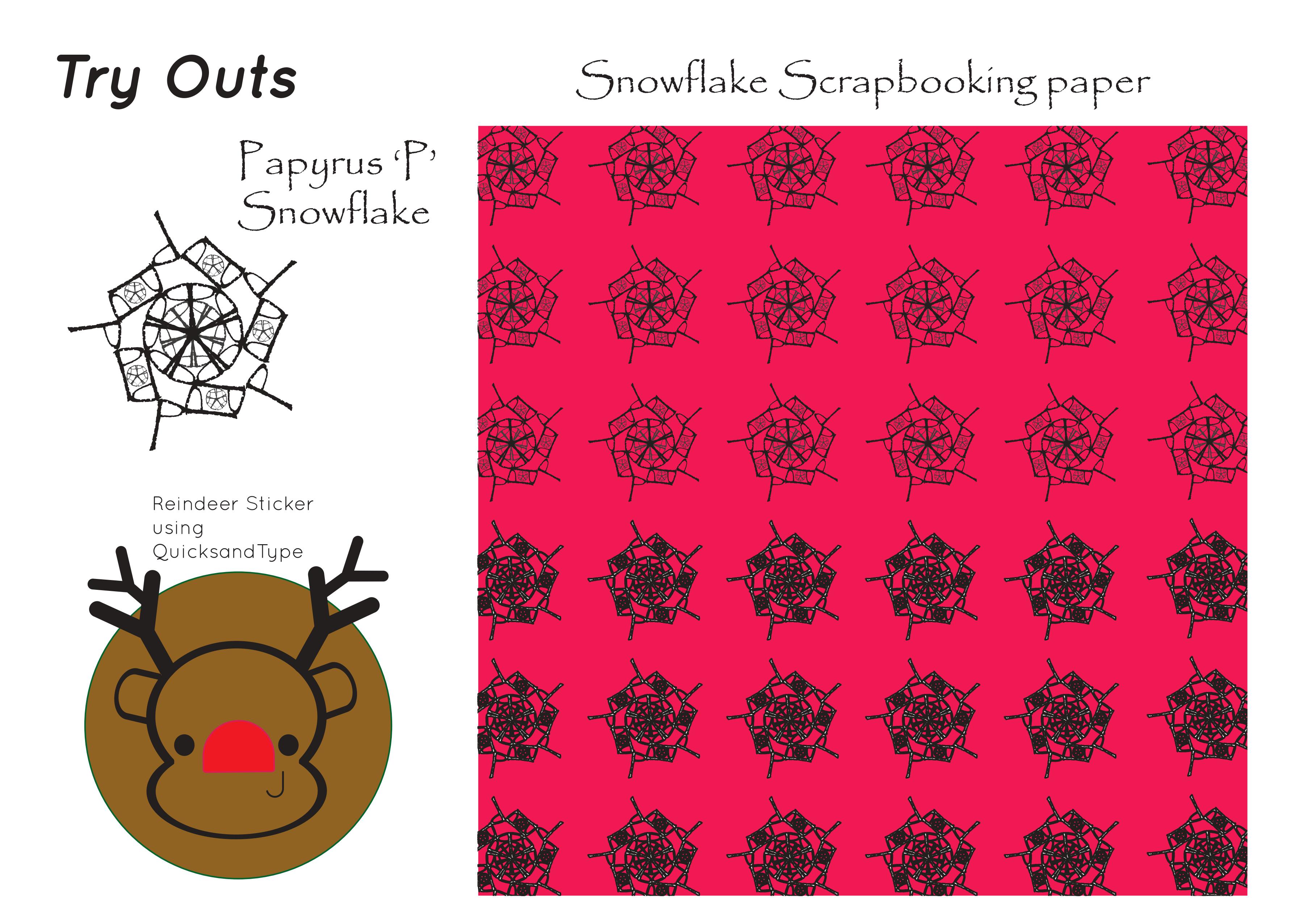
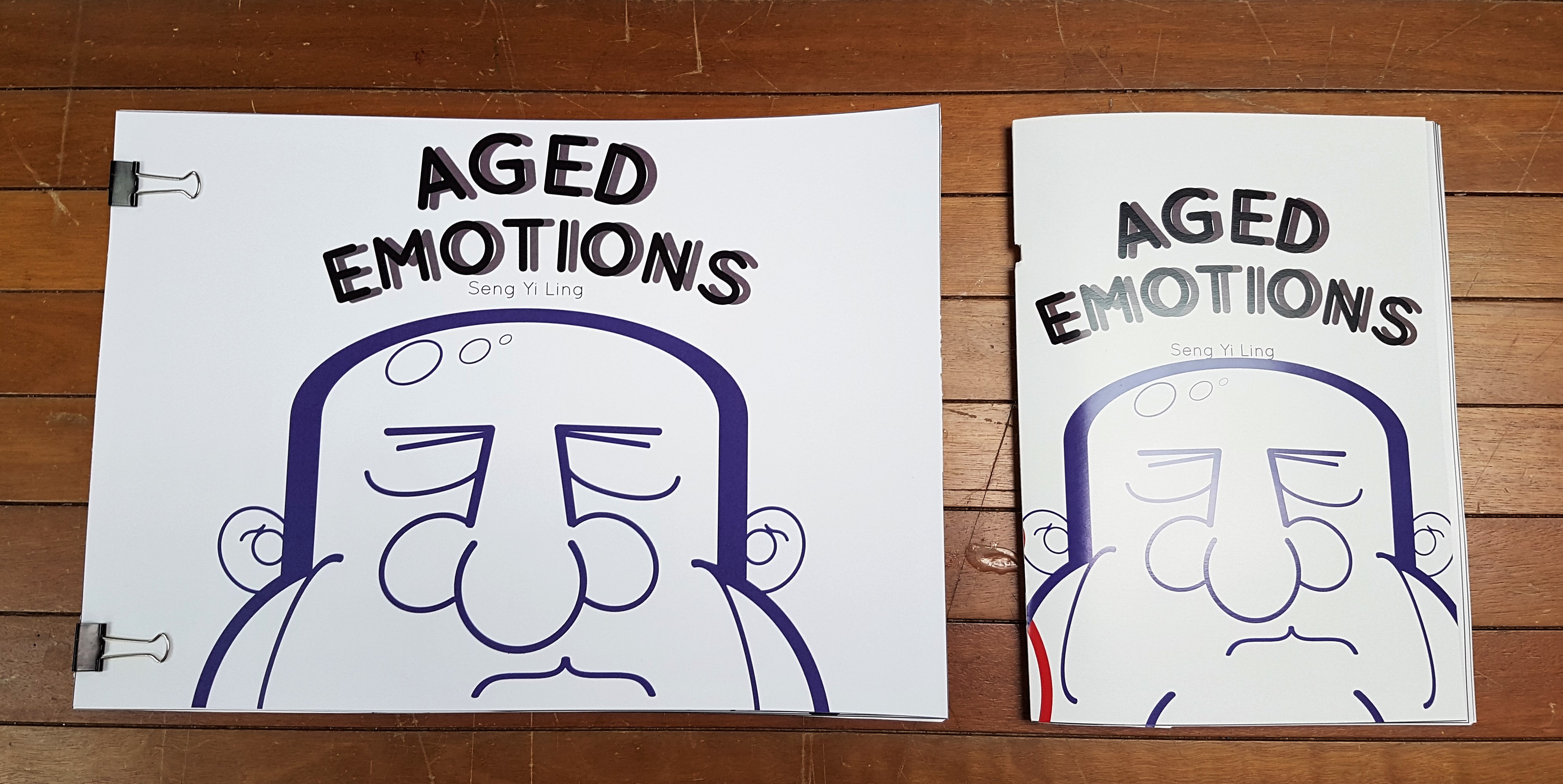
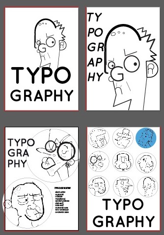
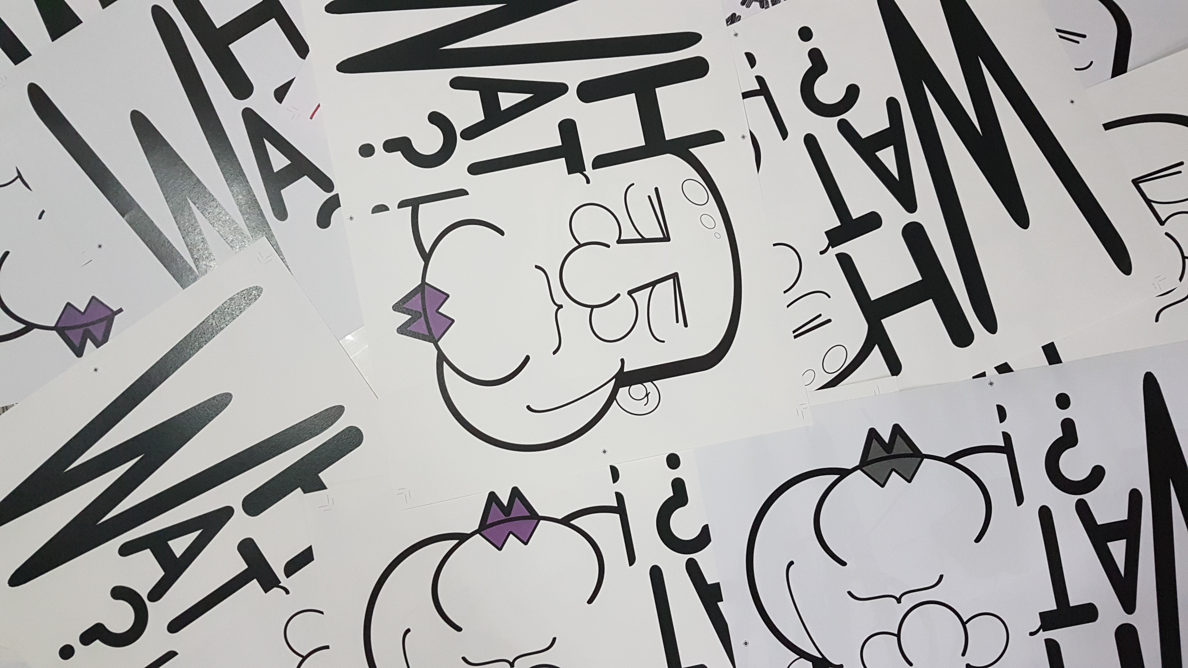
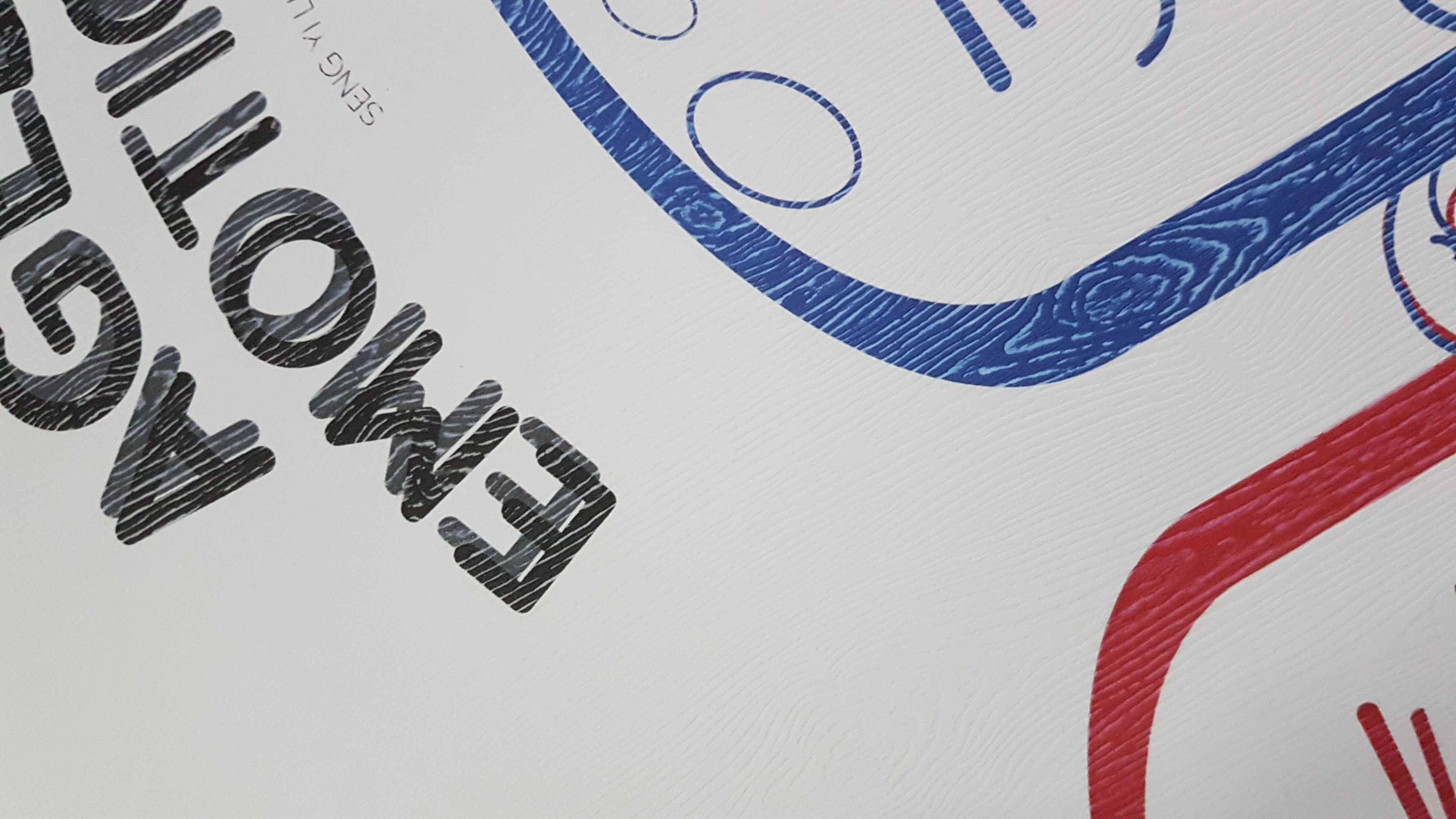
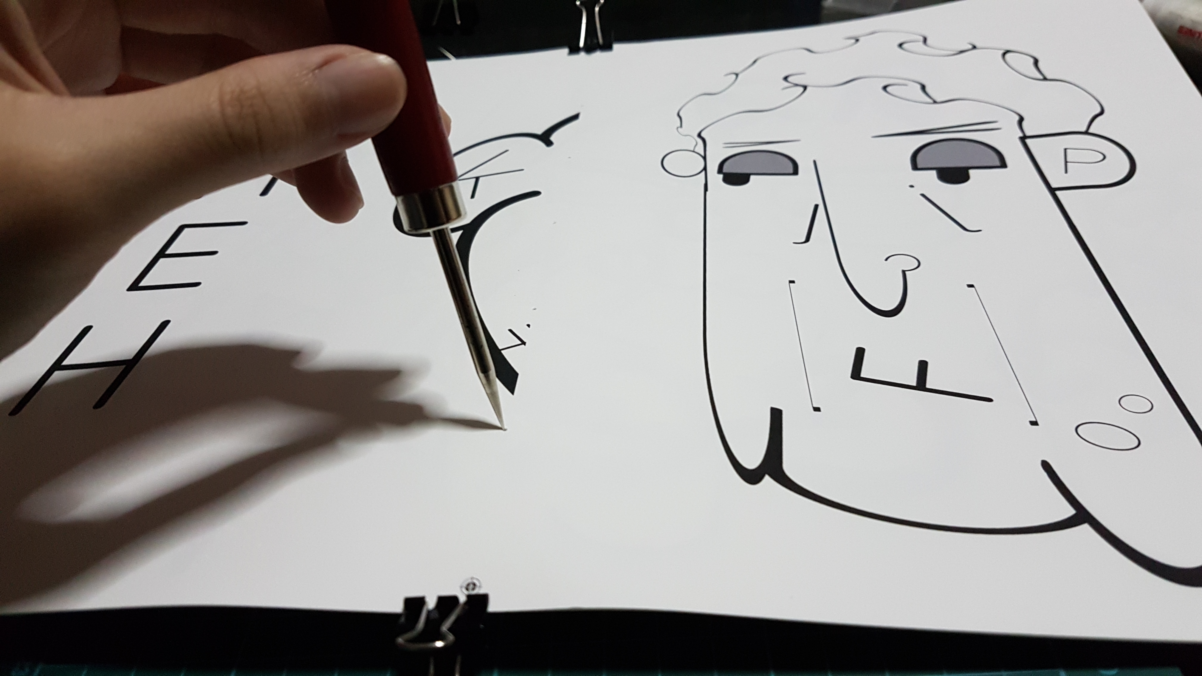
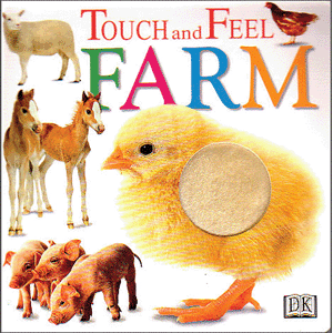
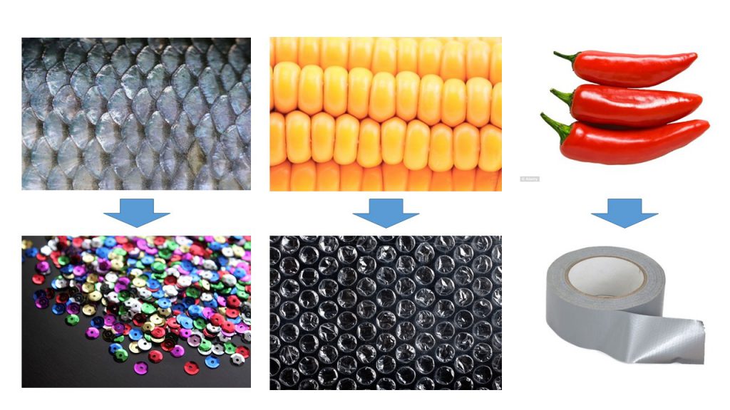
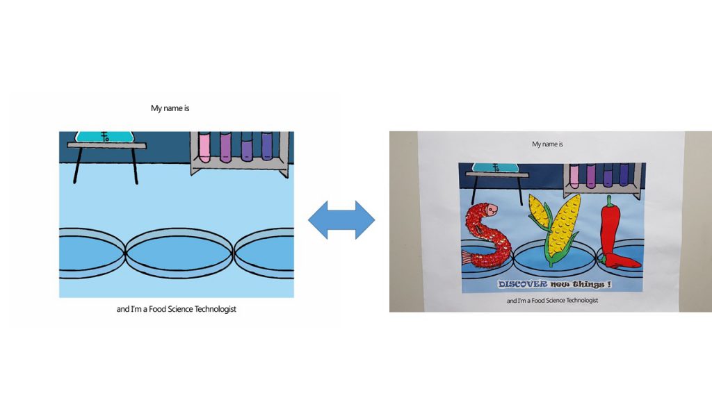
 Hence I wanted to go for something where the fonts conform around the illustration like this:
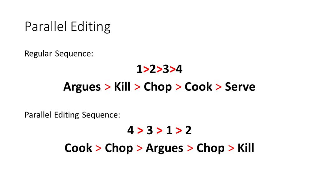
 Methodology:
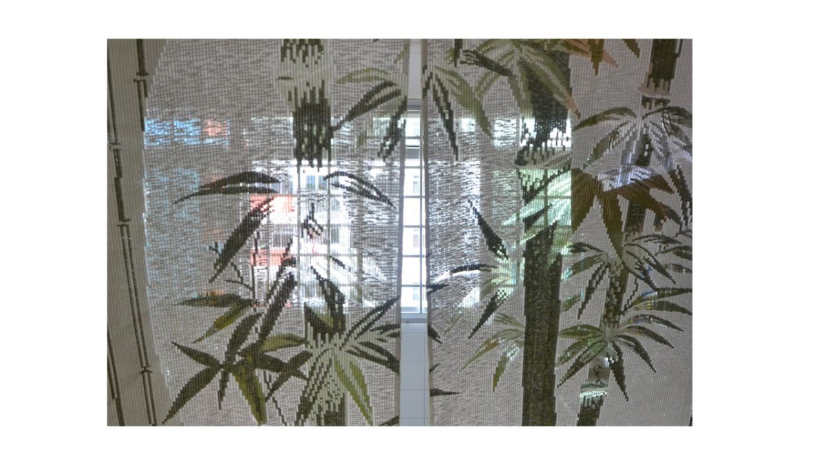


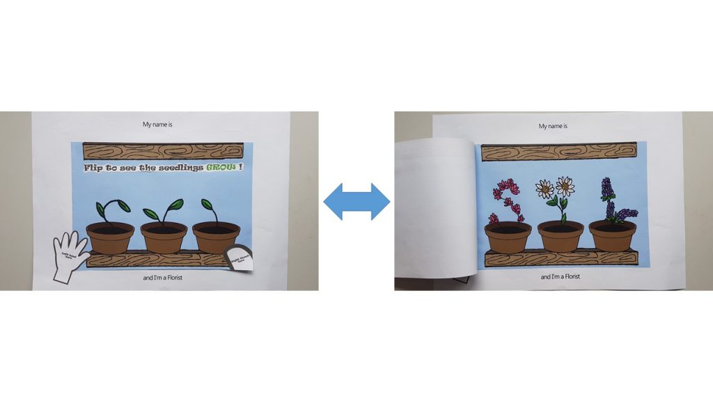
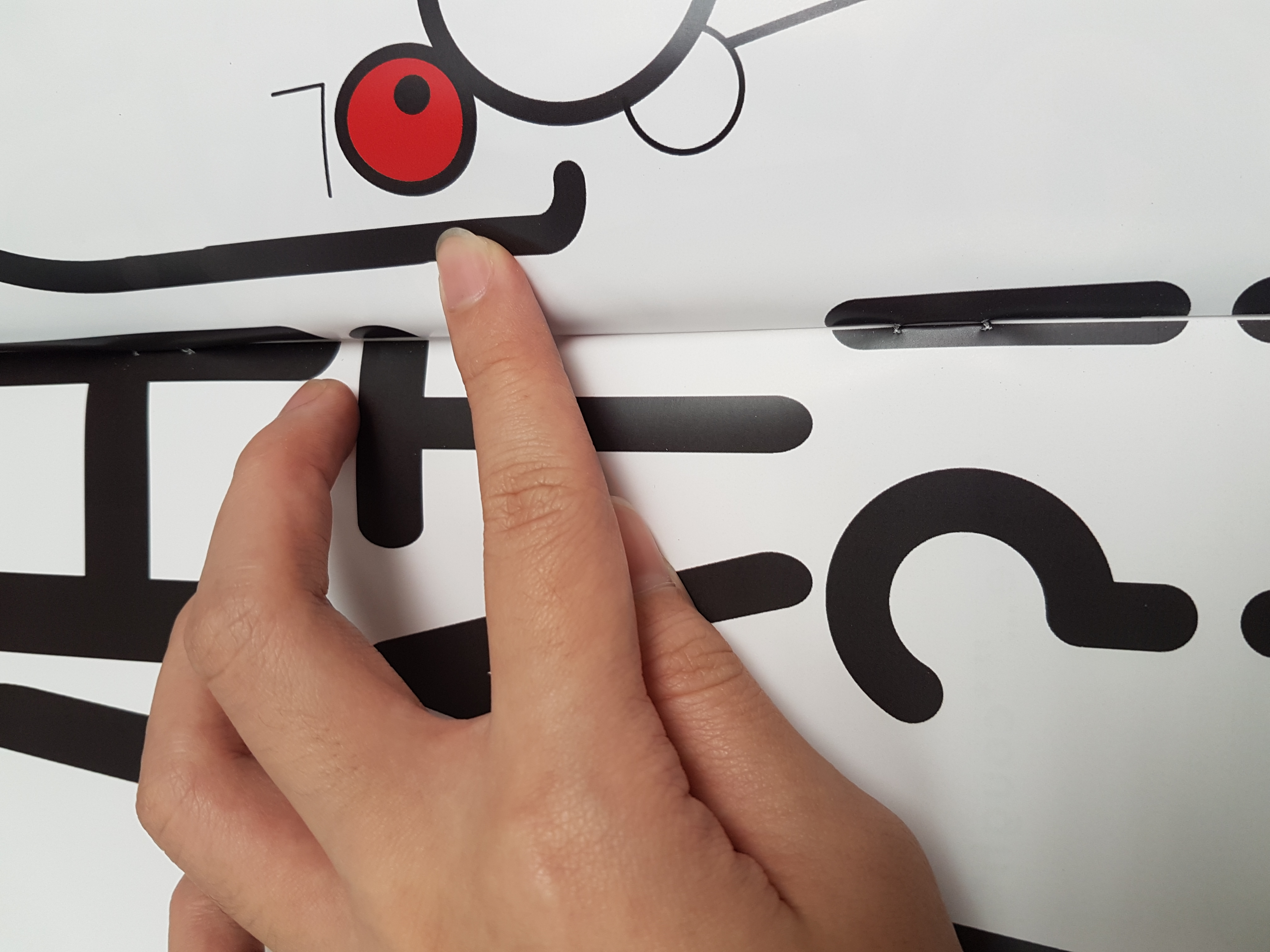
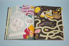
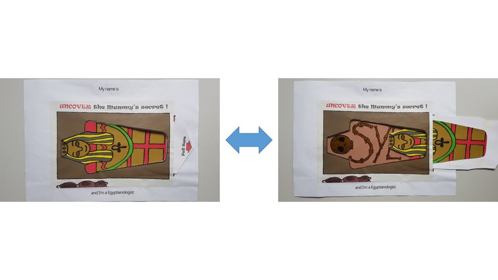 I also included a ‘Pull Here’ instructions with a red arrow to direct the child’s attention to it.
 I really liked how…