The day of presentation… DUN DUN DUN
This is the simulation of the walkthrough of Bunker 143.
Documentation
Do pardon the low quality of the clips as I had limited space on my Vimeo account to upload this video I placed together.
In this video, it will show u the brief thought processes that went by, setting up of the installation, feedback wrap up session with the class (00:53 to 09:40 mark) and the cleaning up process!
Oh, by the way, you can fast for
Concept
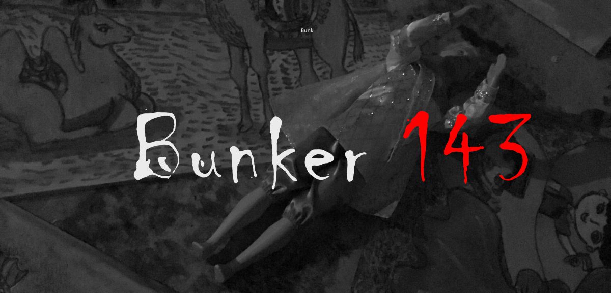
And why did we name our installation Bunker 143? Stay tuned. 😉
Reference Images
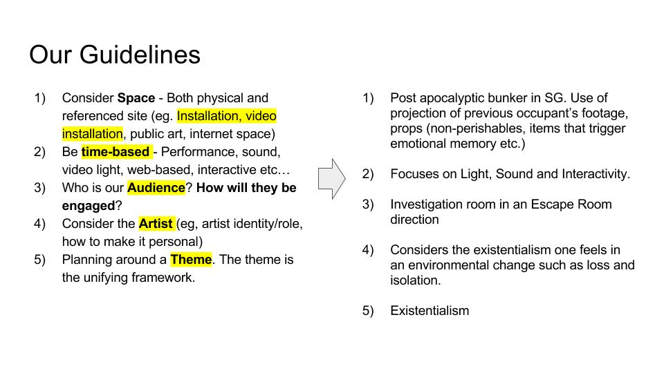
Post apocalyptic scenario

Escape room setting
Narrative and Characters
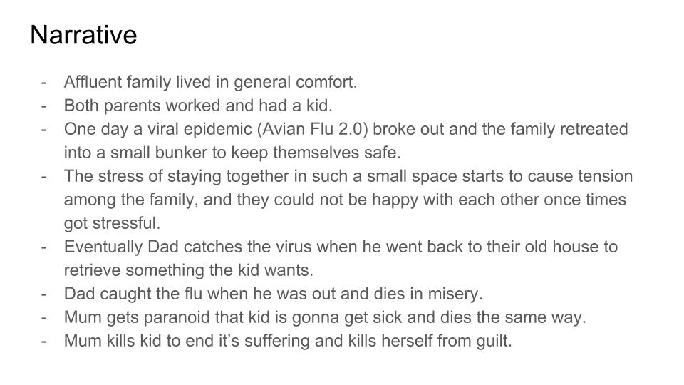
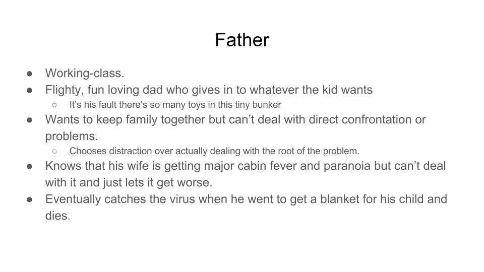
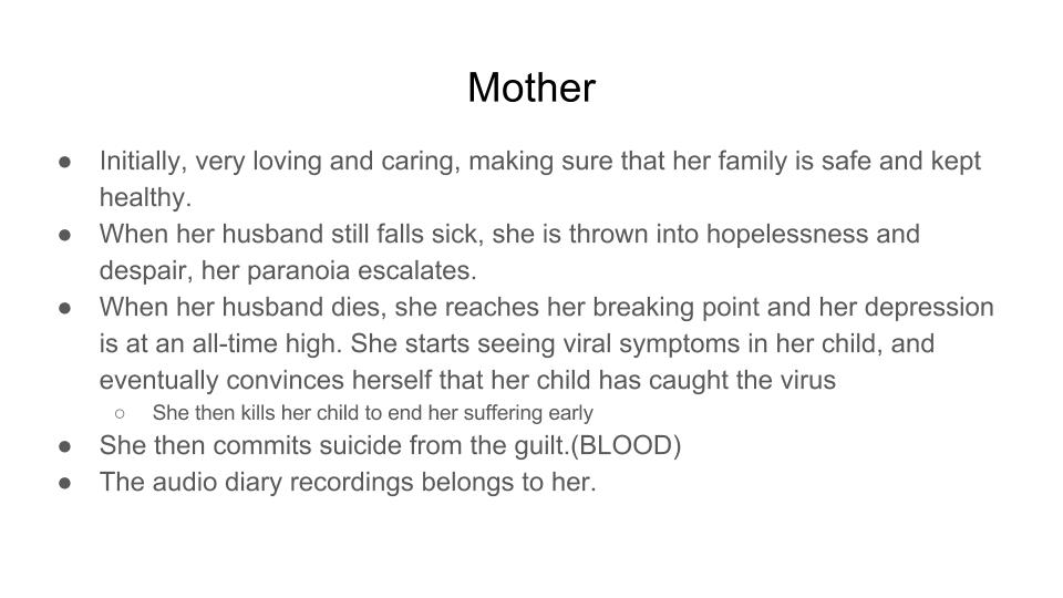
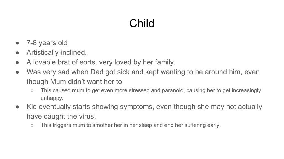
And the narrative kind of explains why we named our installation ‘Bunker 143.’ Because “143” simply represents the number of letters in each word of the phrase, “I (1) Love (4) You (3).”
The deaths of each of the members were the result of love. Dad loves the child so he risked his life to go back to take the blanket. He dies from the virus due to his risk. The mother kills her child because she loves her child and does not want to see the child die in pain and misery from the virus. Mother kills herself from heartache and guilt.
How did we PRESENT our idea into reality?
1) CCTV Video used are footages taken by each member of our group at different locations to cover more ground.
We followed a standard procedure whereby we took footages of scenes where surveillance cameras would be located, panning like how a CCTV would; recording scenes where the area seemed empty, barren and lack of humanity to show the post apocalyptic situation the family faced previously.
The CCTV footages pans on empty areas, and it gives a feeling as though something is going to pop out at you. Like the video game, Five Nights at Freddy’s >>
Multiple screens were playing on a several laptops in different parts of the room, with one master projection against the wall.
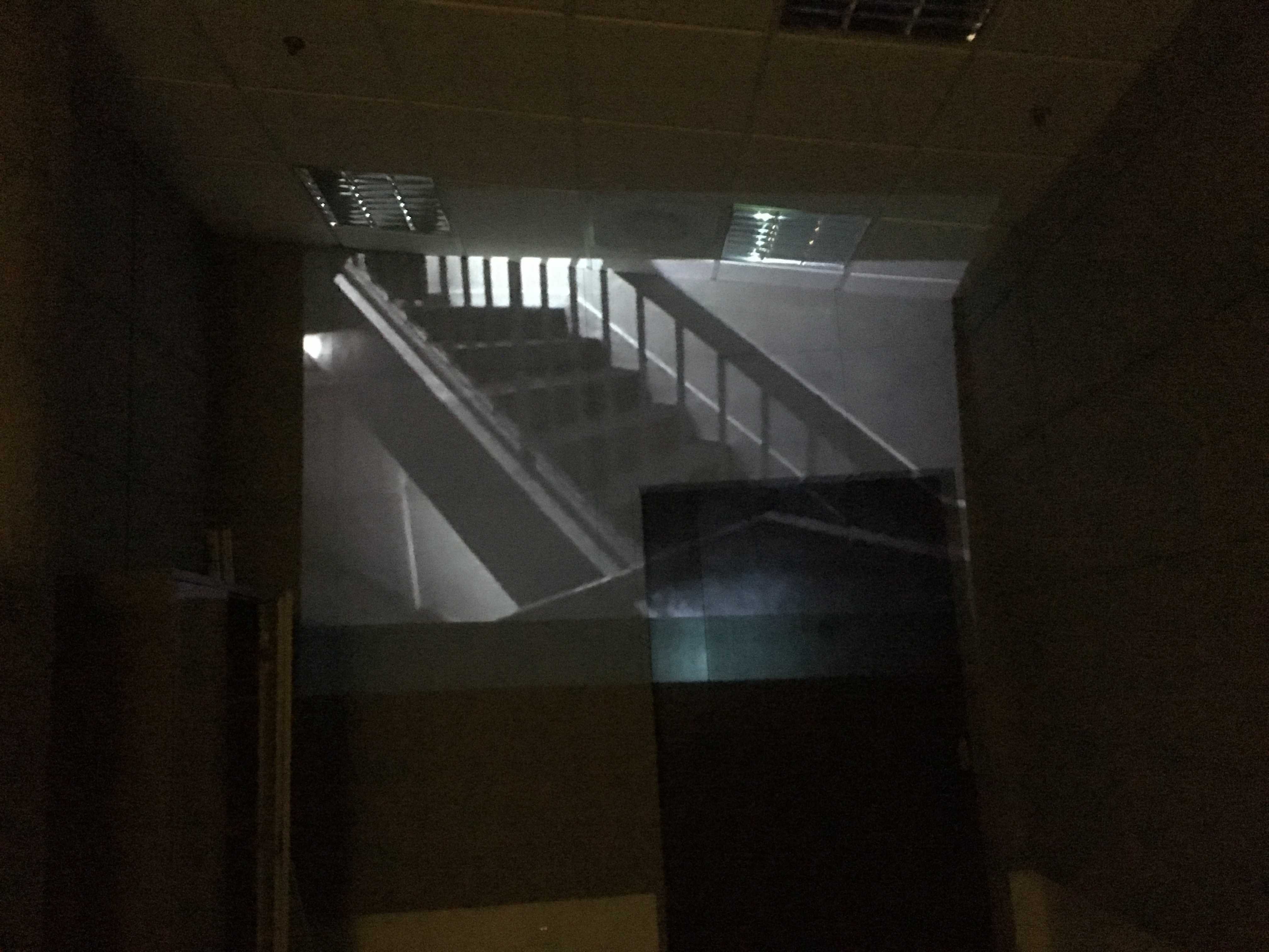
Afterwards, the videos were changed to black and white, blue cellophane paper against the projector to was used to create an eerie, distant and cold vibe; as compared to the red we rejected as looked straight of a horror movie which was not the intended feeling we wanted to evoke.
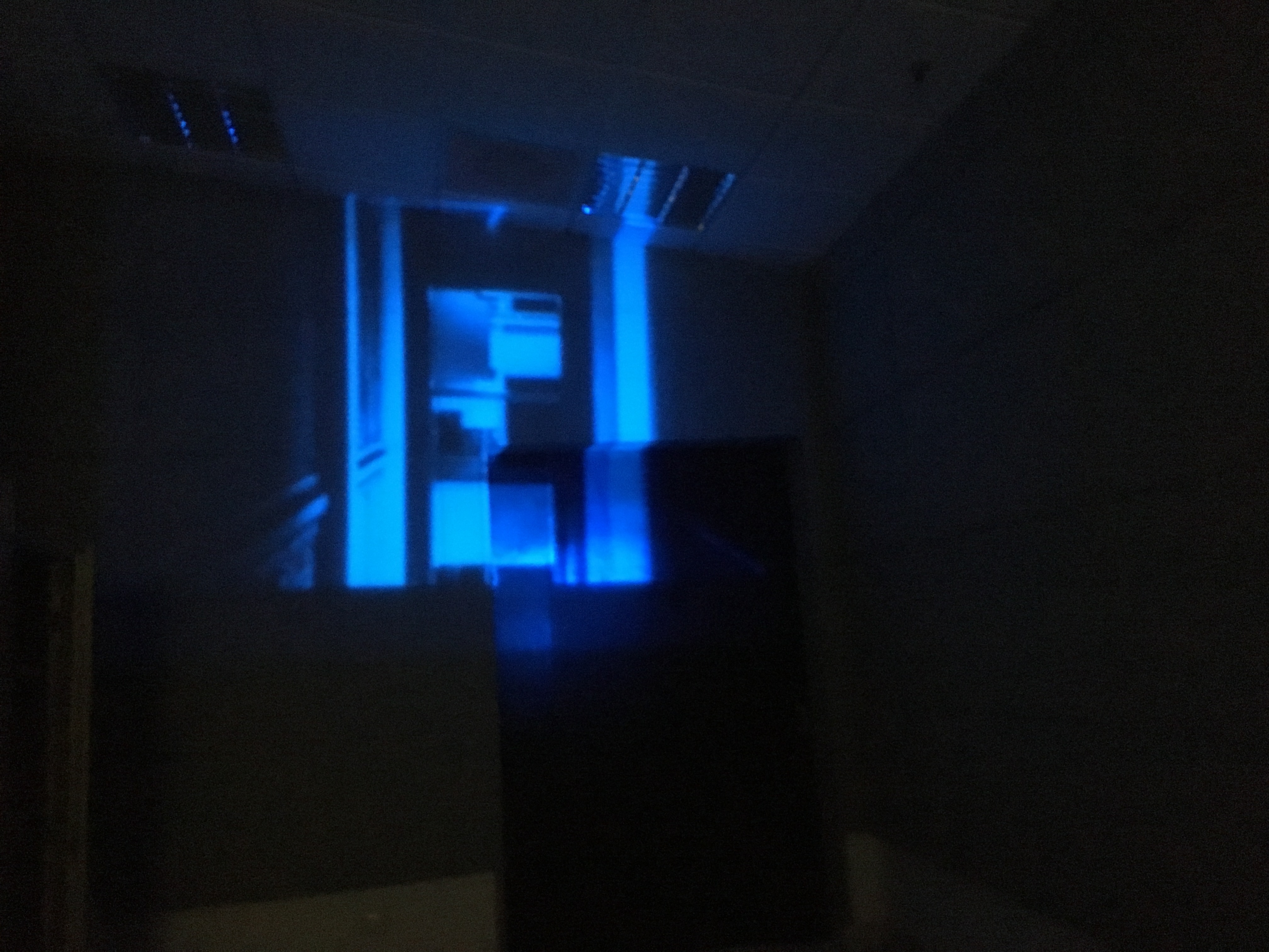 In addition, the projection on the wall creates space in a confined indoor area as it shows the vast outside world.
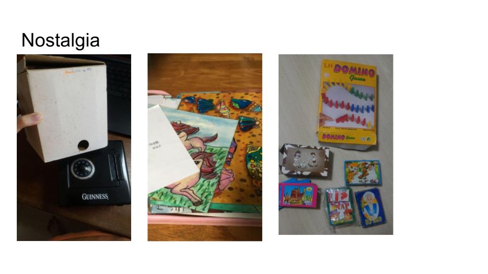
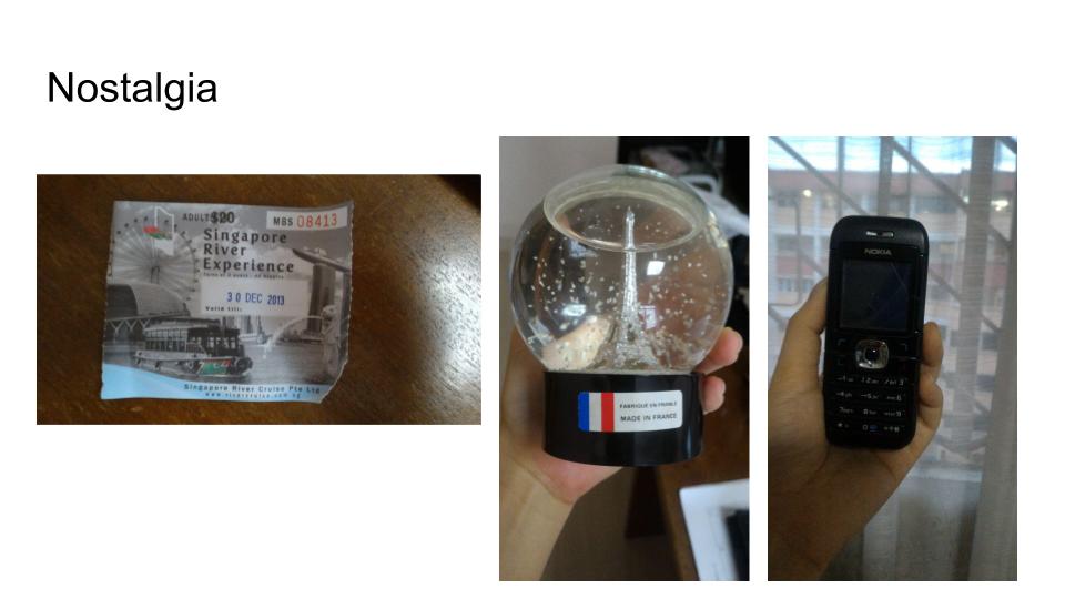
2)Props used are mainly from nostalgic object we had as a children. It kind of sets the time period as to when was the family in the bunker. This way, we do not tell the audiences directly which time period we are in, but show them.
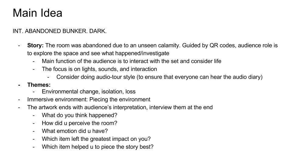
3) QR codes – Audio Diary Logs
The speech in each audio log was designed in such a way that the audience could start with any QR codes they scan and still be able to piece the story together. The sequence does not matter.
Intro – “February 28, it’s been 2 weeks since my family and I entered this bunker. Both of them are holding up well, they seem okay with this arrangement. Everything will be well soon… right?”
“April 17, The room seems smaller than ever, there are too many things in this bunker. Why did my dumb husband bring so many things? Do we really need the old snow-globe? It reminds me of our honeymoon in Paris from way back. *Sigh…*”
“May 30, she looks so happy, playing with her dolls. her toys are all over the place and it’s been getting in the way, but she’s happy so I’ll bear with it. She keeps asking for her blanket, but she still seems to be having fun playing board games with me and drawing. I’ve been cleaning up after her non stop but if it keeps her happy I’ll do it. I can’t wait for the day we can get out and she can live properly again.
“August 26, We have enough food for another 6 months, if the virus doesn’t clear up by then then what will we do. I tried telling him but he kept saying it was fine, that we would be ok. But what if we aren’t? Why can’t he see that we’re in trouble, why does he never, ever understand. If he cares so much for the child why can’t be understand that having enough food is better for her than having all these toys. I don’t know how to do this anymore, he isn’t taking this seriously. ”
“Oh no oh no. . . .he went back to get her blanket. She wouldnt stop crying… He said that it will be okay and that nothing bad will happen. FOR GOD”S SAKE THERE IS AN EPIDEMIC OUT THERE and he. isn’t. back…its been 3 hours… oh no oh no… if something happens…. He is back he is back!!!”
“…He died today.” *long pause* “How could he leave us just like that? Just for that stupid blanket. I-I can’t take this. I need to lie down.”
She keeps sneezing recently, and she looks so pale and skinny. back before he died she kept going near him, I’m sure she’s caught it. she looks sicker every day, I can’t watch this again
*sighs, soft crying, then thumps onto the floor*
4) Use of Sound. The master soundtrack that was constantly on loop is a combination of cricket sounds I recorded when downstairs my house at night, and the whirring noise from Gabrielle’s computer fan. Safe to say that the two sounds matched really well together and so much so, the whirring of the fan sound seeps into your mind and disappears subconsciously as the cricket sound dominates the track. We wanted to have a mix of unsettling mechanical noises and sounds that adds to the sense of isolation in this bunker.
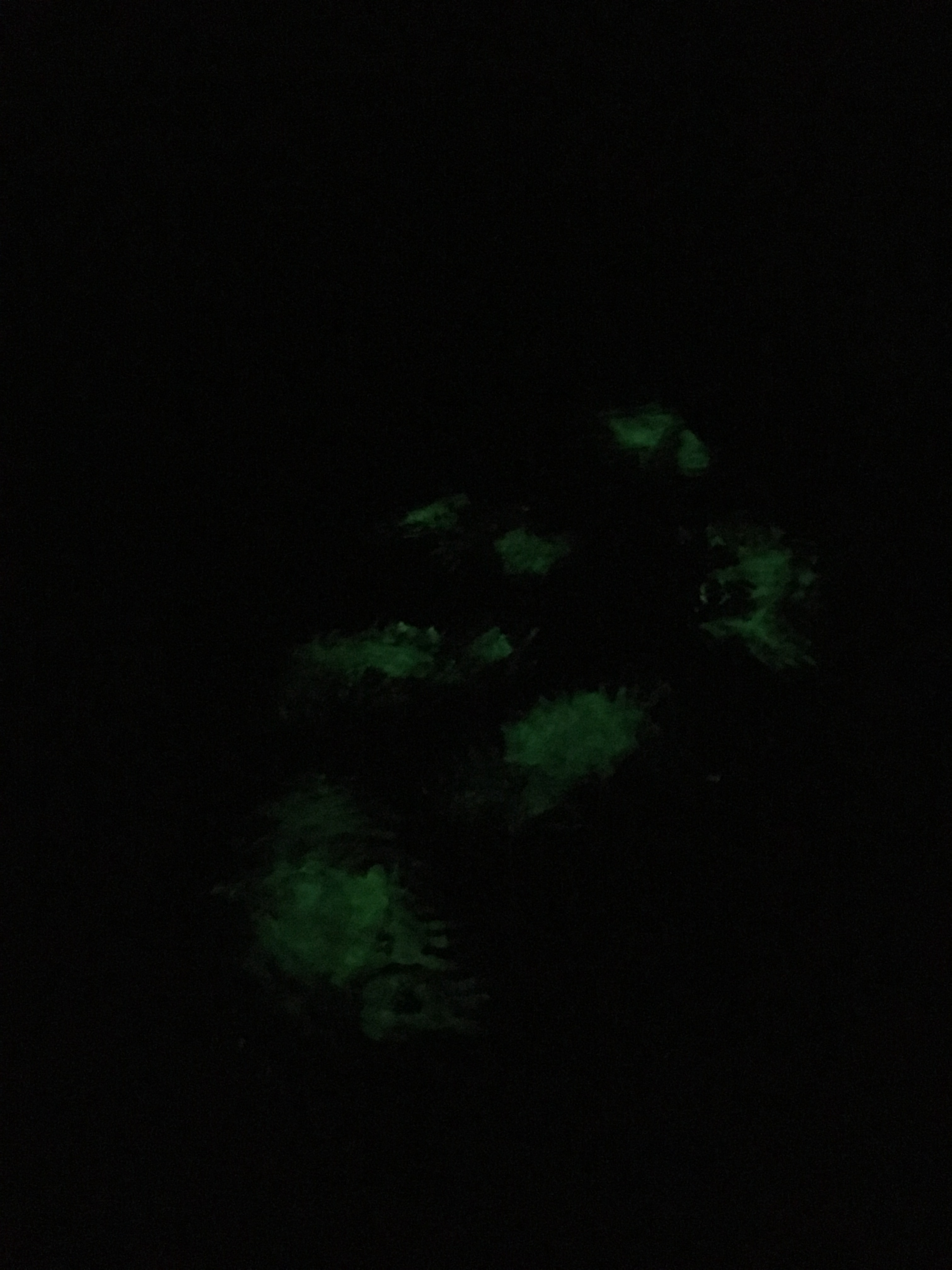
5) Used of Glow in the Dark paint to emulate the presence of blood. Allows the audience to ponder what exactly happened on that area. Especially when Audio Diary Log 8’s QR code is situated there.
Personal Reflection
Personally I think our team pulled this project off really well and everything was pretty cohesive as a whole.
Despite having some changes here and there as we had consultations with Ru Yi and on our own, I think this project managed to come together really well as the final outcome was even better than what we imagined in our heads!
And most importantly, I think the audiences liked our work considering that they were able to question themselves regarding their own memories of the items, and were able to piece the story together. The use of an immersive space and sound really put the audiences into another setting.
What I felt could have been done better was the use of glow in the dark paint. Because of logistic and location issues, we were not able to use fake blood for the scene where the mother committed suicide as it would be hard to clean off and we would probably get scolded by the management. Hence, the use of glow in the dark paint on white paper scattered on the floor was quite an eyesore, and even misleading as one of the audiences asked me if that was pee on pee pad..
BUT NONETHELESS…
We have finally come to the end of Foundation 4D II Final Project!! Yay!
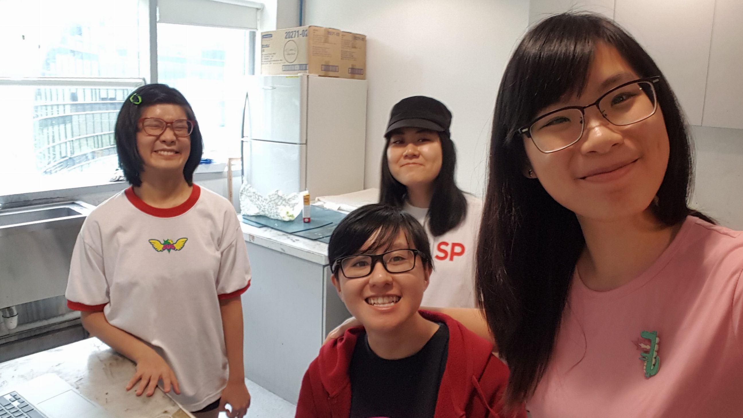
It was great pleasure to work with Gabrielle, Yu Lin and Yit Ling in this project! Not only because they are such great people, they are also important team players in this project! And we are very proud to say that we did not spend a single dollar on this project 🙂 !
Thank you Ruyi for your guidance! I have learnt a lot in these 2 semesters from you, and 4D lessons has always been something I look forward to. 🙂
 CHEERIO~ See you guys around in Year 2 Sem 1 ;D
<3 Seng Yi Ling


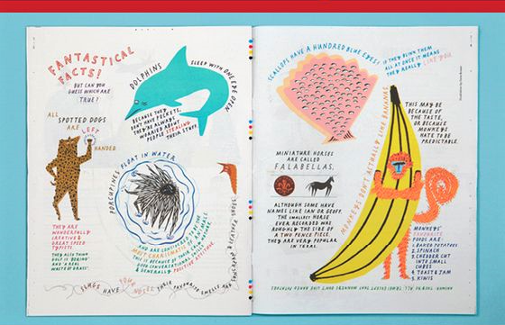
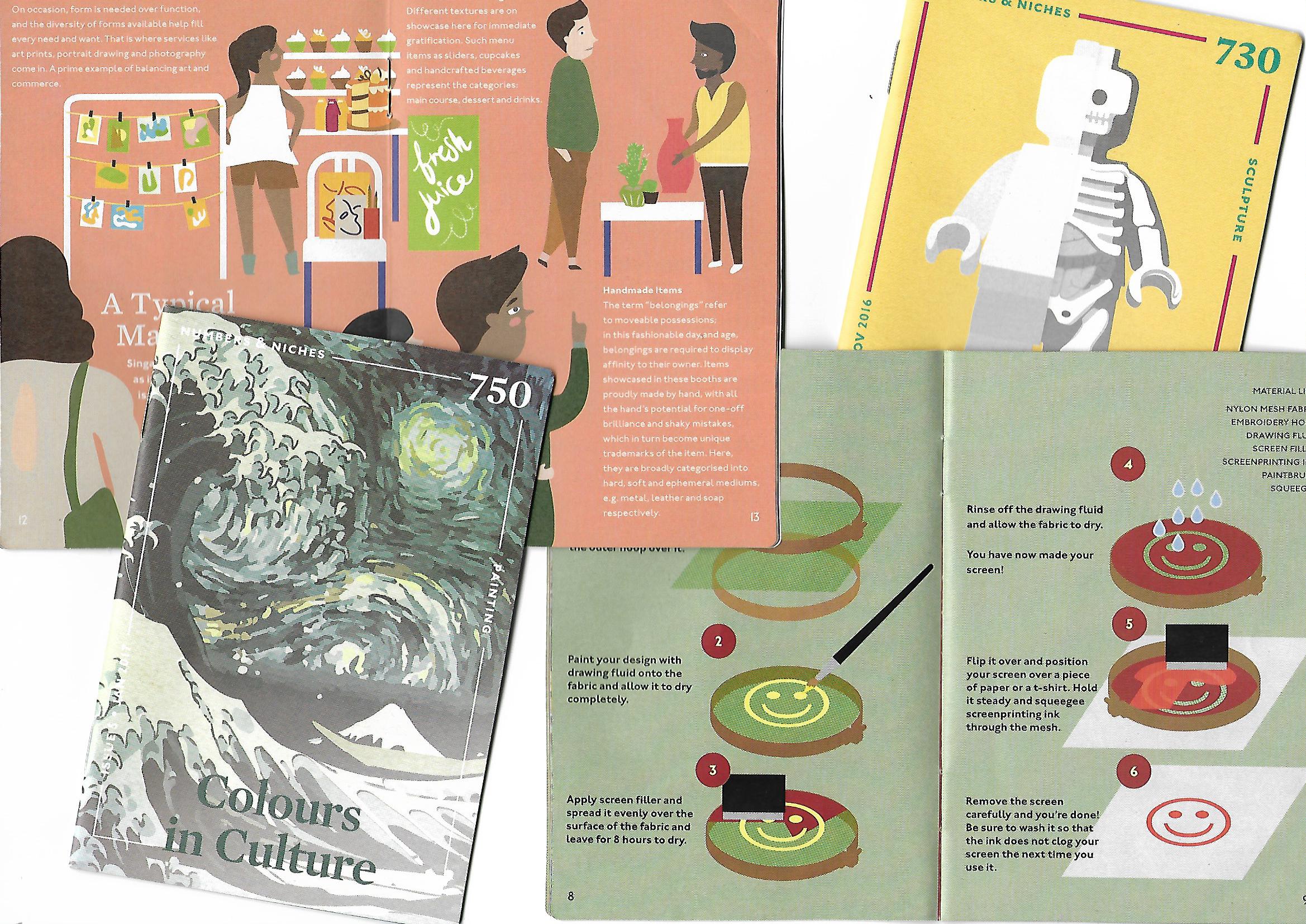
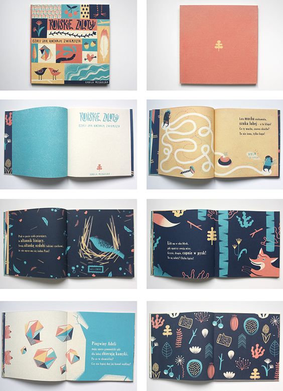 I really like the vibrant colors and how organic the shapes are! I also really liked the path which guided the viewers as to where they should look at! Hence I thought that paths can help me in my Zine. 🙂


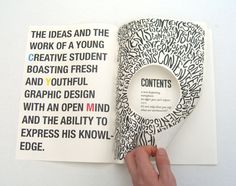
 Hence I wanted to go for something where the fonts conform around the illustration like this: