Very stoked to be able to touch on the topic of the Supernatural for this project because it is something that I have immense fear for, and at the same time I am very intrigued!
Was pretty stuck because the scope is so broad! So I did up a mind-map to see where my interest lie in and hopefully I can narrow down to a more specific topic of the Supernatural I can work with.
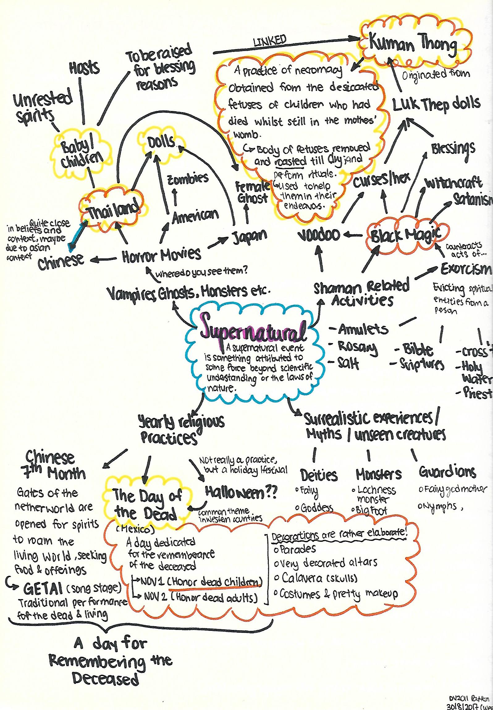 It is a wide network of sparse thoughts here and there, but I finally narrowed down to 2 topics I would like to explore on (The orange and yellow cloud outline)!
1. Thailand’s Kuman Thong ( Golden Boy)
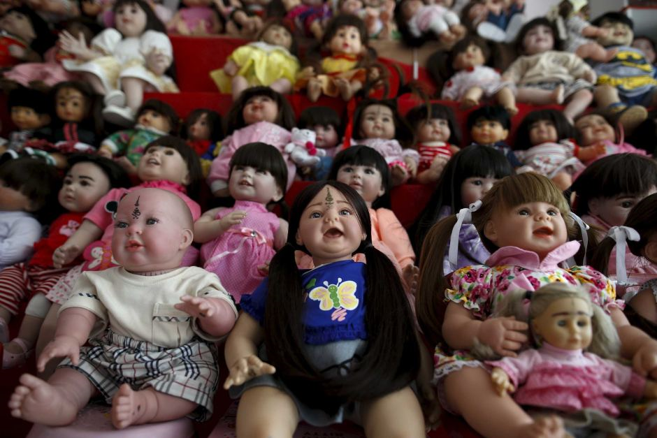
Seeing that Children ghosts/spirits are not as common explorations in the Supernatural realm, I set my mind on working with Children Spirits as the theme for this project. As I really do love kids ( in the non-creepy way), it’ll be a fresh new perspective to look at them through the eyes of the dead (still not trying to be creepy ._.).
 There is this grey area because it is a mixture of good and bad. In a way which meddling with ghost/spirits to obtain a positive outcome, is something that is quite risky.
Some research on Kuman Thong:
Though not part of mainstream Buddhist practices, Thailand black magic amulets were created by and practiced by monks and lay-people (Layperson, someone who is not an expert in a particular field of study) .
Often times the ascetic, Lersi, who was not actually a monk, but was a master of the spirit world, guides black magic spells and rituals. Spell casting is done by lay-people.
Buddhist monks have also got into the practice here in Thailand. Though, as you know, black magic and witchcraft, Thai voodoo – barang, has nothing at all to do with Theravada Buddhism, Thais have integrated it into their belief system and most cannot distinguish between the two.
It amazes me, seeing how people try to put life into a “Luk Trep” doll, or even try to summon the spirits of the dead, while others takes the life of real babies for superstitious reasons.
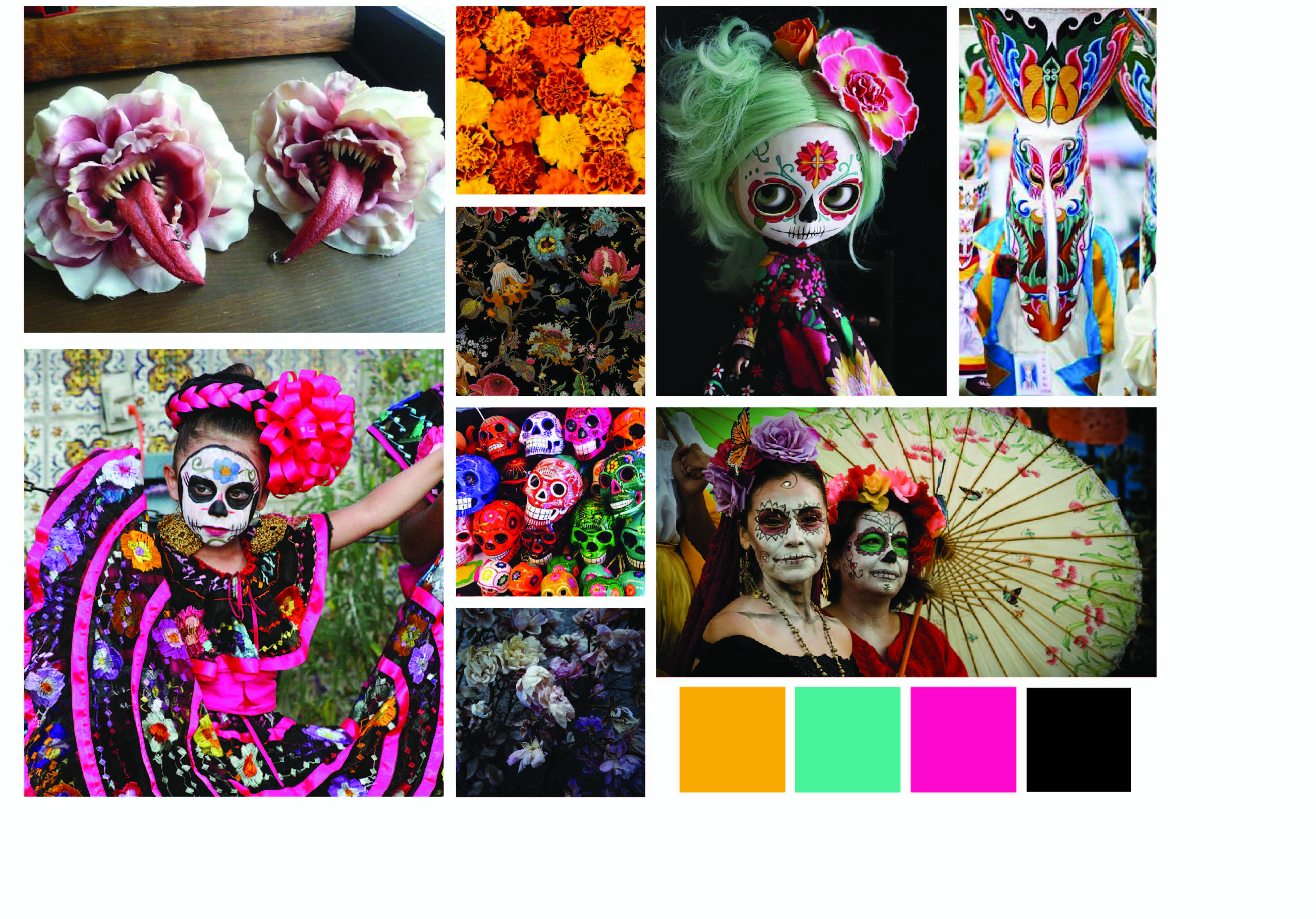
2. The Day of The Dead
At the same time, I am rather fazed by the festivity for ‘The Day of The Dead’. A day for the remembrance of the dead often comes off as downcast or rather solemn event. However, the Mexican holiday is filled with festivity and hype; alongside with the beautiful decoration and colors involved.
 I am rather torn by the two themes, but at the same time I wonder how can I combine the two themes without being too jarring and contradicting, for which the Kuman Thong has a negative connotation to it due to its association with Black Magic, whereas The Day of The Dead is a jovial holiday marked to remember their loved ones.
Style I’m heading towards
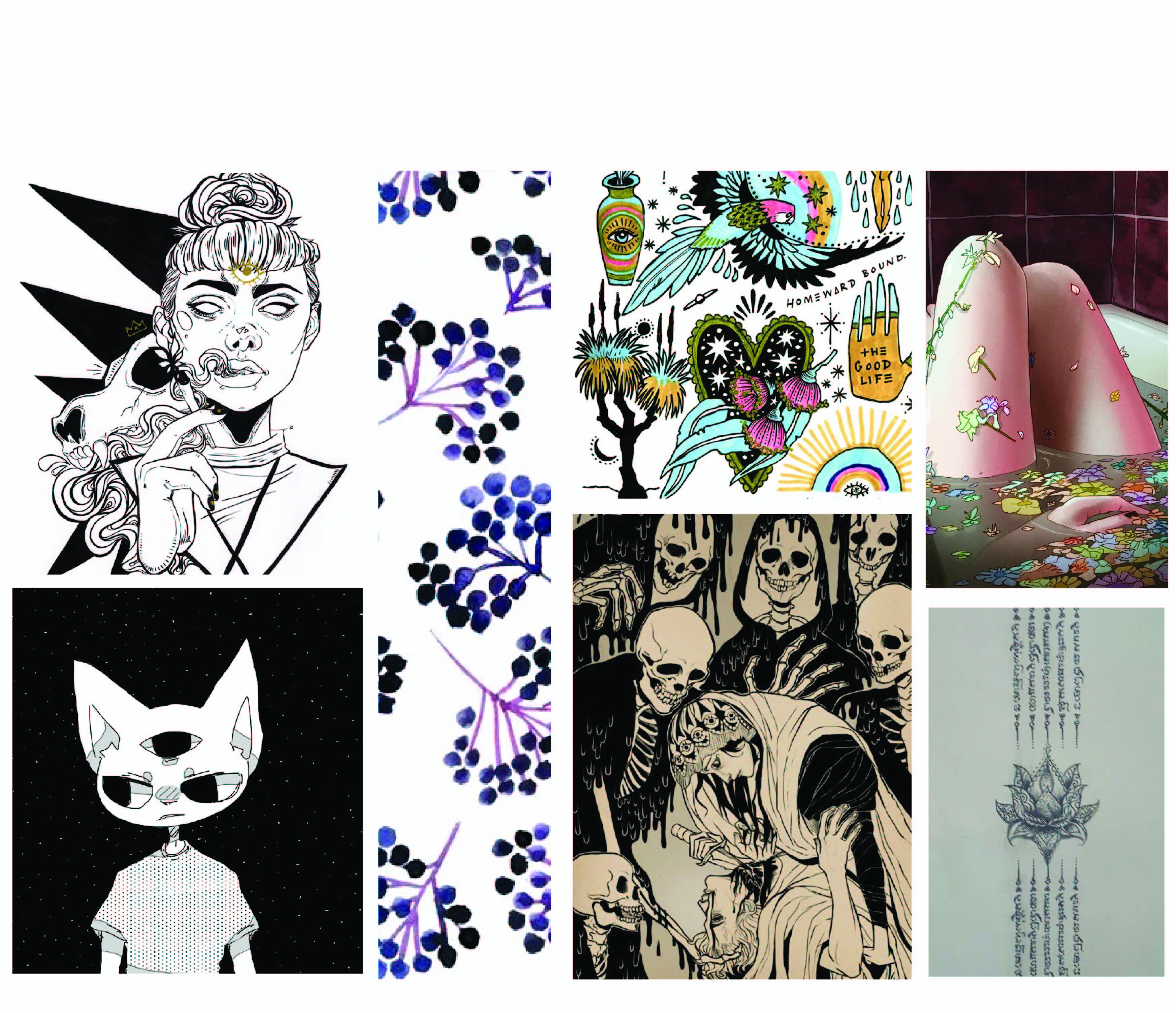 Mainly illustrative because I do enjoy drawing and using pencil to design my sketches is more versatile as I can alter and integrate elements into an object easier.
And I would like to incorporate the elements of design, ‘Symmetry’ into my final work, where there is flow and any direction when the design is flipped, a narrative can still be told.
Source of images
– http://d2ydh70d4b5xgv.cloudfront.net/images/6/3/thai-buddha-amulet-pha-yant-tao-wessuwan-powerful-protect-life-talisman-71316e23df969256fffec99b85e93f34.jpg
– http://www.chinadaily.com.cn/english/doc/2005-02/01/content_414080.htm
– https://fineartamerica.com/featured/thai-pattern-background-anek-suwannaphoom.html
– http://zway2go.com/raising-a-baby-ghost/
– http://www.abc.net.au/news/image/7120990-3×2-940×627.jpg
– https://www.thaiamuletsales.com/pages/thai-black-magic-amulets
– https://www.pinterest.com/pin/445012006899737924/
– https://www.get-offline.com/inspiration/spend-dia-de-los-muertos-with-calavera
– https://www.pinterest.com/BartushDesign/day-of-the-dead/
– https://www.pinterest.com/pin/494199759081522938/
– https://www.pinterest.com/pin/367958232038481523/
– https://www.pinterest.com/pin/540854236476559569/
– https://www.pinterest.com/pin/512636370072621354/


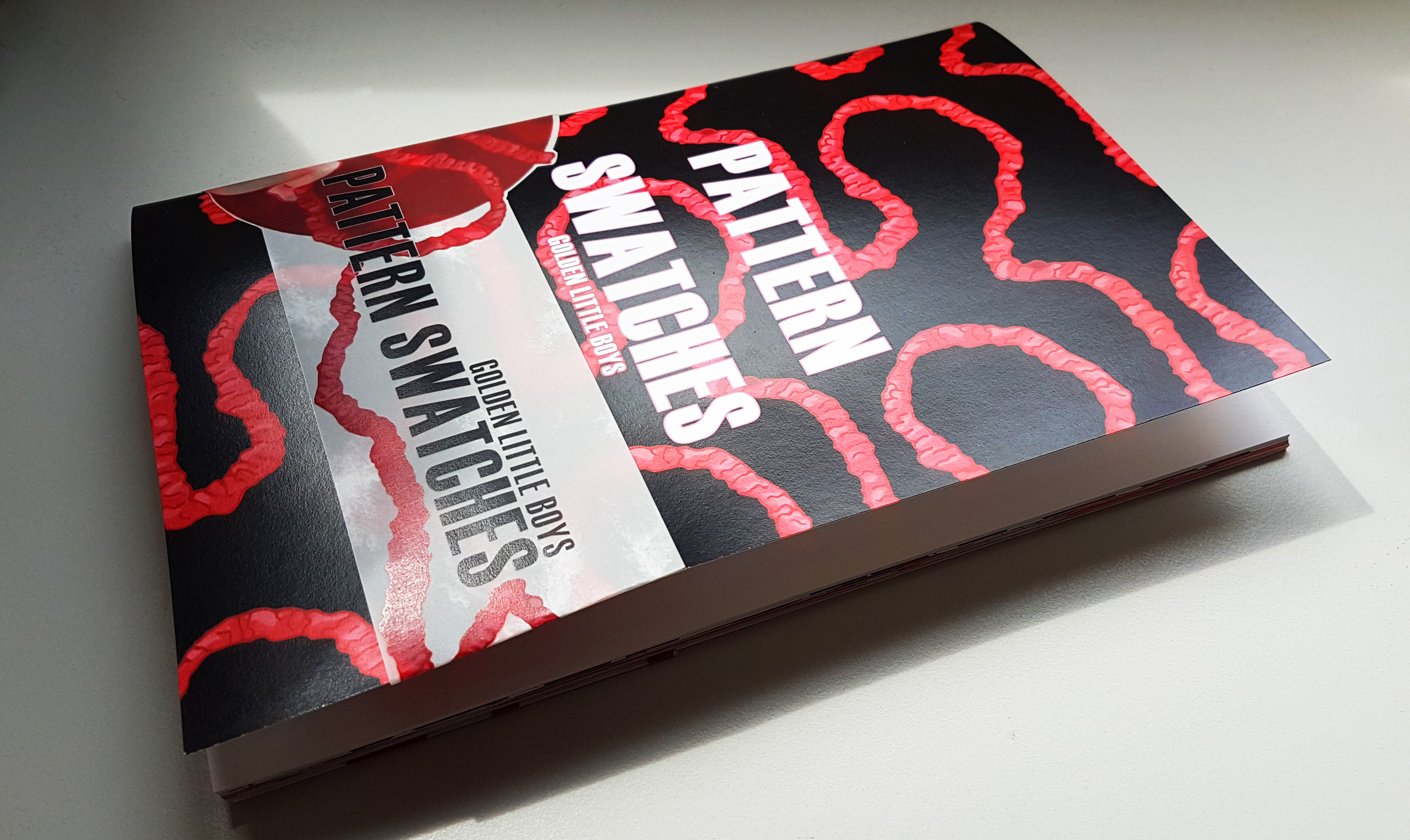
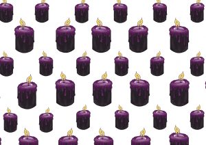
 Here are some of the prints close up!
 The pattern swatch book contains all of the pattern swatch designs!And also the process of how the banner design came about to be!
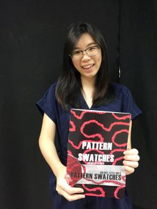 Really happy with how it came out to be!! 🙂


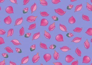
 Hence I placed all my bloomed lotuses at the top, and the petals falling from there. This creates visual direction as well from top to bottom, where all the fallen petals gather at the bottom.
 After consulting with Miss Ina, she asked me to try another composition where the babies are buried in lotus petals!
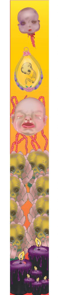
 And it was indeed a very different feeling as compared to the floating babies composition, and I added other existing motifs to see what else works best!
 To be honest, the comments given were really helpful because I was really stuck for a long time and the comments really helped to give me a new direction to approach my banner. THANK YOU. 🙂
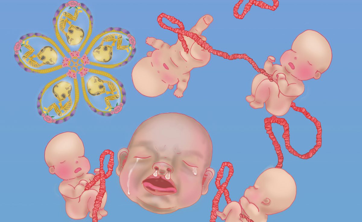
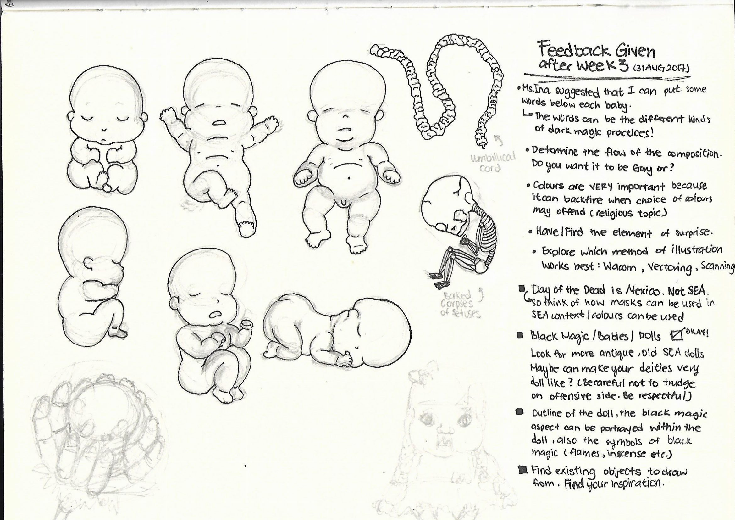
 Banner Draft 1
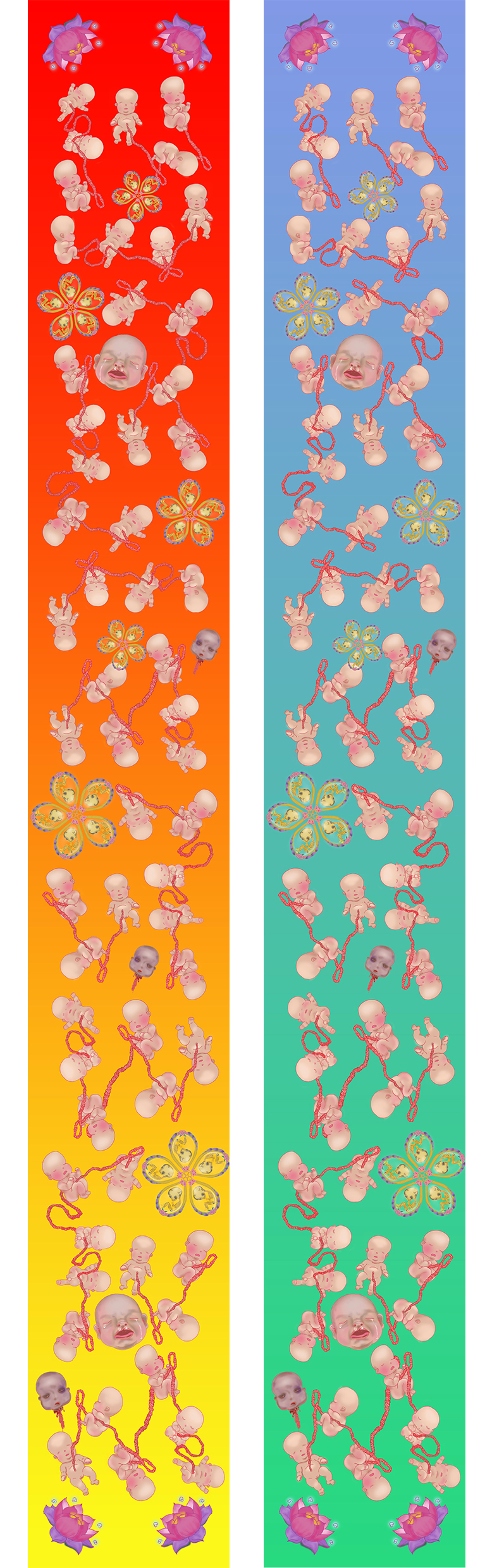

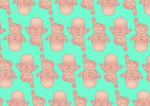
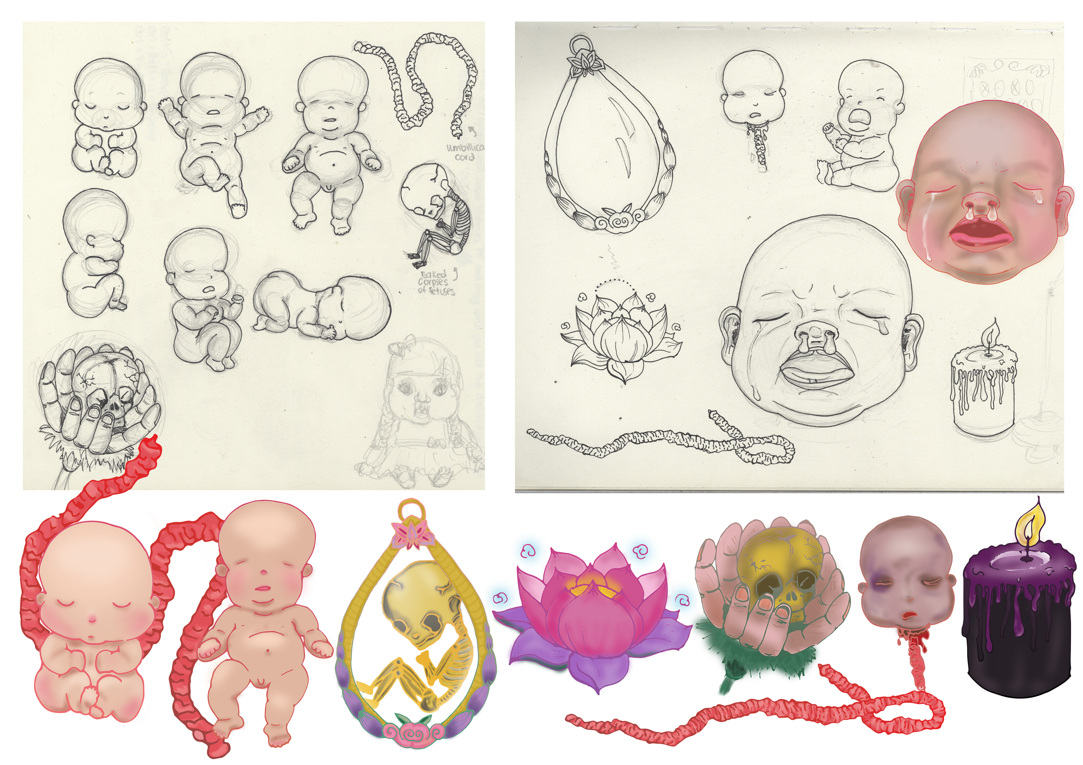
 Afterwards I tried out different forms of illustrating it in digital form, just to see which method works the best. I was looking for feasibility and which method looks best.
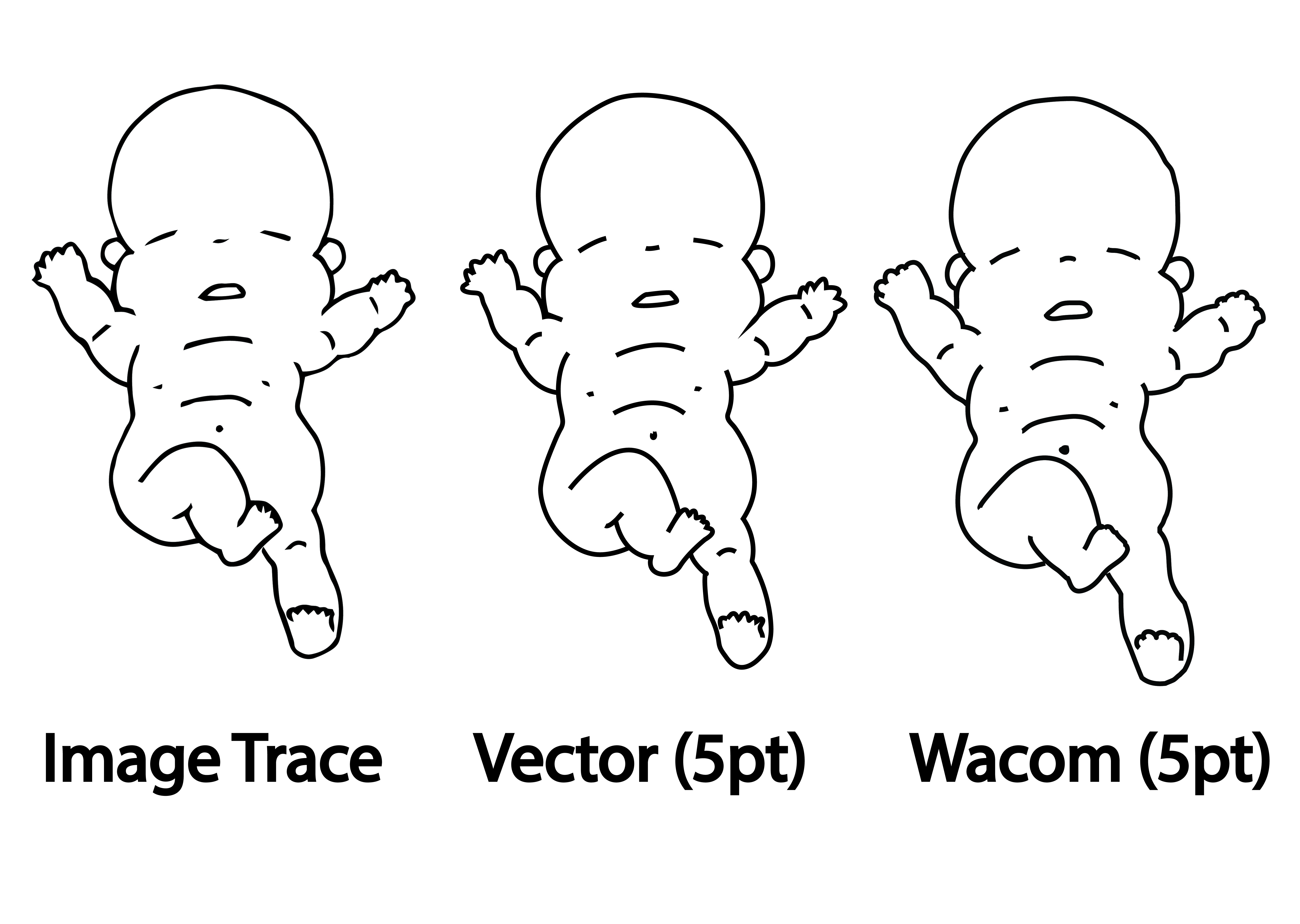 Every method has its pros and cons.
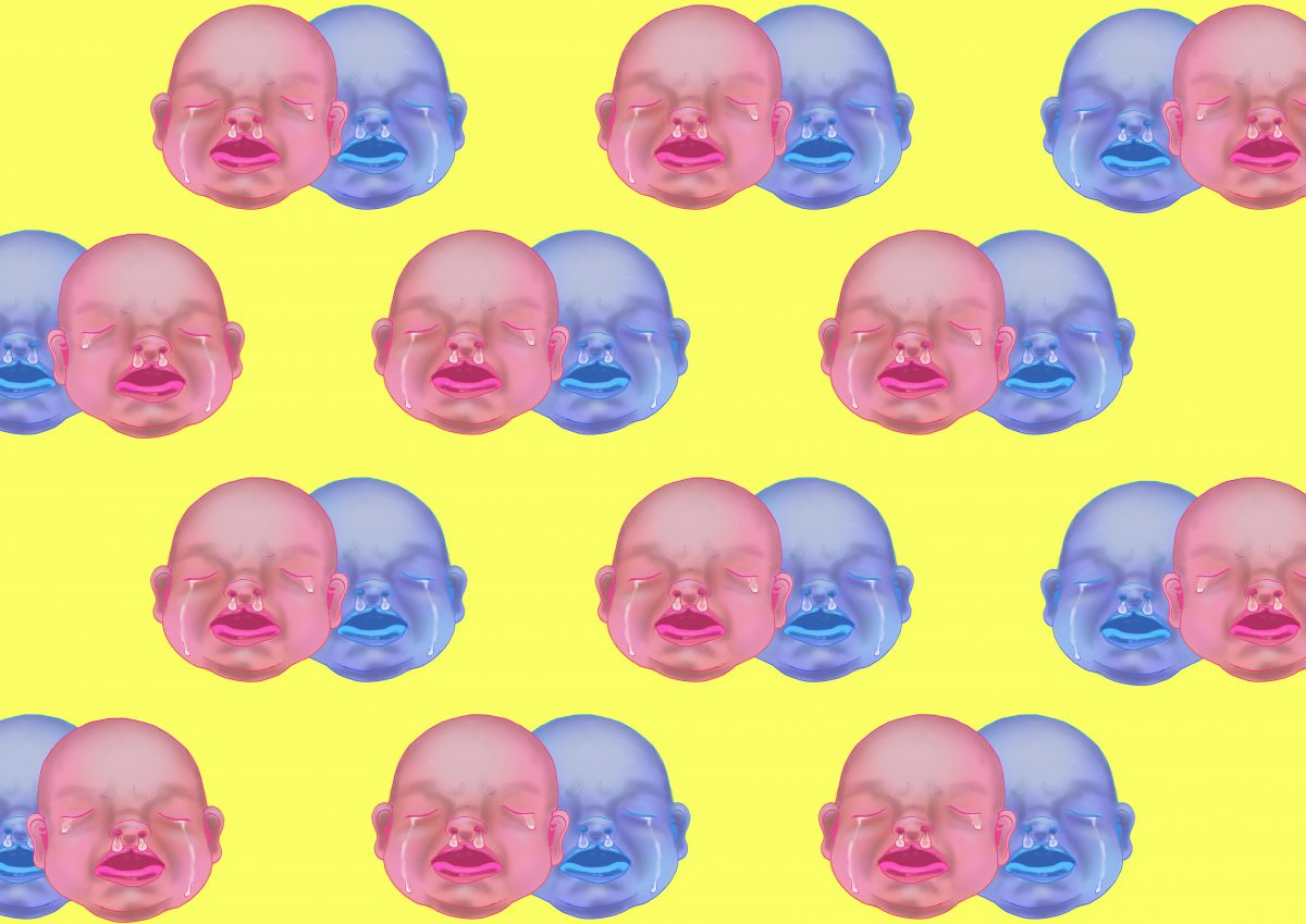
 So I colored the baby using Wacom tablet over the Vectored outline method and got this as a result.
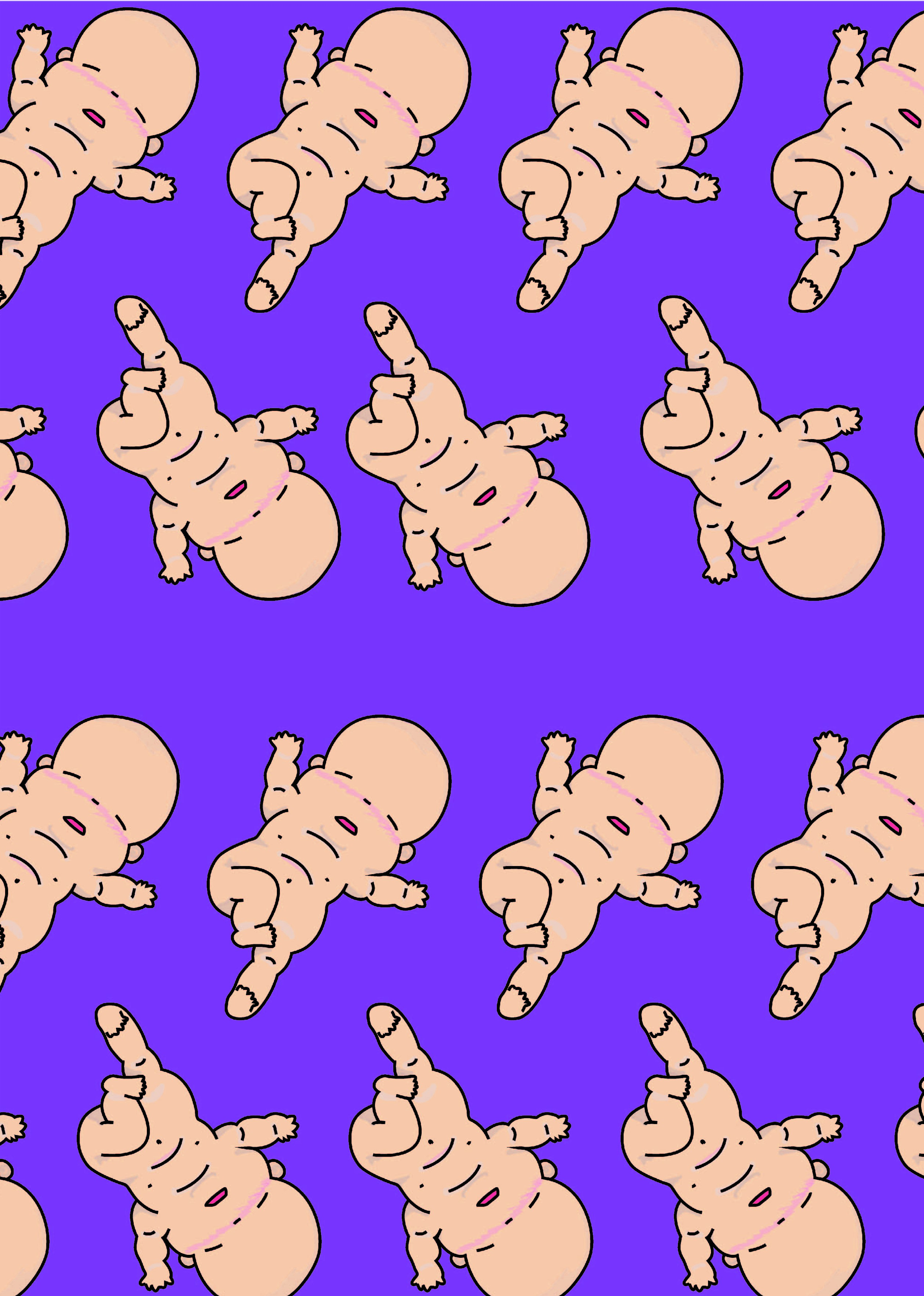 Woo~ it looks like they are doing a mass baby yoga event!