Hello! So this is our group presentation on Image and Transformation! Done by Yu Qing, Jia Qi and myself.

In this presentation, we aimed to cover:

  1. What is Image?
  2. What is Transformation?
  3. What is Image + Transformation?
  4. Why are Images transformed?
  5. How does the use of Images transform it’s meaning? (Isomorphic correspondence)
  6. Use of image transformation in real life
  7. Artists that uses Image and Transformation in their works?
  8. Use of infographics since it is relevant to our ZINE project

slide1 slide4

The world understands image at a glance. People don't necessarily relish learning a new language every time they open magazine, read an advertisement or see a billboard. Yet they do not want to be bored by reading what they see. A cliche stock or clipart used could fill a space or add visual image to a page, However, a cliche is an overused word,metaphor or image. Visual cliches are mnemonic (a system such as a pattern of letters, ideas, or associations which assists in remembering something).

The world understands image at a glance. People don’t necessarily relish learning a new language every time they open magazine, read an advertisement or see a billboard. Yet they do not want to be bored by reading what they see.
A cliche stock or clipart used could fill a space or add visual image to a page, However, a cliche is an overused word,metaphor or image.
Visual cliches are mnemonic (a system such as a pattern of letters, ideas, or associations which assists in remembering something).

An example of visual cliches are iconic logos. We see them almost everyday on a daily basis and so much so we often forget its presence. The Pepsi Cola logo is considered one of the world's most recognizable corporate trademarks. The transformation of the Pepsi Cola logo has changed drastically as seen in 1898 and today. As you can see, the most distinctive changes is the typography of the font, and eventually minimizing the details and capturing the essence of the logo: the red white and blue sphere. It doesn't take more than a second for someone who drinks Pepsi to know that that logo is from Pepsi.

An example of visual cliches are iconic logos. We see them almost everyday on a daily basis and so much so we often forget its presence.
The Pepsi Cola logo is considered one of the world’s most recognizable corporate trademarks.
The transformation of the Pepsi Cola logo has changed drastically as seen in 1898 and today.
As you can see, the most distinctive changes is the typography of the font, and eventually minimizing the details and capturing the essence of the logo: the red white and blue sphere. It doesn’t take more than a second for someone who drinks Pepsi to know that that logo is from Pepsi.

 Similar case for Macdonalds where the iconic golden arches which forms ‘M’ is the essence of the mcdonald's logo. The job of contemporary designers is to somehow manipulate cliches by recasting their archetypal meaning. And this is where transformation of an image is required as clever designers would use invest timeworn veneers with new levels of meaning. It's like giving a new packaging to an object, while the object’s essence is still everlasting and present. Transform cliches from the expected to the unexpected. As new thoughts after all rise from worn-out ones.


Similar case for Macdonalds where the iconic golden arches which forms ‘M’ is the essence of the mcdonald’s logo.
The job of contemporary designers is to somehow manipulate cliches by recasting their archetypal meaning. And this is where transformation of an image is required as clever designers would use invest timeworn veneers with new levels of meaning. It’s like giving a new packaging to an object, while the object’s essence is still everlasting and present.
Transform cliches from the expected to the unexpected. As new thoughts after all rise from worn-out ones.

slide8

Upon looking at this photo of donuts, what is your first memory or mental image that comes to your mind? Some would think of Policemen, or their first memory of eating donuts. Isomorphic Correspondence simply means that we respond to meaning. When we see an image such as a painting or a photo, we interpret its meaning based upon our previous experiences and memories. Designers use these images to evoke a unanimous memory in all of us , transforming the object they intend to advertise for into something we find familiarity in.

Upon looking at this photo of donuts, what is your first memory or mental image that comes to your mind?
Some would think of Policemen, or their first memory of eating donuts.
Isomorphic Correspondence simply means that we respond to meaning. When we see an image such as a painting or a photo, we interpret its meaning based upon our previous experiences and memories.
Designers use these images to evoke a unanimous memory in all of us , transforming the object they intend to advertise for into something we find familiarity in.

For this rather literal advertisement for slurpee, they make use of the icicles in this advertisement demonstrate isomorphic correspondence because they show a cold temperature based on their shape, color, and surface treatment.

For this rather literal advertisement for slurpee, they make use of the icicles in this advertisement demonstrate isomorphic correspondence because they show a cold temperature based on their shape, color, and surface treatment.

This image represents figure ground when the viewer differentiates between the skull and the tree. Similarity and proximity are shown in the lines over the eyes in the skull. Closure is shown where the viewer finishes the bottom of the tree trunk and the mouth of the skull. Isomorphic correspondence is displayed through the tree, which is clutching the air with it’s branches as if it were a human hand.

This image represents figure ground when the viewer differentiates between the skull and the tree. Similarity and proximity are shown in the lines over the eyes in the skull. Closure is shown where the viewer finishes the bottom of the tree trunk and the mouth of the skull. Isomorphic correspondence is displayed through the tree, which is clutching the air with it’s branches as if it were a human hand.

slide12 slide13 slide14 slide15 slide16 slide17 slide18 slide19 slide20 slide21

 Take a look at this image for instance. In 5 seconds come up with a caption for this. I believe in everyone’s mind would be a different caption. See how the text changes the way on WHERE our eyes are directed to the image, and how we interpret the image differently in an instantly.


Take a look at this image for instance. In 5 seconds come up with a caption for this.
I believe in everyone’s mind would be a different caption.
See how the text changes the way on WHERE our eyes are directed to the image, and how we interpret the image differently in an instantly.

When I say “Image and Transformation”, what’s the first thing that comes to your mind?

When I say “Image and Transformation”, what’s the first thing that comes to your mind?

Immensely photoshopped models?

Immensely photoshopped models?

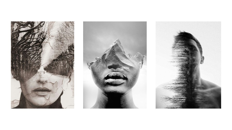
Double exposed photos?

Double exposed photos?

Or even our sem. 1 drawing assignment, to draw fragmented image of ourselves.

Or even our sem. 1 drawing assignment, to draw fragmented image of ourselves.

These are all correct. However, in current times, lots of images/artwork exist. People often scan through images that are similar to what they have seen before. What draws the attention of the audience is either something unique or having a meaning behind the artwork.

For example, Hannah Hoch’s “Heads of State”. Then German president Friedrich Ebert and his Minister of Defense, Gustav Noske, were newspaper cut outs and placed against the background pattern of flowers and butterflies surrounding a woman. The subjects are presented frolicking in a whimsical fantasy land, as if they are unaware of the political and financial hardships being faced by Germany and its citizens during this period. Through the rearrangement of image on a new background, a new meaning is given to the original image.

For example, Hannah Hoch’s “Heads of State”. Then German president Friedrich Ebert and his Minister of Defense, Gustav Noske, were newspaper cut outs and placed against the background pattern of flowers and butterflies surrounding a woman. The subjects are presented frolicking in a whimsical fantasy land, as if they are unaware of the political and financial hardships being faced by Germany and its citizens during this period.
Through the rearrangement of image on a new background, a new meaning is given to the original image.

Another example, award winning short film, Logorama. It uses logos that we often see to depict the absurdity amount of logotypes we are faced in our daily lives.

Another example, award winning short film, Logorama. It uses logos that we often see to depict the absurdity amount of logotypes we are faced in our daily lives.

Image transformation can also exist in a simplification of an original image but still convey it’s visual message. For example, Caricature drawing. Using the personification of the character, we still can recognize who they are, but in a different context.

Image transformation can also exist in a simplification of an original image but still conveying it’s visual message. For example, Caricature drawing. Using the personification of the character, we still can recognize who they are, but in a different context. For example this image “Good Morning America”. It humorously used a one night stand between Donald Trump and the statue of liberty, to describe the incident of Trump being the President of America. And the shocking expression of the Statue of Liberty shows that she is not expecting Donald Trump to be beside her. Just like how America is not expecting Trump to be the next president.

Another example is WWF campaign. Just by using the cause of global warming, being engulfed by the sea, to convey the message of stopping global warming.

Another example is WWF campaign. They use the cause of global warming, being engulfed by the sea, to convey the message of stopping global warming, if not the nature. The realistic approach of the image, makes people feel the realism of the situation happening.

 Another similar project by Nemesis Pictures. They did this advertisement for Lifebuoy. I find that the molding of animals into the form of food really works well with the quote. Instilling awareness in people.

Another similar project by Nemesis Pictures. They did this advertisement for Lifebuoy. I find that the moulding of animals into the form of food really works well with the quote. Instilling awareness in people, to always be cautious of their hand cleanliness.

This is a work by local artist, Eugene Soh. He is also a former ADM student. This work was done during his first year in uni, as he was approached by Campus magazine for a feature. As you see, this is a reproduced work of The Last Supper. The people in this photo were captured individually. And Eugene photoshopped them into a single image. This transformation adds a local touch and humor to the famous artwork.

This is a work by local artist, Eugene Soh. He was also a former ADM student. This work was done during his first year in university, as he was approached by Campus magazine for a feature. As you see, this is a reproduced work of The Last Supper. The people in this photo were captured individually. And Eugene photoshopped them into a single image. This transformation adds a local touch and humour to the famous artwork, which we can all relate to.

slide33 slide34

During Singapore Night Festival 2014, Clement Briend introduced 3D projection of Divine images. He used foliage as a canvas, and using his self-made projectors to cast the images on trees. Through combining photographs and projection, he creates a link between reality and imagination.

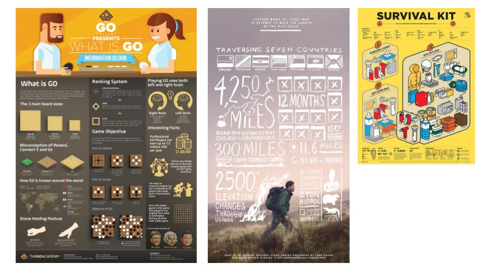
For our current project, we studied on Infographics. Infographics are graphic visual representations of information, data or knowledge intended to present information quickly and clearly. By combining data and images, we transform a plain image to something informative. Infographics exist as early as 1626. This is an illustration by Christoph Scheiner, for his book, where he illustrated the Sun’s rotation patterns. Over the years infographics have evolved, where aesthetics are merged with information. An example from London Transport Museum, they did an infographic poster on how many passengers they have carried and the number of roads they have covered. They used graphics to make information easier to relate and understand. In our current century, where softwares emerge, graphical infographics are more commonly seen.

slide35

An additional example, which is not that 2D. During Singapore Night Festival 2014, Clement Briend introduced 3D projection of Divine images. He used foliage as a canvas, and using his self-made projectors to cast the images on trees. Through combining photographs and projection, he creates a link between reality and imagination.

slide37

In this entire presentation, we have shared what images and transformation are. Why images are transformed and the multiple approach images can be transformed. Through having a purpose, artworks are viewed differently. We hope that through this presentation you had some takeaway points, and got exposed to more possibilities for your future references.

slide38

“Films are 50% visuals and 50% sound. Sometimes sound even overplays the visual.” – David Lynch

Not all the sounds we hear in cinemas are real..

Ruyi played sounds of a church bell, broken glass, rain and thunderstorm and asked us to think of an emotional memory and response. And some of the responses are gathered are grandfather clock, broken relationships, and foreboding.

Same sound interpreted differently by different people.

Ruyi told us to try making sounds from different objects and think of what sounds it resembles as sounds create emotional memories.

Psychoacoustic – Making sounds that trigger psychological response

David Lynch is famous for his industrial sound, creating suspense. In the above scene for Mulholland Drive, there were no sound in the diner, but more sounds were heard when they went out . In the diner it was much quieter, but creates a strange odd feeling to it. The silence during the 70 seconds of the guy telling his story makes you so absorbed in his story. Silence is also a type of sounds. It creates suspense, tension, gives an impression of impending doom and makes the audience hold their breath.

Walter Scott Murch is the father of sound acting of Hollywood. He creates sound for Apocalypse Now, The God father etc.

Disparate contrasting sound with the image creates a sense of irony as well as a form of mixed feelings. Like opera sounds over the image of war, it makes the scene look like a celebration of war.

Putting different sound the same image, creates multiple responses. A sound is a tool, it sets the tone and feel to the scene. The psychoacoustic response is different.


Three Types of sound

  1. Non – Diegetic (Environmental Sound)
  2. Diegetic (Sounds the Character can hear)
  3. Sound Perspective

Non – Diegetic (Environmental Sound)

Sound whose source is neither visible on the screen nor has been implied to be present in the action: 

  • narrator’s commentary
  • sound effects which is added for the dramatic effect
  • mood music

Non-diegetic sound is represented as coming from the a source outside story space. 

Non- diegetic sounds…

  • Indicate a historical period
  • Heighten ambiguity or diminish it (Lynch’s Mulholland Drive, Ocean’s Eleven)
  • Starts or soothes.

Coming to America (Environmental sounds: Neighbor’s rude screams, dogs howling, cars revving, lives rustling, sirens – City Environment of America) It gives the environment of where the character lives in, a rude neighborhood in America.

Twin Peaks (Simple technique of sound technique on reversing the sound creates ambiguity and tension)

Ocean’s Eleven (Playful music plays when Police asked him what will he do when he is released from prison, suggests his intentions is not to turn over a new leaf but stage another robbery again. It makes the audience guess instead of telling them everything.)


Diegetic Sound (Sounds the characters can hear)

Sound whose source is visible on the screen or whose source is implied to be present by the action of the film: 

  • voices of characters 
  • sounds made by objects in the story 
  • music represented as coming from instruments in the story space ( = source music)

Diegetic sound is any sound presented as originated from source within the film’s world 

Se7en (Jazz music and subway sounds and tremours, dog barking and real estate agent knock.)

The God Father (The rumbling sound of the train approaching 3X between intervals. Sound of train approaching increases each time. The initial train rumbling shows the character that he is an unwilling heir, but the increase in sounds explains the state of mind of the character when he decides to kill.)

Diegtic sounds can provide Sound bridge (Bridging one scene to another). Camera on someone who is not typing on the keyboard can creates proximity between two charcters . Sound also introduces characters, using theme songs.

Sound Perspective

A sound’s position in space as perceived by the viewer given by volume, timbre, and pitch. It shows us who and what is their present narrative.

An example of a clip with no sound perspective is this clip from Phantom of The Opera

In this opening scene of the film Touch of Evil, sound perspective is used when the camera frame the goats you hear the goats, clicking of high heels, the growing volume of the ticking master when the camera is closing towards him.


HELLO! So this is the second project for Year 1 Semester 2, which is actually 1 part of the entire project!

Part I( 2 Weeks) : Research, Sketches, Collection of Data and Presenting found data (soft copy) in a visually engaging manner.

Part II : Creation of Zine.

The area that I have gotten from drawing lots in class as to which neighborhood I had to embark an exploration to is…

TELOK BLANGAH

And what do I know about this place? ABSOLUTELY NOTHING. ZILTCH.

When I got the slip of paper that determines the choice of location for the rest of the semester, I even asked Joy,” Is this place even in Singapore??”

Oh well. One thing about this project is that the more foreign you are to the location, the better it is because you’ll be seeing things from fresh eyes and discover new things! 😀

SO LETS GET STARTED WITH THE RESEARCH PROCESS WOOHOO!!


SECONDARY RESEARCH ON TELOK BLANGAH

What is ‘Secondary Research’ Secondary research is accessing information already gathered from the originator or a distributor of a primary research. For instance, like obtaining information from third party sources, magazine article’s or my friend’s grandfather’s sister who lives in Telok Blangah (just an example).

So I made some quick online research about Telok Blangah and to my surprise, I did find some interesting facts already!

  1. Telok Blangah is a subzone region and housing estate located in Bukit Merah, Singapore.
  2. Founder of Singapore,Sang Nila Utama , landed at Telok Blangah and went inland to hunt wild animals, where he spotted a majestic Lion afar and decided to name our homeland, Singapura (Lion City).
  3. The area regained prominence during 1823, the British period, when Sir Stamford Raffles assigned Temenggong Abdul Rahman and his followers, 0.81 km2 of land for their residence and a cemetery. The area flourished under Temenggong Abdul Rahman because of his monopoly over the gutta percha (Some tree sap) trade.
  4.  Kampong Bahru replaced the old kampong along the Singapore River. And this first resettlement could be called the first urban renewal project in Singapore. The Hill maintained the old name of Telok Blangah Hill until July 1845 when it was renamed Mount Faber after Captain Faber of the Madras Engineers.
  5. Telok Blangah Road was officially named in 1907.
  6. The shrine of Puteri Radin Mas Ayu, a sixteenth-century Javanese princess, is located at Mount Faber Road, near the junction with Telok Blangah Road.

SECONDARY RESEARCH ON

WHAT IS TELOK BLANGAH KNOWN FOR?

Nature. Telok Blangah at first glance online screams ‘NATURE’.

Population Estimate as of 30 June 2016 : 10,500

Telok Blangah Hill Park (10 Telok Blangah Green, 109178)

Terrace Garden Mostly used as just a walkway between Hort Park and Mount Faber. There is an undisturbed, idyllic ambience with a solitary gazebo sits atop the hill along with classical European white railings. Despite what a sight the garden is, the real spectacle to behold here is the panoramic view of the cityscape from a bird’s eye view.

Henderson Wave Bridge (Henderson Road, Southern Ridges, Bukit Merah, Singapore 159557)

Singapore’s highest pedestrian bridge, at 36m above ground. Surrounded by greenery and bird’s eye view of the southern part of Singapore, the shell-like crevices doubles as shelters and is a great place for family and friends to relax there. The bridge is illuminated from 7pm to 7am daily.

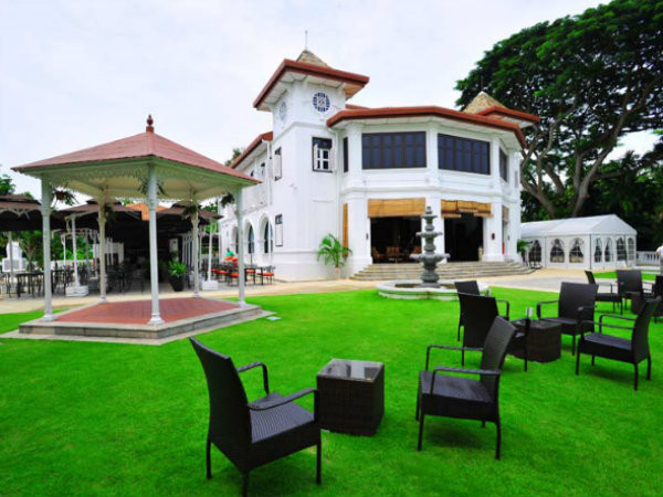
Alkaff Mansion Ristorante (10 Telok Blangah Green)
pc_600x450


Built in 1918 as a weekend retreat for the illustrious Yemeni Alkaff family of spice traders. The Alkaffs ancestors arrived in Singapore from Yemen in 1852, and Alkaff Mansion was not only their family home, but also the venue for luxurious high society parties in the 1930’s – imagine Great Gatsby, Singapore style.

For an unknown reason, the mansion was abandoned after WW2, and went into a state of disrepair. With a large outdoor terrace, fountains, and a gorgeous interior, Alkaff is thought of as one of the most magnificent colonial houses still standing in Singapore. And now, it is an Italian Ristorante.

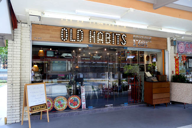
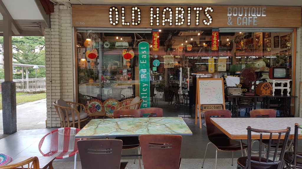
Old Habits Boutique Café (#01-315, 38 Telok Blangah Rise, 090038)
oldhabits9

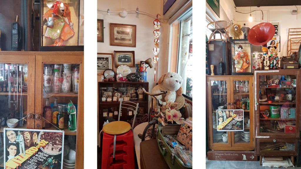
Nostagia is in. Old Habits is part vintage boutique and part café, a place to appreciate the lifestyle of the old eras and immerse in the memories of the past. The interior of the boutique café is docked with many vintage items from the past which the owner of the café, Donovan Goh collects.

This section concludes the secondary research I had done BEFORE I went on my field trip as of 15 Feb 2017. 🙂 The following segment will be on my documentation of my field trip!


FIELD TRIP DAY 19 Feb 2017

And so, I went to Telok Blangah with my trusty partner in crime ( Dad cool) for the field trip and thanks to him, I was able to cover more area on this foreign ground in Singapore!

What is ‘Primary Research’? – Primary research is any type of research that you go out and collect yourself. Examples include surveys, interviews, observations, and ethnographic research. 

So when I was on my way to Telok Blangah, I was not certain what I was looking for. Its either food or shops and I didn’t want to touch on the nature parks aspect as it is the most prominent aspect in Telok Blangah and I didn’t want to do something that can be easily found on the net.

So I went to look for Food first since we were hungry anyway.

FOOD in Telok Blangah
slide1

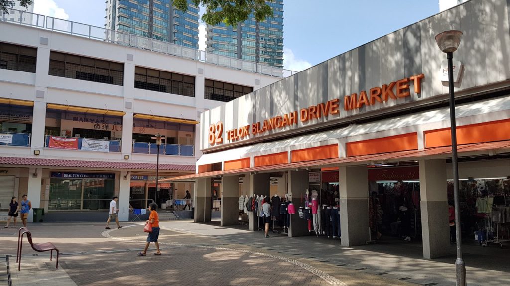
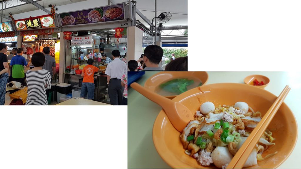
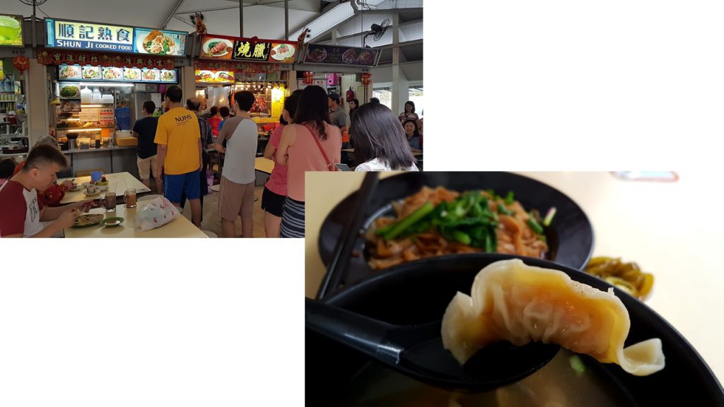
The place my dad and I went to eat at was 82 Telok Blangah Drive Market, I chose that specific location as it was within the Telok Blangah Mall area which I wanted to visit as well. Within the market, there was already a couple of lines queuing up for some local food which I also joined in to partake in the ‘Participant Observation’ aspect.
slide3

The noodles I queued for took 30 mins and I was pondering what was taking so long. I observed and saw that the owner and his wife were perhaps in their mid 60’s and the cooking process was rather unique. The Uncle cooking the noodles had a system where his wife is the one taking the order and frying up the fishcakes (which I believe is handmade), and he was the one preparing for the noodles. He was swift in his actions and he bounced on the balls of his feet. And was the noodles worth the 30 min wait? Well, lets say I have tasted better. But the fishcakes were good though.
slide4

And I also tried Shun Ji Dumpling Noodles as the queue died down after lunch hours. The dumplings were smaller than the ones I’ve eaten , but they are packed with fresh shrimps and pepper! It was really good.

QUALITATIVE DATA COLLECTION

What is ethnography and participant-observation? What are some ways collecting data?

The aim of ethnography and participant-observation is to gain a close and intimate familiarity with a given group of individuals and their practices through an intensive involvement with people in their cultural environment.

Some forms of collecting data are conducting informal interviews, direct observation, and analyzing personal documents produced within an age group etc. It involves the characterization of Qualitative Research and can include Quantitative Dimensions.

What is qualitative and quantitative data?

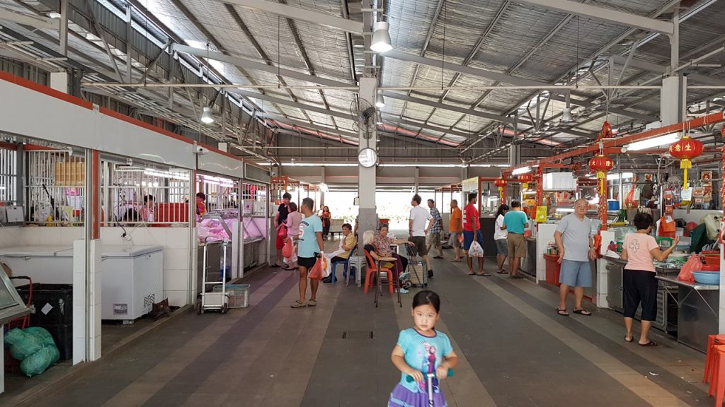
After which I toured around the market and was astounded to see that the wet market was extremely clean and spacious. There wasn’t a hint of poultry odor as the area was very well ventilated.
slide5

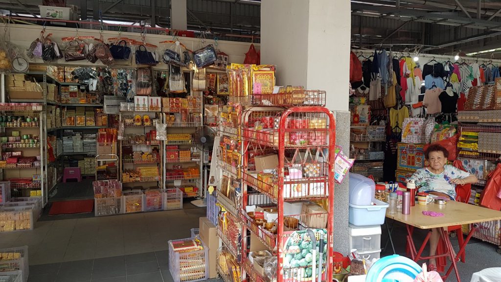
Turning into a corner, I saw an elderly lady tending to her Incense Paper shop and I plucked my courage to conduct a Qualitative Data collection with my 1st interviewee.
slide6

What I have gotten out from the interview:

Incense paper auntie has been selling incense paper for 10 over years, living here for 40 over years. She said that the difference between Telok Blangah then and now is that the markets aren’t as lively. She mentioned that there was a drastic decrease in the number of people living here. Don’t know where all the people go. Old residents die and the younger people don’t really want to move to Telok Blangah. Telok Blangah has more elderly people than youngsters. Houses here are all new now, not as before. She didn’t play a lot as a teen in this area, she was a housewife.

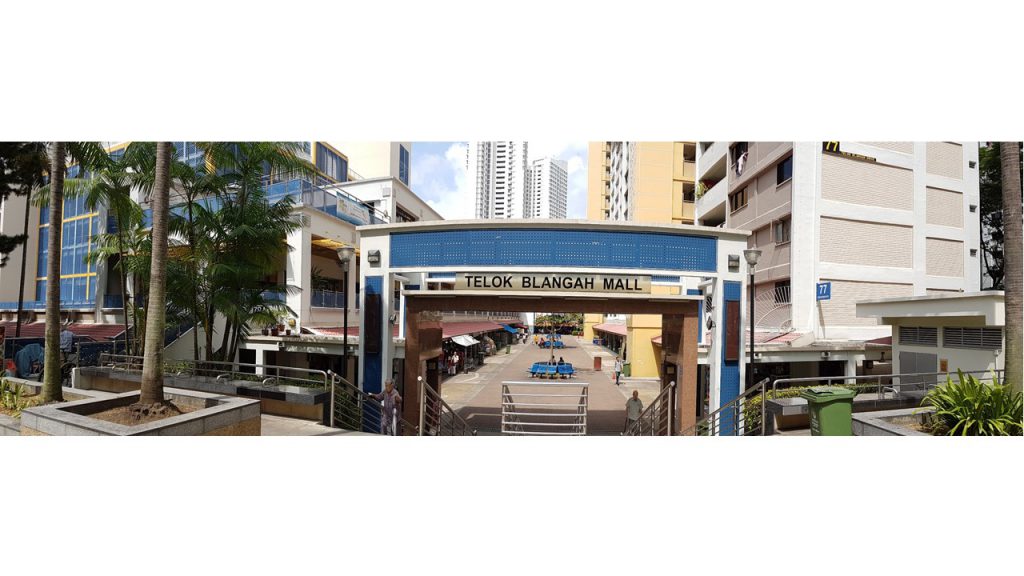
Shortly after, I was spurred to interview more people as I wanted to have multiple perspective of things and personal recounts of the resident’s perception of their own neighborhood. I walked around Telok Blangah Mall.
slide7

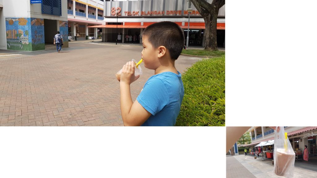
A little boy caught my attention as he was drinking Ice Blended Milo from my childhood cheap bubble tea shops and I asked him where did he get it. He brought me to the shop and I spoke to him. (grabbing my opportunities right here~)
slide8

What I have gotten out from the interview:

The milo ice blended he has gotten is from the ‘old store’, not the ‘new store’ that was closed today. New one is called Mei Li Shop. He always buy at the Old store. HE IS BORN HERE. HE IS SINGAPOREAN ( he emphasized on that, I was not kidding with the caps lock). He questions my nationality haha. He is walking around here as his parents are shopping for things. He goes to his friends’ house to play after school. Play computer games and Ipad. Telok Blangah is very boring. His parents work at Tanjong Pagar and Raffles Place. He can go home on his own.
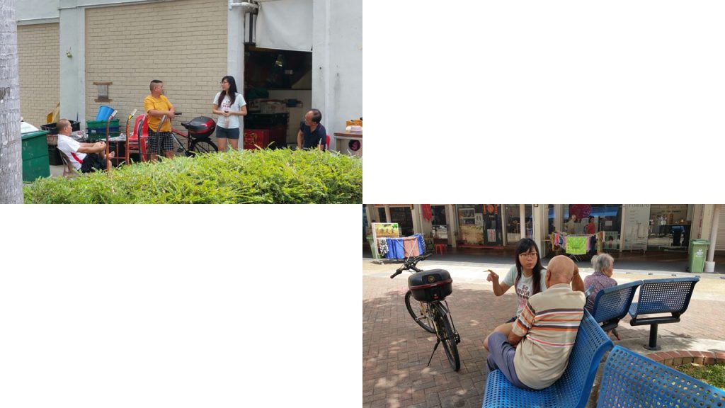
My dad is a vey good paparazzi. I didn't even know he was secretly helping me document my explorations haha!

My dad is a vey good paparazzi. I didn’t even know he was secretly helping me document my explorations haha!

I saw an elderly sitting on his own and I guess that he lived here as he was sitting rather comfortably on the benches. Hence I approached him and asked him about his personal recount of his past in Telok Blangah.

What I have gotten out from the interview:

Uncle stays in the vicinity. Here is nice. Stayed here since 1980. No play. Now retired. Last time work at PSA Container Port. He is happy with his CPF. After eating at the market, he go home. Occasionally goes to the nearby shopping centre.

I was on a roll. It was a heat of a moment spur of courage and I went round searching for people who looked like they lived here and I was determined to collect as many personal recounts as possible. Which led me to this group of uncles who sat at the fruits stall discussing about their lifestyle.

What I have gotten out from the interview:

(In this group I’m interviewing consist of 4 uncles) 3 of them have been staying here for 10 over years, whereas the other has been staying here for 40 over years. Constantly asking me why am I asking them questions (they seem wary. I don’t know why). Here has no place for their leisure. Only form of leisure they can frequent is Marina Bay Sands (MBS) Casino or here at the fruits stall to talk to friends. Here is full of old people nothing else, its so dead here. Its a dead end. Eat and go home that’s it. Houses here 30 years ago used to be short and tiny, now is all high rise. The uncle (71 Years Old) whom I spoke to has been living here the longest came to Singapore in 31 August 1983, selling fruits since then. He was 30 plus when he started selling fruits. He was an immigrant, he ran from Russia to Singapore. He did not go for dates in Singapore because he was busy working. Work and go home. People who used to live here has passed on. Or if they are alive they eat their lunch, go home or sit with friends and talk. 

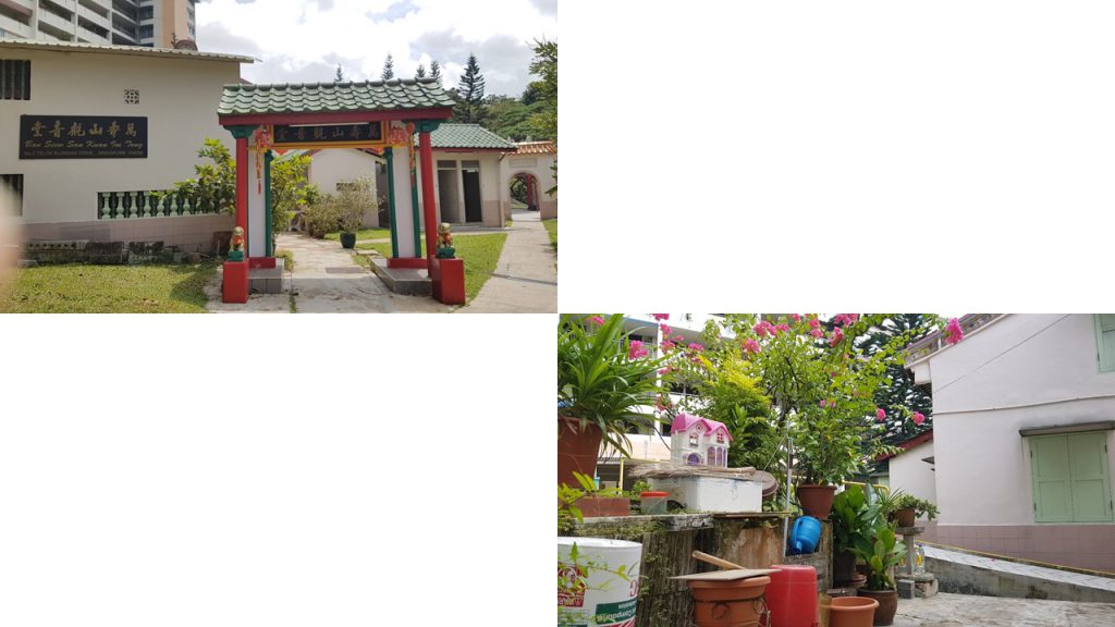
One of the uncles told me that I should visit the 2 old temples behind to interview the elderlies as they have lived there far longer than any of them. So my dad and I went to look for the temples they’ve mentioned.
slide12

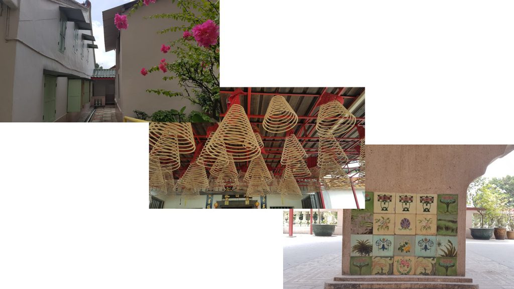
Sad to say, it seems like the elderlies has gone home at that timing we went, but the temple was really beautiful and intimate as it was rather small, and the devotees are the residents within the neighborhood.
slide13

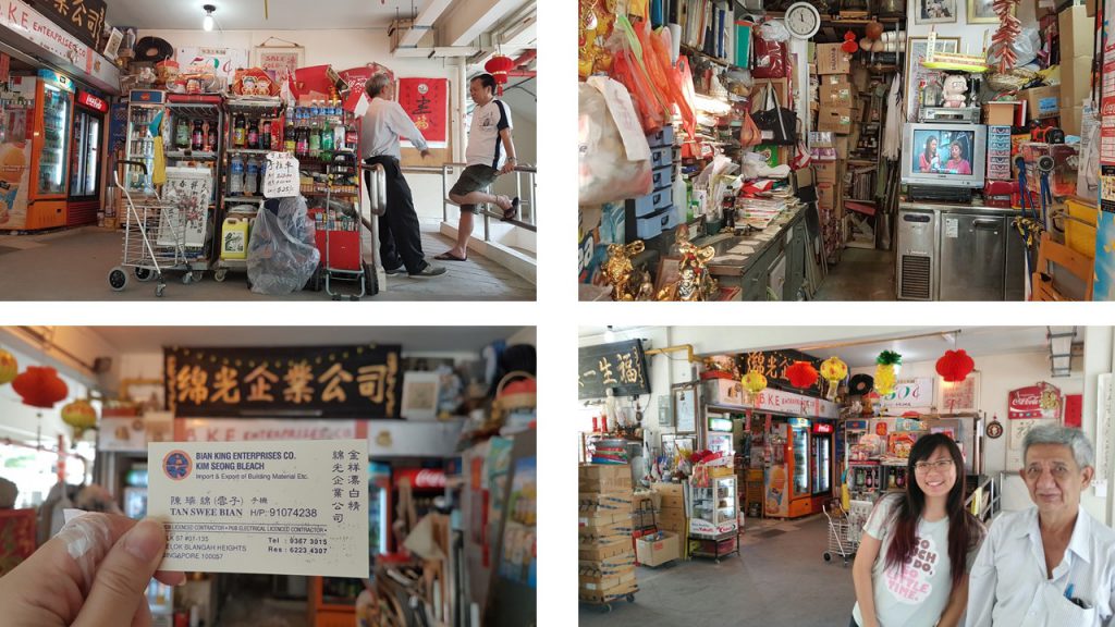
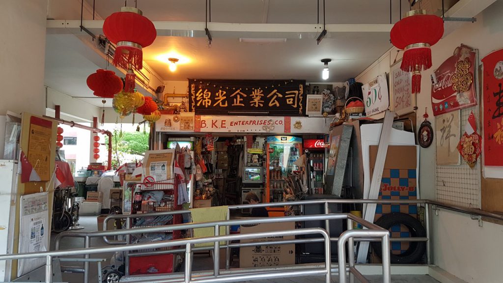
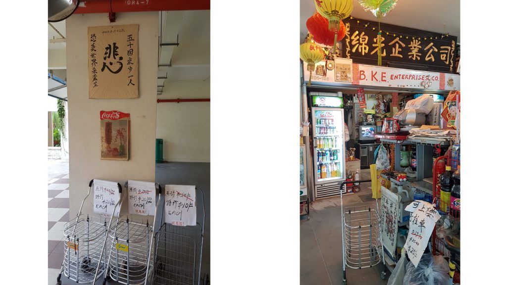
While walking back to our car, my dad and I chanced upon this very vintage looking Mama shop (A mama shop or mamak shop is a convenience store or sundry shop in Singapore that is often located under a high-rise apartment block ) . Most Mama shops I recall as a kid are usually ran by Indians, but this was a Chinese Mama shop. The interior looked extremely different as well so I decided to speak to the owner.
slide9 slide10 slide11

What I have gotten out from the interview:

Stayed here all his life. The company he worked for is 50 over years old. (the mama shop now used to be a part of a company, explains the grand shop sign) . Used to be in a office in Henderson Crescent ( location is at the back of a SGD$10 note), but got chased out by government to Tampines. Uncle started doing business when he was 23 years old, now he is 73 years old. Telok Blanagh here is a hill. Used to be a hill right here *Gesture area which has carparks and HDB flats* , government bombed the area to pave way for making roads and houses. Hill was as tall as Mount Faber. Used to have a very big temple on the hill, and a reservoir. Temple is so large you can see it from the distance, that was over 30 years ago. When he was younger, his childhood was playing in a natural cave in Mount Faber which has been sealed off by the government now. He went there often since he was 6 years old with his friends and his class teacher, playing with mud and clay to make dolls in the natural cave. Not like now, so many things to play with. Last time don’t have so many things to play with. In the past after playing he would go to the waterfall and hydrate himself, waterfall is contaminated now or even gone. Used to eat bird food (鸟饭)as a kid, the ones mother bird brings to their chicks . Venus flytraps are poisonous, they are inedible.

After speaking to the kind owner of the Mama shop, I wanted to visit Old Habits Boutique Café which I saw on my secondary research just to see if I would chance upon any younger age group of interviewees.
slide14

Surprisingly, the patrons of Old Habits Boutique Café were middle aged and families were there too for Sunday brunch. The interior was really beautiful and intriguing as it was heavily decorated with toys, vinyl records, sign boards collected from the past.
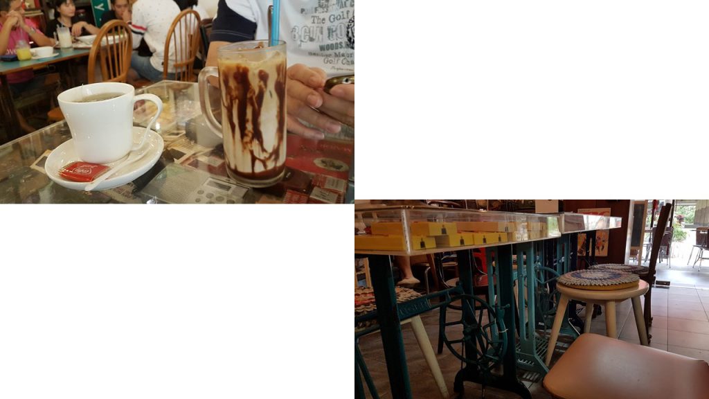
slide16 slide15

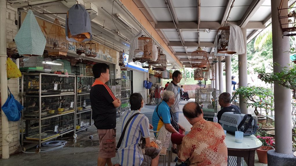
On my way back to the car, I was estatic to see a group of elderly men chatting at the Bird Shop along with their bird cages. I was even more estatic when I saw Parrots on the railings. I talked to the Parrot (What? Parrots can be a part of my Qualitative Data collection too okay? XD) .
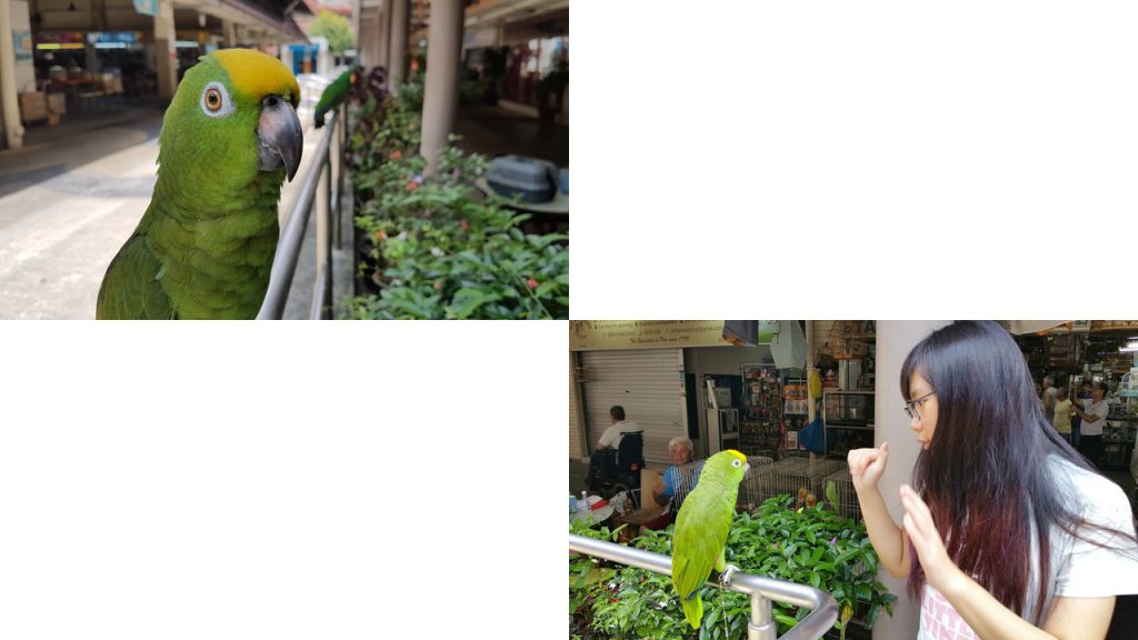
slide17 slide18

The owner of the parrots told me that he has lived here for many years already and part of his and his friend’s past time here is bringing their birds out to ‘Chat’ together as they drank their afternoon coffee.

Overall conclusion from Qualitative Data Collection:

  1. There is a drastic decrease in the number of people living here as compared to the past.
  2. Telok Blangah has more elderly people than youngsters.
  3. There used to be another hill as tall as Mount Faber here, but was removed to pave way for houses and roads.
  4. Here has no place for their leisure.
  5. Here is full of old people nothing else.
  6. Eat and go home that’s it.
  7. Houses here 30 years ago used to be short and tiny, now is all high rise. 
  8. Work and go home.
  9. People who used to live here has passed on. Or if they are alive they eat their lunch, go home or sit with friends and talk. 

How I would think of presenting my data for the infographics
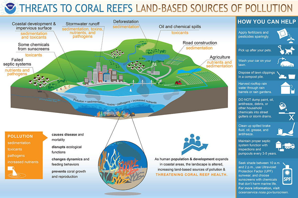
Since, Telok Blangah is quite a hill infested area, I was thinking of presenting the infographics like this. Like a map.

Perhaps using real images to represent certain activities the residents do? Like eating, talking to friends etc.

What are infographics and how are they used to effectively communicate data? What other ways can we visually represent data?

Information graphics or infographics are graphic visual representations of information, data or knowledge intended to present information quickly and clearly. They can improve cognition by utilizing graphics to enhance the human visual system’s ability to see patterns and trends.

After my field trip today, I am sad to say that I still don’t have a concrete methodology as to how I would want to carry my Infographics out. But what I am certain of is that I would like my infographics to be based on my interviewee’s personal recounts and where they would frequent in Telok Blangah. This is not a very concrete resolution, but I would like to brainstorm more on how I would want to convert that to infographics.

That’s all for today!

Hope that the next time I post would be more concrete!!

Cheers,

Seng Yi Ling.

Final Product!

Since the final product is rather hands on interactive, I made a short video to show how the paper engineering mechanism can be played with in my work. If you hadn’t seen the ‘Process Stage’ post, Click HERE!

Thank you Jia Qi for being my camera man 🙂


Feedback given on presentation day!

Classmates’ Feedback and comments:

slide3Joy’s Constructive Feedback 😀:

  • Choice of paper for this project is very important. It is rather flimsy and may break or tear when flipped multiple times. Paper shouldn’t fray at the edges.
  • Works can stand alone without instructions as it is rather distracting. Since the message of my project is ‘Self Discovery’, it may be better for the kids to explore the mechanism and how to play with this book instead of telling them how to.
  • Florist composition need not have ‘Left hand here’ and ‘Right Thumb here’, but instead a thumb and a hand outline is good enough, or even using a ‘flipping the page’ symbol is okay too.
  • Thickness of lines not constant (pots in florist is rather thin as compared to the rest). Suggested to change the setting, so when scaling up or down , can choose to scale proportionally.
  • Egyptianologist Colors were a little more jarring as it has the luminosity of highlighters, whereas everything else has richness.

Thank you lovely classmates and Joy for the comments and constructive feedback! 😀 I really appreciate it!! 😀

YAY~ Assignment 1 is DONE!! 😀

 See you next time for Assignment 2! 🙂

Cheers,

Seng Yi Ling.

For this assignment I have heavily depended on my Visual Journal for note taking and thought processing as compared to last semester where OSS was where I post most of my thought process. Regardless, I will still take you through this journey from the start to end of this ‘Que Sera’ assignment via OSS, so… LETS GO~~


Ideation

Because the name cards require the use of the conceptually driven solutions and letter forms, combined with literal or abstract image to express our future jobs in typographic portraits, I did a mind mapping process in my Visual Journal to help with coming up with the 4 Jobs for each of the name cards: Florist, Egyptianologist, Home maker and Food Science Technologist.

Joy emphasized that we ought to have these 3 factors before consulation in order to give a good framework and direction for our assignment.

Concept

My concept for this project is using the delivery method of my goal now, which is to create a interactive children’s book, to execute the name cards for all 4 jobs.

Message

Individual name cards have their own messages and an overall message as a whole.

Florist – Do not let small thinking cut your life down to size. Dream big! Work hard!

Egyptianologist – Do not let someone else’s opinion define you.

Homemaker – Be as awesome as a Domestic Goddess.

Food Science Technologist – Never stop asking ‘Why?’ until you get you answer.

Overall message – Your job does not define who you are in the future. YOU define who you are in the future.

Tone

The overall tone of the Children’s Book concept is positive and educational. While urging the readers to discover and learn new things.


Artist references

I did not limit myself to one specific artist to use as reference because I did not want their style to be seen in my work. Hence I went online and offline to expose myself to interactive books and illustrations for children to serve as inspiration; extracting the pros of each book and learning to avoid the flaws which I did not want to see in my work.

Expression of tonality: I used different shades of the same color on to express tonality in the designs. This creates slight depth and also has an old school children’s book feeling.

slide4


Methodology

For all of the designs, I used hand drawn illustration, scanned the designs and used Adobe Photoshop to fill in colors and cleaned up the edges.

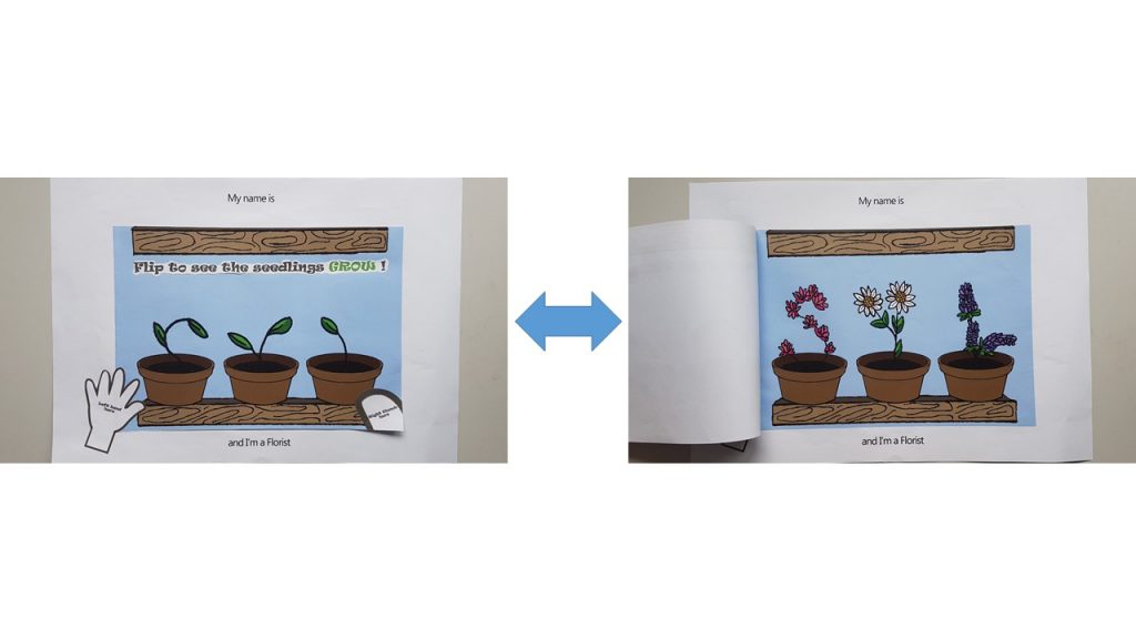
Florist (Age >5)

I used flip book animation to carry out the ‘Flip O’ Rama’ concept from the children’s comic: Captain Underpants. The following video below is how it would have looked like.

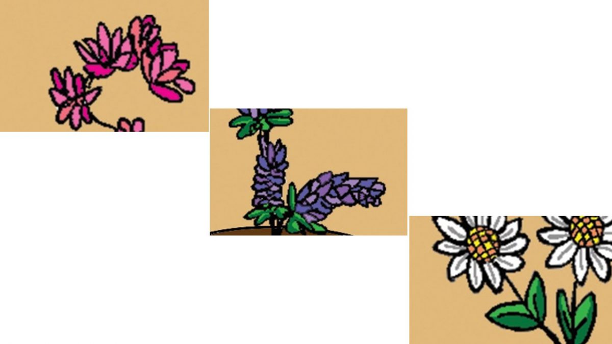
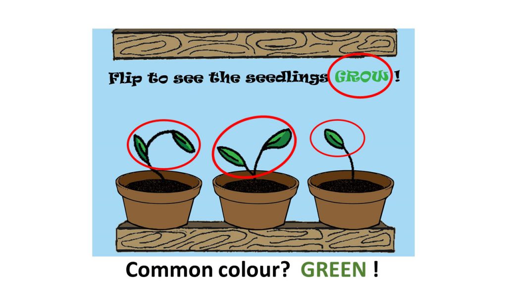
I wanted to show the growth of the plants from a boring seedling which looked like it may die any moment , into a blossoming plant. Hence, for the top image, I used the upper half of my initials : ‘SYL’ as the feeble seedlings in pots, and a full grown blossoming plant for the bottom image. So that when the user flips it repeatedly, it will look like the seedling is growing.

Joy also suggested for me to put out instructions on how the interactive-ness can be carried out by children, hence I pasted a ‘left hand here’ and ‘right thumb here’ instruction on the outside like how the Flip O’ Rama book did.

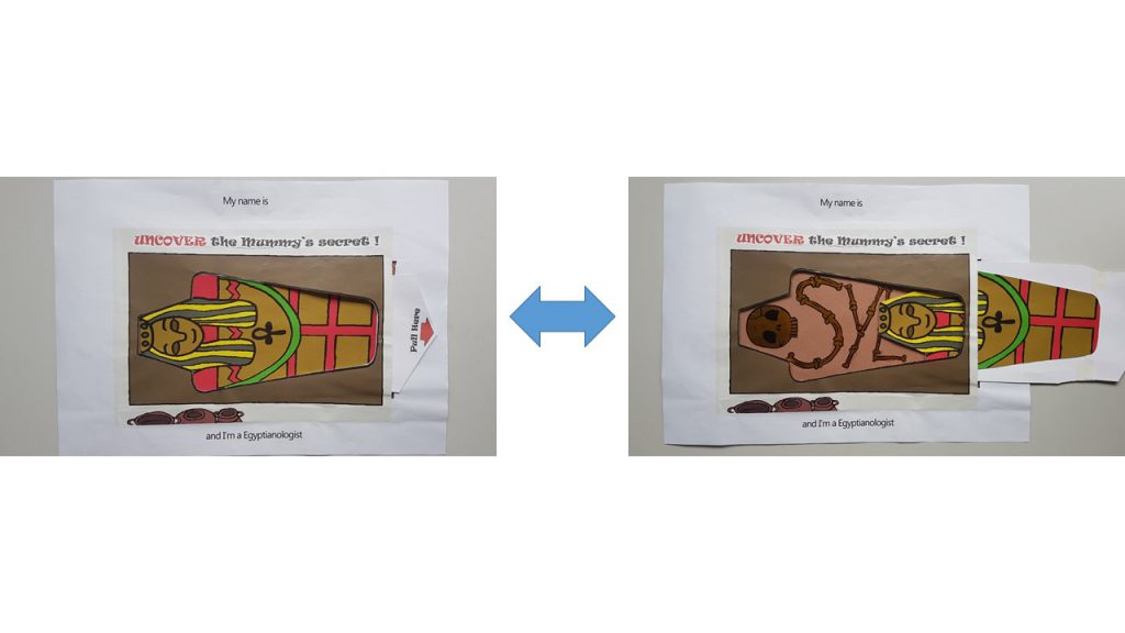
slide5Egyptianologist ( Age 10-15)

I used the pull tab mechanism in this name card as seen in many pop up books.

I used Golden Flint paper on the interior of the Mummy coffin to act as the bones, which forms my name. My idea for this name card is to show that a dull looking exterior of the Mummy gives one the impression of something less of value. However, upon uncovering the truth by pulling the tab, it reveals the bright and golden bones of the Mummy.

In a way it also has many interpretations that can be taught such as:

‘Do not judge a book by its cover ‘ 

‘Its more important to have a heart of gold than a fancy exterior.’

‘Do not let what others think of you define who you really are.’

slide7I also included a ‘Pull Here’ instructions with a red arrow to direct the child’s attention to it.

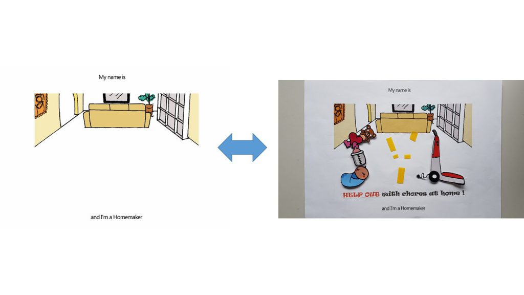
Homemaker ( Age >10)

For this name card, I used Velcro as the material to work with as I wanted to let the children organize and arrange where each of the item should go in the household chore. I was considering using felt to carry out this idea, but Shi Teng gave me a suggestion to draw out the illustrations and have them printed out instead, so that it is more consistent with the overall image of a sketchy hand drawn illustration. Thanks Shi Teng! 😀

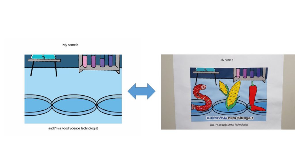
slide8Food Science Technologist ( Age 16- 19)

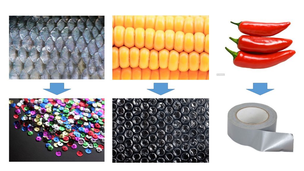
For this name card, I was highly driven ‘Touch and Feel’ books for young children.

I used Sequins to simulate the texture of fish scales, Bubble wrap to simulate the texture of corn and duct tape to simulate the waxy surface of Chilli.

slide1 slide9


Colors

Joy suggested I use a common color for the 4 compositions to express unity throughout. However, as much as I try to pick a common color, I don’t think it worked out very well to have  Blue in my Egyptianologist illustrations ( It would have looked like an Ice Tomb) and neither Orange/ Yellow for my Food Science Technologist illustrations ( I required Blue to express the sterility of the Science lab).

Hence I split my compositions into 2 sides: Blue and Yellow

Blue (Hex code: #A4DBFF) –  Florist (Complementary) and Food Science Technologist(Monochrome)

Yellow ( Hex Code: #E4C877)– Egyptianologist (Warm) and Homemaker (Analogous)

Instruction typography used

I used ‘Ravie’ Font and spaced out the individual letter because Children’s book has to be highly legible.

Font used I have chosen is Ravie because it has a rather whimsical feeling to it, but yet I chose to bold the fonts because it is still instructions and I didn’t want the children reading it to turn a blind eye to it.

Choice of color for font was something that was bugging me as well. As I felt Black was too strong as compared to the rest of the colorful compositions. But yet if I were to choose a color that suits individual composition, I felt that there was no unity to be seen as a whole in a book; and the instructions just blends in with the background where the children might turn a blind eye to it.

Hence my solution came about when I was researching for the way Children’s books present their instructions:

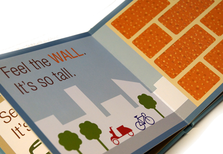
touch_and_feel_board_bookI really liked how…

  1. A muted dark color was used to give the instructions. There is a mild sense of authority which I felt that one’s eyes would be drawn to read.
  2. The key word ‘WALL‘ is in capital form.
  3. The color used for the key word allows children to draw a relation between the word and the object. There is a sign (the word ‘WALL‘) and the signified (the wall picture)

Thus, I applied this reference to my instructions for the children.

I capitalized and gave a color to the keyword which is seen in the object.

to-print


Things I could’ve done if I can turn back in time.

I am really shooting myself in the foot for saying this. But, I think admitting to my mistake and learning from it is better than to bury it under the carpet. So, for my future self, here I go.

  1. Explore different types of paper. I felt the struggle the most when I was carrying out the pull tab mechanism for the ‘I am an Egyptianologist’. I felt that if I explored the different type of GSM for paper before I executed the cutting, I would have achieved a better and smoother pull tab mechanism for this name card.

 The following post would be the FINAL one for Assignment 1 Que Sera!

Cheers,

Seng Yi Ling.

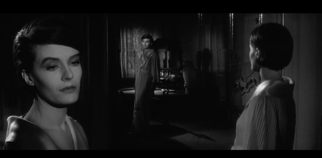
For this class assignment, I watched this film with Kam Yit Ling! :D,

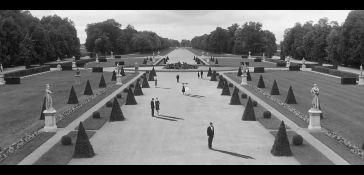
Last Year at Marienbad (1961)

Chronological order of the movie: Very inconsistent and irregular.

Q: Do you think the way this film is told works best for your story (in regard to the Alter Ego Assignment 1) ? How would you re-tell the story?

Yit Ling –  Flashbacks of the relationship between Emily and Alexy can be incorporated. Whereby Emily constantly shows affection to Alexy, would help in the story line of my film to build the history between them, so that the viewers can be more engaged in their relationship.

Yi Ling –  Flashbacks of the relationship between my grandmother and I can be added into the film as we reminisce about my childhood. I think the characters in my film in this case ought to be realistic with the age when it comes to flashback. Like when the flashback scene comes on, a child version of me and a younger version of my grandmother ought to be there.

Q: What makes this narrative (Last Year at Marienbad) work?

– The story centrals around Frank’s point of view about the female protagonist. Hence, it entwines the past, present and future of their relationship together.

– Metaphorical interpretations of their hallucinations/ potential conscience brings about depth of the characters and their inner struggles.

Q: Does this non-linear narrative work for other films

-Sci-fi, Fantasy and Thriller films would go very well with this form of narrative, such as The Time Traveller’s Wife,

Interstellar

Alice Through the Looking Glass.


What we like about this film?

– The cinematography is amazing. Everything seems aligned perfectly.
-We liked how they connect one of the hallucination/past memory with the present scene with the same dialogue, but different scenario. For instance when Frank was counting in the room with the female protagonist as he try to incur memory out from her in the past, the scene changed into the ball room scene where the female protagonist’s husband was counting the cards.

-Flashing of the 1 second scene whereby the female protagonist is holding her shoe, when she is in fact in the bar tells us that she might have remembered something about the past she can’t recall.

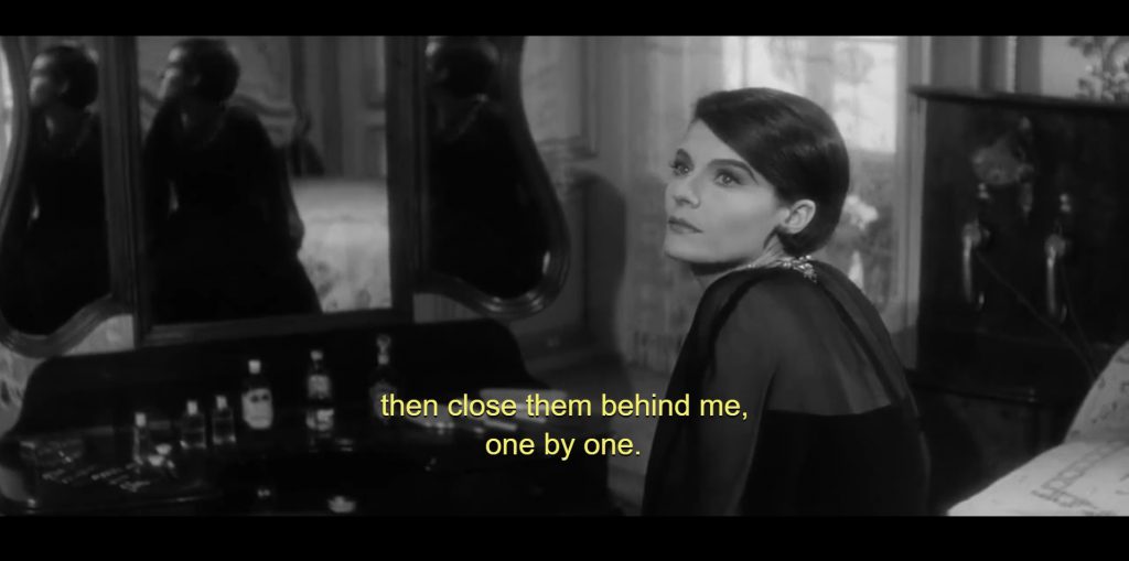
– The multiple reflections of the female protagonist in the mirror can be interpreted as her different selves in the past, present and future.

– The triangle arrangement of her own reflection can symbolize loss and confusion of her current situation, as well as the past she don’t recall.

Doubts about this film we had:

– We do not understand the purpose of having the freeze moments, whereby only one person moves. The movements are focus and exaggerated.

– We do not understand why they kept repeating the dialogue over and over again in different scenes.

– Frank always used past tense to talk to the female protagonist, so we had this illusion that Frank can travel through time. However , if it is really the truth, why would Frank lose to the female protagonist’s husband in the gambling game? Is he a psychopath who is trying to enforce certain ideas onto the female protagonist, or is he trying to mold her into the memory he believes in??


OH MY GOODNESS GRACIOUS… I forgot to upload my research on Ego.. :0 Here it is uploaded in Y1Sem2, present Yi Ling is trying to salvage the past Yi ling’s mistake.


Before we dive into Project 3: Ego, let me do some research~

Project Brief

In 4 rows of 3 squares, create a self portrait based on four different settings.

For each of the 4 rows, use the first column to represent yourself and the second column to represent a setting and third column to represent an imagined outcome. For instance, you (first column) at a family gathering (second column) equals to being the subject of scrutiny by relatives (third column).

Apply your understanding of colors and color theory to visually represent the multifacted nature of your personality. You may choose to do this digitally or by hand (or mix-media). There are a total of 12 image compositions.

Consider how colors can be used to suggest or evoke the feelings in the various representations as well as the cultural context of the various settings.

Specification

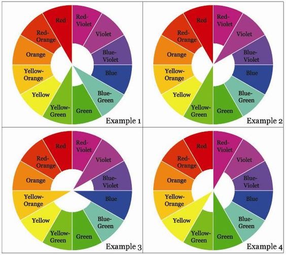
There are no limits to medium, technique or style. However the colors will have to be selected to represent one or few of the color harmonies:

  1. Monochrome Harmony
  2. Analogous Harmony
  3. Analogous Harmony Warm and Cool
  4. Complementary Hues
  5. Split Complementary

Color

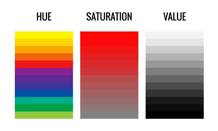
Color has 3 attributes:

  1. Hue
  2. Saturation
  3. Value

If the surface or light does not have these three essential qualities, then it is not a color.

30_day_sweater_hue_value_saturation

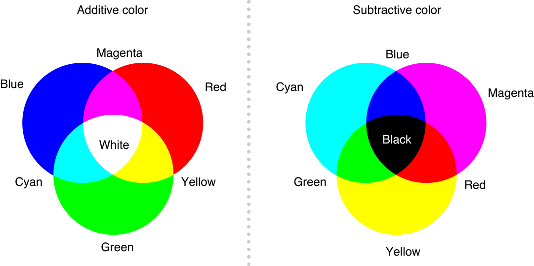
  • The definition of Hue is varies for different experts. However, based on my research, Hue is basically a color. Hue are the colors on the outer rim of a subtractive color wheel.
Additive VS Subtractive Color Wheel

Additive V.S. Subtractive Color Wheel

  • Saturation is the purity or intensity of a color. Value and Saturation are not attached concepts – color can change its saturartion, but leave its value unchanged.
  • Value is the difference between light and dark. By adding more white to a certain color (lets say Red), the hue (Red) is still the same, but of different value.

Harmony in visual design means all parts of the visual image relate to and complement each other. Harmony pulls the pieces of a visual image together.

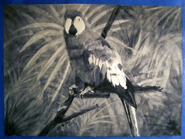
Monochrome Harmony

Monochrome Harmony are a value-based compositions that contain only one hue. There are no hue relationships in a monochrome harmony, only saturation and value relationships.

Parrot painting in Payne's grey by Joe Volkel

Parrot painting in Payne’s grey by Joe Volkel

Analogous Harmony

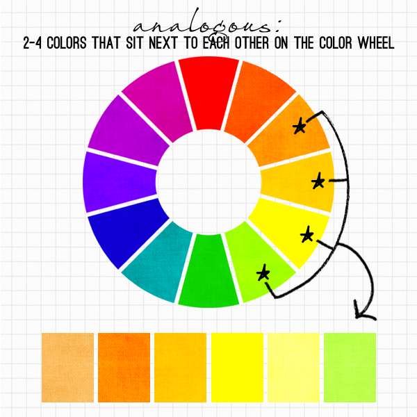
Analogous harmonies contain more than one hue, but all of the hues in this kind of harmony are adjacent on a color wheel. The adjacent colors on the color wheel are very easy to the eyes and peaceful to look at.

analogous

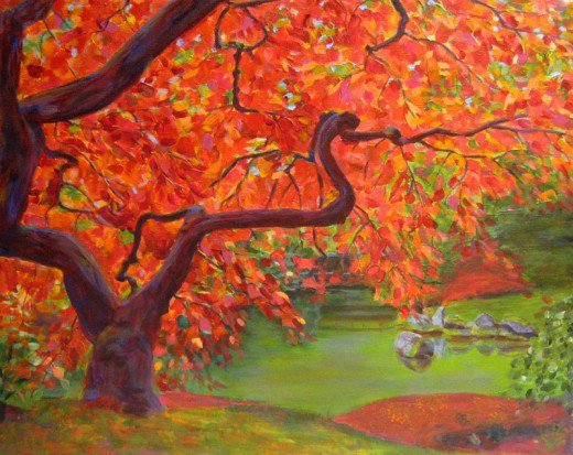
Artwork that demonstrates Analogous Harmony

Artwork that demonstrates Analogous Harmony

Analogous Harmony Warm and Cool

warm-cool-colors

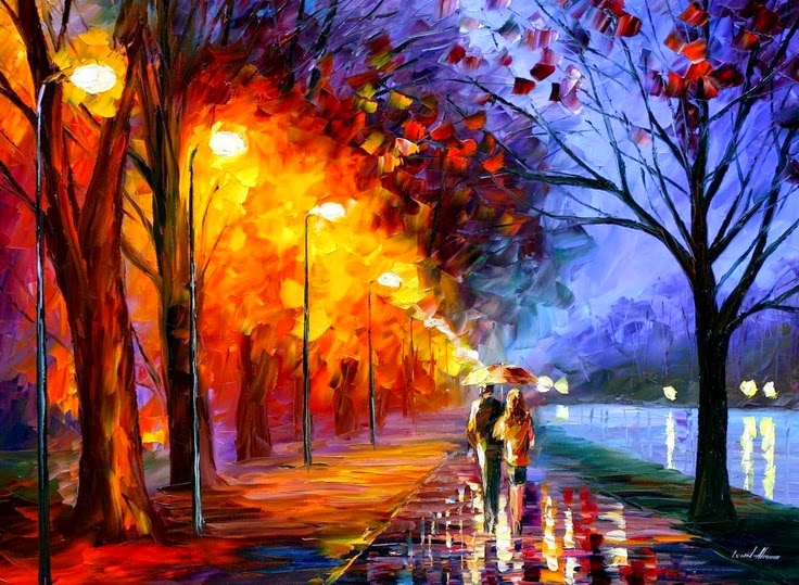
Artwork that exhibits Warm and Cool Analogous Harmony.

Artwork that exhibits Warm and Cool Analogous Harmony.

Complementary Hues

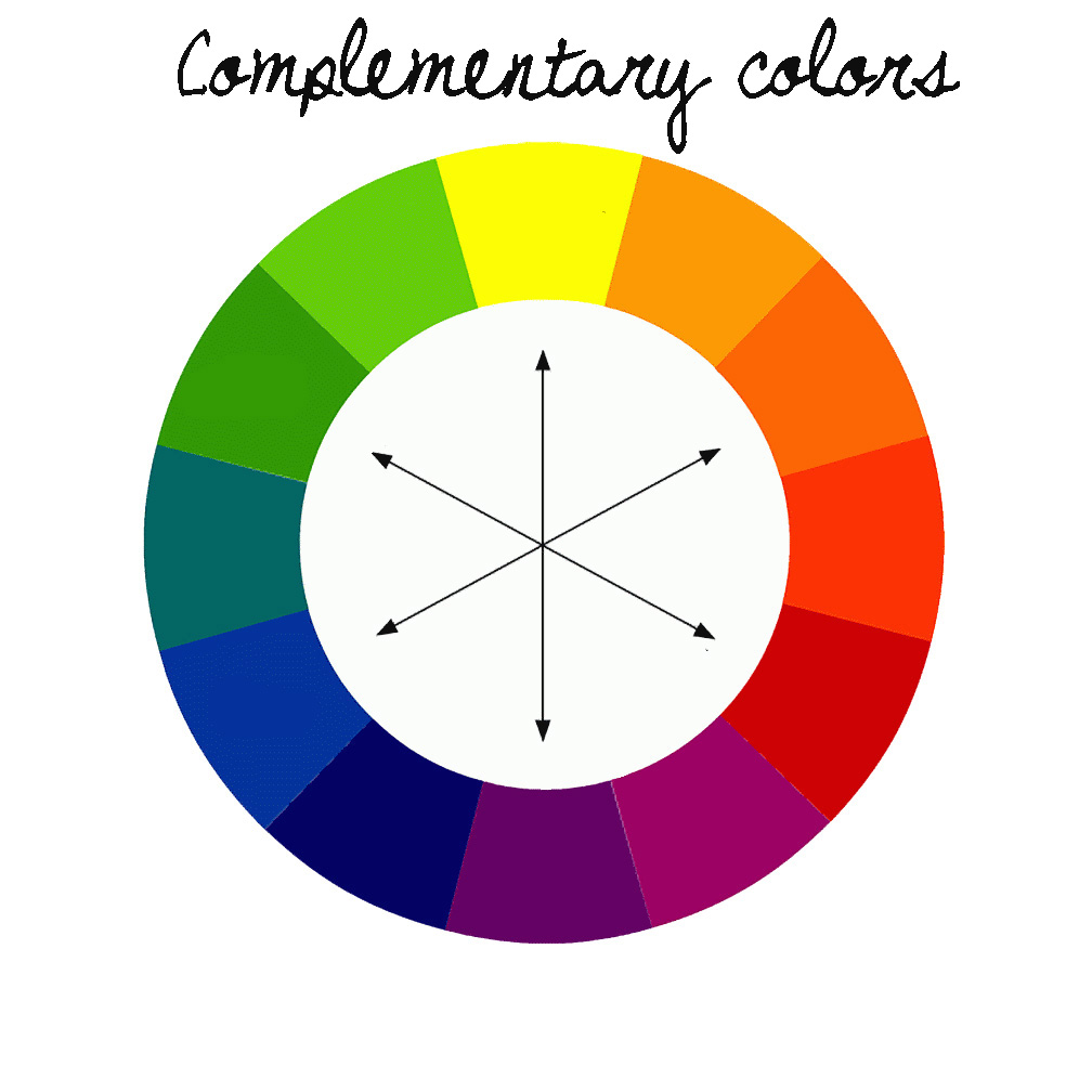
Complementary hues are complementary colors that are opposite each other in a color wheel.

complementary-wheel1

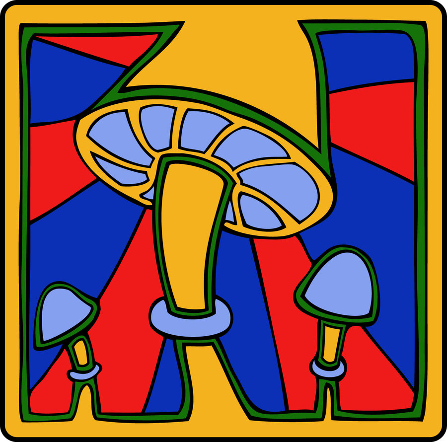
Artwork that exhibits Complementary Artworks.

Artwork that exhibits Complementary Artworks.

Split Complementary

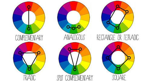
The split-complementary color scheme is a variation of the complementary color scheme. In addition to the base color, it uses the two colors adjacent to its complement. This color scheme has the same strong visual contrast as the complementary color scheme, but has less tension.

8242aaa3ef9d45c20464da149152d7ba

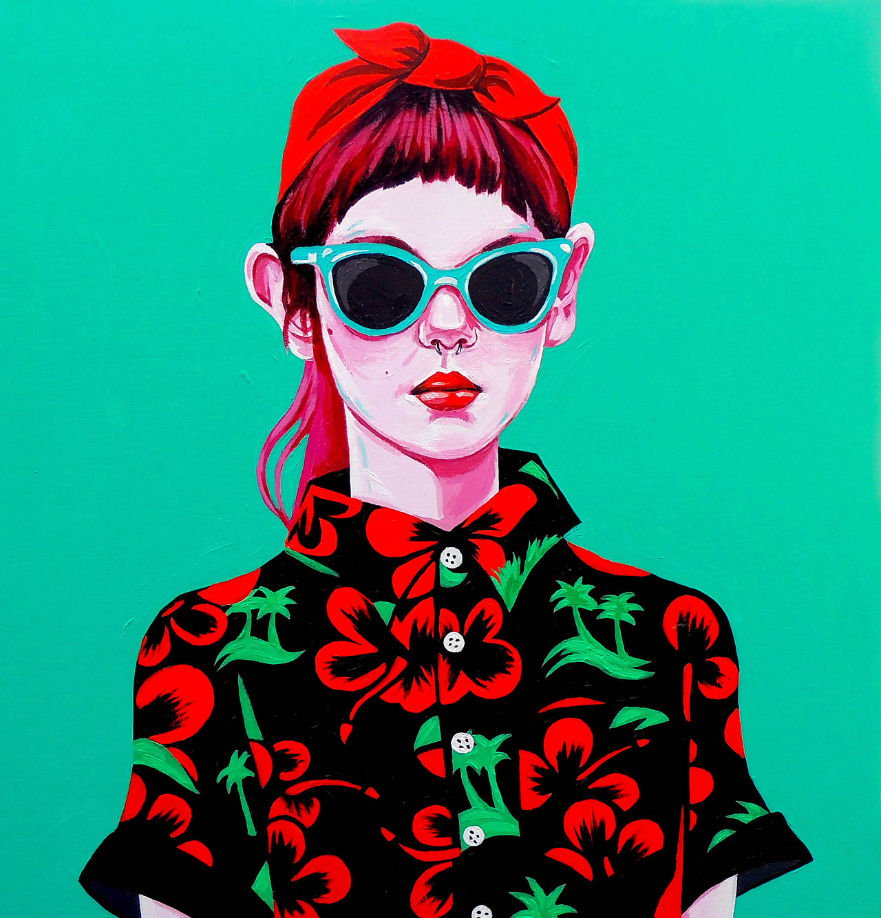
Artwork that exhibits Split Complementary Colors : Red, Turquoise and Green

Artwork that exhibits Split Complementary Colors : Red, Turquoise and Green

In addition to Split Complementary, there is also…

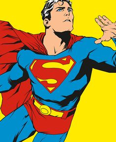
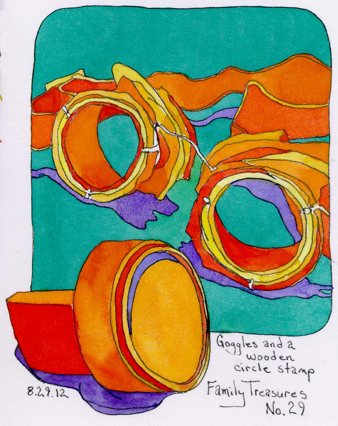
tumblr_m8cl7cwx3j1rrx82mTriadic color scheme uses colors that are evenly spaced around the color wheel.
cb0ed85f5b279a6a84443d7229bbbdea

Teiradic/ Rectangle colour scheme

82848c134c64483c9927605c644914e1

Square color scheme

alternate_complementary_color_harmony_by_samanthamuscaria-d4sd2p4


dddd


As of now, I am rather intrigued by the use of relative positions of the hues in the color wheel. Initially I thought that the color wheel was a mere collection of colors. But now I know that there is more than meets the eyes, and the relationships between the opposite, adjacent and uses the two colors adjacent to its complement color; could result in different meanings, and emotions that are evoked in an artwork. I am very interested in the exploration of Split Complementary Colors as it seemed modern and has a hint of pop-art to it as I search for relevant artworks that exhibits Split Complementary Colors.

Cheers,

Seng Yi Ling.embarassed