GOOD AFTERNOON! This post concludes the FINAL of Part 1 Project 2 of Zine: Neighborhood Explorer presentation!
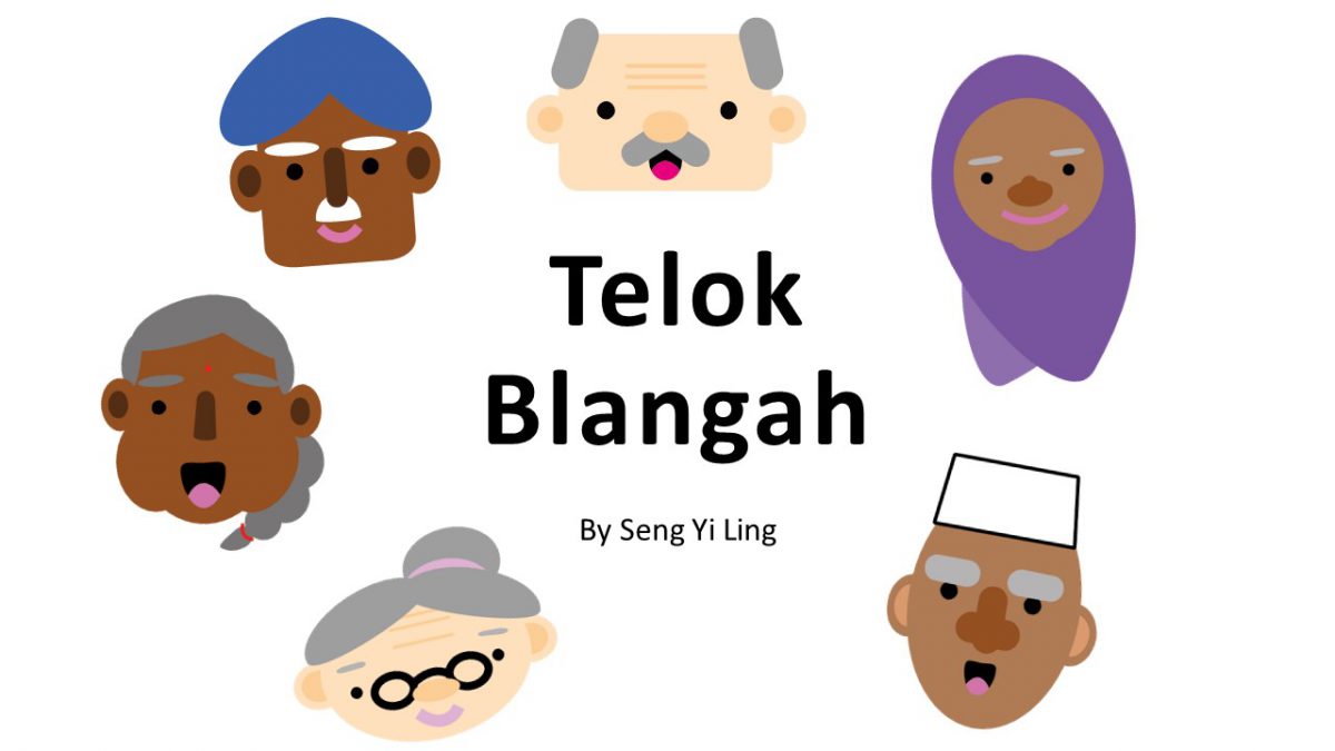
This is the infographics on Telok Blangah that I have finalized 🙂
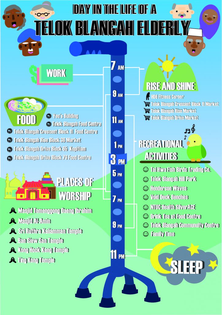
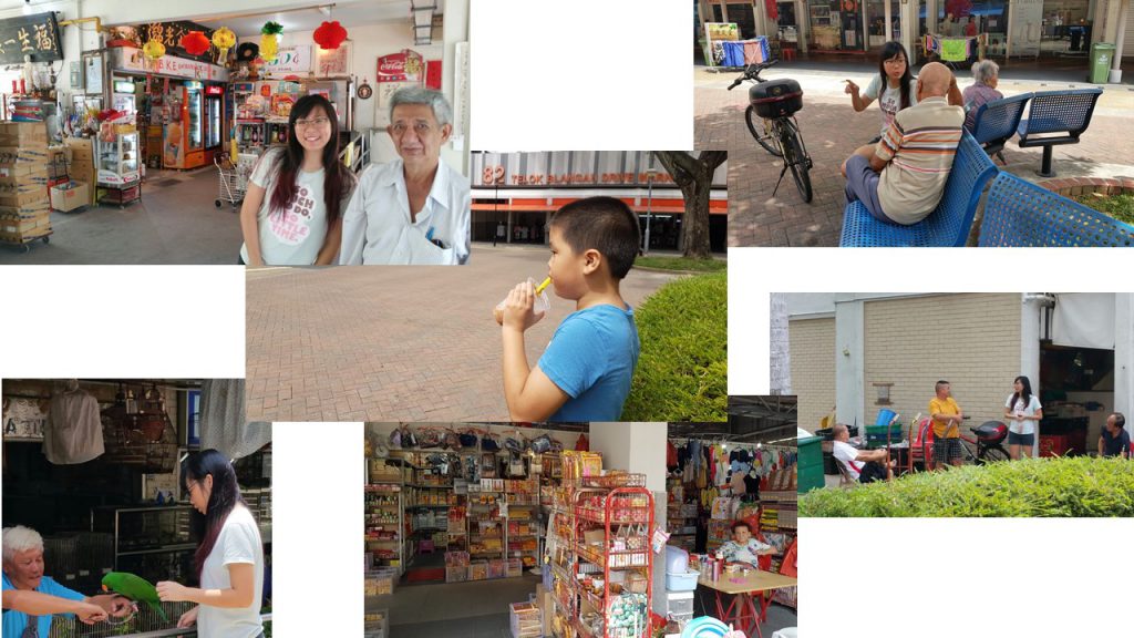
The data I have placed in my infographics are mainly from the Qualitative data (Personal Recounts)that I have gotten from interviews and secondary sources of the exact location names or address online that they have recommend me to visit.
Concept : Present it as a schedule like guide as to how an elderly in Telok Blangah gets by in a day.
Tone: Light Hearted.
Methodology
- I used Haettenschweiler Font as the header and the body text .
- Colors used are neutral palletes of scenic blue and green, as well as monochromatic blue for the walking stick.
- Attempted to use different shades of the same hue to create depth.
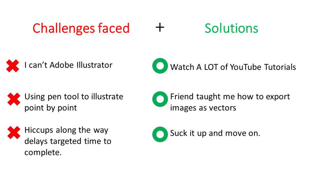
- Main illustrations are created using vectors and exporting images into vector online.
- Icons are used as bullet points for each category of activity.
- Joy mentioned that a my initial idea of using a cane may be misinterpreted as ‘Immobility’ instead of ‘Elderly’. Hence I changed the type of walking stick to the one with legs that elderlies, as I really required vertical semiotic that represents elderlies.
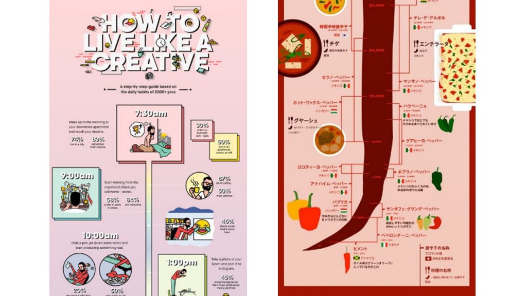
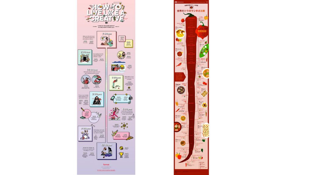
I was inspired to use time stamp and used this two infographics obtained from Pinterest. I extracted the range thing } from the chili infographic to mark out the time line.
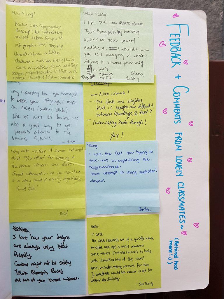
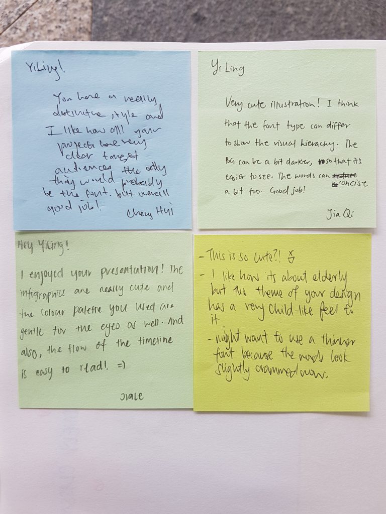
Classmates’ Comments and Feedback
Joy’s Comments and Feedback 🙂
- Joy said that this is her first time seeing my illustrations digitally, good job!.
- Liked that I staggered the information according to timeline. And that giving it a range does give us a guide to when they can execute their activity. However looking at it as a whole it can be seen that it is a day in the life of any elderly and not specifically unique to Telok Blangah elderly.
- Site specific icons can be created instead of using a generic bird to represent “Recreational Activity”. Something recognizable for instance the location of the bird watching location or certain food from Telok Blangah acting as marker would be better.
- Colors for “work” reminds her of Watsons logo. Joy worries for potential misinterpretation in my infographics.
- Text is still cramped even though got drop shadow, hence readability of text is still difficult :(. Typeface that you used is used is better for display type for headers instead of body text. Generally texts on infographics still need to be readable. When you can’t see your text well due to the background colour, it is a cue that text is required to be changed.
- Location names are long as “Telok Blangah” is repeating in many of the bullet points, hence re-emphasising the crampness. Putting a main header : “Telok Blangah”, in general and just list down may reduce the crampness.
- Style is quite unique and there is still space that can be explored.
- Shaf liked the concept of day in the life cause she don’t know what old people do in genera But font though, it is still hard to read :(.
With that I conclude the completion of ZINE part 1 here and I’ll see you again in PART 2 😀


 )
)


