Hello all! It has been a while since I have updated this page. So here is my progress so far!
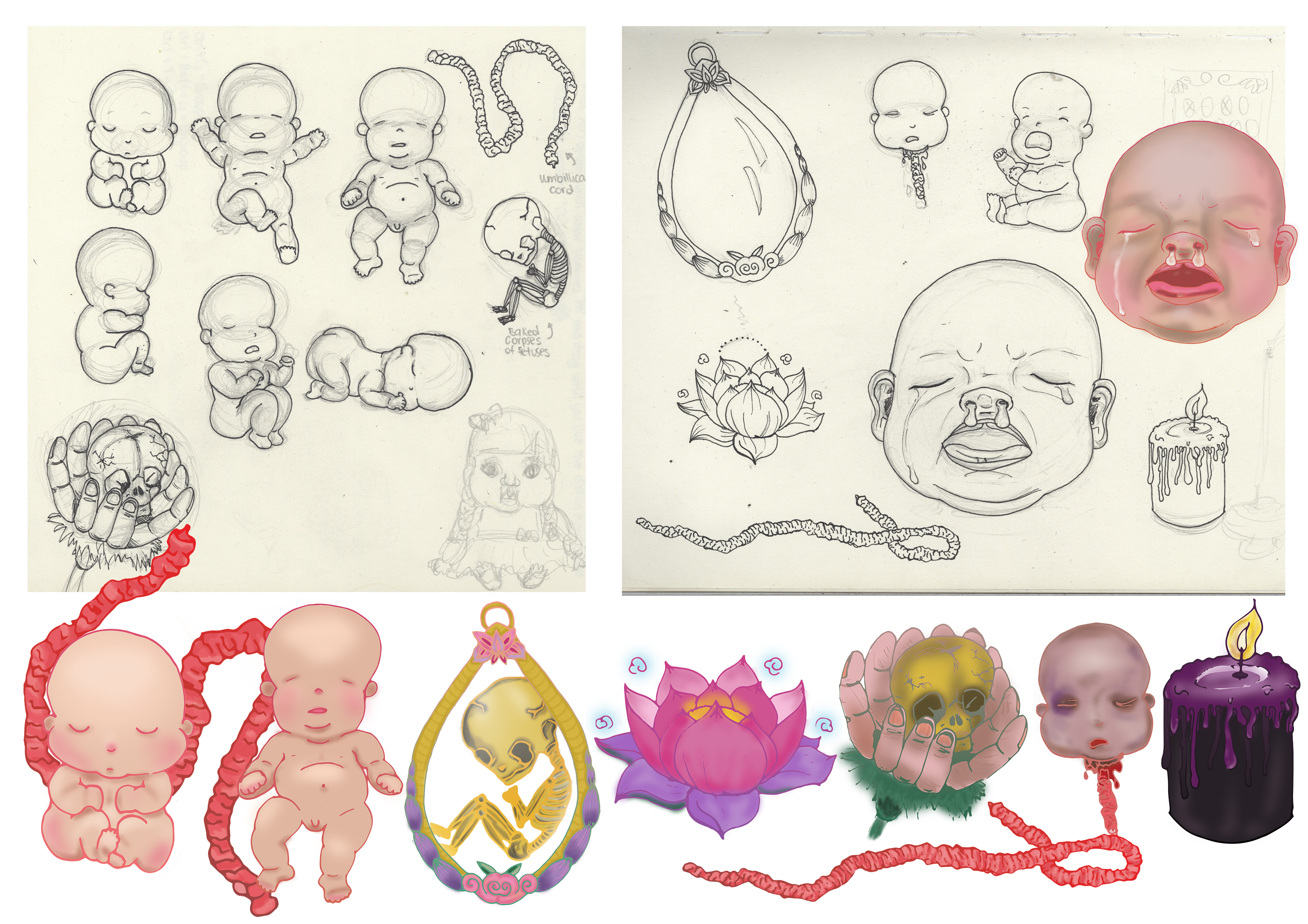
I digitalized my motifs which I drew on paper and then used a Wacom tablet to color in my motifs, adding shading and also changed the outlines of the motif.
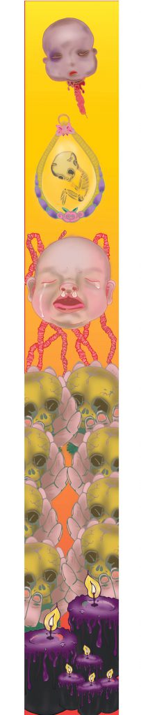
I drew out a few layouts that I can explore placing my composition as I faced serveral,several issues regarding file size on Adobe Illustrator which delayed my process severely. 🙁 These is just ONE of the explorations for the layout compositions.
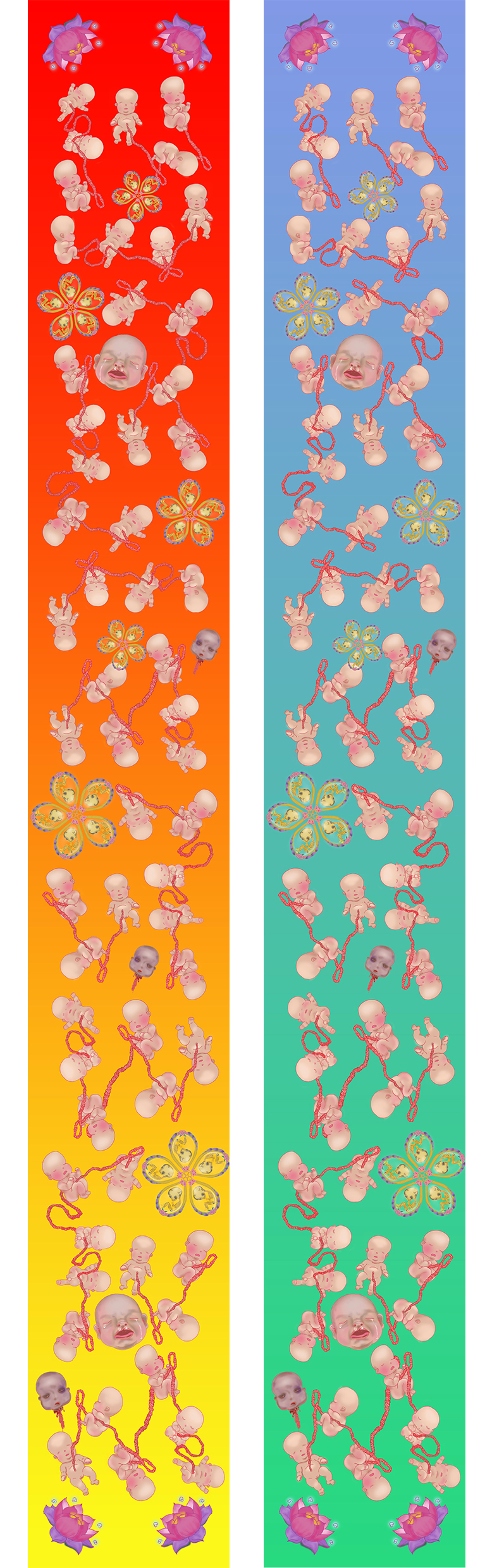
 Banner Draft 1
I simplified the composition based on last week’s suggestion and tried out the initial design I had in mind. Composition is the same for both here, but I changed up the background gradient color to evoke different feelings.
Feedbacks and suggestions given by my lovely classmates and Miss Ina 🙂
- Banner looks rather flat because there is no depth and motifs are roughly all of the same size.
- Very constrained by the banner width hence it looks tight and not spacious.
- Look on Pinterest for some inspiration for layouts and compositions.
- Can refrain from being constrained by the width by extending motifs out of the margin. Perhaps umbilical cord and fray outside too?
- Can play around with opacity, perhaps used in background? Flowers in the BG in low opacity.
- Play around more with scale, to create depth. Baby big head can be of actual size? Cause now got no dominance.
- Introduce a new motif to encapsulate the babies? Bring in an element that they can reside with.
- Connect hard drive to laptop and save it in there, can save your computer from going into coma state.
- Change up the colours. Maybe change the BG to more than 1 colors. Avoid going for the same colors as the motifs, other wise the motifs wont pop.
Will be doing up more draft layouts based on the feedbacks given and update this page again!! 🙂

 Afterwards I tried out different forms of illustrating it in digital form, just to see which method works the best. I was looking for feasibility and which method looks best.
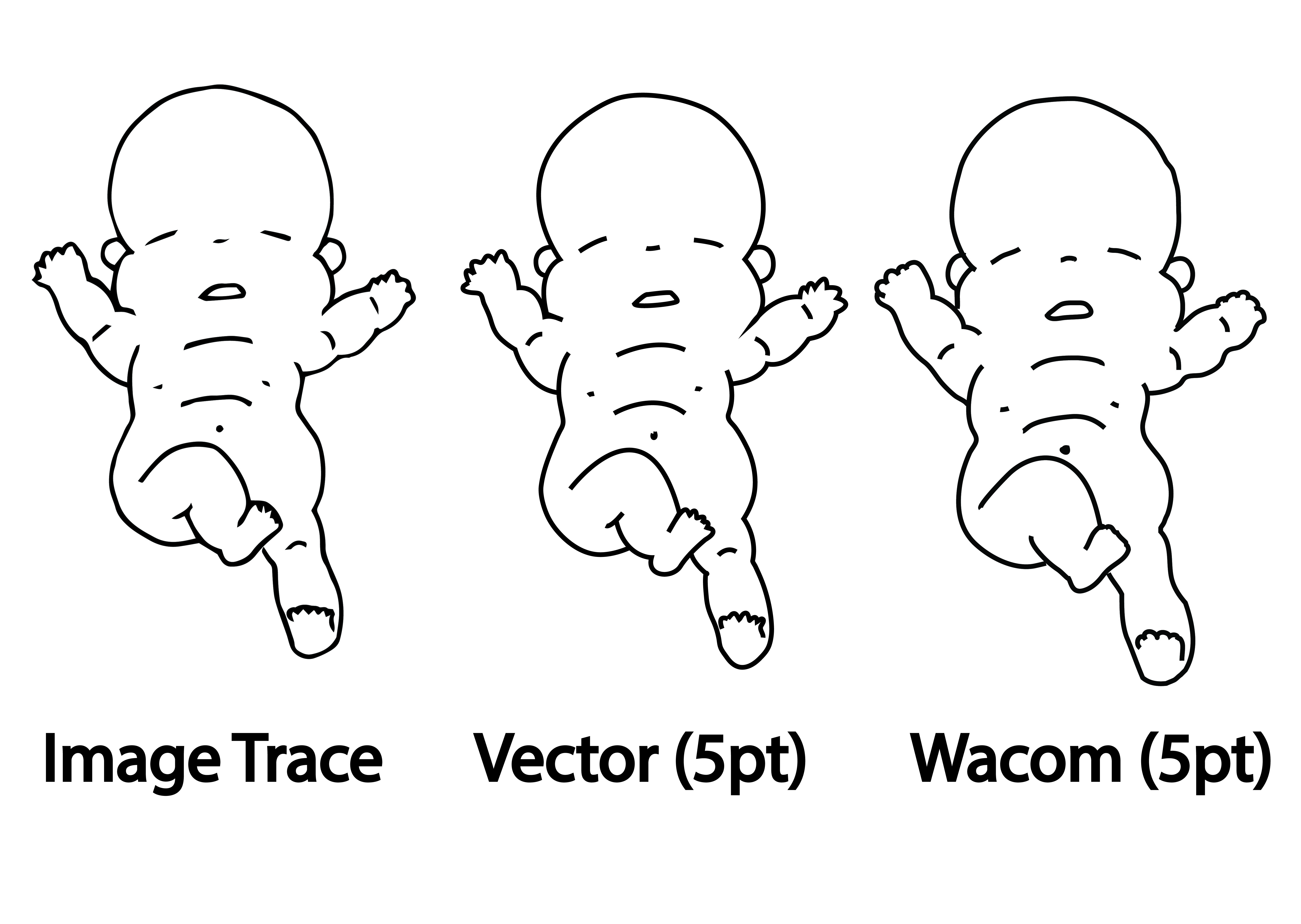 Every method has its pros and cons.
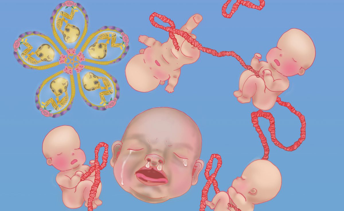
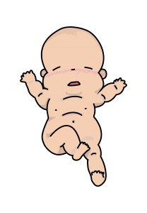 So I colored the baby using Wacom tablet over the Vectored outline method and got this as a result.
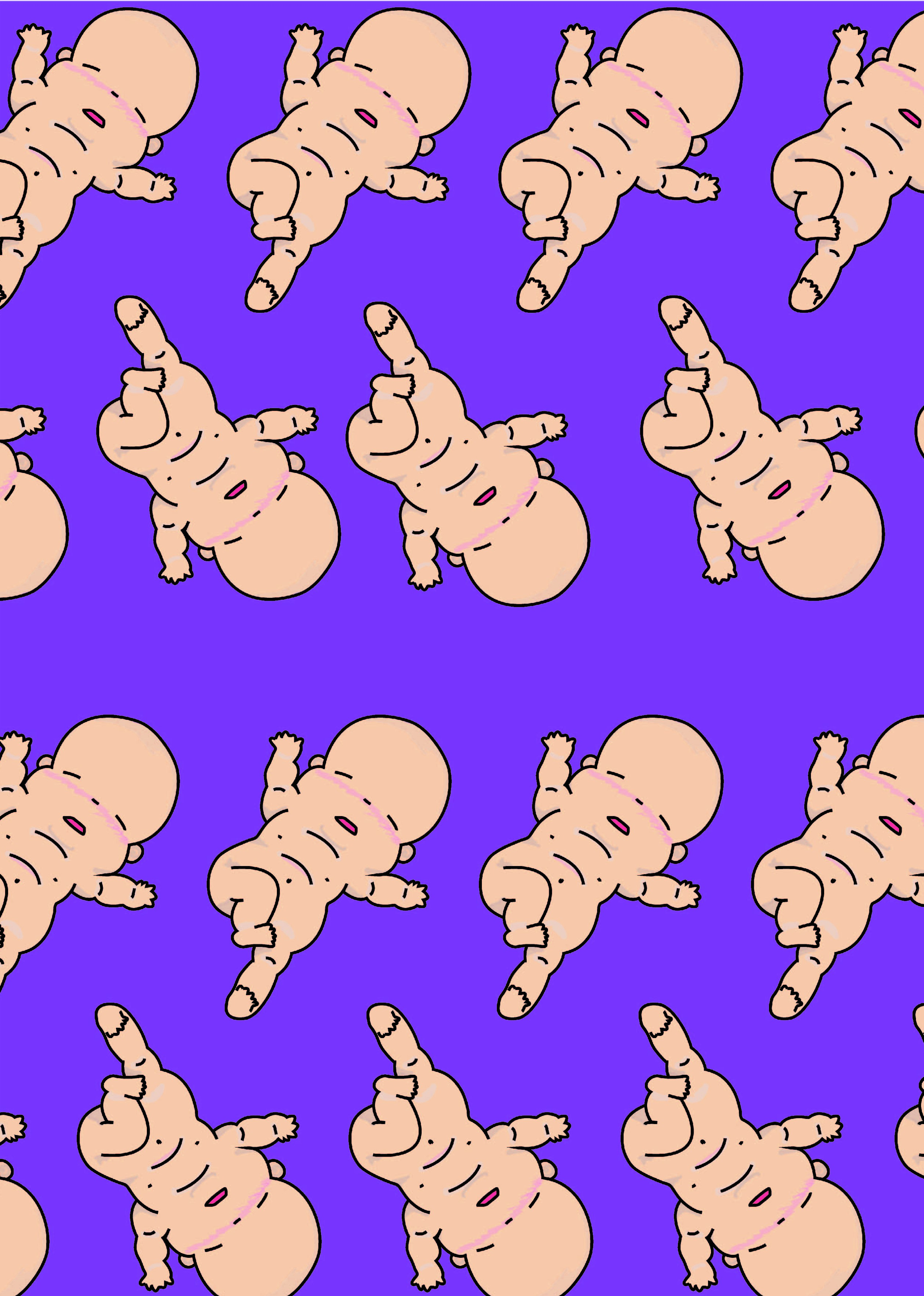 Woo~ it looks like they are doing a mass baby yoga event!