Transforming the banner designs to a horizontal composition was pretty fun as well, as all the while we were working on a vertical canvas instead of a horizontal one.
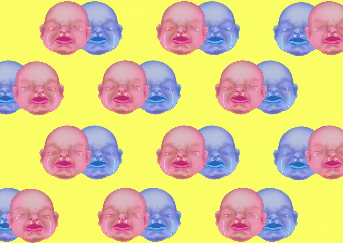
The horizontal design was to be displayed at the media wall at North Spine, and to my surprise, it turned out really nicely as the colors I chose were neon bright. In addition, I increased the saturation and brightness. When it was on the wall, the designs shone extremely bright!! I am very pleased!
Hello all! It has been a while since I have updated this page. So here is my progress so far!
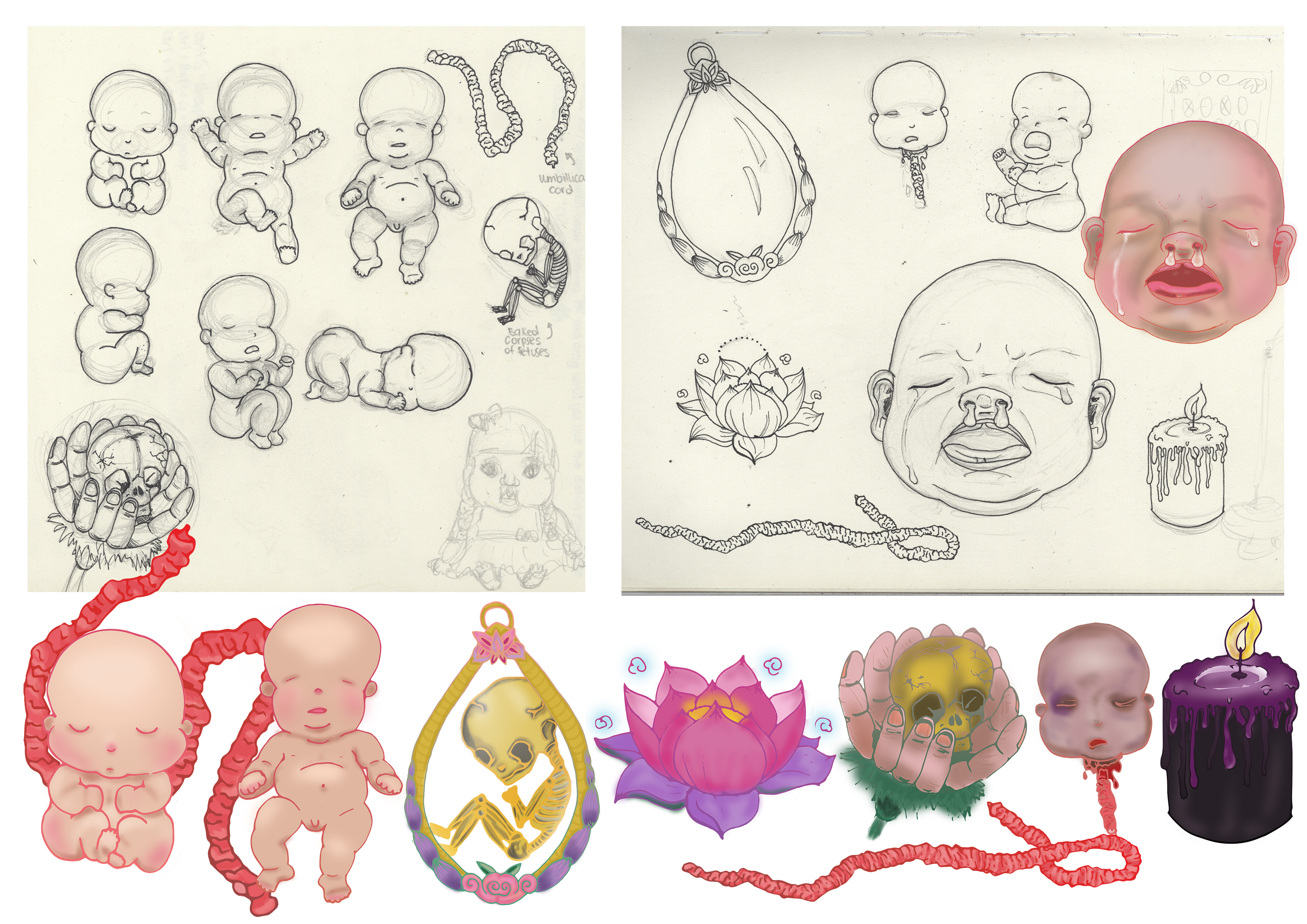
I digitalized my motifs which I drew on paper and then used a Wacom tablet to color in my motifs, adding shading and also changed the outlines of the motif.
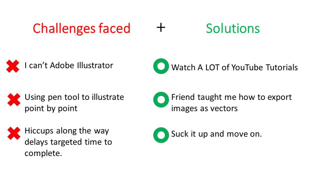
I drew out a few layouts that I can explore placing my composition as I faced serveral,several issues regarding file size on Adobe Illustrator which delayed my process severely. 🙁 These is just ONE of the explorations for the layout compositions.
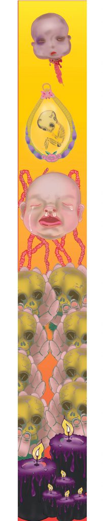
Banner Draft 1
I simplified the composition based on last week’s suggestion and tried out the initial design I had in mind. Composition is the same for both here, but I changed up the background gradient color to evoke different feelings.
Feedbacks and suggestions given by my lovely classmates and Miss Ina 🙂
Banner looks rather flat because there is no depth and motifs are roughly all of the same size.
Very constrained by the banner width hence it looks tight and not spacious.
Look on Pinterest for some inspiration for layouts and compositions.
Can refrain from being constrained by the width by extending motifs out of the margin. Perhaps umbilical cord and fray outside too?
Can play around with opacity, perhaps used in background? Flowers in the BG in low opacity.
Play around more with scale, to create depth. Baby big head can be of actual size? Cause now got no dominance.
Introduce a new motif to encapsulate the babies? Bring in an element that they can reside with.
Connect hard drive to laptop and save it in there, can save your computer from going into coma state.
Change up the colours. Maybe change the BG to more than 1 colors. Avoid going for the same colors as the motifs, other wise the motifs wont pop.
Will be doing up more draft layouts based on the feedbacks given and update this page again!! 🙂
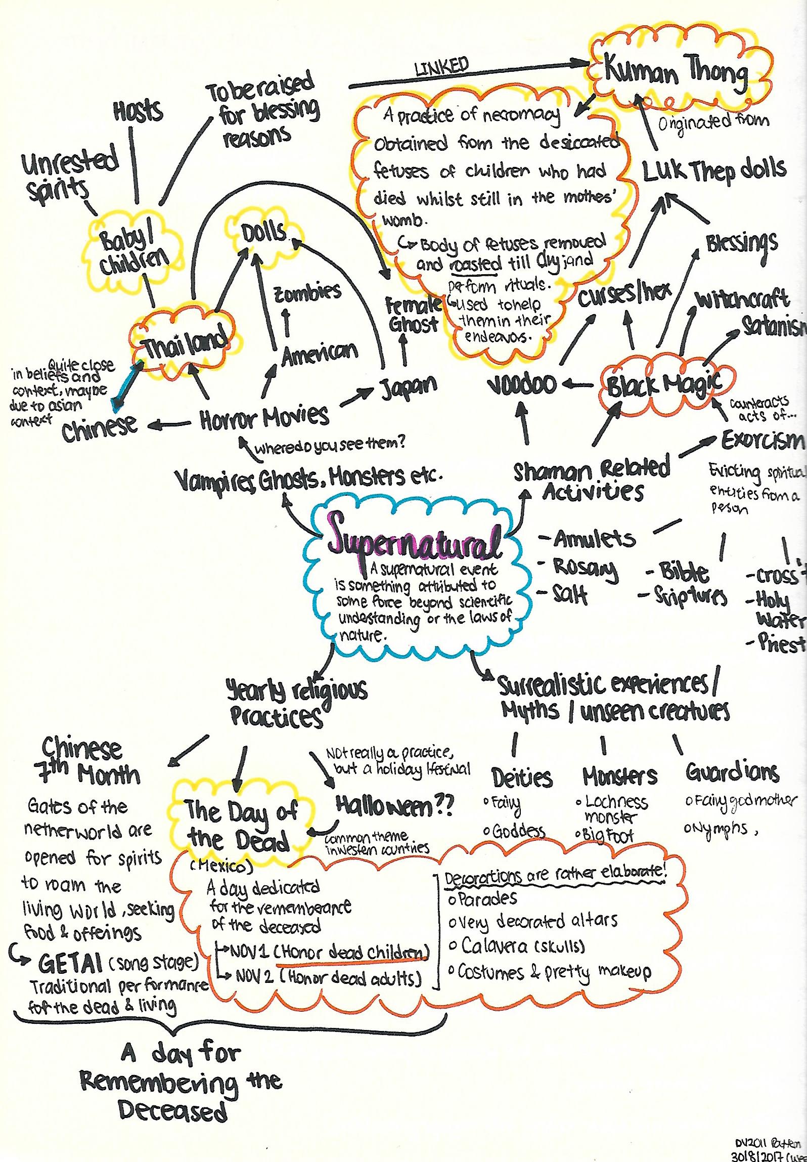
Very stoked to be able to touch on the topic of the Supernatural for this project because it is something that I have immense fear for, and at the same time I am very intrigued!
Was pretty stuck because the scope is so broad! So I did up a mind-map to see where my interest lie in and hopefully I can narrow down to a more specific topic of the Supernatural I can work with.
It is a wide network of sparse thoughts here and there, but I finally narrowed down to 2 topics I would like to explore on (The orange and yellow cloud outline)!
1. Thailand’s Kuman Thong ( Golden Boy)
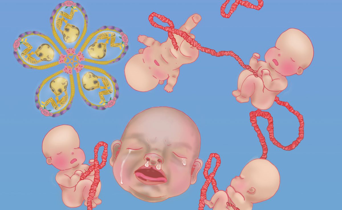
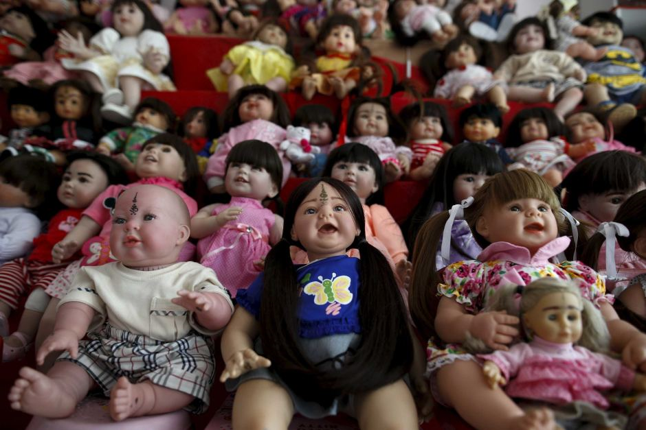
Seeing that Children ghosts/spirits are not as common explorations in the Supernatural realm, I set my mind on working with Children Spirits as the theme for this project. As I really do love kids ( in the non-creepy way), it’ll be a fresh new perspective to look at them through the eyes of the dead (still not trying to be creepy ._.). There is this grey area because it is a mixture of good and bad. In a way which meddling with ghost/spirits to obtain a positive outcome, is something that is quite risky.
Some research on Kuman Thong:
Though not part of mainstream Buddhist practices, Thailand black magic amulets were created by and practiced by monks and lay-people (Layperson, someone who is not an expert in a particular field of study) .
Often times the ascetic, Lersi, who was not actually a monk, but was a master of the spirit world, guides black magic spells and rituals. Spell casting is done by lay-people.
Buddhist monks have also got into the practice here in Thailand. Though, as you know, black magic and witchcraft, Thai voodoo – barang, has nothing at all to do with Theravada Buddhism, Thais have integrated it into their belief system and most cannot distinguish between the two.
It amazes me, seeing how people try to put life into a “Luk Trep” doll, or even try to summon the spirits of the dead, while others takes the life of real babies for superstitious reasons.
2. The Day of The Dead
At the same time, I am rather fazed by the festivity for ‘The Day of The Dead’. A day for the remembrance of the dead often comes off as downcast or rather solemn event. However, the Mexican holiday is filled with festivity and hype; alongside with the beautiful decoration and colors involved.
I am rather torn by the two themes, but at the same time I wonder how can I combine the two themes without being too jarring and contradicting, for which the Kuman Thong has a negative connotation to it due to its association with Black Magic, whereas The Day of The Dead is a jovial holiday marked to remember their loved ones.
Style I’m heading towards
Mainly illustrative because I do enjoy drawing and using pencil to design my sketches is more versatile as I can alter and integrate elements into an object easier.
And I would like to incorporate the elements of design, ‘Symmetry’ into my final work, where there is flow and any direction when the design is flipped, a narrative can still be told.
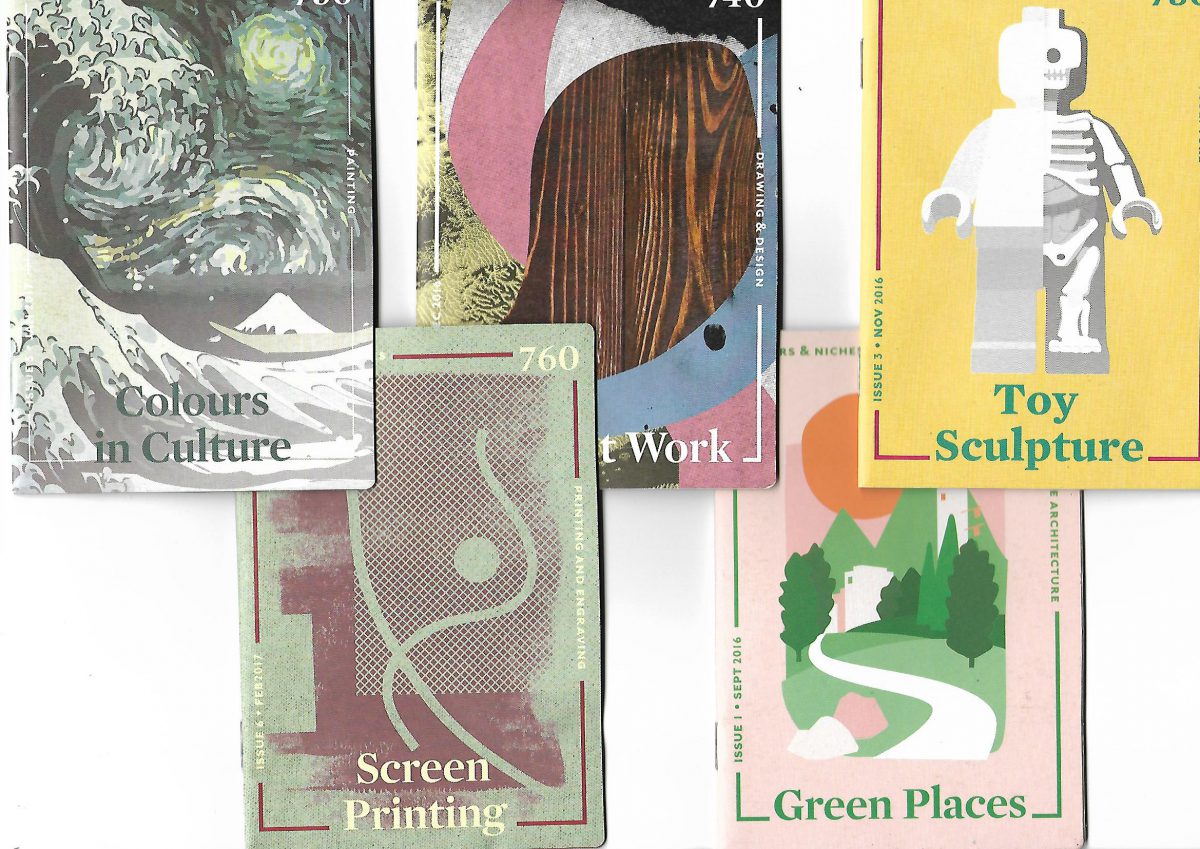
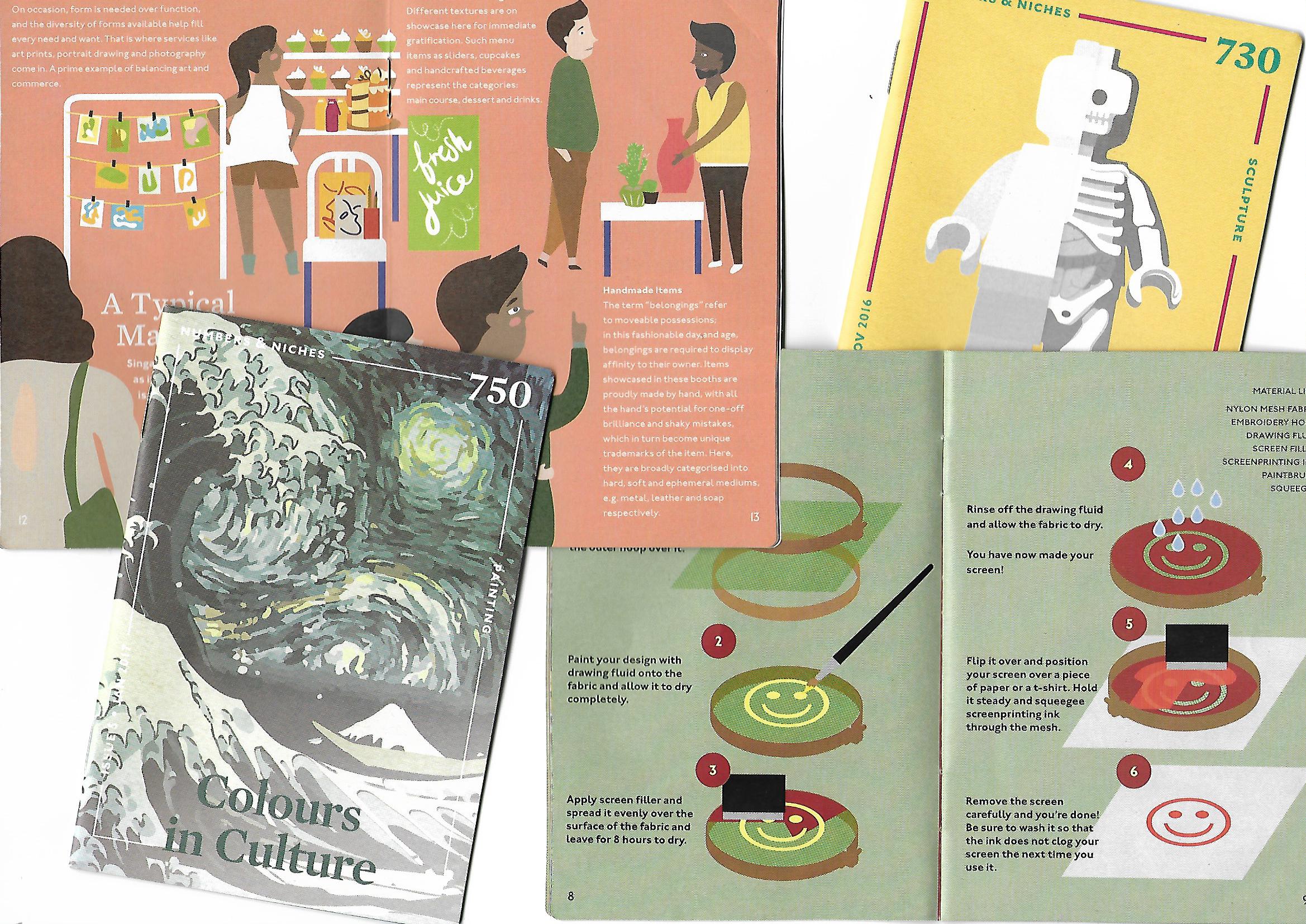
So! I went to do up some research on what Zines are though the net, as well as Pinterest; and get some hands on Zine examples around Singapore, which I found that are quite readily available around us! I also looked for several aspects of the Zines that I can draw inspiration from!
Got these Zines from the National Library and I really liked how the front covers were designed 🙂
Was really looking into the contents of how the ZINE was created for and how they displayed them using layouts.
Based on the weekly groups’ presentation in relation to ZINES, I annotated some very useful notes to take note for this project:
Experimental Formats Zines
What are Zines? Zine derived from Magazine, self published book. Print and bound by any manner.
Decide what is it for. What is your Objective, Main concept and Visual approaches through your Zine.
Pick the right title to your Zine that links to your theme.
Decide layout and order. Plan your structure allowing information to be organized.
Fonts: Don’t make it too small. Don’t use dark background, and upper case for main body. Titles headlines are chances for more elaborate and fancy designs.
Create a master copy to test the copy you have created before you do the final one to see if you got right color, texture of paper etc.
Publication book format and grids
Format is the area in which your design and texts sits.
Grid – A system which divides 2D planes to smaller fields. design made into visual math. Types of grid: Manuscript (Story books), Column grid (Newspaper), Modular grid , Hierarchal grid etc.
Typeface– Font family. Each typeface has specific weight, style , ornamentation etc. Diff typeface alphabet will result in different effect for your viewer.
Column – Vertical division of a page of text is 7-10 words per line.
Leading – The amount of blank space between lines of print. Good leading carries the eye from line to line. It cannot be too tight or too spacious for the reader.
Margin – 1 to 5mm of margin space is recommended so you wont mutilate your text.
Page numbers – Be distinctive from your body text. Can use different font family.
Body and Display typeface – Display space to stand out. Use similar typeface. But do not mix characters from the same style. Good to have contrast using different font size.
I then pondered the several points that I had to take note of, and came up with these initial planning stages as to how my Zine can go about.
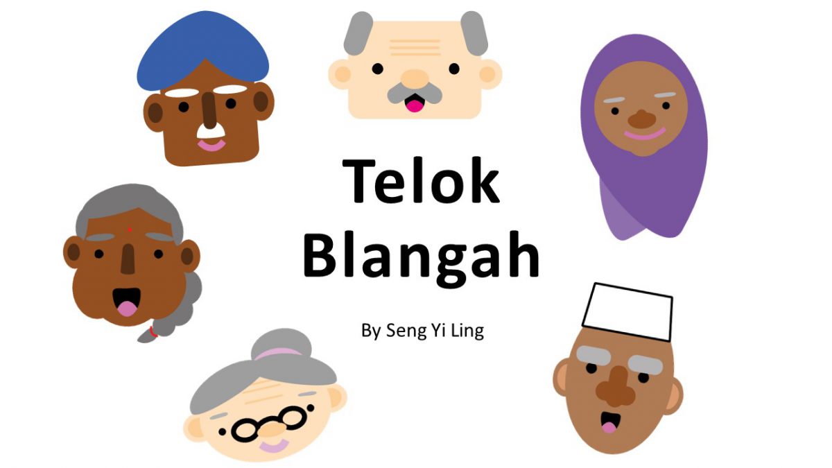
Main Concept: Guide around Telok Blangah with an elderly.
“Day in Telok Blangah guided by Uncle Tan. Readers get to go on an expedition with Uncle Tan, and he will show you around the places in Telok Blangah he like to visit, where he thinks you might like and what to do there.”
The story will go around the primary information and personal recounts I have gathered from the interviews I conducted, as well as secondary research such as location names.
My objective: To educate the readers that Telok Blangah can also be for young people, and not mainly for the old; Showing them places that the young and old can do, and what the older generations did then and now to pass time.
Visual Approaches? Art Direction?: I had some dilemma with this because the Zines I see out there are so organized and minimalistic. I for one am not a minimalist and I find it really difficult to make my thoughts abstract visually, when there are so much expression and colors in my thoughts. Hence, Pinterest really helped me to see that not all Zines out there are minimalist and expression and colors can be incorporated!
I really like the vibrant colors and how organic the shapes are! I also really liked the path which guided the viewers as to where they should look at! Hence I would really think paths can help me in my Zine 🙂
Execution:
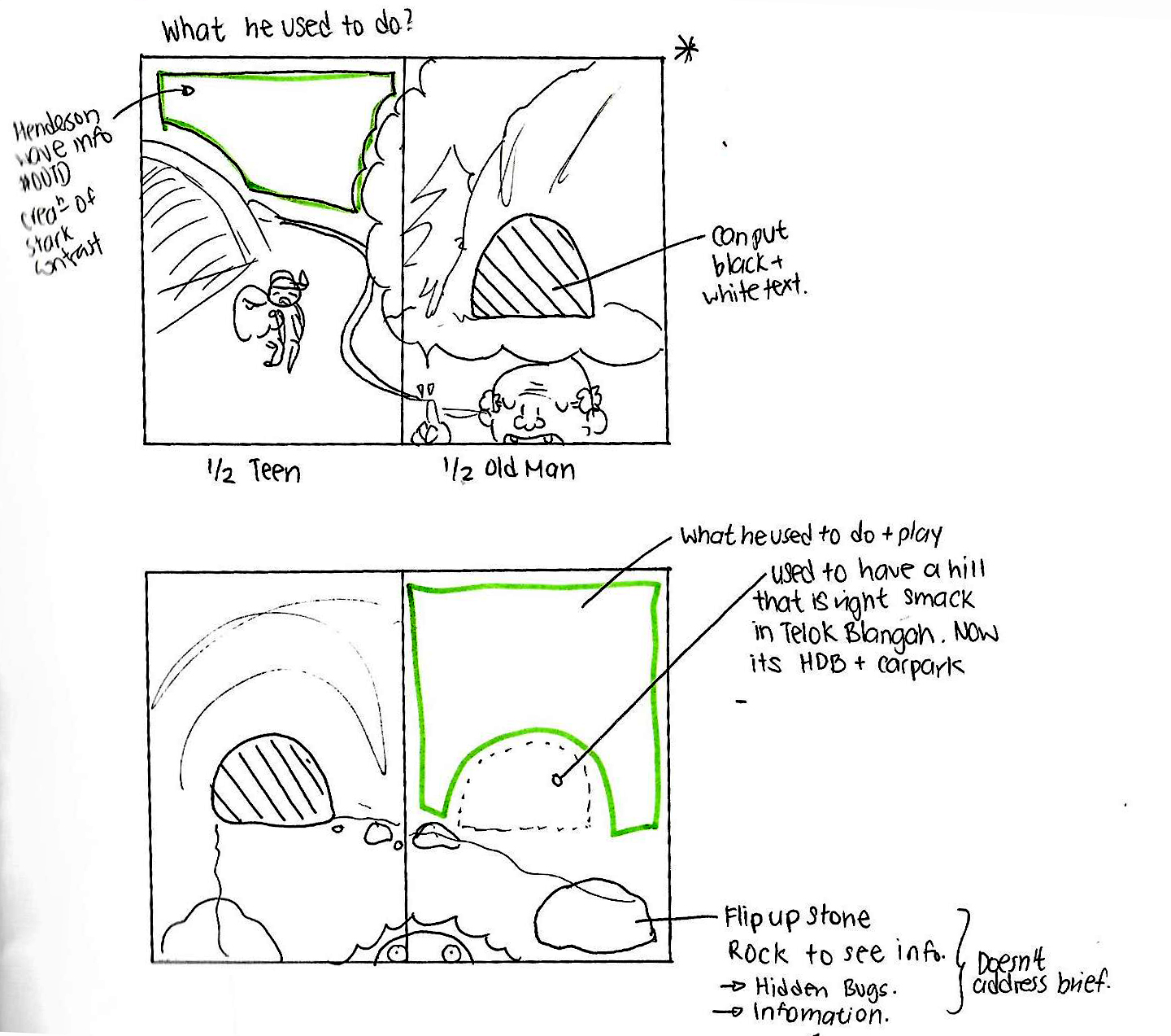
Cut outs? Interactivity by flipping?
I wanted to have this interactivity in my Zine by having cut out pages and flip tabs.
Initial sketching on how I want to incorporate the interactivity into the Zine.
The shaded area is where I want to cut the hole, and the rock at the bottom right can be flipped over to see insects.
However, after consultation with Joy, the cutting and flipping does not address the brief of the Zine project and sadly I have to scrap that idea. 🙁
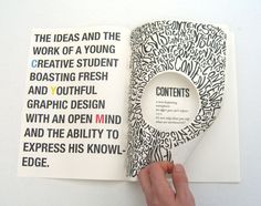
Layouts: I didn’t want the very organized approach as I feel rather restricted by such layouts, as much as they are really aesthetically pleasing to look at like this:
Hence I wanted to go for something where the fonts conform around the illustration like this:
Typography font to use:
Probably a serif font cause its more readable.
Choice of medium? :
Perhaps Watercolor and pen,scan in and enhance colors by photo editing software? Vectoring in Adobe Illustrator to create the clean edges?
All these are just the planning stages! The final confirmation post will be next!! 😀 Stay tuned!
GOOD AFTERNOON! This post concludes the FINAL of Part 1 Project 2 of Zine: Neighborhood Explorer presentation!
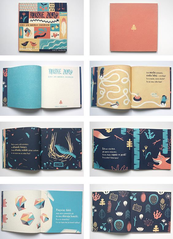
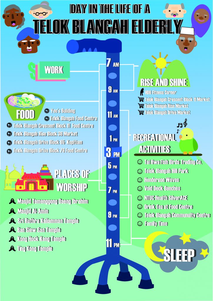
This is the infographics on Telok Blangahthat I have finalized 🙂
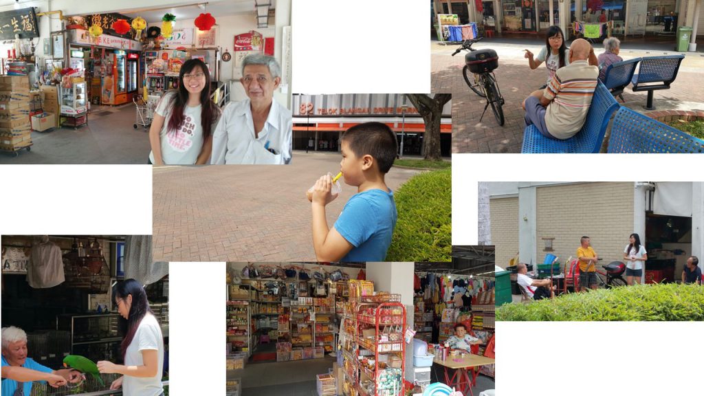
The data I have placed in my infographics are mainly from the Qualitative data (Personal Recounts)that I have gotten from interviews and secondary sources of the exact location names or address online that they have recommend me to visit.
Concept : Present it as a schedule like guide as to how an elderly in Telok Blangah gets by in a day.
Tone: Light Hearted.
Methodology
I used Haettenschweiler Font as the header and the body text .
Colors used are neutral palletes of scenic blue and green, as well as monochromatic blue for the walking stick.
Attempted to use different shades of the same hue to create depth.
Main illustrations are created using vectors and exporting images into vector online.
Icons are used as bullet points for each category of activity.
Joy mentioned that a my initial idea of using a cane may be misinterpreted as ‘Immobility’ instead of ‘Elderly’. Hence I changed the type of walking stick to the one with legs that elderlies, as I really required vertical semiotic that represents elderlies.
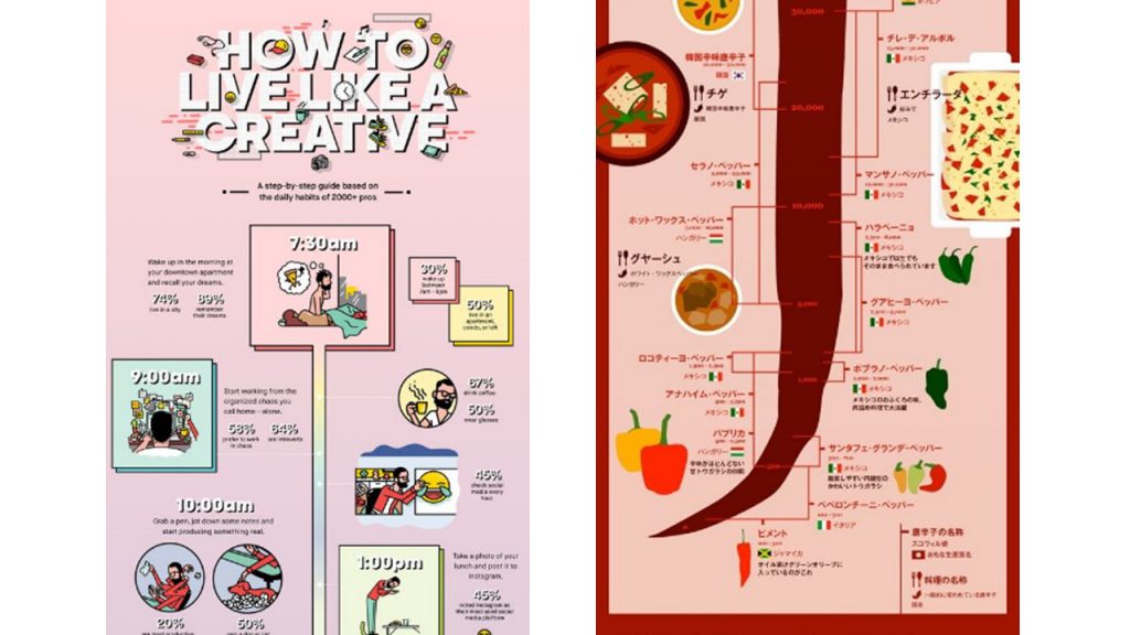
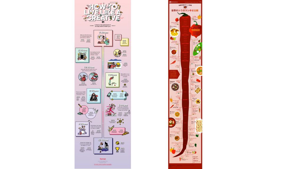
I was inspired to use time stamp and used this two infographics obtained from Pinterest. I extracted the range thing } from the chili infographic to mark out the time line.
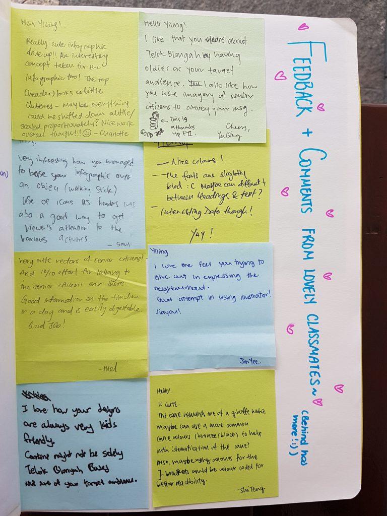
Classmates’ Comments and Feedback
Joy’s Comments and Feedback 🙂
Joy said that this is her first time seeing my illustrations digitally, good job!.
Liked that I staggered the information according to timeline. And that giving it a range does give us a guide to when they can execute their activity. However looking at it as a whole it can be seen that it is a day in the life of any elderly and not specifically unique to Telok Blangah elderly.
Site specific icons can be created instead of using a generic bird to represent “Recreational Activity”. Something recognizable for instance the location of the bird watching location or certain food from Telok Blangah acting as marker would be better.
Colors for “work” reminds her of Watsons logo. Joy worries for potential misinterpretation in my infographics.
Text is still cramped even though got drop shadow, hence readability of text is still difficult :(. Typeface that you used is used is better for display type for headers instead of body text. Generally texts on infographics still need to be readable. When you can’t see your text well due to the background colour, it is a cue that text is required to be changed.
Location names are long as “Telok Blangah” is repeating in many of the bullet points, hence re-emphasising the crampness. Putting a main header : “Telok Blangah”, in general and just list down may reduce the crampness.
Style is quite unique and there is still space that can be explored.
Shaf liked the concept of day in the life cause she don’t know what old people do in genera But font though, it is still hard to read :(.
With that I conclude the completion of ZINE part 1 here and I’ll see you again in PART 2 😀
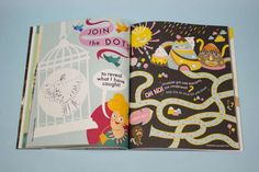
Since the final product is rather hands on interactive, I made a short video to show how the paper engineering mechanism can be played with in my work. If you hadn’t seen the ‘Process Stage’ post, Click HERE!
Thank you Jia Qi for being my camera man 🙂
Feedback given on presentation day!
Classmates’ Feedback and comments:
Joy’s Constructive Feedback 😀:
Choice of paper for this project is very important. It is rather flimsy and may break or tear when flipped multiple times. Paper shouldn’t fray at the edges.
Works can stand alone without instructions as it is rather distracting. Since the message of my project is ‘Self Discovery’, it may be better for the kids to explore the mechanism and how to play with this book instead of telling them how to.
Florist composition need not have ‘Left hand here’ and ‘Right Thumb here’, but instead a thumb and a hand outline is good enough, or even using a ‘flipping the page’ symbol is okay too.
Thickness of lines not constant (pots in florist is rather thin as compared to the rest). Suggested to change the setting, so when scaling up or down , can choose to scale proportionally.
Egyptianologist Colors were a little more jarring as it has the luminosity of highlighters, whereas everything else has richness.
Thank you lovely classmates and Joy for the comments and constructive feedback! 😀 I really appreciate it!! 😀
For this assignment I have heavily depended on my Visual Journal for note taking and thought processing as compared to last semester where OSS was where I post most of my thought process. Regardless, I will still take you through this journey from the start to end of this ‘Que Sera’ assignment via OSS, so… LETS GO~~
Ideation
Because the name cards require the use of the conceptually driven solutions and letter forms, combined with literal or abstract image to express our future jobs in typographic portraits, I did a mind mapping process in my Visual Journal to help with coming up with the 4 Jobs for each of the name cards: Florist, Egyptianologist, Home maker and Food Science Technologist.
Joy emphasized that we ought to have these 3 factors before consulation in order to give a good framework and direction for our assignment.
Concept
My concept for this project is using the delivery method of my goal now, which is to create a interactive children’s book, to execute the name cards for all 4 jobs.
Message
Individual name cards have their own messages and an overall message as a whole.
Florist – Do not let small thinking cut your life down to size. Dream big! Work hard!
Egyptianologist– Do not let someone else’s opinion define you.
Homemaker– Be as awesome as a Domestic Goddess.
Food Science Technologist– Never stop asking ‘Why?’ until you get you answer.
Overall message– Your job does not define who you are in the future. YOU define who you are in the future.
Tone
The overall tone of the Children’s Book concept is positive and educational. While urging the readers to discover and learn new things.
Artist references
I did not limit myself to one specific artist to use as reference because I did not want their style to be seen in my work. Hence I went online and offline to expose myself to interactive books and illustrations for children to serve as inspiration; extracting the pros of each book and learning to avoid the flaws which I did not want to see in my work.
Expression of tonality: I used different shades of the same color on to express tonality in the designs. This creates slight depth and also has an old school children’s book feeling.
Methodology
For all of the designs, I used hand drawn illustration, scanned the designs and used Adobe Photoshop to fill in colors and cleaned up the edges.
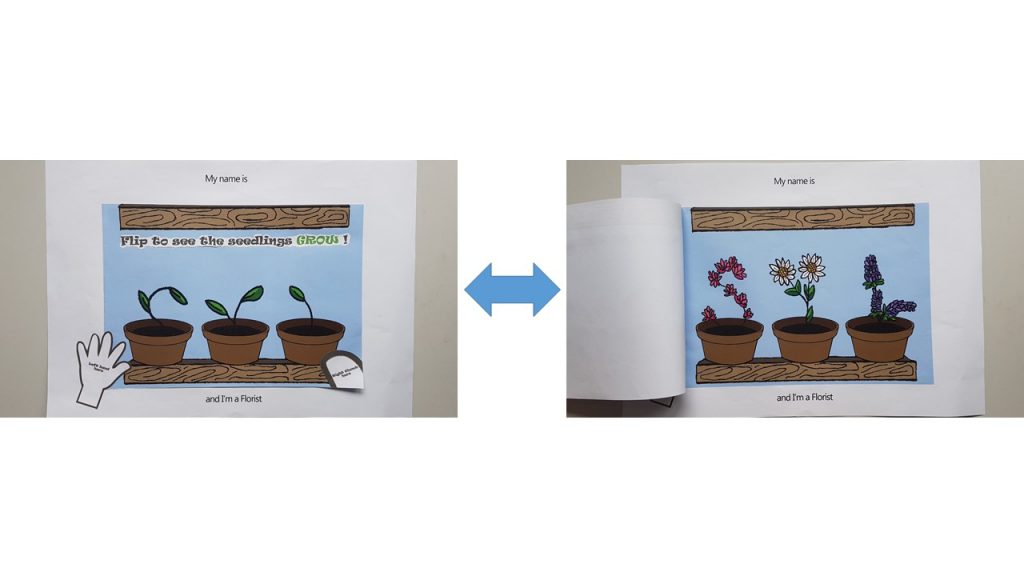
Florist (Age >5)
I used flip book animation to carry out the ‘Flip O’ Rama’ concept from the children’s comic: Captain Underpants. The following video below is how it would have looked like.
I wanted to show the growth of the plants from a boring seedling which looked like it may die any moment , into a blossoming plant. Hence, for the top image, I used the upper half of my initials : ‘SYL’ as the feeble seedlings in pots, and a full grown blossoming plant for the bottom image. So that when the user flips it repeatedly, it will look like the seedling is growing.
Joy also suggested for me to put out instructions on how the interactive-ness can be carried out by children, hence I pasted a ‘left hand here’ and ‘right thumb here’ instruction on the outside like how the Flip O’ Rama book did.
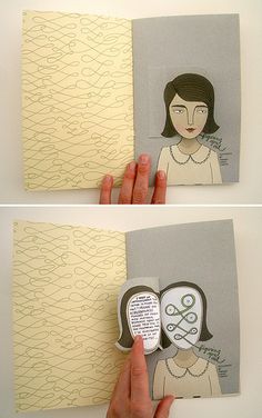
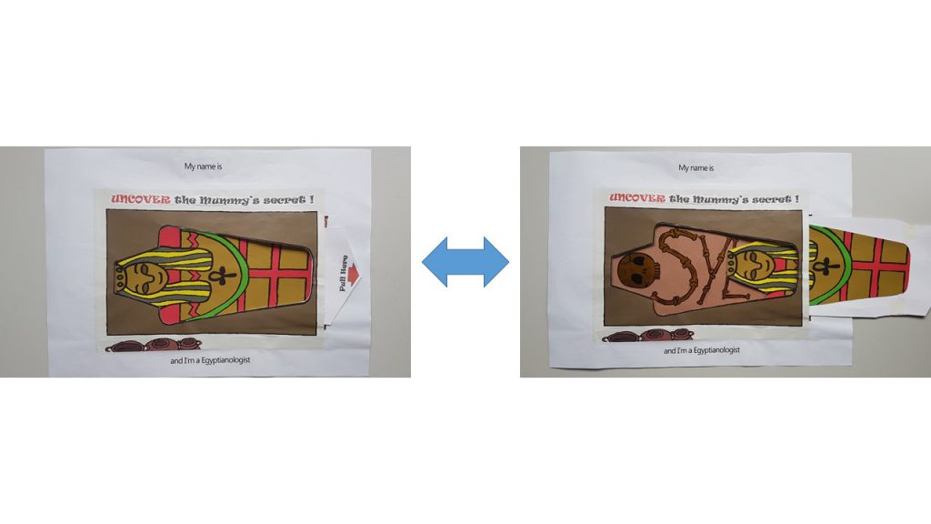
Egyptianologist ( Age 10-15)
I used the pull tab mechanism in this name card as seen in many pop up books.
I used Golden Flint paper on the interior of the Mummy coffin to act as the bones, which forms my name. My idea for this name card is to show that a dull looking exterior of the Mummy gives one the impression of something less of value. However, upon uncovering the truth by pulling the tab, it reveals the bright and golden bones of the Mummy.
In a way it also has many interpretations that can be taught such as:
‘Do not judge a book by its cover ‘
‘Its more important to have a heart of gold than a fancy exterior.’
‘Do not let what others think of you define who you really are.’
I also included a ‘Pull Here’ instructions with a red arrow to direct the child’s attention to it.
Homemaker ( Age >10)
For this name card, I used Velcro as the material to work with as I wanted to let the children organize and arrange where each of the item should go in the household chore. I was considering using felt to carry out this idea, but Shi Teng gave me a suggestion to draw out the illustrations and have them printed out instead, so that it is more consistent with the overall image of a sketchy hand drawn illustration. Thanks Shi Teng! 😀
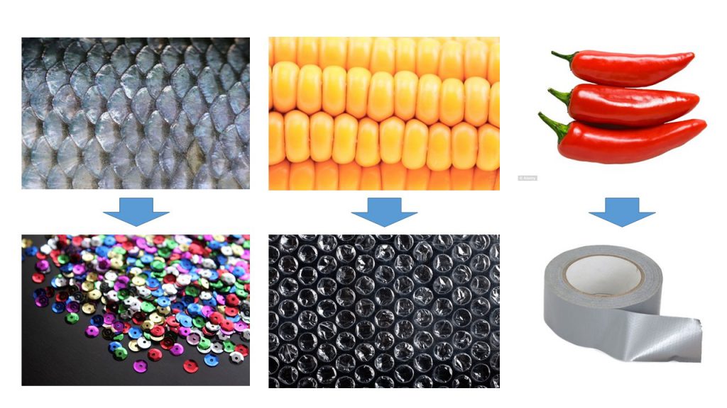
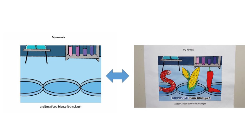
Food Science Technologist ( Age 16- 19)
For this name card, I was highly driven ‘Touch and Feel’ books for young children.
I used Sequins to simulate the texture of fish scales, Bubble wrap to simulate the texture of corn and duct tape to simulate the waxy surface of Chilli.
Colors
Joy suggested I use a common color for the 4 compositions to express unity throughout. However, as much as I try to pick a common color, I don’t think it worked out very well to have Blue in my Egyptianologist illustrations ( It would have looked like an Ice Tomb) and neither Orange/ Yellow for my Food Science Technologist illustrations ( I required Blue to express the sterility of the Science lab).
Hence I split my compositions into 2 sides: Blue and Yellow
Blue (Hex code: #A4DBFF) – Florist (Complementary) and Food Science Technologist(Monochrome)
Yellow ( Hex Code: #E4C877)– Egyptianologist (Warm) and Homemaker (Analogous)
Instruction typography used
I used ‘Ravie’ Font and spaced out the individual letter because Children’s book has to be highly legible.
Font used I have chosen is Ravie because it has a rather whimsical feeling to it, but yet I chose to bold the fonts because it is still instructions and I didn’t want the children reading it to turn a blind eye to it.
Choice of color for font was something that was bugging me as well. As I felt Black was too strong as compared to the rest of the colorful compositions. But yet if I were to choose a color that suits individual composition, I felt that there was no unity to be seen as a whole in a book; and the instructions just blends in with the background where the children might turn a blind eye to it.
Hence my solution came about when I was researching for the way Children’s books present their instructions:
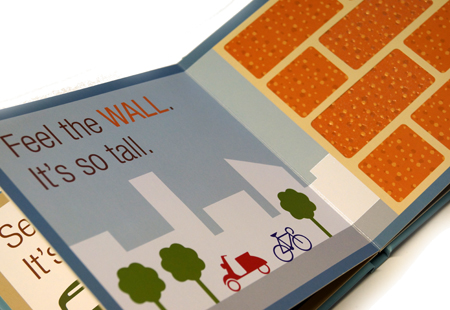
I really liked how…
A muted dark color was used to give the instructions. There is a mild sense of authority which I felt that one’s eyes would be drawn to read.
The key word ‘WALL‘ is in capital form.
The color used for the key word allows children to draw a relation between the word and the object. There is a sign (the word ‘WALL‘) and the signified (the wall picture)
Thus, I applied this reference to my instructions for the children.
I capitalized and gave a color to the keyword which is seen in the object.
Things I could’ve done if I can turn back in time.
I am really shooting myself in the foot for saying this. But, I think admitting to my mistake and learning from it is better than to bury it under the carpet. So, for my future self, here I go.
Explore different types of paper. I felt the struggle the most when I was carrying out the pull tab mechanism for the ‘I am an Egyptianologist’. I felt that if I explored the different type of GSM for paper before I executed the cutting, I would have achieved a better and smoother pull tab mechanism for this name card.
The following post would be the FINAL one for Assignment 1 Que Sera!
OH MY GOODNESS GRACIOUS… I forgot to upload my research on Ego.. :0 Here it is uploaded in Y1Sem2, present Yi Ling is trying to salvage the past Yi ling’s mistake.
Before we dive into Project 3: Ego, let me do some research~
Project Brief
In 4 rows of 3 squares, create a self portrait based on four different settings.
For each of the 4 rows, use the first column to represent yourself and the second column to represent a setting and third column to represent an imagined outcome. For instance, you (first column) at a family gathering (second column) equals to being the subject of scrutiny by relatives (third column).
Apply your understanding of colors and color theory to visually represent the multifacted nature of your personality. You may choose to do this digitally or by hand (or mix-media). There are a total of 12 image compositions.
Consider how colors can be used to suggest or evoke the feelings in the various representations as well as the cultural context of the various settings.
Specification
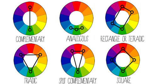
There are no limits to medium, technique or style. However the colors will have to be selected to represent one or few of the color harmonies:
Monochrome Harmony
Analogous Harmony
Analogous Harmony Warm and Cool
Complementary Hues
Split Complementary
Color
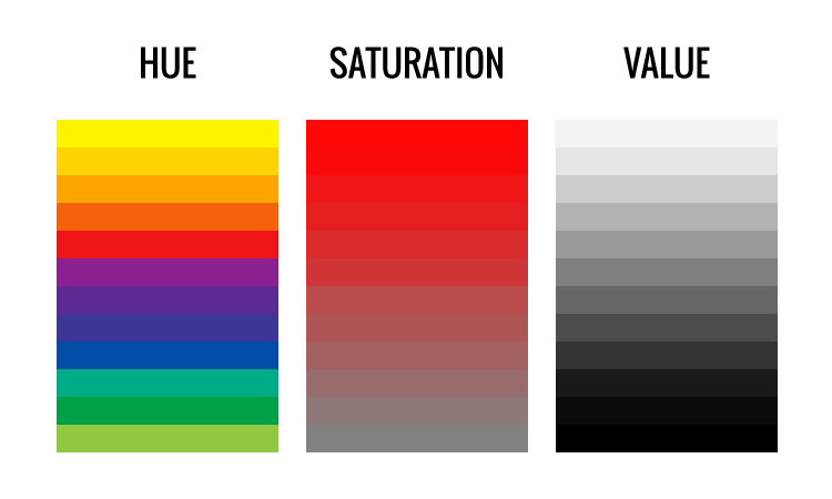
Color has 3 attributes:
Hue
Saturation
Value
If the surface or light does not have these three essential qualities, then it is not a color.
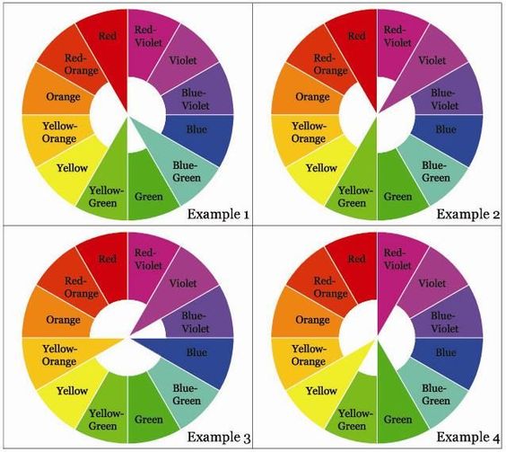
The definition of Hueis varies for different experts. However, based on my research, Hue is basically a color. Hue are the colors on the outer rim of a subtractive color wheel.
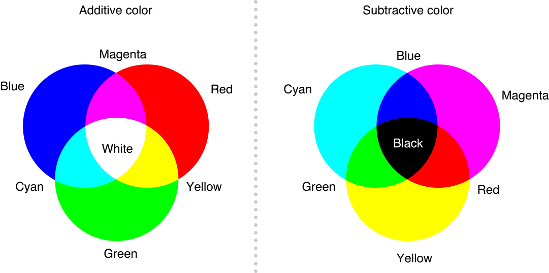
Additive V.S. Subtractive Color Wheel
Saturation is the purity or intensity of a color. Value and Saturation are not attached concepts – color can change its saturartion, but leave its value unchanged.
Value is the difference between light and dark. By adding more white to a certain color (lets say Red), the hue (Red) is still the same, but of different value.
Harmony in visual design means all parts of the visual image relate to and complement each other. Harmony pulls the pieces of a visual image together.
Monochrome Harmony
Monochrome Harmony are a value-based compositions that contain only one hue. There are no hue relationships in a monochrome harmony, only saturation and value relationships.
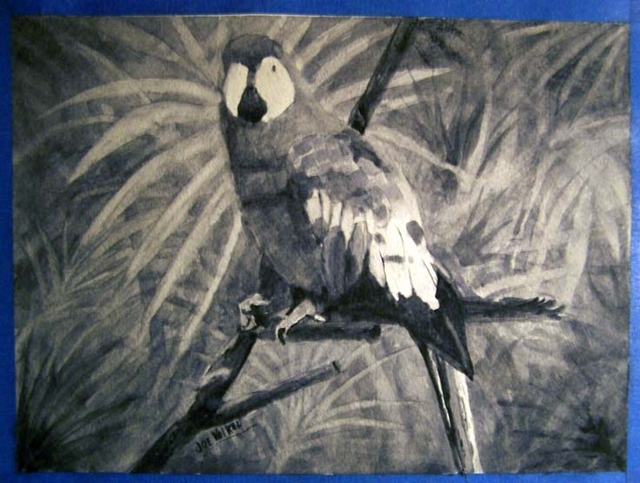
Parrot painting in Payne’s grey by Joe Volkel
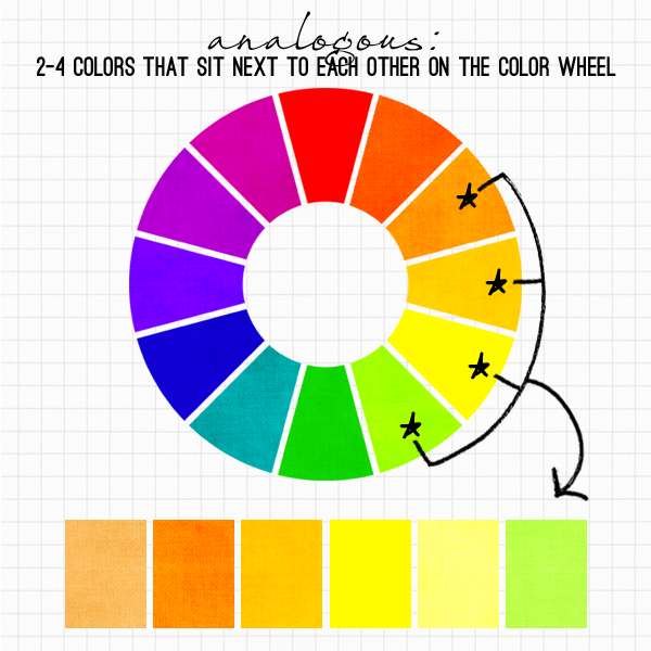
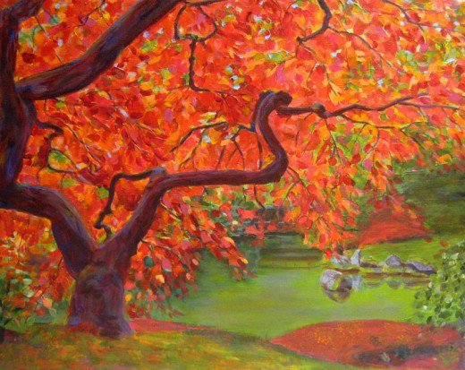
Analogous Harmony
Analogous harmonies contain more than one hue, but all of the hues in this kind of harmony are adjacent on a color wheel. The adjacent colors on the color wheel are very easy to the eyes and peaceful to look at.
Artwork that demonstrates Analogous Harmony
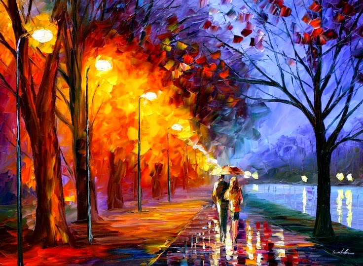
Analogous Harmony Warm and Cool
Artwork that exhibits Warm and Cool Analogous Harmony.
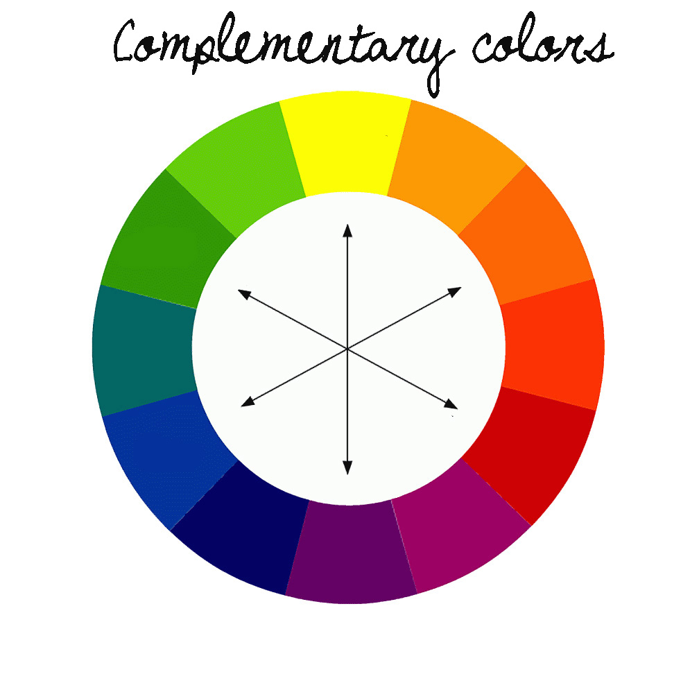
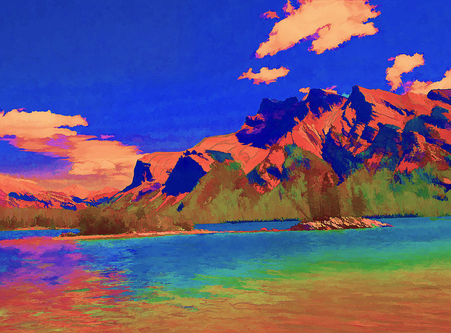
Complementary Hues
Complementary hues are complementary colors that are opposite each other in a color wheel.
Artwork that exhibits Complementary Artworks.
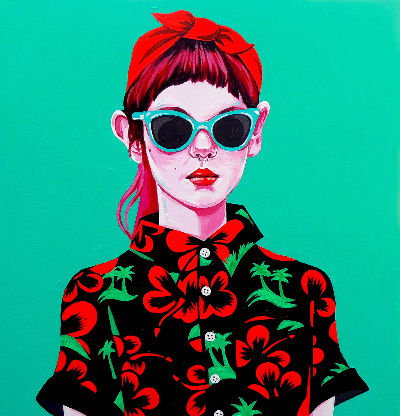
Split Complementary
The split-complementary color scheme is a variation of the complementary color scheme. In addition to the base color, it uses the two colors adjacent to its complement. This color scheme has the same strong visual contrast as the complementary color scheme, but has less tension.
Artwork that exhibits Split Complementary Colors : Red, Turquoise and Green
In addition to Split Complementary, there is also…
Triadic color scheme uses colors that are evenly spaced around the color wheel.
Teiradic/ Rectangle colour scheme
Square color scheme
dddd
As of now, I am rather intrigued by the use of relative positions of the hues in the color wheel. Initially I thought that the color wheel was a mere collection of colors. But now I know that there is more than meets the eyes, and the relationships between the opposite, adjacent and uses the two colors adjacent to its complement color; could result in different meanings, and emotions that are evoked in an artwork. I am very interested in the exploration of Split Complementary Colors as it seemed modern and has a hint of pop-art to it as I search for relevant artworks that exhibits Split Complementary Colors.
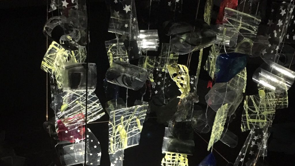
For this modular construction project, our group which consists of Queenie and I, created this lampshade cover (sort of).
Amalgamation
This modular construction is the amalgamation of our previous project on Morphogenic Construction. Queenie used the SEM of Leek and I used SEM of Dried Tears.
Queenie Ke’s
We obtained her construction’s highlights which were …
The Folds in the layer -> We incorporated that into our brainchild, by folding transparency paper.
Use of dried layers of glue -> We incorporated that into ours by coloring the glue sheets with red and blue paint as well as calligraphy ink.
Mine (Seng Yi Ling)
My previous construction’s highlights were…
The Wire frame
Plastic to make the units -> Used transparency and plastic sheets with pattern to create shadows.
Thread to hang units.
Aesthetic Cohesiveness
Units in each row are arranged in a uniform pattern.
Materials used for each unit are…
Glue from glue gun onto cling wrap
Star patterned plastic wrapping sheet
Red and Blue Watercolor paint on glue
Donated transparency paper from our classmates
Delight
Colors, light and shadows are rather friendly. Rather interactive due to the mobility of each row. Each unit moves rather independently on it’s own in the air.
Light and Shadow
For this assignment, Queenie and I heavily focusedon the light and shadow casted from our model, hence the physical exterior aesthetic aspect of our model is rather… ahem….
ANYWAYS.
This is a video of how the light and shadow look upon changing the position of the light source: front and back, left and right.
The panels closer to the light source appears larger, and overlaps with the shadow casted by the panel which is further away from the light source.
Transmission of light through the red, blue and black glue layers created colored translucent shadows.
Transparency folded up has a reflective surface. Hence, mobility of the transparency units when turning creates a refraction of lights.
During presentation, our classmates were rather fazed –Queenie and I were rather surprised by the responses haha.– by the shadows casted on the ceiling and all around the room when we placed the light source (iPhone light) directly faced up on the table, in the center of the model. Yit Ling told me that she felt serene looking at our ‘constellation’ like shadows .
Some of the pictures in class of our work were taken by Dawin and they were really pretty so we used them! Thanks Dawin!
Constructive feedbacks we’ve received from Mr. Peter and our lovely classmates were that we could actually hang our lampshade cover instead of having it on legs; and that letting it have uneven legs to give mobility or allow it to rotate like a musical box would make the shadow even more interesting on the walls and ceilings.
‘Family Portrait’ of Queenie and my lovechi..I mean. BRAINCHILD. 😀 THANK YOU QUEENIE FOR WORKING WITH ME ON THIS PROJECT <3
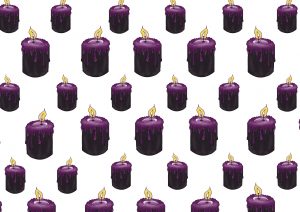
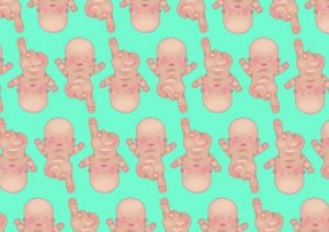
 Here are some of the prints close up!
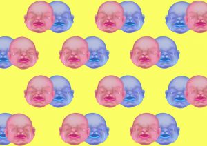
 The pattern swatch book contains all of the pattern swatch designs!And also the process of how the banner design came about to be!
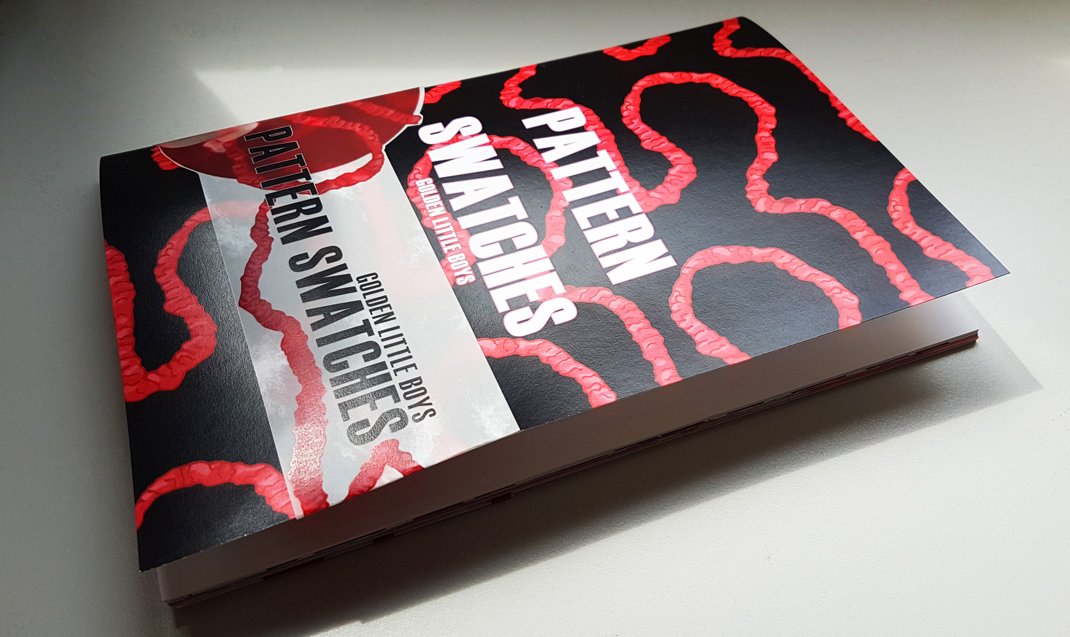
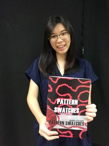 Really happy with how it came out to be!! 🙂


 Banner Draft 1
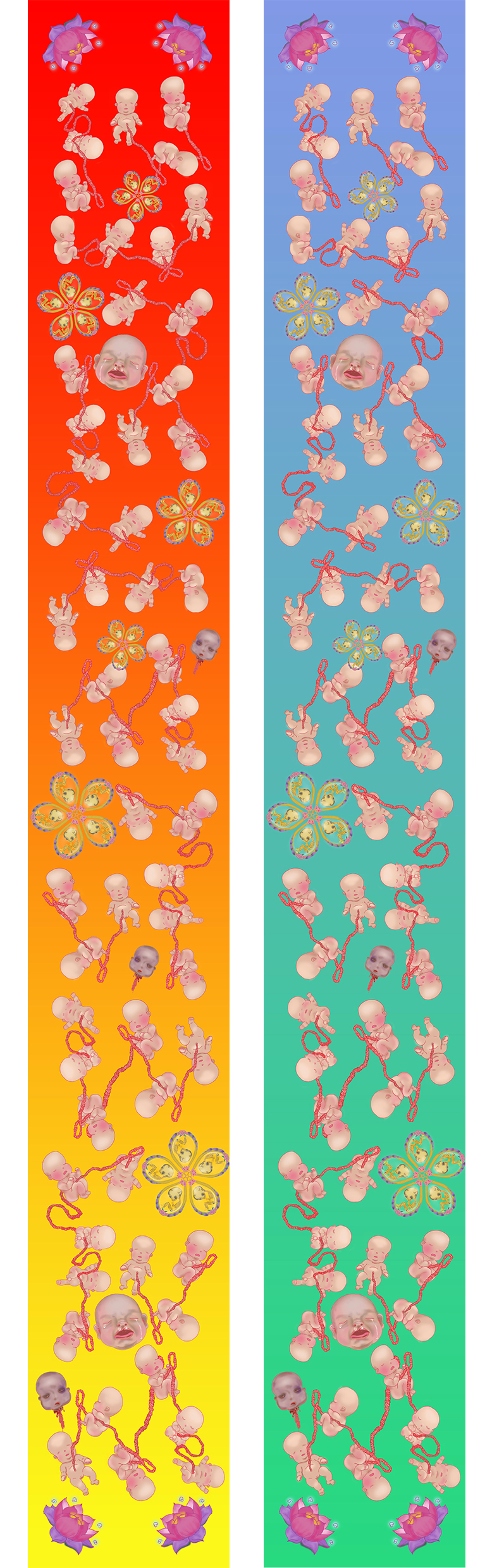
 It is a wide network of sparse thoughts here and there, but I finally narrowed down to 2 topics I would like to explore on (The
  There is this grey area because it is a mixture of good and bad. In a way which meddling with ghost/spirits to obtain a positive outcome, is something that is quite risky.
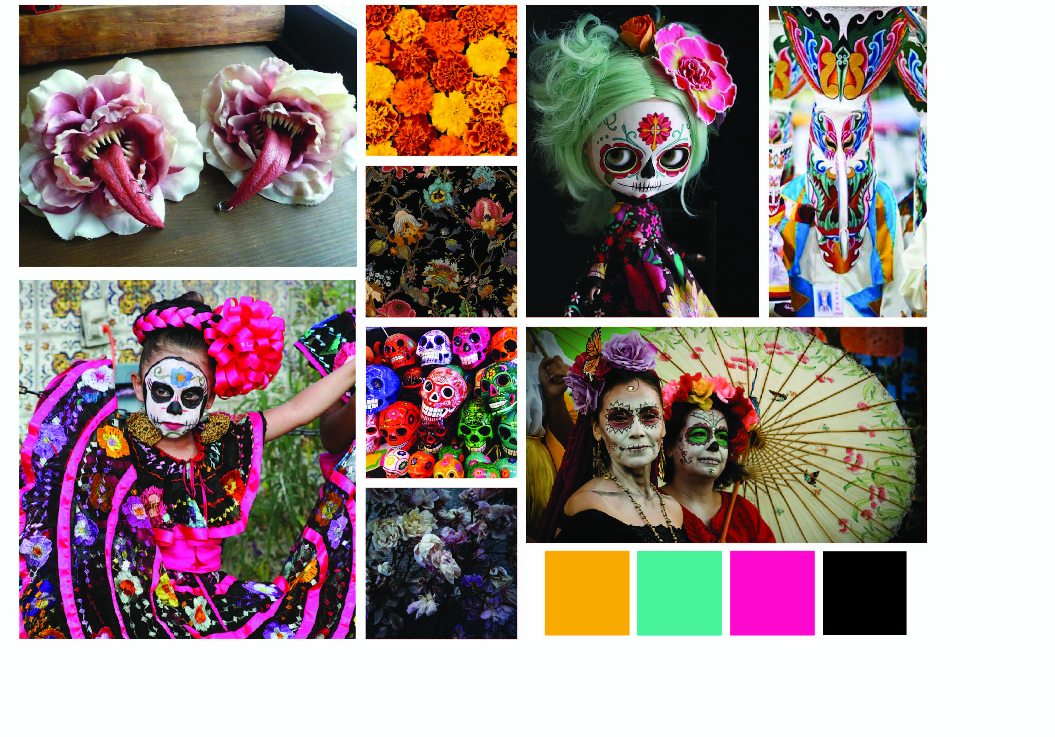 I am rather torn by the two themes, but at the same time I wonder how can I combine the two themes without being too jarring and contradicting, for which the Kuman Thong has a negative connotation to it due to its association with Black Magic, whereas The Day of The Dead is a jovial holiday marked to remember their loved ones.


 Hence I wanted to go for something where the fonts conform around the illustration like this:
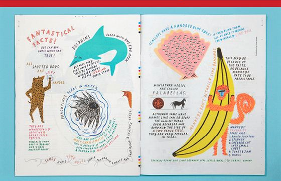


 Joy’s Constructive Feedback 😀:

 I also included a ‘Pull Here’ instructions with a red arrow to direct the child’s attention to it.
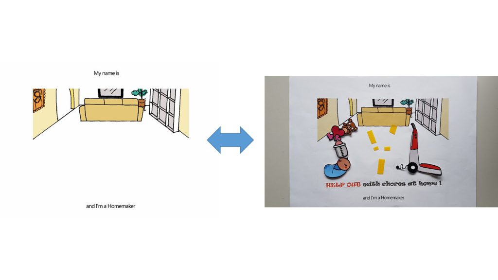
 I really liked how…
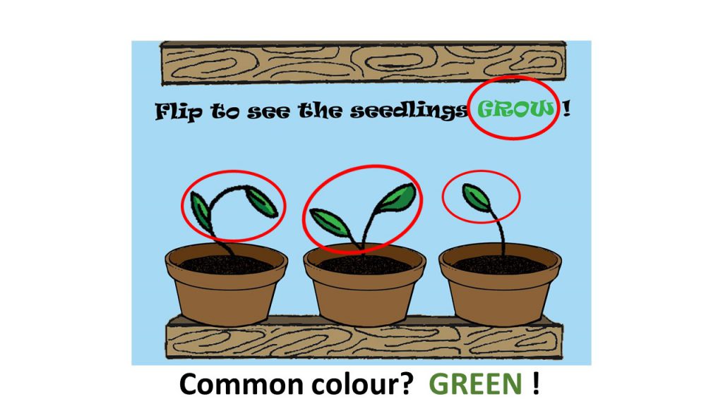

 Triadic color scheme uses colors that are evenly spaced around the color wheel.


 .
.