Lets get on with the process of making the cover editorial illustration!
I drew out my designs on paper first and I tried using transparencies to create individual elements to play around with layers.
And then I scanned my designs in and tried to image trace it, however, because I used pencil, the lines were not very clear which resulted in unjointed lines.
I resulted to vectoring the area, and ‘clipping masked’ the designs I wanted to be in.

I set up the tonal values of the colour schemes to create depth for layering.
This is the progress I had when I vectored the designs, and I used the image on the extreme right for atmospheric perspective reference, and a constant reminder to my absent minded brain that “THE DARKER IT IS THE CLOSER IT IS TO THE FRONT”.
Miss Lisa introduced to me Johnny Duddle’s Gigantausaurus which uses the creation of atmospheric perspective with plants. *Inner voice “THE DARKER IT IS THE CLOSER IT IS TO THE FRONT”.

Johnny Duddle’s Gigantausaurus
UPDATE 23/3/2018
I am about to make a very big risk, and that is to restart this again.
Halfway through the illustration I feel that the progress is very forced and something is amiss.
The vectoring and masking of the patterns did not carry out a raw and crisp feel that I wanted, and using Adobe Illustrator made it harder for me to bring forth the aerial perspective that I wanted to achieve. Layering was very tedious on Adobe Illustrator.
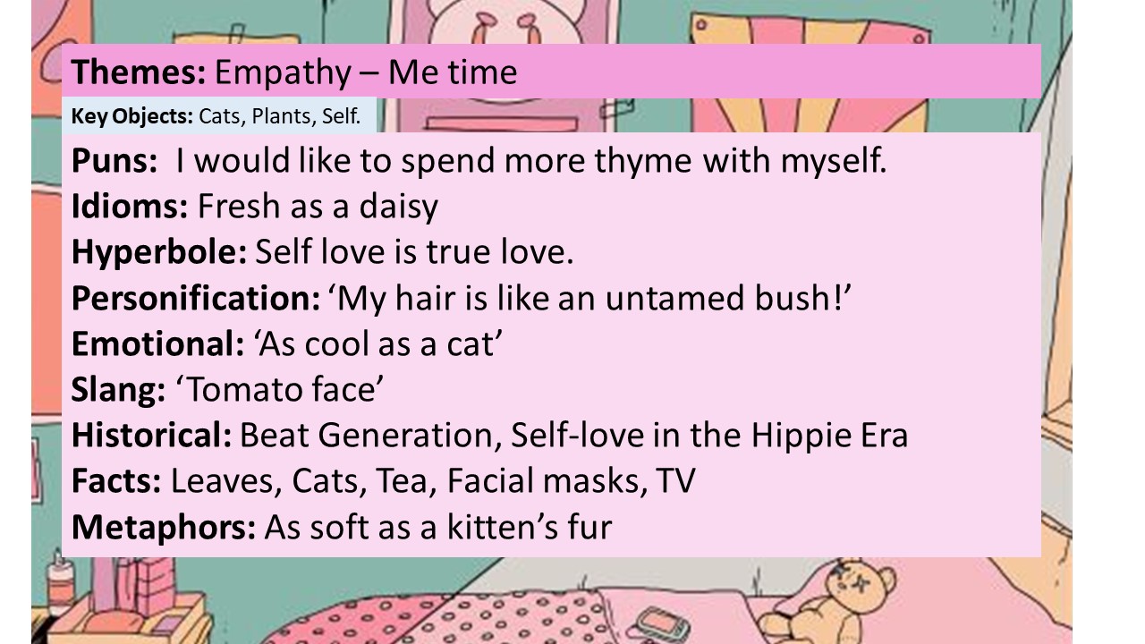
Because looking my composition as a whole and after some analysis and feedback from more people, my illustrations did not make a lot of sense as the huge cathead waterfall was very domineering and evoked a more cat-centraled message than the ‘Empathy- self love’ message that I wanted to evoke.
Hence, I totally discarded my vector progress and outlines that were done in Adobe Illustrator, and restarted an updated design.
I am moving to Photoshop and drawing everything from scratch again. 🙂

This is a more up close view on the new designs I did on Photoshop, the layering done via Photoshop was so much easier than Adobe Illustrator. The art direction as closer to the reference image that I wanted to achieve and I am very pleased with it. 🙂

I replaced the initial cat head with the mountains to create more depth and a more tranquil environment for relaxation in the Terrarium, using the image on the right for reference.
After layering and drawing out the illustrations through my Wacom tablet, i ended up with this!

I decided to have the background to be purple and orange to create a sun-set mood and also to create more contrast against the paler and more earthy colors.

I then clipping masked the shape of the terrarium onto the illustration.

Trying out different background colours for the varoom magazine for submission!

Magazine mock up look and feel

Magazine mock up look and feel

Magazine mock up look and feel
After presenting the work to the class on submission day, some feed backs were given and i made necessary amendments to the work!
- Glass reflection was suggested to be added onto the terrarium to create a more 3D look.
- Shadows for the ladder and changing the perspective more will give the ladder more depth
- Changing the background color of the magazine to blue will bring about a more relaxed and tranquil feeling.
I found the feedbacks given to be very useful and really aided in bringing out the best in my work! 🙂
Stay tuned for the final post to see the final submission piece for this assignment!
Click the link below to see the FINAL post for Task 2!
https://oss.adm.ntu.edu.sg/yseng001/dv2002-assessment-2-editorial-illustration-final/

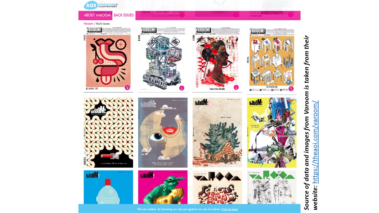 This is just some of the cover issues of the magazine.