HELLO fellow reader!! This post will be on the research process behind the creation of my Zine for PART 2 of the assignment!! 🙂
To view Project 2 Part 1 on the Research and Final, click on these two links below! 🙂
2D II Assignment 2 PART 1: “Zine: Neighborhood Explorer” RESEARCH
2D II Assignment 2 PART 1: “Zine: Neighborhood Explorer” FINAL
So! I went to do up some research on what Zines are though the net, as well as Pinterest; and get some hands on Zine examples around Singapore, which I found that are quite readily available around us! I also looked for several aspects of the Zines that I can draw inspiration from!

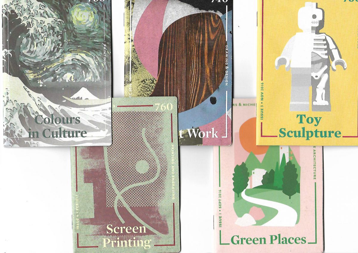
Got these Zines from the National Library and I really liked how the front covers were designed 🙂
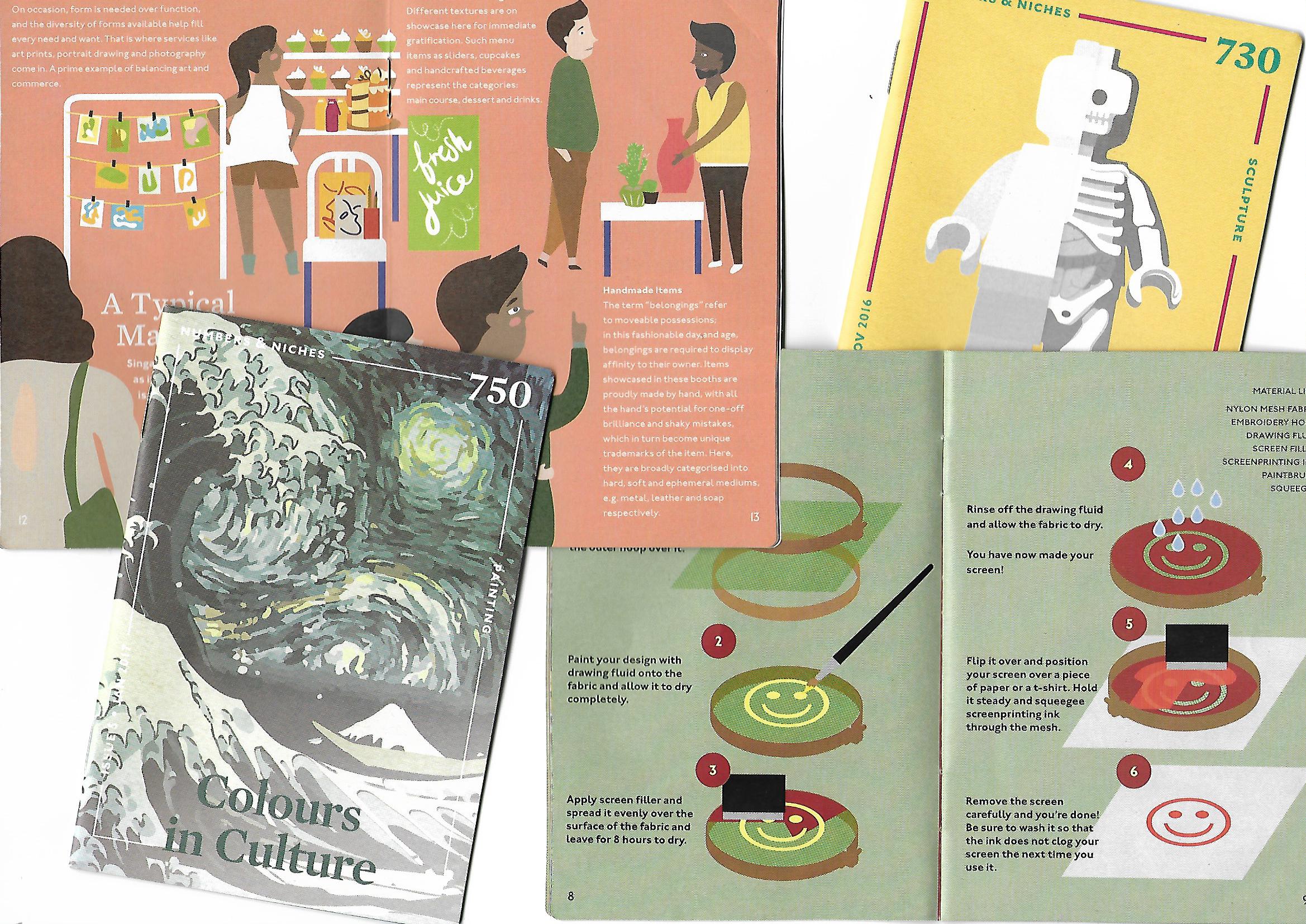
Was really looking into the contents of how the ZINE was created for and how they displayed them using layouts.
Based on the weekly groups’ presentation in relation to ZINES, I annotated some very useful notes to take note for this project:
Experimental Formats Zines
- What are Zines? Zine derived from Magazine, self published book. Print and bound by any manner.
- Decide what is it for. What is your Objective, Main concept and Visual approaches through your Zine.
- Pick the right title to your Zine that links to your theme.
- Decide layout and order. Plan your structure allowing information to be organized.
- Fonts: Don’t make it too small. Don’t use dark background, and upper case for main body. Titles headlines are chances for more elaborate and fancy designs.
- Create a master copy to test the copy you have created before you do the final one to see if you got right color, texture of paper etc.
Publication book format and grids
- Format is the area in which your design and texts sits.
- Grid – A system which divides 2D planes to smaller fields. design made into visual math. Types of grid: Manuscript (Story books), Column grid (Newspaper), Modular grid , Hierarchal grid etc.
- Typeface– Font family. Each typeface has specific weight, style , ornamentation etc. Diff typeface alphabet will result in different effect for your viewer.
- Column – Vertical division of a page of text is 7-10 words per line.
- Leading – The amount of blank space between lines of print. Good leading carries the eye from line to line. It cannot be too tight or too spacious for the reader.
- Margin – 1 to 5mm of margin space is recommended so you wont mutilate your text.
- Page numbers – Be distinctive from your body text. Can use different font family.
- Body and Display typeface – Display space to stand out. Use similar typeface. But do not mix characters from the same style. Good to have contrast using different font size.
I then pondered the several points that I had to take note of, and came up with these initial planning stages as to how my Zine can go about.
Main Concept: Guide around Telok Blangah with an elderly.
“Day in Telok Blangah guided by Uncle Tan. Readers get to go on an expedition with Uncle Tan, and he will show you around the places in Telok Blangah he like to visit, where he thinks you might like and what to do there.”
The story will go around the primary information and personal recounts I have gathered from the interviews I conducted, as well as secondary research such as location names.
My objective:
To educate the readers that Telok Blangah can also be for young people, and not mainly for the old; Showing them places that the young and old can do, and what the older generations did then and now to pass time.
Visual Approaches? Art Direction?:
I had some dilemma with this because the Zines I see out there are so organized and minimalistic. I for one am not a minimalist and I find it really difficult to make my thoughts abstract visually, when there are so much expression and colors in my thoughts. Hence, Pinterest really helped me to see that not all Zines out there are minimalist and expression and colors can be incorporated!
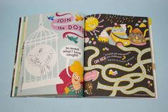
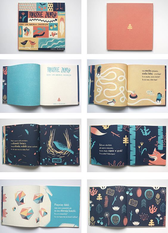
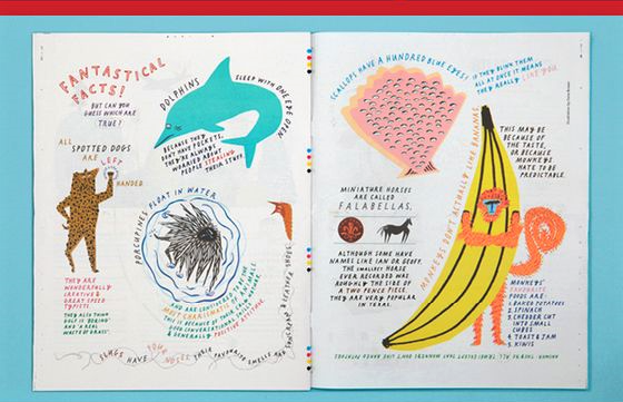
I really like the vibrant colors and how organic the shapes are! I also really liked the path which guided the viewers as to where they should look at! Hence I would really think paths can help me in my Zine 🙂

Execution:
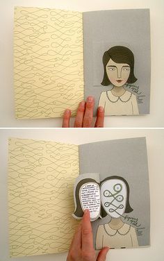
Cut outs? Interactivity by flipping?
I wanted to have this interactivity in my Zine by having cut out pages and flip tabs.
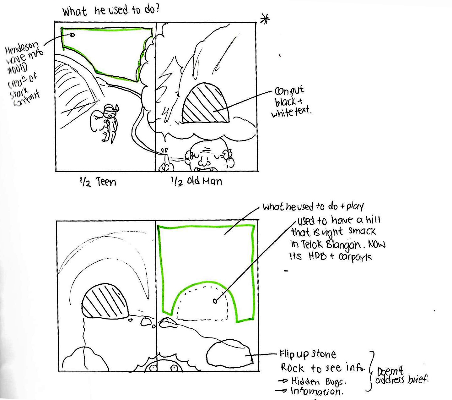
Initial sketching on how I want to incorporate the interactivity into the Zine.
The shaded area is where I want to cut the hole, and the rock at the bottom right can be flipped over to see insects.
However, after consultation with Joy, the cutting and flipping does not address the brief of the Zine project and sadly I have to scrap that idea. 🙁
Layouts:
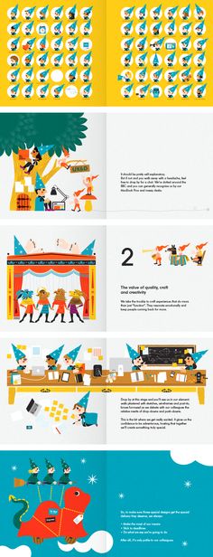
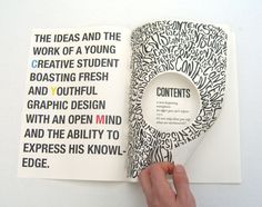
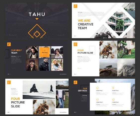
I didn’t want the very organized approach as I feel rather restricted by such layouts, as much as they are really aesthetically pleasing to look at like this:
 Hence I wanted to go for something where the fonts conform around the illustration like this:
Typography font to use:
Probably a serif font cause its more readable.
Choice of medium? :
Perhaps Watercolor and pen,scan in and enhance colors by photo editing software? Vectoring in Adobe Illustrator to create the clean edges?
All these are just the planning stages! The final confirmation post will be next!! 😀 Stay tuned!
Cheers,
Seng Yi Ling.