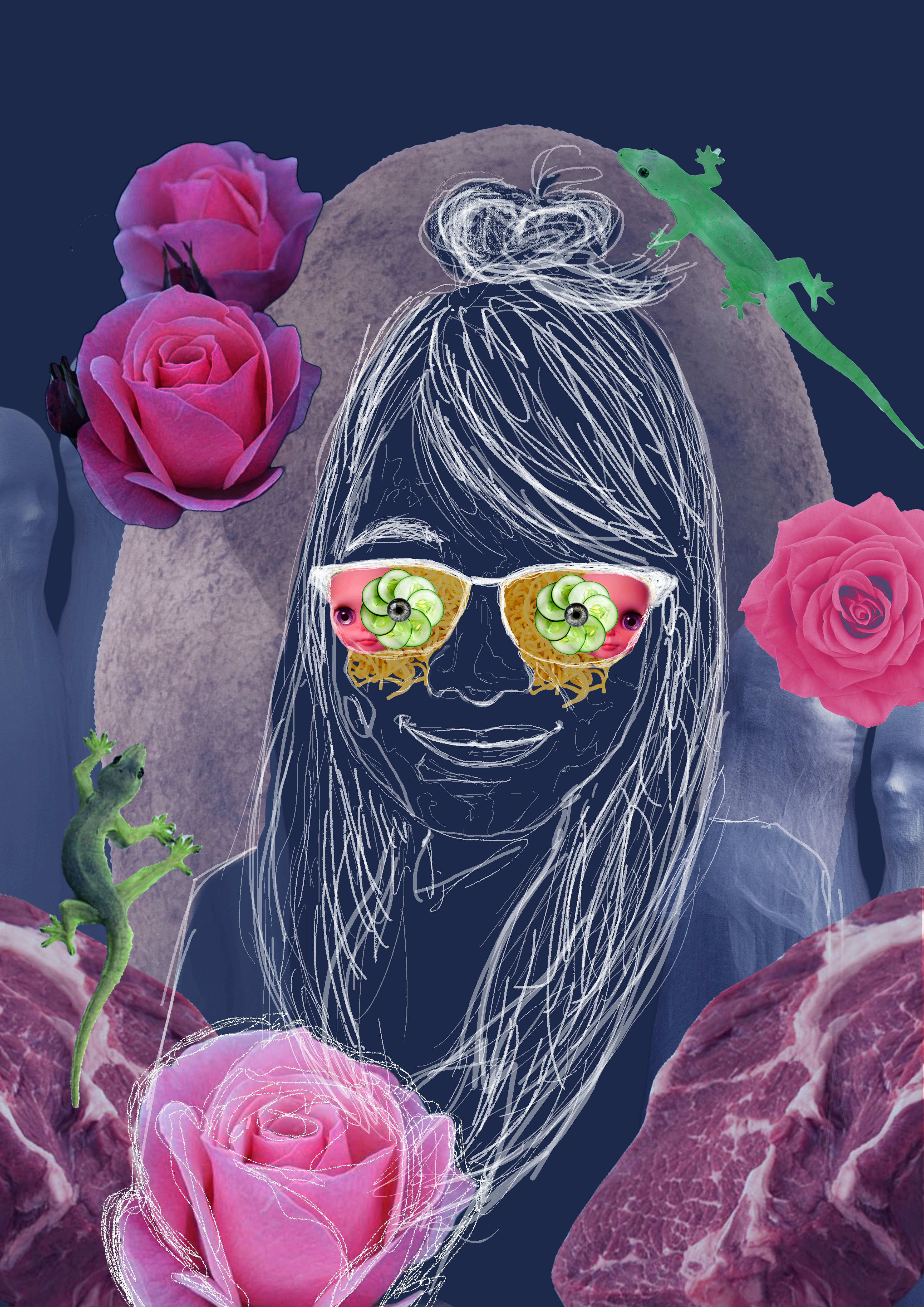
DV2002: Assessment #1 – Self Portrait (FINAL)


FINAL PRODUCT
Here is a video of how the ZINE looks like when flipped, and the following are a closer look on how the digital form looked like per page.

Outside Front Cover

Page 1

Page 2

Page 3

Page 4

Page 5

Page 6

Outside Back Cover
To see the previous project on Project 2 Part 1, click:
2D II Assignment 2 PART 1: “Zine: Neighborhood Explorer” FINAL
Concept
Guide around Telok Blangah with an elderly.
“Day in Telok Blangah guided by Uncle Tan. Readers get to go on an expedition with Uncle Tan, and he will show you around the places in Telok Blangah he like to visit, where he thinks you might like and what to do there.”
The story will go around the primary information and personal recounts I have gathered from the interviews I conducted, as well as secondary research such as location names.
Art direction
Heading in the direction of more whimsical illustrations that are more kid friendly.

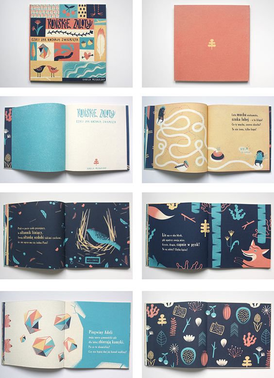 I really like the vibrant colors and how organic the shapes are! I also really liked the path which guided the viewers as to where they should look at! Hence I thought that paths can help me in my Zine. 🙂
Change(s) in idea/execution (if any):
Wanted to use a more calligraphic font, but instead chose a font that has more of a personal handwritten feeling to it since the drawings are very hand drawn. So I chose to use the font: A little Sunshine.
Challenges
Enjoyable moments
Classmates’ Feedbacks and Comments! <3
This critique session was a little more different from the previous ones we had as Joy got us to shift to the left every 2 minutes, and giving a quick anonymous critique towards the Zine.
Oh my goodness… It was arms day that day. I have never felt my arm burn so much since the last time I did ‘A’ levels HAHAHA!!! So we were given an envelope to place all the 18 notes in the respective envelopes and also when we were presenting, some classmates gave their comments on post it notes as well! ^-^

Majority of the comments in the 18 notes I have received is that my font is too thin to be read against a dark background and readability was an issue! 🙁 And that the second spreadsheet was rather bare and empty as compared to the first spread. Really thankful for the feedback because these factors never really came to me since I’ve been looking at my Zine so many times I knew what I was writing and where I wanted to place it. Hence, through this, I have learnt that when a publication is made, it is very important that you see your publication in the eyes of the readers and not purely my own. I ought to see my ZINE like how I would if I were a total new stranger. 😀
Joy’s Comments and Feedbacks <3
With that, I conclude the end of Year 1 Semester 2 of FDN 2D II !!

To be honest I am rather sad as much as I am glad that the holidays are approaching 🙂 Really thankful to have such a nice bunch of classmates in this semester’s class who were so willing to help each other out and give kind and constructive feedbacks 🙂 As well as Joy, thank you for being my 2D teacher for the whole of YEAR 1 ! 2 SEMESTERS ! I have learnt a lot from you and it was an ultimate pleasure and JOY to be your student! Hope to see you guys again in my following years here in ADM!! 😀

Cheers,
Seng Yi Ling.
To be updated in Year 2 Sem 1~
HELLO fellow reader!! This post will be on the research process behind the creation of my Zine for PART 2 of the assignment!! 🙂
To view Project 2 Part 1 on the Research and Final, click on these two links below! 🙂
2D II Assignment 2 PART 1: “Zine: Neighborhood Explorer” RESEARCH
2D II Assignment 2 PART 1: “Zine: Neighborhood Explorer” FINAL
So! I went to do up some research on what Zines are though the net, as well as Pinterest; and get some hands on Zine examples around Singapore, which I found that are quite readily available around us! I also looked for several aspects of the Zines that I can draw inspiration from!
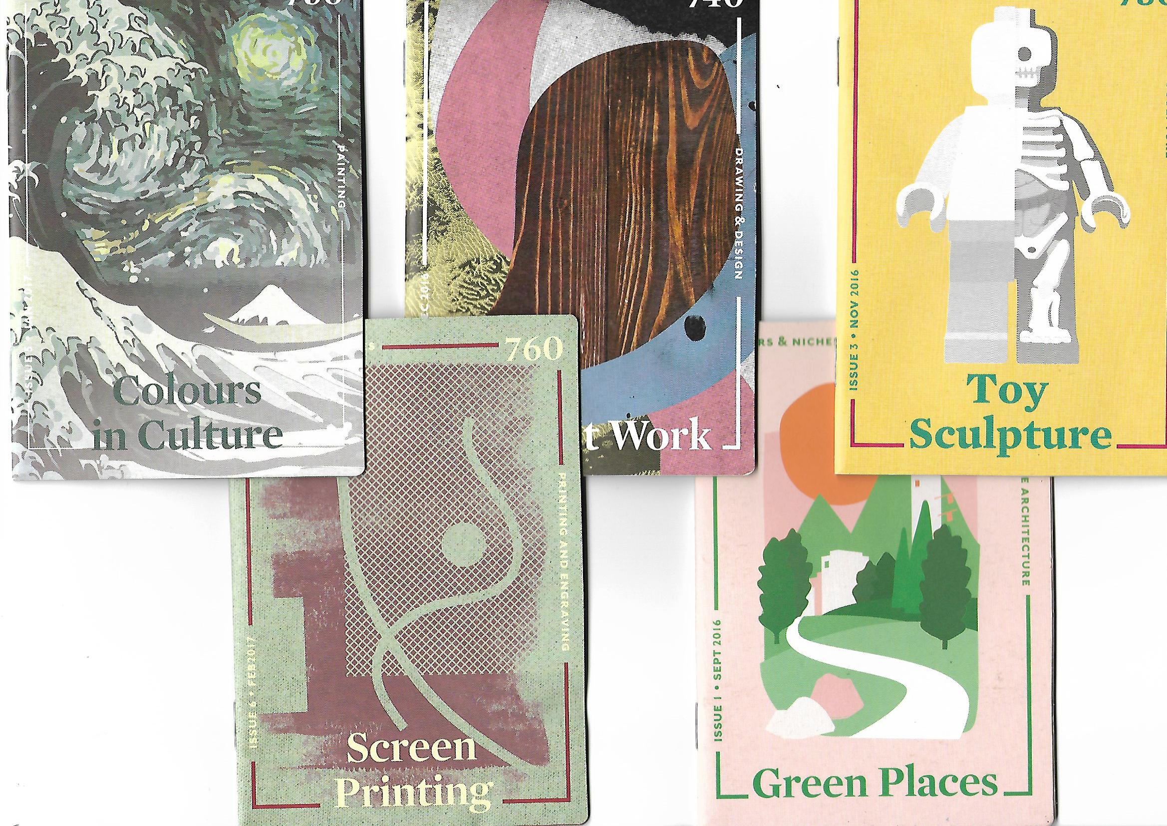
Got these Zines from the National Library and I really liked how the front covers were designed 🙂
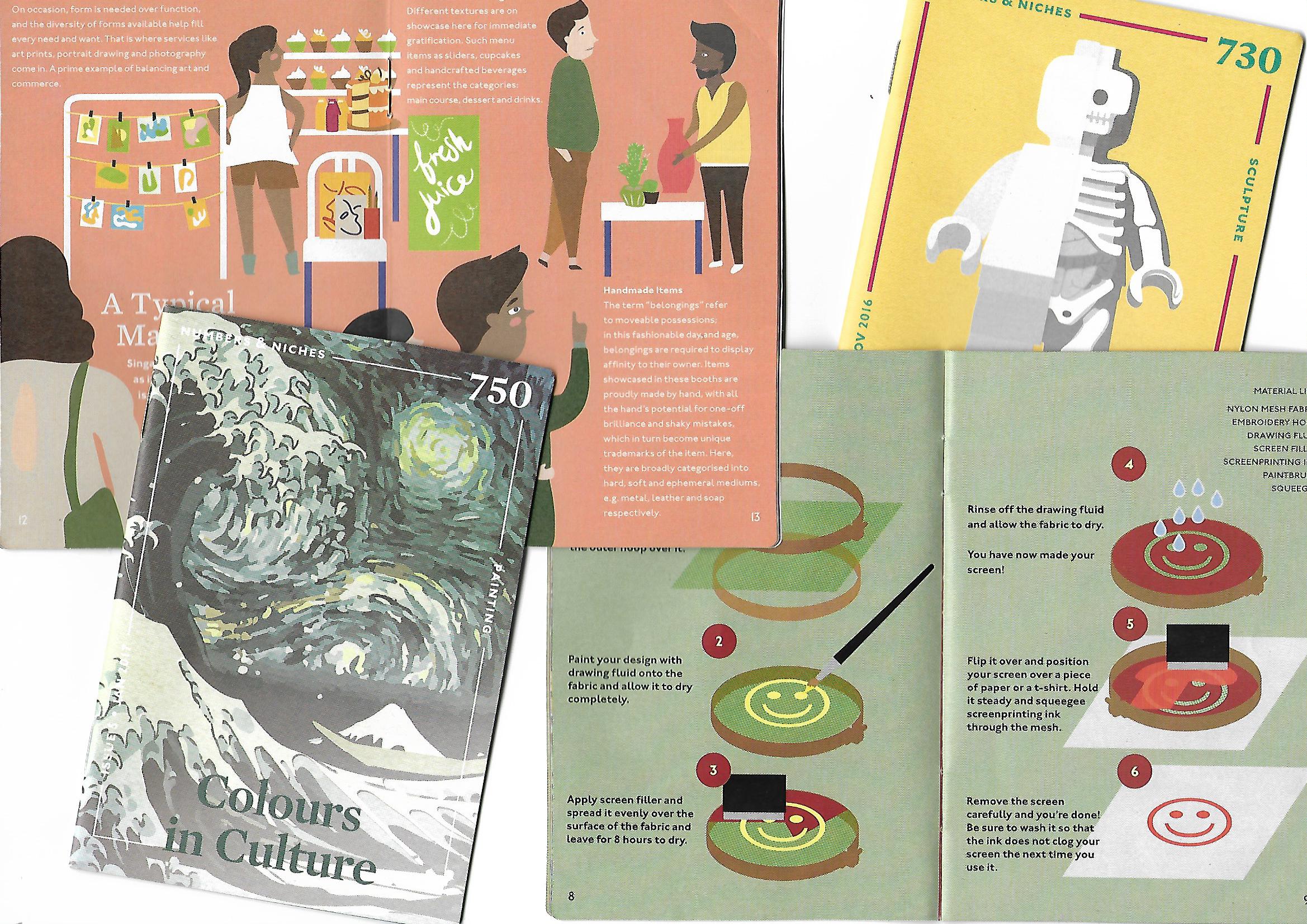
Was really looking into the contents of how the ZINE was created for and how they displayed them using layouts.
Based on the weekly groups’ presentation in relation to ZINES, I annotated some very useful notes to take note for this project:
Experimental Formats Zines
Publication book format and grids
I then pondered the several points that I had to take note of, and came up with these initial planning stages as to how my Zine can go about.
Main Concept: Guide around Telok Blangah with an elderly.
“Day in Telok Blangah guided by Uncle Tan. Readers get to go on an expedition with Uncle Tan, and he will show you around the places in Telok Blangah he like to visit, where he thinks you might like and what to do there.”
The story will go around the primary information and personal recounts I have gathered from the interviews I conducted, as well as secondary research such as location names.
My objective:
To educate the readers that Telok Blangah can also be for young people, and not mainly for the old; Showing them places that the young and old can do, and what the older generations did then and now to pass time.
Visual Approaches? Art Direction?:
I had some dilemma with this because the Zines I see out there are so organized and minimalistic. I for one am not a minimalist and I find it really difficult to make my thoughts abstract visually, when there are so much expression and colors in my thoughts. Hence, Pinterest really helped me to see that not all Zines out there are minimalist and expression and colors can be incorporated!
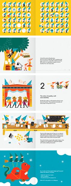
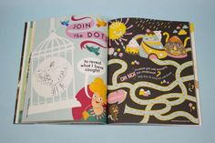

I really like the vibrant colors and how organic the shapes are! I also really liked the path which guided the viewers as to where they should look at! Hence I would really think paths can help me in my Zine 🙂

Execution:
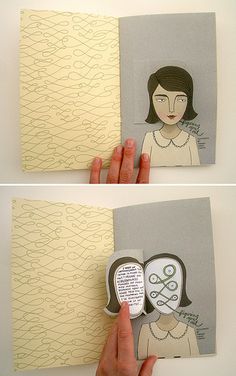
Cut outs? Interactivity by flipping?
I wanted to have this interactivity in my Zine by having cut out pages and flip tabs.
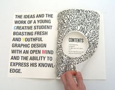
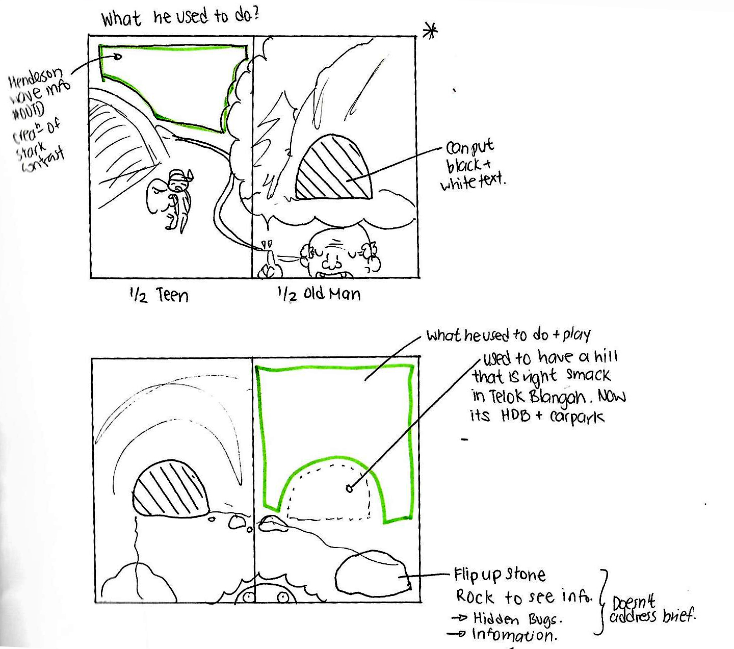
Initial sketching on how I want to incorporate the interactivity into the Zine.
The shaded area is where I want to cut the hole, and the rock at the bottom right can be flipped over to see insects.
However, after consultation with Joy, the cutting and flipping does not address the brief of the Zine project and sadly I have to scrap that idea. 🙁
Layouts:
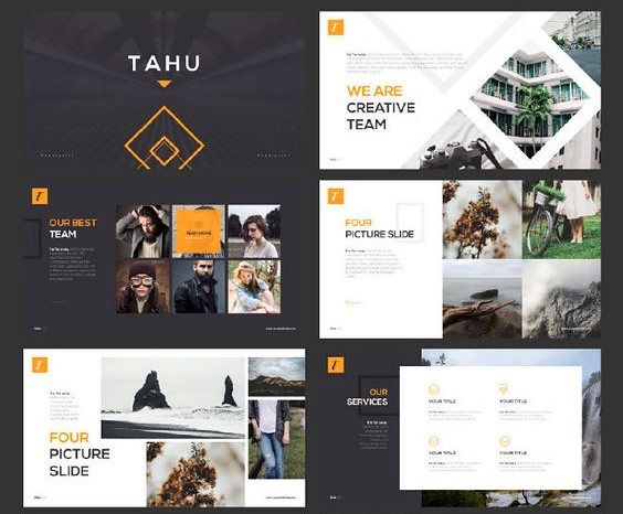
I didn’t want the very organized approach as I feel rather restricted by such layouts, as much as they are really aesthetically pleasing to look at like this:
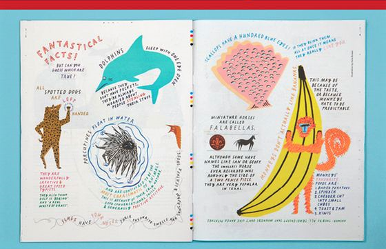
 Hence I wanted to go for something where the fonts conform around the illustration like this:
Typography font to use:
Probably a serif font cause its more readable.
Choice of medium? :
Perhaps Watercolor and pen,scan in and enhance colors by photo editing software? Vectoring in Adobe Illustrator to create the clean edges?
All these are just the planning stages! The final confirmation post will be next!! 😀 Stay tuned!
Cheers,
Seng Yi Ling.
Our Group Proposal
Main Idea:
Our idea for this narrative site specific location is a set up in a post apocalyptic abandoned Singaporean bunker. The premise is that the room once belonged to a family of 3, and was abandoned after an unseen environmental calamity. The audience’s role will be to explore the space and slowly see what happened to the previous occupant, contemplate their place in the world, and possibly how to get out of the confined space.
The focus of the set will be on lights, sounds, and interaction.
Themes:
Planned location:
Lights:
Sounds:
Interaction:
References:
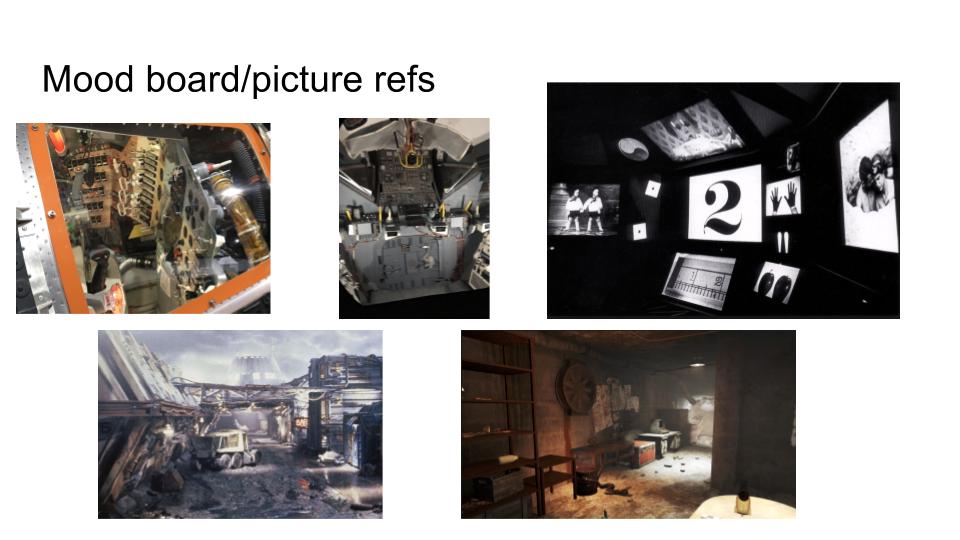 Methodology:
Really hope that our installation will be really awesome!! SO EXCITED!! 😀
Stay tuned to our documentation post soon!!! ;D
Cheers,
Seng Yi Ling
Appropriation, Re-appropriation and Re-contextualization
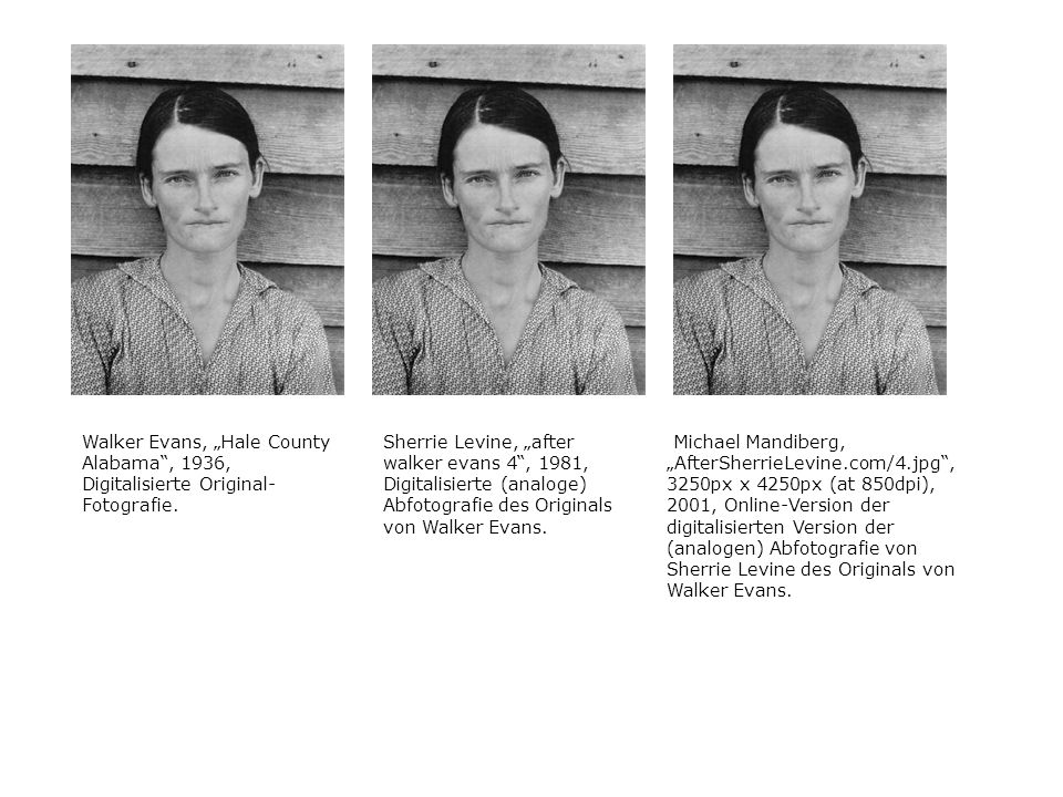 Allie Mc Burroughs by Evans Walker in 1933.
Levine re-appropriates masculine works of Evans Walker in 1981.
Mandiberg re-contextualizes Levine‘s work in 2002, in a way that the work was so many times replicated to economical reasons. Even to the point of printing out the certification; the limited edition work has loses its value.
Its not about the image anymore. It is about the meaning behind the work of that era it was created.
Creative Commons is an online platform which is open to sharing, remixing and reinterpreting your work. Makes the creative more creative.
Your work is not a finished product. It acts as a chain. People respond to your work.
So when is it ethical and non-ethical?
Crediting your work? Ask for permission from the original creator?
Like DJ remixes, their works is based off other’s work. There ain’t no single author anymore.
Without attributing the song to the original? Copying without making any changes? Is that considered as a ripoff?
EVERYTHING IS A REMIX
Even the iconic movie series: Star Wars is a remix from films such as Yomjibo, The Searches , The Good the Bad and the Ugly, Empire of Dreams, Metropolis, Silent Running etc. etc.
Creation require Influence, without the creating of Star Wars, there would be lesser influence on the films we have today…
Creativity doesn’t come from Magic. It comes from Copying. You can reference artists’ works without shame!
Q: Describe a future form of postproduction art that does not exist today but that you can imagine twenty years from now.
My Answer: Though this may seem extremely far fetched and crazy, I would like to think that in 20 years from now, remixing would be more tangible. Where there is a giant table like Iron Man does and the search box where the machine can sense what kind of content you want to create: Showing up related searches which are relevant to your thoughts and ideas. And when you obtain these ideas and original art works, the source will be permanently linked to your track/film/images. It is rather invasive but, hey… sharing is caring right. #CreativeCommonslol
But like what my classmates shared, you can only imagine the future forms if you know the medium used in the future. Anything is possible.
Hui Min and I had a discussion regarding Creative Commons’ sharing platform and how willing are we to share our works with others. She is rather open about sharing her work to inspire someone, and she thinks it is quite an honor for her if she manages to do so! 🙂 Whereas for me, I am rather concerned about sharing my work (Which may be inspire from other sources as well. nothing is original anymore.) on this site as I feel that there is no control on the World Wide Web. I have no idea who would be using my work or how they are going to use it. It is like throwing my child into the vast universe for them to dissect. It bothers me. However, if it is within a closed community for sharing, I would be more willing.
Vidding
Remix and Mash up
The choice of the song transforms the character of Spock in Kandy Fong’s fan video of Spock in Star Trek using VCR.
Tan Pin Pin sliced 40 years of NDP footages into 7 minutes with varying background music. The political message how has NDP footage changed from the 60s till now. The style of performance, has a very North Korean vibe: Structured move. Despite the change in presidency, the ethics and idea of promoting racial harmony is the same. She doesn’t show blatantly her statement of her view of the government on her film. Using national day footage, she is not creating new work but she is mocking a conscious choice in what to include in her footage, thus creating a new meaning to her work.
Omer Fast cuts the clip of new anchor’s words from NEWS to words that he need to form a political message that the media doesn’t tell you everything. Reusing old footage would be more impactful than if he were to create new footage. The CNN anchors always look very impassive and reassuring to the viewers. By cutting the footage like these, the anchors looks more emotional and vulnerable.
Jonathan McIngosh‘s Buffy VS Edward. Why did he remix his works and used Buffy with Edward to talk about Feminism? Most people think that Edward is a charming romantic male character, but he is in fact… a stalker. By using Buffy, the feminism message is emphasized as in Twilight, Edward is this dominant male figure and Buffy diminishes that in McIngosh’s film.
Conclusion
What makes a good or bad remix?
Good remixes has a purpose and intention. The message is clear in the remix works. Otherwise it’ll just a cut duplicate of the original work. It is not necessary about the Medium. It is what you want to say.
Why do the artists appropriate existing works?
Old footages has context that is more relatable. There is direct immediacy. There is a adding on of the artist’s message onto the original meaning of the film. There is no need for introduction to be for one to be assimilated to the film. Remixes need no introduction as they are using existing content that is familiar to the masses. It can also act as a form of critiquing the ideology. The artist is the philosopher.
FIELDTRIP DAY~
On the 28 Feb 2017, our 4D class went on a field trip to Art Science Museum to take note of the use of space/screens/sounds/experiential storytelling, that can serve as inspirations to the Final Project! 😀
In this fieldtrip, I was floored by how much interactivity is involved in the exhibits. Especially the Future World and Into the Wild exhibits as audiences of all ages are welcomed to participate.
I took a vlog to document my trip as I find that pictures themselves cannot convey the experience as well as a video. So do forgive me if the video seems really informal and non-professional as my objective was to document the experience, and not to shoot it in a cinematic film like project ^^
Along the way, I also made some annotations in the video to document my learning points and what I felt could be incorporated into the final project, ENJOY!
Stay tuned to my second post for the fieldtrips!! 😀
TATA FOR NOW~ 🙂
Final Product!
Since the final product is rather hands on interactive, I made a short video to show how the paper engineering mechanism can be played with in my work. If you hadn’t seen the ‘Process Stage’ post, Click HERE!
Thank you Jia Qi for being my camera man 🙂
Feedback given on presentation day!
Classmates’ Feedback and comments:
 Joy’s Constructive Feedback 😀:
Thank you lovely classmates and Joy for the comments and constructive feedback! 😀 I really appreciate it!! 😀
YAY~ Assignment 1 is DONE!! 😀
See you next time for Assignment 2! 🙂
Cheers,
Seng Yi Ling.
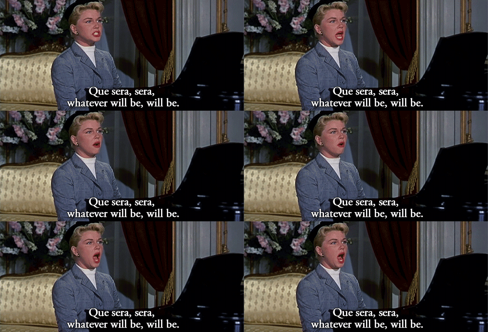
For this assignment I have heavily depended on my Visual Journal for note taking and thought processing as compared to last semester where OSS was where I post most of my thought process. Regardless, I will still take you through this journey from the start to end of this ‘Que Sera’ assignment via OSS, so… LETS GO~~
Ideation
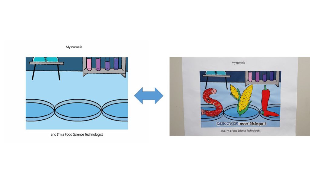
Because the name cards require the use of the conceptually driven solutions and letter forms, combined with literal or abstract image to express our future jobs in typographic portraits, I did a mind mapping process in my Visual Journal to help with coming up with the 4 Jobs for each of the name cards: Florist, Egyptianologist, Home maker and Food Science Technologist.
Joy emphasized that we ought to have these 3 factors before consulation in order to give a good framework and direction for our assignment.
Concept
My concept for this project is using the delivery method of my goal now, which is to create a interactive children’s book, to execute the name cards for all 4 jobs.
Message
Individual name cards have their own messages and an overall message as a whole.
Florist – Do not let small thinking cut your life down to size. Dream big! Work hard!
Egyptianologist – Do not let someone else’s opinion define you.
Homemaker – Be as awesome as a Domestic Goddess.
Food Science Technologist – Never stop asking ‘Why?’ until you get you answer.
Overall message – Your job does not define who you are in the future. YOU define who you are in the future.
Tone
The overall tone of the Children’s Book concept is positive and educational. While urging the readers to discover and learn new things.
Artist references
I did not limit myself to one specific artist to use as reference because I did not want their style to be seen in my work. Hence I went online and offline to expose myself to interactive books and illustrations for children to serve as inspiration; extracting the pros of each book and learning to avoid the flaws which I did not want to see in my work.
Expression of tonality: I used different shades of the same color on to express tonality in the designs. This creates slight depth and also has an old school children’s book feeling.
Methodology
For all of the designs, I used hand drawn illustration, scanned the designs and used Adobe Photoshop to fill in colors and cleaned up the edges.
Florist (Age >5)
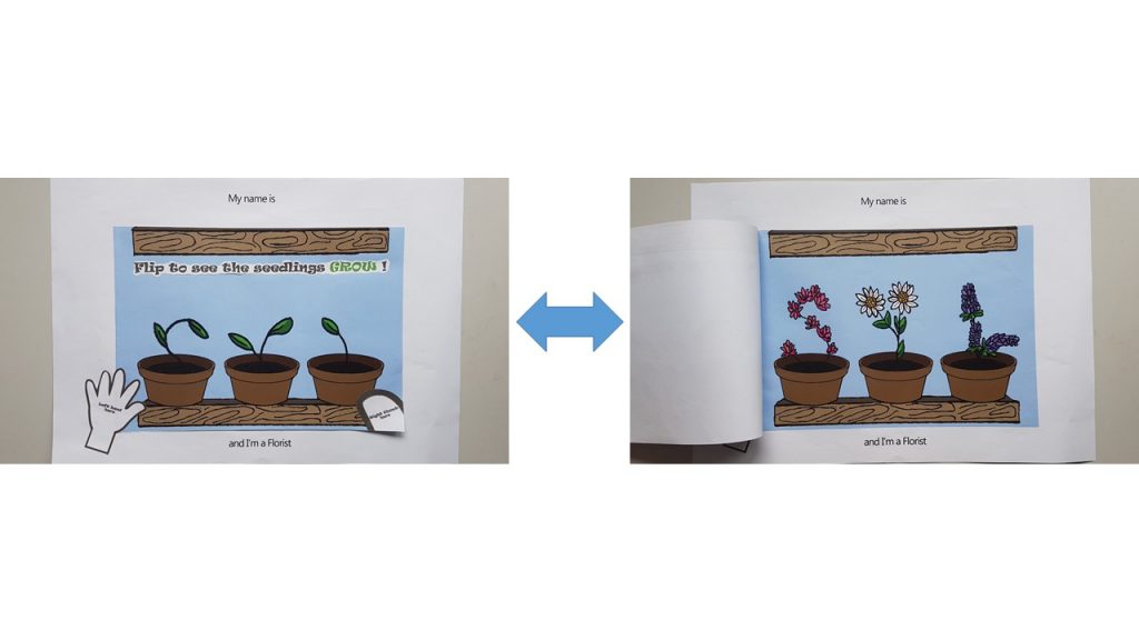
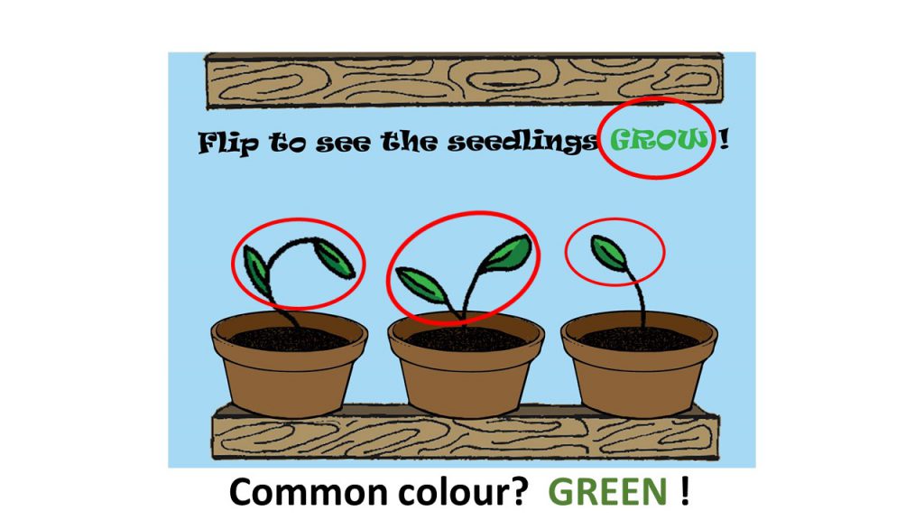
I used flip book animation to carry out the ‘Flip O’ Rama’ concept from the children’s comic: Captain Underpants. The following video below is how it would have looked like.
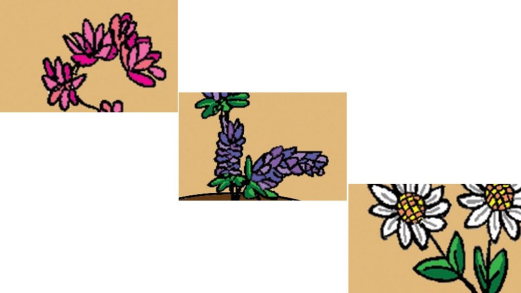
I wanted to show the growth of the plants from a boring seedling which looked like it may die any moment , into a blossoming plant. Hence, for the top image, I used the upper half of my initials : ‘SYL’ as the feeble seedlings in pots, and a full grown blossoming plant for the bottom image. So that when the user flips it repeatedly, it will look like the seedling is growing.
Joy also suggested for me to put out instructions on how the interactive-ness can be carried out by children, hence I pasted a ‘left hand here’ and ‘right thumb here’ instruction on the outside like how the Flip O’ Rama book did.
 Egyptianologist ( Age 10-15)
I used the pull tab mechanism in this name card as seen in many pop up books.
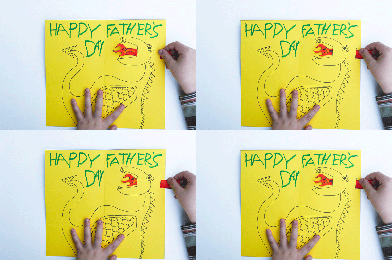
I used Golden Flint paper on the interior of the Mummy coffin to act as the bones, which forms my name. My idea for this name card is to show that a dull looking exterior of the Mummy gives one the impression of something less of value. However, upon uncovering the truth by pulling the tab, it reveals the bright and golden bones of the Mummy.
In a way it also has many interpretations that can be taught such as:
‘Do not judge a book by its cover ‘
‘Its more important to have a heart of gold than a fancy exterior.’
‘Do not let what others think of you define who you really are.’
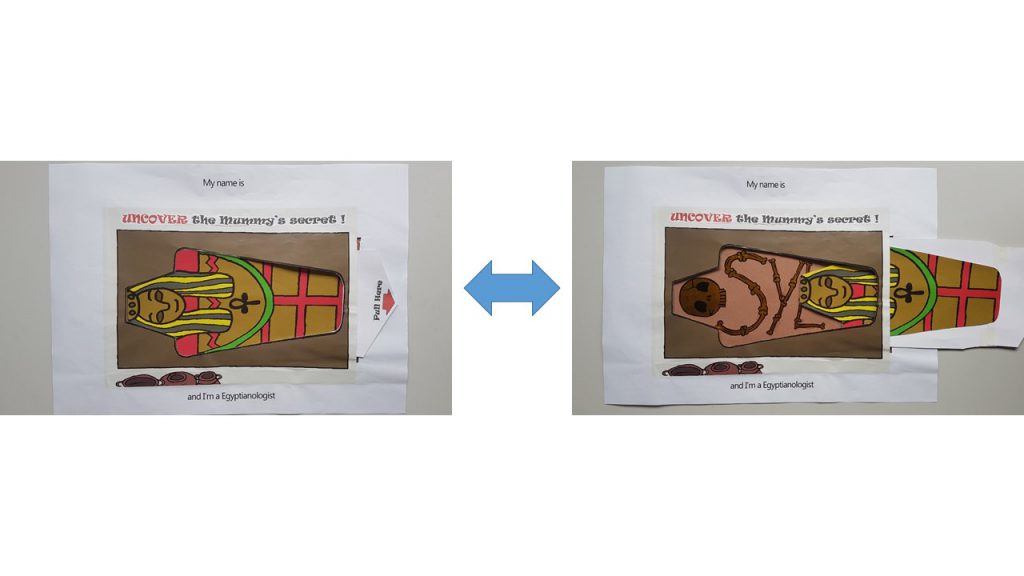 I also included a ‘Pull Here’ instructions with a red arrow to direct the child’s attention to it.
Homemaker ( Age >10)
For this name card, I used Velcro as the material to work with as I wanted to let the children organize and arrange where each of the item should go in the household chore. I was considering using felt to carry out this idea, but Shi Teng gave me a suggestion to draw out the illustrations and have them printed out instead, so that it is more consistent with the overall image of a sketchy hand drawn illustration. Thanks Shi Teng! 😀
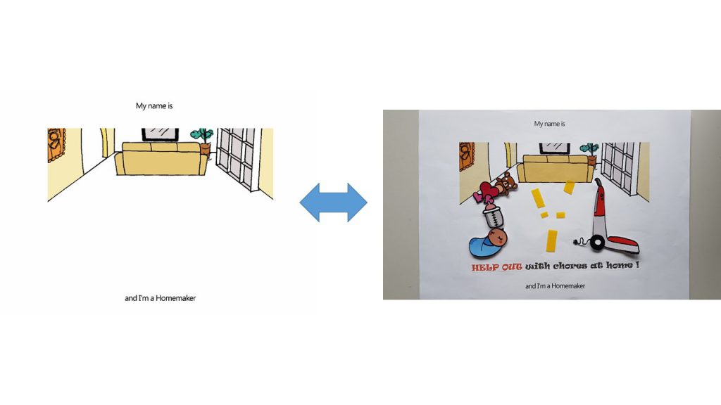 Food Science Technologist ( Age 16- 19)
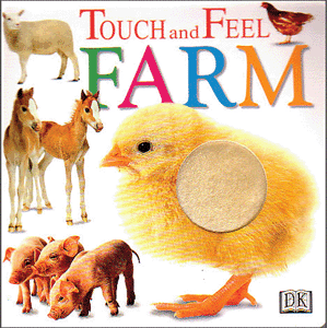
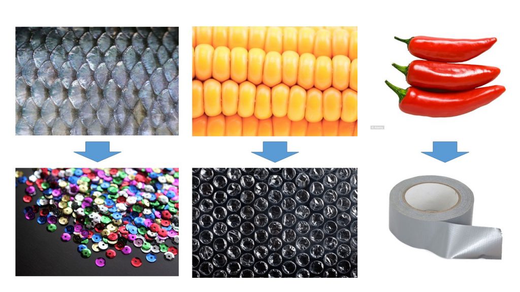
For this name card, I was highly driven ‘Touch and Feel’ books for young children.
I used Sequins to simulate the texture of fish scales, Bubble wrap to simulate the texture of corn and duct tape to simulate the waxy surface of Chilli.
Colors
Joy suggested I use a common color for the 4 compositions to express unity throughout. However, as much as I try to pick a common color, I don’t think it worked out very well to have Blue in my Egyptianologist illustrations ( It would have looked like an Ice Tomb) and neither Orange/ Yellow for my Food Science Technologist illustrations ( I required Blue to express the sterility of the Science lab).
Hence I split my compositions into 2 sides: Blue and Yellow
Blue (Hex code: #A4DBFF) – Florist (Complementary) and Food Science Technologist(Monochrome)
Yellow ( Hex Code: #E4C877)– Egyptianologist (Warm) and Homemaker (Analogous)
Instruction typography used
I used ‘Ravie’ Font and spaced out the individual letter because Children’s book has to be highly legible.
Font used I have chosen is Ravie because it has a rather whimsical feeling to it, but yet I chose to bold the fonts because it is still instructions and I didn’t want the children reading it to turn a blind eye to it.
Choice of color for font was something that was bugging me as well. As I felt Black was too strong as compared to the rest of the colorful compositions. But yet if I were to choose a color that suits individual composition, I felt that there was no unity to be seen as a whole in a book; and the instructions just blends in with the background where the children might turn a blind eye to it.
Hence my solution came about when I was researching for the way Children’s books present their instructions:
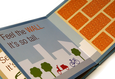 I really liked how…
Thus, I applied this reference to my instructions for the children.
I capitalized and gave a color to the keyword which is seen in the object.
Things I could’ve done if I can turn back in time.
I am really shooting myself in the foot for saying this. But, I think admitting to my mistake and learning from it is better than to bury it under the carpet. So, for my future self, here I go.
The following post would be the FINAL one for Assignment 1 Que Sera!
Cheers,
Seng Yi Ling.


Compositions


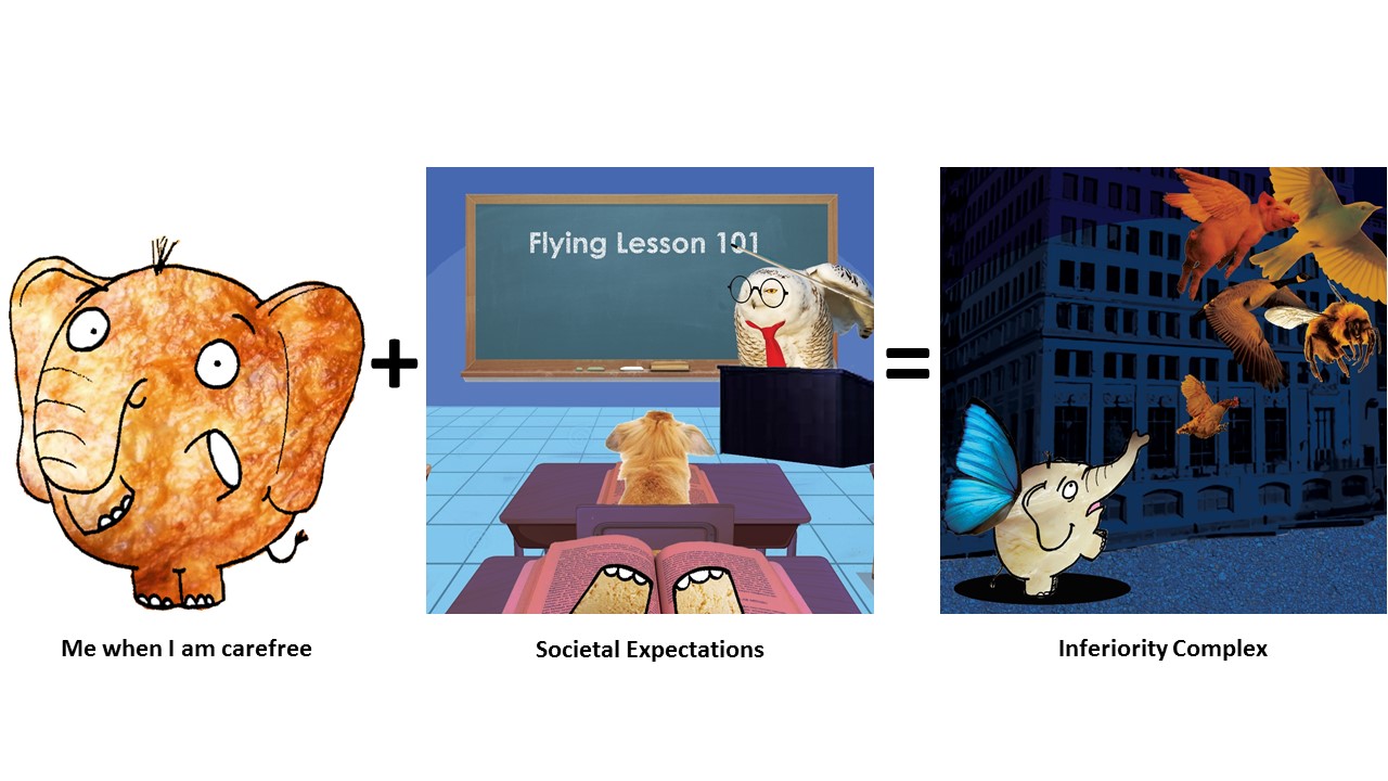
3) Utopia 2




Comments and Feedback
 THANK YOU GUYS FOR THE LOVELY COMMENTS <3
Our very first G05 class outing happened yesterday at NUS Museum featuring the exhibition: Double Vision! Double Vision is a selection of video works and experimental films that are inspired by the affinities between the Philippines and Vietnam in the history of the American wars in the Pacific.

Videos & artist films by: David Griggs, Gym Lumbera, Miko Revereza, Roxlee, Shireen Seno, Angel Velasco Shaw, Stephanie Syjuco and Kidlat Tahimik.
Pdf format of the Brochure: http://www.nus.edu.sg/museum/pdf/2016/NUSM_DoubleVision.pdf
When we first entered the exhibition, the first film we watched was Shotgun Tuding by Shireen Seno
Trailer:
In summary, the film is about Tuding (the protagonist) who journeys to a distant town to hunt down the man who got her youngest sister Teresit pregnant. Along the way she
This film is constructed after Pancit Western, which is the Pinoy form of Spaghetti Westerns.
What I liked about this film:
Shots used are rather interesting. I found the dramatic close up of the subject matter’s face and dramatic pan out shots to be rather comedic and kind of poking fun at the mainstream western American Wild Wild West kind of films, where two cow boys would be having their showdown.
Color pallete used in this film was muted and had a rather soft and dusty feeling to me.
Nailed by Angel Velasco Shaw
Is a Filipina’s exploration of a Catholic Church and 400 years of Spanish and American colonialism woven in a montage of images, sounds, stories and performances.
Although I watched this film from the start, I didn’t have much patience to sit through this particular film. The narrations were muffled, and I think with subtitles I would actually have stayed till the end of the film…
But regardless, I took away some learning points from the video in which I really find it interesting. The way the artists juxtaposes 2 shots: The dying pig being tortured to it’s death on the ground & the baby cradled in the mother’s arms; was rather fascinating to me because, in the case of the ritual where the child is baptized in one scene ( I think?), a pig is slaughtered. The phrase, ‘A life for a life.’ came to my mind immediately after this scene, and then Yit Ling (my classmate who was sitting beside me) said :’ The pig is like a baby also… because it can only scream and cry and you have no idea what it is saying, but it is suffering.’ My heart sank when I heard that.
ABCD by Rox Lee is an experimental animation video shot on Super 8 film. It uses techniques such as hand-drawn animation, painting on film, found footage, and collage to advocate a radically new and personal understanding of the alphabet.
I really liked the use of a mixture of techniques to this film as it adds variety. The film is a socio-political commentary. By incorporating the use of the order of alphabets, it made things a little disturbing in a sense by which the use of hand-drawn animation and Alphabetical sequence usually seen on American TV shows for children to teach them about alphabets, things take a darker turn when something so innocent turns into something morbid and cruel.
Instead of the usual, ‘A is for Apple, B is for Boy etc.’ the film goes ‘ D is for Dynamite’ and then the following scene is a morbid display of explosion etc.
My thoughts at the end of the exhibition:
Sad to say, I was not as enthralled as I expected to be after watching the film exhibition as I did not understand majority of the films. Perhaps it is because I have little interest in politics. The film that kept my attention from start to end is Shotgun Tuding by Shireen Seno as I felt there was a narrative story plot goal for me to follow from start to end. But regardless, I took away some lessons from this exhibition and that is the choice of color pallete, type of shots to be excuted and use of different techniques to evoke certain emotions in the viewers.