For our first assignment, we are tasked to create a stylized A3 self portrait exploring the concept of visual narrative, considering how we can best represent ourselves in order to express our personality and unique character; experimenting with stylization.
LETS BEGIN!
Methodology
I started out by narrowing down my list of words from the mind map on things I like and things I don’t like.

My mindmap, concept and little sketches
Mood Board
Based on my mood board which I made while surfing Pinterest, my initial art direction was to use photo montage background for the things I don’t like and illustrative doodles inside my glasses for things that I do like. And then for the self portrait I would like to do it in a sketchy continuous line technique.
But while testing the fusion of the 3 different styles together: Photo, Doodling, and Sketchy lines; They look like a terrible mess.
I then tried another approach, which to abandon one of the styles and just stick mainly to 2 styles, the photo montage being one of the two.
I tried to do the doodling technique and the sketchy lines and I felt that the latter suits my theme and choice of items better.
Hence I chose to use Photomontage and Sketchy lines to do my portrait.
Artist References
My artists references are not really fixed, but more of I went looking around and extracted things I liked from each artwork I see and I try to marry them together.

Taken from: https://www.google.com.sg/search?dcr=0&tbm=isch&sa=1&ei=opx6WvOlLcrqvASCiKzgDg&q=picasso+blue&oq=picasso+blue&gs_l=psy-ab.3..0l10.1105.3667.0.3804.5.4.0.1.1.0.81.306.4.4.0….0…1c.1.64.psy-ab..0.5.332…0i67k1.0.6qED0Hacj40#imgrc=tEE2P5jy7Fb32M:&spf=1517984936724
I liked the feelings evoked from Picasso Blue period painting. The hue is already an indication of the somber mood, which reinforces the feelings evoked by the subject matter’s expression.
I liked this photo I saw on Pinterest where the subject figure is framed beautifully in the picture, the items beside her complements it really well. and I would like to emulate that composition by framing myself with the things I don’t.
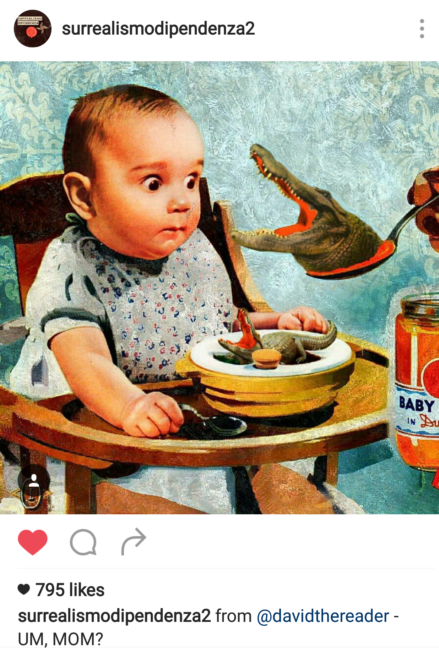
And all the while, I really enjoyed making funny surrealistic photo montage compositions! @surrealismodipendenza2 being one of the Instagram accounts I drew inspirations from.
Depth
Because one of my art direction was to use photo montage, I studied how I can create depth using flat images.
I realized that for landscapes, the receding mountains are lighter in shade as compared to the one closer to us, which are much darker.

Image taken from : http://www.cqcn88.com/mculture.asp
And in this surrealistic photomontage, I realized that by overlapping the images, depth is also created.

Image taken from : https://coyotegallery.wordpress.com/2014/05/11/pat-hopkins-surreal-photomontage/
Lines
I used varied line thickness to create more texture and emphasis on the portrait. Thinnest lines being the light and contours on my face.
The choice of brush has a little opacity, so when it overlaps, it creates an even brighter line.
Colors
I was quite in a dilemma for the color choices and eventually I made many drafts just to see which stands out the way I want it more, and what works best.
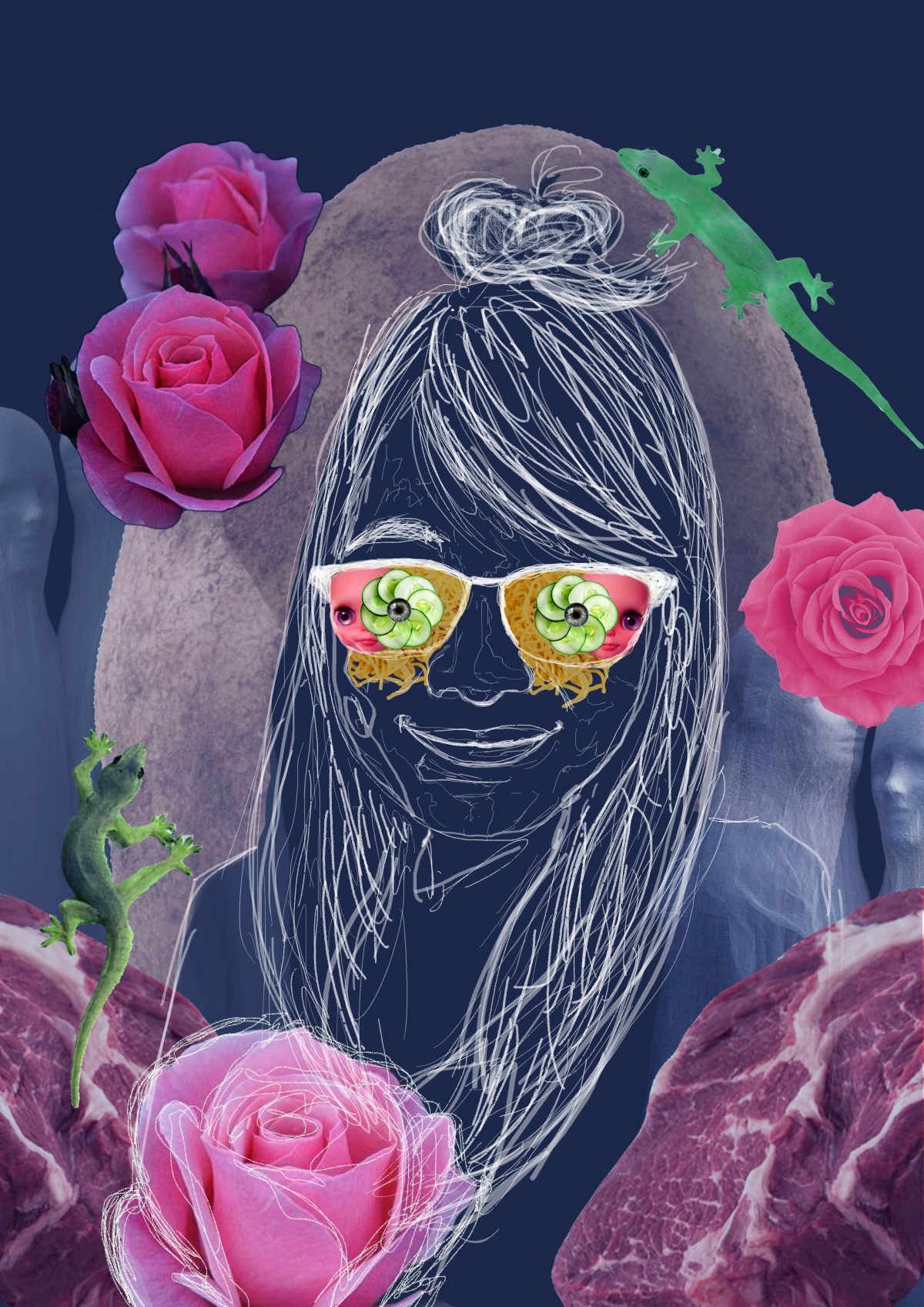
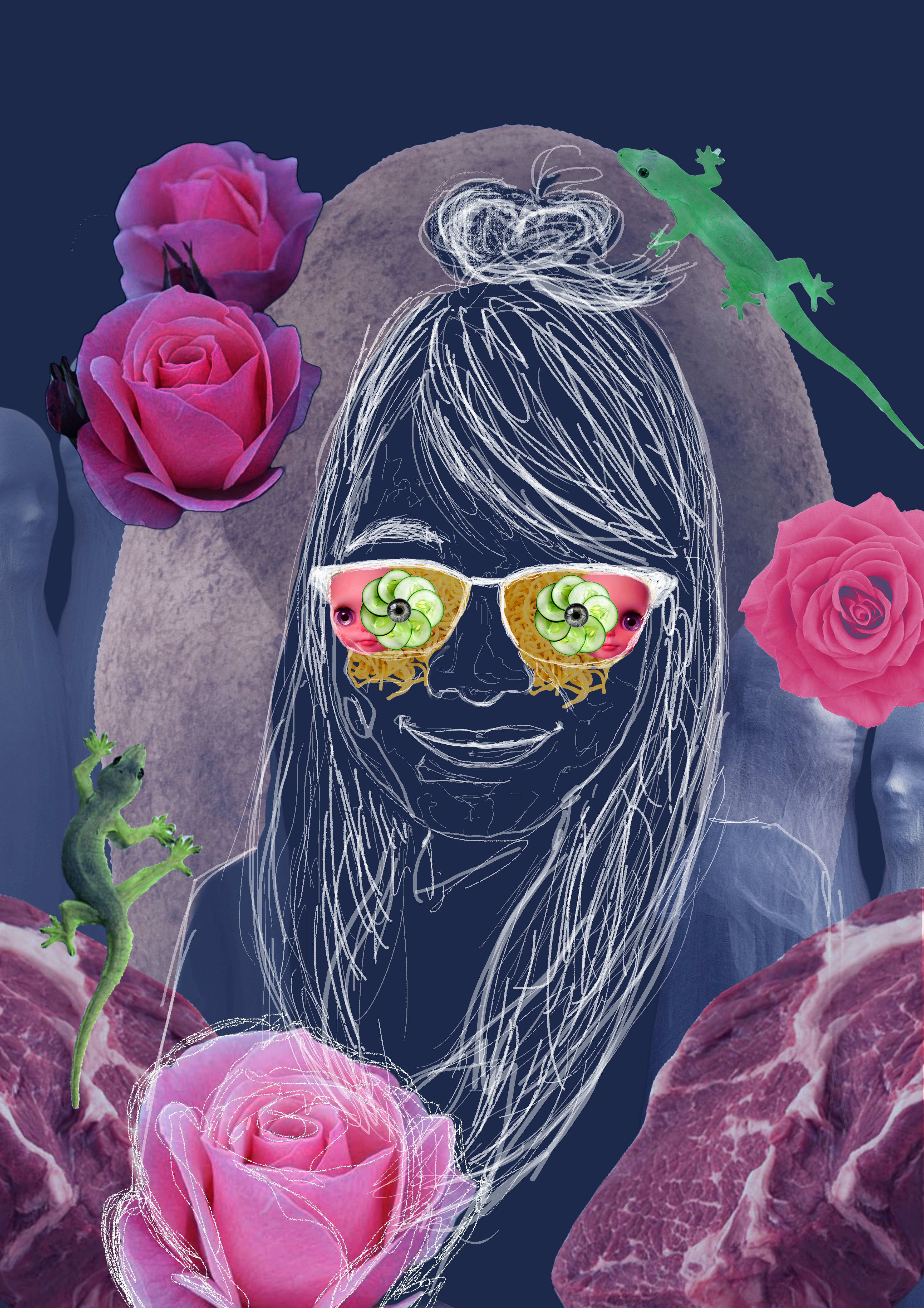
My overall composition I wanted it to be vertically symmetrical and framed with the photo montages of things I liked and disliked. The subject figure acts as a central axis.
That initial intention to use black and white (Number 1 to 3) for the background to represent disdain for the things I like kind of drowned the whole composition, and the focal point in the glasses are really small.
Number 7 was pretty funny to me (Noodle hair and babies as my shirt), and the focus was clearer. But the line work for my self portrait was obscured :(.
Number 4 and 6 were too glaring and drawing attention away from the central figure. (A friend commented that the colors were like the after effects of taking drugs…).
Eventually I chose color composition Number 5 because the blueish hue made the overall artwork comforting to look at, sufficient attention can be placed in the central figure and the items in the glasses.
In the background, I placed images of things that I dislike: Meat, flowers, lizards, ghosts and a huge potato as a nimbus.
And in my glasses, I placed the things
I like in it: Dolls, cucumber and noodles!

The color pallet I eventually chose is Complementary colors (Orange, Red and Green) with its saturation increased to create contrast against the bluish hue for the background and stand out against the white lines for the sketchy illustration.
To see the final submission, click on the link below!