Interactive Device Project2: Skitzie the Cat

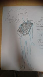
Skitzie the Cat is just your average black cat that likes to hang out on your shoulder. They are curious and like to people watch while you do your stuff. But Skitzie is very shy, hence pretends to be a scarf when anyone comes too close.

(insert hooman wearable sketch)

About Skitzie the Cat

Skitzie is a guardian for those who are not to aware of their surroundings. In a sense Skitzie’s ‘hasty retreat’ to become a scarf is a warning that there are on coming people approaching.

For this project, I had imagined Skitzie to be able to move their head and their ears to see the world. Skitzie is also envisioned to be able to ‘blink’ through LEDs and hum through a speaker. I wanted there to be sound or light as an indicator to the person who is wearing Skitzie to know very clearly when Skitzie is a cat and when they are pretending to be a scarf. The Warning has to be distinct enough to catch people’s notice.

Skitzie’s hardware

Skitzis is a combination of servo motors and a sharp

  1. Testing the Servo Motor:

Website Reference: https://www.instructables.com/id/Arduino-Servo-Motors/

2. Testing the Proximity sensor

Sharp ir arduino 0

Website Reference: https://create.arduino.cc/projecthub/jenniferchen/distance-measuring-sensor-900520

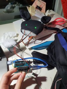
I combine the circuits and then made a head.

Testing out the Eyes circuit, it works. Turns off and on depending on the closeness.

For Some odd reason though when i add the ears, the eyes disappeared.

Then it got fixed (connections are problematic, check everythingggg).

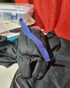
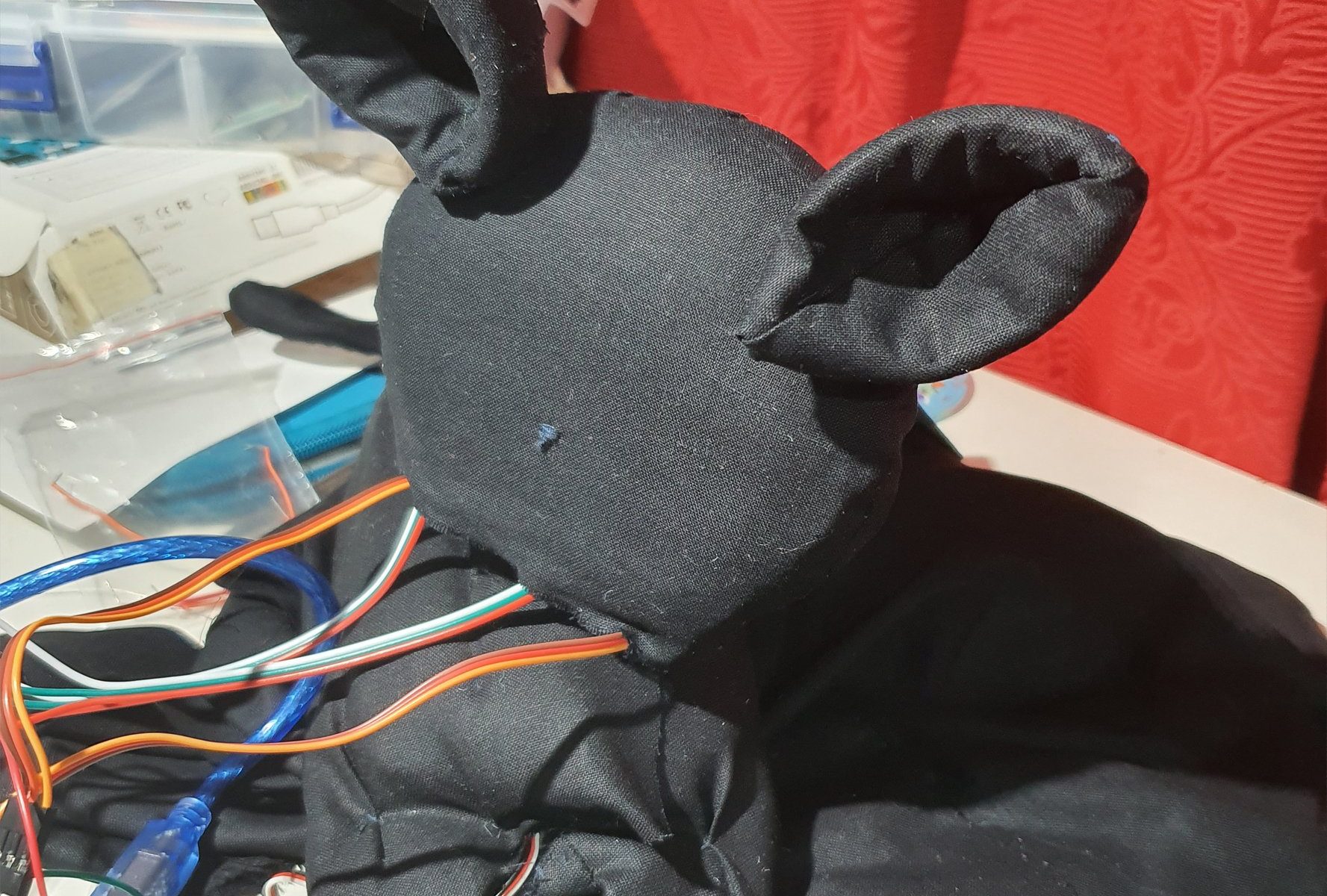
This is the body, that I made around the head servo motor.

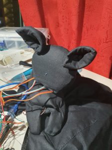
All Assembled.

Reflections:

Honestly the aesthetic of Skitzie didnt come out right, which I am a little bit disappointed by. Subsequently the head keeps falling off if left for too long, so I need to fix that in future. Hopefully we will see the return f a better Skitzie in future.


Refernces:

  • https://www.google.com/search?q=code+servo+motor+with+sensor&oq=code+servo+motor+with+sensor&aqs=chrome..69i57j0.11575j1j4&sourceid=chrome&ie=UTF-8#kpvalbx=_VbKEXdWDPNjc9QPCsoCIBA25

Final Project: Trio

One musician makes a Solo.

Two musicians make a Duet.

Three musicians make a Trio.

So lets make a Trio.

Three is a weird number, we only have two hands after all, so to have three sensors you would need at least another person to make sure all sensors are occupied to control the sound that is made (of course the preferable number is three, but I do so wish to see two people flailing around).

Why did I create trio? I guess it was more along the lines of finding a project that seems fun to interact with, but at the same time you struggle to make it work for you. At the end of the day the device is really just a commentary of how sometimes in life while you are trying your best to make something work, the end result does not bear fruit, or even better, bears fruit but there is not really a take away to this situation now is there?

In summary, let me waste your time.

The Circuit:

Life update:

Initially in the previous post I had made my code entirely out of Piezzo Buzzers and ultrasonic sensors, made to beep in a set tempo. Which, to be honest, is not really what I wanted. I want the tempo to be set by removing the object in front of the sensors face. But after editing the code I realise a major issue: the ultrasonic sensor is kind of being influenced by the buzzer it self.

(insert confused noises) It was steady before? But that was when the ultrasonic sensor only needed to play one tone with an interval in between, hence meaning it was not reading the environment every second hence it does not get influenced before.

So at this point it was time to consider changing my components.

Sharp ir arduino 0

Image taken from: https://create.arduino.cc/projecthub/jenniferchen/distance-measuring-sensor-900520

So I tried out the Sharp infrared/proximity? sensor. It goes by distance sensor at Continental.

Putting the entire circuit together, a single Piezzo buzzer and an Arduino together, the circuit works.

However, duplicating the code becomes a bit more troublesome. As it turns out, you cannot fit 3 piezzo buzzers to a single Arduino and expect them to ‘sound’ at the same time (Trouble shooting this the night before and realising you have to duplicate the circuit and not the code is really bad for your health by the way).

I did not account for this tripling of the space needed to store my three Arduinos, three distance sensors, three piezzo buzzers and three power packs. It is a super tight fit, mind you. By right I can squeeze everything into the box,. But by left squeezing very thing in the night before the showcase and then snapping something is not an ideal situation.

Piecing them together:

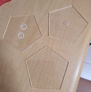
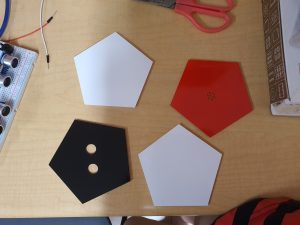
From the last post I showed that I laser cut, filed and spray painted my pieces, accordingly:

Since that time, I had to redo the black pieces, to fit the Sharp Infrared Sensor instead of the Ultrasonic sensor. Hence cut a rectangular piece instead.

I have also cut some wedges to support the structure.

And I stacked all my pieces up and glued them together with a glue gun.

Finally I stuck my components inside the surface.

Reflections:

In this case I have achieved what I wanted to in this project, the three sensors play according to the distance of them and the object. However maybe in future I would like to be a bit more ambitious/annoying and make the circuit for more (time to make a symphony for one then).

Of course there are a bit more things I should have accounted for, like the size of the circuit, or the potential increase of the circuit.

Telok Ayer publishing a Zine

Finally with all the illustrations in place, I decided to compile them and add some of my thoughts onto the pages.

Page one was given a title. Looking back at it now, maybe i should not have put my name there, kind of ruins the effect of the cover page. I wanted the title for this Zine to reflect how confused I am to describe Telok Ayer uniquely.

The second page reflects the food that you get there, I wanted to put it in a sort of menu like setting, hence added the borders.

Page 3 i felt was quite self explanatory, how there are random statues placed around like tourist attraction, and everyone does just that in its presence.

Page 4-5, I left it be.

Page 6, I remembered looking at the shop houses during one of my trips there and wondering what the definition of preservation is. Whilst i believe it is good to re purpose these old shop houses, I think the area of Telok Ayer also begins to lose its uniqueness as it houses more modern shops now.

I let page 7 be as well.

page 8, this was a statue as well, I remembered looking at it ad saying this was probably something iconic to Telok ayer in the past. Now they can only use it as an odd tourist attraction, hence this sort of cynical reply at the end.

I did not have much time to print as I spent a lot of time redesigning the illustrations on Illustrator, but i ended up printing it on art card. Which i felt was sturdy and reflected the sold colours and lines of my Graphics well.


Though maybe i could have explored more on printing.

Playing Stranger Things

The Final Project

For our final project for Experimental interaction we are asked to create a social project that will allow us to interact with others. We formed small groups and began brainstorming what we could do for the interaction portion. Mostly our project revolves around ‘playing games’ with strangers that we meet on the streets, in a way to see how willing people are to interact with other strangers. The end result is ‘Play Stranger Things’.

Play Stranger Things

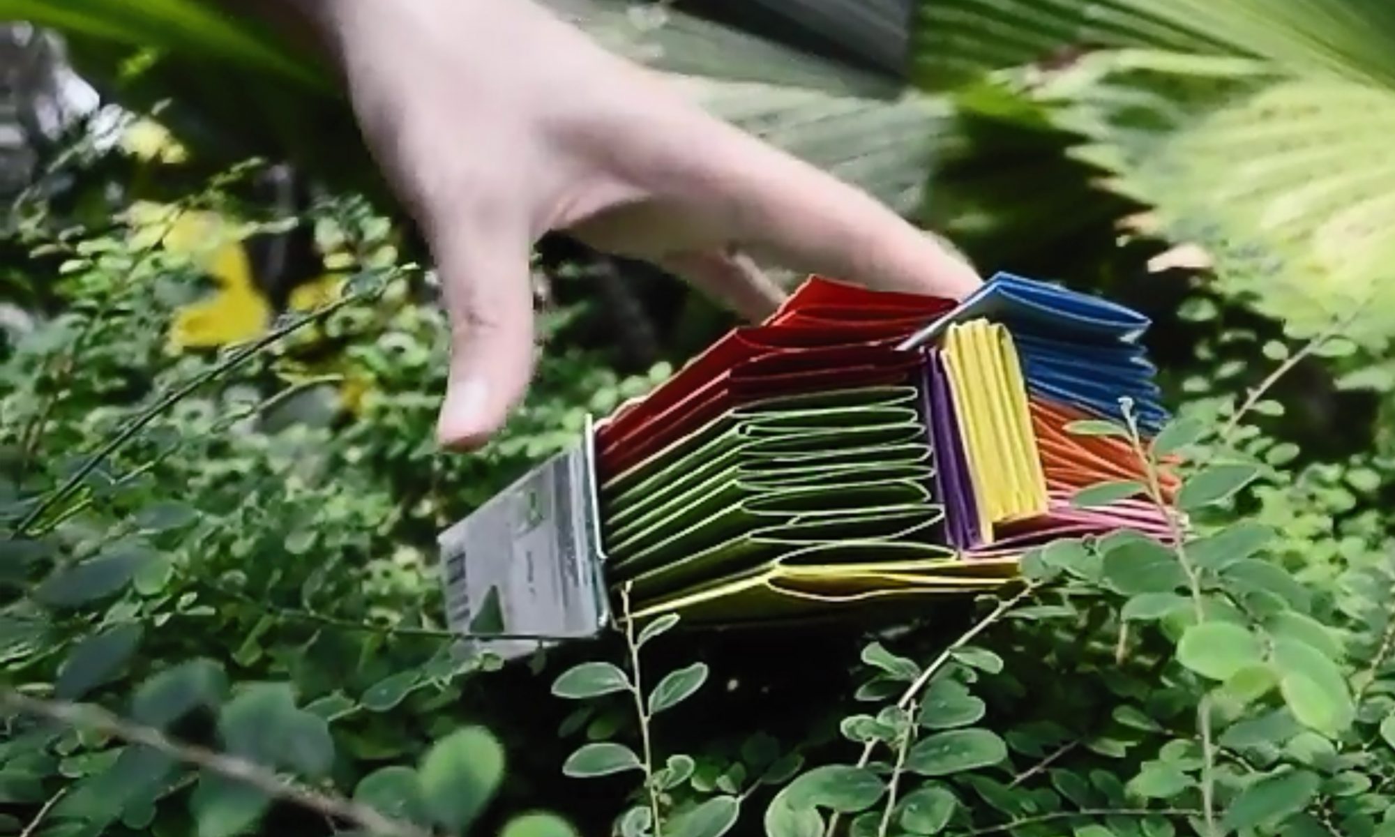
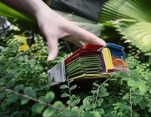
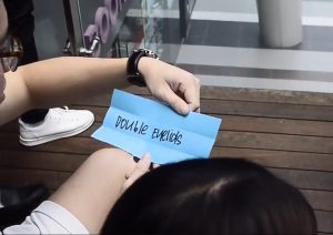
‘Play Stranger Things’ is a collaborative art piece where strangers become the artist and is tasked to draw a human face. The only catch is that each stranger can only draw a single feature of the human face, and each feature is dictated by the coloured sheet that they draw from our ‘box of features’.

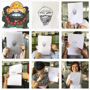
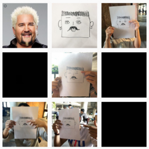
The point of the game is to get as many people to play as possible, and document the developement of the image on an instgram page, @letsplaystrangerthings (https://www.instagram.com/letsplaystrangerthings/). Also each time we are rejected by a stranger we record it in the form of a black screen, indicating a glitch our collaborative work which referenced Glitch art. Subsequently, the final picture is placed side by side by a character or person a stranger said it looks like.


(Screenshot taken from our instagram)

(Screenshot taken from our instagram)

Creating the project

Initially, the project took the direction of drawing a well known person, for example ‘Amos Yee’. However after a quick test run, we realised that even as art students, interpreting a facial feature like ‘long curly hair’ would take form in many different ways, and the resulting image will not look exactly like the human.

Hence, we scrapped the idea of creating a known person, and researched variations of each facial features, example ‘eyes’, ‘nose’ and ‘ears’ and have someone guess who they are at the end of the drawing.

The features colour coded:

Yellow: face shape

Red: Eyebrows

Purple: Ears

Green: Hair

Pink: Mouth

Orange: Nose

Blue: Eyes

We then put them in box and went out to Northspine NTU to conduct our project.

Reviewing the project

The point of the game is as mentioned before, the test the willingness of strangers to play and interact with other strangers, and so far, most of the people we approach are quite willing to be approached and contribute to the art.

Of course there was quite a fair bit of rejection as well, and we were intimidated by how busy everyone seemed to look, and sometimes did not want to intrude in their time. We also approached a lot of groups of people after awhile, as they seem more keen to play the game with their friends. Overall the interaction seemed to be more positive when in the presence of their friends.

We also ran into a group of sponsers at the Humanties and Social sciences building, which we had a trade with. We do their survey and they played games with us.

In Conclusion

I feel that our project is like Blast Theory in the way that we let pur audience take control of the project, and we let them interpret the instructions that we give them and react in the way that they want.

Image Making Through Type Final

Final thoughts

So this is the out come of the past few weeks labour.

The first two looks a lot like each other, due to my set mindset of having them take on the similar aesthetic.


Subsequently, the third one is vastly different, where I tried to do things in a different perspective. This one was more exploratory then finished I feel.

The Last one is more grounded in how it branches away from the similar style of the first two, but it is also due to the fact that this one was referencing a style that already exists.

In conclusion, I think there is still a lot I can improve on for this project.

2D Project 2

For this project i chose the following quotes:

  1. “Dishonour on you! Dishonour on your cow!” — Mulan (1998)
  2. “He touched the butt” — Finding Nemo (2003)
  3. “Oh Good my dog found the chainsaw” — Lilo and Stitch (2002)
  4. “This is my family. I found it all on my own. Its little and broken, but still good. Yeah, still good.” — Lilo and Stitch (2002)

“Dishonour on you! Dishonour on your cow!” — Mulan (1998)

For this quote, I illustrated the picture based on the key words “Dishonour”, “You” and “Cow”

“Dishonour”, I relate to death, bad omens and things related to fortune, hence I hose black cats and skulls, and grim reapers.

“You” I relate to humans, human skulls, fingers anything somewhat accusatory.

“Cow” is literally represented with images of cows or horse or animal skulls.

I liked the design and decided to play around with the scale, half tone, threshold and came up with variations of the one composition. Though I still like the design without the colour halftone.

“He touched the butt” — Finding Nemo (2003)

For this quote I split the  Illustration the into the key words “He”, “Touched” and “Butt”.

“He” refers to a male, or humans in general. Hence for “He” i thought of icons that are often associated to man like a mustache or literally the male gender symbol.

“Touched” I had wanted to use the mouse arrow symbol, the clicking symbol or the more literal sense of touch as in hands.

“Butt” there are two meanings to this word, so at first I found peaches to visually show a butt, or animal butts like cats and dogs. However the more i searched, I realised that it is easier to illustrate with images of “jerks” instead. Hence I have a chose images of Cats and Donkeys ( also known as a Jackass).

The idea was rather literal I find, and a bit to simple and symmetrical. The comments I got was it was too ‘quiet’ so it was eventually rejected.

“Oh Good my dog found the chainsaw” — Lilo and Stitch (2002)

The keywords for this illustration is “Good”, “Dog”, “Found” and “Chainsaw”.

“Good” was hard to illustrate, but i eventually decided on using elements of good luck. Examples of which are clovers, horseshoes, rabbit feet and dream catchers.

“Dogs” are literally represented as dogs for me.

“Found” I wanted to represent as sight, or magnifying glass. There was also a thought of creating a trail, to show the process of being found instead of actually being found.

“Chainsaw” was initially just a chainsaw, but then I felt that it was too literal, hence i broke the word into two, “Chain” and “saw” so images of chains and eyes.

The although I liked the idea of the first two, the comments  got for them both were that they were very symmetrical and ‘quiet’. Hence I decided to expand on the piece on the left to create the one on the bottom. This one was considerably better, as it was ‘noisier’ and more chaotic.

“This is my family. I found it all on my own. Its little and broken, but still good. Yeah, still good.” — Lilo and Stitch (2002)

The key words for this quote is “My family”, “found”, “little”, “broken” and “Good”.

This was tricky as there was a lot more elements to works with and the words had held so much possibilities it was difficult to choose.

For “My Family” I wanted to branch away from the typical family of humans, and wanted to search for other symbolism, like a “family” of animals, or a “family” tree.

“Found” is similar to the above, where i wanted magnifying glasses,  or a trail to show the process of finding.

“Little” I did not want to find and image, rather I wanted to play with the scale of the main ‘characters of the illustration.

“Broken” I referred to broken limbs or injuries at first. However, after, I started researching more, I had broken objects like windows an glass in mind.

“Good” once again refers to the above, idea of good omens, hence lucky items like rabbits feet, clovers, magnets, etc.

In the end, I felt this quote had abit too many elements to piece into a single coposition and chose to focus on the others

Final design:

So in the end, I chose this design to print:

Printing the process:

Before we start the printing process, we first have to print the design on to transparent sheets

Next we need to prepare the silk screen.  Spread a thin equal layer of emulsion on both sides of the screen and put it in the dryer/leave it to dry.

When it is dry, inverted the transparency and paste it onto surface of the frame.

This was the picture would be the mirrored image when it is printed.

When the image is secured, we put it in this machine where it is exposed to light. The machine sucks out the air from the silk screen frame, and the light sensitive emulsion would imprint the image on the transparency on it.

After it comes out of the machine, we can wash the screen with water and a sponge. The emulsion would be scrubbed away from the frame, and the parts that are left behind would be the negative space reflected in the transparency.


After the image is out, pat dry the silk screen and leave it to dry.

When that is done, tape the four sides of the silkscreen such that it crops the image exactly. Do so on the front and the back side of the silkscreen.  By doing so we are preventing leakage of the ink.

After that we lay the silkscreen onto the surface that we want to print on, with the frame side up. Since this a test run, we are using newsprint. Dab some ink horizontally on the top of the area covered in emulsion/tape and make sure it is spread equally. Get someone to help you hold down the frame, putting equal pressure on every side. Making sure you have the correct sized squeegee, pull the ink down in one stroke.

If done correctly, it would look like the picture in the above left. if there is unequal pressure or too little ink, it would turn out like the picture in the right hand side.

Finally, iron the tote bag flat, and stuff it with card board. This will make your printing much easier, as the surface is flat. Align your image to the bag, and print.

Viola~