Material Cookbook || Chapter 2: Plastic Fusion and Thread Fabric

Material List for Plastic Fusion:

  • Plastic bags or plastics of any kind
  • An Iron
  • Wax Paper

Instructions for Plastic Fusion:

Step 1: Cut and arrange the plastic bags in the pattern that you want.

Step 2: Sandwich the plastics between wax paper and iron them to fuse. (The starting setting was the one with the highest heat)

Reflection:

Thin plastics burns very easily, the kind from the markets or trash bag material. Layer them sufficiently or turn down the heat from the iron.

The designs on the plastics transferred to the wax paper. It could be because the heat was too high, but certain designs melted faster then the plastics and fused to the wax paper instead. On a side note, some of the plastics fused to the wax paper instead of with the other plastics. (It could be the type of wax paper used, but that is a hunch? )

Transparent plastics are sticky. The take more heat to melt (or at least my transparent package did) but it refuses to fuse. Instead it feels slightly resistant to touch hence I describe it as sticky. It does create very beautiful ‘frosted glass’ texture though.

Sometimes the heat is not enough and it results in the plastics not fusing, hence a cute little hole for your finger to stick through, a very intentional design flaw XD.

Material List for Thread Fabric:

  • Threads
  • A sewing Machine
  • Water Soluble Stabiliser
  • Fabric and trimmings to add into the ‘fabric’.
  • UV resistant acrylic spray

Instructions for Plastic Fusion:

Step 1: cut two identical pieces of water soluble stabiliser

Step 2: Sandwich threads, fabric trimmings or anything you want in between the two pieces of water soluble stabiliser.

Step 3: Pin them in place and start sewing.

Step 4: Wash the water soluble material away.

Step 5: Place the wet material over a surface shape that you want them to hold and leave to dry. (Optional)

Step 6: Spray a coat of UV resistant acrylic spray over it to stiffen the material and allow it to keep its shape. (Optional)


Reflection:

Upper and lower threads can be of different colours to create more interesting visual contrasts.

Make sure that the threads overlap, because that is the only thing holding the ‘fabric’ together when the water soluble stabiliser is washed away.

Sewing can be done with any patterns, lets have fun and explore together.

Be careful when washing the threads only fabric, as they feel a bit fragile, especially if you threads are a bit sparse like our trial. Do not squeeze them into a ball (I thought they were going to stick all together oAo).

Material Cookbook || Chapter 1: Direct and Indirect Pattern Transfer

Materials Needed:

  • Transfer Ink for Fabric
  • polyester material, the silky kind
  • Paper
  • Fabric crayons
  • wax paper
  • Iron/Heat press
  • Flat items (Feathers, string, lace, etc)

Instructions: Dry transfer – Direct


Step 1: Draw a pattern or image on paper using the fabric crayons.

Step 2: Line the paper on top of your chosen material, image side down.

Step 3: Place a sheet of wax paper to protect your cloth from direct heat from the iron. This will prevent the cloth from burning or warping.

Step 4: Iron the stack. Note that the Colour will start to seep into the cloth when it is ironed properly. It also takes awhile for the image to transfer so be patient and check it constantly without moving your image.

 Reflection:

Heating with an iron is uneven and I removed the heat too early on from some parts of the fabric which results in fainter imprints.

Polyester burns and shrinks under high heat. Also the silkier the fabric, the more vibrant the colours.

Yellow on paper is very bright whilst purple on paper is almost black, yet transferring over to the cloth lightens the colours.


Instructions: Wet transfer – Indirect

Step 1: Paint your paper with Transfer Ink and leave it to dry

Step 2: Arrange your flat objects on top of your chosen cloth.

Step 3: Line the dried paper with transfer ink on top of your chosen material, coloured side down.

Step 4: Place a sheet of wax paper to protect your cloth from direct heat from the iron. This will prevent the cloth from burning or warping.

Step 5: Iron the stack. Note that the Colour will start to seep into the cloth when it is ironed properly. It also takes awhile for the image to transfer so be patient and check it constantly without moving your image.

Reflection:

The flat objects like string move around a lot when checking, be careful when lifting the sheets.

the transfer ink also takes longer then the crayons for heat transfer, be patient.

Instructions: Wet transfer – Direct

Step 1: Paint your flat objects with transfer ink.

Step 2: Arrange your flat objects on top of your chosen cloth, painted side down.

Step 3: Place a sheet of wax paper to protect your cloth from direct heat from the iron. This will prevent the cloth from burning or warping.

Step 4: Iron the stack. Note that the Colour will start to seep into the cloth when it is ironed properly. It also takes awhile for the image to transfer so be patient and check it constantly without moving your image.

Reflection:

In class example done by Galina. 
The positive imprint is an example of direct wet printing.

I did not have the opportunity to play with this as my string was too flimsy to make a second imprint. The ink picked up from the first wet transfer print is enough to transfer a detailed enough pattern to the cloth as witnessed in the class example.


Final Project: Trio

One musician makes a Solo.

Two musicians make a Duet.

Three musicians make a Trio.

So lets make a Trio.

Three is a weird number, we only have two hands after all, so to have three sensors you would need at least another person to make sure all sensors are occupied to control the sound that is made (of course the preferable number is three, but I do so wish to see two people flailing around).

Why did I create trio? I guess it was more along the lines of finding a project that seems fun to interact with, but at the same time you struggle to make it work for you. At the end of the day the device is really just a commentary of how sometimes in life while you are trying your best to make something work, the end result does not bear fruit, or even better, bears fruit but there is not really a take away to this situation now is there?

In summary, let me waste your time.

The Circuit:

Life update:

Initially in the previous post I had made my code entirely out of Piezzo Buzzers and ultrasonic sensors, made to beep in a set tempo. Which, to be honest, is not really what I wanted. I want the tempo to be set by removing the object in front of the sensors face. But after editing the code I realise a major issue: the ultrasonic sensor is kind of being influenced by the buzzer it self.

(insert confused noises) It was steady before? But that was when the ultrasonic sensor only needed to play one tone with an interval in between, hence meaning it was not reading the environment every second hence it does not get influenced before.

So at this point it was time to consider changing my components.

Sharp ir arduino 0

Image taken from: https://create.arduino.cc/projecthub/jenniferchen/distance-measuring-sensor-900520

So I tried out the Sharp infrared/proximity? sensor. It goes by distance sensor at Continental.

Putting the entire circuit together, a single Piezzo buzzer and an Arduino together, the circuit works.

However, duplicating the code becomes a bit more troublesome. As it turns out, you cannot fit 3 piezzo buzzers to a single Arduino and expect them to ‘sound’ at the same time (Trouble shooting this the night before and realising you have to duplicate the circuit and not the code is really bad for your health by the way).

I did not account for this tripling of the space needed to store my three Arduinos, three distance sensors, three piezzo buzzers and three power packs. It is a super tight fit, mind you. By right I can squeeze everything into the box,. But by left squeezing very thing in the night before the showcase and then snapping something is not an ideal situation.

Piecing them together:

From the last post I showed that I laser cut, filed and spray painted my pieces, accordingly:

Since that time, I had to redo the black pieces, to fit the Sharp Infrared Sensor instead of the Ultrasonic sensor. Hence cut a rectangular piece instead.

I have also cut some wedges to support the structure.

And I stacked all my pieces up and glued them together with a glue gun.

Finally I stuck my components inside the surface.

Reflections:

In this case I have achieved what I wanted to in this project, the three sensors play according to the distance of them and the object. However maybe in future I would like to be a bit more ambitious/annoying and make the circuit for more (time to make a symphony for one then).

Of course there are a bit more things I should have accounted for, like the size of the circuit, or the potential increase of the circuit.

Project Idea Development — Be Gentle with Door-chan, She is VERY Sensitive.

I had discussed with En Cui of two projects, and while she is expanding on the idea of the bilboard, I’m expanding on the idea of the talking door.

At first I had talked to Celine about a few ideas, and this one took on a concept that is very similar to hers, revolving around the idea of the door. However, this interstices revolves around the space between your hand and the door, and how you touch something.

The idea was mainly have the door react to your touch according to how you open it.

There will be a sensor attached to the handle, that would sense the vibrations along the door handle, and it would let out a response accordingly. The idea is to have the door say rather accusatory things, like “Who gave you the right to touch me!?”, mostly to give the people who touch the door a shock, let go of the door, and hopefully not enter the room at all :3


Telok Ayer, developing a zine

After touring Telok Ayer for two days, I really wanted to base my zine either on the old and new architecture in Telok Ayer, or the ornamental nature of the Temples and shop houses.

However, it soon became quite prominent that those ideas were more common then I thought. Hence, I decided on my second trip that i would start looking around the surrounding areas of Telok Ayer, specifically Amoy Street as it still has the ‘old historic’ look that echos Telok Ayer.

It became even more prominent that the harder I looked for something unique to echo Telok Ayer street, the more difficult it became. There is not much left of the Historical Dock that used to be there. Rather, the iconic shop houses were made new, painted in various shades of colour, the shops now catered international food like Korean barbecue, Thai food, western, and various bars. The temples had self inserted gift shops and some became museums, or hotel fronts in attempt to preserve the building.

In its own way it is interesting, to see how much has changed. However, with the brief in mind, to ‘portray the essence of the street’ it seems my street is giving me a run for my money. Everything that makes Telok Ayer Iconic, I feel, is the same thing that makes another place iconic. I see shop houses along Chinatown and Little India. I see Ann Siang hill and Telok Ayer green, as small inserts of green spaces common found in every other place. Bars are iconic for places like Clarke Quay, and the restaurants there are no longer serving local food.

I would describe the place as commercialized, or a Hodge-Podge of things put together in an attempt to make use of the space.

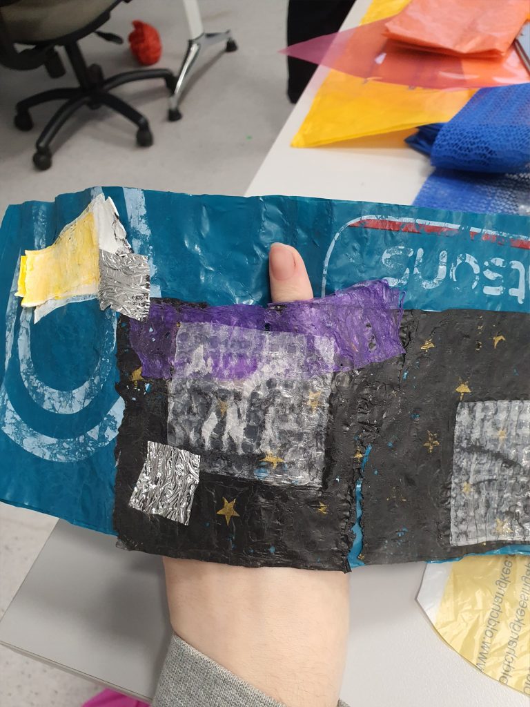
Hence I went about thinking about making a Zine that reflects this confusion that I felt for Telok Ayer, and an idea that revolved around the temple narrative. Ultimately the temple narrative got rejected, because i felt that it might be too in literal.

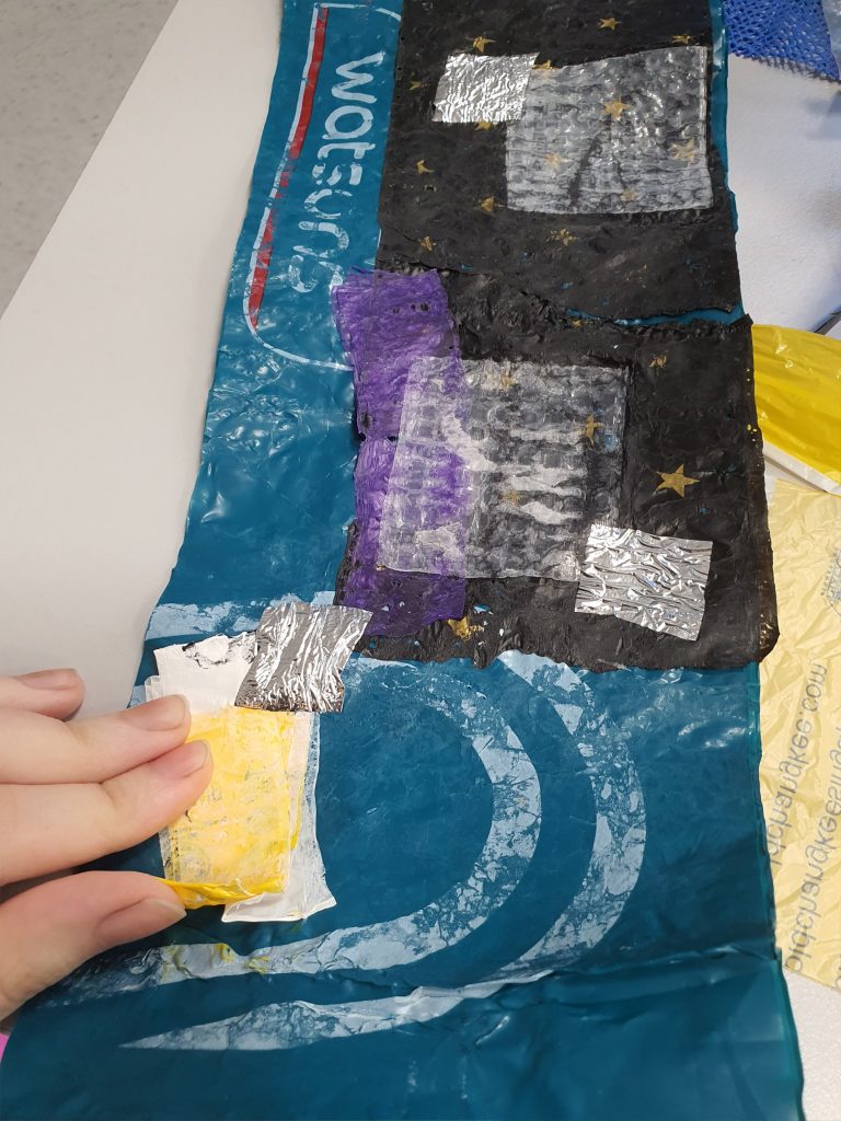
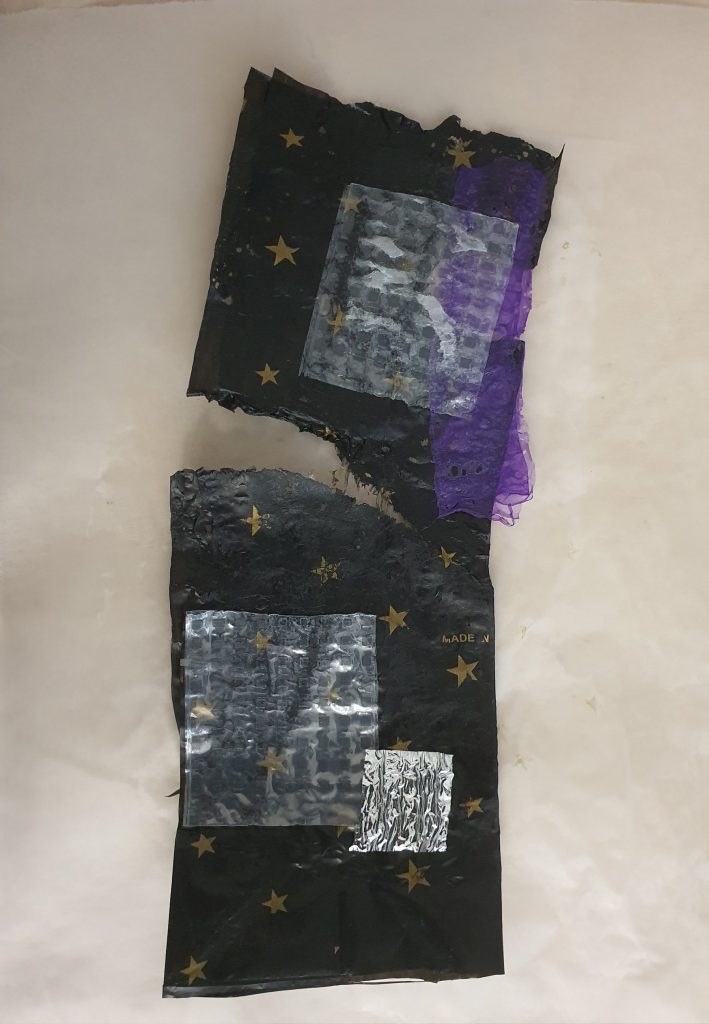
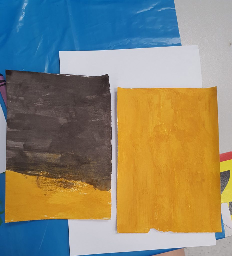
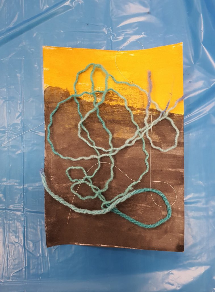
I still wanted to insert the intricate designs of the temples and shop houses, but to keep the graphic element of the illustration, I decided to minimalise the style into flat planes with a single coloured shading.

I made a list of what elements I wanted in the art work:

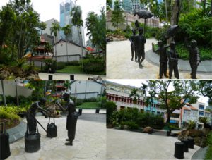
  • Telok Ayer Green, the randomly inserted park, with statues of fisherman of the past. It feels like a tourism spot, but a tourism spot to chance upon? it is honestly not very well known place. I asked my friends if they knew where Telok Ayer is, only one response came back positive, and he said he went there to drink.
  • Ann Siang Hill, actually placed at the corner of Amoy Street, it feels a bit colonial walking up the hill. It felt out of place when you think of this unchanging place called Telok Ayer
  • The surrounding Temples how they are still being preserved
  • Fuk Tak Chi Temple which became a museum or door front for Amoy Street Hotel, coexistence of old and new.
  •  The food revolves mostly around bars and restaurants for internationl food. It rarely reflects the traditional food that Telok Ayer had in the past.
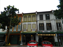
  • The shop houses which are so iconic to Telok Ayer, we see almost everywhere else like in Chinatown, Little India, etc. They were also modernised and upgraded with aircon vents and elecrical boxes, which makes for quite an interesting sight.
  • There is a mosque, Al Abrar Mosque, which I felt was very isolated. I went there close to chinese new year, hence the temples were bustling with people, compared to that the mosque was quite and quite isolated. I wanted to go in but did not. It did not feel right of me to enter. i want to illustrate that sort of quiet, isolated feeling.
  • There was also a heritage center there that was closed, i like the aesthetic of it though. It was a very interesting contrast in comparison to the temples.

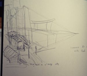
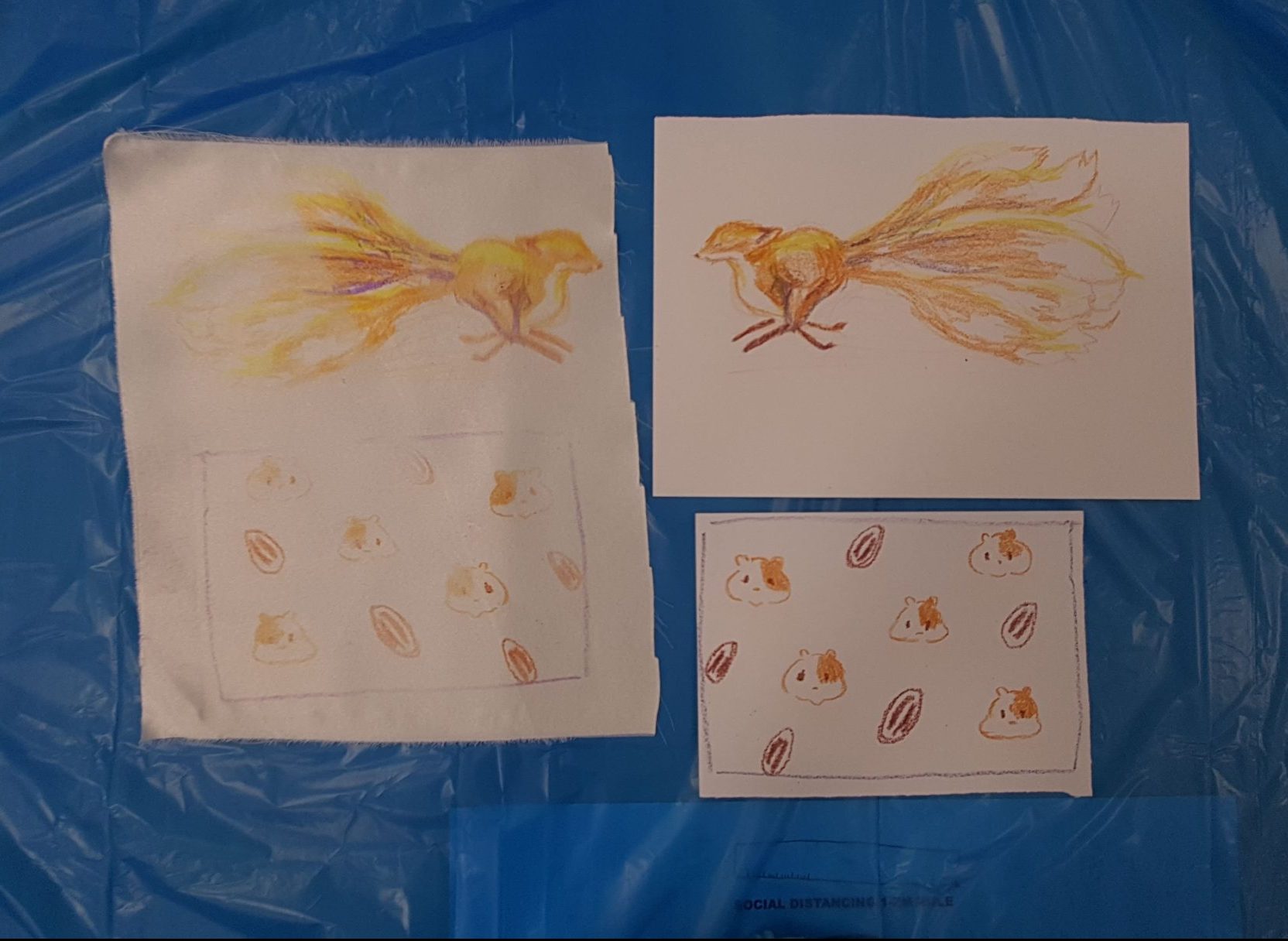
I began to sketch what I felt represented these aspects of Telok Ayer digitally.

I managed to get a really good shot of the pagoda that I felt reflects how Telok Ayer is. Its buildings rarely change, as it is being preserved for the culture aspect, but its surroundings does. hence i created this sort of digital aesthetic to the skyscrapers, which look as though it has been edited into old ‘Telok Ayer’.

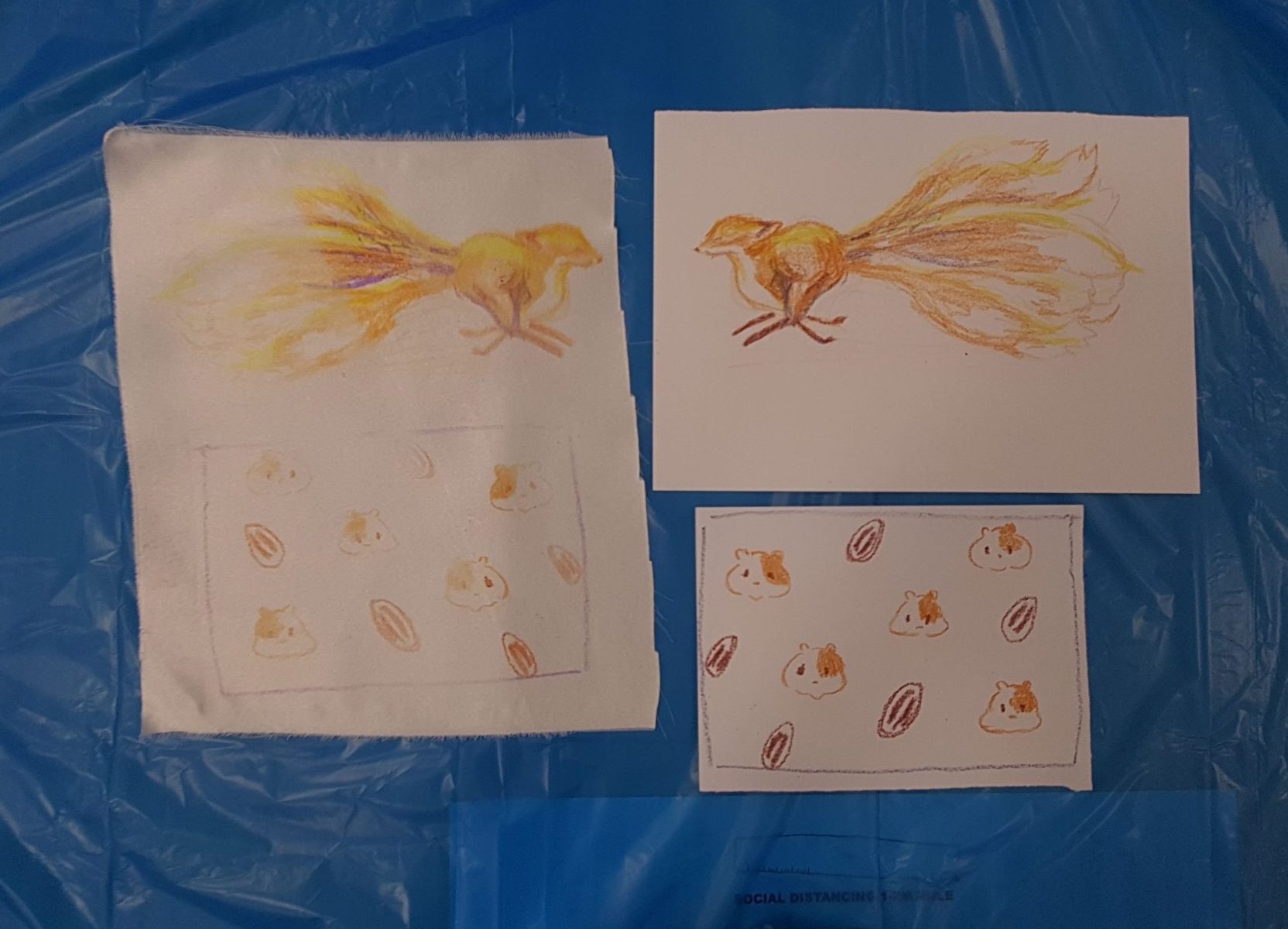
I also wanted to illustrate the food in Telok Ayer.

I had realised, walking down the streets of Telok Ayer is that most eateries there are either Cafes, Bars or restaurants that cater Korean food, Thai Food, International food, basically it no longer reflects ‘traditional Singapore’.

Image result for mc escher tessellations

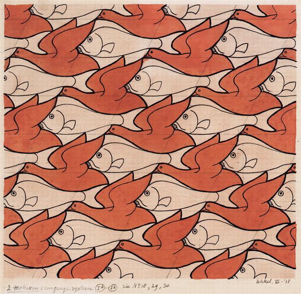
(Source is taken from: https://www.wikiart.org/en/m-c-escher/bird-fish)

I wanted to create a sort of food patter which encompasses the variety of the street, like what M.C Escher does with his textiles as seen above. I wanted this sort of overwhelmingly compact illustration.

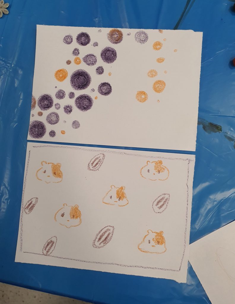
However, it was ultimately ruled out due to the difference in style. So I went with a more food wallpaper style, with cute illustrations of food on it.


Image result for food wallpaper

(Source taken from: https://www.pinterest.com/pin/540572761507280597/)

However, it did not tie with the cover image as well. So I made a compromise.

Following the previous image, I had the ‘newer’ products drawn with lines, as though it were digitally add into the environment. That way there is this somewhat cohesiveness to the art style. Meanwhile the ‘traditional treats’ or food items that were used in the past but maybe not in that way are coloured in, showing that they had existed already.

Related image

(Source taken from:  https://commons.wikimedia.org/wiki/File:Ann_Siang_Hill_Park_2,_Dec_05.JPG)

I also had the chance to wander around the streets nearby, and I was quite amazed by how the image of a place can change so easily from one street to another. Walking about Ann Siang hill was like walking in a colonial inspired park like Fort Canning, which would not have been place here till recently, seeing as Telok Ayer was more a Chinese settlement in the past, or a place for docking. Thus i wanted to show how the place seemed to new aesthetic wise, among the traditional shop house structures.

Following the similar aesthetic of the previous images I came up with this.

Subsequently, I started looking at Telok Ayer green which is like a self insert modern park in a small part of history. Though it was more of an attempt of tourist attraction with all these statues of the Chinese migrants of that time.

From there I created two illustrations:


I attempted to stay close to the geometric lines as a connecting theme in my work, but i felt maybe i did not do too good of a job at that.

Subsequently, i moved onto the shop houses, wanting to illustrate them in an ‘upgraded’ manner, with the glass windows and air con vents.

Finally came the temple, where we see even less of the geometric lines.

I think this image was the most interesting to work with, despite having one of the least cohesiveness to its image. I liked the interesting cropping, and so did many of my classmates when they gave me feedback.

Overall, I think I could have done better aesthetic wise if I had more time, because right now, the illustrations look as though they had more potential to be even more cohesive.

Image Making Through Process

For the next few days I went about illustrating my job in font. I didnt like the idea of scrolling through free font sites looking for a base font to build on my illustration.

The Sketches

This sketch was for an initial idea of the Chemist, however I realised that i too many options of which I was more interested to pursue, hence dropped the idea in its early stages of developement.

These were the basic sketches that eventually become the base for the pattissier illustration. I had a hard time deciding whether I wanted to portray the finished product (all the cakes) or the process of making a cake, so I did a short study of both.

These were the sketches that I had done up for the idea of the magician/circus performer. I wanted it to be very narrative with alot of things going on. However there were several factors that would lead me to change that idea eventuall. Thus the early stages of development had resulted in less defined alphabet sketches, but more details into how an actual object can look like an Alphabet. (Also without colour it is quite hard to differentiate the alphabet from the background).

This was the last of my sketches, but not the last of my exploration. I was really enthusiastic about this job prospect as there was a lot of things that i could play with to create my name. Different toys and tools, and I event had time to play with the prospect of creating my full name.

Playing with digital media

So I took to illustrating the Pattissier first, since i had a rather clear idea of what aesthetic I wanted to achieve from it.

I used Illusrator as I wanted a flat, pop art style that makes it ‘cute’. I did illustrate the two different ways that I mentioned above, one being with all the cakes all lined up as my name, and the other being the one where I illustrate a cake and the process of making the cake.

I went with the finished cakes, as it was more adorable, and it illustrated the idea of pattissier alright (my friends could tell what job it was, so it means I got my meaning across just fine).

I had a bit of trouble when creating the cakes, because it is not very easy to recreate texture on a vector system.

Image result for tart

(Source taken from: https://www.thespruce.com/fruit-tart-with-pastry-cream-filling-995161)

Image result for cake

(Source taken from: https://celebdear.com/product/velvet-chocolate-cake/)

There is only so much detail you can put in on a tiny illustration and there is way too many things I want to put on my cakes like the shine on the fruit, and the crispness of the tart.

Subsequently I illustrated the Toymaker idea in the form of ‘Doll maker’ again on Illustrator. I felt that by doing so I could kind of merge the idea of fashion designer and doll maker into one, seeing as both may end up doing this similar process (One making the doll the product and the other the doll as a mock up for their actual dress).

It is set in the workshop, as I felt that by showing the process i can have a variety of things go into the illustration, not just the idea of ‘collecting’ toys.

I did this with the similar style as the first. However, I had feed back to try and do something different, so I tried to branch out for the third piece.

The third piece has a mix of Photoshop and Illustrator. I wanted a museum curator because i like the idea of arranging collections as an aesthetic. So i created the halls of the museum in Illustrator before realising that if I was going to photo collage this, Photoshop would be more effective.

It got a bit messy after that as I started to piece images together.

There is a lot of things I can improve on for the composition, but I did not have the time to do it. However I think its mostly due to the perspective of with I based the entire illustration in.

I did the last one entirely in Photoshop, trying to branch away from over relying on the style of illustrating.

I had an initial idea of having it in a similar aesthetic as the first two but I was dissuaded from continuing down that line, so it remained like that.

So this illustration was supposed to be about being a magician or a circus performer. I was searching under ‘magician aesthetics’ for this, and ‘circus aesthetics’ when I came across a circus poster, and went with that as the main aesthetic for this final illustration.

Image result for circus posters

(Source taken from: https://www.etsy.com/listing/87011761/vintage-circus-poster-circus-procession)

Image result for circus posters

(source taken from: http://www.elcheapoposters.com/ringling-bros-barnum-amp-bailey-circus-poster-6-circus010.html)

I really liked the animal ones, and also it was easier to find pictures that would reflect the style of these posters.