First I roughly sketched out a few ideas I had in mind in my sketchbook.
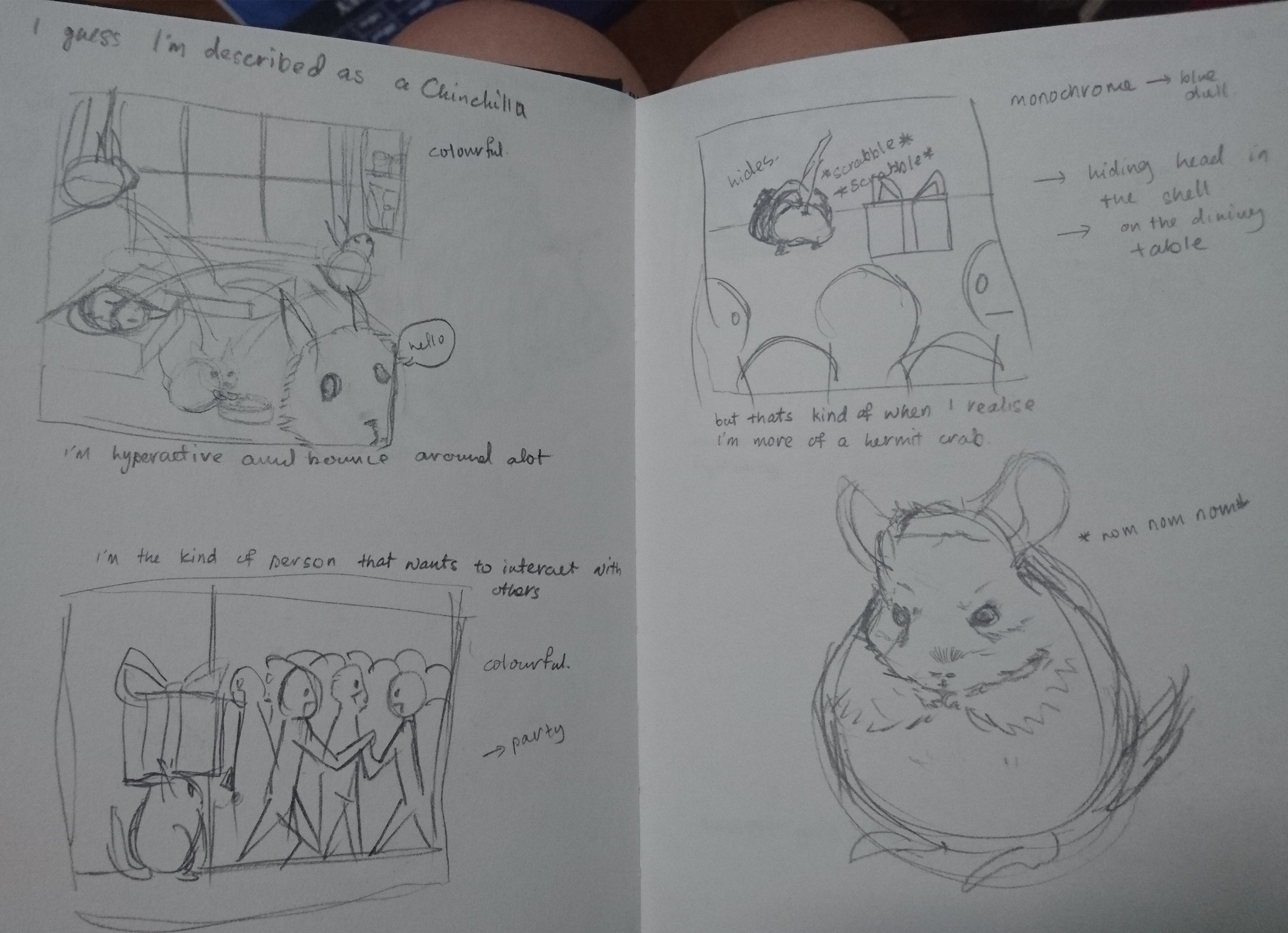
(First Box: I guessed I am described as a Chinchilla, I am hyperactive and bounce around a lot.
Second Box: I’m kind of the person that wants to interact with others.
Third Box: But that is kind of when I realize that I’m more of a hermit crab.)
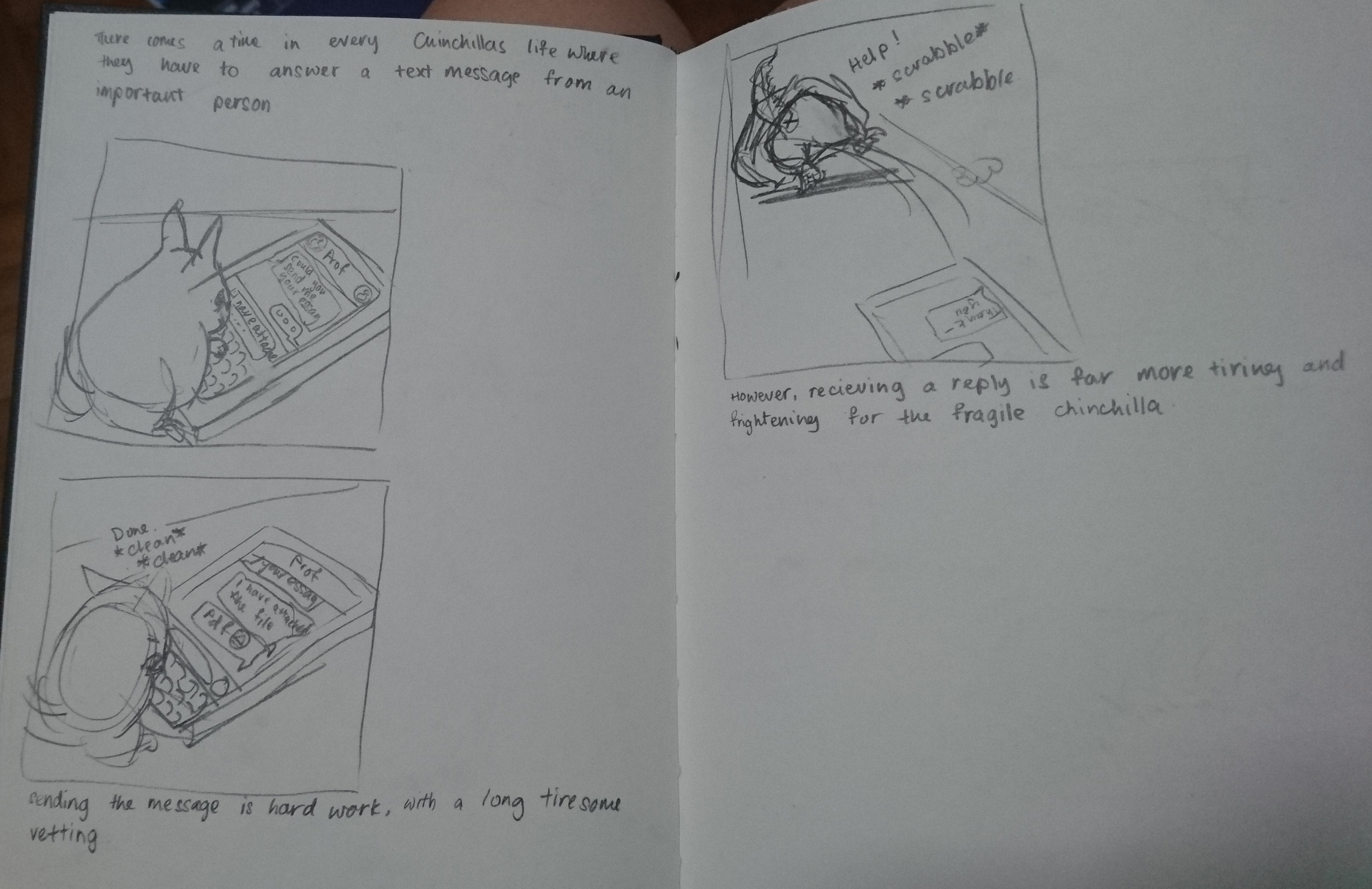
(First Box: There comes a time in every Chinchillas life where they have to answer a text message from an important person.
Second Box: Sending the message is hard work, with a long tiresome vetting process.
Third box: However, receiving the message is far more tiring and frightening for the fragile Chinchilla.)
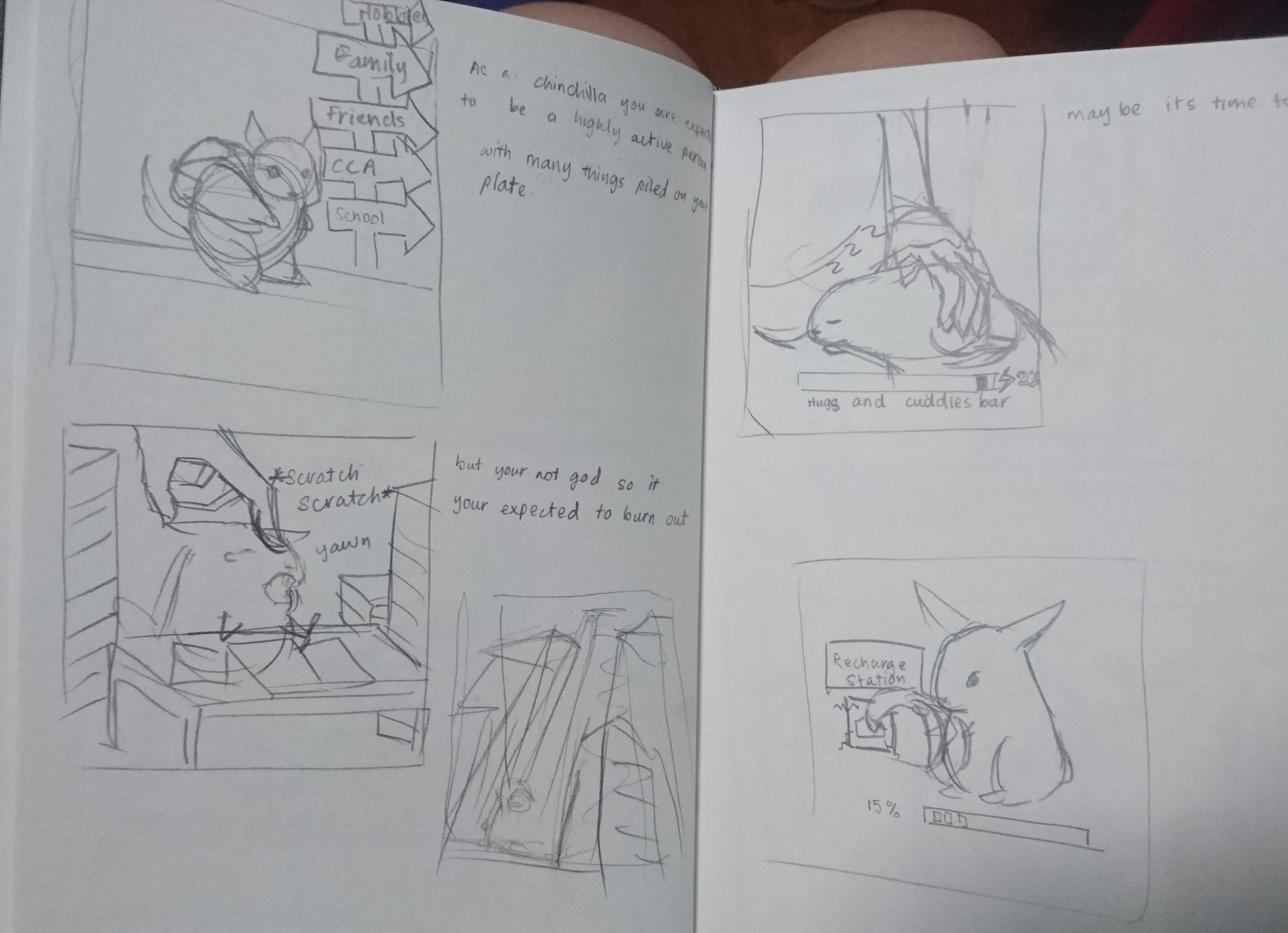
(First Box: As a Chinchilla you are expected to be a highly active person with many things pile on your plate.
Second Box: But you are not God so it is expected that you would burn out.
2.5 box is the edited image of the scenario supposed to be seen in the second Box.
Third Box: Maybe its time to recharge.
Fourth box is the edited version of the third Box.)
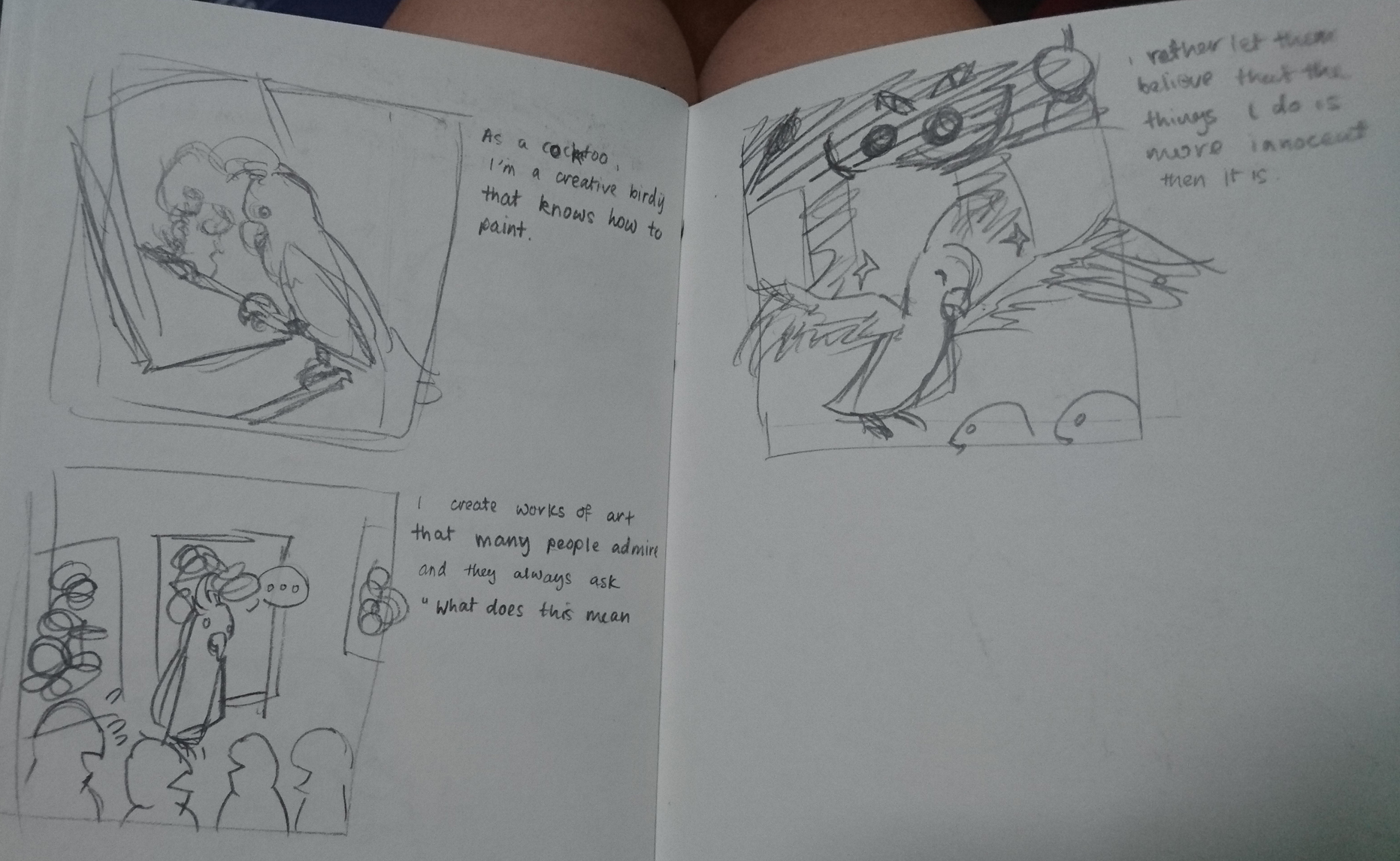
(First Box: As a Cockatoo, I’m a creative birdie that knows how to paint.
Second Box: I create works of art that many people admire and they always ask, “What do they mean?”
Third Box: I rather them believe that the things I do is more innocent than it is.)
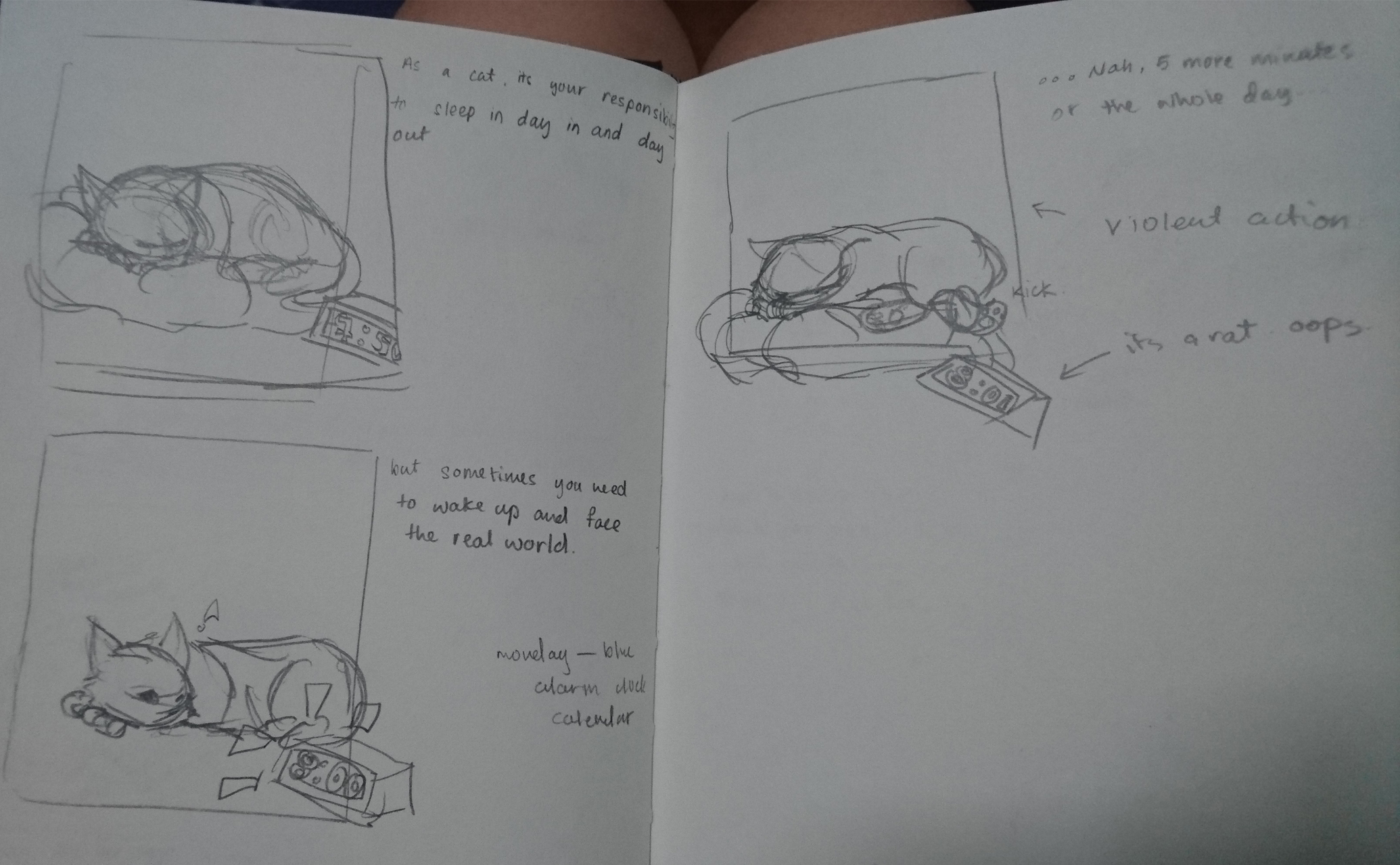
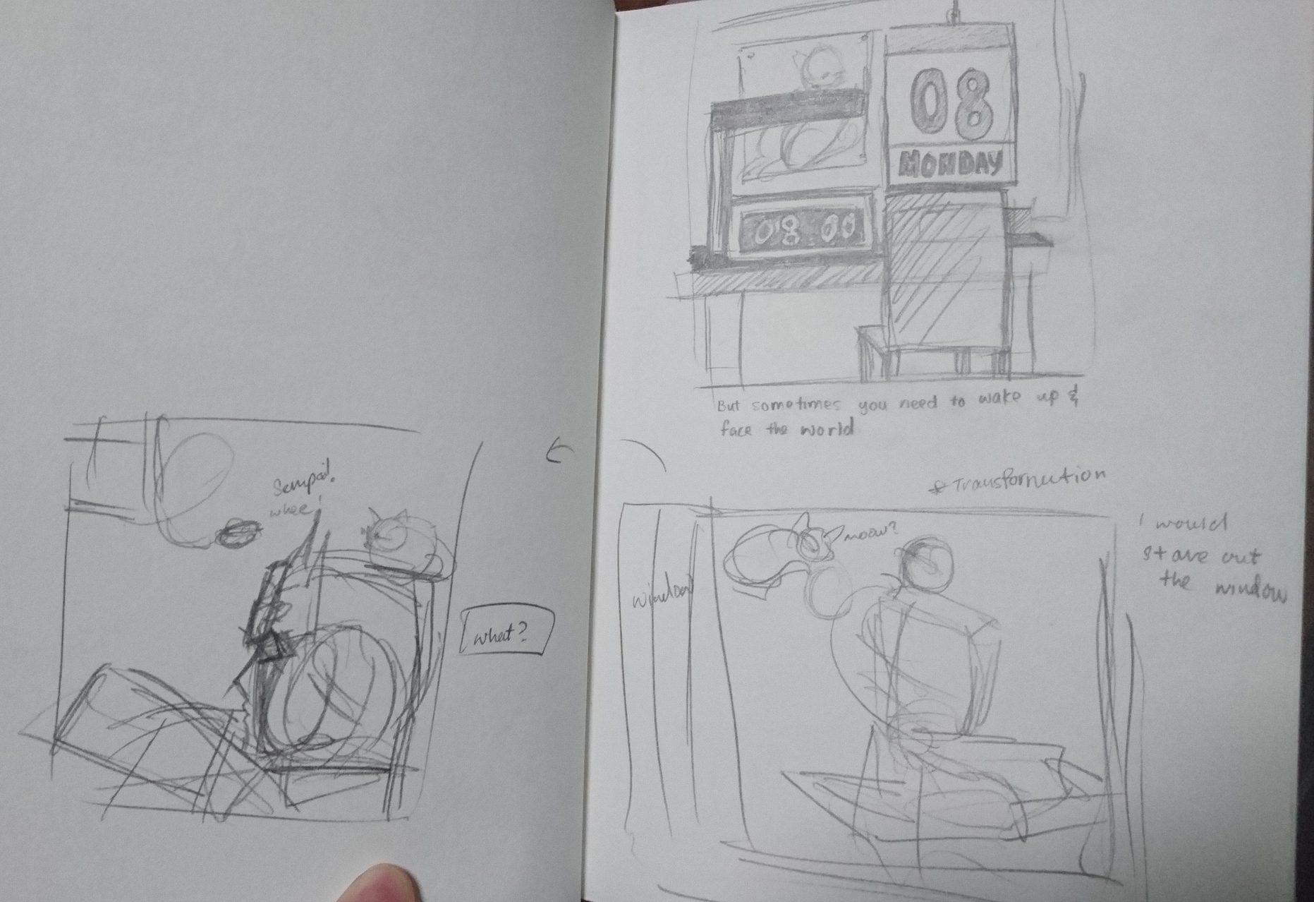
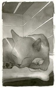
(First box: As a cat it is your responsibility to sleep in day in and day out.
Second Box: But sometimes you need to wake up and face the real world.
Third Box: …Nah, maybe in five minutes, or a day…)
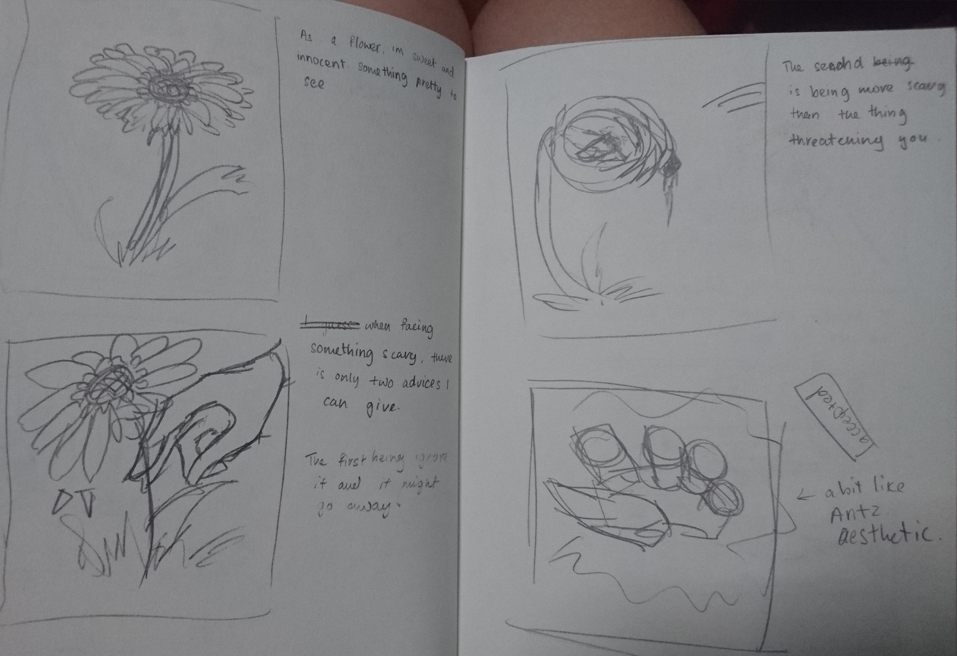
(First Box: As a flower I am sweet and innocent, something pretty to see.
Second Box: When facing something scary, there is only two things I can advice you do. The first being ignore it and maybe it will go away.
Third Box: The second is to become more scary than the thing threatening you.
Fourth Box is an edit on the perspective of Box 2.)
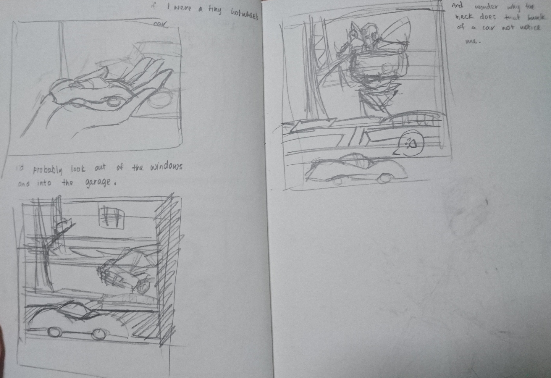
(First Box: If I were a tiny Hot Wheels Car.
Second Box: I would stare out my window.
Third Box: And wonder why that hunk of a car does not notice me?)
(Here are the edits for the Hot Wheels panel and the cat panel)
The story line for them were fine, but the perspective that I put them in, in the various scenarios were not too well done, so i sketched out and edited a few panels.
In the end I picked these four.
I went online to see what styles I wanted to portray them in.
I kind of already had an ink and wash idea in my head, sort of illustrative style that is more realistic.
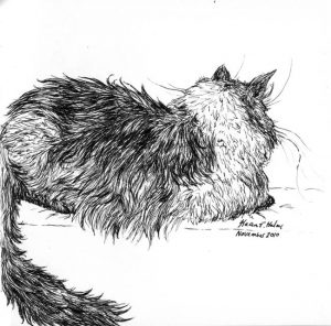
(the above is the works of Kelly Murphy and Karen Haley respectively, I hoped to use this for the Chinchilla and the Cat illustration.)
Subsequently I wanted a sort of comic book style for my fourth panel as it references the transformers comics, but instead I went a semi-realistic, less graphical rendering.
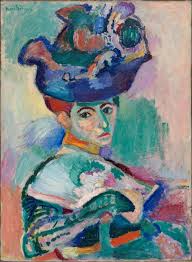

I was referencing Henri Matisse (the first picture) more than Helena Wierzbicki (The second picture) as her work was a bit too colourful.
I like the colours patchy, it suited me more then the smooth blended techniques, and in this case it gives it a bit more edgy feeling to it, a bit more action-like.
The Last style i was referencing was the movie Antz (1998). It had this scene where the ants interacted with humans, and I remembered how foreign looking the humans were to the ants. I wanted to imitate that sort of imagery.
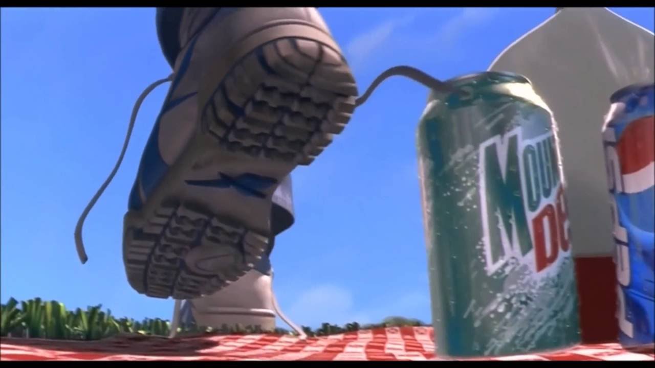
The sort of picture like quality where the humans come from the sky and the plants are down to earth.
So for the first two panels I went ahead and started to ink and wash my illustrations. They came out rather desaturated, so i scanned them in and upped the saturation and contrast.
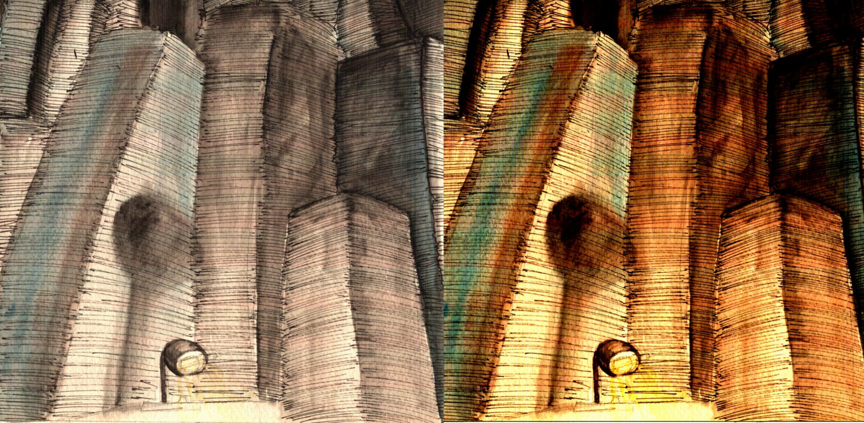
Some edits were a bit more drastic then others, like changing the cool tones to warm, but I felt that the composition would have looked better in the warm tones then the cooler ones.
Next I went to photograph some flowers at Gardens by the Bay. I needed two flowers one opened and one a closed bud, yet they both have to have the same amount of mass to seem as though the flower was chomping down on it. I finally managed to find two flowers with similar backgrounds and masses to make it seem that they are the same.
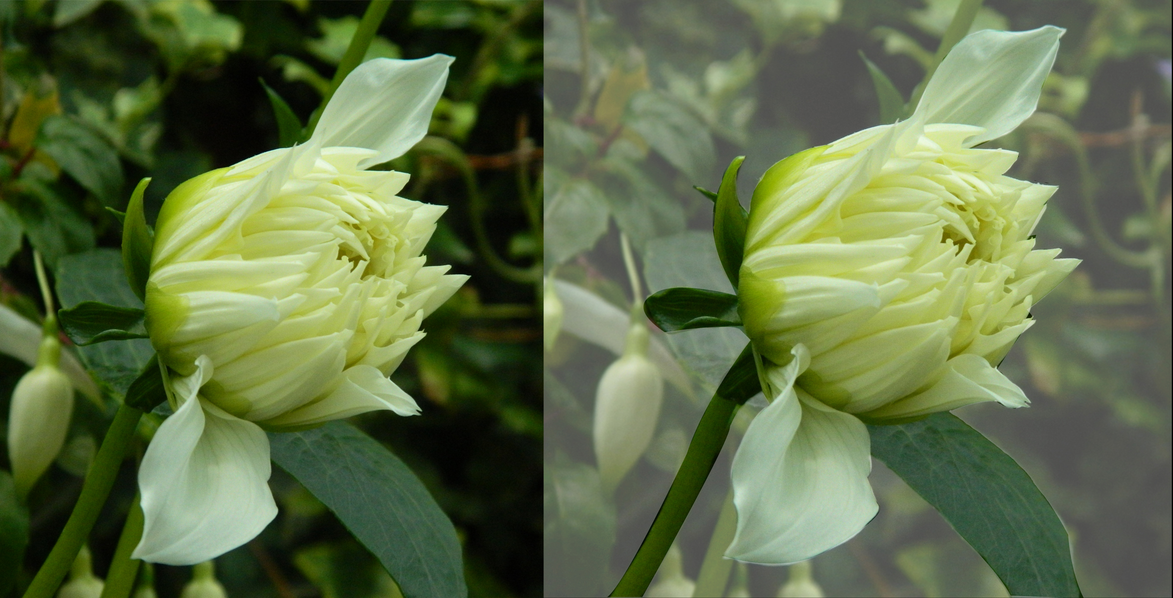
Then I edited it to make a foggy back ground and some other ‘special effects’.
Lastly I drew the Hot Wheels toy car on Photoshop.
Hence resulting in this final.
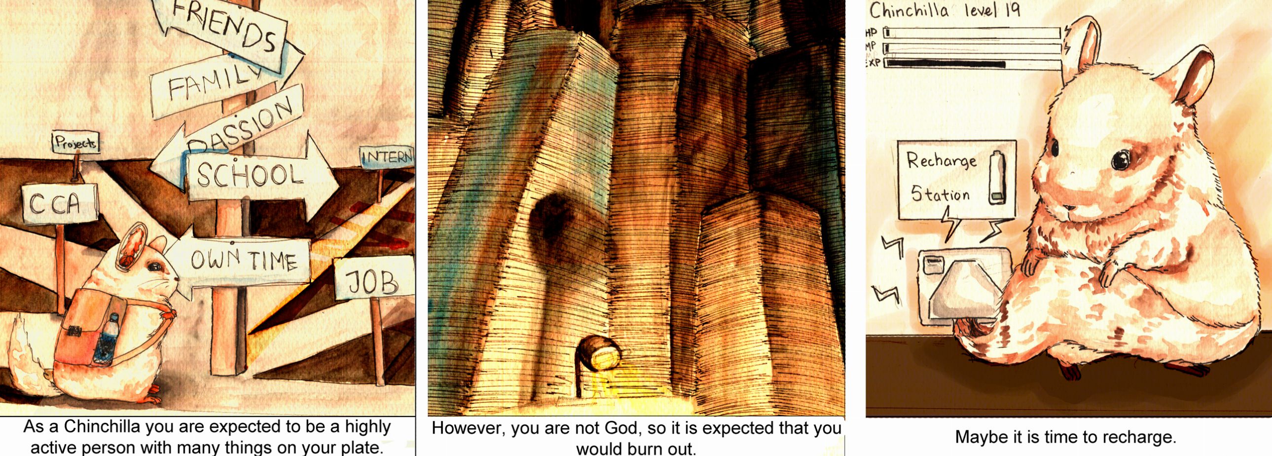
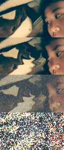
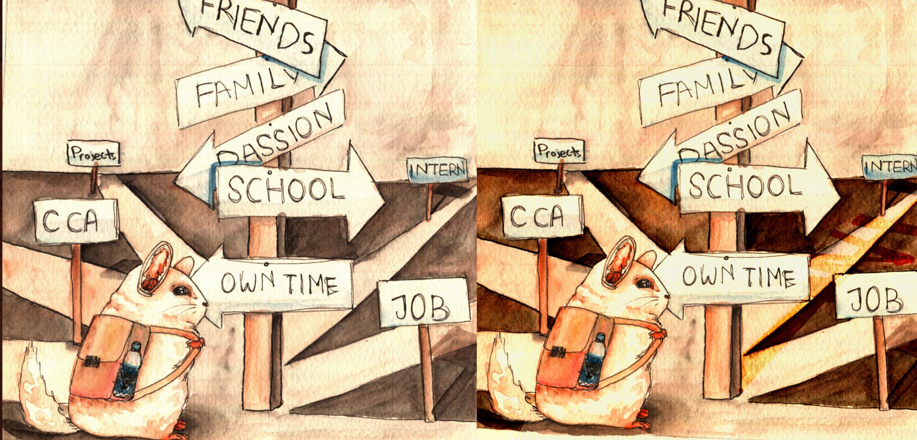
The Chinchilla and the crossroads reflects my everyday mentality of prioritizing what has to be done, something that is relatable to many. The panel was originally a mix of complimentary colours orange, browns and blues. However, it became slightly more monochromatic as I felt it gave the composition a bit more tension, and it is draining/gives the feelings of dread and frustration when looking at it, which was what was supposed to be conveyed.
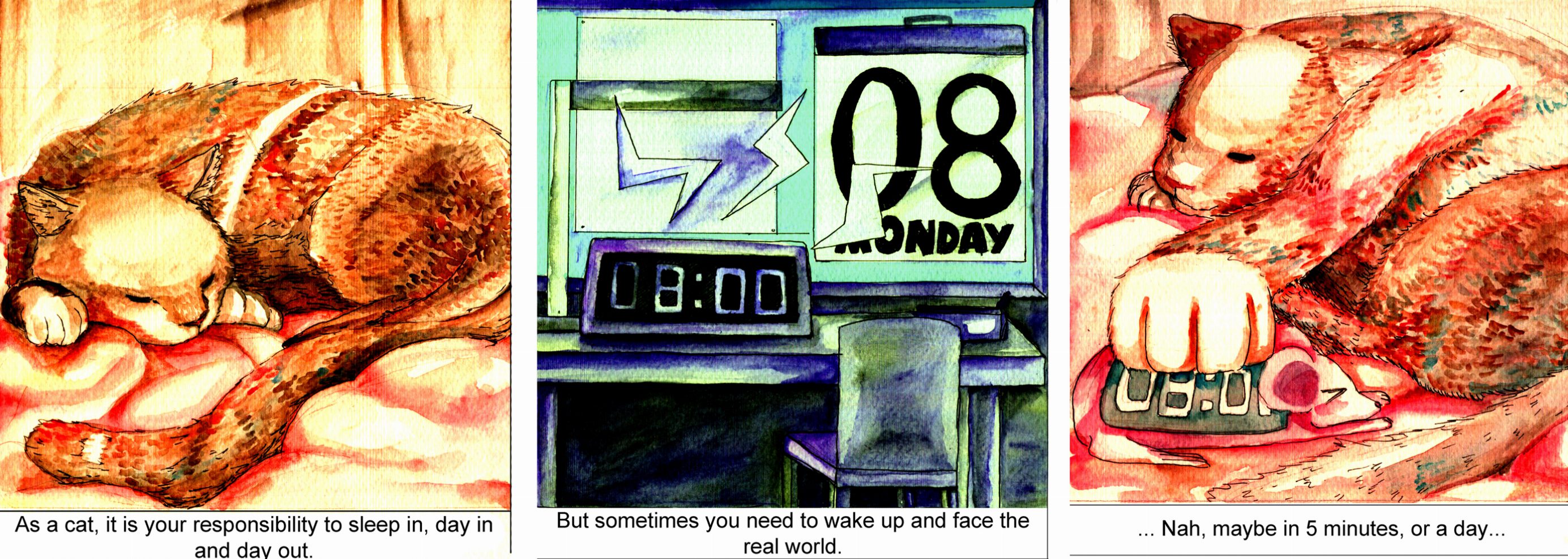
The cat represents this idea of laziness/love for sleep that I have. This panel was done in a monochromatic scale intentionally, to show a sort of simplicity in the nature of sleep. The first and last box were done in warm and bright colours, to create a more positive mood, associated with the desire for sleep. The second box is blue, like Monday blues.
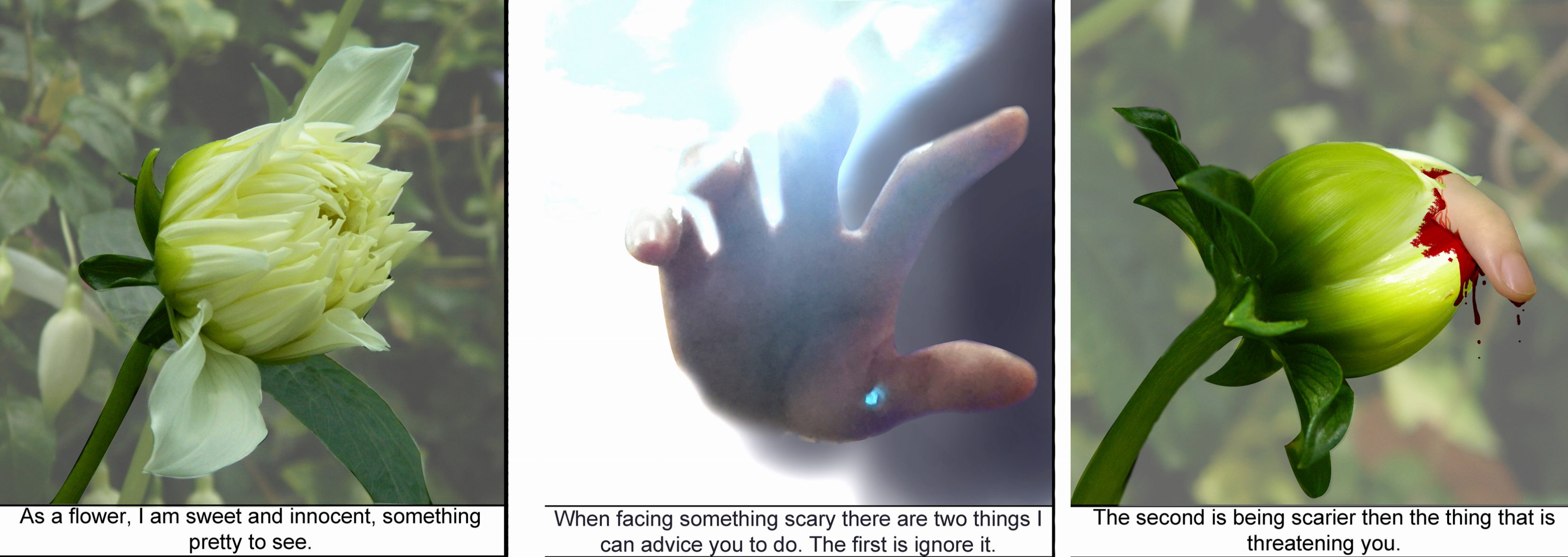
The idea of the flower, kind of represents this ‘weirdness’ that kind of reflects what I am. I was told in Junior College that my humor is dark and hits when everyone least expects it. The panels are three photos that I took and digitally manipulated. I blurred out the backgrounds for the first and last picture, in attempts to make it look the same (Honestly, they were both green, so it did not make much difference after the blurring). Subsequently I added in a picture of my finger and dabbed on some ‘blood’ onto the flower petals (I’m glad this part turned out realistic, if not it would have clashed with the photo). This two were largely make use of the colour green, which brings me to my second panel which uses more blues and pink. The change in colour, gives the second image a sort of ‘foreign’ feel, hence making the human an intruding presence.

This last idea about the Hot Wheels car is a metaphor for my idealistic personality. The way I aim high, but it is out of my league/out of my reach (simply because it does not exist), and sometimes a bit more fantastical. Hence, I wanted to use colours that are a bit more dream-like and unnatural, hence the pastel palette.