The lapse project is a collection of five projects, all revolving around the theme of lapses in time, in memory and in realities. Whilst not being able to physically be in the preence of these art works, reading up on it I was able gather an impression of it.
The projects:
VR Lapse
Particle Lapse
24 hour Lapse
Panorama Lapse
Journal Lapse
Within the projects the last two, Panorama Lapse and Journal Lapse are not interactive, hence I will not be discussing them.
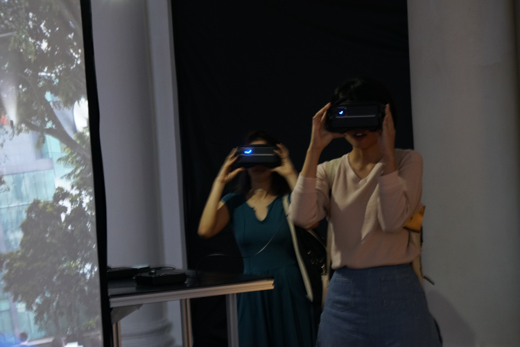
VR Lapse is a virtual reality simulation, bringing the audience to Singapore’s oldest colonial building, only to find out it is digitally erased.
Does Out of Sight, Out of Mind in Singapore leads to Nevermind?
Quoted from popspoken.com, during their interview with inter-mission shares the artists concern with how significant Art related artefacts in Singapore are slowly being washed away with the ever changing landscape.
With that message in mind, I wonder if the project works on someone with no context of the place at all. It is true that these are cultural landmarks, however I am left drawing a blank when someone tells me ‘Art House’. They were trying to trigger this idea of misplacement, the ‘I am pretty sure there is something missing here’ sort of thought, but if there was no recollection of the place in the first place, can this idea still be drawn out? Does that hinder the experience of the work.
Subsequently since we are discussing the idea of interactivity of a work, I feel that the interactivity level is quite low. Being placed on empty, unchanging landscape, with nothing to influence, is passive like watching a movie or a slide show.
The second project adds to the atmosphere of the first. Particle Lapse is more interactive in a sense that it is using the movement of the viewer and creating a feedback sound/atmosphere for the audience who is traversing the virtual world, giving them the extra dimension of sound that is meant to confuse the audience. In this case there is a contributive element that the audience plays in the artwork.
Finally there is 24 Hour Lapse which is an installation where visitors from the past 24 hours are projected alongside the present visitors on a CRT monitor. It is kind of interesting how they play with the idea of people from two differnt times sharing the same space, even if it is only a screen. However in terms of interactivity, it is again quite passive as the present visitors cannot influence the already pre-recorded video.
Overall the Lapse project is not a very interactive project. It works more as a stage which is the artists mind, and the audience is the audience, not the participants on the stage. As such we only view their feelings and experience for the idea of lapse in memory, which is not always universal hence abit hard to relate to.
‘Rain Room’ by Random International featured in the Museum of Modern Art, New York in 2013. It makes use of a 100 square meter room full of falling water simulating rain, and 3D tracking cameras to capture the motion of the visitors passing through the room. By doing so would stop the ‘rain’ fall above that peticular area and create a pathway for them to cross.
The work replicates the sound and the smell of the rain, creating a sort of white noise that encompasses you along with the rain. It sort of reflects this relationship between human and nature, which is subsequently getting regulated with technology. How contrary it is that people would stand and simply contemplate in this artifical downpour vs fleeing the actual downpour.
What I find particularly interesting about this project is the artist statement of creating this room. They said that they had created the room with no preconceived idea of what kind of reaction they would draw from the audience experiencing their work. In a sense that unredictability of reaction itself becomes part of the artwork.
“DON’T RUN!” exclaimed a Museum of Modern Art press rep, as a young woman who had entered the field of falling water in Rain Room, 2012, began to take flight and was promptly soaked.
As quoted from artforum.com’s review of the work, after a guest had out ran the motion sensors, temporarily glitching the system and got drenched from the work not stopping the rain for her. It is amazing how this ‘carefully chereographed downpour’ still had the ability to instill that same instincts humans have in the faces of an actual downpour in some, however bring out a contemplative peace in others.
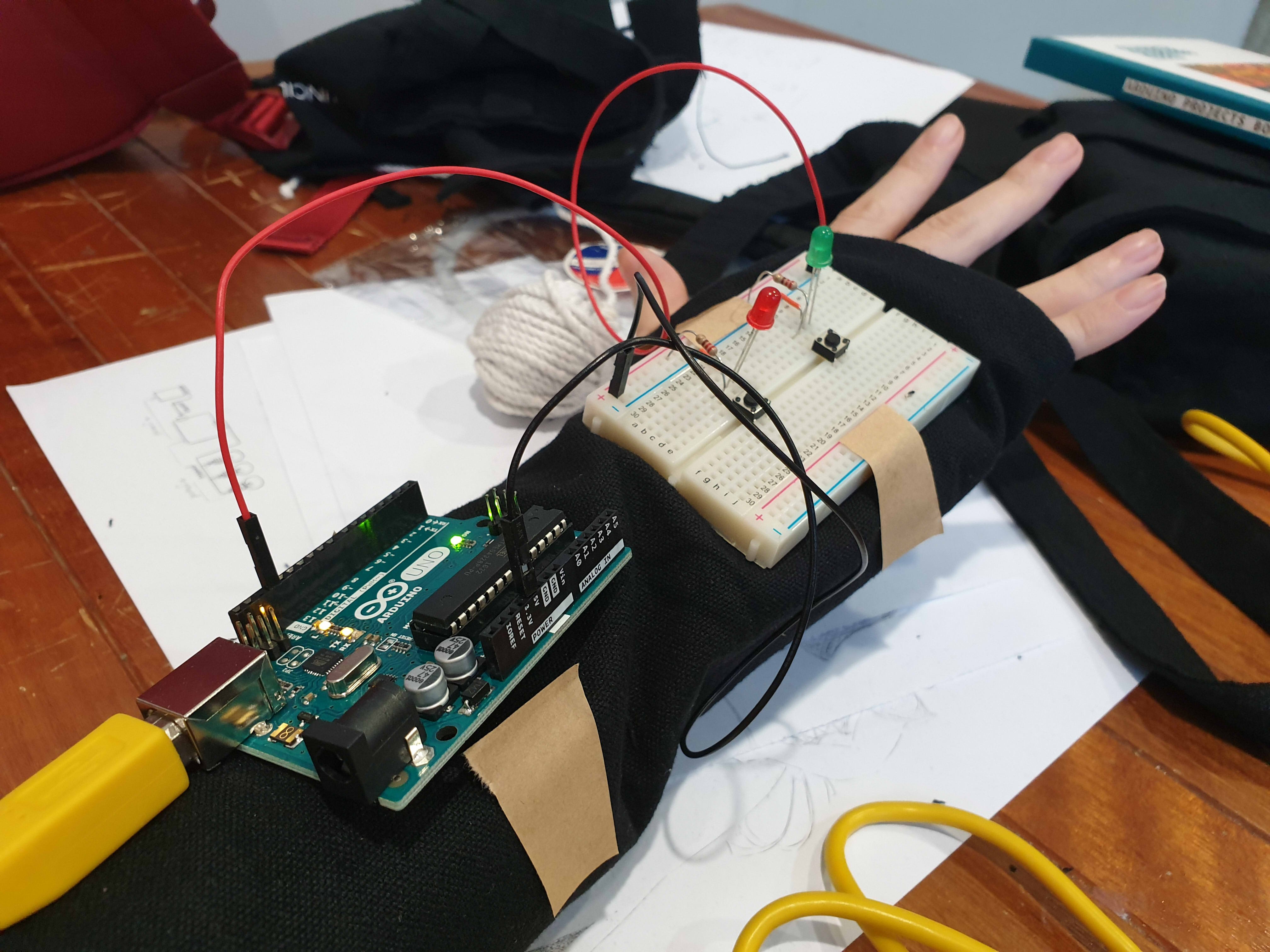
This project revolves around the idea of the gaps between noise/sound, hence we created a portable device that will sample the overall surrounding sound and in response would light an LED in a corresponding colour. The colour is based on a calculation where ‘red’ is volume , ‘green’ is pitch (regardless of octave) and ‘blue’ is pitch (exact octave). Red and Blue were scaled to fit a range of 0 to 255, however, for the Green there were 5 ranges created, skewed accordingly so that the range for a humanly possible pitch is larger then a not humanly possible pitch. The code makes use of an array to store data in each pixel, until all nine pixels have been used up, then the information would be overwritten for the following pixel.
References for the code:
Origin of basic-ass code (which is no longer here): https://www.teachmemicro.com/arduino-microphone/
Origin of getAmplitude code: https://learn.adafruit.com/adafruit-microphone-amplifier-breakout/measuring-sound-levels
Origin of getFrequensea code: https://www.norwegiancreations.com/2017/08/what-is-fft-and-how-can-you-implement-it-on-an-arduino/
Origin of NeoPixel code: https://learn.adafruit.com/adafruit-neopixel-uberguide/arduino-library-use
Our work takes reference to works like ‘Pulse Index’ by Rafael Lozano. It is similar in the sense that it takes record of the viewers in put, in their case the thumbprints, in our case sound, and record it on a visual plane to show the changes overtime.
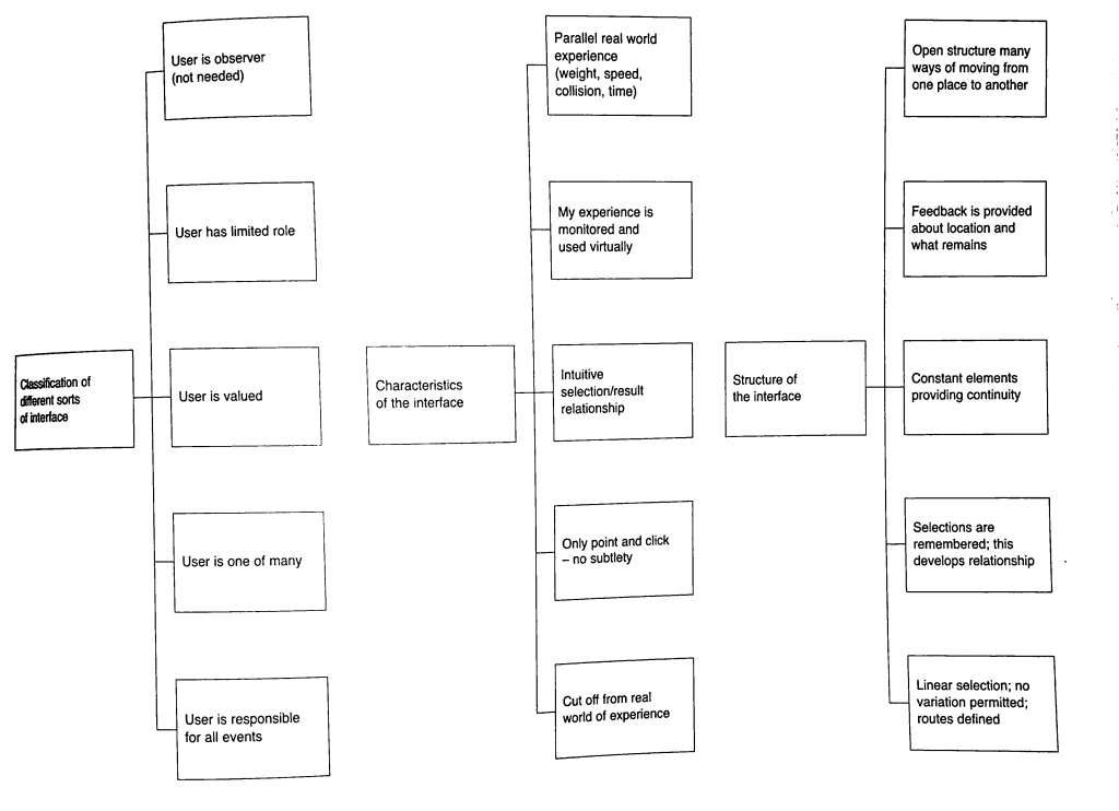
Characteristics of Interface:
Classification of interface:
Our project falls under ‘User is one of Many’ and ‘User is valued’. Our project values the unity of the environmental sound and how your sound is captured in this collective and you cant discern what is your sound and what is the environment, hence the user is one of many part. However, the user is valued is also present in a way that they are the anomaly that created the most change when they interact with it directly.
Characteristics of interface:
Our project falls under ‘Monitered and reflected experience’ as well as ‘Intuitive selection/results relationship’. For the former, the device is to collect the environmental sound and show a colour represnetation, hence all interatctions are copied and shown directly based on the sounds that you make. The latter is true as when you see the light changing to sound, the viewers will automatically try to interact with it to see the extent that it will change to, hence creating the result of trying to find the gaps between the sounds you make when you see the different coloured representations of each instance of sounds made.
Structure of Interface:
Based on the flow chart, our Project complies to everything except the last one ‘Linear Selection’. The first idea of open structure is seen in the way we made our device portable. The second idea of ‘Feedback provided’ is done so in the form of LED lights lit in accordance to the sound of the environment/people within the environment interacting with it. The third idea is ‘Constant elements providing continuity’, since the set up is designed to reflect the sound at every (how many seconds). Finally selections are recorded in nine LED pixels, showing 8 seconds of the recently past environmental sounds.
(Liz finally answered the question yay)
Who did what:
The coding for this project was done by En Cui and the physical fabrication of the device was put together by me (Elizabeth) (but you know in the end Liz kind of screwed up alot of the soldering and stuff and needed En Cui and Lei’s help to put them together. Thank youuu)
Process:
From the initial stage of mannually making LEDs light up by pressing the buttons whenever someone made a sound we created a circuit where the LED would light up in a certain colour according to the environmental sound.
After that we used this circuit as a a reference and moved from a single RGB LED to a strip of LED wire. That way we could create a set up where the colour of a certain period of time could be recorded and compared to the pervious period of time.
yay the LED lights up.
Measuring the length of wire for the glove.
This is where problems started surfacing on the soldering part so there was a redo. (soldering wise and circuit wise sob)
Testing out the Circuit.
Yay it’s done.
After Review:
Everyone reacted to the work as we hoped they would despite only having two participants. They crowded and tried to put in their own input by making noises around the two. Though we have coments that the feedback is not fast enough to show the exact inflection of voice as one is speaking, hence not very obvious. We forgot to mention this during the review, but the delay is also constrained by technical limitations. If we reduce the delay, we will need more LEDs to represent the same amount of time, and the Arduino memory overloads at 13 LEDs. Additionally, even at delay(0), the Arduino still cannot function fast enough to get the desired result:
As a result of the delay, our theme in this work might not be very obvious to the viewers to pick up on as a result. The eventual solution may thus be to use something with more processing power.
There are comments on how they are working very hard to satisfy the device as well. Some say that it seemed like a prop for band or choir performances, or a tool for training how to get the exact pitch.
Summary Reflection:
EC needs to actually know when it’s not possible than maybe possible.
Liz should not be so innovative. Liz is just not good with technology.
We should have thought out the final form better.
Extended Concluding thoughts (if you want to read about our woes):
En Cui’s Reflection:
Concept-wise, the challenge was that the core concept and form were not well-aligned. While we talked out several issues, there’s still the challenge of the interstice being unclear. But I think, in the end, the clarity of the message depends on how you interact with the wearable. For example, the distinction is much clearer if you experience the wearable in multiple contexts, than just one.
Regarding the code and circuit, it was actually mostly okay. While things didn’t always work, the only solution needed was to observe the problem, deduce what could be possible reasons for its occurrence, then test out my hypotheses one by one. Examples include mathematical errors and faulty wiring. I also did soldering part 2 for the microphone, and honestly the solution was just learning to recognise patterns of problems and solutions based on past mistakes, such as the solder not sticking to the iron (wiping more), or getting fingers burnt (plasters).
I also realise after a full day of reflection that I’m just incompetent at doing group work efficiently. Leaving me in charge is a generally bad idea.
Elizabeth’s Reflection:
For the most bit I felt very challenged by the project, especially since it is the first time we were using and putting together components to make a circuit. for the physical fabrication portion it was the first time I used a solder, and my circuit looked very ugly after that, and I dont really think I improved in that aspect very much even after multiple attempts 🙁 When using the Hot glue gun to insulate the exposed solder I think I made the circuit worse, because there was already a built up of solder.
Also, I did not solder the circuit down the right way apparently. You can only solder your wires to one side of the LED because they are fickle and like to have their electrical charge flowing in one direction. Also, do not solder and hot glue your circuit till you are 100% sure it works, saves you a lot of heartpain and time, (thank you Lei and En Cui for dealing with my screw ups D;).
I also made a few mistakes by piercing the LED strip’s digital pins on accident thinking I can sew it down that way. Thinking about it now, I should have known better then to try piercing any part of the components.
Speaking of computer, I feel very attacked by my own computer, since I think it has issues running the code we shared over google docs, and gave me a heart attack that I might have short circuited the only RGB LED in the starter pack, and still the circuit refused to light after I confirmed that I did not. I think there is something wrong with my computer DX. I either leave the testing for computer to En Cui or find a school computer for this (pick the right computer for this, not all computers have arduino).
If we had a bit more time and I had a bit more skill in soldering, we wish to have more LED lights to reflect the change in sound.
From last Week’s flow chart, En Cui and I worked on creating a mock up circuit which follows a segment of the flow chart.
Mock Up model 1
We started with a basic microphone set up.
From here we tested to see if we can get the input reading through the serial monitor of the surrounding sounds, and the changes when we spoke into the microphone.
Problems:
Serial Montitor showed that the input was either a ‘high’ at 1022/1023, or a ‘low’ 0.
Conclusion at this segment:
We thought our microphone was iffy
Nonetheless we continued, as the microphone was still able to detect sound we decided it will be good enough for now and we will solve this issue later.
Mock Up model 2
Subsequently, we added onto the first model to include the LED output.
From here the code was expanded to include a code to control an RBG LED and to read frequency and Volume of the surrounding environment. Initially, the code was done in random way where for every 3 digits that the frequency had the digit in the hundred place would be the percentage of red, tens the percentage of blue, and ones for green, that would make up the colour that the light bulb would create.
Watch Video at:
Problems:
The colour of the lightblub was coming out abit too randomly
So from there we attempted to group a range of frequencies and match them to a colour. Subsequently we made it such that the volume is matched to the brightness of the LED.
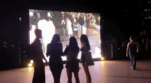
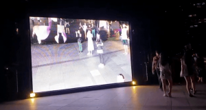
I managed to catch a few of the interactive works when I went for I Light. The first being ‘Facey Thing’ by Uji Studios which was a sort of satirical take on the selfie culture amongst the masses in this day and age.
Fig 1. Facey Thing by Uji Studios, 2019, I Light, Singapore.
pictures screenshot from video taken by: En Cui
When you first encounter it, ‘Facey Thing’ is a bright huge screen that is twice the height of an ordinary human.
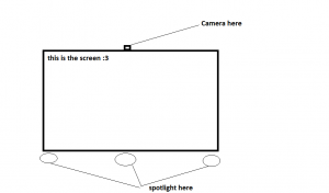
Diagram 1, mock up of Facey Thing
So the set up is simple, consisting of a screen which is hooked up to a single camera that captures the passerbys that are oving in front of the work. The code that runs this work is set to capture the faces of the people who are standing in front of it.
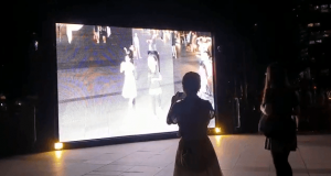
Fig 2. Facey Thing by Uji Studios, 2019, I Light, Singapore.
pictures screenshot from video taken by: En Cui
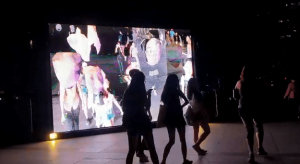
Fig 3. Facey Thing by Uji Studios, 2019, I Light, Singapore.
pictures screenshot from video taken by: En Cui
Whenyour face is recognised by the screen it is boxed up as seen in fig 2 above and would later evolve to fig 3. In Fig 3, the faces of the passerbys are blown up and dragged upward almost as though painting the canvas with their face. So in this case the images on the screen are temporarily changed by the people who interact with it, if not it is no more then an ordinary close circuit video recording. It warps the initial intention of Selfies to be one that portray one self as ‘glam’ to being very ‘unglam’ instead by warping the passerby’s faces.
Fig 4. Facey Thing by Uji Studios, 2019, I Light, Singapore.
pictures screenshot from video taken by: En Cui
The people that decided to interact it were waving their hands of moving about oddly to try and get their face recognised by the system.
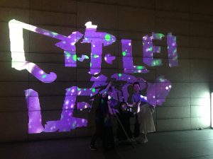
Subsequently I caught “Shades of Temporality” by SWEATSHOPPE – Blake Shaw and Bruno Levy.
Fig 5. Shades of Temporality by SweatShoppe, 2019, I Light Singapore
Text: 你好 Lei <3
Written by: En Cui, Christine and Elizabeth
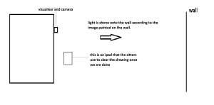
This work has two elements to it, the first being the visualiser projecting the ‘painted image’ on to the wall, and the second being the paint rollers.
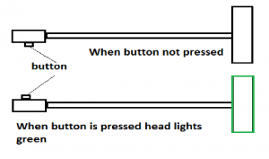
Diagram 2, Mock up of the painting brushes used in Shades of Temporarity
Diagram 3, Mock up of the set up of Shades of Temporarity
When the button in diagram 2 is pressed the paint brush head up turns green. this is then sensed by the camera and the visualiser will send an out put of light that will corespond to the area where the paint brush touched, projecting a loop of graphical illustrations of Singapore.
In this case the audience are encouraged to make temporary graffity designs on the wall, hence creating art. the audience is given the ability to write what ever they want to express themselves in anyway they see fit.
Crystal Universe by teamLab, Future World,Art Science Museum, Singapore
picture taken from: https://faithjoyhope.blogspot.com/2016/03/new-what-you-can-expect-artscience.html
The first art work that I chose for this critique is ‘Crystal Universe’ by teamLab. What I find intriguing about this work is the way entering the space is like entering a different realm. It is an aesthetic work, if you want to classify it, but what makes it so effective is that because it is so ‘instagram worthy’ it draws crowds of people easily. The work is described as a ‘galaxy of hanging leds’ by vice.com. True enough the LEDs light up like a galaxy of stars in the dark room, and one is allowed to travel through the path created, experiencing the LEDs from different perspectives. The interactive element comes in two forms, the first being immersing ones self in the atmosphere created by the twinkling LEDs and the subsequent one being actually changing the LEDs programming through your smartphone. By doing so the viewers control the way the LEDs shine, creating a reflective space that suit them. As such the viewer becomes both the audience as well as the artist who shapes their experience of the space.
However, on a more realistic note, the experience of creating your own experience is not always a pleasant one, considering that the number of people that visited the space, and the lack of limitation of the people walking through the work at all times which hinders the viewers experience of the work.
The Treachery of Sanctuary 2012, by Chris Milk, Fort Mason Center, San Francisco
Picture taken from:http://milk.co/treachery
The second piece i chose was Chris Milk’s “The Treachery of Sanctuary”. The piece consists of three monolithic screens that are shone with light. When a person moves in front of the screens their ‘shadow’ is shone over it, triggereing the art to react. What I found interesting about this piece is how it took the image of the person and warped/disinitegrated it. The wor
The work is a representation of its own creative process, which I find hilarious.
The first panel represents “the genesis of the idea, when you finally have a breakthrough.”
The participants then notice a flock of birds above them– as they reach out, their body begins to break down and birds begin to emerge.
this represents the viewers becoming the idea behind the work, and later in the secon panel, the flock continues to rain down on their ‘shadow’ pecking what is left of the shadow. This the artists says represents the hardships faced during the project. Finally, the last panel is the triumph where you become a bird yourself.
The entire work is coded to act in a certain way, but will not be able to do so without the audience interacting with it. Hence in this situation the audience is still sort of the artist shaping what is viewed on the screen.
For this project the audience still plays a huge role in the artwork by interacting with it and creating the visual imagery. However as always the artist has created the code which limits the reaction of the work, meaning they have set the narrative and setting of the art work, everything else is free to be influenced and changed by the audience.
Questions:
Interactivity and aesthetics, how do you attract people to your work without prompt
Viewer experience and will a large audience affect the experience of the work compared to a small audience
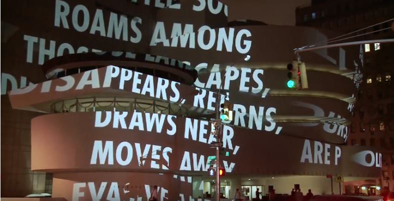
(image taken from: https://www.guggenheim.org/exhibition/jenny-holzers-for-the-guggenheim)
I chose the work ‘For the Guggenheim’ by Jenny Holzer.
Jenny Holzer is well known for her aphorism and condense narratives on LED billboards, engraved in plaques or projected on buildings. They generally are condensed into the various series of ‘laments’, ‘truisms’ and ‘Inflammatory Essays’
Holzer’s work ‘For the Guggenheim’ is a large scale projection of various aphorisms and condense narratives over the Guggenheim museum. The building was overlaid with scrolling bold, white texts that ranged from one liners and short narratives. They pull various emotions and intrigue the audience to think upon the words of advice flashing on the Guggenheim, some almost haunting drawing one to think of past memories. An example of such quotes, “the little soul roams among, those landscapes, disappear, returns, draws near, moves away, evasive…” it somehow intrigues one to imagine, wander and maybe reflect on what these words mean to them.
Holzer believes in both message and the medium used, as such her words are a call to the general public to make them think Critically. One of her most famous sentences, ‘Protect Me from What I Want’ and ‘Abuse of Power Comes as No Surprise’ are used to draw people to social injustice.
References:
The Art Story. (2018). Jenny Holzer Overview and Analysis. [online] Available at: https://www.theartstory.org/artist-holzer-jenny.htm [Accessed 9 Sep. 2018].
Guggenheim. (2018). Jenny Holzer: For the Guggenheim. [online] Available at: https://www.guggenheim.org/exhibition/jenny-holzers-for-the-guggenheim [Accessed 9 Sep. 2018].
Smith, R. (2018). Review/Art; Holzer Makes the Guggenheim a Museum of Many Messages. [online] Nytimes.com. Available at: https://www.nytimes.com/1989/12/13/arts/review-art-holzer-makes-the-guggenheim-a-museum-of-many-messages.html [Accessed 9 Sep. 2018].
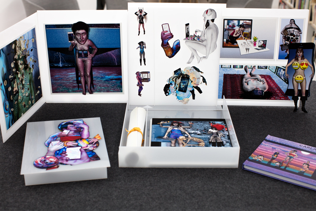
(source is taken from: http://carlagannis.com/blog/)
Gallery name: Until the End of the World
Artist: Carla Gannis
Year: 2017
Carla Gannis’ “Until the end of the World’ exhibition is executed like the ancient Greek theater where the ‘actors will speak through a mask’. in this case the ‘mask’ is her virtual persona, one like our social media, and how we portray ourselves on that ‘third space’.
The exhibition consists of various art works, like multi-media installations and ‘selfie-paintings’. She makes use of new technology to create the work, where visitors can ‘hover over the static piece of work with their phone to see it move and interact with it’.
Her works have certain nuances that suggests that it is feminist in nature, commenting on a woman’s place in society, and also on how society is affected by technology and the possible changes across the centuries.
(source is taken from: https://www.artsy.net/show/dam-gallery-carla-gannis-until-the-end-of-the-world)
The review:
Digital Identity: A digital identity is information on an entity used by computer systems to represent an external agent. That agent may be a person, organisation, application, or device.
I mentioned Carla Gannis’ ‘Selfie-drawings’ and how you could interact with them when using a certain app. In a way this character in the app has assume the role of Carla, and it paints a picture of how she wishes the audience to view her.
Its funny, because you can only interact with her through an app, like how people communicate via social media.
(source taken from: https://www.artsy.net/show/dam-gallery-carla-gannis-until-the-end-of-the-world)
But Facebook appeared to some
writers as angel, and some as demon; to some as an emerging
global village, and to others as isolation in disguise; to some as an
opportunity for maintaining relationships, and to others as broadcast
narcissism.
As quoted from D.E. Wittkower’s ‘A reply to Facebook Critics’, it is a form of charade, this idea of digital identity, and it becomes a tool that helps some people disguise themselve, a safe heaven of annoymity to discuss certain subjects or to be unbothered, sometimes to decieve others for their own gain.
In this case this annoymity also acts as a platform for relatability, to be placed in the shoes of this character, like what Carla Gannis is doing in her work. She places the audience in an almost intimate setting with her virtual persona and allow us to interact with it, as though we have been physically transported to the third space.
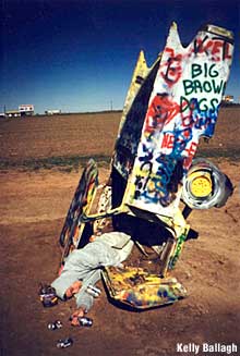
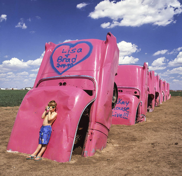
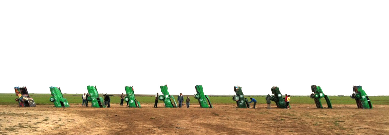
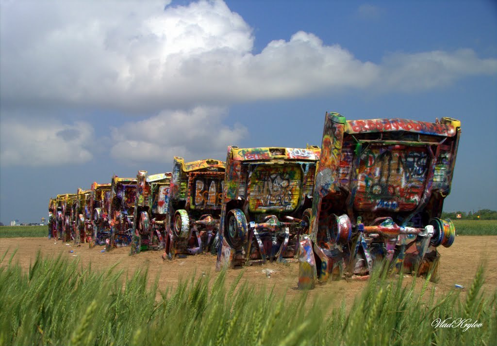
(Source taken from: https://en.wikipedia.org/wiki/Cadillac_Ranch#/media/File:Cadillac_Ranch.jpg)
Title: Cadillac Ranch
Artist: Chip Lord
Year created: 1974/1994
Medium: Installation
Overview
Cadillac Ranch is an installation of 10 Cadillac’s buried nose deep in a line, in the dirt along route 66 west of Amarillo.
Its almost as if they were droven off a cliff and plunged head first into the ground. Now useless, the owners wander off looking for help and the Cadillacs lay, left there buried with their tailfins in the air waiting for travellers to chance upon it.
After awhile, the work was subjugated to the whims of the travellers, meaning they were either defaced with graffitti or ripped apart as souvenirs. Whats left of these cars are but a line of rainbow coloured skins of their former selves, rebirth into comic relief for a travellers amusement.
(Source taken from: https://www.roadsideamerica.com/story/2220)
Ant Farm
As mentioned by Constance Lewallen, in his writing ‘Still Subversive After all These Years’
Ant Farm — a collective of radical architects who were also video, performance, and installation artists but, above all, visionaries and cultural commentators — offers an intriguing look into the conceptual activity of the late sixties and seventies, a time that has proved to be seminal for succeeding generations of adventuresome artists.
Their work embraces ‘the latest technologies to disseminate its scathing criticism of American culture and mass media’.
In the case of the Cadillac Ranch it is a commentary about consumerism and maybe pop culture. What a car and a crashed car is in society. More interestingly is how members of the online communitty take to the idea of a crashed car.
Its almost Ironic, how one can act so indifferent and even gleeful of the idea of chancing upon a crashed car. How satirical their photos get when they interact with the car itself.
Decades have passed. The Cadillacs have now been in the ground as art longer than they were on the road as cars. They are stripped to their battered frames, splattered in day-glo paint splooge, barely recognizable as automobiles. Yet Cadillac Ranch is more popular than ever.
As quoted from roadsideamerica.com
And in a way it is quite interesting as it changes in an unsual way with time. The artwork evolves with evey added touch of a new tourist own creativity into the mix. It keeps conversations going, give people something new to talk about.
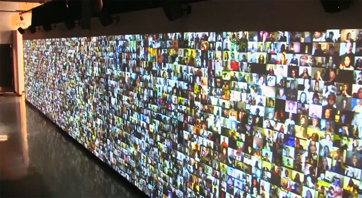
Artwork title: Hello World! or: How I Learned to Stop Listening and Love the Noise
Artist: Christopher Baker
Medium: Multi-channel multimedia installation
Year created: 2008
The Review
Hello world is a video installation where 5,000 video diaries of various individuals are played along a wall. The people in the videos can be seen speaking in their rooms, kitchens, a space of comfort.
Walking into the gallery space, one is instantly immersed in layers of voices, overlapping to the point that the words blend and become noise. It is as though you are listening to them talk about something intimate, nd at the same time, their personal issues are made public. You hear everything but at the same time you hear nothing in a sea of voices.
His works is a visual representation of the modern lifestyle of being constantly interconnected despite being far apart.
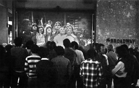
The concept is similar to that mentioned in Randall Packer’s writing ‘The Third Space’ in regards to the art work ‘Hole in Space’. He mentions the idea of a ‘third space’ being created, or a virtual identity being transimitted from one party to another through technology.
(source taken from: http://www.medienkunstnetz.de/works/hole-in-space/)
In this case the works differ in the the sense that ‘Hole in Space’ is a live broadcast, which is ephemeral, it is ever changing depending on the people and how they interact. On the other hand, ‘Hello World!’ is a collection of pre-recorded videos, hence the interaction becomes one-way. That means that there would be a distinctive lack of communication between the people whose videos are put up.
When we were in class, we talk about how communication is important when working as a collective whole to make a work cohesive. So it is amazing to see the images contrast with each despite the lack negotiation.
Credits
Christopher Baker: Hello World! (n.d.). Retrieved February 07, 2018, from http://www.huhmagazine.co.uk/3200/christopher-baker-hello-world!
Gallery, S. (n.d.). Christopher Baker. Retrieved February 07, 2018, from http://www.saatchigallery.com/artists/artpages/christopher_baker_hello_world2.htm
Packer, Randall, Open Source Studio, IEEE Spectrum, 2015