Help.
(I need to cut this down, too many pictures. )

A house for a hermit crab

I had to print out the sadness image that I photoshopped before i could put everything together.

Looking at them now, i realized how similar some of my mark makings are. Which probably means i have a long way to go. I liked how these 6 turned out though.


After Consultation, it is quite clear that i have some interpretation error, so its time to relook at my life choices.
Firstly, the definition of ‘Horror’ that i have created would have better suited ‘Paranoia’ now that it think about it. I decided to delve a bit deeper into the idea of texture on my mark making. I wanted a rough texture on to emphasize on the spikes of ‘Horror’ like a defense, however it turned out very differently.
By using paper mache i attempted to recreate the below effect

I first threw the toilet paper i was using into a container with ink in it to let it soak. Then i used my hand to break up the clumps. After that i sieved through the ink and strained some of the water from the paper mache before finally throwing it on the paper.

It did not end favourably as the consistency of the paper mache started clumping together, or disintegrating when I pulled them apart with a palette knife. Hence I piled more on and it gave off a more ‘disgusting’ vibe.

For ‘Sadness’ photo shopped the ripples, adjusting the light and darkness of the image to create contrasting marks.


I liked the way the overlapped each other, but it still felt a bit plain so I searched through the other rippling effects i had and recomposed the image.


The first composition had a very distracting background, hence, it was deemed as not suitable for the project. The second composition was a bit better, but it still felt as thought the elements stood as individuals rather then a single piece. Thus I created the final composition and cropped it tighter.

‘Affection’ had gone through a few stages of evolution in terms of thickness of the paint as i wanted Affection to have a translucent effect. It is like it is an unconscious feeling that we experience, but do not actually take note of it.
Using black water colour on watercolour paper, i begin drawing the patterns i did with the cotton buds previously.

The initial composition was not very pleasing as it had not point of convergence. it was messy and there were too many things to see. The second one i rather enjoyed, however it was rather inconsistent, with the tinier loops, which grabbed attention. Thus there were again too many things too look at once again. The third composition I wanted to add tiny emphasis on the paper against a sparse back ground. I dotted the canvas with blobs of water and added the paint by poking it with a brush and letting the paint spread. This sort of insinuates the times were small acts of kindness are acknowledged as affection one feels for others. But it turned out pretty ugly as the paint blobs all had the same texture when it appeared. Finally I created the last design, a sort of vortex that swirls around the centre of the sheet. I wanted it to seem as though it encompasses us, it is always there.
Hence i chose to Dilute the ink, to a fainter consistency and repaint the last design on a final sheet.
‘Hysteria’ came about when I was making ‘Surprise’. Due to the nature of ‘Surprise’ i wanted one single element that showed a change in the scenery. An Explosion or a hiccup on the blank canvas.
I wanted a sharper contrast, hence i used white acrylic paint on black cartridge paper. Using a square brush i begin my mark making . I overestimated how many ‘hiccups’ i wanted and was left with to many blobs of paint. Subsequently, The acrylic paint was not able to make that smooth gradient i wanted by brush alone.
In a fit of frustration I started stabbing the blob of paint with tissue.
I had hoped that it would become a smooth gradient like my previous attempts with Chinese ink on Newsprint

The colour imprint was faint, but i believe with thicker paint the build up would be better.

As it turned out i was wrong about the colour built up. But the effect was quite pleasing to look at. Looking back at it now, the white on black made a stronger more negative connotation to me when the white is solid. It reminds me of those jump scare clips that people post, where the image starts flashing in inverse colours. It was also interesting that the tissue stuck to the paper and made a flaky texture on some parts of the paper.
I decided to try white acrylic on black paper again, but this time with more diluted paint.

After consultation i had wanted to remake a similar composition for ‘Zest’ but in a more positive light.

The effect was beautiful, however the piece had mellowed and become more ‘Contented’ then the lively ball of energy that i had perceived to be ‘Zest’.
Finally was ‘Surprise’. After all the botched attempts for surprise, i had wanted to change the aesthetic of ‘Surprise’ into something surprising. I had sketched out a plan for surprise to be made out of geometric shapes and planned to use ink on paper.
However whist inking it out, it started looking more rigid than i had planned for ‘Surprise’, hence i redid using ink and wash on watercolour paper instead.

The effect was far more fluid then the first.


We were supposed to pick 6 emotions for the project:
*Update:
I redid the emotions, ‘Envy’ was a bit harder to portray and whilst experimenting with what became ‘Horror’ i made ‘Disgust’ hence ‘Envy’ was replaced by this.
‘Horror’ was also replaced by Hysteria, as I was experimenting with ‘Surprise’ it morphed into ‘Hysteria’. (It was a good thing too, i think my definition of ‘Horror’ was not very fitting.)
I redid ‘Zest’ in a rounder brush and realised that it better suited the idea of ‘Contentment’ when it was made with thinner paint. Hence ‘Contentment’ replaced ‘Zest’.

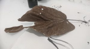
Other then what i said i was going to bring the previous week, I went scavenging the school grounds for twigs and leaves.

Most of them created dry lines on the paper due to its inability to retain water.


For most scenarios the mark was first very watery, before splitting of into broken hairlines. I did not like it as they gave similar emotions whilst looking at it.
I decided trying to use the leaves in a different way. Since i had been using them whole previously i had decided to cut out a small segment from it.
Using the long flat side I created a rippling effect.
This one looks interesting, its lines are partially broken in some areas and full in others, which creates a slightly negative emotion when looking at it. I’m going to use this for sadness, due to the lines that cut off creating a void, a bit like the emptiness one would feel when they are sad.
I broke the large stick i found in multiple pieces so it was easier to handle. I also made sure that the bark started flaking at the ends so that it gave a rougher texture.

Using the thicker paint i manage to create a few set of interesting lines.

Chucks of the wood ended up in the lines for the first, and it created a jarring effect that i want to use for horror.
The other three i tried to create a swirl pattern, to imitate the idea of Zest, being enthusiastic and all over the place, in my opinion the second and third was the most like Zest.
I saw a palette knife lying around, and wanted to know if the lines created would look the same as the one made by wood.

As it turned out, metal creates more fluid lines then sticks, yet by handling it in certain way, the effect made by the sticks can be replicated with a palette knife.
Someone left the work station dirty with stains on the whiteboard, so I started playing with the work space. It turned out, the effect of wetting the wall and ‘stamping’ it against the paper gave me a more unique effect. i started playing withe the ink, most of them came out with splotches, and empty patches. They looked like sadness.

I am probably going to photoshop all my plausible ‘sadness’ mark making together to create a new composition all together.
Lastly I tried out using the cotton buds. I had a feeling that the cotton buds were going to create uniformly rounded lines, hence choosing it to portray positive emotions like affection.

However, the lines were to uniform. the lack of variation in the entire composition made the composition bland. Hence i would have to look into other ways of creating the idea of ‘Affection’.