After touring Telok Ayer for two days, I really wanted to base my zine either on the old and new architecture in Telok Ayer, or the ornamental nature of the Temples and shop houses.


However, it soon became quite prominent that those ideas were more common then I thought. Hence, I decided on my second trip that i would start looking around the surrounding areas of Telok Ayer, specifically Amoy Street as it still has the ‘old historic’ look that echos Telok Ayer.


It became even more prominent that the harder I looked for something unique to echo Telok Ayer street, the more difficult it became. There is not much left of the Historical Dock that used to be there. Rather, the iconic shop houses were made new, painted in various shades of colour, the shops now catered international food like Korean barbecue, Thai food, western, and various bars. The temples had self inserted gift shops and some became museums, or hotel fronts in attempt to preserve the building.
In its own way it is interesting, to see how much has changed. However, with the brief in mind, to ‘portray the essence of the street’ it seems my street is giving me a run for my money. Everything that makes Telok Ayer Iconic, I feel, is the same thing that makes another place iconic. I see shop houses along Chinatown and Little India. I see Ann Siang hill and Telok Ayer green, as small inserts of green spaces common found in every other place. Bars are iconic for places like Clarke Quay, and the restaurants there are no longer serving local food.
I would describe the place as commercialized, or a Hodge-Podge of things put together in an attempt to make use of the space.
Hence I went about thinking about making a Zine that reflects this confusion that I felt for Telok Ayer, and an idea that revolved around the temple narrative. Ultimately the temple narrative got rejected, because i felt that it might be too in literal.
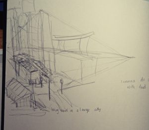


I still wanted to insert the intricate designs of the temples and shop houses, but to keep the graphic element of the illustration, I decided to minimalise the style into flat planes with a single coloured shading.
I made a list of what elements I wanted in the art work:
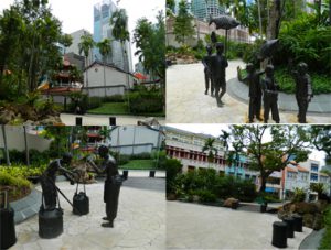
- Telok Ayer Green, the randomly inserted park, with statues of fisherman of the past. It feels like a tourism spot, but a tourism spot to chance upon? it is honestly not very well known place. I asked my friends if they knew where Telok Ayer is, only one response came back positive, and he said he went there to drink.
- Ann Siang Hill, actually placed at the corner of Amoy Street, it feels a bit colonial walking up the hill. It felt out of place when you think of this unchanging place called Telok Ayer
- The surrounding Temples how they are still being preserved
- Fuk Tak Chi Temple which became a museum or door front for Amoy Street Hotel, coexistence of old and new.
- The food revolves mostly around bars and restaurants for internationl food. It rarely reflects the traditional food that Telok Ayer had in the past.
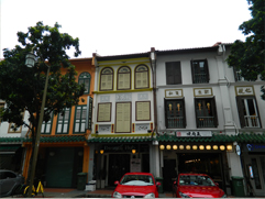
- The shop houses which are so iconic to Telok Ayer, we see almost everywhere else like in Chinatown, Little India, etc. They were also modernised and upgraded with aircon vents and elecrical boxes, which makes for quite an interesting sight.
- There is a mosque, Al Abrar Mosque, which I felt was very isolated. I went there close to chinese new year, hence the temples were bustling with people, compared to that the mosque was quite and quite isolated. I wanted to go in but did not. It did not feel right of me to enter. i want to illustrate that sort of quiet, isolated feeling.
- There was also a heritage center there that was closed, i like the aesthetic of it though. It was a very interesting contrast in comparison to the temples.
I began to sketch what I felt represented these aspects of Telok Ayer digitally.


I managed to get a really good shot of the pagoda that I felt reflects how Telok Ayer is. Its buildings rarely change, as it is being preserved for the culture aspect, but its surroundings does. hence i created this sort of digital aesthetic to the skyscrapers, which look as though it has been edited into old ‘Telok Ayer’.
I also wanted to illustrate the food in Telok Ayer.

I had realised, walking down the streets of Telok Ayer is that most eateries there are either Cafes, Bars or restaurants that cater Korean food, Thai Food, International food, basically it no longer reflects ‘traditional Singapore’.
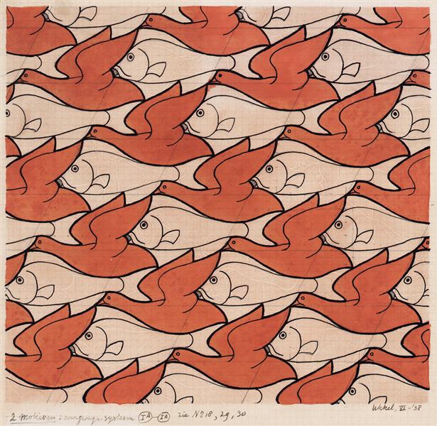
(Source is taken from: https://www.wikiart.org/en/m-c-escher/bird-fish)
I wanted to create a sort of food patter which encompasses the variety of the street, like what M.C Escher does with his textiles as seen above. I wanted this sort of overwhelmingly compact illustration.
However, it was ultimately ruled out due to the difference in style. So I went with a more food wallpaper style, with cute illustrations of food on it.

(Source taken from: https://www.pinterest.com/pin/540572761507280597/)
However, it did not tie with the cover image as well. So I made a compromise.

Following the previous image, I had the ‘newer’ products drawn with lines, as though it were digitally add into the environment. That way there is this somewhat cohesiveness to the art style. Meanwhile the ‘traditional treats’ or food items that were used in the past but maybe not in that way are coloured in, showing that they had existed already.

(Source taken from: https://commons.wikimedia.org/wiki/File:Ann_Siang_Hill_Park_2,_Dec_05.JPG)
I also had the chance to wander around the streets nearby, and I was quite amazed by how the image of a place can change so easily from one street to another. Walking about Ann Siang hill was like walking in a colonial inspired park like Fort Canning, which would not have been place here till recently, seeing as Telok Ayer was more a Chinese settlement in the past, or a place for docking. Thus i wanted to show how the place seemed to new aesthetic wise, among the traditional shop house structures.

Following the similar aesthetic of the previous images I came up with this.
Subsequently, I started looking at Telok Ayer green which is like a self insert modern park in a small part of history. Though it was more of an attempt of tourist attraction with all these statues of the Chinese migrants of that time.

From there I created two illustrations:


I attempted to stay close to the geometric lines as a connecting theme in my work, but i felt maybe i did not do too good of a job at that.
Subsequently, i moved onto the shop houses, wanting to illustrate them in an ‘upgraded’ manner, with the glass windows and air con vents.

Finally came the temple, where we see even less of the geometric lines.

I think this image was the most interesting to work with, despite having one of the least cohesiveness to its image. I liked the interesting cropping, and so did many of my classmates when they gave me feedback.
Overall, I think I could have done better aesthetic wise if I had more time, because right now, the illustrations look as though they had more potential to be even more cohesive.




/fruit-tart-2500-58a474945f9b58819c899b6e.jpg)


