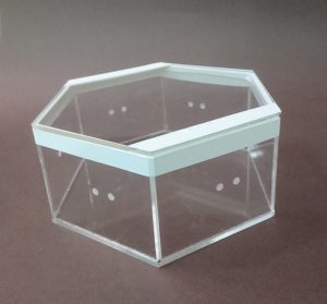
Red Box, Blue Box is just the start of a bunch of interactive acrylic boxes that light at the touch of each other.
The idea of Red Box Blue Box was meant to be of boxes of different shapes and sizes with the ability to connect and influence each other at any side. However due to the time restriction of this project Red Box and Blue Box are the only two to make an appearance.
The humble origins of the boxes
The two boxes begin their humble beginnings as a pair of LED strips attempting to light.
At the beginning I never thought of programming an Arduino per Box due to my lack of knowledge. However eventually, I did manage for two.
The starting stages I have used Aluminium foil switches, as I wanted the circuit to touch and be closed, bringing out the idea of contact instead of a button. However there were some ideas of using a pair of magnets instead of aluminium foil, hence I changed the switch to be made of magnets. Hence I prepped the shell of the box to have two holes for where the magnets will be slotted, not wanting to breech the surface for aesthetic reasons.
I drew out a circuit halfway, only to realize later on that is not how a circuit worked. Subsequently, not only the circuit, I realized I was not using the magnet switches properly. It turns out that magnets despite being able to attract its counter part across two 4mm acrylic pieces, does not actually transmit code through (Sad non-physics student Elizabeth learns the hard way, thank you Dan Ning for the physics lesson).
But alas, the first method of testing Aluminium foil actually prove to be the most efficient method of transmitting code. Hence resulting in the final product.
I Started looking for other circuits to reference, one being connecting two arduinos as such:
But I realised the accompanying code was more reliant on one arduino then the other, which is not what I am looking for.
In the end, I was referencing this circuit.
And creating a simple button circuit
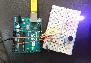
I repeated the circuit for six sides of the hexagon.
This project revolves around the idea of the gaps between noise/sound, hence we created a portable device that will sample the overall surrounding sound and in response would light an LED in a corresponding colour. The colour is based on a calculation where ‘red’ is volume , ‘green’ is pitch (regardless of octave) and ‘blue’ is pitch (exact octave). Red and Blue were scaled to fit a range of 0 to 255, however, for the Green there were 5 ranges created, skewed accordingly so that the range for a humanly possible pitch is larger then a not humanly possible pitch. The code makes use of an array to store data in each pixel, until all nine pixels have been used up, then the information would be overwritten for the following pixel.
References for the code:
Origin of basic-ass code (which is no longer here): https://www.teachmemicro.com/arduino-microphone/
Origin of getAmplitude code: https://learn.adafruit.com/adafruit-microphone-amplifier-breakout/measuring-sound-levels
Origin of getFrequensea code: https://www.norwegiancreations.com/2017/08/what-is-fft-and-how-can-you-implement-it-on-an-arduino/
Origin of NeoPixel code: https://learn.adafruit.com/adafruit-neopixel-uberguide/arduino-library-use
Our work takes reference to works like ‘Pulse Index’ by Rafael Lozano. It is similar in the sense that it takes record of the viewers in put, in their case the thumbprints, in our case sound, and record it on a visual plane to show the changes overtime.
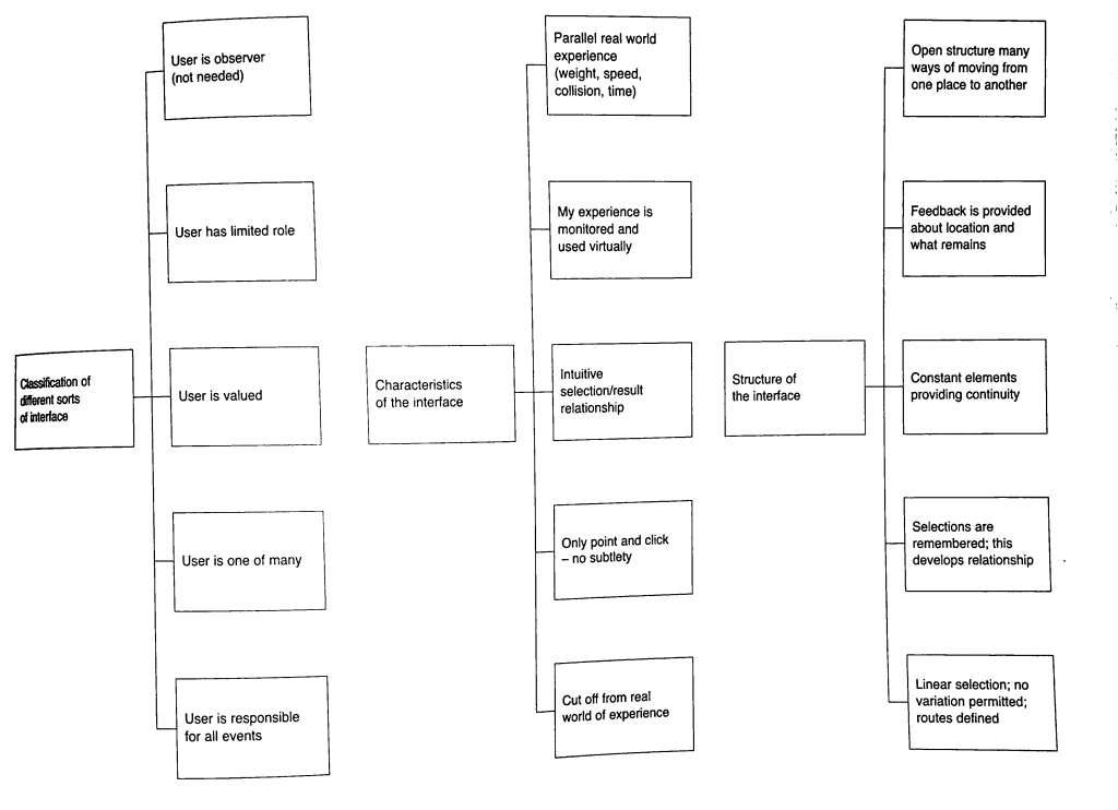
Characteristics of Interface:
Classification of interface:
Our project falls under ‘User is one of Many’ and ‘User is valued’. Our project values the unity of the environmental sound and how your sound is captured in this collective and you cant discern what is your sound and what is the environment, hence the user is one of many part. However, the user is valued is also present in a way that they are the anomaly that created the most change when they interact with it directly.
Characteristics of interface:
Our project falls under ‘Monitered and reflected experience’ as well as ‘Intuitive selection/results relationship’. For the former, the device is to collect the environmental sound and show a colour represnetation, hence all interatctions are copied and shown directly based on the sounds that you make. The latter is true as when you see the light changing to sound, the viewers will automatically try to interact with it to see the extent that it will change to, hence creating the result of trying to find the gaps between the sounds you make when you see the different coloured representations of each instance of sounds made.
Structure of Interface:
Based on the flow chart, our Project complies to everything except the last one ‘Linear Selection’. The first idea of open structure is seen in the way we made our device portable. The second idea of ‘Feedback provided’ is done so in the form of LED lights lit in accordance to the sound of the environment/people within the environment interacting with it. The third idea is ‘Constant elements providing continuity’, since the set up is designed to reflect the sound at every (how many seconds). Finally selections are recorded in nine LED pixels, showing 8 seconds of the recently past environmental sounds.
(Liz finally answered the question yay)
Who did what:
The coding for this project was done by En Cui and the physical fabrication of the device was put together by me (Elizabeth) (but you know in the end Liz kind of screwed up alot of the soldering and stuff and needed En Cui and Lei’s help to put them together. Thank youuu)
Process:
From the initial stage of mannually making LEDs light up by pressing the buttons whenever someone made a sound we created a circuit where the LED would light up in a certain colour according to the environmental sound.
After that we used this circuit as a a reference and moved from a single RGB LED to a strip of LED wire. That way we could create a set up where the colour of a certain period of time could be recorded and compared to the pervious period of time.
yay the LED lights up.
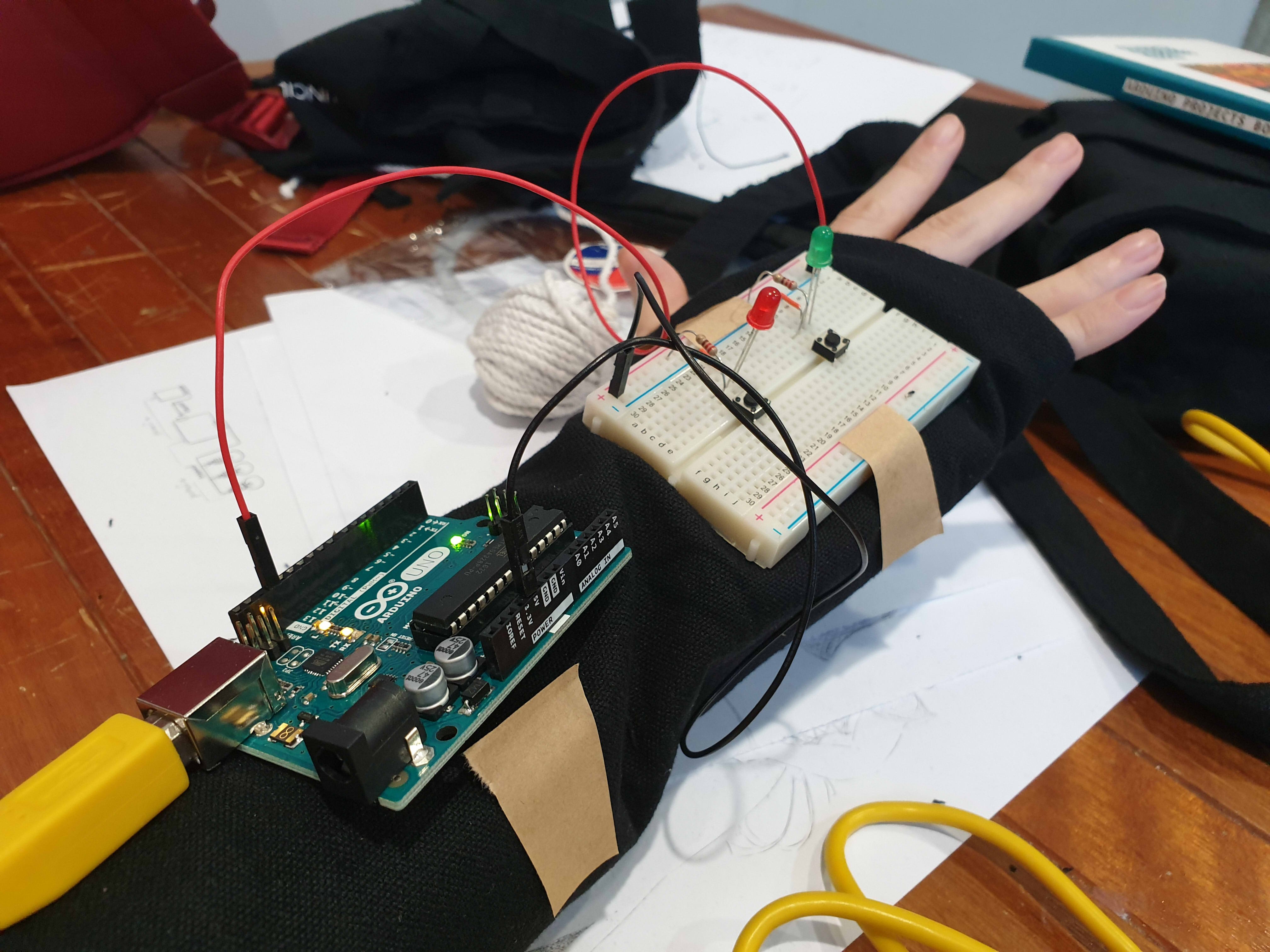
Measuring the length of wire for the glove.
This is where problems started surfacing on the soldering part so there was a redo. (soldering wise and circuit wise sob)
Testing out the Circuit.
Yay it’s done.
After Review:
Everyone reacted to the work as we hoped they would despite only having two participants. They crowded and tried to put in their own input by making noises around the two. Though we have coments that the feedback is not fast enough to show the exact inflection of voice as one is speaking, hence not very obvious. We forgot to mention this during the review, but the delay is also constrained by technical limitations. If we reduce the delay, we will need more LEDs to represent the same amount of time, and the Arduino memory overloads at 13 LEDs. Additionally, even at delay(0), the Arduino still cannot function fast enough to get the desired result:
As a result of the delay, our theme in this work might not be very obvious to the viewers to pick up on as a result. The eventual solution may thus be to use something with more processing power.
There are comments on how they are working very hard to satisfy the device as well. Some say that it seemed like a prop for band or choir performances, or a tool for training how to get the exact pitch.
Summary Reflection:
EC needs to actually know when it’s not possible than maybe possible.
Liz should not be so innovative. Liz is just not good with technology.
We should have thought out the final form better.
Extended Concluding thoughts (if you want to read about our woes):
En Cui’s Reflection:
Concept-wise, the challenge was that the core concept and form were not well-aligned. While we talked out several issues, there’s still the challenge of the interstice being unclear. But I think, in the end, the clarity of the message depends on how you interact with the wearable. For example, the distinction is much clearer if you experience the wearable in multiple contexts, than just one.
Regarding the code and circuit, it was actually mostly okay. While things didn’t always work, the only solution needed was to observe the problem, deduce what could be possible reasons for its occurrence, then test out my hypotheses one by one. Examples include mathematical errors and faulty wiring. I also did soldering part 2 for the microphone, and honestly the solution was just learning to recognise patterns of problems and solutions based on past mistakes, such as the solder not sticking to the iron (wiping more), or getting fingers burnt (plasters).
I also realise after a full day of reflection that I’m just incompetent at doing group work efficiently. Leaving me in charge is a generally bad idea.
Elizabeth’s Reflection:
For the most bit I felt very challenged by the project, especially since it is the first time we were using and putting together components to make a circuit. for the physical fabrication portion it was the first time I used a solder, and my circuit looked very ugly after that, and I dont really think I improved in that aspect very much even after multiple attempts 🙁 When using the Hot glue gun to insulate the exposed solder I think I made the circuit worse, because there was already a built up of solder.
Also, I did not solder the circuit down the right way apparently. You can only solder your wires to one side of the LED because they are fickle and like to have their electrical charge flowing in one direction. Also, do not solder and hot glue your circuit till you are 100% sure it works, saves you a lot of heartpain and time, (thank you Lei and En Cui for dealing with my screw ups D;).
I also made a few mistakes by piercing the LED strip’s digital pins on accident thinking I can sew it down that way. Thinking about it now, I should have known better then to try piercing any part of the components.
Speaking of computer, I feel very attacked by my own computer, since I think it has issues running the code we shared over google docs, and gave me a heart attack that I might have short circuited the only RGB LED in the starter pack, and still the circuit refused to light after I confirmed that I did not. I think there is something wrong with my computer DX. I either leave the testing for computer to En Cui or find a school computer for this (pick the right computer for this, not all computers have arduino).
If we had a bit more time and I had a bit more skill in soldering, we wish to have more LED lights to reflect the change in sound.
In Manovich Lev’s ‘The Language of the New Media’ he identifies new media to fall under five categories: Numerical Representation which is the language used to generate outputs in machinery; Modularity which means it has various components of which a new media work can be separated; Automation which is the removal of human intentionality in the work; Variability which means that the work can have a range of outputs/outcomes/reactions; and finally Transcoding which is the ability to turn ‘physical information’ like sound, text, etc, into a set of code that can be read by the computer.
For mine and En Cui’s project, we make use of four out of five of this categories, namely numerical representation, modularity, variability and transcoding.
When we are oconsider the idea of numerical representation, so long as we are creating things on a digital platform, our written codes for our project to function is a form of numerical representation. Numerical representation is the digital language that machinery use to communicate hence it is present in all projects that make use of technology.
Subsequently, We have the idea of modularity. Modularity is shown in various layers in thir work. It could be seen in the components that make up the body of the project, like the wires, LEDs and microphone.
It could also refer to our project’s ability to capture data at different points in time in the form of different coloured LED lights, and within that collection, create another collective image of the environment at different points in time.
A bit like Rafael Lozano-Hemmer’s work ‘Pulse Index’, we are looking at how the individual components make up a bigger collective, and how that collective changes over time, which changes the outcome of the work at each time.
Moving on to the idea of variability, the entire idea of our work revolves around the idea of different sounds, merging overlapping and melding to the point that you cannot figure out if it is your own voice or an influence of the environment. Hence the variable in our project comes in the form of the sound input and a corresponding unique coloured light output. Each output would depend on the pitch and volume of the sound recorded by the microphone. Since different people have different pitches in tone, and volume of which they speak each led at different points in time will be different.
Finally, there is the idea of Transcoding where physical information is translated into data code that can be read by the computer. In this case it is the idea of sound that has been picked up by the microphone, being converted into code that is later translated into the values of RGB and brightness that is reflected on the LED.
After our short dicussion, En Cui and I have decided to combine the ideas of the talking door and the concept of gaps between multiple conersations to create an interactive hat. The idea of the hat was to create both a visual (Different coloured LEDs for different pitch and/or volume) and audio output whenever someone spoke. The idea was that it would let out a different sound depending on the pitch and volume it sensed from the surroundings, meaning that it will consider the environmental sound as a whole.
Watch the video here:
What did you learn from the process?
From this process we have learnt that our concept is hard to connect with the audience, so we should make it more diresct. Though the idea of using the object is fairly simple as it is what it is, which means the idea of a found object is really strong enough to have the audience interact with it without giving much instructions. The reactions can be learnt along the way. We should also make it such that what ever the reaction is should be within the view of the participant, as the lights are on top of the hat. Also our project is very context driven as it relies a crowded, noisy area to link to our concept of the gaps in between conversations.
What surprised you while going through the process?
Shout out to our Tester who is especially cooperative :3c. There was a lot of confusion trying to link the project to its concept, it is not directly understood as an individual or group concept, but I guess that is what happens when you only have one tester and your project responds to them whether in a group or not. The idea of the hat was for portability but we have the idea that it will react to its environment no matter if it is worn or not, this results in some comments that we might want to change the shape it takes. We are also worried about how to convince the audience whether they can grab the object freely.
How can your apply what you have discovered to the designing of your installation?
So we might consider changing the appearance of the artwork. We might tweak the message a bit, and maybe have multiple small things instead of one big thing, to make it less intimidating. Also Lei said we can use P5.js to do speech to text, we are kind of bombarded with endless possibilities now lol.
I had discussed with En Cui of two projects, and while she is expanding on the idea of the bilboard, I’m expanding on the idea of the talking door.
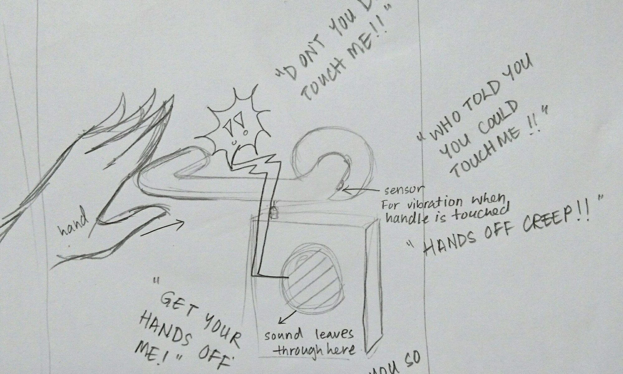
At first I had talked to Celine about a few ideas, and this one took on a concept that is very similar to hers, revolving around the idea of the door. However, this interstices revolves around the space between your hand and the door, and how you touch something.
The idea was mainly have the door react to your touch according to how you open it.
There will be a sensor attached to the handle, that would sense the vibrations along the door handle, and it would let out a response accordingly. The idea is to have the door say rather accusatory things, like “Who gave you the right to touch me!?”, mostly to give the people who touch the door a shock, let go of the door, and hopefully not enter the room at all :3
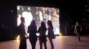
I managed to catch a few of the interactive works when I went for I Light. The first being ‘Facey Thing’ by Uji Studios which was a sort of satirical take on the selfie culture amongst the masses in this day and age.
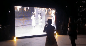
Fig 1. Facey Thing by Uji Studios, 2019, I Light, Singapore.
pictures screenshot from video taken by: En Cui
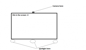
When you first encounter it, ‘Facey Thing’ is a bright huge screen that is twice the height of an ordinary human.
Diagram 1, mock up of Facey Thing
So the set up is simple, consisting of a screen which is hooked up to a single camera that captures the passerbys that are oving in front of the work. The code that runs this work is set to capture the faces of the people who are standing in front of it.
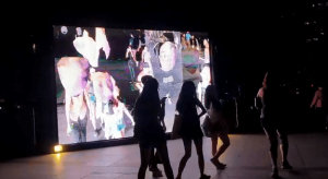
Fig 2. Facey Thing by Uji Studios, 2019, I Light, Singapore.
pictures screenshot from video taken by: En Cui
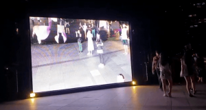
Fig 3. Facey Thing by Uji Studios, 2019, I Light, Singapore.
pictures screenshot from video taken by: En Cui
Whenyour face is recognised by the screen it is boxed up as seen in fig 2 above and would later evolve to fig 3. In Fig 3, the faces of the passerbys are blown up and dragged upward almost as though painting the canvas with their face. So in this case the images on the screen are temporarily changed by the people who interact with it, if not it is no more then an ordinary close circuit video recording. It warps the initial intention of Selfies to be one that portray one self as ‘glam’ to being very ‘unglam’ instead by warping the passerby’s faces.
Fig 4. Facey Thing by Uji Studios, 2019, I Light, Singapore.
pictures screenshot from video taken by: En Cui
The people that decided to interact it were waving their hands of moving about oddly to try and get their face recognised by the system.
Subsequently I caught “Shades of Temporality” by SWEATSHOPPE – Blake Shaw and Bruno Levy.
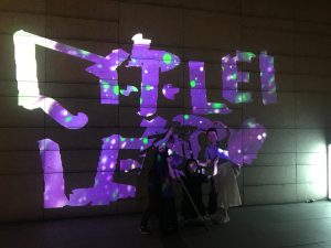
Fig 5. Shades of Temporality by SweatShoppe, 2019, I Light Singapore
Text: 你好 Lei <3
Written by: En Cui, Christine and Elizabeth
This work has two elements to it, the first being the visualiser projecting the ‘painted image’ on to the wall, and the second being the paint rollers.
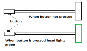
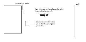
Diagram 2, Mock up of the painting brushes used in Shades of Temporarity
Diagram 3, Mock up of the set up of Shades of Temporarity
When the button in diagram 2 is pressed the paint brush head up turns green. this is then sensed by the camera and the visualiser will send an out put of light that will corespond to the area where the paint brush touched, projecting a loop of graphical illustrations of Singapore.
In this case the audience are encouraged to make temporary graffity designs on the wall, hence creating art. the audience is given the ability to write what ever they want to express themselves in anyway they see fit.
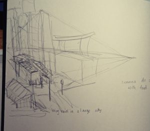
After touring Telok Ayer for two days, I really wanted to base my zine either on the old and new architecture in Telok Ayer, or the ornamental nature of the Temples and shop houses.
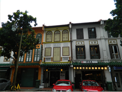
However, it soon became quite prominent that those ideas were more common then I thought. Hence, I decided on my second trip that i would start looking around the surrounding areas of Telok Ayer, specifically Amoy Street as it still has the ‘old historic’ look that echos Telok Ayer.
It became even more prominent that the harder I looked for something unique to echo Telok Ayer street, the more difficult it became. There is not much left of the Historical Dock that used to be there. Rather, the iconic shop houses were made new, painted in various shades of colour, the shops now catered international food like Korean barbecue, Thai food, western, and various bars. The temples had self inserted gift shops and some became museums, or hotel fronts in attempt to preserve the building.
In its own way it is interesting, to see how much has changed. However, with the brief in mind, to ‘portray the essence of the street’ it seems my street is giving me a run for my money. Everything that makes Telok Ayer Iconic, I feel, is the same thing that makes another place iconic. I see shop houses along Chinatown and Little India. I see Ann Siang hill and Telok Ayer green, as small inserts of green spaces common found in every other place. Bars are iconic for places like Clarke Quay, and the restaurants there are no longer serving local food.
I would describe the place as commercialized, or a Hodge-Podge of things put together in an attempt to make use of the space.
Hence I went about thinking about making a Zine that reflects this confusion that I felt for Telok Ayer, and an idea that revolved around the temple narrative. Ultimately the temple narrative got rejected, because i felt that it might be too in literal.
I still wanted to insert the intricate designs of the temples and shop houses, but to keep the graphic element of the illustration, I decided to minimalise the style into flat planes with a single coloured shading.
I made a list of what elements I wanted in the art work:
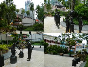
Telok Ayer Green, the randomly inserted park, with statues of fisherman of the past. It feels like a tourism spot, but a tourism spot to chance upon? it is honestly not very well known place. I asked my friends if they knew where Telok Ayer is, only one response came back positive, and he said he went there to drink.
Ann Siang Hill, actually placed at the corner of Amoy Street, it feels a bit colonial walking up the hill. It felt out of place when you think of this unchanging place called Telok Ayer
The surrounding Temples how they are still being preserved
Fuk Tak Chi Temple which became a museum or door front for Amoy Street Hotel, coexistence of old and new.
The food revolves mostly around bars and restaurants for internationl food. It rarely reflects the traditional food that Telok Ayer had in the past.
The shop houses which are so iconic to Telok Ayer, we see almost everywhere else like in Chinatown, Little India, etc. They were also modernised and upgraded with aircon vents and elecrical boxes, which makes for quite an interesting sight.
There is a mosque, Al Abrar Mosque, which I felt was very isolated. I went there close to chinese new year, hence the temples were bustling with people, compared to that the mosque was quite and quite isolated. I wanted to go in but did not. It did not feel right of me to enter. i want to illustrate that sort of quiet, isolated feeling.
There was also a heritage center there that was closed, i like the aesthetic of it though. It was a very interesting contrast in comparison to the temples.
I began to sketch what I felt represented these aspects of Telok Ayer digitally.
I managed to get a really good shot of the pagoda that I felt reflects how Telok Ayer is. Its buildings rarely change, as it is being preserved for the culture aspect, but its surroundings does. hence i created this sort of digital aesthetic to the skyscrapers, which look as though it has been edited into old ‘Telok Ayer’.
I also wanted to illustrate the food in Telok Ayer.
I had realised, walking down the streets of Telok Ayer is that most eateries there are either Cafes, Bars or restaurants that cater Korean food, Thai Food, International food, basically it no longer reflects ‘traditional Singapore’.
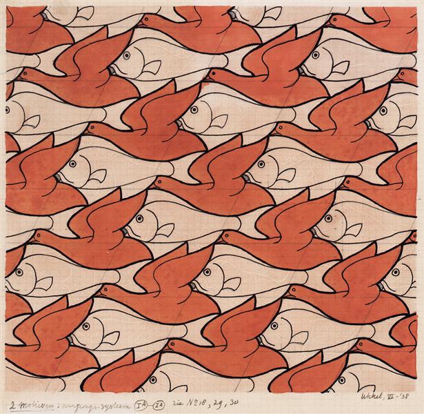
(Source is taken from: https://www.wikiart.org/en/m-c-escher/bird-fish)
I wanted to create a sort of food patter which encompasses the variety of the street, like what M.C Escher does with his textiles as seen above. I wanted this sort of overwhelmingly compact illustration.
However, it was ultimately ruled out due to the difference in style. So I went with a more food wallpaper style, with cute illustrations of food on it.
(Source taken from: https://www.pinterest.com/pin/540572761507280597/)
However, it did not tie with the cover image as well. So I made a compromise.
Following the previous image, I had the ‘newer’ products drawn with lines, as though it were digitally add into the environment. That way there is this somewhat cohesiveness to the art style. Meanwhile the ‘traditional treats’ or food items that were used in the past but maybe not in that way are coloured in, showing that they had existed already.
(Source taken from: https://commons.wikimedia.org/wiki/File:Ann_Siang_Hill_Park_2,_Dec_05.JPG)
I also had the chance to wander around the streets nearby, and I was quite amazed by how the image of a place can change so easily from one street to another. Walking about Ann Siang hill was like walking in a colonial inspired park like Fort Canning, which would not have been place here till recently, seeing as Telok Ayer was more a Chinese settlement in the past, or a place for docking. Thus i wanted to show how the place seemed to new aesthetic wise, among the traditional shop house structures.
Following the similar aesthetic of the previous images I came up with this.
Subsequently, I started looking at Telok Ayer green which is like a self insert modern park in a small part of history. Though it was more of an attempt of tourist attraction with all these statues of the Chinese migrants of that time.
From there I created two illustrations:
I attempted to stay close to the geometric lines as a connecting theme in my work, but i felt maybe i did not do too good of a job at that.
Subsequently, i moved onto the shop houses, wanting to illustrate them in an ‘upgraded’ manner, with the glass windows and air con vents.
Finally came the temple, where we see even less of the geometric lines.
I think this image was the most interesting to work with, despite having one of the least cohesiveness to its image. I liked the interesting cropping, and so did many of my classmates when they gave me feedback.
Overall, I think I could have done better aesthetic wise if I had more time, because right now, the illustrations look as though they had more potential to be even more cohesive.
For our final project for Experimental interaction we are asked to create a social project that will allow us to interact with others. We formed small groups and began brainstorming what we could do for the interaction portion. Mostly our project revolves around ‘playing games’ with strangers that we meet on the streets, in a way to see how willing people are to interact with other strangers. The end result is ‘Play Stranger Things’.
Play Stranger Things
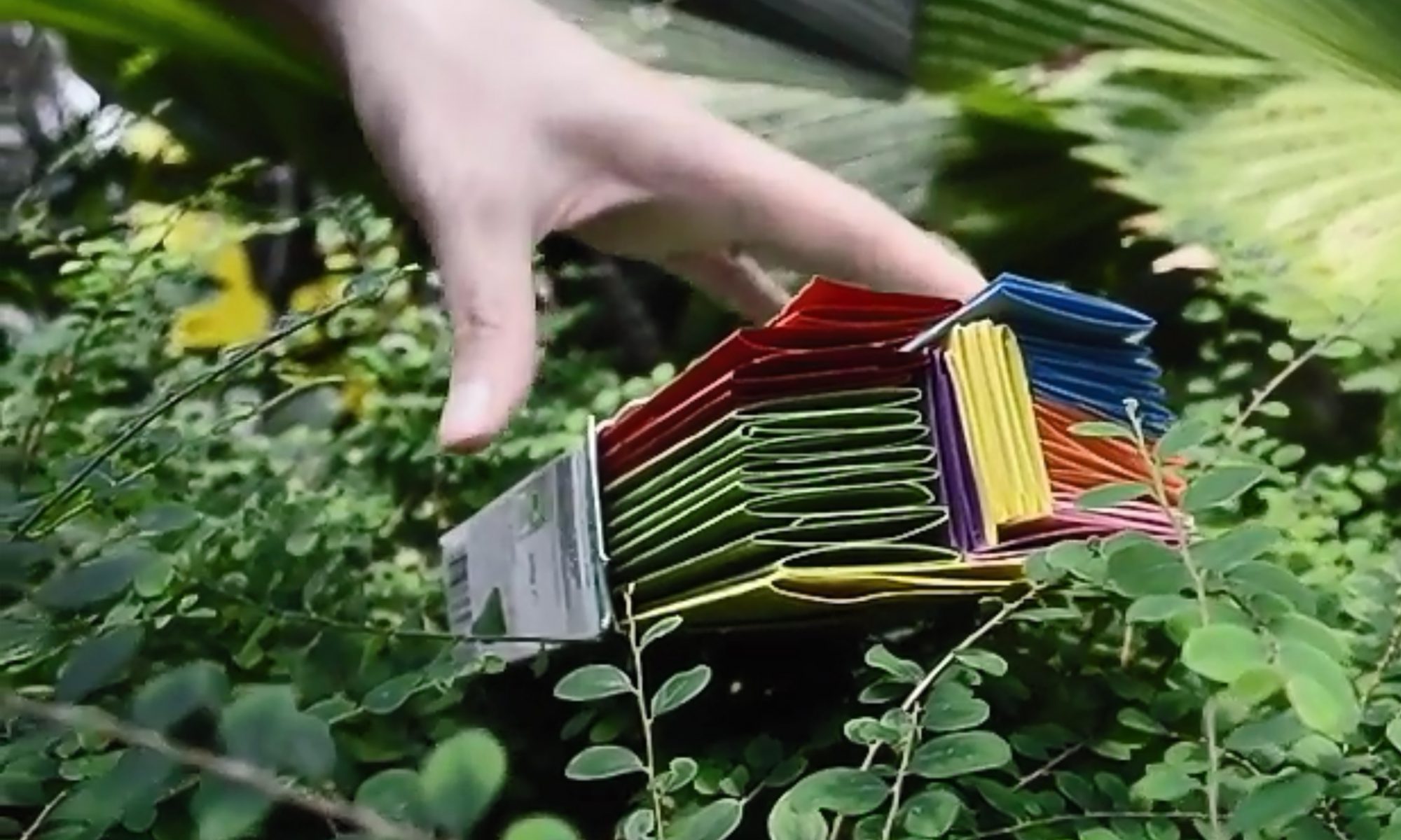
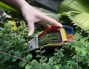
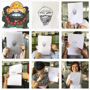
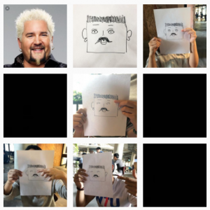
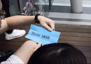
‘Play Stranger Things’ is a collaborative art piece where strangers become the artist and is tasked to draw a human face. The only catch is that each stranger can only draw a single feature of the human face, and each feature is dictated by the coloured sheet that they draw from our ‘box of features’.
The point of the game is to get as many people to play as possible, and document the developement of the image on an instgram page, @letsplaystrangerthings (https://www.instagram.com/letsplaystrangerthings/). Also each time we are rejected by a stranger we record it in the form of a black screen, indicating a glitch our collaborative work which referenced Glitch art. Subsequently, the final picture is placed side by side by a character or person a stranger said it looks like.
(Screenshot taken from our instagram)
(Screenshot taken from our instagram)
Creating the project
Initially, the project took the direction of drawing a well known person, for example ‘Amos Yee’. However after a quick test run, we realised that even as art students, interpreting a facial feature like ‘long curly hair’ would take form in many different ways, and the resulting image will not look exactly like the human.
Hence, we scrapped the idea of creating a known person, and researched variations of each facial features, example ‘eyes’, ‘nose’ and ‘ears’ and have someone guess who they are at the end of the drawing.
The features colour coded:
Yellow: face shape
Red: Eyebrows
Purple: Ears
Green: Hair
Pink: Mouth
Orange: Nose
Blue: Eyes
We then put them in box and went out to Northspine NTU to conduct our project.
Reviewing the project
The point of the game is as mentioned before, the test the willingness of strangers to play and interact with other strangers, and so far, most of the people we approach are quite willing to be approached and contribute to the art.
Of course there was quite a fair bit of rejection as well, and we were intimidated by how busy everyone seemed to look, and sometimes did not want to intrude in their time. We also approached a lot of groups of people after awhile, as they seem more keen to play the game with their friends. Overall the interaction seemed to be more positive when in the presence of their friends.
We also ran into a group of sponsers at the Humanties and Social sciences building, which we had a trade with. We do their survey and they played games with us.
In Conclusion
I feel that our project is like Blast Theory in the way that we let pur audience take control of the project, and we let them interpret the instructions that we give them and react in the way that they want.
(Source taken from: https://en.wikipedia.org/wiki/Cadillac_Ranch#/media/File:Cadillac_Ranch.jpg)
Title: Cadillac Ranch
Artist: Chip Lord
Year created: 1974/1994
Medium: Installation
Overview
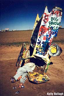
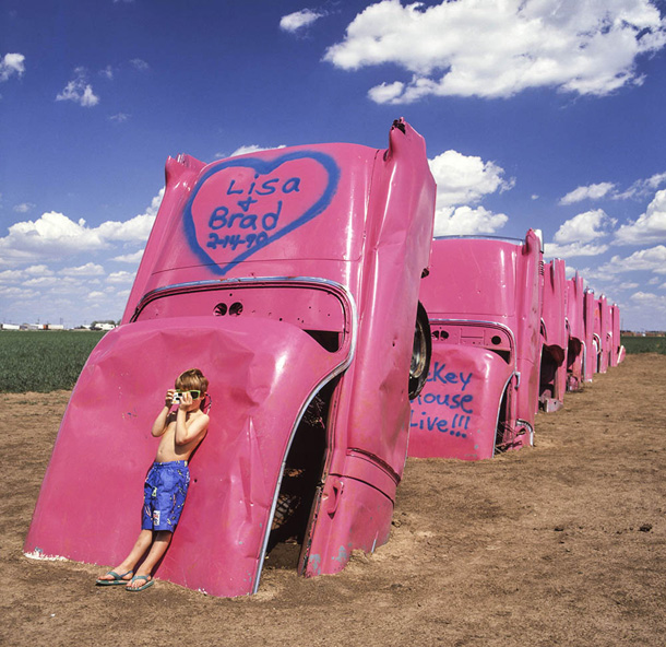
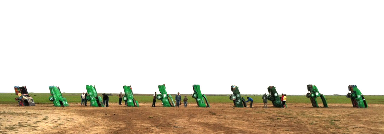
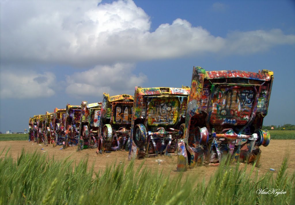
Cadillac Ranch is an installation of 10 Cadillac’s buried nose deep in a line, in the dirt along route 66 west of Amarillo.
Its almost as if they were droven off a cliff and plunged head first into the ground. Now useless, the owners wander off looking for help and the Cadillacs lay, left there buried with their tailfins in the air waiting for travellers to chance upon it.
After awhile, the work was subjugated to the whims of the travellers, meaning they were either defaced with graffitti or ripped apart as souvenirs. Whats left of these cars are but a line of rainbow coloured skins of their former selves, rebirth into comic relief for a travellers amusement.
(Source taken from: https://www.roadsideamerica.com/story/2220)
Ant Farm
As mentioned by Constance Lewallen, in his writing ‘Still Subversive After all These Years’
Ant Farm — a collective of radical architects who were also video, performance, and installation artists but, above all, visionaries and cultural commentators — offers an intriguing look into the conceptual activity of the late sixties and seventies, a time that has proved to be seminal for succeeding generations of adventuresome artists.
Their work embraces ‘the latest technologies to disseminate its scathing criticism of American culture and mass media’.
In the case of the Cadillac Ranch it is a commentary about consumerism and maybe pop culture. What a car and a crashed car is in society. More interestingly is how members of the online communitty take to the idea of a crashed car.
Its almost Ironic, how one can act so indifferent and even gleeful of the idea of chancing upon a crashed car. How satirical their photos get when they interact with the car itself.
Decades have passed. The Cadillacs have now been in the ground as art longer than they were on the road as cars. They are stripped to their battered frames, splattered in day-glo paint splooge, barely recognizable as automobiles. Yet Cadillac Ranch is more popular than ever.
As quoted from roadsideamerica.com
And in a way it is quite interesting as it changes in an unsual way with time. The artwork evolves with evey added touch of a new tourist own creativity into the mix. It keeps conversations going, give people something new to talk about.
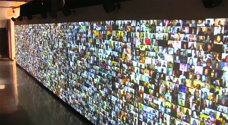
Artwork title: Hello World! or: How I Learned to Stop Listening and Love the Noise
Artist: Christopher Baker
Medium: Multi-channel multimedia installation
Year created: 2008
The Review
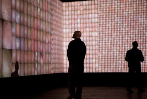
Hello world is a video installation where 5,000 video diaries of various individuals are played along a wall. The people in the videos can be seen speaking in their rooms, kitchens, a space of comfort.
Walking into the gallery space, one is instantly immersed in layers of voices, overlapping to the point that the words blend and become noise. It is as though you are listening to them talk about something intimate, nd at the same time, their personal issues are made public. You hear everything but at the same time you hear nothing in a sea of voices.
His works is a visual representation of the modern lifestyle of being constantly interconnected despite being far apart.
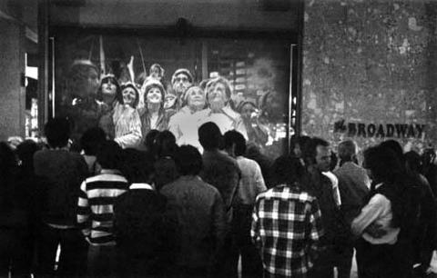
The concept is similar to that mentioned in Randall Packer’s writing ‘The Third Space’ in regards to the art work ‘Hole in Space’. He mentions the idea of a ‘third space’ being created, or a virtual identity being transimitted from one party to another through technology.
(source taken from: http://www.medienkunstnetz.de/works/hole-in-space/)
In this case the works differ in the the sense that ‘Hole in Space’ is a live broadcast, which is ephemeral, it is ever changing depending on the people and how they interact. On the other hand, ‘Hello World!’ is a collection of pre-recorded videos, hence the interaction becomes one-way. That means that there would be a distinctive lack of communication between the people whose videos are put up.
When we were in class, we talk about how communication is important when working as a collective whole to make a work cohesive. So it is amazing to see the images contrast with each despite the lack negotiation.
Credits
Christopher Baker: Hello World! (n.d.). Retrieved February 07, 2018, from http://www.huhmagazine.co.uk/3200/christopher-baker-hello-world!
Gallery, S. (n.d.). Christopher Baker. Retrieved February 07, 2018, from http://www.saatchigallery.com/artists/artpages/christopher_baker_hello_world2.htm
Packer, Randall, Open Source Studio, IEEE Spectrum, 2015