Manifesto: I live like I am____

When I was creating a manifesto, I thought about what could and could not be said in the academic setting, and thought this was a great opportunity to just let it out.

‘I live like I am ________’ you fill in the words, how do you want to live? how do you think I live? I wanted to live like a censored world, where your mind just automatically fill in the blanks that dictate what I believe in. it could be anything under the sun, but for the sake of saying what I wanted to say i created a version that is only partially blanked out by a blacked box.


Image Making Through Type Final

Final thoughts

So this is the out come of the past few weeks labour.

The first two looks a lot like each other, due to my set mindset of having them take on the similar aesthetic.


Subsequently, the third one is vastly different, where I tried to do things in a different perspective. This one was more exploratory then finished I feel.

The Last one is more grounded in how it branches away from the similar style of the first two, but it is also due to the fact that this one was referencing a style that already exists.

In conclusion, I think there is still a lot I can improve on for this project.

Image Making Through Process

For the next few days I went about illustrating my job in font. I didnt like the idea of scrolling through free font sites looking for a base font to build on my illustration.

The Sketches

This sketch was for an initial idea of the Chemist, however I realised that i too many options of which I was more interested to pursue, hence dropped the idea in its early stages of developement.

These were the basic sketches that eventually become the base for the pattissier illustration. I had a hard time deciding whether I wanted to portray the finished product (all the cakes) or the process of making a cake, so I did a short study of both.

These were the sketches that I had done up for the idea of the magician/circus performer. I wanted it to be very narrative with alot of things going on. However there were several factors that would lead me to change that idea eventuall. Thus the early stages of development had resulted in less defined alphabet sketches, but more details into how an actual object can look like an Alphabet. (Also without colour it is quite hard to differentiate the alphabet from the background).

This was the last of my sketches, but not the last of my exploration. I was really enthusiastic about this job prospect as there was a lot of things that i could play with to create my name. Different toys and tools, and I event had time to play with the prospect of creating my full name.

Playing with digital media

So I took to illustrating the Pattissier first, since i had a rather clear idea of what aesthetic I wanted to achieve from it.

I used Illusrator as I wanted a flat, pop art style that makes it ‘cute’. I did illustrate the two different ways that I mentioned above, one being with all the cakes all lined up as my name, and the other being the one where I illustrate a cake and the process of making the cake.

I went with the finished cakes, as it was more adorable, and it illustrated the idea of pattissier alright (my friends could tell what job it was, so it means I got my meaning across just fine).

I had a bit of trouble when creating the cakes, because it is not very easy to recreate texture on a vector system.

Image result for tart

(Source taken from: https://www.thespruce.com/fruit-tart-with-pastry-cream-filling-995161)

Image result for cake

(Source taken from: https://celebdear.com/product/velvet-chocolate-cake/)

There is only so much detail you can put in on a tiny illustration and there is way too many things I want to put on my cakes like the shine on the fruit, and the crispness of the tart.

Subsequently I illustrated the Toymaker idea in the form of ‘Doll maker’ again on Illustrator. I felt that by doing so I could kind of merge the idea of fashion designer and doll maker into one, seeing as both may end up doing this similar process (One making the doll the product and the other the doll as a mock up for their actual dress).

It is set in the workshop, as I felt that by showing the process i can have a variety of things go into the illustration, not just the idea of ‘collecting’ toys.

I did this with the similar style as the first. However, I had feed back to try and do something different, so I tried to branch out for the third piece.

The third piece has a mix of Photoshop and Illustrator. I wanted a museum curator because i like the idea of arranging collections as an aesthetic. So i created the halls of the museum in Illustrator before realising that if I was going to photo collage this, Photoshop would be more effective.

It got a bit messy after that as I started to piece images together.

There is a lot of things I can improve on for the composition, but I did not have the time to do it. However I think its mostly due to the perspective of with I based the entire illustration in.

I did the last one entirely in Photoshop, trying to branch away from over relying on the style of illustrating.

I had an initial idea of having it in a similar aesthetic as the first two but I was dissuaded from continuing down that line, so it remained like that.

So this illustration was supposed to be about being a magician or a circus performer. I was searching under ‘magician aesthetics’ for this, and ‘circus aesthetics’ when I came across a circus poster, and went with that as the main aesthetic for this final illustration.

Image result for circus posters

(Source taken from: https://www.etsy.com/listing/87011761/vintage-circus-poster-circus-procession)

Image result for circus posters

(source taken from: http://www.elcheapoposters.com/ringling-bros-barnum-amp-bailey-circus-poster-6-circus010.html)

I really liked the animal ones, and also it was easier to find pictures that would reflect the style of these posters.


When your N̸̰̙̻̖̮̭͚̊͆̑̄͐̉̕̕̕͝í̵̛̫̞͖͇͕̲̤̗̳͈͍̝͋͆̕g̶̡̡̡̛̣̙̹̣̠̳̞̞͉̻̱̓̎̽̈́̂͋͑͌͌͠h̸̨̨̟̺̙̖͉̺͈̻͔̻̱̗̓̏̒̄̍̀̓̾̚ṫ̶͓̠͎̗̞̬̺̟̲̭̀͐̂͆̽̔̒̒̀̇͗́͆́m̷̰͊̆̏̅͋̓̈́́͊͘a̷̢͙̤͇͓͉͇̹̞̯̰͈̮͑͑̃̈͝͠r̵̡̤̰̥͙̝̄͒͂̾̾͑̋̈́͑͌͠ͅe̵̛̼̲͕͖̗͙̝̣̝̍͗͗̓̂͝s̴̱̼͈͇͕̣͍͇̝̍̉͝ Become Reality

Micro-Project 5

So we were playing with G̴͔̘͚̞͚̞͓̭͈͛̓͆̏̈́̅̀͒͂ļ̵̫̓̾́̃̈́́̐͝í̴̢̧̝̰̱̗̰͙̘̖̼̜̪͎t̶̬͓̙̹̊ͅč̷̨̢̜͖̪̪͇̫̼̭̳̎͒̈́̆̈͐͗̂̈́̕̚͝ͅh̸̢̭͈͈̟̖̖̙̱̼̠̝̽̑̇͛͜ͅ ̶̲̠͉̭͍̦͎̬̪̙̣̜́͐͆̎͛̉͑a̶̡̧̟̺͎̫̜̳̗̤̣͎͗͐͂̉̎͛͛́́͐̇̚͜͜͝͝r̵͇͆̓̾̓̈͊̀̅̇̇̓̉ẗ̴̨̡͓̩͎͖̦͎̘̪̟̲̲̬͔́̈́̀͆̀͌̑ Today.

We were asked to edit one group mates image and then save it. Next we pass it to the next group mate to re edit again. the process repeats till everyone has edited the image once.

So my group members edited my image something along the lines of the image below.

Its quite fun actually, defacing  each others pictures, in fact most of them did not look like ourselves after the entire transformation was over. Its more interesting when we don’t look like ourselves anyway.

Ego in Different Setting Process

First I roughly sketched out a few ideas I had in mind in my sketchbook.

(First Box: I guessed I am described as a Chinchilla, I am hyperactive and bounce around a lot.

Second Box: I’m kind of the person that wants to interact with others.

Third Box: But that is kind of when I realize that I’m more of a hermit crab.)

(First Box: There comes a time in every Chinchillas life where they have to answer a text message from an important person.

Second Box: Sending the message is hard work, with a long tiresome vetting process.

Third box: However, receiving the message is far more tiring and frightening for the fragile Chinchilla.)

(First Box: As a Chinchilla you are expected to be a highly active person with many things pile on your plate.

Second Box: But you are not God so it is expected that you would burn out.

2.5 box is the edited image of the scenario supposed to be seen in the second Box.

Third Box: Maybe its time to recharge.

Fourth box is the edited version of the third Box.)

(First Box: As a Cockatoo, I’m a creative birdie that knows how to paint.

Second Box: I create works of art that many people admire and they always ask, “What do they mean?”

Third Box: I rather them believe that the things I do is more innocent than it is.)

(First box: As a cat it is your responsibility to sleep in day in and day out.

Second Box: But sometimes you need to wake up and face the real world.

Third Box: …Nah, maybe in five minutes, or a day…)

(First Box: As a flower I am sweet and innocent, something pretty to see.

Second Box: When facing something scary, there is only two things I can advice you do. The first being ignore it and maybe it will go away.

Third Box: The second is to become more scary than the thing threatening you.

Fourth Box is an edit on the perspective of Box 2.)

(First Box: If I were a tiny Hot Wheels Car.

Second Box: I would stare out my window.

Third Box: And wonder why that hunk of a car does not notice me?)

(Here are the edits for the Hot Wheels panel and the cat panel)

The story line for them were fine, but the perspective that I put them in, in the various scenarios were not too well done, so i sketched out and edited a few panels.

In the end I picked these four.


I  went online to see what styles I wanted to portray them in.

I kind of already had an ink and wash idea in my head, sort of illustrative style that is more realistic.

(the above is the works of Kelly Murphy and Karen Haley respectively, I hoped to use this for the Chinchilla and the Cat illustration.)

Subsequently I wanted a sort of comic book style for my fourth panel as it references the transformers comics, but instead I went a semi-realistic, less graphical rendering.

I was referencing Henri Matisse (the first picture) more than Helena Wierzbicki (The second picture) as her work was a bit too colourful.

I like the colours patchy, it suited me more then the smooth blended techniques, and in this case it gives it a bit more edgy feeling to it, a bit more action-like.

The Last style i was referencing was the movie Antz (1998). It had this scene where the ants interacted with humans, and I remembered how foreign looking the humans were to the ants. I wanted to imitate that sort of imagery.

The sort of picture like quality where the humans come from the sky and the plants are down to earth.

So for the first two panels I went ahead and started to ink and wash my illustrations. They came out rather desaturated, so i scanned them in and upped the saturation and contrast.

Some edits were a bit more drastic then others, like changing the cool tones to warm, but I felt that the composition would have looked better in the warm tones then the cooler ones.

Next I went to photograph some flowers at Gardens by the Bay. I needed two flowers one opened and one a closed bud, yet they both have to have the same amount of mass to seem as though the flower was chomping down on it. I finally managed to find two flowers with similar backgrounds and masses to make it seem that they are the same.

Then I edited it to make a foggy back ground and some other ‘special effects’.

Lastly I drew the Hot Wheels toy car on Photoshop.

Hence resulting in this final.

The Chinchilla and the crossroads reflects my everyday mentality of prioritizing what has to be done, something that is relatable to many. The panel was originally a mix of complimentary colours orange, browns and blues. However, it became slightly more monochromatic as I felt it gave the composition a bit more tension, and it is draining/gives the feelings of dread and frustration when looking at it, which was what was supposed to be conveyed.


The cat represents this idea of laziness/love for sleep that I have. This panel was done in a monochromatic scale intentionally, to show a sort of simplicity in the nature of sleep. The first and last box were done in warm and bright colours, to create a more positive mood, associated with the desire for sleep. The second box is blue, like Monday blues.

The idea of the flower, kind of represents this ‘weirdness’ that kind of reflects what I am. I was told in Junior College that my humor is dark and hits when everyone least expects it. The panels are three photos that I took and digitally manipulated. I blurred out the backgrounds for the first and last picture, in attempts to make it look the same (Honestly, they were both green, so it did not make much difference after the blurring). Subsequently I added in a picture of my finger and dabbed on some ‘blood’ onto the flower petals (I’m glad this part turned out realistic, if not it would have clashed with the photo). This two were largely make use of the colour green, which brings me to my second panel which uses more blues and pink. The change in colour, gives the second image a sort of ‘foreign’ feel, hence making the human an intruding presence.

This last idea about the Hot Wheels car is a metaphor for my idealistic personality. The way I aim high, but it is out of my league/out of my reach (simply because it does not exist), and sometimes a bit more fantastical. Hence, I wanted to use colours that are a bit more dream-like and unnatural, hence the pastel palette.

2D Project 2

For this project i chose the following quotes:

  1. “Dishonour on you! Dishonour on your cow!” — Mulan (1998)
  2. “He touched the butt” — Finding Nemo (2003)
  3. “Oh Good my dog found the chainsaw” — Lilo and Stitch (2002)
  4. “This is my family. I found it all on my own. Its little and broken, but still good. Yeah, still good.” — Lilo and Stitch (2002)

“Dishonour on you! Dishonour on your cow!” — Mulan (1998)

For this quote, I illustrated the picture based on the key words “Dishonour”, “You” and “Cow”

“Dishonour”, I relate to death, bad omens and things related to fortune, hence I hose black cats and skulls, and grim reapers.

“You” I relate to humans, human skulls, fingers anything somewhat accusatory.

“Cow” is literally represented with images of cows or horse or animal skulls.

I liked the design and decided to play around with the scale, half tone, threshold and came up with variations of the one composition. Though I still like the design without the colour halftone.

“He touched the butt” — Finding Nemo (2003)

For this quote I split the  Illustration the into the key words “He”, “Touched” and “Butt”.

“He” refers to a male, or humans in general. Hence for “He” i thought of icons that are often associated to man like a mustache or literally the male gender symbol.

“Touched” I had wanted to use the mouse arrow symbol, the clicking symbol or the more literal sense of touch as in hands.

“Butt” there are two meanings to this word, so at first I found peaches to visually show a butt, or animal butts like cats and dogs. However the more i searched, I realised that it is easier to illustrate with images of “jerks” instead. Hence I have a chose images of Cats and Donkeys ( also known as a Jackass).

The idea was rather literal I find, and a bit to simple and symmetrical. The comments I got was it was too ‘quiet’ so it was eventually rejected.

“Oh Good my dog found the chainsaw” — Lilo and Stitch (2002)

The keywords for this illustration is “Good”, “Dog”, “Found” and “Chainsaw”.

“Good” was hard to illustrate, but i eventually decided on using elements of good luck. Examples of which are clovers, horseshoes, rabbit feet and dream catchers.

“Dogs” are literally represented as dogs for me.

“Found” I wanted to represent as sight, or magnifying glass. There was also a thought of creating a trail, to show the process of being found instead of actually being found.

“Chainsaw” was initially just a chainsaw, but then I felt that it was too literal, hence i broke the word into two, “Chain” and “saw” so images of chains and eyes.

The although I liked the idea of the first two, the comments  got for them both were that they were very symmetrical and ‘quiet’. Hence I decided to expand on the piece on the left to create the one on the bottom. This one was considerably better, as it was ‘noisier’ and more chaotic.

“This is my family. I found it all on my own. Its little and broken, but still good. Yeah, still good.” — Lilo and Stitch (2002)

The key words for this quote is “My family”, “found”, “little”, “broken” and “Good”.

This was tricky as there was a lot more elements to works with and the words had held so much possibilities it was difficult to choose.

For “My Family” I wanted to branch away from the typical family of humans, and wanted to search for other symbolism, like a “family” of animals, or a “family” tree.

“Found” is similar to the above, where i wanted magnifying glasses,  or a trail to show the process of finding.

“Little” I did not want to find and image, rather I wanted to play with the scale of the main ‘characters of the illustration.

“Broken” I referred to broken limbs or injuries at first. However, after, I started researching more, I had broken objects like windows an glass in mind.

“Good” once again refers to the above, idea of good omens, hence lucky items like rabbits feet, clovers, magnets, etc.

In the end, I felt this quote had abit too many elements to piece into a single coposition and chose to focus on the others

Final design:

So in the end, I chose this design to print:

Printing the process:

Before we start the printing process, we first have to print the design on to transparent sheets

Next we need to prepare the silk screen.  Spread a thin equal layer of emulsion on both sides of the screen and put it in the dryer/leave it to dry.

When it is dry, inverted the transparency and paste it onto surface of the frame.

This was the picture would be the mirrored image when it is printed.

When the image is secured, we put it in this machine where it is exposed to light. The machine sucks out the air from the silk screen frame, and the light sensitive emulsion would imprint the image on the transparency on it.

After it comes out of the machine, we can wash the screen with water and a sponge. The emulsion would be scrubbed away from the frame, and the parts that are left behind would be the negative space reflected in the transparency.


After the image is out, pat dry the silk screen and leave it to dry.

When that is done, tape the four sides of the silkscreen such that it crops the image exactly. Do so on the front and the back side of the silkscreen.  By doing so we are preventing leakage of the ink.

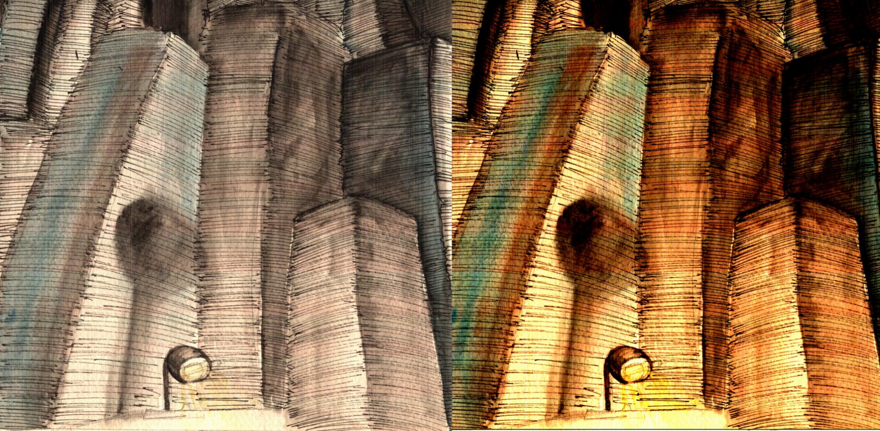
After that we lay the silkscreen onto the surface that we want to print on, with the frame side up. Since this a test run, we are using newsprint. Dab some ink horizontally on the top of the area covered in emulsion/tape and make sure it is spread equally. Get someone to help you hold down the frame, putting equal pressure on every side. Making sure you have the correct sized squeegee, pull the ink down in one stroke.

If done correctly, it would look like the picture in the above left. if there is unequal pressure or too little ink, it would turn out like the picture in the right hand side.

Finally, iron the tote bag flat, and stuff it with card board. This will make your printing much easier, as the surface is flat. Align your image to the bag, and print.

Viola~

My Line is so Emo Finale

I had to print out the sadness image that I photoshopped before i could put everything together.

Looking at them now, i realized how similar some of my mark makings are. Which probably means i have a long way to go. I liked how these 6 turned out though.


My Line is Emo Process Part 2

After Consultation, it is quite clear that i have some interpretation error, so its time to relook at my life choices.

Firstly, the definition of ‘Horror’ that i have created would have better suited ‘Paranoia’ now that it think about it. I decided to delve a bit deeper into the idea of texture on my mark making. I wanted a rough texture  on to emphasize on the spikes of ‘Horror’ like a defense, however it turned out very differently.

By using paper mache i attempted to recreate the below effect

I first threw the toilet paper i was using into a container with ink in it to let it soak. Then i used my hand to break up the clumps. After that i sieved through the ink and strained some of the water from the paper mache before finally throwing it on the paper.

It did not end favourably as the consistency of the paper mache started clumping together, or disintegrating when I pulled them apart with a palette knife. Hence I piled more on and it gave off a more ‘disgusting’ vibe.

For ‘Sadness’ photo shopped the ripples, adjusting the light and darkness of the image to create contrasting marks.

I liked the way the overlapped each other, but it still felt a bit plain so I searched through the other rippling effects i had and recomposed the image.

The first composition had a very distracting background, hence, it was deemed as not suitable for the project. The second composition was a bit better, but it still felt as thought the elements stood as individuals rather then a single piece. Thus I created the final composition and cropped it tighter.

‘Affection’ had gone through a few stages of evolution in terms of thickness of the paint as i wanted Affection to have a translucent effect. It is like it is an unconscious feeling that we experience, but do not actually take note of it.

Using black water colour on watercolour paper,  i begin drawing the patterns i did with the cotton buds previously.

The initial composition was not very pleasing as it had not point of convergence. it was messy and there were too many things to see. The second one i rather enjoyed, however it was rather inconsistent, with the tinier loops, which grabbed attention. Thus there were again too many things too look at once again. The third composition I wanted to add tiny emphasis on the paper against a sparse back ground. I dotted the canvas with blobs of water and added the paint by poking it with a brush and letting the paint spread. This sort of insinuates the times were small acts of kindness are acknowledged as affection one feels for others. But it turned out pretty ugly as the paint blobs all had the same texture when it appeared. Finally I created the last design, a sort of vortex that swirls around the centre of the sheet. I wanted it to seem as though it encompasses us, it is always there.

Hence i chose to Dilute the ink, to a fainter consistency and repaint the last design on a final sheet.

‘Hysteria’ came about when I was making ‘Surprise’. Due to the nature of ‘Surprise’ i wanted one single element that showed a change in the scenery. An Explosion or a hiccup on the blank canvas.

I wanted a sharper contrast, hence i used white acrylic paint on black cartridge paper. Using a square brush i begin my mark making . I overestimated how many ‘hiccups’ i wanted and was left with to many blobs of paint. Subsequently, The acrylic paint was not able to make that smooth gradient i wanted by brush alone.

In a fit of frustration I started stabbing the blob of paint with tissue.

I had hoped that it would become a smooth gradient like my previous attempts with Chinese ink on Newsprint

The colour imprint was faint, but i believe with thicker paint the build up would be better.

As it turned out i was wrong about the colour built up. But the effect was quite pleasing to look at. Looking back at it now, the white on black made a stronger more negative connotation to me when the white is solid. It reminds me of those jump scare clips that people post, where the image starts flashing in inverse colours. It was also interesting that the tissue stuck to the paper and made a flaky texture on some parts of the paper.

I decided to try white acrylic on black paper again, but this time with more diluted paint.

After consultation i had wanted to remake a similar composition for ‘Zest’ but in a more positive light.

The effect was beautiful, however the piece had mellowed and become more ‘Contented’ then the lively ball of energy that i had perceived to be ‘Zest’.

Finally was ‘Surprise’. After all the botched attempts for surprise, i had wanted to change the aesthetic of ‘Surprise’ into something surprising. I had sketched out a plan for surprise to be made out of geometric shapes and planned to use ink on paper.


However whist inking it out, it started looking more rigid than i had planned for ‘Surprise’, hence i redid using ink and wash on watercolour paper instead.

The effect was far more fluid then the first.