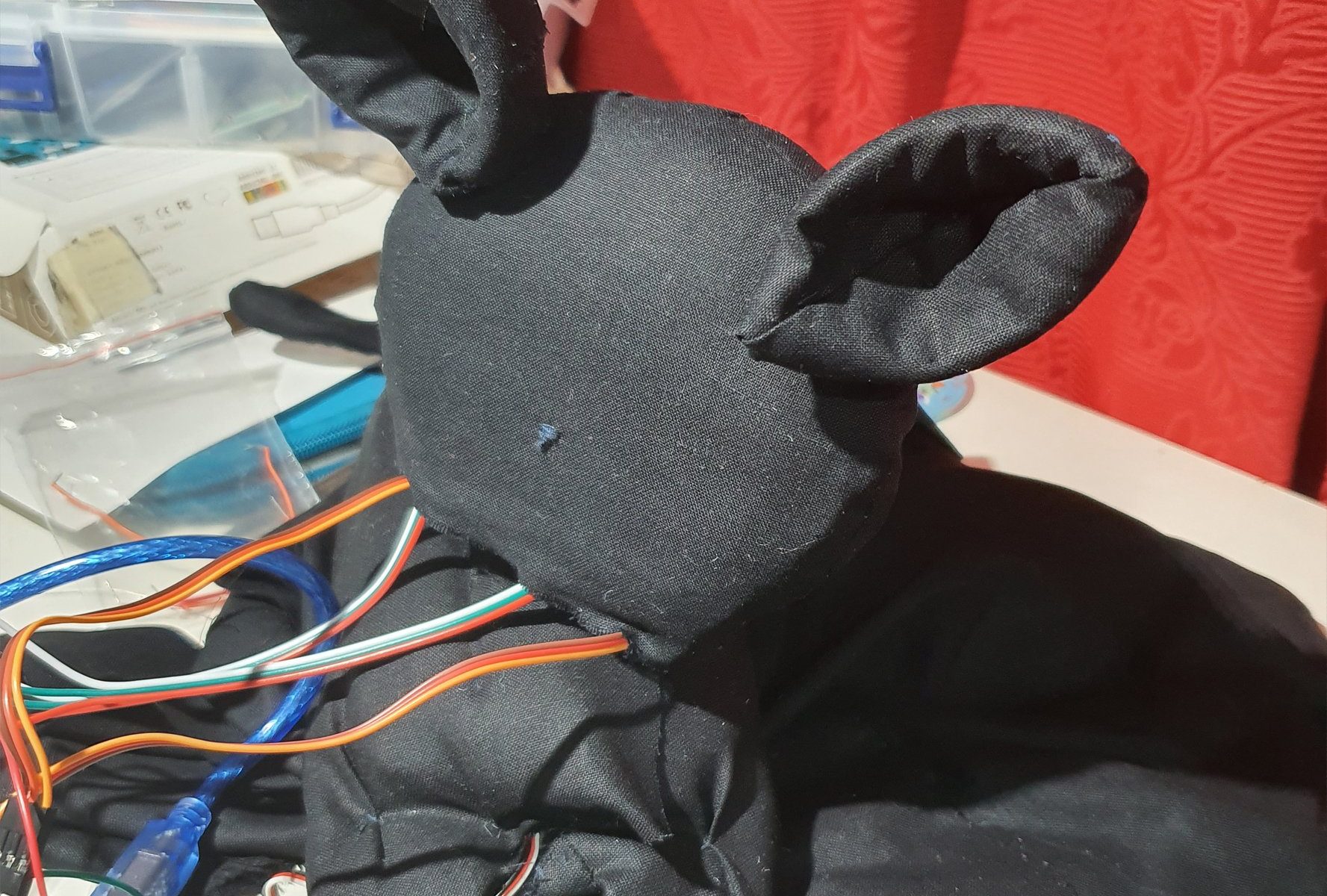
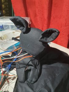
Skitzie the Cat is just your average black cat that likes to hang out on your shoulder. They are curious and like to people watch while you do your stuff. But Skitzie is very shy, hence pretends to be a scarf when anyone comes too close.
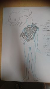
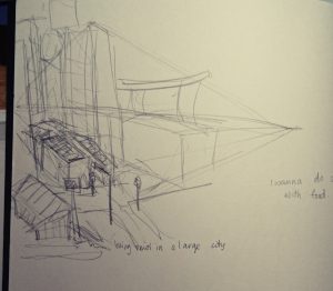
(insert hooman wearable sketch)
About Skitzie the Cat
Skitzie is a guardian for those who are not to aware of their surroundings. In a sense Skitzie’s ‘hasty retreat’ to become a scarf is a warning that there are on coming people approaching.
For this project, I had imagined Skitzie to be able to move their head and their ears to see the world. Skitzie is also envisioned to be able to ‘blink’ through LEDs and hum through a speaker. I wanted there to be sound or light as an indicator to the person who is wearing Skitzie to know very clearly when Skitzie is a cat and when they are pretending to be a scarf. The Warning has to be distinct enough to catch people’s notice.
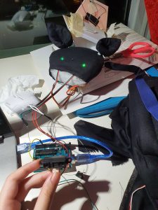
Skitzie’s hardware
Skitzis is a combination of servo motors and a sharp
Testing out the Eyes circuit, it works. Turns off and on depending on the closeness.
For Some odd reason though when i add the ears, the eyes disappeared.
Then it got fixed (connections are problematic, check everythingggg).
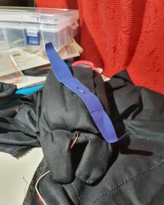
This is the body, that I made around the head servo motor.
All Assembled.
Reflections:
Honestly the aesthetic of Skitzie didnt come out right, which I am a little bit disappointed by. Subsequently the head keeps falling off if left for too long, so I need to fix that in future. Hopefully we will see the return f a better Skitzie in future.
This project revolves around the idea of the gaps between noise/sound, hence we created a portable device that will sample the overall surrounding sound and in response would light an LED in a corresponding colour. The colour is based on a calculation where ‘red’ is volume , ‘green’ is pitch (regardless of octave) and ‘blue’ is pitch (exact octave). Red and Blue were scaled to fit a range of 0 to 255, however, for the Green there were 5 ranges created, skewed accordingly so that the range for a humanly possible pitch is larger then a not humanly possible pitch. The code makes use of an array to store data in each pixel, until all nine pixels have been used up, then the information would be overwritten for the following pixel.
References for the code:
Origin of basic-ass code (which is no longer here): https://www.teachmemicro.com/arduino-microphone/
Origin of getAmplitude code: https://learn.adafruit.com/adafruit-microphone-amplifier-breakout/measuring-sound-levels
Origin of getFrequensea code: https://www.norwegiancreations.com/2017/08/what-is-fft-and-how-can-you-implement-it-on-an-arduino/
Origin of NeoPixel code: https://learn.adafruit.com/adafruit-neopixel-uberguide/arduino-library-use
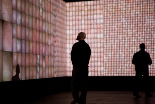
Our work takes reference to works like ‘Pulse Index’ by Rafael Lozano. It is similar in the sense that it takes record of the viewers in put, in their case the thumbprints, in our case sound, and record it on a visual plane to show the changes overtime.
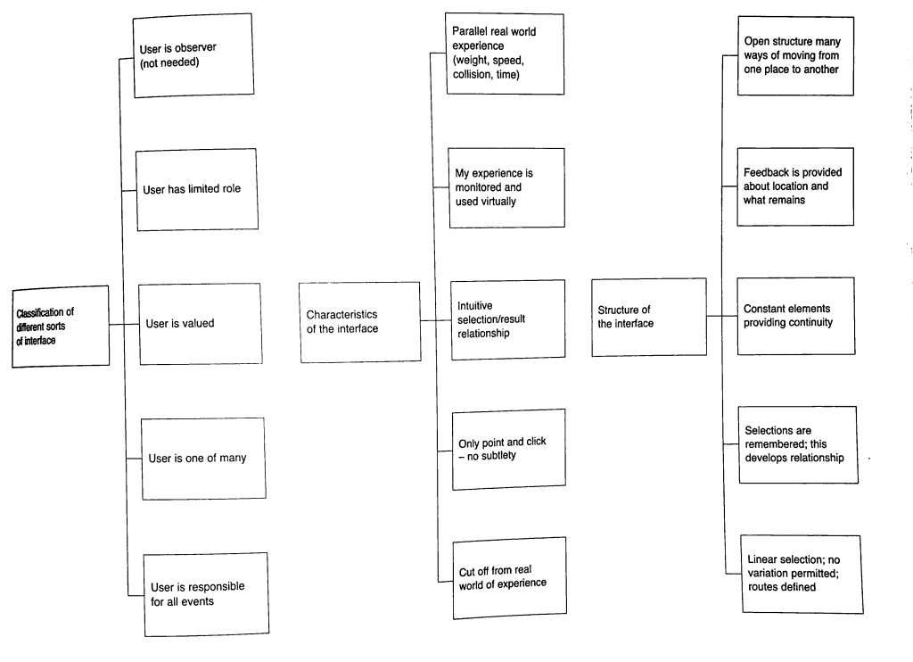
Characteristics of Interface:
Classification of interface:
Our project falls under ‘User is one of Many’ and ‘User is valued’. Our project values the unity of the environmental sound and how your sound is captured in this collective and you cant discern what is your sound and what is the environment, hence the user is one of many part. However, the user is valued is also present in a way that they are the anomaly that created the most change when they interact with it directly.
Characteristics of interface:
Our project falls under ‘Monitered and reflected experience’ as well as ‘Intuitive selection/results relationship’. For the former, the device is to collect the environmental sound and show a colour represnetation, hence all interatctions are copied and shown directly based on the sounds that you make. The latter is true as when you see the light changing to sound, the viewers will automatically try to interact with it to see the extent that it will change to, hence creating the result of trying to find the gaps between the sounds you make when you see the different coloured representations of each instance of sounds made.
Structure of Interface:
Based on the flow chart, our Project complies to everything except the last one ‘Linear Selection’. The first idea of open structure is seen in the way we made our device portable. The second idea of ‘Feedback provided’ is done so in the form of LED lights lit in accordance to the sound of the environment/people within the environment interacting with it. The third idea is ‘Constant elements providing continuity’, since the set up is designed to reflect the sound at every (how many seconds). Finally selections are recorded in nine LED pixels, showing 8 seconds of the recently past environmental sounds.
(Liz finally answered the question yay)
Who did what:
The coding for this project was done by En Cui and the physical fabrication of the device was put together by me (Elizabeth) (but you know in the end Liz kind of screwed up alot of the soldering and stuff and needed En Cui and Lei’s help to put them together. Thank youuu)
Process:
From the initial stage of mannually making LEDs light up by pressing the buttons whenever someone made a sound we created a circuit where the LED would light up in a certain colour according to the environmental sound.
After that we used this circuit as a a reference and moved from a single RGB LED to a strip of LED wire. That way we could create a set up where the colour of a certain period of time could be recorded and compared to the pervious period of time.
yay the LED lights up.
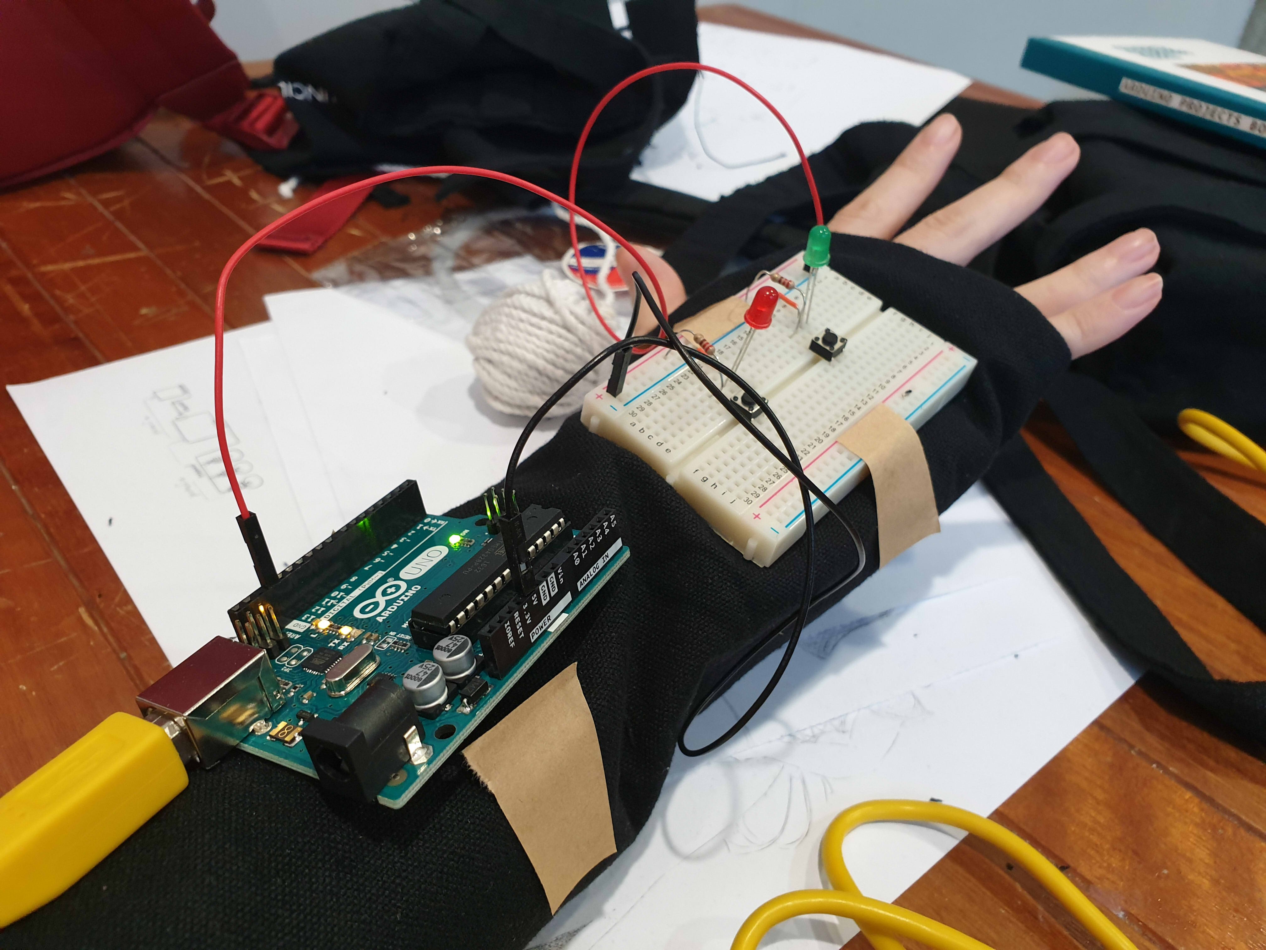
Measuring the length of wire for the glove.
This is where problems started surfacing on the soldering part so there was a redo. (soldering wise and circuit wise sob)
Testing out the Circuit.
Yay it’s done.
After Review:
Everyone reacted to the work as we hoped they would despite only having two participants. They crowded and tried to put in their own input by making noises around the two. Though we have coments that the feedback is not fast enough to show the exact inflection of voice as one is speaking, hence not very obvious. We forgot to mention this during the review, but the delay is also constrained by technical limitations. If we reduce the delay, we will need more LEDs to represent the same amount of time, and the Arduino memory overloads at 13 LEDs. Additionally, even at delay(0), the Arduino still cannot function fast enough to get the desired result:
As a result of the delay, our theme in this work might not be very obvious to the viewers to pick up on as a result. The eventual solution may thus be to use something with more processing power.
There are comments on how they are working very hard to satisfy the device as well. Some say that it seemed like a prop for band or choir performances, or a tool for training how to get the exact pitch.
Summary Reflection:
EC needs to actually know when it’s not possible than maybe possible.
Liz should not be so innovative. Liz is just not good with technology.
We should have thought out the final form better.
Extended Concluding thoughts (if you want to read about our woes):
En Cui’s Reflection:
Concept-wise, the challenge was that the core concept and form were not well-aligned. While we talked out several issues, there’s still the challenge of the interstice being unclear. But I think, in the end, the clarity of the message depends on how you interact with the wearable. For example, the distinction is much clearer if you experience the wearable in multiple contexts, than just one.
Regarding the code and circuit, it was actually mostly okay. While things didn’t always work, the only solution needed was to observe the problem, deduce what could be possible reasons for its occurrence, then test out my hypotheses one by one. Examples include mathematical errors and faulty wiring. I also did soldering part 2 for the microphone, and honestly the solution was just learning to recognise patterns of problems and solutions based on past mistakes, such as the solder not sticking to the iron (wiping more), or getting fingers burnt (plasters).
I also realise after a full day of reflection that I’m just incompetent at doing group work efficiently. Leaving me in charge is a generally bad idea.
Elizabeth’s Reflection:
For the most bit I felt very challenged by the project, especially since it is the first time we were using and putting together components to make a circuit. for the physical fabrication portion it was the first time I used a solder, and my circuit looked very ugly after that, and I dont really think I improved in that aspect very much even after multiple attempts 🙁 When using the Hot glue gun to insulate the exposed solder I think I made the circuit worse, because there was already a built up of solder.
Also, I did not solder the circuit down the right way apparently. You can only solder your wires to one side of the LED because they are fickle and like to have their electrical charge flowing in one direction. Also, do not solder and hot glue your circuit till you are 100% sure it works, saves you a lot of heartpain and time, (thank you Lei and En Cui for dealing with my screw ups D;).
I also made a few mistakes by piercing the LED strip’s digital pins on accident thinking I can sew it down that way. Thinking about it now, I should have known better then to try piercing any part of the components.
Speaking of computer, I feel very attacked by my own computer, since I think it has issues running the code we shared over google docs, and gave me a heart attack that I might have short circuited the only RGB LED in the starter pack, and still the circuit refused to light after I confirmed that I did not. I think there is something wrong with my computer DX. I either leave the testing for computer to En Cui or find a school computer for this (pick the right computer for this, not all computers have arduino).
If we had a bit more time and I had a bit more skill in soldering, we wish to have more LED lights to reflect the change in sound.
Finally with all the illustrations in place, I decided to compile them and add some of my thoughts onto the pages.
Page one was given a title. Looking back at it now, maybe i should not have put my name there, kind of ruins the effect of the cover page. I wanted the title for this Zine to reflect how confused I am to describe Telok Ayer uniquely.
The second page reflects the food that you get there, I wanted to put it in a sort of menu like setting, hence added the borders.
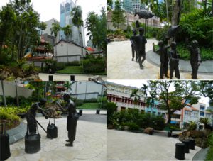
Page 3 i felt was quite self explanatory, how there are random statues placed around like tourist attraction, and everyone does just that in its presence.
Page 4-5, I left it be.
Page 6, I remembered looking at the shop houses during one of my trips there and wondering what the definition of preservation is. Whilst i believe it is good to re purpose these old shop houses, I think the area of Telok Ayer also begins to lose its uniqueness as it houses more modern shops now.
I let page 7 be as well.
page 8, this was a statue as well, I remembered looking at it ad saying this was probably something iconic to Telok ayer in the past. Now they can only use it as an odd tourist attraction, hence this sort of cynical reply at the end.
I did not have much time to print as I spent a lot of time redesigning the illustrations on Illustrator, but i ended up printing it on art card. Which i felt was sturdy and reflected the sold colours and lines of my Graphics well.
Though maybe i could have explored more on printing.
After touring Telok Ayer for two days, I really wanted to base my zine either on the old and new architecture in Telok Ayer, or the ornamental nature of the Temples and shop houses.
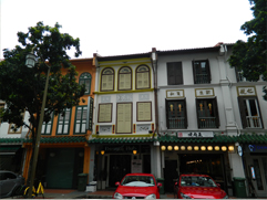
However, it soon became quite prominent that those ideas were more common then I thought. Hence, I decided on my second trip that i would start looking around the surrounding areas of Telok Ayer, specifically Amoy Street as it still has the ‘old historic’ look that echos Telok Ayer.
It became even more prominent that the harder I looked for something unique to echo Telok Ayer street, the more difficult it became. There is not much left of the Historical Dock that used to be there. Rather, the iconic shop houses were made new, painted in various shades of colour, the shops now catered international food like Korean barbecue, Thai food, western, and various bars. The temples had self inserted gift shops and some became museums, or hotel fronts in attempt to preserve the building.
In its own way it is interesting, to see how much has changed. However, with the brief in mind, to ‘portray the essence of the street’ it seems my street is giving me a run for my money. Everything that makes Telok Ayer Iconic, I feel, is the same thing that makes another place iconic. I see shop houses along Chinatown and Little India. I see Ann Siang hill and Telok Ayer green, as small inserts of green spaces common found in every other place. Bars are iconic for places like Clarke Quay, and the restaurants there are no longer serving local food.
I would describe the place as commercialized, or a Hodge-Podge of things put together in an attempt to make use of the space.
Hence I went about thinking about making a Zine that reflects this confusion that I felt for Telok Ayer, and an idea that revolved around the temple narrative. Ultimately the temple narrative got rejected, because i felt that it might be too in literal.
I still wanted to insert the intricate designs of the temples and shop houses, but to keep the graphic element of the illustration, I decided to minimalise the style into flat planes with a single coloured shading.
I made a list of what elements I wanted in the art work:
Telok Ayer Green, the randomly inserted park, with statues of fisherman of the past. It feels like a tourism spot, but a tourism spot to chance upon? it is honestly not very well known place. I asked my friends if they knew where Telok Ayer is, only one response came back positive, and he said he went there to drink.
Ann Siang Hill, actually placed at the corner of Amoy Street, it feels a bit colonial walking up the hill. It felt out of place when you think of this unchanging place called Telok Ayer
The surrounding Temples how they are still being preserved
Fuk Tak Chi Temple which became a museum or door front for Amoy Street Hotel, coexistence of old and new.
The food revolves mostly around bars and restaurants for internationl food. It rarely reflects the traditional food that Telok Ayer had in the past.
The shop houses which are so iconic to Telok Ayer, we see almost everywhere else like in Chinatown, Little India, etc. They were also modernised and upgraded with aircon vents and elecrical boxes, which makes for quite an interesting sight.
There is a mosque, Al Abrar Mosque, which I felt was very isolated. I went there close to chinese new year, hence the temples were bustling with people, compared to that the mosque was quite and quite isolated. I wanted to go in but did not. It did not feel right of me to enter. i want to illustrate that sort of quiet, isolated feeling.
There was also a heritage center there that was closed, i like the aesthetic of it though. It was a very interesting contrast in comparison to the temples.
I began to sketch what I felt represented these aspects of Telok Ayer digitally.
I managed to get a really good shot of the pagoda that I felt reflects how Telok Ayer is. Its buildings rarely change, as it is being preserved for the culture aspect, but its surroundings does. hence i created this sort of digital aesthetic to the skyscrapers, which look as though it has been edited into old ‘Telok Ayer’.
I also wanted to illustrate the food in Telok Ayer.
I had realised, walking down the streets of Telok Ayer is that most eateries there are either Cafes, Bars or restaurants that cater Korean food, Thai Food, International food, basically it no longer reflects ‘traditional Singapore’.
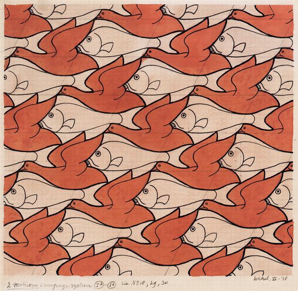
(Source is taken from: https://www.wikiart.org/en/m-c-escher/bird-fish)
I wanted to create a sort of food patter which encompasses the variety of the street, like what M.C Escher does with his textiles as seen above. I wanted this sort of overwhelmingly compact illustration.
However, it was ultimately ruled out due to the difference in style. So I went with a more food wallpaper style, with cute illustrations of food on it.
(Source taken from: https://www.pinterest.com/pin/540572761507280597/)
However, it did not tie with the cover image as well. So I made a compromise.
Following the previous image, I had the ‘newer’ products drawn with lines, as though it were digitally add into the environment. That way there is this somewhat cohesiveness to the art style. Meanwhile the ‘traditional treats’ or food items that were used in the past but maybe not in that way are coloured in, showing that they had existed already.
(Source taken from: https://commons.wikimedia.org/wiki/File:Ann_Siang_Hill_Park_2,_Dec_05.JPG)
I also had the chance to wander around the streets nearby, and I was quite amazed by how the image of a place can change so easily from one street to another. Walking about Ann Siang hill was like walking in a colonial inspired park like Fort Canning, which would not have been place here till recently, seeing as Telok Ayer was more a Chinese settlement in the past, or a place for docking. Thus i wanted to show how the place seemed to new aesthetic wise, among the traditional shop house structures.
Following the similar aesthetic of the previous images I came up with this.
Subsequently, I started looking at Telok Ayer green which is like a self insert modern park in a small part of history. Though it was more of an attempt of tourist attraction with all these statues of the Chinese migrants of that time.
From there I created two illustrations:
I attempted to stay close to the geometric lines as a connecting theme in my work, but i felt maybe i did not do too good of a job at that.
Subsequently, i moved onto the shop houses, wanting to illustrate them in an ‘upgraded’ manner, with the glass windows and air con vents.
Finally came the temple, where we see even less of the geometric lines.
I think this image was the most interesting to work with, despite having one of the least cohesiveness to its image. I liked the interesting cropping, and so did many of my classmates when they gave me feedback.
Overall, I think I could have done better aesthetic wise if I had more time, because right now, the illustrations look as though they had more potential to be even more cohesive.
During lesson, our class went through what was coined the ‘telematic embrace’.
During the lesson we held a online conference on Adobe Connect. Then we were asked to do a few tasks in front of our web cams. From where we sat, we could all see most of our classmates undergo each task rather differently, resulting in a wall of rather interesting imagery.
(Source was an image shared by our proffessor Randall Packer)
The task above was to share a photo we have on our phone. Through this exchange, we are able to learn alot about our own classmate. The photos we have on our phone says alot about who we are personally. In a situation where they are placed next to each other it is a playful contrast of of our personalities, despite sharing the same major.
(Source was an image shared by our proffessor Randall Packer)
The task above was to place our clear water bottles over the screen to create and interesting effect. Despite being quite easy to create, to achieve such a synchronised collaborative art work, one must be willing to cooperate and negotiate. In each photo that we have contributed to, it is only due to our willingness to follow the instructions given to us that we are able to create a cohesive combined image.
The conclusion
This idea of ‘Do-It-With-Others’ would have rather unpredictable results despite the contributers having the same set of instructions. It makes the outcome of the works surprising and unique as various ideas contrast and complement each other.