To copy the functionality of nature to solve our man-made problems.
Examples:
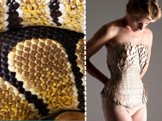
Stefanie Nieuwenhuys
(pictures taken from: https://blogs.3ds.com/fashionlab/stefanie-nieuwenhuyse-recycle-le-bois-comme-des-ecailles-serie-biomimetisme/)
After spying diamond-shaped wood chips on a workshop floor at London’s Kingston University—the leftovers of some architecture student, no doubt—Stefanie Nieuwenhuys was reminded of a secondhand snakeskin bag she once purchased. Scooping them up, the fashion student set to work, layering the wooden scraps onto fabric like reptilian scales.
The artist makes use of scrap material to make her outfits. This project of hers emphasises the idea of reusing materials. Laser cutting the pieces to look like scales, and imitating the layering to look like that of a snake.
Diana Eng
Diana Eng based her “Miura Ori” scarf on an origami “leaf-fold” pattern invented by Koryo Miura, a Japanese space scientist who was in turn inspired by the unfurling mechanism of the hornbeam and beech leaves.
The origami patterns were made by observing nature, and the omission of right angles, like forehead wrinkles or the veins of a dragonfly’s wing. Because of that, the pattern is collapsible.
Monserrat Ciges
Created to imitate animals that are able to voluntarily self-transform.
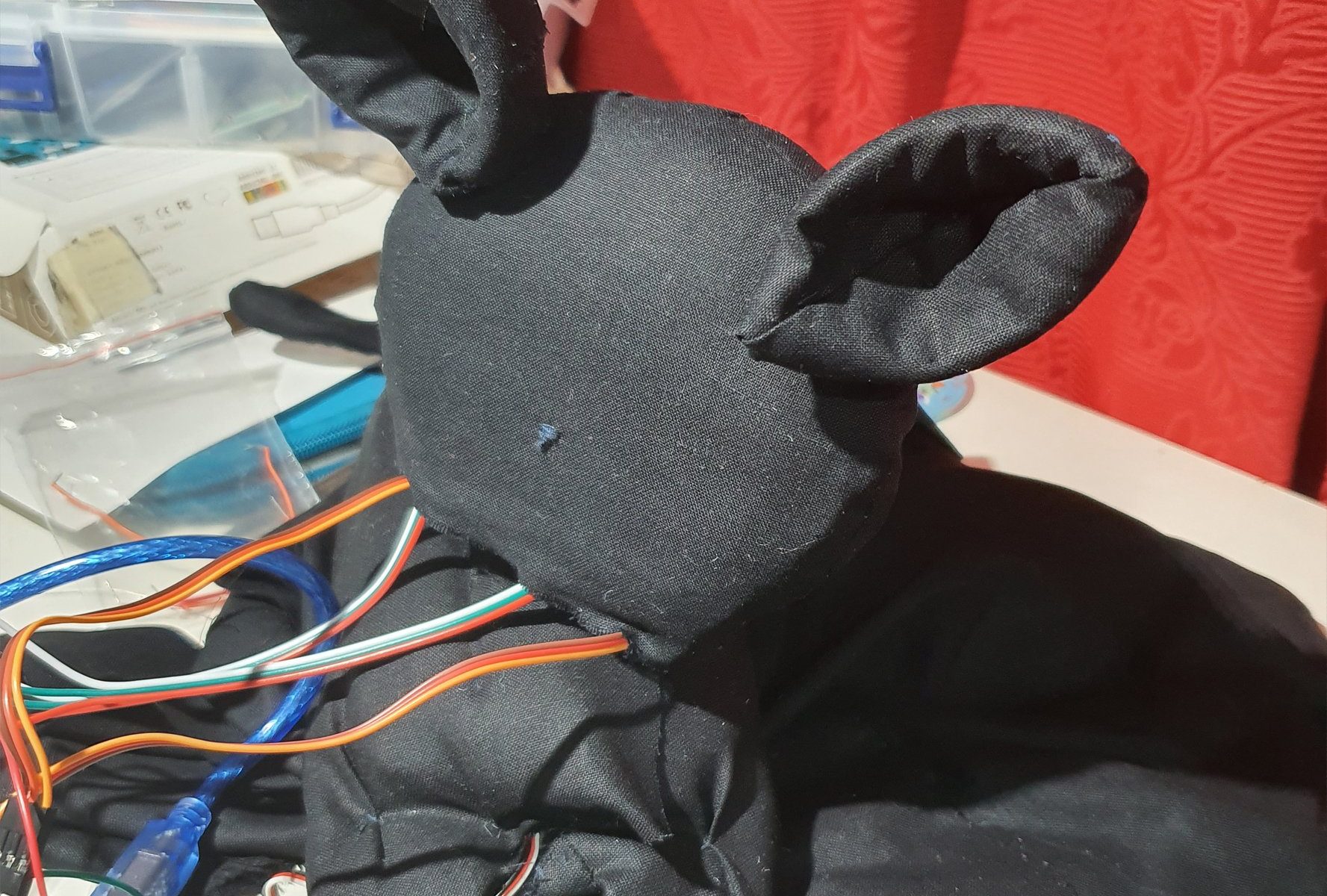
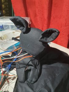
Skitzie the Cat is just your average black cat that likes to hang out on your shoulder. They are curious and like to people watch while you do your stuff. But Skitzie is very shy, hence pretends to be a scarf when anyone comes too close.
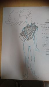
(insert hooman wearable sketch)
About Skitzie the Cat
Skitzie is a guardian for those who are not to aware of their surroundings. In a sense Skitzie’s ‘hasty retreat’ to become a scarf is a warning that there are on coming people approaching.
For this project, I had imagined Skitzie to be able to move their head and their ears to see the world. Skitzie is also envisioned to be able to ‘blink’ through LEDs and hum through a speaker. I wanted there to be sound or light as an indicator to the person who is wearing Skitzie to know very clearly when Skitzie is a cat and when they are pretending to be a scarf. The Warning has to be distinct enough to catch people’s notice.
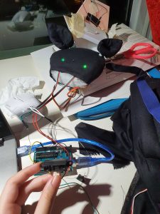
Skitzie’s hardware
Skitzis is a combination of servo motors and a sharp
Testing out the Eyes circuit, it works. Turns off and on depending on the closeness.
For Some odd reason though when i add the ears, the eyes disappeared.
Then it got fixed (connections are problematic, check everythingggg).
This is the body, that I made around the head servo motor.
All Assembled.
Reflections:
Honestly the aesthetic of Skitzie didnt come out right, which I am a little bit disappointed by. Subsequently the head keeps falling off if left for too long, so I need to fix that in future. Hopefully we will see the return f a better Skitzie in future.
Art is a form of expression or reaction to contemporary themes, hence that is why there are groups of artists who creates Art as a form of commentary about the changes in society.
The book ‘Digital currents: Art in the Electronic age’ is a compilation of the changes society and the art world has taken during the Digital age. The first chapter capture the revolutionary change in the art world brought about by the camera. This chapter compares the past forms art before the birth of photography. Art then had revolved around the ways of seeing, ‘how does one recreate what is 3D on a 2D or another 3D surface?’. The creation of the camera shortens that process, flattening reality into the span of a 2D image, a photograph. The birth of this new technology presents a more accurate image of reality, hence the book comments ‘after today, painting is dead’. In terms of skill, the artist replication of reality could never beat the accuracy of the camera.
However when one door closes, artists turn to find new ways to make use of this new form of image making, while other artist make use of old mediums like painting to create new forms of expressions.
The book also talks about new forms of visual art, other then simply using photography of illustrating a beautiful composition, there is the rise of photo collage to create a surreal juxtaposition of images.
Art is a commentary, and with the huge and rapid change brought to society during the digital age, there was many issues to criticise or be enthralled by. Artist like Andy Warhol had criticised the creation of the mass production, how unfeeling and typical it was becoming. He made use of stencils and silk screen to replicate exactly the image created by a machine. In this sense, we see that the art world has become more contemplative, more concept driven, a bystander to societies change, to draw attention to issues. Their role in art making has been elevated to that of an intellect rather then a simple skilled craftsman.
The digital age also brought about new technologies, hence new ways to create art. What is art? One would wonder. This book highlights the creation of new mediums beyond traditional mediums like paint, stone and clay. In fact, they talk about cameras for photography and film, they talk about projections on screens and installations to interact with. The digital age reminds us that anything can be art so long as it has the purpose to communicate ideas.
In conclusion, the digital age was a big game changer in the art world as it changed the view of what art could be in terms of aesthetic, form and purpose.
Book: Lovejoy, Margot. Digital Currents: Art in the Electronic Age. New York, NY: Routledge, 2004
Kuri The Mobile Home Security Robot by Mayfield Robotics:
Description
Kuri is an adorable home companion that acts like a ‘living’ robot. At first I assumed the Kuri was going to function like a google home device on wheels, but Kuri is slightly more than that as they make certain ‘expressions’ that make Kuri feel more alive. Krui has the ability to smile at you, follow you around and ‘speak’ to you. The adorable robot has an inbuilt function to track your motion and look up at you, and respond to its name with beeps and chirps. Subsequently as a home security device, Kuri has tiny cameras located in their ‘eyes’ to capture clips of whatever that goes on at home. Kuri also accting like a home device has the ability to answer certain questions that you ask, like ‘is it going to rain today?’ and they will shake their head with an adorable beep.
Kuri is also described to be a good nanny and entertain the kids, but so far, other then following them around and animating expressions, I am not too sure how kids will find Kuri entertaining.
Functions
Microphone: Voice Recognition to answer questions or comply with requests
Speakers: To ‘speak’ in chirps and beeps, to play music and podcasts found on internet.
HD camera: For security footage, and allowing live streaming.
Asynchronous motors: To allow Kuri to move around the house, Kuri also has sensors that will allow them to map the house, and not bump into objects
Capacitive touch sensor: For Kuri to recognise and react to human touch.
Pros
A mobile security system that patrols your house
Companionship
Responds to all commands intelligently
Adapt to your environment easily and recognize people’s voices, and differentiate people from pets/other Kuri bots.
When in need of recharging they automatically returns to their charging station for a power nap.
Cons
Kuri cannot climb stairs, sorry landed property folks
Kuri also has no way of helping in the case of an emergency (except inform you through messaging)
Analysis
Kuri really is just a mobile smart home. Since it already has most of the functions of an ordinary smart home device with the added ability to move about. Looking at the funstions that it has other then the surveillance function, the ability to move about is a bit redundant. Subsequently since Kuri is expensive without much additional functions of the usual google home device which is priced at less then $200 roughly it is really not an attractive product, which is the probable reason for the closure of the company last year.
Considering the company was focusing on the ‘animated’ part of Kuri to make them more alive, that is probably where most of their innovation went to. ( I wonder if this is the case, eliminating the animations, if it cheaper, easier and a more viable solution to add a google home device to a roomba. Obviously not as cute, but functionality wise will it sell better? )
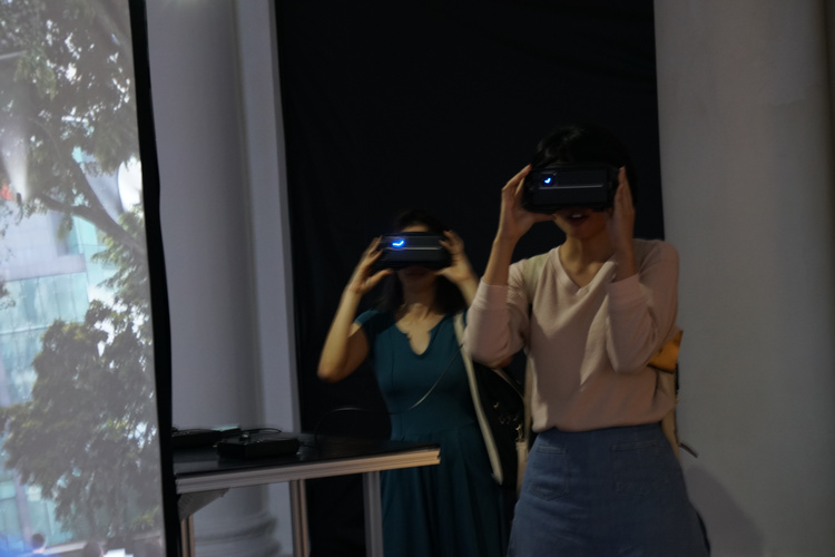
The lapse project is a collection of five projects, all revolving around the theme of lapses in time, in memory and in realities. Whilst not being able to physically be in the preence of these art works, reading up on it I was able gather an impression of it.
The projects:
VR Lapse
Particle Lapse
24 hour Lapse
Panorama Lapse
Journal Lapse
Within the projects the last two, Panorama Lapse and Journal Lapse are not interactive, hence I will not be discussing them.
VR Lapse is a virtual reality simulation, bringing the audience to Singapore’s oldest colonial building, only to find out it is digitally erased.
Does Out of Sight, Out of Mind in Singapore leads to Nevermind?
Quoted from popspoken.com, during their interview with inter-mission shares the artists concern with how significant Art related artefacts in Singapore are slowly being washed away with the ever changing landscape.
With that message in mind, I wonder if the project works on someone with no context of the place at all. It is true that these are cultural landmarks, however I am left drawing a blank when someone tells me ‘Art House’. They were trying to trigger this idea of misplacement, the ‘I am pretty sure there is something missing here’ sort of thought, but if there was no recollection of the place in the first place, can this idea still be drawn out? Does that hinder the experience of the work.
Subsequently since we are discussing the idea of interactivity of a work, I feel that the interactivity level is quite low. Being placed on empty, unchanging landscape, with nothing to influence, is passive like watching a movie or a slide show.
The second project adds to the atmosphere of the first. Particle Lapse is more interactive in a sense that it is using the movement of the viewer and creating a feedback sound/atmosphere for the audience who is traversing the virtual world, giving them the extra dimension of sound that is meant to confuse the audience. In this case there is a contributive element that the audience plays in the artwork.
Finally there is 24 Hour Lapse which is an installation where visitors from the past 24 hours are projected alongside the present visitors on a CRT monitor. It is kind of interesting how they play with the idea of people from two differnt times sharing the same space, even if it is only a screen. However in terms of interactivity, it is again quite passive as the present visitors cannot influence the already pre-recorded video.
Overall the Lapse project is not a very interactive project. It works more as a stage which is the artists mind, and the audience is the audience, not the participants on the stage. As such we only view their feelings and experience for the idea of lapse in memory, which is not always universal hence abit hard to relate to.
A fitness tracker is a device that you wear on your wrists. It keeps track of multiple things like the number of steps you have taken, your heart rate, your location, etc (depending on the model).
In this case we will be looking at the MI Band 3, which has the ability to track:
exercise in terms of steps taken, distance moved, calories burned
sleep, whether deep or light and total sleep
heart rate, automatic or manual
The device itself has a long lasting battery, and has a quick charge function, which is very convinent as it is a device that is to be used on a day to day basis. Subsequently it is also affordable, unlike other brands which can cost up to a few hundred in the market.
It also functions as a Smart watch.
However, some reviews say that the product cannot compare to other brands, like Fitbit, in terms of competetive analsis and sharing. Also being a China brand it also not compatible with the iPhone (sorry iPhone users no xiaomi for you). Subsequently, the band has most of its functions like a seperate ‘my exercise’ function in built in the app, but not it the phone. Which makes it a bit more tedious in the sense that you have to bring your phone with you when you exercise (ah, first world problems).
Considering this, if the xiaomi wants to be more competetive in the market, the company should first make their products competible with all products (uh, easier said then done huh). Having more apps already in built in the band would also make things more convinient for the lazy consumer, or maybe have a slightly more specialised tracking system that would allow them to differentiate when the wearer is doing one activity or another.
‘Rain Room’ by Random International featured in the Museum of Modern Art, New York in 2013. It makes use of a 100 square meter room full of falling water simulating rain, and 3D tracking cameras to capture the motion of the visitors passing through the room. By doing so would stop the ‘rain’ fall above that peticular area and create a pathway for them to cross.
The work replicates the sound and the smell of the rain, creating a sort of white noise that encompasses you along with the rain. It sort of reflects this relationship between human and nature, which is subsequently getting regulated with technology. How contrary it is that people would stand and simply contemplate in this artifical downpour vs fleeing the actual downpour.
What I find particularly interesting about this project is the artist statement of creating this room. They said that they had created the room with no preconceived idea of what kind of reaction they would draw from the audience experiencing their work. In a sense that unredictability of reaction itself becomes part of the artwork.
“DON’T RUN!” exclaimed a Museum of Modern Art press rep, as a young woman who had entered the field of falling water in Rain Room, 2012, began to take flight and was promptly soaked.
As quoted from artforum.com’s review of the work, after a guest had out ran the motion sensors, temporarily glitching the system and got drenched from the work not stopping the rain for her. It is amazing how this ‘carefully chereographed downpour’ still had the ability to instill that same instincts humans have in the faces of an actual downpour in some, however bring out a contemplative peace in others.
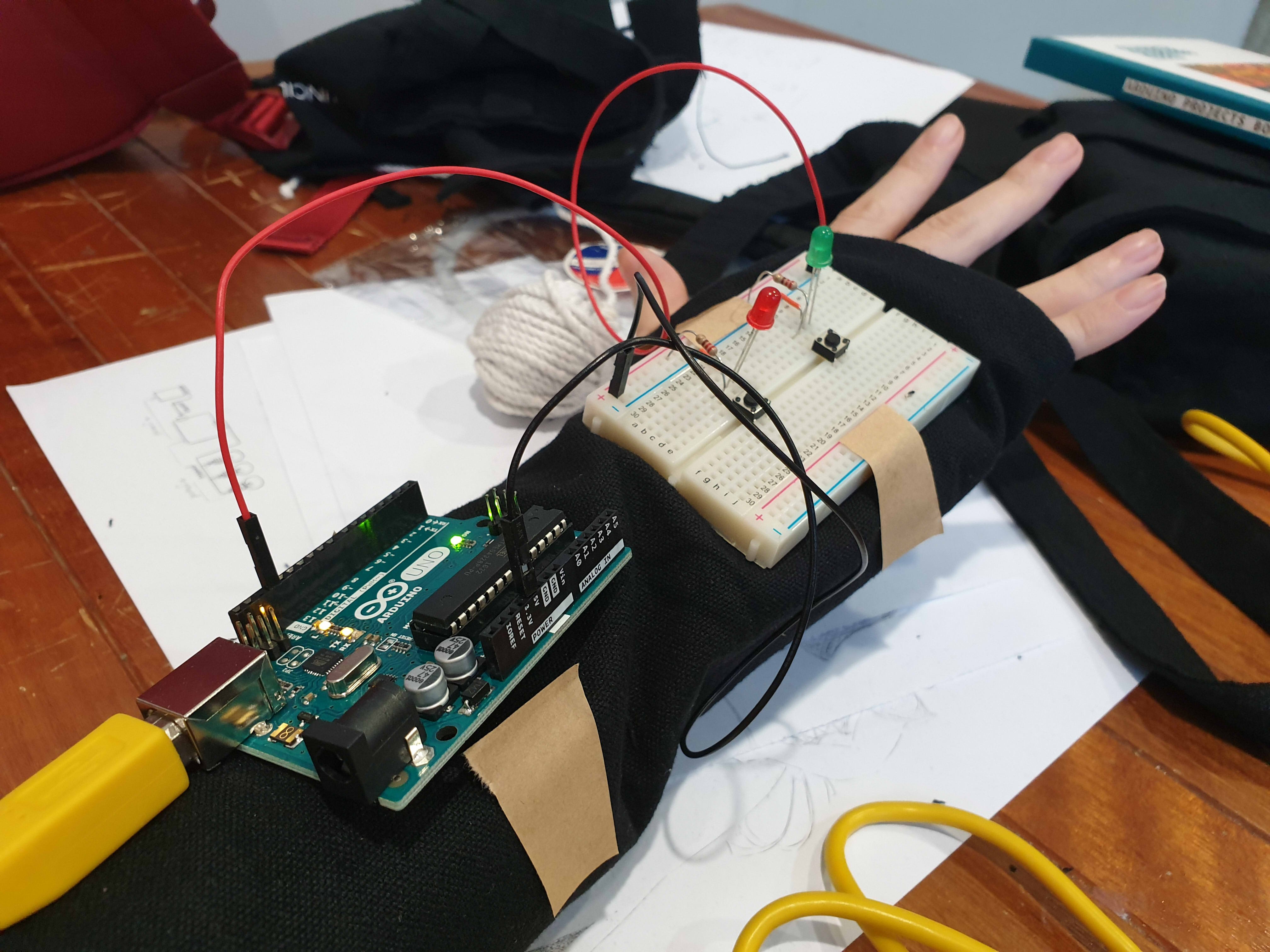
This project revolves around the idea of the gaps between noise/sound, hence we created a portable device that will sample the overall surrounding sound and in response would light an LED in a corresponding colour. The colour is based on a calculation where ‘red’ is volume , ‘green’ is pitch (regardless of octave) and ‘blue’ is pitch (exact octave). Red and Blue were scaled to fit a range of 0 to 255, however, for the Green there were 5 ranges created, skewed accordingly so that the range for a humanly possible pitch is larger then a not humanly possible pitch. The code makes use of an array to store data in each pixel, until all nine pixels have been used up, then the information would be overwritten for the following pixel.
References for the code:
Origin of basic-ass code (which is no longer here): https://www.teachmemicro.com/arduino-microphone/
Origin of getAmplitude code: https://learn.adafruit.com/adafruit-microphone-amplifier-breakout/measuring-sound-levels
Origin of getFrequensea code: https://www.norwegiancreations.com/2017/08/what-is-fft-and-how-can-you-implement-it-on-an-arduino/
Origin of NeoPixel code: https://learn.adafruit.com/adafruit-neopixel-uberguide/arduino-library-use
Our work takes reference to works like ‘Pulse Index’ by Rafael Lozano. It is similar in the sense that it takes record of the viewers in put, in their case the thumbprints, in our case sound, and record it on a visual plane to show the changes overtime.
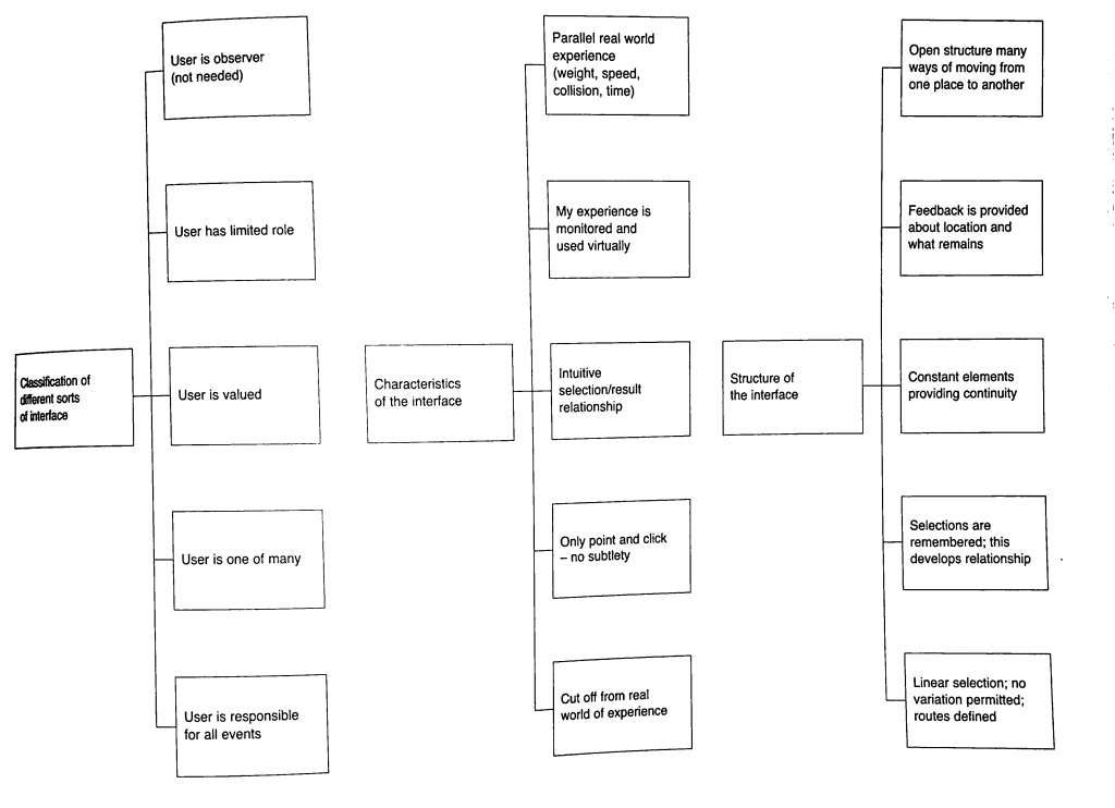
Characteristics of Interface:
Classification of interface:
Our project falls under ‘User is one of Many’ and ‘User is valued’. Our project values the unity of the environmental sound and how your sound is captured in this collective and you cant discern what is your sound and what is the environment, hence the user is one of many part. However, the user is valued is also present in a way that they are the anomaly that created the most change when they interact with it directly.
Characteristics of interface:
Our project falls under ‘Monitered and reflected experience’ as well as ‘Intuitive selection/results relationship’. For the former, the device is to collect the environmental sound and show a colour represnetation, hence all interatctions are copied and shown directly based on the sounds that you make. The latter is true as when you see the light changing to sound, the viewers will automatically try to interact with it to see the extent that it will change to, hence creating the result of trying to find the gaps between the sounds you make when you see the different coloured representations of each instance of sounds made.
Structure of Interface:
Based on the flow chart, our Project complies to everything except the last one ‘Linear Selection’. The first idea of open structure is seen in the way we made our device portable. The second idea of ‘Feedback provided’ is done so in the form of LED lights lit in accordance to the sound of the environment/people within the environment interacting with it. The third idea is ‘Constant elements providing continuity’, since the set up is designed to reflect the sound at every (how many seconds). Finally selections are recorded in nine LED pixels, showing 8 seconds of the recently past environmental sounds.
(Liz finally answered the question yay)
Who did what:
The coding for this project was done by En Cui and the physical fabrication of the device was put together by me (Elizabeth) (but you know in the end Liz kind of screwed up alot of the soldering and stuff and needed En Cui and Lei’s help to put them together. Thank youuu)
Process:
From the initial stage of mannually making LEDs light up by pressing the buttons whenever someone made a sound we created a circuit where the LED would light up in a certain colour according to the environmental sound.
After that we used this circuit as a a reference and moved from a single RGB LED to a strip of LED wire. That way we could create a set up where the colour of a certain period of time could be recorded and compared to the pervious period of time.
yay the LED lights up.
Measuring the length of wire for the glove.
This is where problems started surfacing on the soldering part so there was a redo. (soldering wise and circuit wise sob)
Testing out the Circuit.
Yay it’s done.
After Review:
Everyone reacted to the work as we hoped they would despite only having two participants. They crowded and tried to put in their own input by making noises around the two. Though we have coments that the feedback is not fast enough to show the exact inflection of voice as one is speaking, hence not very obvious. We forgot to mention this during the review, but the delay is also constrained by technical limitations. If we reduce the delay, we will need more LEDs to represent the same amount of time, and the Arduino memory overloads at 13 LEDs. Additionally, even at delay(0), the Arduino still cannot function fast enough to get the desired result:
As a result of the delay, our theme in this work might not be very obvious to the viewers to pick up on as a result. The eventual solution may thus be to use something with more processing power.
There are comments on how they are working very hard to satisfy the device as well. Some say that it seemed like a prop for band or choir performances, or a tool for training how to get the exact pitch.
Summary Reflection:
EC needs to actually know when it’s not possible than maybe possible.
Liz should not be so innovative. Liz is just not good with technology.
We should have thought out the final form better.
Extended Concluding thoughts (if you want to read about our woes):
En Cui’s Reflection:
Concept-wise, the challenge was that the core concept and form were not well-aligned. While we talked out several issues, there’s still the challenge of the interstice being unclear. But I think, in the end, the clarity of the message depends on how you interact with the wearable. For example, the distinction is much clearer if you experience the wearable in multiple contexts, than just one.
Regarding the code and circuit, it was actually mostly okay. While things didn’t always work, the only solution needed was to observe the problem, deduce what could be possible reasons for its occurrence, then test out my hypotheses one by one. Examples include mathematical errors and faulty wiring. I also did soldering part 2 for the microphone, and honestly the solution was just learning to recognise patterns of problems and solutions based on past mistakes, such as the solder not sticking to the iron (wiping more), or getting fingers burnt (plasters).
I also realise after a full day of reflection that I’m just incompetent at doing group work efficiently. Leaving me in charge is a generally bad idea.
Elizabeth’s Reflection:
For the most bit I felt very challenged by the project, especially since it is the first time we were using and putting together components to make a circuit. for the physical fabrication portion it was the first time I used a solder, and my circuit looked very ugly after that, and I dont really think I improved in that aspect very much even after multiple attempts 🙁 When using the Hot glue gun to insulate the exposed solder I think I made the circuit worse, because there was already a built up of solder.
Also, I did not solder the circuit down the right way apparently. You can only solder your wires to one side of the LED because they are fickle and like to have their electrical charge flowing in one direction. Also, do not solder and hot glue your circuit till you are 100% sure it works, saves you a lot of heartpain and time, (thank you Lei and En Cui for dealing with my screw ups D;).
I also made a few mistakes by piercing the LED strip’s digital pins on accident thinking I can sew it down that way. Thinking about it now, I should have known better then to try piercing any part of the components.
Speaking of computer, I feel very attacked by my own computer, since I think it has issues running the code we shared over google docs, and gave me a heart attack that I might have short circuited the only RGB LED in the starter pack, and still the circuit refused to light after I confirmed that I did not. I think there is something wrong with my computer DX. I either leave the testing for computer to En Cui or find a school computer for this (pick the right computer for this, not all computers have arduino).
If we had a bit more time and I had a bit more skill in soldering, we wish to have more LED lights to reflect the change in sound.
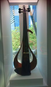
During our trip to the Red Dot Museum, I chanced upon Yamaha’s YEV Electronic violin.
At first I was captivated by the use of wood to hint at a violin silhouette. This is very unlike the other electronic violins that are already market that either copies the silhouette of an acoustic violin, or is completely unrecognizable as a violin all together.
The YEV violins are also described to have ‘a design that is beautiful from every angle point’ created by the slanted curvature of the wood and is said that ‘the graceful curves allow players who are accustomed to playing acoustic violins to switch effortlessly to the YEV’.
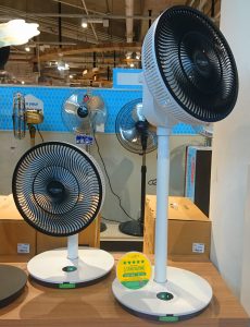
At courts I was looking at the fan section and realized that while the design for fans had evolved over the years, the old retro electronic fan look has made a comeback. Most fans seem to play around with the materials a standing fan is made of, but the GreenFan by Novita, had created a more sleek modern design by having a pad for buttons instead of switches or buttons that jut. Hence creating a smooth flat plane.
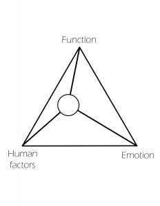
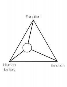
Hence I feel that on the Nodes of Influence chart, this product would score lower in emotional value, as its design is almost minimalist in nature. It should be average on the functional scale, as it does perform its purpose well, and as for the human scale it should be okay too since everyone is familiar with the symbols on the button pad in order to use it.
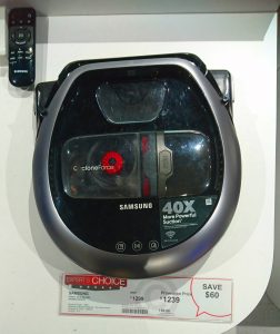
Subsequently whilst walking around Courts I noticed a row for Robot vacuums. I found it interesting large vacuums are now compacted into a small disk, and is now fully automated for consumer convenience. I was looking at the Samsung Robot Vacuum cyclone force as an example of a vacuum robot. I found it interesting that the design of the vacuum robot mostly took on the form of a circular disk (how do you clean corners?) and came with a remote.
In this case the product is controlled by a remote so the human factor is accounted for. Again, there is not much emotional factor added into its aesthetic as these electronics are created for function over frivolous decorating.