4D Final Project – “Where Is She?”

For our last project of this semester, we had to do it in groups so I worked with Xuan Wei, Shi Min and Nicholas.

Here’s our group’s proposal to know more about our work:

https://oss.adm.ntu.edu.sg/kohs0101/wp-content/uploads/sites/1857/2017/11/Where-is-She.docx_-1.pdf

IDEATION

Our group project was focused on making use of sound effects and immersing our audience into our story.  So we decided to do something like a “40-part Motet” work, where Janet Cardiff uses speakers filled with different kinds of sounds to pull the audiences in.  However, for our work, these sounds are coming from people that are having a conversation – where a story unfolds about a lost girl and in the midst of it, the audience have to uncover who is the prime suspect for her loss by paying attention to the conversation. We got this idea from “Serial” podcast and for our story it was inspired by the true story of Huang Na’s disappearance. We used that as a strong concept behind our final work.

PROCESS AND FINAL

We used 3 speakers, 1 panning out 2 on their own where each speaker voices out. Since we as the characters are telling the story, we had to test out numerous times to do our recordings. This is because we really needed to be in character. (as seen below, the amount of recordings taken to get the perfect one)

For more of our processes – to hear more of our recordings, to see the script we came up with to build our storyline, the different tries in trying to stay in character (bloopers too), click this link:

https://drive.google.com/drive/folders/1cvw8dH2XLtFKw6zZvRrejP274YCl7_BY

We decided to have the final sound art in the Cinema Room @ The ADM Library, this is so as to get the audience more involved in the story by simply listening to the speaker talking, and concentrating on nothing else visually. Just the sounds. We also decided that for final presentation, our story will be divided into 3 portions so that the 1st group that enters will only be allowed to choose 1 of the 3 stories to have a listen. Similarly for the rest of the group that participates in this. This is so that we could give them the full experience of immersing into the story, by concentrating on the characters through their sounds, the tones of their voices at certain timings and such.

In the google docs it also provides our final installation, and how it end up being played. Do take a look at it! It’s been a fun and tiring process doing this, but we made it and this is a new experience I will never forget.
2D EGO – Process

In addition to my previous post, I’m going to talk more on the concept for my idea behind my EGO project.

IDEATION

I chose to be a Moon instead of any other thing or human beings because I have always thought Moon are beautiful, despite it having their phases, just like humans. I have always associated myself with the moon, so why not be…a Moon this time? Haha.

I researched more on the Moon phases because the meaning behind each tells a significant part of a story in my life and how I can show that the Moon cycle is also a growing cycle for me. Here’s the Moon theory, a concept I use for this final project.

So the arrows pointing to the numbers in circles, is to show how i will be representing myself in the panel of that number.

For example for the 1st, I am a ‘New Moon’ because my first panel is:

Me looking forward to JC life  +  Toxic friends  = Sad me, not excited anymore

For my 2nd, I am a ‘Crescent Moon’ because my second panel is:

Me wanting to get through JC life  +  Books (Me working hard) = Happy me holding an award 

For my 3rd, I am a ‘First Quarter Moon’ because my third panel is:

Depressed me  +  Loved by friends and family = I’m slowly healing, becoming a stronger me

And last but not least, for my 4th, I am a ‘Full Moon’  because my fourth panel is:

Happy me, renewed + Met someone new that I can vibe with = Happier me, in love

So I drew out my ideas and how I would want it to look. Since I decided to do traditional illustration  because I’m better by doing things traditionally (and not digitally), now is my time to make full use of it. I chose to execute this by making a tall black board with 12 square panels to make a pop-up within each empty panel, of my illustration of the Moon (me).

And for the colour scheme…

There’s a contrast between the first moon panel, New Moon, and the last moon panel, Full Moon because one shows the beginning of my “sad” stage, and the last shows the beginning of my happier journey. Hence why the first panel the moon is in red colour, because I was a new moon, and new moon are silhouettes but here I needed to put colour so I preferred a dark colour like red. And for the 4th panel, it starts off with yellow because I’m now a full moon, supposedly glowing. There’s a difference in the analogous colour scheme in the 2nd and 3rd panel – the 2nd one is more warm as I added a green colour touch to it, supposedly to symbolise the touch of happiness and proud moment because my hard work has paid off. But the 3rd panel the colour scheme is cooler and darker, to symbolise the start of my depression stage, and the struggle to get back up.

PROCESS

I also wanted to make my pop-up illustration glow in the dark, because the whole idea of this was to make it seem like i’m living in space and so i thought it’d be great to have different colours glow, like how a moon does. Hence i tried using Mod-Podge Glow Paint as layer on top of my painting.

However the biggest problem here is, it only glows in ONE colour which was super annoying because the whole point of this project was to have different colours shown in harmony. I just needed them to GLOWWW.

Fret not, I decided to buy fluorescent paints that will glow when UV light is being shone on it.

Before UV light.
After UV light.
I love the effect here! After UV light.

And I was limited to 5 colours so I mixed it with each other and tested to see if they can give me different colours for the analogous effect, and glad to say for most it did.

2D EGO – Colour Harmony Research and Inspiration

Before diving into our new and final project, EGO, it was better to start off with some research on colour theories as we dive into the world of COLOURSSS. Then I will touch a bit on my illustration inspirations.

COLOURS

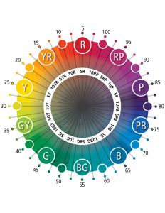
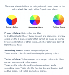
From the last two presentations in class, our classmates touched on the importance of colours and their theory and more. Here are the the basic important ones that are more relevant to me for my future use in this project.

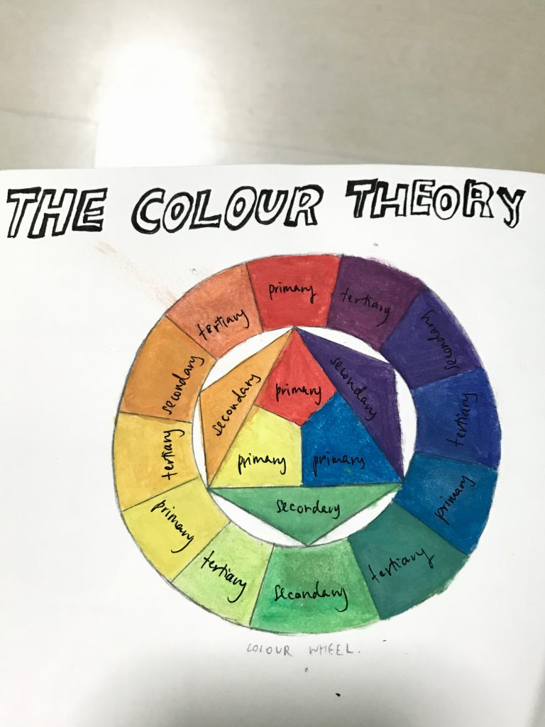
Based on the above findings, I made a colour wheel reference for myself in my sketchbook too.

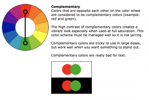
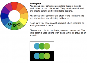
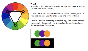
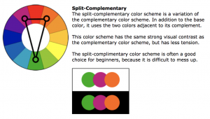
Another important thing to include here is the Colour Harmonies.

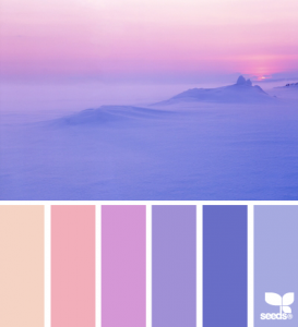
After searching more on these, I realise I am more inclined towards dark analogous colours such as blue, purple and red/pink.

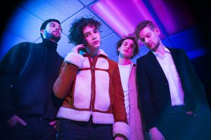
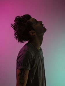
This is also because from the very beginning I was always so inspired by the colours in the photography taken of my favourite band, The 1975.

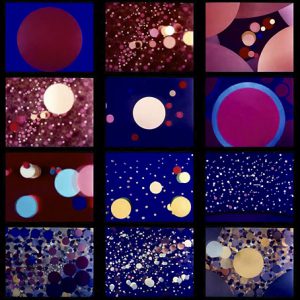
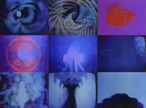
The neon analogous colours in it makes everything look better, and I like the glowing effect too. The same goes for this work below by Oskar Fischinger and the following by Jordan Belson. Oscar plays with shapes and colours to represent the sounds he makes into his music, what attracts me the most is his use of colours which glows too. Similarly to Jordan Belson who puts colours that are pleasing in the eye for his film-making.

Oskar Fischinger’s Optical Poem
Jordan Belson’s work

I realised that I was also into neon colours, or that they glow, or those colours are in analogous harmony. So I searched more images on the above for inspiration.

Inspiration i got from some illustrators:

Robin Eisenberg

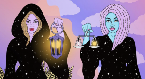
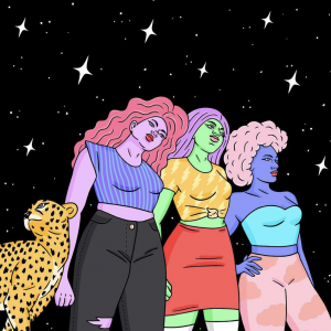
She’s an illustrator I found out about through instagram. What I like most about her work is the colour harmony. She frequently uses the analogous, triadic and split-complementary colour scheme so well, it’s pleasing in the eye and refreshing by changing the colour of these women’s hair, skin and clothes.

I like her works also because of her simple but yet nice outcome in her illustration. (Like the one below)

Kelsey Smith

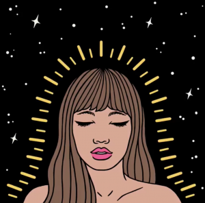
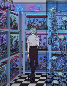
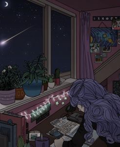
Another artist would be a 17 year old artist in the making who does the works below:

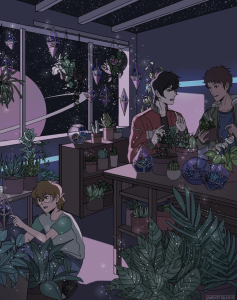
I really love her works because of how she plays with cool analogous colour scheme in dark tones (her night-time illustrations) and manages to pull it off. She somehow manages to let light get in in those colours, giving that glow effect too.  Aside from that, I am a huge fan of her ‘space’ related works, it gives off the dreamy effect.

Because of all these, I have then decided to make my EGO project work revolving around planets and space too, but mainly me as the Moon. There’s a story behind this so do check out in my next post, my process post!

3D MA City of Voids – Research & Process (Individual)

So in this lesson we started touching on MA City of Voids idea. This final project is a group work and my teammates are Bala, Azizah and me. We had to come up with 2 sounds using the objects and instruments below:

These are the sounds we created from it:

1st recording:

2nd recording:

I chose to focus on our 2nd recording. Using the Audacity app like we are told to, I studied the pitches produced by those sounds and made use of the “thick lines and long lines” seen in them to create my forms in my demo mood box.

Graphical annotation of our 2nd recording sound in space.

I also looked up on the kinds of modular structures to understand more of what is preferred when creating the mood box based on my sounds.

The ones below are a few examples that attracted my attention because of how each are unique.

This is one of my references as I loved the curved idea out of the modular structure. Hence my idea of making a wave-like thing in my mood box.
I used this as another of my reference as I was intrigued by the square formations that seem like it’s jutting out of the walls at different places and looking like it’s a music of it’s own. Hence thinking of using my LEGO as part of my mood box.

I wanted to use the colour scheme as seen below, it just felt right according to the music played in the recording – soothing (hence the light weight gold that could be folded like waves and looks smooth), but the sounds after ends up being sudden (hence the long silver metal jutting out), and then something rough and rushed (LEGOs to be placed in certain areas to represent them).

In the process of making, I used thin bendable gold brass foils to create the sound waves hence the bending of the foil is needed here. And the thick silver metal looking like it strung out in the middle as it shows the short note after the end of 2 intervals in the recording. (seen below)

Initially i wanted to use the blue legos as seen above to make the second SO, but i felt that it doesn’t go along with the rhythm well and also like our prof advised, maybe it will be better if i replace it with something that looks like a spring.

So i made use of a thick wire that i had and tried to make a spring look-a-like:

And yep, I prefer it this way. When I listen to the recording again, it suits alongside the last SO. 🙂


3D Mnemosyne – Pair work process [II] and Final

In our next Mnemosyne task, we were all paired up and my partner is Alina. We were told to make use of our mnemosyne bottles to create a new work with our partner, something that is WEARABLE. HAH, that one got us shook.

For our work, we decided to incorporate a few parts of our bottle design and take that into consideration when making a new work.

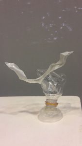
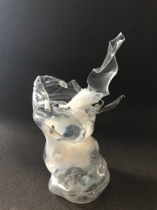
This is Alina’s bottle design.
This is mine.

So we decided to create a ‘top’ incorporating the things we learnt before on planes such as twisted, bent and curved planes.

We chose to use 2 good scents:

  • caramel scented (mine)
  • argan-olive oil (Alina’s)

Our bad scent:

  • the smell that lingers in a dentist clinic

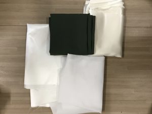
The materials we used:

  • white silk (for Dominant portion)
  • olive green cloth (for SD portion)
  • white cloth; extra
  • thin bendable gold-coloured wire (for SO portion)
Materials used that is not seen inside: gold wire as SO to attach the top together by the back in a curved loop.

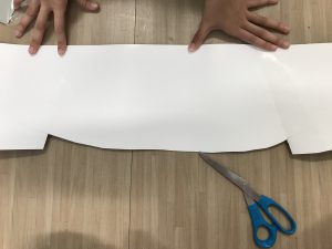
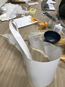
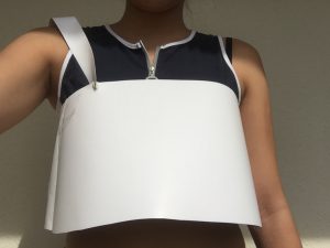
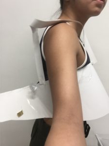
So we made a mock up of our top first by using art card.

The structure of the top.

Twisted plane over the shoulder.
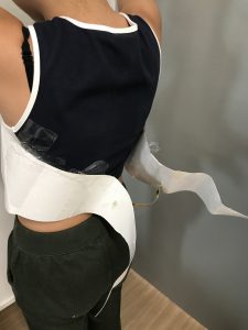
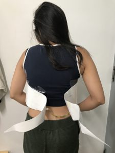
From the front to the back, it curves, and then the ends curved outwards into a complex plane.

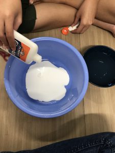
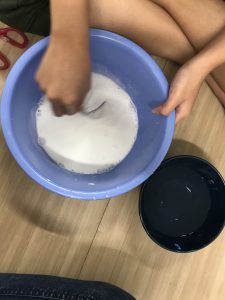
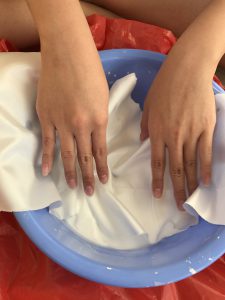
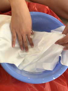
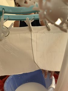
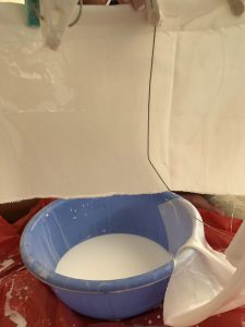
Then we  began with the real thing where Alina came up with the suggestion of gluing the white silk so as to make it wearable and not flimsy.

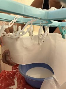
Soaking the white silk into the load of white glue.

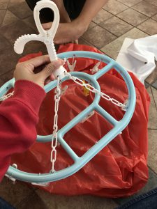
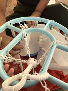
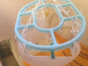
We also needed a hanger to clip on our silk and let it dry according to the shape we needed for our top.

We placed a hard wire behind that helps to act as the spine to our flimsy cloth, so as to create the structure for when the cloth dries up.

Folding it carefully and according to the body shape as the structure for our top.

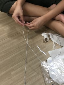
While waiting for the cloth to dry, we did wire structuring for our SO to connect the front to the back by the shoulder.

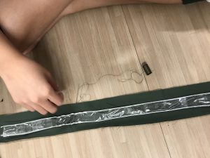
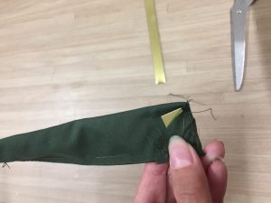
And so made 2 of those thick wires and we pasted them in such a way that we can make a bigger surface area to create the structuring of the SD part of our olive-green cloth, over the shoulder. (as seen below)

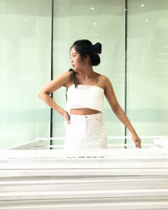
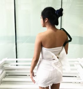
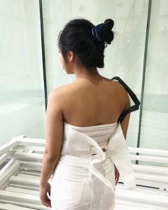
All of the above led to the final product:

FINAL

I love the outcome, happy to say that it looks legit and wearable haha, considering the planes inside too to create it.

YAY and we are done 🙂