After much decision on which composition to use for the final, it came to this:
_____ + _____ = ME
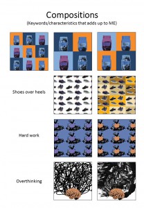
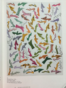
- I find myself comfortable wearing slippers, sandals, and shoes most of time instead of high heels. This composition had a variation where I tried to add some pop art effects, but I the original image colour of the shoes are nice thus I went for minimalism with the background.
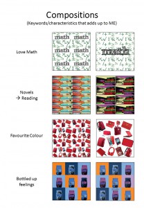
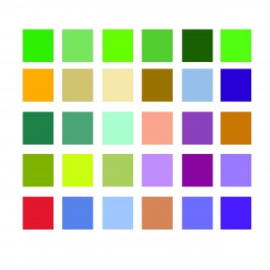
- As shown from the image above, I like the colour red thus the image implies that most of my items are in red.
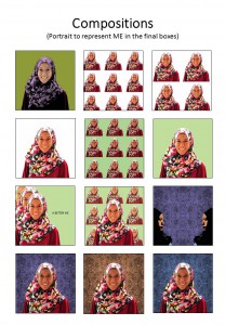
- ME, a portrait of myself with textured background from the previous monoprint works.
_____ – _____ = A BETTER ME
- I tend to overthink alot whenever I am working, and it would mess up my mind — bringing myself down
- I also tend to bottle up my feelings whenever I am not feeling too happy or etc.
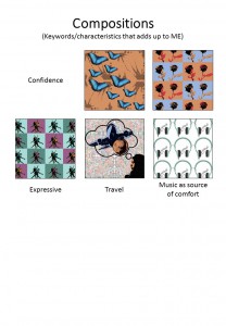
- Therefore when I minus Overthinking with Bottling Up Feelings, it would get me to be free from the mess in my mind and heart and soul. I used butterflies to symbolise being free.
____ x _____ = AN IDEAL ME
- Because I tend to overthink which leads me to pull myself down with such negativity, I would like to be more optimistic than pessimistic.
- I want to be more expressive, more vocal so that people actually know how I feel. I used the image of dancers because dancers are always told to show emotions through their body movement and their facial expression.
- If I were to multiply optimistic with being more expressive, I would get the ideal me who blooms with confidence. I used flower (rose in particular) because it is in my favourite colour but at the same time, it is known that flowers bloom. Thus when you bloom, you tend to be ready, be brave for whatever that comes your way.
____ + ____ = ME IN 5 YEARS
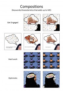
- Pretty ambitious thinking, but I would like to see myself at least getting engaged. These series composition were the tough ones as I wanted to show that I was dreaming (which explains the bubble thought in the image). However, the background would have been plain thus I decided to add repetition at the background for consistency in style.
- Hard earned money saved in the piggy bank for future use
- Therefore, the equation added up as such — seeing myself travelling around the world with the money that I earned. The background comprises of repetition of stamps to show the travelling to different countries.

Therefore, the picture above shows the completion of the project!


