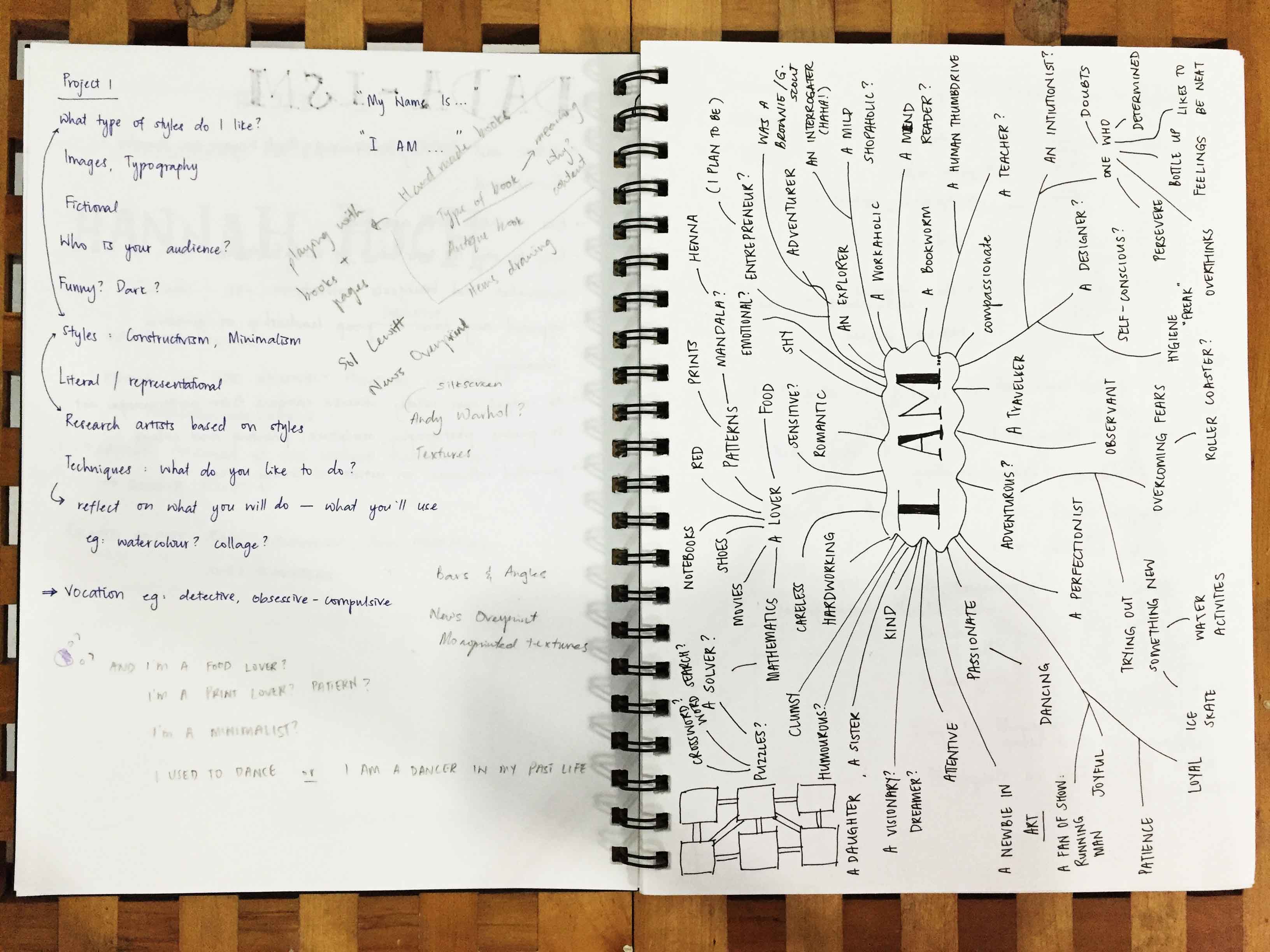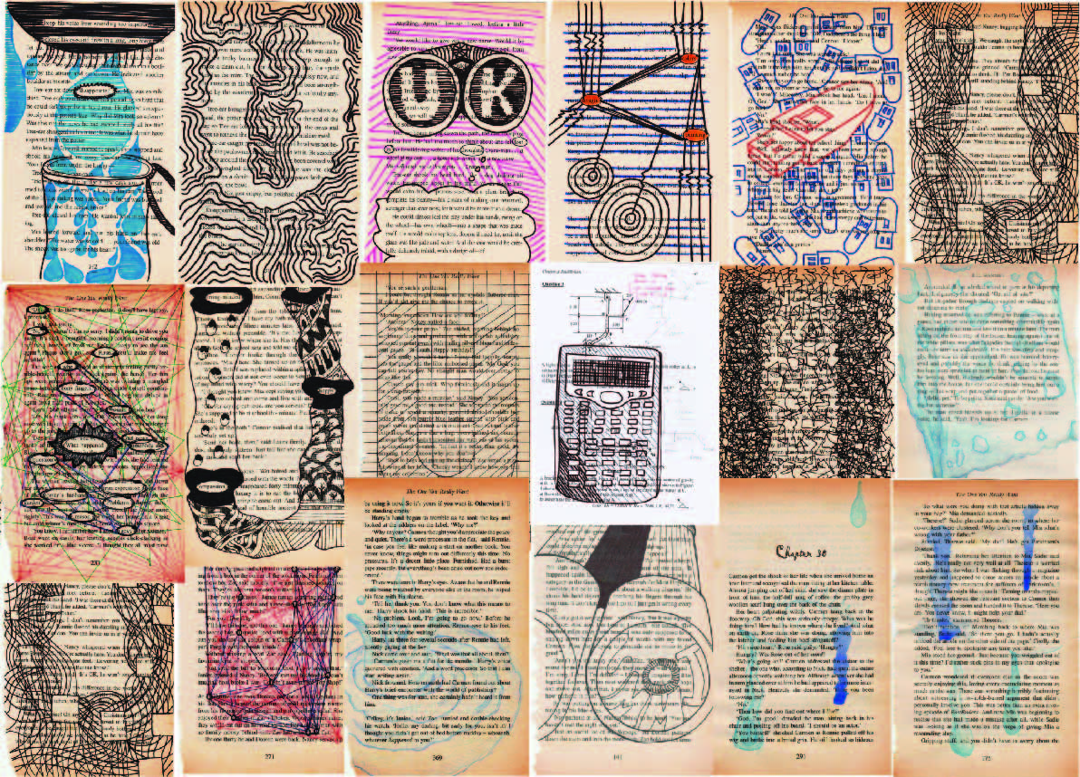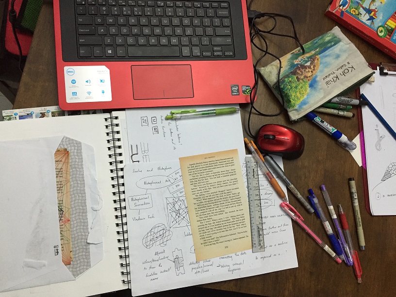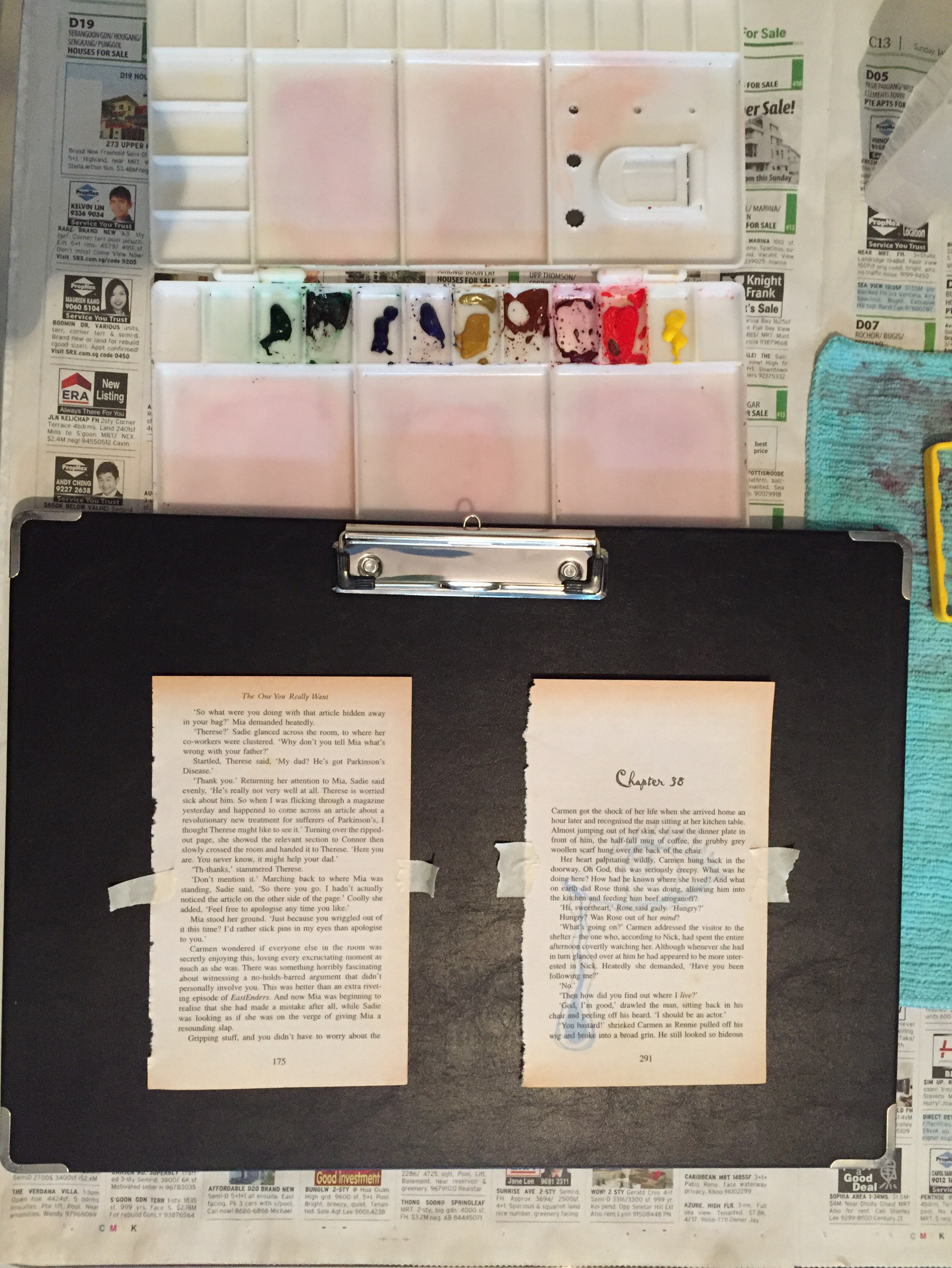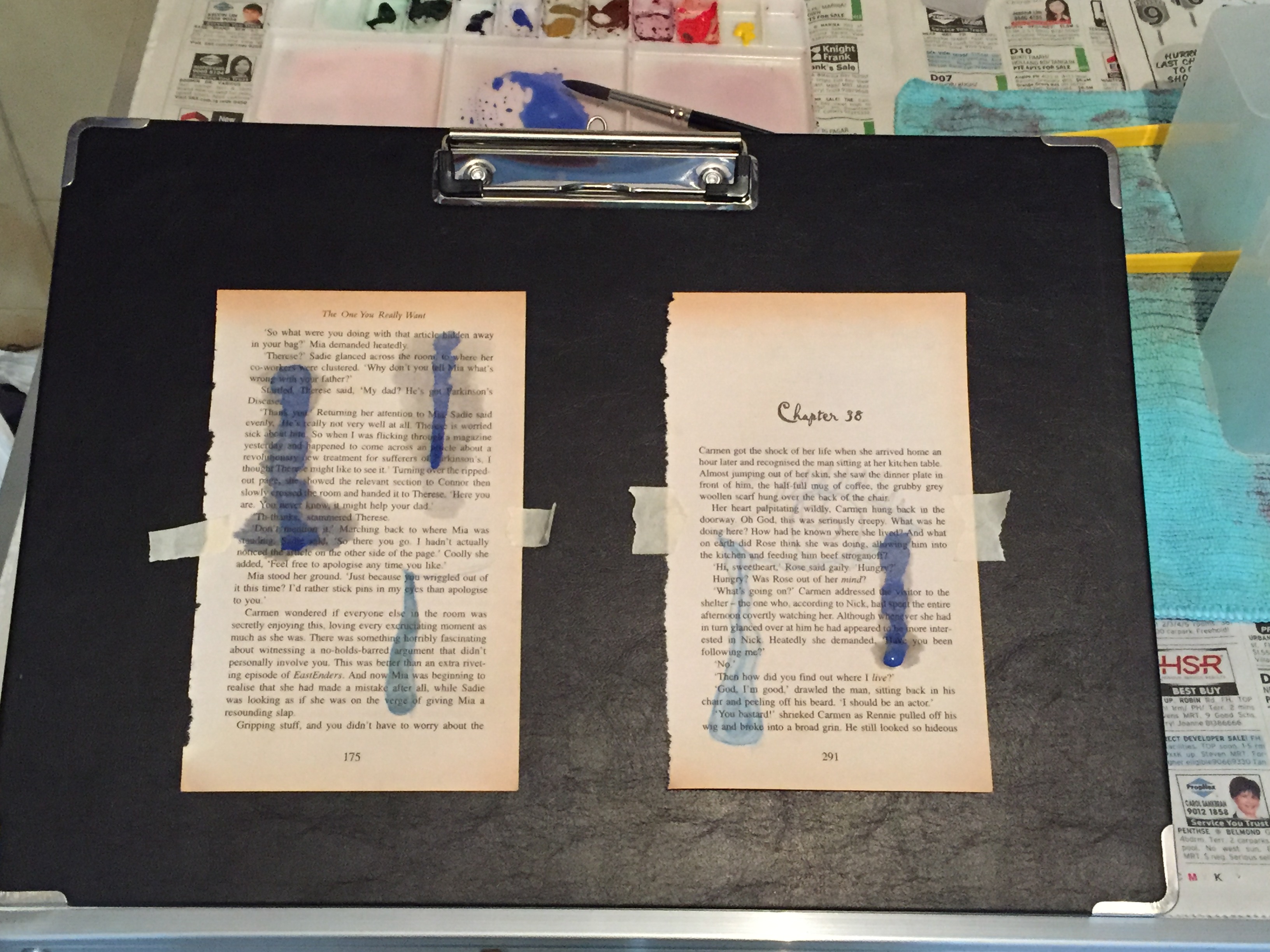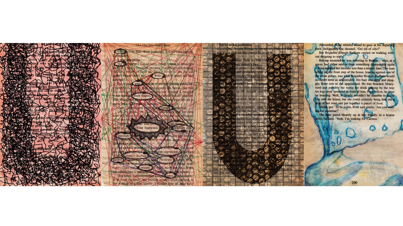
Below are the 4 final A5 and its description. These 4 pieces are book pages (torn from long kept novels) that was drawn on, some painted on, then scanned in, edited and layered scanned monoprints to get these overlaying effects. My typography in all these 4 final pieces are the initial of my name, U.
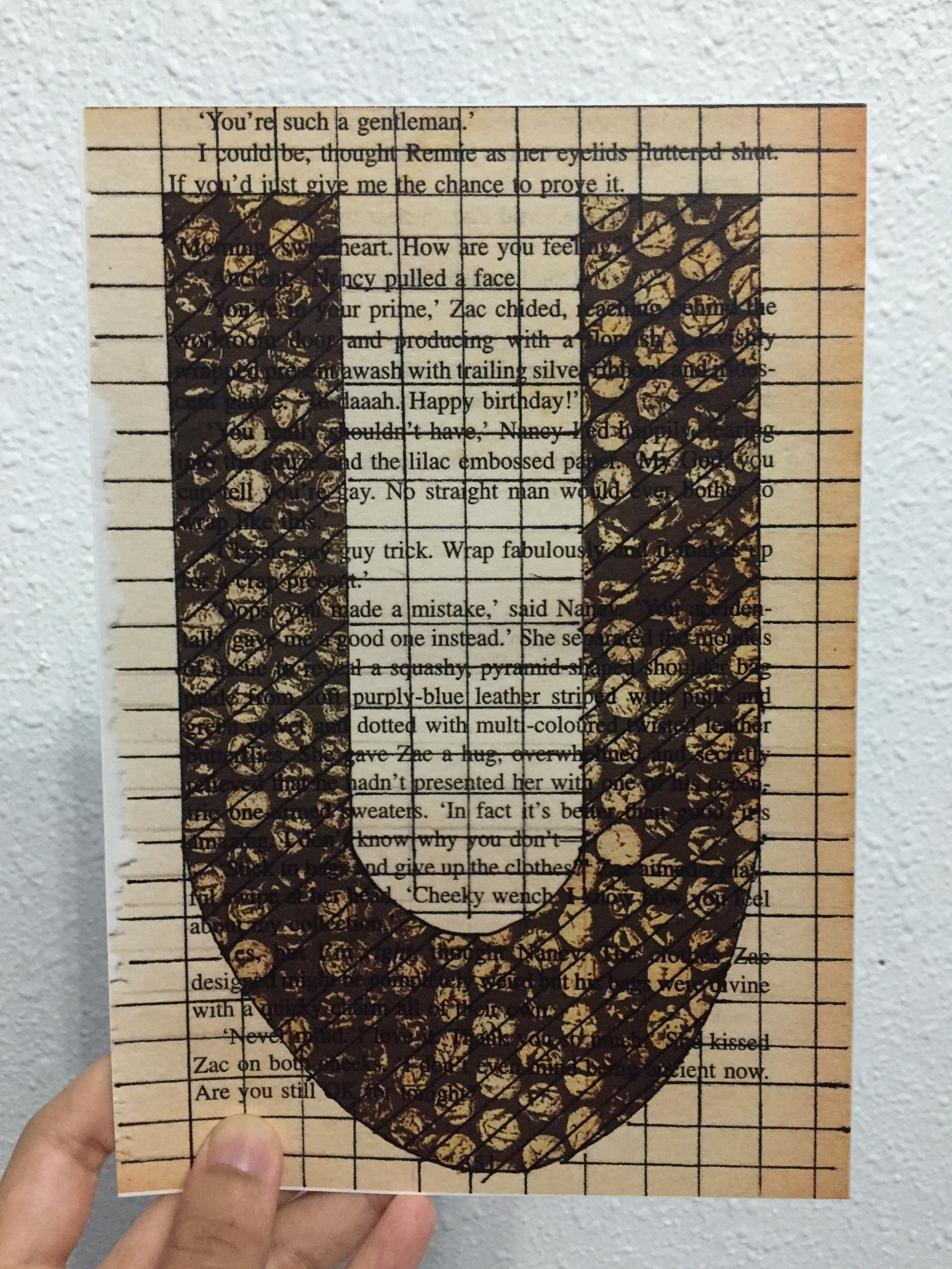
“MY NAME IS…”
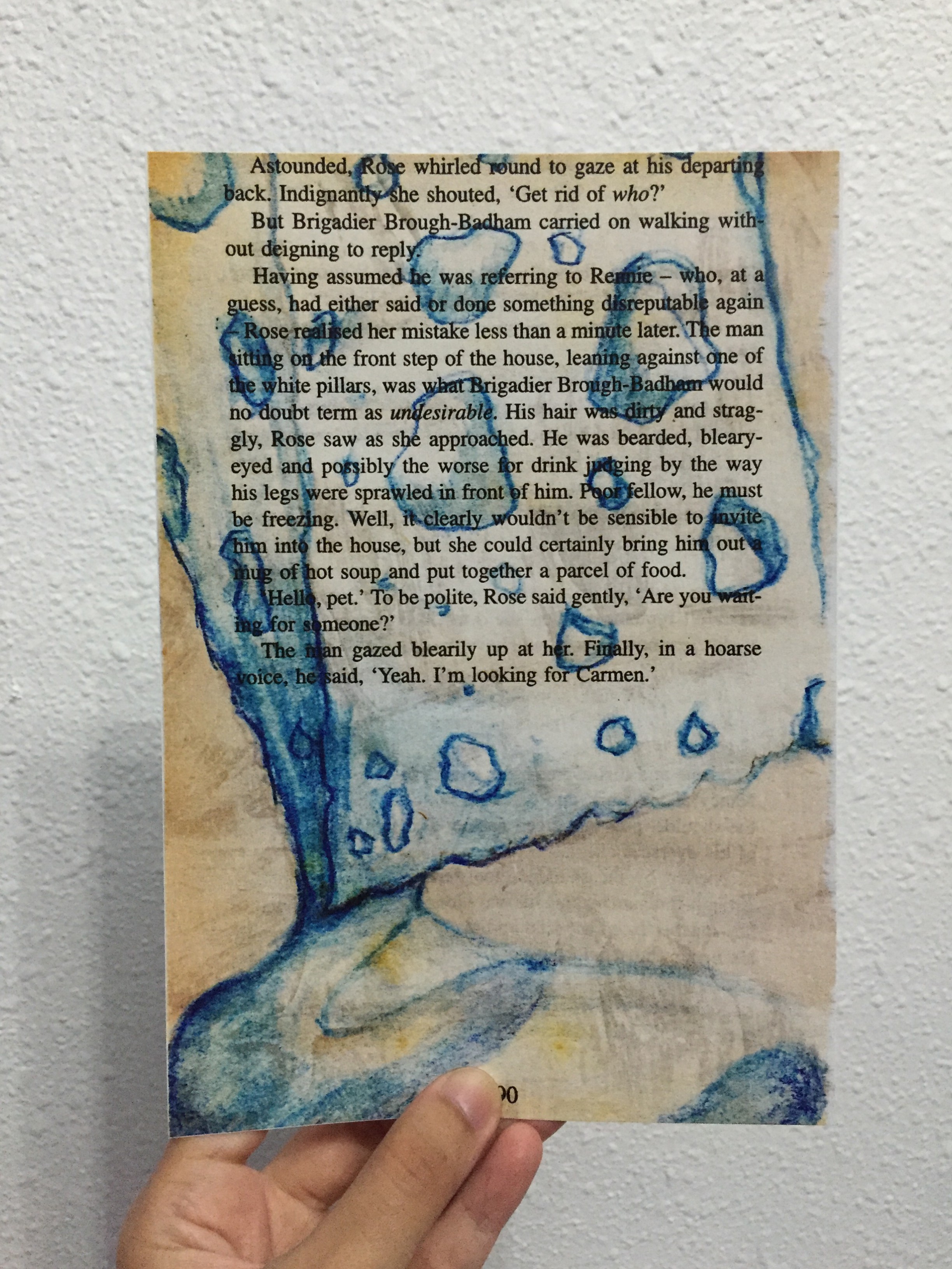
“AND I’M AS ABSORBENT AS A SPONGE”
Because I find that I always tend to absorb information as much as possible, store them somewhere deep inside my brain, then amazed at myself for actually memorizing what was actually absorbed some time ago. Like the example I gave during the presentation, the house wifi password — at most it was an 8 digit password, yet I could just recite them without referring to any paper etc.
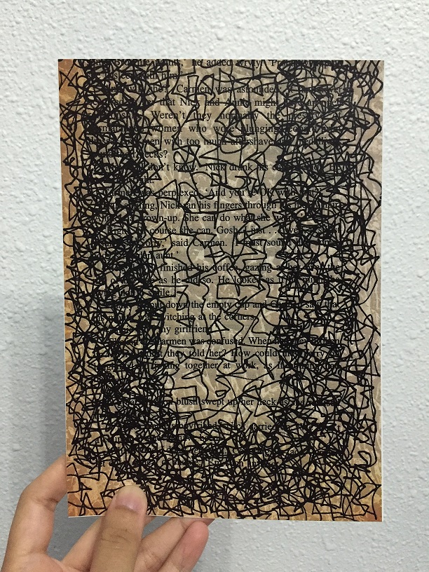
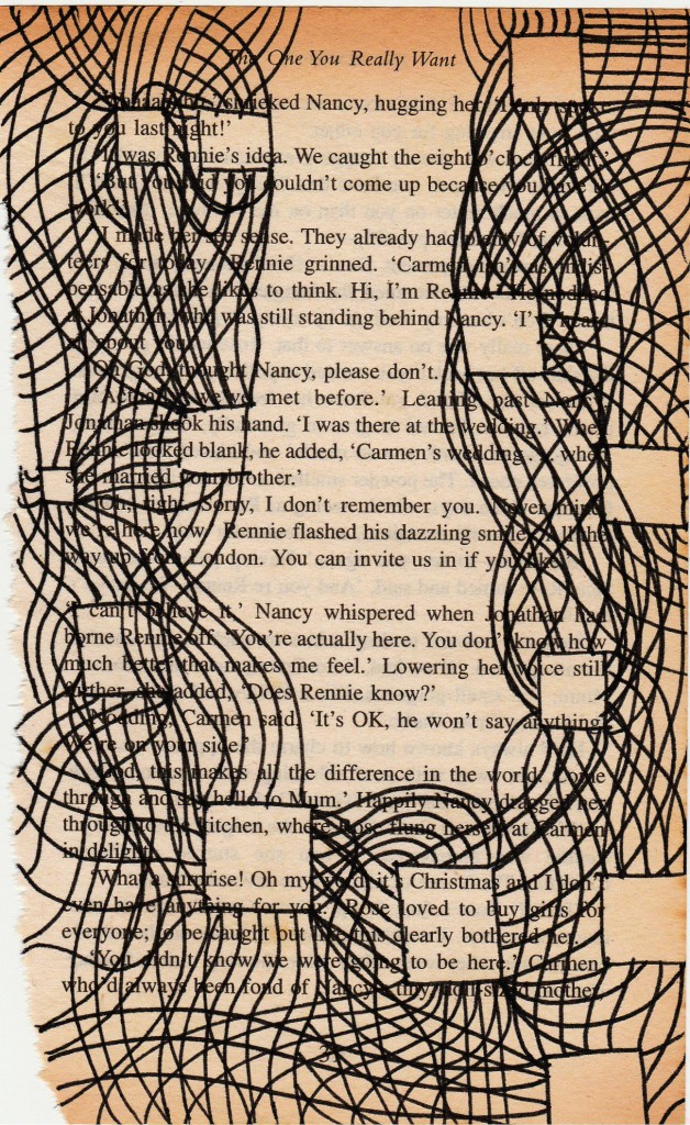
“MY NAME IS…”
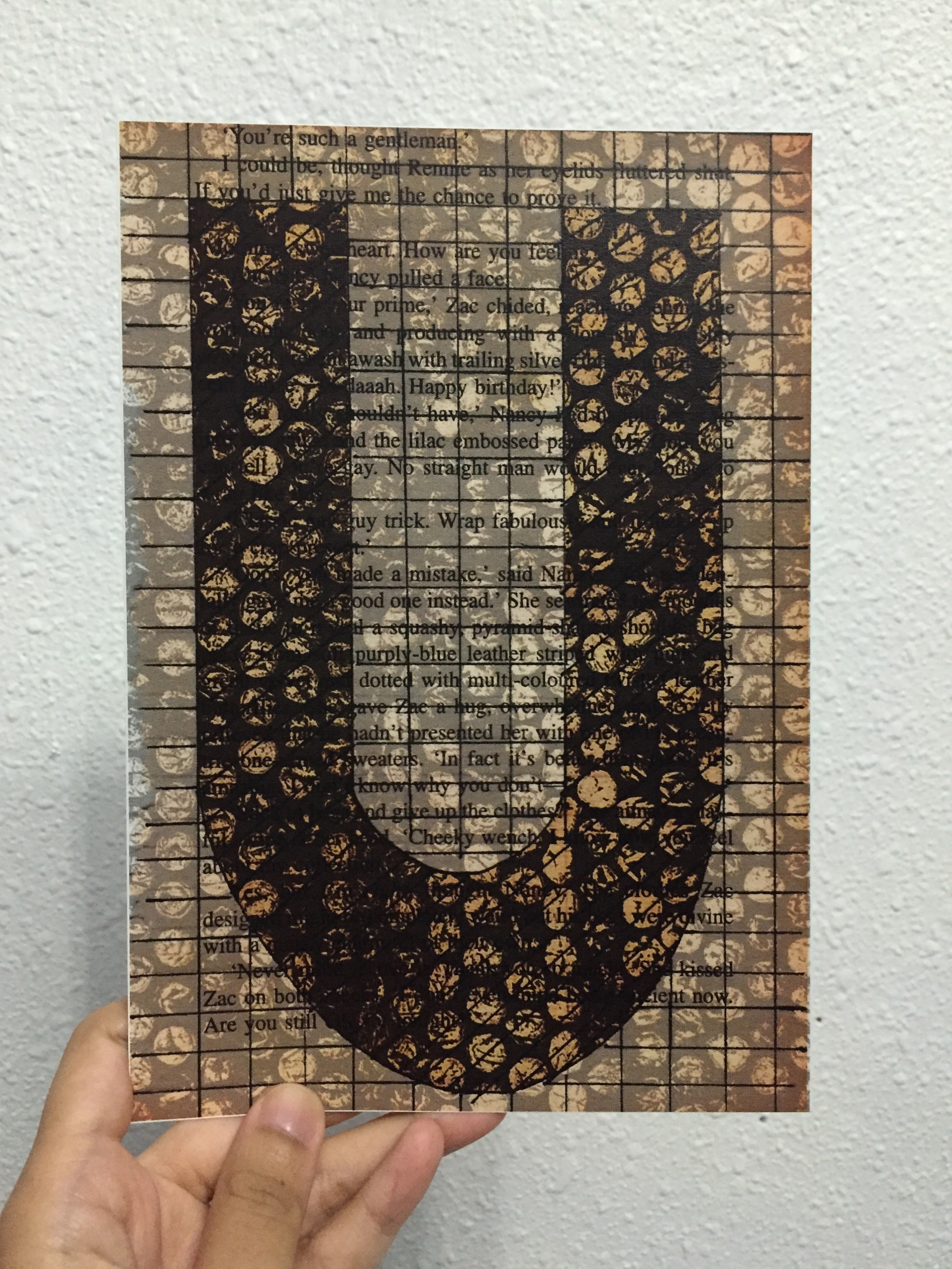
“AND I’M SYSTEMATIC”
Most of the time, I tend to work step by step, follow the rules, and work simple. I like simple, minimalistic, as shown by just the grid lines that covers the entire book page. Systematic is represented by the bubble wrap textured monoprint.
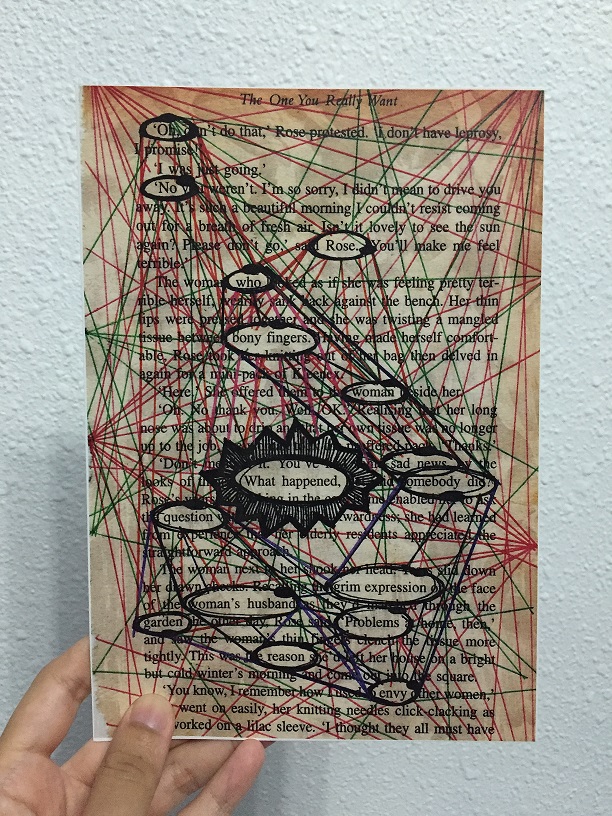
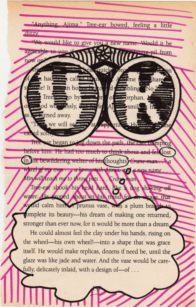
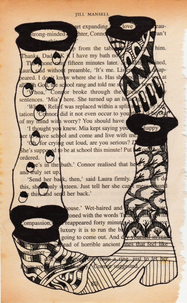
“MY NAME IS…”
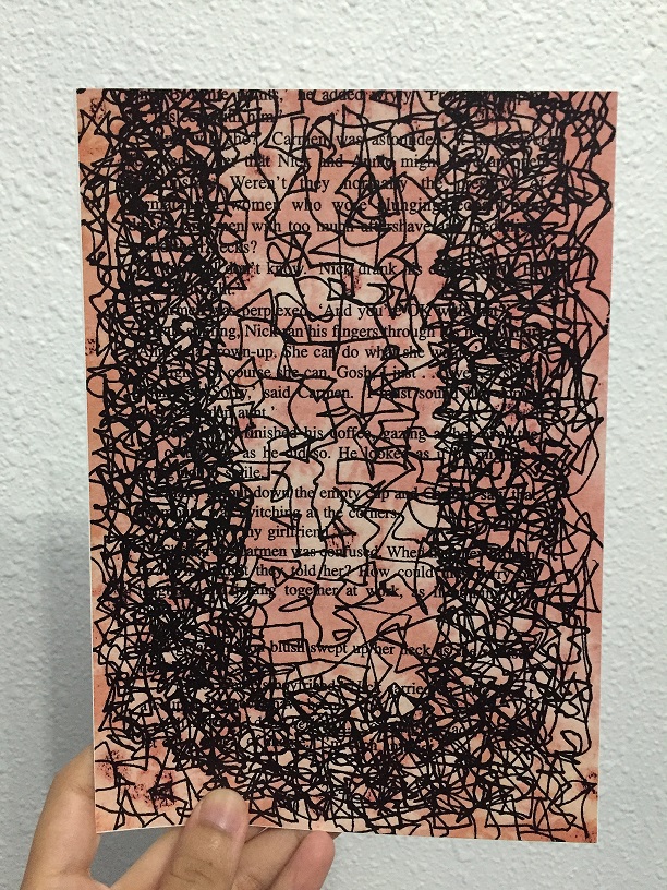
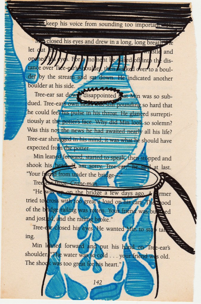
“AND I’M AS BUSY AS A BEE”
Bees are known to be hardworking, and I feel that hardworking and determination goes well together. The lines are like those dotted lines we always see in the children’s book when bees buzz around, only mine is busier. The background included salt effect from watercolour techniques, with the red complimenting the black lines.
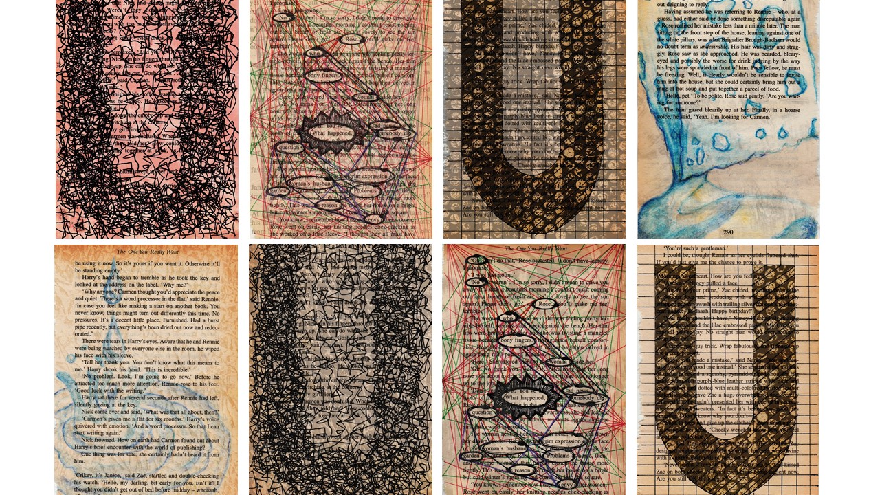
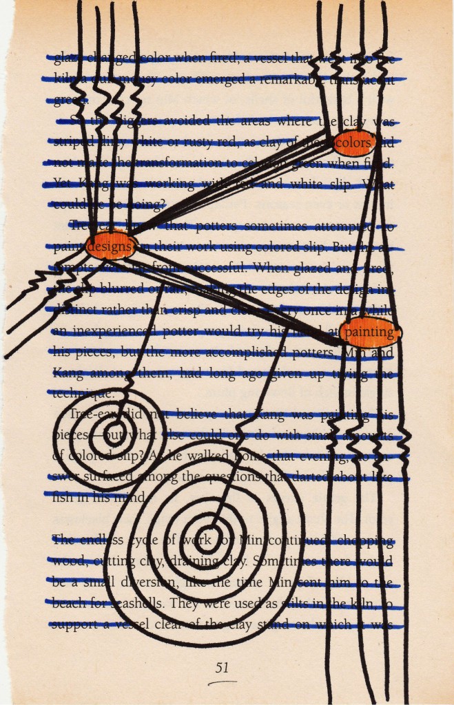
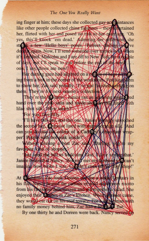
“MY NAME IS…”
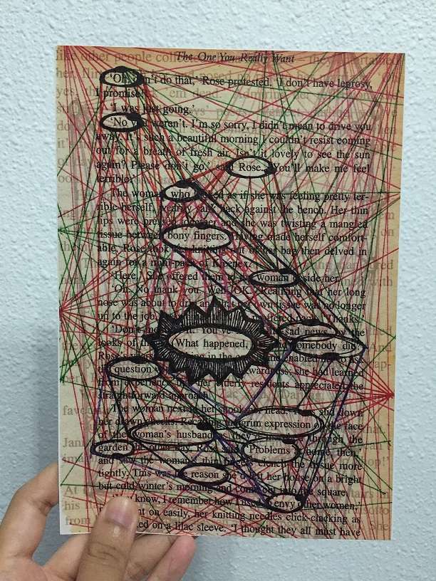
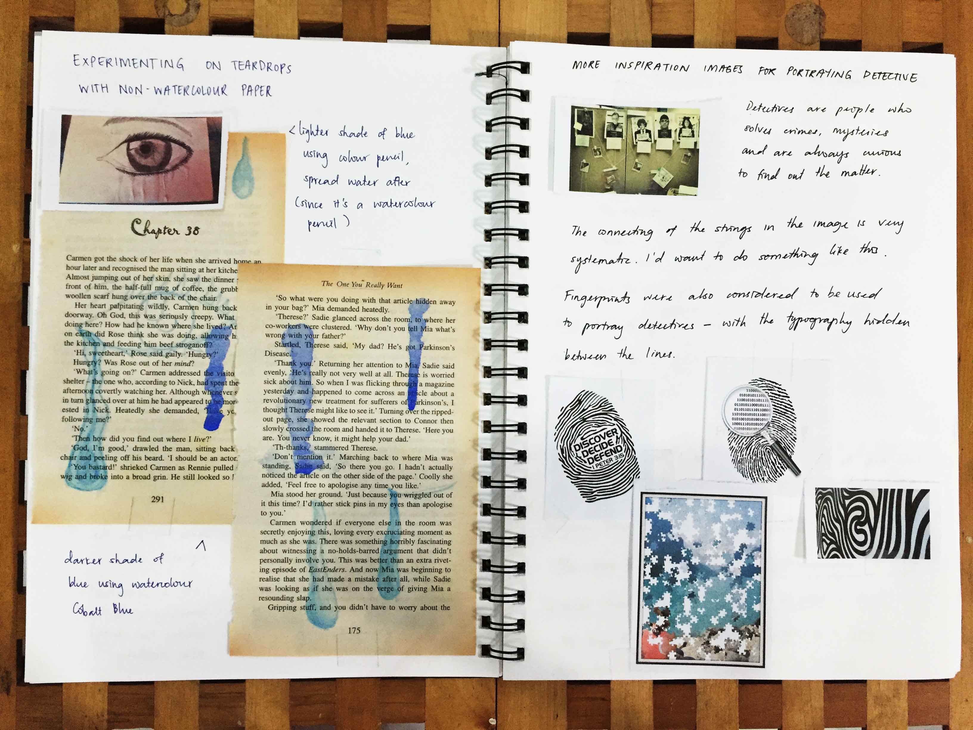
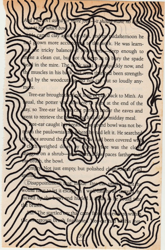
“AND I’M LIKE SHERLOCK HOLMES”
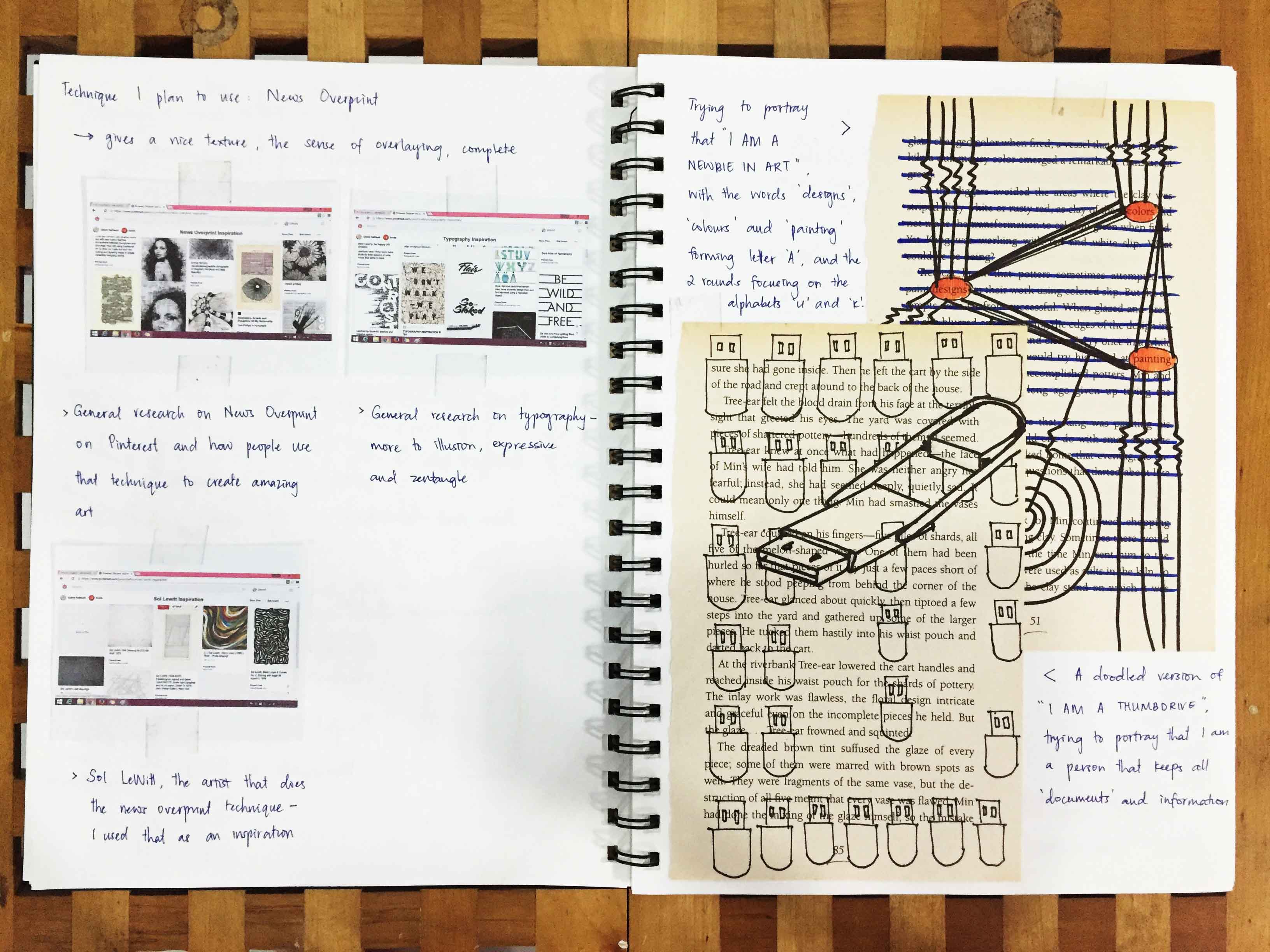
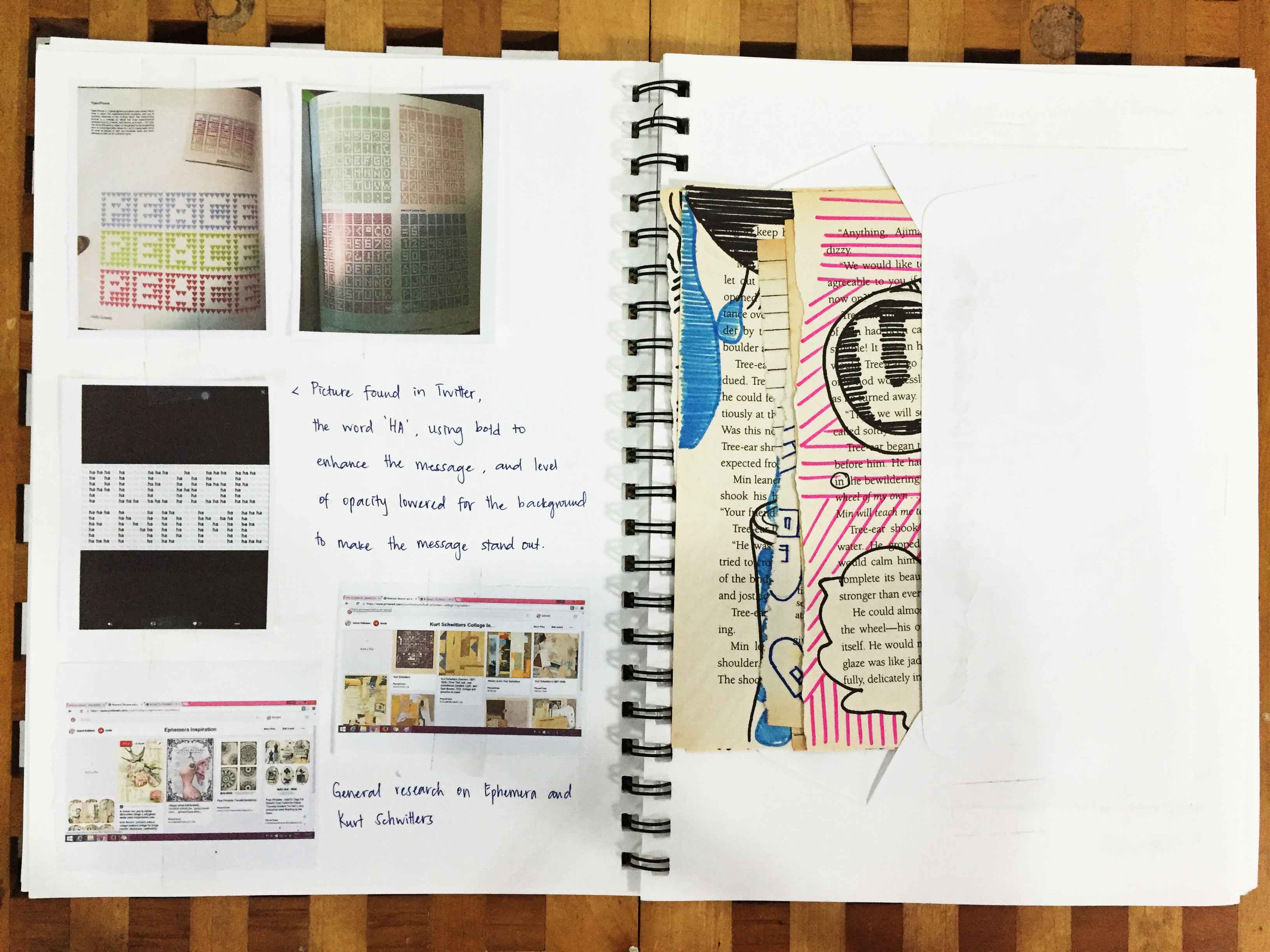
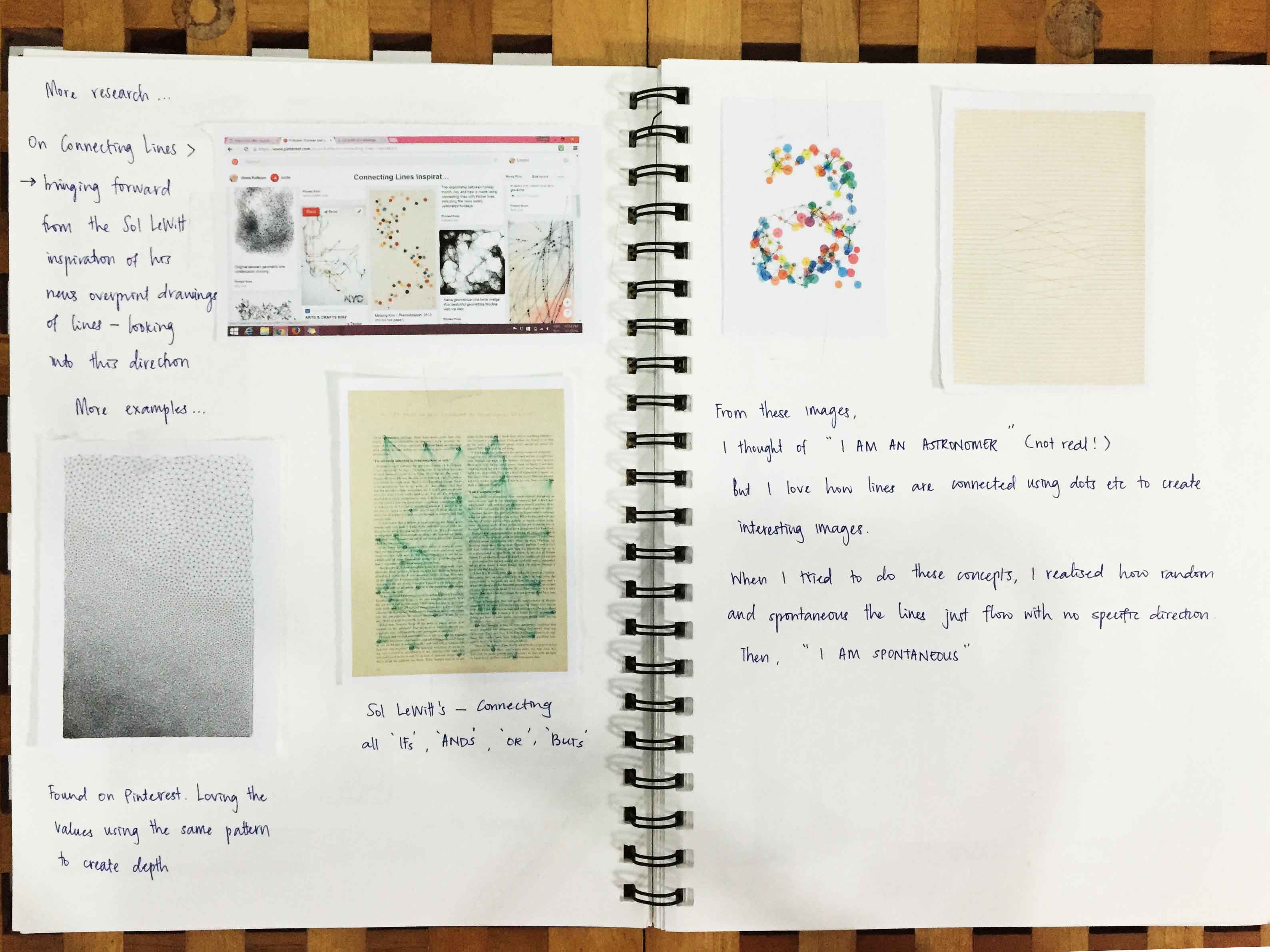
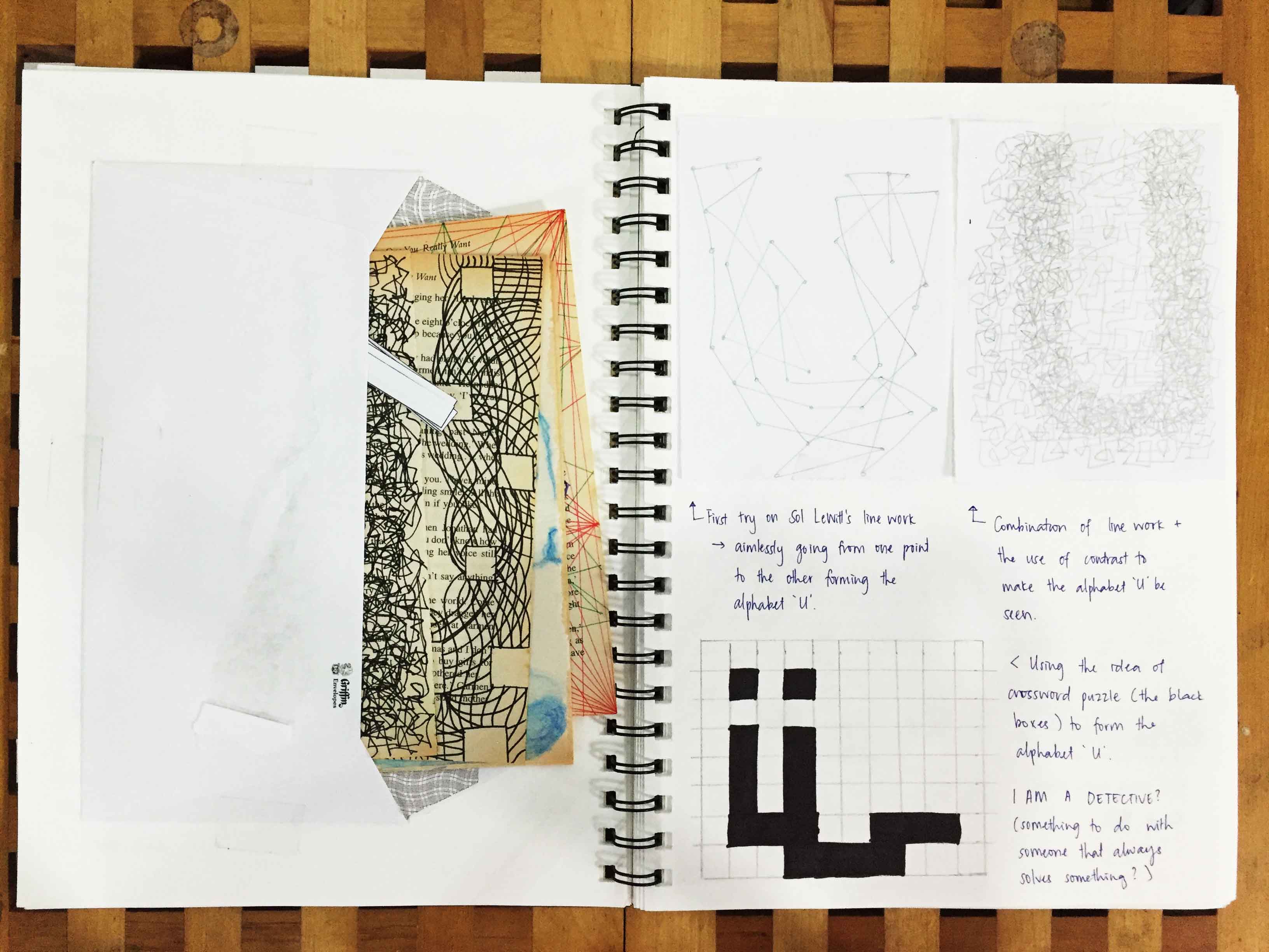
Sherlock Holmes, detective, CSI can be in the same category. I like connecting the dots, solving puzzles and figuring out “mysteries” (not those scary mysteries, no) surrounding me. With that, I was inspired by the detective crime board on how they connect their crimes to their suspects etc, thus the lines all around the book page. Texts from another book page was overlayed to show the ongoing thoughts in the detective/Sherlock’s mind as to how they would solve their crime, just like how I always have thoughts running around my mind whenever I’m in detective mode.
(And the alphabet U here is actually hidden in these lines — referencing from crime TV shows that the hint that will lead you to your culprit is somewhere hidden in your crime board)