From the previous post, I mentioned my attraction and interest on the technique of News Overprint. So this post will hold a slightly in-depth portion on my research throughout the project.
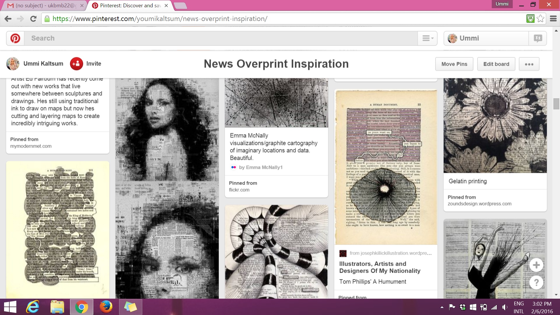
(above) I used these images as an example of how I could incorporate designs into my own book page.

(above) I used these images to help me have an idea how I want to make the typography stand out within the designs in the book page. I thought alot of contrast between bold and light, negative space etc.

(above) I refer to Sol LeWitt’s wall drawing line works to see how I could portray my personality by using just lines.
There are other resources that I came across with that I found to be interesting to add on as an inspiration:


The third image uses the same word throughout the work “HA”. The bold effect allows one to actually see what the message is, with its background faded.


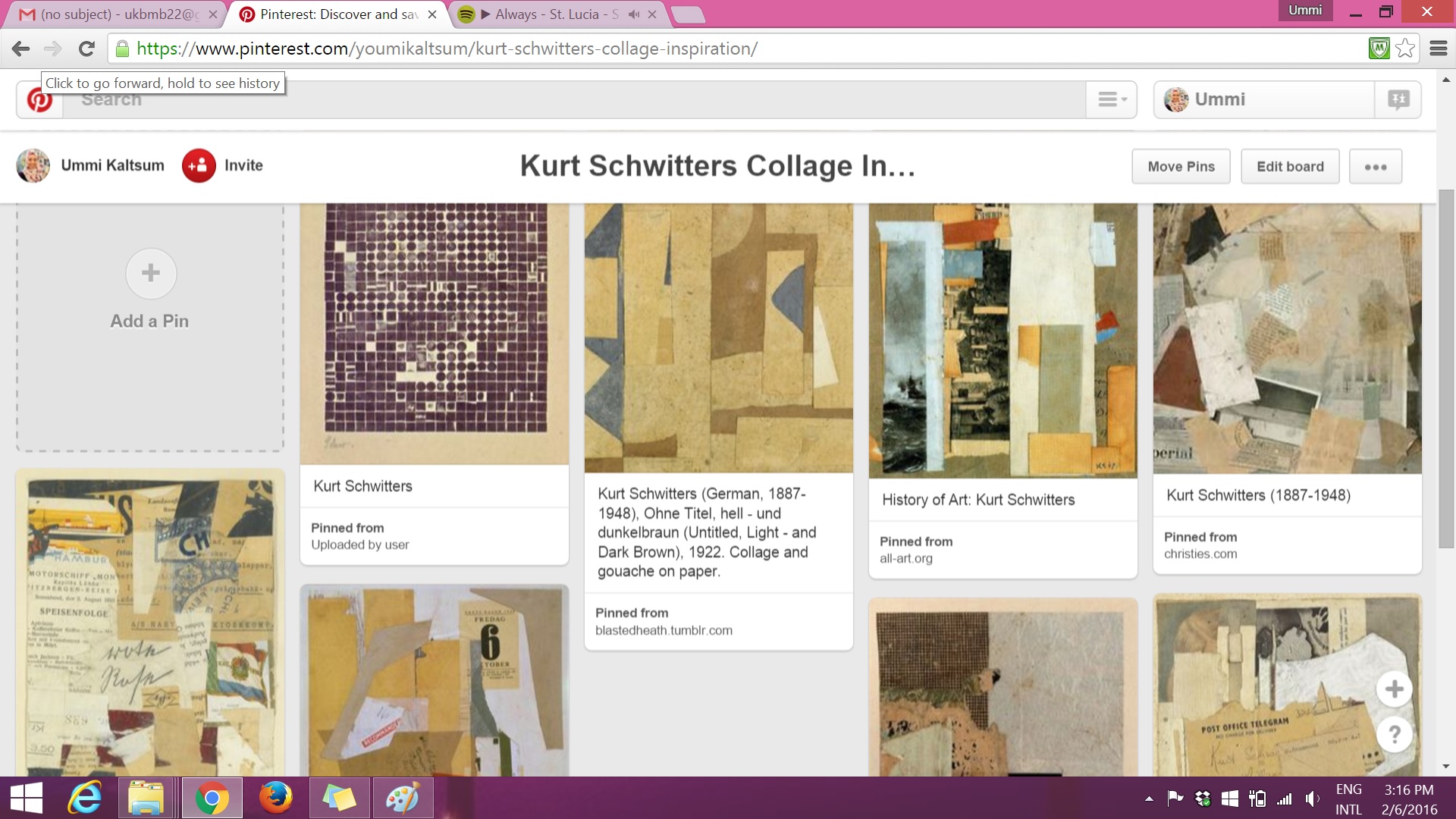
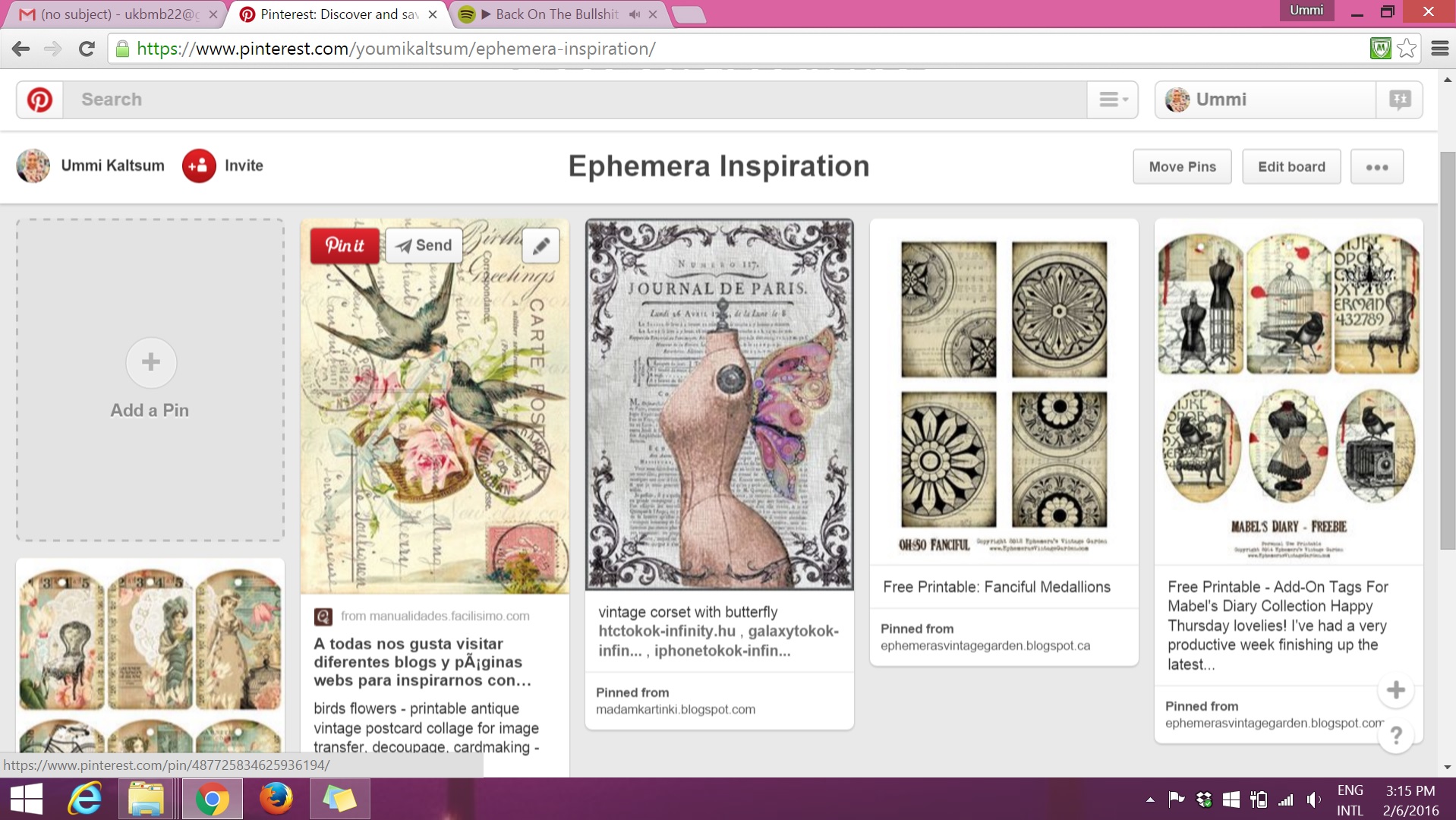
The 2 images below consists of Pinterest research on artist Kurt Schwitters on his collage works and the technique of Ephemera:
Continuing research on ‘Connecting Lines’ — I wanted to look further from Sol LeWitt’s line works, example: on how I could use these lines to form shapes or typography?

And after these research, I’d try it out myself to see if it suits with the vocation or personality I chose.