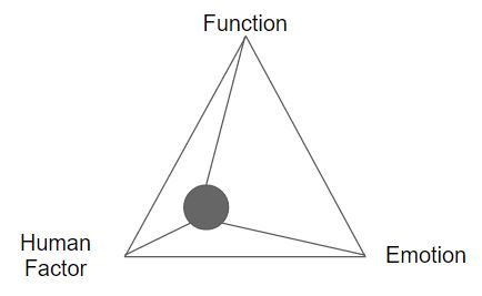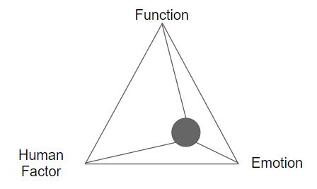
During the Harvey Norman’s field trip, there were 2 products that has the same emotion and interesting factor, as well as products in similar trends.
Firstly,
The 2 products with same emotion, same interesting factor:
Panasonic steam iron

Morphy Richards steam iron
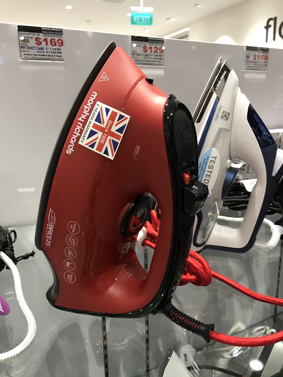
In terms of emotion:
- Both products are designed in a streamlined shape with multiple functions installed on the steam iron. As a user, I think having multiple functions makes me feel that the product brings efficiency to the user to complete as much ironing as possible.
In terms of interesting factor:
- Panasonic steam iron has a steep convex shape towards the tip of the iron base while Morphy Richards’ has a hump-like shape towards the tip of the iron base.
- Panasonic steam iron bottom part of the body, designed looking like a 3-legged rocket, plays more with negative space to stabilize the entire form. With the negative space, the iron looks rather lightweight as compared to a heavy-looking Morphy Richards’, where the bottom part of the body is solid.
Secondly,
The products that were similar in trend:
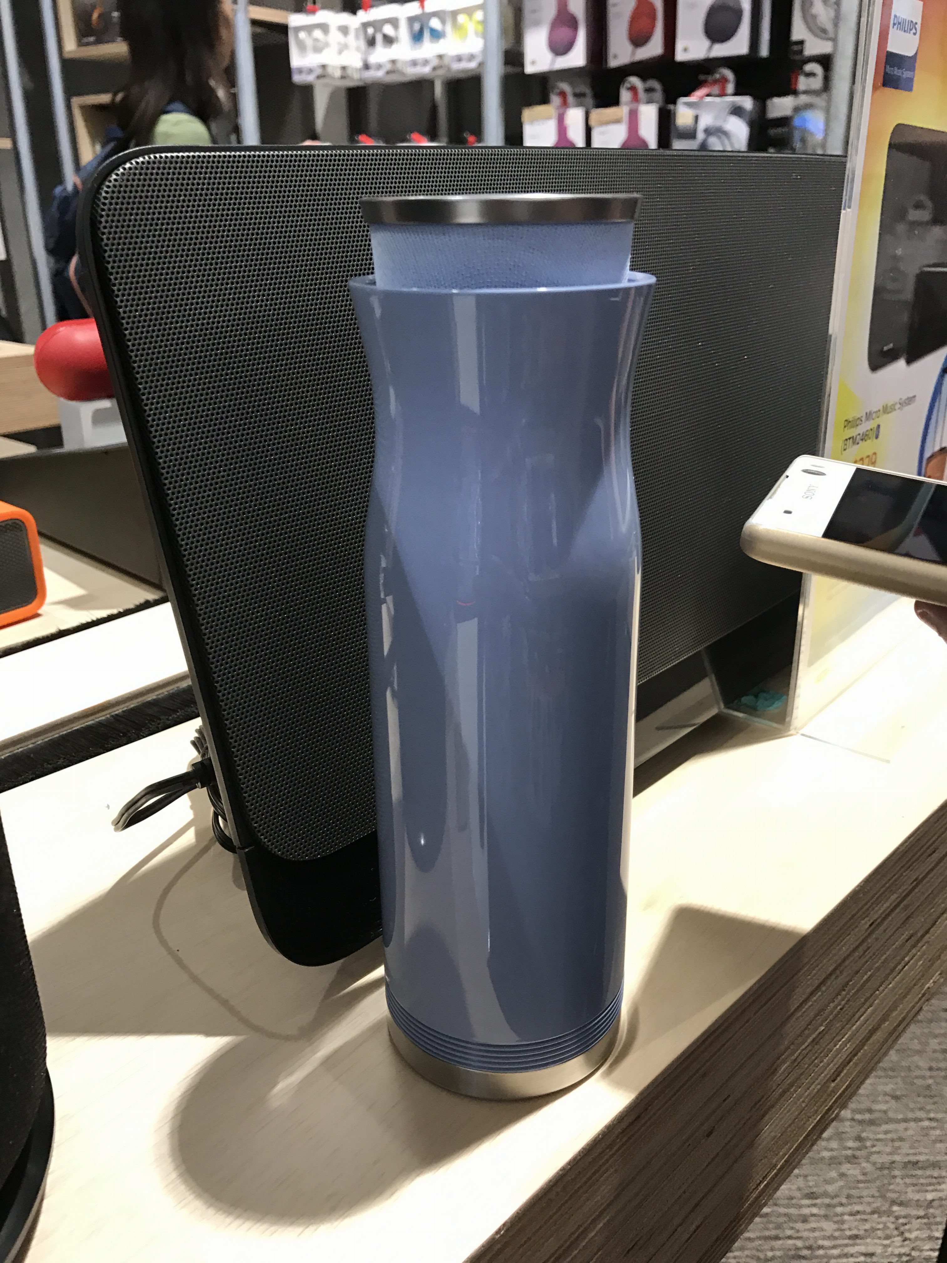
LG (bottle-like) speaker
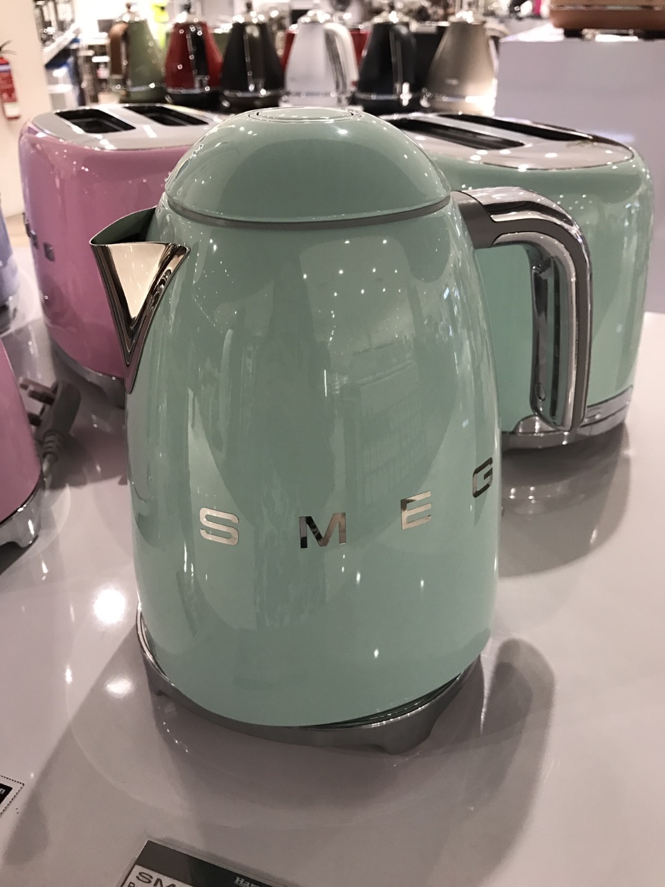
SMEG Electric Kettle
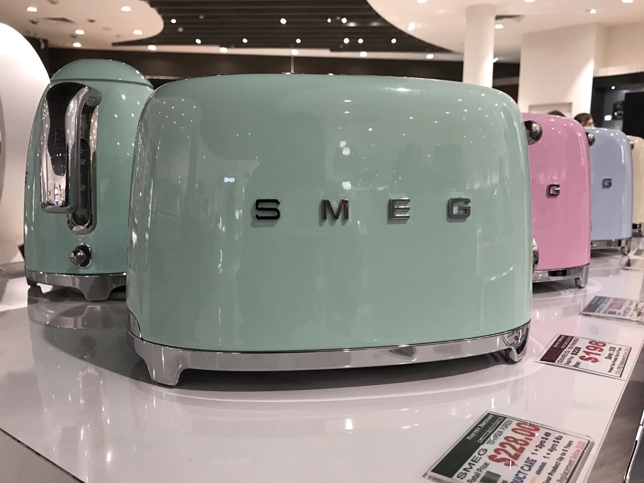
SMEG Toaster
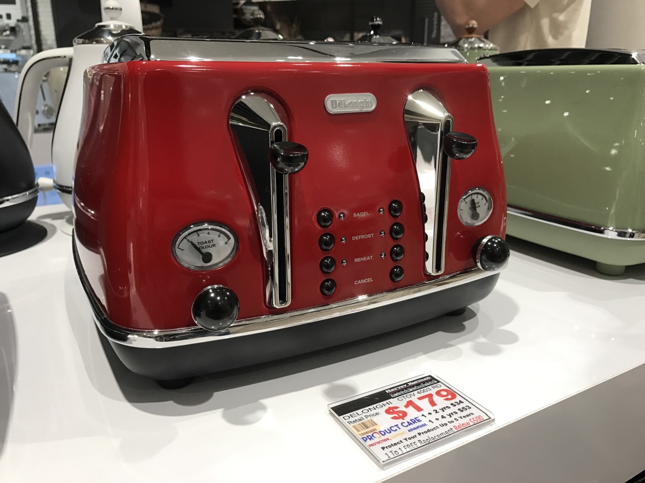
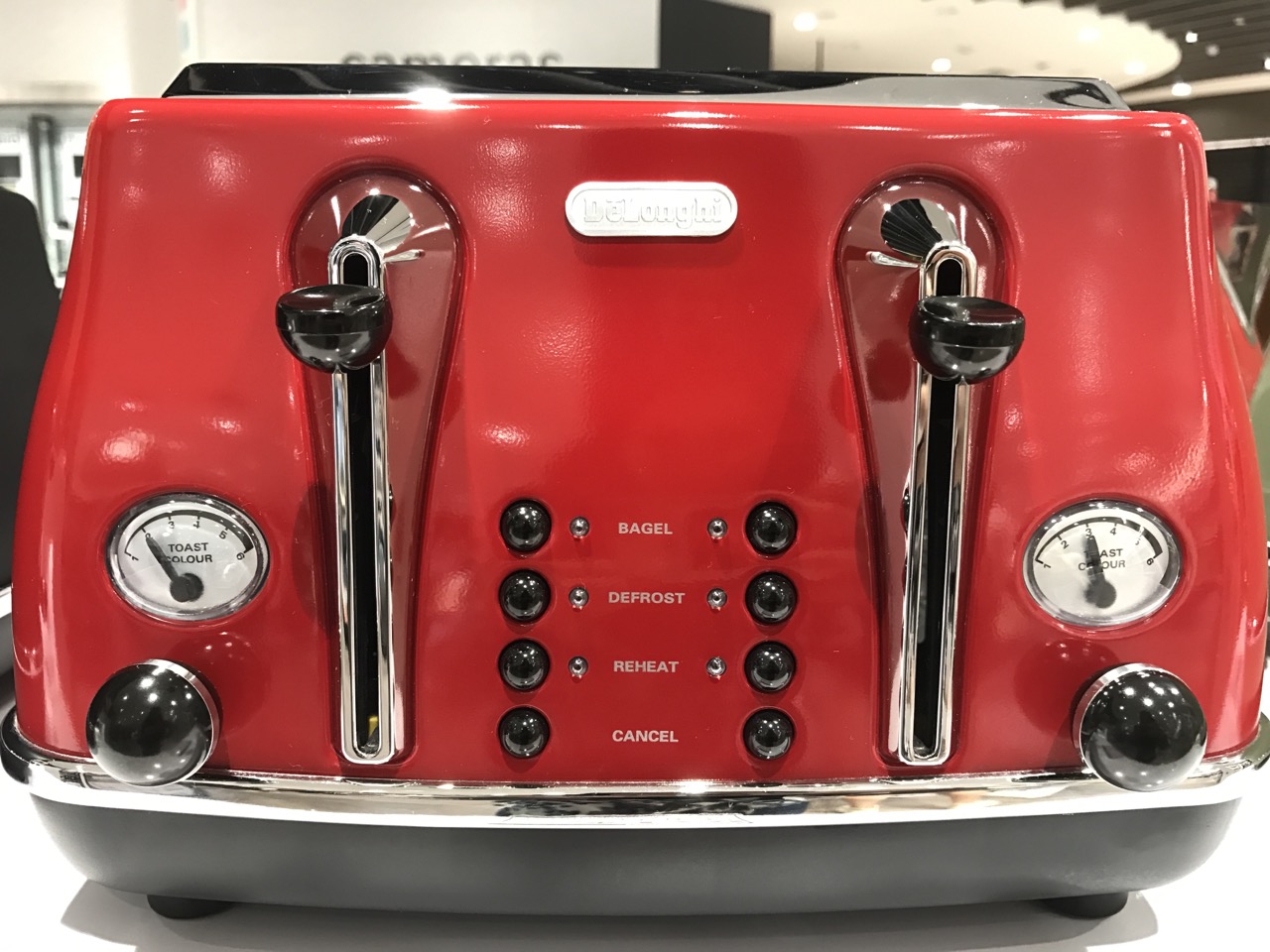
Delonghi Toaster
In terms of similar trend:
- I find that the products used colours that attracts user’s attention from afar. The cool pastel colours of LG and SMEG products were approachable and allowed the users to want to take a closer look.
- Delonghi toaster on the other hand was the next product that caught my attention after the pastel-coloured products. The range of colours gave me the feeling of nostalgia and retro.
- Similarities between the SMEG and Delonghi toaster showed another trend of having small, thin and sleek rounded knobs.
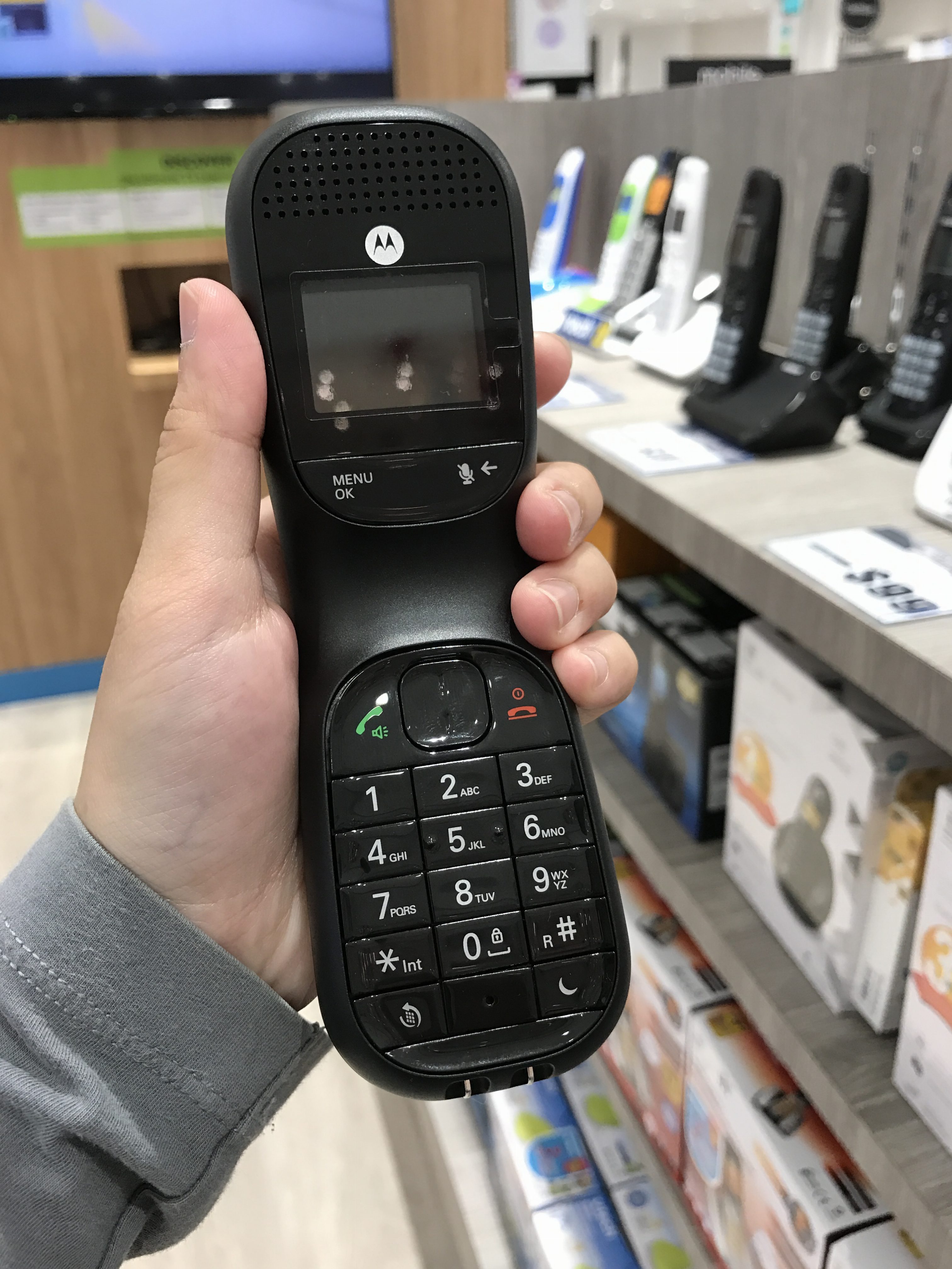
Motorola Cordless Handset

LG Speaker

In terms of similar trend:
- Aesthetic and form of both product are designed in consideration of the human factor/ergonomics, where user’s hand fits nicely around the inward curvature of the product.