Tag Archives: research

Factors of product aesthetics.

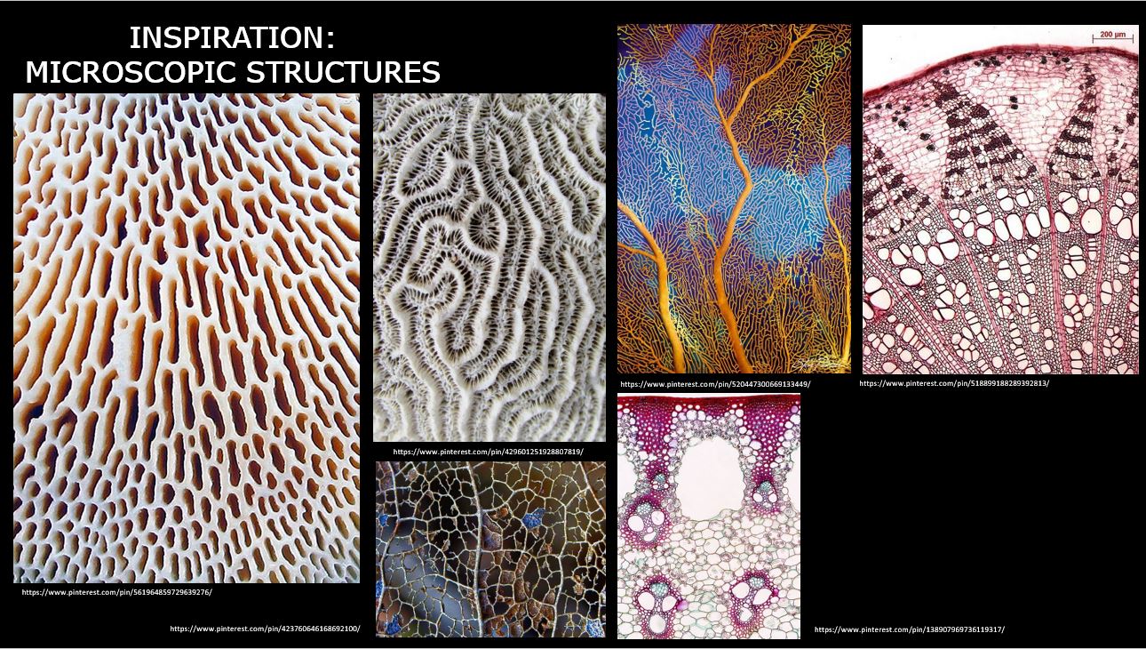
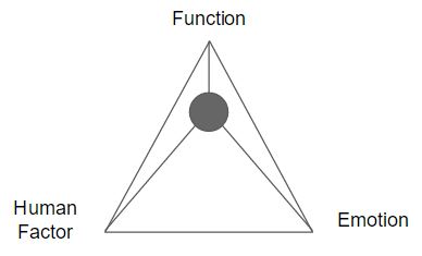
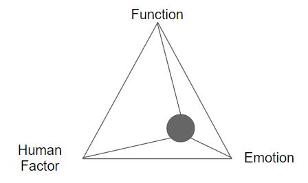
From the previous in-class lecture, we’ve touched on how 3 factors are influences of producing products’ aesthetics and/or form: function, human factor, and emotion.

Below, you can find my thoughts on the different products that is dominant in function, human factor, and emotion, respectively.
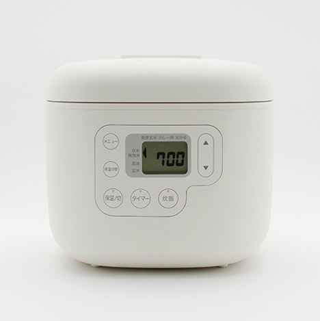
Function-dominant 

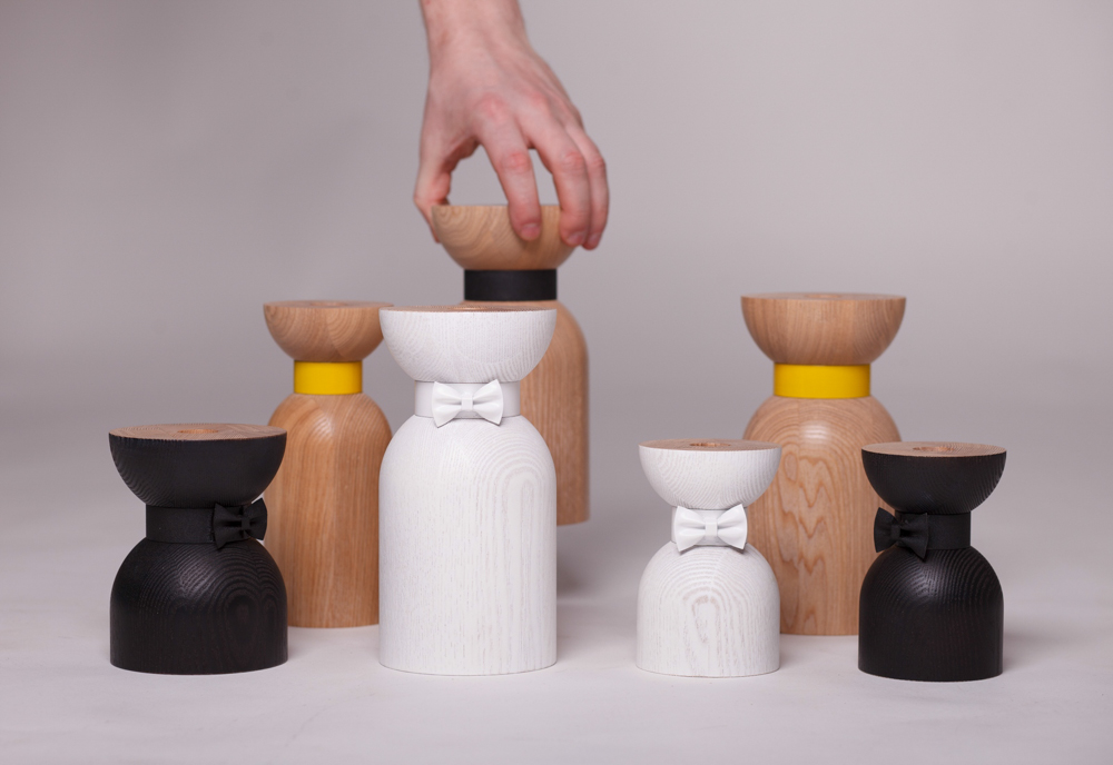
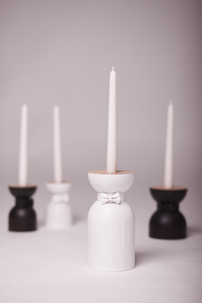
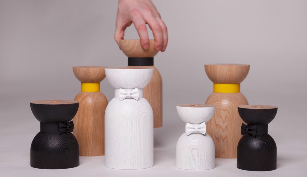
Product: Bow-tie candleholder

Designer: Vladimir Ivanov

Functional design are meant to be easily understood when the product is used.

The bow-tie candle holder designed by Vladimir Ivanov is minimal in terms of shape and details thus it is a straightforward product. The wood is most likely done by wood turning, where the diameter of the base is sufficient to stabilize the weight as well as height when the candle is placed in the required hole in the middle of the top plane. 

Human Factor-dominant

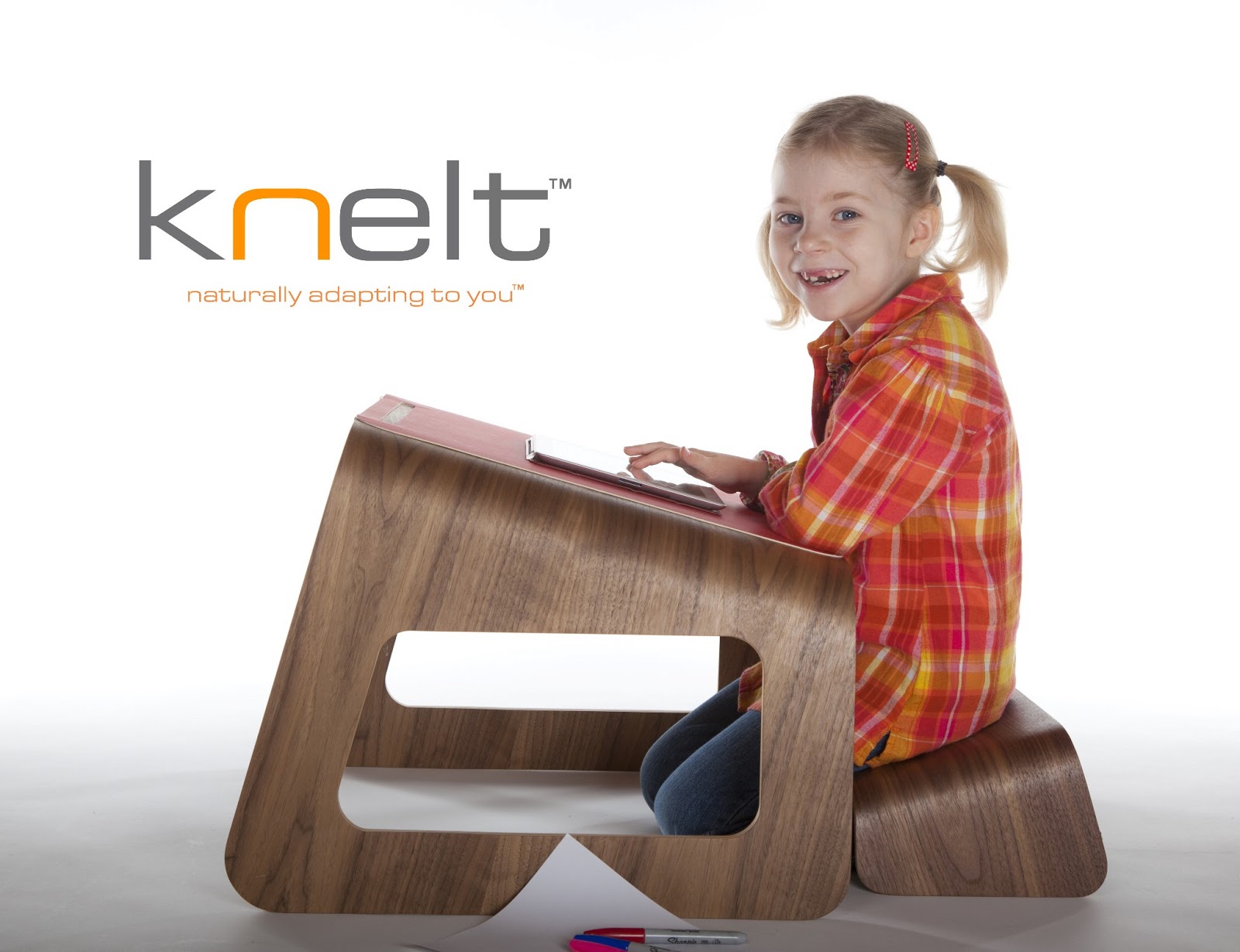
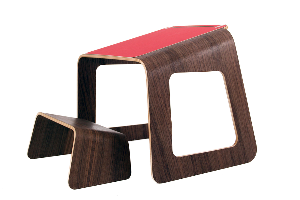
Product name: Knelt Desk

Designer: Tim Spencer, Ubiquity Design Studio

Problem: Through research, it was observed that children have the tendency to hunch over their flat desk while they kneel. Hunching over can lead to bad posture due to the stress on the spinal cord.

Solution: With the users being children from the age range of 3 – 10, the designer designed the Knelt Desk to educate the children of the proper sitting posture. Comparing the proportion of the desk and the seat, the desk is at least twice the height. They designed both the desk and seat at an elevated angle so that the user could experience the comfortable sitting position thus taking away with them the knowledge of correct sitting posture as they grow.

Source: http://ubiquitydesignstudio.blogspot.sg/

Emotion-dominant


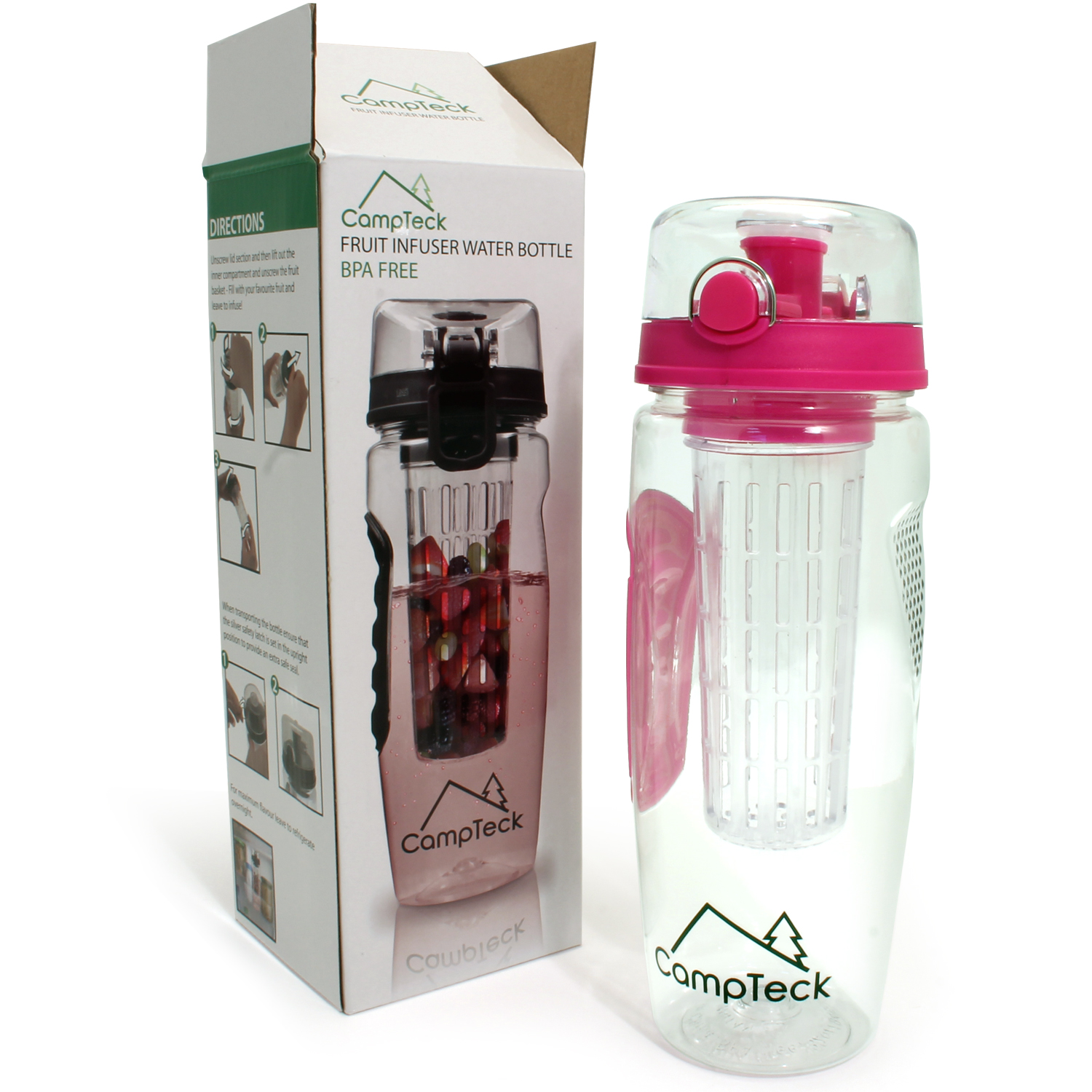
Product: CampTeck BPA-free Water Bottle

Before BPA-free water bottles were designed, plastic water bottles were everybody’s best friend. Although plastic are known to be non-biodegradable, research proved that it is harmful towards human health.

Plastic bottles contained a compound called bisphenol A — BPA for short. Reports stated that BPA is harmful towards human health system as excessive BPA in our body can lead to cancer, etc. Therefore, like the campaign of “No Plastic Bottles” campaign ran by ADM, encourage consumers/users to use BPA-free water bottles instead, preventing more harm to human health, as well as harming aquatic lives where plastics can be disposed.

I think this product is emotion-dominant because:

  • makes the user feel safer than drinking from plastic water bottles.
  • reminds the users to try their best to reduce the use of plastic bottles
  • users can carry out a healthier daily drink choice as fruit infuser was also incorporated in the design.

Naoto Fukasama

Among the designers we have been introduced in class, I would say that I can relate to Fukasawa’s design philosophy of simplicity. He also has the philosophy of  “Objective Thinking”, where he stated that we should not express our own mind through the product.

I think Fukasawa best describes how I work to produce my designs. Simple designs attract me the most because of its clean and sleek look. Fukasawa’s household appliances he designed for Muji shows minimalism in terms of functions, detailing and simple shapes.

Fukasawa designed these household appliances for Muji such as the hot water kettle, toaster and rice cooker.

Process: Creating Motifs Part 5

Lately, I started on the motifs for the Virus that will cause the Mutation in the city. The motifs were created and/or designed the same way I did for the previous motifs: find an image of an interesting microscopic anatomy, trace on tracing paper, scan and then digitized and compiled them all together to form ONE virus.

The virus cells that I was inspired by can be seen below.

Virus #1: Structure of Virus

Virus #2: HIV

Virus #3: Structure of Polio Viruses

Virus #4: Ebola Virus

Then, I combined them to form into one motif:

virus-compiled-bw_1
The compiled virus in Black and White
virus-compiled_1
The combined motif in colours.

I had 2 versions of the motif in terms of colour to have a general outline vs how I intend for the virus motif to look like — clearly going towards the direction where my “healthy, normal, and non-virus” main motifs will soon change its “pure” colours to the spread of virus.

Apart from motifs, since the previous lesson where we were demo-ed on how to animate our banner in After Effects, I had thoughts mingling in my mind and thus decided to write it down:

new-doc-2_1

To be brief, I noted down how I think I want my animation to be — main motifs zoomed in or out, virus approaching main motifs, spreading of colour, etc.

When I had these thoughts, I was thinking of Star Wars — how their spaceships were floating in space, the movement of space when spaceship goes towards whirlpool galaxy(?).

Maybe these images will help to show you how I envisioned the background of my banner to be:

Source: http://www.paperhi.com/Toplist_Best_3061
Source: http://starwars.wikia.com/wiki/Hyperspace/Legends
Source: https://www.wired.com/images_blogs/underwire/2013/02/parallax-hyperspace-stars2.jpg

Process: Experimental Medicine Building

Recently, I head down to the Experimental Medicine Building, to use the resources that they have on human microscopic anatomy/structure.

First foremost, I was taught the fundamentals of using a microscope, and lastly the choosing of whichever samples that I would like to view on.

I was spoilt for choices with the many samples, however the technician was of great help. He sat beside my work desk and assisted me — he even play trial and error to view the different samples to get the pattern that I was looking for in our human anatomy.

I selected a few of the samples, and did a screenshot of what I studied:

Mammal Cerebellum

Human Spinal Cord

Human Scalp

Mammal Thyroid and Parathyroid Glands

Mammal Kidney

Human Lung

Human Skin, Non-pigmented

Mammal Artery and Vein

Human Skeletal Muscle

Mammal Compact Bone

Mammal Ovarian Follicles

Human Ovary, active phase

Human Tongue

Mammal Esophagus

Human Stratified Columnar Epithelium

City: Selected Theme

Mutation in the City”

So, it seems that I have decided for my theme to be Mutation as I was inspired by microscopic structures and bio-mimicry.

The theme “Mutation in the City” mainly focus on the health aspect in the city — how people are infected with virus or sickness like cancer etc. I had the inspiration from movies with zombies and I was curious of how the cells (virus + normal cell) in our body actually reacts with one another. Like, does it react vigorously like how metals in the first group in the Periodic Table reacts with water?

Research on Mutation (Link:https://www.pinterest.com/youmikaltsum/inspiration-pattern-design-mutationsinfectious/)

With the example above, I want to look for interaction between the cells thus it led me to decide on how my pattern design will be formed — collage images of the microscopic structure into 1 big pattern, use variation of colours to show the interaction between the cells, and most probably using the shape of DNA figure.

City: Moodboard & Theme selection

This post will contain information and images on the themes ideas for the Project City.

SUPERNATURAL CITY

Transform city found objects, and/or data, into representational or abstract forms, designs, and patterns for a large-scale public art installation.

When I think of cities, I think of man-made and natural aspects. I considered what can be seen in the cities, what can be felt in terms of how you feel etc. I decided to go on the direction of Nature for my City. Recently, I went to Chinese/Japanese Garden to see what I can be inspired from.

The first thing that came to my mind were ripples, how the water flows naturally could be turned or modified into an organic pattern following the movement or direction. After my personal trip, I went on Pinterest to gather inspiration and created my moodboard.

Inspiration Tab-Pattern Design
General research on Pattern Design on Pinterest. (Link: https://www.pinterest.com/youmikaltsum/inspiration-pattern-design/)


Moodboard - Ripples Inspiration
Moodboard on idea #1

The second idea I had in mind was textures. So I looked out for trees, the road and other materials I can find along the park for unique textures. Some trees that had scales growing on the trunk thus it lead me to think of bio-mimicry, and/or microscopic structure.

Moodboard - Textures Inspiration
Moodboard on idea #2 – textures
Moodboard - Microscopic Inspiration
Moodboard on idea #3

 Lastly, I researched on the different techniques to go create patterns. After browsing through Pinterest, I narrowed down to 2 techniques which you can find below:

My compilation of the different ways to create pattern using different tools (Link: https://www.pinterest.com/youmikaltsum/inspiration-pattern-design-techniques/)


Moodboard on techniques
  1. marbling — I thought of using watercolour or milk with food colouring to create the cross section of the pattern
  2. monoprint — I thought of re-using the monoprint from previous semester, and do a few more to get variations so that I could collage them digitally.

In terms of colour, I thought of bright and contrasting colours like the last picture on the right from the techniques moodboard.

POV: Synecdoche

“There’s another term of negative space. What is it?”

So there is another term of “playing with negative space” which is called synecdoche.

22e966372552f8efed8fd5f975e43277
Taken from: https://s-media-cache-ak0.pinimg.com/236x/22/e9/66/22e966372552f8efed8fd5f975e43277.jpg

Or another example, using collage…

synecdoche
Taken from: https://www.pinterest.com/pin/487725834626331353/


From the previous collage trial, Prof re-introduced me to synecdoche and I did a few research before proceeding to the next phase of trying to incorporate synecdoche into my collages.

POV: Research

When the brief was given for this POV project, I decided to do collages, like cut and paste collages. So I head on to Pinterest to find inspiration on collages as well as finding out different artists all together.

Below are some of the inspiration tabs I screenshot while researching.

Collage inspiration tab

Old magazines rolled
The colours attracted me the most. From far it looked like colour pencils aligned neatly, but it stated that they were actually rolled up magazines then collaged together. (Taken from: https://www.pinterest.com/pin/487725834626272330/)
Old kids painting
When I saw this, I was struck with an idea that I could find old art works stored somewhere in my house and simply tear/cut and paste to form the POV. (Taken from: https://www.pinterest.com/pin/487725834626272314/)
Valerie Roybal Collage 1
I saw this collage and was in awe. The different prints formed such beautiful pattern all together. (Taken from: https://www.pinterest.com/pin/487725834626272608/)
valerie roybal inspiration tab
From the image above, I got to know the artist that did the collage and searched for more of her works on Pinterest.


lisa hochstein inspiration tab
The list goes on when I further looked through Pinterest…
james verbicky inspiration tab
I find that when you collage the image, lined it up nicely…. it made such a nice backdrop.
Starbirth_detail1
Artist David Adey’s collage using lips from magazine (Taken from http://davidadey.com/Starbirth)
Starbirth_detail2
Close up (taken from http://davidadey.com/Starbirth)
abstract collage inspiration tab
I looked at abstract collages to get inspiration on how to not be too literal for the POV.