Tag Archives: emotions

Factors of product aesthetics.

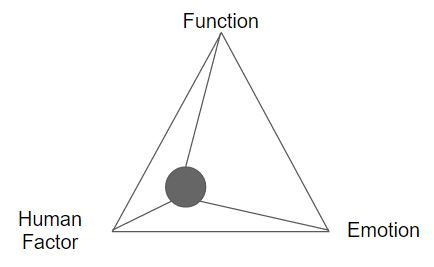
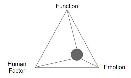
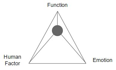
From the previous in-class lecture, we’ve touched on how 3 factors are influences of producing products’ aesthetics and/or form: function, human factor, and emotion.

Below, you can find my thoughts on the different products that is dominant in function, human factor, and emotion, respectively.

Function-dominant 

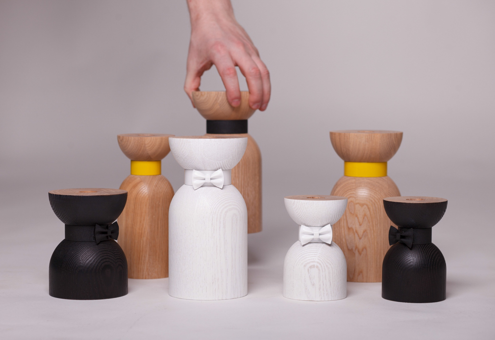
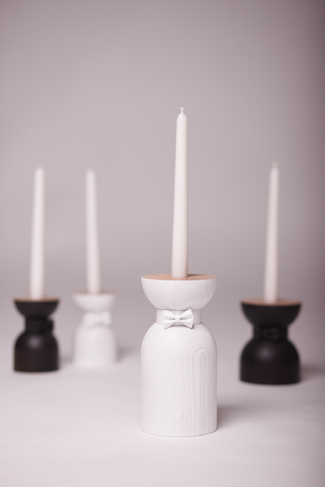
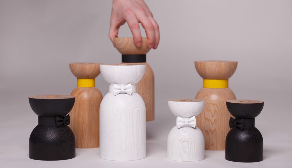
Product: Bow-tie candleholder

Designer: Vladimir Ivanov

Functional design are meant to be easily understood when the product is used.

The bow-tie candle holder designed by Vladimir Ivanov is minimal in terms of shape and details thus it is a straightforward product. The wood is most likely done by wood turning, where the diameter of the base is sufficient to stabilize the weight as well as height when the candle is placed in the required hole in the middle of the top plane. 

Human Factor-dominant

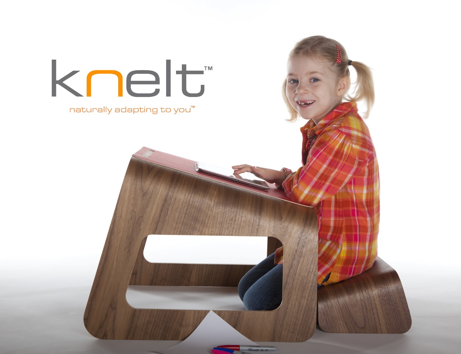
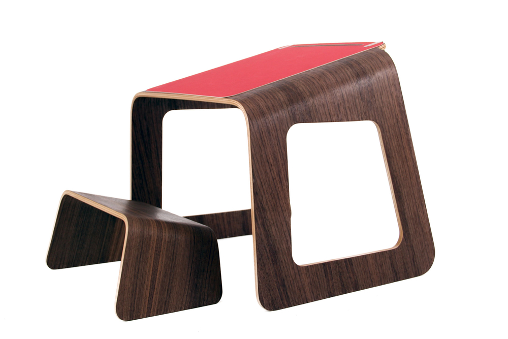
Product name: Knelt Desk

Designer: Tim Spencer, Ubiquity Design Studio

Problem: Through research, it was observed that children have the tendency to hunch over their flat desk while they kneel. Hunching over can lead to bad posture due to the stress on the spinal cord.

Solution: With the users being children from the age range of 3 – 10, the designer designed the Knelt Desk to educate the children of the proper sitting posture. Comparing the proportion of the desk and the seat, the desk is at least twice the height. They designed both the desk and seat at an elevated angle so that the user could experience the comfortable sitting position thus taking away with them the knowledge of correct sitting posture as they grow.

Source: http://ubiquitydesignstudio.blogspot.sg/

Emotion-dominant


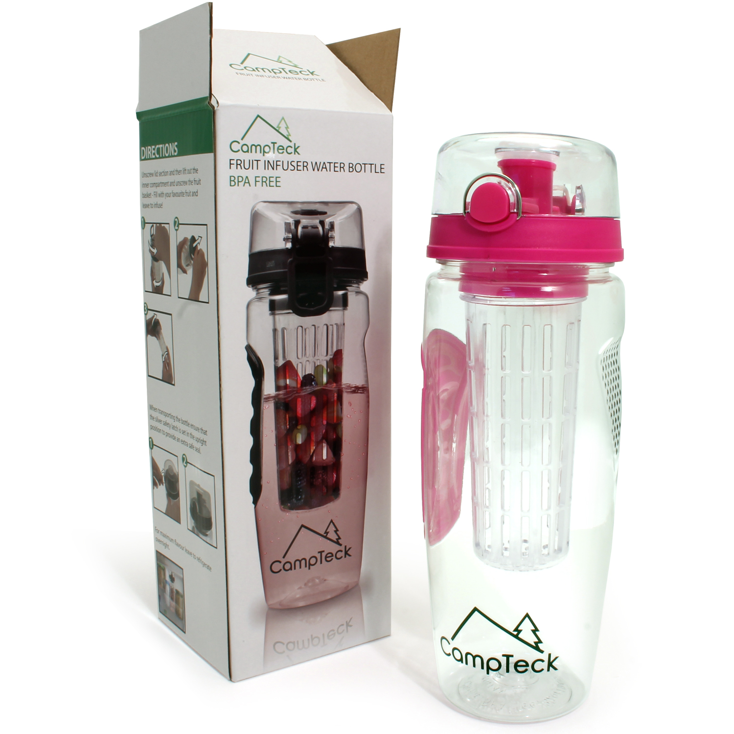
Product: CampTeck BPA-free Water Bottle

Before BPA-free water bottles were designed, plastic water bottles were everybody’s best friend. Although plastic are known to be non-biodegradable, research proved that it is harmful towards human health.

Plastic bottles contained a compound called bisphenol A — BPA for short. Reports stated that BPA is harmful towards human health system as excessive BPA in our body can lead to cancer, etc. Therefore, like the campaign of “No Plastic Bottles” campaign ran by ADM, encourage consumers/users to use BPA-free water bottles instead, preventing more harm to human health, as well as harming aquatic lives where plastics can be disposed.

I think this product is emotion-dominant because:

  • makes the user feel safer than drinking from plastic water bottles.
  • reminds the users to try their best to reduce the use of plastic bottles
  • users can carry out a healthier daily drink choice as fruit infuser was also incorporated in the design.
#throwback: Agnes Martin

Major throwback to the first week of Foundation 2D.

This was a group research that Caroline and I did during the first lesson of 2D. We chose and was assigned one of the many artists — Agnes Martin. This research is a hand-me-down information from the slides that we did. (So basically I’m just transferring the information here.)

Agnes Martin (1912 - 2004)
“When I first made a grid, I happened to be thinking of the innocence of trees, and then a grid came into my mind and I thought it represented innocence, and I still do, and so I painted it and then I was satisfied. I thought, “This is my vision.” – Agnes Martin


Agnes Martin (1912 – 2004)

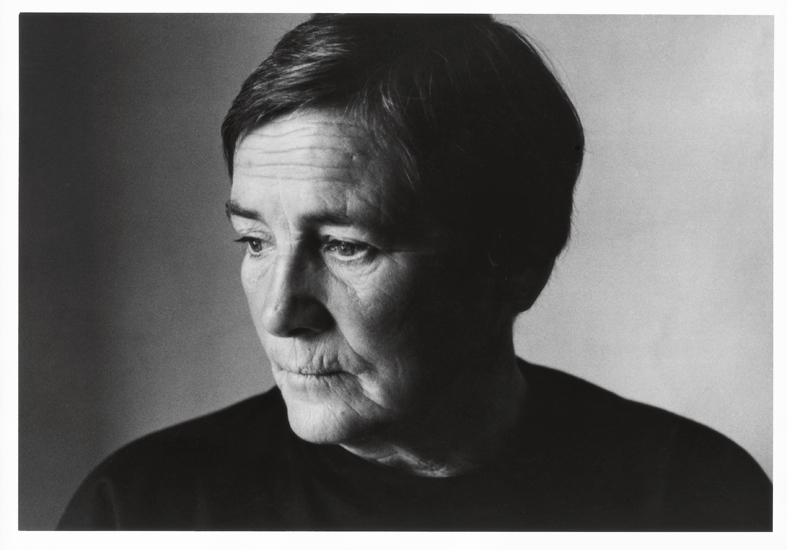
Martin was known as an American abstract painter, referred as a minimalist but considered herself an abstract expressionist. She turned to art around the age of 30, when she was a student at Columbia University in New York.

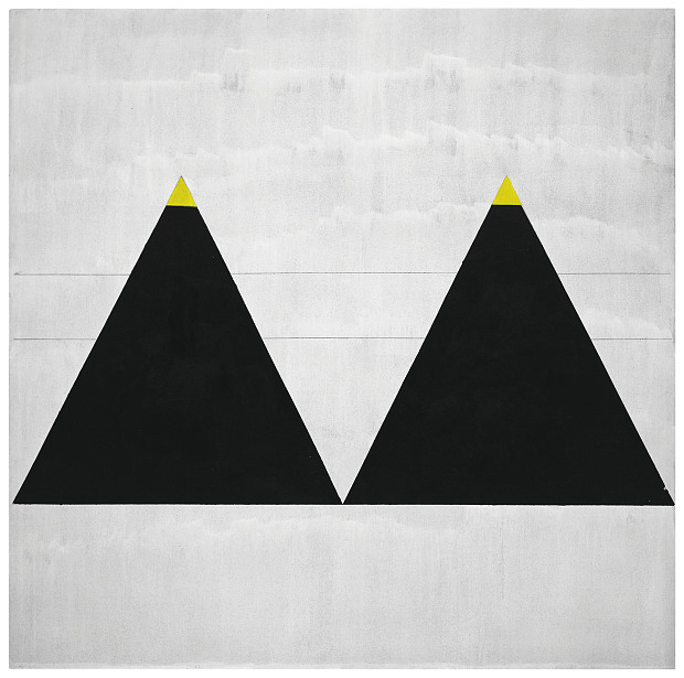
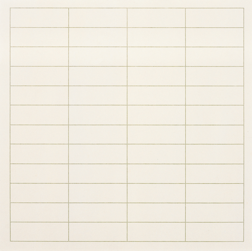
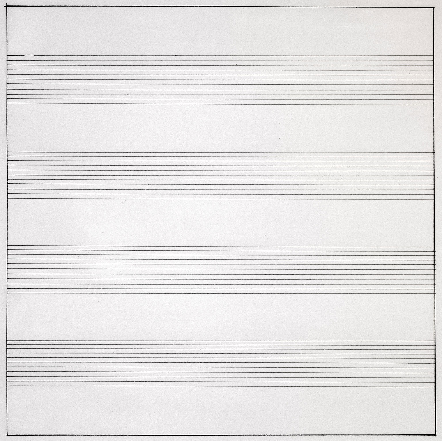
One of Martin's art piece
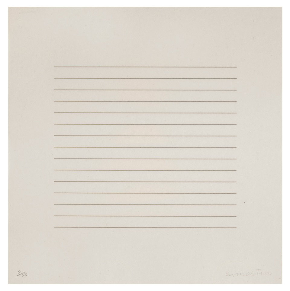
One of Martin’s art piece


So when I typed “Agnes Martin artworks” at Google search, I was perplexed, surprised and couldn’t really believe what I was looking at! The picture above is one of the many artworks of Martin’s. Look at how simple her artworks are — geometrical shape, and just lines by pen and a ruler. At that point of time I was thinking to myself “WHAT? That means if I were to just draw a single line in pencil and tell people ‘This is my art piece’, I would be famous too?”

HA HA HA (Dream on Ummi)

That was definitely a complete puzzle to me and that was the first impression of Martin’s artworks. She has this signature style of hers where she uses squared monochrome canvas, layered with gesso, overlaid with hand-drawn pencil lines and thin layers of oil or acrylic paint.

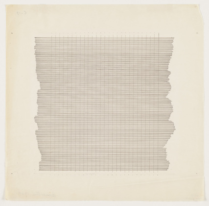
(More examples of her pencil-ed lines below…)

Agnes_Martin_Hiram_Butler_Gallery_a securedownload-2

Untitled-10

Let me share Martin’s techniques used in her artworks. Firstly, pencil lines. As you can see from the above examples, you can tell that she is a mechanical person. She actually has hand-drawn horizontal, vertical or in grid formations across gesso canvas. She stretched string across the canvas and uses ruler to draw. Then, her line spacing was mathematically worked out on paper, then painted between to form solid bands.

Secondly, colour range in her artworks. Martin mainly uses the primary colours of red, blue and yellow, and of course the most basic colour of black and white. She customizes the colours by thinning, mixing, lightening and darkening them. Furthermore, with these colours, she actually creates ghostly effect of the colours by bleaching them out. That is why her coloured artworks has those neutral, gentle yet faded colours.

1974, Martin’s artworks eventually moved out from the ‘monochrome zone’ and became more human and involving by replacing neutral tones to brighter colours.

In general, Martin’s inspiration are mostly from nature and emotions. She always somehow connects her artworks with her emotions deep inside. Therefore, if you were to re-read the quote at the top of this post, you could see how much she would relate nature with emotions and then transferring those characters onto her canvas.

So what do I think of Agnes Martin?

Personally, I like simple stuff. I was impressed that her just a few lines could actually mean something so deep. I actually have this motto of “Less is More”, and I think Martin portrays that as well.

Lines follow Emotions

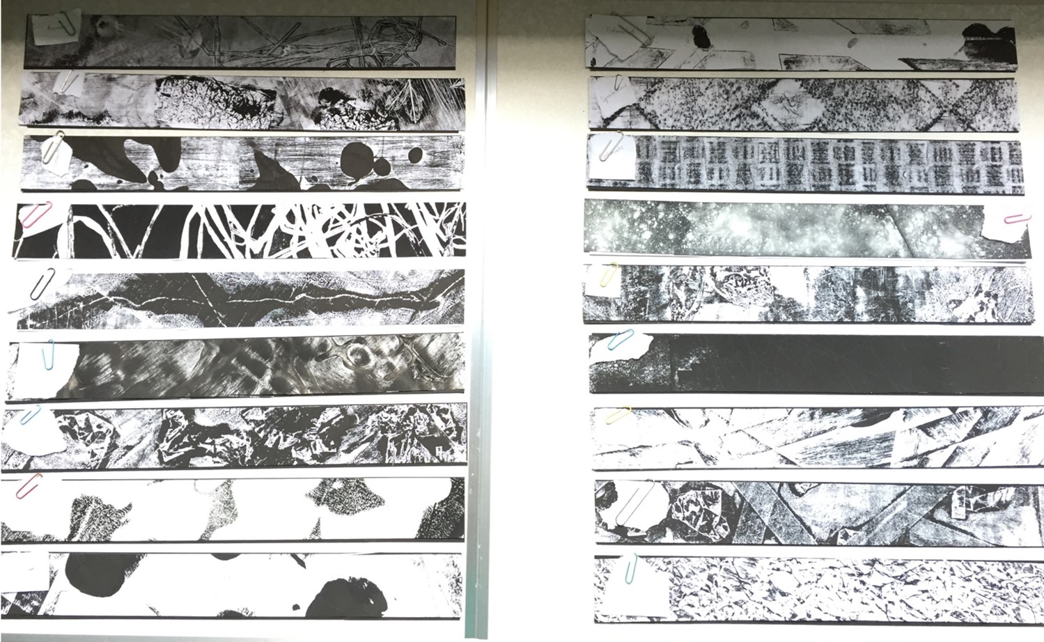
These are the 18 strips without its windows. Left column, top to bottom: Bizarre, Embarrassed, Distracted, Lyrical, Indecisive, Ambiguous, Psychotic, Sensual & Awkward Right column, top to bottom: Exhausted, Spontaneous, Systematic, Turbulent, Sloven, Nonsensical, Anxious, Aggressive & Fragile


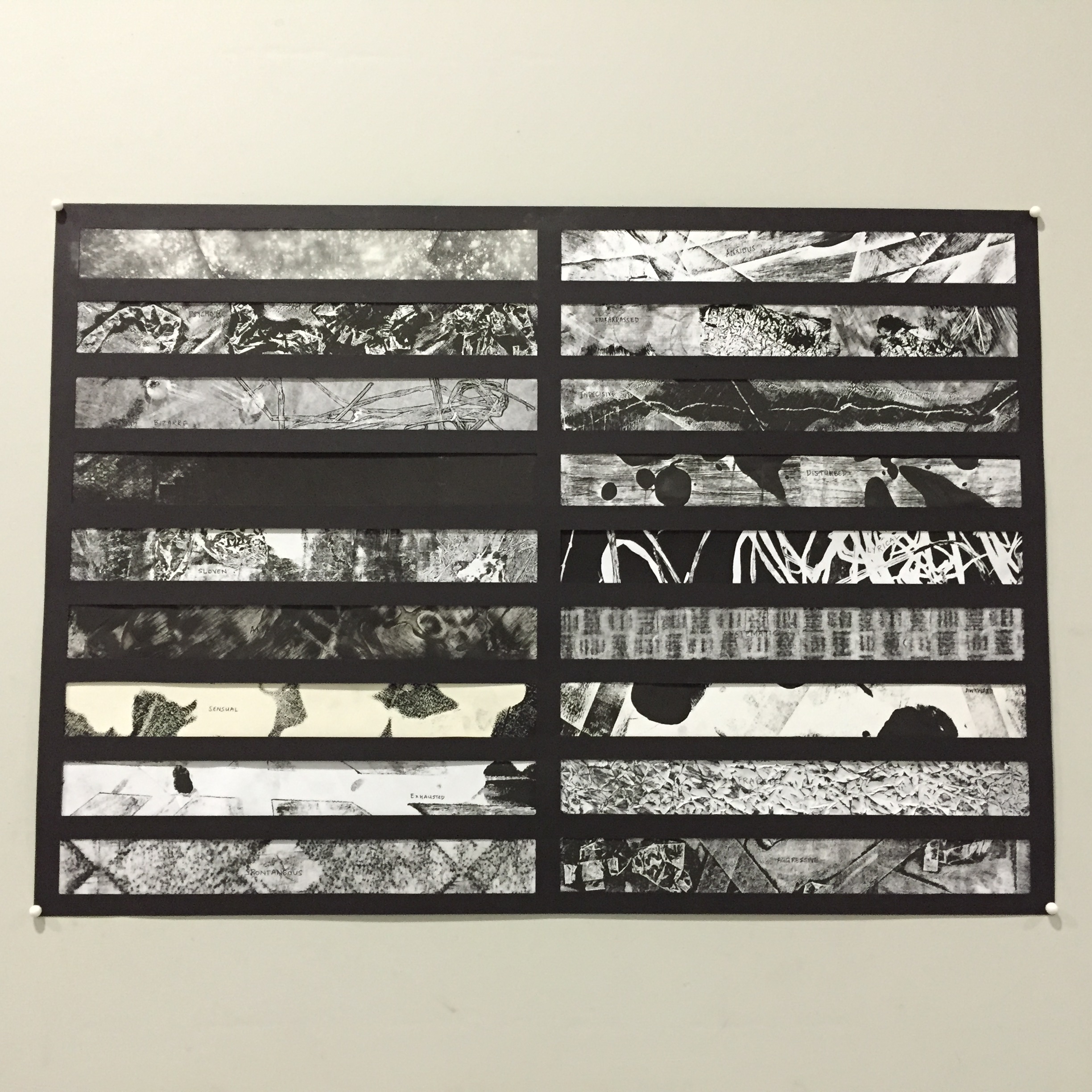
Just like in design terms of “Form follow Function”, this assignment had the term of “Lines follow Emotions” where we had to mix and match the different abstract lines we have to the following emotions.

 When I was trying to sort out the lines to go with which emotion, I was mostly stuck on how one actually see the lines as nonsensical for example. However, I decided to just go with my own interpretation of how each line represents the emotions.


Bizarre in a way that the lines are interrupted with a weird looking key patch that stands out among the greys.
The contrast between the tone in the monoprinted sheet. I thought when you get embarrassed, you tend to blush so the darker tone in the strips represents the blushing effect among the rest.
The contrast between the tone in the monoprinted sheet. I was thinking at the moment “when you get embarrassed, you tend to blush” so the darker tone in the strips represents the blushing effect among the rest.
distracted
When one is distracted, their mind tends to get messy with all the different thoughts at the back of their mind. Therefore, this was chosen as ‘distracted’ as the blobs of ink represents the bubble of thoughts in one’s mind(?)
lyrical
Lyrical somewhat means expressive, rhythmic or some sort. Therefore I cut out a portion of my monoprint that has lines flowing as if you can see musical notes floating along the lines.
I cut out portion of my monoprint that shows indecisive -- lines crossed path each other. Imagine you standing at the intersection and then thinking "Do i go this way or that way or that or this way?"
“I want KFC. No wait, MacDonalds. No no, Burger King….. or Long John Silver?” Just like you get indecisive on what to eat for lunch, these lines get indecisive on where they want to go. In the end, all went separate ways.
Method of spamming glue spontaneously to actually create texture when it dried up (but i failed). Ambiguous in a way that the tone is not certain and you actually don't know what is happening either -- as some part of the strips are bold, grey and white.
Method of spamming glue spontaneously to actually create texture when it dried up (but i failed).
Ambiguous in a way that the tone is not certain and you actually don’t know what is happening either — as some part of the strips are bold, grey and white.
When I think of psychotic, I think of the show Criminal Minds -- shows the different signs of psychosis. I interpreted it in a way that I would collage certain parts of the monoprints to create something 'insane'. For example, I see a face at the right corner of the strip, a scary T-Rex's mouth opened wide & etc.
When I think of psychotic, I think of the show Criminal Minds — shows the different signs of psychosis.
I interpreted it in a way that I would collage certain parts of the monoprints to create something ‘insane’. For example, I see a face at the right corner of the strip, a scary T-Rex’s mouth opened wide & etc.
When one think of the word 'sensual', it always got to do with one's body. (I thought of it like that) So, I represented my emotion of 'sensual' with curvatures as it shows sexiness. As if it's a body shape of a lady or somewhat. The background is bold so the curvatures actually stands out.
When one think of the word ‘sensual‘, it always got to do with one’s body. (I thought of it like that)
So, I represented my emotion of ‘sensual’ with curvatures as it shows sexiness. As if it’s a body shape of a lady or somewhat. The background is bold so the curvatures actually stands out.
This strip was a cut out portion from my piece of somewhat Decalcomania technique. When one is awkward, one tend to stay as far as possible from the crowd. Therefore, the blobs of ink are actually at a distance from one another thus you can feel the awkwardness around them.
This strip was a cut out portion from my piece of somewhat Decalcomania technique.
When one is awkward, one tend to stay as far as possible from the crowd. Therefore, the blobs of ink are actually at a distance from one another thus you can feel the awkwardness around them.
This strip was a monoprint consisting of paper tape and blobs of ink. Imagine your smartphone, as you use more data your phone battery will deplete. Putting this interpretation with the lines I have, the blob of ink at the right corner of the strip actually shows that it is on the verge of finishing thus it looks exhausted.
This strip was a monoprint consisting of paper tape and blobs of ink.
“I am exhausted, I have no energy left to continue this activity.” Putting this interpretation with the lines I have, the blob of ink at the right corner of the strip actually shows that it is on the verge of finishing/depleting thus it looks exhausted.
Method of Frottage was used with chalk pastel. Spontaneity is the action of being natural. For example when one gives a speech, they actually don't refer to anything nor prepare but words just flow of them. Interpreting from that, I thought this piece was spontaneous with its symmetrical shape. The reason was because humans tend to like symmetry and it is actually a natural and common thing. (i do)
Method of Frottage was used with chalk pastel.
Spontaneity is the action of being natural. For example when one gives a speech, they actually don’t refer to anything nor prepare but words just flow of them. Interpreting from that, I thought this piece was spontaneous with its symmetrical shape. The reason was because humans tend to like symmetry and it is actually a natural and common thing. (i do)
Systematic is all about the rhythm and repetitive patterns. This piece was also done using the Frottage technique of a table mat. It falls under this emotion perfectly for its obvious reason -- repetitive patterns.
Systematic is all about the rhythm and repetitive patterns. This piece was also done using the Frottage technique of a table mat. It falls under this emotion perfectly for its obvious reason — repetitive patterns.
This piece was done using baby powder. I painted the paper with black ink and then upon drying, baby powder was spammed onto the paper. (A little bit of fixing with hair spray to keep the powders stuck to the paper but I think it was unsuccessful) Think of being in a flight and then it's going against strong wind. I thought of that for this emotion. Therefore, with the chaotic spread of the powder around the paper, I think it shows the turbulence.
This piece was done using baby powder. I painted the paper with black ink and then upon drying, baby powder was spammed onto the paper. (A little bit of fixing with hair spray to keep the powders stuck to the paper but I think it was unsuccessful). Think of being in a flight and then it’s going against strong wind. I thought of that for this emotion. Therefore, with the chaotic spread of the powder around the paper, I think it shows the turbulence.
This strip was chosen to show the emotion of sloven as the strip is filled with messy components.
This piece was nonsensical in a way that it doesn't make any sense at all. Even when I was experimenting the scraping of wet paint with a tip of a paper clip.
This piece was nonsensical in a way that it doesn’t make any sense at all. Even when I was experimenting the scraping of wet paint with a tip of a paper clip.
When you're anxious, your muscles tend to tense up. In this piece, I interpret it in a way that the intersection of the paper tapes grew tense as the different sides get pulled.
When you’re anxious, your muscles tend to tense up. In this piece, I interpret it in a way that the intersection of the paper tapes grew tense as the different sides get pulled.
aggressive
The monoprint used to portray this emotion has this bold effect that make the whole strip stands out. The texture of the paper tape and the creases of the crumpled paper scattered around shows that more force was initiated. Aggressive in terms of the sharpness and the intensity of the texture.
When you think of fragile, you know it has got to do with things that are brittle and tender loving care. This strip was done using the Froissage technique, chalk pastel ran over the creases to give the effect. The creases represents the cracks and it was actually fragile when I was cutting it due to the creases.


With all these strips, it was then compiled and sorted out to their windows… (see below)

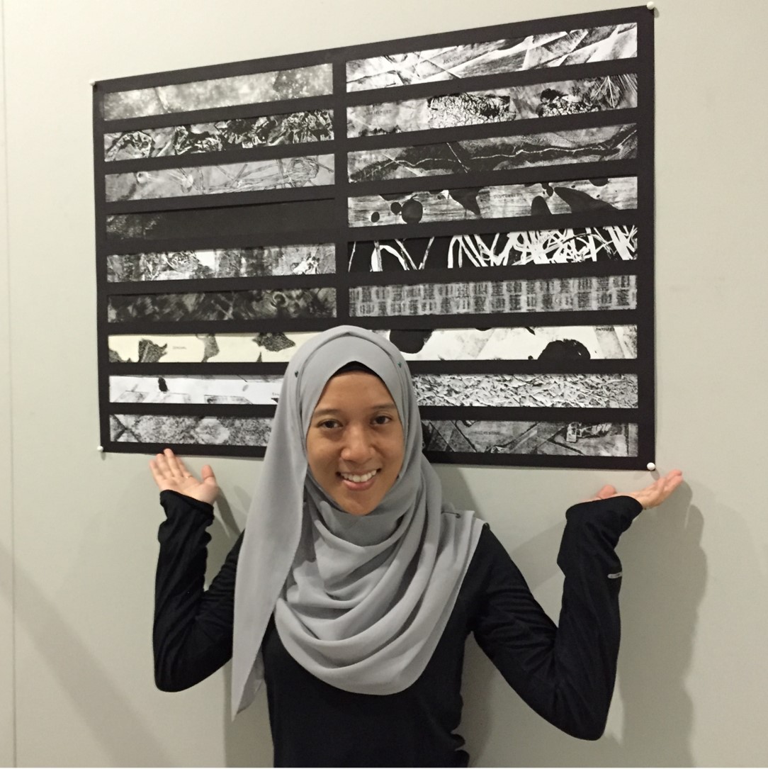
My completed piece of lines. #achievementunlocked
My completed piece of lines.
#achievementunlocked