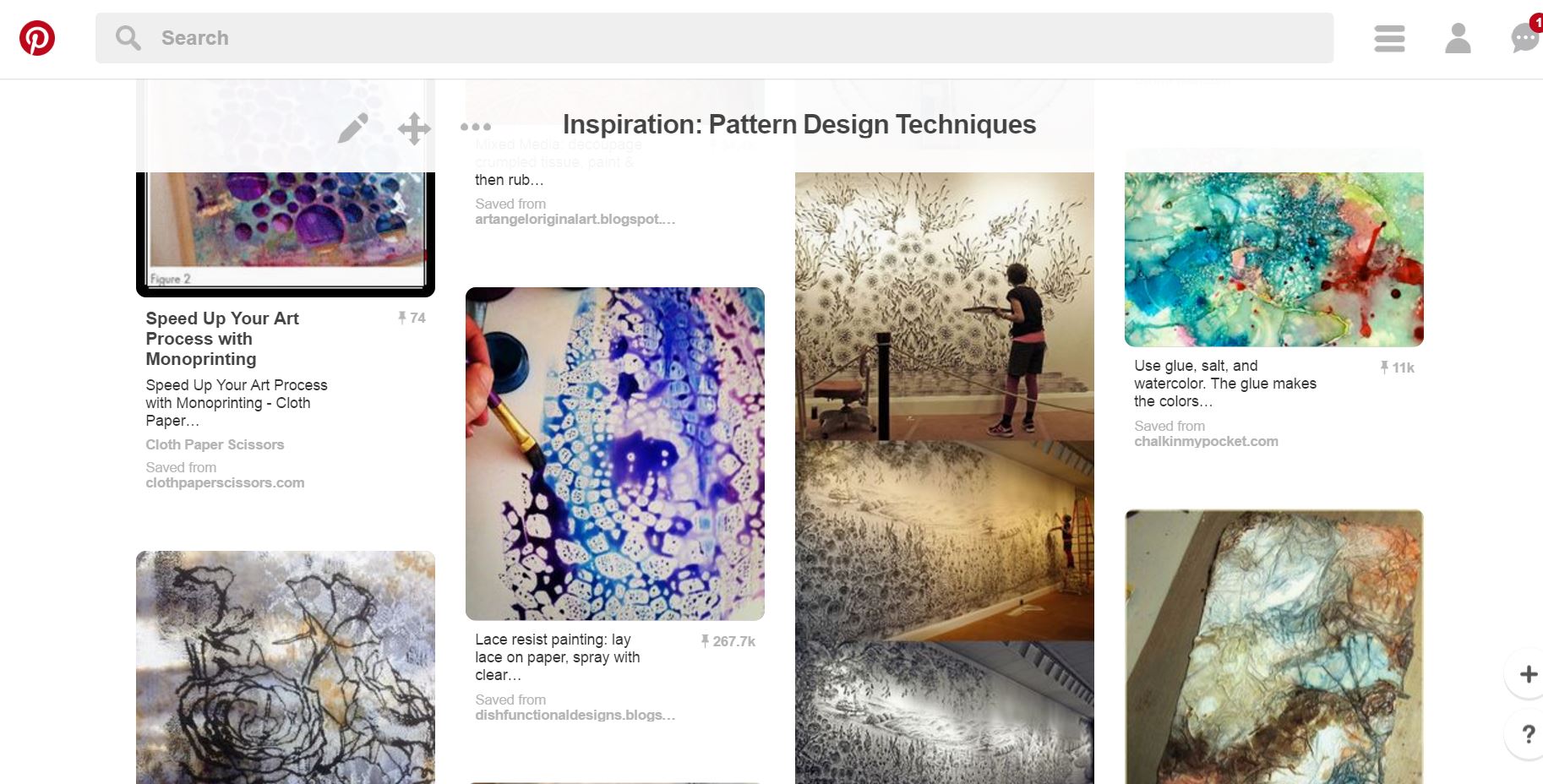
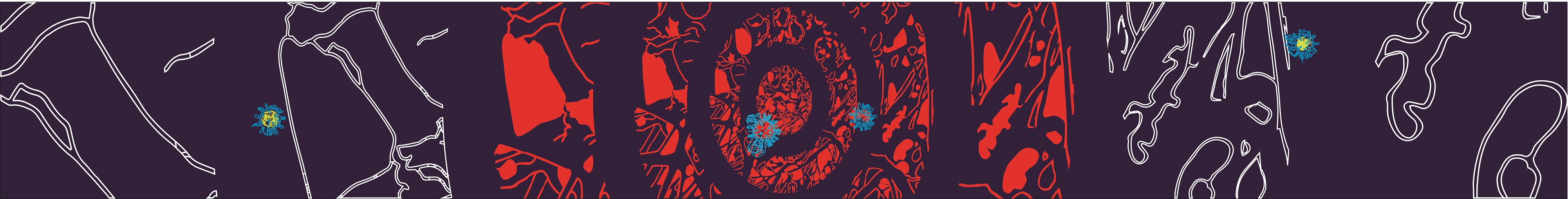
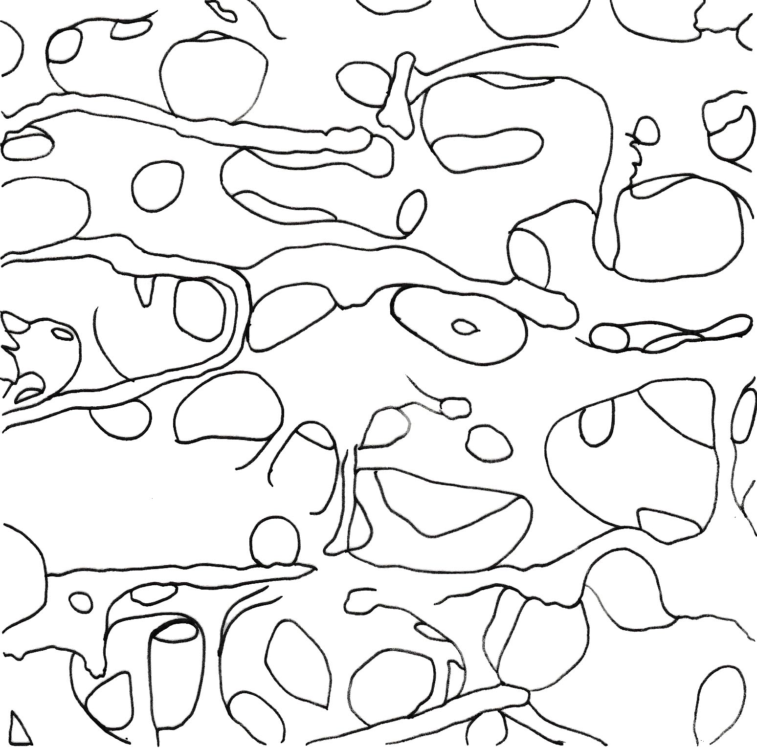
Below are the images of the Final Collection.
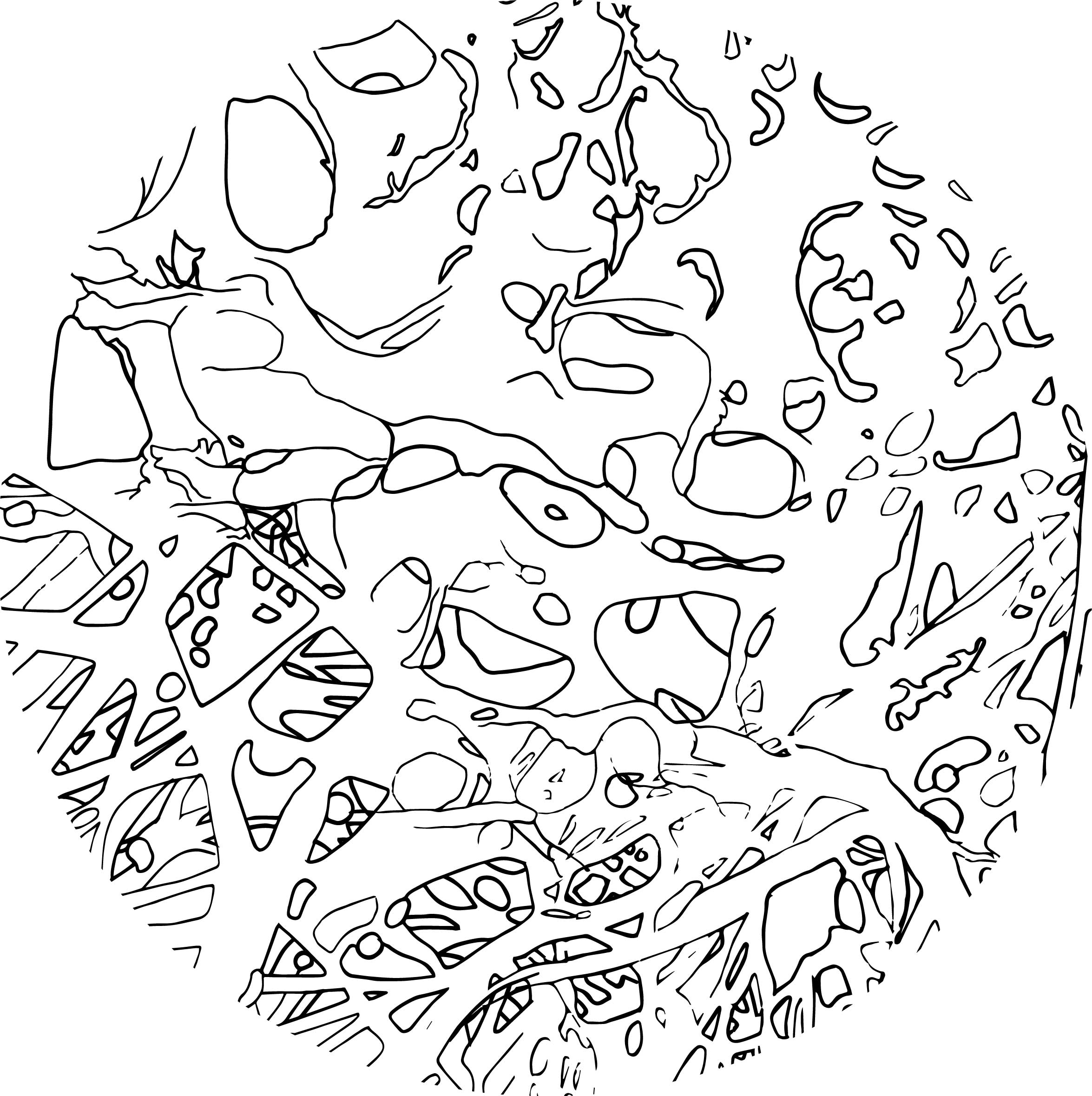
- Main motif: mix of 4 different types of human microscopic anatomy/structure formed into 1.
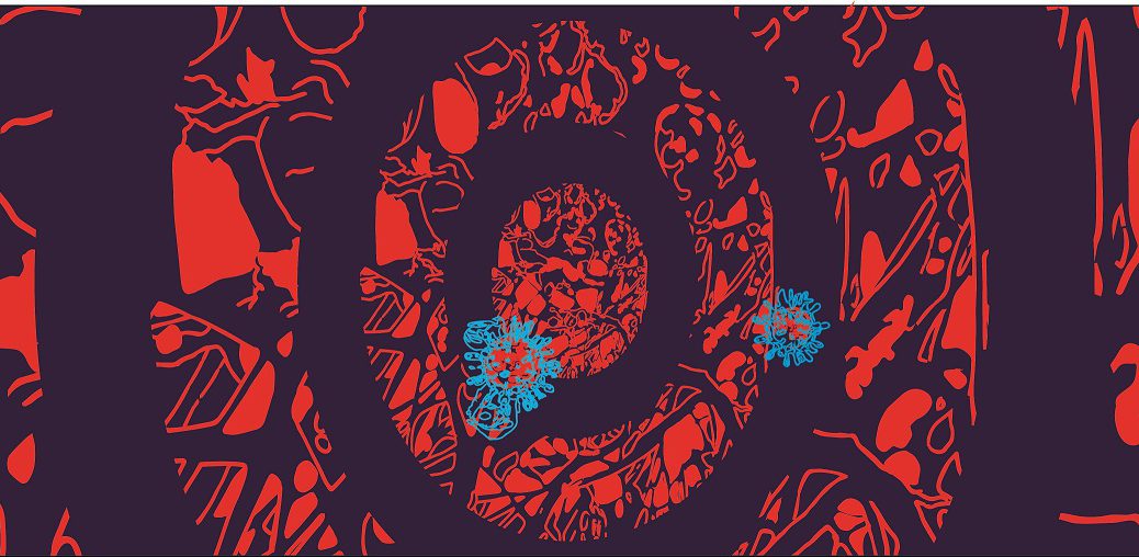
2. Main virus: separated mixed composition to form 4 different viruses

3. Still images of pattern

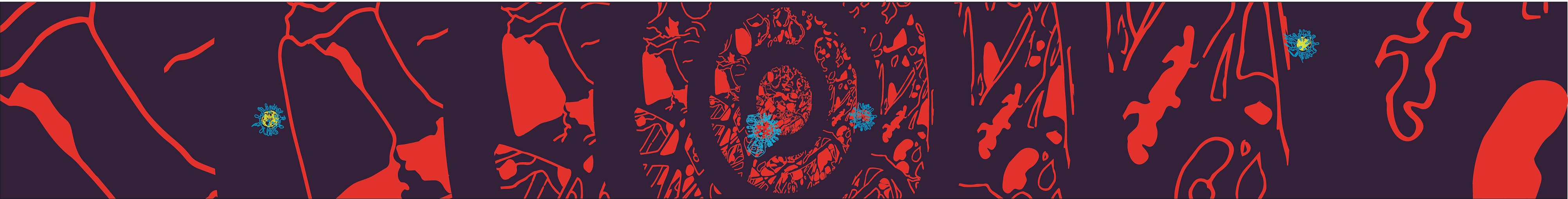
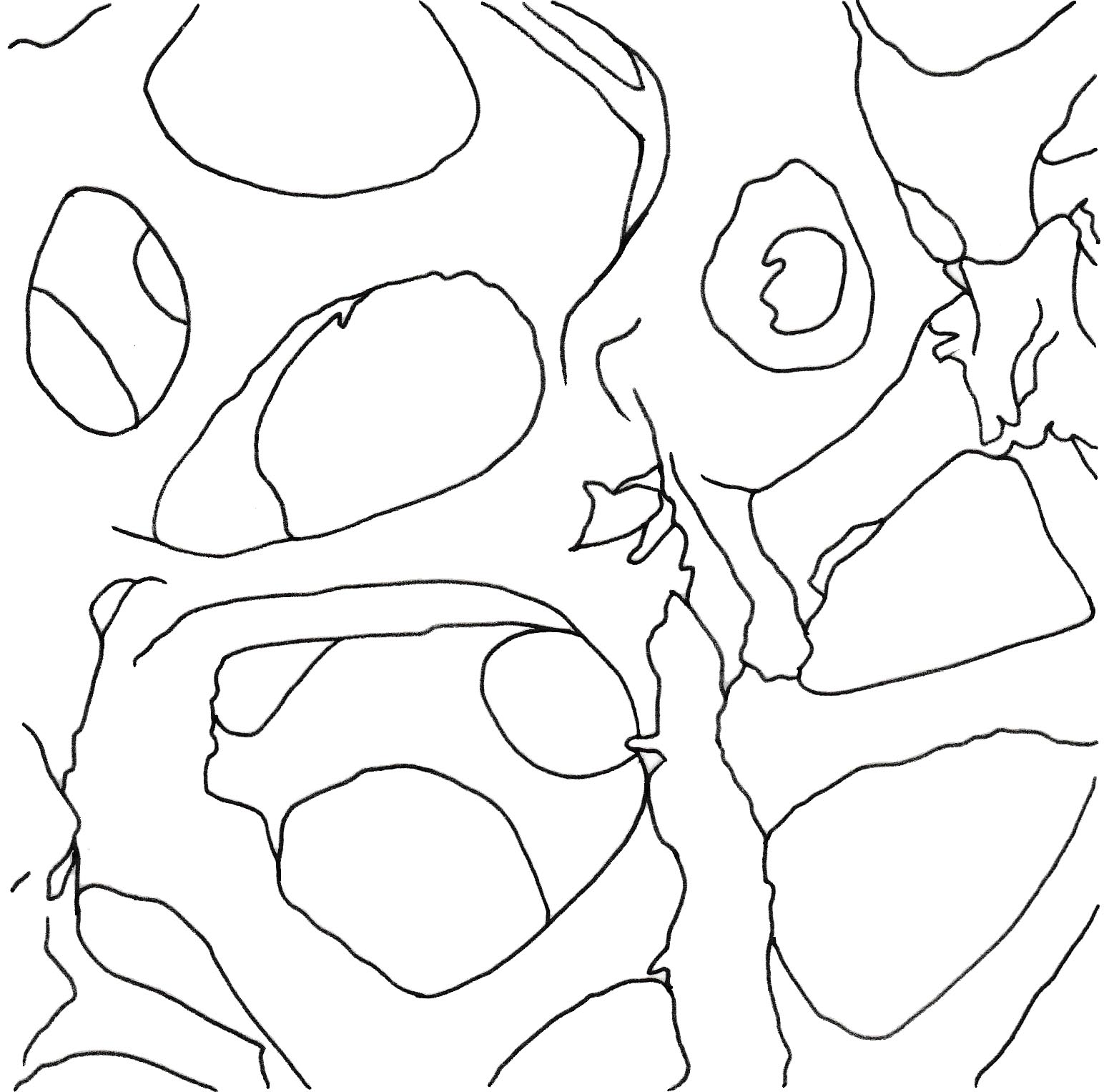
Below are the images of the Final Collection.
2. Main virus: separated mixed composition to form 4 different viruses
3. Still images of pattern
Previously, it was just exploring of the different structures symmetrically repeated and reflected to form a motif. However, I am moving on to the process of putting together 2 or more different motifs to become one.
The first few examples can be seen below, where 1 human microscopy is repeated, and overlayed with another. The only difference between the two are the opacity.
On a side note, when I see these motifs (above), I realised it looked like the lace material.
And another example below, where I layered 3 different structures into 1. Though it is messy as the lines intersecting were pretty obvious and distracting.

From the consultation, I was introduced to an artist who does her work in abstract forms with an unorganised, messy and complex backdrop or surroundings.
Her name is Julie Mehretu, and these are some of her works that I find them interesting and are parts of my inspiration:
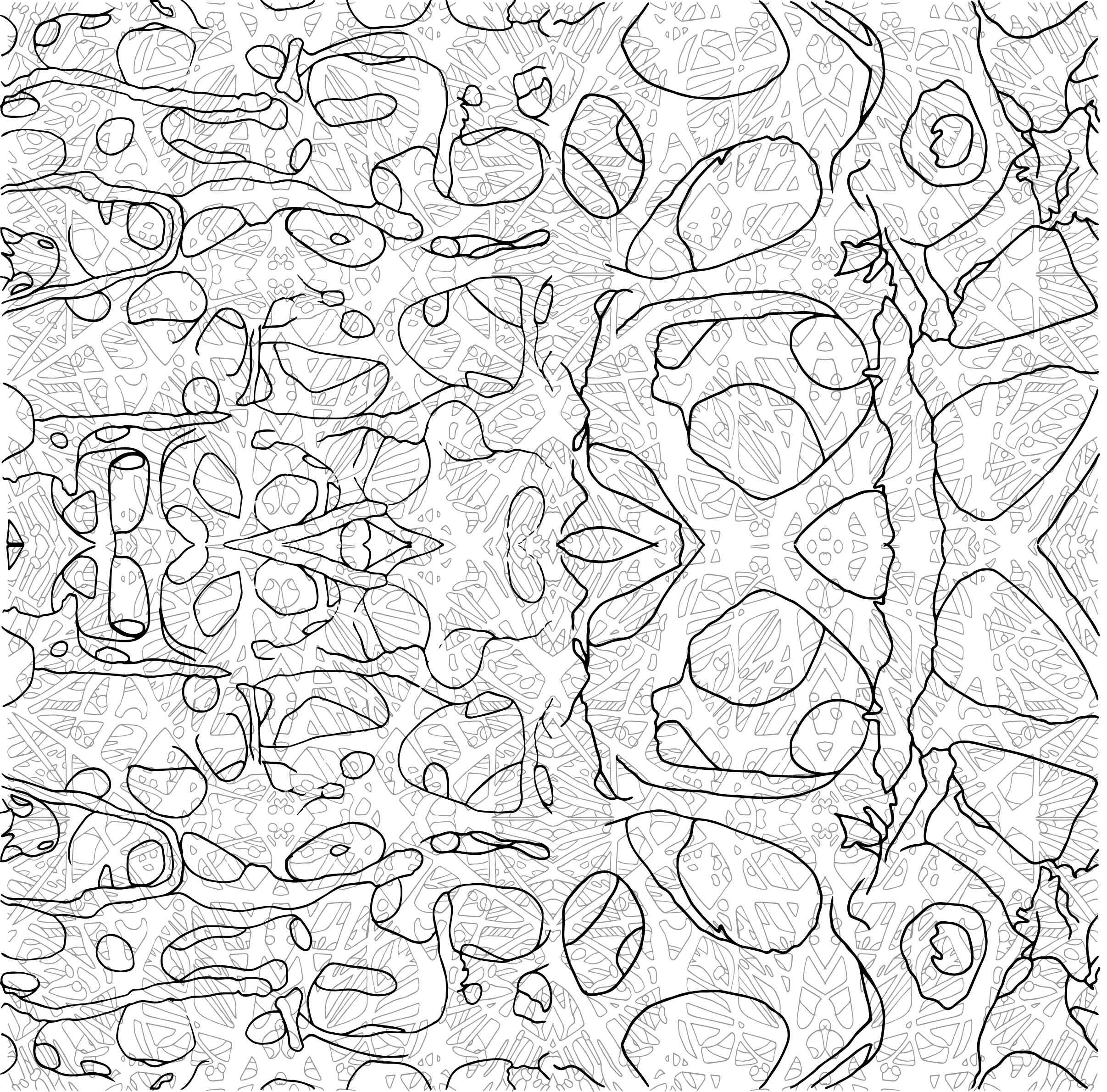
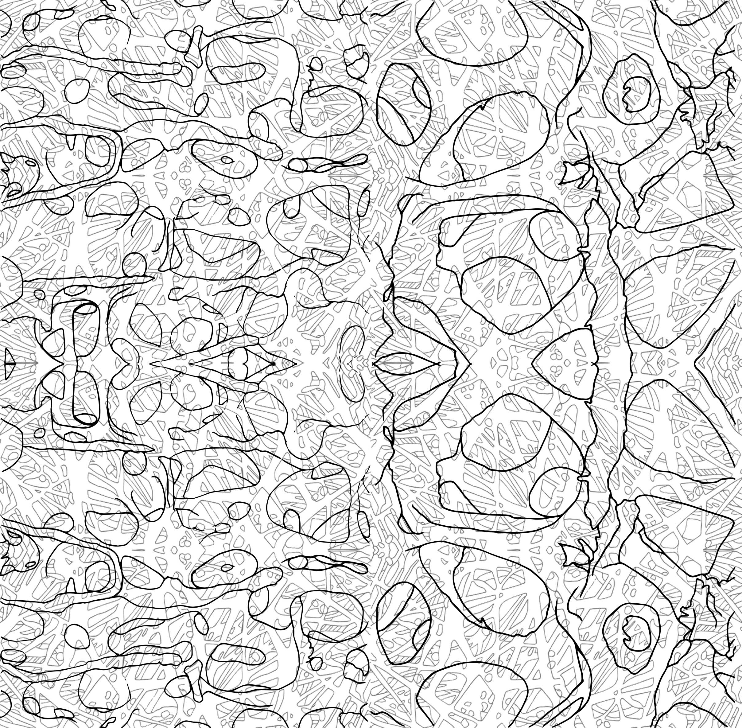
To minus off the use of symmetry and reflections, I combined the tracings that I had, following the best fir of positions of the structures, and started to form them into one whole motif.
Then, I repeat the image above, and formed design inspired by spirals, cosmos or what looked like mandala due to the radiating in and out. (Mixed in a little knowledge of Art History over here)
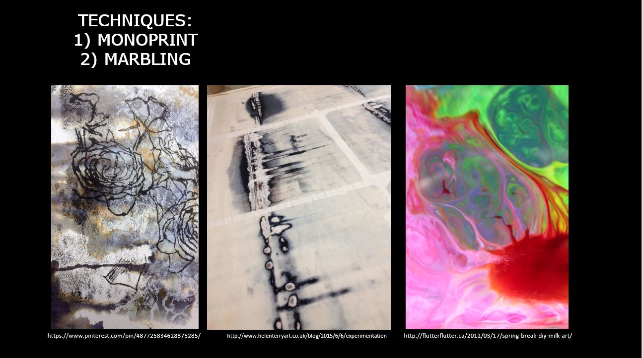
Next, how do I make it look as messy as Julie Mehretu’s? I decided to try and have textures. At first I thought of manually creating textures using several techniques I found online. But I too, wanted to try the grunge effect. So the images below are the before and after of grunge texture, with colour and monochromatic.

HOW DO I CREATE MOTIFS?
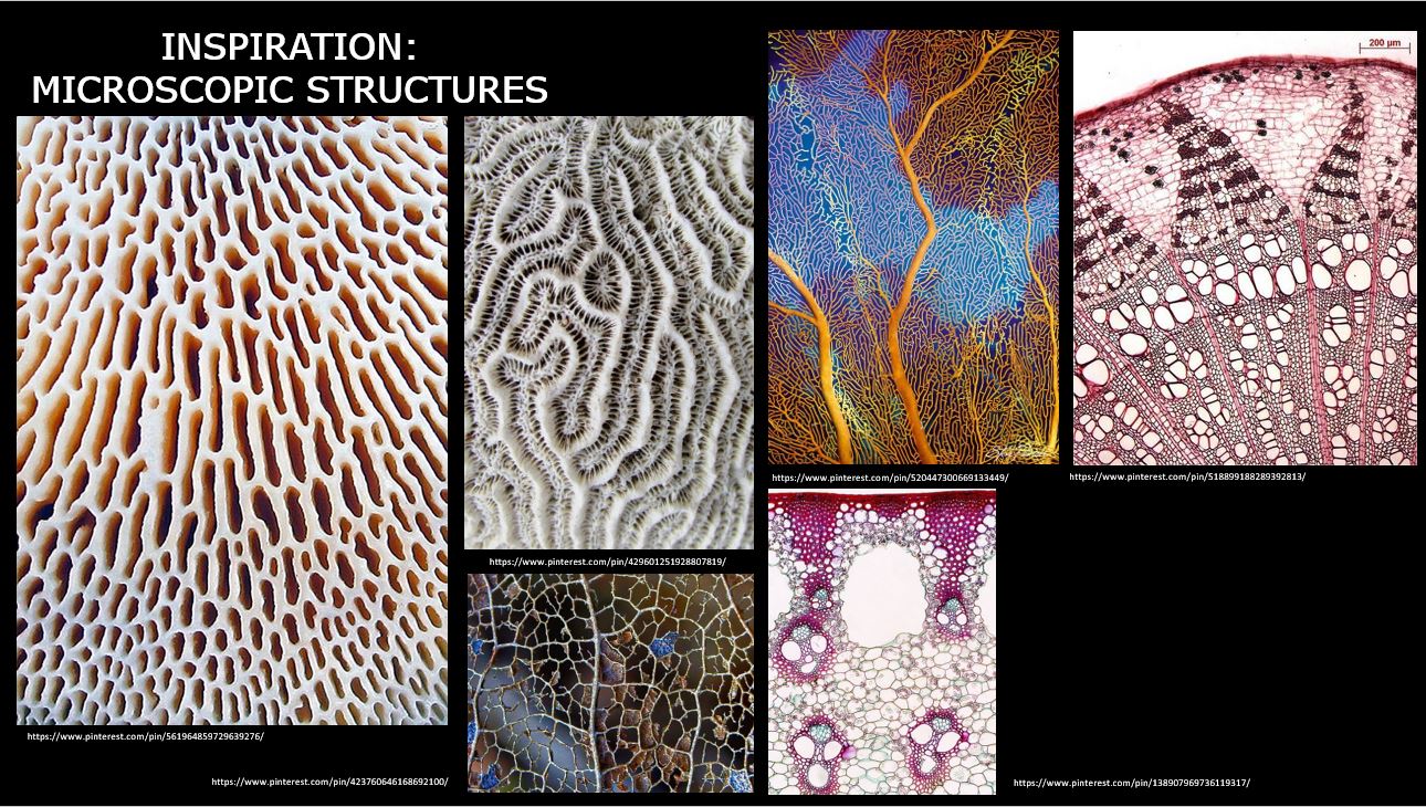
I planned to use the raw imagery of the human microscopic anatomy from the lab, but with tight schedules, I resorted to an alternative: using resources from books and online articles.
I was inspired from watching Bonnie Christine’s method of transferring hand-drawn sketches to digital. Therefore, I gave it a go to create my motifs.
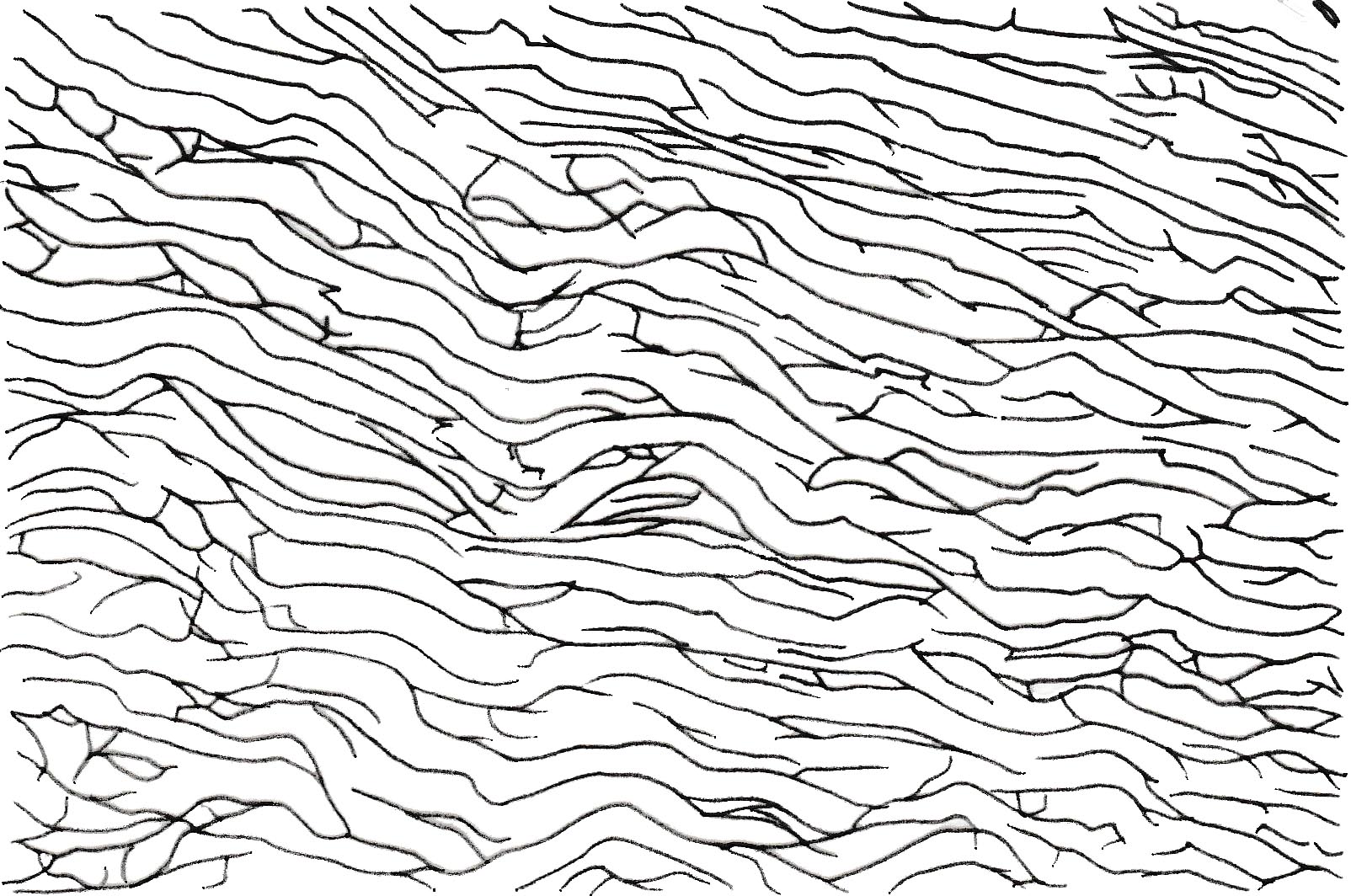
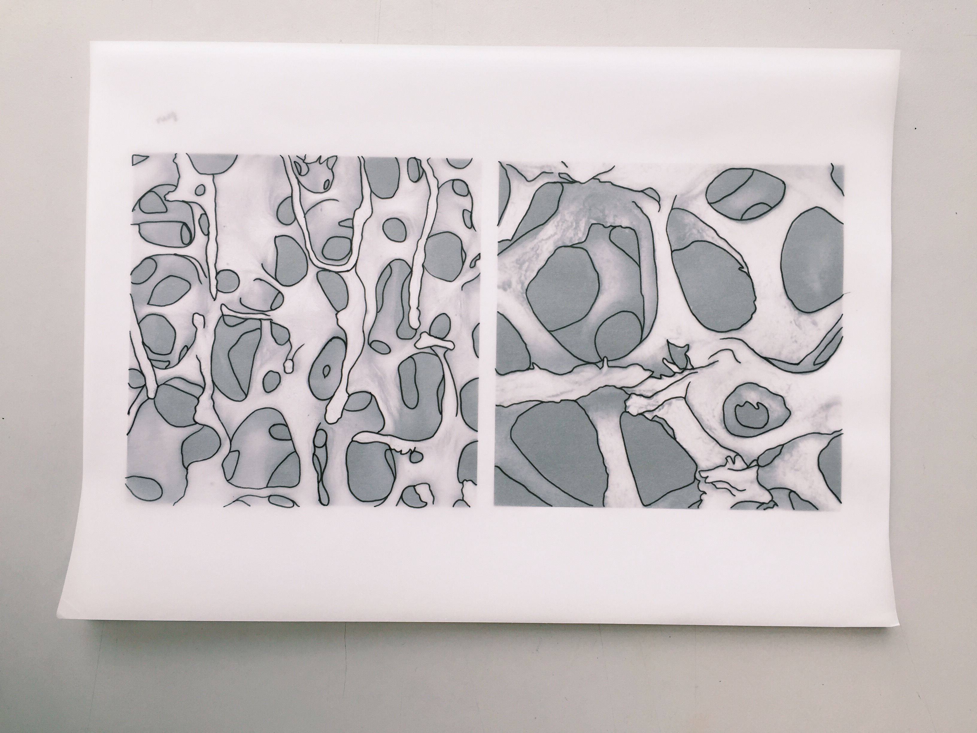
Firstly, I selected a few microscopic images (from the website, book, and article,), printed them out, traced them over and finally scanning them in to digitize them.
You can view the images below:
Human Cells
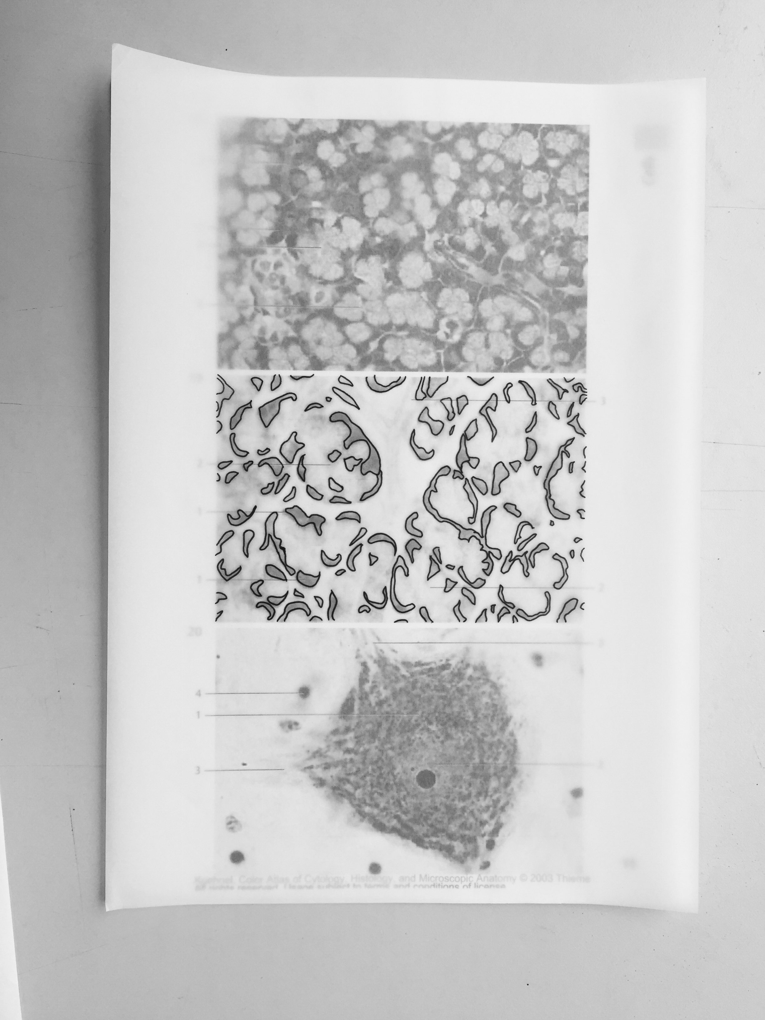

Connective and Supportive Tissue
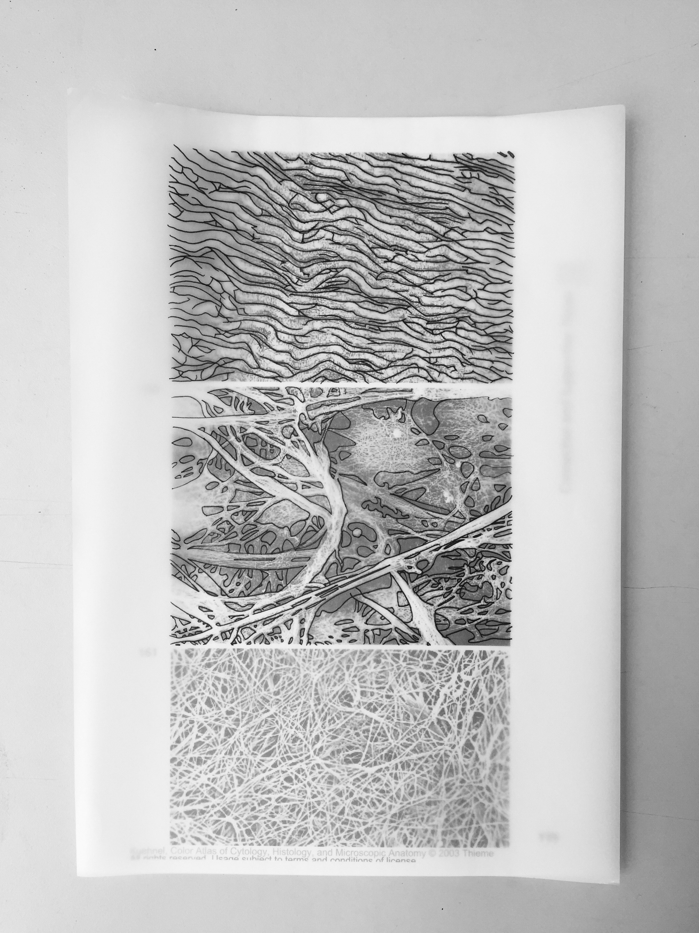


Bone
With these bunch of scanned images, I would compose them to form one motif.
(Still progressing…)
On a side note, I find the pattern designs done by William Morris, from the Arts and Crafts Movement, pretty interesting. Arts and crafts movement is well known for its decorative art. From William Morris’ art, I like how the artboard/canvas are all filled up with patterns leaving minimal negative space.
All along I’ve been planning the outlook of how I want my pattern to turn out, how it will look from afar vs when zoomed in. Thus, these gave me more depth to the idea of how I want my motifs will look like.

“Mutation in the City”
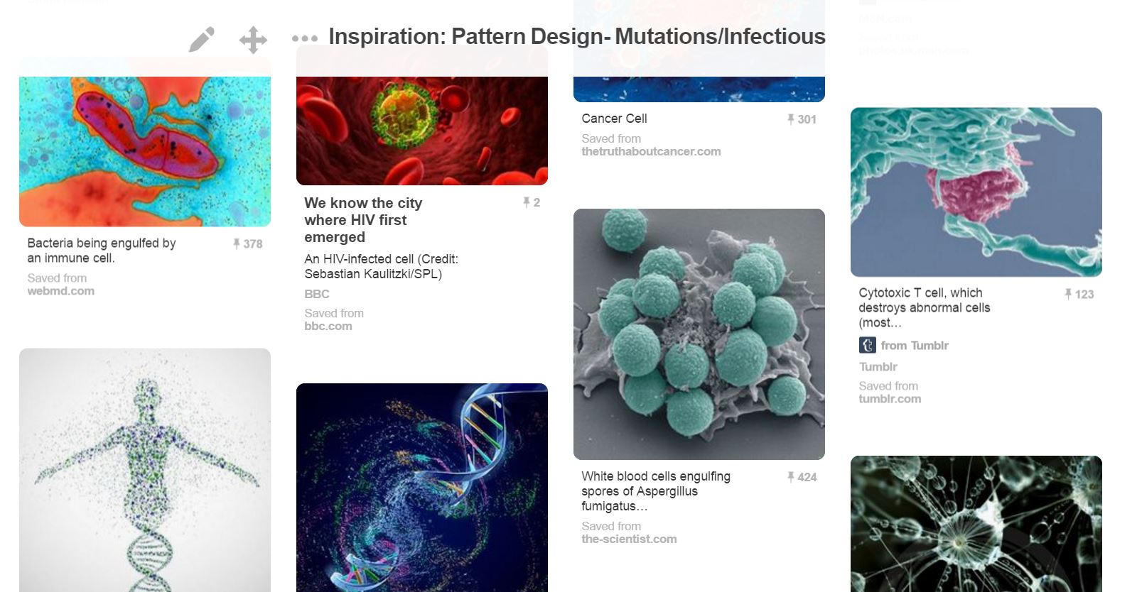
So, it seems that I have decided for my theme to be Mutation as I was inspired by microscopic structures and bio-mimicry.
The theme “Mutation in the City” mainly focus on the health aspect in the city — how people are infected with virus or sickness like cancer etc. I had the inspiration from movies with zombies and I was curious of how the cells (virus + normal cell) in our body actually reacts with one another. Like, does it react vigorously like how metals in the first group in the Periodic Table reacts with water?

With the example above, I want to look for interaction between the cells thus it led me to decide on how my pattern design will be formed — collage images of the microscopic structure into 1 big pattern, use variation of colours to show the interaction between the cells, and most probably using the shape of DNA figure.
After much decision on which composition to use for the final, it came to this:
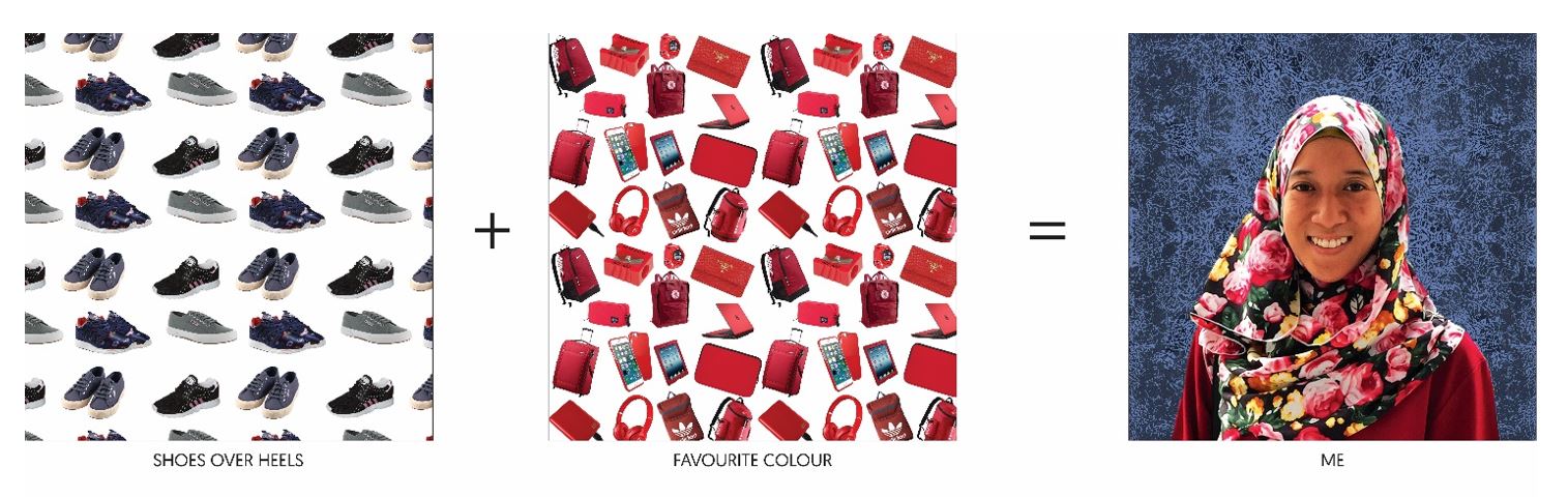
_____ + _____ = ME
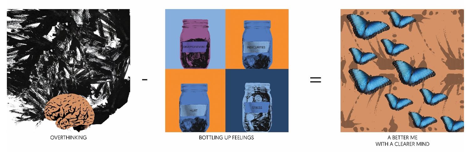
_____ – _____ = A BETTER ME
____ x _____ = AN IDEAL ME

____ + ____ = ME IN 5 YEARS
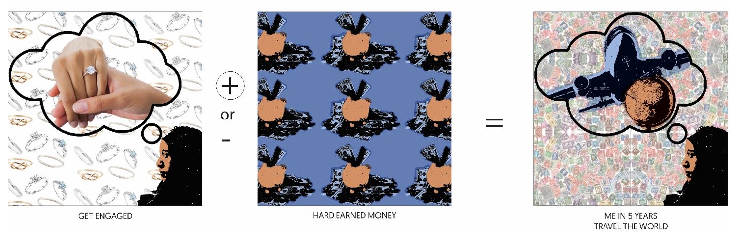

Therefore, the picture above shows the completion of the project!
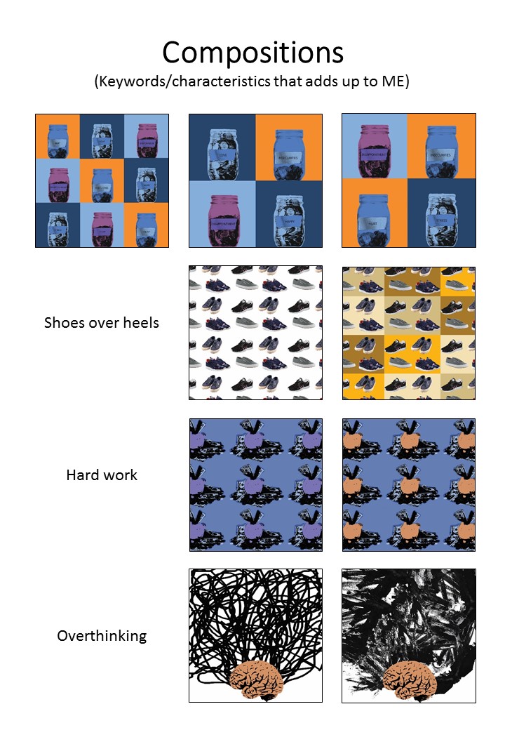
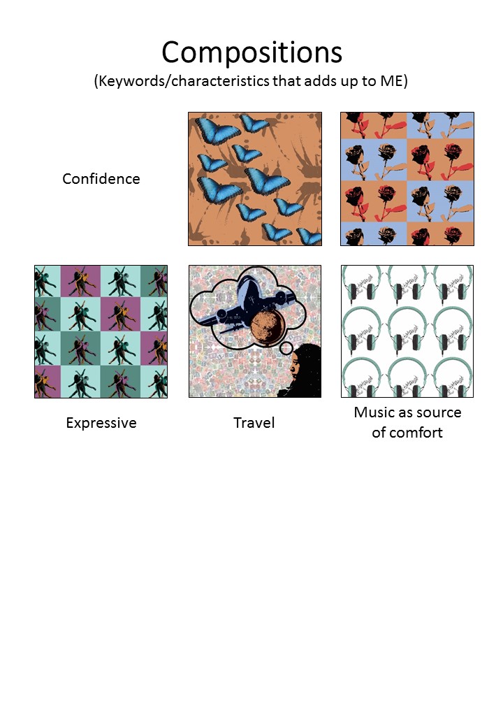
With all the things I listed about myself, I came up with some compositions with some of the keywords. It was a challenge as the process of the pop art effect is pretty time consuming, plus trying to come up with the concept of the compositions took away most of my brain juice. But I was reminded that I too, like minimalism as much as patterns (that can also be seen as messy).
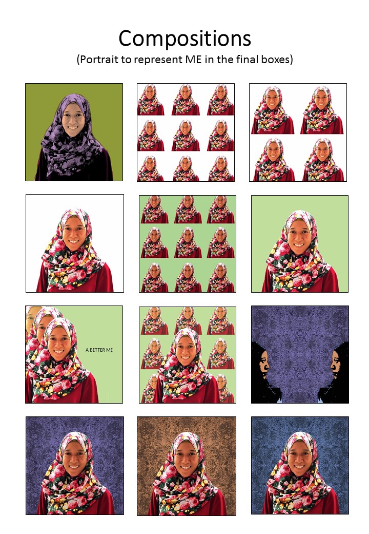
These are the compositions of ME and the different keywords of myself:


EGO
Basically, this project tells people about me, my personalities, my likes and dislikes etc. I listed the things about myself and thought that I would want to have something threshold-y. Consultation with Prof Ina came to the point where mine could be something like Andy Warhol’s pop art.
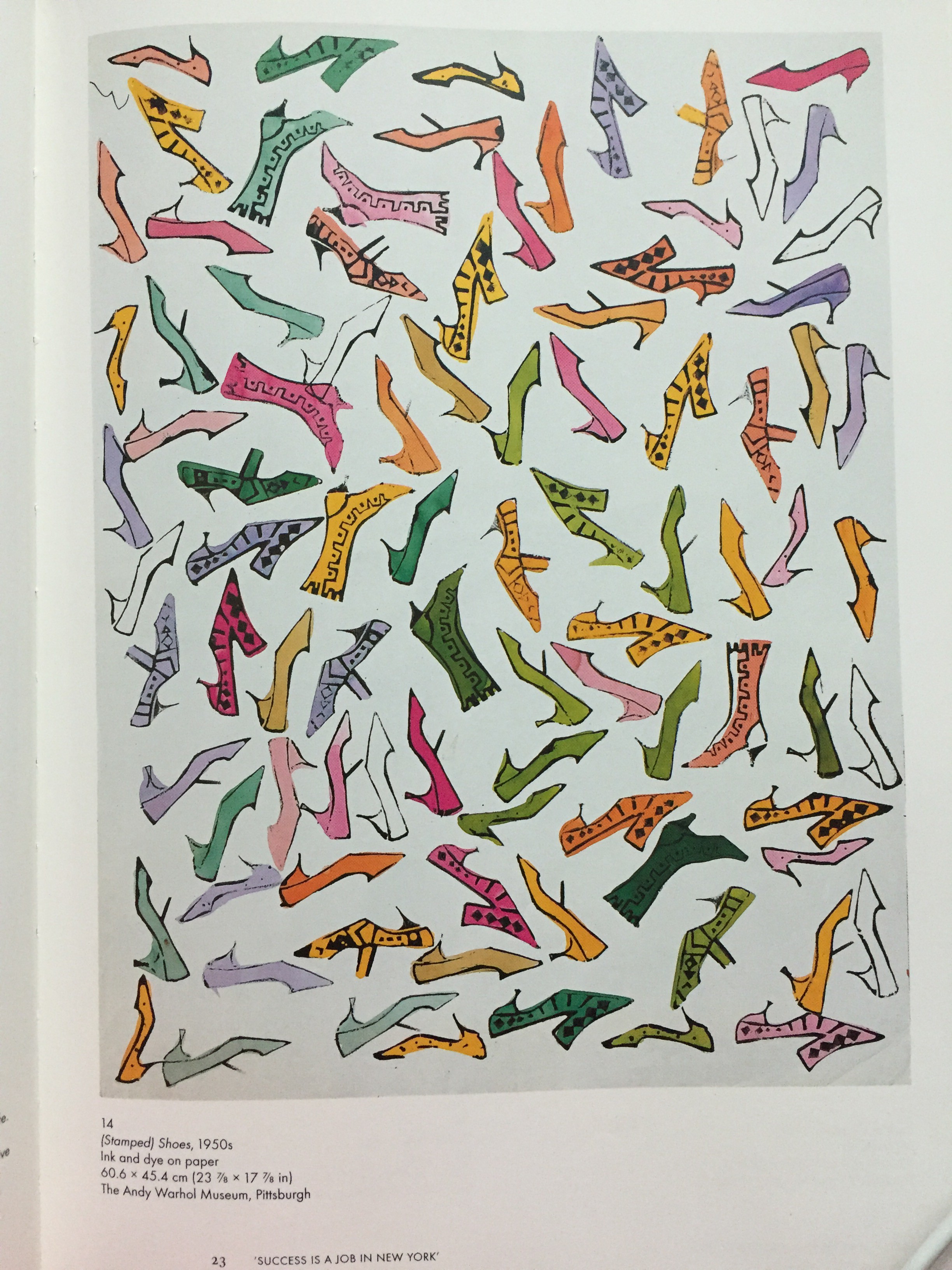
So, I went to the school library and got myself some reference books: