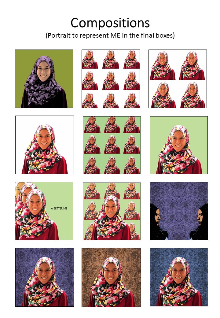
Tag Archives: colours

City: Moodboard & Theme selection

This post will contain information and images on the themes ideas for the Project City.

SUPERNATURAL CITY

Transform city found objects, and/or data, into representational or abstract forms, designs, and patterns for a large-scale public art installation.

When I think of cities, I think of man-made and natural aspects. I considered what can be seen in the cities, what can be felt in terms of how you feel etc. I decided to go on the direction of Nature for my City. Recently, I went to Chinese/Japanese Garden to see what I can be inspired from.

The first thing that came to my mind were ripples, how the water flows naturally could be turned or modified into an organic pattern following the movement or direction. After my personal trip, I went on Pinterest to gather inspiration and created my moodboard.

Inspiration Tab-Pattern Design
General research on Pattern Design on Pinterest. (Link: https://www.pinterest.com/youmikaltsum/inspiration-pattern-design/)


Moodboard - Ripples Inspiration
Moodboard on idea #1

The second idea I had in mind was textures. So I looked out for trees, the road and other materials I can find along the park for unique textures. Some trees that had scales growing on the trunk thus it lead me to think of bio-mimicry, and/or microscopic structure.

Moodboard - Textures Inspiration
Moodboard on idea #2 – textures
Moodboard - Microscopic Inspiration
Moodboard on idea #3

 Lastly, I researched on the different techniques to go create patterns. After browsing through Pinterest, I narrowed down to 2 techniques which you can find below:

My compilation of the different ways to create pattern using different tools (Link: https://www.pinterest.com/youmikaltsum/inspiration-pattern-design-techniques/)


Moodboard on techniques
  1. marbling — I thought of using watercolour or milk with food colouring to create the cross section of the pattern
  2. monoprint — I thought of re-using the monoprint from previous semester, and do a few more to get variations so that I could collage them digitally.

In terms of colour, I thought of bright and contrasting colours like the last picture on the right from the techniques moodboard.

Final Compositions

After much decision on which composition to use for the final, it came to this:

_____ + _____ = ME

  • I find myself comfortable wearing slippers, sandals, and shoes most of time instead of high heels. This composition had a variation where I tried to add some pop art effects, but I the original image colour of the shoes are nice thus I went for minimalism with the background.
  • As shown from the image above, I like the colour red thus the image implies that most of my items are in red.
  • ME, a portrait of myself with textured background from the previous monoprint works.

_____ – _____ = A BETTER ME

8

  • I tend to overthink alot whenever I am working, and it would mess up my mind — bringing myself down
  • I also tend to bottle up my feelings whenever I am not feeling too happy or etc.
  • Therefore when I minus Overthinking with Bottling Up Feelings, it would get me to be free from the mess in my mind and heart and soul. I used butterflies to symbolise being free.

____ x _____ = AN IDEAL ME

9

  • Because I tend to overthink which leads me to pull myself down with such negativity, I would like to be more optimistic than pessimistic.
  • I want to be more expressive, more vocal so that people actually know how I feel. I used the image of dancers because dancers are always told to show emotions through their body movement and their facial expression.
  • If I were to multiply optimistic with being more expressive, I would get the ideal me who blooms with confidence. I used flower (rose in particular) because it is in my favourite colour but at the same time, it is known that flowers bloom. Thus when you bloom, you tend to be ready, be brave for whatever that comes your way.

____ + ____ = ME IN 5 YEARS

10

  • Pretty ambitious thinking, but I would like to see myself at least getting engaged. These series composition were the tough ones as I wanted to show that I was dreaming (which explains the bubble thought in the image). However, the background would have been plain thus I decided to add repetition at the background for consistency in style.
  • Hard earned money saved in the piggy bank for future use
  • Therefore, the equation added up as such — seeing myself travelling around the world with the money that I earned. The background comprises of repetition of stamps to show the travelling to different countries.
FINAL OF THE FINAL


Therefore, the picture above shows the completion of the project!

Work in Progress

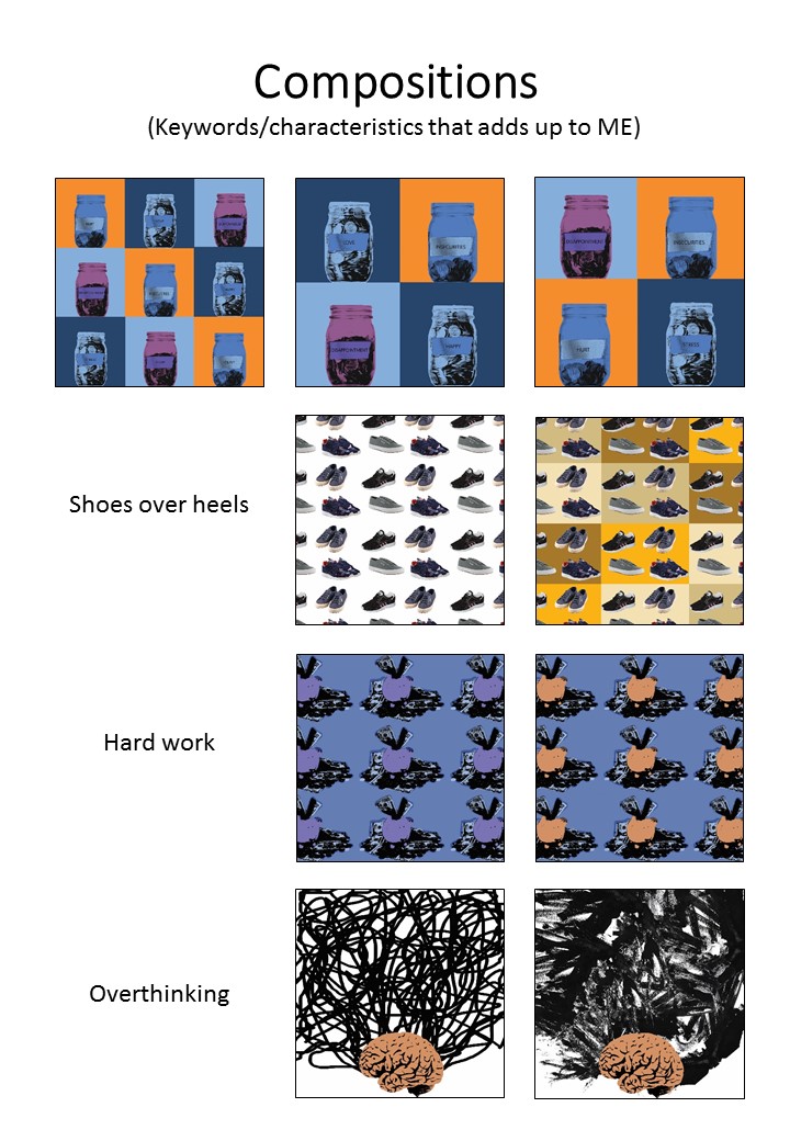
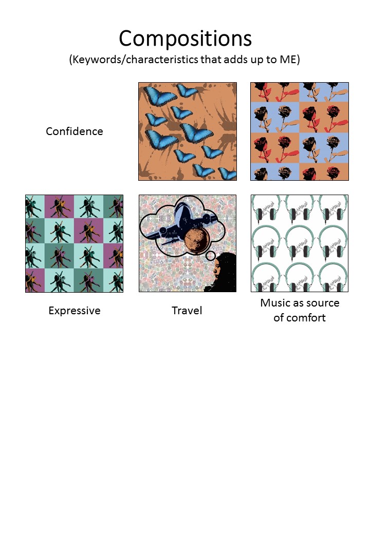
With all the things I listed about myself, I came up with some compositions with some of the keywords. It was a challenge as the process of the pop art effect is pretty time consuming, plus trying to come up with the concept of the compositions took away most of my brain juice. But I was reminded that I too, like minimalism as much as patterns (that can also be seen as messy).

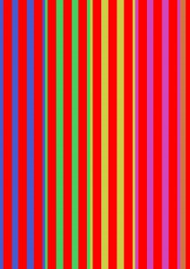
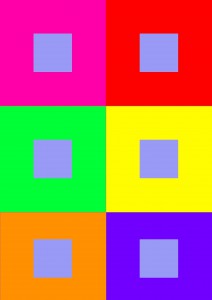
These are the compositions of ME and the different keywords of myself:

Portrait of myself with different trials of colour schemes
Different compositions of the different keywords of myself

3

4

5

Colour Schemes for the compositions

Artist Reference/Style

EGO

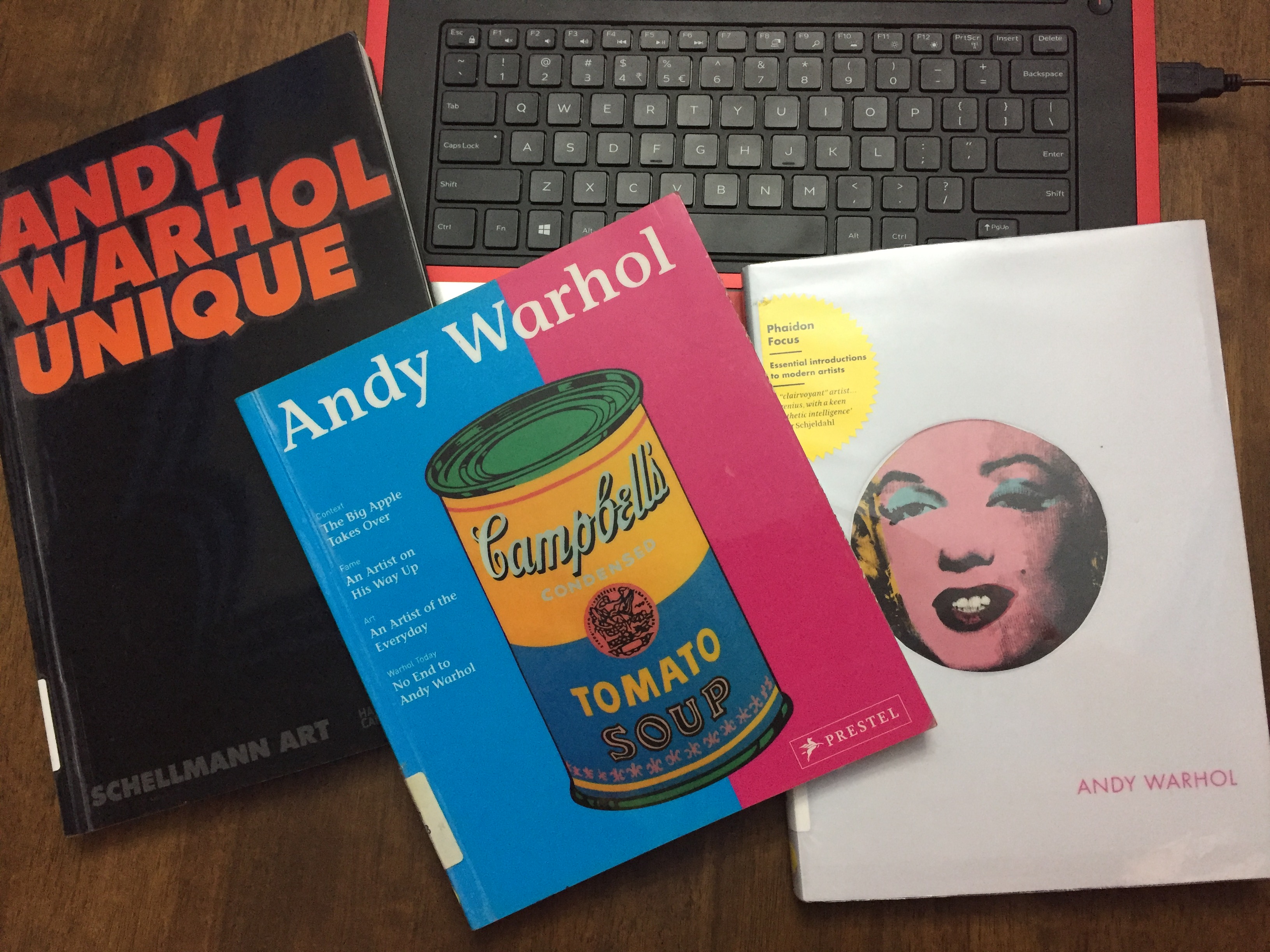
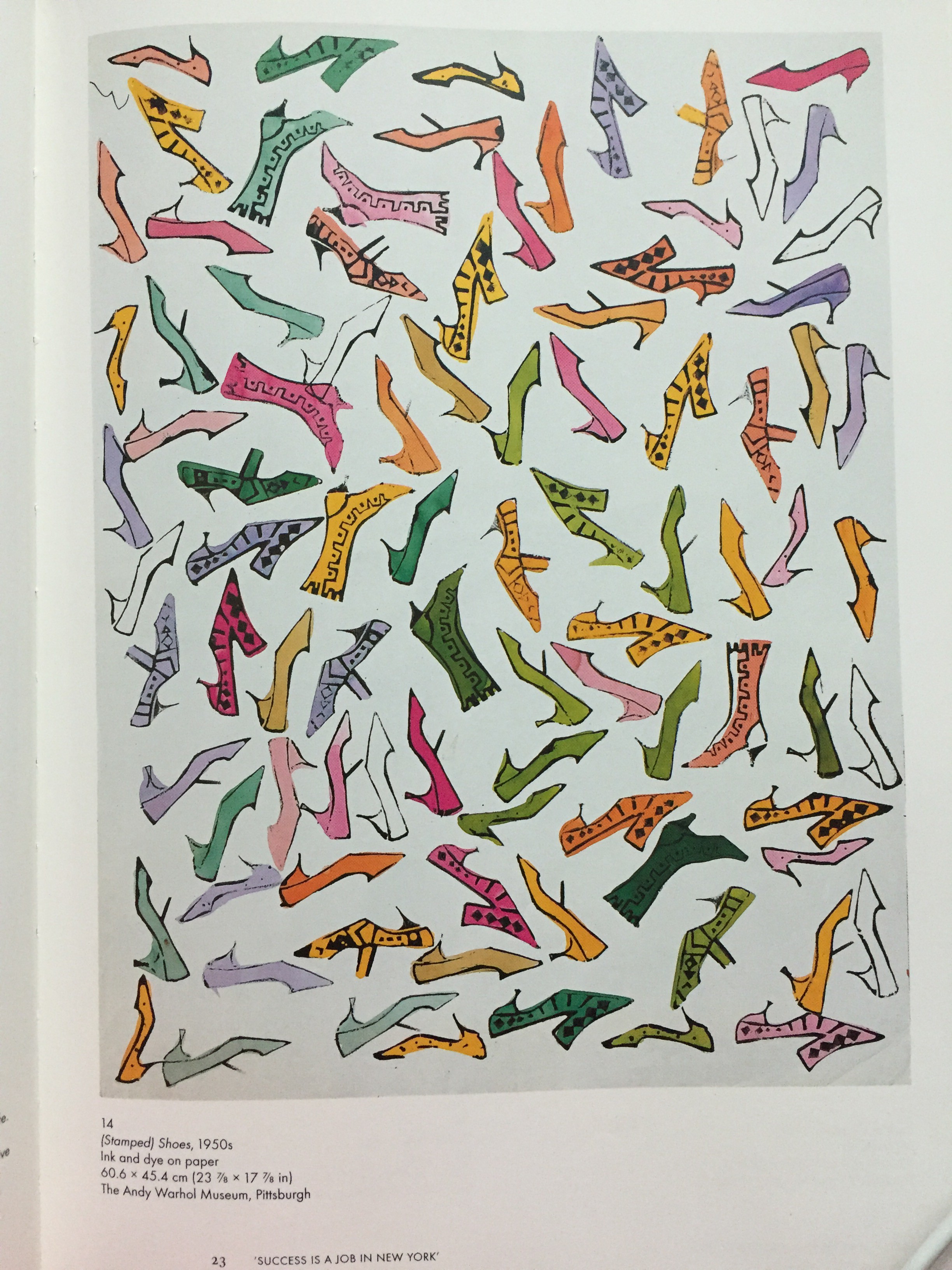
Basically, this project tells people about me, my personalities, my likes and dislikes etc. I listed the things about myself and thought that I would want to have something threshold-y. Consultation with Prof Ina came to the point where mine could be something like Andy Warhol’s pop art.

So, I went to the school library and got myself some reference books:

Reference Books (1)
Reference Books (1)
Reference Books (2)
Reference Books (2)
My work was inspired by these artpieces
I like prints, repetition, and patterns. Thus it became one of the style to the project


Colour Exercises


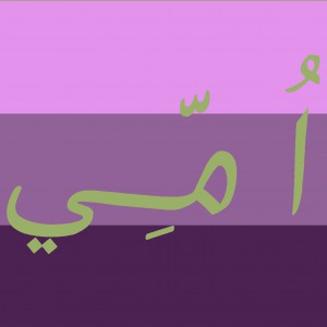
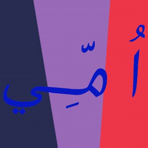
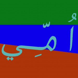
It was all about colours and its hue, value and saturation. These are the ones I did for the in-class colour exercise. Part 1 was the one colour being on top of the other, and I am slowly learning of observing how one colour actually looks warmer than the other when it is put against a different shade/tint/tone/value of another colour. Part 2 on the other hand, was supposed to be using chinese characters but my name doesn’t have one. I would like to use anybody else’s, but then I forgot my name can be done in Arabic characters as well. (That explains the characters you see on the image, basically its called UMMI)

#throwback: Agnes Martin

Major throwback to the first week of Foundation 2D.

This was a group research that Caroline and I did during the first lesson of 2D. We chose and was assigned one of the many artists — Agnes Martin. This research is a hand-me-down information from the slides that we did. (So basically I’m just transferring the information here.)

Agnes Martin (1912 - 2004)
“When I first made a grid, I happened to be thinking of the innocence of trees, and then a grid came into my mind and I thought it represented innocence, and I still do, and so I painted it and then I was satisfied. I thought, “This is my vision.” – Agnes Martin


Agnes Martin (1912 – 2004)

Martin was known as an American abstract painter, referred as a minimalist but considered herself an abstract expressionist. She turned to art around the age of 30, when she was a student at Columbia University in New York.

One of Martin's art piece
One of Martin’s art piece


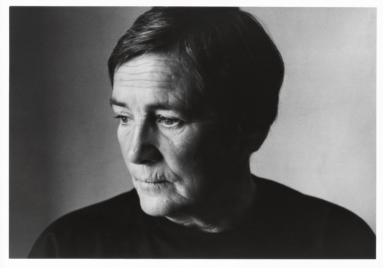
So when I typed “Agnes Martin artworks” at Google search, I was perplexed, surprised and couldn’t really believe what I was looking at! The picture above is one of the many artworks of Martin’s. Look at how simple her artworks are — geometrical shape, and just lines by pen and a ruler. At that point of time I was thinking to myself “WHAT? That means if I were to just draw a single line in pencil and tell people ‘This is my art piece’, I would be famous too?”

HA HA HA (Dream on Ummi)

That was definitely a complete puzzle to me and that was the first impression of Martin’s artworks. She has this signature style of hers where she uses squared monochrome canvas, layered with gesso, overlaid with hand-drawn pencil lines and thin layers of oil or acrylic paint.

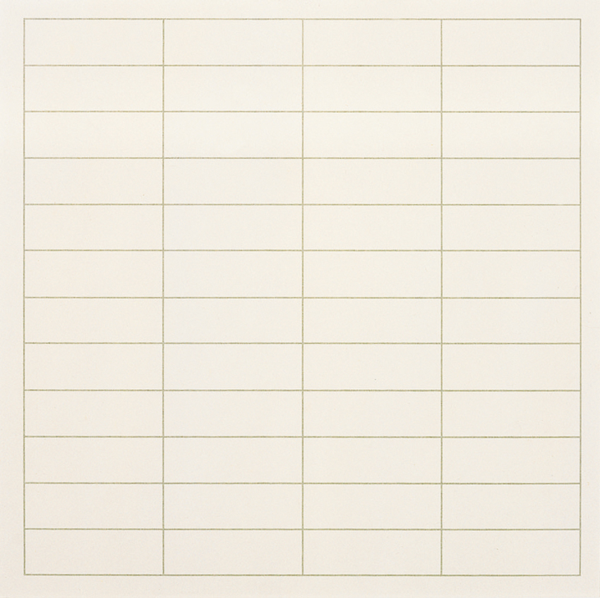
(More examples of her pencil-ed lines below…)

Agnes_Martin_Hiram_Butler_Gallery_a securedownload-2

Untitled-10

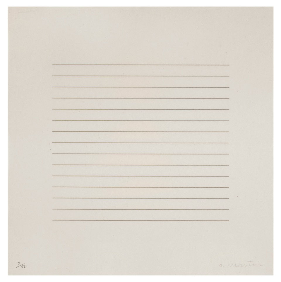
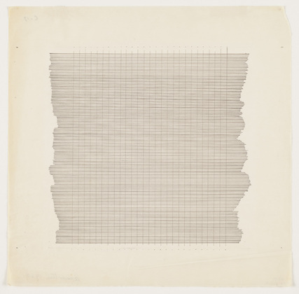
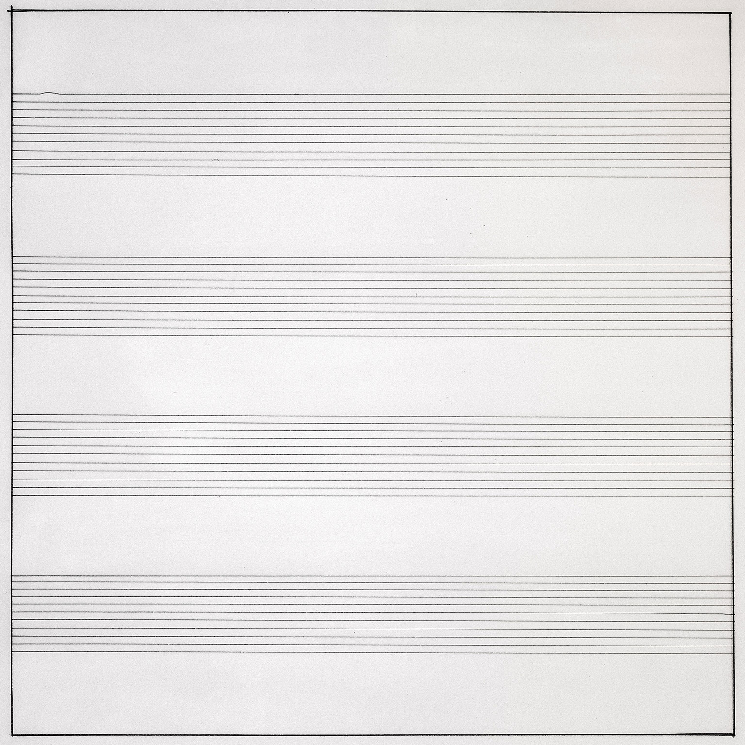
Let me share Martin’s techniques used in her artworks. Firstly, pencil lines. As you can see from the above examples, you can tell that she is a mechanical person. She actually has hand-drawn horizontal, vertical or in grid formations across gesso canvas. She stretched string across the canvas and uses ruler to draw. Then, her line spacing was mathematically worked out on paper, then painted between to form solid bands.

Secondly, colour range in her artworks. Martin mainly uses the primary colours of red, blue and yellow, and of course the most basic colour of black and white. She customizes the colours by thinning, mixing, lightening and darkening them. Furthermore, with these colours, she actually creates ghostly effect of the colours by bleaching them out. That is why her coloured artworks has those neutral, gentle yet faded colours.

1974, Martin’s artworks eventually moved out from the ‘monochrome zone’ and became more human and involving by replacing neutral tones to brighter colours.

In general, Martin’s inspiration are mostly from nature and emotions. She always somehow connects her artworks with her emotions deep inside. Therefore, if you were to re-read the quote at the top of this post, you could see how much she would relate nature with emotions and then transferring those characters onto her canvas.

So what do I think of Agnes Martin?

Personally, I like simple stuff. I was impressed that her just a few lines could actually mean something so deep. I actually have this motto of “Less is More”, and I think Martin portrays that as well.