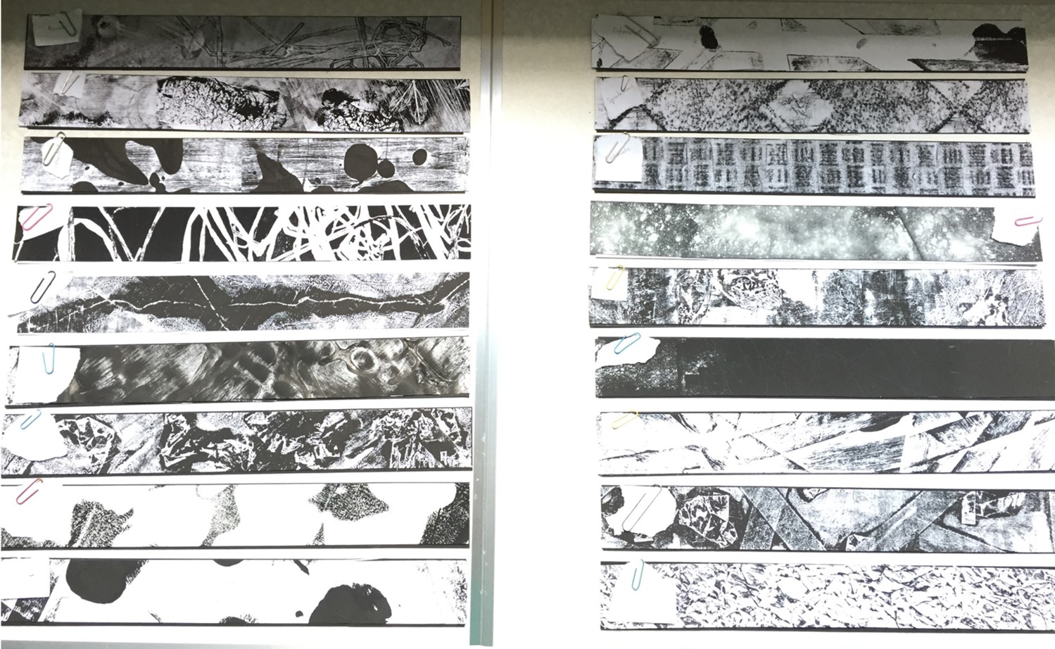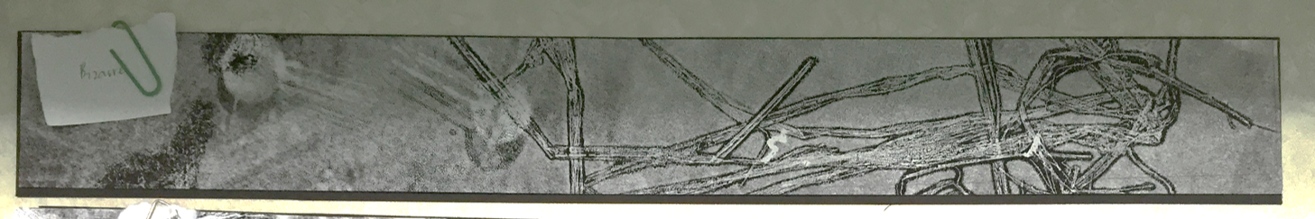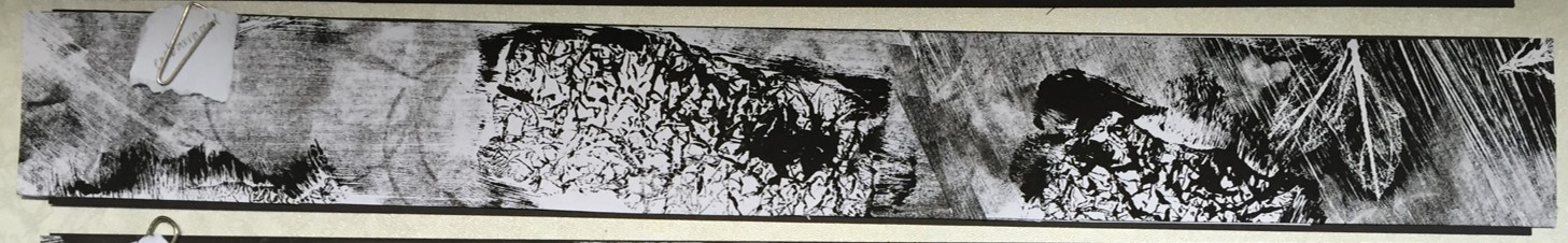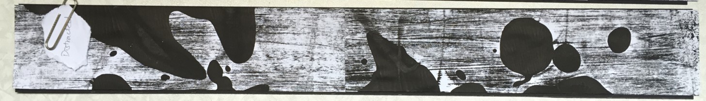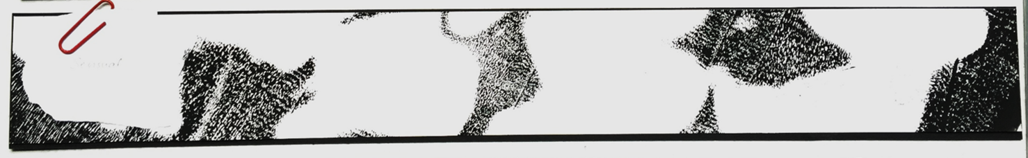
….. with Assignment 1, that is.
Now, it is time for me to catch up on sleep.

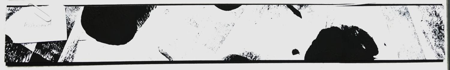
….. with Assignment 1, that is.
Now, it is time for me to catch up on sleep.
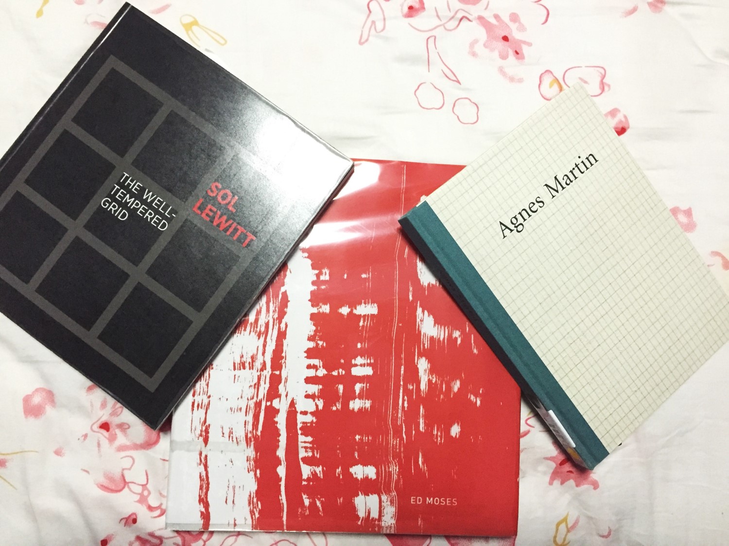
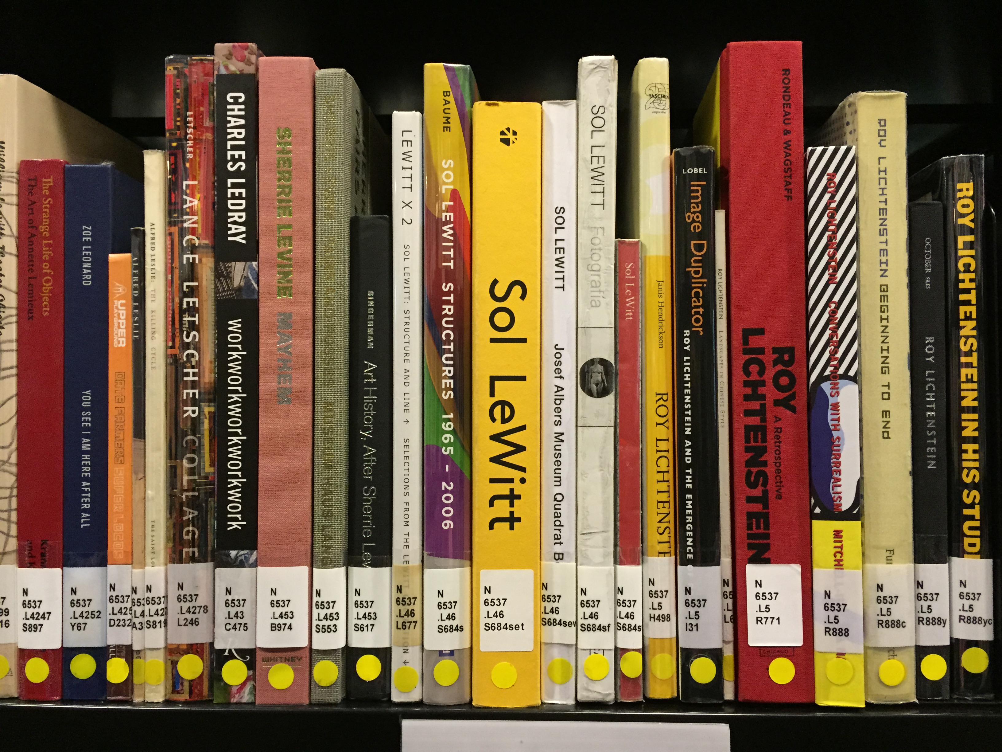
Besides Agnes Martin, I actually looked up on Ed Moses and a little bit on Sol LeWitt. So I went to the ADM library and borrowed these books (see below) for further reference.
Although the research of these 2 artists are brief, I managed to get some information about them and their techniques.
First of, we have Sol LeWitt.
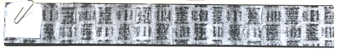
Sol LeWitt is a leading figure of Minimalism and pioneer of Conceptual art. LeWitt’s work is characterized by serialization, repetition, and progression, exemplified by his iconic open-grid structures. LeWitt’s wall paintings are just about the same as Agnes Martin, lines are mathematically drawn. In LeWitt’s case, once he does the calculations and planning, he would get his assistants to carry out the work for him with specific instructions.
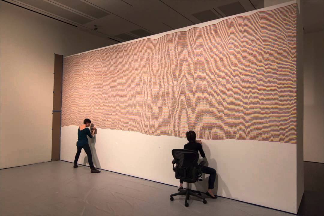
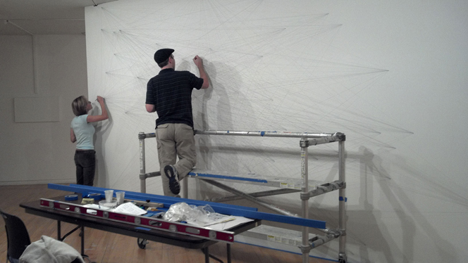
I actually watched a documentary before about LeWitt’s art techniques and how he works in the industry. They actually showed his assistants working on the installation — not 1 or 2, but at least 4 people working on a wide wall.
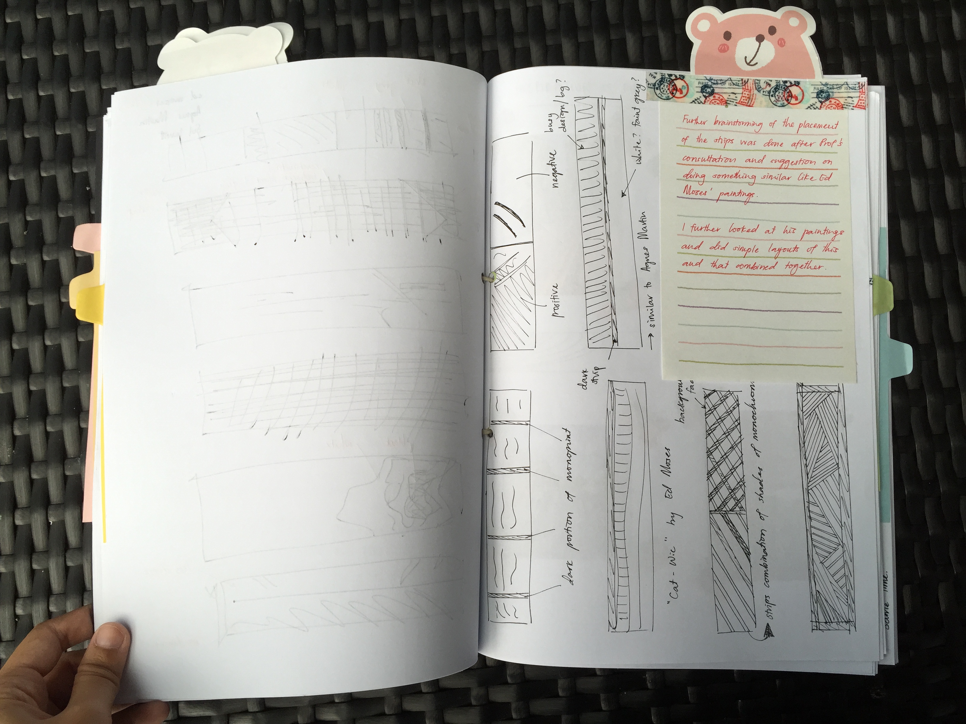
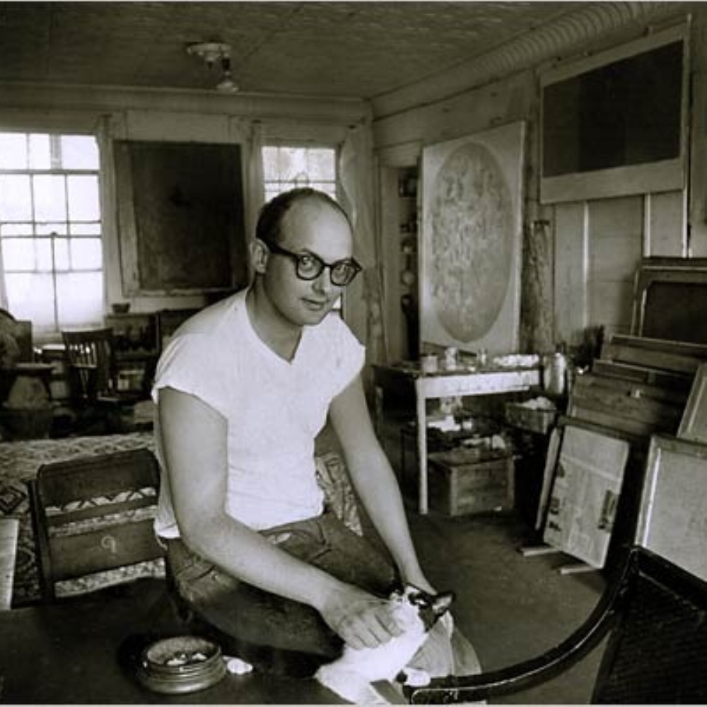
Next, Ed Moses, the artist.
![[CLOSE UP] Monographs of Ed Moses (and the process of his art-making) by Radius Books.](http://oss.adm.ntu.edu.sg/ummi0001/wp-content/uploads/sites/329/2015/09/EDMOSES_1.jpg)
I considered myself lucky to have found the book (see above) in the ADM library. Although the weight was a total burden, I had to do what I had to do for research — BORROW IT!
In the book contained bits and pieces of the artist, his artworks, and FAQs. I admit I was solely interested in his artworks besides anything else. But I picked up a few information from the book as well.
Ed Moses…..
Techniques
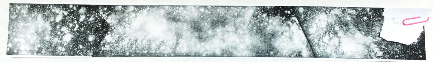
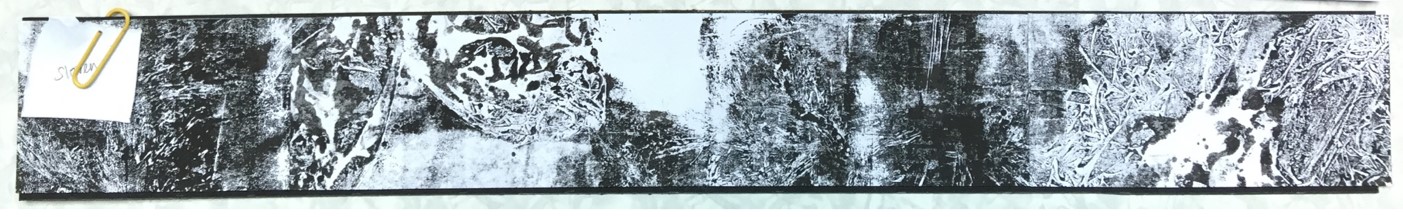
Interesting information of his techniques are actually the materials he used for his artworks. As stated above, he uses unusual materials like raw mahagony and unstretched canvas; unusual tools like long-handled mops, sponges and squeeges, besides normal rollers and brushes.
(There’s more…)
Moses also used….
Here are some snapshots of his artworks from the book. (I should have done proper citation of the images. My bad!)

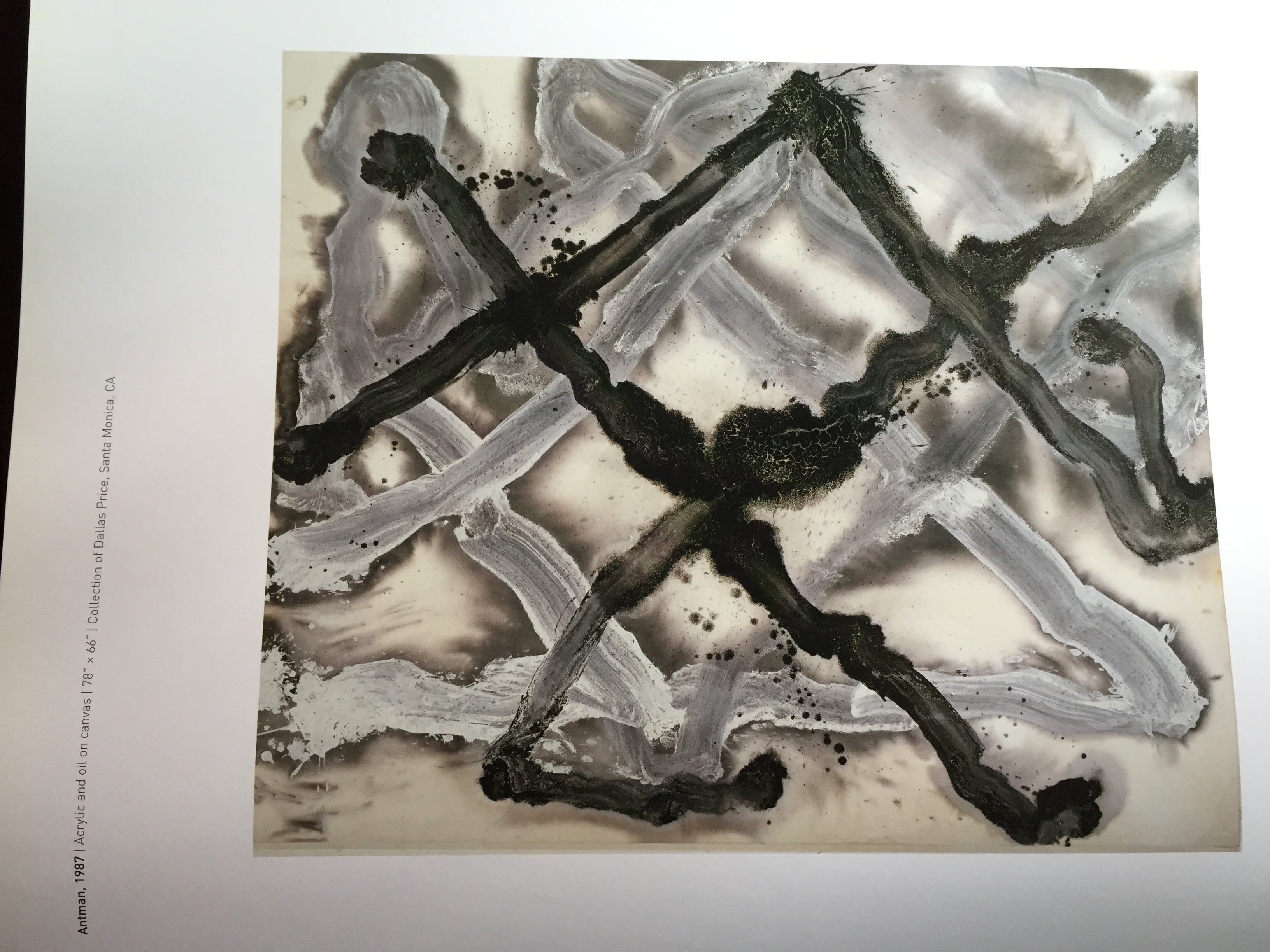

Most of the time when I continued to flip the pages, I was in awe with how contrasting and bold Moses’ artwork are.
In conclusion with these 2 artists, I mainly looked at their artworks for inspiration and motivation to continue coming up with whatever I have at the back of my mind. I didn’t really plan to follow this artist to that type of art piece, I just do without thinking. Then when Prof Ina mentioned mine had some of Agnes Martin’s work in the monoprint etc, I was like…… “really?”
Funny how I didn’t even realised that!
Major throwback to the first week of Foundation 2D.
This was a group research that Caroline and I did during the first lesson of 2D. We chose and was assigned one of the many artists — Agnes Martin. This research is a hand-me-down information from the slides that we did. (So basically I’m just transferring the information here.)
Agnes Martin (1912 – 2004)
Martin was known as an American abstract painter, referred as a minimalist but considered herself an abstract expressionist. She turned to art around the age of 30, when she was a student at Columbia University in New York.
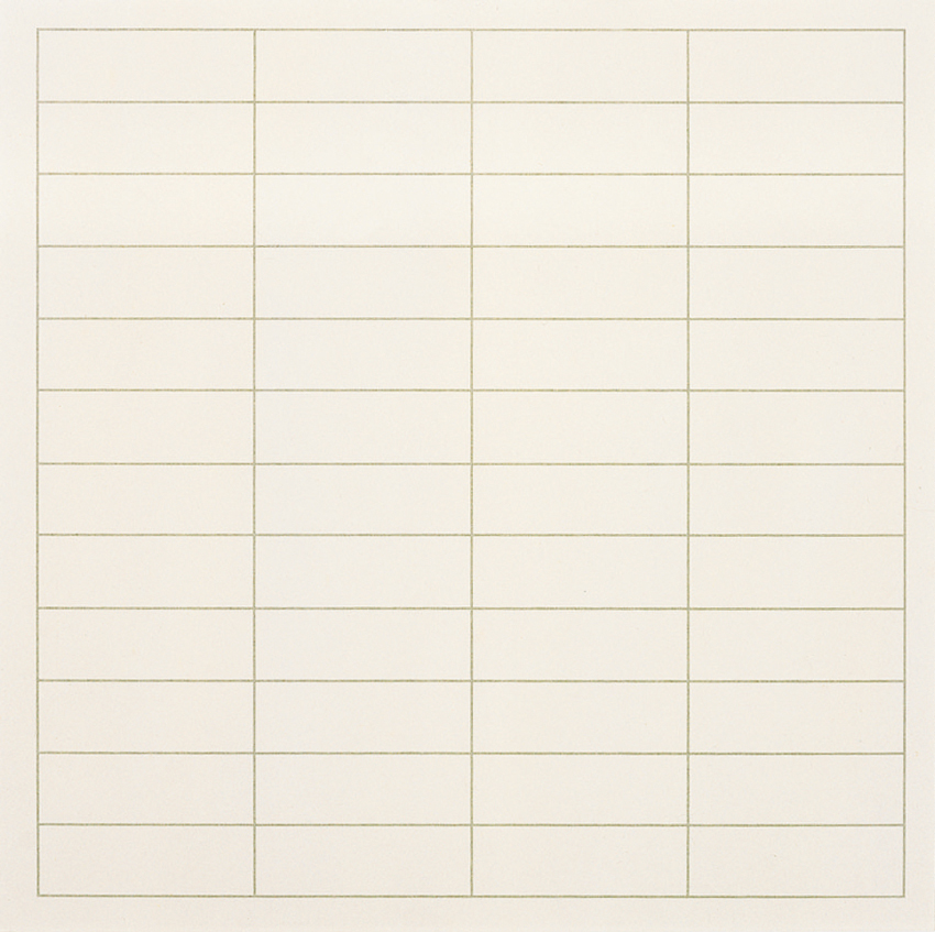
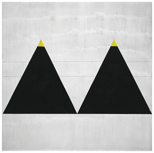
So when I typed “Agnes Martin artworks” at Google search, I was perplexed, surprised and couldn’t really believe what I was looking at! The picture above is one of the many artworks of Martin’s. Look at how simple her artworks are — geometrical shape, and just lines by pen and a ruler. At that point of time I was thinking to myself “WHAT? That means if I were to just draw a single line in pencil and tell people ‘This is my art piece’, I would be famous too?”
HA HA HA (Dream on Ummi)
That was definitely a complete puzzle to me and that was the first impression of Martin’s artworks. She has this signature style of hers where she uses squared monochrome canvas, layered with gesso, overlaid with hand-drawn pencil lines and thin layers of oil or acrylic paint.
(More examples of her pencil-ed lines below…)
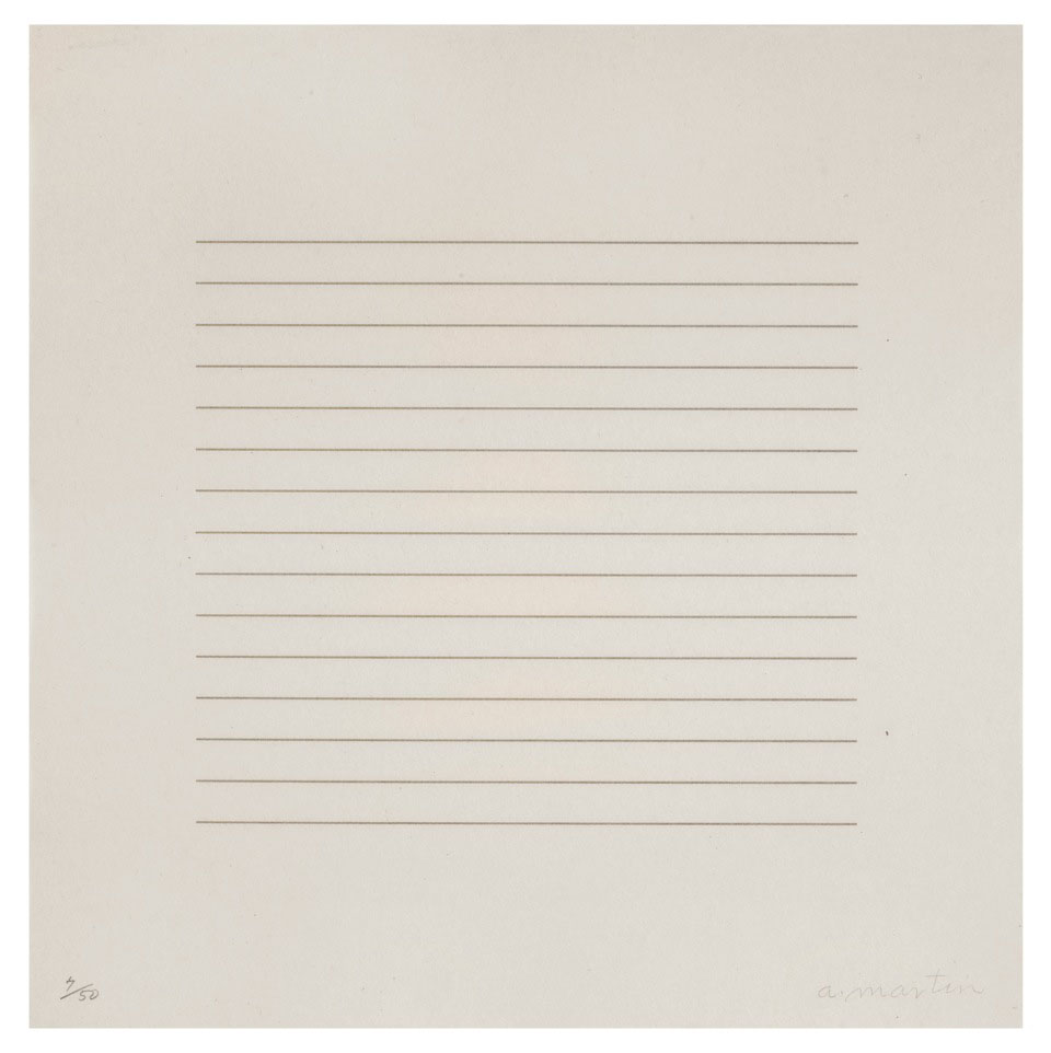
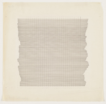
Let me share Martin’s techniques used in her artworks. Firstly, pencil lines. As you can see from the above examples, you can tell that she is a mechanical person. She actually has hand-drawn horizontal, vertical or in grid formations across gesso canvas. She stretched string across the canvas and uses ruler to draw. Then, her line spacing was mathematically worked out on paper, then painted between to form solid bands.
Secondly, colour range in her artworks. Martin mainly uses the primary colours of red, blue and yellow, and of course the most basic colour of black and white. She customizes the colours by thinning, mixing, lightening and darkening them. Furthermore, with these colours, she actually creates ghostly effect of the colours by bleaching them out. That is why her coloured artworks has those neutral, gentle yet faded colours.
1974, Martin’s artworks eventually moved out from the ‘monochrome zone’ and became more human and involving by replacing neutral tones to brighter colours.
In general, Martin’s inspiration are mostly from nature and emotions. She always somehow connects her artworks with her emotions deep inside. Therefore, if you were to re-read the quote at the top of this post, you could see how much she would relate nature with emotions and then transferring those characters onto her canvas.
So what do I think of Agnes Martin?
Personally, I like simple stuff. I was impressed that her just a few lines could actually mean something so deep. I actually have this motto of “Less is More”, and I think Martin portrays that as well.
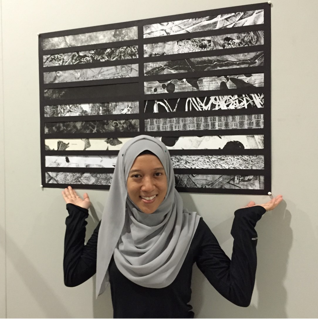
Here is a compilation of the time lapse clips I took throughout the journey of the Lines assignment!