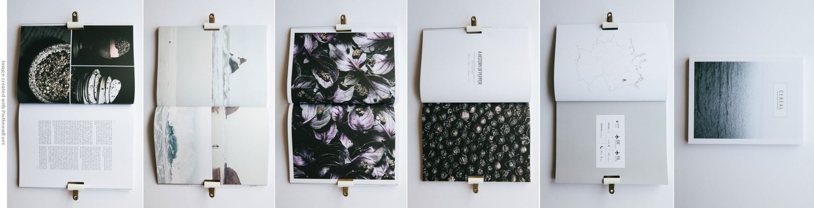
I contemplated while working on this idea of showing decomposition in terms of texture in the zine. In this context, decomposition shows the life of a Nike shoe — a cycle, starting of the book being all vibrant with colours just like how fruits are colourful when it is ripe and fresh to be eaten.
However, as you flip along the pages of the booklet, it started to go into black and white, into more sensitive topic of a Nike shoe — showing the decaying process.
(Printed in an A6 size from Out De Box)
Front Cover Page: The nike tick being edited to look like its breakingIntroduction PageFull of colours showing the positive impact of a Nike shoeThe start of decay
Consultation was fruitful because ideas came in after some thought with the suggestions from Prof Ina. We looked through a zine/book/publication(?) as an example. Because my works are in black and white, Prof Ina suggested out of the many greyscale/b&w pages, there is at least 1 page coloured, as the centre page for example.
Something that Prof Ina mentioned during consultation made me think more of the layout and arrangements of the pages.
Here are some WIP images:
See the coloured among the b/w?
Of course I thought of the different ways my masterpieces can be placed within a page.. But i love how it occupies the entire page on its own. I thought of leaving borders too…… But not at the moment.
Again, it is still a work in progress state!
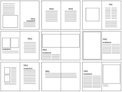
Just a little something, I came across this layout plan while researching more for zine. The moment I saw it, I started to question myself again about the layout of the texts etc.
Taken from: http://d-muntyan1215-dp.blogspot.sg/2013/04/kinfolk-grids-and-layout-development.html
After POV, we some sort bring the project forward to create zine, a publication of our projects from this semester or the previous semester.
Having said that, I am going to include only the POV “masterpieces” for the zine because I feel it is way better than the other projects I did…. ever.
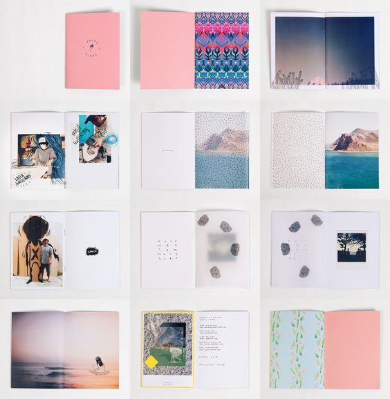
While researching for zine, it took me quite some time to figure out how I want my layout to be, how the zine will come about — like a book or like brochures (the 8 pages printed in 1 A3 and your folding begins).
I considered the second option though, but it got me thinking that my work will be shown quite small? So I am in the direction of the book-type. I got inspired with “clean cut magazine-ish” feel, suggested by one of the classmates, so I researched…
Taken from: http://achapeu.com.br/wp-content/files_mf/31259.jpg
Taken from: http://www.mr-cup.com/blog/editorial/2.html
Don’t you just love the simple layout of the 2 examples? (I DO…)
Let us play a guessing game! Maybe you could fill in the blanks?
Here are the final outcome:
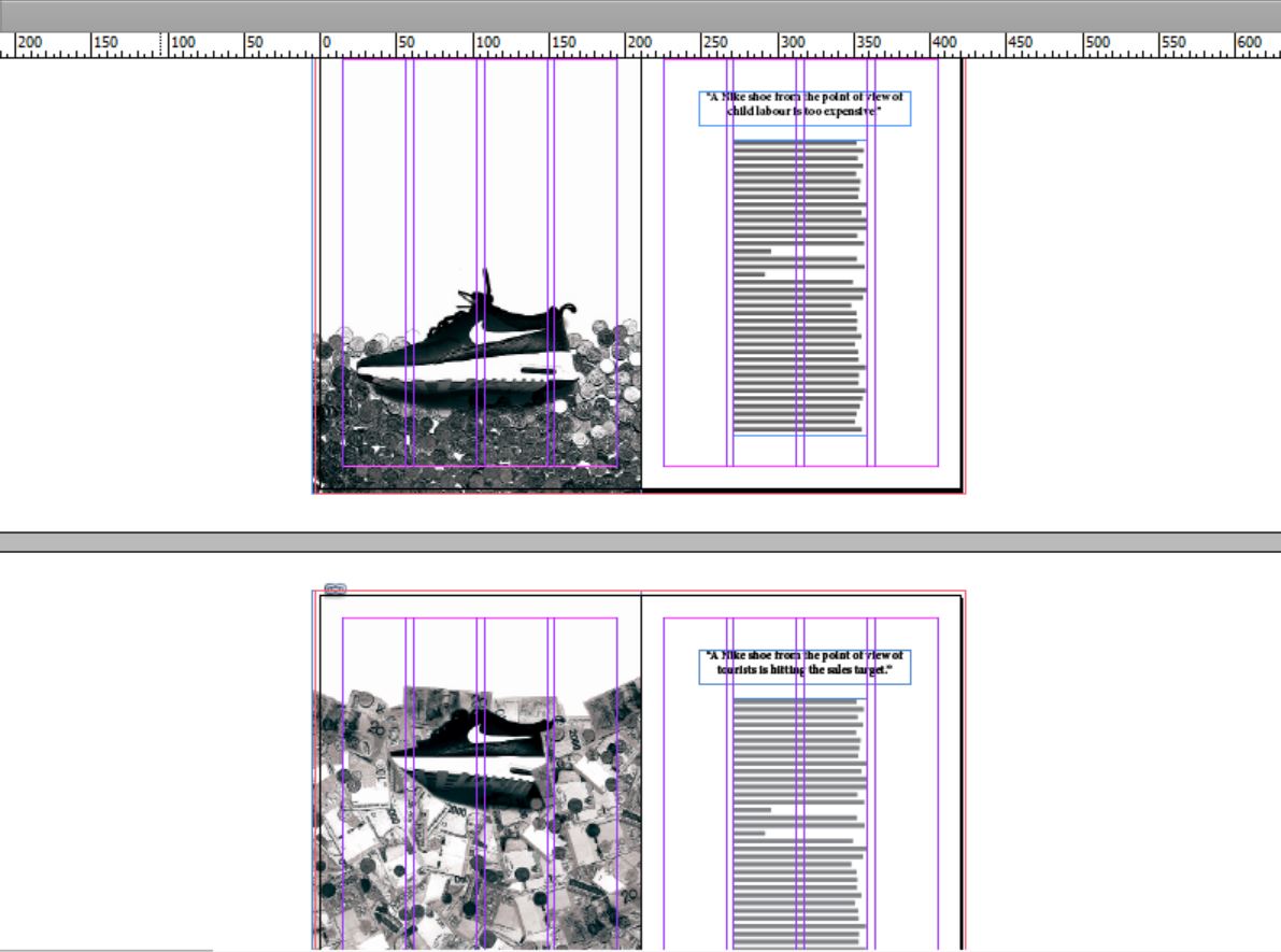
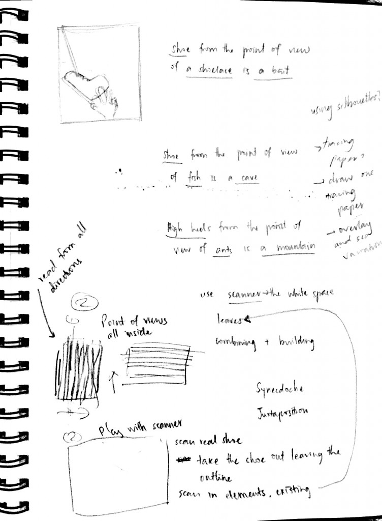
A Nike shoe from the point of view of child labour is _______.A Nike shoe from the point of view of life is ___________.A Nike shoe from the point of view of trash is ______.A Nike shoe from the point of view of tourists is _______.A Nike shoe from the point of view of a parent is ________.A Nike shoe from the point of view of child labour is __________.A Nike shoe from the point of view of an athlete is ________.
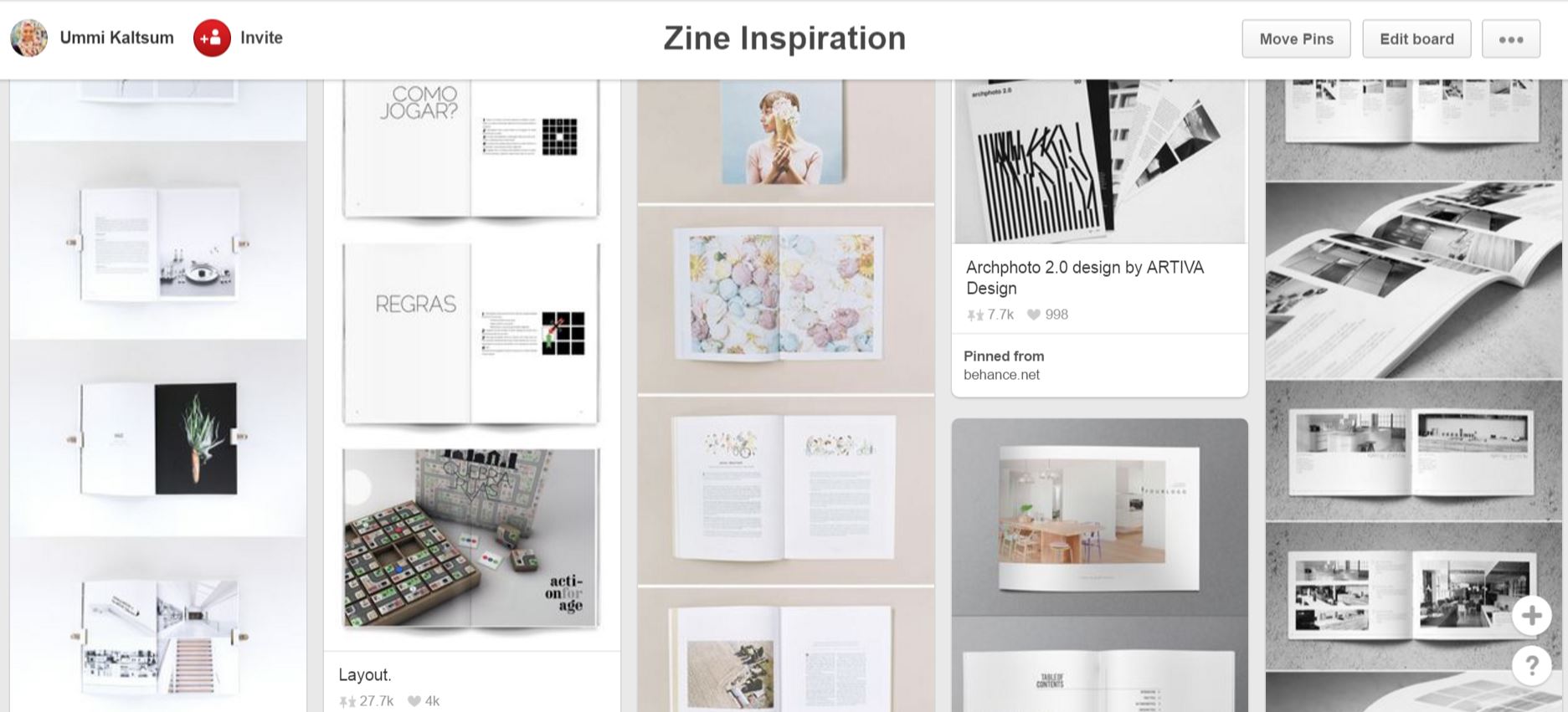
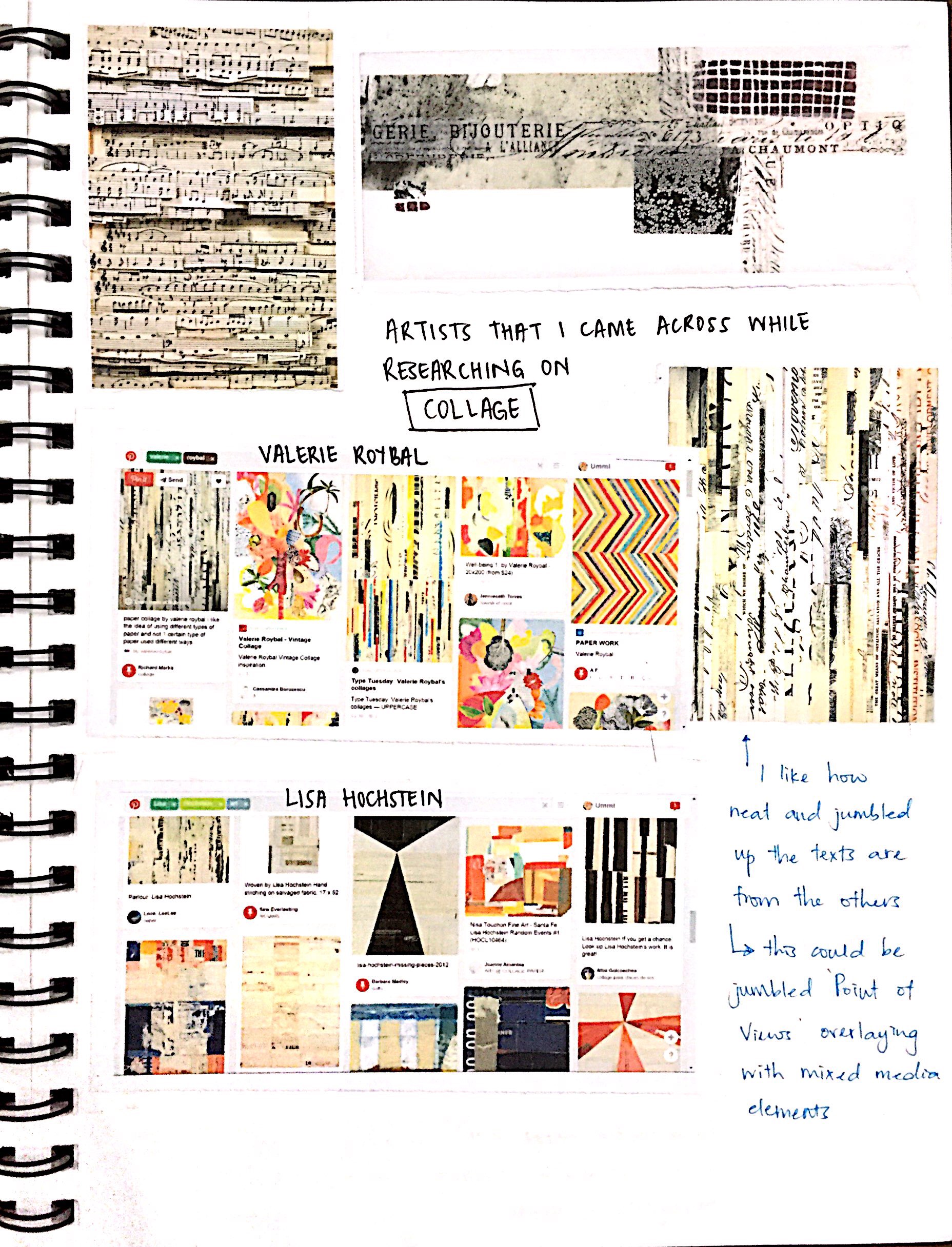
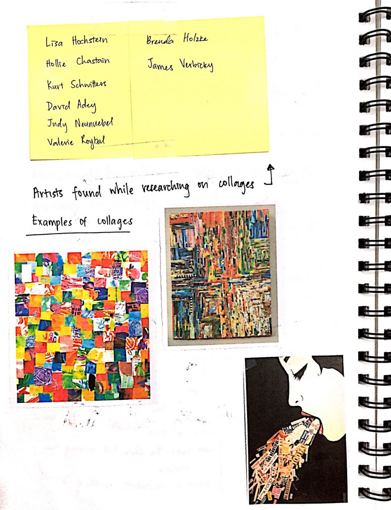
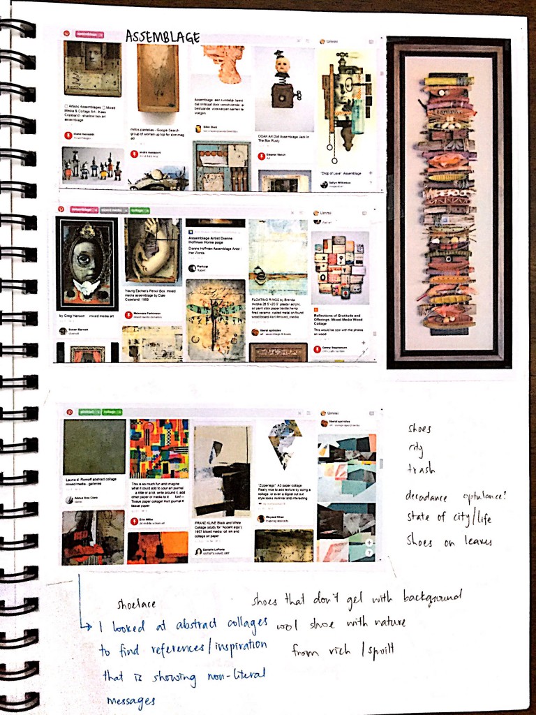
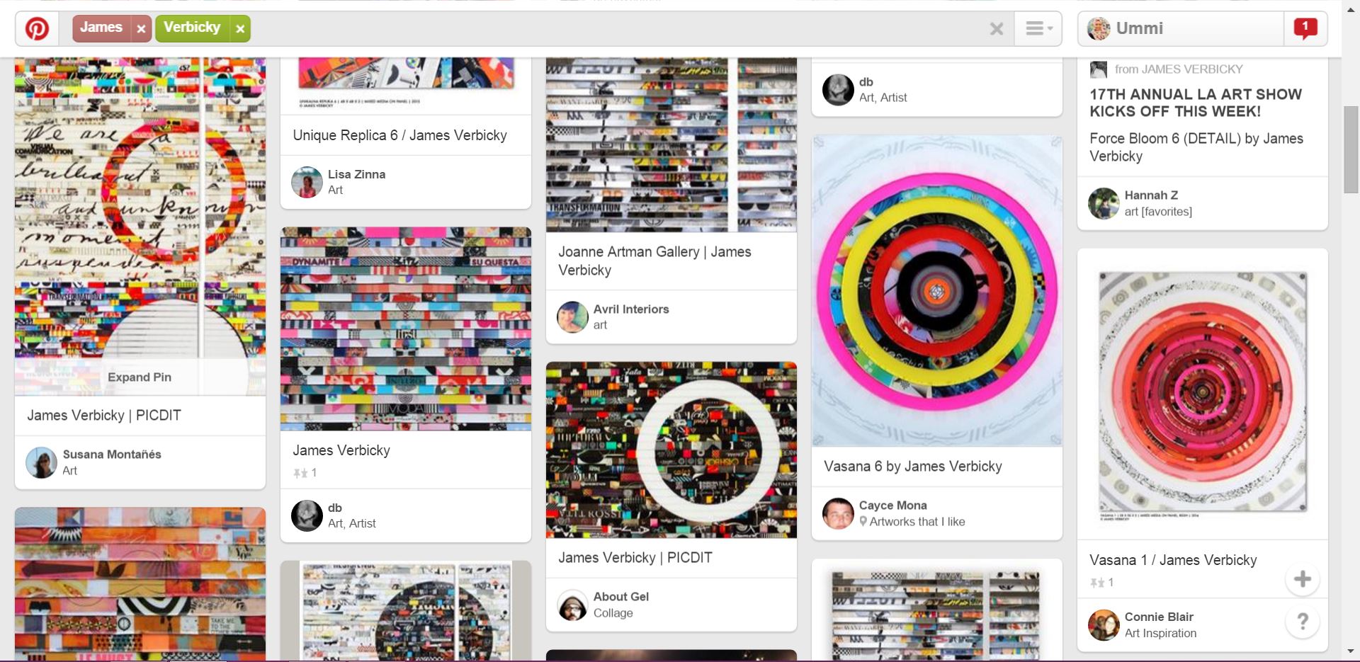
Well, this project did not really consist much of hard-copy journal progress for me because I used the scanner and digital work. But these are the scanned images of my journal on the research part of the project, mostly artists and their works found on Pinterest!
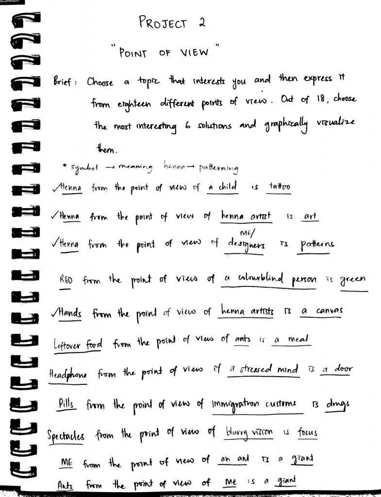
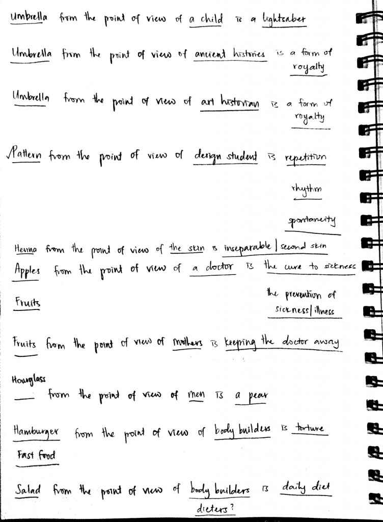
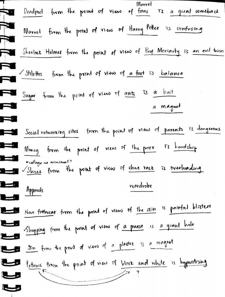
Start of the solution of 18 tag lines.
But my brain juice started to fill up…
And so I squeezed them all out.
Until to the point where I made a decision.
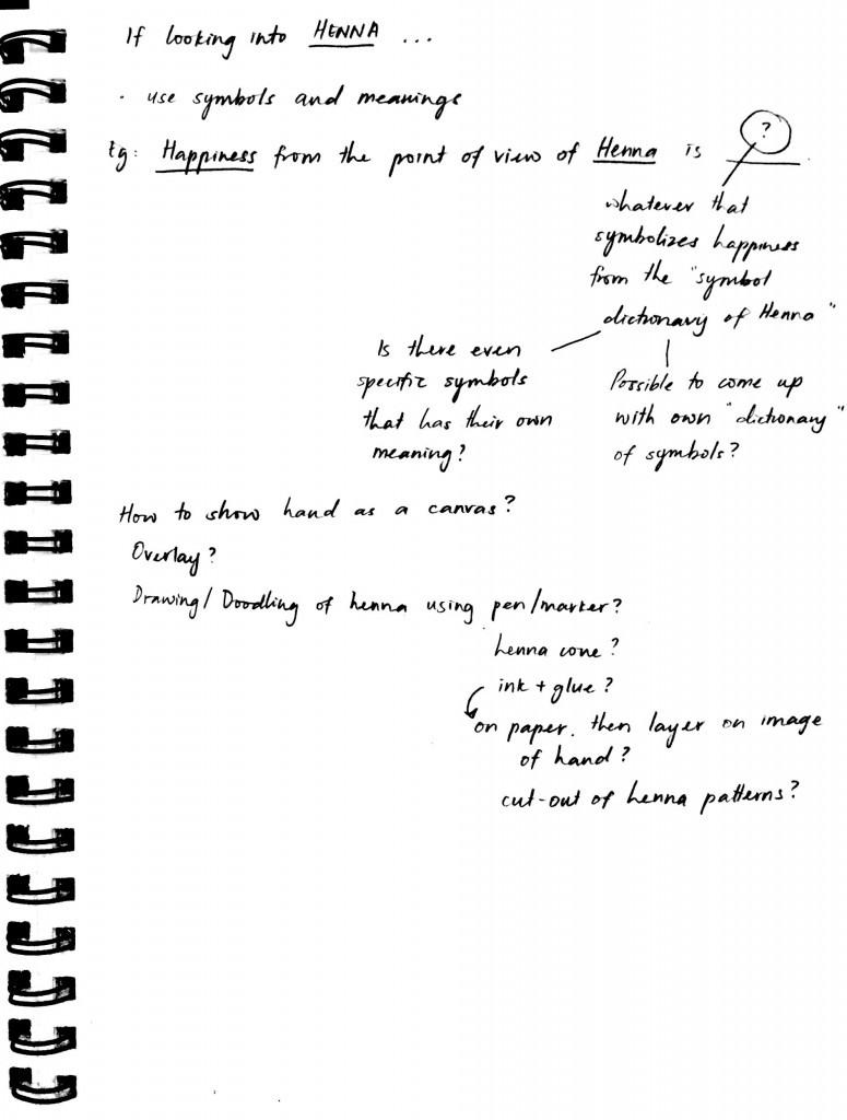
These are just some thoughts I had when I thought of using Henna as the object
These are just post it notes with my instant thoughts
Consultations with Prof Ina
Then I started to come across artists from Pinterest
My first collage trial
Then with the artists that I found out, I started to use them as my source of inspiration
There was a first collage trial, there’s always a second. The collage was not completely done as I just put it all together without editing as much.
(Caption was not decided)
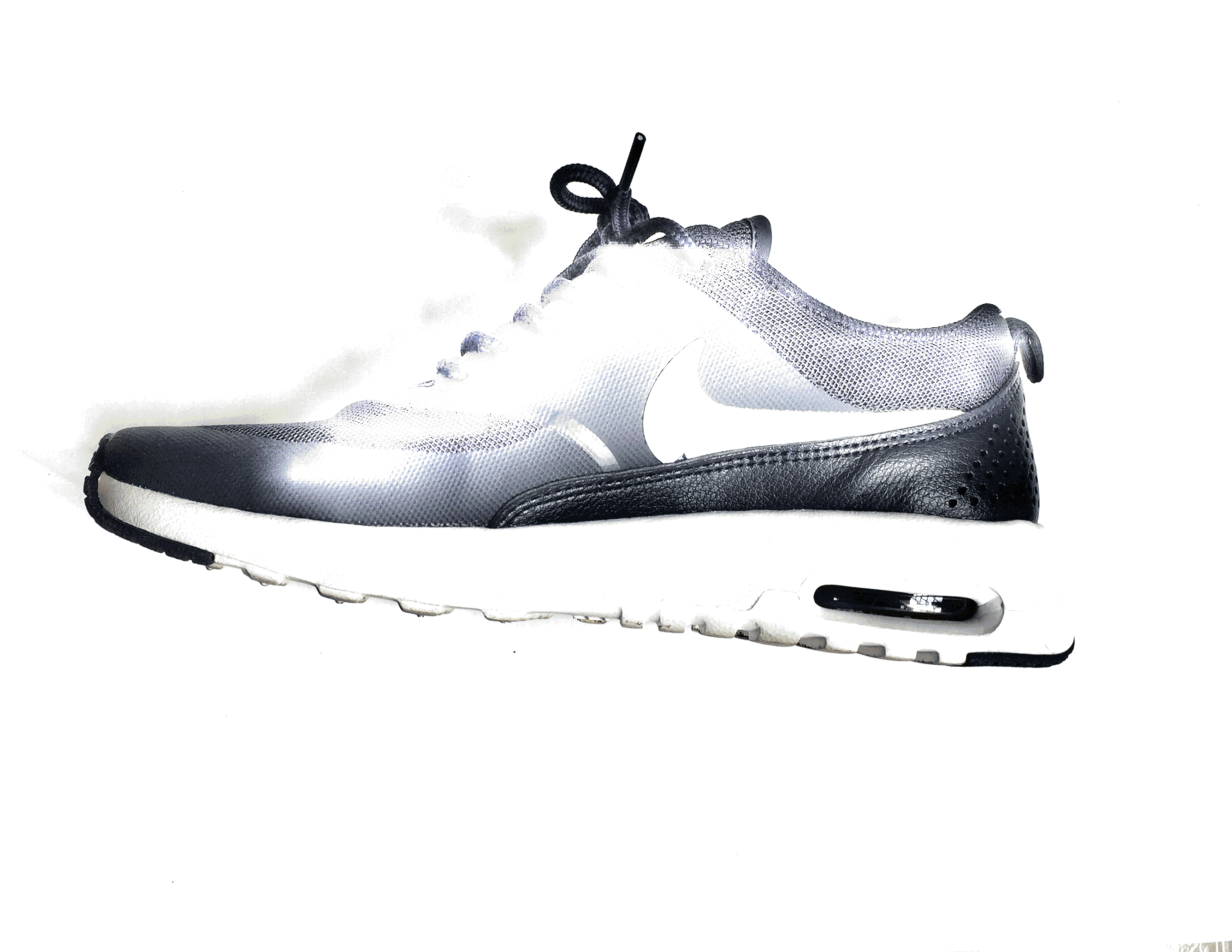
Well, at this stage, I have not come up with a solid idea of how the collage will be. I think I didn’t even include the synecdoche into the collage. All I thought of was to use whatever resources or elements I have at home, scan them and collage them. Yes, you got it right. I scanned my Nike shoe.
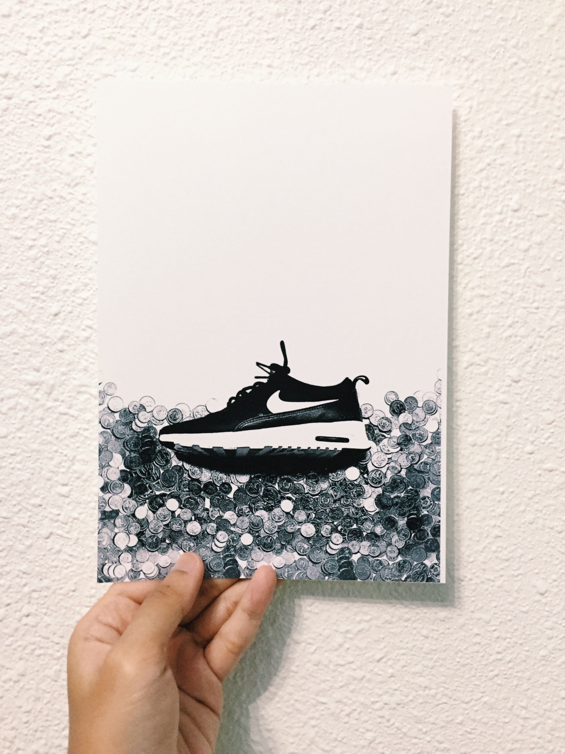
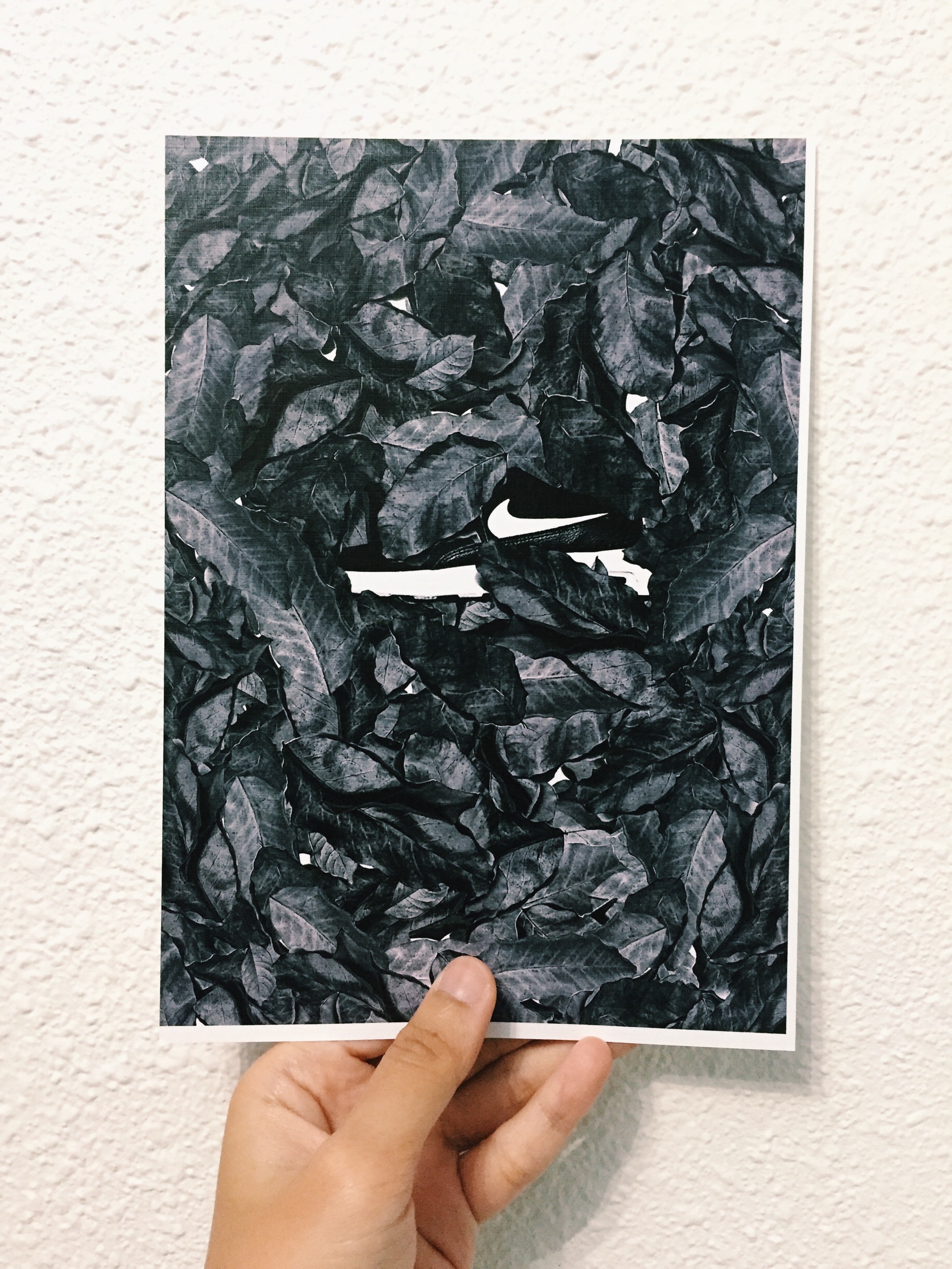
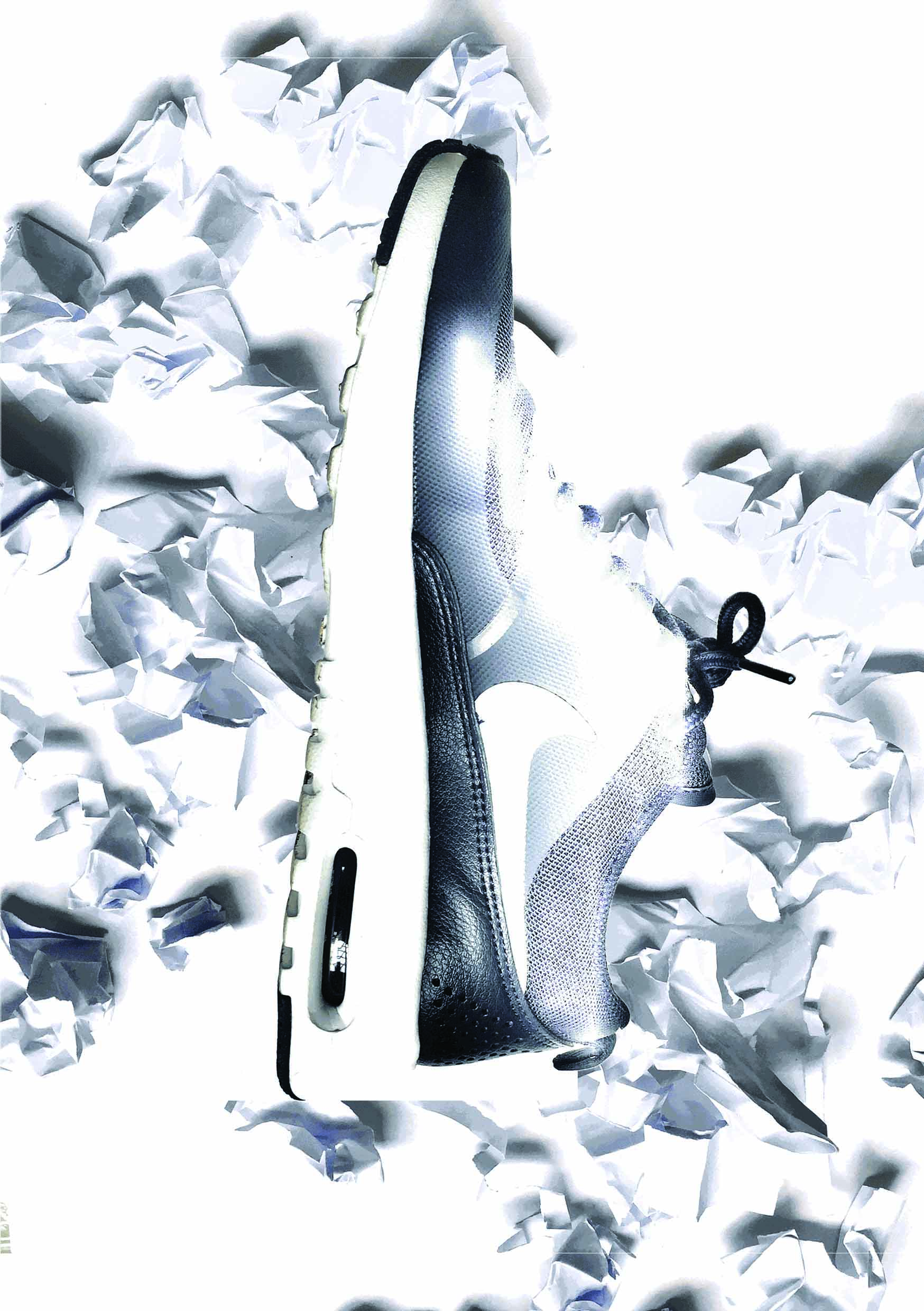
After consultation, the Nike shoe will be the constant object in this POV project. We looked at consumerism, sweatshops in Nike and child labour. The collages are arranged following the rule of thirds, showing how much or little impact it has on the POV. So, these are first drafts of the collage with the possible POVs:
“A Nike shoe from the point of view of shelf life is not forever.” (I might have to rethink about this caption)
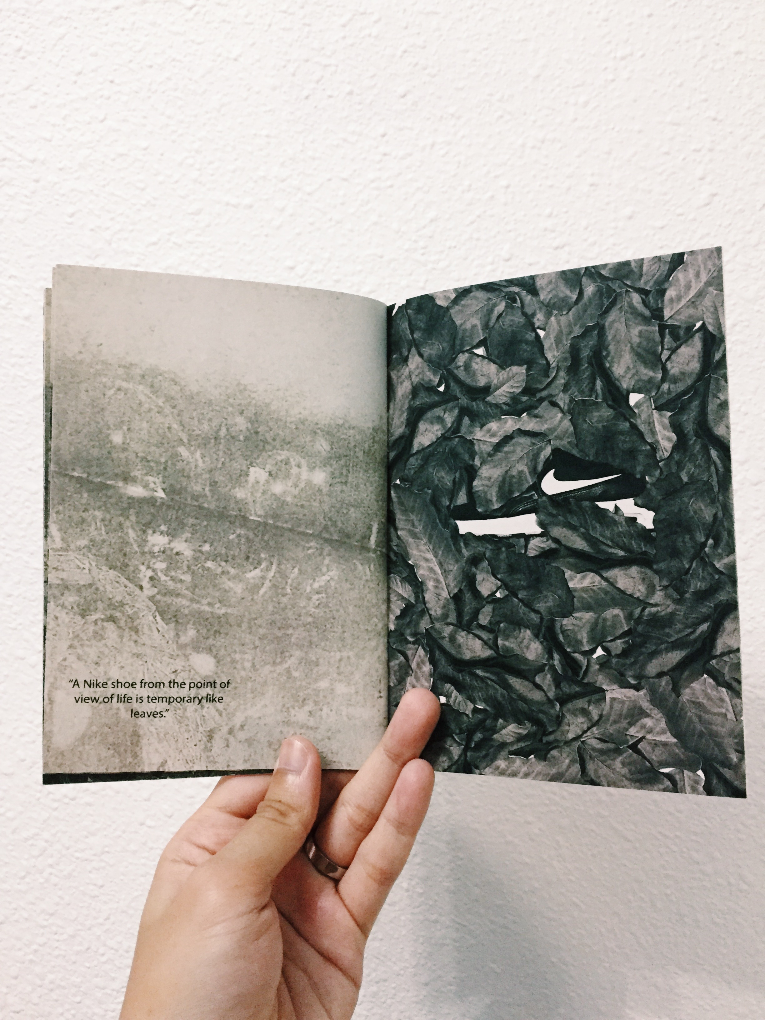
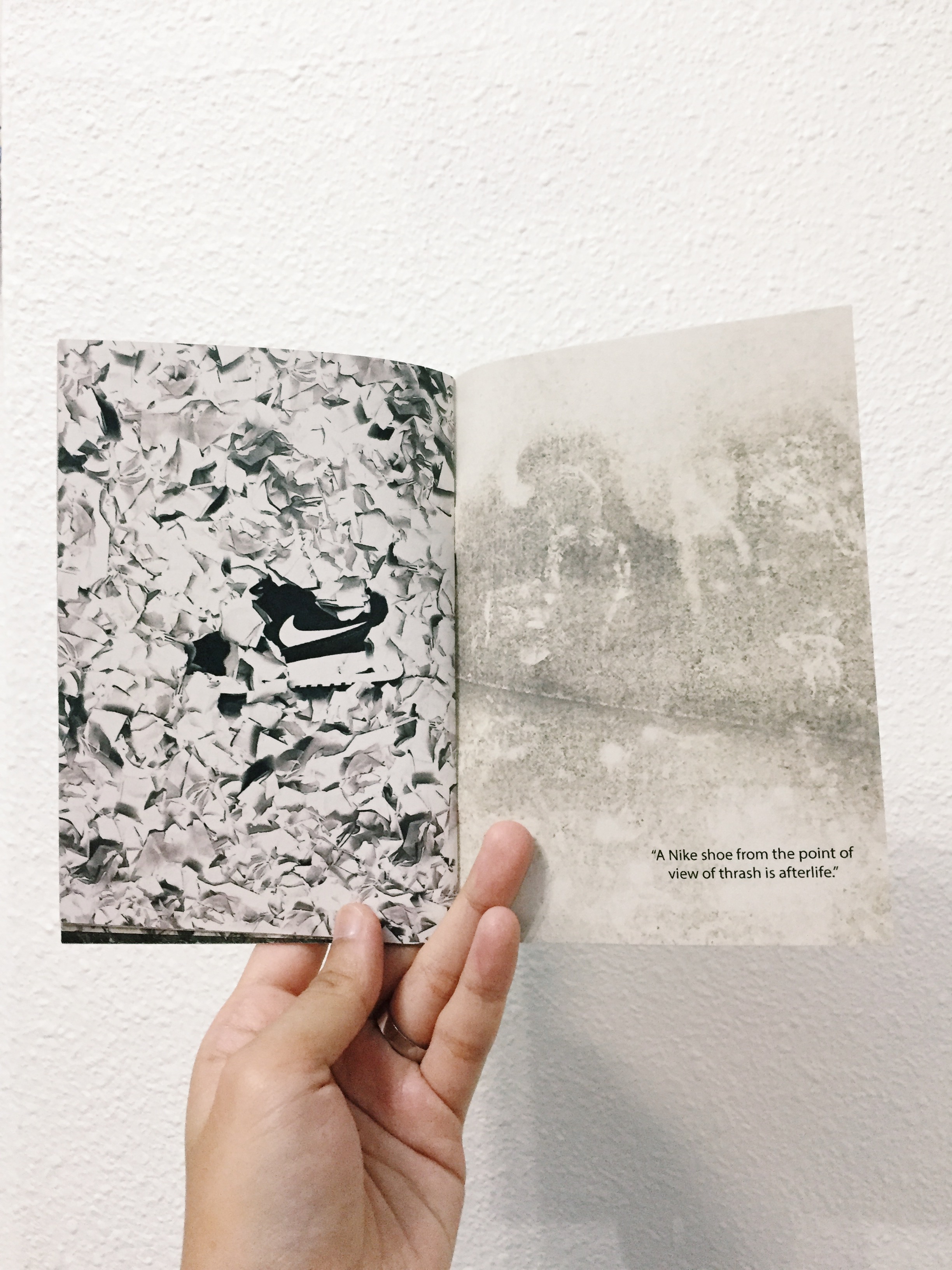
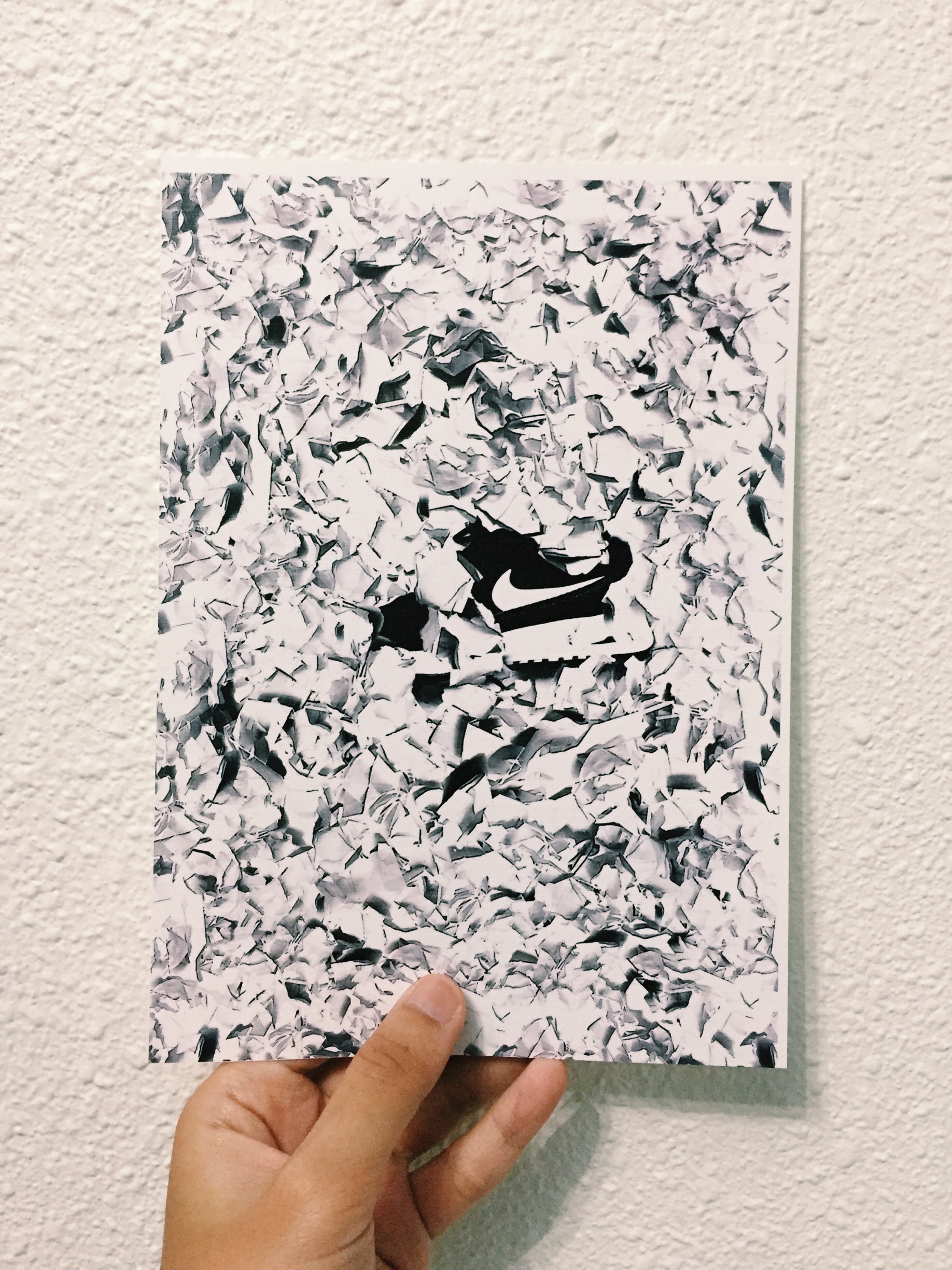
Concept: using crumpled paper, representing trash. Nike shoe is surrounded with crumpled papers, slightly covered. From here you can see the message that I am trying to bring forward: that even nice branded shoes will not last forever because if you constantly put them on, it’ll eventually get worn out and the last place it’ll be in is the trash bin.
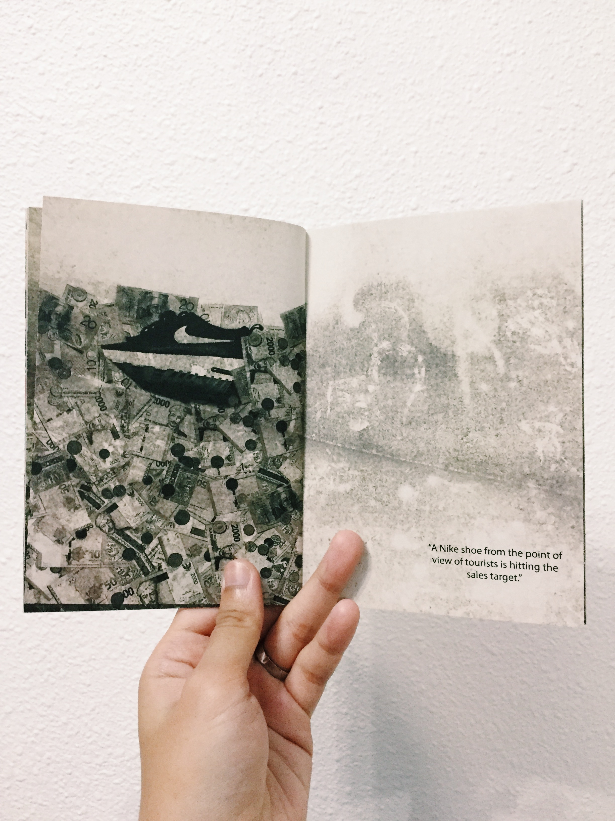
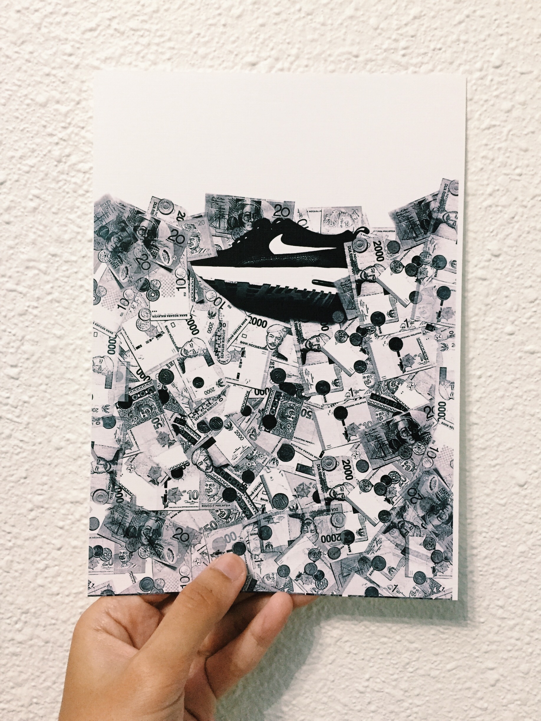
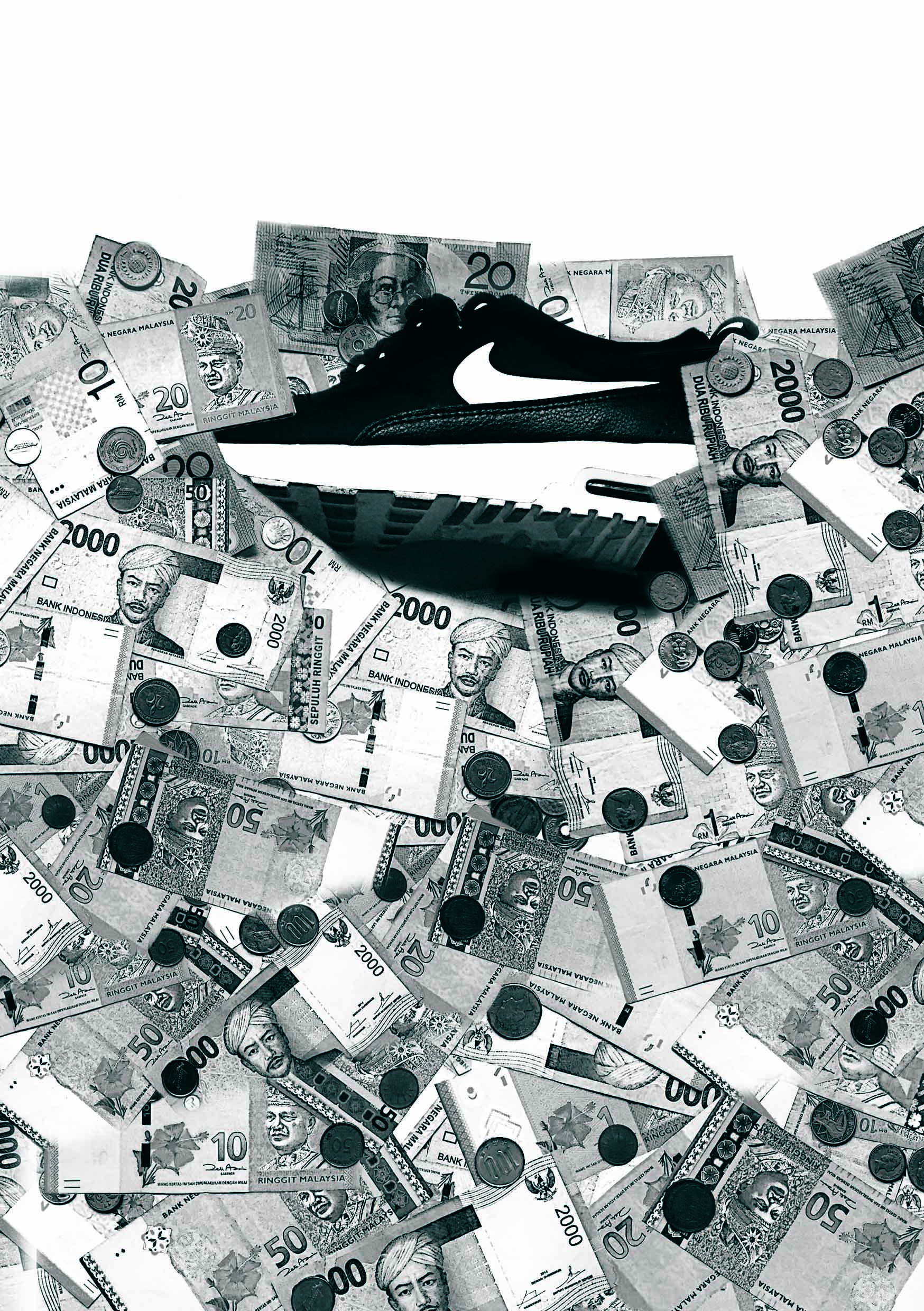
“A Nike shoe from the point of view of foreign currency is profit.”
Concept: foreign currencies representing the different countries that one can buy Nike shoes from. We know that when you buy overseas, it is just easy money for them.
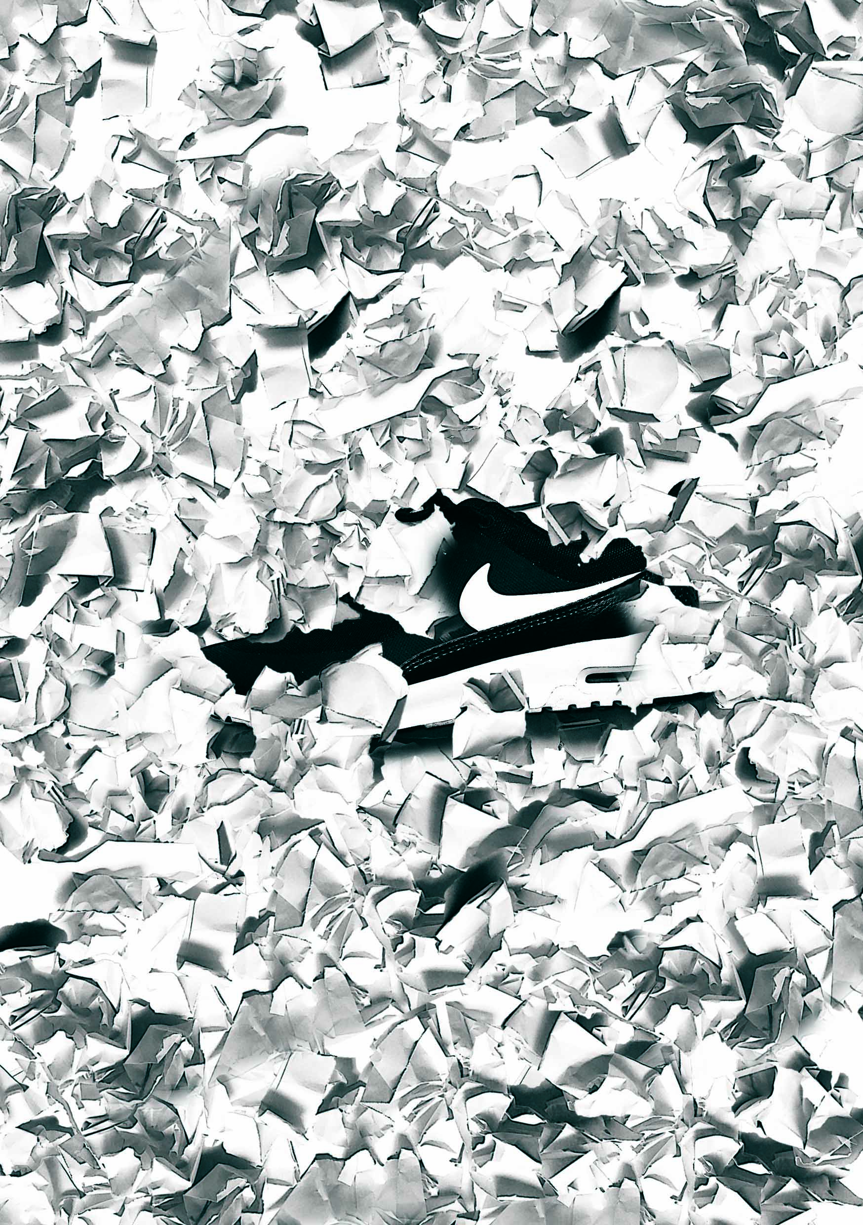
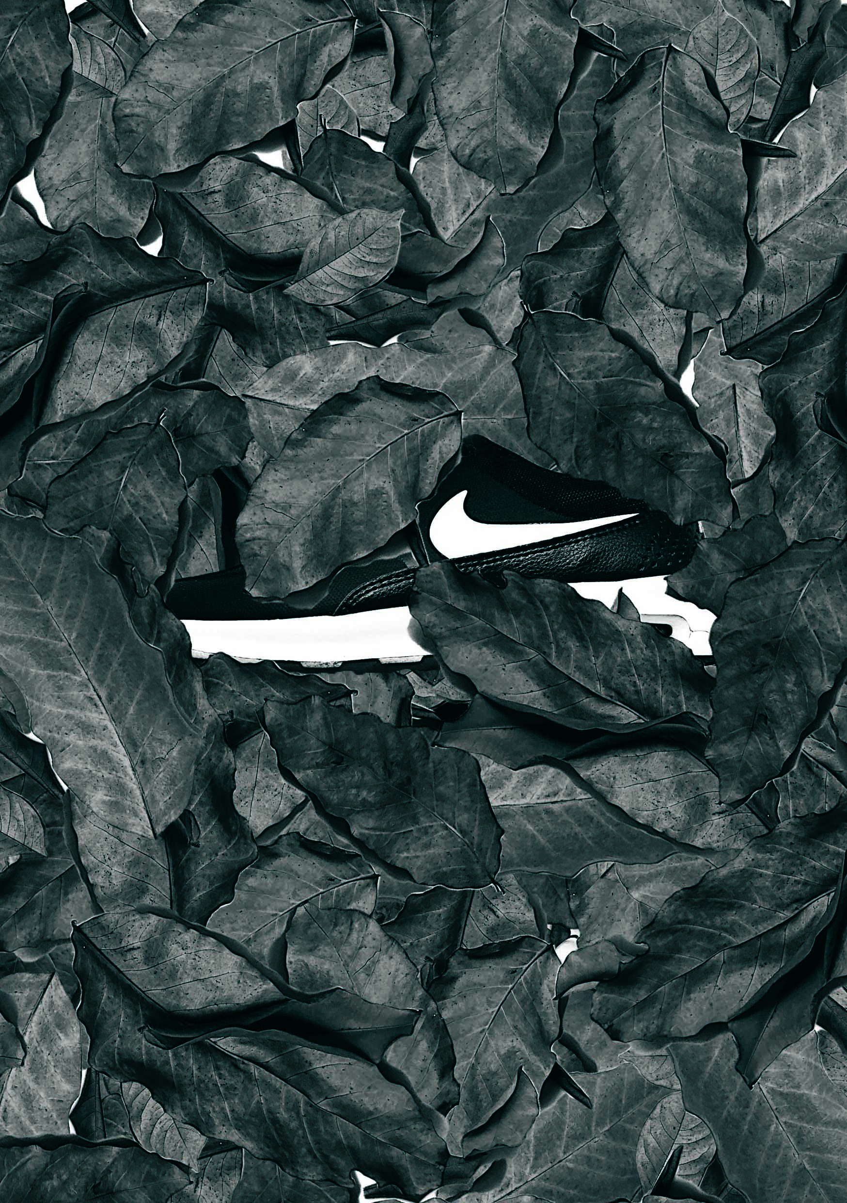
Caption not really decided, but it’s similar to the crumpled paper.
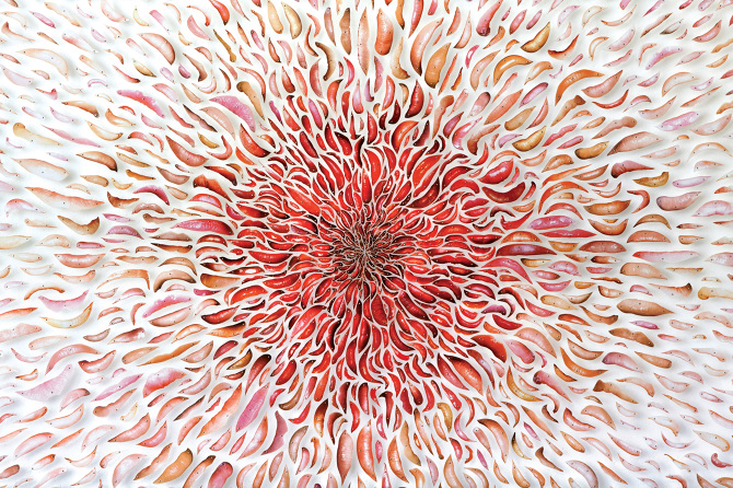
Concept: Similar to the crumpled paper as mentioned, the concept of not lasting forever. Because leaves dry up and they end up in the trash bin as well.
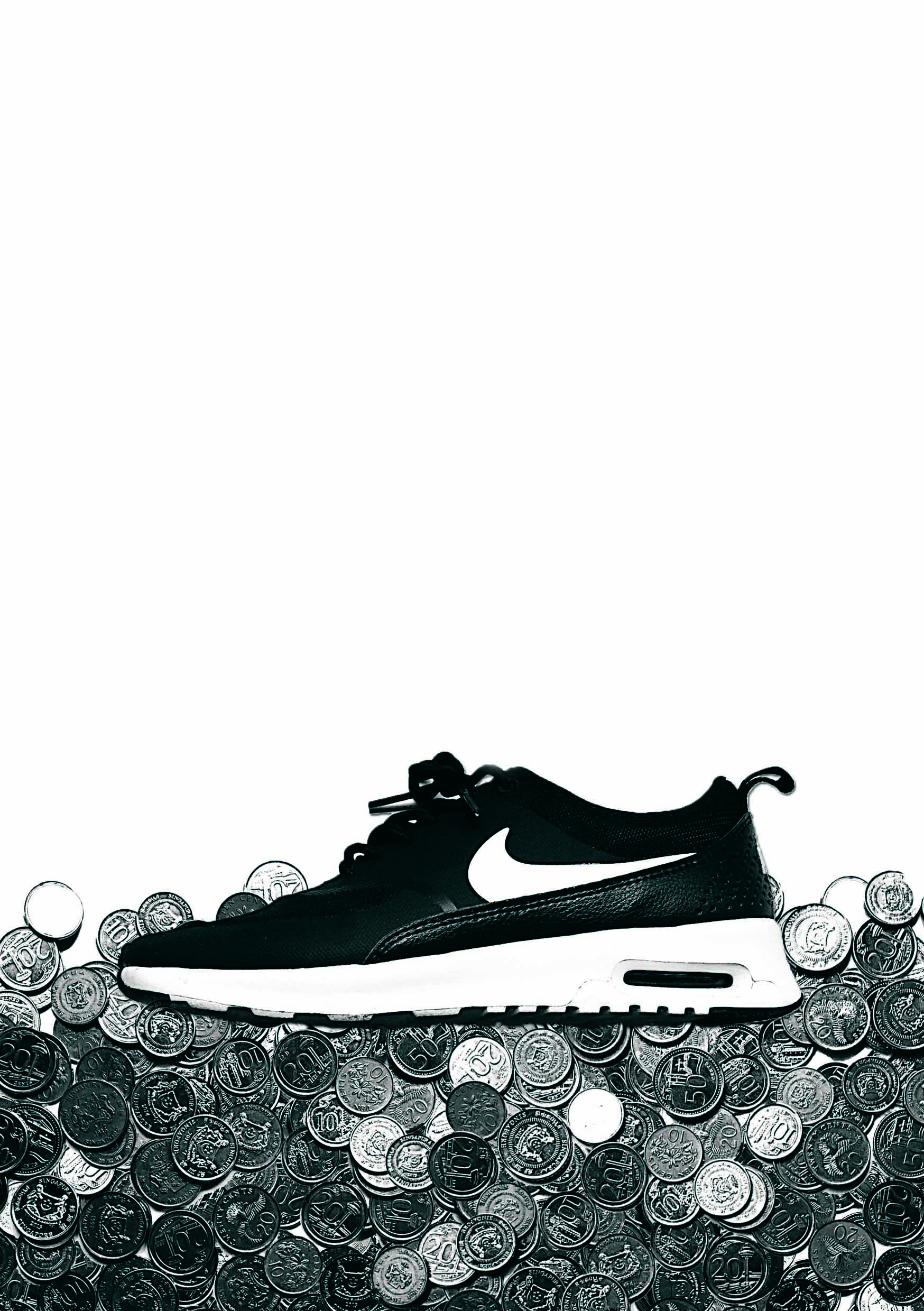
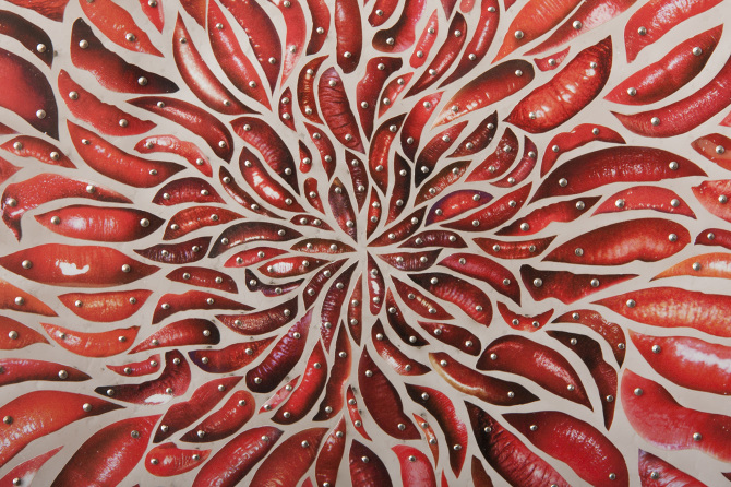
“A Nike shoe from the point of view of child labour is underpaid.”
Concept: I used coins to represent low wages as research stated that the workers are underpaid for the work they do for long hours.
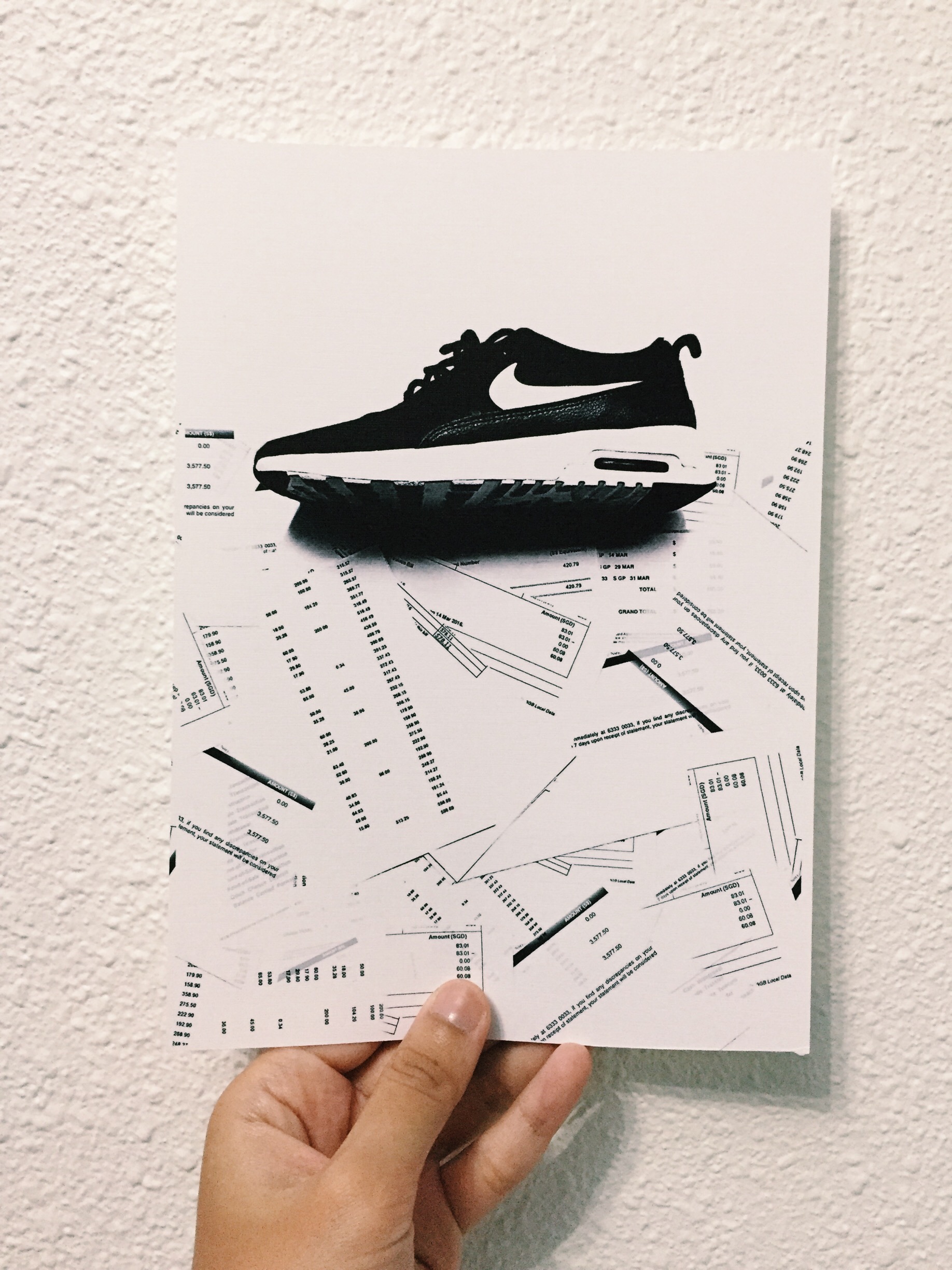
“A Nike shoe from the point of view of a parent is unpaid bills”
Concept: bills showing the consequences of a parent who keeps on buying for their child nonstop Nike shoes.
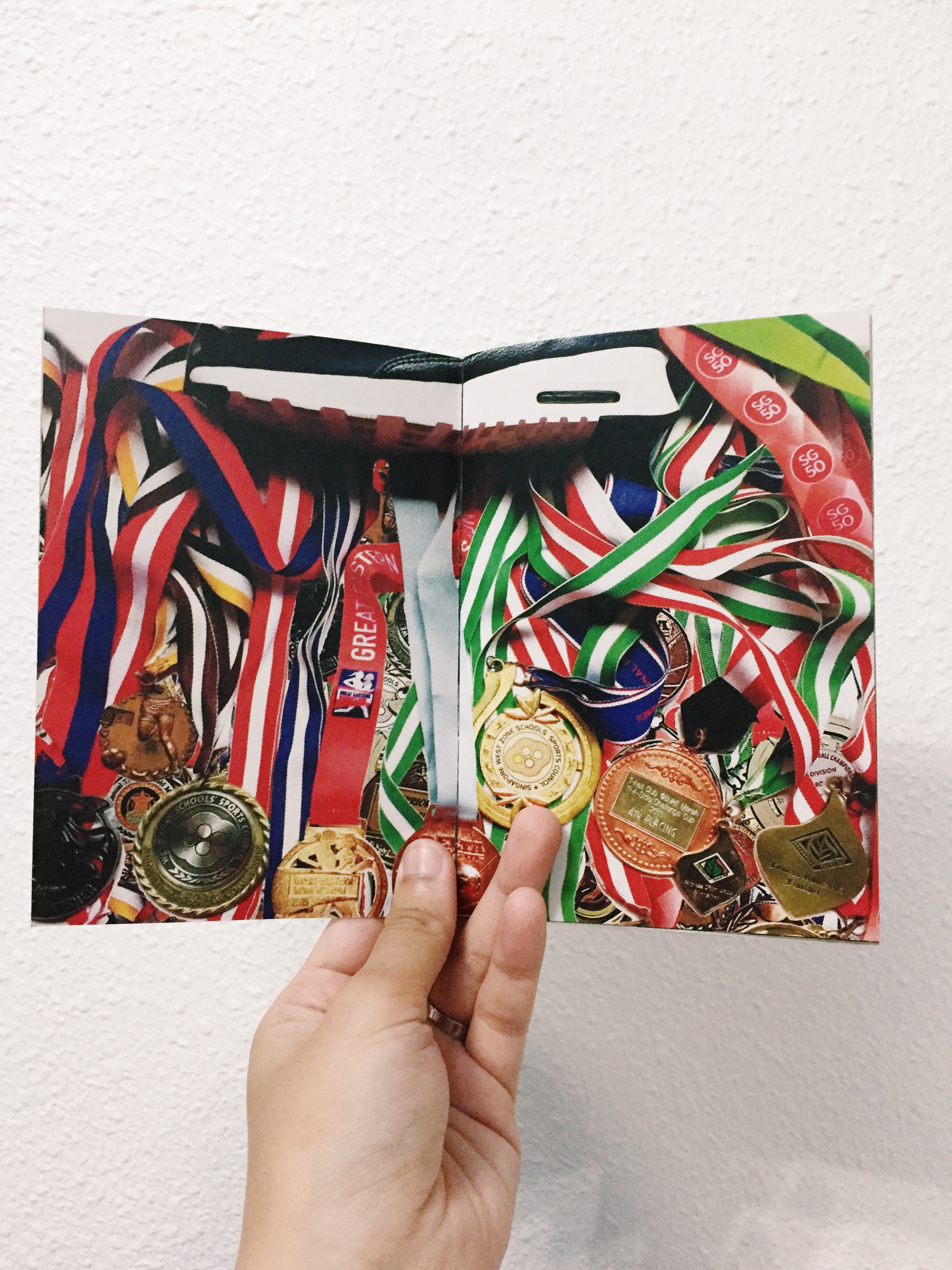
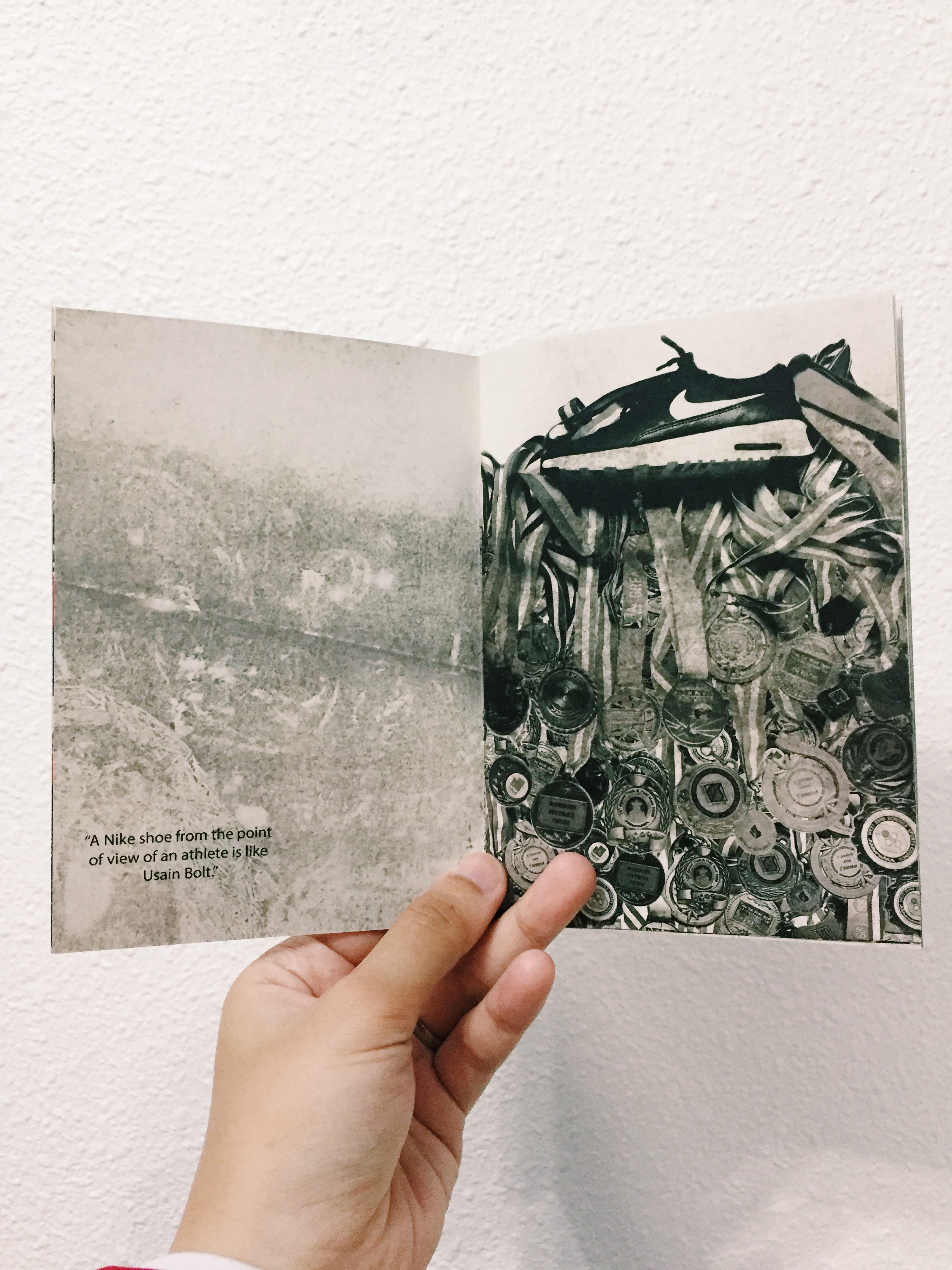
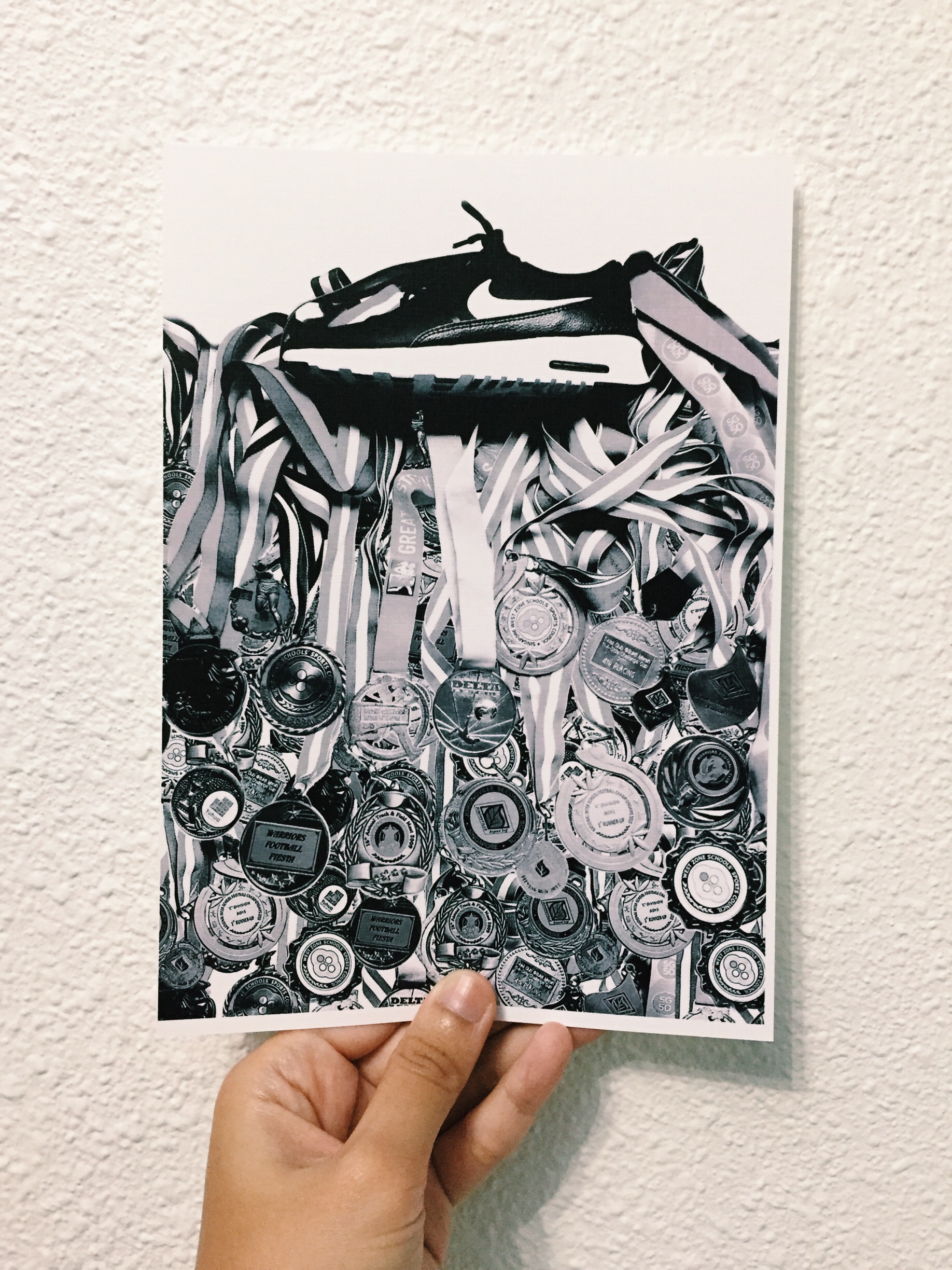
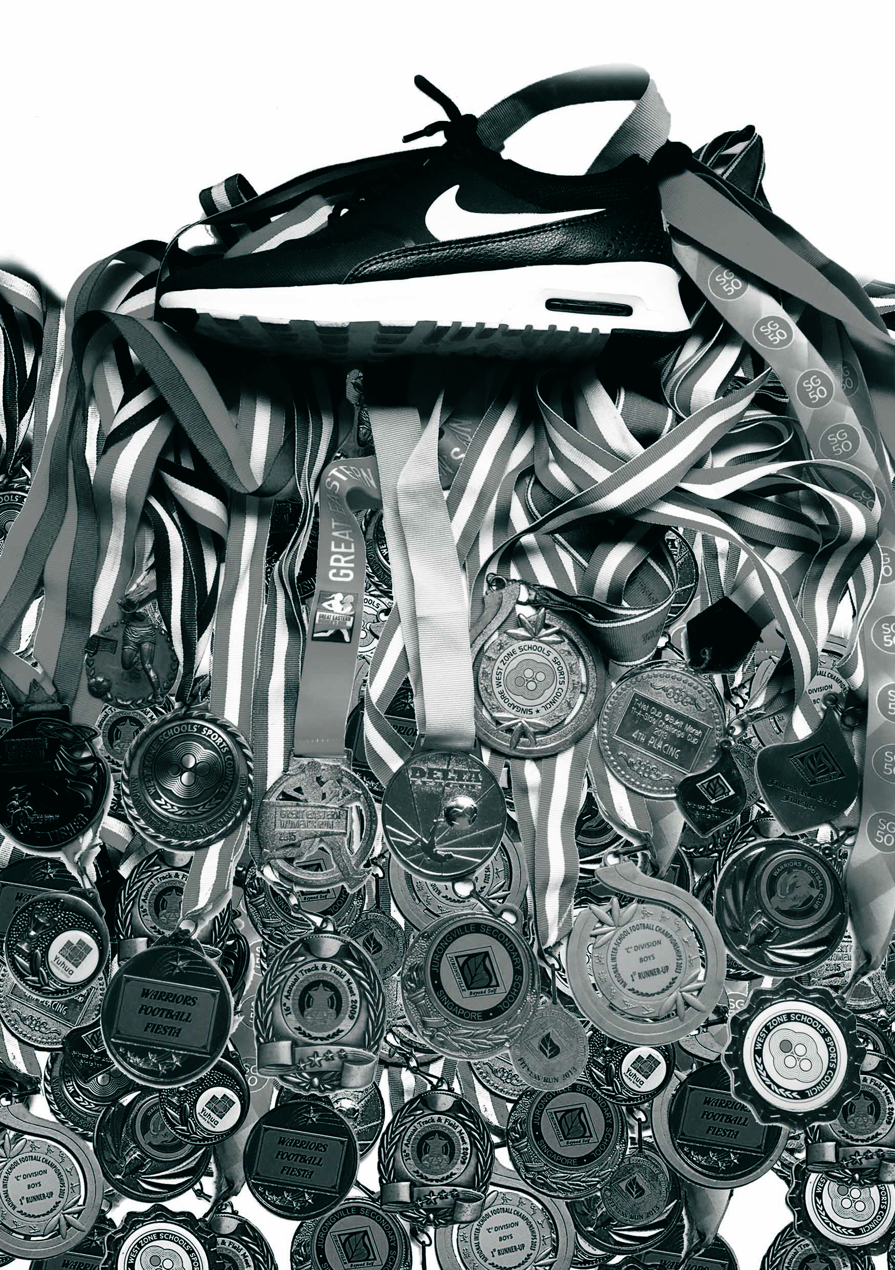
“A Nike shoe from the point of view of an athlete is good performance.”
Concept: Putting aside the negative side of Nike shoe, it also brings positive results into athlete’s world. And the result is good performance which is represented by the medals.
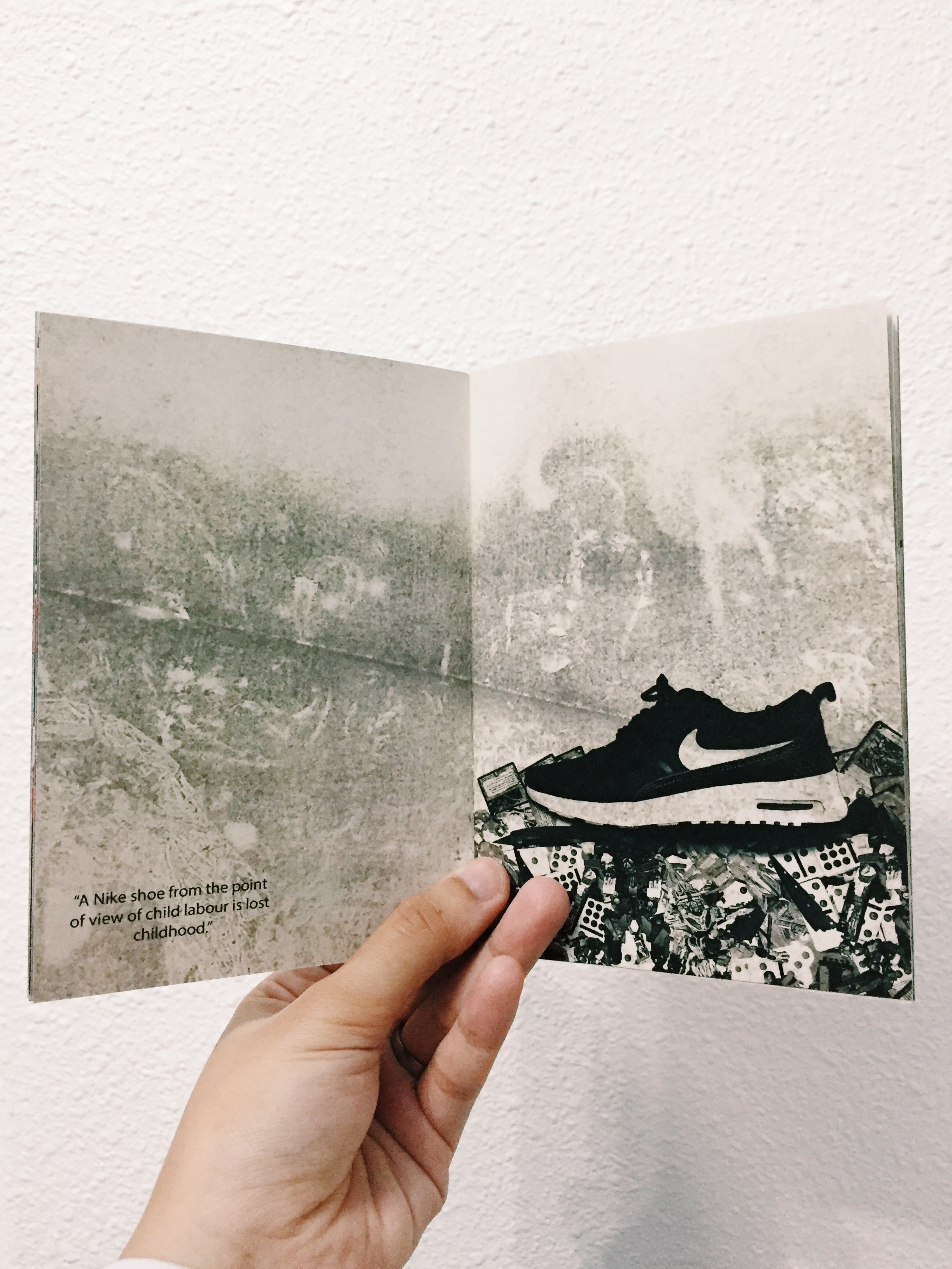
“A Nike shoe from the point of view of child labour is lost childhood”.
Concept: the consequences of child labour is a lost childhood, which is represented by toys at the last thirds of the whole canvas.
Of course, these are drafts, I still have to do some tweaking on the brightness and put together better captions.
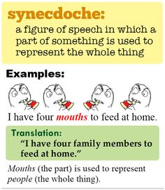
“There’s another term of negative space. What is it?”
So there is another term of “playing with negative space” which is called synecdoche.
Taken from: https://s-media-cache-ak0.pinimg.com/236x/22/e9/66/22e966372552f8efed8fd5f975e43277.jpg
Or another example, using collage…
Taken from: https://www.pinterest.com/pin/487725834626331353/
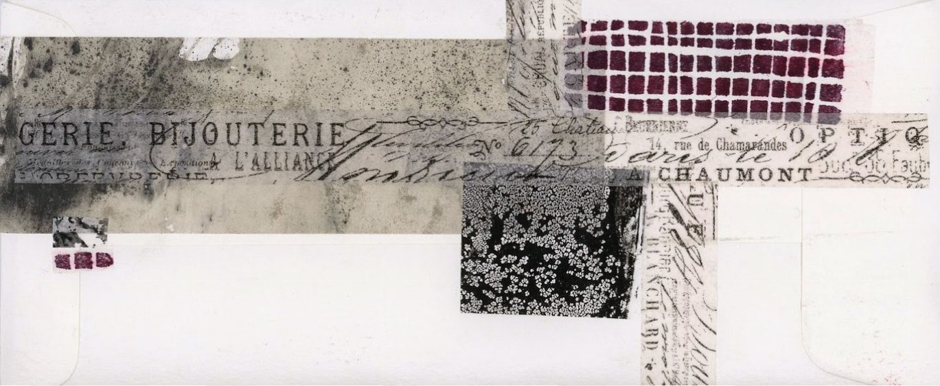
From the previous collage trial, Prof re-introduced me to synecdoche and I did a few research before proceeding to the next phase of trying to incorporate synecdoche into my collages.
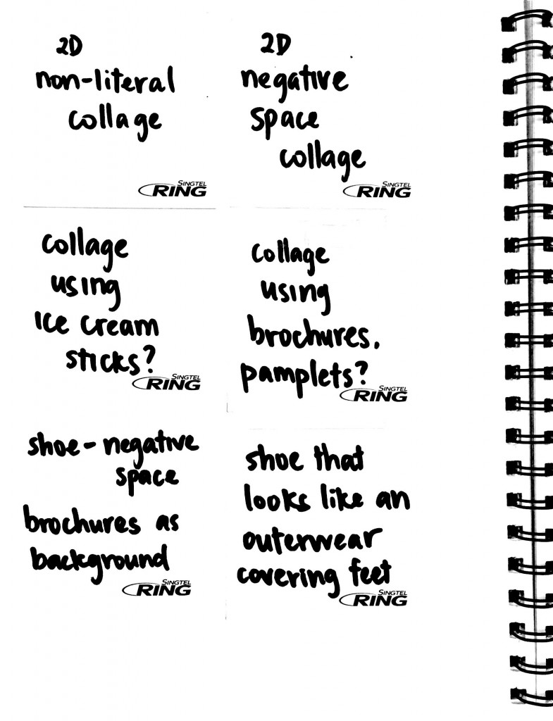
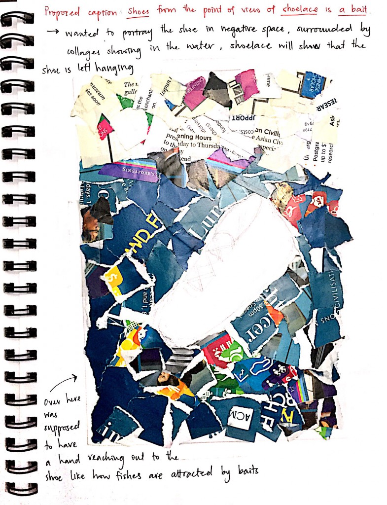
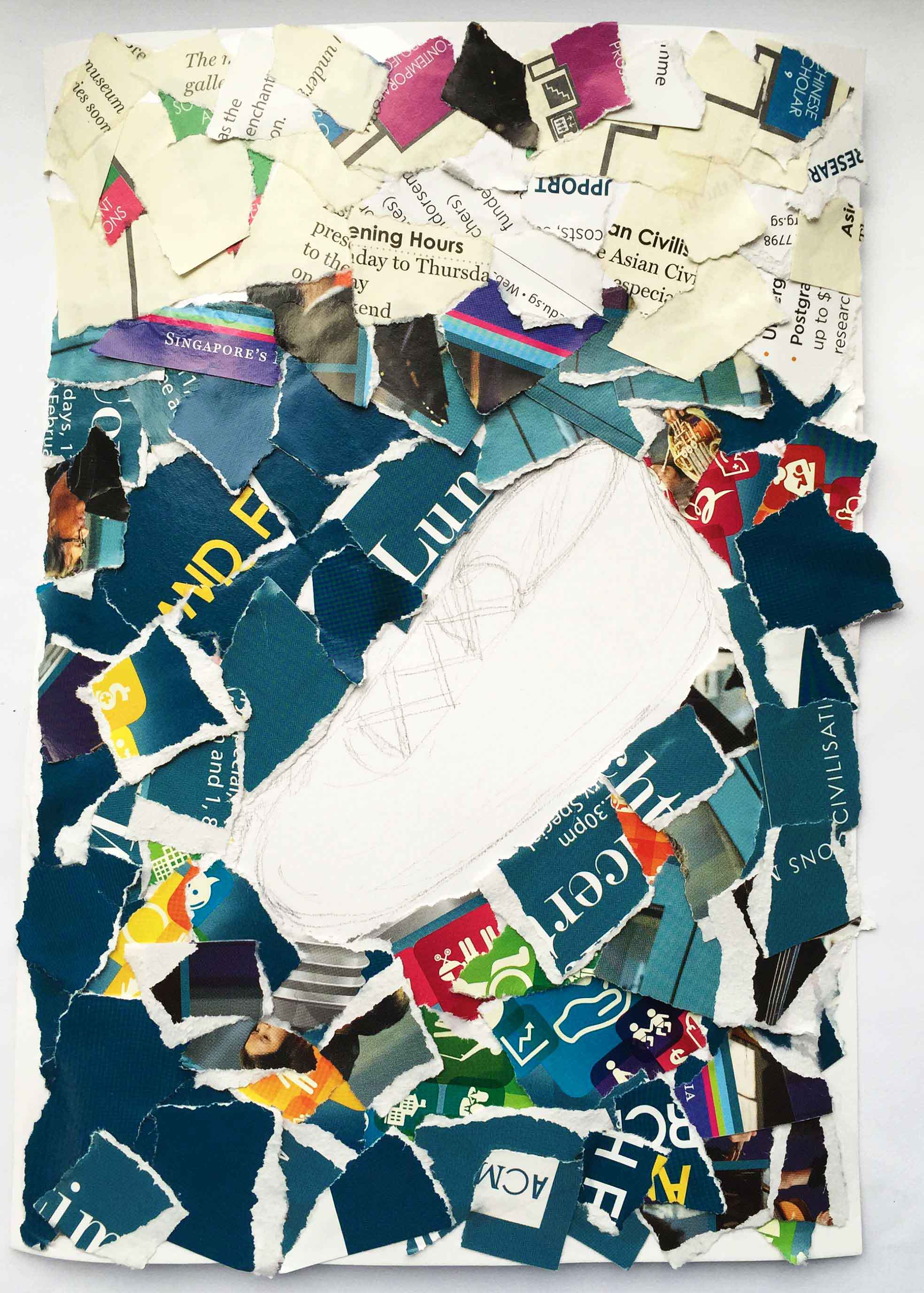
So with all the little by little research, I tried to do my own collage using brochures. That was the initial idea so I randomly teared brochures and tried to put my idea from what i imagined to paper…. But it didn’t turn out the way I wanted to.
I wanted to play with negative spaces that’s why you see an empty spot in the collage — the water (blue brochures) and the land (creamy brochures) are the positive spaces.
The collage was suppose to read: A shoe from the point of view of shoelace is a bait.
How is it a shoe is a bait? Why from the point of view of shoelace?
Let’s imagine (because the collage is incomplete):
Whenever you hold untied shoelaces on one side, the shoe tilts, or can be seen as hanging. From there I wanted the shoelace to represent a fishing line, and the shoe as the bait. What is left is the “fish” that will “eat” the “bait” (which is also missing in the collage). I wanted to collage the brochures into a hand reaching out towards the shoe from the bottom corner of the page, which will be represented as the fish.
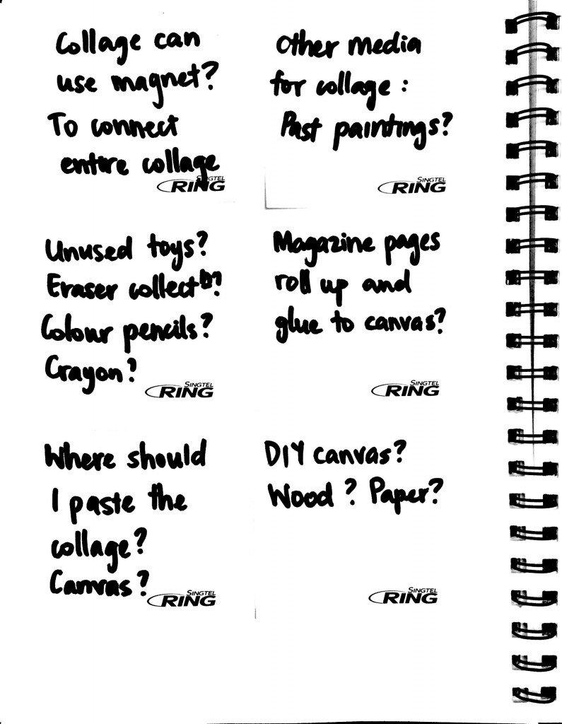
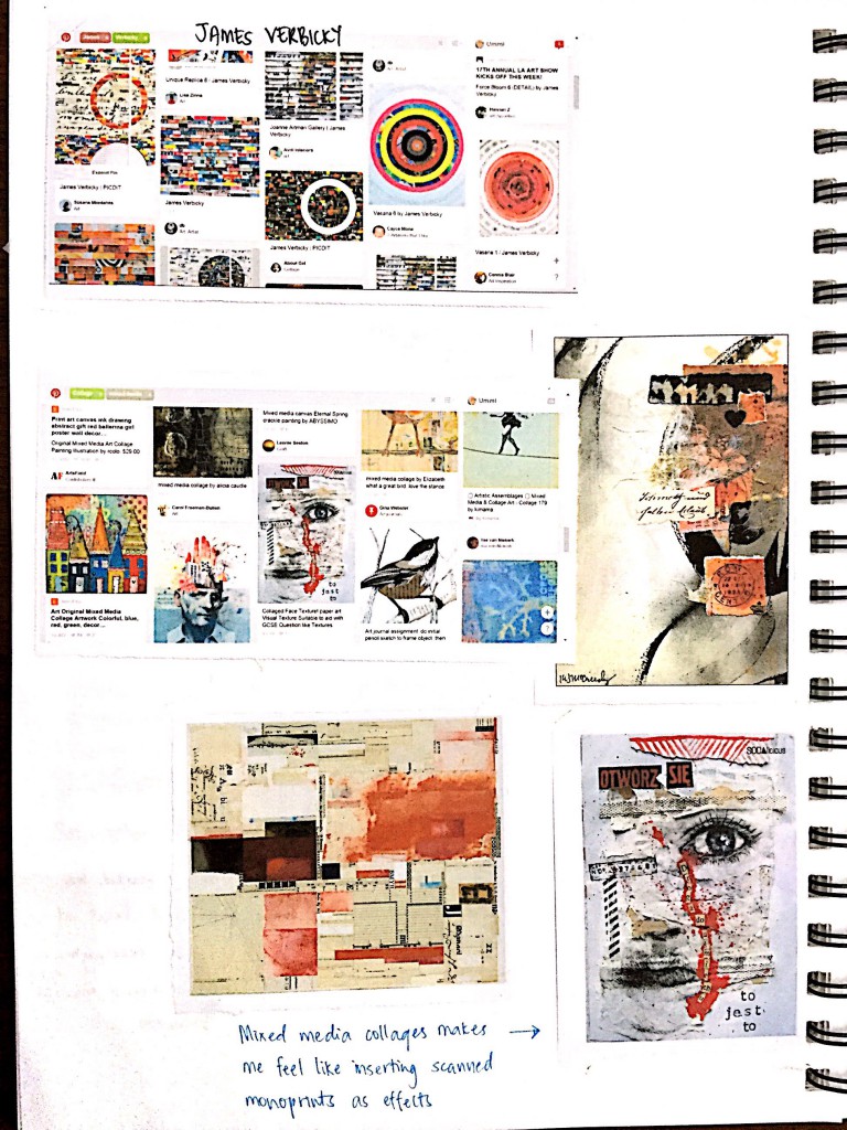
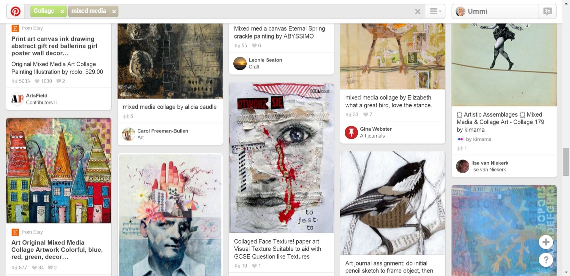
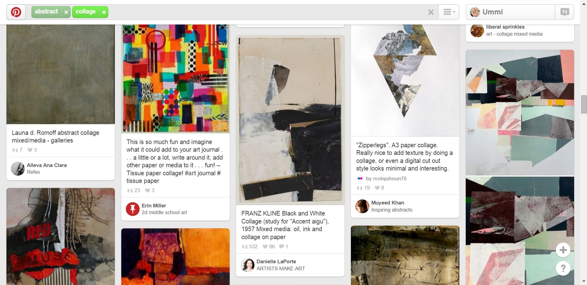
When the brief was given for this POV project, I decided to do collages, like cut and paste collages. So I head on to Pinterest to find inspiration on collages as well as finding out different artists all together.
Below are some of the inspiration tabs I screenshot while researching.
The colours attracted me the most. From far it looked like colour pencils aligned neatly, but it stated that they were actually rolled up magazines then collaged together. (Taken from: https://www.pinterest.com/pin/487725834626272330/)When I saw this, I was struck with an idea that I could find old art works stored somewhere in my house and simply tear/cut and paste to form the POV. (Taken from: https://www.pinterest.com/pin/487725834626272314/)I saw this collage and was in awe. The different prints formed such beautiful pattern all together. (Taken from: https://www.pinterest.com/pin/487725834626272608/)From the image above, I got to know the artist that did the collage and searched for more of her works on Pinterest.
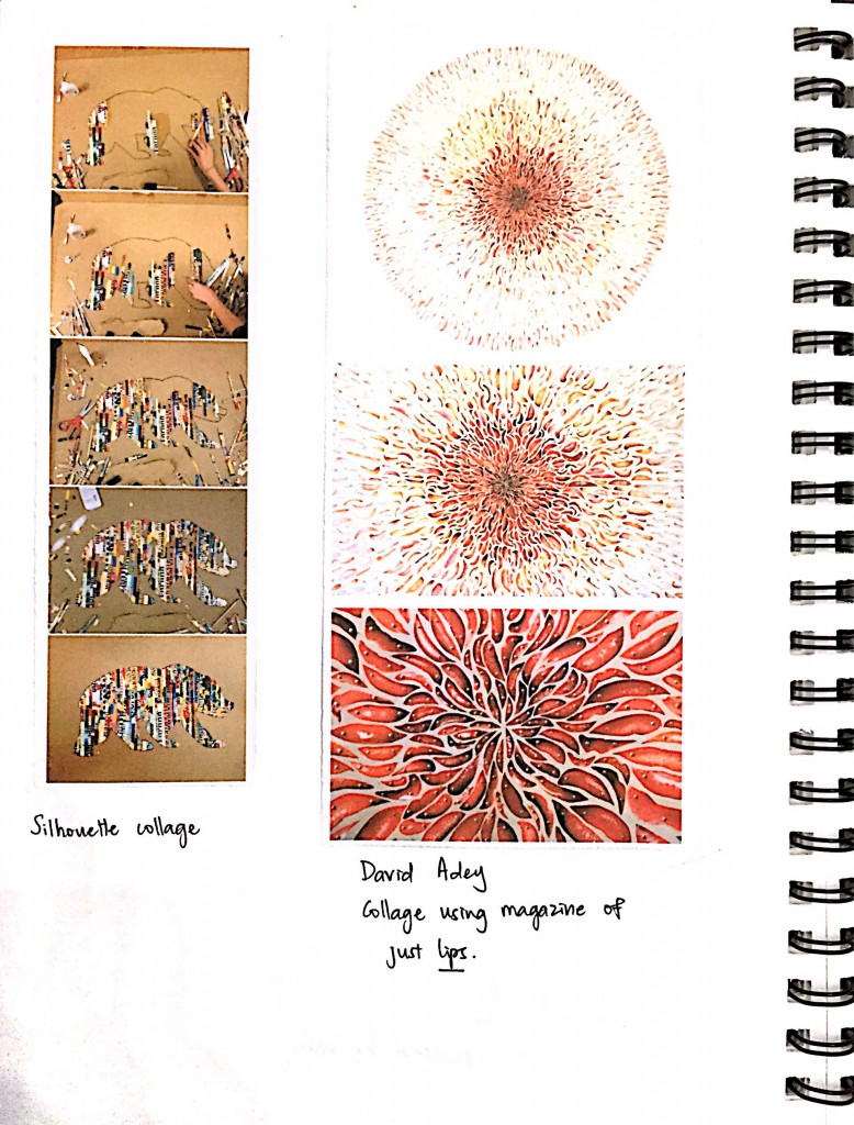
The list goes on when I further looked through Pinterest…I find that when you collage the image, lined it up nicely…. it made such a nice backdrop.Artist David Adey’s collage using lips from magazine (Taken from http://davidadey.com/Starbirth)Close up (taken from http://davidadey.com/Starbirth)I looked at abstract collages to get inspiration on how to not be too literal for the POV.
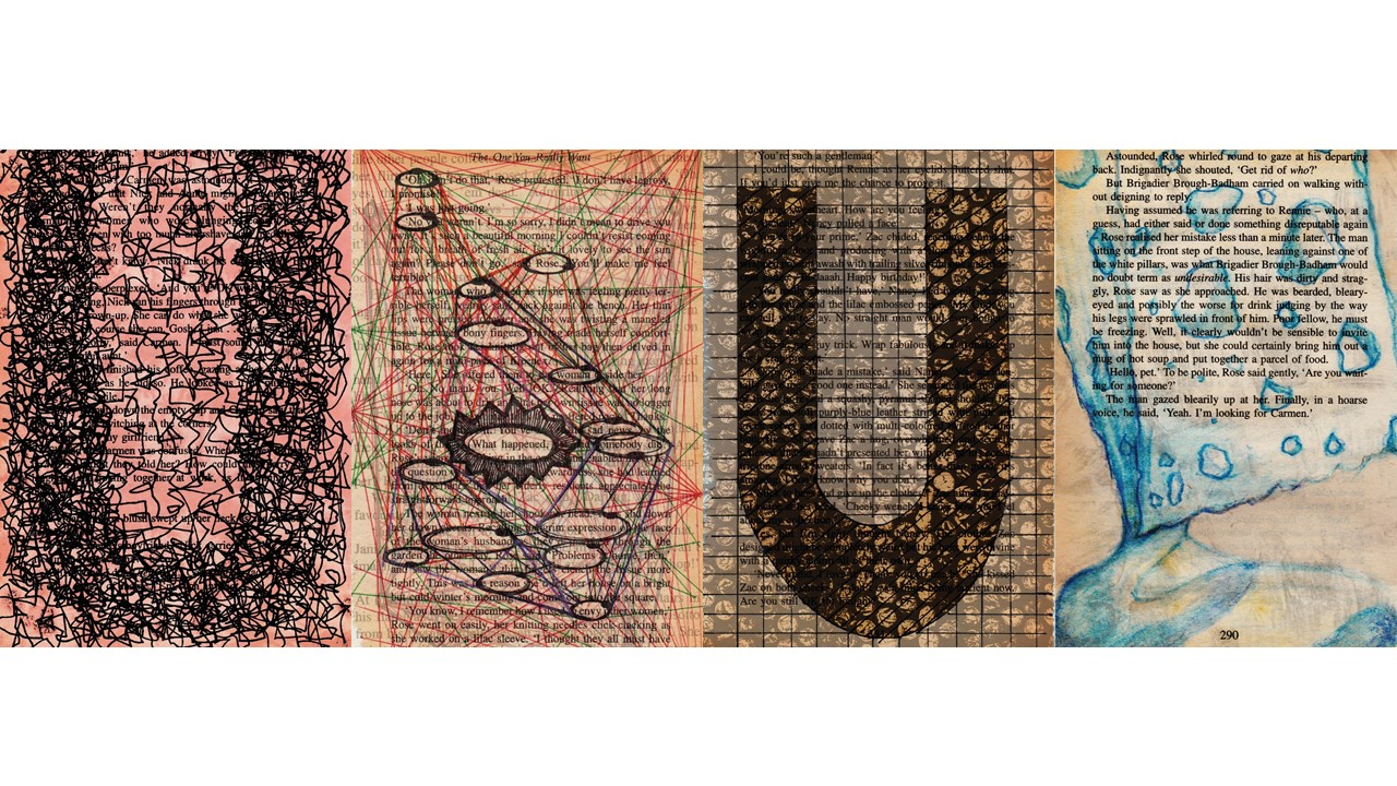
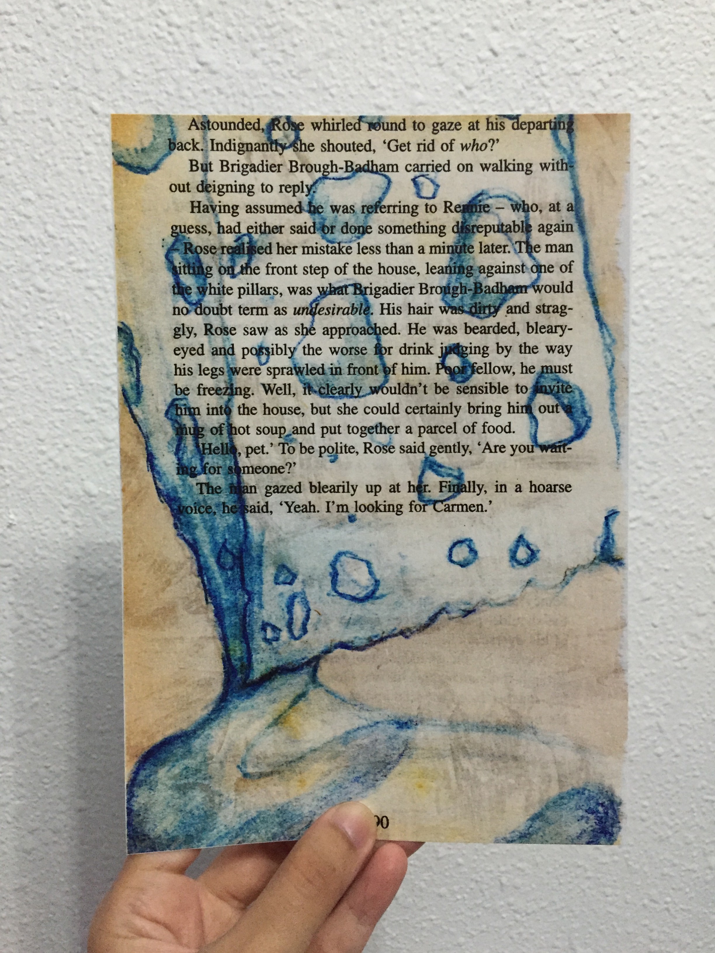
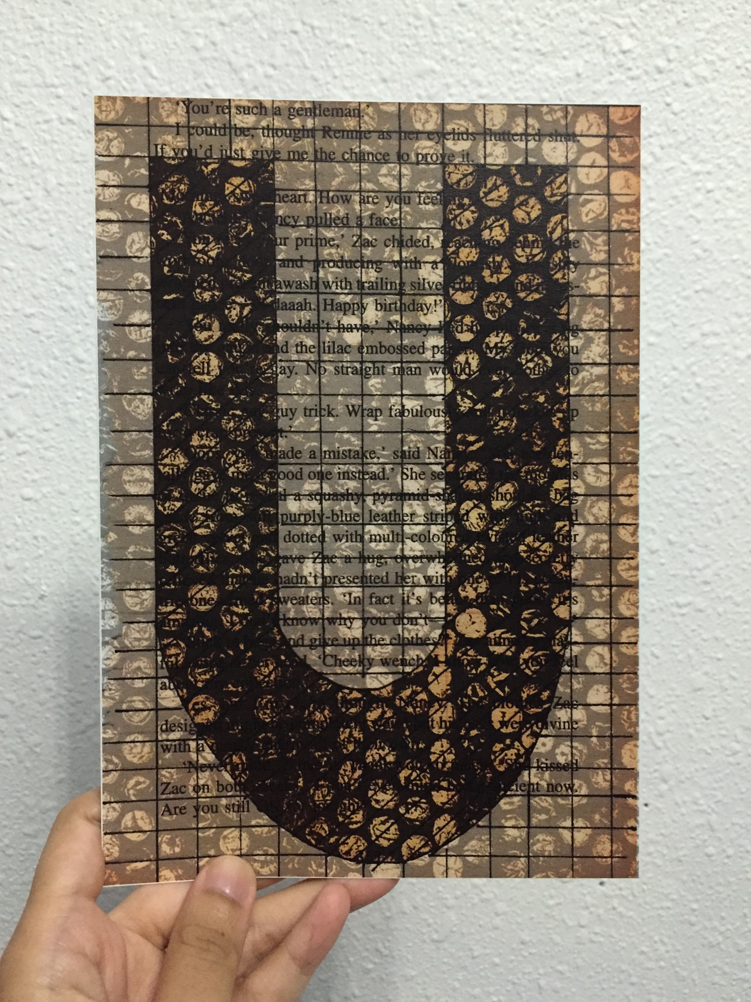
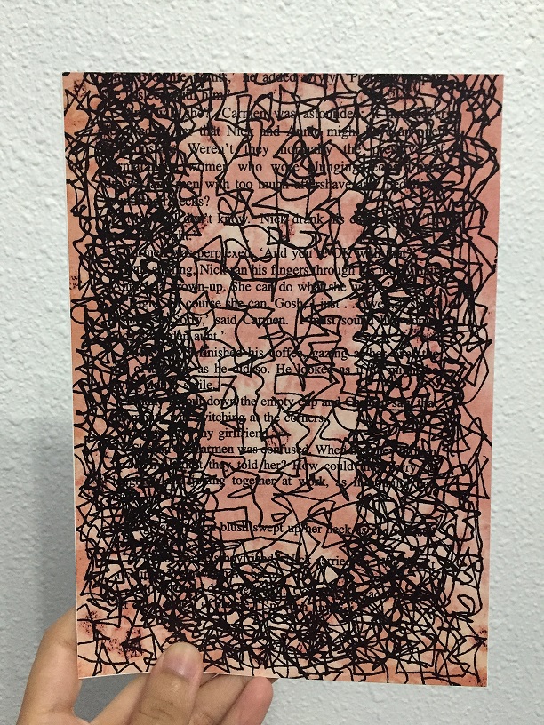
Below are the 4 final A5 and its description. These 4 pieces are book pages (torn from long kept novels) that was drawn on, some painted on, then scanned in, edited and layered scanned monoprints to get these overlaying effects. My typography in all these 4 final pieces are the initial of my name, U.
“MY NAME IS…”
“AND I’M AS ABSORBENT AS A SPONGE”
Because I find that I always tend to absorb information as much as possible, store them somewhere deep inside my brain, then amazed at myself for actually memorizing what was actually absorbed some time ago. Like the example I gave during the presentation, the house wifi password — at most it was an 8 digit password, yet I could just recite them without referring to any paper etc.
“MY NAME IS…”
“AND I’M SYSTEMATIC”
Most of the time, I tend to work step by step, follow the rules, and work simple. I like simple, minimalistic, as shown by just the grid lines that covers the entire book page. Systematic is represented by the bubble wrap textured monoprint.
“MY NAME IS…”
“AND I’M AS BUSY AS A BEE”
Bees are known to be hardworking, and I feel that hardworking and determination goes well together. The lines are like those dotted lines we always see in the children’s book when bees buzz around, only mine is busier. The background included salt effect from watercolour techniques, with the red complimenting the black lines.
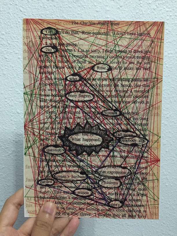
“MY NAME IS…”
“AND I’M LIKE SHERLOCK HOLMES”
Sherlock Holmes, detective, CSI can be in the same category. I like connecting the dots, solving puzzles and figuring out “mysteries” (not those scary mysteries, no) surrounding me. With that, I was inspired by the detective crime board on how they connect their crimes to their suspects etc, thus the lines all around the book page. Texts from another book page was overlayed to show the ongoing thoughts in the detective/Sherlock’s mind as to how they would solve their crime, just like how I always have thoughts running around my mind whenever I’m in detective mode.
(And the alphabet U here is actually hidden in these lines — referencing from crime TV shows that the hint that will lead you to your culprit is somewhere hidden in your crime board)