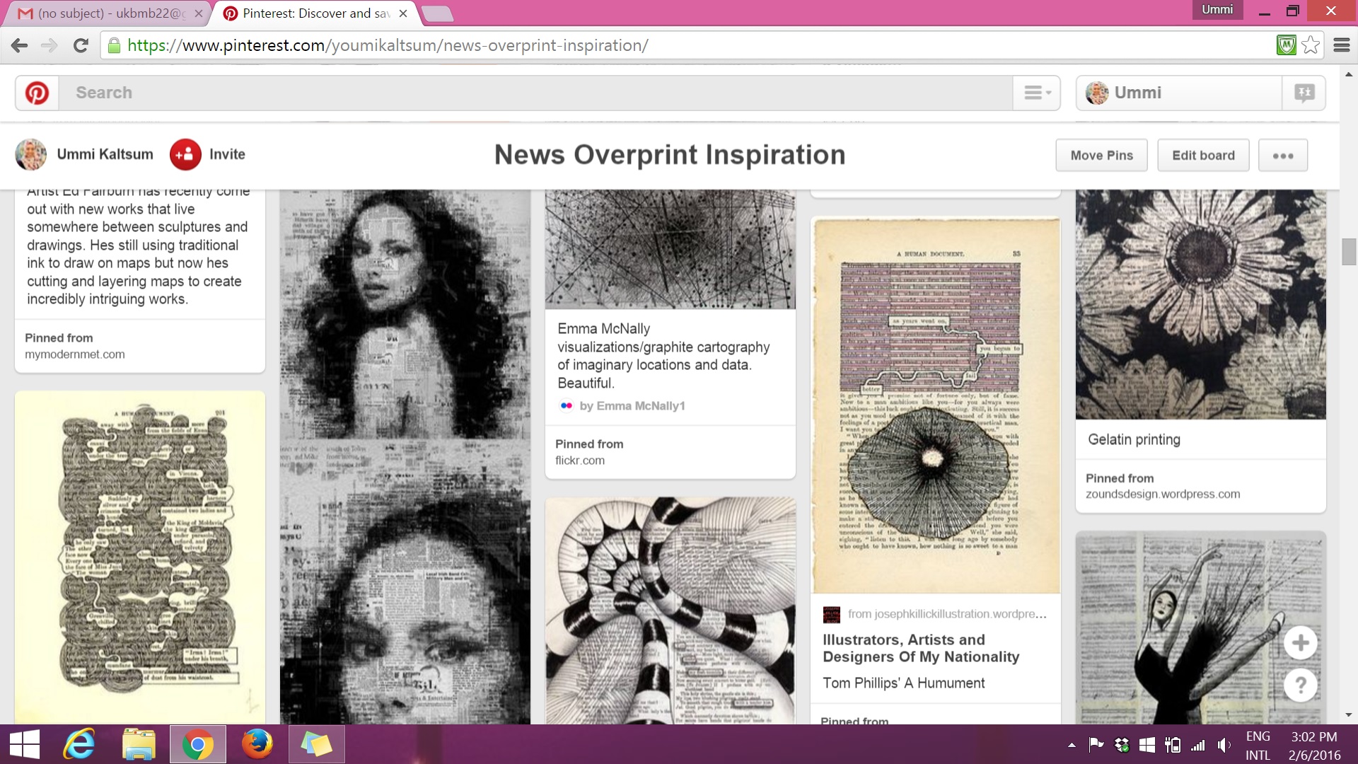
From the previous post, I mentioned my attraction and interest on the technique of News Overprint. So this post will hold a slightly in-depth portion on my research throughout the project.
More inspiration pins on Pinterest @ https://www.pinterest.com/youmikaltsum/news-overprint-inspiration/
(above) I used these images as an example of how I could incorporate designs into my own book page.
(above) I used these images to help me have an idea how I want to make the typography stand out within the designs in the book page. I thought alot of contrast between bold and light, negative space etc.
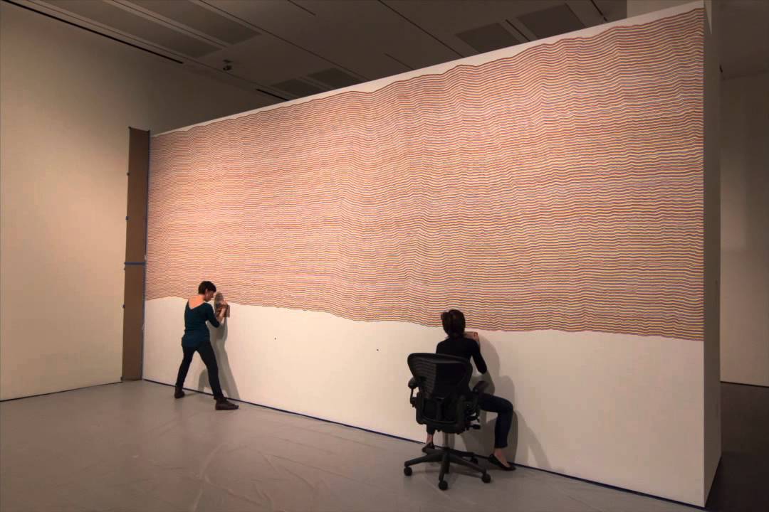
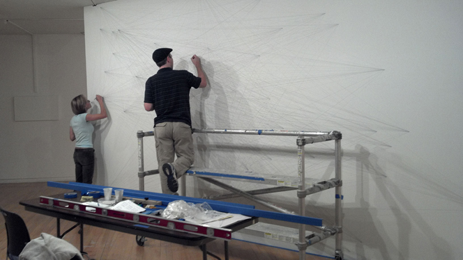
(above) I refer to Sol LeWitt’s wall drawing line works to see how I could portray my personality by using just lines.
There are other resources that I came across with that I found to be interesting to add on as an inspiration:
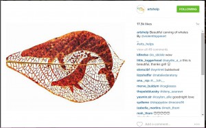
Instagram account @artshelp, unknown artist
Instagram account @artshelp, artist unknown.
Found in Twitter, artist unknown
The third image uses the same word throughout the work “HA”. The bold effect allows one to actually see what the message is, with its background faded.
“Virtual Typography” book found in ADM library
Another book found in ADM library
Repetition of heart shape resulting in patterns — which always attracts me
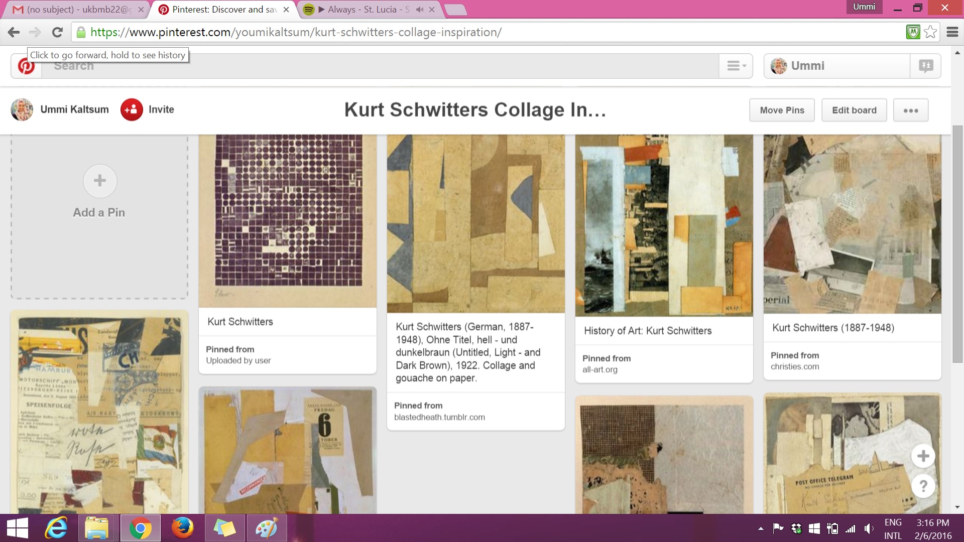
The 2 images below consists of Pinterest research on artist Kurt Schwitters on his collage works and the technique of Ephemera:
Continuing research on ‘Connecting Lines’ — I wanted to look further from Sol LeWitt’s line works, example: on how I could use these lines to form shapes or typography?
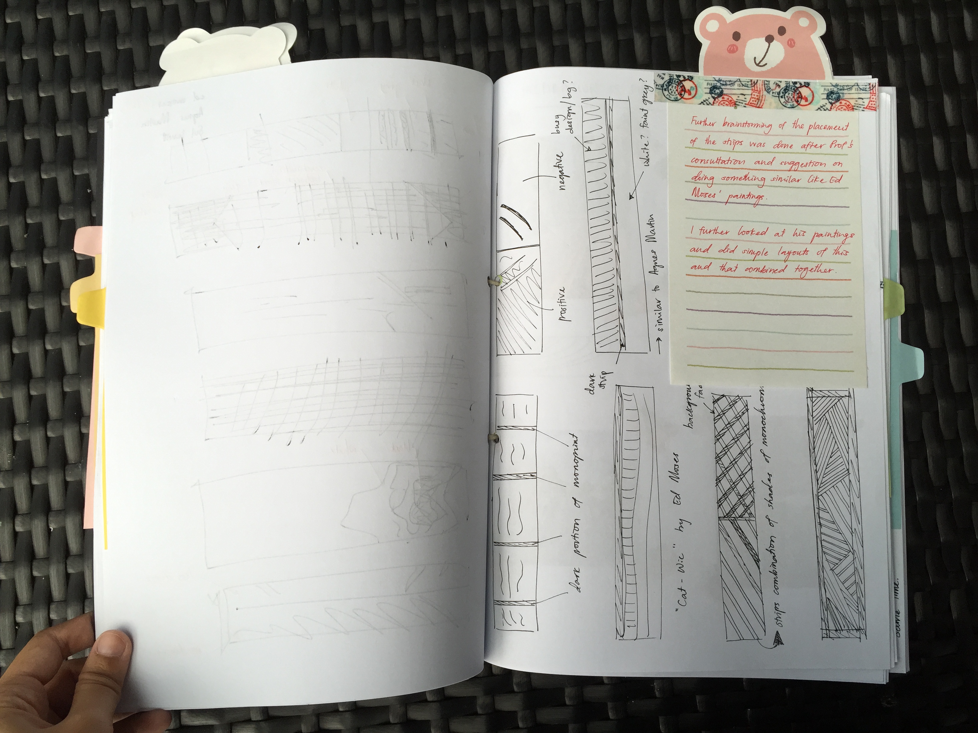
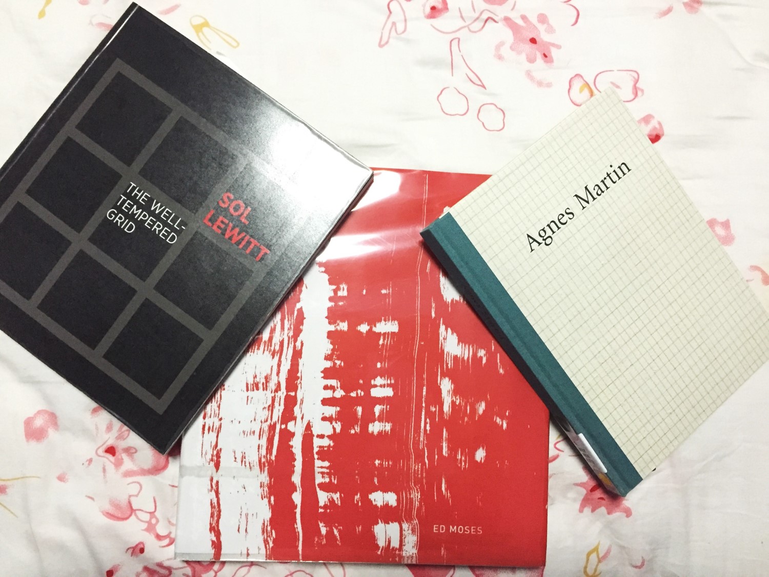
Besides Agnes Martin, I actually looked up on Ed Moses and a little bit on Sol LeWitt. So I went to the ADM library and borrowed these books (see below) for further reference.
Although the research of these 2 artists are brief, I managed to get some information about them and their techniques.
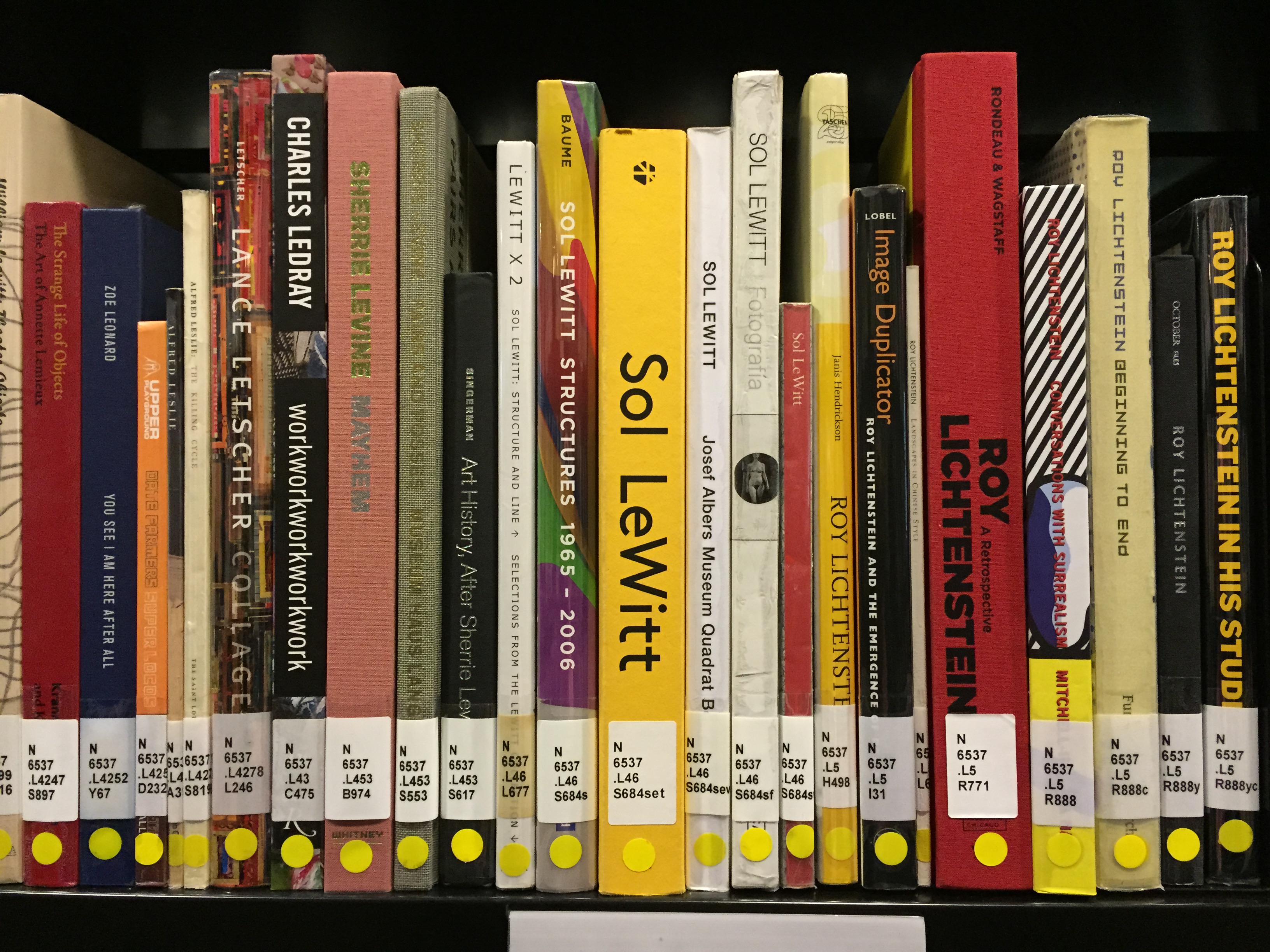
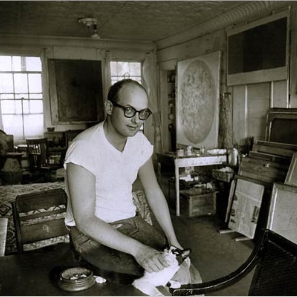
First of, we have Sol LeWitt.
Sol LeWitt is a leading figure of Minimalism and pioneer of Conceptual art. LeWitt’s work is characterized by serialization, repetition, and progression, exemplified by his iconic open-grid structures. LeWitt’s wall paintings are just about the same as Agnes Martin, lines are mathematically drawn. In LeWitt’s case, once he does the calculations and planning, he would get his assistants to carry out the work for him with specific instructions.
As you can see here, assistants does the work instructed by LeWitt.Installation of the wall painting. Accurately drawn by hand following specific instructions by LeWitt.
I actually watched a documentary before about LeWitt’s art techniques and how he works in the industry. They actually showed his assistants working on the installation — not 1 or 2, but at least 4 people working on a wide wall.
Next, Ed Moses, the artist.
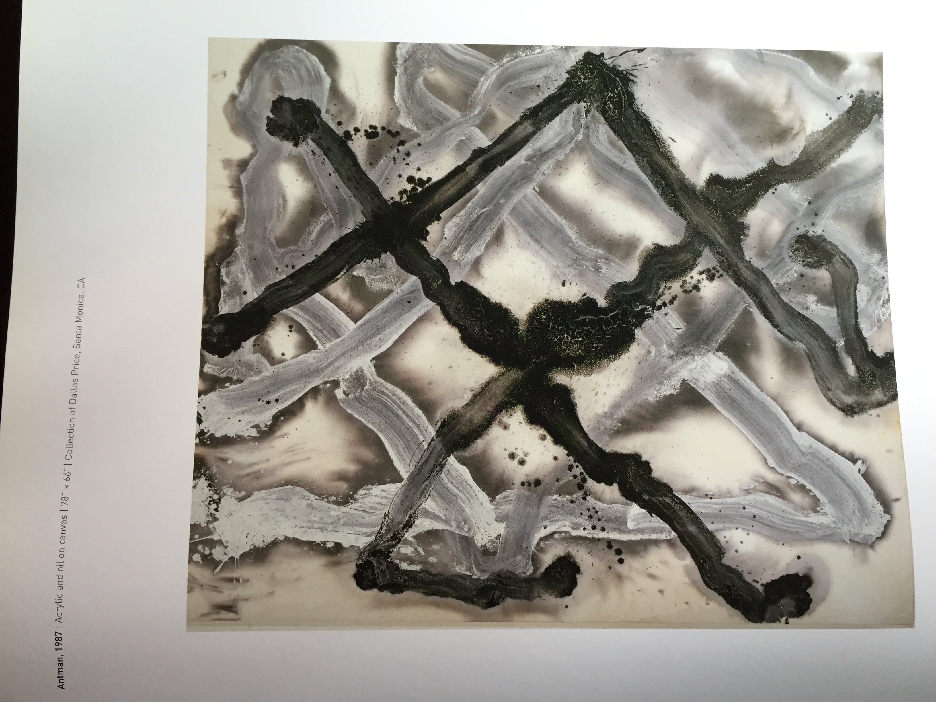
[CLOSE UP] Monographs of Ed Moses (and the process of his art-making) by Radius Books.
I considered myself lucky to have found the book (see above) in the ADM library. Although the weight was a total burden, I had to do what I had to do for research — BORROW IT!
In the book contained bits and pieces of the artist, his artworks, and FAQs. I admit I was solely interested in his artworks besides anything else. But I picked up a few information from the book as well.
Ed Moses…..
Prefers taking risks, moving beyond what he already knew
Focuses on profound possibilities and challenges of abstract painting
Thinks that painting is an adventure whose ultimate reward is knowledge of self
Techniques
Mainly uses watercolours for his paintings
Multi-coloured to monochrome
Structure of diagonal & parallel lines
Early paintings formed by a grid
Concept of “Playing with Chaos” — painting without rules or preconceived compositional goals
Works on both sides of the canvas, allowing bled through ghosts from one side to prompt composition painted on unusual materials with unusual tools
Interesting information of his techniques are actually the materials he used for his artworks. As stated above, he uses unusual materials like raw mahagony and unstretched canvas; unusual tools like long-handled mops, sponges and squeeges, besides normal rollers and brushes.
Paint with spray gun — using insoluble mixtures of oil paint, acrylic & shellac
Here are some snapshots of his artworks from the book. (I should have done proper citation of the images. My bad!)
LOOK AT THE GRADIENT!
Most of the time when I continued to flip the pages, I was in awe with how contrasting and bold Moses’ artwork are.
In conclusion with these 2 artists, I mainly looked at their artworks for inspiration and motivation to continue coming up with whatever I have at the back of my mind. I didn’t really plan to follow this artist to that type of art piece, I just do without thinking. Then when Prof Ina mentioned mine had some of Agnes Martin’s work in the monoprint etc, I was like…… “really?”
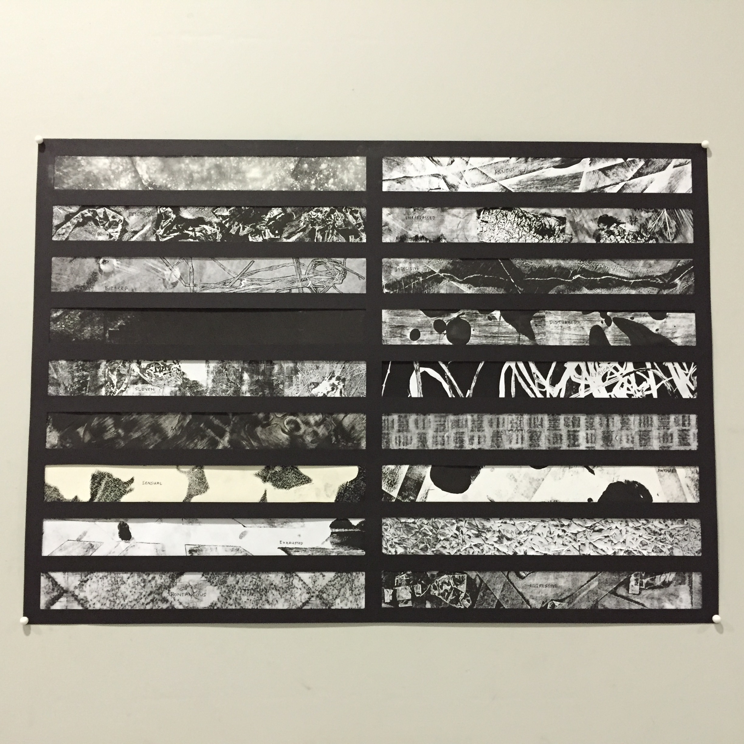
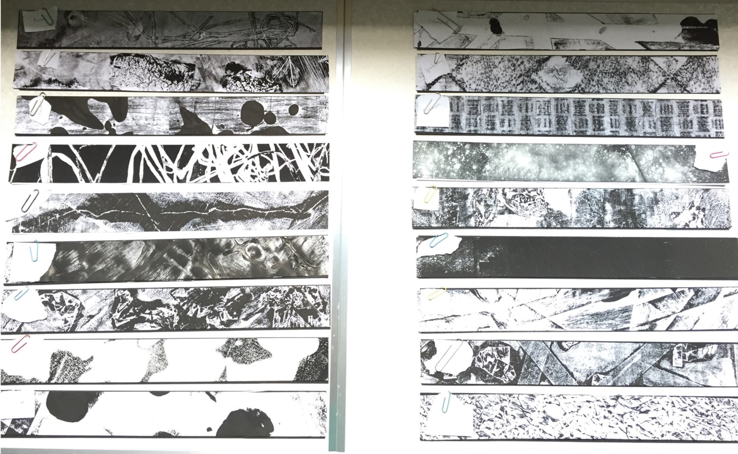
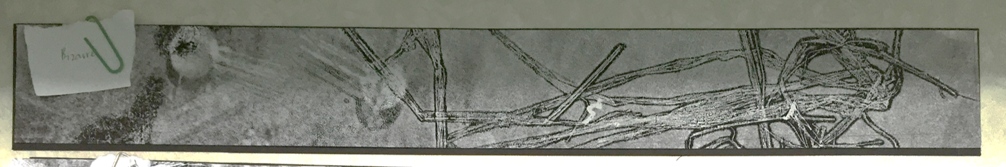
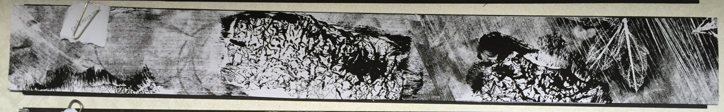
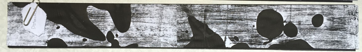
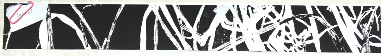
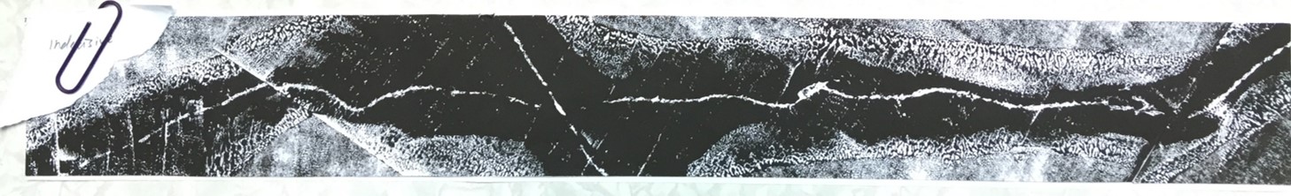
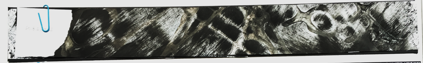
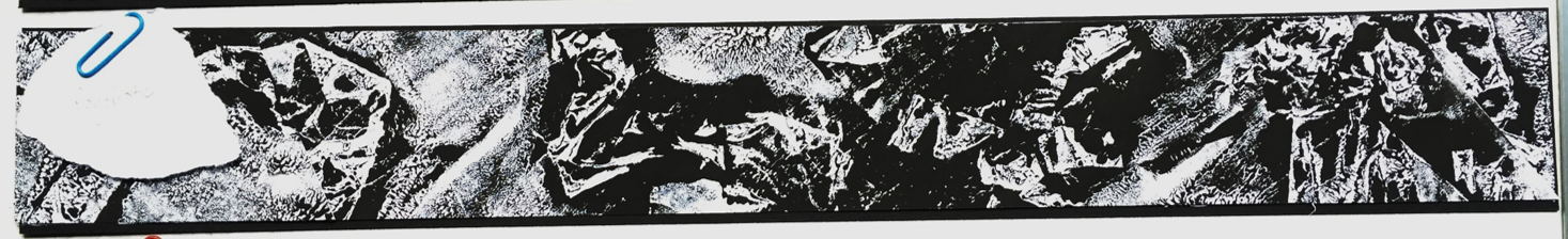
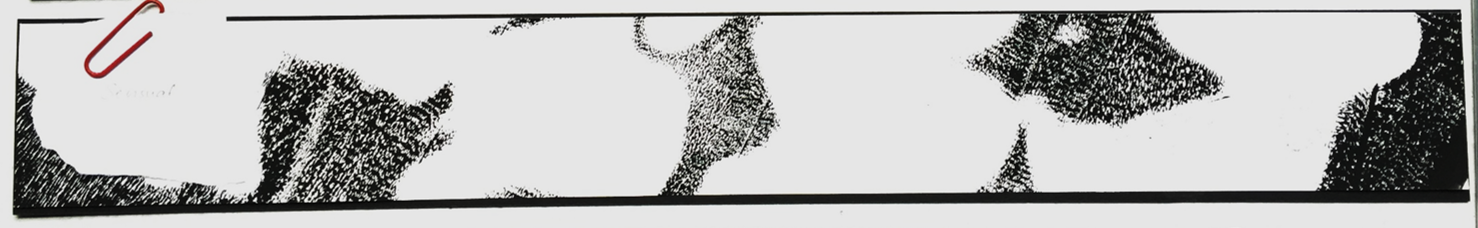
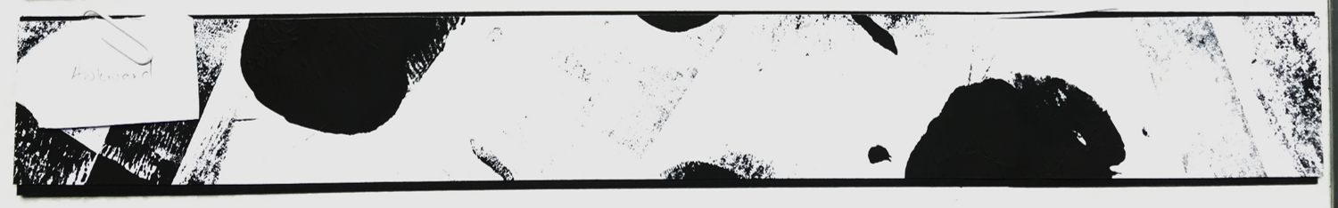
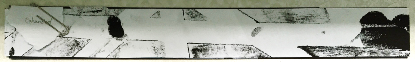
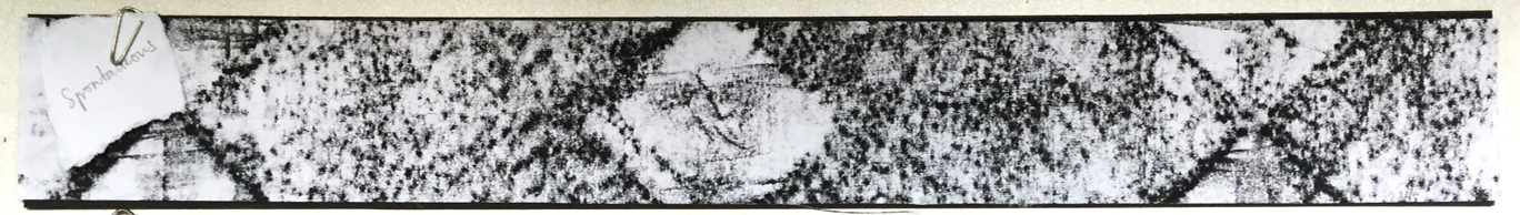
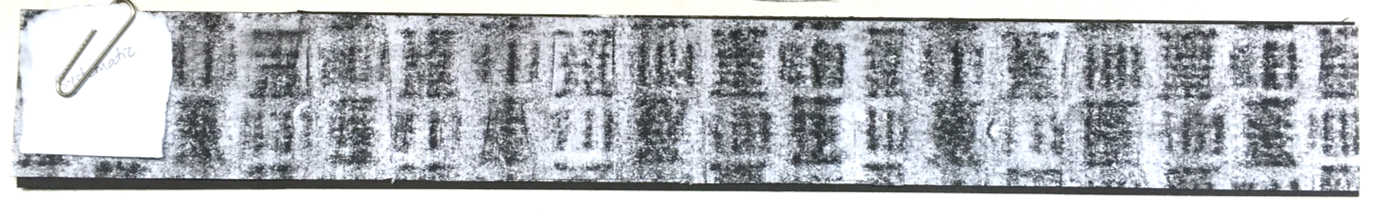
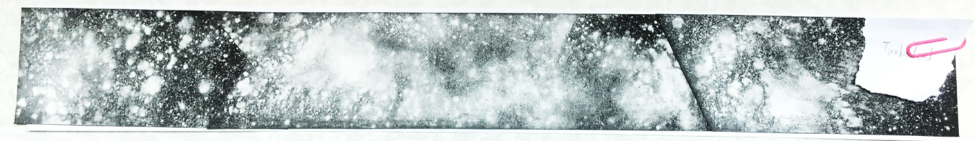
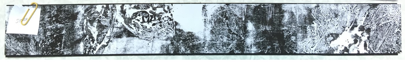
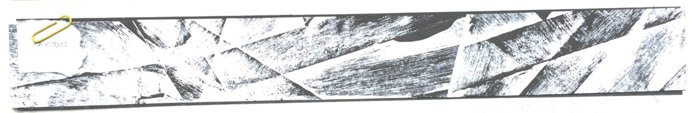
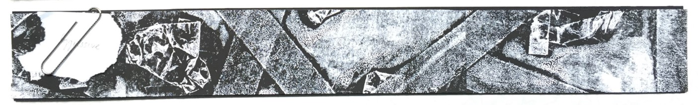
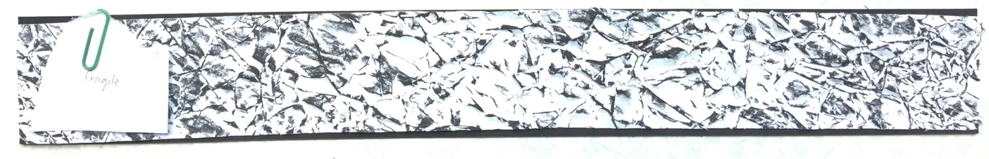
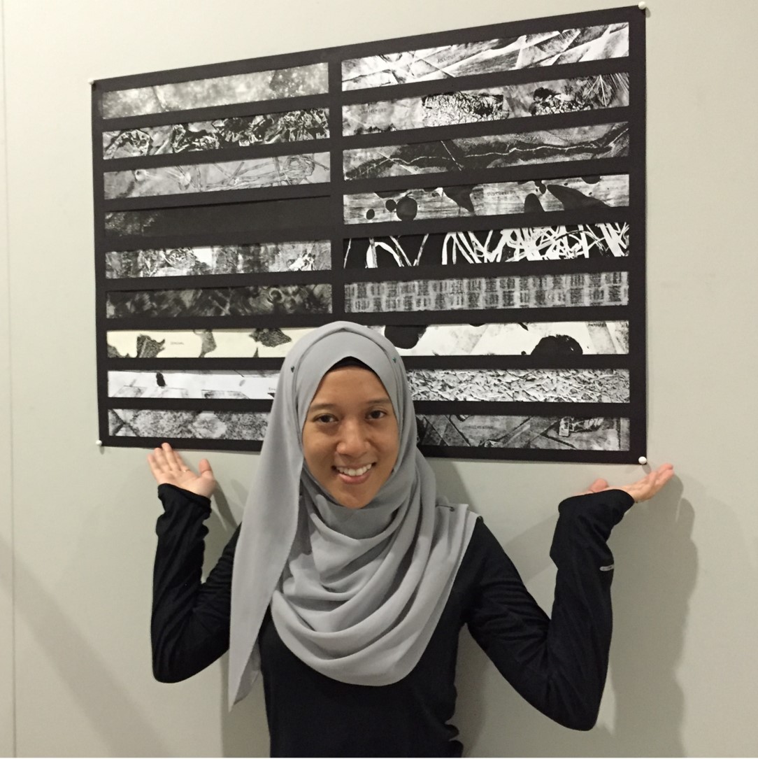
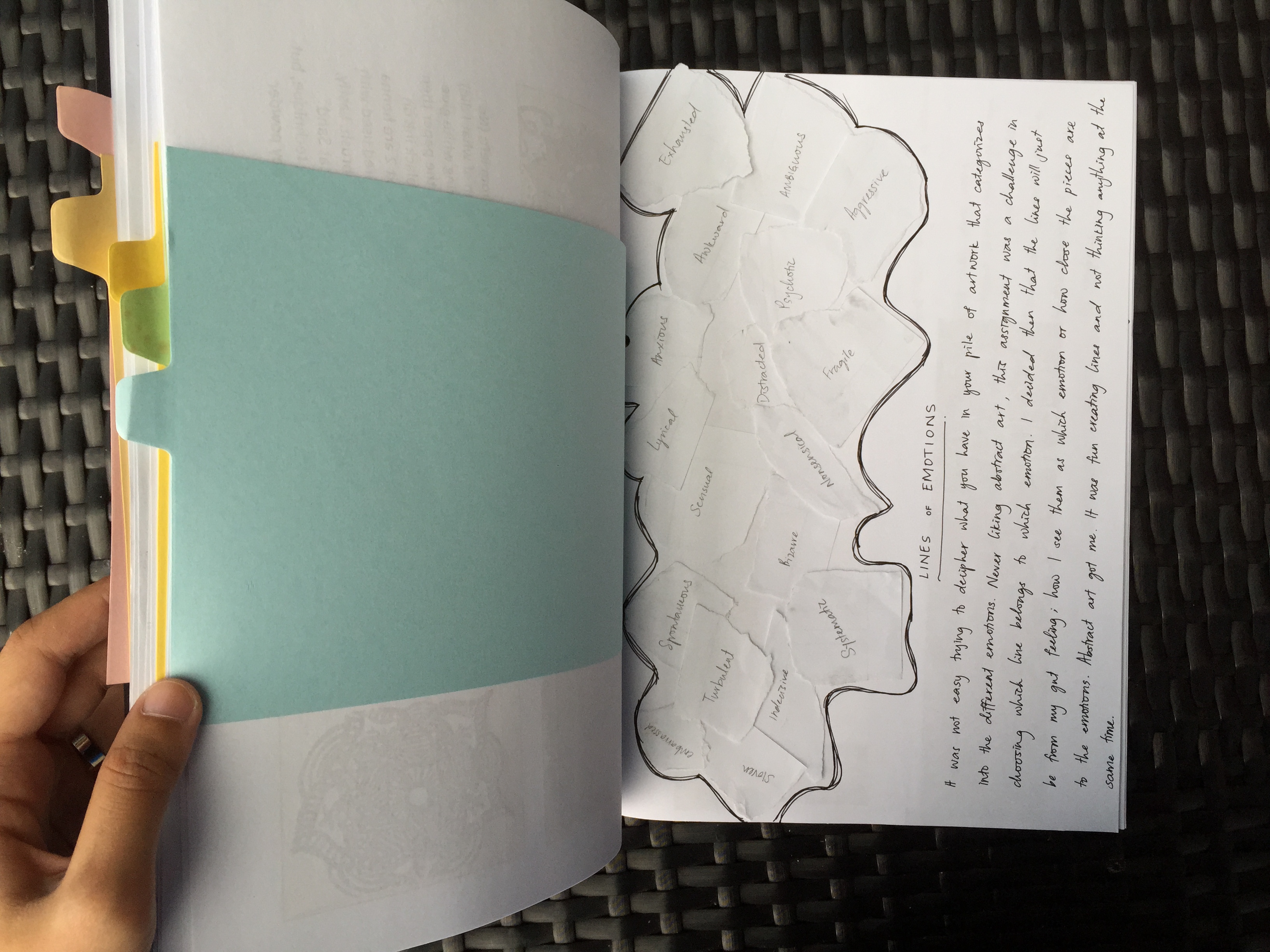
These are the 18 strips without its windows. Left column, top to bottom: Bizarre, Embarrassed, Distracted, Lyrical, Indecisive, Ambiguous, Psychotic, Sensual & Awkward Right column, top to bottom: Exhausted, Spontaneous, Systematic, Turbulent, Sloven, Nonsensical, Anxious, Aggressive & Fragile
Just like in design terms of “Form follow Function”, this assignment had the term of “Lines follow Emotions” where we had to mix and match the different abstract lines we have to the following emotions.
When I was trying to sort out the lines to go with which emotion, I was mostly stuck on how one actually see the lines as nonsensical for example. However, I decided to just go with my own interpretation of how each line represents the emotions.
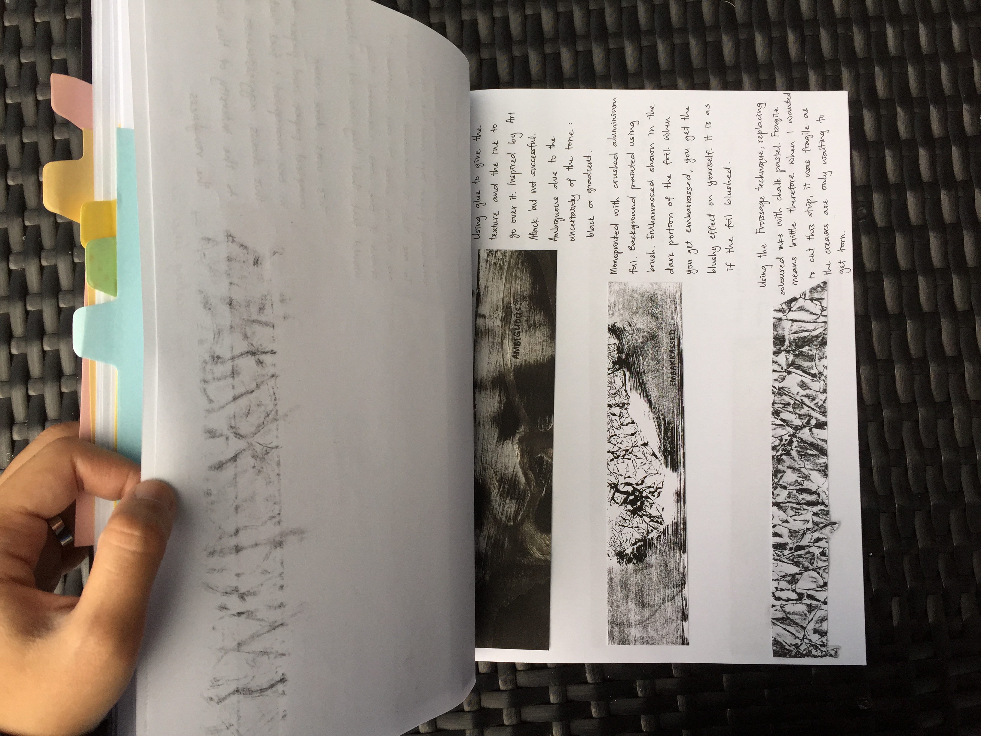
Bizarre in a way that the lines are interrupted with a weird looking key patch that stands out among the greys.The contrast between the tone in the monoprinted sheet. I was thinking at the moment “when you get embarrassed, you tend to blush” so the darker tone in the strips represents the blushing effect among the rest.When one is distracted, their mind tends to get messy with all the different thoughts at the back of their mind. Therefore, this was chosen as ‘distracted’ as the blobs of ink represents the bubble of thoughts in one’s mind(?)Lyrical somewhat means expressive, rhythmic or some sort. Therefore I cut out a portion of my monoprint that has lines flowing as if you can see musical notes floating along the lines.“I want KFC. No wait, MacDonalds. No no, Burger King….. or Long John Silver?” Just like you get indecisive on what to eat for lunch, these lines get indecisive on where they want to go. In the end, all went separate ways.Method of spamming glue spontaneously to actually create texture when it dried up (but i failed). Ambiguous in a way that the tone is not certain and you actually don’t know what is happening either — as some part of the strips are bold, grey and white.When I think of psychotic, I think of the show Criminal Minds — shows the different signs of psychosis. I interpreted it in a way that I would collage certain parts of the monoprints to create something ‘insane’. For example, I see a face at the right corner of the strip, a scary T-Rex’s mouth opened wide & etc.When one think of the word ‘sensual‘, it always got to do with one’s body. (I thought of it like that) So, I represented my emotion of ‘sensual’ with curvatures as it shows sexiness. As if it’s a body shape of a lady or somewhat. The background is bold so the curvatures actually stands out.This strip was a cut out portion from my piece of somewhat Decalcomania technique. When one is awkward, one tend to stay as far as possible from the crowd. Therefore, the blobs of ink are actually at a distance from one another thus you can feel the awkwardness around them.This strip was a monoprint consisting of paper tape and blobs of ink. “I am exhausted, I have no energy left to continue this activity.” Putting this interpretation with the lines I have, the blob of ink at the right corner of the strip actually shows that it is on the verge of finishing/depleting thus it looks exhausted.Method of Frottage was used with chalk pastel. Spontaneity is the action of being natural. For example when one gives a speech, they actually don’t refer to anything nor prepare but words just flow of them. Interpreting from that, I thought this piece was spontaneous with its symmetrical shape. The reason was because humans tend to like symmetry and it is actually a natural and common thing. (i do)Systematic is all about the rhythm and repetitive patterns. This piece was also done using the Frottage technique of a table mat. It falls under this emotion perfectly for its obvious reason — repetitive patterns.This piece was done using baby powder. I painted the paper with black ink and then upon drying, baby powder was spammed onto the paper. (A little bit of fixing with hair spray to keep the powders stuck to the paper but I think it was unsuccessful). Think of being in a flight and then it’s going against strong wind. I thought of that for this emotion. Therefore, with the chaotic spread of the powder around the paper, I think it shows the turbulence.This strip was chosen to show the emotion of sloven as the strip is filled with messy components.This piece was nonsensical in a way that it doesn’t make any sense at all. Even when I was experimenting the scraping of wet paint with a tip of a paper clip.When you’re anxious, your muscles tend to tense up. In this piece, I interpret it in a way that the intersection of the paper tapes grew tense as the different sides get pulled.The monoprint used to portray this emotion has this bold effect that make the whole strip stands out. The texture of the paper tape and the creases of the crumpled paper scattered around shows that more force was initiated. Aggressive in terms of the sharpness and the intensity of the texture.When you think of fragile, you know it has got to do with things that are brittle and tender loving care. This strip was done using the Froissage technique, chalk pastel ran over the creases to give the effect. The creases represents the cracks and it was actually fragile when I was cutting it due to the creases.
With all these strips, it was then compiled and sorted out to their windows… (see below)
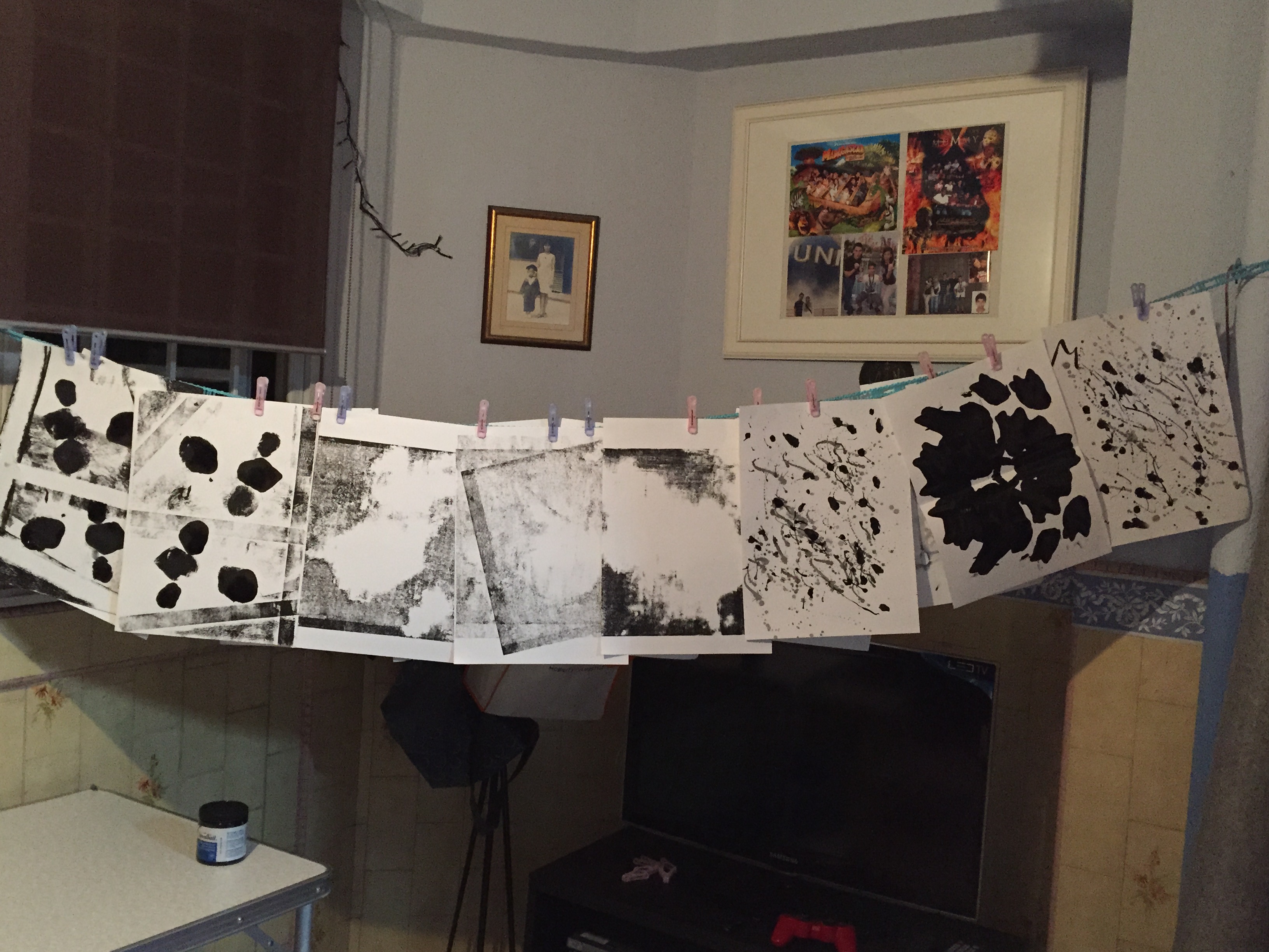
Cover page of my hard copy journal. It is a compilation of the research and techniques I did throughout the assignment.Flipping the pages til its at the experimentation technique of Decalcomania/Rohrsachach Test. After trying out one that was lacking of ink (and drips of water), I tried out with blobs of ink on the paper and then pressing it down and getting bold effects.Experimentation technique of splattering (or dripping) paint inspired by artist Jackson Pollock. I actually find the technique therapeutic as it took away the frustrations I was having during the time. I ended up feeling slightly relaxed right after. And then I did it again…Experimentation technique of Froissage using chalk pastel instead of soaking the paper with ink. I like how the tone complements the creases and from afar it look more like a mosaic.This page consists of planning of how I would come about collaging the sets of monoprints. These lines drawn were referred from Ed Moses’ artworks — how the lines are placed etc.This is an overview of the emotions and some reflection I did about trying to sort the lines with the emotions.This shows 3 out of 18 lines interpreted and sharing of the techniques used for the various strips. (There are more of the strips in the hard copy journal itself only that I took a few)
“A Line is a dot that went for a walk.”
Throughout the assignment, I made full use of the layout pad to compile everything I have done into the hard copy journal. It consists of doodling, inspiration images I captured, the different experimentation of automatic techniques, and personal reflection based on research and consultation.
The line definitely went for a walk last Friday during submission and it’s not coming back anytime soon.
I always have these ideas at the back of my mind when I have some “me time”, so I decided to have another session of self monoprinting at my balcony.
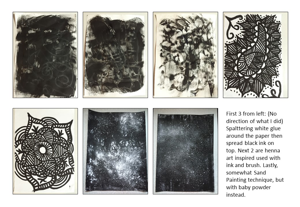
So I decided to try several techniques, as attached in the set of pictures above:
Top set contains the techniques of Decalcomania
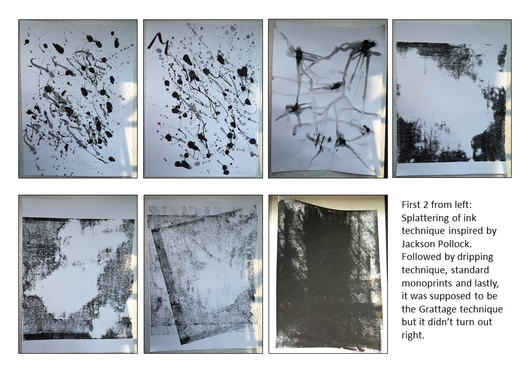
Middle set contains mixture of inspired Jackson Pollock splattering of paint technique, standard monoprint, and the dripping of paint/ink technique.
Last set contains inspired Mehndi or Henna art (4th and 5th from the left), inspired Art Attack technique of painting over dried glue (first 3 from left) but it failed when the glue flattens as it dries up, and, technique somewhat similar to Sand Painting except the minus off the glue and the sand and replacing it with just baby powder.
*Just some reflections*
I had this thought to myself whereby I feel that most of the time when I do these monoprints and automatism techniques, my mind would be completely blank. Sometimes during the monoprint sessions, I would just loose myself into whatever I was doing, using whatever resources and not actually thinking what I want to achieve in the printing. For example, putting this and that on the mat. Or when trying out the Rorschach tests, I don’t try to draw anything in particular, I just spam inks here and there and that’s what I get.
On the other hand, while trying out the Jackson Pollock technique, I was splattering the ink while I was feeling rather upset, and as I splat more inks, the emotions followed and I actually felt better when I was done.


![[CLOSE UP] Monographs of Ed Moses (and the process of his art-making) by Radius Books.](http://oss.adm.ntu.edu.sg/ummi0001/wp-content/uploads/sites/329/2015/09/EDMOSES_1.jpg)