Tag Archives: collage

POV: Final

Recap: Point of View of a Nike Shoe

Let us play a guessing game! Maybe you could fill in the blanks?

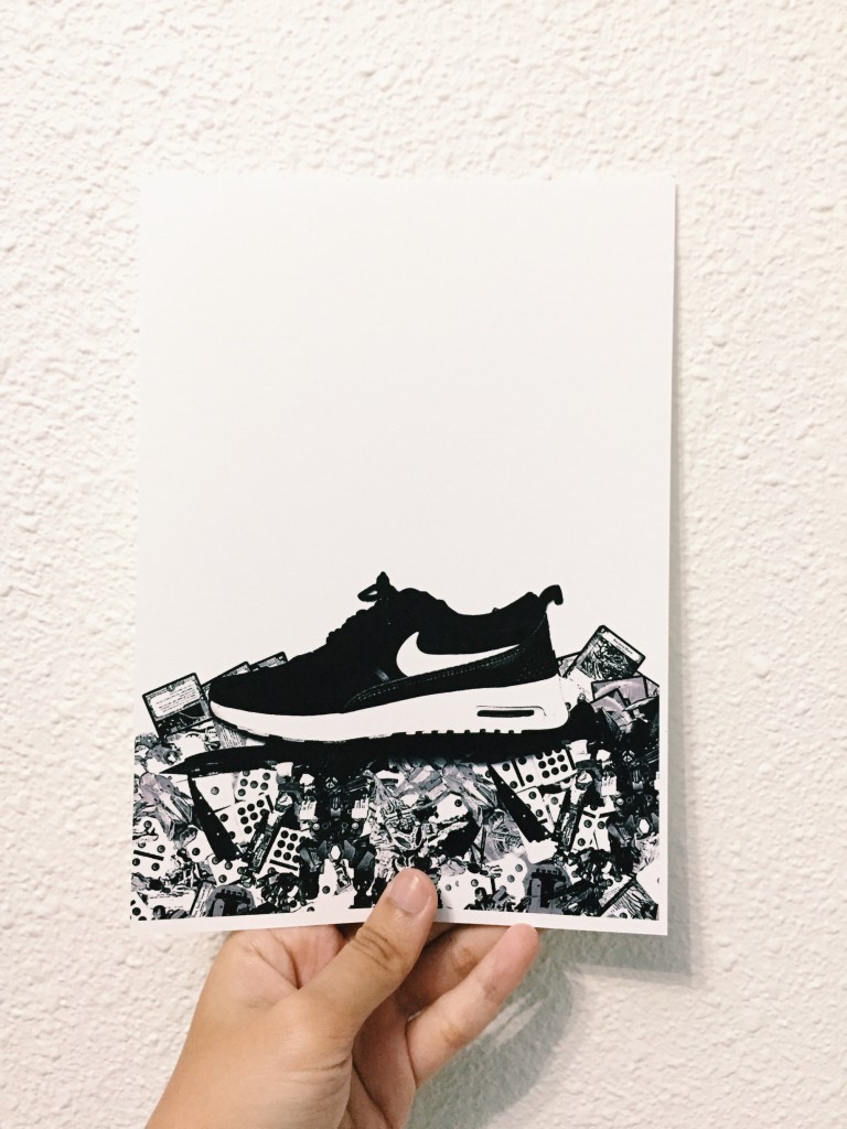
Here are the final outcome:
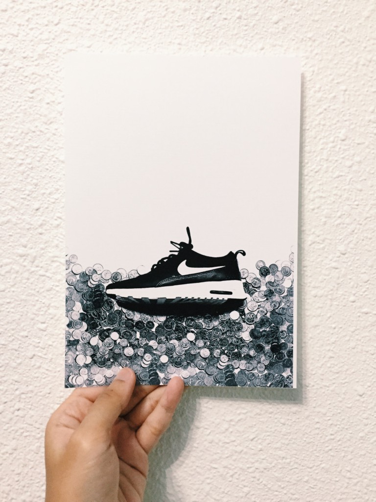
Processed with VSCOcam with c1 preset
A Nike shoe from the point of view of child labour is _______.
Processed with VSCOcam with c1 preset
A Nike shoe from the point of view of life is ___________.
A Nike shoe from the point of view of trash is ______.
A Nike shoe from the point of view of tourists is _______.
A Nike shoe from the point of view of a parent is ________.
A Nike shoe from the point of view of child labour is __________.
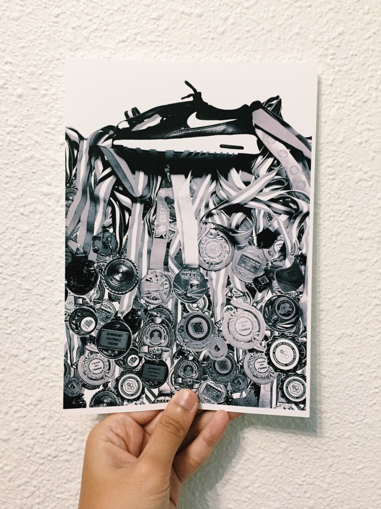
A Nike shoe from the point of view of an athlete is ________.

POV: Digital Collage WIP

There was a first collage trial, there’s always a second. The collage was not completely done as I just put it all together without editing as much.
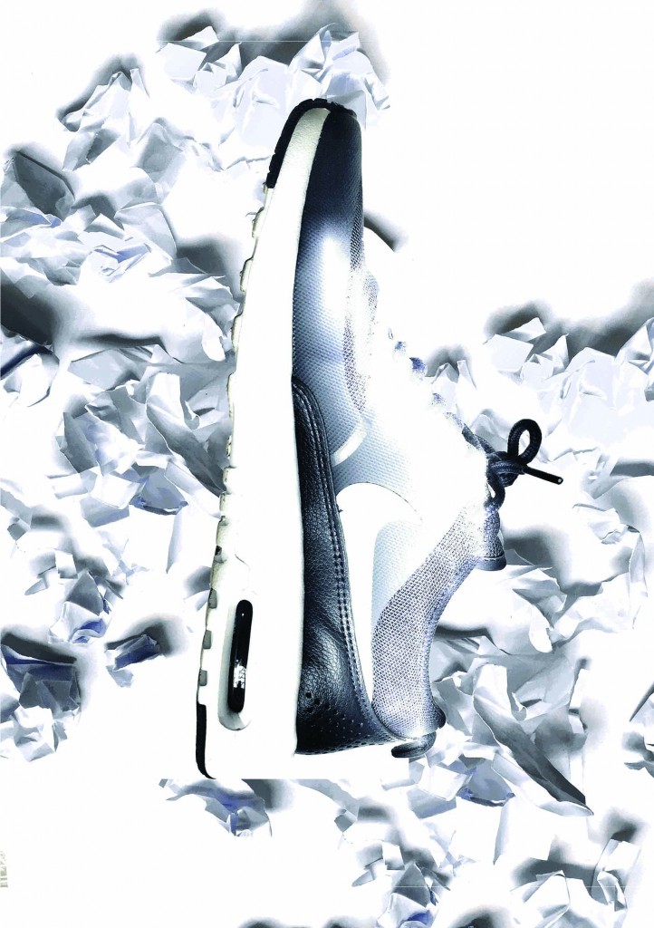
Collage 1-Recovered
(Caption was not decided)

Well, at this stage, I have not come up with a solid idea of how the collage will be. I think I didn’t even include the synecdoche into the collage. All I thought of was to use whatever resources or elements I have at home, scan them and collage them. Yes, you got it right. I scanned my Nike shoe.

After consultation, the Nike shoe will be the constant object in this POV project. We looked at consumerism, sweatshops in Nike and child labour. The collages are arranged following the rule of thirds, showing how much or little impact it has on the POV. So, these are first drafts of the collage with the possible POVs:
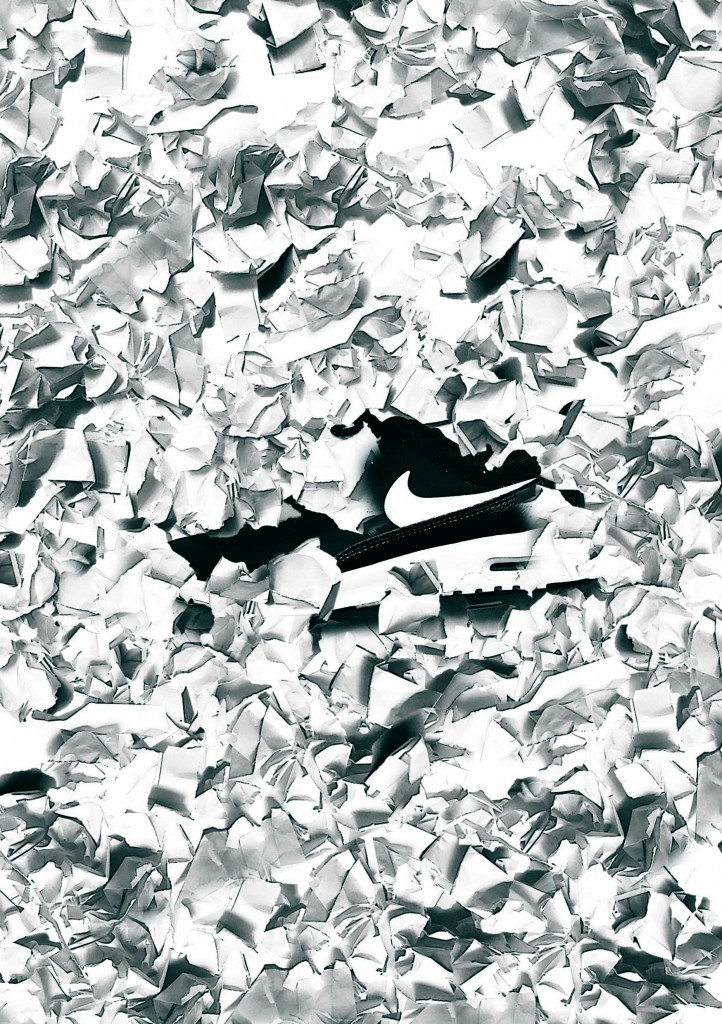
Nike 1_covered low
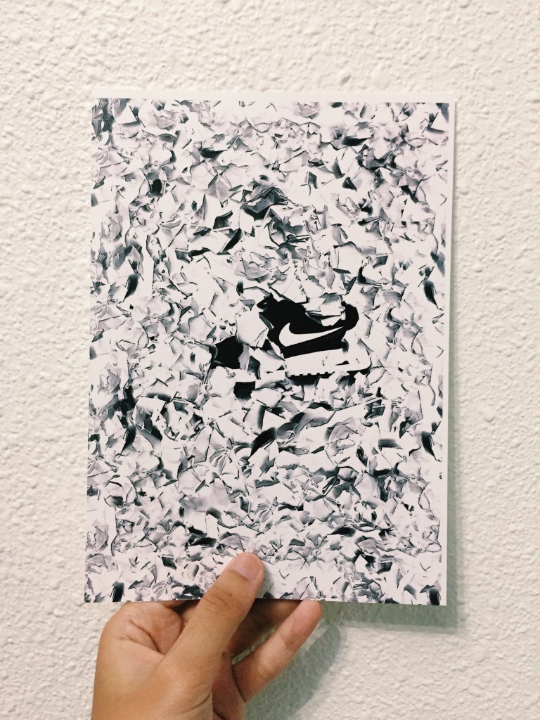
“A Nike shoe from the point of view of shelf life is not forever.” (I might have to rethink about this caption)

Concept: using crumpled paper, representing trash. Nike shoe is surrounded with crumpled papers, slightly covered. From here you can see the message that I am trying to bring forward: that even nice branded shoes will not last forever because if you constantly put them on, it’ll eventually get worn out and the last place it’ll be in is the trash bin.
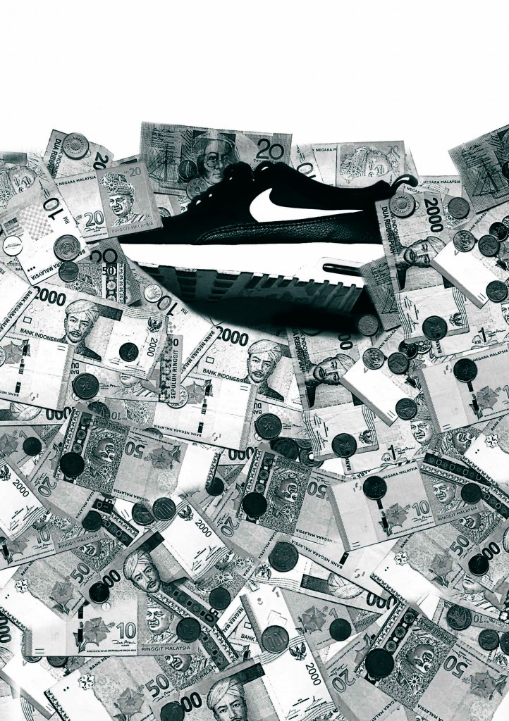
Nike 2-1-2
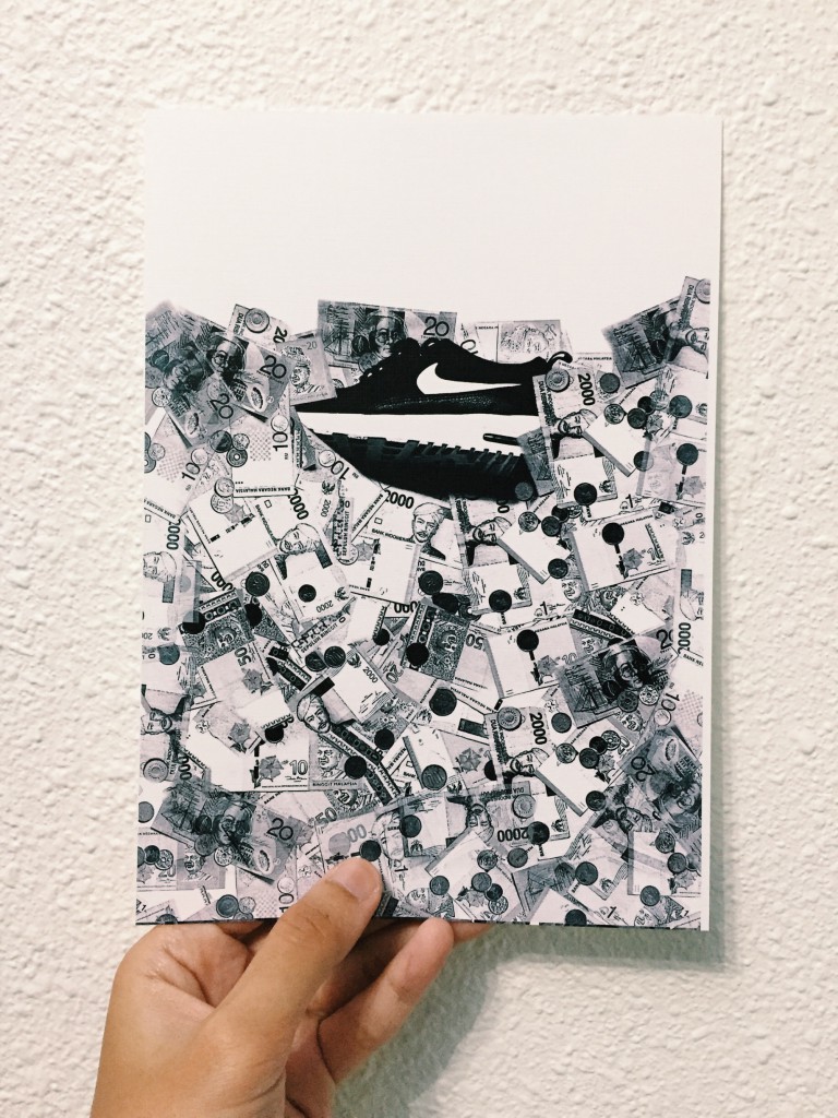
“A Nike shoe from the point of view of foreign currency is profit.”

Concept: foreign currencies representing the different countries that one can buy Nike shoes from. We know that when you buy overseas, it is just easy money for them.
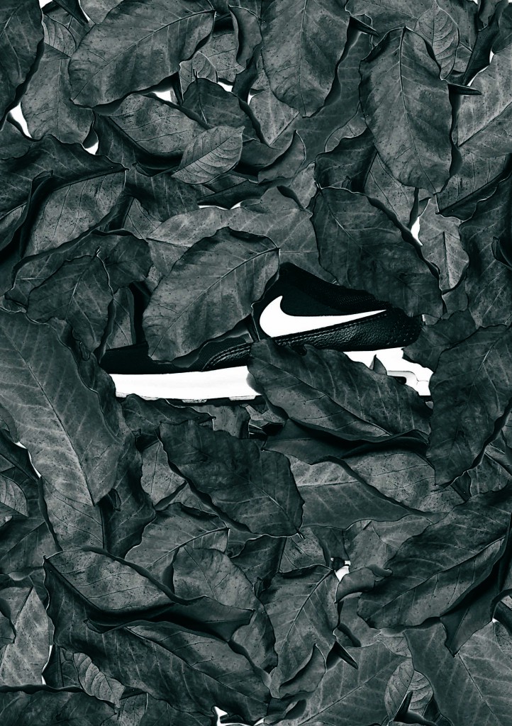
Nike 3_1_covered low
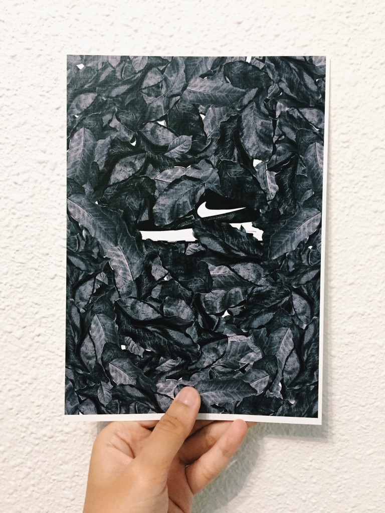
Caption not really decided, but it’s similar to the crumpled paper.

Concept: Similar to the crumpled paper as mentioned, the concept of not lasting forever. Because leaves dry up and they end up in the trash bin as well.
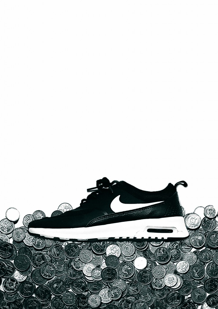
Nike 4.1_low
“A Nike shoe from the point of view of child labour is underpaid.”

Concept: I used coins to represent low wages as research stated that the workers are underpaid for the work they do for long hours.
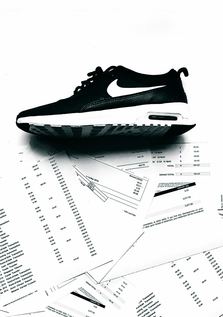
Nike 6-3-1
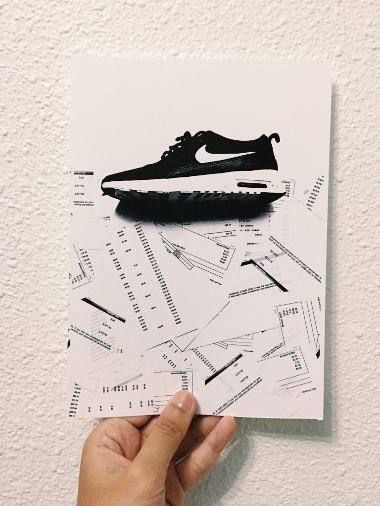
“A Nike shoe from the point of view of a parent is unpaid bills”

Concept: bills showing the consequences of a parent who keeps on buying for their child nonstop Nike shoes.
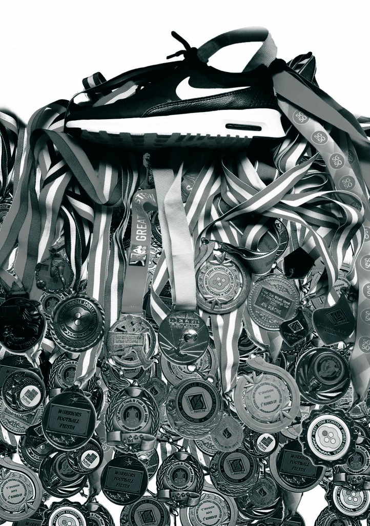
“A Nike shoe from the point of view of an athlete is good performance.”

Concept: Putting aside the negative side of Nike shoe, it also brings positive results into athlete’s world. And the result is good performance which is represented by the medals.
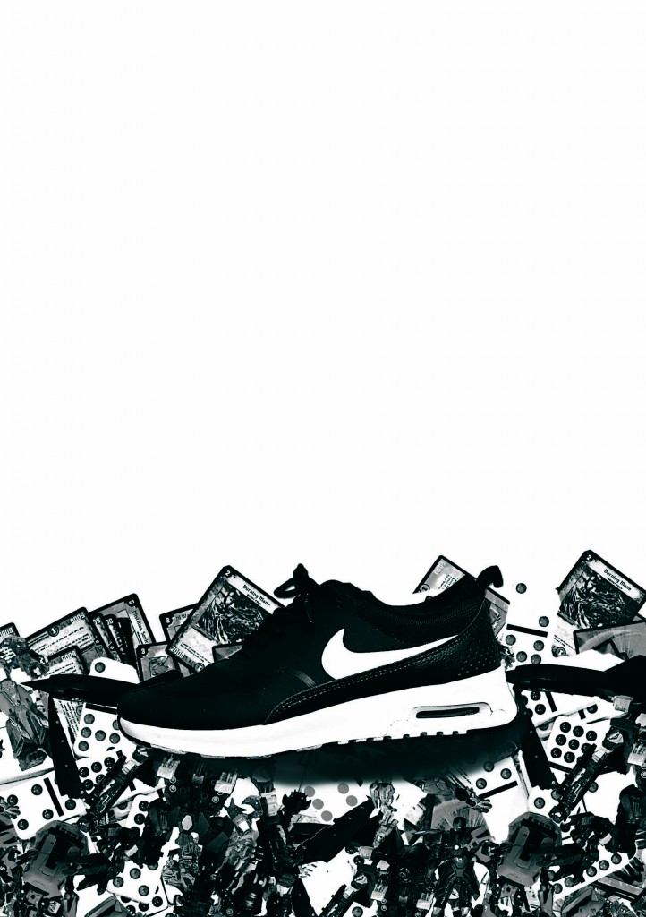
Nike 7-2
“A Nike shoe from the point of view of child labour is lost childhood”.

Concept: the consequences of child labour is a lost childhood, which is represented by toys at the last thirds of the whole canvas.

Of course, these are drafts, I still have to do some tweaking on the brightness and put together better captions.

POV: Collage Trial

So with all the little by little research, I tried to do my own collage using brochures.  That was the initial idea so I randomly teared brochures and tried to put my idea from what i imagined to paper…. But it didn’t turn out the way I wanted to.

Collage Trial (1)_1

  1. I wanted to play with negative spaces that’s why you see an empty spot in the collage — the water (blue brochures) and the land (creamy brochures) are the positive spaces.
  2. The collage was suppose to read: A shoe from the point of view of shoelace is a bait.

How is it a shoe is a bait? Why from the point of view of shoelace?

Let’s imagine (because the collage is incomplete):

Whenever you hold untied shoelaces on one side, the shoe tilts, or can be seen as hanging. From there I wanted the shoelace to represent a fishing line, and the shoe as the bait. What is left is the “fish” that will “eat” the “bait” (which is also missing in the collage). I wanted to collage the brochures into a hand reaching out towards the shoe from the bottom corner of the page, which will be represented as the fish.

POV: Research

When the brief was given for this POV project, I decided to do collages, like cut and paste collages. So I head on to Pinterest to find inspiration on collages as well as finding out different artists all together.

Below are some of the inspiration tabs I screenshot while researching.

Collage inspiration tab

Old magazines rolled
The colours attracted me the most. From far it looked like colour pencils aligned neatly, but it stated that they were actually rolled up magazines then collaged together. (Taken from: https://www.pinterest.com/pin/487725834626272330/)
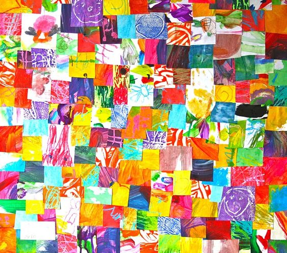
Old kids painting
When I saw this, I was struck with an idea that I could find old art works stored somewhere in my house and simply tear/cut and paste to form the POV. (Taken from: https://www.pinterest.com/pin/487725834626272314/)
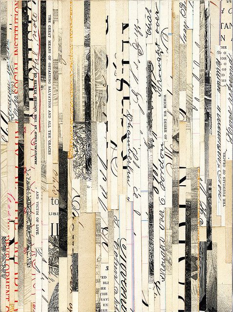
Valerie Roybal Collage 1
I saw this collage and was in awe. The different prints formed such beautiful pattern all together. (Taken from: https://www.pinterest.com/pin/487725834626272608/)
valerie roybal inspiration tab
From the image above, I got to know the artist that did the collage and searched for more of her works on Pinterest.


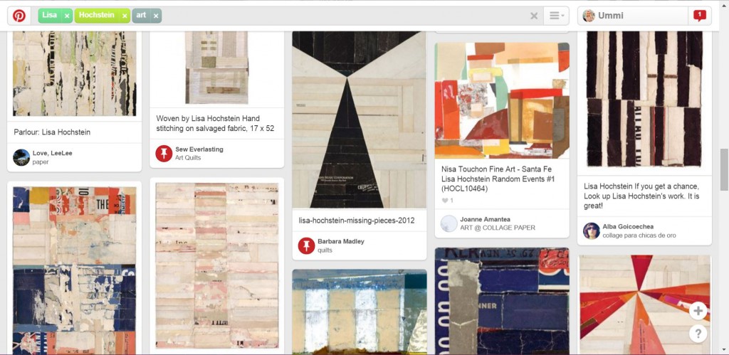
lisa hochstein inspiration tab
The list goes on when I further looked through Pinterest…
james verbicky inspiration tab
I find that when you collage the image, lined it up nicely…. it made such a nice backdrop.
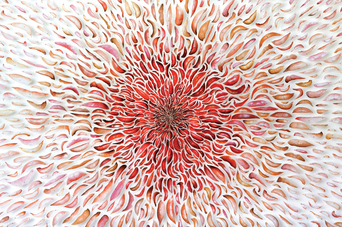
Starbirth_detail1
Artist David Adey’s collage using lips from magazine (Taken from http://davidadey.com/Starbirth)
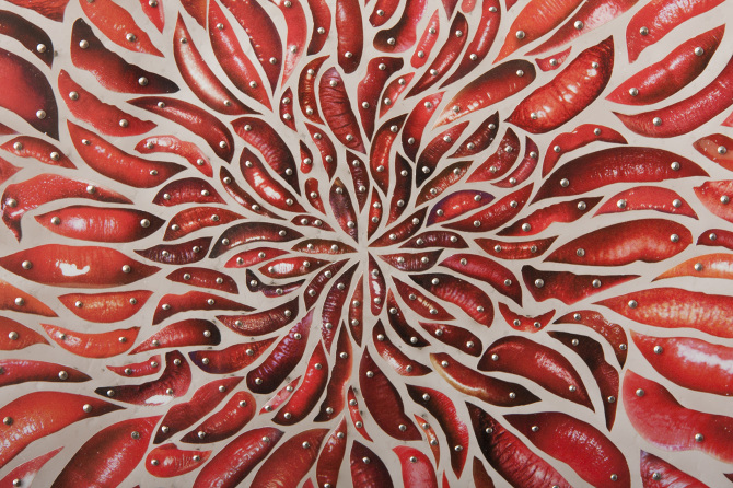
Starbirth_detail2
Close up (taken from http://davidadey.com/Starbirth)
abstract collage inspiration tab
I looked at abstract collages to get inspiration on how to not be too literal for the POV.

Typographic Portrait: Research research

From the previous post, I mentioned my attraction and interest on the technique of News Overprint. So this post will hold a slightly in-depth portion on my research throughout the project.
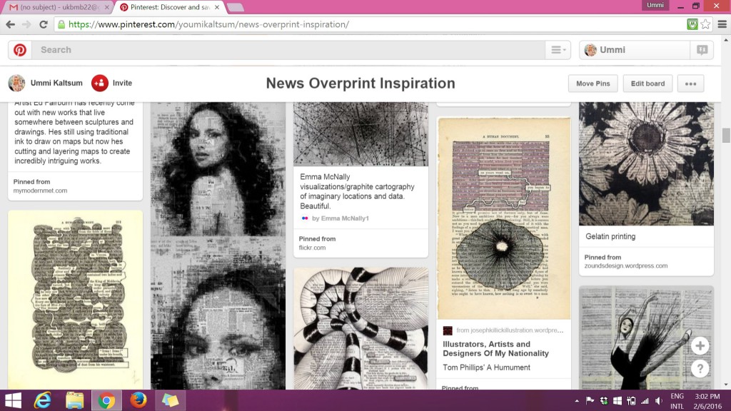
More inspiration pins on Pinterest @ https://www.pinterest.com/youmikaltsum/news-overprint-inspiration/


(above) I used these images as an example of how I could incorporate designs into my own book page.


https://www.pinterest.com/youmikaltsum/typography-inspiration/


(above) I used these images to help me have an idea how I want to make the typography stand out within the designs in the book page. I thought alot of contrast between bold and light, negative space etc.
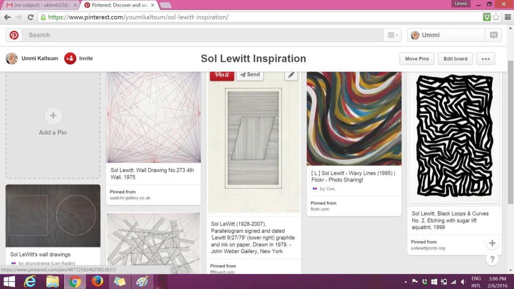
 

https://www.pinterest.com/youmikaltsum/sol-lewitt-inspiration/


(above) I refer to Sol LeWitt’s wall drawing line works to see how I could portray my personality by using just lines.


There are other resources that I came across with that I found to be interesting to add on as an inspiration:

The third image uses the same word throughout the work “HA”. The bold effect allows one to actually see what the message is, with its background faded.


The 2 images below consists of Pinterest research on artist Kurt Schwitters on his collage works and the technique of Ephemera:

https://www.pinterest.com/youmikaltsum/kurt-schwitters-collage-inspiration/


https://www.pinterest.com/youmikaltsum/ephemera-inspiration/


Continuing research on ‘Connecting Lines’ — I wanted to look further from Sol LeWitt’s line works, example: on how I could use these lines to form shapes or typography?

https://www.pinterest.com/youmikaltsum/connecting-lines-inspiration/


And after these research, I’d try it out myself to see if it suits with the vocation or personality I chose.

Lines follow Emotions

These are the 18 strips without its windows. Left column, top to bottom: Bizarre, Embarrassed, Distracted, Lyrical, Indecisive, Ambiguous, Psychotic, Sensual & Awkward Right column, top to bottom: Exhausted, Spontaneous, Systematic, Turbulent, Sloven, Nonsensical, Anxious, Aggressive & Fragile


Just like in design terms of “Form follow Function”, this assignment had the term of “Lines follow Emotions” where we had to mix and match the different abstract lines we have to the following emotions.

 When I was trying to sort out the lines to go with which emotion, I was mostly stuck on how one actually see the lines as nonsensical for example. However, I decided to just go with my own interpretation of how each line represents the emotions.


Bizarre in a way that the lines are interrupted with a weird looking key patch that stands out among the greys.
The contrast between the tone in the monoprinted sheet. I thought when you get embarrassed, you tend to blush so the darker tone in the strips represents the blushing effect among the rest.
The contrast between the tone in the monoprinted sheet. I was thinking at the moment “when you get embarrassed, you tend to blush” so the darker tone in the strips represents the blushing effect among the rest.
distracted
When one is distracted, their mind tends to get messy with all the different thoughts at the back of their mind. Therefore, this was chosen as ‘distracted’ as the blobs of ink represents the bubble of thoughts in one’s mind(?)
lyrical
Lyrical somewhat means expressive, rhythmic or some sort. Therefore I cut out a portion of my monoprint that has lines flowing as if you can see musical notes floating along the lines.
I cut out portion of my monoprint that shows indecisive -- lines crossed path each other. Imagine you standing at the intersection and then thinking "Do i go this way or that way or that or this way?"
“I want KFC. No wait, MacDonalds. No no, Burger King….. or Long John Silver?” Just like you get indecisive on what to eat for lunch, these lines get indecisive on where they want to go. In the end, all went separate ways.
Method of spamming glue spontaneously to actually create texture when it dried up (but i failed). Ambiguous in a way that the tone is not certain and you actually don't know what is happening either -- as some part of the strips are bold, grey and white.
Method of spamming glue spontaneously to actually create texture when it dried up (but i failed).
Ambiguous in a way that the tone is not certain and you actually don’t know what is happening either — as some part of the strips are bold, grey and white.
When I think of psychotic, I think of the show Criminal Minds -- shows the different signs of psychosis. I interpreted it in a way that I would collage certain parts of the monoprints to create something 'insane'. For example, I see a face at the right corner of the strip, a scary T-Rex's mouth opened wide & etc.
When I think of psychotic, I think of the show Criminal Minds — shows the different signs of psychosis.
I interpreted it in a way that I would collage certain parts of the monoprints to create something ‘insane’. For example, I see a face at the right corner of the strip, a scary T-Rex’s mouth opened wide & etc.
When one think of the word 'sensual', it always got to do with one's body. (I thought of it like that) So, I represented my emotion of 'sensual' with curvatures as it shows sexiness. As if it's a body shape of a lady or somewhat. The background is bold so the curvatures actually stands out.
When one think of the word ‘sensual‘, it always got to do with one’s body. (I thought of it like that)
So, I represented my emotion of ‘sensual’ with curvatures as it shows sexiness. As if it’s a body shape of a lady or somewhat. The background is bold so the curvatures actually stands out.
This strip was a cut out portion from my piece of somewhat Decalcomania technique. When one is awkward, one tend to stay as far as possible from the crowd. Therefore, the blobs of ink are actually at a distance from one another thus you can feel the awkwardness around them.
This strip was a cut out portion from my piece of somewhat Decalcomania technique.
When one is awkward, one tend to stay as far as possible from the crowd. Therefore, the blobs of ink are actually at a distance from one another thus you can feel the awkwardness around them.
This strip was a monoprint consisting of paper tape and blobs of ink. Imagine your smartphone, as you use more data your phone battery will deplete. Putting this interpretation with the lines I have, the blob of ink at the right corner of the strip actually shows that it is on the verge of finishing thus it looks exhausted.
This strip was a monoprint consisting of paper tape and blobs of ink.
“I am exhausted, I have no energy left to continue this activity.” Putting this interpretation with the lines I have, the blob of ink at the right corner of the strip actually shows that it is on the verge of finishing/depleting thus it looks exhausted.
Method of Frottage was used with chalk pastel. Spontaneity is the action of being natural. For example when one gives a speech, they actually don't refer to anything nor prepare but words just flow of them. Interpreting from that, I thought this piece was spontaneous with its symmetrical shape. The reason was because humans tend to like symmetry and it is actually a natural and common thing. (i do)
Method of Frottage was used with chalk pastel.
Spontaneity is the action of being natural. For example when one gives a speech, they actually don’t refer to anything nor prepare but words just flow of them. Interpreting from that, I thought this piece was spontaneous with its symmetrical shape. The reason was because humans tend to like symmetry and it is actually a natural and common thing. (i do)
Systematic is all about the rhythm and repetitive patterns. This piece was also done using the Frottage technique of a table mat. It falls under this emotion perfectly for its obvious reason -- repetitive patterns.
Systematic is all about the rhythm and repetitive patterns. This piece was also done using the Frottage technique of a table mat. It falls under this emotion perfectly for its obvious reason — repetitive patterns.
This piece was done using baby powder. I painted the paper with black ink and then upon drying, baby powder was spammed onto the paper. (A little bit of fixing with hair spray to keep the powders stuck to the paper but I think it was unsuccessful) Think of being in a flight and then it's going against strong wind. I thought of that for this emotion. Therefore, with the chaotic spread of the powder around the paper, I think it shows the turbulence.
This piece was done using baby powder. I painted the paper with black ink and then upon drying, baby powder was spammed onto the paper. (A little bit of fixing with hair spray to keep the powders stuck to the paper but I think it was unsuccessful). Think of being in a flight and then it’s going against strong wind. I thought of that for this emotion. Therefore, with the chaotic spread of the powder around the paper, I think it shows the turbulence.
This strip was chosen to show the emotion of sloven as the strip is filled with messy components.
This piece was nonsensical in a way that it doesn't make any sense at all. Even when I was experimenting the scraping of wet paint with a tip of a paper clip.
This piece was nonsensical in a way that it doesn’t make any sense at all. Even when I was experimenting the scraping of wet paint with a tip of a paper clip.
When you're anxious, your muscles tend to tense up. In this piece, I interpret it in a way that the intersection of the paper tapes grew tense as the different sides get pulled.
When you’re anxious, your muscles tend to tense up. In this piece, I interpret it in a way that the intersection of the paper tapes grew tense as the different sides get pulled.
aggressive
The monoprint used to portray this emotion has this bold effect that make the whole strip stands out. The texture of the paper tape and the creases of the crumpled paper scattered around shows that more force was initiated. Aggressive in terms of the sharpness and the intensity of the texture.
When you think of fragile, you know it has got to do with things that are brittle and tender loving care. This strip was done using the Froissage technique, chalk pastel ran over the creases to give the effect. The creases represents the cracks and it was actually fragile when I was cutting it due to the creases.


With all these strips, it was then compiled and sorted out to their windows… (see below)

My completed piece of lines. #achievementunlocked
My completed piece of lines.
#achievementunlocked