Here is a recap of what how we would like to proceed on our idea:
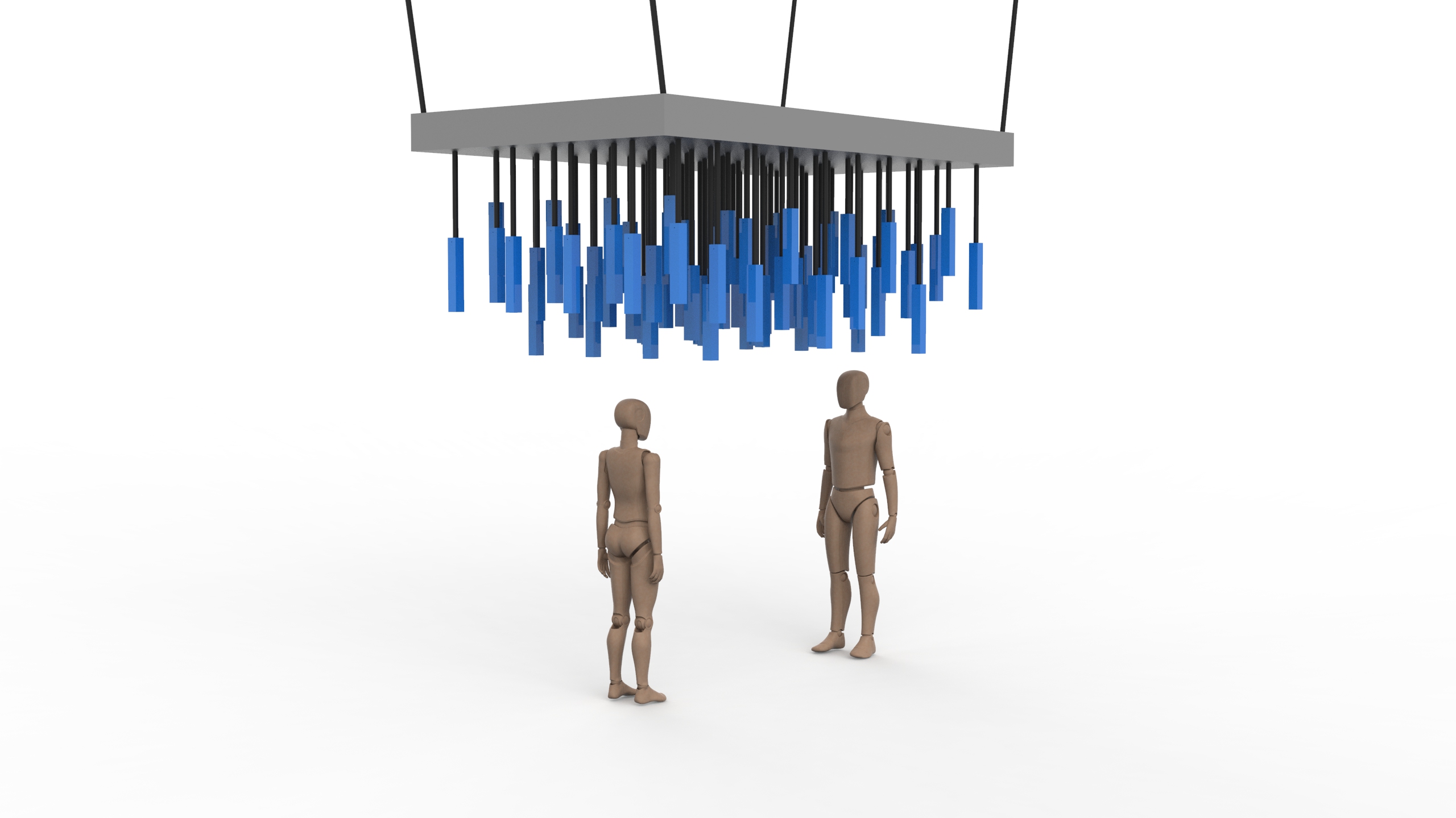
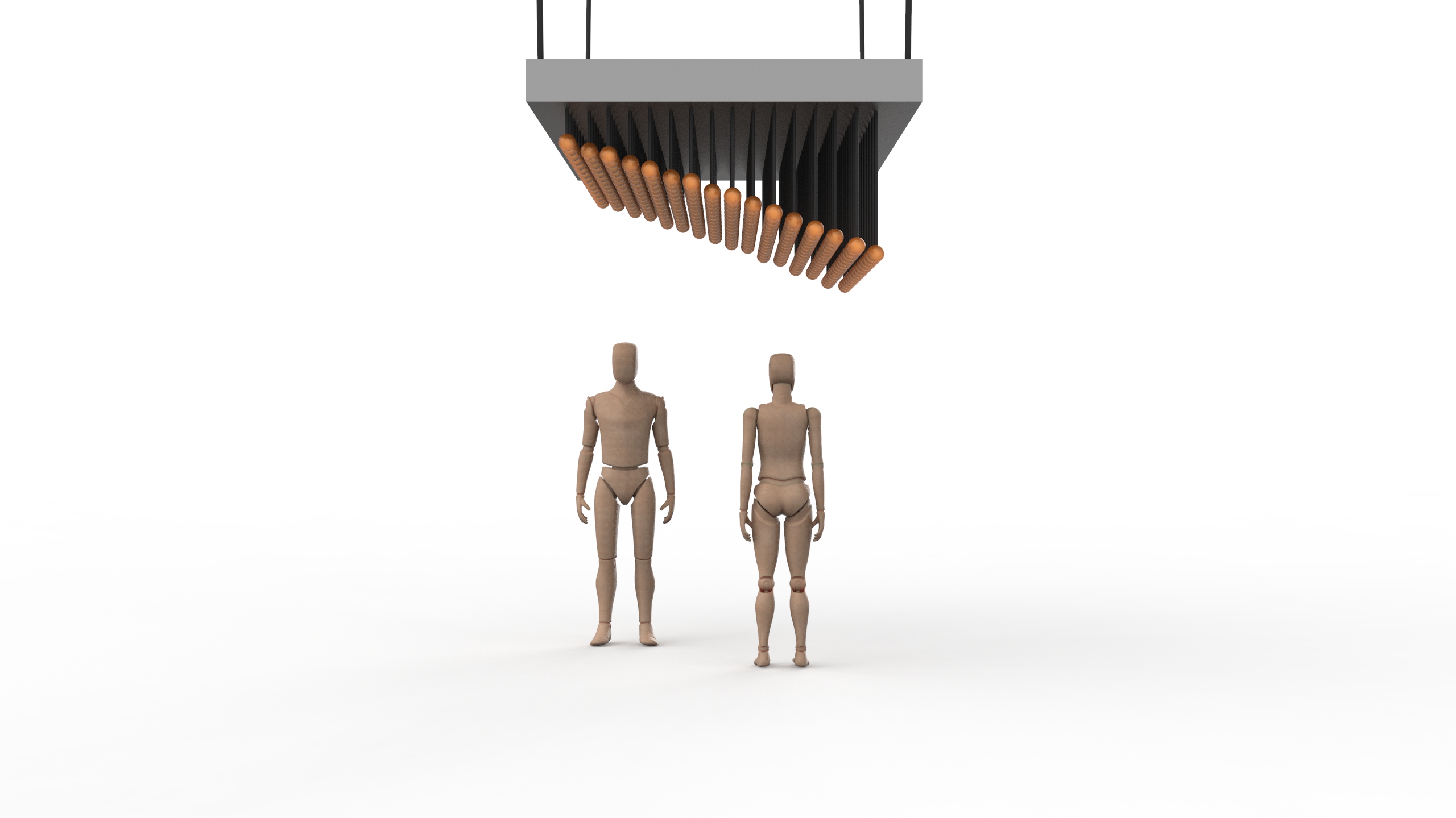
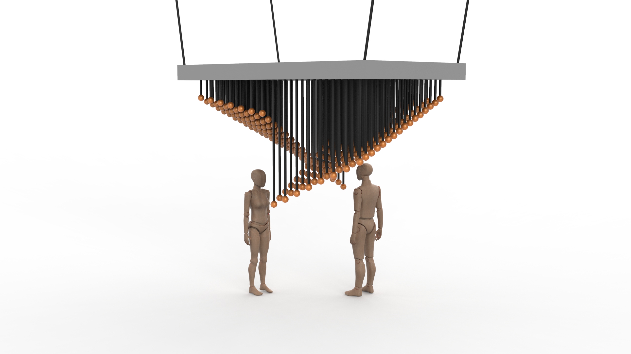
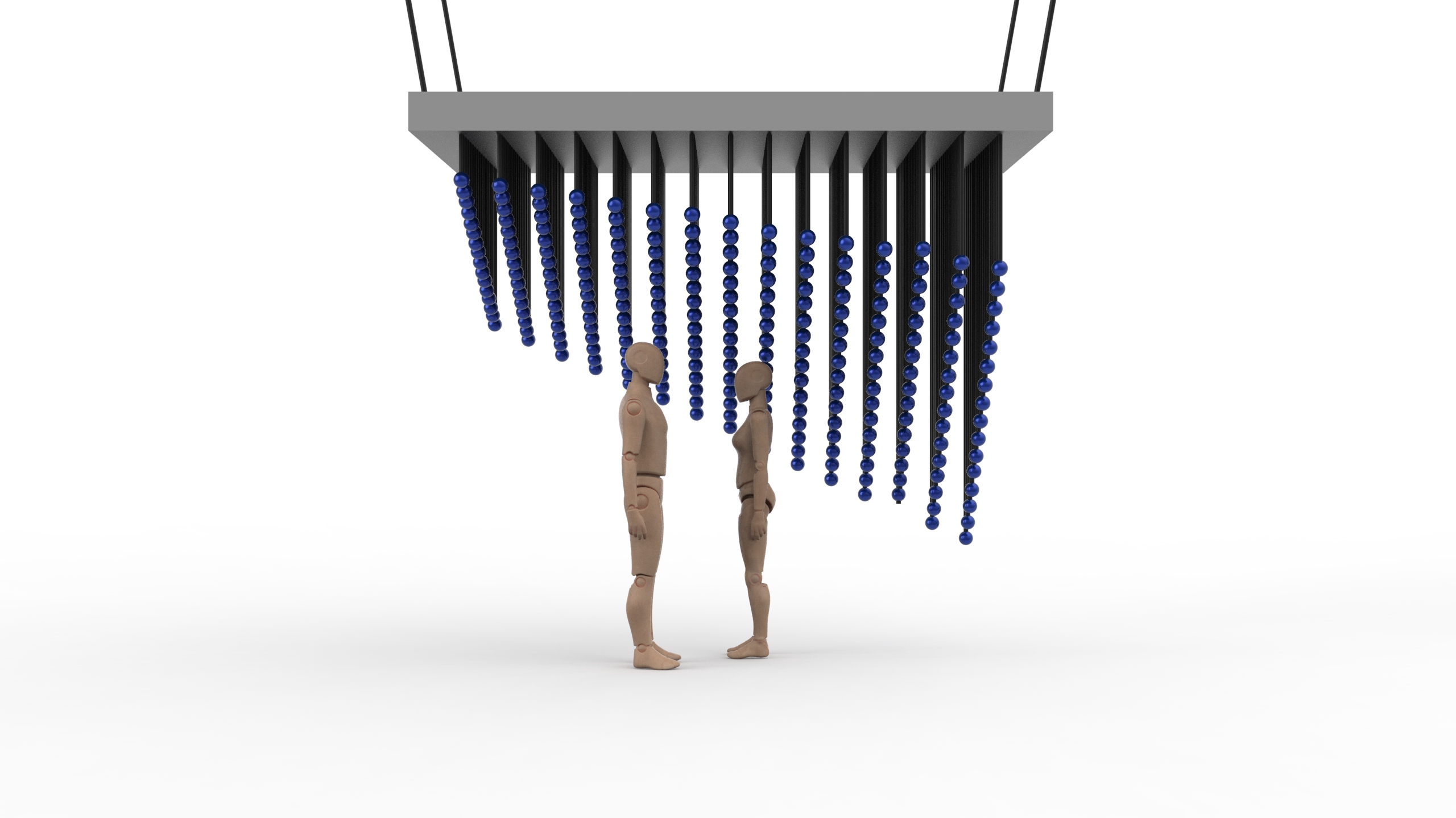
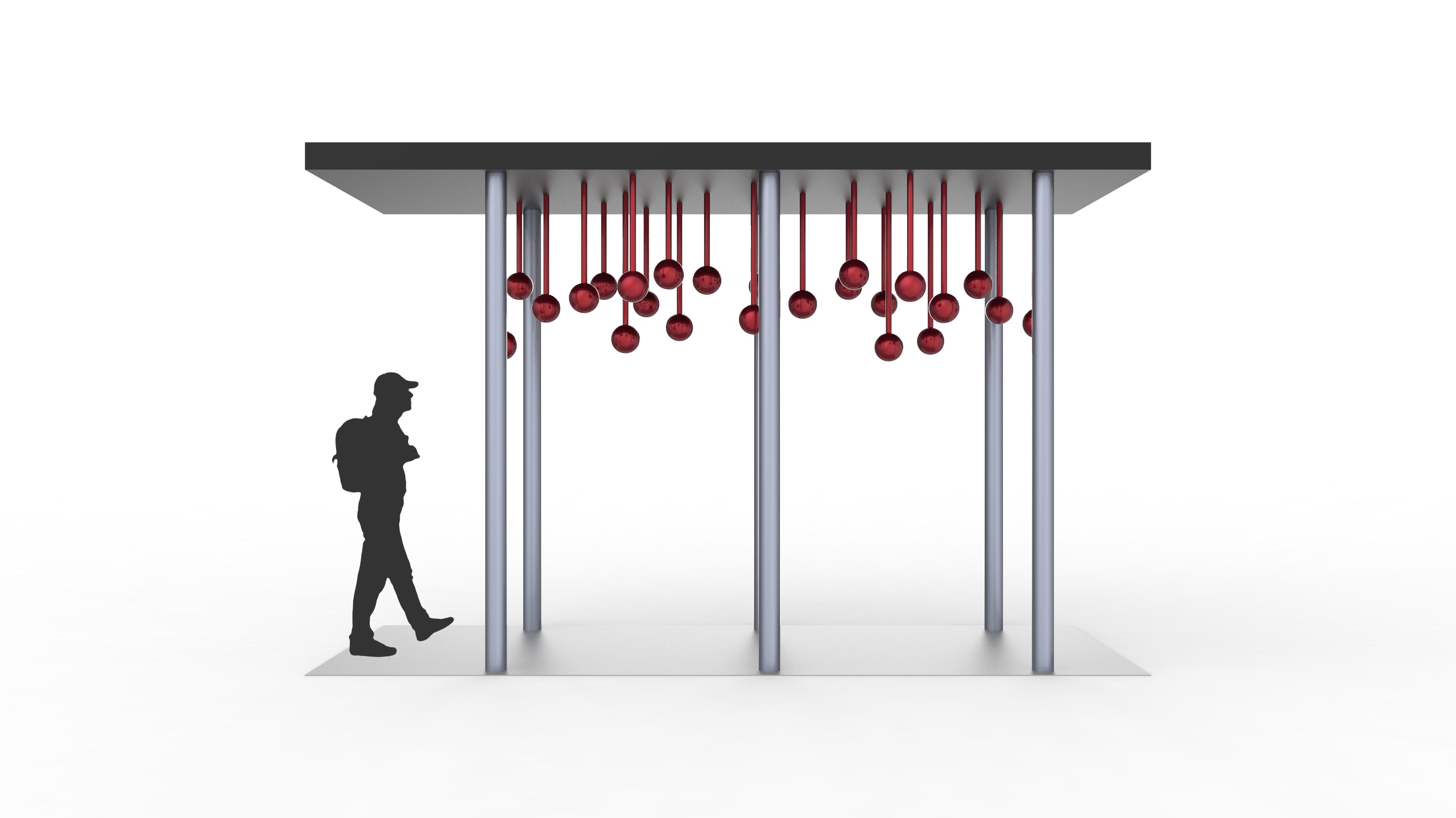
We wanted to see how the arrangements would look like virtually thus our renderings below. We wanted to see the scale of the installation therefore we input human models (man: 1720mm, woman: 1660mm).
#1a
Iso ViewFront viewSide view
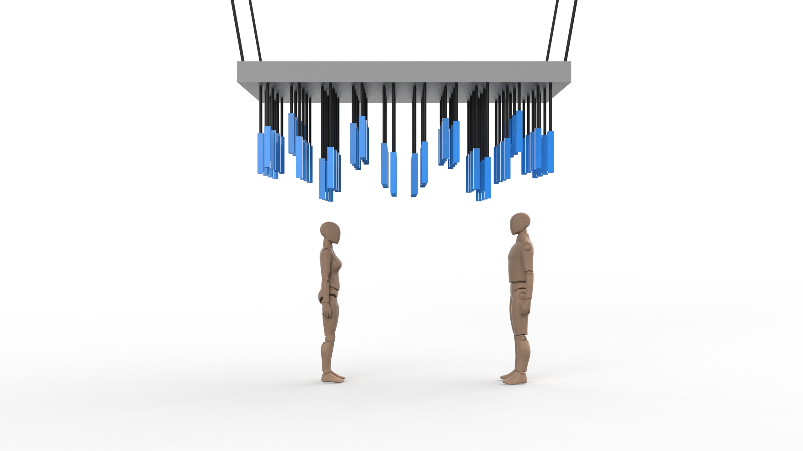
#1b
With the same orientation, how about alternating the layers?
Front ViewSide viewIso View
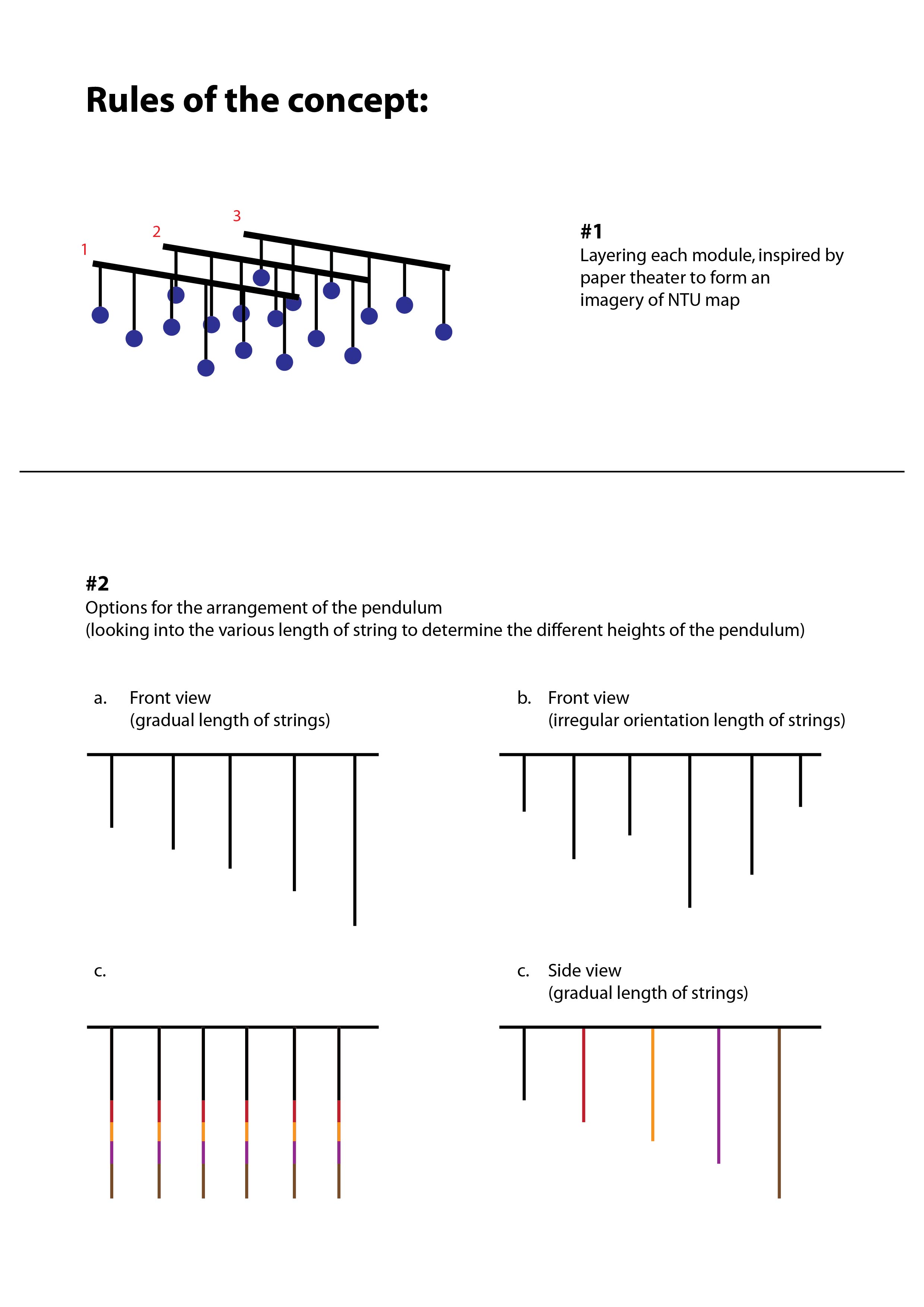
#2
Iso ViewFront ViewSide ViewArrangement of the layers of pendulum
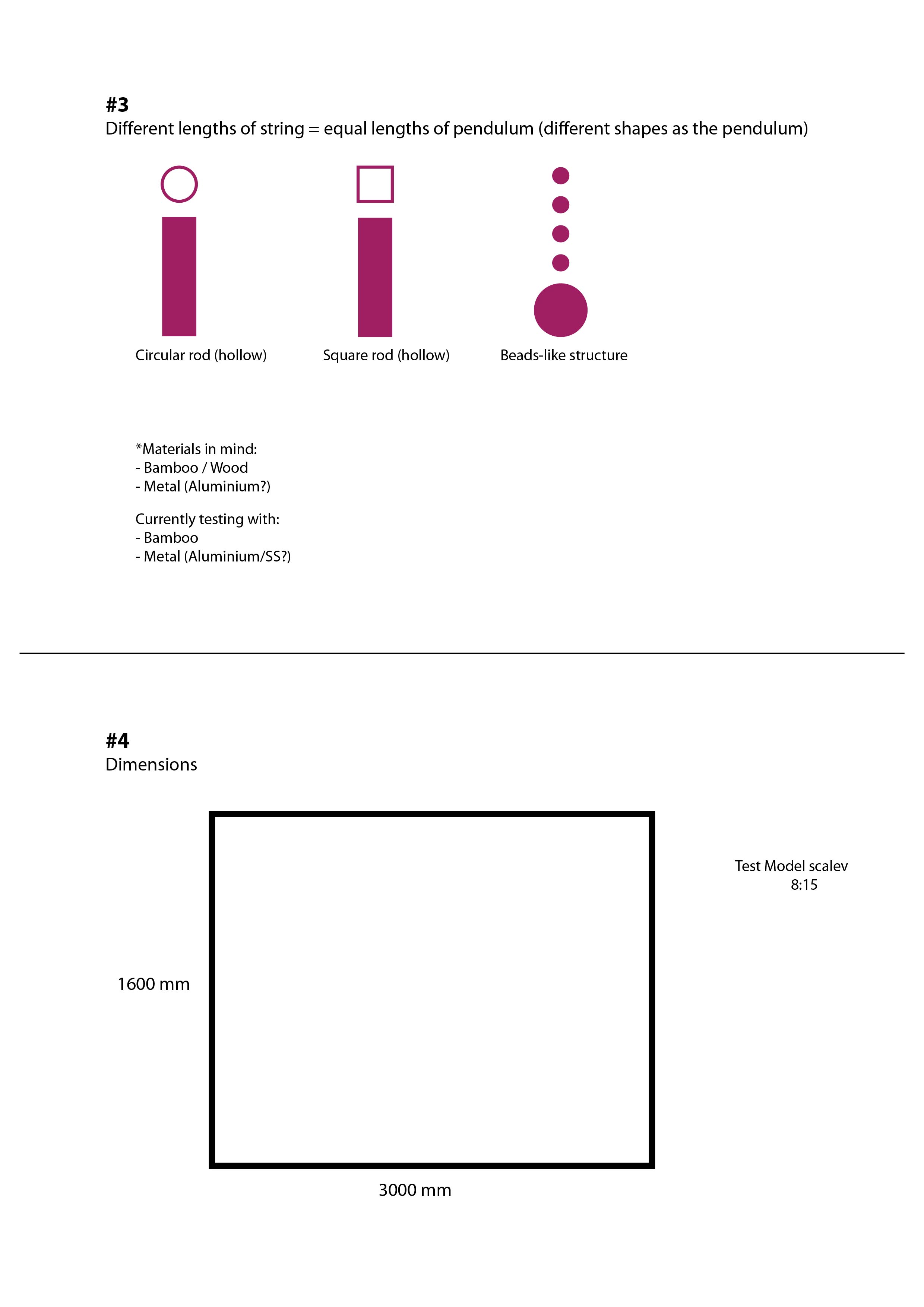
#3
Iso ViewFront ViewSide ViewArrangement of pendulums
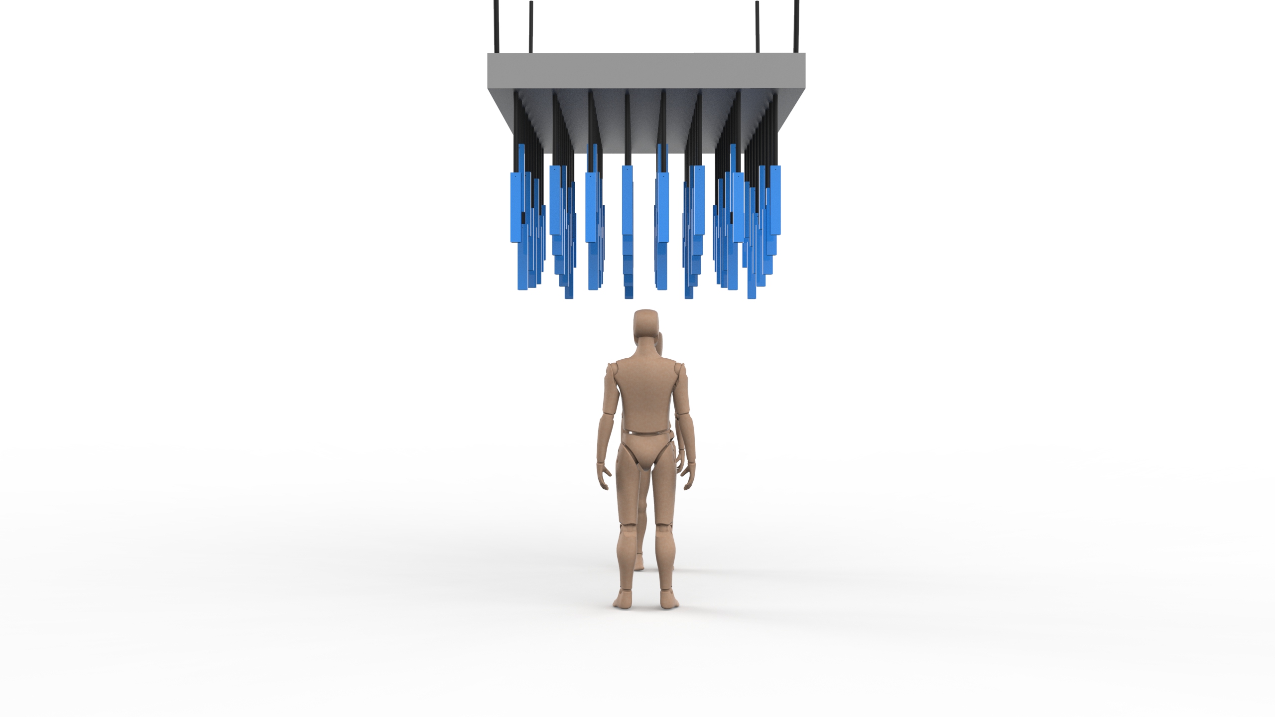
#4a
Iso ViewFront ViewSide ViewArrangements of pendulum
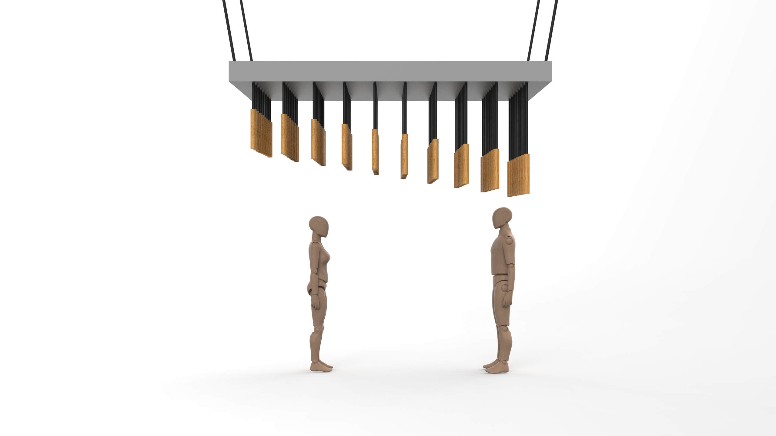
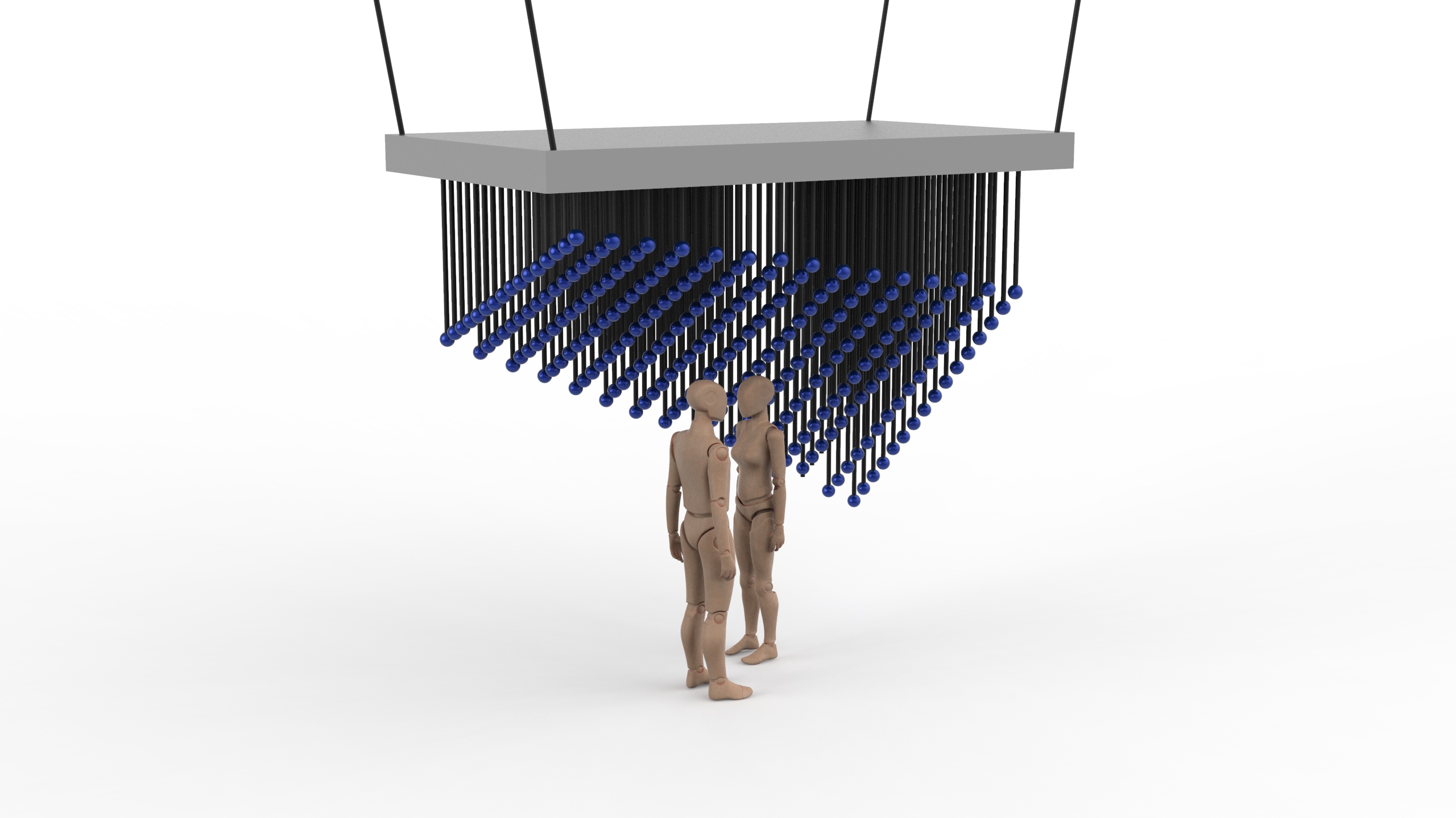
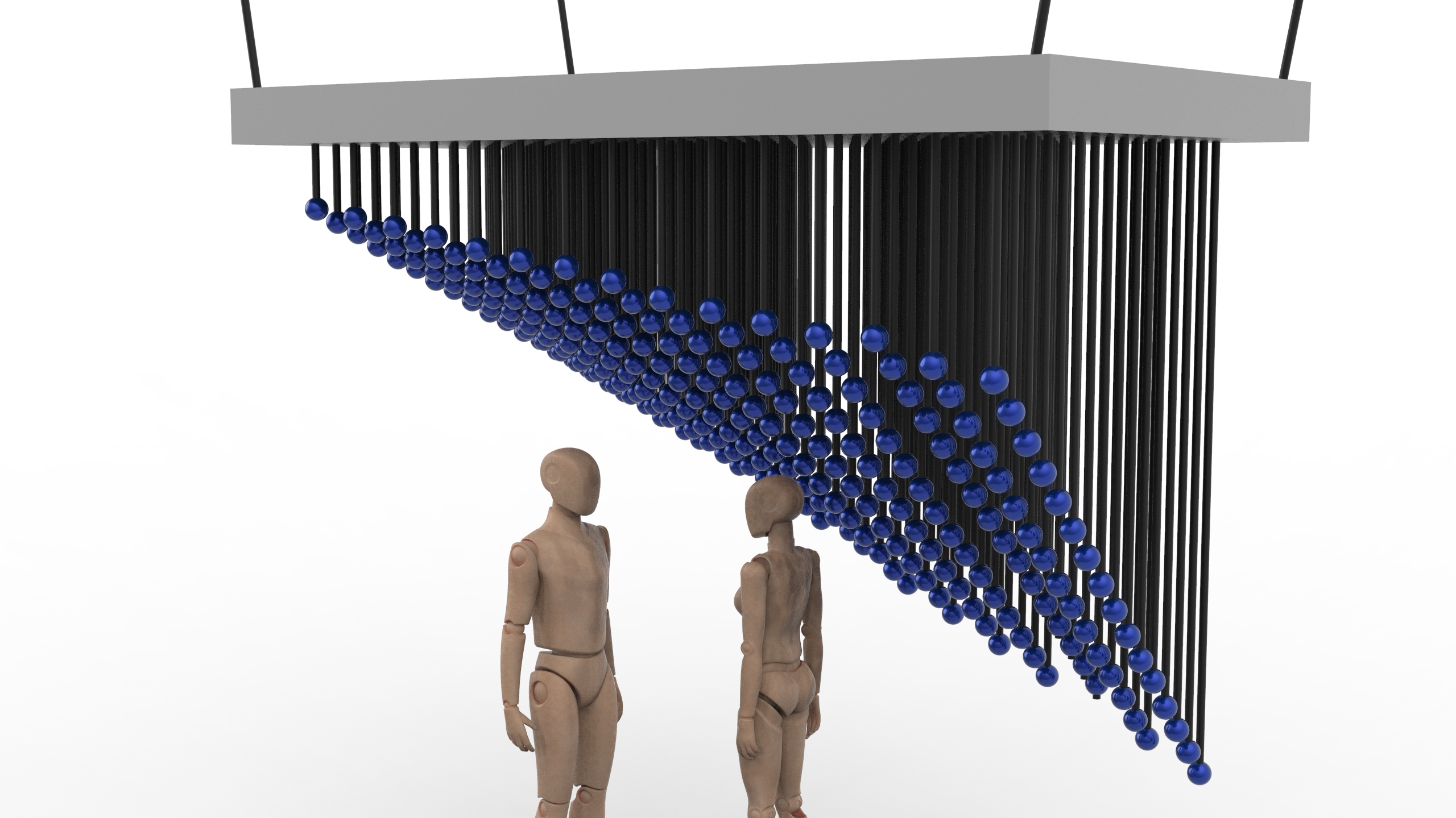
#5
Iso ViewFront ViewSide ViewArrangements of pendulum
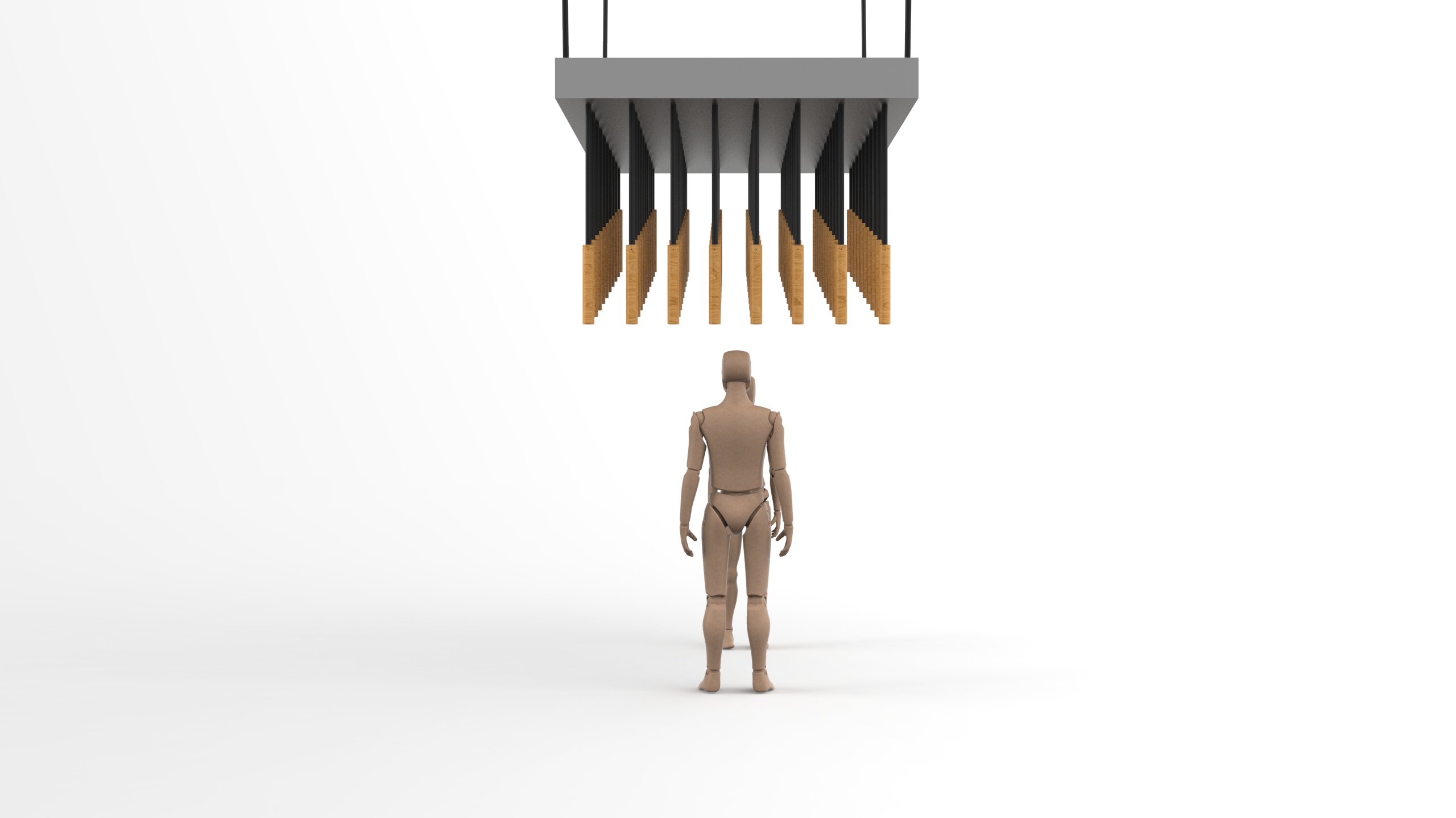
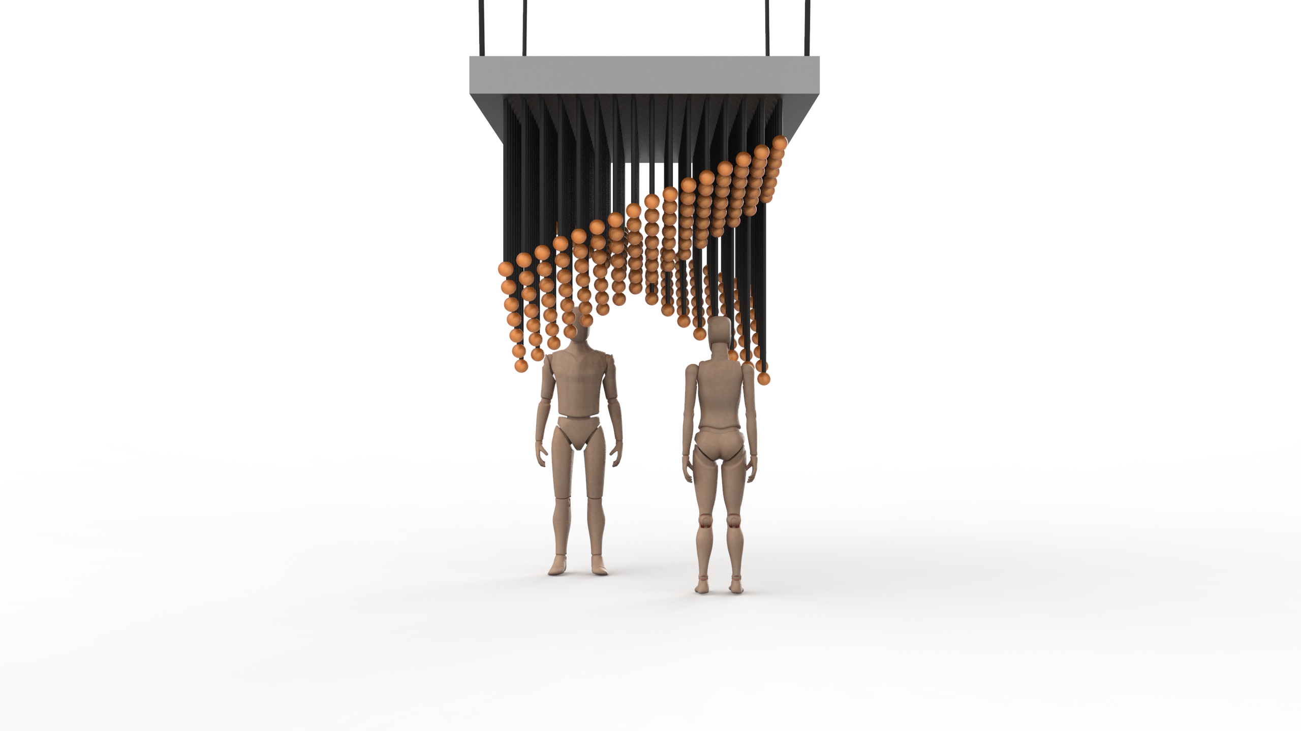
#6
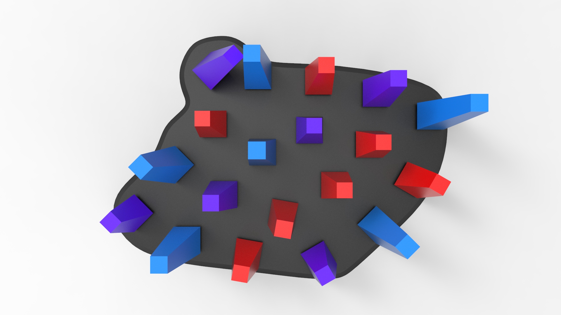
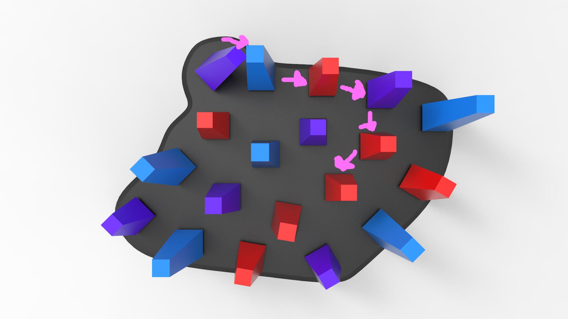
Iso ViewCloseup of arrangementsFront ViewSide ViewArrangements of pendulum
#7
Iso View
Front ViewSide ViewArrangements of pendulums
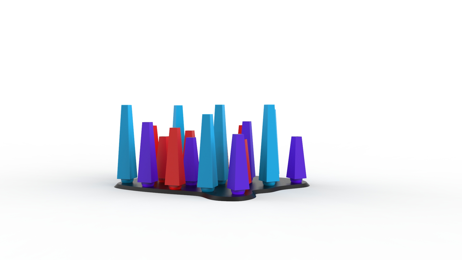
From the renderings #1 to 3, the arrangements are not as dense as the #4 to 7. This is because we were visualizing how different densities affect the installation.
While we were brainstorming of methods to create sound from the previous weeks’ concepts, we had pendulums and wind chimes as an instrument.
However, we decided to look deeper into pendulums and wind chimes because we wanted the user to have the experience of touching and seeing of the entire installation.
So we laid out our ideas as such below:
Idea #1
We envisioned the pendulums to be located under the sheltered walkway within NTU
The scale we’re looking at
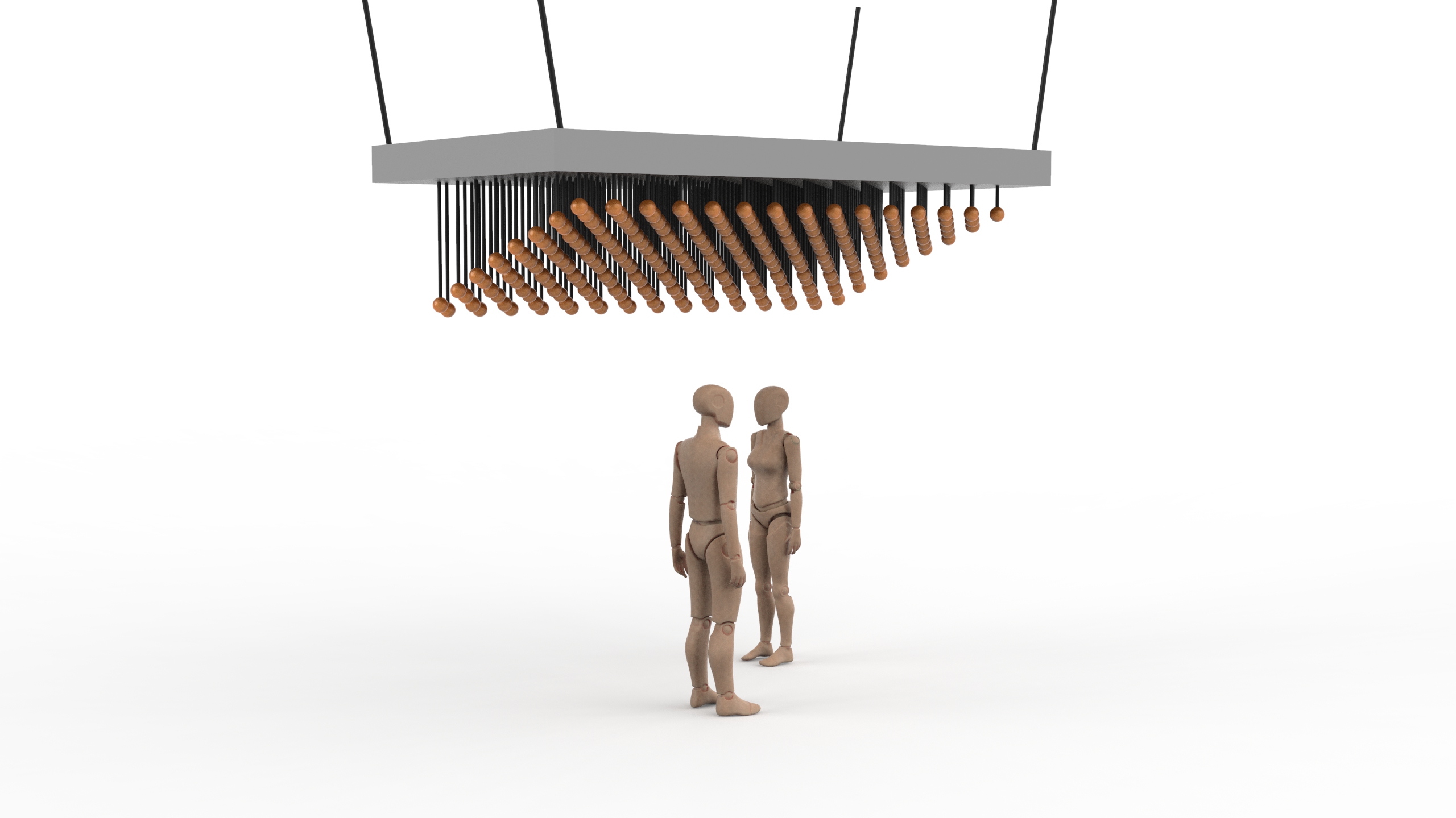
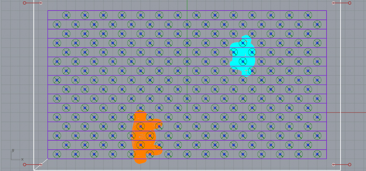
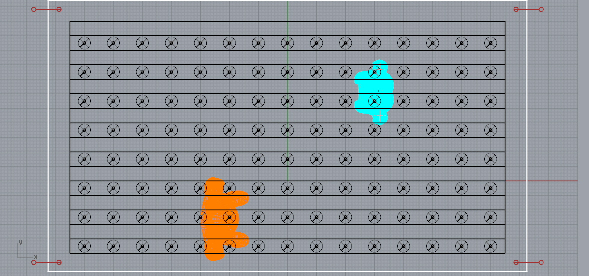
For the first concept we intend to use pendulums suspended from the ceiling. The pendulums are of different length to represent the different individuals (students).
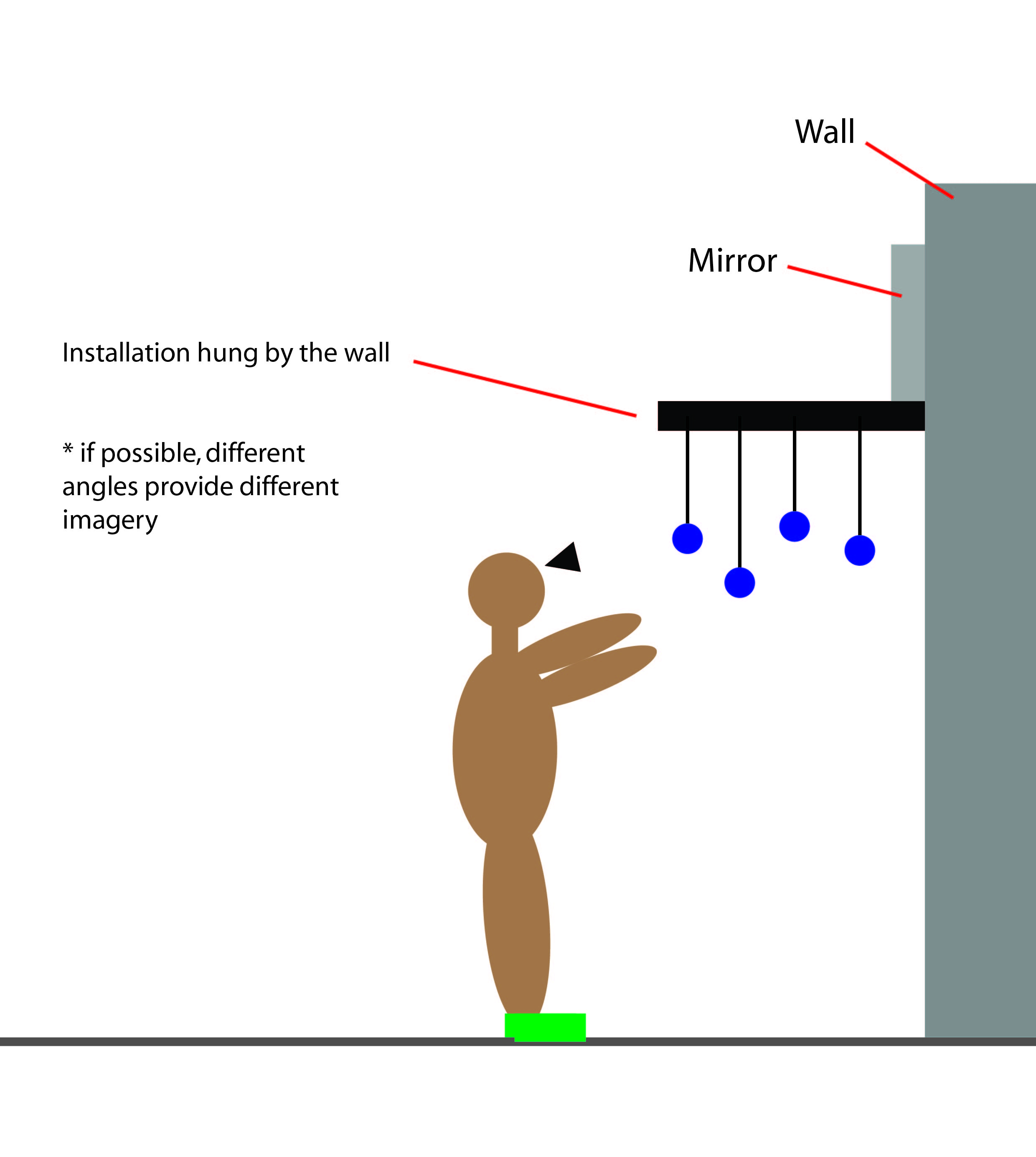
The layering of the pendulum could form an imagery from a certain angle to look like half of the ntu map and the other half would be reflected onto the mirror. (as illustrated below)
The students would swing the pendulums which would cause a chain reaction of the balls moving — creating the randomised movement we envisioned. By allowing the student to be in-charge of the movement of the balls it signifies how the students create their own real life relationships and daily occurrence with other students. The height of the installation would be around the head level of an average Singaporean.
From the illustration above, we thought that we could place the installation under sheltered walkways within NTU (like the first render above) or install it by the wall. But we agreed that a stand-alone installation at a certain location would be better as the users could gather around the installation for a better experience.
At this point, we are looking at placing it at an open space in front of One Stop SAC and Ultra Supplies @ North Spine (nearby the Media Wall).
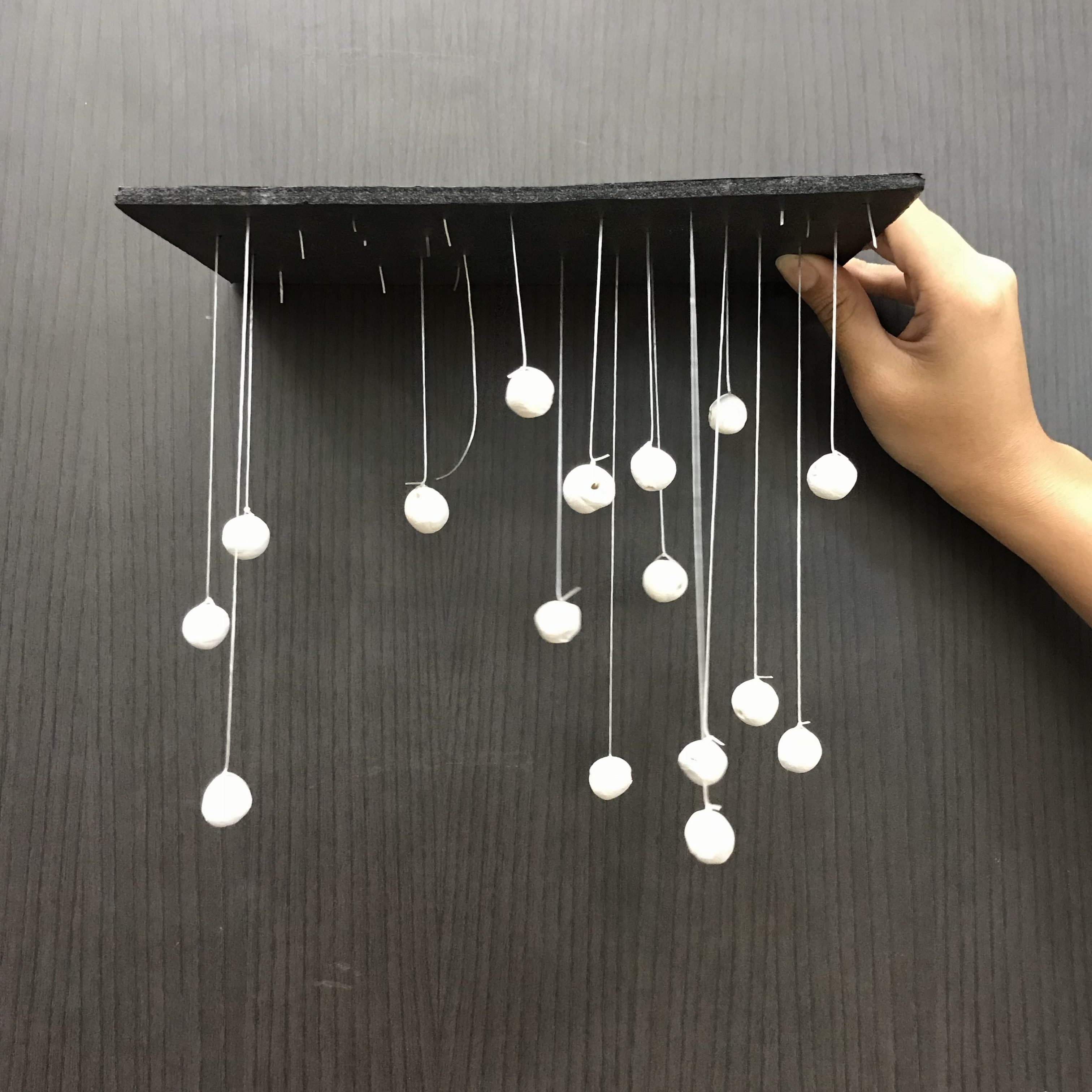
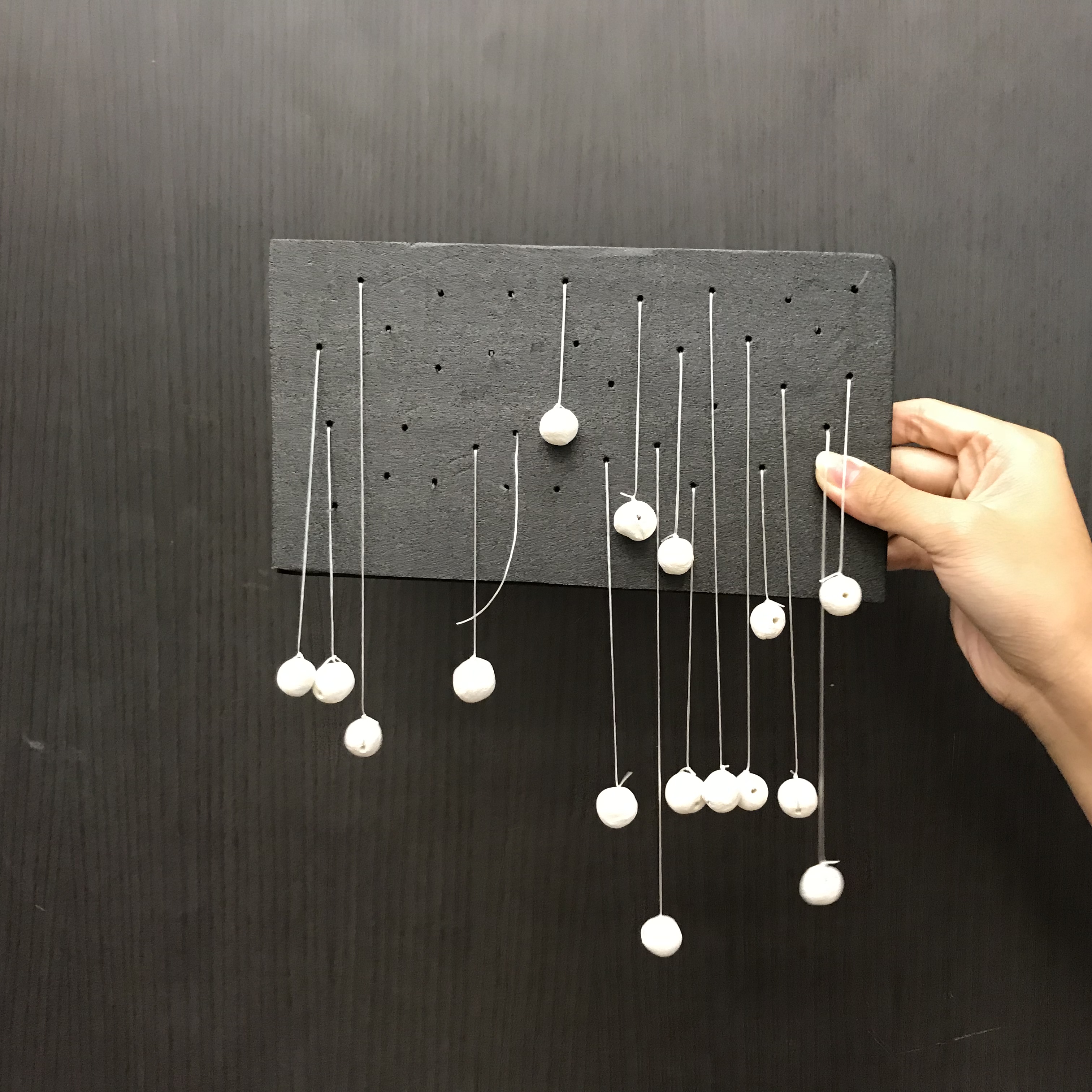
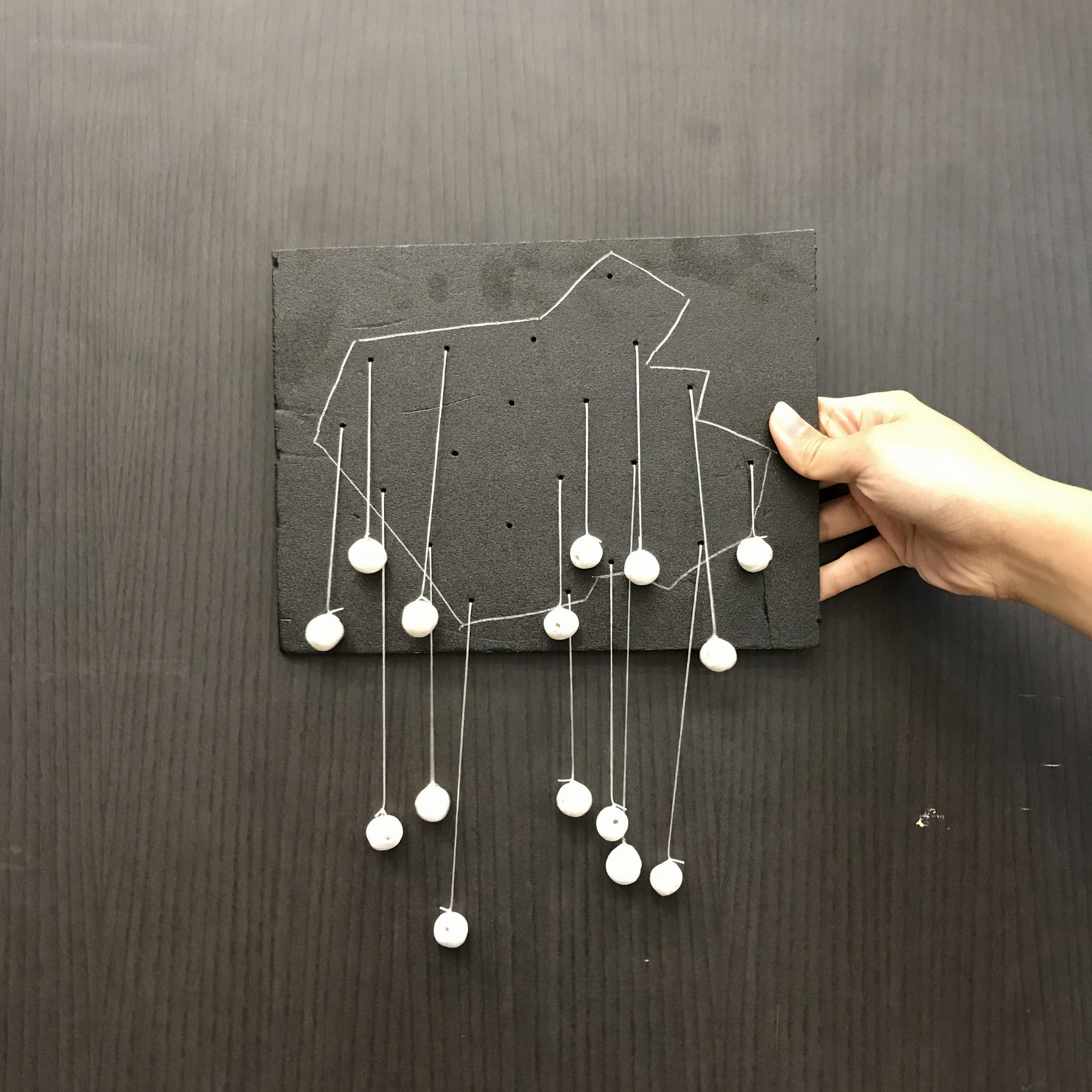
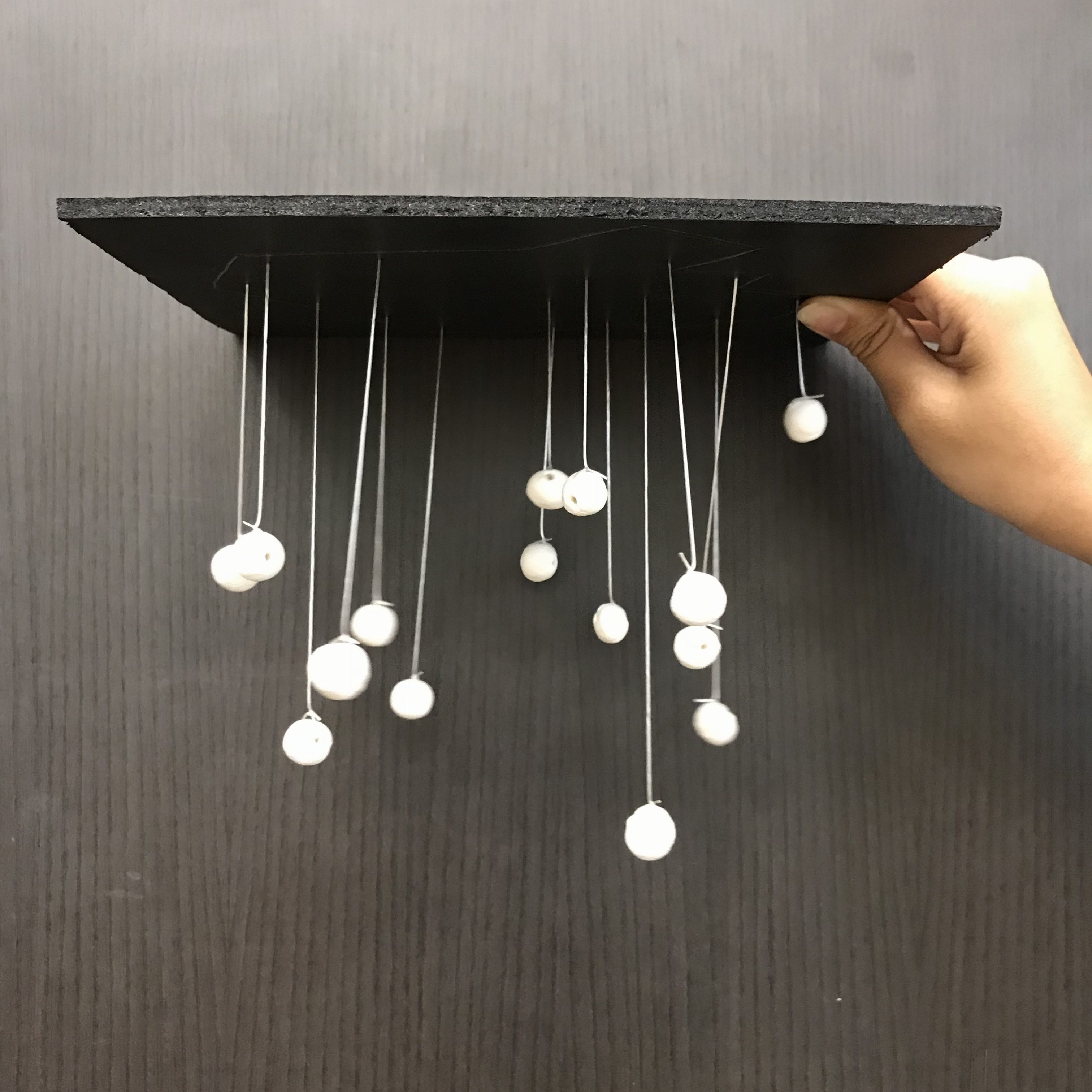
Below are the mock-ups’ documentation:
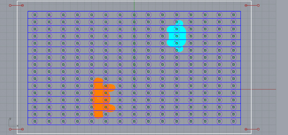
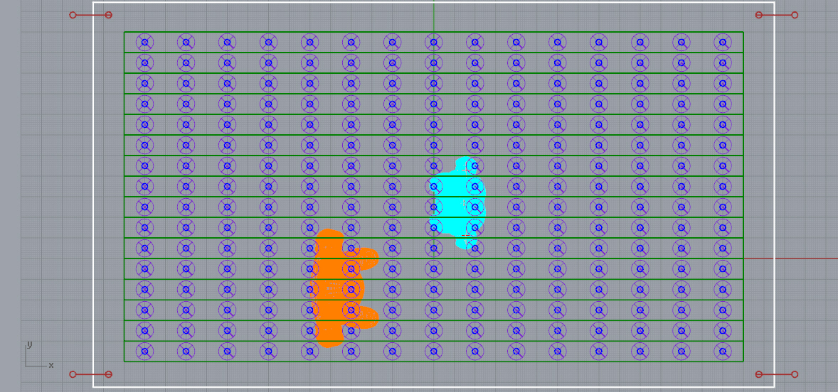
Pendulum arranged in random(Close up of pendulums’ placements) We realised that with the materials used (string and ball made of clay), the pendulum tend to get tangled. Thus we were thinking of trying with aluminum wire, slightly stiffer to stabilize each pendulum.We tried to arrange the pendulums within the NTU map as an outline/boundary. But we realised that the user may not even be able to see the ntu map within the randomly arranged pendulums.
Idea #2
Front view
Top view
For the second concept the installation would be placed on the ground. It would be a walk through experience for the students.
The installation space would have block like shapes with springs scattered across the whole area. The blocks with spring in them works like how the barriers at carparks function. (Or more referred to the roly poly toy, where it will spring back and forth)
The blocks with spring represent students which will be scattered across the whole installation area. With the real life students walking through, the installation would trigger the movement of the ‘students’ creating the randomised pattern we intended to achieve. The ‘students’ are placed near enough to each other to allow the creation of this reaction.
–> But after considering, we have decided to go ahead with Idea #1.
We decided to come up with certain pointers that we would like our installation to have (or try to have..):
So our next step is to work on the CAD version to see the installation as a whole as well as working on the mock up.
– Show the consequence of plastic pollution that affects the ocean, through the multiplication of jellyfishes.
Why jellyfish?
– Jellyfishes multiply when the temperature of the ocean is affected by pollution. Increasing high number of jellyfish is a strong warning that our ocean is dying.
Storyboard:
No one steps on:
a. A few jellyfish are lit up (light intensity = heartbeat) and will move up and down (creates a sense of life)
b. Floor has blue ripples (ocean)
2. Someone steps on:
a. A few more are lit up
3. A couple of people step on:
a. Floor has violet ripples
b. More jellyfish light up
4. Many steps on:
a. All jellyfish are lit up
b. Red ripples on the floor
Technology:
Pulley system – up and down (Moving the jellyfishes)
Stepping plate – change the background light (showing the warning of the dying ocean)
LED light – lighting up jellyfishes
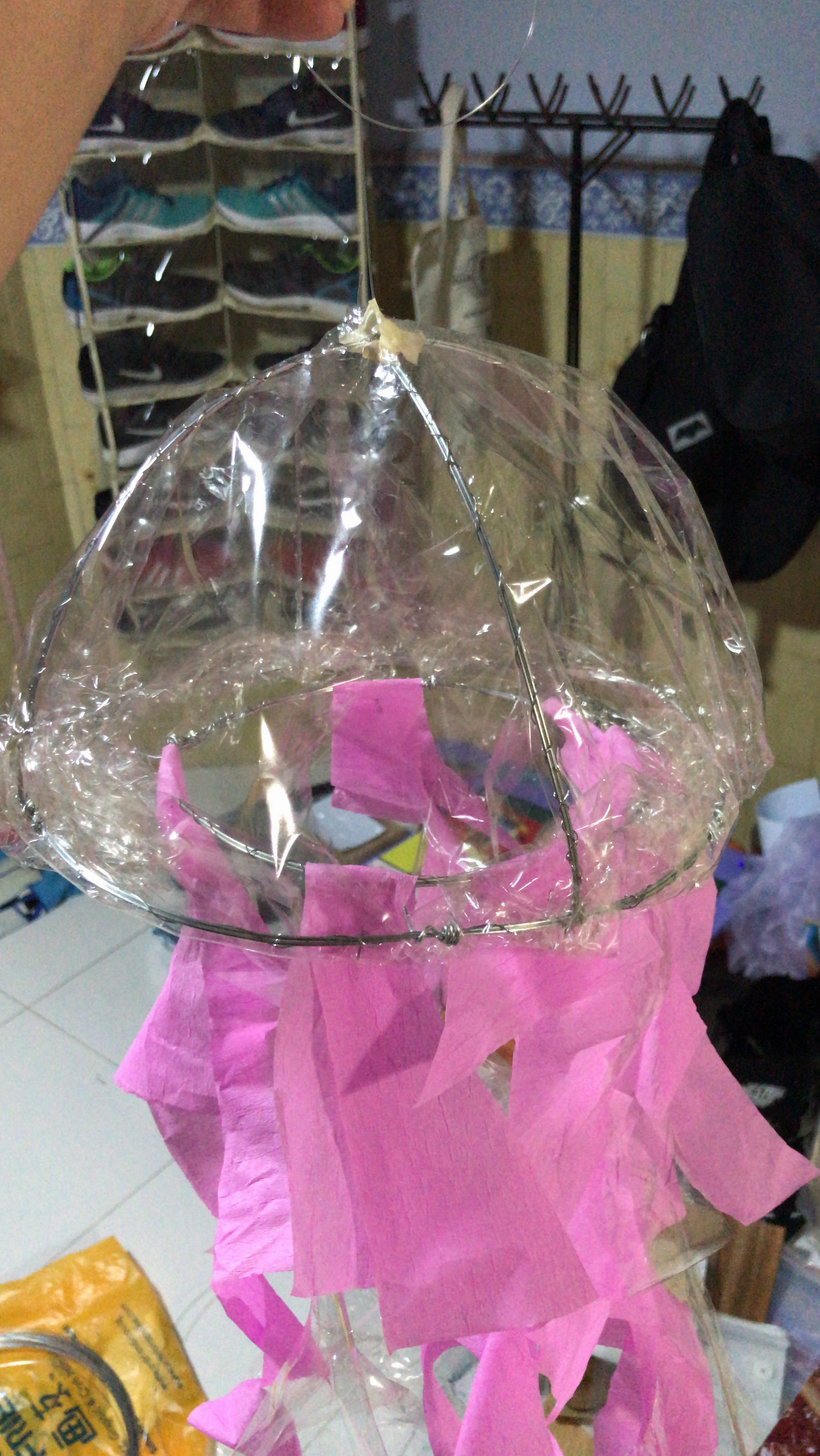
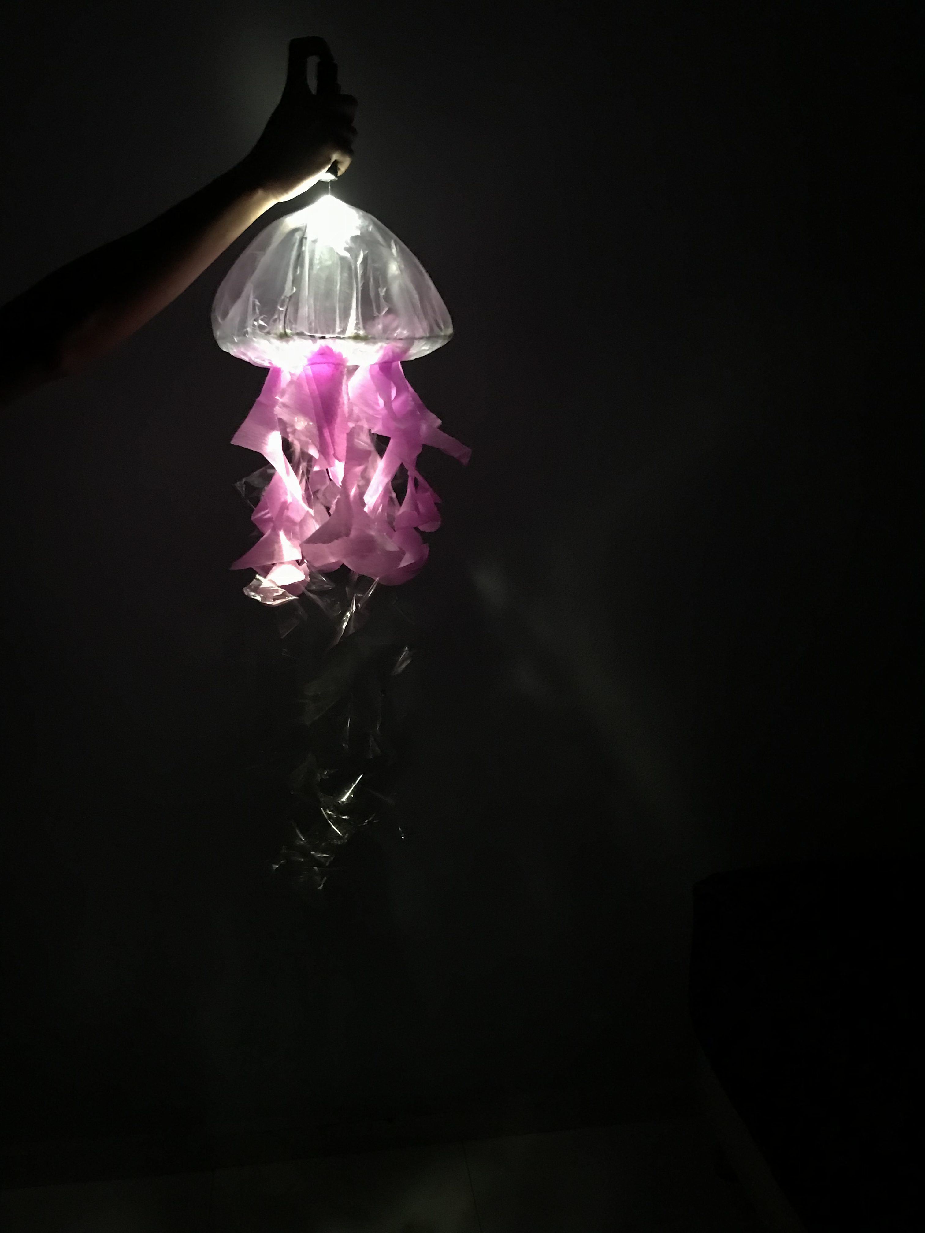
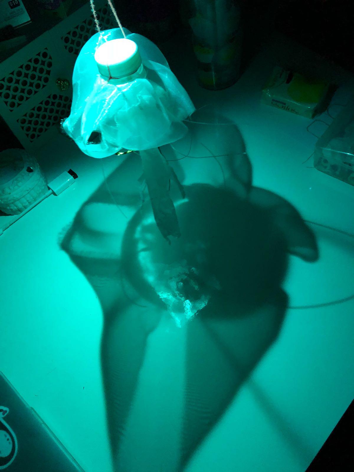
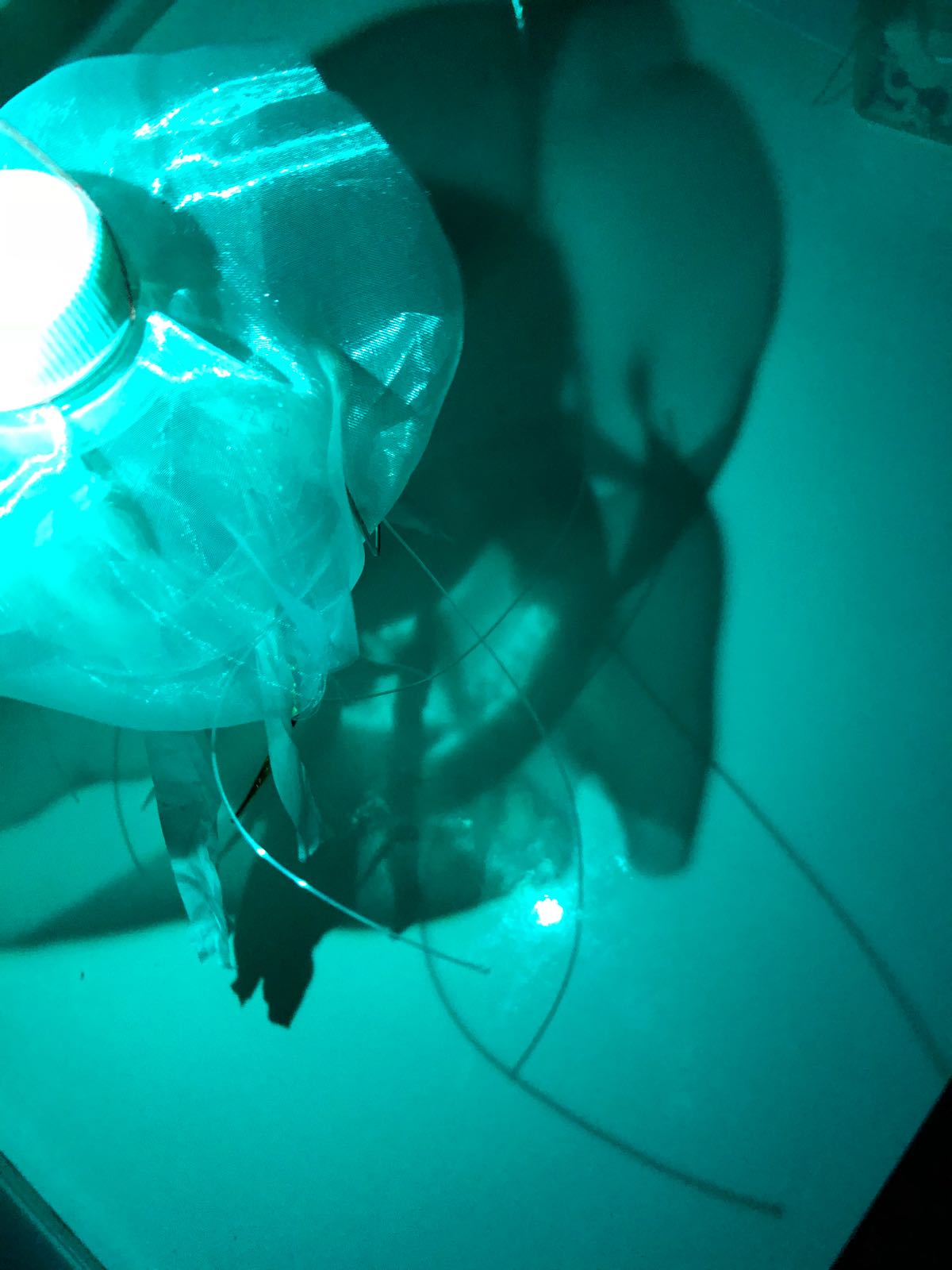
Material of jellyfish:
Shower cap/any translucent plastic
Metal wire
Plastic bottle
Nylon thread
Organza fabric
Interactivity with children
Netting of jellyfish printed on paper → cut and fold using glue (and process of researching of alternatives)
Where do we put the paper jellyfish after: separate rack or together with the installation?
Site Option:
Team members and responsibilities:
Kay – Video Rendering, Research on children’s interactivity
Raymond – Video Rendering
Ummi – 3D Model Rendering
Aaron – Research on children’s interactivity, Research on lighting components
Timothy Nohe was the guest speaker during class for this week. He gave a presentation on his interactive work titled ‘Light City: Electron Drawing — Visual Music’.
I find it interesting that he used other methods to create an interactive installation for the festival. I think for me, it was such a unique idea. Children in the video can be seen enjoying themselves with “disrupting” the movement of the image by running their hands on the gestural infrared controller — sending voltages to the synthesizer thus creating a change of pattern to the image. It also focuses on capturing the interactivity among all age groups where viewers learn from one another on how to change the movement of the lights on the screen.
We were given the opportunity to experience the “making” of the interactive image by playing with the generating system with the use of synthesizers, mixer and joystick by connecting wires from an input to an output. We were able to play with the wavelength or frequency, and sound.
There were a few learning points to take away from the speaker: he mentioned of the sound generated affected the dolphins nearby from the location of his installation. Thus they had to do testing in order to get a sound that does not “kill” or upset the dolphins. He also mentioned to always have a spare equipment for just-in-case situations, and having extra equipment that protects the system from the rain.
I think these points could be considered in the iLight proposal as well as we are dealing with an outdoor space.
During recess week, ADM-DIP members met up for the presentation on the IEM side. From feedback, we refined further:
Concept
Showing the effect of plastic pollution in the ocean.
How
Effect is shown through the marine life that is affected by plastic pollution with the change of colour.
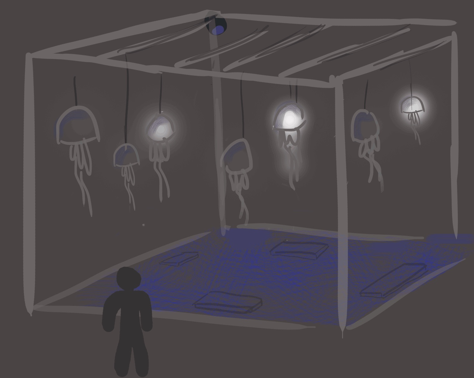
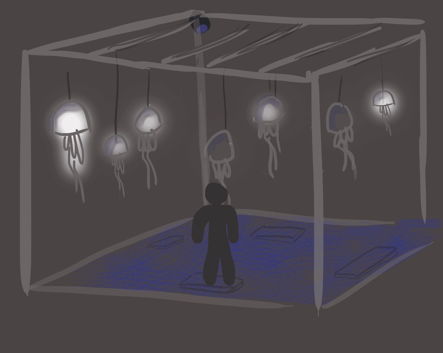
Mobiles installation of marine life, represented by jellyfish; about 6-8 suspended
What will happen
Ripple effect will be projected on the ground (from the top structure) to give the viewer sense of being underwater
Jellyfish dimly lit at random or some may not light up at first. When viewers step on the panel, the jellyfish will light up (like heartbeat)
The more panel is stepped on, the environment lighting (in this case the colour of the ocean) turns from blue to red.
Considered the movement of jellyfish — moving up and down, or sideways
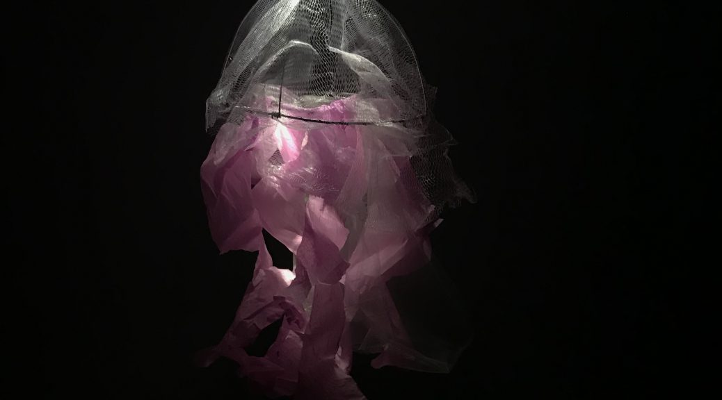
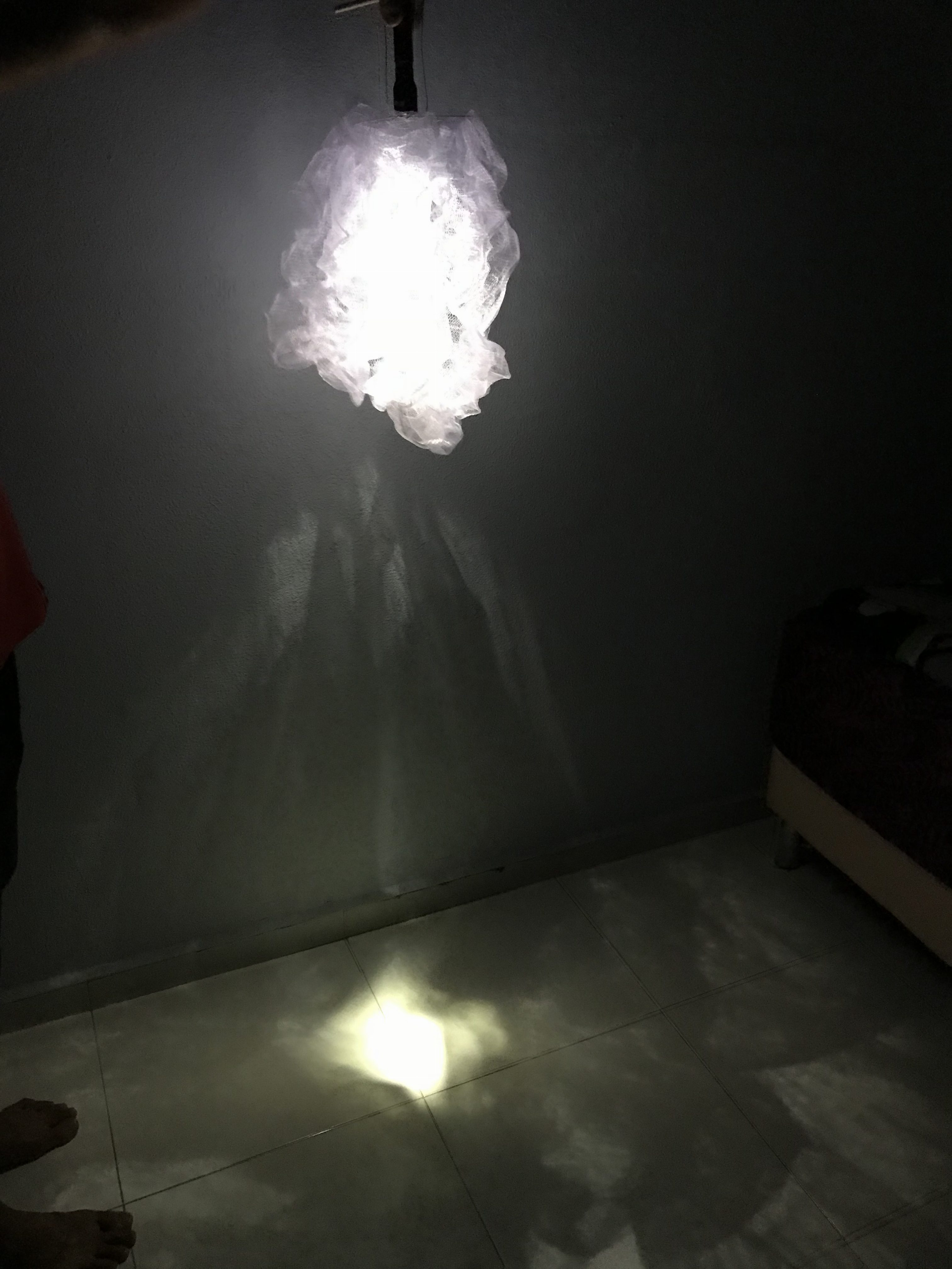
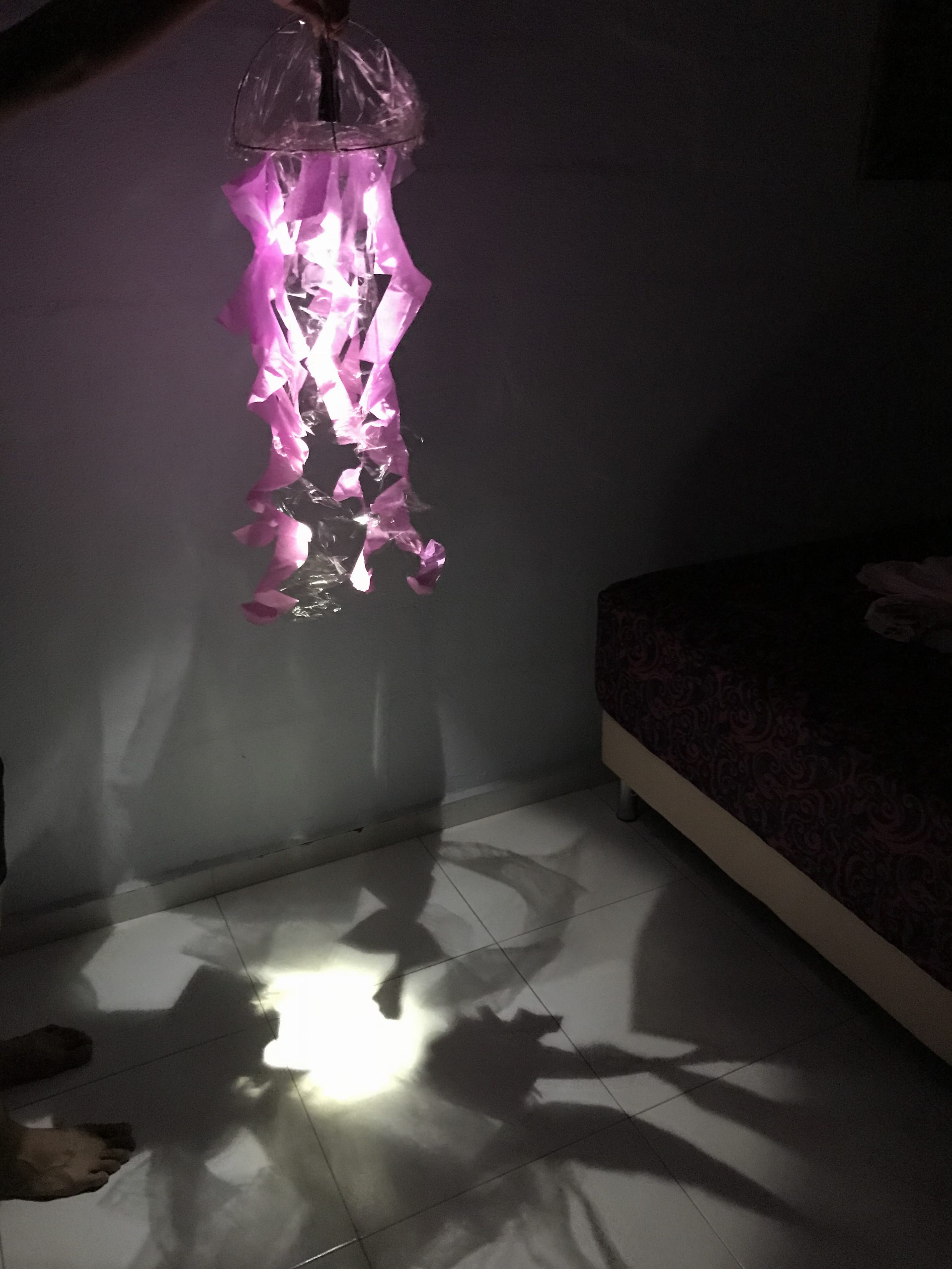
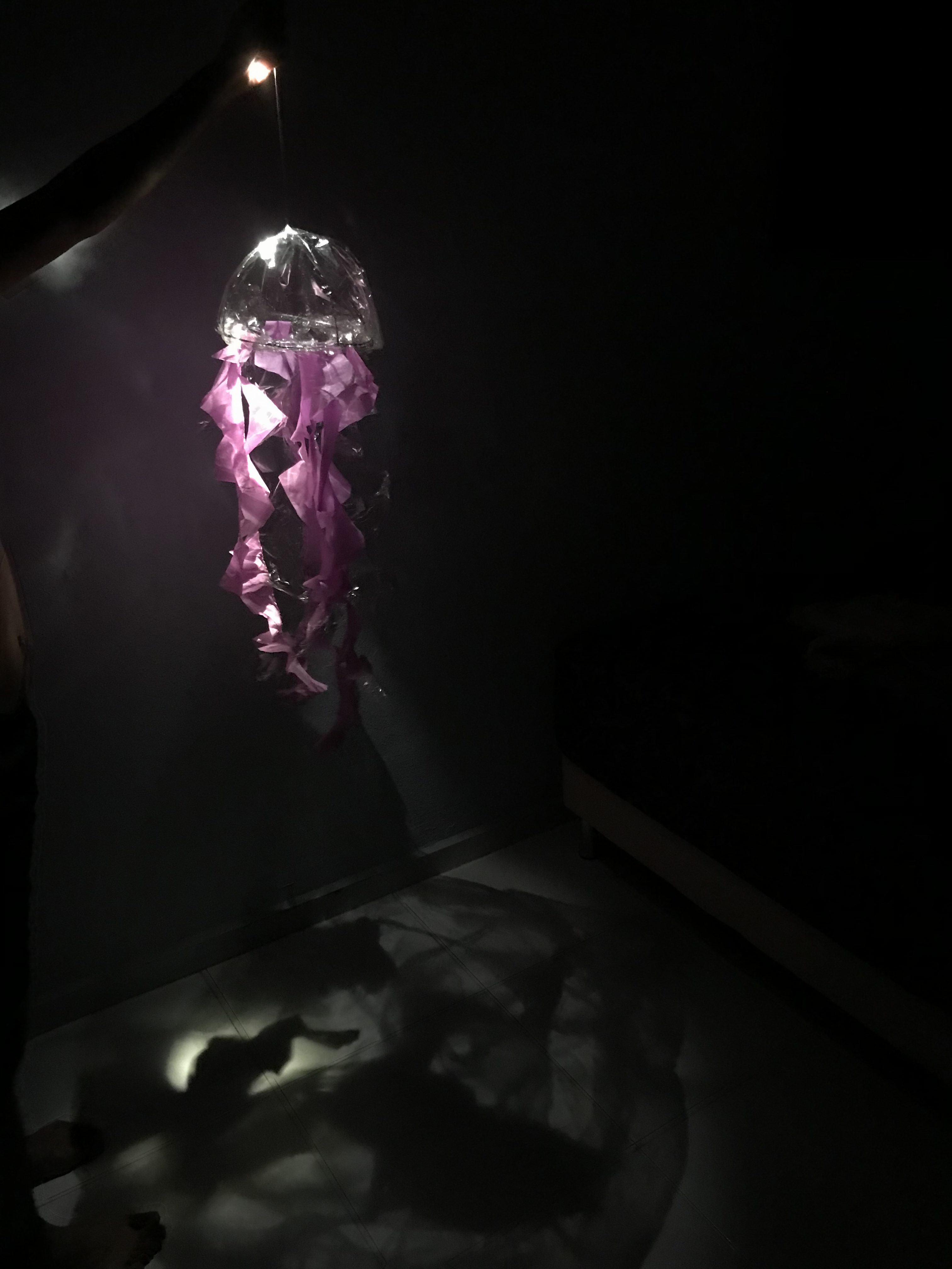
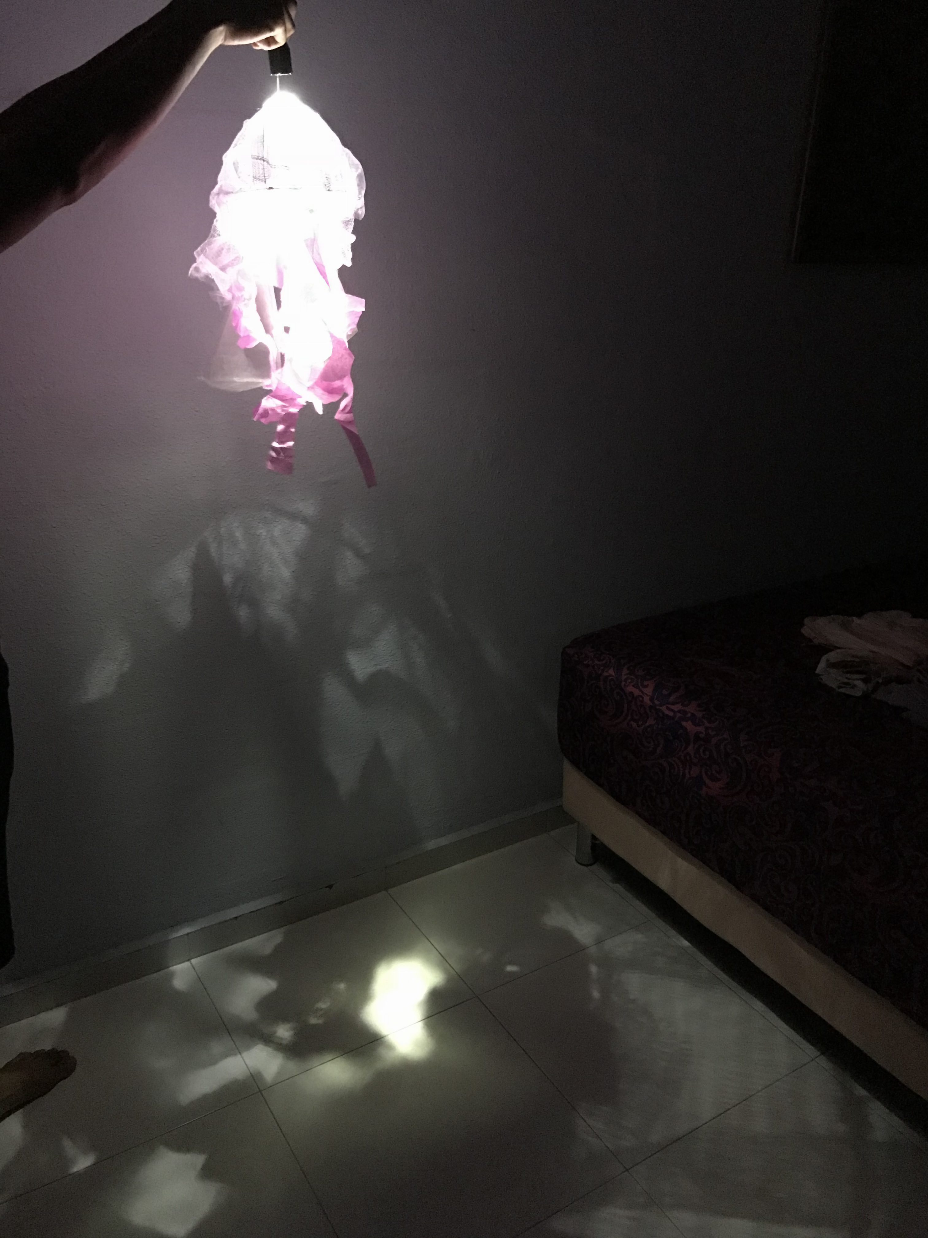
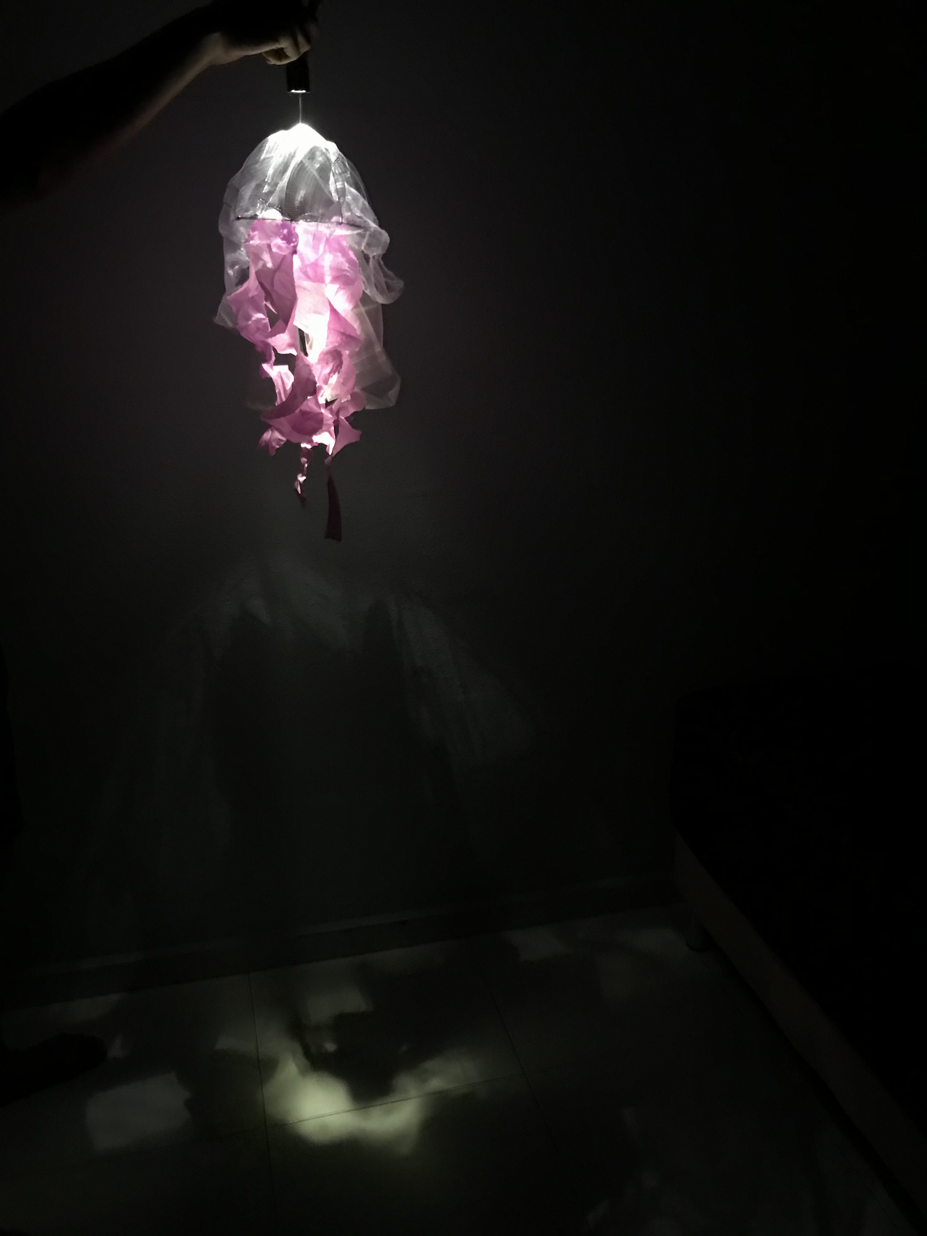
After the presentation, works were delegated to each team: DIP testing on technology, and ADM working on the jellyfish prototype. Materials for the jellyfish prototypes were mainly plastics and a mix of fabric to get certain reflective/shimmery effect. We were also trying to see what effect each material gives when it is projected to the floor.
When we tried to use LED light for each jellyfish, we realised that the strength of 1 LED light is not enough and it does not spread throughout the inside of the jellyfish.
Thus, the lighting may probably need a brighter light source for the entire jellyfish to light up. On the other hand, the choice of size of the jellyfish was decided to be of smaller scale, the standard size of water bottle.
In the previous chapter, Chipchase did a research on the 3 important items in one’s bag — key, money, and mobile phone. In this chapter, Chipchase then move towards the research and study of “carrying behaviour”.
I’d agree to some of the behavioural study he shared in this chapter:
1)
“On public transit in China and Brazil you’ll often see riders wearing backpacks on their chests (or “frontpacks”), a strong indicator of a short range of distribution, a high risk of theft, and an acute awareness of that risk and the need to react quickly if errant hands start unzipping a pocket.”
I think one would behave in such a way out of security. For myself, when I traveled for the first time to China, my backpack would normally be placed at the front for safety purposes — as stated, to react quickly if errant hands start unzipping a pocket. However, I’ve started to realise that wearing the backpack at the front became a habit when I traveled overseas like, not only in China but also in Korea.
2)
“… mobile technology has dramatically changed people’s behaviours outside the home, from carrying less to remembering less to owning less.”
With the rise of mobile technology, people relied on digital maps rather than physical maps mostly as a choice of convenience. However, how much would an application help when it suddenly does not work at the time where one desperately needs it?
For example, I was using Google maps in Korea to search for the route to a destination but it was not able to locate. Thus I had to resort to a hardcopy map that I brought as an alternative to find my way.
Thus I feel that one should rely on technology as much as we rely on a physical tool.
“When you want to know how and why people do the things they do, the best people to learn from are the doers themselves, and the best place to learn is where the doing gets done. This is the simple premise of design research.”
It is common for people/designers who are doing research to find the information and understanding of a situation online through social media etc. However, Chipchase’s way of design research is more towards first hand experience and observation by going through the daily routine of the users in order to understand why these doers do the things they do.
“Rapid Cultural Calibration” technique
As stated in the chapter, the technique can help deepen our understanding of a new culture and compare it with our own and others we’ve visited.
An observation that I had when I was in Seoul recently:
In the morning, locals were seen to be dashing across the road to catch the green man from a distance (at first I thought they were running towards the bus, but they dash across the road instead), heading towards the nearby subway station. While here in Singapore, locals were seen to be “enjoying their morning walk” to the MRT station nearby.
Another cultural observation was the subway train in Seoul — the local’s behaviours towards the reserved seats. The seats at both ends of each cabin was strictly reserved for senior citizens. It was a rare sight to see youngsters or non senior citizens in that seat. Not only the reserved seats, but locals usually allows the elders to have their seat. Comparing to Singapore, the reserved seats were mostly occupied.
I like the idea of traveling around the cities you visit to observe and understand the actions and behaviour of people. It gives the designers more insights and ideas to the next product they would make with relation to the cultural needs/behaviours.
Questions:
The conclusion of “great design research is by finding the right balance between formal and informal data collection.” Would doing only online research be considered as an imbalance?
How much information/observations does one have to collect before proceeding to the next design phase?
Chapter 1 mostly touch on the important characteristics of good design: discoverability and understanding. Throughout the chapter, I agree that designers should not only focus on making a product that works however they should also take into consideration of understanding the user’s interaction with the product itself. It would not be much of a success if the product sells well, works well, but it does not meet the needs of the human, their capabilities and behavior. In my opinion, designers hold the responsibility of fully understanding the behavior and the needs of users, then design
the everyday products based on what they have discovered.
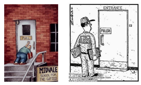
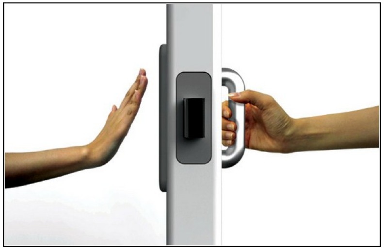
Chapter 1 has several points that made me wonder about the products/designs that I have seen or came across these recent days/months. For example, learning about the Norman door made me think about how sliding doors, now, are designed to be opened using technology. At one point of time, users were not even aware that the doors leading to a shop were operated by push/press button thus getting pushed by the oncoming door.
Automated vs manual (https://50daysux.files.wordpress.com/2013/07/day18-doors3.jpeg)
With relation to doors, how reliable is using technology in an everyday location? Perhaps, should the design of the button component be on the eye-level?