Tag Archives: monoprint

City: Moodboard & Theme selection

This post will contain information and images on the themes ideas for the Project City.

SUPERNATURAL CITY

Transform city found objects, and/or data, into representational or abstract forms, designs, and patterns for a large-scale public art installation.

When I think of cities, I think of man-made and natural aspects. I considered what can be seen in the cities, what can be felt in terms of how you feel etc. I decided to go on the direction of Nature for my City. Recently, I went to Chinese/Japanese Garden to see what I can be inspired from.

The first thing that came to my mind were ripples, how the water flows naturally could be turned or modified into an organic pattern following the movement or direction. After my personal trip, I went on Pinterest to gather inspiration and created my moodboard.

Inspiration Tab-Pattern Design
General research on Pattern Design on Pinterest. (Link: https://www.pinterest.com/youmikaltsum/inspiration-pattern-design/)


Moodboard - Ripples Inspiration
Moodboard on idea #1

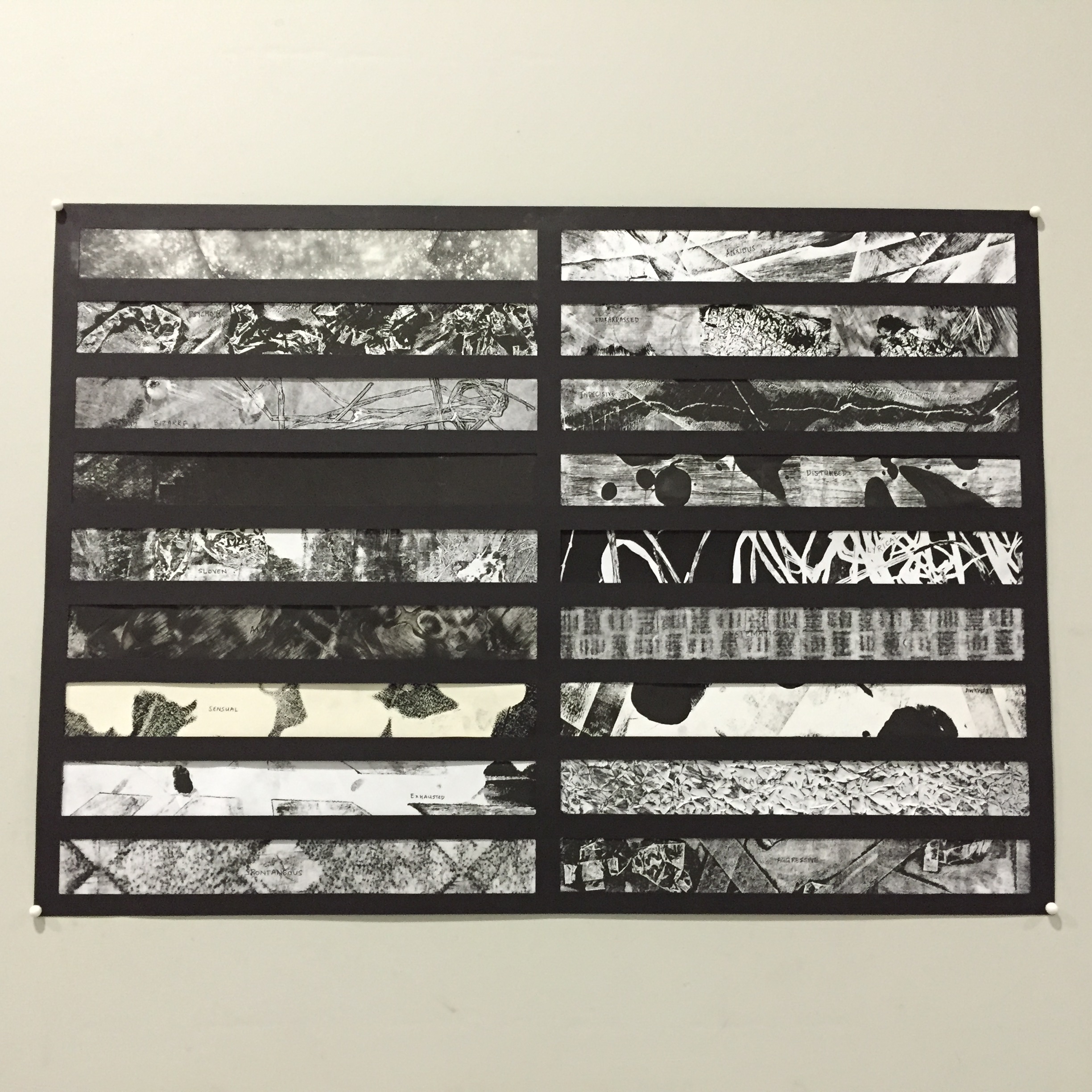
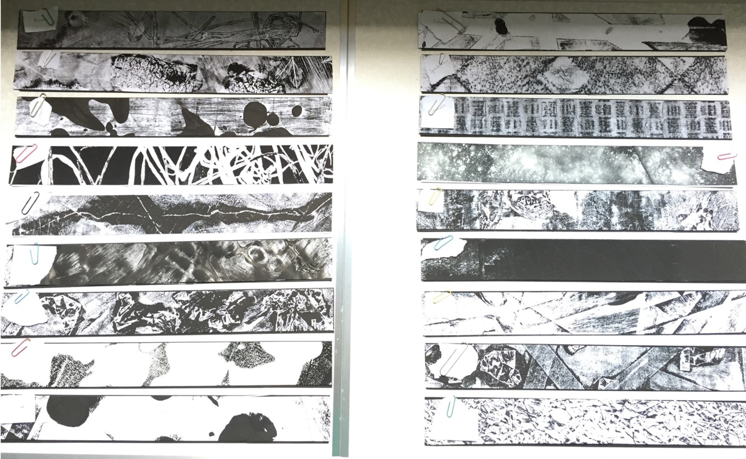
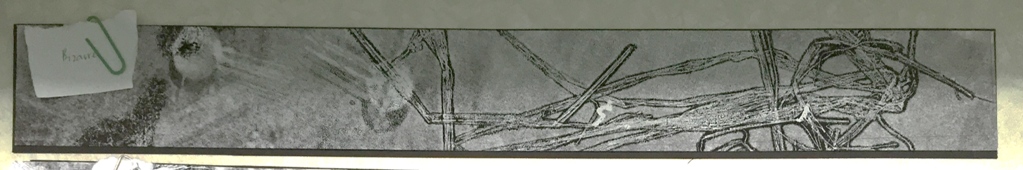
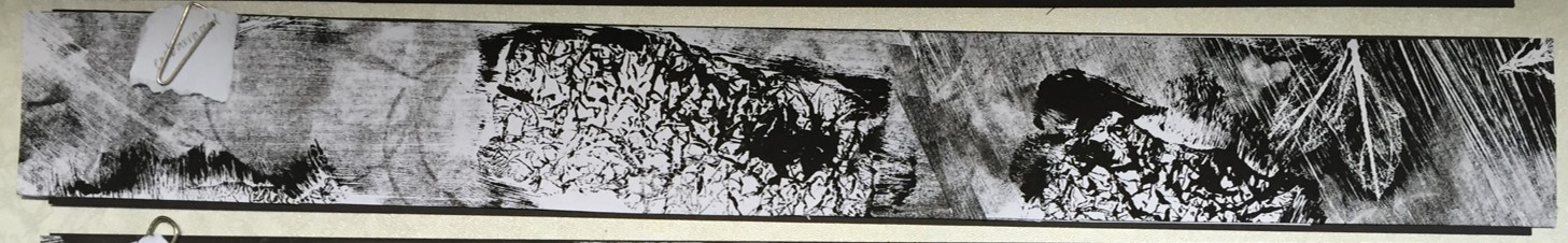
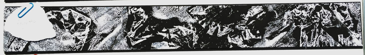
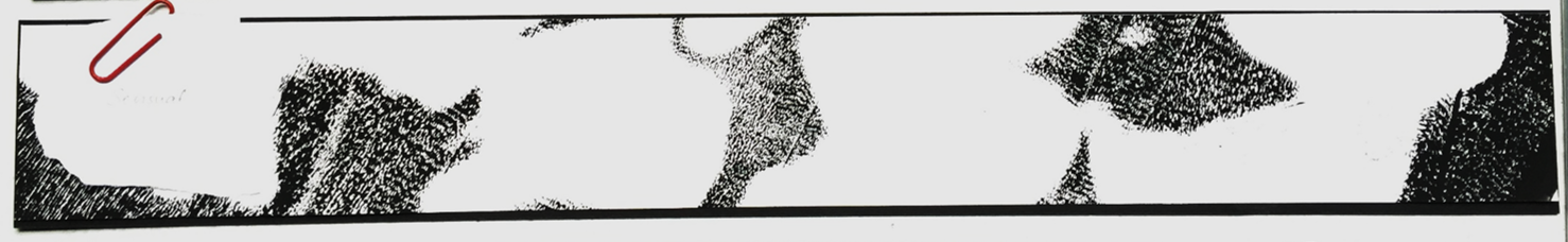
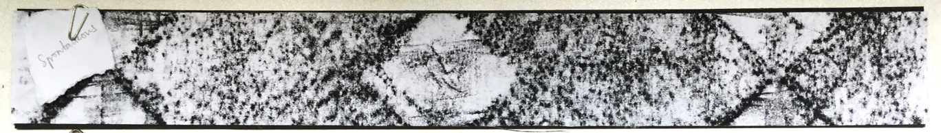
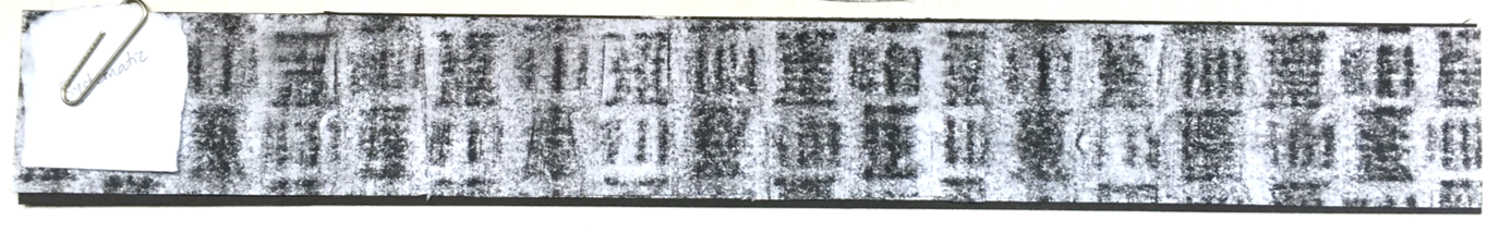
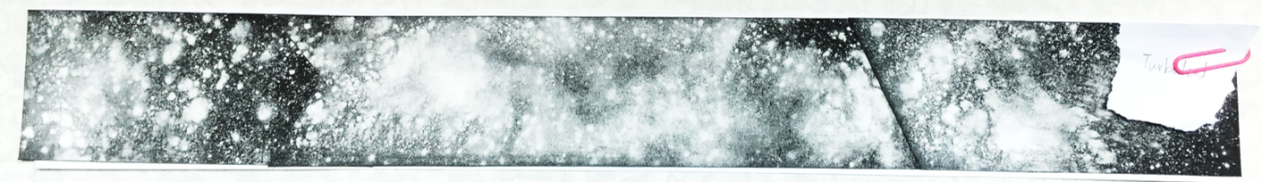
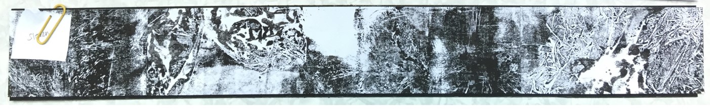
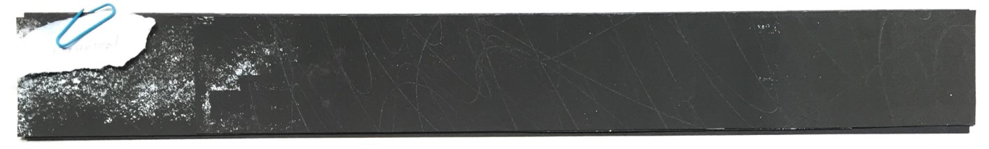
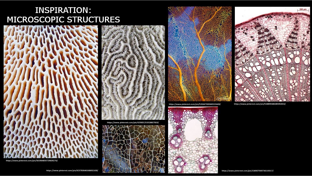
The second idea I had in mind was textures. So I looked out for trees, the road and other materials I can find along the park for unique textures. Some trees that had scales growing on the trunk thus it lead me to think of bio-mimicry, and/or microscopic structure.

Moodboard - Textures Inspiration
Moodboard on idea #2 – textures
Moodboard - Microscopic Inspiration
Moodboard on idea #3

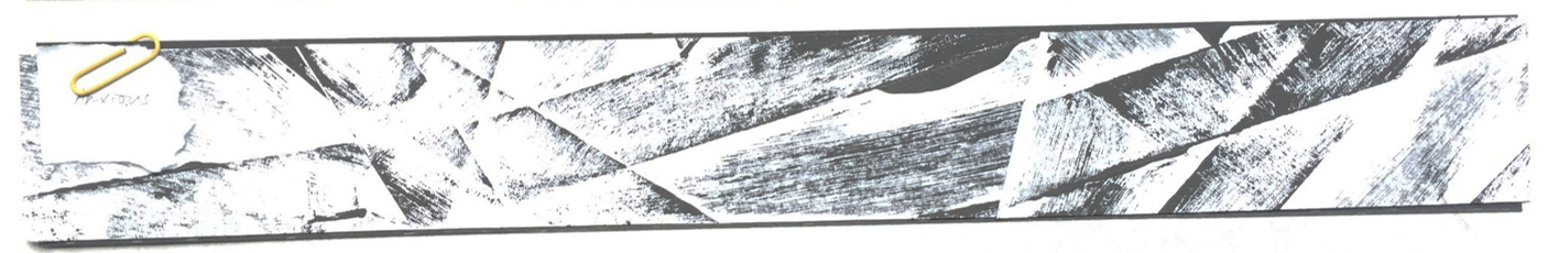
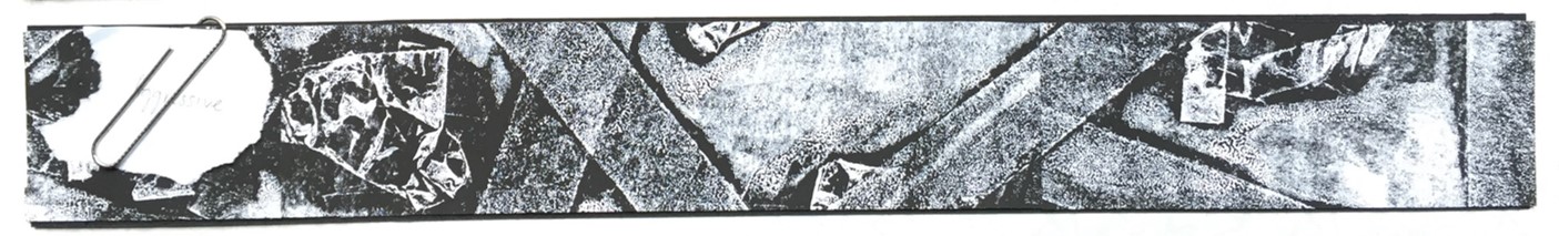
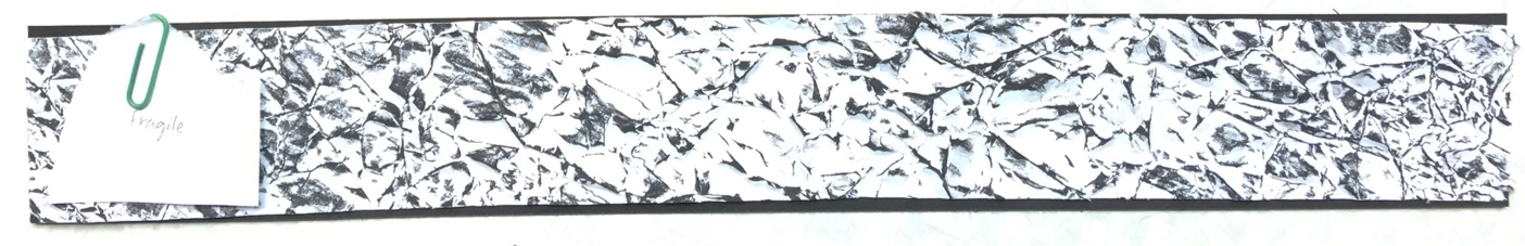
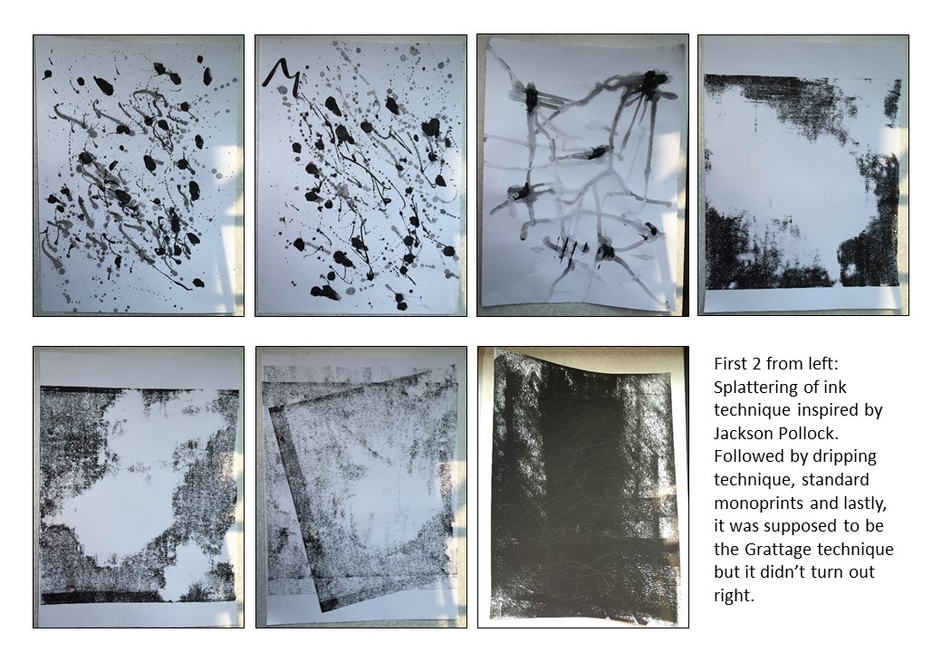
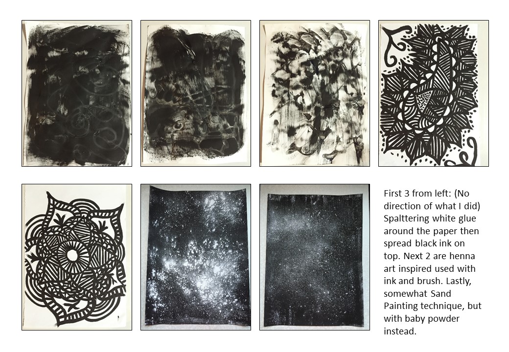
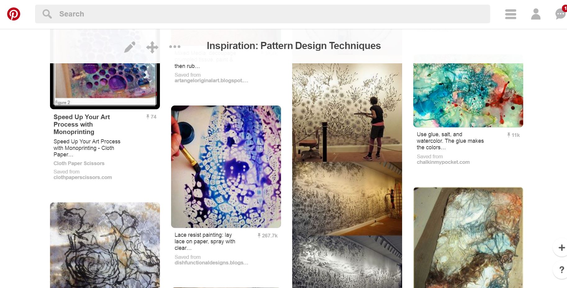
 Lastly, I researched on the different techniques to go create patterns. After browsing through Pinterest, I narrowed down to 2 techniques which you can find below:

My compilation of the different ways to create pattern using different tools (Link: https://www.pinterest.com/youmikaltsum/inspiration-pattern-design-techniques/)


Moodboard on techniques
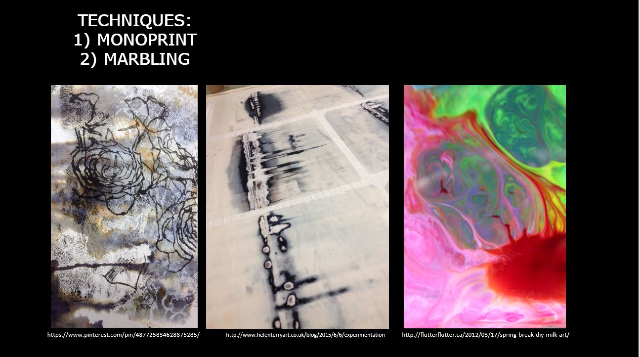
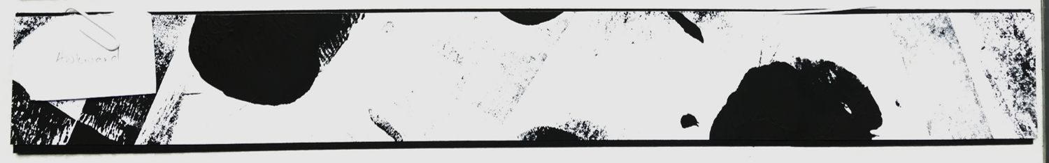
  1. marbling — I thought of using watercolour or milk with food colouring to create the cross section of the pattern
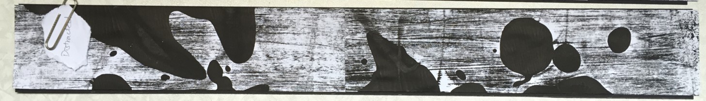
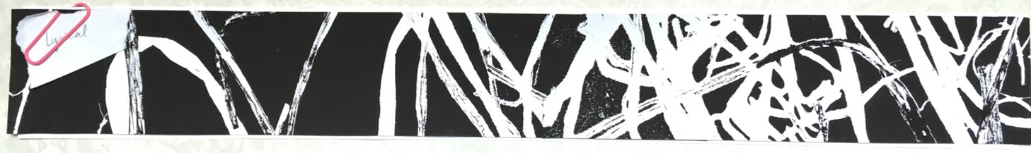
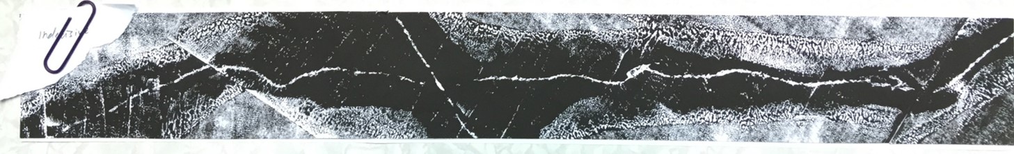
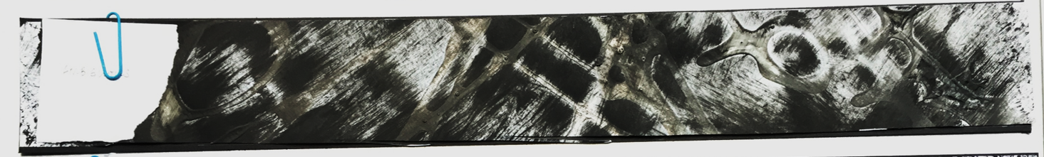
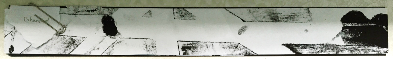
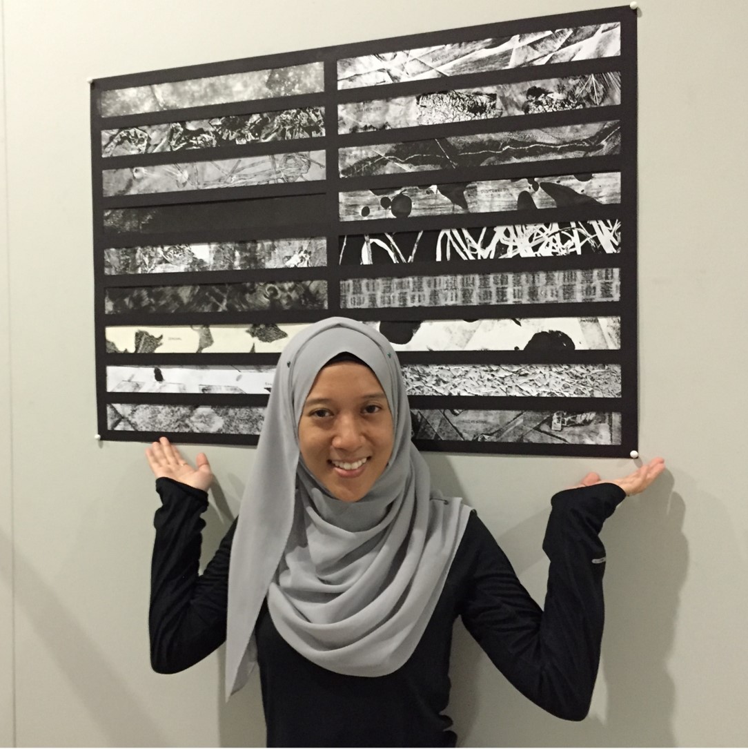
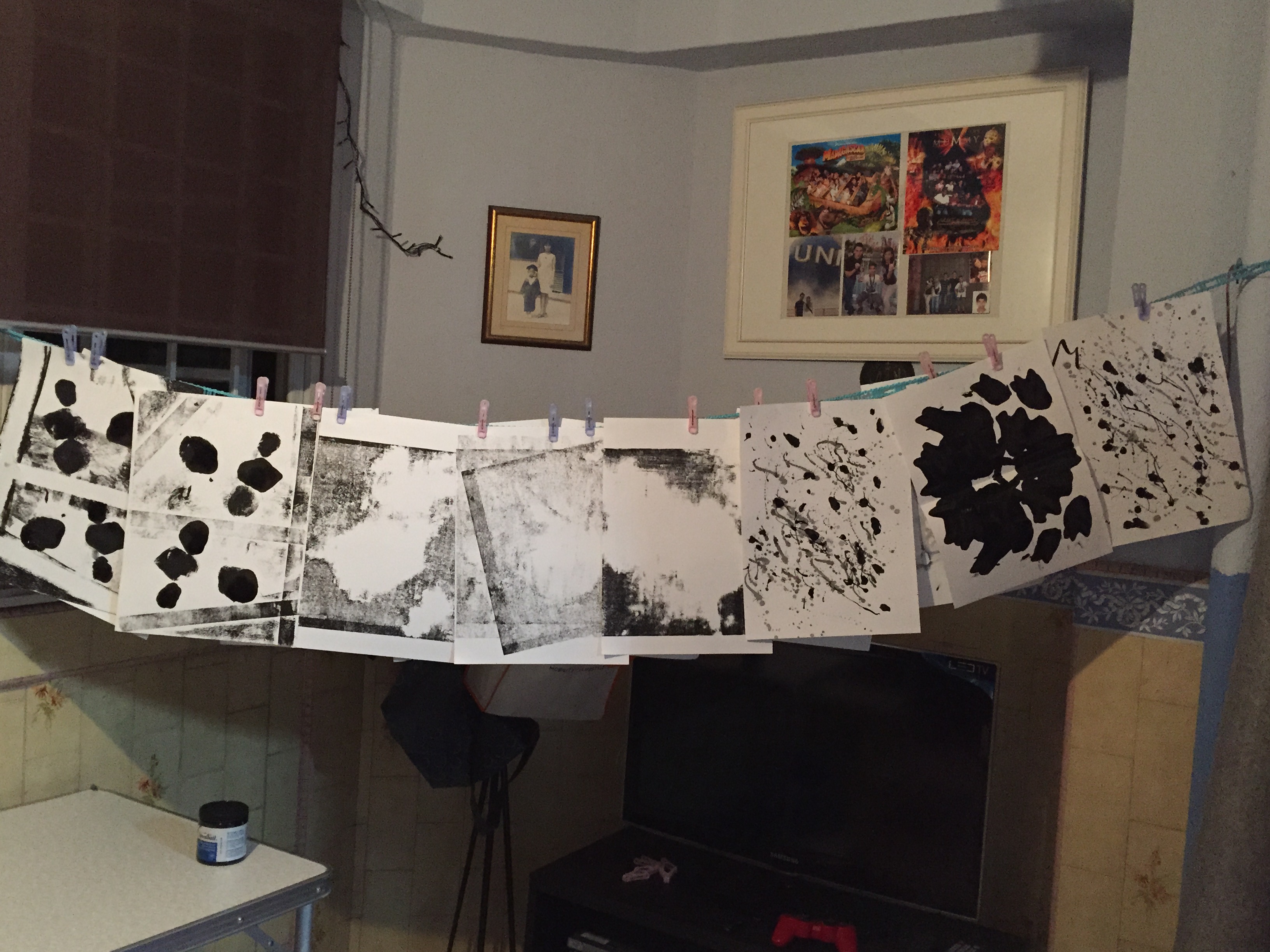
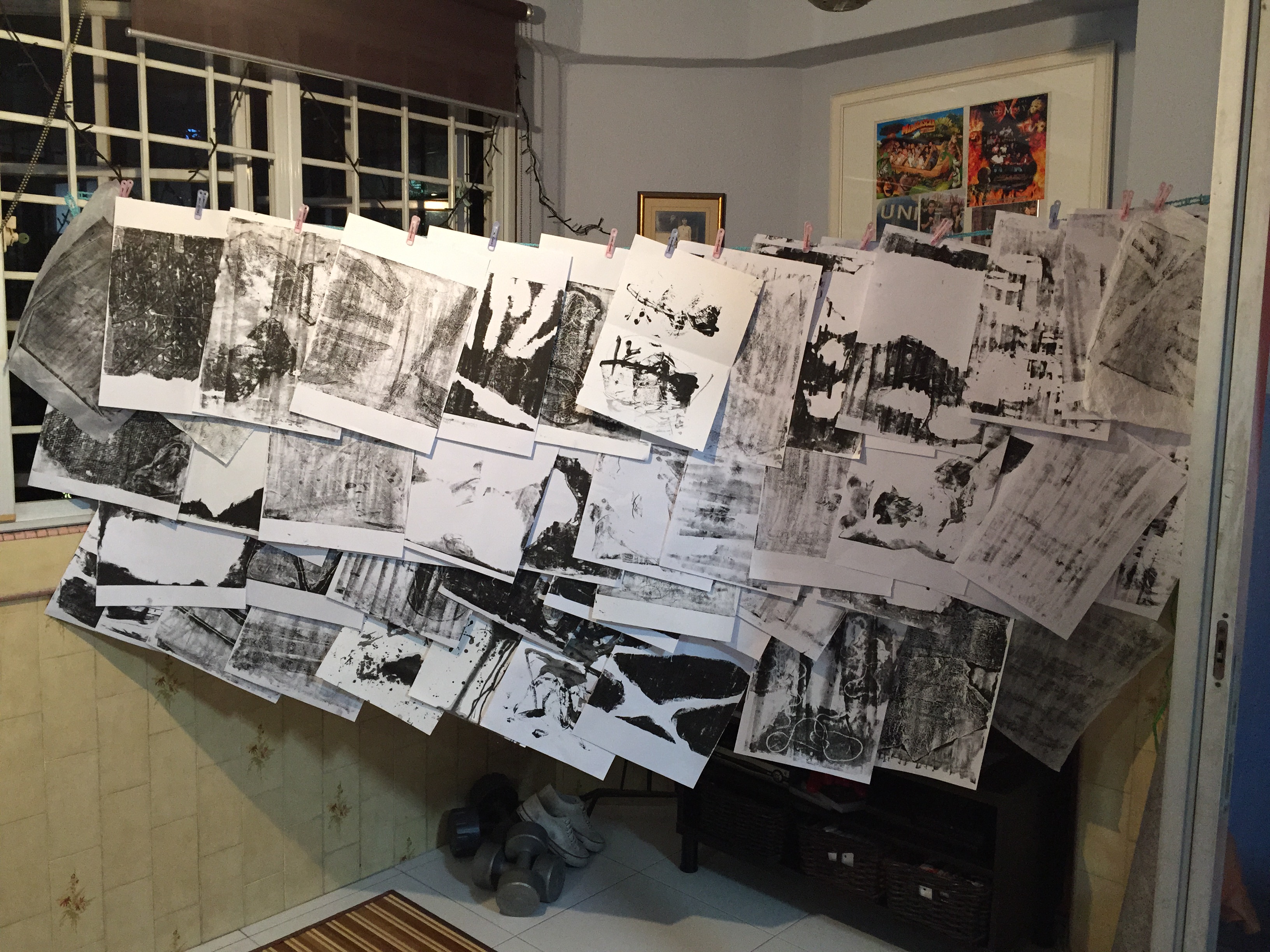
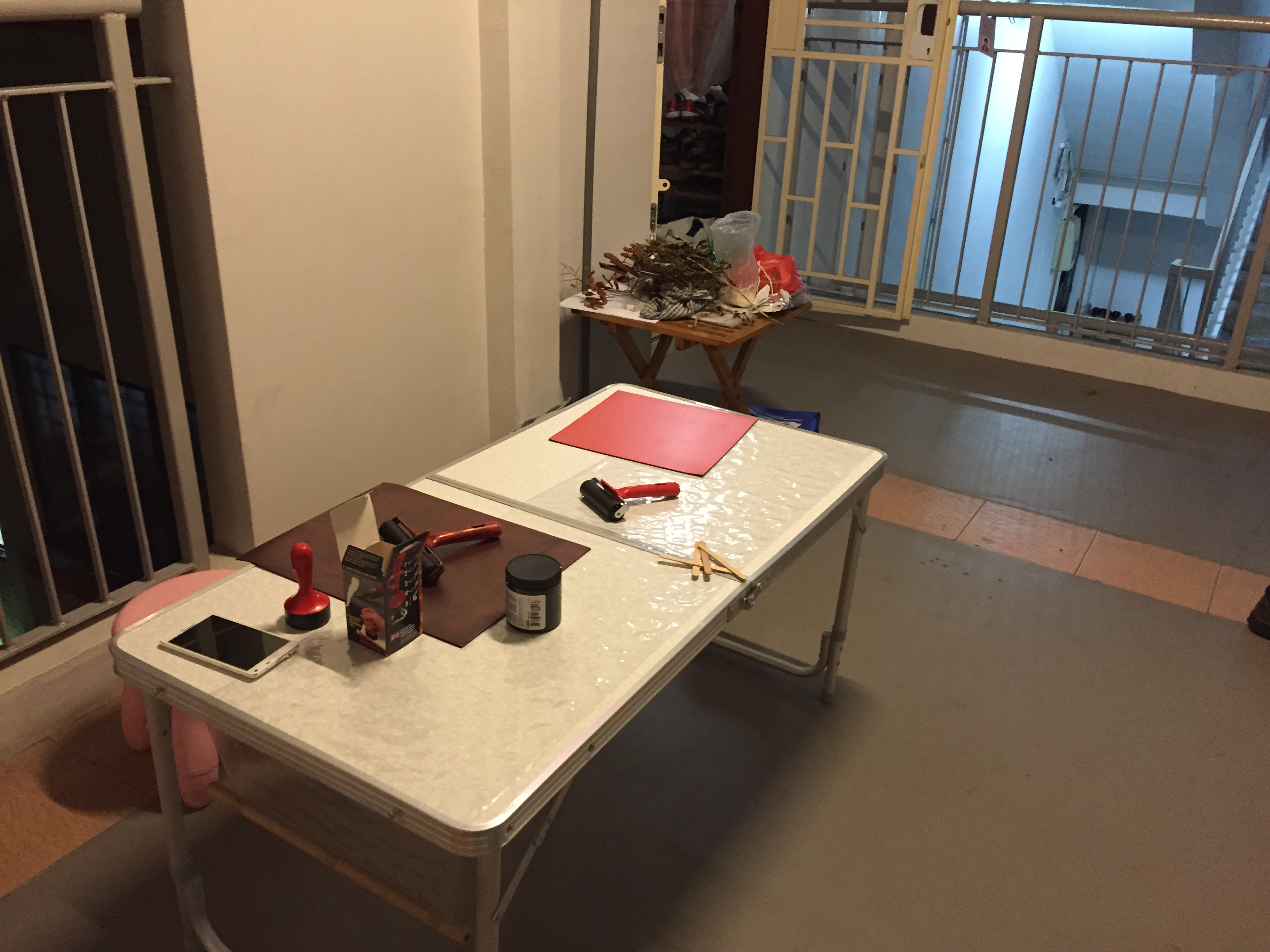
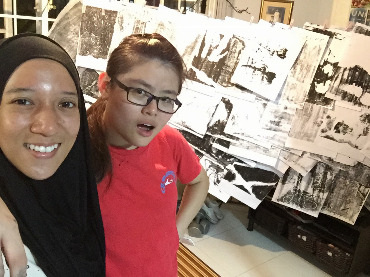
  2. monoprint — I thought of re-using the monoprint from previous semester, and do a few more to get variations so that I could collage them digitally.

In terms of colour, I thought of bright and contrasting colours like the last picture on the right from the techniques moodboard.

Lines follow Emotions

These are the 18 strips without its windows. Left column, top to bottom: Bizarre, Embarrassed, Distracted, Lyrical, Indecisive, Ambiguous, Psychotic, Sensual & Awkward Right column, top to bottom: Exhausted, Spontaneous, Systematic, Turbulent, Sloven, Nonsensical, Anxious, Aggressive & Fragile


Just like in design terms of “Form follow Function”, this assignment had the term of “Lines follow Emotions” where we had to mix and match the different abstract lines we have to the following emotions.

 When I was trying to sort out the lines to go with which emotion, I was mostly stuck on how one actually see the lines as nonsensical for example. However, I decided to just go with my own interpretation of how each line represents the emotions.


Bizarre in a way that the lines are interrupted with a weird looking key patch that stands out among the greys.
The contrast between the tone in the monoprinted sheet. I thought when you get embarrassed, you tend to blush so the darker tone in the strips represents the blushing effect among the rest.
The contrast between the tone in the monoprinted sheet. I was thinking at the moment “when you get embarrassed, you tend to blush” so the darker tone in the strips represents the blushing effect among the rest.
distracted
When one is distracted, their mind tends to get messy with all the different thoughts at the back of their mind. Therefore, this was chosen as ‘distracted’ as the blobs of ink represents the bubble of thoughts in one’s mind(?)
lyrical
Lyrical somewhat means expressive, rhythmic or some sort. Therefore I cut out a portion of my monoprint that has lines flowing as if you can see musical notes floating along the lines.
I cut out portion of my monoprint that shows indecisive -- lines crossed path each other. Imagine you standing at the intersection and then thinking "Do i go this way or that way or that or this way?"
“I want KFC. No wait, MacDonalds. No no, Burger King….. or Long John Silver?” Just like you get indecisive on what to eat for lunch, these lines get indecisive on where they want to go. In the end, all went separate ways.
Method of spamming glue spontaneously to actually create texture when it dried up (but i failed). Ambiguous in a way that the tone is not certain and you actually don't know what is happening either -- as some part of the strips are bold, grey and white.
Method of spamming glue spontaneously to actually create texture when it dried up (but i failed).
Ambiguous in a way that the tone is not certain and you actually don’t know what is happening either — as some part of the strips are bold, grey and white.
When I think of psychotic, I think of the show Criminal Minds -- shows the different signs of psychosis. I interpreted it in a way that I would collage certain parts of the monoprints to create something 'insane'. For example, I see a face at the right corner of the strip, a scary T-Rex's mouth opened wide & etc.
When I think of psychotic, I think of the show Criminal Minds — shows the different signs of psychosis.
I interpreted it in a way that I would collage certain parts of the monoprints to create something ‘insane’. For example, I see a face at the right corner of the strip, a scary T-Rex’s mouth opened wide & etc.
When one think of the word 'sensual', it always got to do with one's body. (I thought of it like that) So, I represented my emotion of 'sensual' with curvatures as it shows sexiness. As if it's a body shape of a lady or somewhat. The background is bold so the curvatures actually stands out.
When one think of the word ‘sensual‘, it always got to do with one’s body. (I thought of it like that)
So, I represented my emotion of ‘sensual’ with curvatures as it shows sexiness. As if it’s a body shape of a lady or somewhat. The background is bold so the curvatures actually stands out.
This strip was a cut out portion from my piece of somewhat Decalcomania technique. When one is awkward, one tend to stay as far as possible from the crowd. Therefore, the blobs of ink are actually at a distance from one another thus you can feel the awkwardness around them.
This strip was a cut out portion from my piece of somewhat Decalcomania technique.
When one is awkward, one tend to stay as far as possible from the crowd. Therefore, the blobs of ink are actually at a distance from one another thus you can feel the awkwardness around them.
This strip was a monoprint consisting of paper tape and blobs of ink. Imagine your smartphone, as you use more data your phone battery will deplete. Putting this interpretation with the lines I have, the blob of ink at the right corner of the strip actually shows that it is on the verge of finishing thus it looks exhausted.
This strip was a monoprint consisting of paper tape and blobs of ink.
“I am exhausted, I have no energy left to continue this activity.” Putting this interpretation with the lines I have, the blob of ink at the right corner of the strip actually shows that it is on the verge of finishing/depleting thus it looks exhausted.
Method of Frottage was used with chalk pastel. Spontaneity is the action of being natural. For example when one gives a speech, they actually don't refer to anything nor prepare but words just flow of them. Interpreting from that, I thought this piece was spontaneous with its symmetrical shape. The reason was because humans tend to like symmetry and it is actually a natural and common thing. (i do)
Method of Frottage was used with chalk pastel.
Spontaneity is the action of being natural. For example when one gives a speech, they actually don’t refer to anything nor prepare but words just flow of them. Interpreting from that, I thought this piece was spontaneous with its symmetrical shape. The reason was because humans tend to like symmetry and it is actually a natural and common thing. (i do)
Systematic is all about the rhythm and repetitive patterns. This piece was also done using the Frottage technique of a table mat. It falls under this emotion perfectly for its obvious reason -- repetitive patterns.
Systematic is all about the rhythm and repetitive patterns. This piece was also done using the Frottage technique of a table mat. It falls under this emotion perfectly for its obvious reason — repetitive patterns.
This piece was done using baby powder. I painted the paper with black ink and then upon drying, baby powder was spammed onto the paper. (A little bit of fixing with hair spray to keep the powders stuck to the paper but I think it was unsuccessful) Think of being in a flight and then it's going against strong wind. I thought of that for this emotion. Therefore, with the chaotic spread of the powder around the paper, I think it shows the turbulence.
This piece was done using baby powder. I painted the paper with black ink and then upon drying, baby powder was spammed onto the paper. (A little bit of fixing with hair spray to keep the powders stuck to the paper but I think it was unsuccessful). Think of being in a flight and then it’s going against strong wind. I thought of that for this emotion. Therefore, with the chaotic spread of the powder around the paper, I think it shows the turbulence.
This strip was chosen to show the emotion of sloven as the strip is filled with messy components.
This piece was nonsensical in a way that it doesn't make any sense at all. Even when I was experimenting the scraping of wet paint with a tip of a paper clip.
This piece was nonsensical in a way that it doesn’t make any sense at all. Even when I was experimenting the scraping of wet paint with a tip of a paper clip.
When you're anxious, your muscles tend to tense up. In this piece, I interpret it in a way that the intersection of the paper tapes grew tense as the different sides get pulled.
When you’re anxious, your muscles tend to tense up. In this piece, I interpret it in a way that the intersection of the paper tapes grew tense as the different sides get pulled.
aggressive
The monoprint used to portray this emotion has this bold effect that make the whole strip stands out. The texture of the paper tape and the creases of the crumpled paper scattered around shows that more force was initiated. Aggressive in terms of the sharpness and the intensity of the texture.
When you think of fragile, you know it has got to do with things that are brittle and tender loving care. This strip was done using the Froissage technique, chalk pastel ran over the creases to give the effect. The creases represents the cracks and it was actually fragile when I was cutting it due to the creases.


With all these strips, it was then compiled and sorted out to their windows… (see below)

My completed piece of lines. #achievementunlocked
My completed piece of lines.
#achievementunlocked

Another round of trials

I always have these ideas at the back of my mind when I have some “me time”, so I decided to have another session of self monoprinting at my balcony.

Slide9 Slide10 Slide11


So I decided to try several techniques, as attached in the set of pictures above:

  • Top set contains the techniques of Decalcomania
  • Middle set contains mixture of inspired Jackson Pollock splattering of paint technique, standard monoprint, and the dripping of paint/ink technique.
  • Last set contains inspired Mehndi or Henna art (4th and 5th from the left), inspired Art Attack technique of painting over dried glue (first 3 from left) but it failed when the glue flattens as it dries up, and, technique somewhat similar to Sand Painting except the minus off the glue and the sand and replacing it with just baby powder.

*Just some reflections*

I had this thought to myself whereby I feel that most of the time when I do these monoprints and automatism techniques, my mind would be completely blank. Sometimes during the monoprint sessions, I would just loose myself into whatever I was doing, using whatever resources and not actually thinking what I want to achieve in the printing. For example, putting this and that on the mat. Or when trying out the Rorschach tests, I don’t try to draw anything in particular, I just spam inks here and there and that’s what I get.

On the other hand, while trying out the Jackson Pollock technique, I was splattering the ink while I was feeling rather upset, and as I splat more inks, the emotions followed and I actually felt better when I was done.

Definitely so, art is therapeutic!

Another quick video before you leave!

Artist in the making: Dzaki Safaruan

Follow up from the couple of previous post from when we were to post about a favourite artist or somewhat, I picked a 26 year old local Singaporean, Dzaki Safaruan.

26-year-old local Singaporean artist in the making: Dzaki Safaruan More about him over at (http://www.nafa.edu.sg/showcase/graduation-portfolios/muhammad-dzaki-bin-safaruan)
26-year-old local Singaporean artist in the making: Dzaki Safaruan
More about him over at (http://www.nafa.edu.sg/showcase/graduation-portfolios/muhammad-dzaki-bin-safaruan)

If one were to google him online, there is nothing much to find as he is not as famous as Ed Moses or the other artists that we know of from this assignment. But maybe I’ll just introduce him with what I know.

Dzaki Safaruan is a cousin of mine who recently graduated from NAFA for his Degree in Fine Arts. He has this “thing” for art since his secondary school times(?) and decided to pursue his love and passion for art right after. One thing for sure, he always has a sketchbook with him. Sometimes it would be as big as A4 size, and sometimes it would be the pocket sized sketchbook.

I have a few of his art works that you could look at and be as amazed as I am.

First of, just a simple painting that he did for my mum's birthday.
First of, just a simple painting that he did for my mum’s birthday.
This artwork was exhibited for his Diploma's FYP. As far as i know, he did alot of printmaking and this is one of it. If one were to actually zoom in on the artwork, they are actually collages of comic arts.
This artwork was exhibited for his Diploma’s FYP. As far as i know, he did alot of printmaking and this is one of it. If one were to actually zoom in on the artwork, they are actually collages of comic arts.


This was done when Singapore's first Prime Minister Lee Kwan Yew pass away. It was situated at the open space behind JCube Mall during the farewell periods. As you can see, he used black ribbons to compose a graphic face late Mr LKY.
This was done when Singapore’s first Prime Minister Lee Kwan Yew pass away. It was situated at the open space behind JCube Mall during the farewell periods.
As you can see, he used black ribbons to compose a graphic face late Mr LKY.
Translated caption reads "A strand of thread (from prayer rug) per day, in the end becomes..."
Translated caption reads “A strand of thread (from prayer rug) per day, in the end becomes…” It was his art piece for the final year project. Basically what he did was consistently pulling a strand of thread from the prayer rug each day. All these strands then was formed back into a rope.
(http://www.straitstimes.com/lifestyle/arts/hour-at-the-museum-after-printmaking) This is another interesting art piece he made.
(http://www.straitstimes.com/lifestyle/arts/hour-at-the-museum-after-printmaking)
This is another interesting art piece he made.

His works are amazing, with all the precision lines and details. Recently he gave me an advice and ideas on how I could make my monoprint exciting from his experience. I tried one and its result:

He told me I could try to use baby powder instead of sand and pressed it down as it will give texture. So I painted the paper with black ink, and 'showered' my paper with powder then pressing it down.
He told me I could try to use baby powder instead of sand and pressed it down as it will give texture.
So I painted the paper with black ink, and ‘showered’ my paper with powder then pressing it down.


P/S: You can find out more on his work on FacebookWebstagram and/or Instagram!