Below are the improved still images I have been working from the previous testing on the media wall:


Below are the improved still images I have been working from the previous testing on the media wall:
Below are the images of the Final Collection.
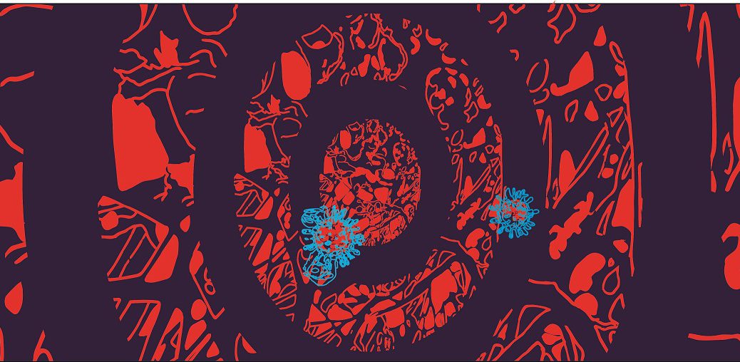
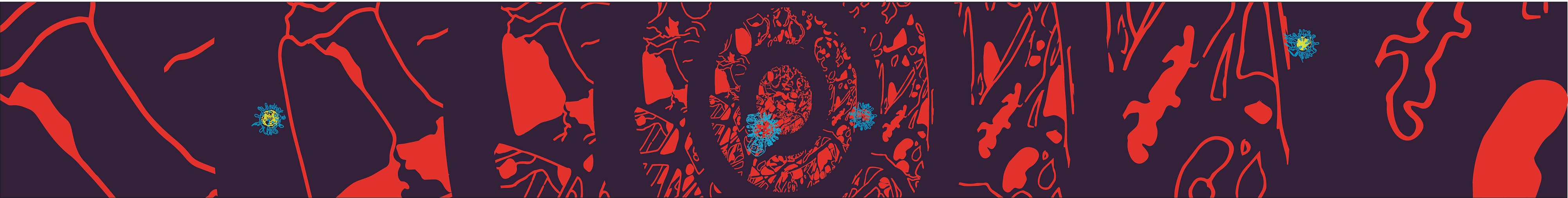
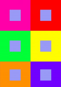
2. Main virus: separated mixed composition to form 4 different viruses

3. Still images of pattern

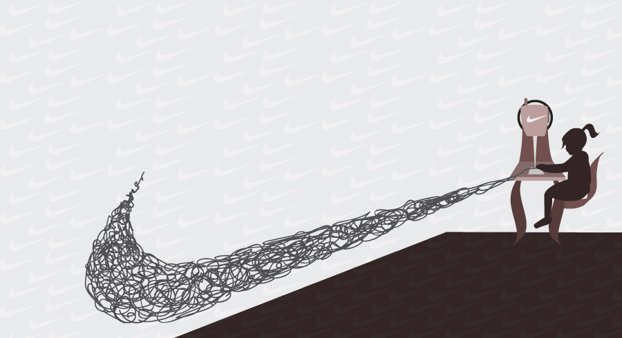
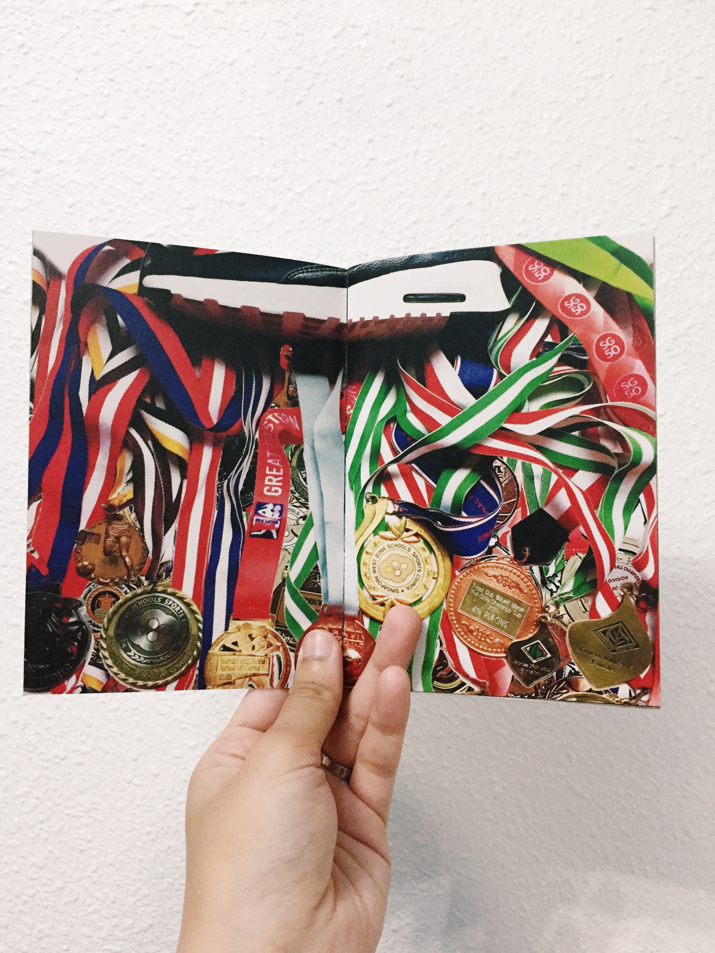
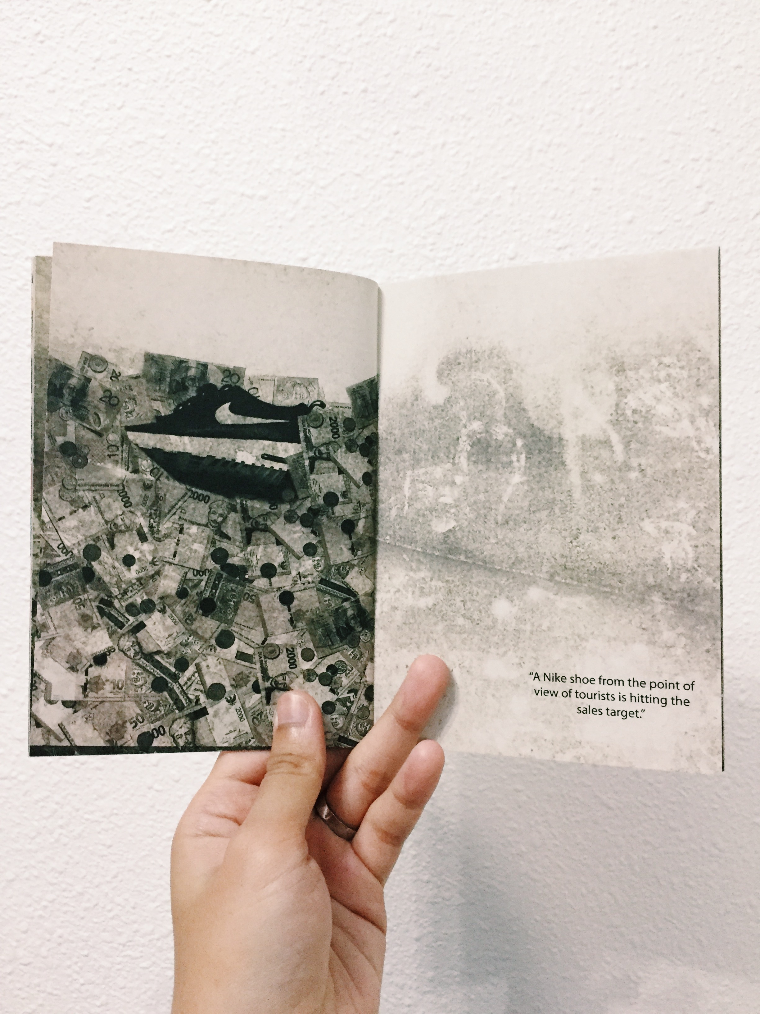
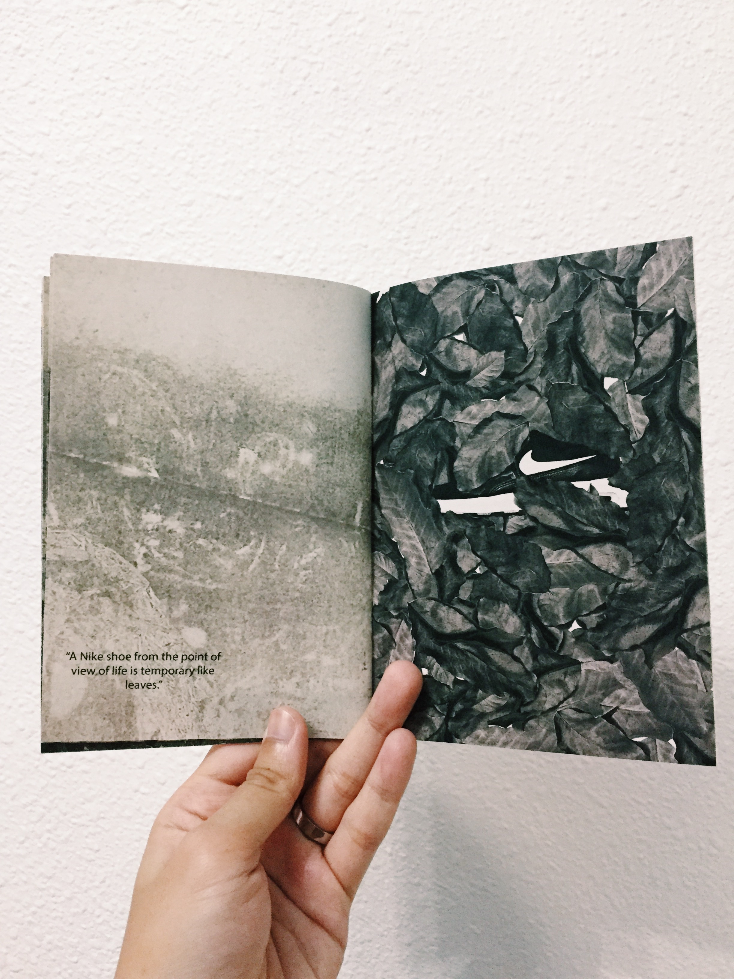
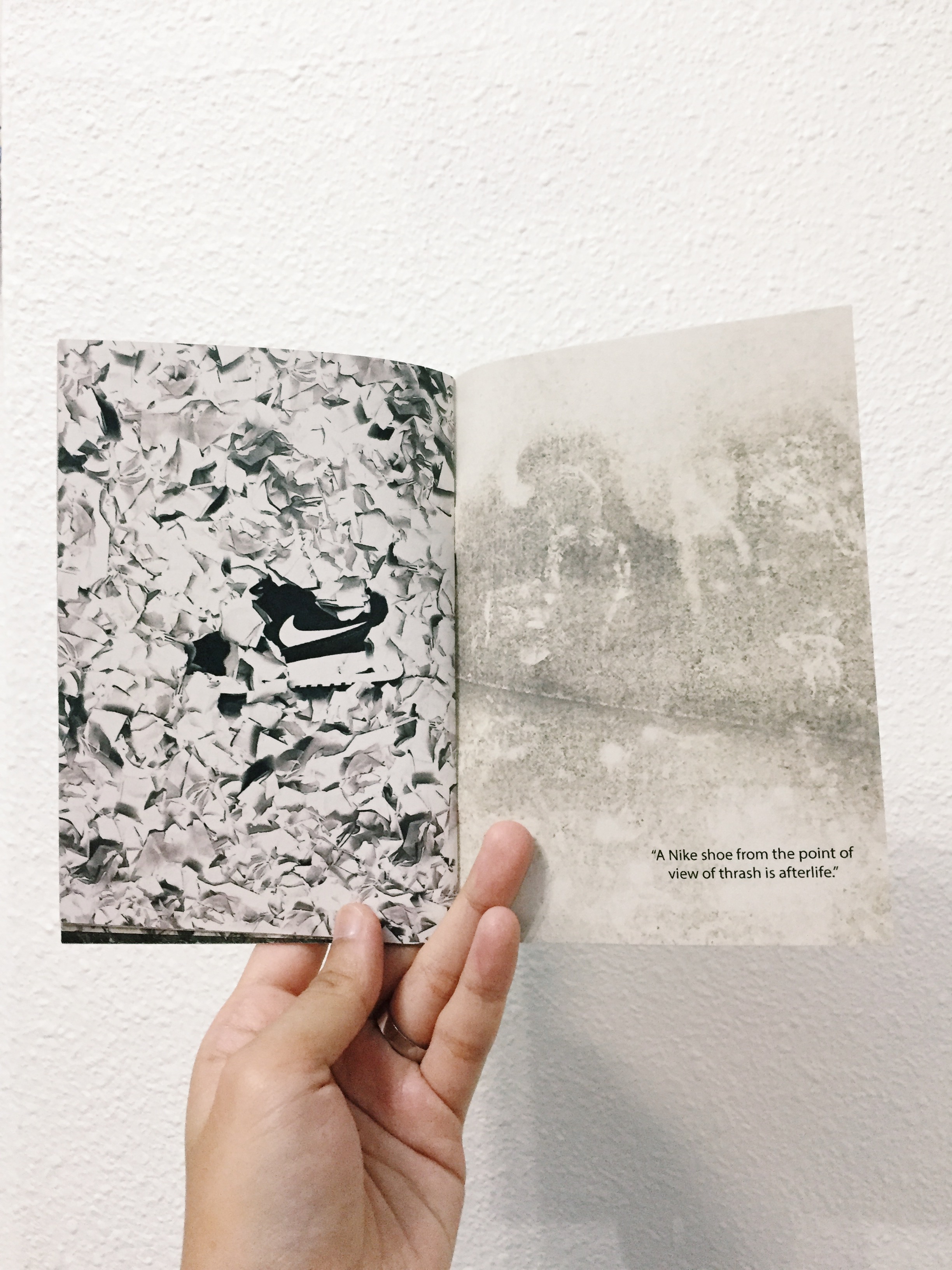
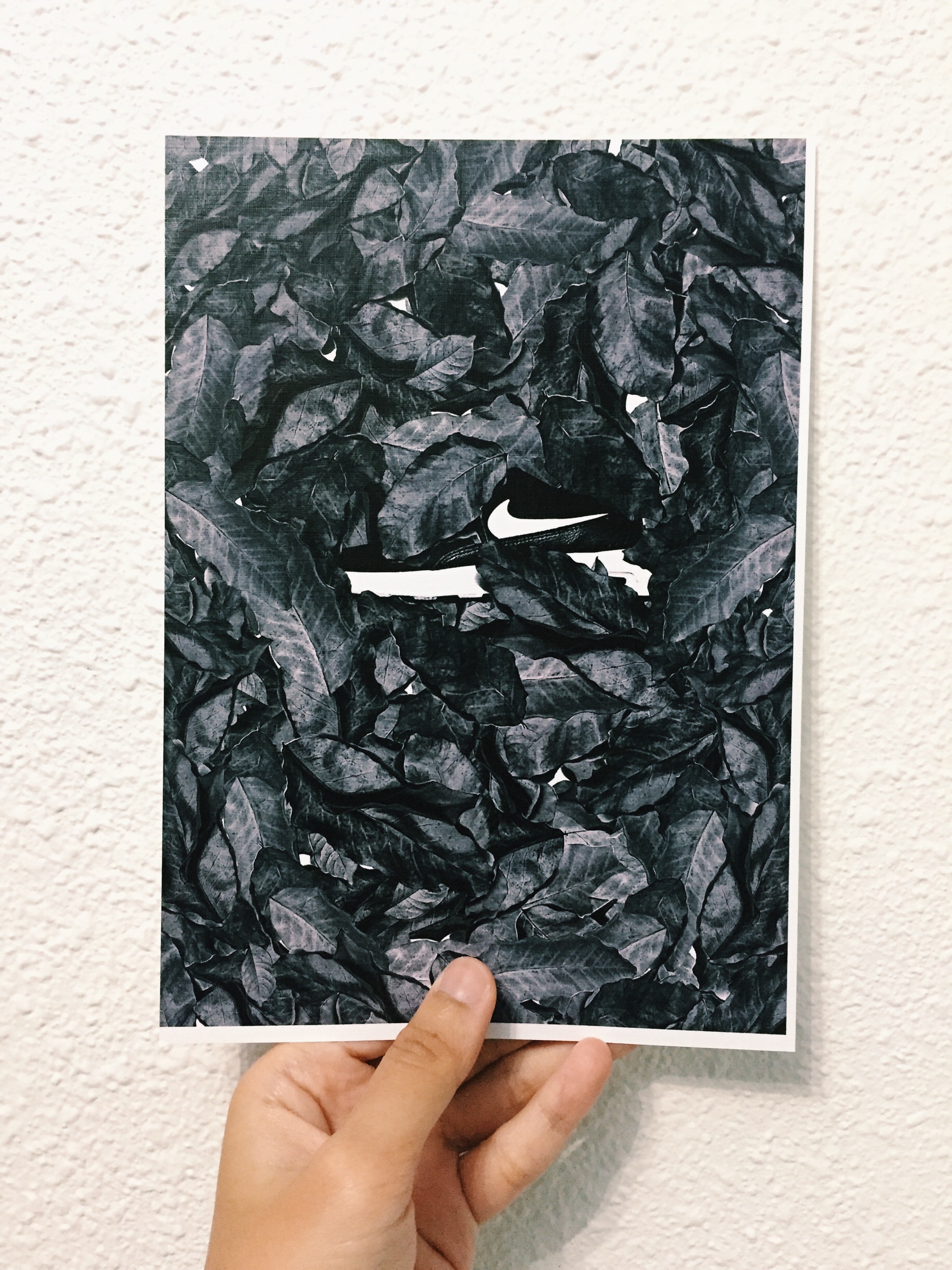
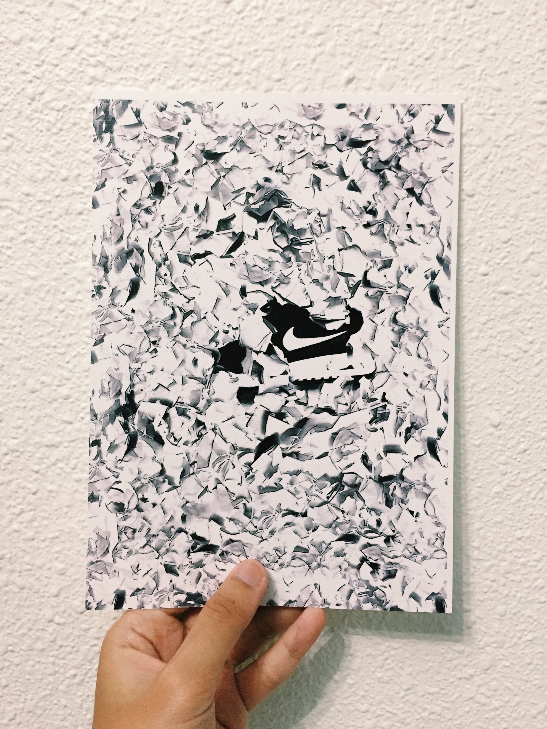
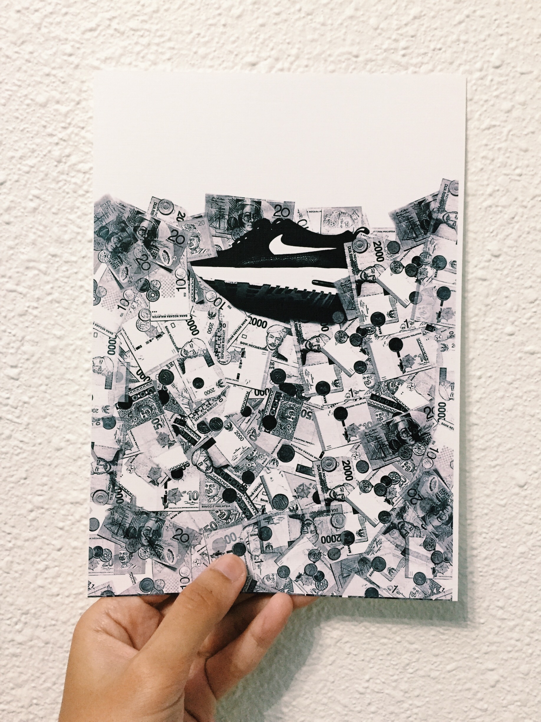
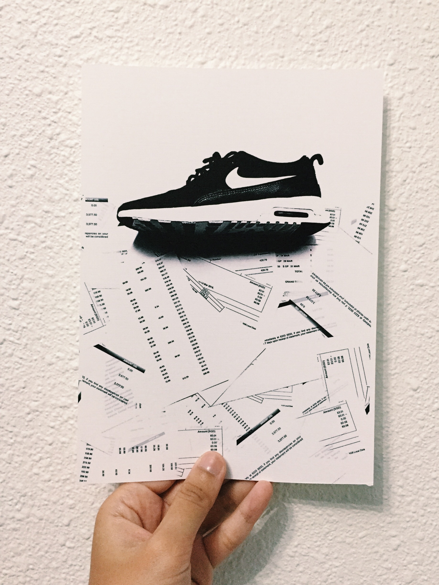
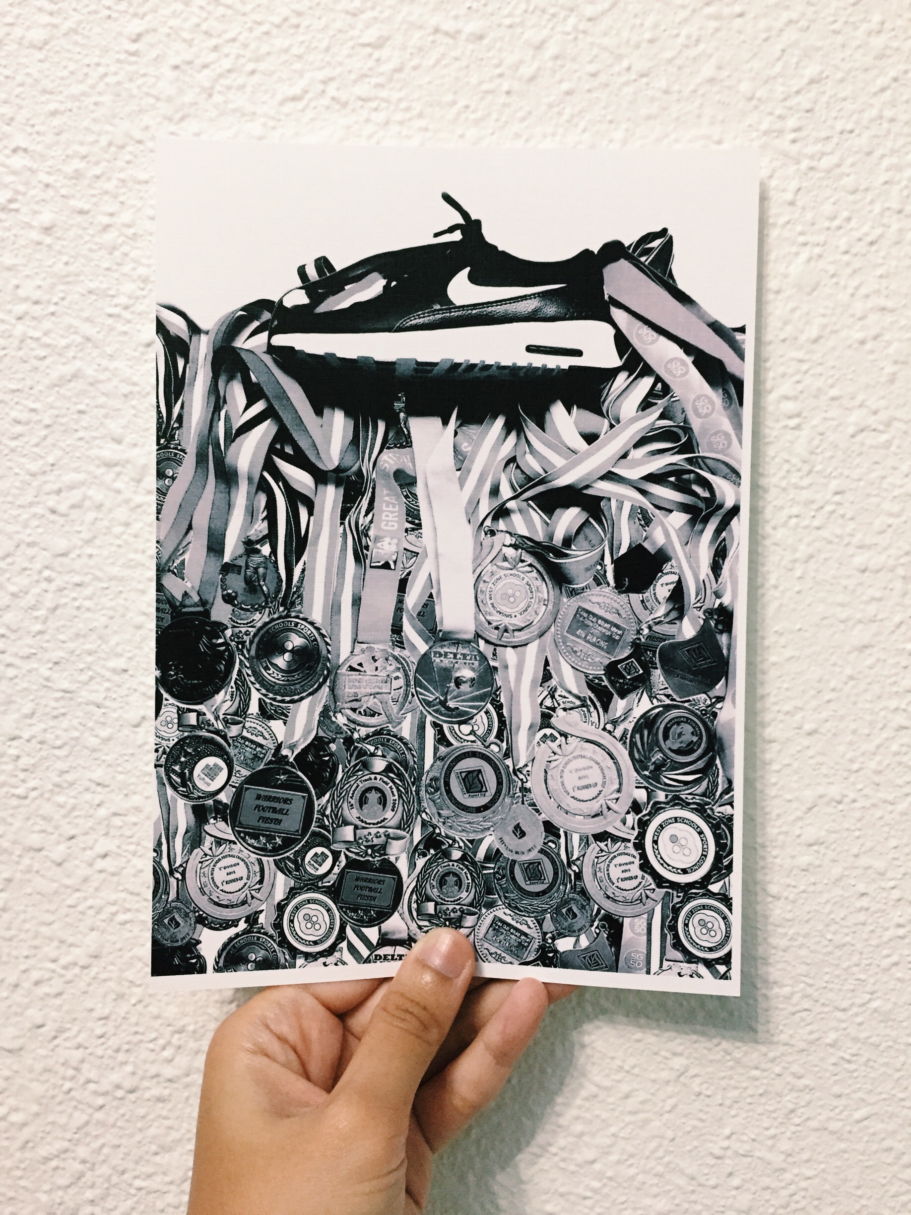
I contemplated while working on this idea of showing decomposition in terms of texture in the zine. In this context, decomposition shows the life of a Nike shoe — a cycle, starting of the book being all vibrant with colours just like how fruits are colourful when it is ripe and fresh to be eaten.
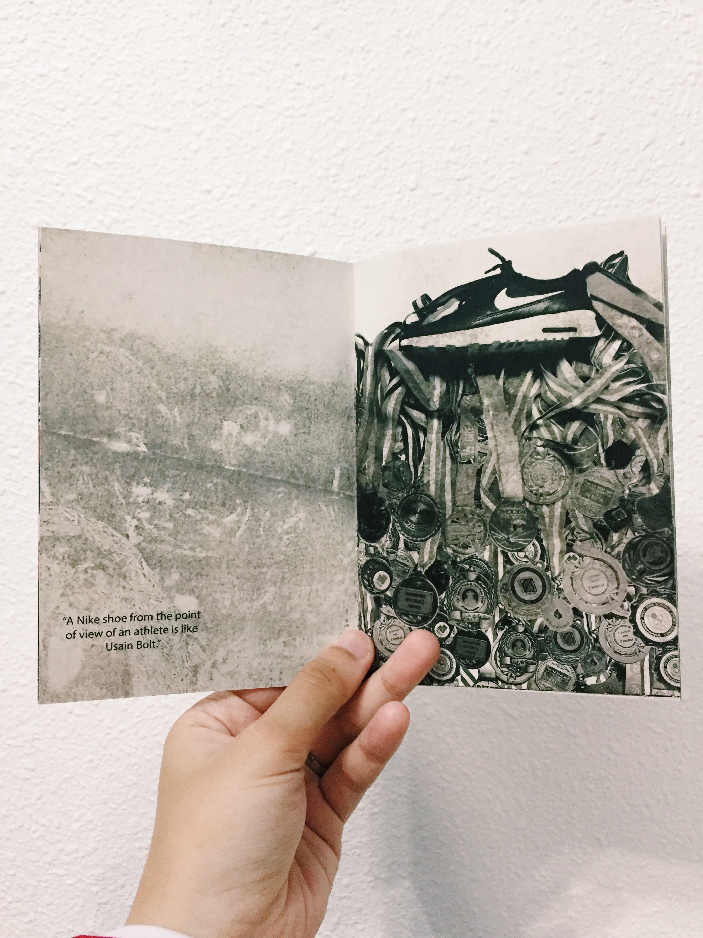
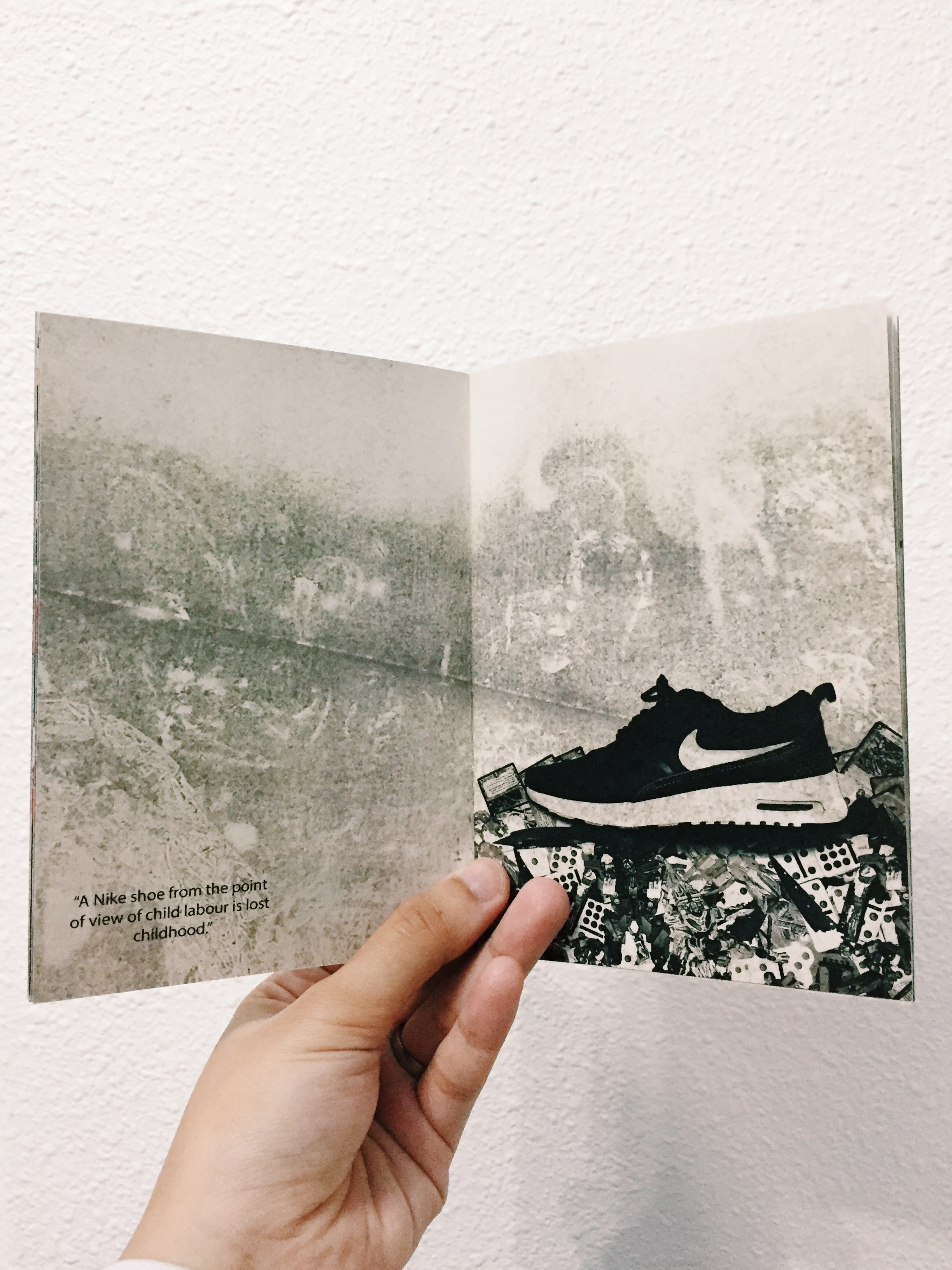
However, as you flip along the pages of the booklet, it started to go into black and white, into more sensitive topic of a Nike shoe — showing the decaying process.
(Printed in an A6 size from Out De Box)


(I’ll reprint it in A5!)
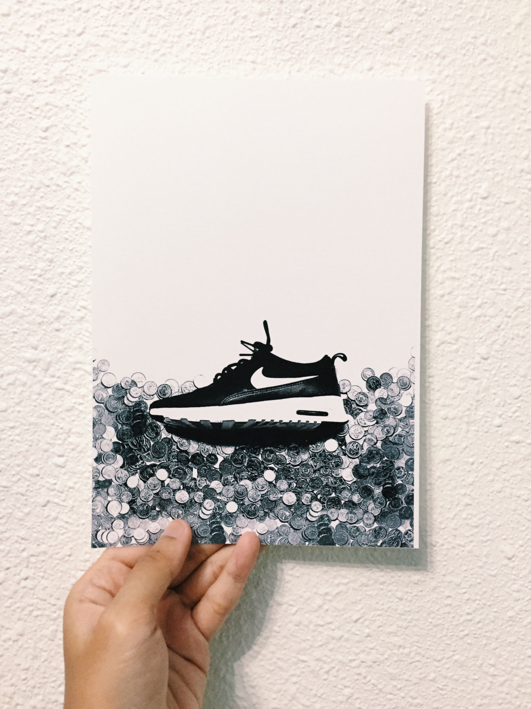
Recap: Point of View of a Nike Shoe
Let us play a guessing game! Maybe you could fill in the blanks?
Here are the final outcome:

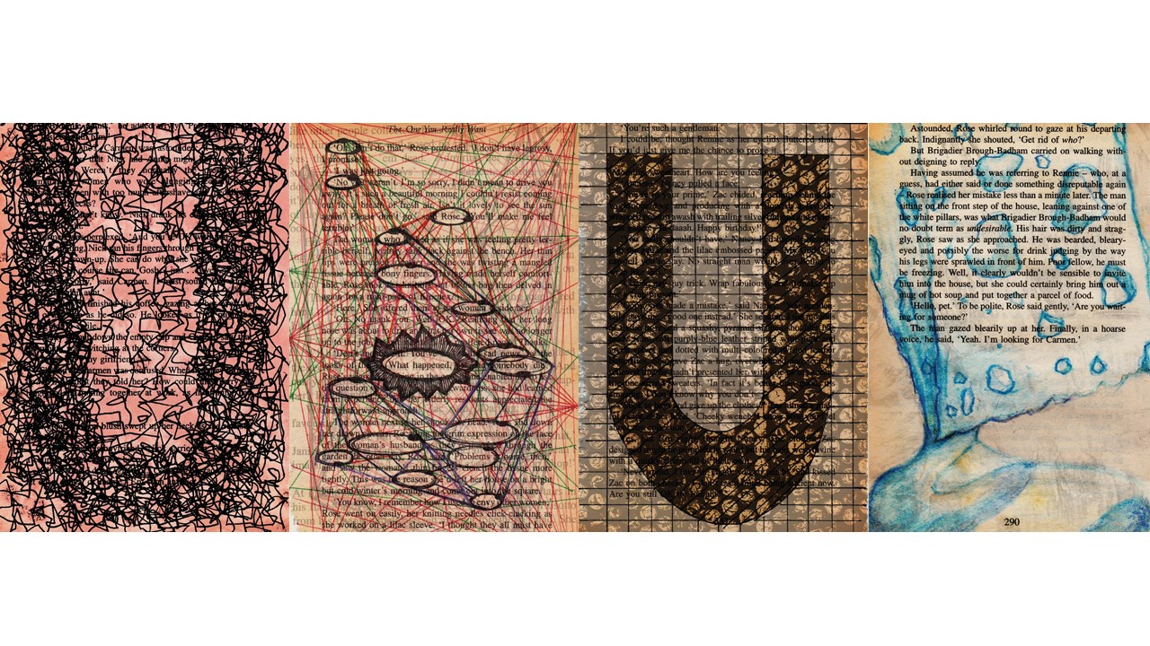
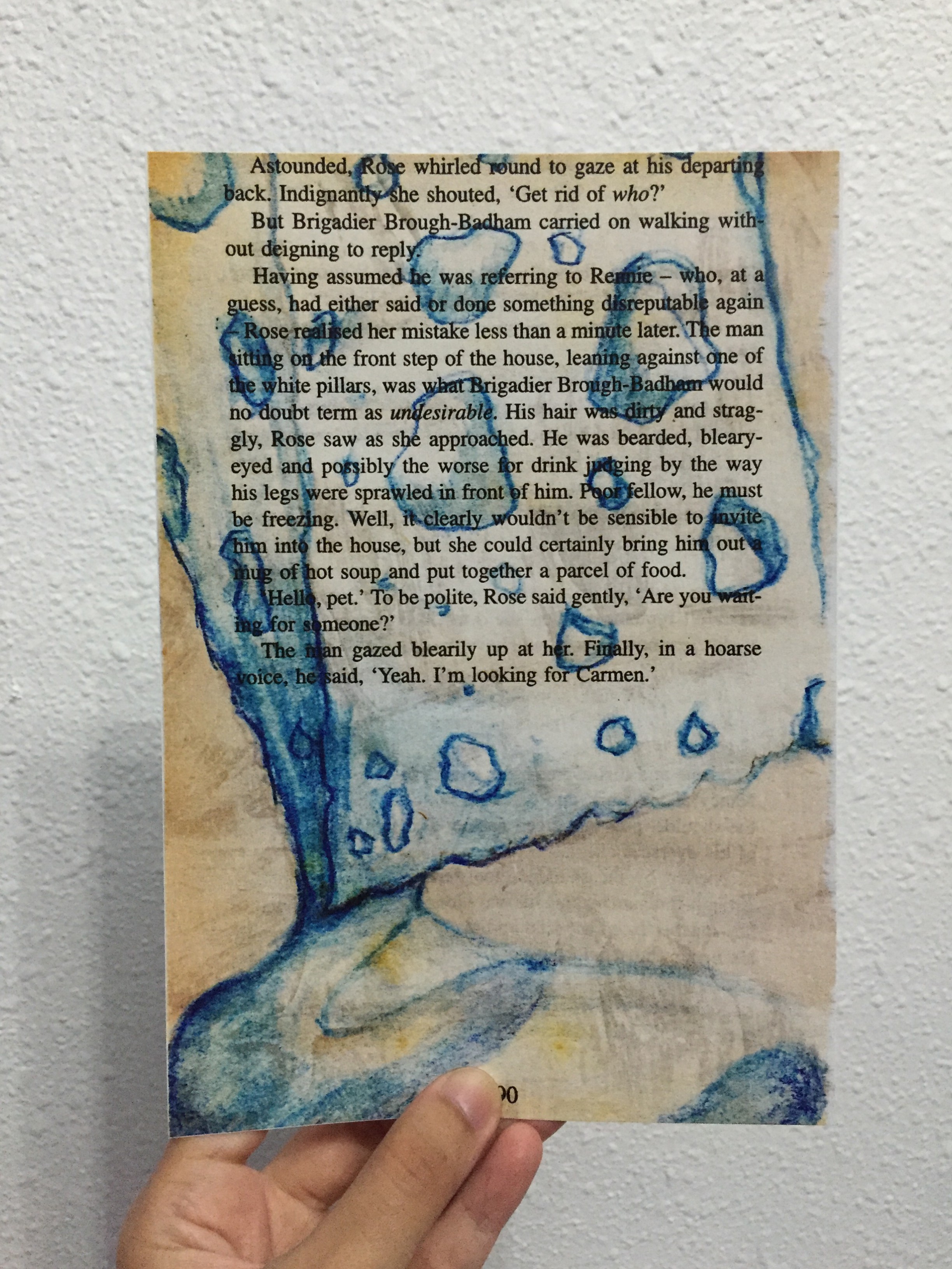
Below are the 4 final A5 and its description. These 4 pieces are book pages (torn from long kept novels) that was drawn on, some painted on, then scanned in, edited and layered scanned monoprints to get these overlaying effects. My typography in all these 4 final pieces are the initial of my name, U.
“MY NAME IS…”
“AND I’M AS ABSORBENT AS A SPONGE”
Because I find that I always tend to absorb information as much as possible, store them somewhere deep inside my brain, then amazed at myself for actually memorizing what was actually absorbed some time ago. Like the example I gave during the presentation, the house wifi password — at most it was an 8 digit password, yet I could just recite them without referring to any paper etc.
“MY NAME IS…”
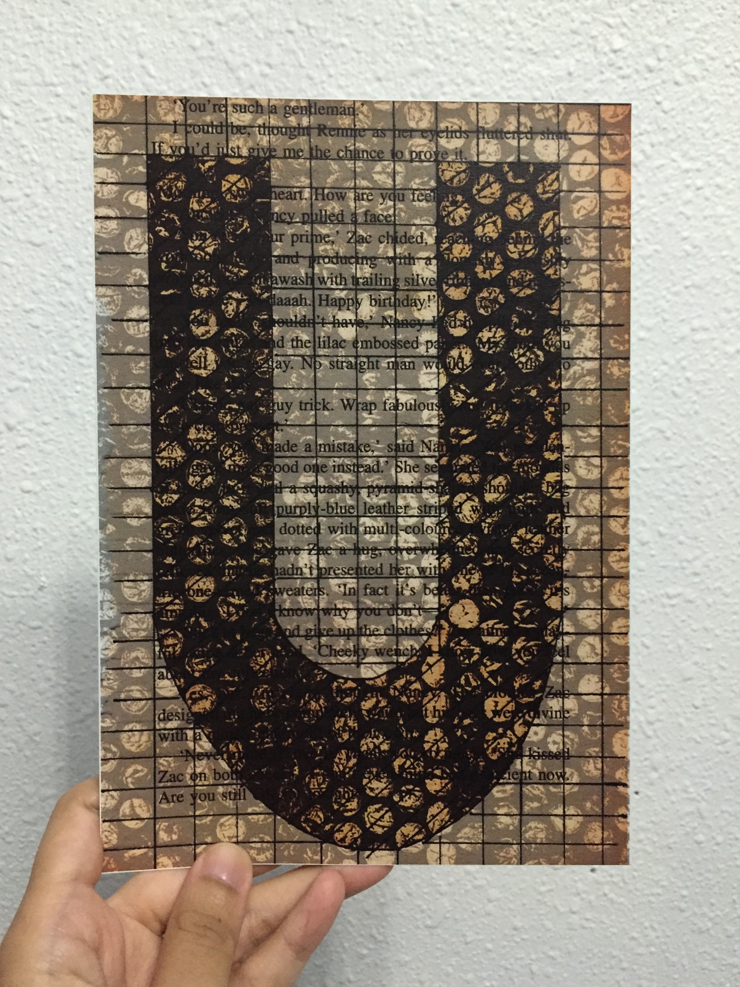
“AND I’M SYSTEMATIC”
Most of the time, I tend to work step by step, follow the rules, and work simple. I like simple, minimalistic, as shown by just the grid lines that covers the entire book page. Systematic is represented by the bubble wrap textured monoprint.
“MY NAME IS…”
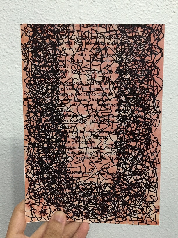
“AND I’M AS BUSY AS A BEE”
Bees are known to be hardworking, and I feel that hardworking and determination goes well together. The lines are like those dotted lines we always see in the children’s book when bees buzz around, only mine is busier. The background included salt effect from watercolour techniques, with the red complimenting the black lines.
“MY NAME IS…”
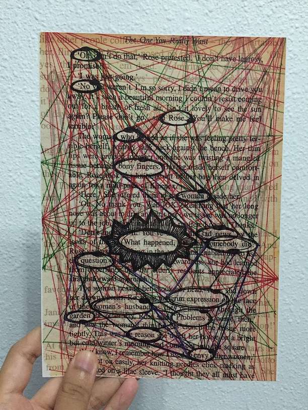
“AND I’M LIKE SHERLOCK HOLMES”
Sherlock Holmes, detective, CSI can be in the same category. I like connecting the dots, solving puzzles and figuring out “mysteries” (not those scary mysteries, no) surrounding me. With that, I was inspired by the detective crime board on how they connect their crimes to their suspects etc, thus the lines all around the book page. Texts from another book page was overlayed to show the ongoing thoughts in the detective/Sherlock’s mind as to how they would solve their crime, just like how I always have thoughts running around my mind whenever I’m in detective mode.
(And the alphabet U here is actually hidden in these lines — referencing from crime TV shows that the hint that will lead you to your culprit is somewhere hidden in your crime board)
‘HELLO’ was an in-class exercise that we did before Project 1 was introduced.
Here are the scanned version of the name tags:
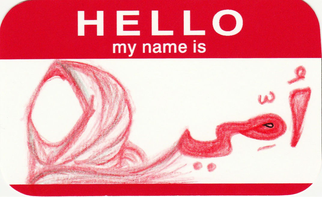


And so,
HELLO MY NAME IS UMMI (:
After much decision on which composition to use for the final, it came to this:
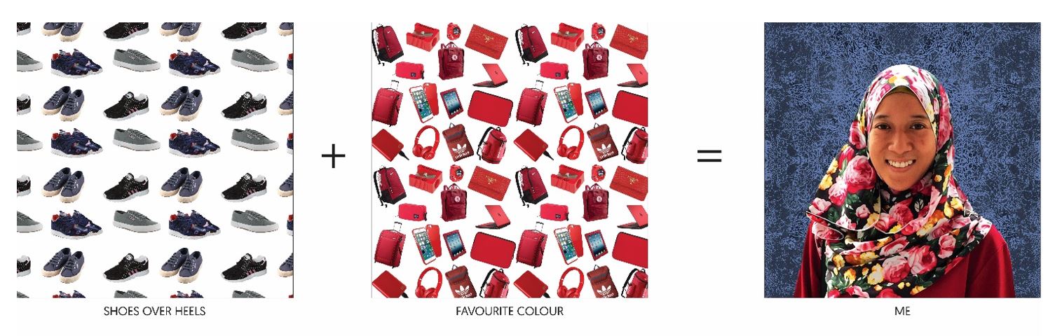
_____ + _____ = ME
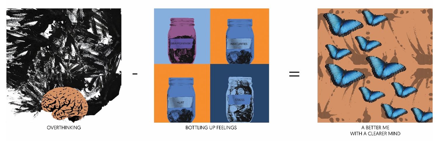
_____ – _____ = A BETTER ME
____ x _____ = AN IDEAL ME

____ + ____ = ME IN 5 YEARS
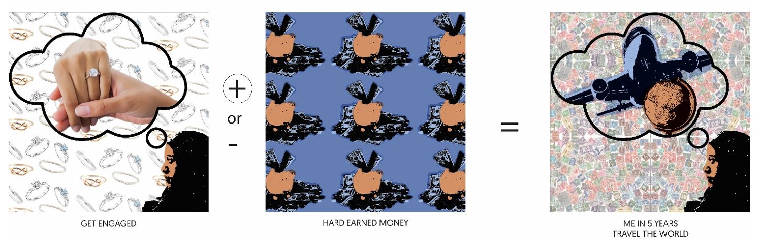

Therefore, the picture above shows the completion of the project!
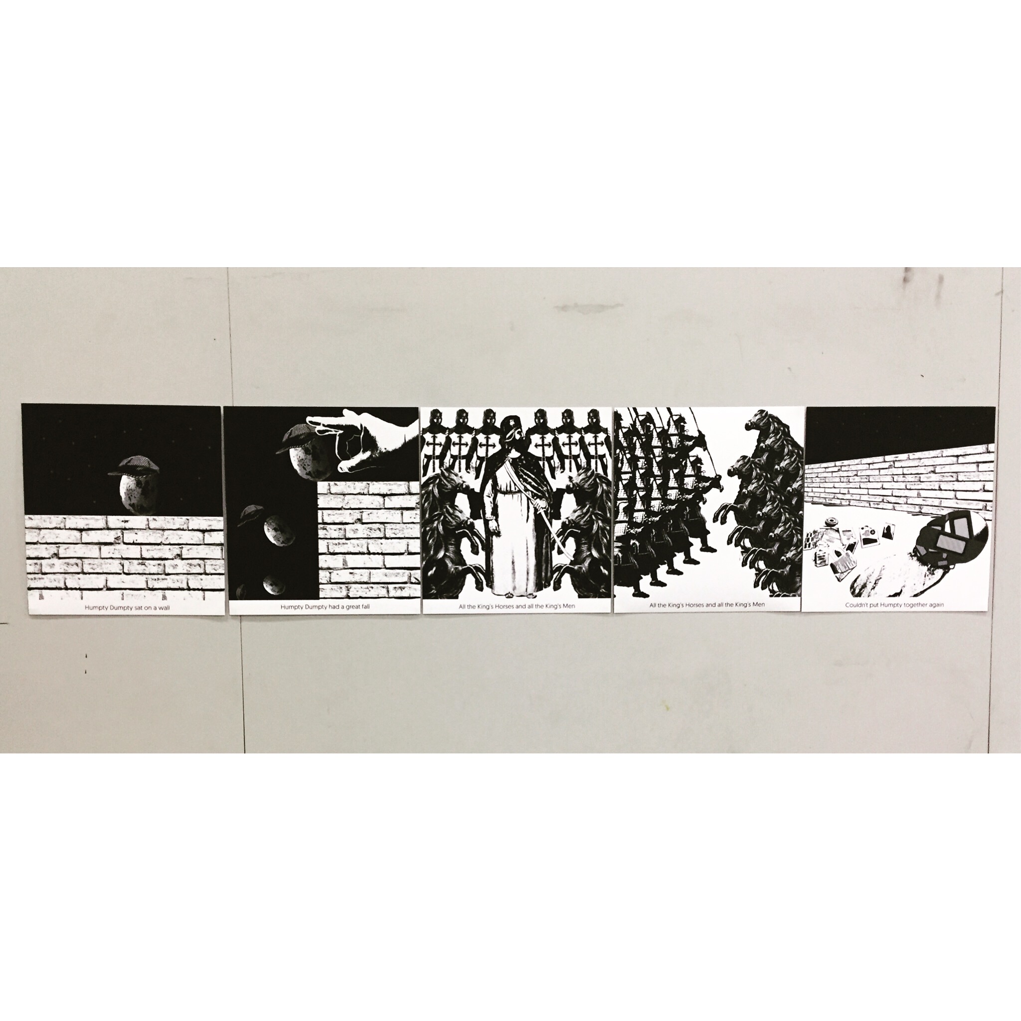
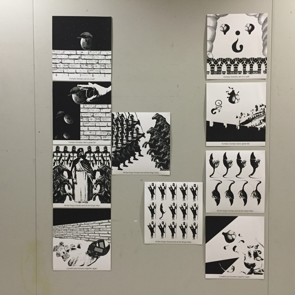
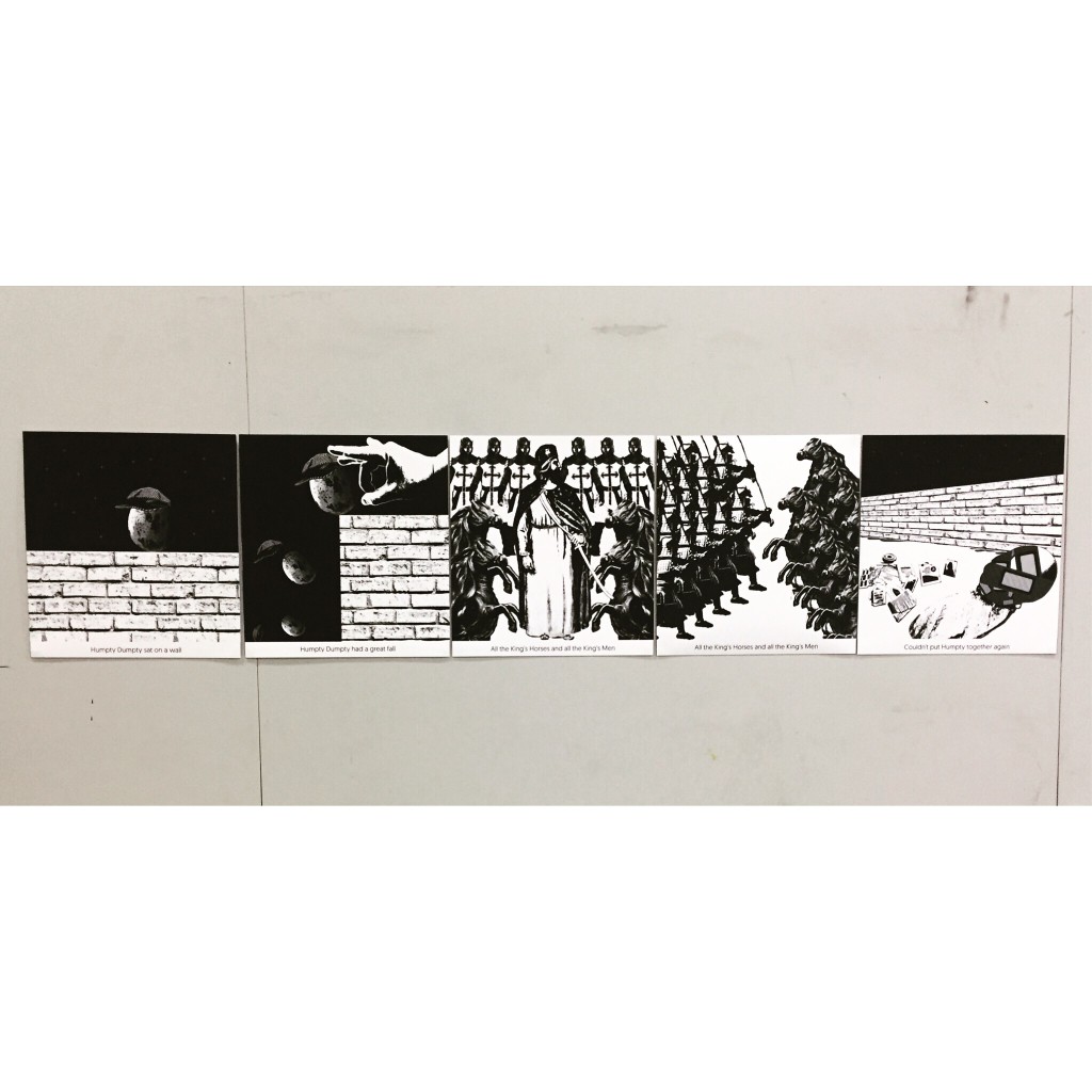
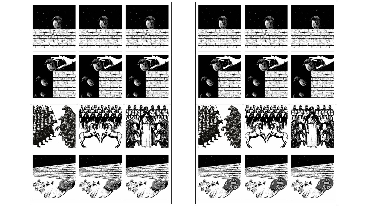
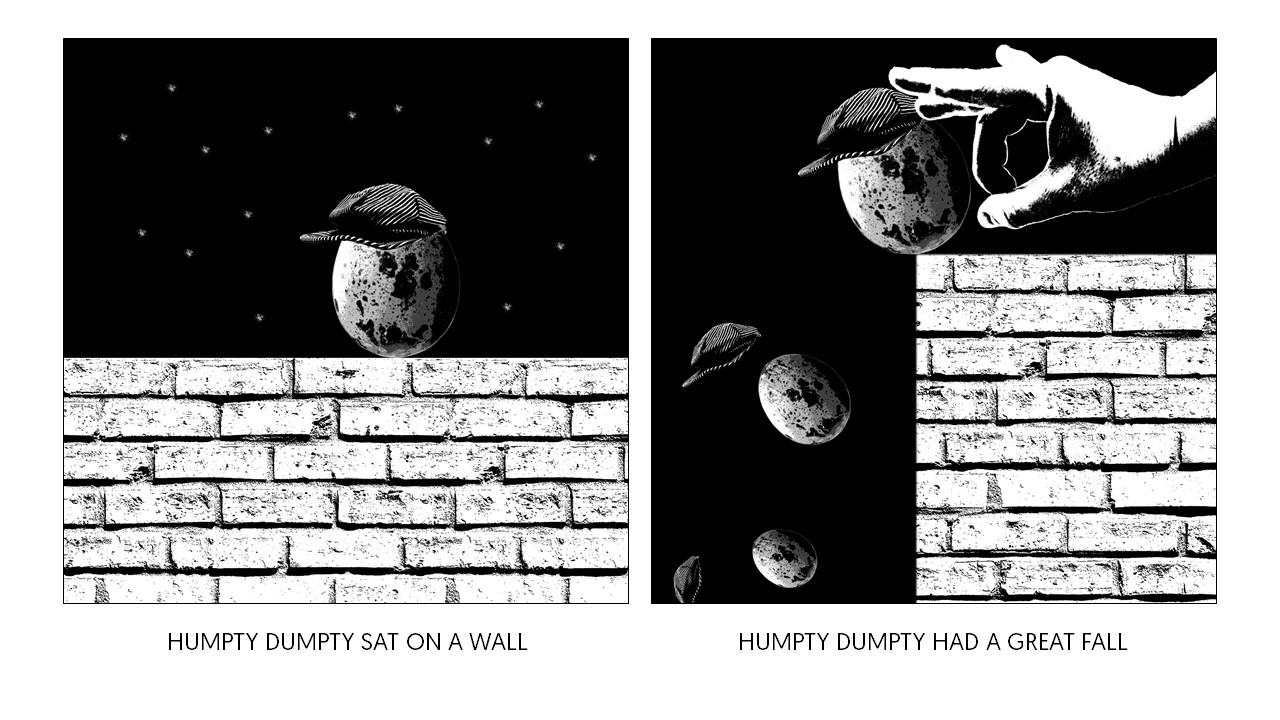
Below are the images for the finalized Humpty Dumpty rhyme composition for Assignment 2.
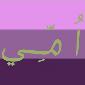
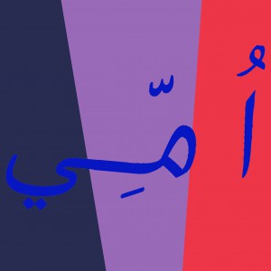
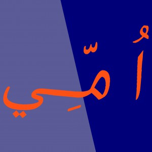
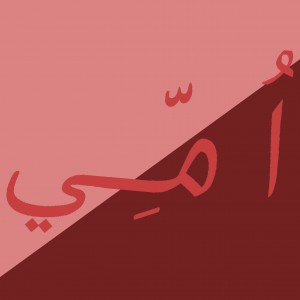
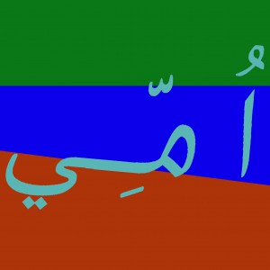
It was all about colours and its hue, value and saturation. These are the ones I did for the in-class colour exercise. Part 1 was the one colour being on top of the other, and I am slowly learning of observing how one colour actually looks warmer than the other when it is put against a different shade/tint/tone/value of another colour. Part 2 on the other hand, was supposed to be using chinese characters but my name doesn’t have one. I would like to use anybody else’s, but then I forgot my name can be done in Arabic characters as well. (That explains the characters you see on the image, basically its called UMMI)
After one to one consultation with Prof, I had a few that was in the “Chosen” folder. In the process of selecting which image actually suits and flows with one another, I aligned them all into the template.
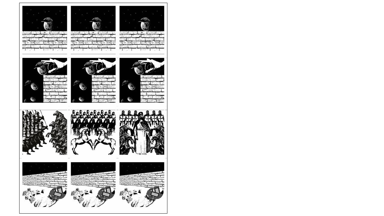
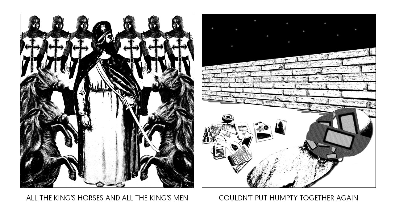
Therefore, these are my final 4 compositions that makes up the whole Humpty Dumpty rhyme.