Previously, it was just exploring of the different structures symmetrically repeated and reflected to form a motif. However, I am moving on to the process of putting together 2 or more different motifs to become one.
The first few examples can be seen below, where 1 human microscopy is repeated, and overlayed with another. The only difference between the two are the opacity.
On a side note, when I see these motifs (above), I realised it looked like the lace material.
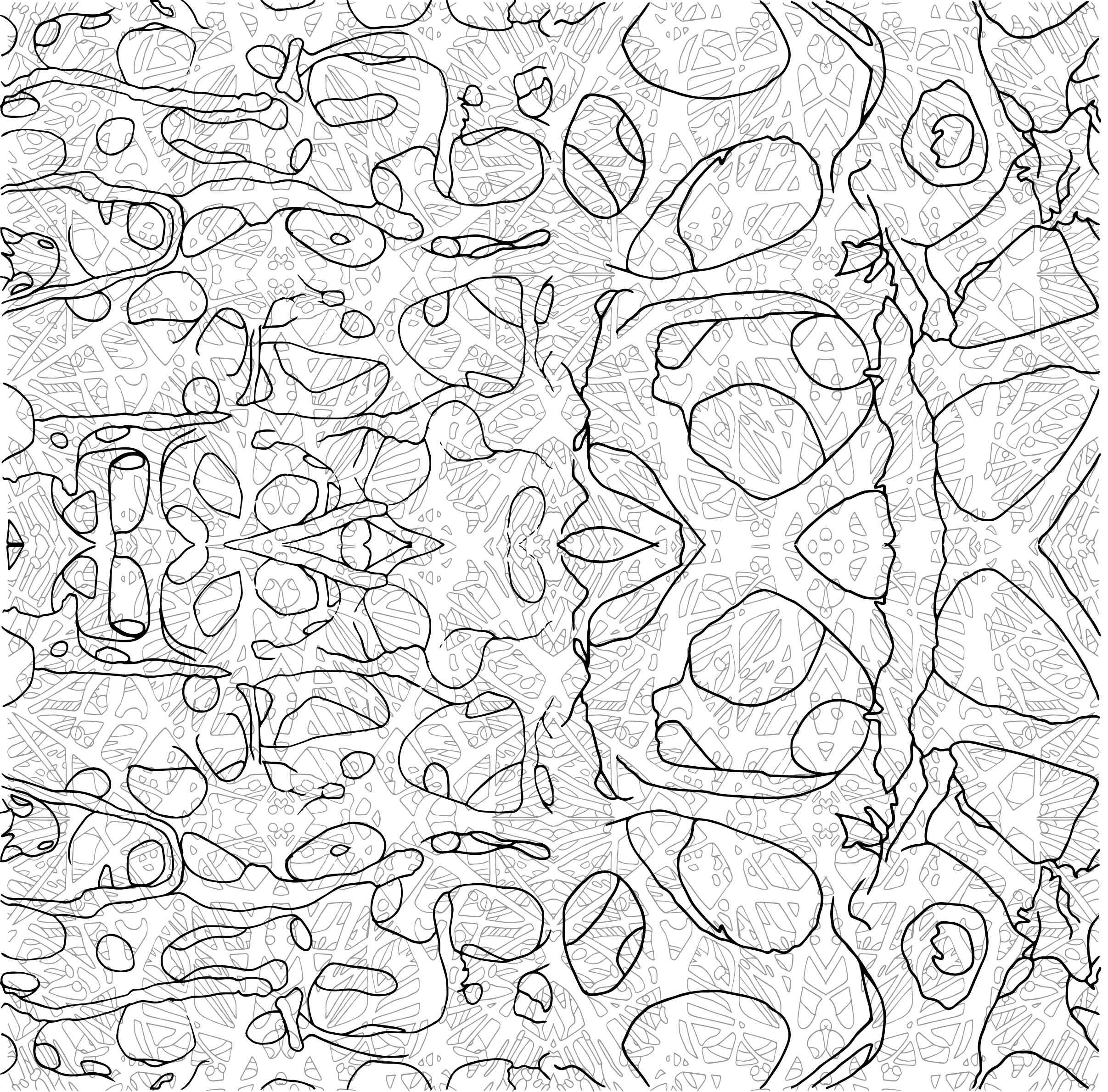
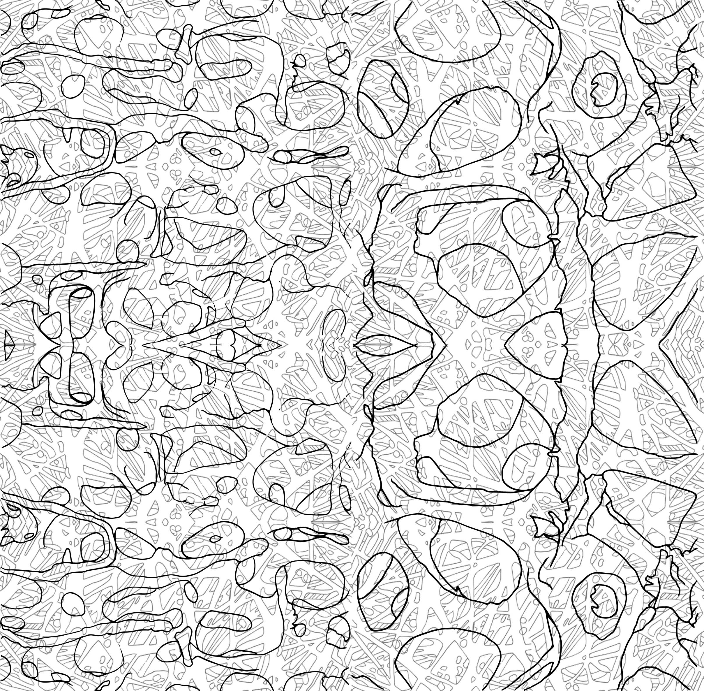
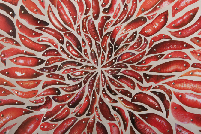
And another example below, where I layered 3 different structures into 1. Though it is messy as the lines intersecting were pretty obvious and distracting.
At first glance, I think it is too messy, but it gives a very nice layer.
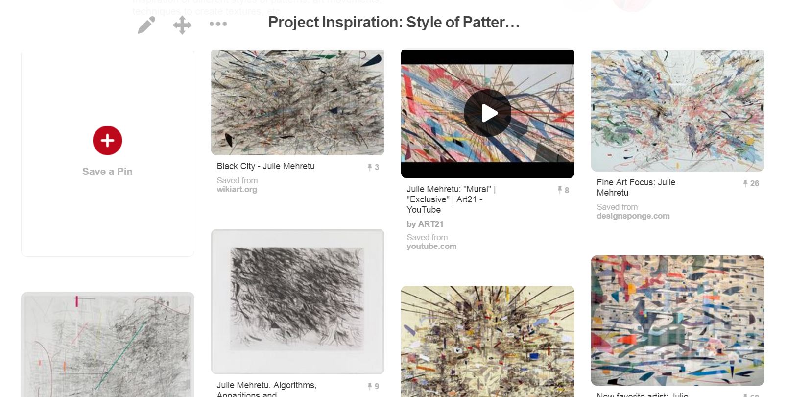
From the consultation, I was introduced to an artist who does her work in abstract forms with an unorganised, messy and complex backdrop or surroundings.
Her name is Julie Mehretu, and these are some of her works that I find them interesting and are parts of my inspiration:
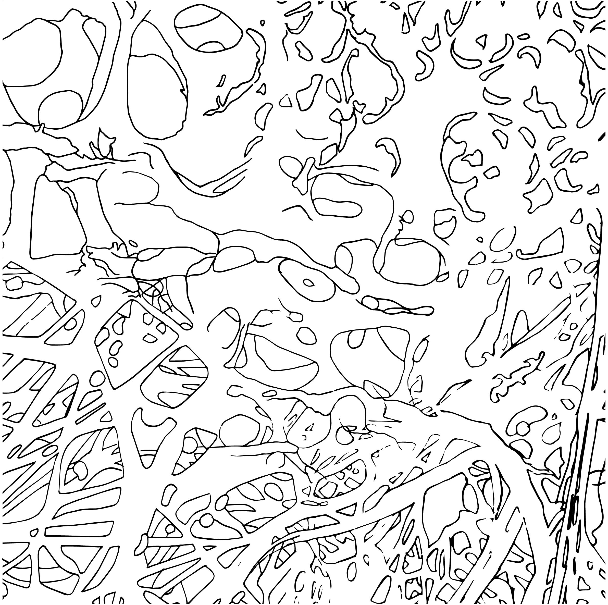
To minus off the use of symmetry and reflections, I combined the tracings that I had, following the best fir of positions of the structures, and started to form them into one whole motif.
Then, I repeat the image above, and formed design inspired by spirals, cosmos or what looked like mandala due to the radiating in and out. (Mixed in a little knowledge of Art History over here)
Next, how do I make it look as messy as Julie Mehretu’s? I decided to try and have textures. At first I thought of manually creating textures using several techniques I found online. But I too, wanted to try the grunge effect. So the images below are the before and after of grunge texture, with colour and monochromatic.
Trying out the texture with colour.versus the grunge texture with a lower opacity
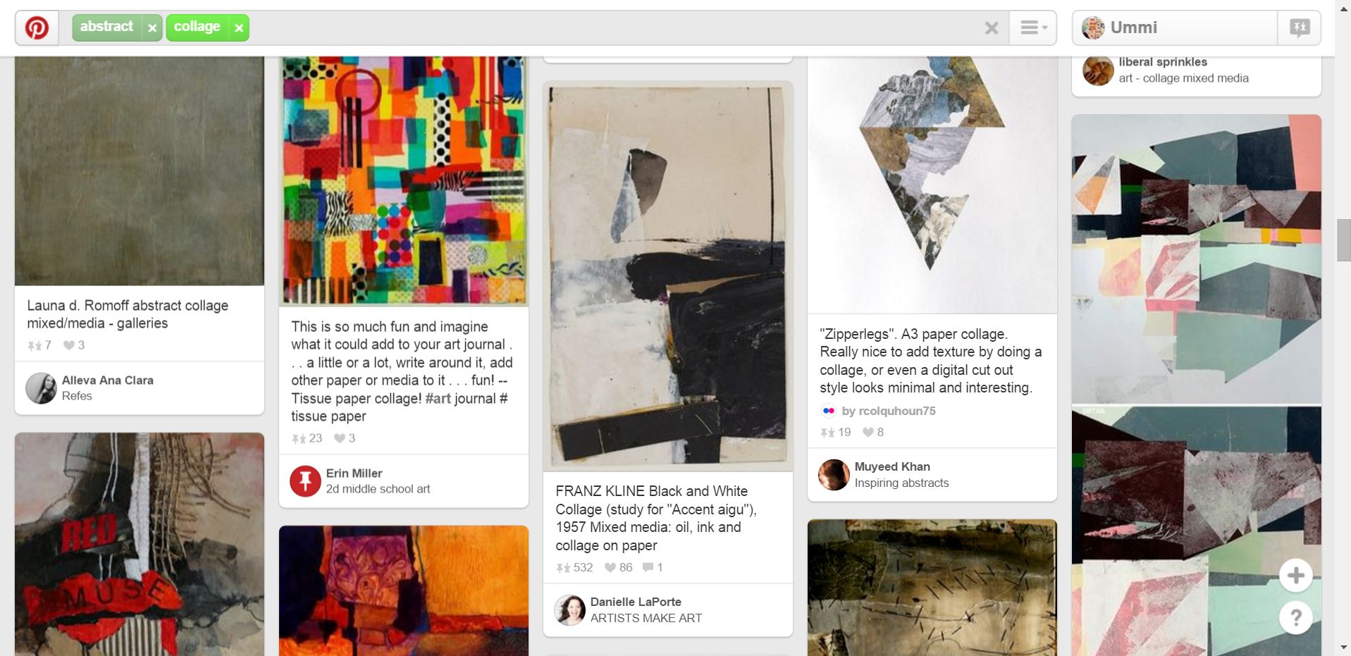
When the brief was given for this POV project, I decided to do collages, like cut and paste collages. So I head on to Pinterest to find inspiration on collages as well as finding out different artists all together.
Below are some of the inspiration tabs I screenshot while researching.
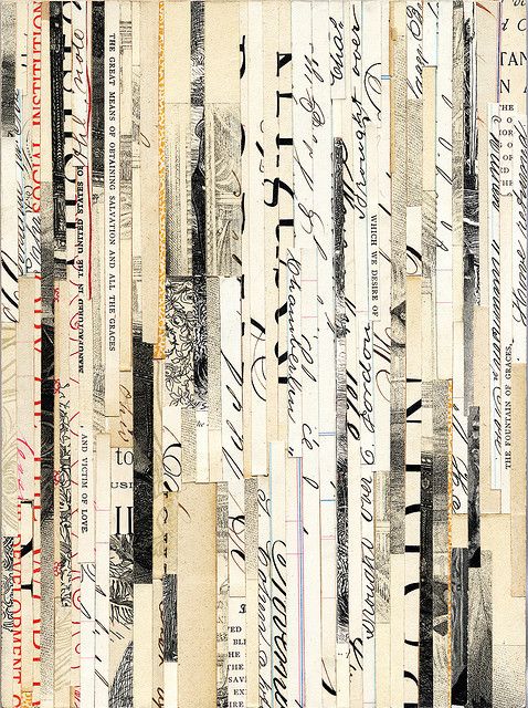
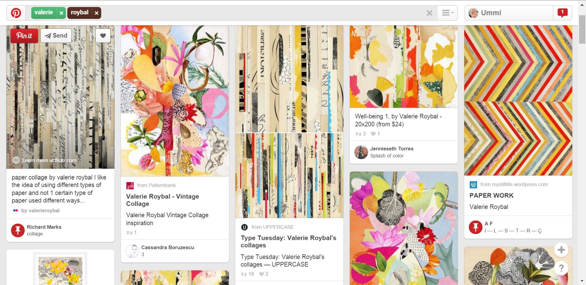
The colours attracted me the most. From far it looked like colour pencils aligned neatly, but it stated that they were actually rolled up magazines then collaged together. (Taken from: https://www.pinterest.com/pin/487725834626272330/)When I saw this, I was struck with an idea that I could find old art works stored somewhere in my house and simply tear/cut and paste to form the POV. (Taken from: https://www.pinterest.com/pin/487725834626272314/)I saw this collage and was in awe. The different prints formed such beautiful pattern all together. (Taken from: https://www.pinterest.com/pin/487725834626272608/)From the image above, I got to know the artist that did the collage and searched for more of her works on Pinterest.
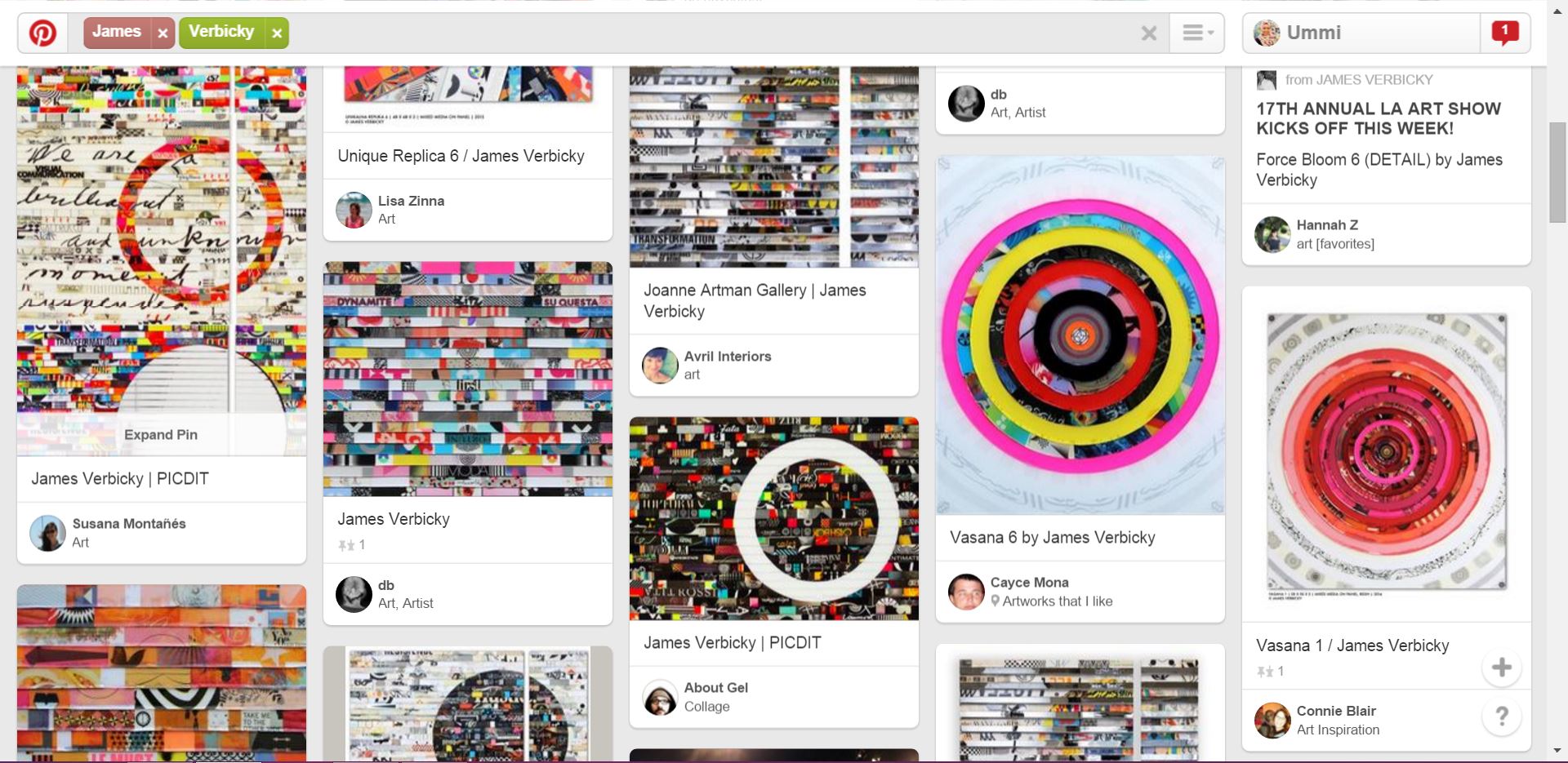
The list goes on when I further looked through Pinterest…I find that when you collage the image, lined it up nicely…. it made such a nice backdrop.Artist David Adey’s collage using lips from magazine (Taken from http://davidadey.com/Starbirth)Close up (taken from http://davidadey.com/Starbirth)I looked at abstract collages to get inspiration on how to not be too literal for the POV.
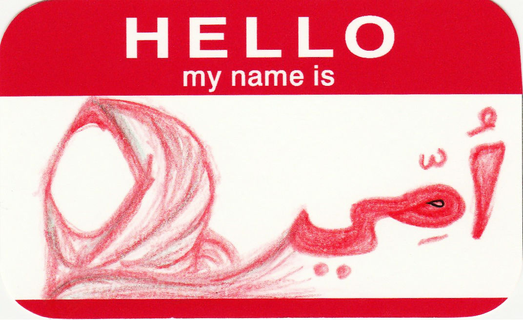
‘HELLO’ was an in-class exercise that we did before Project 1 was introduced.
Here are the scanned version of the name tags:
Typography; I wanted to portray my identity in this name tag — headscarves and Arabic font (basically it reads UMMI, but from right to left) that I believe shows people who I am, and my religious beliefs.
Abstract; It was done to look like veins in our human body.
Conceptual; I like the thrills and excitement of riding roller coasters, thus the roller coaster for this name tag. It symbolizes overcoming challenges and fears as nothing in this world is a straight path to reach your goals.
Major throwback to the first week of Foundation 2D.
This was a group research that Caroline and I did during the first lesson of 2D. We chose and was assigned one of the many artists — Agnes Martin. This research is a hand-me-down information from the slides that we did. (So basically I’m just transferring the information here.)
“When I first made a grid, I happened to be thinking of the innocence of trees, and then a grid came into my mind and I thought it represented innocence, and I still do, and so I painted it and then I was satisfied. I thought, “This is my vision.” – Agnes Martin
Agnes Martin (1912 – 2004)
Martin was known as an American abstract painter, referred as a minimalist but considered herself an abstract expressionist. She turned to art around the age of 30, when she was a student at Columbia University in New York.
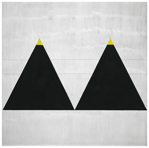
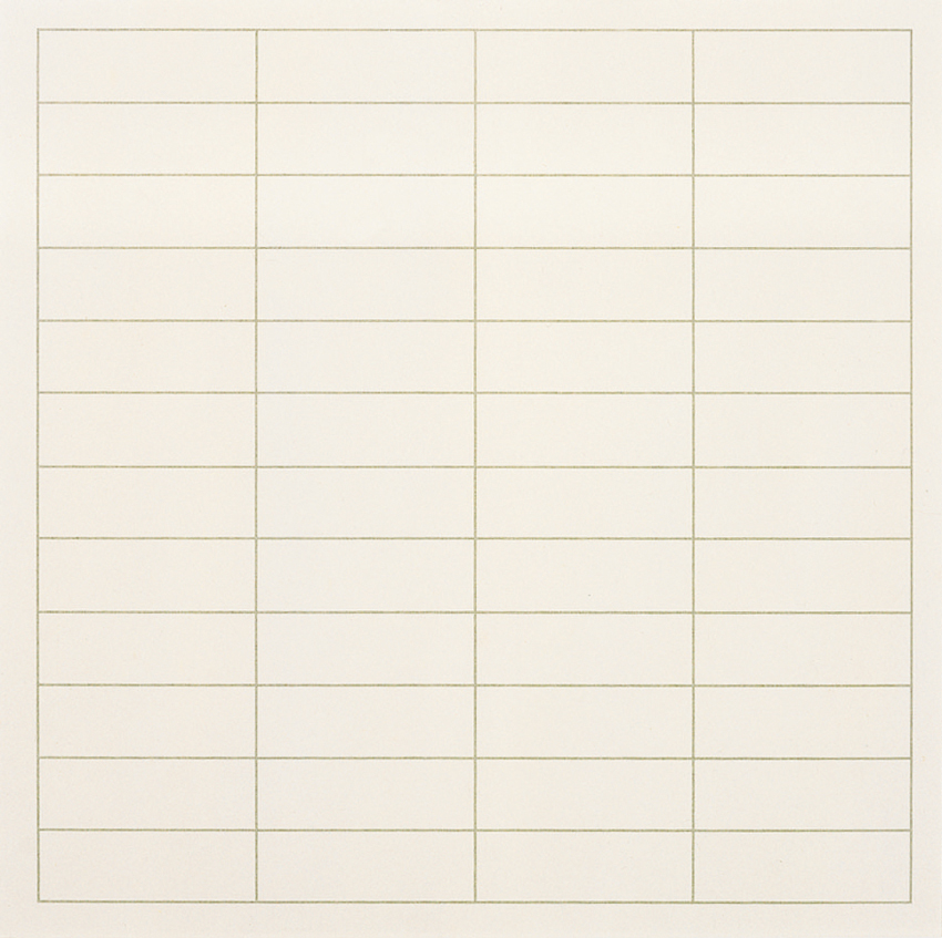
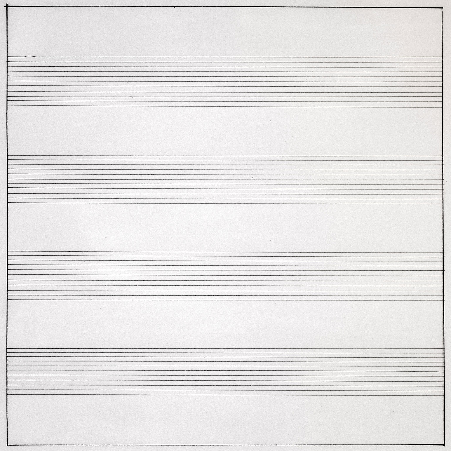
One of Martin’s art piece
So when I typed “Agnes Martin artworks” at Google search, I was perplexed, surprised and couldn’t really believe what I was looking at! The picture above is one of the many artworks of Martin’s. Look at how simple her artworks are — geometrical shape, and just lines by pen and a ruler. At that point of time I was thinking to myself “WHAT? That means if I were to just draw a single line in pencil and tell people ‘This is my art piece’, I would be famous too?”
HA HA HA (Dream on Ummi)
That was definitely a complete puzzle to me and that was the first impression of Martin’s artworks. She has this signature style of hers where she uses squared monochrome canvas, layered with gesso, overlaid with hand-drawn pencil lines and thin layers of oil or acrylic paint.
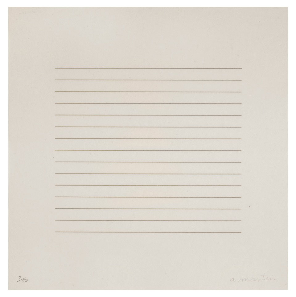
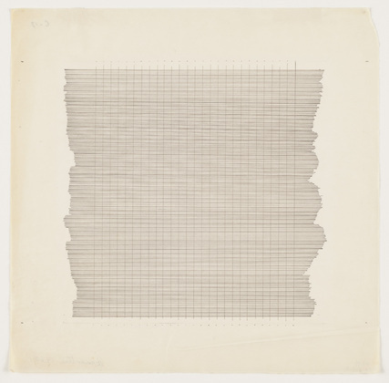
(More examples of her pencil-ed lines below…)
Let me share Martin’s techniques used in her artworks. Firstly, pencil lines. As you can see from the above examples, you can tell that she is a mechanical person. She actually has hand-drawn horizontal, vertical or in grid formations across gesso canvas. She stretched string across the canvas and uses ruler to draw. Then, her line spacing was mathematically worked out on paper, then painted between to form solid bands.
Secondly, colour range in her artworks. Martin mainly uses the primary colours of red, blue and yellow, and of course the most basic colour of black and white. She customizes the colours by thinning, mixing, lightening and darkening them. Furthermore, with these colours, she actually creates ghostly effect of the colours by bleaching them out. That is why her coloured artworks has those neutral, gentle yet faded colours.
1974, Martin’s artworks eventually moved out from the ‘monochrome zone’ and became more human and involving by replacing neutral tones to brighter colours.
In general, Martin’s inspiration are mostly from nature and emotions. She always somehow connects her artworks with her emotions deep inside. Therefore, if you were to re-read the quote at the top of this post, you could see how much she would relate nature with emotions and then transferring those characters onto her canvas.
So what do I think of Agnes Martin?
Personally, I like simple stuff. I was impressed that her just a few lines could actually mean something so deep. I actually have this motto of “Less is More”, and I think Martin portrays that as well.