On the 28 Feb 2017, our 4D class went on a field trip to Art Science Museum to take note of the use of space/screens/sounds/experiential storytelling, that can serve as inspirations to the Final Project! 😀
In this fieldtrip, I was floored by how much interactivity is involved in the exhibits. Especially the Future World and Into the Wild exhibits as audiences of all ages are welcomed to participate.
I took a vlog to document my trip as I find that pictures themselves cannot convey the experience as well as a video. So do forgive me if the video seems really informal and non-professional as my objective was to document the experience, and not to shoot it in a cinematic film like project ^^
Along the way, I also made some annotations in the video to document my learning points and what I felt could be incorporated into the final project, ENJOY!
Stay tuned to my second post for the fieldtrips!! 😀
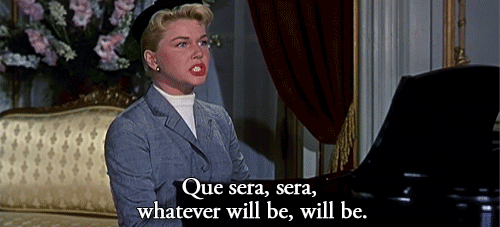
For this assignment I have heavily depended on my Visual Journal for note taking and thought processing as compared to last semester where OSS was where I post most of my thought process. Regardless, I will still take you through this journey from the start to end of this ‘Que Sera’ assignment via OSS, so… LETS GO~~
Ideation
Because the name cards require the use of the conceptually driven solutions and letter forms, combined with literal or abstract image to express our future jobs in typographic portraits, I did a mind mapping process in my Visual Journal to help with coming up with the 4 Jobs for each of the name cards: Florist, Egyptianologist, Home maker and Food Science Technologist.
Joy emphasized that we ought to have these 3 factors before consulation in order to give a good framework and direction for our assignment.
Concept
My concept for this project is using the delivery method of my goal now, which is to create a interactive children’s book, to execute the name cards for all 4 jobs.
Message
Individual name cards have their own messages and an overall message as a whole.
Florist – Do not let small thinking cut your life down to size. Dream big! Work hard!
Egyptianologist– Do not let someone else’s opinion define you.
Homemaker– Be as awesome as a Domestic Goddess.
Food Science Technologist– Never stop asking ‘Why?’ until you get you answer.
Overall message– Your job does not define who you are in the future. YOU define who you are in the future.
Tone
The overall tone of the Children’s Book concept is positive and educational. While urging the readers to discover and learn new things.
Artist references
I did not limit myself to one specific artist to use as reference because I did not want their style to be seen in my work. Hence I went online and offline to expose myself to interactive books and illustrations for children to serve as inspiration; extracting the pros of each book and learning to avoid the flaws which I did not want to see in my work.
Expression of tonality: I used different shades of the same color on to express tonality in the designs. This creates slight depth and also has an old school children’s book feeling.
Methodology
For all of the designs, I used hand drawn illustration, scanned the designs and used Adobe Photoshop to fill in colors and cleaned up the edges.
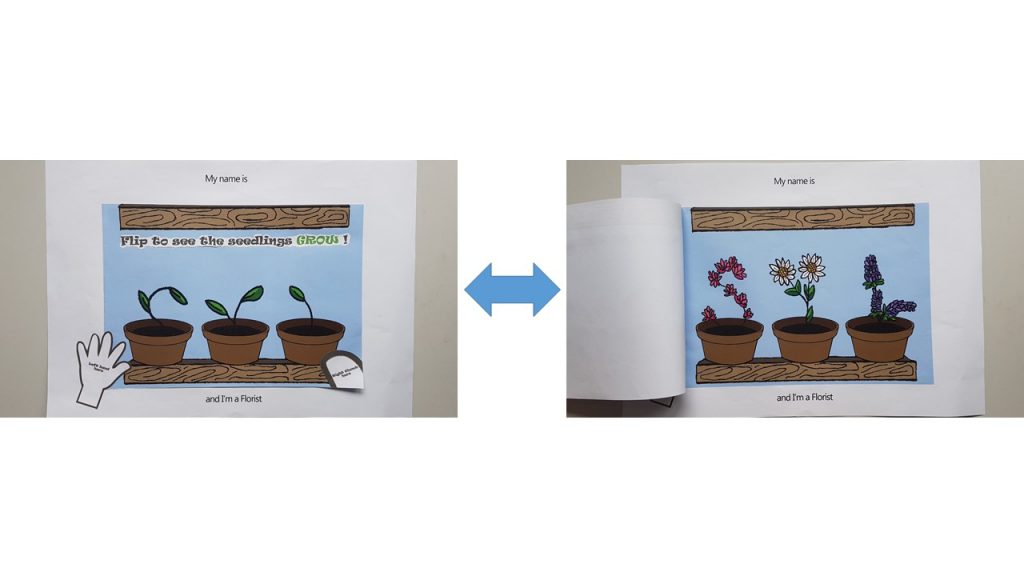
Florist (Age >5)
I used flip book animation to carry out the ‘Flip O’ Rama’ concept from the children’s comic: Captain Underpants. The following video below is how it would have looked like.
I wanted to show the growth of the plants from a boring seedling which looked like it may die any moment , into a blossoming plant. Hence, for the top image, I used the upper half of my initials : ‘SYL’ as the feeble seedlings in pots, and a full grown blossoming plant for the bottom image. So that when the user flips it repeatedly, it will look like the seedling is growing.
Joy also suggested for me to put out instructions on how the interactive-ness can be carried out by children, hence I pasted a ‘left hand here’ and ‘right thumb here’ instruction on the outside like how the Flip O’ Rama book did.
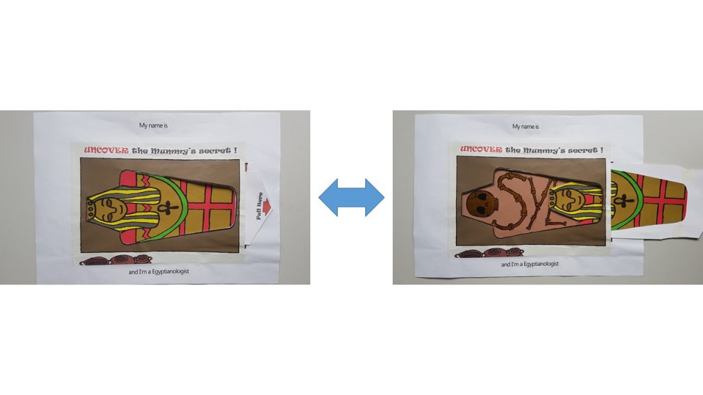
Egyptianologist ( Age 10-15)
I used the pull tab mechanism in this name card as seen in many pop up books.
I used Golden Flint paper on the interior of the Mummy coffin to act as the bones, which forms my name. My idea for this name card is to show that a dull looking exterior of the Mummy gives one the impression of something less of value. However, upon uncovering the truth by pulling the tab, it reveals the bright and golden bones of the Mummy.
In a way it also has many interpretations that can be taught such as:
‘Do not judge a book by its cover ‘
‘Its more important to have a heart of gold than a fancy exterior.’
‘Do not let what others think of you define who you really are.’
I also included a ‘Pull Here’ instructions with a red arrow to direct the child’s attention to it.
Homemaker ( Age >10)
For this name card, I used Velcro as the material to work with as I wanted to let the children organize and arrange where each of the item should go in the household chore. I was considering using felt to carry out this idea, but Shi Teng gave me a suggestion to draw out the illustrations and have them printed out instead, so that it is more consistent with the overall image of a sketchy hand drawn illustration. Thanks Shi Teng! 😀
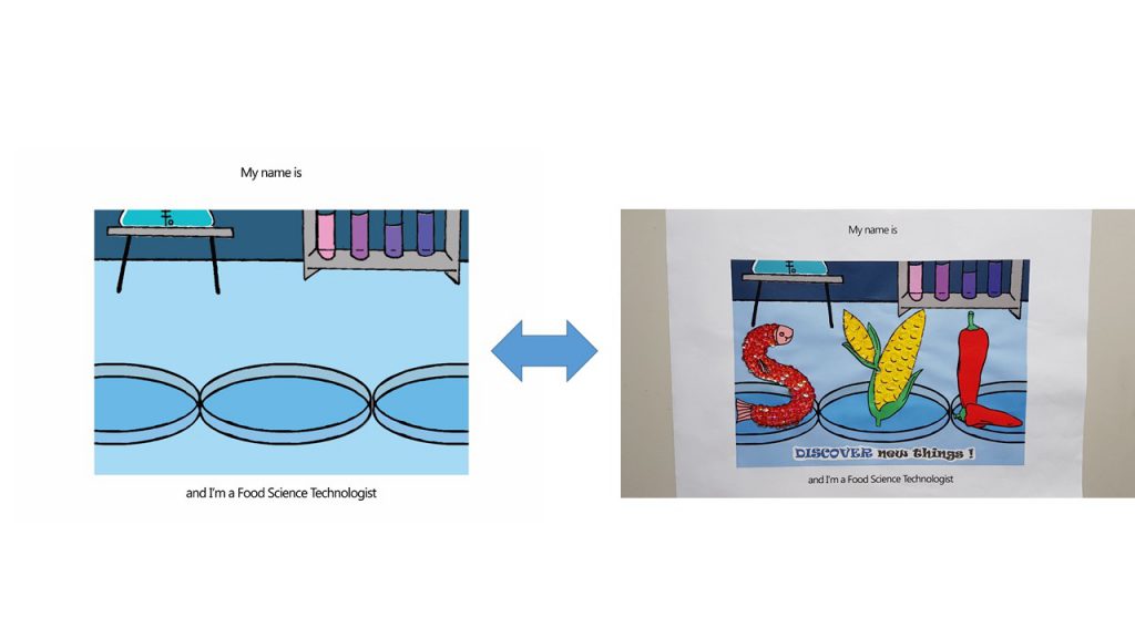
Food Science Technologist ( Age 16- 19)
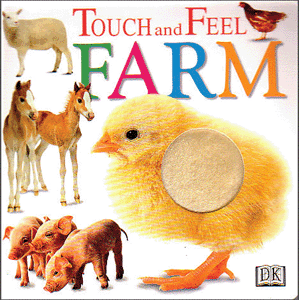
For this name card, I was highly driven ‘Touch and Feel’ books for young children.
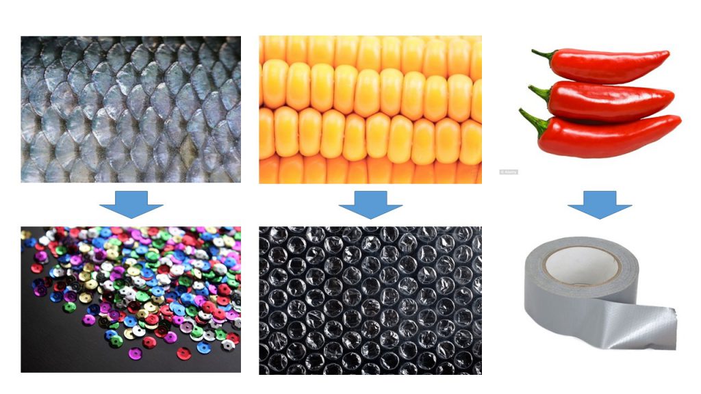
I used Sequins to simulate the texture of fish scales, Bubble wrap to simulate the texture of corn and duct tape to simulate the waxy surface of Chilli.
Colors
Joy suggested I use a common color for the 4 compositions to express unity throughout. However, as much as I try to pick a common color, I don’t think it worked out very well to have Blue in my Egyptianologist illustrations ( It would have looked like an Ice Tomb) and neither Orange/ Yellow for my Food Science Technologist illustrations ( I required Blue to express the sterility of the Science lab).
Hence I split my compositions into 2 sides: Blue and Yellow
Blue (Hex code: #A4DBFF) – Florist (Complementary) and Food Science Technologist(Monochrome)
Yellow ( Hex Code: #E4C877)– Egyptianologist (Warm) and Homemaker (Analogous)
Instruction typography used
I used ‘Ravie’ Font and spaced out the individual letter because Children’s book has to be highly legible.
Font used I have chosen is Ravie because it has a rather whimsical feeling to it, but yet I chose to bold the fonts because it is still instructions and I didn’t want the children reading it to turn a blind eye to it.
Choice of color for font was something that was bugging me as well. As I felt Black was too strong as compared to the rest of the colorful compositions. But yet if I were to choose a color that suits individual composition, I felt that there was no unity to be seen as a whole in a book; and the instructions just blends in with the background where the children might turn a blind eye to it.
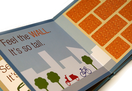
Hence my solution came about when I was researching for the way Children’s books present their instructions:
I really liked how…
A muted dark color was used to give the instructions. There is a mild sense of authority which I felt that one’s eyes would be drawn to read.
The key word ‘WALL‘ is in capital form.
The color used for the key word allows children to draw a relation between the word and the object. There is a sign (the word ‘WALL‘) and the signified (the wall picture)
Thus, I applied this reference to my instructions for the children.
I capitalized and gave a color to the keyword which is seen in the object.
Things I could’ve done if I can turn back in time.
I am really shooting myself in the foot for saying this. But, I think admitting to my mistake and learning from it is better than to bury it under the carpet. So, for my future self, here I go.
Explore different types of paper. I felt the struggle the most when I was carrying out the pull tab mechanism for the ‘I am an Egyptianologist’. I felt that if I explored the different type of GSM for paper before I executed the cutting, I would have achieved a better and smoother pull tab mechanism for this name card.
The following post would be the FINAL one for Assignment 1 Que Sera!
First week of Semester 2~ *Inhales Exhales* I can already smell the assignements piling in already… LETS GO~
Stories and Your Identity
For today’s class, Ru Yi taught us what makes a good story.
Finding your own voice.
Stories you care about
To boot:
The kind of stories you are best qualifies to tell
The kinds of character that particularly attracts you.
The situations you find especially intriguing
A journal to record them all ( Words, Dialogues that attracts you etc.)
And then Ru Yi showed us a video of novelist, Chimamanda Adichie‘s speech : The Danger of a single story.
After watching listening to her speech, I have learnt that as a child, she created stories based on what she was exposed to in American books; in which she has no first hand experience of as a Nigerian child. For instance, eating apples in winter and drinking ginger beer. As a child she was vulnerable and impressionable. Soon, she changed and started writing about things she recognizes on first hand. She then realized that many of us including herself then that media’s portrayal of people and their single story kind of forms what a specific group of a person ought to look like, this has resulted in what they have become to the rest.
So the overall point that I have extracted from this video is…
“Don’t make ‘One Story’ be the ‘Only Story’.”
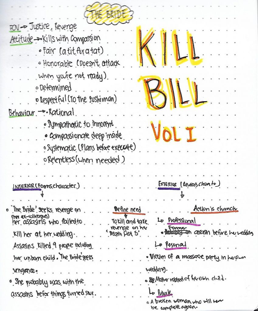
In order for a good story to be created, we need to have characters that are impressionable. Hence there is a need to define the need of your characters.
POV (What the character’s believes in)
Attitude (Intellectual Decision)
Behavior / Mentality (The way in which a person behaves in response to a particular situation)
Hence, I watched Kill Bill Volume I for the first time, and had a go at dissecting the main character: The Bride (and yes she wasn’t given a name, they bleeped her name when mentioned in the film by other characters)
Here is the trailer for the movie! 🙂
*Spoilers alert
This is the dissection of ‘The Bride’ in Kill Bill Volume I I have attempted in. 🙂
I have learnt that character dissection is very important because it helps the character in the movie to connect with the audience in terms of familiarity and evoke a feeling to care for the character. This enhances the plot of the film.
Q: Why does it make you feel the way you feel? Are there any particular features or qualities about the place that evoke those feelings? Is it people, the environment or a combination?
I like to feel safe and stick to the things I am used to and familiar with, because I already know nothing bad is going to get to me.
My grandmother is very similar to me when it comes to preference. We both like things of the past. So she tries to retain the way things were when she first moved in the HDB flat, and never buys something new or modern unless the new replica of the broken product cannot be found anymore. Hence, the place is very much like the way I was as a child as far as I could remember.
The non-slip mustard tiled grid floors, traditional Chinese tear-off calendar, wooden rice container etc. looked the way they were for my whole life. Being in my grandmother’s house makes me feel like a little girl again every time I visit.
It is a combination of both the people and the environment really, that evoke those feelings of nostalgia, safety and lots of love. My grandparent’s house will not be the same as it is without my grandmother nor the feeling will be the same if my grandmother is living in a totally different house. I felt that difference the most upon the passing of my grandfather. Hence, the emptiness portrayed in the photographs is evident in my photos.
Q: What would you like to share with us?
Richard Billingham, Untitled (Ray’s A Laugh 6), 1995
I was quite inspired by one of the reference artist, Richard Billingham. He was able to evoke the personalities of his subject matter and scenario, while being frank and authentic. He say he feels better when he doesn’t use a digital camera as he does not want to keep looking at the photographs behind the screen be bothered by how he can repetitively take a better photograph and he no longer knows what is he doing, so he thinks it is better if he cannot see what he has done at that moment, and then look later when the film is developed. I could relate to how Billingham feel regarding using a digital camera or smartphone to take photographs, as I would be so concerned about how pretty a photograph looks, I forget my initial intention: to take a meaningful photograph instead. A lot of his inspiration comes from childhood, which is what captured my attention initially.
The reason I shot the photographs from a downward angle is because I wanted to recreate the perspective I had as a child: Small and curious. I enhance the colours to replicate how the actual scenario looked like off camera, it is because this is how I see things: In colour, the way it is.
Upon taking the photographs, I was trying to look at the parts in the house that caught my attention the most at that age. I recall climbing up the table counter from the kitchen stove area so that I can reach the ‘Mamee Noodle Snack’ in the cabinet my grandmother hid from me before dinner. Hence, this photo of the kitchen counter. (Photograph 2)
The area where I played ‘Masak Masak’ with my grandmother’s bowls in the wooden cabinet, mixing my milk powder formula with the raw rice in the wooden bucket. (Photograph 4)
The cooking area where I watched my grandmother cook as I snuck a few pieces of piping hot luncheon meat into my mouth the instant she plated them. But of course, I think she knew. (Photograph 1)
All of these scenarios ended the same: My grandmother carrying and scolding me in Teo Chew dialect while I writhed and kicked in annoyance all the way to the living room where it is ‘safer’ for me to play as my grandfather would be watching me while he dozes off.
Problems faced when I was doing this project is that I was unable to capture the entire scenario. Like for instance, this photo feels incomplete without having that table. But if I were to manually move the table into the photo I am taking, the photo loses its significance because it feels staged.
However, if I were to stand in a position where both the table and the scenario I want to capture can be simultaneously captured, it still feels wrong because there is an extra materials in the photo that I don’t wish to capture.
Doing a panoramic shot of my world feels very spherical and some objects have too much depth when it is actually rather flat. Hence, the photos I have taken feels… missing of some emotions, or too many elements to focus on.
These are the 4 images I have selected that best convey the world that is significant to me:
Photograph 1: A panoramic view of my world
Photograph 2
Photograph 3
Photograph 4
To conclude, as I grow older I have learnt that society does not work the way it does at home. I have to learn to try new things, be adventurous and take a leap of faith. But very much, most of the times I feel that doing these are very daunting and foreign to me, and that is where I rely on things that remind me of my safe haven. Since childhood is something I can never ever go back to, holding dear memories of it and being in places that reminds me of them is the least I can do to comfort myself when things gets too scary, it allows me to know how much of a person I have grown into, and how much more I have to know and grow.
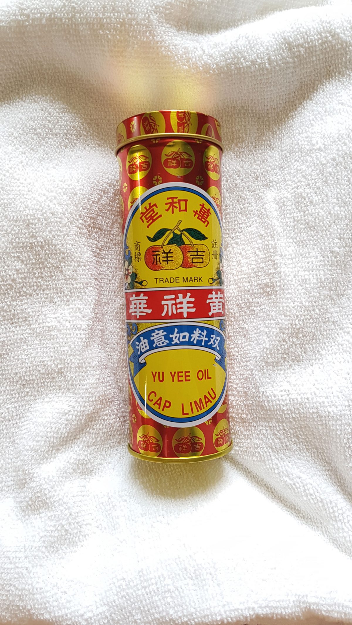
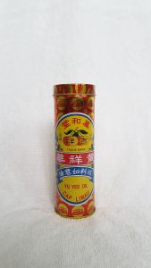
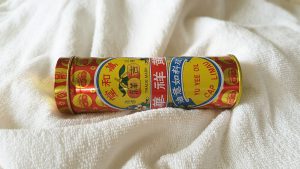
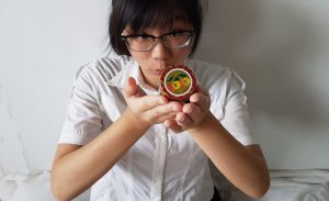
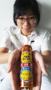
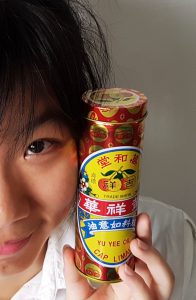
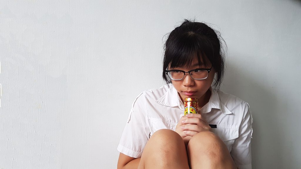
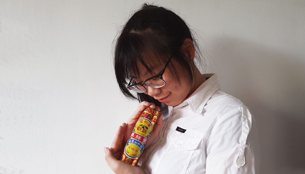
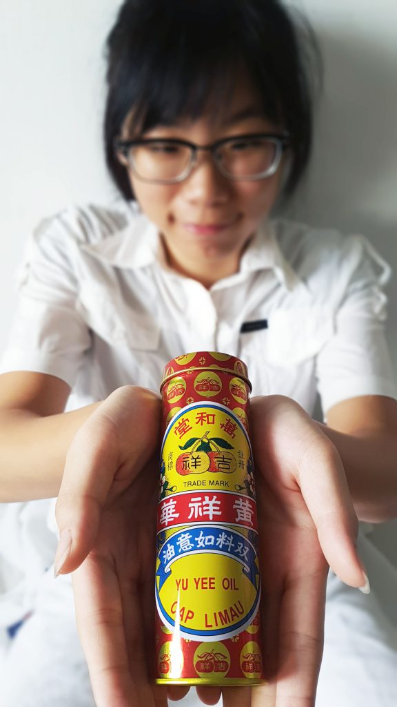
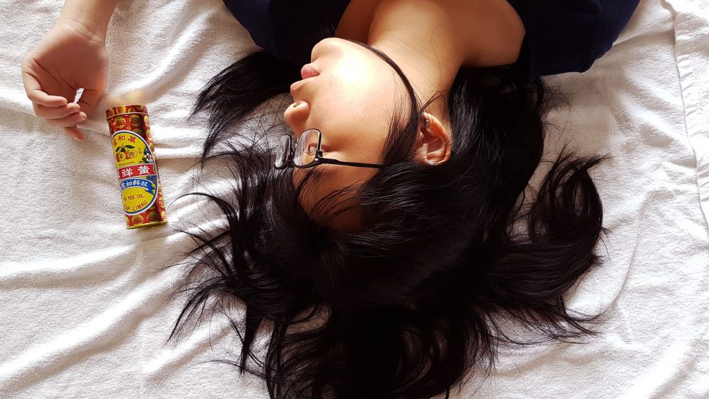
Yu Yee Oil has been with us for as long as many of us can remember. I believe that every Singaporean is able to recognise this brand just base on the packaging design and colour. It is a go-to medicated oil for children who has stomach-ache and an essential item for parents to apply this on the belly and bottom of the feet for their kids every time after their bath.
Yu Yee Oil is a significant object that greatly reminds me of my childhood. It has been with me since I was a baby.
Even today, I still use it. Not only because for its function to cure stomach-aches, but because the smell itself is very comforting. I even bring it with me to places I am unfamiliar with. A familiar scent that has been with me since childhood. A scent that is highly distinguishable. A whiff of it instantly calms me down. It makes me feel grounded. The moment the minty scent hits the back of my throat; a surge of warmth spreads within me and I feel all soft, mushy and warm; like a baby wrapped in a bundle. And I like feeling like that. A baby wrapped in a bundle, safe and sound with not a thing to worry about. And I think this is a way I can take myself away from reality, even if it is only just for a while.
References and Objectives:
I used maternity, family and baby photoshoots as visual references.
I wanted to capture the essence of family love, tranquility and purity. So I studied how the position of subject matters in the photos can help achieve the mood I wanted to convey.
Hence, with that, I wanted to capture these bolded words above in my photographs.
Close up of the object in a neutral background from various vantage points
Front view of object against white back drop.
Top View of object on soft towel
Side view of object lying down on soft towel.
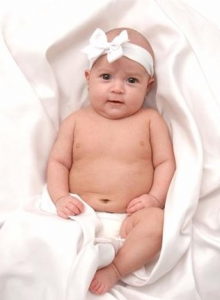
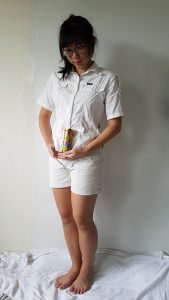
Full Figure shot of myself with the object.
Normal Standing pose with the object.
Full Figure shot of myself interacting with the object. Aim to capture my feeling about the object.
Cradling my object like a baby bump.
Mid-range shot of me interacting with the object. Aim to capture my feeling about the object.
Playing with my object as though it is like a newborn.
Close- up shots of me interacting with the object
My final top 3 photographs that I felt conveyed the mood of my story:
I deliberately wore white to create a juxtaposition between the bright and vibrant colours of my object. So that more attention can be drawn to my object and my expressions which I wanted to use as the main elements to set the mood of my story.
My object keeps me safe when I am scared.
I chose a specific timing in the afternoon to capture this image as the lighting from my window casts a shadow behind me. Shadow is casted towards the interior of the room which represented the internal darkness I have inside of me, and the bright light casted towards the exterior is a representation of my bright personality on the outside.
My Object is soft and delicate to the skin like a baby.
My object is small and close to me. Literally and metaphorically.
I attempted to create depth in this photograph as I brought my object much closer to the camera and pulled myself far behind. I wanted to show that a small and bright object like this, can also have a great impact in my plain white life.
These are just some of the photographs that failed the cut to get selected as my top 3 images because I couldn’t capture the emotions I want to convey in the photographs.
I brought my hand around the object to draw the viewer’s attention by framing it, and tilting my head at that direction. I thought looking at it would provide an implied line in the direction of the object. I tousled and spread out my hair to give a more relaxed feeling. However, I felt that after the shot was taken the mood was more…sensuous than pure and tranquil. Hence this photograph did not make the cut.
Physical contact is a way to draw people closer because of intimacy and entering of one’s personal space. Hence, I plastered the object close to my face and cropped a mid-shot photograph to a close-up photograph obtain this. My objective for cropping is to allow the viewer to feel closer to us (me and my object). And placing the object against my face is a form of physical intimacy.
This photograph failed the cut because my object’s function is not to be used anywhere near the face (application on face may burn). In addition, this photograph looks like a cosmetic advertisement instead, which totally goes against the function of my object.
Week 2 of Foundation 4D class was our first lesson for the day!
Our instructor Miss Ruyi Wong taught us about many different aspects that contributes to a good photograph, as well as what our eyes perceive.
Reference artists such as Cindy Sherman and Sally Mann were used.
My classmates also shared their about their favorite photographers and explained the reasons why so. And the photographers shared that I have gained a new interest in are @nguan and @sheiku. (I went by their Instagram account)
Looking at Nguan’s works, I find that they are very distinguishable as it has a pinkish filter that no one is able to easily replicate, and the colors present are comfortable to the eyes.
The subjects matter of his photographs are usually doing mundane, everyday things. The subject matter sometimes look straight at the camera. I felt that he was able to capture a sense of tranquility in his works, as well as bring about nostalgia to something of the past. His ‘Singapore Project’ is one of my favorite projects that he has done as the scenes and the type of subject matter portrayed in his photographs are places I have been and people whom somehow I have met before. This sense of familiarity is very soothing.
Sheiku’s works are something that I draw similarity to a contemporary artist, Damien Hirst’s work. Similarly to Damien Hirst, Sheiku’s works are bizarre, unconventional and it include a shock factor. Sheiku turns ordinary objects into something extraordinary by introducing ready-mades and dissecting the object into something unrecognizable when put together.
His works on Instagram are either not captioned, or captioned with something vague or irrelevant. I would like to think that Sheiku wants us to explain his works in our own interpretation. For instance, upon seeing the above image, a short self-interpretation of this work comes to my mind…
“You trampled on my raw and beating heart when my love for you has grown and almost blossomed.”
Different emotions are evoked upon different ways of seeing Sheiku’s works for me. First comes shock (from choice of subject matter), second comes curiosity ( for why did he chose these objects and what do they mean?) and then lastly, a mellow emotion will wash over me as I try to interpret his meaning to his works.
The study of signs – Semiotics has started since 1900s.
Semioticsis the study of signs and symbols and their use or interpretation.
Semiotics can be defined into two parts of signs.
Signifier — The form of a sign. The form might be a sound, a word, a photograph, a facial expression, a painting of a pipe, etc.
Signified — The concept or object that’s represented. The concept or object might be an actual pipe, the command to stop etc.
Signifiers are different in different cultures. Examples such as Justin Bieber flashing a double backhand peace sign seem harmless, but to some parts of the world it may seem offensive. (honestly speaking I still have no idea why was it offensive, my search results on Google was negative Do tell me what it means if you know thank you!)
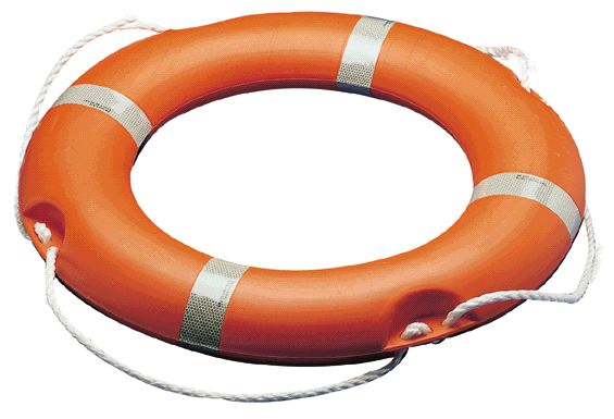
A unanimous signifier that everyone recognizes for example is a Life Buoy!
Everyone who sees it will know it is a buoyant support such as a lifebelt for keeping a person afloat in water.
Icon, Index, Symbol
Icon has a physical resemblance to the signified, the thing being represented.
Index is indirectly connected with an object
Symbol is not a representational image. There is no direct resemblance to the object.
Iconoclasm is the act of attacking/ assertively rejecting cherished beliefs and institutions or established values and practices.
Metaphors & Association
Modern Advertising relies heavily on visual metaphors.
For instant, in the Alice in Wonderland cartoon version Miss Wong showed us, the bird calling Alice a ‘Serpent’ is a metaphor and assiociation to an ‘bird egg stealer’ as she is very big (because she ate some bread that made her grew into a giant), and her size is associated with the length of a serpent.
Or another example showed in the slides by Miss Wong is this advertisement for a beauty product. A ‘skin as smooth as peach’ is associated with a baby’s bottom.
As a peach is highly associated with a bum because of it’s shape and texture. This ad is advertising it’s product in such as way that, if the consumer uses this product, their face will be a smooth and youthful like a baby’s bottom. (yea right…)
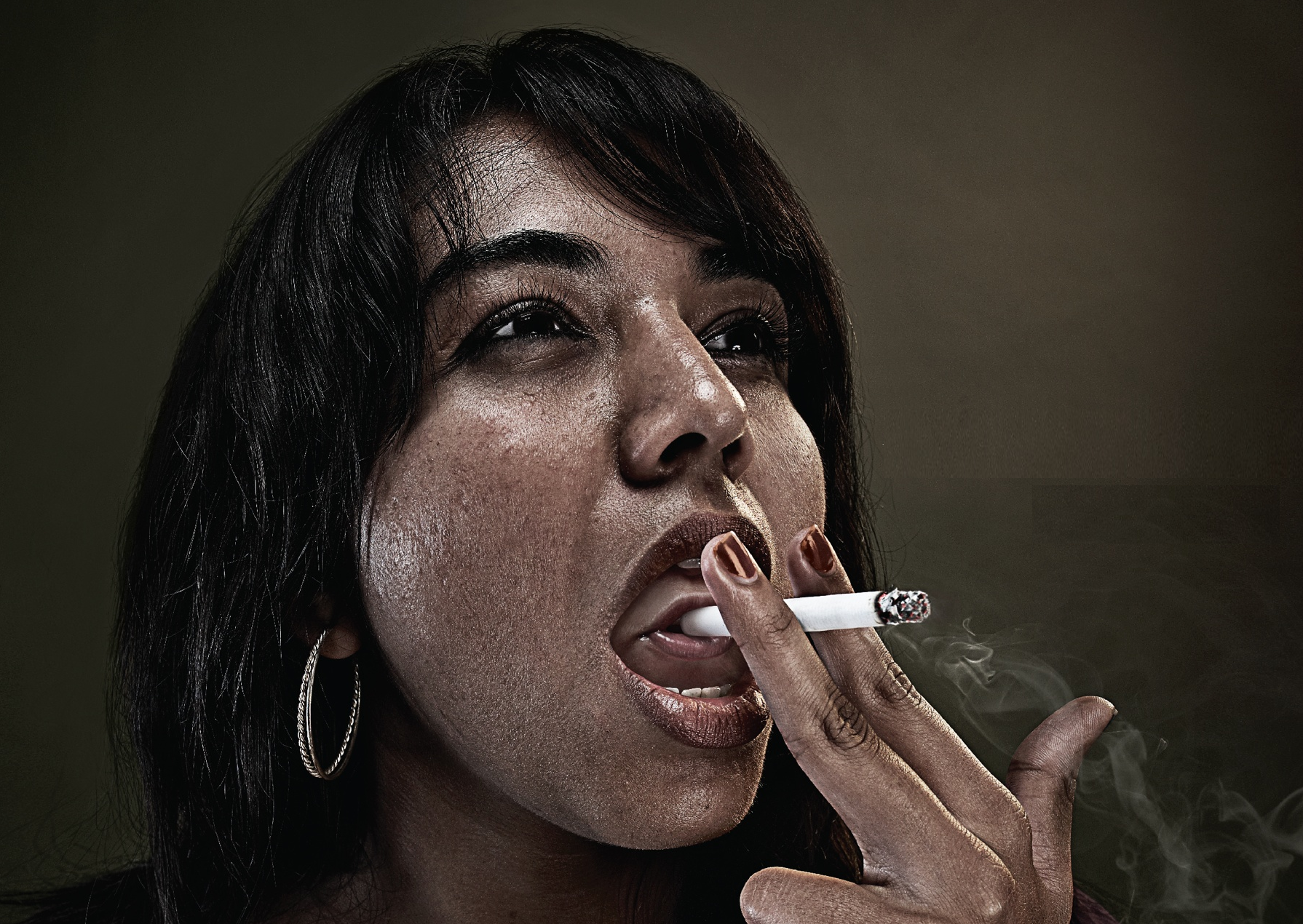
Applying what I have learnt about Visual Metaphors onto another advertisement, I chose to use this anti-smoking advertisement…
In my own interpretation, this is a very strong anti-smoking ad as two subject matters are involved. As smoking is usually seen as doing harm to oneself, this advertisement raises awareness to smokers that not only they are doing harm to themselves, but also to other; as depicted by the second subject matter inside the smoker (literally and metaphorically INSIDE the smoker).
This image is highly grotesque to me as putting an unborn infant in view of direct contact with a cigarette is disturbing and uncomfortable to look at. In this case, I find that this advertisement has achieved it’s objective to induce a sense of pity to the innocent baby, against the act of smoking. Thus, encouraging smokers to quit smoking, and pregnant women to quit smoking for the sake of their offspring.
Miss Wong then let us out to take some photos, using what we have learnt in class. I tried to find signs of semiotics in the scene I was taking.
A bright orange cone is a sign for drivers and onlookers to be aware, and a tool to redirect traffic.
Seeing that the cone is placed near the wall with a white tape stretched across, I deduced that the cone is to draw attention to others that the paint on the wall is wet. So do caution.
Directional arrows show where drivers should head to. Reflective yellow and black arrows on the bend of the wall warn drivers to be careful of the bed. 2 parallel white lines tells drivers to keep in their lanes.
With that, this concludes my lesson review for week 2!
Not only have I viewed images, advertisements and present day scenes with a new eye; I think that more thought will be placed when I look at things or before I take a photograph in the future.

 I also included a ‘Pull Here’ instructions with a red arrow to direct the child’s attention to it.
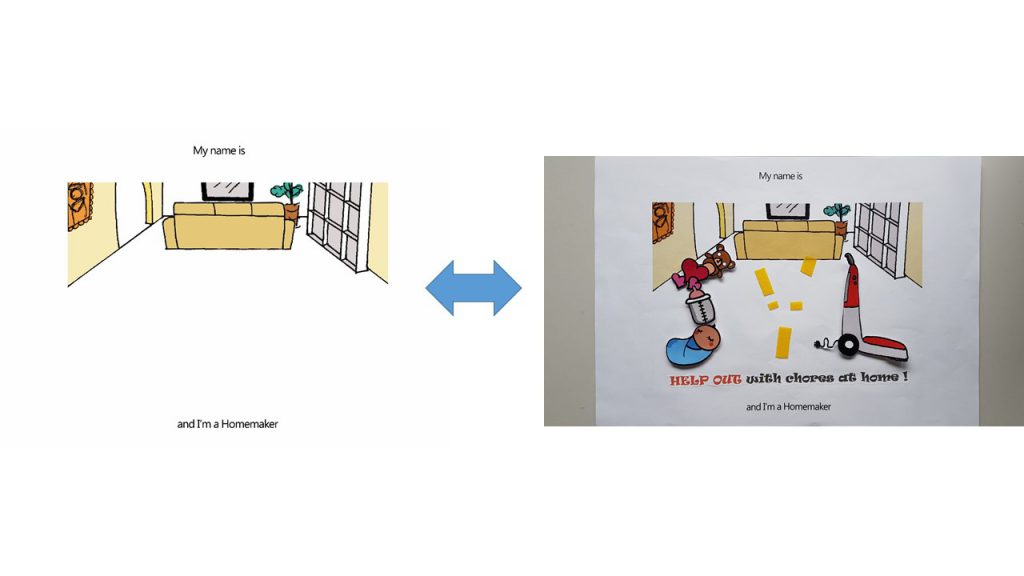
 I really liked how…
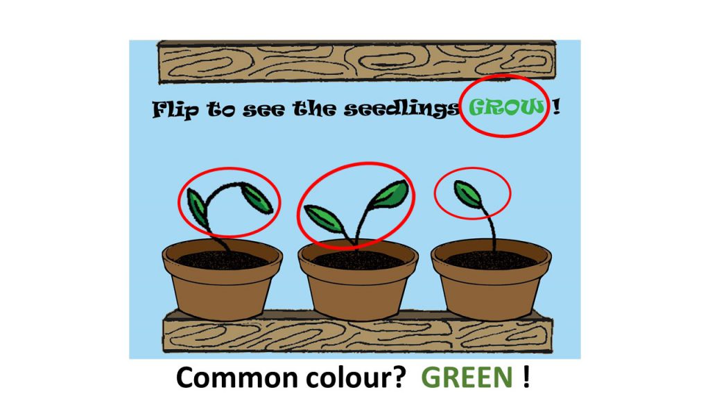
 This is the dissection of ‘The Bride’ in Kill Bill Volume I I have attempted in. 🙂


 Do tell me what it means if you know thank you!)