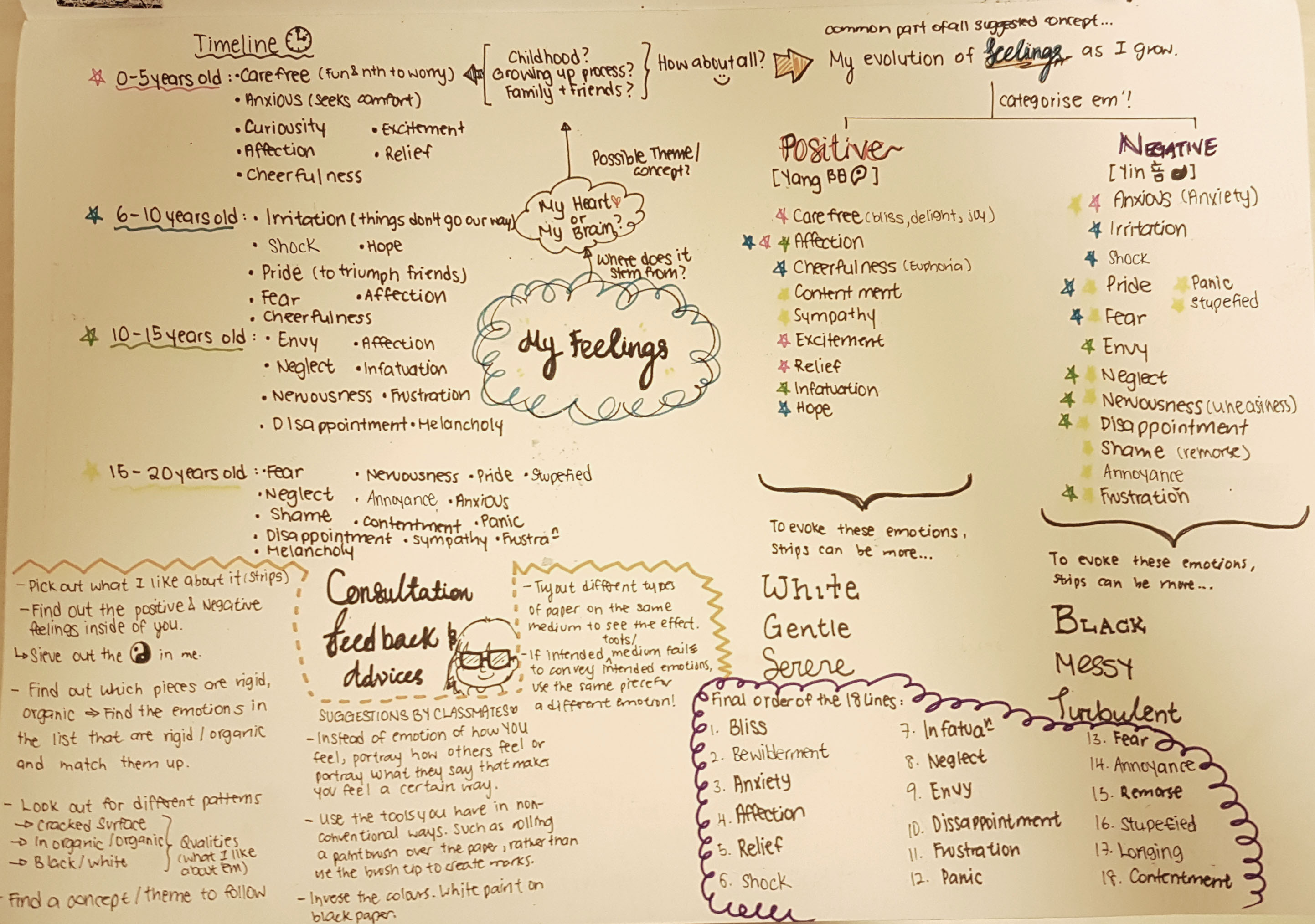
SILK SCREENING
It was my very first time at silk-screening on the previous week and I had trouble conceptualizing the process because I simply couldn’t fathom how our printed designs on TRANSPARENT PLASTIC (Correct term: Transparency Paper) could be translated onto printed designs on tote bag while using this sieve looking tool (Correct term: Silk Screening frame).
I had to see and have hands-on experience to believe this amazing invention created by mankind!
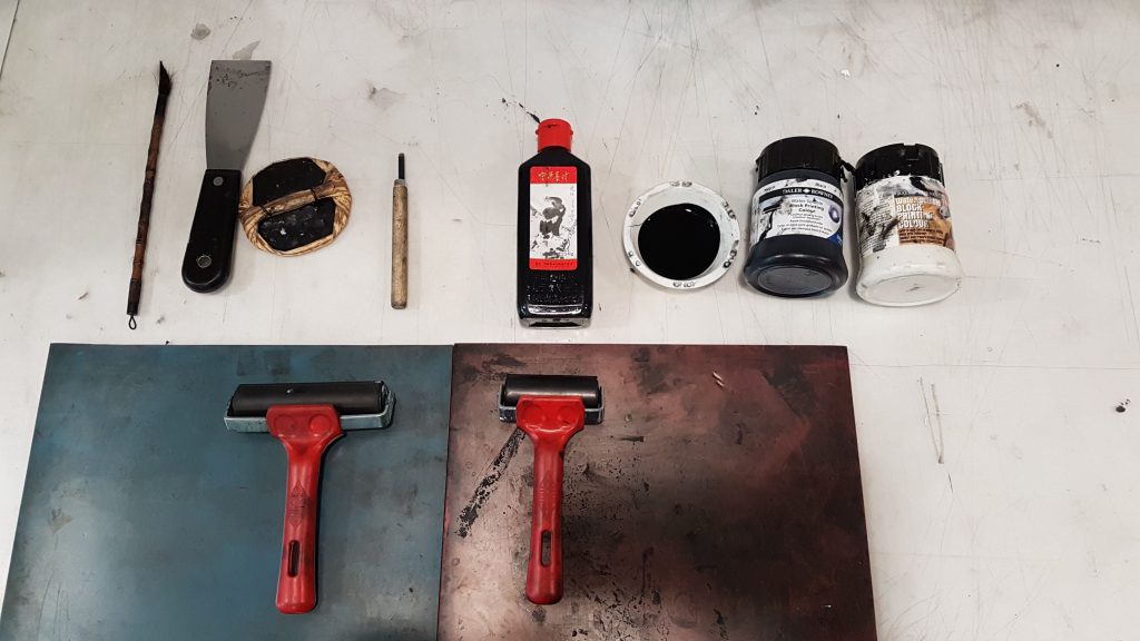
Firstly we were told to wash our silk screen frames and use a hair dryer to blow dry them, to ensure they were clean!
Then we went into this enclosed red room ( Red light was present) where NO LIGHT was allowed to be present as there might be some chemical reaction with the medium we were going to use. We then coated the netting of our frames on the back and front using the blue paint-like medium and then placing our coated frames in this GIAGANTIC oven (It had really smooth rolling trays…) to dry the medium !
After which we were taught by Xiuming (Work-study senior) to place our transparency and frame into this GIGANTIC MACHINE which looked like a photocopy machine on the outside, but had like reflective metal on the inside which made it look like a tanning machine. After which we locked our designs in the machine, it made a whirring sound and the cloth above our designs was like sucked in!!! I was super amused at this point because I had never seen anything like this before!
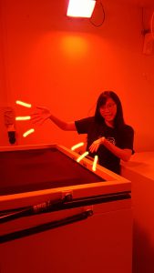
The Photocopy looking machine which printed our designs onto the silk screen frame surface 🙂
After which the machine did it’s job, we took our designs to the back of the room to wash the residue off using this jet spray (It was fun… pretending that the jet spray was a rifle  )! But in all honesty, I was rather upset at the amount of water wasted in this process of washing… considering that all of the students in ADM Year 1 had to do this, it is bad for the environment by wasting so much water. :'(
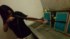
This jet spray allows the residue to be forced out of the net!
After cleaning up our designs on the frames, we used the hairdryer to dry the frame and apply a layer of thick ink over the top of our frame and pushed the ink across the designs using a wiper tool to ‘print’ our designs onto our tote bag!
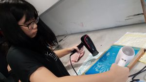
Drying the design
I wasn’t very please with the eventual outcome on the tote bag as some areas were too dark and splotchy instead of greyish, and details were missed out… As you can see it is pretty in-identical to my digital design.
After test runs on paper, the final design has been printed on my tote bag!
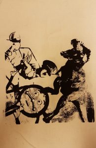
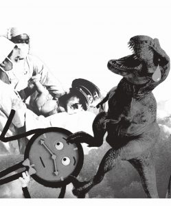 <<<Original digital design after bitmap
What I regretted the most after the final printing onto my tote bag was not being able to have a good gauge of what my final print will look like based on the tonal contrast, quality of the digital image and frequency of the dots in bitmap, BEFORE printing on the transparency paper … I hope that in the future I can have more opportunity to try out silk screening again. It was really fun! But at the same time, the process of silk screening was not easy at all; and I really do commend those who could do it so well! 
If my personal experience with silk screening is not detailed enough, do check out this video on how silk screening is conducted!!
Cheers!
Seng Yi Ling


 ~~~~~~~~~~~~~~~~~~~~~~~~~~~~~~~~~~~~~~~~~~~~~~~~~~~~~~


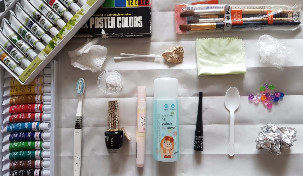 Image 1:
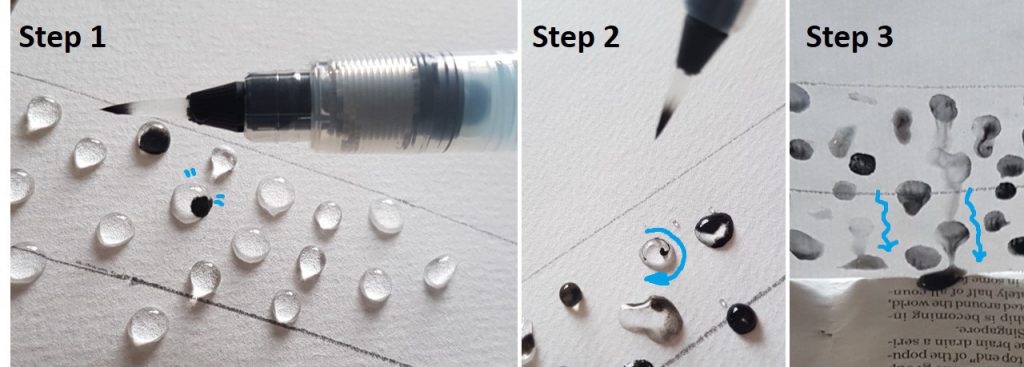
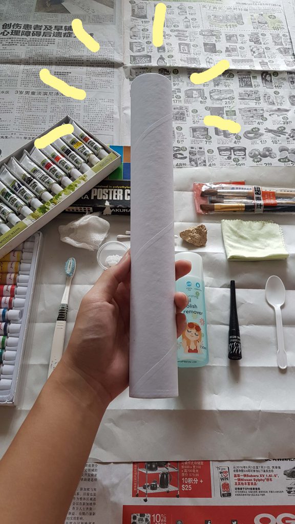 Image 2: Because I didn’t have a roller like the mono-printing post previously, I used a kitchen towel cardboard tube as a… low-budget roller. Hope that it works just as well.
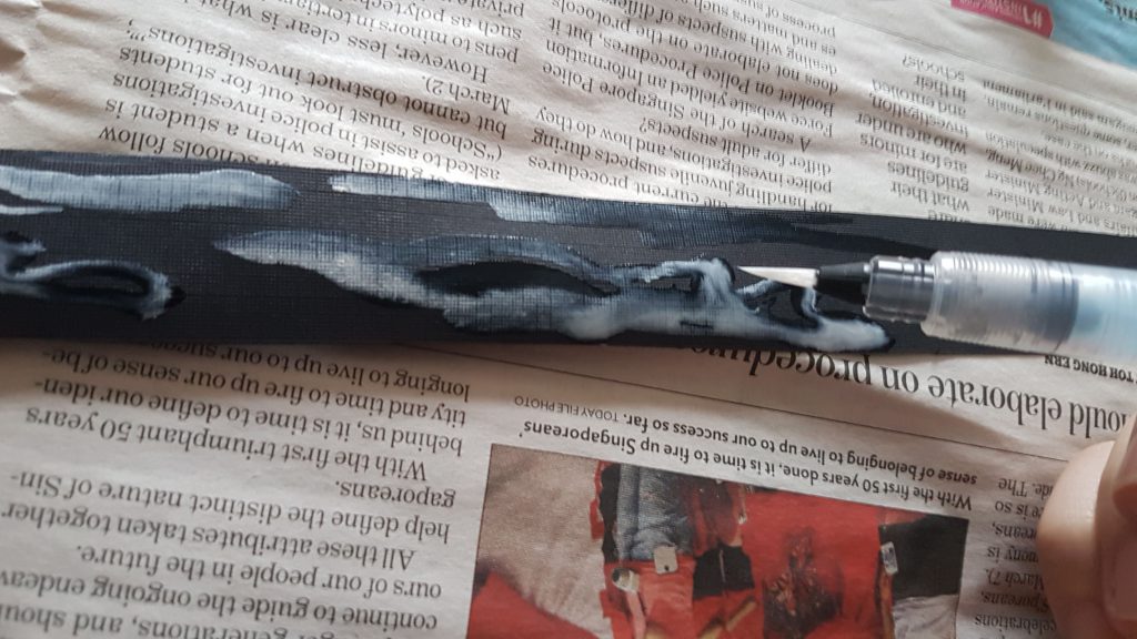
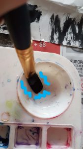 << Image 3: I tried mixing watercolor paint with nail polish remover and to my surprise and excitement, the 2 mediums are not completely miscible! Black paint coagulations were found at the bottom of the palette.
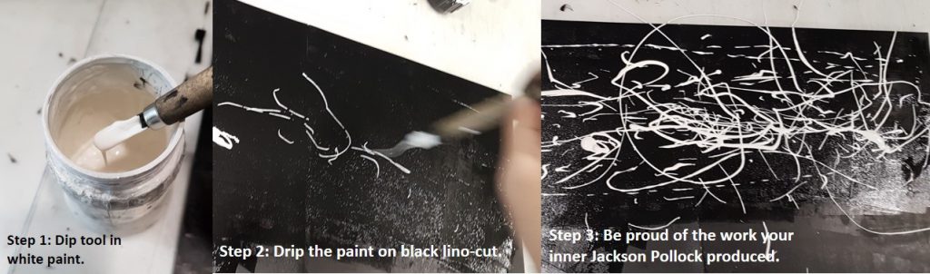
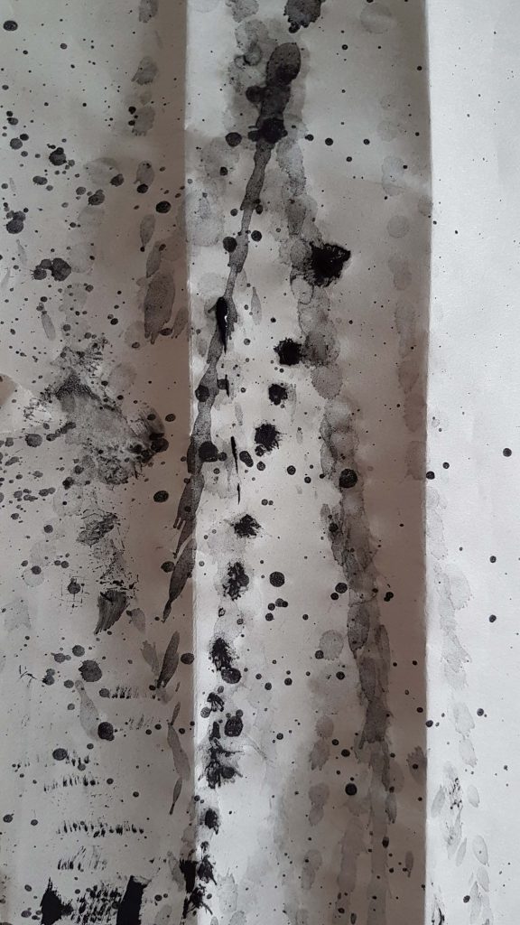 Image 4: After vigorously mixing the mediums in image 3, I swung my wet paintbrush onto the newsprint paper, creating far-ranged splatter patterns.
 Image 5: I cut open a tube of white nail varnish and poured it over the newsprint, and then adding a few drops of black nail varnish onto the white.
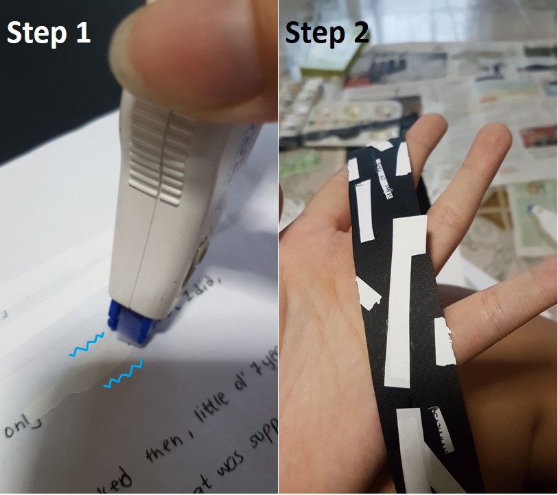
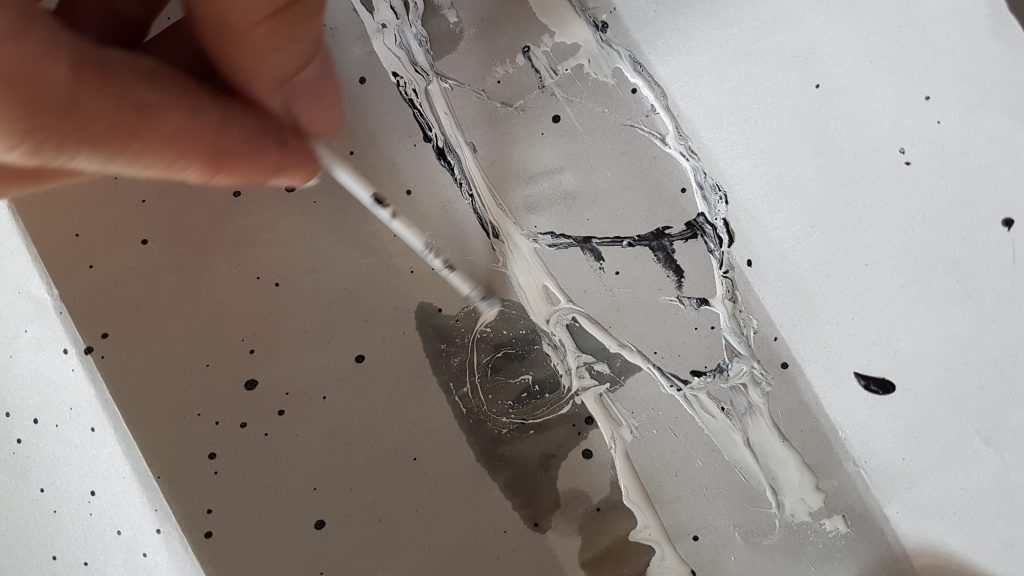 Image 6: I then used the plastic teaspoon to pour nail polish remover over the white nail varnish, and then using a Q-tip (with the cotton portion cut off) to swirl the mixture; creating another pattern that is a result of 2 immiscible mediums!
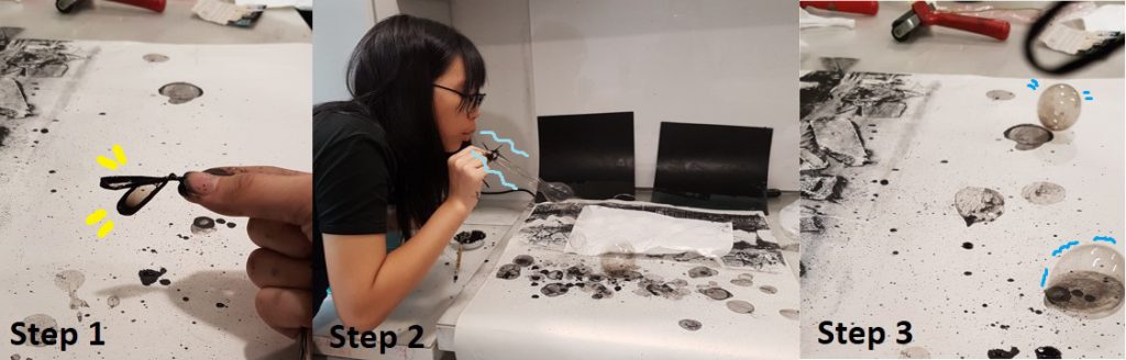
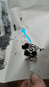
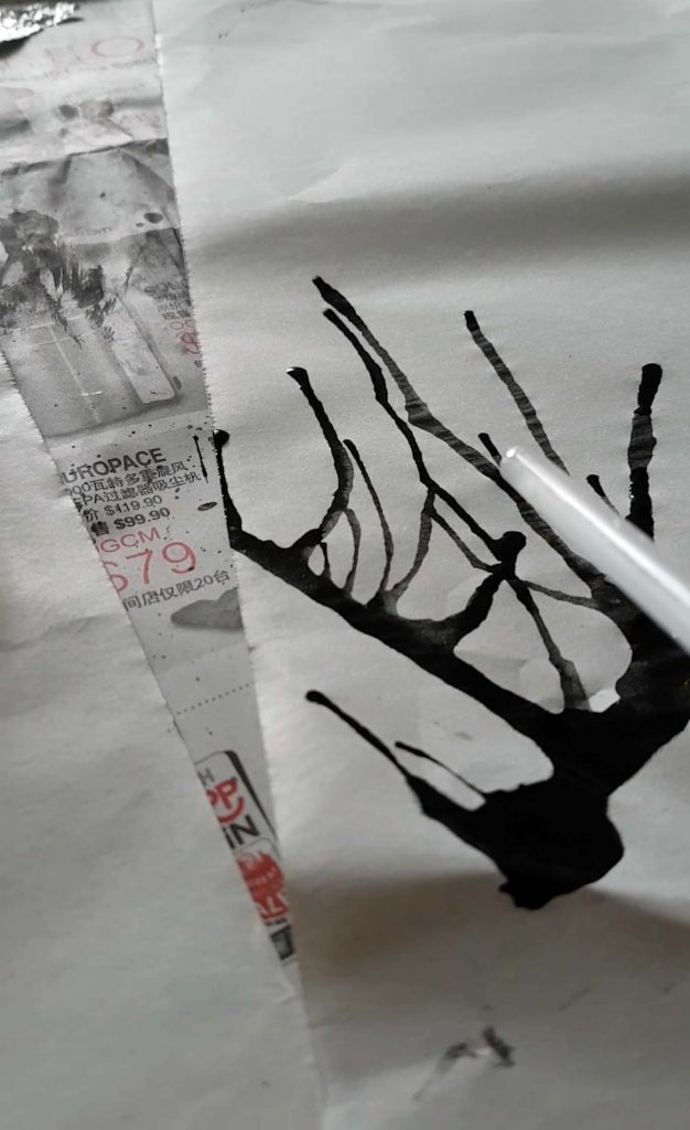 Image 7: Blowing air out from a straw onto an A2 newsprint with fluid black watercolor paint.
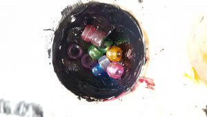
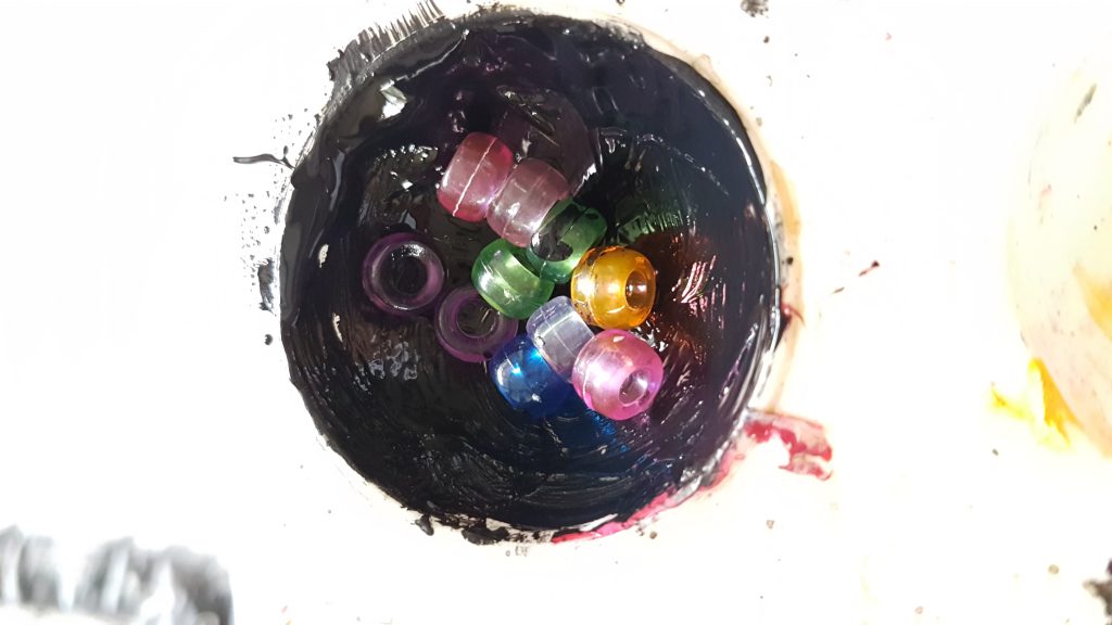 Image 8: I didn’t have marbles so I used beads and coated them in dense poster color paint.
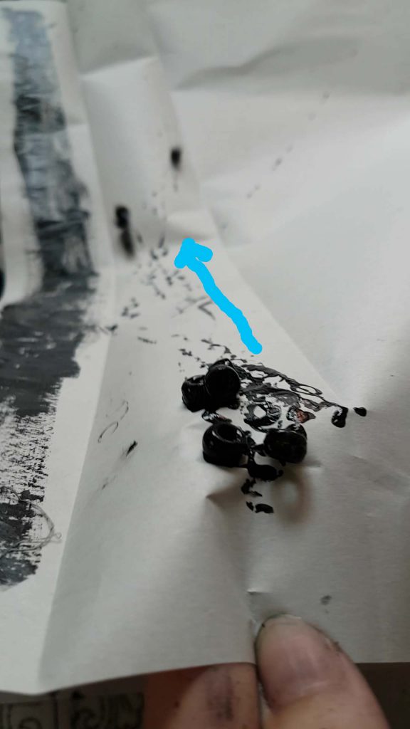 Image 9: I tilted the paper in an angle and allowed the beads to roll downwards, creating a linear rolling pattern that goes in different direction.
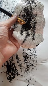
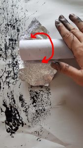
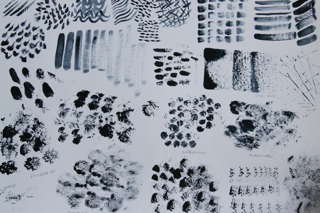
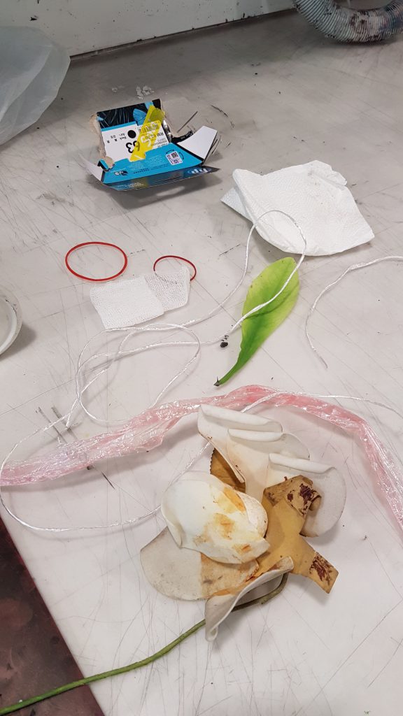
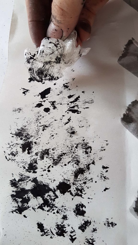 Image 12: I also used a scrunched up cling wrap dipped in paint to dab it all over my newsprint. Creating a blotchy and detailed patterns as the pain began to dry a little.
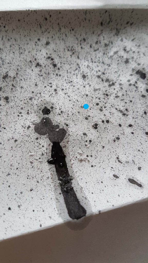 Image 13: Incorporating a tooth brush, I created tiny splattered patterns . The blotchy watercolor paint drip was created by accident. So I decided to add some salt crystals onto it, hoping to achieve a water color to gather the water pigments. But the experimentation has failed as the paper absorbed the water color more efficiently than the salt could.
 Image 1: Spreading the mono-printing ink onto the lino-cut with the roller.
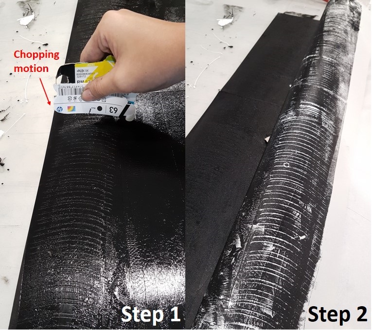
 Image 2: Placing my mark making objects onto the wet lino-cut from Image 1.
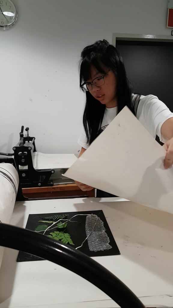 Image 3: Placing a piece of A2 newsprint paper on the lino-cut from Image 2.
 Image 4: Covering my newsprint paper with a stack of A2 newsprint, which acts as a ‘Blanket’ to protect the roller machine from getting stained.
 Image 5: Begin turning the wheel which moves the platform below it, rolling the A2 newsprint over the lino-cut.
 Image 7: After gently removing the mark making tools, place another clean A2 Newsprint on top of the lino-cut and repeat the step in Image 6 to achieve a detailed print of the mark making tools!